vital signs - greatermilwaukeefoundation.org · the country. vital signs 2013 was used by many...
TRANSCRIPT

Vital SignsBenchmarking Metro Milwaukee
2015

Project Cosponsors
Greater Milwaukee FoundationUnited Way of Greater Milwaukee & Waukesha CountyGreater Milwaukee Committee
Project Staff
Community Research PartnersLynnette Cook, Executive DirectorMegan Johanson, Director of Research and Data ServicesDevin Keithley, Senior Research AssociateHaleh Dolati, Research AssociateShaun Fontanella, Research AssistantGrant Holmes, Research Assistant

Vital SignsBenchmarking Metro Milwaukee 2015JULY 2015

Sincerely,
Ellen Gilligan Julia H. Taylor Mary Lou Young
President and CEO, President, President and CEO,
Greater Milwaukee Foundation Greater Milwaukee Committee United Way of Greater Milwaukee & Waukesha County
Both reports have provided empirical evidence reinforcing previous studies and years of anecdotal observation that sharp racial and ethnic disparities persist in numerous indicators of regional vitality. We believe that as metro Milwaukee becomes an increasingly diverse region, it is critical to our region’s future strength and vitality that we advance the well-being of all residents. It is incumbent upon all of us to use this powerful information to direct the important work of moving our region forward. We can only accomplish this goal together, and we look forward to working with you to make it happen.
July 2015
Dear Partners,
In 2013 we commissioned Vital Signs, a compilation of quality of life indicators, comparing Greater Milwaukee to 15 metro regions across the country. Vital Signs 2013 was used by many community residents and stakeholders to spark conversation and dialogue, and inform the work of nonprofits, businesses, government leaders, and residents.
Vital Signs 2015 shows movement since 2013 regarding our region’s strength, well-being, and vitality. The new report retains many of the same indicators as the 2013 report and compares Milwaukee to the same 15 regions, facilitating analysis and highlighting important trends.

Table of ContentsSection 1: Population Vitality
Population Vitality Overview ......................................................................... 1-21.01 Population Growth .............................................................................. 1-31.02 Birth Rate ............................................................................................ 1-41.03 Foreign-born Population...................................................................... 1-51.04 Race and Ethnicity .............................................................................. 1-61.05 Residential Segregation........................................................................ 1-71.06 Child Population.................................................................................. 1-81.07 Senior Population ................................................................................ 1-91.08 Median Age ....................................................................................... 1-101.09 Households ........................................................................................ 1-111.10 Same-sex Couples .............................................................................. 1-12
IntroductionSection 1: Population VitalitySection 2: Economic StrengthSection 3: Personal ProsperitySection 4: Lifelong LearningSection 5: Community Well-beingData SourcesAppendices

GREATER MILWAUKEE FOUNDATION | VITAL SIGNS: BENCHMARKING METRO MILWAUKEE 2015
Section 2: Economic Strength
Economic Strength Overview ........................................................................ 2-22.01 Industry Sector Employment ............................................................... 2-42.02 Employment Change by Industry ........................................................ 2-62.03 High-tech Industries ........................................................................... 2-82.04 Patents ................................................................................................. 2-92.05 Entrepreneurship ............................................................................... 2-102.06 Fortune 1000 Companies .................................................................. 2-112.07 Venture Capital .................................................................................. 2-122.08 Business Firms ................................................................................... 2-132.09 Small Business Firms ......................................................................... 2-142.10 Small Business Startups ..................................................................... 2-152.11 Minority Business Ownership ........................................................... 2-162.12 Women’s Business Ownership ........................................................... 2-172.13 Gross Metropolitan Product .............................................................. 2-182.14 Exports .............................................................................................. 2-192.15 Income and Wages ............................................................................. 2-202.16 Occupations ....................................................................................... 2-212.17 Workforce .......................................................................................... 2-222.18 Creative Workforce ............................................................................ 2-232.19 Green Jobs ......................................................................................... 2-242.20 Unemployment .................................................................................. 2-252.21 Brain Gain ......................................................................................... 2-26
Section 3: Personal Prosperity
Personal Prosperity Overview ......................................................................... 3-23.01 Household Income .............................................................................. 3-43.02 Income $75,000 and Above ................................................................. 3-53.03 Income Gap ......................................................................................... 3-63.04 Pay Equity ........................................................................................... 3-73.05 Poverty ................................................................................................. 3-83.06 Low Income ......................................................................................... 3-93.07 Income Supports ................................................................................ 3-103.08 Earned Income Tax Credit ................................................................ 3-113.09 Teen Pregnancy .................................................................................. 3-123.10 Parental Employment ........................................................................ 3-13 3.11 New Housing Starts .......................................................................... 3-143.12 Homeownership ................................................................................ 3-153.13 Foreclosures ....................................................................................... 3-163.14 Owner Housing Affordability ............................................................ 3-173.15 Rental Housing Affordability ............................................................ 3-18

Section 4: Lifelong Learning
Lifelong Learning Overview .......................................................................... 4-24.01 Educational Attainment ...................................................................... 4-34.02 English Language ................................................................................ 4-44.03 Pre-K Enrollment ................................................................................ 4-54.04 School Lunch Assistance ..................................................................... 4-64.05 High School Attendance ..................................................................... 4-7 4.06 Higher Education Enrollment ............................................................. 4-84.07 Research Doctorates ............................................................................ 4-9
Section 5: Community Well-being
Community Well-being Overview ................................................................. 5-25.01 Local Foods ......................................................................................... 5-45.02 Obesity ................................................................................................ 5-55.03 Diabetes ............................................................................................... 5-65.04 Smoking ............................................................................................... 5-75.05 Infant Mortality ................................................................................... 5-85.06 Health Insurance ................................................................................. 5-95.07 Hospitals and Physicians ................................................................... 5-105.08 Charitable Giving .............................................................................. 5-115.09 Volunteering ...................................................................................... 5-125.10 Local Government ............................................................................. 5-135.11 Diversity in Political Leadership ........................................................ 5-145.12 Women in Political Leadership ......................................................... 5-155.13 Women in Corporate Leadership ...................................................... 5-165.14 Crime ................................................................................................. 5-175.15 Road Safety ........................................................................................ 5-185.16 Traffic Congestion ............................................................................. 5-195.17 Commute Time ................................................................................. 5-205.18 Commute Mode ................................................................................ 5-215.19 Carbon Footprint ............................................................................... 5-225.20 Air Quality ........................................................................................ 5-235.21 Green Building .................................................................................. 5-24

GREATER MILWAUKEE FOUNDATION | VITAL SIGNS: BENCHMARKING METRO MILWAUKEE 2015

Introduction
About Community Benchmarking
Benchmarking is a process in which standardized, measurable indicators are used to track and assess how a community is doing. Communities can benchmark in several ways against best practices, policies, or leaders in a field; other communities; the state and nation; or community-established goals, targets, or trends.
In December 2011, the Greater Milwaukee Foundation, a family of more than 1,200 individual charitable funds serving the Milwaukee metropolitan area and beyond, approached Community Research Partners (CRP) about producing a benchmarking study. Building upon the legacy of Vital Signs, a program developed by the Greater Milwaukee Foundation to measure the basic needs in metropolitan Milwaukee through data, CRP designed and implemented the metro area’s first benchmarking report.
Cosponsored by the Greater Milwaukee Foundation, the United Way of Greater Milwaukee & Waukesha County, and the Greater Milwaukee Committee, Vital Signs: Benchmarking Metro Milwaukee 2015 represents the second edition of the benchmarking project.
Principles Guiding the Project This benchmarking project is designed to reflect the following principles:
Benchmark against both similar and best-in-class communities. Compare Milwaukee with 15 metropolitan areas that represent both “peer communities” (similar demographics/geography) and “best-in-class communities” (having characteristics that other communities emulate).
Select indicators from a broad framework, with a focus on economic competitiveness. Identify indicators that describe characteristics of the population, economy, and quality of life that contribute to the economic competitiveness of the region.
IntRoDUCtIon i
Use easily accessible, recent data. Collect data from existing, centralized sources. The process does not include conducting new research or collecting data from individual communities. If possible, the report uses indicator data no more than three years old that can also be regularly updated.
Produce a product that is useful to a wide audience. Prepare a report that (1) is easy for a variety of users to understand, (2) can be used to guide program and policy development, (3) informs the community about how Milwaukee stacks up, and (4) inspires the community to act.
Provide regular updates. After the initial release, produce updates to assess progress and trends.
The Indicator Groups
The indicators in Vital Signs: Benchmarking Metro Milwaukee 2015 are organized within five sections, each describing a facet of the community that contributes to economic competitiveness:
1. Population Vitality: indicators of population growth, diversity, age, and households2. Economic Strength: indicators of industries and innovation, business
growth, business size and ownership, productivity, employment, and workforce
3. Personal Prosperity: indicators of income, economic equity and hardship, homeownership, and housing affordability4. Lifelong Learning: indicators of educational attainment, language,
school attendance, and enrollment
5. Community Well-being: indicators of health, safety, civic life, transportation, and environmental quality

ii GREAtER MILWAUKEE FoUnDAtIon | VItAL SIGnS: BEnCHMARKInG MEtRo MILWAUKEE 2015
The Metro Areas
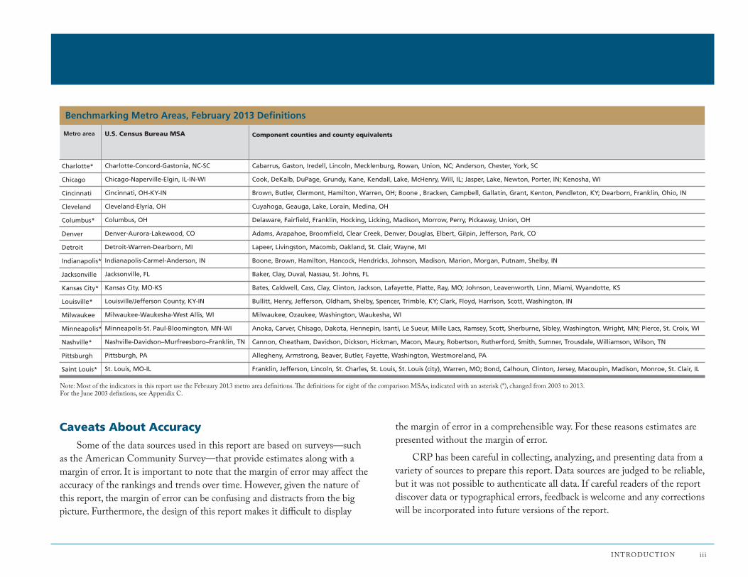
This report compares the Milwaukee metro area with 15 others across the country. For most of the indictors, these are the Metropolitan Statistical Areas (MSAs) defined by the U.S. office of Management and Budget (oMB) in February 2013 and used by the Census Bureau and other federal agencies for statistical purposes. They are composed of counties and county equivalents. For a list of all 16 metro areas benchmarked in this report and their corresponding geographic definitions, see the table on the facing page.
The oMB redefines MSA geographies every 10 years based on new data from the Decennial Census. About two-thirds of the indicators in this report use the current definitions, however many data sources continue to use the June 2003 MSA definitions and these are identified on the applicable indicator pages. While the Milwaukee metro area has remained the same, the definitions for eight of the comparison MSAs have changed. The June 2003 definitions for the 16 metro areas benchmarked in this report can be found in Appendix C.
CRP has also collected much of the indicator data for the top 100 MSAs by population. Where possible, these data are used to create an average for comparison purposes. In addition to this report, an online resource includes the data collected for the top 100 MSAs to enable users to perform their own benchmarking comparisons:
http://www.communityresearchpartners.org/wp-content/uploads/2015/06/VitalSigns2015_top100.xlsx
A map of the top 100 MSAs, highlighting Milwaukee and the 15 benchmarking metros, can be found on page iv.
Organization of the Report
Each section begins with an overview of the data in the section. These introductions include an analysis, in both narrative and graphic format, of how the Milwaukee metro area compares to the other 15 communities.
The report comprises 74 topics, each with a primary indicator and one or more related indicators. Each topic (with two exceptions) is displayed on one page. The indicator pages include data sources and definitions, a table, and a bar graph that together illustrate multiple dimensions of the indicator topic. Where historical data are available, a Milwaukee Trends line graph presents the data for Milwaukee on the primary indicator over time.
About the Rankings
The format of the report is intended to highlight the data. Unlike some benchmarking reports, there are neither letter grades nor up and down arrows to compare the metro areas. However, each indicator section contains a bar graph that rank-orders the metro areas, and there are rankings in the data tables as well. Many of the graphs display data as a percentage or rate to enable apples-to-apples comparisons of metro areas with different populations.
In ranking most of the indicators, 1 indicates both “highest” and “best,” and 16 indicates both “lowest” and “worst.” For some indicators (e.g., unemployment rate, poverty rate, crime rate), the lowest number is actually a positive sign and so is ranked 1, whereas the MSA with the highest number is ranked 16. A footnote indicates the rank-order system used on each page. tied metro areas (identified with T) are each assigned the next number in the ranking sequence. The ranking then skips over the number(s) that would have been assigned if there were no tie (e.g., 1, 2, t-3, t-3, 5).
Finally, ranking should be considered within the context of the specific indicator. For data where the spread between the highest and lowest figures is small, ranking may be a less useful tool for analysis.
Charlotte*
Chicago
Cincinnati
Cleveland
Columbus*
Denver
Detroit
Indianapolis*
Jacksonville
Kansas City*
Louisville*
Milwaukee
Minneapolis*
Nashville*
Pittsburgh
Saint Louis*
Benchmarking Metro Areas, February 2013 Definitions
U.S. Census Bureau MSAMetro area
Charlotte-Concord-Gastonia, NC-SC
Chicago-Naperville-Elgin, IL-IN-WI
Cincinnati, OH-KY-IN
Cleveland-Elyria, OH
Columbus, OH
Denver-Aurora-Lakewood, CO
Detroit-Warren-Dearborn, MI
Indianapolis-Carmel-Anderson, IN
Jacksonville, FL
Kansas City, MO-KS
Louisville/Jefferson County, KY-IN
Milwaukee-Waukesha-West Allis, WI
Minneapolis-St. Paul-Bloomington, MN-WI
Nashville-Davidson–Murfreesboro–Franklin, TN
Pittsburgh, PA
St. Louis, MO-IL
Cabarrus, Gaston, Iredell, Lincoln, Mecklenburg, Rowan, Union, NC; Anderson, Chester, York, SC
Cook, DeKalb, DuPage, Grundy, Kane, Kendall, Lake, McHenry, Will, IL; Jasper, Lake, Newton, Porter, IN; Kenosha, WI
Brown, Butler, Clermont, Hamilton, Warren, OH; Boone , Bracken, Campbell, Gallatin, Grant, Kenton, Pendleton, KY; Dearborn, Franklin, Ohio, IN
Cuyahoga, Geauga, Lake, Lorain, Medina, OH
Delaware, Fairfield, Franklin, Hocking, Licking, Madison, Morrow, Perry, Pickaway, Union, OH
Adams, Arapahoe, Broomfield, Clear Creek, Denver, Douglas, Elbert, Gilpin, Jefferson, Park, CO
Lapeer, Livingston, Macomb, Oakland, St. Clair, Wayne, MI
Boone, Brown, Hamilton, Hancock, Hendricks, Johnson, Madison, Marion, Morgan, Putnam, Shelby, IN
Baker, Clay, Duval, Nassau, St. Johns, FL
Bates, Caldwell, Cass, Clay, Clinton, Jackson, Lafayette, Platte, Ray, MO; Johnson, Leavenworth, Linn, Miami, Wyandotte, KS
Bullitt, Henry, Jefferson, Oldham, Shelby, Spencer, Trimble, KY; Clark, Floyd, Harrison, Scott, Washington, IN
Milwaukee, Ozaukee, Washington, Waukesha, WI
Anoka, Carver, Chisago, Dakota, Hennepin, Isanti, Le Sueur, Mille Lacs, Ramsey, Scott, Sherburne, Sibley, Washington, Wright, MN; Pierce, St. Croix, WI
Cannon, Cheatham, Davidson, Dickson, Hickman, Macon, Maury, Robertson, Rutherford, Smith, Sumner, Trousdale, Williamson, Wilson, TN
Allegheny, Armstrong, Beaver, Butler, Fayette, Washington, Westmoreland, PA
Franklin, Jefferson, Lincoln, St. Charles, St. Louis, St. Louis (city), Warren, MO; Bond, Calhoun, Clinton, Jersey, Macoupin, Madison, Monroe, St. Clair, IL
Component counties and county equivalents
IntRoDUCtIon i i i
note: Most of the indicators in this report use the February 2013 metro area definitions. The definitions for eight of the comparison MSAs, indicated with an asterisk (*), changed from 2003 to 2013. For the June 2003 defintions, see Appendix C.
Caveats About Accuracy
Some of the data sources used in this report are based on surveys—such as the American Community Survey—that provide estimates along with a margin of error. It is important to note that the margin of error may affect the accuracy of the rankings and trends over time. However, given the nature of this report, the margin of error can be confusing and distracts from the big picture. Furthermore, the design of this report makes it difficult to display
the margin of error in a comprehensible way. For these reasons estimates are presented without the margin of error.
CRP has been careful in collecting, analyzing, and presenting data from a variety of sources to prepare this report. Data sources are judged to be reliable, but it was not possible to authenticate all data. If careful readers of the report discover data or typographical errors, feedback is welcome and any corrections will be incorporated into future versions of the report.

Columbus
Cleveland
Detroit
Pittsburgh
CincinnatiLouisville
Indianapolis
Chicago
Milwaukee
Minneapolis
Nashville
Kansas CityDenver
Saint Louis
Charlotte
Jacksonville
LegendMilwaukee MSAOther benchmarking MSAsRemaining top 100 MSAs
Location of the Benchmarking Metro Areas
iv GREAtER MILWAUKEE FoUnDAtIon | VItAL SIGnS: BEnCHMARKInG MEtRo MILWAUKEE 2015
Top 100 MSAs by Population, 2013*
note: This map reflects the February 2013 metro area definitions
*CRP has provided indicators data in an online resource for all of the top 100 MSAs by population (including Milwaukee and the 15 other benchmarking MSAs) to enable users to peform their own benchmarking comparisons:
http://www.communityresearchpartners.org/wp-content/uploads/2015/06/VitalSigns2015_top100.xlsx

Section 1: Population Vitality
This section includes indicators of population growth, diversity, age, and households that describe the vitality of the metro area populations. The following are the Population Vitality indicator categories:
1.01 Population Growth
1.02 Birth Rate
1.03 Foreign-born Population
1.04 Race and Ethnicity
1.05 Residential Segregation
1.06 Child Population
1.07 Senior Population
1.08 Median Age
1.09 Households
1.10 Same-sex Couples
PoPulation Vitalit y 1-1

Population Vitality Overview
This section includes demographic indicators measuring population growth, migration, diversity, age, and household size and composition. These help describe the vitality of the metro area populations. Faster growing, more diverse, and younger metro areas tend to be more economically competitive. The table on the right shows where the rankings in this section fall. For the most part, the rankings have not changed much from the last benchmarking report. Milwaukee still tends to rank in the middle or toward the bottom tier when it comes to population vitality. However, there are signs the population will be getting younger and more diverse in the near future. This demographic transition will pose new challenges if the racial divide continues to widen.
Age and Diversity Milwaukee currently has a moderate level of diversity. The metro area still ranks near the top tier in the percentage of the population of a racial or ethnic minority (indicator 1.04). at the same time, the population is aging slightly. although ranks have not changed much, the percentage of the population age 65 and older (1.07) has grown and the percentage under 18 has dropped from the last report (1.06). all of these demographic changes reflect national trends. However, there is a large age disparity in Milwaukee between Whites and non-Whites—the non-Hispanic White population is one of the oldest among the 16 metros, whereas the african american and asian populations are among the youngest (1.08). This suggests that as older Whites reach the end of life, the younger non-White population, who tend to have higher birth rates, will grow and reverse the aging trend.
Racial Disparities as the population becomes more racially and ethnically diverse, the divide—both literal and figurative—between the White and non-White populations in metro Milwaukee may continue to grow as well. although the data have not been updated since the last report, it is worth restating that Milwaukee has the worst residential segregation between Whites and african americans (1.05). also, as mentioned above, there is a disparity in age between races.
1-2 GREatER MilWauKEE FounDation | Vital SiGnS: BEnCHMaRKinG MEtRo MilWauKEE 2015
These racial disparities can be seen throughout the report. african american and Hispanic households have among the lowest median incomes in the cohort, whereas non-Hispanic White households in the metro area earn more than twice as much (3.01). likewise, the percentages of african americans, asians, and Hispanics in poverty are all among the highest; african americans in Milwaukee have the highest poverty rate among the 16 metro areas, but the poverty rate among non-Hispanic Whites is one of the lowest (3.05). Perhaps most devastating, african american mothers in metropolitan Milwaukee experience one of the highest infant mortality rates in the cohort, whereas White mothers in the community experience one of the lowest rates (5.05).
Population Vitality: How Milwaukee Compares This figure depicts how the Milwaukee metro area compares to the other 15 metro areas using data from the bar graphs on the indicator pages in the Population Vitality section.
Population (% change)
Births per 1,000 population
Foreign-born population (%)
Minority population (%)
Black–White Dissimilarity Index*
Population under age 18 (%)
Population age 65 & older* (%)
Median age*
Average persons per household
Same-sex couples per 1,000 households
These indicators are ranked from highest (1) to lowest (16), except (*) ranked lowest (1) to highest (16).
87 9654321 16151413121110
Bottom tierTop tierMilwaukee metro area Middle tier
PoPulation Vitalit y 1-3
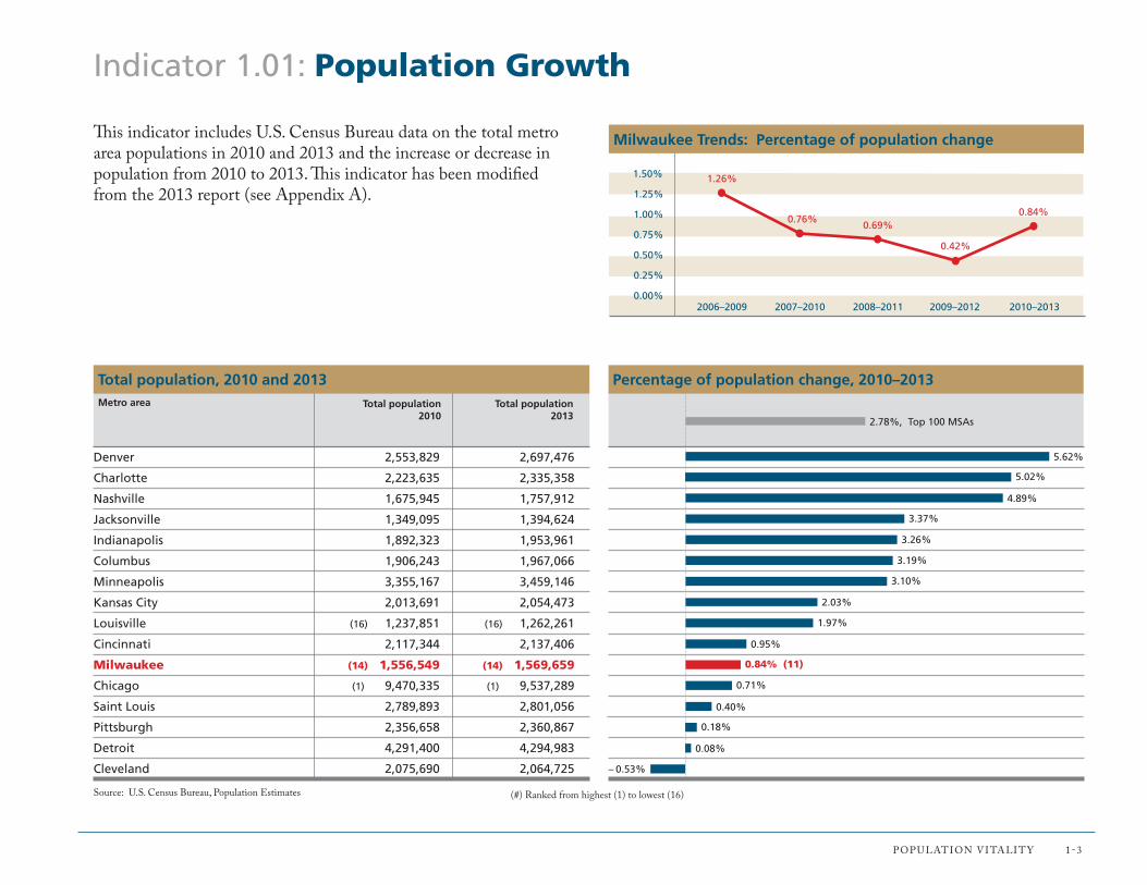
Indicator 1.01: Population Growth
5.02%
4.89%
3.37%
3.26%
3.19%
3.10%
2.03%
1.97%
0.95%
0.84% (11)
0.71%
0.40%
0.18%
0.08%
– 0.53%
Percentage of population change, 2010–2013
Denver 2,553,829 2,697,476
Charlotte 2,223,635 2,335,358
Nashville 1,675,945 1,757,912
Jacksonville 1,349,095 1,394,624
Indianapolis 1,892,323 1,953,961
Columbus 1,906,243 1,967,066
Minneapolis 3,355,167 3,459,146
Kansas City 2,013,691 2,054,473
Louisville (16) 1,237,851 (16) 1,262,261
Cincinnati 2,117,344 2,137,406
Milwaukee (14) 1,556,549 (14) 1,569,659
Chicago (1) 9,470,335 (1) 9,537,289
Saint Louis 2,789,893 2,801,056
Pittsburgh 2,356,658 2,360,867
Detroit 4,291,400 4,294,983
Cleveland 2,075,690 2,064,725
Total population2010
Total population2013
Total population, 2010 and 2013
Source: u.S. Census Bureau, Population Estimates
Metro area
(#) Ranked from highest (1) to lowest (16)
This indicator includes u.S. Census Bureau data on the total metro area populations in 2010 and 2013 and the increase or decrease in population from 2010 to 2013. This indicator has been modified from the 2013 report (see appendix a).
5.62%
2.78%, Top 100 MSAs
2006–2009 2007–2010 2008–2011 2009–2012 2010–2013
1.50%
0.75%
1.25%
0.50%
1.00%
0.25%
0.00%
Milwaukee Trends: Percentage of population change
1.26%
0.76%0.69%
0.42%
0.84%

1-4 GREatER MilWauKEE FounDation | Vital SiGnS: BEnCHMaRKinG MEtRo MilWauKEE 2015
Indicator 1.02: Birth Rate
This indicator includes data on birth rates from the u.S. Census Bureau. The birth rate is the total number of live births occurring to residents of an area expressed as a percentage of an area’s population. The rate is estimated using reports from the Census Bureau’s Federal–State Cooperative Program for Population Estimates and the national Center for Health Statistics.
Indianapolis 27,021
Columbus 26,464
Kansas City 27,632
Minneapolis 44,980
Nashville 22,821
Denver 34,971
Cincinnati 27,366
Milwaukee (14) 19,963
Chicago (1) 120,920
Charlotte 29,505
Jacksonville 17,510
Louisville (16) 15,698
Saint Louis 34,204
Detroit 50,105
Cleveland 23,204
Pittsburgh 23,938
Total births
Total births, 2013
Source: u.S. Census Bureau, Population Estimates
Metro area
(#) Ranked from highest (1) to lowest (16)
2009 2010 2011 2012 2013
14.5
13.0
14.0
12.5
13.5
12.0
11.5
Milwaukee Trends: Births per 1,000 population
13.913.6
13.3
(8)12.8 12.7
(8)
13.8
13.5
13.4
13.0
13.0
12.7 (T-8)
12.7
12.6
12.6
12.4
12.2
11.7
11.2
Births per 1,000 population, 2013
13.0
12.8
12.7, Top 100 MSAs
10.1
(#) Milwaukee metro area rank from current and previous Vital Signs reports shown in parentheses

PoPulation Vitalit y 1-5
Indicator 1.03: Foreign-born Population
This indicator includes data from the american Community Survey on the number and percentage of the total population who were not u.S. citizens at birth. The percentage of foreign-born persons who arrived in the united States in 2000 or later provides a picture of new immigrants in a metro area.
17.8%
12.0%
9.7%
9.7%
9.3%
8.2%
7.5%
7.1%
7.0% (9)
6.5%
6.5%
5.5%
4.9%
4.4%
4.4%
3.8%
Percentage of population that is foreign born, 2013
Chicago (1) 1,694,826 35.4%
Denver 324,111 42.9%
Minneapolis 336,263 49.8%
Charlotte 225,673 49.4%
Detroit 400,284 42.1%
Jacksonville 113,671 41.9%
Nashville 131,415 55.5%
Columbus 139,562 54.8%
Milwaukee (13) 110,618 (11) 44.1%
Kansas City 134,385 50.3%
Indianapolis 127,767 59.6%
Cleveland 114,501 (16) 33.8%
Louisville (16) 62,494 (1) 63.2%
Cincinnati 93,691 55.5%
Saint Louis 122,762 44.3%
Pittsburgh 88,999 48.6%
Total foreign-bornpopulation
Percentage entered United States, 2000 or after
Foreign-born population, 2013
Source: u.S. Census Bureau, american Community Survey
Metro area
(#) Ranked from highest (1) to lowest (16)
16.6%, Top 100 MSAs
2009 2010 2011 2012 2013
8.5%
7.0%
8.0%
6.5%
7.5%
6.0%
5.5%
Milwaukee Trends: Percentage of foreign-born population
6.9%
6.4%
7.1%
(8)
7.4%7.0%
(9)
(#) Milwaukee metro area rank from current and previous Vital Signs reports shown in parentheses
1-6 GREatER MilWauKEE FounDation | Vital SiGnS: BEnCHMaRKinG MEtRo MilWauKEE 2015
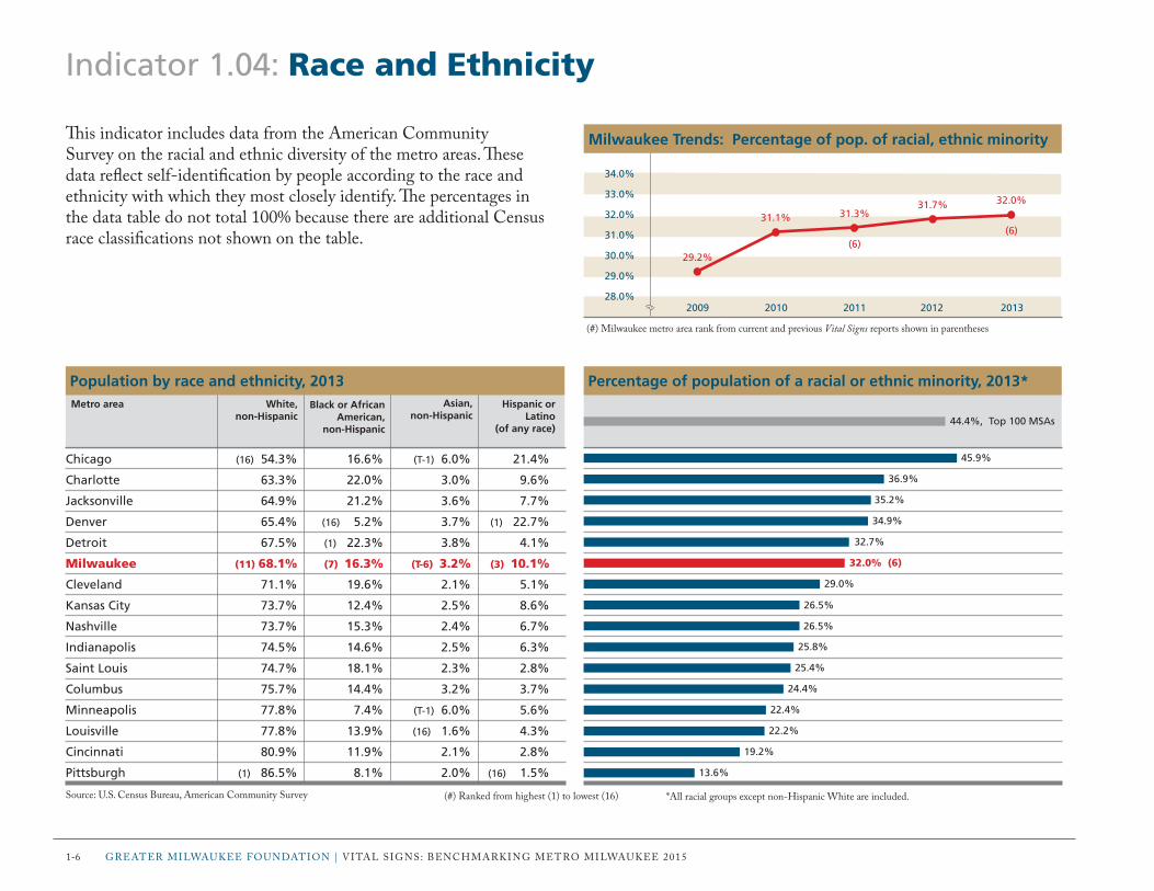
Indicator 1.04: Race and Ethnicity
This indicator includes data from the american Community Survey on the racial and ethnic diversity of the metro areas. These data reflect self-identification by people according to the race and ethnicity with which they most closely identify. The percentages in the data table do not total 100% because there are additional Census race classifications not shown on the table.
45.9%
36.9%
35.2%
34.9%
32.7%
26.5%
26.5%
25.8%
25.4%
24.4%
22.4%
22.2%
19.2%
Percentage of population of a racial or ethnic minority, 2013*
Chicago (16) 54.3% 16.6% (T-1) 6.0% 21.4%
Charlotte 63.3% 22.0% 3.0% 9.6%
Jacksonville 64.9% 21.2% 3.6% 7.7%
Denver 65.4% (16) 5.2% 3.7% (1) 22.7%
Detroit 67.5% (1) 22.3% 3.8% 4.1%
Milwaukee (11) 68.1% (7) 16.3% (T-6) 3.2% (3) 10.1%
Cleveland 71.1% 19.6% 2.1% 5.1%
Kansas City 73.7% 12.4% 2.5% 8.6%
Nashville 73.7% 15.3% 2.4% 6.7%
Indianapolis 74.5% 14.6% 2.5% 6.3%
Saint Louis 74.7% 18.1% 2.3% 2.8%
Columbus 75.7% 14.4% 3.2% 3.7%
Minneapolis 77.8% 7.4% (T-1) 6.0% 5.6%
Louisville 77.8% 13.9% (16) 1.6% 4.3%
Cincinnati 80.9% 11.9% 2.1% 2.8%
Pittsburgh (1) 86.5% 8.1% 2.0% (16) 1.5%
Black or African American,
non-Hispanic
Population by race and ethnicity, 2013
Source: u.S. Census Bureau, american Community Survey
32.0% (6)
29.0%
White, non-Hispanic
Asian, non-Hispanic
Hispanic or Latino
(of any race)
Metro area
(#) Ranked from highest (1) to lowest (16) *all racial groups except non-Hispanic White are included.
44.4%, Top 100 MSAs
13.6%
2009 2010 2011 2012 2013
34.0%
31.0%
33.0%
30.0%
32.0%
29.0%
28.0%
Milwaukee Trends: Percentage of pop. of racial, ethnic minority
29.2%
31.1% 31.3%
(6)
31.7% 32.0%
(6)
(#) Milwaukee metro area rank from current and previous Vital Signs reports shown in parentheses

PoPulation Vitalit y 1-7
Indicator 1.05: Residential Segregation
This indicator includes data from the Population Studies Center at the university of Michigan. a dissimilarity index can be used to measure racial and ethnic residential segregation in a community. it calculates the evenness with which two groups are distributed across a defined area. an index of 0 means complete integration, and an index of 100 means complete segregation. The dissimilarity index was based on an analysis of 2010 Decennial Census tract data. These data are for metro areas based on June 2003 definitions. new data were not available to update the indicator for the 2015 report.
52.9
53.1
53.8
56.2
58.1
61.2
62.2
62.6
65.8
66.4
69.4
72.3
74.1
75.3
76.4
81.5 (16)
Black–White Dissimilarity Index, 2010Asian–White
dissimilarity index
Asian–White and Hispanic–White Dissimilarity Indices, 2010
Source: university of Michigan, Population Studies Center
Metro area
(#) Ranked from lowest (1) to highest (16)
Minneapolis
Jacksonville
Charlotte
Nashville
Louisville
Kansas City
Columbus
Denver
Pittsburgh
Indianapolis
Cincinnati
Saint Louis
Cleveland
Detroit
Chicago
Milwaukee
42.8
37.5
43.6
41.0
42.2
38.4
43.3
(1) 33.4
(16) 52.4
41.6
46.0
44.3
41.3
50.6
44.9
(4) 40.7
42.5
(1) 27.6
47.6
47.9
38.7
44.4
41.5
48.8
28.6
47.3
36.9
30.7
52.3
43.3
56.3
(16) 57.0
Hispanic–White dissimilarity index
56.2, Top 100 MSAs median
1990 2000 2010
88.0
82.0
86.0
80.0
84.0
78.0
76.0
Milwaukee Trends: Black–White Dissimilarity Index
82.8 83.3
81.5

Indicator 1.06: Child Population
This indicator includes data from the american Community Survey on the number and percentage of individuals under age 18. a larger share of children in a population is an indicator of a family-friendly community and a vibrant, growing workforce.
1-8 GREatER MilWauKEE FounDation | Vital SiGnS: BEnCHMaRKinG MEtRo MilWauKEE 2013
25.4%
25.1%
24.9%
24.4%
24.3%
24.2%
24.1%
24.1%
23.9%
23.8% (10)
23.2%
23.1%
23.0%
22.8%
22.2%
19.5%
Percentage of population under age 18, 2013Population under age 18, 2013
Source: u.S. Census Bureau, american Community Survey
Metro area
(#) Ranked from highest (1) to lowest (16)
Indianapolis 496,260
Kansas City 514,098
Charlotte 580,589
Cincinnati 519,692
Minneapolis 840,956
Columbus 476,407
Denver 649,551
Chicago (1) 2,294,736
Nashville 419,370
Milwaukee (14) 373,796
Detroit 996,014
Louisville (16) 291,455
Saint Louis 643,436
Jacksonville 318,542
Cleveland 458,268
Pittsburgh 459,307
Total populationunder age 18
23.6%, Top 100 MSAs
2009 2010 2011 2012 2013
26.0%
24.5%
25.5%
24.0%
25.0%
23.5%
23.0%
Milwaukee Trends: Percentage of population under age 18
24.6% 24.6% 24.4%
(9)
24.2%
23.8%
(10)
(#) Milwaukee metro area rank from current and previous Vital Signs reports shown in parentheses

PoPulation Vitalit y 1-9
Indicator 1.07: Senior Population
This indicator includes data from the american Community Survey on the number and percentage of individuals age 65 and older. as baby boomers age, the senior population across the country grows, posing new challenges. a larger share of seniors in a population is an indicator of a community with greater health care needs and more people exiting the workforce and becoming economically dependent on the working-age population.
Percentage of population age 65 and older, 2013
Denver 303,346
Columbus 229,647
Nashville 206,771
Minneapolis 411,028
Charlotte 280,572
Indianapolis 236,165
Chicago (16) 1,184,616
Kansas City 266,047
Cincinnati 284,077
Milwaukee (4) 211,820
Jacksonville 192,450
Louisville (1) 177,340
Detroit 616,038
Saint Louis 404,480
Cleveland 334,796
Pittsburgh 425,433
Population age 65 and older, 2013
Source: u.S. Census Bureau, american Community Survey
11.2%
11.7%
11.8%
11.9%
12.0%
13.0%
13.3%
13.5% (10)
13.8%
14.0%
14.3%
14.4%
16.2%
18.0%
12.1%
12.4%
Metro area
(#) Ranked from lowest (1) to highest (16)
Total populationage 65 and older 13.2%, Top 100 MSAs
2009 2010 2011 2012 2013
14.5%
13.0%
14.0%
12.5%
13.5%
12.0%
11.5%
Milwaukee Trends: Percentage of population age 65 and older
12.5% 12.6% 12.7%
(10)
13.1%
13.5%
(10)
(#) Milwaukee metro area rank from current and previous Vital Signs reports shown in parentheses

Indicator 1.08: Median Age
This indicator includes data from the american Community Survey on the median age of the metro area populations. The median age, which is expressed in years, is the age that divides the population into two groups of equal size. Half the population is older than the median age, and half is younger. This indicator includes median age data for the total population as well as the median age for selected racial and ethnic subgroups.
1-10 GREatER MilWauKEE FounDation | Vital SiGnS: BEnCHMaRKinG MEtRo MilWauKEE 2015
35.7
36.0
36.1
36.1
36.5
36.6
36.6
36.9
37.2 (9)
37.9
38.0
38.6
38.9
40.0
41.3
42.8
Median age of the total population (years), 2013
Columbus (1) 38.5 31.5 32.5 24.6
Indianapolis 39.2 31.4 32.9 (1) 24.4
Denver 40.6 33.7 35.2 27.2
Nashville 39.5 31.6 33.1 24.8
Chicago 42.4 34.5 36.5 27.7
Kansas City 40.2 33.1 32.8 25.5
Minneapolis 40.9 (1) 27.2 (1) 28.7 24.6
Charlotte 41.4 32.8 32.1 25.8
Milwaukee (14) 43.5 (2) 29.0 (2) 29.7 (6) 25.1
Cincinnati 40.3 32.3 32.1 24.6
Jacksonville 42.5 31.3 38.9 30.0
Saint Louis 41.8 33.2 33.7 25.8
Louisville 41.5 32.2 31.5 27.3
Detroit 43.3 (16) 35.2 (16) 34.6 (16) 26.3
Cleveland 44.6 35.1 35.1 26.5
Pittsburgh (16) 45.0 33.5 31.0 25.8
Hispanicor Latino
(of any race)
Median age (years) by race and ethnicity, 2013
Source: u.S. Census Bureau, american Community Survey
White, non-Hispanic
Black or African
American
Asian Metro area
(#) Ranked from lowest (1) to highest (16)
37.5, U.S.
2009 2010 2011 2012 2013
40.0
37.0
39.0
36.0
38.0
35.0
34.0
Milwaukee Trends: Median age of total population (years)
37.0 36.9 37.0
(9)
37.1 37.2
(9)
(#) Milwaukee metro area rank from current and previous Vital Signs reports shown in parentheses

PoPulation Vitalit y 1-11
Indicator 1.09: Households
This indicator includes data from the american Community Survey on the number and type of households in the metro areas. a household is defined as an occupied housing unit, and households are categorized into types based on the characteristics of the primary householder and his or her relationship with others in the household. Examples of household types include married couples, persons living alone, and single mothers with children and no husband present. average household size is calculated by dividing the total number of people living in households in an area by the total number of households.
Average persons per household, 2013
Chicago (1) 3,450,331 47.7% 28.6% 8.4%
Charlotte 859,709 48.4% (1) 26.8% 9.4%
Jacksonville 516,144 46.7% 28.8% 8.6%
Nashville 662,187 48.2% 28.7% 8.1%
Indianapolis 739,503 47.2% 28.7% (16) 9.5%
Denver 1,035,096 47.6% 29.4% 7.3%
Detroit 1,658,085 45.2% 29.8% 9.1%
Columbus 750,394 46.3% 28.6% 8.6%
Minneapolis 1,332,110 (1) 50.1% 27.8% 7.1%
Cincinnati 822,005 48.0% 27.8% 9.1%
Kansas City 798,618 47.9% 28.6% 8.8%
Louisville (16) 494,276 46.3% 29.1% 8.8%
Saint Louis 1,105,652 47.3% 29.0% 8.9%
Milwaukee (14) 622,962 (15) 44.7% (14) 30.5% (T-11) 9.1%
Cleveland 844,428 (16) 42.4% (16) 33.0% 9.2%
Pittsburgh 988,106 46.1% 32.9% (1) 6.4%
Number and percentage of households by type, 2013
Source: u.S. Census Bureau, american Community Survey
2.72
2.68
2.65
2.60
2.59
2.56
2.55
2.54
2.53
2.50
2.47 (14)
2.48
2.39
2.33
2.57
2.56
Women with children (no husband
present)*
Metro area
(#) Ranked from highest (1) to lowest (16) except (*) ranked from lowest to highest
Married couple
households
Total households
Persons living alone*
2.70, Top 100 MSAs
2009 2010 2011 2012 2013
2.65
2.50
2.60
2.45
2.55
2.40
2.35
Milwaukee Trends: Average persons per household
2.58
2.49 2.49
(14)
2.47 2.47
(14)
(#) Milwaukee metro area rank from current and previous Vital Signs reports shown in parentheses

1-12 GREatER MilWauKEE FounDation | Vital SiGnS: BEnCHMaRKinG MEtRo MilWauKEE 2015
Indicator 1.10: Same-sex Couples
This indicator includes data from the american Community Survey on same-sex partner households. The number includes both married and unmarried same-sex couples.
7.24
7.08
5.81
5.76
4.89
4.45
4.32
4.19 (8)
4.18
4.07
3.81
3.51
3.48
3.46
3.43
2.81
Same-sex couples per 1,000 households, 2013
4.66, Top 100 MSAs
2009 2010 2011 2012 2013
7.00
4.00
6.00
3.00
5.00
2.00
1.00
Milwaukee Trends: Same-sex couples per 1,000 households
5.294.93
3.43
(16)
3.43
4.19
(8)
Denver 4,542 2,950
Columbus 2,857 2,454
Indianapolis 1,564 2,731
Minneapolis 3,735 3,936
Jacksonville (16) 988 1,535
Kansas City 1,892 1,658
Louisville 1,063 1,073
Milwaukee (11) 1,529 (14) 1,079
Saint Louis 1,870 2,749
Pittsburgh 2,399 1,620
Nashville 1,540 (16) 980
Cincinnati 1,428 1,460
Detroit 2,403 3,363
Cleveland 1,365 1,559
Chicago (1) 7,381 (1) 4,445
Charlotte 1,178 1,242
Same-sex couples by sex, 2013
Source: u.S. Census Bureau, american Community Survey
Male couplesMetro area
(#) Ranked from highest (1) to lowest (16)
Female couples
(#) Milwaukee metro area rank from current and previous Vital Signs reports shown in parentheses

This section includes indicators of industries and innovation, business growth, business size and ownership, productivity, employment, and workforce that describe the strength of the metro area economies. The following are the Economic Strength indicator categories:
Section 2: Economic Strength
Economic StrEngth 2-1
2.01 Industry Sector Employment
2.02 Employment Change by Industry
2.03 High-tech Industries
2.04 Patents
2.05 Entrepreneurship
2.06 Fortune 1000 Companies
2.07 Venture Capital
2.08 Business Firms
2.09 Small Business Firms
2.10 Small Business Startups
2.11 Minority Business Ownership
2.12 Women’s Business Ownership
2.13 Gross Metropolitan Product
2.14 Exports
2.15 Income and Wages
2.16 Occupations
2.17 Workforce
2.18 Creative Jobs
2.19 Green Jobs
2.20 Unemployment
2.21 Brain Gain

2-2 grEAtEr miLWAUKEE FoUnDAtion | VitAL SignS: BEnchmArKing mEtro miLWAUKEE 2015
Economic Strength Overview
This section includes economic indicators measuring industrial specialization and growth, business development, diversity in business ownership, innovation, productivity, income and wages, workforce vitality and creativity, the clean economy, and brain gain. These help describe the strength of the metro area economies. A growing, diverse, and innovative economy—and workforce—can drive the economic competitiveness of a region. The table on the next page shows where the rankings in this section fall. They provide a troubling economic picture for milwaukee, which has twice as many indicators in the bottom tier as in the top tier. milwaukee continues to transition from declining industries to more resilient ones, but the metro area is falling behind in other areas.
Business Development The metro area still has a solid manufacturing sector—second only to the education and health services sector in employment—remaining in first place for manufacturing as a percentage of total employment (indicator 2.01). manufacturing in milwaukee has endured because it has evolved and specialized over time to keep up with demand. At the same time though, the metro area has become one of the slowest in terms of business development. milwaukee ranks in the bottom tier for venture capital (2.07) and in last place for the percentage of business owners in the workforce (2.05). this lack of investment and entrepreneurship can begin to explain the inability to create new businesses. the region ranks in the bottom tier for growth in the number of employer firms (2.08), very small businesses as a percentage of all employer firms (2.09), and very small business startups (2.10).
Jobs For better or worse, a robust manufacturing sector often means an abundance of low-paying blue-collar jobs. When all benchmarking metro areas are adjusted to milwaukee’s cost of living, milwaukee ranks in the bottom tier for per capita income (2.15). The unemployment rate currently falls in the middle tier. however, it is worth noting that in the last report, milwaukee ranked in the top tier for this indicator, with one of the lowest rates among the 16 metro areas (2.20). Although the unemployment rate is lower now than it was two years ago, the substantial drop in rank indicates that the unemployment rate is falling faster in other cities and that the economic recovery from the great recession has slowed down in milwaukee. milwaukee has moved into the top tier for creative jobs as a proportion of all jobs (2.18). At the same time, the metro ranks near the bottom tier for management and professional occupations as a percentage of total employment (2.16), with only a slight improvement from the last report. The lack of these jobs helps explain why milwaukee is relatively poor at attracting graduate degree–level talent. The metro area ranks in the bottom tier for the number of new residents age 25 and older with a graduate degree per 100,000 persons in the population (2.21).

Economic StrEngth 2-3
Economic Strength: How Milwaukee Compares This figure depicts how the milwaukee metro area compares to the other 15 metro areas using data from the bar graphs on the indicator pages in the Economic Strength section.
Education & health services employment (%)
Manufacturing employment (%)
Education & health services employment (% change)
Manufacturing emp. (% change)
High-tech GDP LQ
Patent grants per 100,000 pop.
Business ownership rate (%)
Fortune 1000 companies
VC investment per capita
Employer firms (% change)
Very small business firms (%)
Very small establishment births per 1,000 establishments
87 9654321 16151413121110
These indicators are ranked from highest (1) to lowest (16), except (*) ranked lowest (1) to highest (16).
Bottom tierTop tierMilwaukee metro area Middle tier
Minority-owned businesses (%)
Women-owned businesses (%)
GMP per capita
Merchandise exports, value per capita
Adjusted per capita income
Management, business, science, and arts occupations (%)
Prime working-age pop. (%)
Creative jobs per 1,000 jobs
Clean economy jobs per 1,000 jobs
Unemployment rate* (%)
New residents age 25+ with a graduate degree per 100,000 population
87 9654321 16151413121110
Bottom tierTop tierMilwaukee metro area
These indicators are ranked from highest (1) to lowest (16), except (*) ranked lowest (1) to highest (16).
Middle tier

2-4 grEAtEr miLWAUKEE FoUnDAtion | VitAL SignS: BEnchmArKing mEtro miLWAUKEE 2015
Indicator 2.01: Industry Sector Employment (1 of 2)
This indicator includes data from the Bureau of Labor Statistics (BLS) on the distribution of employment by industry. The BLS uses the north American industry classification System, which groups similar establishments into industry groups or sectors. Descriptions of the selected industry sectors used in this indicator are in Appendix B. These data are for metro areas based on June 2003 definitions.
Percentage education and health services employment, 2013
Pittsburgh 15.1% 6.2% 1.6% 10.3%
Cleveland 14.2% 6.1% 1.5% 12.9%
Milwaukee (14) 14.3% (8) 6.6% (T-8) 1.8% (14) 10.7%
Saint Louis 15.0% 6.5% 2.3% 12.3%
Minneapolis 15.3% 7.9% 2.2% 13.1%
Detroit (1) 19.2% (16) 5.5% 1.5% (16) 10.1%
Nashville 15.0% 6.3% 2.5% 12.8%
Cincinnati 16.0% 6.4% (16) 1.4% 12.4%
Chicago 17.3% 6.5% 1.8% 12.4%
Jacksonville 15.5% (1) 10.0% 1.5% 12.1%
Indianapolis 15.2% 6.3% 1.7% 12.9%
Columbus 16.7% 7.7% 1.9% (1) 16.7%
Kansas City 16.0% 7.4% 3.0% 14.7%
Louisville (16) 12.5% 6.9% 1.5% 13.4%
Denver 18.0% 7.4% (1) 3.4% 14.2%
Charlotte 16.5% 8.5% 2.5% 13.8%
Professional and business
services
Financial activities
Percentage of total employment by industry sector, 2013
Source: Bureau of Labor Statistics, current Employment Statisticsnote: All industry sectors are not included, so percentages do not total 100%.
Information GovernmentMetro area
(#) ranked from highest (1) to lowest (16)
20.7%
19.1%
18.4% (3)
17.9%
16.5%
16.0%
15.7%
15.3%
15.3%
14.9%
14.6%
14.1%
13.7%
13.7%
12.3%
10.2%
15.7%, Top 100 MSAs
2009 2010 2011 2012 2013
20.0%
17.0%
19.0%
16.0%
18.0%
15.0%
14.0%
Milwaukee Trends: Percentage education and health services
17.9%18.2%
17.9%
(3)
18.1%18.4%
(3)
(#) milwaukee metro area rank from current and previous Vital Signs reports shown in parentheses

Economic StrEngth 2-5
Percentage manufacturing employment, 2013
Milwaukee (15) 3.2% (16) 9.4% (13) 4.3% (16) 8.8%
Detroit 3.3% 10.8% 4.6% 9.6%
Cleveland (16) 3.0% 9.9% 4.8% 9.3%
Louisville (1) 6.8% 10.1% 4.7% 10.4%
Cincinnati 3.8% 10.1% (1) 5.8% 10.8%
Minneapolis 3.5% 9.8% 4.6% 9.3%
Chicago 4.6% 10.2% 5.4% 9.6%
Indianapolis 6.0% 10.3% 4.9% 10.1%
Nashville 4.3% 10.6% 4.9% 10.9%
Saint Louis 3.5% 10.6% 4.6% 10.8%
Charlotte 4.3% 11.1% 5.3% 11.1%
Pittsburgh 3.7% 10.9% (16) 3.9% 9.9%
Kansas City 4.5% 10.4% 5.0% 9.8%
Columbus 4.7% 10.2% 4.0% 10.0%
Denver 3.8% 9.9% 5.0% 10.9%
Jacksonville 5.1% (1) 11.8% 4.1% (1) 11.9%
Transportation and utilities
Wholesale trade
Percentage of total employment by industry sector, 2013
Source: Bureau of Labor Statistics, current Employment Statisticsnote: All industry sectors are not included so percentages do not total 100%
Retail tradeMetro area
14.4% (1)
12.3%
12.1%
11.8%
10.4%
10.2%
9.2%
9.0%
8.8%
8.6%
8.4%
7.7%
7.2%
6.9%
4.9%
4.6%
(#) ranked from highest (1) to lowest (16)
Leisure and hospitality
7.5%, Top 100 MSAs
Indicator 2.01: Industry Sector Employment (2 of 2)
2009 2010 2011 2012 2013
17.0%
14.0%
16.0%
13.0%
15.0%
12.0%
11.0%
Milwaukee Trends: Percentage manufacturing employment
14.2% 14.0%14.4%
(1)
14.6% 14.4%
(1)
(#) milwaukee metro area rank from current and previous Vital Signs reports shown in parentheses
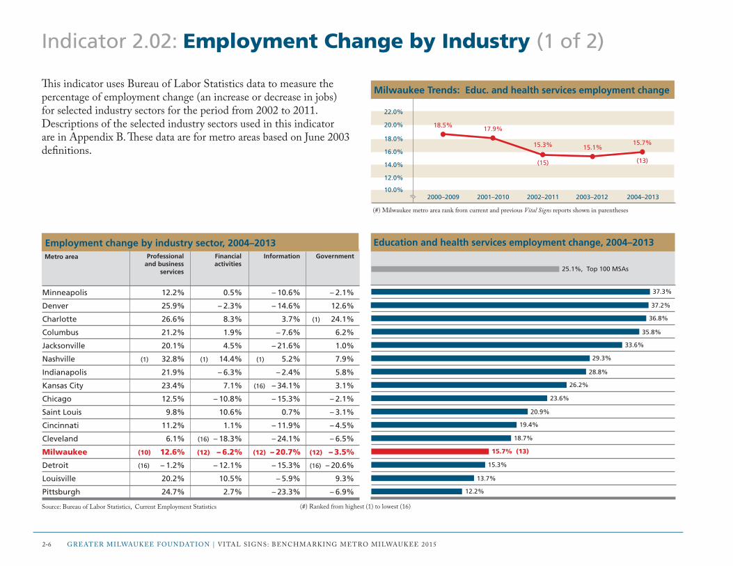
Indicator 2.02: Employment Change by Industry (1 of 2)
This indicator uses Bureau of Labor Statistics data to measure the percentage of employment change (an increase or decrease in jobs) for selected industry sectors for the period from 2002 to 2011. Descriptions of the selected industry sectors used in this indicator are in Appendix B. These data are for metro areas based on June 2003 definitions.
Minneapolis 12.2% 0.5% – 10.6% – 2.1%
Denver 25.9% – 2.3% – 14.6% 12.6%
Charlotte 26.6% 8.3% 3.7% (1) 24.1%
Columbus 21.2% 1.9% – 7.6% 6.2%
Jacksonville 20.1% 4.5% – 21.6% 1.0%
Nashville (1) 32.8% (1) 14.4% (1) 5.2% 7.9%
Indianapolis 21.9% – 6.3% – 2.4% 5.8%
Kansas City 23.4% 7.1% (16) – 34.1% 3.1%
Chicago 12.5% – 10.8% – 15.3% – 2.1%
Saint Louis 9.8% 10.6% 0.7% – 3.1%
Cincinnati 11.2% 1.1% – 11.9% – 4.5%
Cleveland 6.1% (16) – 18.3% – 24.1% – 6.5%
Milwaukee (10) 12.6% (12) – 6.2% (12) – 20.7% (12) – 3.5%
Detroit (16) – 1.2% – 12.1% – 15.3% (16) – 20.6%
Louisville 20.2% 10.5% – 5.9% 9.3%
Pittsburgh 24.7% 2.7% – 23.3% – 6.9%
Employment change by industry sector, 2004–2013
Source: Bureau of Labor Statistics, current Employment Statistics
Professional and business
services
Financial activities
Information GovernmentMetro area
(#) ranked from highest (1) to lowest (16)
2-6 grEAtEr miLWAUKEE FoUnDAtion | VitAL SignS: BEnchmArKing mEtro miLWAUKEE 2015
Education and health services employment change, 2004–2013
37.3%
37.2%
36.8%
35.8%
33.6%
29.3%
28.8%
26.2%
23.6%
20.9%
19.4%
18.7%
15.7% (13)
15.3%
13.7%
12.2%
25.1%, Top 100 MSAs
2000–2009 2001–2010 2002–2011 2003–2012 2004–2013
22.0%
16.0%
20.0%
14.0%
18.0%
12.0%
10.0%
Milwaukee Trends: Educ. and health services employment change
18.5% 17.9%
15.3%
(15)
15.1%15.7%
(13)
(#) milwaukee metro area rank from current and previous Vital Signs reports shown in parentheses

Economic StrEngth 2-7
– 8.7%
– 9.9%
– 11.0%
(T-3) – 11.0%
– 13.1%
– 13.7%
– 14.6%
– 14.8%
– 15.0%
– 16.6%
– 16.9%
– 17.4%
– 17.7%
– 18.2%
– 22.5%
– 23.1%
Manufacturing employment change, 2004–2013
Louisville 16.6% – 3.5% 0.3% 12.9%
Minneapolis – 6.8% – 5.3% – 3.0% 8.2%
Denver – 1.2% 5.6% 5.0% 19.8%
Milwaukee (16) – 12.5% (11) – 5.9% (15) – 9.4% (9) 9.2%
Pittsburgh – 9.9% – 8.2% – 1.9% 9.0%
Kansas City 0.4% – 5.1% 8.4% 7.0%
Cincinnati – 10.3% – 6.6% 5.5% 7.4%
Charlotte 0.8% (1) 16.5% – 1.7% (1) 32.9%
Nashville (1) 22.9% 3.1% (1) 15.0% 22.2%
Columbus 18.3% – 8.2% 6.5% 13.0%
Jacksonville 3.7% 1.0% – 6.7% 27.5%
Indianapolis 20.0% 0.0% – 0.4% 11.8%
Cleveland – 6.5% (16) – 9.8% (16) – 9.5% 2.9%
Chicago 2.6% – 2.9% – 0.9% 11.5%
Saint Louis – 4.8% – 4.5% 3.4% 3.0%
Detroit – 5.8% – 9.7% – 9.1% (16) – 2.6%
Employment change by industry sector, 2004–2013
Source: Bureau of Labor Statistics, current Employment Statistics
Transportation and utilities
Retail trade Wholesale trade
Metro area
(#) ranked from highest (1) to lowest (16)
Leisure and hospitality – 15.9% Top 100 MSAs
Indicator 2.02: Employment Change by Industry (2 of 2)
2000–2009 2001–2010 2002–2011 2003–2012 2004–2013
– 5.0%
– 20.0%
– 10.0%
– 25.0%
– 25.0%
– 30.0%
– 35.0%
Milwaukee Trends: Manufacturing employment change
– 29.9%– 27.1%
– 18.3%
(4)
– 12.4% – 11.0%
(3)
(#) milwaukee metro area rank from current and previous Vital Signs reports shown in parentheses

2-8 grEAtEr miLWAUKEE FoUnDAtion | VitAL SignS: BEnchmArKing mEtro miLWAUKEE 2015
Indicator 2.03: High-tech Industries
This indicator includes data that provide two perspectives on high-tech industries. The first is Bureau of Labor Statistics data on information technology (it) occupations, which include computer, information systems, and database occupations. The second source is the milken institute’s high-tech gDP Location Quotient (LQ). The LQ is a measure of the extent to which a metro area’s high tech concentration is above or below the U.S. concentration (LQ = 1.0). These data are for metro areas based on June 2003 definitions.
1.62
1.40
1.26
1.12
1.06
0.93
0.82
(T-7) 0.82
0.80
0.77
0.71
0.71
0.71
0.70
0.67
0.54
High-tech GDP Location Quotient, 2012
Denver 52,830 (1) 4.12%
Indianapolis 23,740 2.60%
Kansas City 32,450 3.29%
Minneapolis 60,180 3.36%
Saint Louis 39,930 3.09%
Pittsburgh 30,060 2.66%
Chicago (1) 111,210 2.56%
Milwaukee (13) 21,640 (T-9) 2.66%
Columbus 36,850 3.92%
Cincinnati 26,910 2.70%
Detroit 53,900 2.97%
Charlotte 29,580 3.37%
Nashville 18,860 2.38%
Jacksonville (16) 10,980 1.87%
Cleveland 25,120 2.49%
Louisville 11,290 (16) 1.85%
Total IToccupations
IT occupations as a percentage of
all occupations
IT occupations, May 2013
Sources: Bureau of Labor Statistics, occupational Employment Statistics; milken institute, Best-Performing cities
Metro area
(#) ranked from highest (1) to lowest (16)
1.00, United States
2008 2009 2010 2011 2012
1.20
0.90
1.10
0.80
1.00
0.70
0.60
Milwaukee Trends: High-tech GDP Location Quotient
0.92
1.08
0.79
(9)0.71
0.82
(7)
(#) milwaukee metro area rank from current and previous Vital Signs reports shown in parentheses

Economic StrEngth 2-9
Indicator 2.04: Patents
This indicator includes data from the U.S. Patent and trademark office on utility patent grants. A utility patent is a form of intellectual property that protects the way in which an invention is used and works. This is to be distinguished from a design patent, which protects the ornamental design of an item without changing its function.
99.9
69.9
48.1
44.7
41.9
41.1 (6)
39.5
39.4
38.2
36.1
30.4
29.3
23.3
Utility patent grants per 100,000 population, 2013
18.4
13.7
12.4
(#) ranked from highest (1) to lowest (16)
52.7, Top 100 MSAs
2009 2010 2011 2012 2013
50.0
35.0
45.0
30.0
40.0
25.0
20.0
Milwaukee Trends: Utility patent grants per 100,000 population
32.535.9 35.4
(5)
36.3
41.1
(6)
Minneapolis 3,457
Detroit 3,001
Cincinnati 1,028
Kansas City 918
Cleveland 865
Milwaukee (11) 645
Chicago (1) 3,766
Denver 1,063
Pittsburgh 902
Indianapolis 706
Saint Louis 851
Columbus 576
Charlotte 544
Louisville 232
Nashville 241
Jacksonville (16) 173
Utility patent grants
Utility patent grants, 2013
Source: U.S. Patent and trademark office
Metro area
(#) milwaukee metro area rank from current and previous Vital Signs reports shown in parentheses

2-10 grEAtEr miLWAUKEE FoUnDAtion | VitAL SignS: BEnchmArKing mEtro miLWAUKEE 2015
Indicator 2.05: Entrepreneurship
This indicator uses data from the American community Survey on business ownership. Workers are considered business owners if they report being self-employed in their own business. Business owners can be classified by incorporation, as either a majority shareholder of a privately held corporation or as a partner or sole proprietor of an unincorporated company, professional practice, or farm.
10.37%
9.70%
9.22%
8.53%
8.43%
8.35%
8.15%
8.05%
8.00%
7.57%
7.46%
7.30%
7.28%
Rate of business ownership, 2013*
Denver 65,498 77,960
Nashville 22,056 61,976
Jacksonville 31,485 26,556
Minneapolis 72,051 85,349
Kansas City 32,375 53,624
Charlotte 39,292 53,257
Detroit 68,809 86,718
Chicago (1) 168,471 (1) 198,114
Indianapolis 33,442 41,157
Cleveland 31,742 41,722
Cincinnati 27,897 47,722
Columbus 25,697 45,305
Pittsburgh 30,852 52,376
Saint Louis 40,489 56,536
Louisville (16) 16,730 (16) 26,238
Milwaukee (15) 20,459 (14) 29,280
Partners or sole proprietors of
unincorporated businesses
Business owners age 16 and older by incorporation, 2013
Source: U.S. census Bureau, American community Survey* Self-employed workers as a percentage of the civilian employed population age 16 and older
6.47% (16)
7.15%
7.17%
Metro area
(#) ranked from highest (1) to lowest (16)
9.25%, Top 100 MSAs
Majority shareholders of privately held
corporations
2009 2010 2011 2012 2013
8.50%
7.00%
8.00%
6.50%
7.50%
6.00%
5.50%
Milwaukee Trends: Rate of business ownership*
7.30%
6.86%6.69%
(16)
6.57% 6.47%
(16)
(#) milwaukee metro area rank from current and previous Vital Signs reports shown in parentheses

Economic StrEngth 2-11
Indicator 2.06: Fortune 1000 Companies
This indicator includes data from the Fortune 1000 list of companies. The list ranks the 1,000 largest U.S. companies based on revenues. companies eligible for the list are any for which revenues are publicly available.
Number of Fortune 1000 companies, 2014
Chicago (1) 695,457
Minneapolis 517,591
Denver 125,073
Saint Louis 214,949
Detroit 426,293
Charlotte 258,332
Columbus 199,137
Pittsburgh 107,720
Cincinnati 266,660
Cleveland 84,430
Milwaukee (8) 148,354
Nashville 100,096
Indianapolis 118,777
Kansas City (16) 26,802
Louisville 63,040
Jacksonville 29,356
Total revenues (in $ millions)
Fortune 1000 companies by total revenue, 2014
Source: Fortune, Fortune 500; geo Lounge
63
26
19
17
18
16
15
15
14
14
13 (11)
11
9
4
4
8
Metro area
(#) ranked from highest (1) to lowest (16)
2010 2011 2012 2013 2014
16
13
15
12
14
11
10
Milwaukee Trends: Fortune 1000 companies
13
14
13
(11)
14
13
(11)
(#) milwaukee metro area rank from current and previous Vital Signs reports shown in parentheses

Indicator 2.07: Venture Capital
This indicator uses data from Pricewaterhousecoopers and the national Venture capital Association on venture capital investment activity. investment analytics are based on data from Thomson reuters. Venture capital is a source of financing for startup companies and new or turnaround ventures that involve investment risk but offer the prospect for above average future profits. These data are for metro areas based on June 1993 definitions. This indicator is new to the 2015 report.
$185.90
$147.32
$122.91
$108.93
$78.28
$74.32
$45.72
$45.28
$43.99
$40.07
$24.89
$21.53
$8.65
Venture capital investment per capita, 2014
Denver 43 480
Pittsburgh 79 338
Chicago (1) 94 (1) 1,065
Minneapolis 38 369
Cincinnati 37 137
Nashville 48 118
Saint Louis 41 125
Kansas City 13 91
Cleveland 17 95
Louisville 5 46
Detroit 18 106
Indianapolis 15 41
Charlotte 6 18
Columbus 12 16
Milwaukee (15) 2 (15) 7
Jacksonville (16) 0 (16) 0
Total investments (in $ millions)
Venture capital investment and deals, 2014
Source: Pricewaterhousecoopers/national Venture capital Association, moneytree report
$0.00
$4.69 (15)
$8.57
Metro area
(#) ranked from highest (1) to lowest (16)
$243.33, Top 100 MSAs
Number of deals
2010 2011 2012 2013 2014
$8.00
$12.00
$6.00
$10.00
$4.00
$2.00
$0.00
Milwaukee Trends: Venture capital investment per capita
$5.11$6.41
$1.93
$3.99$4.69
2-12 grEAtEr miLWAUKEE FoUnDAtion | VitAL SignS: BEnchmArKing mEtro miLWAUKEE 2015

Indicator 2.08: Business Firms
This indicator includes data on employer firms from the Small Business Administration. An employer firm is a business organization, under common ownership or control and with one or more establishments, that has some annual payroll. An establishment is a physical location where business is conducted or services or operations are performed. multi-establishment firms in the same industry within a metro area are counted as one firm. Employment consists of all full- and part-time employees on the payroll in march. These data are for metro areas based on June 2003 definitions.
– 0.25%
– 0.27%
– 0.52%
– 0.69%
– 0.79%
– 1.00%
– 1.05%
– 1.15%
– 1.23%
– 1.29%
– 1.64%
-2.00%
(15) – 2.07%
– 2.59%
Percentage change in number of employer firms, 2010–2011
Columbus 757,339 0.93% 29,672
Denver 1,049,564 1.10% 60,553
Chicago (1) 3,845,021 1.24% (1) 194,309
Detroit 1,554,363 (1) 3.56% 78,677
Minneapolis 1,596,823 1.55% 72,315
Indianapolis 752,263 1.26% 32,511
Kansas City 859,449 (16) – 0.14% 39,627
Charlotte 736,199 1.21% 34,555
Cleveland 889,949 2.27% 41,408
Pittsburgh 1,058,939 2.72% 45,936
Nashville 665,865 1.98% 29,007
Jacksonville (16) 483,329 0.21% 26,833
Cincinnati 875,217 0.08% 34,768
Saint Louis 1,174,986 0.46% 54,434
Milwaukee (12) 745,662 (9) 1.14% (12) 30,275
Louisville 517,444 0.47% (16) 23,239
Employer firms, employment change,
2010–2011
Employer firms, total employment, 2011
Total number of employer firms,
2011
Employer firms and change in employment, 2011
Source: Small Business Administration, office of Advocacy
Metro area
(#) ranked from highest (1) to lowest (16)
– 0.25%
– 1.53%
– 0.49% Top 100 MSAs
2006–2007 2007–2008 2008–2009 2009–2010 2010–2011
1.00%
– 2.00%
0.00%
– 3.00%
– 1.00%
– 4.00%
– 5.00%
Milwaukee Trends: Percentage change in employer firms
– 0.78%
– 2.07%
– 2.85%
(9)
– 1.44%– 2.07%
(15)
(#) milwaukee metro area rank from current and previous Vital Signs reports shown in parentheses
Economic StrEngth 2-13

2-14 grEAtEr miLWAUKEE FoUnDAtion | VitAL SignS: BEnchmArKing mEtro miLWAUKEE 2015
Indicator 2.09: Small Business Firms
This indicator includes data from the Small Business Administration on small employer business firms. The data include information on small employer business firms and their employment by firm size. A “small business” is defined as an employer business firm with fewer than 500 employees, and a “very small business” is defined as one with fewer than 20 employees. Very small businesses, the vast majority of all business firms, are critical to economic growth. These data are for metro areas based on June 2003 definitions.
86.8%
85.7%
85.4%
84.3%
84.2%
83.4%
83.1%
82.9%
82.1%
81.5%
80.7%
80.5%
80.4%
Very small business firms, percentage of all employer firms, 2011
Chicago 46.6% (1) 98.0% 16.1%
Detroit (1) 49.8% 97.3% (1) 17.4%
Denver 46.5% 96.0% 17.3%
Minneapolis 46.4% 97.0% 14.1%
Jacksonville 42.2% 94.3% 16.5%
Saint Louis 46.7% 96.2% 15.9%
Cleveland 47.0% 95.9% 16.2%
Pittsburgh 46.6% 96.1% 15.7%
Kansas City 45.8% 95.2% 15.3%
Charlotte 42.0% 94.1% 14.8%
Louisville 45.6% 94.0% 15.4%
Indianapolis 44.2% 94.4% 14.2%
Nashville 43.4% (16) 93.9% 14.9%
Cincinnati 43.4% 94.6% 14.0%
Milwaukee (2) 47.2% (9) 95.1% (12) 14.4%
Columbus (16) 41.1% 94.0% (16) 13.6%
Small firms (< 500)as a percentage of all
employer firms
Small business firms and their employment, by firm size, 2011
Source: Small Business Administration, office of Advocacy
79.5%
79.9% (15)
80.0%
Metro area
(#) ranked from highest (1) to lowest (16)
85.0%, Top 100 MSAs
Small firm (< 500) employment as a
percentage of total employment
Very small firm (< 20) employment as a
percentage of total employment
2007 2008 2009 2010 2011
81.5%
80.0%
81.0%
79.5%
80.5%
79.0%
78.5%
Milwaukee Trends: Very small firms, percentage of all firms
80.1%79.8%
80.0%
(15)
80.2%79.9%
(15)
(#) milwaukee metro area rank from current and previous Vital Signs reports shown in parentheses

Economic StrEngth 2-15
Indicator 2.10: Small Business Startups
This indicator includes data on employer business establishment births from the Small Business Administration. “Births” are defined as establishments that have zero employment in the first quarter of the initial year and positive employment in the first quarter of the subsequent year. A “small business” is defined as an employer business firm with fewer than 500 employees, and a “very small business” is defined as one with fewer than 20 employees. Very small businesses, the vast majority of all business firms, are critical to economic growth. These data are for metro areas based on June 2003 definitions.
95.5
94.3
82.1
79.9
75.5
74.2
71.0
71.0
69.3
69.2
61.1
59.5
58.0
56.2 (14)
52.0
54.5
Very small business est. births per 1,000 establishments, 2009–2010
Jacksonville 3,803 (1) 123.8 2,932
Denver 7,720 119.2 6,106
Charlotte 4,558 112.7 3,321
Chicago (1) 20,736 99.2 (1) 16,695
Minneapolis 7,451 94.5 5,958
Detroit 8,000 90.9 6,530
Saint Louis 6,044 93.7 4,577
Nashville 3,304 94.4 2,485
Kansas City 4,205 91.0 3,205
Indianapolis 3,509 90.4 2,685
Louisville (16) 2,293 83.8 (16) 1,672
Columbus 3,123 85.6 2,171
Cleveland 3,794 79.6 2,766
Milwaukee (15) 2,716 (15) 76.0 (15) 2,010
Cincinnati 3,381 78.1 2,361
Pittsburgh 4,073 (16) 74.3 2,855
Total business est. births per 1,000 establishments
Business establishment births, 2009–2010
Source: Small Business Administration, office of Advocacy
Metro area
(#) ranked from highest (1) to lowest (16)
81.7, Top 100 MSAsTotal number
of business establishment births
Very small business establishment births
(< 20 employees)
2005–2006 2006–2007 2007–2008 2008–2009 2009–2010
80.0
65.0
75.0
60.0
70.0
55.0
50.0
Milwaukee Trends: Very small est. births per 1,000 establishments
71.6
76.4
62.2
(14)57.5 56.2
(14)
(#) milwaukee metro area rank from current and previous Vital Signs reports shown in parentheses

2-16 grEAtEr miLWAUKEE FoUnDAtion | VitAL SignS: BEnchmArKing mEtro miLWAUKEE 2015
Indicator 2.11: Minority Business Ownership
This indicator includes data from the census Bureau’s Survey of Business owners on the number and percentage of all businesses owned by persons of a racial or ethnic minority. minority-owned firms are those where the sole proprietor or majority owner is Black, hispanic, Asian, Pacific islander, or American indian. These data are for metro areas based on June 2003 definitions and are collected every five years. new data were not available to update the indicator for the 2015 report.
24.1%
20.0%
19.9%
19.5%
13.4%
13.1%
12.7%
12.6%
12.3% (9)
11.5%
10.8%
10.7%
9.6%
8.7%
8.4%
6.4%
Minority-owned businesses, percentage of all businesses, 2007
Chicago (1) 55,086 (1) 155,951
Detroit 5,045 68,480
Jacksonville 6,119 16,117
Charlotte 5,675 24,374
Denver 18,804 17,044
Columbus 2,257 17,731
Cleveland 2,321 20,012
Saint Louis 2,819 25,225
Milwaukee (11) 2,296 (14) 11,564
Nashville 3,473 14,846
Indianapolis 2,286 13,399
Kansas City 4,070 14,418
Louisville 1,731 (16) 8,453
Cincinnati 1,598 13,089
Minneapolis 3,926 22,656
Pittsburgh (16) 1,319 10,253
Number of Hispanic-owned businesses
Number of non-Hispanic minority-
owned businesses
Number of businesses by race and ethnicity of owner, 2007
Source: U.S. census Bureau, Survey of Business owners
Metro area
(#) ranked from highest (1) to lowest ( 16)
25.9%, Top 100 MSAs
2002 20071997
13.0%
10.0%
12.0%
9.0%
11.0%
8.0%
7.0%
Milwaukee Trends: Percentage of minority-owned businesses
8.7%9.4%
12.3%

Economic StrEngth 2-17
Indicator 2.12: Women’s Business Ownership
This indicator includes data from the census Bureau’s Survey of Business owners on the number and percentage of all businesses owned by women. Women-owned firms are those where the sole proprietor or majority owner is a woman. These data are for metro areas based on June 2003 definitions and are collected every five years. new data were not available to update the indicator for the 2015 report.
31.5%
31.0%
30.8%
29.7%
29.2%
29.0%
28.9% (7)
28.7%
28.5%
28.4%
27.8%
27.5%
27.1%
Women-owned businesses, percentage of all businesses, 2007
Detroit 115,787
Chicago (1) 271,086
Columbus 46,749
Denver 79,547
Charlotte 45,038
Jacksonville 32,392
Milwaukee (14) 32,479
Minneapolis 90,372
Saint Louis 63,303
Kansas City 49,027
Cincinnati 46,757
Indianapolis 40,056
Cleveland 47,433
Louisville (16) 28,586
Pittsburgh 48,360
Nashville 40,428
Number of women-owned businesses, 2007
Source: U.S. census Bureau, Survey of Business owners
25.4%
26.7%
26.9%
Metro area
(#) ranked from highest (1) to lowest (16)
Number of businesses owned
by women29.3%, Top 100 MSAs
2002 20071997
30.0%
27.0%
29.0%
26.0%
28.0%
25.0%
24.0%
Milwaukee Trends: Percentage of women-owned businesses
26.2%
28.4%28.9%

2-18 grEAtEr miLWAUKEE FoUnDAtion | VitAL SignS: BEnchmArKing mEtro miLWAUKEE 2015
Indicator 2.13: Gross Metropolitan Product
This indicator uses data compiled for the U.S. conference of mayors that measure gross metropolitan product (gmP). gmP is a concept analogous to the gross domestic product, the commonly accepted measure nations use to calculate the total annual value of goods and services they have produced. The gmP growth rate is the increase over time in the value of the goods and services produced by a metropolitan economy. gmP per capita is calculated by dividing the value of goods and services by the total population of a metro area. These data are for metro areas based on June 2003 definitions.
$70,582
$67,425
$64,801
$63,889
$61,716
$57,783 (6)
$57,522
$56,340
$54,826
$54,037
$53,667
$51,833
$50,761
$50,314
$49,360
$46,679
GMP per capita, 2013
Charlotte 131.7 5.15%
Minneapolis 228.6 4.54%
Denver 174.8 4.13%
Indianapolis 116.5 4.55%
Chicago (1) 588.6 3.70%
Milwaukee (14) 90.7 (16) 2.72%
Nashville 96.3 (1) 5.81%
Kansas City 117.2 3.60%
Cleveland 113.2 3.14%
Columbus 102.8 4.08%
Pittsburgh 126.7 3.71%
Cincinnati 111.6 4.34%
Louisville 66.6 5.29%
Saint Louis 142.2 3.22%
Detroit 212.0 3.80%
Jacksonville (16) 65.1 3.11%
GMP (in $ billions) Average annual GMP growth rate,
2010–2013
Gross metropolitan product, 2013
Source: The U.S. conference of mayors, U.S. metro Economies
Metro area
(#) ranked from highest (1) to lowest (16)
$57,972, Top 100 MSAs
2009 2010 2011 2012 2013
$60,000
$54,000
$58,000
$52,000
$56,000
$50,000
$48,000
Milwaukee Trends: GMP per capita
$52,191
$53,795
$55,498
(6)
$56,635$57,783
(6)
(#) milwaukee metro area rank from current and previous Vital Signs reports shown in parentheses

Economic StrEngth 2-19
Indicator 2.14: Exports
This indicator includes data from the international trade Administration on the dollar value of all merchandise exports based on their origin of movement. A merchandise export is a good that can be physically transported across the U.S. border. Services exports are not included in this indicator.
$12,551
$9,814
$7,049
$6,865
$5,654 (5)
$5,394
$4,989
$4,951
$4,709
$4,575
$4,425
$4,424
$3,900
$2,914
$1,769
$1,341
Merchandise exports, value per capita, 2013
Detroit (1) 53.9
Cincinnati 21.0
Louisville 8.9
Minneapolis 23.7
Milwaukee (T-10) 8.9
Cleveland 11.1
Indianapolis 9.7
Nashville 8.7
Chicago 44.9
Charlotte 10.7
Saint Louis 12.4
Pittsburgh 10.4
Kansas City 8.0
Columbus 5.7
Jacksonville (16) 2.5
Denver 3.6
Value of merchandise exports by origin of
movement (in $ billions)
Value of merchandise exports, 2013
Source: international trade Administration
Metro area
(#) ranked from highest (1) to lowest (16)
$5,515, Top 100 MSAs
2009 2010 2011 2012 2013
$6,500
$5,000
$6,000
$4,500
$5,500
$4,000
$3,500
Milwaukee Trends: Merchandise exports, value per capita
$4,171
$4,920
$5,650
(5)
$5,856$5,654
(5)
(#) milwaukee metro area rank from current and previous Vital Signs reports shown in parentheses

2-20 grEAtEr miLWAUKEE FoUnDAtion | VitAL SignS: BEnchmArKing mEtro miLWAUKEE 2015
Indicator 2.15: Income and Wages
This indicator uses data from the Bureau of Labor Statistics and the American community Survey to compare median hourly wages and per capita income for the metro areas. Per capita income is an average obtained by dividing aggregate income by the total population of an area; it does not reflect income distribution. The cost of Living index was used to adjust the data on the bar graph to milwaukee mSA dollars. This results in a lower per capita income for high cost of living locations such as chicago and minneapolis and a higher per capita income for lower cost of living areas such as columbus and nashville.
Per capita income adjusted for Milwaukee’s cost of living, 2013*
Columbus 17.00 28,601
Denver 19.21 33,636
Nashville 16.17 28,013
Pittsburgh 16.91 29,985
Cincinnati 17.01 29,014
Saint Louis 17.07 29,675
Minneapolis (1) 19.40 (1) 34,029
Louisville 16.01 27,739
Indianapolis 16.78 (16) 27,657
Kansas City 17.30 29,688
Detroit 18.50 28,080
Jacksonville (16) 15.53 27,958
Charlotte 16.99 28,003
Cleveland 17.12 28,686
Milwaukee (5) 17.44 (7) 29,069
Chicago 17.79 31,302
Per capita income(unadjusted $)
Median hourly wages and per capita income, 2013
Sources: U.S. census Bureau, American community Survey; Bureau of Labor Statistics, occupational Employment Statistics (may 2013)*c2Er cost of Living index, 2013 annual average, used to adjust to milwaukee dollars**These data are for metro areas based on June 2003 definitions.
$33,451
$32,921
$32,606
$32,559
$32,262
$32,119
$31,530
$30,974
$30,676
$30,522
$29,953
$29,932
$29,845
$27,703
$29,069 (15)
$29,236
Median hourly wage (unadjusted $)**
Metro area
(#) ranked from highest (1) to lowest (16)
$28,752, United States
2009 2010 2011 2012 2013
$31,000
$28,000
$30,000
$27,000
$29,000
$26,000
$25,000
Milwaukee Trends: Per capita income
$27,523$26,997
$27,824
(12)
$28,476 $29,069
(15)
(#) milwaukee metro area rank from current and previous Vital Signs reports shown in parentheses

Economic StrEngth 2-21
Indicator 2.16: Occupations
This indicator includes data from the American community Survey on the distribution of jobs in five selected major occupational categories. occupations describe a set of activities or tasks that employees are paid to perform. Some occupations are concentrated in a few particular industries, whereas others are found in many industries.
42.0%
41.6%
40.2%
38.7%
38.6%
38.5%
38.1%
38.0%
37.7%
37.4%
37.2% (11)
36.9%
36.8%
36.7%
36.7%
34.4%
Percentage of mgmt., business, science, & arts occupations, 2013
Minneapolis 16.1% (16) 23.9% (16) 6.3% 11.7%
Denver 16.7% 24.6% 8.2% (16) 8.8%
Columbus 16.8% 24.0% 6.7% 12.3%
Kansas City 16.6% 25.7% 7.4% 11.7%
Pittsburgh 17.3% 24.7% 7.9% 11.5%
Saint Louis 17.2% 25.6% 7.5% 11.1%
Cincinnati 17.0% 25.5% 6.8% 12.7%
Cleveland 17.8% 24.4% 6.5% 13.3%
Chicago 17.2% 25.0% 6.6% 13.5%
Nashville (16) 15.5% 26.1% (T-1) 8.5% 12.5%
Milwaukee (T-4) 17.3% (10) 24.8% (15) 6.4% (2) 14.2%
Charlotte 17.1% 25.4% (T-1) 8.5% 12.1%
Indianapolis 16.4% 24.5% 8.3% 14.0%
Jacksonville (1) 18.3% (1) 26.8% 7.9% 10.3%
Detroit 17.5% 25.0% 6.7% 14.1%
Louisville 16.1% 25.0% 7.6% (1) 16.9%
Service Production, transportation,
material moving
Percentage of total employment by occupational categories, 2013
Source: U.S. census Bureau, American community Surveynote: Does not include all occupations, so percentages do not total 100%.
Sales and office
Natural resources,
construction, maintenance
Metro area
(#) ranked from highest (1) to lowest (16)
38.6%, Top 100 MSAs
2009 2010 2011 2012 2013
40.0%
37.0%
39.0%
36.0%
38.0%
35.0%
34.0%
Milwaukee Trends: Mgmt., business, science, & arts occupations
37.2%37.5%
36.9%
(12)
37.7%37.2%
(11)
(#) milwaukee metro area rank from current and previous Vital Signs reports shown in parentheses

2-22 grEAtEr miLWAUKEE FoUnDAtion | VitAL SignS: BEnchmArKing mEtro miLWAUKEE 2015
Indicator 2.17: Workforce
This indicator uses data from the American community Survey to describe the working age population. The entry age group consists of the population ages 15 to 24 and the exit population ages 55 to 64. The ratio compares the size of the population in the age group entering the workforce to that of the exit age group. The workforce participation rate is the proportion of the population in the labor force, including persons who are employed and those unemployed and looking for work. The 25–34 age bracket represents the population segment that includes young professionals. Persons ages 22 to 54 are considered to be of prime working age.
48.1%
47.0%
46.8%
46.6%
46.5%
46.1%
46.0%
45.2%
45.1%
44.6%
44.4% (11)
44.2%
44.0%
Percentage of population of prime working age, 2013
Denver 1.02 78.6% (1) 15.7%
Nashville 1.14 75.7% 14.7%
Columbus (1) 1.16 76.1% 15.1%
Minneapolis 1.04 (1) 81.7% 14.8%
Charlotte 1.15 76.7% 13.5%
Chicago 1.14 76.6% 14.4%
Indianapolis 1.11 76.5% 14.2%
Kansas City 1.01 78.1% 14.2%
Jacksonville 1.03 73.3% 13.9%
Louisville 0.95 75.3% 13.4%
Milwaukee (T-7) 1.04 (4) 77.6% (T-8) 13.9%
Saint Louis 0.99 76.9% 13.4%
Cincinnati 1.05 75.5% 13.0%
Detroit 0.98 (16) 73.0% (16) 12.0%
Pittsburgh (16) 0.85 75.6% 12.6%
Cleveland 0.91 76.1% 12.1%
Percentage of population ages 25–34
Workforce entry and exit ratio and participation rate, 2013
Source: U.S. census Bureau, American community Survey
42.5%
42.6%
43.8%
Ratio of workforceentry (ages 15–24) to
exit (ages 55–64) populations
Metro area
(#) ranked from highest (1) to lowest (16)
45.6%, Top 100 MSAs
Workforce participation rate
(ages 16–64)
2009 2010 2011 2012 2013
48.0%
45.0%
47.0%
44.0%
46.0%
43.0%
42.0%
Milwaukee Trends: Percentage of pop. of prime working age
46.3%
45.3% 45.0%
(12)
44.8%44.4%
(11)
(#) milwaukee metro area rank from current and previous Vital Signs reports shown in parentheses

Economic StrEngth 2-23
Indicator 2.18: Creative Jobs
This indicator uses data from the Bureau of Labor Statistics. creative jobs are broadly defined to include occupations in the arts, design, and marketing and strategy fields. The attraction of creative workers is a key contributor to economic development. Descriptions of the occupational categories used in this indicator are in Appendix B. These data are for metro areas based on June 2003 definitions.
16.4
13.1
13.0 (3)
12.7
12.2
11.6
10.9
10.8
10.6
10.5
10.3
10.2
10.2
Creative jobs per 1,000 jobs, 2013
Minneapolis 9,760 10,380 9,220
Denver 6,660 7,330 2,850
Milwaukee (11) 4,390 (8) 3,800 (6) 2,360
Kansas City 5,470 4,810 2,230
Chicago (1) 20,760 (1) 18,270 (1) 13,810
Cincinnati 4,770 4,620 2,130
Indianapolis 4,700 3,200 2,070
Saint Louis 5,830 5,470 2,590
Columbus 4,200 3,660 2,110
Nashville 3,440 2,590 2,290
Cleveland 5,530 3,120 1,800
Charlotte 3,630 3,060 2,270
Detroit 6,710 8,310 3,400
Pittsburgh 5,300 3,610 2,350
Louisville 2,470 2,170 1,120
Jacksonville (16) 1,980 (16) 1,570 (16) 770
Marketing and strategy jobs
Creative jobs by occupational category, 2013
Source: Bureau of Labor Statistics, occupational Employment Statistics
7.4
9.5
10.0
Arts jobsMetro area
(#) ranked from highest (1) to lowest (16)
13.1, Top 100 MSAs
Design jobs
2009 2010 2011 2012 2013
16.0
13.0
15.0
12.0
14.0
11.0
10.0
Milwaukee Trends: Creative jobs per 1,000 jobs
14.213.8
12.7
(6)11.8
13.0
(3)
(#) milwaukee metro area rank from current and previous Vital Signs reports shown in parentheses

2-24 grEAtEr miLWAUKEE FoUnDAtion | VitAL SignS: BEnchmArKing mEtro miLWAUKEE 2015
Indicator 2.19: Green Jobs
This indicator uses data from the Brookings institution on clean economy jobs, also known as green jobs. Brookings defines clean economy jobs as those making goods or providing services that increase environmental sustainability, increase energy efficiency, or facilitate the use of energy from renewable sources as well as jobs enforcing or assisting in the compliance of environmental laws, educating workers for jobs that benefit the environment, or working to conserve natural resources or natural food systems. These data are for metro areas based on June 2003 definitions. new data were not available to update the indicator for the 2015 report.
25.2
24.6
23.8
23.7
23.1
22.0
19.3
19.1
18.6
18.5
17.2
16.9
16.4 (13)
13.3
12.7
11.6
Clean economy jobs per 1,000 jobs, 2010
Kansas City 25,039
Cleveland 24,664
Louisville 14,447
Nashville 17,913
Denver 27,929
Minneapolis 37,750
Pittsburgh 21,963
Charlotte 15,485
Cincinnati 18,525
Chicago (1) 79,388
Indianapolis 15,183
Columbus 15,498
Milwaukee (15) 13,471
Saint Louis 17,553
Jacksonville (16) 7,679
Detroit 20,323
Clean economy jobs, 2010
Source: Brookings institution
Metro area Total clean economy jobs 18.9, Top 100 MSAs
(#) ranked from highest (1) to lowest (16)
2007 20102003
18.0
15.0
17.0
14.0
16.0
13.0
12.0
Milwaukee Trends: Clean economy jobs per 1,000 jobs
16.3
15.3
16.4

Economic StrEngth 2-25
Indicator 2.20: Unemployment
This indicator uses data on employment and unemployment from the Bureau of Labor Statistics. A person is considered unemployed if he or she is willing and able to work for pay but is unable to find work. The unemployment rate is the percentage of all persons in the civilian workforce who are unemployed. These data are for metro areas based on June 2003 definitions.
3.16%
3.66%
3.86%
4.21%
4.31%
4.83%
4.98%
5.05%
5.11%
5.31% (10)
5.41%
5.44%
5.57%
5.62%
6.05%
8.10%
Unemployment rate, October 2014
Minneapolis 1,885,827 59,585
Denver 1,469,151 53,763
Columbus 987,101 38,150
Pittsburgh 1,242,611 52,263
Cincinnati 1,099,949 47,388
Kansas City 1,036,359 50,019
Indianapolis 951,783 47,402
Nashville 854,209 43,118
Louisville (16) 626,846 (1) 32,059
Milwaukee (14) 809,336 (4) 42,998
Saint Louis 1,421,737 76,936
Cleveland 1,041,427 56,608
Jacksonville 734,947 40,931
Charlotte 932,796 52,411
Chicago (1) 4,914,253 (16) 297,409
Detroit 2,036,072 164,877
Number in the civilian workforce*
Number unemployed
Number in civilian workforce and unemployed, October 2014
Source: Bureau of Labor Statistics, Local Area Unemployment Statistics
Metro area
(#) ranked from lowest (1) to highest (16); except (*) ranked highest (1) to lowest (16)
5.63%, Top 100 MSAs
Oct. 2010 Oct. 2011 Oct. 2012 Oct. 2013 Oct. 2014
9.00%
6.00%
8.00%
5.00%
7.00%
4.00%
3.00%
Milwaukee Trends: Unemployment rate
7.82%7.34%
6.54%
(5)
6.72%
5.31%
(10)
(#) milwaukee metro area rank from current and previous Vital Signs reports shown in parentheses
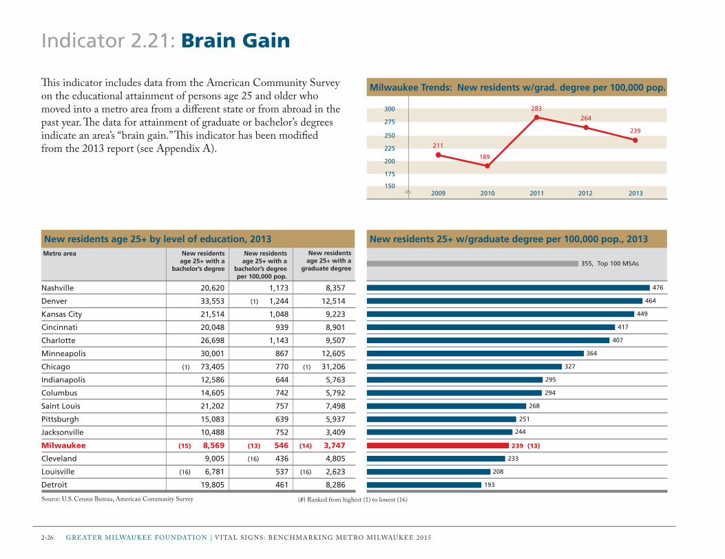
2-26 grEAtEr miLWAUKEE FoUnDAtion | VitAL SignS: BEnchmArKing mEtro miLWAUKEE 2015
Indicator 2.21: Brain Gain
This indicator includes data from the American community Survey on the educational attainment of persons age 25 and older who moved into a metro area from a different state or from abroad in the past year. The data for attainment of graduate or bachelor’s degrees indicate an area’s “brain gain.” This indicator has been modified from the 2013 report (see Appendix A).
476
464
449
417
407
364
327
295
294
268
251
244
239 (13)
233
208
193
New residents 25+ w/graduate degree per 100,000 pop., 2013
Nashville 20,620 1,173 8,357
Denver 33,553 (1) 1,244 12,514
Kansas City 21,514 1,048 9,223
Cincinnati 20,048 939 8,901
Charlotte 26,698 1,143 9,507
Minneapolis 30,001 867 12,605
Chicago (1) 73,405 770 (1) 31,206
Indianapolis 12,586 644 5,763
Columbus 14,605 742 5,792
Saint Louis 21,202 757 7,498
Pittsburgh 15,083 639 5,937
Jacksonville 10,488 752 3,409
Milwaukee (15) 8,569 (13) 546 (14) 3,747
Cleveland 9,005 (16) 436 4,805
Louisville (16) 6,781 537 (16) 2,623
Detroit 19,805 461 8,286
New residents age 25+ with a
bachelor’s degree
New residents age 25+ with a
bachelor’s degreeper 100,000 pop.
New residents age 25+ by level of education, 2013
Source: U.S. census Bureau, American community Survey
Metro area New residents age 25+ with a
graduate degree355, Top 100 MSAs
(#) ranked from highest (1) to lowest (16)
2009 2010 2011 2012 2013
300
225
275
200
250
175
150
Milwaukee Trends: New residents w/grad. degree per 100,000 pop.
211
189
283
264
239

Section 3: Personal Prosperity
This section includes indicators of income, economic equity and hardship, homeownership, and housing affordability that describe the prosperity of residents of the metro areas. The following are the Personal Prosperity indicator categories:
Personal ProsPerit y 3-1
3.01 Household Income
3.02 Income $75,000 and Above
3.03 Income Gap
3.04 Pay Equity
3.05 Poverty
3.06 Low Income
3.07 Income Supports
3.08 Earned Income Tax Credit
3.09 Teen Pregnancy
3.10 Parental Employment
3.11 New Housing Starts
3.12 Homeownership
3.13 Foreclosures
3.14 Owner Housing Affordability
3.15 Rental Housing Affordability

Personal Prosperity Overview
This section includes economic indicators measuring income equality, financial hardship, homeownership, and housing affordability. These help describe the prosperity of metro area residents. a more equitable and financially stable workforce with fewer hardships, greater housing choices, and a better quality of life can help to improve a region’s economic competitiveness. The table on the right shows where the rankings in this section fall. With a few exceptions, the ranks have not changed much from the last report; Milwaukee still tends to fall in the middle and bottom tiers. Many metro area residents continue to face great financial hardships even as the country begins to rebound from the Great recession.
Poverty and Low Income one major change from the last report stands out. Milwaukee has dropped from the middle to bottom tier in poverty rate (indicator 3.05). in fact, Milwaukee is one of only four metro areas with an increase in the poverty rate from two years prior. This indicates that Milwaukee’s economic recovery may be failing to keep up with national trends. low income is defined here as those persons living in households with income below 200% of the federal poverty level (FPl) and includes the population in poverty. Milwaukee has one of the highest percentages of the population living in low-income households (3.06), dropping from the middle to bottom tier in this indicator. Paradoxically, Milwaukee has one of the lowest percentages of tax returns claiming the earned income tax Credit (eitC), a federal income tax credit for low-income workers (3.08). Milwaukee’s rank suggests that the eitC is under-utilized by metro area households, however it may also be due in part to the relatively high number of unemployed workers, who would be ineligible for the tax credit (2.20).
3-2 Greater MilWaUKee FoUnDation | Vital siGns: BenCHMarKinG Metro MilWaUKee 2015
although typically related to poverty and low income, the teen pregnancy rate in Milwaukee is surprisingly low. The metro area remains in the top tier for this indicator; it has one of the lowest percentages of unmarried women ages 15 to 19 that gave birth in the prior year (3.09).
Housing and Affordability as was the case two years ago, another issue facing metro area residents is the housing market. in keeping with the national trend, foreclosure activity in the metro area has begun to slow down (3.13). across the country, new housing starts have nearly doubled. Milwaukee, however, has seen relatively little growth in construction rates and still ranks in the bottom tier for new permitted units per 1,000 total housing units (3.11). Fewer housing choices affect affordability for both renters and owners. Milwaukee ranks in the middle in terms of owner housing affordability (3.14). slightly fewer than half of renters spend more than 30% of their household income on rent and utilities, a threshold under which the U.s. Department of Housing and Urban Development considers housing to be affordable (3.15). With the slow economic recovery and many renters unable to save for a down payment on a home, the housing market is shifting to one with fewer homebuyers and more renters. This shift is certainly apparent in Milwaukee. The metro area continues to rank last in homeownership—with the lowest number of owner-occupied housing units as a percentage of all households (3.12).

Personal Prosperity: How Milwaukee Compares This figure depicts how the Milwaukee metro area compares to the other 15 metro areas using data from the bar graphs on the indicator pages in the Personal Prosperity section.
Median household income
Households with income > $75,000 (%)
Income gap ratio*
Pay ratio, women to men (FTYR workers only)
Pop. below poverty level* (%)
Pop. below 200% FPL* (%)
Households receiving public assistance* (%)
Tax returns claiming EITC* (%)
Unmarried women 15–19 who gave birth in past year* (%)
Children with no parent in the labor force* (%)
New permitted residential units per 1,000 housing units
Homeownership (%)
Home loans in foreclosure or 90+ days delinquent* (%)
Housing affordable to median income buyer (%)
Renters spending > 30% of income on housing* (%)
87 9654321 16151413121110 87 9654321 16151413121110
These indicators are ranked from highest (1) to lowest (16), except (*) ranked lowest (1) to highest (16). These indicators are ranked from highest (1) to lowest (16), except (*) ranked lowest (1) to highest (16).
Bottom tierTop tierMilwaukee metro area Middle tier Bottom tierTop tierMilwaukee metro area Middle tier
Personal ProsPerit y 3-3

3-4 Greater MilWaUKee FoUnDation | Vital siGns: BenCHMarKinG Metro MilWaUKee 2015
Indicator 3.01: Household Income
This indicator includes data from the american Community survey on median household income for the metro area populations and selected racial and ethnic groups. The median income divides all households into two equal groups, one with incomes above the median and the other with incomes below the median. Household income includes wages and salary; interest; dividends; social security; supplemental security income; public assistance or welfare payments; and any other sources of income received regularly, such as unemployment compensation, child support, or alimony.
$67,194
$62,760
$60,564
$56,248
$54,449
$54,079
$53,378
$51,996
$51,957 (9)
$51,857
$51,495
$51,291
$51,251
$51,087
$50,905
$49,358
Median household income, 2013
Minneapolis (1) 72,014 31,564 65,594 42,764
Denver 70,593 (1) 41,215 74,137 42,071
Chicago 71,910 34,287 77,151 45,349
Kansas City 61,783 35,277 62,456 40,432
Saint Louis 61,254 31,215 66,044 50,570
Columbus 58,582 33,451 74,689 38,520
Cincinnati 58,779 28,684 75,104 42,271
Nashville 56,673 37,716 69,273 36,458
Milwaukee (4) 62,031 (15) 27,438 (7) 69,363 (15) 32,308
Detroit 60,079 30,162 (1) 82,212 41,276
Jacksonville 57,430 32,469 66,581 50,171
Pittsburgh (16) 53,227 28,088 67,076 (1) 55,108
Charlotte 58,539 36,522 76,094 38,843
Indianapolis 57,612 31,452 62,225 (16) 27,293
Louisville 55,463 28,826 (16) 60,026 35,571
Cleveland 57,108 (16) 26,646 65,813 38,762
White, non-Hispanic
($)
Median household income by race and ethnicity, 2013
source: U.s. Census Bureau, american Community survey
Metro area Black or African American
($)
Asian($)
Hispanic or Latino
(of any race) ($)
(#) ranked from highest (1) to lowest (16)
$52,250, United States
2009 2010 2011 2012 2013
$58,000
$52,000
$56,000
$50,000
$54,000
$48,000
$46,000
Milwaukee Trends: Median household income
$52,024
$49,774$50,664
(10)
$52,605$51,957
(9)
(#) Milwaukee metro area rank from current and previous Vital Signs reports shown in parentheses

Personal ProsPerit y 3-5
Indicator 3.02: Income $75,000 and Above
This indicator includes data from the american Community survey on the percentage of all households in the metro areas with a household income of $75,000 or above as well as the percentages of racial and ethnic subgroups at this income level.
44.8%
41.9%
40.3%
36.6%
35.0%
34.9%
34.9%
34.5% (8)
34.1%
33.6%
33.2%
33.2%
32.6%
32.3%
32.3%
32.3%
Percentage of households with income $75,000 and above, 2013
Minneapolis 48.0% 17.4% 42.8% 28.4%
Denver 47.1% (1) 22.4% 49.5% 24.4%
Chicago (1) 48.1% 20.4% 51.7% 26.4%
Kansas City 41.0% 17.6% (16) 38.7% 18.6%
Cincinnati 38.3% 13.1% 50.0% 25.1%
Columbus 38.3% 18.9% 49.7% 18.6%
Saint Louis 39.6% 14.2% 46.0% 31.5%
Milwaukee (5) 40.8% (16) 12.6% (12) 44.7% (15) 14.8%
Detroit 39.5% 15.8% (1) 55.7% 27.8%
Charlotte 39.2% 18.8% 51.2% 18.4%
Pittsburgh (16) 34.6% 15.0% 48.3% (1) 36.1%
Nashville 36.7% 19.4% 45.1% 15.4%
Jacksonville 36.9% 16.3% 46.6% 27.7%
Cleveland 37.9% 13.2% 45.9% 22.4%
Indianapolis 36.7% 14.7% 40.6% (16) 12.4%
Louisville 35.6% 16.1% 41.3% 21.4%
White, non-Hispanic
Household income $75,000 and above by race and ethnicity, 2013
source: U.s. Census Bureau, american Community survey
Metro area Black or African
American
Asian Hispanic or Latino
(of any race)
(#) ranked from highest (1) to lowest (16)
38.0%, Top 100 MSAs
2009 2010 2011 2012 2013
36.0%
33.0%
35.0%
32.0%
34.0%
31.0%
30.0%
Milwaukee Trends: Percentage households w/income ≥ $75,000
32.5%32.1%
32.8%
(8)
34.1%34.5%
(8)
(#) Milwaukee metro area rank from current and previous Vital Signs reports shown in parentheses

3-6 Greater MilWaUKee FoUnDation | Vital siGns: BenCHMarKinG Metro MilWaUKee 2015
Indicator 3.03: Income Gap
This indicator includes data from the american Community survey on household income distribution and the gap between those in the highest income (top 20%) and lowest income (bottom 20%) groups. The income gap ratio is the difference between the income levels at the 80th and 20th percentiles, divided by the income level at the 20th percentile. The higher the ratio, the greater the gap, or disparity, between the top and bottom 20% of households.
3.25
3.27
3.32
3.50
3.54
3.55
3.62
3.63
3.68
3.70
3.81 (11)
3.84
3.91
4.05
4.13
4.16
Income gap ratio, 80th and 20th percentiles, 2013
Minneapolis (1) 29,054 (1) 123,457
Nashville 23,537 100,540
Kansas City 24,622 106,346
Jacksonville 22,554 101,562
Denver 26,905 122,280
Louisville 21,658 (16) 98,519
Columbus 23,083 106,633
Indianapolis 21,717 100,481
Saint Louis 22,580 105,586
Charlotte 22,219 104,502
Milwaukee (13) 21,496 (10) 103,399
Cincinnati 22,006 106,509
Pittsburgh 20,676 101,522
Chicago 23,823 120,393
Cleveland (16) 19,578 100,478
Detroit 20,295 104,690
Income level20th percentile ($)
Income level80th percentile ($)
Household incomes at 20th and 80th percentiles, 2013*
source: U.s. Census Bureau, american Community survey
Metro area
(#) ranked from lowest (1) to highest (16); except (*) ranked from highest (1) to lowest (16)
3.70, Top 100 MSAs
2009 2010 2011 2012 2013
4.40
3.80
4.20
3.60
4.00
3.40
3.20
Milwaukee Trends: Income gap ratio, 80th and 20th percentiles
3.623.75
4.02
(15)
3.923.81
(11)
(#) Milwaukee metro area rank from current and previous Vital Signs reports shown in parentheses

Personal ProsPerit y 3-7
Indicator 3.04: Pay Equity
This indicator includes data from the american Community survey on disparities in median earnings between men and women working full time, year round (Ftyr). it measures women’s pay equity with men working the same amount in terms of cents on the dollar. This indicator has been modified from the 2013 report (see appendix a).
82.9¢
82.2¢
82.0¢
81.8¢
79.9¢ (T-5)
79.9¢
79.5¢
79.0¢
78.6¢
77.7¢
77.0¢
76.4¢
76.0¢
75.6¢
74.7¢
74.5¢
Pay ratio, women to men (FTYR workers only), cents per $, 2013
Nashville 26,441 37,256
Columbus 27,047 40,593
Minneapolis (1) 30,776 (1) 45,412
Denver 29,400 42,832
Milwaukee (9) 26,332 (4) 40,794
Charlotte 25,807 37,496
Jacksonville 26,989 (16) 36,245
Chicago 27,698 42,229
Louisville 25,863 36,760
Cleveland 26,257 39,474
Kansas City 27,571 39,319
Cincinnati (16) 25,060 38,914
Saint Louis 27,051 39,161
Detroit 25,661 40,731
Indianapolis 25,859 37,433
Pittsburgh 25,804 38,145
Median earnings for all workers who are
women ($)
Median earnings for FTYR workers who are
women ($)
Women’s median earnings, 2013
source: U.s. Census Bureau, american Community survey
Metro area
(#) ranked from highest (1) to lowest (16)
79.2¢, U.S.
2009 2010 2011 2012 2013
84.0¢
78.0¢
82.0¢
76.0¢
80.0¢
74.0¢
72.0¢
Milwaukee Trends: Pay ratio, women to men, cents per dollar
76.2¢
74.5¢
79.3¢ 79.7¢ 79.9¢

3-8 Greater MilWaUKee FoUnDation | Vital siGns: BenCHMarKinG Metro MilWaUKee 2015
Indicator 3.05: Poverty
This indicator includes data from the american Community survey on poverty rates of the metro area populations and selected racial and ethnic groups. The poverty rate is the percentage of the population in households living below the poverty threshold as defined by the U.s. Census Bureau.
Minneapolis (1) 6.4% 31.3% 18.1% 22.5%
Denver 7.4% 25.2% 10.9% 22.7%
Kansas City 8.6% 25.6% 15.2% 25.6%
Pittsburgh 10.3% 33.0% (16) 20.6% 21.7%
Saint Louis 8.3% 30.1% 13.7% 16.1%
Nashville 10.6% (1) 22.4% (1) 7.4% 27.8%
Louisville 10.6% 26.2% 13.4% 29.9%
Chicago 7.3% 30.4% 11.3% 20.6%
Cincinnati 10.9% 33.8% 13.1% 28.6%
Charlotte 9.6% 24.9% 13.4% 26.1%
Jacksonville 10.9% 28.1% 9.3% (1) 14.3%
Columbus 11.0% 31.0% 9.0% 29.1%
Indianapolis 10.4% 29.9% 9.3% (16) 37.4%
Cleveland 9.7% 33.6% 10.3% 25.6%
Milwaukee (5) 8.5% (16) 38.1% (13) 14.2% (14) 29.3%
Detroit (16) 11.2% 33.1% 10.4% 23.4%
Hispanic origin
(of any race)
Percentage population* below poverty level by race/ethnicity, 2013
source: U.s. Census Bureau, american Community survey* Population for whom poverty status is determined (i.e., population in households)
Percentage of the population* below poverty level, 2013
10.3%
12.1%
12.6%
12.8%
12.9%
13.7%
13.8%
14.4%
14.5%
14.8%
14.8%
14.8%
15.2%
15.6%
15.9% (15)
16.9%
Black or African
American
White, non-Hispanic
Asian
(#) ranked from lowest (1) to highest (16)
Metro area
15.2%, Top 100 MSAs
2009 2010 2011 2012 2013
18.0%
15.0%
17.0%
14.0%
16.0%
13.0%
12.0%
Milwaukee Trends: Percentage population* below poverty level
14.3%
15.5% 15.2%
(10)
15.9% 15.9%
(15)
(#) Milwaukee metro area rank from current and previous Vital Signs reports shown in parentheses

Indicator 3.06: Low Income
This indicator includes data from the american Community survey on persons living in households with incomes below 200% of the federal poverty level (FPl). This is a common threshold for identifying low-income households. Furthermore, eligibility for public assistance to low-income households is typically capped at or near 200% FPl.
24.4%
28.4%
28.6%
29.3%
29.5%
30.8%
31.1%
31.1%
31.6%
32.1%
33.0% (12)
32.7%
33.6%
33.6%
33.7%
34.6%
Percentage of population* living below 200% FPL, 2013
Minneapolis 3,397,278 827,847
Denver 2,663,509 756,249
Pittsburgh 2,300,779 658,954
Saint Louis 2,740,729 802,810
Kansas City 2,018,783 596,290
Cincinnati 2,084,132 641,175
Chicago (1) 9,375,444 (16) 2,915,559
Louisville (16) 1,237,895 (1) 385,547
Columbus 1,913,546 604,163
Cleveland 2,023,498 649,215
Nashville 1,718,322 561,187
Milwaukee (14) 1,539,233 (3) 508,021
Jacksonville 1,366,441 458,960
Detroit 4,252,247 1,430,712
Indianapolis 1,909,800 643,605
Charlotte 2,298,466 794,572
Population for whom poverty status is
determined**
Population in households with incomes below
200% FPL
Population* living below 200% of FPL, 2013
source: U.s. Census Bureau, american Community survey* Population for whom poverty status is determined (i.e., population in households)
(#) ranked from lowest (1) to highest (16), except (**) ranked highest to lowest
Metro area
33.1%, Top 100 MSAs
2009 2010 2011 2012 2013
38.0%
32.0%
36.0%
30.0%
34.0%
28.0%
26.0%
Milwaukee Trends: Percentage pop.* living below 200% FPL
30.7%32.0%
32.8%
(10)
32.2%33.0%
(12)
Personal ProsPerit y 3-9
(#) Milwaukee metro area rank from current and previous Vital Signs reports shown in parentheses

3-10 Greater MilWaUKee FoUnDation | Vital siGns: BenCHMarKinG Metro MilWaUKee 2015
Indicator 3.07: Income Supports
This indicator includes data from the american Community survey on households that received government income supports in the previous 12 months. income supports include public assistance payments from state or local government, food stamps, and supplemental security income (ssi).
Percentage of households receiving public assistance, 2013
Denver 31,669 18,219 81,054
Minneapolis 48,776 46,941 119,003
Kansas City 33,891 16,604 84,107
Pittsburgh 56,114 26,832 118,834
Saint Louis 50,578 23,292 138,863
Charlotte 34,200 15,823 108,957
Louisville 27,514 (1) 12,271 (1) 62,811
Nashville 25,714 26,963 84,582
Cincinnati 44,280 20,488 105,366
Jacksonville (1) 24,610 12,662 67,702
Indianapolis 29,324 14,349 99,660
Chicago (16) 162,610 (16) 94,546 (16) 459,515
Columbus 39,196 22,368 109,818
Cleveland 47,503 28,670 131,941
Milwaukee (8) 35,656 (6) 16,673 (8) 106,710
Detroit 112,100 53,823 290,820
Number receiving
food stamps
Households receiving SSI, cash assistance, and food stamps, 2013
source: U.s. Census Bureau, american Community survey
18.2%
17.9% (15)
15.1%
16.3%
14.1%
13.9%
13.7%
13.3%
13.3%
13.2%
13.2%
13.2%
12.6%
Number receiving SSI
Number receiving cash
public assistance
8.4%
9.6%
11.1%
(#) ranked from lowest (1) to highest (16)
Metro area
13.6%, Top 100 MSAs
2009 2010 2011 2012 2013
20.0%
14.0%
18.0%
12.0%
16.0%
10.0%
8.0%
Milwaukee Trends: Percentage households receiving public assist.
9.9%
13.6%
16.7%
(15)
16.8%17.9%
(15)
(#) Milwaukee metro area rank from current and previous Vital Signs reports shown in parentheses

Personal ProsPerit y 3-11
Indicator 3.08: Earned Income Tax Credit
This indicator includes data from the Brookings institution on tax returns claiming the earned income tax Credit (eitC). The eitC is a federal income tax credit for low-income workers that reduces the amount of tax an individual owes and may be returned in the form of a refund. The study was based on an analysis of tax returns filed with the internal revenue service between the months of January and June. These data are for metro areas based on June 2003 definitions. This indicator is new to the 2015 report.
12.7%
13.3%
14.9%
15.9% (4)
16.7%
17.1%
17.6%
17.7%
17.8%
17.8%
18.8%
19.0%
19.5%
19.9%
21.6%
22.9%
Percentage of tax returns claiming the EITC, 2012
Minneapolis 1,545,738 195,588
Pittsburgh 1,128,335 149,915
Denver 1,148,260 171,642
Milwaukee (13) 714,321 (1) 113,363
Kansas City 889,653 148,701
Cincinnati 955,371 162,955
Chicago (1) 4,184,721 (16) 734,981
Columbus 851,992 151,177
Cleveland 959,843 170,665
Saint Louis 1,259,337 224,637
Indianapolis 808,087 151,836
Detroit 1,915,876 364,071
Nashville 708,192 138,211
Louisville (16) 576,535 114,903
Charlotte 750,777 161,934
Jacksonville 594,571 135,991
Number of tax returns claiming
the EITC
Total number of tax returns*
Number of tax returns, 2012
source: Brookings institution, eitC interactive (#) ranked from lowest (1) to highest (16) except (*) ranked highest to lowest
Metro area
19.2%, Top 100 MSAs
17.0%
15.5%
16.5%
15.0%
16.0%
14.5%
14.0%
Milwaukee Trends: Percentage of tax returns claiming the EITC
2009 2010 2011 2012
15.5% 15.5%
16.0% 15.9%

3-12 Greater MilWaUKee FoUnDation | Vital siGns: BenCHMarKinG Metro MilWaUKee 2015
Indicator 3.09: Teen Pregnancy
This indicator includes data from the american Community survey on unmarried women ages 15 to 19 that gave birth in the previous 12 months. Beyond the biological risk of low birth weight that is connected with the age of the mother, there are several socioeconomic risks with teen pregnancy, including lower educational levels, higher rates of poverty, and poorer quality of life for children of teenage mothers.
0.65%
1.07% (2)
1.11%
1.14%
1.15%
1.29%
1.44%
1.51%
1.65%
1.74%
1.93%
2.19%
2.36%
2.49%
2.51%
3.03%
Percentage unmarried women 15–19 gave birth in past year, 2013
Denver 75,293 (1) 489
Milwaukee (14) 50,713 (3) 545
Jacksonville 44,417 493
Kansas City 62,734 717
Saint Louis 89,250 1,029
Minneapolis 108,046 1,399
Pittsburgh 72,215 1,043
Chicago (1) 315,232 (16) 4,750
Charlotte 74,740 1,236
Columbus 63,120 1,100
Cleveland 65,176 1,260
Detroit 139,838 3,062
Indianapolis 60,203 1,421
Cincinnati 69,583 1,735
Louisville (16) 38,609 971
Nashville 53,882 1,635
Number of unmarried women ages 15–19 who
gave birth in last 12 months
Total number of unmarried women
ages 15–19*
Number of unmarried women ages 15–19, 2013
source: U.s. Census Bureau, american Community survey (#) ranked from lowest (1) to highest (16) except (*) ranked highest to lowest
Metro area
1.51%, Top 100 MSAs
2009 2010 2011 2012 2013
6.00%
3.00%
5.00%
2.00%
4.00%
1.00%
0.00%
Milwaukee Trends: Unmarried women 15–19 gave birth past yr.
2.35%
3.48%
1.52%
(4)
1.28% 1.07%
(2)
(#) Milwaukee metro area rank from current and previous Vital Signs reports shown in parentheses
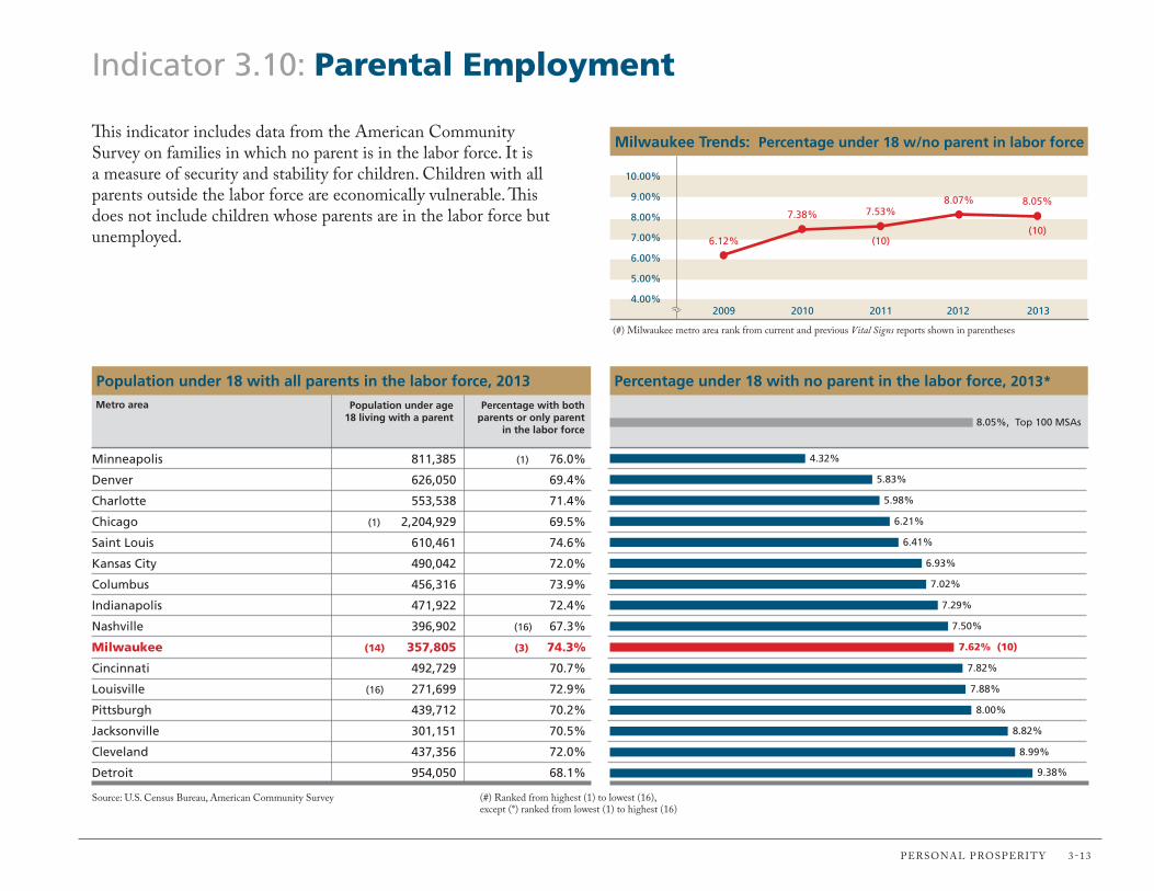
Indicator 3.10: Parental Employment
This indicator includes data from the american Community survey on families in which no parent is in the labor force. it is a measure of security and stability for children. Children with all parents outside the labor force are economically vulnerable. This does not include children whose parents are in the labor force but unemployed.
Percentage under 18 with no parent in the labor force, 2013*
Minneapolis 811,385 (1) 76.0%
Denver 626,050 69.4%
Charlotte 553,538 71.4%
Chicago (1) 2,204,929 69.5%
Saint Louis 610,461 74.6%
Kansas City 490,042 72.0%
Columbus 456,316 73.9%
Indianapolis 471,922 72.4%
Nashville 396,902 (16) 67.3%
Milwaukee (14) 357,805 (3) 74.3%
Cincinnati 492,729 70.7%
Louisville (16) 271,699 72.9%
Pittsburgh 439,712 70.2%
Jacksonville 301,151 70.5%
Cleveland 437,356 72.0%
Detroit 954,050 68.1%
Percentage with both parents or only parent
in the labor force
Population under age 18 living with a parent
Population under 18 with all parents in the labor force, 2013
source: U.s. Census Bureau, american Community survey
4.32%
5.83%
5.98%
6.21%
6.41%
6.93%
7.02%
7.29%
7.50%
7.62% (10)
7.82%
7.88%
8.00%
8.82%
(#) ranked from highest (1) to lowest (16), except (*) ranked from lowest (1) to highest (16)
Metro area
8.99%
9.38%
8.05%, Top 100 MSAs
2009 2010 2011 2012 2013
10.00%
7.00%
9.00%
6.00%
8.00%
5.00%
4.00%
Milwaukee Trends: Percentage under 18 w/no parent in labor force
6.12%
7.38% 7.53%
(10)
8.07% 8.05%
(10)
Personal ProsPerit y 3-13
(#) Milwaukee metro area rank from current and previous Vital Signs reports shown in parentheses

3-14 Greater MilWaUKee FoUnDation | Vital siGns: BenCHMarKinG Metro MilWaUKee 2015
Indicator 3.11: New Housing Starts
This indicator includes data from the Census Bureau on new housing starts. The Census Bureau collects and reports on building permit data from U.s. cities. new housing starts include residential building permits for both single-family and multiple-unit residential buildings.
New permitted units per 1,000 housing units, 2013
Nashville 10,889 35.5% 718,572
Charlotte 14,009 37.2% 955,454
Denver (1) 15,475 55.0% 1,097,911
Jacksonville 7,358 14.6% 609,262
Columbus 8,363 (1) 58.2% 831,380
Indianapolis 8,151 38.5% 827,489
Kansas City 7,532 43.9% 876,401
Minneapolis 12,033 40.4% 1,406,054
Louisville 4,017 36.5% (16) 544,586
Cincinnati 4,330 23.6% 914,522
Saint Louis 5,548 16.3% 1,229,930
Pittsburgh 4,563 28.8% 1,100,717
Detroit 6,352 (16) 14.3% 1,887,929
Chicago 11,627 37.6% (1) 3,791,588
Milwaukee (16) 1,949 (10) 34.6% (14) 669,901
Cleveland 2,741 18.2% 953,523
Total number of housing units
New housing starts, 2013
source: U.s. Census Bureau, Building Permits survey
15.2
14.7
14.1
12.1
10.1
9.9
8.6
8.6
7.4
4.7
4.5
4.1
3.4
3.1
2.9 (T-15)
2.9
Percentage new permitted units
within multiunit structures
(#) ranked from highest (1) to lowest (16)
Metro area
8.2, Top 100 MSAs
Number of new permitted
residential units
2009 2010 2011 2012 2013
6.0
3.0
5.0
2.0
4.0
1.0
0.0
Milwaukee Trends: New permitted units per 1,000 housing units
2.22.9
2.3
(13)
2.6 2.9
(15)
(#) Milwaukee metro area rank from current and previous Vital Signs reports shown in parentheses

Personal ProsPerit y 3-15
2009 2010 2011 2012 2013
64.0%
61.0%
63.0%
60.0%
62.0%
59.0%
58.0%
Milwaukee Trends: Percentage owner-occupied housing units
62.3% 62.2%
60.4%
(16)
59.9%60.5%
(16)
Indicator 3.12: Homeownership
This indicator includes data on homeownership from the american Community survey (aCs). The aCs considers a housing unit to be owner-occupied if the owner or co-owner lives in the unit, even if it is mortgaged or not fully paid for.
69.8%
69.6%
69.5%
68.6%
67.7%
65.7%
65.5%
65.3%
65.0%
64.8%
64.6%
64.5%
64.1%
63.5%
61.8%
60.5% (16)
Percentage of owner-occupied housing units, 2013
Pittsburgh 988,106 689,627
Saint Louis 1,105,652 769,289
Minneapolis 1,332,110 925,512
Detroit 1,658,085 1,137,245
Louisville (16) 494,276 (16) 334,631
Nashville 662,187 435,026
Cincinnati 822,005 538,676
Jacksonville 516,144 336,866
Charlotte 859,709 558,635
Cleveland 844,428 547,584
Indianapolis 739,503 477,758
Kansas City 798,618 514,952
Chicago (1) 3,450,331 (1) 2,211,699
Denver 1,035,096 657,099
Columbus 750,394 463,918
Milwaukee (14) 622,962 (14) 377,065
Total occupied housing units
Total owner-occupied housing
units
Owner-occupied housing units, 2013
source: U.s. Census Bureau, american Community survey (#) ranked from highest (1) to lowest (16)
Metro area
61.3%, Top 100 MSAs
(#) Milwaukee metro area rank from current and previous Vital Signs reports shown in parentheses

3-16 Greater MilWaUKee FoUnDation | Vital siGns: BenCHMarKinG Metro MilWaUKee 2015
Indicator 3.13: Foreclosures
This indicator includes data from the Center for Housing Policy, the local initiatives support Corporation, and the Urban institute on foreclosure activity. traditional measures typically only include properties that have already gone into foreclosure. The serious Delinquency rate was designed to better assess the level of mortgage distress by combining the percentage of all home mortgage loans in foreclosure with those that are 90 or more days delinquent but have not yet entered foreclosure. These data are for metro areas based on June 2003 definitions. This indicator has been modified from the 2013 report (see appendix a).
3.43%
4.43%
5.84%
6.02%
6.36%
6.53%
6.71%
7.02%
7.05%
7.60% (10)
8.07%
8.18%
8.24%
9.21%
10.39%
13.16%
Serious Delinquency Rate, September 2013
Minneapolis (1) 1.89% (1) 1.54%
Denver 2.62% 1.81%
Charlotte 2.92% 2.92%
Kansas City 3.10% 2.92%
Nashville 3.39% 2.97%
Saint Louis 3.46% 3.07%
Pittsburgh 4.01% 2.70%
Detroit 3.27% 3.74%
Louisville 4.28% 2.77%
Milwaukee (10) 4.39% (11) 3.21%
Cincinnati 4.94% 3.13%
Indianapolis 4.94% 3.24%
Columbus 4.99% 3.25%
Chicago 6.03% 3.17%
Cleveland 6.20% 4.19%
Jacksonville (16) 8.59% (16) 4.57%
Foreclosures and home mortgage delinquencies, September 2013
source: national Housing Conference + Center for Housing Policy/ local initiatives support Corporation/Urban institute, Foreclosure-response.org
(#) ranked from lowest (1) to highest (16)
Metro area
6.71%, Top 100 MSAs median
Percentage of all home mortgage loans 90 or more days delinquent
Percentage of all home mortgage loans
in foreclosure
Sep. 2009 Sep. 2010 Sep. 2011 Sep. 2012 Sep. 2013
11.00%
8.00%
10.00%
7.00%
9.00%
6.00%
5.00%
Milwaukee Trends: Serious Delinquency Rate
8.59% 8.59% 8.86%9.37%
7.60%

Personal ProsPerit y 3-17
Indicator 3.14: Owner Housing Affordability
This indicator includes data compiled by the national association of Home Builders on owner housing affordability across the nation. The affordability data are based on the U.s. Department of Housing and Urban Development median family income, interest rates, and the price of existing and new homes sold in each market area for a particular quarter. Data on homes sold are collected from court records on sales nationwide. These data are for metro areas based on June 2003 definitions.
Percentage housing affordable to median income buyer, Q3 2014
Indianapolis 131,000 64,300
Cincinnati 141,000 68,500
Cleveland (12) 125,000 (12) 62,600
Saint Louis 154,000 67,100
Louisville 150,000 64,300
Pittsburgh 140,000 65,600
Detroit N/A N/A
Minneapolis 210,000 (1) 82,900
Milwaukee (5) 170,000 (3) 70,300
Jacksonville 156,000 63,200
Columbus 175,000 70,000
Charlotte 189,000 64,200
Denver (1) 278,000 76,700
Chicago N/A N/A
Kansas City N/A N/A
Nashville N/A N/A
Median family income ($)
Median sales price and median family income, third quarter 2014
source: national association of Home Buildersn/a = data not available
85.4%
82.0%
80.4%
80.3%
80.0%
79.0%
76.7%
76.5%
74.3% (T-9)
74.3%
68.2%
67.2%
64.5%
N/A
N/A
N/A
Median sale price ($)
Metro area
61.8%, United States
(#) ranked from highest (1) to lowest (16)
Q3 2010 Q3 2011 Q3 2012 Q3 2013 Q3 2014
90.0%
75.0%
85.0%
70.0%
80.0%
65.0%
60.0%
Milwaukee Trends: Percentage housing affordable to med. income
77.3%78.9% 79.7%
(11) 72.2%74.3%
(9)
(#) Milwaukee metro area rank from current and previous Vital Signs reports shown in parentheses

3-18 Greater MilWaUKee FoUnDation | Vital siGns: BenCHMarKinG Metro MilWaUKee 2015
Indicator 3.15: Rental Housing Affordability
This indicator includes data from the american Community survey on renter housing units and their affordability to their occupants. according to the U.s. Department of Housing and Urban Development (HUD), housing is affordable if renters pay no more than 30% of their annual household income for rent and utilities. Households who pay more than 30% of their income for housing are considered by HUD to be “cost burdened.”
48.9%
48.8%
48.8%
48.2% (13)
47.4%
47.1%
46.9%
45.1%
44.6%
44.3%
44.2%
43.5%
43.1%
42.4%
42.0%
41.4%
Percentage renters spending > 30% of income on housing, 2013
Louisville (16) 159,645 (1) 66,027
Pittsburgh 298,479 125,292
Cincinnati 283,329 120,116
Columbus 286,476 123,537
Kansas City 283,666 123,310
Saint Louis 336,363 148,739
Nashville 227,161 100,642
Charlotte 301,074 134,257
Minneapolis 406,598 183,556
Cleveland 296,844 139,195
Chicago (1) 1,238,632 (16) 583,976
Indianapolis 261,745 123,952
Milwaukee (13) 245,897 (4) 118,546
Denver 377,997 184,283
Detroit 520,840 254,335
Jacksonville 179,278 87,703
Renter-occupied housing units and housing cost burden, 2013
source: U.s. Census Bureau, american Community survey
Total renter-occupied housing
units*
Number of renters spending > 30% of income on housing
Metro area
48.9%, Top 100 MSAs
(#) ranked from lowest (1) to highest (16) except (*) ranked highest (1) to lowest (16)
2009 2010 2011 2012 2013
54.0%
48.0%
52.0%
46.0%
50.0%
44.0%
42.0%
Milwaukee Trends: Renters spending > 30% of income on housing
48.3%
50.9%50.2%
(13)
51.2%
48.2%
(13)
(#) Milwaukee metro area rank from current and previous Vital Signs reports shown in parentheses

Section 4: Lifelong Learning
This section includes indicators of educational attainment, language, school attendance, and enrollment that describe the educational resources of the metro areas. The following are the Lifelong Learning indicator categories:
4.01 Educational Attainment
4.02 English Language
4.03 Pre-K Enrollment
4.04 School Lunch Assistance
4.05 High School Attendance
4.06 Higher Education Enrollment
4.07 Research Doctorates
LIFELONG LEARNING 4-1

Lifelong Learning Overview
This section includes indicators measuring educational attainment, language skills, school attendance and enrollment, access to free or reduced-price lunch, and academic research. These indicators help describe the academic and educational potential of the metro area populations. Better language skills, more academic engagement, and greater access to educational resources can increase a metro area’s potential to stay economically competitive. The table on the right shows where the rankings in this section fall. Milwaukee’s overall educational outlook is fair—an improvement from the last report. More than half of the indicators in this section now fall in or near the top tier. There are signs, however, that although the metro area is good at educating people, it is failing to attract or retain a highly educated workforce.
High School Attendance Milwaukee has seen dramatic improvement in high school attendance since the last report. The metro area has moved into the top tier for this indicator, with a substantial decrease in the status dropout rate, or the percentage of teens ages 16 to 19 who are neither in school nor high school graduates (Indicator 4.05).
Higher Education With four major institutions of higher learning—the University of Wisconsin-Milwaukee, Marquette University, the Medical College of Wisconsin, and Cardinal Stritch University—the metro area remains in the top tier for research doctoral degrees awarded per 100,000 persons in the population (4.07). These institutions also have helped move Milwaukee into first place for enrollment in college or graduate school per 1,000 people in the metro area (4.06).
4-2 GREATER MILWAUKEE FOUNDATION | VITAL SIGNS: BENCHMARKING METRO MILWAUKEE 2015
How Milwaukee Compares This figure depicts how the Milwaukee metro area compares to the other 15 metro areas using data from the bar graphs on the indicator pages in the Lifelong Learning section.
Population 25+ with a graduate degree (%)
Bilingual speakers of non-English languages (%)
Children 3–4 in school (%)
K–12 students eligible for FRPL* (%)
Teens 16–19 not in school & not high school graduates* (%)
Higher education enrollment per 1,000 population
Research doctorates granted per 100,000 population
Bottom tierTop tierMilwaukee metro area
These indicators are ranked from highest (1) to lowest (16), except (*) ranked lowest (1) to highest (16).
87 9654321 16151413121110
Middle tier
At the same time it appears these students are not staying in the area once they graduate. Milwaukee still ranks in the bottom tier for the percentage of residents age 25 and older with a graduate degree (4.01). In addition, the metro area is doing a poor job of attracting graduate degree–level talent. As mentioned in Section 2, Milwaukee ranks in the bottom tier for new residents with a graduate degree (2.21). These indicators suggest that the metro area lacks the type of jobs that attract or help retain human capital.

LIFELONG LEARNING 4-3
Indicator 4.01: Educational Attainment
This indicator includes data from the American Community Survey on the educational attainment of the adult population (persons age 25 years and older).
14.4%
13.7%
13.2%
12.5%
12.4%
12.2%
12.1%
11.5%
11.5%
11.5%
11.3%
11.2% (12)
11.0%
Percentage of population age 25+ with a graduate degree, 2013
Source: U.S. Census Bureau, American Community Survey
9.0%
10.1%
10.6%
(#) Ranked from highest (1) to lowest (16); except (*) ranked from lowest (1) to highest (16)
Denver 9.9% (1) 20.4% (1) 40.3%
Chicago 12.8% 24.8% 35.1%
Minneapolis (1) 7.0% 22.8% 39.3%
Pittsburgh 7.5% (16) 34.6% 32.2%
Saint Louis 9.1% 26.5% 32.5%
Kansas City 8.8% 26.5% 33.7%
Columbus 10.0% 29.4% 33.7%
Cincinnati 10.4% 30.4% 31.2%
Detroit 11.4% 27.3% 29.0%
Cleveland 10.6% 29.7% 29.8%
Nashville 11.8% 28.6% 32.3%
Milwaukee (T-7) 10.0% (7) 27.2% (6) 33.2%
Indianapolis 11.3% 28.8% 30.8%
Louisville 11.7% 31.1% (16) 27.0%
Charlotte (16) 13.1% 25.0% 32.0%
Jacksonville 9.7% 28.0% 28.3%
Percentage with a bachelor’s degree
or higher
Educational attainment, population 25 years and older, 2013Percentage
without a high school diploma*
Metro area Percentage with no higher than a high
school diploma* 12.6%, Top 100 MSAs
2009 2010 2011 2012 2013
13.0%
10.0%
12.0%
9.0%
11.0%
8.0%
7.0%
Milwaukee Trends: Population age 25+ with a graduate degree
10.6%11.2%
10.4%
(13)
11.2% 11.2%
(12)
(#) Milwaukee metro area rank from current and previous Vital Signs reports shown in parentheses

4-4 GREATER MILWAUKEE FOUNDATION | VITAL SIGNS: BENCHMARKING METRO MILWAUKEE 2015
Indicator 4.02: English Language
This indicator includes data from the American Community Survey on English-speaking ability among the population speaking another language at home. Bilingual speakers of non-English languages are defined here as the population age 5 and older speaking English “very well” while also speaking a language other than English at home. Persons lacking the ability to speak English well can have difficulty functioning in U.S. society. This indicator has been modified from the 2013 report (see Appendix A).
Percentage of bilingual speakers of non-English languages, 2013*
Pittsburgh 118,902 80,500
Saint Louis 159,143 107,480
Jacksonville 143,668 94,705
Cleveland 183,629 117,832
Detroit 510,758 324,889
Cincinnati 117,038 74,387
Columbus 174,507 105,821
Nashville 160,966 97,203
Denver 500,236 301,459
Milwaukee (7) 182,189 (7) 108,533
Minneapolis 428,334 253,439
Chicago (1) 2,585,693 (1) 1,524,517
Indianapolis 164,455 95,561
Kansas City 180,679 104,906
Charlotte 287,533 163,685
Louisville (16) 76,018 (16) 42,448
Population age 5 and older speaking a language other than
English at home
Bilingual speakers of non-English languages
age 5 and older
Speakers of non-English languages by English-speaking ability, 2013
Source: U.S. Census Bureau, American Community Survey* Percentage of the population age 5 and older speaking English “very well” while also speaking a language other than English at home
67.5%
65.9%
64.2%
63.6%
63.6%
60.6%
60.4%
60.3%
59.6% (10)
59.2%
59.0%
58.1%
58.1%
56.9%
55.8%
Metro area
(#) Ranked from highest (1) to lowest (16)
67.7%
57.1%, Top 100 MSAs
2009 2010 2011 2012 2013
63.0%
60.0%
62.0%
59.0%
61.0%
58.0%
57.0%
Milwaukee Trends: Bilingual speakers of non-English languages
60.4% 60.4% 60.4%
59.6% 59.6%

LIFELONG LEARNING 4-5
Indicator 4.03: Pre-K Enrollment
This indicator includes data from the American Community Survey on school enrollment for children ages 3 and 4, including the type of school (public or private). The data do not represent all nursery school and preschool enrollment because these education levels include children outside the age range of 3 to 4.
Percentage of children ages 3–4 enrolled in school, 2013
Saint Louis 21,844 18,177
Denver 21,468 16,220
Chicago (1) 78,510 (1) 56,349
Jacksonville 9,293 8,850
Pittsburgh 11,983 12,996
Milwaukee (10) 13,342 (16) 7,137
Columbus 13,638 11,181
Charlotte 15,146 15,490
Cleveland 10,208 12,644
Detroit 31,983 17,003
Minneapolis 24,501 18,318
Cincinnati 15,193 12,267
Kansas City 13,928 11,546
Louisville (16) 6,081 8,251
Nashville 11,467 9,032
Indianapolis 10,840 10,595
Number of children ages 3–4 enrolled in private school
Number of children ages 3–4 enrolled in school, 2013
Source: U.S. Census Bureau, American Community Survey
37.8%
42.1%
43.7%
44.4%
44.8%
45.0%
46.9%
48.1%
48.2%
48.2%
48.7% (6)
49.1%
49.3%
Number of children ages 3–4 enrolled
in public school
55.6%
52.9%
51.5%
(#) Ranked from highest (1) to lowest (16)
Metro area
48.5%, Top 100 MSAs
2009 2010 2011 2012 2013
56.0%
50.0%
54.0%
48.0%
52.0%
46.0%
44.0%
Milwaukee Trends: Percentage ages 3–4 enrolled in school
52.9%
45.1%
48.9%
(9)
55.1%
48.7%
(6)
(#) Milwaukee metro area rank from current and previous Vital Signs reports shown in parentheses

4-6 GREATER MILWAUKEE FOUNDATION | VITAL SIGNS: BENCHMARKING METRO MILWAUKEE 2015
Indicator 4.04: School Lunch Assistance
This indicator includes data from the National Center for Education Statistics on K–12 students who are eligible for free or reduced-price lunch (FRPL). These data are for metro areas based on June 2003 definitions.
34.2%
35.0%
38.6%
40.1%
40.4%
41.6%
41.6%
43.3%
44.4% (9)
44.5%
45.6%
46.4%
46.5%
47.5%
49.8%
51.6%
Percentage of K–12 students eligible for FRPL, 2011–2012
Pittsburgh 92,673 16,070
Minneapolis 155,319 33,399
Saint Louis 122,761 38,908
Columbus 107,648 14,348
Cincinnati 112,480 16,136
Kansas City 119,998 22,847
Denver 157,103 28,515
Cleveland 113,333 15,373
Milwaukee (4) 93,809 (1) 10,867
Indianapolis 114,164 21,775
Jacksonville (1) 84,204 11,304
Nashville 105,332 14,609
Detroit 292,462 30,895
Charlotte 112,453 31,397
Chicago (16) 364,386 (16) 422,346
Louisville 85,383 13,145
Number of K–12 students eligible for reduced-price lunch
Number of K–12 students eligible for
free lunch
K–12 students eligible for free or reduced-price lunch, 2011–2012
Source: U.S. Department of Education, National Center for Education Statistics
Metro area
(#) Ranked from lowest (1) to highest (16)
38.8%, Top 100 MSAs
2007–2008 2008–2009 2009–2010 2010–2011 2011–2012
46.0%
40.0%
44.0%
38.0%
42.0%
36.0%
34.0%
Milwaukee Trends: Percentage of K–12 students eligible for FRPL
38.5% 38.4%
41.0%42.1%
(8)
44.4%
(9)
(#) Milwaukee metro area rank from current and previous Vital Signs reports shown in parentheses

LIFELONG LEARNING 4-7
Indicator 4.05: High School Attendance
This indicator includes data from the American Community Survey on high school attendance. It measures the percentage of teens ages 16 to 19 who neither are currently enrolled in school nor hold a high school diploma. This is known as the status dropout rate. High school dropouts are less likely to have the minimum skills and credentials needed to function in society and are more likely to live in poverty and require government assistance. The idle teen rate is another measure of high school attendance. This is the percentage of the same age group who neither are currently enrolled in school nor are in the labor force.
1.81%
2.13%
3.02% (3)
3.17%
3.56%
3.62%
3.63%
3.63%
3.73%
4.01%
4.27%
4.47%
4.86%
5.11%
5.21%
5.53%
Status dropout rate, ages 16 to 19, 2013
Pittsburgh (1) 1.95%
Cincinnati 3.41%
Milwaukee (6) 4.41%
Chicago 4.50%
Minneapolis 2.53%
Columbus 4.55%
Nashville 4.25%
Kansas City 4.35%
Jacksonville (16) 6.89%
Saint Louis 5.01%
Louisville 4.59%
Charlotte 4.95%
Detroit 5.25%
Cleveland 4.46%
Indianapolis 6.20%
Denver 4.45%
Percentage of population ages 16–19 not in school
and not in the labor force
Idle teens, ages 16–19, 2013
Source: U.S. Census Bureau, American Community Survey
Metro area
(#) Ranked from lowest (1) to highest (16)
3.94%, Top 100 MSAs
2009 2010 2011 2012 2013
6.00%
3.00%
5.00%
2.00%
4.00%
1.00%
0.00%
Milwaukee Trends: Status dropout rate, ages 16 to 19
4.17%4.83% 4.62%
(10)2.77% 3.02%
(3)
(#) Milwaukee metro area rank from current and previous Vital Signs reports shown in parentheses

4-8 GREATER MILWAUKEE FOUNDATION | VITAL SIGNS: BENCHMARKING METRO MILWAUKEE 2015
Indicator 4.06: Higher Education Enrollment
This indicator includes data from the American Community Survey on enrollment in college and graduate school. The ACS includes people living in student housing at the time of the survey if they have been there, or will be there, more than two months. This indicator has been modified from the 2013 report (see Appendix A).
77.6 (1)
74.7
73.5
73.4
71.2
68.9
68.9
68.8
68.7
68.4
67.0
66.4
64.5
Higher education enrollment per 1,000 population, 2013
Source: U.S. Census Bureau, American Community Survey
61.3
61.4
62.1
(#) Ranked from highest (1) to lowest (16)
Milwaukee (12) 99,888 (13) 21,951
Columbus 114,374 32,484
Saint Louis 160,664 45,210
Chicago (1) 549,148 (1) 150,394
Minneapolis 193,502 52,769
Nashville 97,250 23,920
Detroit 241,852 54,217
Jacksonville 79,024 16,966
Denver 139,595 45,767
Cleveland 112,772 28,354
Cincinnati 116,746 26,253
Pittsburgh 122,643 34,087
Charlotte 123,893 26,717
Louisville (16) 63,438 (16) 15,019
Kansas City 97,290 28,661
Indianapolis 101,378 18,470
College and graduate/professional enrollment, 2013Number enrolled
in graduate or professional
school
Metro area Number of persons enrolled
in college 75.3, Top 100 MSAs
2007 2008 2009 2010 2011
82.0
76.0
80.0
74.0
78.0
72.0
70.0
Milwaukee Trends: Higher education enrollment per 1,000 pop.
73.0
80.7
76.477.8 77.6

LIFELONG LEARNING 4-9
Indicator 4.07: Research Doctorates
This indicator includes data from the National Science Foundation on doctoral research. It measures the annual number of research doctoral degrees (which excludes all professional doctoral degrees, such as doctorates in medicine and law) granted at area colleges and universities.
35.8
34.7
33.0
18.6
18.2 (5)
16.8
14.6
13.3
13.0
10.0
7.7
5.8
5.4
Research doctoral degrees granted per 100,000 population, 2013
Columbus 1 705
Minneapolis 3 1,202
Pittsburgh 3 778
Nashville 4 327
Milwaukee (T-2) 4 (7) 286
Chicago (1) 16 (1) 1,605
Saint Louis 4 410
Cincinnati 3 285
Louisville 2 164
Cleveland 2 206
Denver 4 209
Detroit 4 249
Charlotte 1 125
Kansas City 1 52
Indianapolis (T-15) 0 (T-15) 0
Jacksonville (T-15) 0 (T-15) 0
Number of research doctoral degrees awarded
Number of institutions granting research doctoral degrees
Research universities and research doctoral degrees, 2013
Source: National Science Foundation
2.5
0.0
0.0
(#) Ranked from highest (1) to lowest (16)
Metro area
16.7, Top 100 MSAs
2009 2010 2011 2012 2013
22.0
16.0
20.0
14.0
18.0
12.0
10.0
Milwaukee Trends: Research doctoral degrees per 100,000 pop.
15.1 14.7 14.7
(5)
18.3 18.2
(5)
(#) Milwaukee metro area rank from current and previous Vital Signs reports shown in parentheses

4-10 GREATER MILWAUKEE FOUNDATION | VITAL SIGNS: BENCHMARKING METRO MILWAUKEE 2015

Section 5: Community Well-being
This section includes indicators of health, safety, civic life, transportation, and environmental quality that describe the well-being of the metro areas. The following are the Community Well-being indicator categories:
Communit y Well-being 5-1
5.01 Local Foods
5.02 Obesity
5.03 Diabetes
5.04 Smoking
5.05 Infant Mortality
5.06 Health Insurance
5.07 Hospitals and Physicians
5.08 Charitable Giving
5.09 Volunteering
5.10 Local Government
5.11 Diversity in Political Leadership
5.12 Women in Political Leadership
5.13 Women in Corporate Leadership
5.14 Crime
5.15 Road Safety
5.16 Traffic Congestion
5.17 Commute Time
5.18 Commute Mode
5.19 Carbon Footprint
5.20 Air Quality
5.21 Green Building

Community Well-being Overview
This section includes a wide variety of indicators measuring health and safety, civic engagement, leadership, transportation, and the environment that help describe the general community well-being of the metro areas. Healthy and engaged citizens, equitable leadership, safe streets, smart transportation choices, and a clean environment are important quality of life components that give the metro area a competitive edge in attracting and retaining residents and businesses. The table on the following page shows where the rankings in this section fall. Half of the rankings remain in the top tier or near the top for community well-being. milwaukee is still a robust metropolitan area, though there are definite areas of concern.
Health and Wellness milwaukee has not seen much change in rankings for health indicators; however, there are some troubling trends. The metro area continues to rank in the top tier for both the number of physicians per 100,000 persons in the population (indicator 5.07) and the percentage of adults with health care coverage (5.06). Research shows, however, that health insurance is more often used to treat health problems than for preventive care that might address the root of these problems. Since the last report, milwaukee has had a huge increase in the obesity rate, and thus dropped from the top tier to the bottom (5.02). At the same time, the metro areas ranks in the top tier for the number of local farmers’ markets per million people (5.01), indicating that area residents are not taking advantage of the opportunity to purchase fresh, nutritious, locally grown food. The infant mortality rate has improved from the last report, and the metro area no longer ranks in the bottom tier for that indicator. When we analyze the data by race of the mother, however, it becomes apparent that this lower rate is due entirely to a substantial drop in the number of infant deaths among White mothers. At the same time, African American mothers in
5-2 gReAteR milWAuKee founDAtion | VitAl SignS: benCHmARKing metRo milWAuKee 2015
milwaukee saw an increase in the number of infant deaths and are now more than three times as likely to experience the death of a child who is less than one year old compared to White mothers. This is the greatest racial disparity in infant mortality rates among the 16 metro areas (5.05).
Community Service milwaukee remains one of the most civically engaged of the comparison metros, with adults reporting among the highest levels of community service in the metro areas. milwaukee continues to rank in the top tier for volunteerism, with the second highest volunteer rate of the 16 metros. Remarkably, the average metro resident performed more than 10 extra annual hours of volunteer service than two years earlier, giving milwaukee the second highest average number of volunteer hours per year (5.09). The metro area also ranks in the top tier for charitable giving, with the second highest percentage of adults donating more than $25 to charitable organizations. based on tax returns, however, milwaukee ranks near the bottom in terms of charitable contributions as a percentage of income (5.08).
Transportation Choices and the Environment Commuters in the metro area enjoy a relatively short drive to work (5.17) and among the fewest hours of traffic delay (5.16) of the comparison metros. The ease of driving alone, however, does not stop milwaukee workers from using alternative commute modes. The metro area boasts among the highest percentages of workers using public transportation, walking, and biking to get to work (5.18). These smart transportation choices help contribute to a cleaner environment. milwaukee is one of the greener metro areas and ranks near the top in household carbon footprint (5.19), number of days with good air quality (5.20), and green building square footage per capita (5.21).

Communit y Well-being 5-3
How Milwaukee Compares This figure depicts how the milwaukee metro area compares to the other 15 metro areas using data from the bar graphs on the indicator pages in the Community Well-being section.
Local farmers’ markets per 1,000,000 population
Adults who are obese* (%)
Adults ever diagnosed with type 1 or 2 diabetes* (%)
Adults who smoke* (%)
Infant deaths per 1,000 births*
Population with health insurance (%)
Physicians per 100,000 pop.
Adults donating > $25 to charity in past year (%)
Adults volunteering (%)
Local government entities per 100,000 population*
Major public officials of a racial or ethnic minority (%)
87 9654321 16151413121110
Major public officials who are women (%)
Fortune 1000 board directors who are women (%)
Violent crimes per 100,000 population*
Traffic fatalities per 100,000 population*
Hours of delay per auto commuter*
Workers commuting 25+ minutes* (%)
Workers using an alternative commute mode (%)
Total average household carbon footprint*
Days with good air quality
LEED-certified square footage per capita
87 9654321 16151413121110
Bottom tierTop tierMilwaukee metro area
These indicators are ranked from highest (1) to lowest (16), except (*) ranked lowest (1) to highest (16).
Middle tier Bottom tierTop tierMilwaukee metro area
These indicators are ranked from highest (1) to lowest (16), except (*) ranked lowest (1) to highest (16).
Middle tier

Indicator 5.01: Local Foods
This indicator includes data from the u.S. Department of Agriculture’s food environment Atlas on access to farmers’ markets. by providing consumers the opportunity to purchase fresh, nutritious, locally grown food, rural farm stands and urban farmers’ markets contribute to the general health of the community and the sustainability of the local economy. This indicator has been modified from the 2013 report (see Appendix A).
Local farmers’ markets per 1,000,000 population, 2013
Kansas City 62
Columbus 58
Minneapolis 101
Milwaukee (12) 42
Louisville 29
Chicago (1) 215
Cincinnati 46
Cleveland 44
Pittsburgh 47
Indianapolis 38
Denver 51
Saint Louis 52
Charlotte 43
Detroit 77
Nashville 25
Jacksonville (16) 16
Number of local farmers’ markets, 2013Number of local
farmers’ markets
Source: u.S. Department of Agriculture, food environment Atlas
Metro area
(#) Ranked from highest (1) to lowest (16)
30.2
29.5
29.2
26.8 (4)
23.0
22.5
21.5
19.9
19.4
18.9
18.6
18.4
17.9
14.2
N/A 11.5
18.9, Top 100 MSAs
21.3
5-4 gReAteR milWAuKee founDAtion | VitAl SignS: benCHmARKing metRo milWAuKee 2015
2009 2010 2011 2012 2013
30.0
24.0
28.0
22.0
26.0
20.0
18.0
Milwaukee Trends: Local farmers’ markets per 1,000,000 pop.
20.5
23.124.3
28.7
26.8

Indicator 5.02: Obesity
This indicator includes data on the percentage of adults reporting in the behavioral Risk factor Surveillance System (bRfSS) survey a body mass index (bmi) of 25.0 or greater. bmi is calculated as weight (in kilograms) divided by height (in meters) squared. A bmi of 25.0 to 29.9 indicates the individual is overweight, whereas a bmi of 30.0 or greater indicates obesity. The bRfSS is administered by the Wisconsin Department of Health Services in conjunction with the Centers for Disease Control and Prevention. These data are for metro areas based on June 2003 definitions.
Percentage of adults who are obese (BMI 30.0 or greater), 2012
Denver (1) 55.6%
Minneapolis 60.9%
Chicago 62.3%
Pittsburgh 64.4%
Cleveland 64.5%
Charlotte 64.3%
Cincinnati 63.6%
Kansas City 64.0%
Nashville 63.4%
Jacksonville 65.9%
Indianapolis 64.9%
Columbus 63.6%
Milwaukee (13) 66.2%
Saint Louis 67.6%
Louisville (16) 67.7%
Detroit 66.7%
Percentage of adults who are overweight
or obese (BMI 25.0 or greater)
Percentage of adults who are overweight or obese, 2012
Metro area
(#) Ranked from lowest (1) to highest (16)
20.1%
23.9%
26.6%
26.9%
27.7%
27.9%
28.3%
28.3%
29.1%
29.2%
30.1%
30.6%
30.9% (13)
31.1%
31.8%
34.2%
Source: Centers for Disease Control and Prevention, behavioral Risk factor Surveillance System
27.6%, U.S. state median
Communit y Well-being 5-5
2008 2009 2010 2011 2012
32.0%
26.0%
30.0%
24.0%
28.0%
22.0%
20.0%
Milwaukee Trends: Percentage of adults who are obese
25.1%24.3%
26.0%
(5)
27.3%
30.9%
(13)
(#) milwaukee metro area rank from current and previous Vital Signs reports shown in parentheses

Indicator 5.03: Diabetes
This indicator includes data on the percentage of adults reporting in the behavioral Risk factor Surveillance System (bRfSS) survey that they have ever been diagnosed with diabetes. The bRfSS is administered by the Wisconsin Department of Health Services in conjunction with the Centers for Disease Control and Prevention. These data are for metro areas based on June 2003 definitions. new data were not available to update the indicator for the 2015 report.
Percentage of adults ever diagnosed w/type 1 or 2 diabetes, 2010
Minneapolis 1.5% (T-1) 0.8%
Denver 0.9% 1.0%
Louisville 0.8% 2.0%
Milwaukee (1) 0.4% (T-7) 1.4%
Saint Louis 1.1% (16) 3.6%
Nashville (16) 4.7% 1.0%
Chicago 0.9% 1.4%
Kansas City 1.1% 1.2%
Pittsburgh 1.1% 1.4%
Charlotte 1.2% 1.8%
Columbus 1.3% 1.2%
Jacksonville 0.7% 3.4%
Indianapolis 1.2% 2.0%
Cincinnati 1.1% 2.0%
Cleveland 2.7% (T-1) 0.8%
Detroit 1.0% 2.0%
Adults ever diagnosed w/prediabetes or gestational diabetes, 2010*Percentage of adult
women ever diagnosed with gestational
diabetes*
Percentage of adults ever diagnosed with
prediabetes*
Source: Centers for Disease Control and Prevention, behavioral Risk factor Surveillance System * Does not include adults who have also ever been diagnosed with type 1 or 2 diabetes.
Metro area
(#) Ranked from lowest (1) to highest (16)
5.3%
5.4%
6.9%
7.6% (4)
8.5%
8.7%
8.8%
9.2%
9.2%
9.3%
9.3%
9.6%
9.9%
10.6%
N/A 12.1%
8.7%, U.S. state median
9.1%
5-6 gReAteR milWAuKee founDAtion | VitAl SignS: benCHmARKing metRo milWAuKee 2015
2006 2007 2008 2009 2010
9.0%
6.0%
8.0%
5.0%
7.0%
4.0%
3.0%
Milwaukee Trends: Percentage adults ever w/type 1, 2 diabetes
4.6%5.1%
6.6%
8.0%7.6%

Communit y Well-being 5-7
Indicator 5.04: Smoking
This indicator includes data on the percentage of adults reporting in the behavioral Risk factor Surveillance System (bRfSS) survey that they smoked at least 100 cigarettes in their lifetime and that they currently smoke. The bRfSS is administered by the Wisconsin Department of Health Services in conjunction with the Centers for Disease Control and Prevention. These data are for metro areas based on June 2003 definitions.
Percentage of adults who currently smoke, 2012
Chicago (1) 58.8% 11.9%
Denver 55.8% (1) 11.7%
Minneapolis 55.1% 12.6%
Charlotte 56.3% 13.2%
Columbus 56.4% 15.5%
Saint Louis 54.8% 14.1%
Milwaukee (6) 55.3% (T-3) 12.6%
Jacksonville 58.5% 13.5%
Indianapolis 53.4% 15.7%
Kansas City 53.6% 16.2%
Cleveland 52.5% 16.9%
Pittsburgh 52.5% 17.3%
Cincinnati 51.9% 17.9%
Nashville 52.8% 17.9%
Detroit 53.7% 18.0%
Louisville (16) 49.0% (16) 22.0%
Adults by smoking habits, 2012Percentage of
adults who smoke daily
Percentage adults who have never smoked or
have smoked fewer than 100 cigarettes*
Source: Centers for Disease Control and Prevention, behavioral Risk factor Surveillance System
Metro area
(#) Ranked from lowest (1) to highest (16),except (*) ranked from highest to lowest
17.7%
18.0%
18.0%
18.6%
20.0%
20.1%
20.3% (7)
21.8%
22.0%
22.2%
22.4%
23.3%
23.7%
24.4%
N/A 25.9%
19.6%, U.S. state median
20.9%
2008 2009 2010 2011 2012
26.0%
20.0%
24.0%
18.0%
22.0%
16.0%
14.0%
Milwaukee Trends: Percentage of adults who currently smoke
18.2%18.9%
20.5%
(13)
24.3%
20.3%
(7)
(#) milwaukee metro area rank from current and previous Vital Signs reports shown in parentheses

Indicator 5.05: Infant Mortality
This indicator includes data from the Centers for Disease Control and Prevention (CDC) on deaths of children under one year of age. linked birth and death records are tied to the county of the mother’s residence rather than the county of an infant’s birth or death. The CDC only reports county-level infant death data for counties with populations larger than 250,000. Race and ethnicity data are limited to those counties in which there are 10 or more deaths reported for a particular racial or ethnic group. The metro area figures below are for only those counties within the metro areas that meet these criteria. The most recent data are from 2010.
Infant deaths per 1,000 live births, 2010
Minneapolis 3.57 8.67
Kansas City 5.06 (1) 8.24
Charlotte (1) 3.23 9.24
Denver 5.15 14.84
Nashville 5.55 12.23
Chicago 5.25 12.62
Saint Louis 4.67 11.99
Louisville 6.27 10.22
Milwaukee (4) 4.72 (13) 14.79
Jacksonville 5.94 10.62
Columbus 6.50 10.96
Pittsburgh 6.73 14.29
Detroit 5.10 13.90
Cleveland 5.05 15.51
Cincinnati 6.50 (16) 17.96
Indianapolis (16) 8.22 13.82
Infant deaths per 1,000 live births, by mother’s race/ethnicity, 2010Black or African
American
White
Source: Centers for Disease Control and Prevention, linked birth/infant Death Records
Metro area
(#) Ranked from lowest (1) to highest (16)
4.25
5.64
5.71
5.88
6.73
6.89
7.07
7.76 (9)
7.79
7.90
8.04
8.13
8.71
9.55
N/A 10.01
5.96, Top 100 MSAs
7.41
5-8 gReAteR milWAuKee founDAtion | VitAl SignS: benCHmARKing metRo milWAuKee 2015
2006 2007 2008 2009 2010
10.00
8.50
9.50
8.00
9.00
7.50
7.00
Milwaukee Trends: Infant deaths per 1,000 live births
9.25
8.05
9.21
(13) 8.54
7.76
(9)
(#) milwaukee metro area rank from current and previous Vital Signs reports shown in parentheses

Communit y Well-being 5-9
Indicator 5.06: Health Insurance
This indicator includes data from the American Community Survey on the health insurance coverage of the civilian noninstitutionalized population as well as selected racial and ethnic groups. This indicator has been modified from the 2013 report (see Appendix A).
92.5%
91.9%
90.4% (3)
89.8%
89.6%
89.4%
88.7%
88.4%
87.6%
86.8%
86.5%
86.0%
85.9%
84.4%
Percentage of the population with health insurance, 2013*
Pittsburgh 93.1% (1) 87.6% (1) 89.6% (1) 87.0%
Minneapolis (1) 94.6% 84.4% 89.1% 69.8%
Milwaukee (2) 93.9% (4) 85.9% (5) 86.9% (5) 75.7%
Cleveland 91.2% 86.3% 87.1% 84.5%
Saint Louis 92.1% 81.3% 86.4% 76.4%
Cincinnati 91.0% 83.7% 85.2% 72.1%
Detroit 91.0% 83.5% 88.5% 79.5%
Columbus 90.4% 85.0% 84.1% 64.2%
Louisville 89.7% 83.7% 78.5% 66.6%
Kansas City 90.3% 80.9% 80.9% 66.8%
Nashville 89.5% 86.8% (16) 75.1% (16) 58.1%
Indianapolis 89.3% 81.4% 76.1% 67.8%
Chicago 91.8% 82.4% 85.5% 74.1%
Denver 90.2% 85.4% 85.2% 73.4%
Jacksonville (16) 86.5% 82.3% 81.8% 74.6%
Charlotte 89.1% (16) 80.5% 82.1% 60.2%
Source: u.S. Census bureau, American Community Survey* Civilian noninstitutionalized population
(#) Ranked from highest (1) to lowest (16)
Metro area
84.1%
86.4%
85.6%, Top 100 MSAs
2009 2010 2011 2012 2013
96.0%
90.0%
94.0%
88.0%
92.0%
86.0%
84.0%
Milwaukee Trends: Percentage of pop. with health insurance
90.1% 89.9% 90.3% 90.8% 90.4%
Hispanic origin
(of any race)
Black or African
American
White, non-Hispanic
Asian
Percentage with health insurance by race and ethnicity, 2013*

Indicator 5.07: Hospitals and Physicians
This indicator includes data from the American medical Association on the number of physicians and from the American Hospital Association on the number of hospitals and hospital beds.These data are for metro areas based on June 2003 definitions.
530
447
427 (3)
423
409
377
376
370
363
357
356
352
349
347
325
Number of physicians per 100,000 population, 2012
Cleveland 29 7,616 369 10,946
Pittsburgh 36 8,876 (1) 376 10,548
Milwaukee (T-7) 24 (11) 3,970 (8) 253 (13) 6,694
Indianapolis 24 5,050 281 7,607
Nashville 27 5,123 311 6,719
Chicago (1) 75 (1) 20,061 211 (1) 35,873
Saint Louis 30 7,892 280 10,599
Denver 24 5,190 196 9,805
Louisville (T-14) 13 (16) 3,047 234 (16) 4,719
Columbus 19 5,200 277 6,708
Cincinnati 22 4,572 213 7,639
Jacksonville (T-14) 13 3,964 288 4,850
Detroit 23 3,714 (16) 87 14,992
Minneapolis 30 6,361 190 11,640
Kansas City 23 3,714 180 6,718
Charlotte (T-14) 13 3,595 196 4,895
Numbers of hospitals and beds, 2012Number of physicians
Source: American medical Association, Physician Characteristics and Distribution in the U.S.; American Hospital Association, AHA Hospital Statistics
268
Metro area
(#) Ranked from highest (1) to lowest (16)
Number of hospital beds
per 100,000 population
Number of hospital beds
Number of hospitals 372, Top 100 MSAs
5-10 gReAteR milWAuKee founDAtion | VitAl SignS: benCHmARKing metRo milWAuKee 2015
2008 2009 2010 2011 2012
440
410
430
400
420
390
380
Milwaukee Trends: Physicians per 100,000 population
403410
418
(3)
421427
(3)
(#) milwaukee metro area rank from current and previous Vital Signs reports shown in parentheses

Communit y Well-being 5-11
Indicator 5.08: Charitable Giving
This indicator includes data on charitable giving. The first set of data, from the Chronicle of Philanthropy, is based on tax returns. The giving ratio is defined as charitable contributions as a percentage of adjusted gross income. The second data set, from the Corporation for national & Community Service, is based on a survey of adults who reported donating money, assets, or property with a combined value of more than $25 to charitable or religious organizations in the prior year. These data are for metro areas based on June 2003 definitions. This indicator has been modified from the 2013 report (see Appendix A).
66.9%
65.3% (2)
60.6%
60.6%
60.5%
60.3%
57.9%
57.3%
57.2%
52.6%
51.1%
50.8%
50.3%
50.2%
49.3%
Percentage adults donating > $25 to charity in past year, 2012
Indianapolis 1,143 35,113 3.26%
Milwaukee (14) 971 (12) 35,669 (11) 2.72%
Charlotte 1,386 40,588 3.41%
Louisville (16) 768 (16) 22,806 3.37%
Minneapolis 2,520 95,683 2.63%
Kansas City 1,390 43,289 3.21%
Saint Louis 1,880 60,628 3.10%
Chicago (1) 6,737 (1) 244,894 2.75%
Nashville 1,175 29,732 3.95%
Denver 1,888 69,785 2.71%
Detroit 2,255 84,917 2.66%
Jacksonville 963 23,609 (1) 4.08%
Pittsburgh 1,091 44,374 (16) 2.46%
Cleveland 1,130 40,718 2.78%
Columbus 1,044 37,865 2.76%
Cincinnati 1,160 43,139 2.69%
Charitable contributions and giving ratio, 2012Giving ratioTotal adjusted
gross income ($ millions)
Total charitable contributions
($ millions)
Source: Corporation for national & Community Service, Volunteering and Civic life in America; Chronicle of Philanthropy, How America gives
44.0%
(#) Ranked from highest (1) to lowest (16)
Metro area
51.0%, United States

5-12 gReAteR milWAuKee founDAtion | VitAl SignS: benCHmARKing metRo milWAuKee 2015
Indicator 5.09: Volunteering
This indicator uses data from the Corporation for national & Community Service. The data set is based on a survey of adults who reported performing unpaid volunteer activities. The volunteer rate is the percentage of adults surveyed who volunteered in the prior year. The volunteer retention rate is the proportion of volunteers who volunteered in both of the prior two years. These data are for metro areas based on June 2003 definitions.
35.8%
33.4% (2)
33.1%
31.8%
30.8%
30.6%
30.6%
29.3%
28.1%
27.7%
27.1%
27.0%
26.7%
26.2%
25.9%
Overall volunteer rate, 2013
25.8%
Minneapolis 35.8 71.5%
Milwaukee (2) 41.2 (5) 70.7%
Charlotte (1) 45.3 67.8%
Kansas City 35.2 71.3%
Denver 31.4 67.8%
Saint Louis 30.5 (1) 72.4%
Indianapolis 34.1 64.0%
Jacksonville 37.1 N/A
Columbus 38.8 71.8%
Pittsburgh 32.1 66.1%
Nashville 34.7 68.2%
Detroit (16) 26.6 63.9%
Louisville 32.9 62.6%
Cincinnati 33.3 68.2%
Chicago 32.5 66.5%
Cleveland 28.1 (15) 56.6%
Source: Corporation for national & Community Service, Volunteering and Civic life in American/A/ = data not available
Volunteer retention rate
(#) Ranked from highest (1) to lowest (16)
Metro area
Volunteer rates and average annual hours, 2013Average annual volunteer hours
per resident25.4%, United States
2009 2010 2011 2012 2013
40.0%
34.0%
38.0%
32.0%
36.0%
30.0%
28.0%
Milwaukee Trends: Overall volunteer rate
33.4%
36.3%
32.0%
(4)
32.5%33.4%
(2)
(#) milwaukee metro area rank from current and previous Vital Signs reports shown in parentheses

Communit y Well-being 5-13
Indicator 5.10: Local Government
This indicator includes data from the u.S. Census bureau on local government entities. A local government entity is one that has a clearly defined territory and population at the local level, such as a city, town, village, township, or county. The presence of many government entities within a metro area may result in competition among jurisdictions and pose challenges to efficient governance and addressing regional issues.
1.6
2.1
3.7
4.0
5.0
6.0 (T-6)
6.0
8.0
11.4
11.5
12.3
12.6
14.0
14.1
15.8
Local government entities per 100,000 population, 2012
Jacksonville (T-1) 4 (1) 17 (T-1) 0 (1) 21
Denver 8 45 (T-1) 0 53
Charlotte 10 71 (T-1) 0 81
Nashville 12 55 (T-1) 0 67
Detroit 6 109 98 213
Milwaukee (T-1) 4 (4) 61 (5) 29 (5) 94
Chicago 14 (16) 348 (16) 210 (16) 572
Cleveland 5 104 58 167
Indianapolis 10 89 117 216
Cincinnati 15 139 90 244
Minneapolis (16) 16 218 178 412
Kansas City 13 165 76 254
Columbus 10 100 157 267
Saint Louis 14 273 107 394
Louisville 11 137 47 195
Pittsburgh 7 254 202 463
Local government entities, 2012
Sources: u.S. Census bureau, Census of governments *other local government entities include minor civil divisions such as townships, which are not found in all states.
Total units of local
government
Other local government
entities*
MunicipalitiesCounties
19.6
(#) Ranked from lowest (1) to highest (16)
Metro area
4.7, Top 100 MSAs
8.0
6.5
7.5
6.0
7.0
5.5
5.0
Milwaukee Trends: Local government entities per 100,000 pop.
1992 1997 2002 2007 2012
6.66.4 6.3
(7)
6.1 6.0
(6)
(#) milwaukee metro area rank from current and previous Vital Signs reports shown in parentheses

5-14 gReAteR milWAuKee founDAtion | VitAl SignS: benCHmARKing metRo milWAuKee 2015
Indicator 5.11: Diversity in Political Leadership
This indicator includes data from the national governors Association, the u.S. Conference of mayors, the united States Senate, and the united States House of Representatives on the number of major public officials by race and ethnicity. major public officials include all governors, mayors of cities and towns with a population of 100,000 or more, and members of Congress (Senators and Representatives). Public officials are counted in the table if they publicly identify with a racial identity other than White or as Hispanic or latino of any race. This indicator has been modified from the 2013 report (see Appendix A).
37.5%
23.1%
22.2%
20.0%
16.7%
15.4%
12.5%
12.5% (T-7)
10.0%
7.1%
6.3%
5.6%
0
0
0
Percentage major public officials of a racial/ethnic minority, 2015
Source: national governors Association; u.S. Conference of mayors; united States Senate; united States House of Representatives
0
(#) Ranked from highest (1) to lowest (16)
2011 2012 2013 2014 2015
18.0%
12.0%
16.0%
10.0%
14.0%
8.0%
6.0%
Milwaukee Trends: Maj. public officials of racial/ethnic minority
14.3% 14.3%
12.5% 12.5% 12.5%
Jacksonville 0 1 1 1 3
Charlotte 1 0 1 1 3
Columbus 0 1 0 1 2
Cleveland 0 1 0 1 2
Chicago 0 0 0 5 (1) 5
Detroit 0 0 0 2 2
Kansas City 0 1 0 1 2
Milwaukee 0 0 0 1 (T-8) 1
Indianapolis 0 0 0 1 1
Saint Louis 0 0 0 1 1
Denver 0 1 0 0 1
Minneapolis 0 0 0 1 1
Cincinnati 0 0 0 0 (T-13) 0
Louisville 0 0 0 0 (T-13) 0
Nashville 0 0 0 0 (T-13) 0
Pittsburgh 0 0 0 0 (T-13) 0
Total major public officials
of a racial/ethnic minority
Governors Mayors (cities greater than
100,000 pop.)
U.S. Repre-sentatives
U.S. Senators Metro area
Major public officials of a racial/ethnic minority by office, 2015
18.9%, United States

Communit y Well-being 5-15
Indicator 5.12: Women in Political Leadership
This indicator includes data from the national governors Association, the u.S. Conference of mayors, the united States Senate, and the united States House of Representatives on the number of major public officials who are women. major public officials include all governors, mayors of cities and towns with a population of 100,000 or more, and members of Congress (Senators and Representatives). This indicator has been modified from the 2013 report (see Appendix A).
30.8%
25.0%
25.0% (T-2)
23.1%
22.2%
20.0%
18.8%
16.7%
14.3%
12.5%
11.1%
10.0%
10.0%
0
0
Percentage of major public officials who are women, 2015
Source: national governors Association; u.S. Conference of mayors; united States Senate; united States House of Representatives
0
(#) Ranked from highest (1) to lowest (16)
2011 2012 2013 2014 2015
35.0%
20.0%
30.0%
15.0%
25.0%
10.0%
5.0%
Milwaukee Trends: Major public officials who are women
14.3% 14.3%
25.0% 25.0% 25.0%
Detroit 0 0 1 3 (T-1) 4
Kansas City 0 1 1 2 (T-1) 4
Milwaukee 0 0 1 1 (T-7) 2
Charlotte 1 0 0 2 3
Nashville 0 0 0 2 2
Cleveland 0 0 0 2 2
Denver 0 2 0 1 3
Minneapolis 0 1 1 1 3
Saint Louis 0 0 1 1 2
Jacksonville 0 0 0 1 1
Columbus 0 0 0 1 1
Chicago 0 0 1 2 3
Indianapolis 0 0 0 1 1
Cincinnati 0 0 0 0 (T-14) 0
Louisville 0 0 0 0 (T-14) 0
Pittsburgh 0 0 0 0 (T-14) 0
Total major public officials
who are women
Governors Mayors (cities greater than
100,000 pop.)
U.S. Repre-sentatives
U.S. Senators Metro area
Major public officials who are women by office, 2015
19.2%, United States

5-16 gReAteR milWAuKee founDAtion | VitAl SignS: benCHmARKing metRo milWAuKee 2015
Indicator 5.13: Women in Corporate Leadership
This indicator includes data from 2020 Women on boards on women serving on the boards of directors of local fortune 1000 companies. This indicator is new to the 2015 benchmarking report.
19.0%
19.0%
17.9%
17.6%
17.3%
16.8%
16.3%
15.3%
14.9% (9)
14.3%
13.8%
13.5%
13.2%
11.4%
10.4%
Percentage Fortune 1000 board directors who are women, 2013
Columbus 158 30
Cincinnati 153 29
Minneapolis 291 52
Cleveland 142 25
Chicago (1) 611 (1) 106
Detroit 173 29
Louisville 43 7
Charlotte 157 24
Milwaukee (11) 134 (T-9) 20
Saint Louis 161 23
Nashville 94 13
Indianapolis 89 12
Pittsburgh 152 20
Denver 175 20
Kansas City 67 7
Jacksonville (16) 39 (16) 3
Fortune 1000 board directors, 2013Fortune 1000
board directors who are women
Total Fortune 1000 board
directors
Source: 2020 Women on boards; geo lounge
7.7%
(#) Ranked from highest (1) to lowest (16)
Metro area
16.5%, United States
2011 2013
17.0%
14.0%
16.0%
13.0%
15.0%
11.0%
12.0%
Milwaukee Trends: Fortune 1000 board directors who are women
14.7% 14.9%
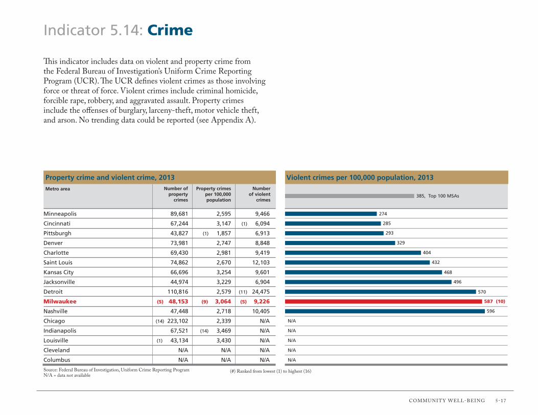
Communit y Well-being 5-17
Indicator 5.14: Crime
This indicator includes data on violent and property crime from the federal bureau of investigation’s uniform Crime Reporting Program (uCR). The uCR defines violent crimes as those involving force or threat of force. Violent crimes include criminal homicide, forcible rape, robbery, and aggravated assault. Property crimes include the offenses of burglary, larceny-theft, motor vehicle theft, and arson. no trending data could be reported (see Appendix A).
Violent crimes per 100,000 population, 2013
Source: federal bureau of investigation, uniform Crime Reporting Programn/A = data not available
274
285
293
329
404
432
468
496
570
587 (10)
596
N/A
N/A
N/A
N/A
N/A
(#) Ranked from lowest (1) to highest (16)
Minneapolis 89,681 2,595 9,466
Cincinnati 67,244 3,147 (1) 6,094
Pittsburgh 43,827 (1) 1,857 6,913
Denver 73,981 2,747 8,848
Charlotte 69,430 2,981 9,419
Saint Louis 74,862 2,670 12,103
Kansas City 66,696 3,254 9,601
Jacksonville 44,974 3,229 6,904
Detroit 110,816 2,579 (11) 24,475
Milwaukee (5) 48,153 (9) 3,064 (5) 9,226
Nashville 47,448 2,718 10,405
Chicago (14) 223,102 2,339 N/A
Indianapolis 67,521 (14) 3,469 N/A
Louisville (1) 43,134 3,430 N/A
Cleveland N/A N/A N/A
Columbus N/A N/A N/A
Number of violent
crimes
Property crime and violent crime, 2013Number of
property crimes
Property crimes per 100,000 population
Metro area
385, Top 100 MSAs

5-18 gReAteR milWAuKee founDAtion | VitAl SignS: benCHmARKing metRo milWAuKee 2015
Indicator 5.15: Road Safety
This indicator includes data from the national Highway traffic Safety Administration on fatalities resulting from a motor vehicle traffic accident. A fatality is counted when a motorist’s or nonmotorist’s death occurs within 30 days of a crash involving at least one motor vehicle in transport. nonmotorists include pedestrians; bicyclists; persons in parked motor vehicles; persons in buildings; and persons traveling by skateboard, wheelchair, animal, or animal-drawn conveyance. This indicator is new to the 2015 report.
Traffic fatalities per 100,000 population, 2012
Source: national Highway traffic Safety Administration, fatality Analysis Reporting System
4.9
4.9
5.4
5.7
7.3
7.5 (6)
8.3
8.3
9.6
9.7
10.0
10.5
10.2
10.9
11.6
13.3
(#) Ranked from lowest (1) to highest (16)
Minneapolis 169 18.9%
Cleveland (1) 102 18.6%
Chicago (16) 513 23.0%
Denver 152 (16) 34.9%
Detroit 313 23.0%
Milwaukee (2) 118 (11) 21.2%
Indianapolis 160 16.9%
Columbus 162 14.2%
Cincinnati 205 (1) 9.3%
Pittsburgh 228 11.4%
Charlotte 229 21.4%
Saint Louis 284 13.0%
Kansas City 215 14.4%
Louisville 137 11.7%
Nashville 201 11.9%
Jacksonville 183 25.7%
Nonmotorists as a percentage of all
traffic fatalities
Traffic fatalities, 2012Total traffic
fatalitiesMetro area
8.0, Top 100 MSAs
2008 2009 2010 2011 2012
9.0
6.0
8.0
5.0
7.0
4.0
3.0
Milwaukee Trends: Traffic fatalities per 100,000 population
5.5 5.8
6.7
5.4
7.5

Communit y Well-being 5-19
Indicator 5.16: Traffic Congestion
This indicator includes data from the texas A&m transportation institute on traffic congestion. Hours of delay per auto commuter is the sum of all extra travel time due to traffic congestion over the course of one year divided by the number of auto commuters. other measures include the percentage of all automobile travel (measured in vehicle-miles traveled, or Vmt) congested during peak hours and the percentage of the freeway system (measured in lane-miles) that is congested during peak hours. The metro area figures below are for Census-defined urban areas within the metro areas. trending data have been revised from the 2013 report (see Appendix A).
Kansas City 23% 23%
Milwaukee (5) 34% (4) 26%
Jacksonville 55% 50%
Cleveland (1) 21% (1) 21%
Saint Louis 31% 25%
Minneapolis 50% 35%
Louisville 57% 49%
Cincinnati 47% 35%
Pittsburgh 25% 34%
Columbus 49% 36%
Detroit 60% 47%
Charlotte 59% 51%
Indianapolis 62% 57%
Denver 72% 59%
Nashville 48% 49%
Chicago (16) 88% (16) 70%
Percentage lane-miles congested
during peak hours
Source: texas A&m transportation institute
Percentage VMT congested during
peak hours
(#) Ranked from lowest (1) to highest (16)
Metro area
Percentage VMT and lane-miles congested during peak hours, 2011
2007 2008 2009 2010 2011
32
26
30
24
28
22
20
Milwaukee Trends: Hours of delay per auto commuter
2928
26
28 28
27
28 (2)
30
31
31
34
35
37
39
40
40
40
41
45
47
Hours of delay per auto commuter, 2011
51
43, Top 100 MSAs

Indicator 5.17: Commute Time
This indicator uses data from the American Community Survey on travel to work times. Commute time is reported for two groups: (1) persons who travel by car (including company cars but excluding taxicabs), truck (of one-ton capacity or less), or van and (2) persons who travel by public transportation (bus or trolley bus, streetcar or trolley car, subway or elevated railway, or ferryboat).
38.3% (1)
39.1%
39.4%
40.1%
42.8%
43.8%
44.0%
44.4%
44.8%
44.9%
45.3%
45.4%
46.4%
47.3%
49.1%
Percentage of workers commuting 25 minutes or longer, 2013
Milwaukee (2) 22.7 (9) 46.4
Kansas City (1) 22.5 39.5
Columbus 23.1 (1) 38.0
Louisville 22.9 40.6
Cincinnati 23.9 41.7
Indianapolis 24.4 40.4
Cleveland 24.0 47.2
Charlotte 25.2 46.1
Minneapolis 24.5 40.7
Saint Louis 24.4 47.1
Jacksonville 25.3 47.5
Pittsburgh 25.5 41.6
Nashville 25.8 48.5
Detroit 26.0 (16) 52.0
Denver 26.0 47.1
Chicago (16) 28.7 48.7
Average commute time by mode, 2013Average commute
time by public transportation
(minutes)
Average commute time by driving alone (minutes)
Source: u.S. Census bureau, American Community Survey
55.7%
(#) Ranked from lowest (1) to highest (16)
Metro area
47.8%, Top 100 MSAs
5-20 gReAteR milWAuKee founDAtion | VitAl SignS: benCHmARKing metRo milWAuKee 2015
2009 2010 2011 2012 2013
40.0%
37.0%
39.0%
36.0%
38.0%
35.0%
34.0%
Milwaukee Trends: Percentage commuting 25 minutes or longer
35.8%
37.0%
38.3%
(2)
38.1% 38.3%
(1)
(#) milwaukee metro area rank from current and previous Vital Signs reports shown in parentheses
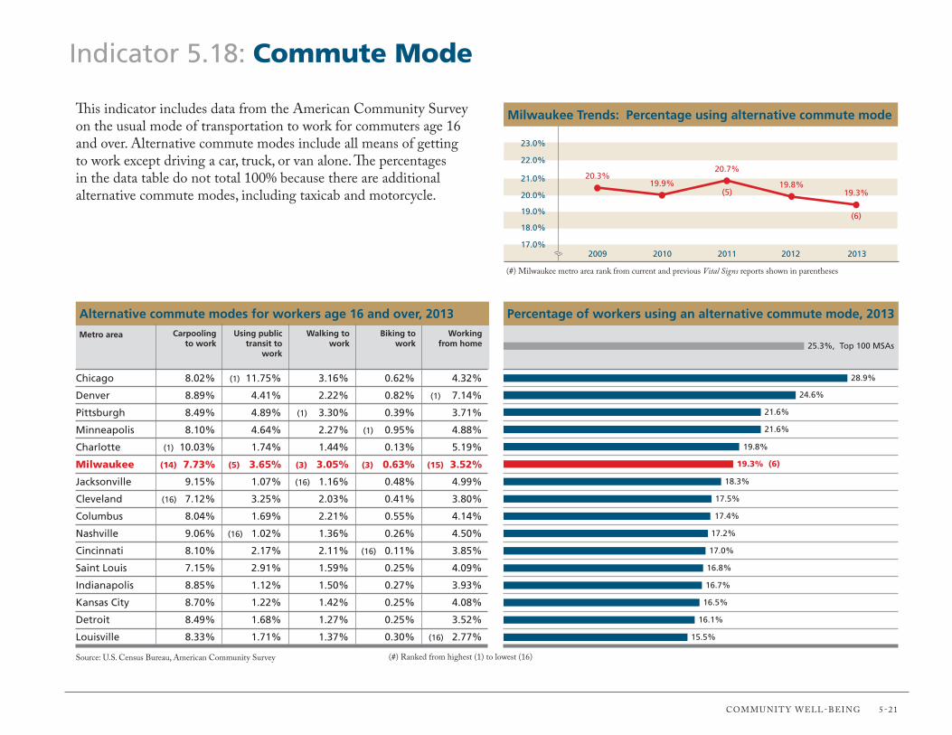
Communit y Well-being 5-21
Indicator 5.18: Commute Mode
This indicator includes data from the American Community Survey on the usual mode of transportation to work for commuters age 16 and over. Alternative commute modes include all means of getting to work except driving a car, truck, or van alone. The percentages in the data table do not total 100% because there are additional alternative commute modes, including taxicab and motorcycle.
28.9%
24.6%
21.6%
21.6%
19.8%
19.3% (6)
18.3%
17.5%
17.4%
17.2%
17.0%
16.8%
16.7%
Percentage of workers using an alternative commute mode, 2013
Chicago 8.02% (1) 11.75% 3.16% 0.62% 4.32%
Denver 8.89% 4.41% 2.22% 0.82% (1) 7.14%
Pittsburgh 8.49% 4.89% (1) 3.30% 0.39% 3.71%
Minneapolis 8.10% 4.64% 2.27% (1) 0.95% 4.88%
Charlotte (1) 10.03% 1.74% 1.44% 0.13% 5.19%
Milwaukee (14) 7.73% (5) 3.65% (3) 3.05% (3) 0.63% (15) 3.52%
Jacksonville 9.15% 1.07% (16) 1.16% 0.48% 4.99%
Cleveland (16) 7.12% 3.25% 2.03% 0.41% 3.80%
Columbus 8.04% 1.69% 2.21% 0.55% 4.14%
Nashville 9.06% (16) 1.02% 1.36% 0.26% 4.50%
Cincinnati 8.10% 2.17% 2.11% (16) 0.11% 3.85%
Saint Louis 7.15% 2.91% 1.59% 0.25% 4.09%
Indianapolis 8.85% 1.12% 1.50% 0.27% 3.93%
Kansas City 8.70% 1.22% 1.42% 0.25% 4.08%
Detroit 8.49% 1.68% 1.27% 0.25% 3.52%
Louisville 8.33% 1.71% 1.37% 0.30% (16) 2.77%
Working from home
Alternative commute modes for workers age 16 and over, 2013
Source: u.S. Census bureau, American Community Survey
16.5%
16.1%
15.5%
(#) Ranked from highest (1) to lowest (16)
Metro area25.3%, Top 100 MSAs
Biking to work
Walking to work
Using public transit to
work
Carpooling to work
2009 2010 2011 2012 2013
23.0%
20.0%
22.0%
19.0%
21.0%
18.0%
17.0%
Milwaukee Trends: Percentage using alternative commute mode
20.3%19.9%
20.7%
(5)19.8%
19.3%
(6)
(#) milwaukee metro area rank from current and previous Vital Signs reports shown in parentheses

5-22 gReAteR milWAuKee founDAtion | VitAl SignS: benCHmARKing metRo milWAuKee 2015
Indicator 5.19: Carbon Footprint
This indicator includes data from the CoolClimate network at the university of California, berkeley, on the average household carbon footprint. it measures carbon dioxide emissions in tons per year. The model includes both direct emissions from the consumption of fossil fuels used to run cars and heat homes as well as indirect emissions embodied in the production of electricity, water, waste, food, goods, and services. Carbon dioxide is a greenhouse gas that contributes to climate change. These data are for metro areas based on June 2003 definitions. no trending data are available. This indicator has been modified from the 2013 report (see Appendix A).
44.6
48.8
49.5
50.2
50.8 (6)
51.1
51.2
51.4
52.7
53.3
53.4
53.7
55.3
55.6
Total average household carbon footprint (tons/year), 2013
Jacksonville 14.62 (1) 11.17 7.61 5.27 5.90
Pittsburgh (1) 13.23 17.13 (1) 7.11 (1) 4.87 (1) 5.43
Charlotte 16.12 13.09 7.65 5.60 6.34
Cleveland 13.86 17.03 7.39 5.26 5.92
Columbus 15.05 16.22 7.38 5.44 6.15
Milwaukee (6) 15.42 (4) 16.15 (6) 7.50 (9) 5.50 (9) 6.22
Cincinnati 15.74 16.28 7.56 5.41 6.09
Louisville 16.17 16.71 7.38 5.15 5.77
Nashville (16) 17.15 15.37 7.49 5.34 6.01
Indianapolis 16.71 16.75 7.51 5.51 6.23
Denver 16.62 16.55 7.56 5.87 6.71
Saint Louis 15.53 18.83 7.56 5.39 6.07
Chicago 15.32 17.53 (16) 8.17 5.95 6.74
Kansas City 15.89 (16) 20.18 7.53 5.51 6.24
Detroit 16.49 18.97 7.77 5.80 6.59
Minneapolis 16.91 18.47 7.67 (16) 6.04 (16) 6.92
Average household carbon footprint (tons/year) by activity, 2013ServicesGoods
Source: university of California, berkeley, CoolClimate network
56.0
Metro area
47.8
(#) Ranked from lowest (1) to highest (16)
48.4, Top 100 MSAs
FoodHousingTransportation

Communit y Well-being 5-23
Indicator 5.20: Air Quality
This indicator includes data from the u.S. environmental Protection Agency’s Air Quality index (AQi). The AQi is used to report the level of pollution in the air, including ground-level ozone, particle pollution, carbon monoxide, sulfur dioxide, and nitrogen dioxide. An AQi between 0 and 50 is considered good air quality. Values between 51 and 100 are considered moderate pollution levels. A value between 101 and 150 is unhealthy for “sensitive groups,” including people with lung disease, older adults, and children. An AQi greater than 150 is considered unhealthy for everyone. These data are for metro areas based on June 2003 definitions.
300
243
239
233
211 (6)
165
156
153
150
136
123
115
109
106
Number of days with good air quality (AQI 0 to 50), 2013
Jacksonville (1) 38 2
Charlotte 42 (T-1) 0
Columbus 43 2
Nashville 45 1
Minneapolis 44 2
Milwaukee (T-5) 45 (T-1) 0
Detroit 52 7
Cincinnati 54 11
Cleveland 55 13
Louisville 53 1
Denver 54 27
Pittsburgh 56 18
Kansas City 58 (16) 42
Saint Louis (T-15) 59 35
Indianapolis (T-15) 59 12
Chicago 58 12
Median AQI and days with unhealthy air quality (AQI >100), 2013*Median AQI
Source: u.S. environmental Protection Agency, Air Quality index Report
88
Metro area
278
(#) Ranked from highest (1) to lowest (16), except (*) ranked lowest (1) to highest (16)
Number of days with unhealthy
air quality (AQI >100)
2009 2010 2011 2012 2013
350
200
300
150
250
100
50
Milwaukee Trends: Number of days with good air quality
278260
207172
(6)
211
(6)
(#) milwaukee metro area rank from current and previous Vital Signs reports shown in parentheses

Indicator 5.21: Green Building
This indicator uses data from the u.S. green building Council on green building certification under the leadership in energy and environmental Design (leeD) rating system. buildings gain leeD certification by demonstrating compliance with requirements for sustainable sites, water efficiency, energy and atmosphere, materials and resources, indoor environmental quality, and innovation and design process. levels of certification can increase from Certified to Silver, gold, and Platinum. These data are for metro areas based on June 2003 definitions. All counts are cumulative.
25.03
15.49
15.17
10.67
9.78 (6)
9.66
9.61
8.17
7.99
6.44
6.20
6.05
5.47
3.37
LEED-certified square footage per capita, 2014
Denver 363 232 67.5
Chicago (1) 925 (1) 398 (1) 204.0
Minneapolis 225 83 52.5
Charlotte 188 79 28.3
Pittsburgh 227 75 25.2
Milwaukee (T-12) 117 (12) 35 (10) 15.4
Cleveland 180 65 19.9
Columbus 147 54 18.3
Cincinnati 166 45 17.6
Nashville 117 42 13.4
Kansas City 119 38 13.4
Jacksonville 92 23 8.6
Indianapolis 79 33 11.0
Saint Louis 153 54 15.5
Louisville (16) 58 (16) 19 (16) 4.4
Detroit 118 25 13.5
LEED certifications and square footage, 2014Total LEED-certified
square footage (millions)
Total LEED certifications of
Gold or above
Source: u.S. green building Council, green building information gateway
3.15
Metro area
21.39
(#) Ranked from highest (1) to lowest (16)
11.45, Top 100 MSAs
Total LEED certifications
5-24 gReAteR milWAuKee founDAtion | VitAl SignS: benCHmARKing metRo milWAuKee 2015
2010 2011 2012 2013 2014
12.00
6.00
10.00
4.00
8.00
2.00
0.00
Milwaukee Trends: LEED-certified square footage per capita
3.044.03
7.10
(5)
8.269.78
(6)
(#) milwaukee metro area rank from current and previous Vital Signs reports shown in parentheses

Data Sources
The following are the web addresses for the data sources used in this report:
2020 Women on Boards, 2020 Gender Diversity Directoryhttp://www.2020wob.com/companies/
American Hospital Association, AHA Hospital Statistics http://ahadata.adagetechnologies.com/book-cd-products/AHA-Statistics/
American Medical Association, Physician Characteristics and Distribution in the U.S.https://commerce.ama-assn.org/store/catalog/
Brookings Institution, Metropolitan Policy Program, Earned Income Tax Credit (EITC) Interactivehttp://www.brookings.edu/research/interactives/eitc
Brookings Institution, Metropolitan Policy Program, Sizing the Clean Economyhttp://www.brookings.edu/about/programs/metro/clean-economy
Chronicle of Philanthropy, How America Giveshttp://philanthropy.com/article/Interactive-Explore-How/149107/#search
Corporation for National and Community Service, Volunteering and Civic Life in America http://www.volunteeringinamerica.gov/rankings.cfm
Council for Community and Economic Research (C2ER) Cost of Living Indexhttp://www.coli.org/
Fortune, Fortune 500http://fortune.com/fortune500/
Geo Lounge, Geography of Fortune 1000 Companies in 2014http://www.geolounge.com/geography-fortune-1000-2014/
Milken Institute, Best-Performing Citieshttp://best-cities.org/bestcities.taf?rankyear=2013&type=large-cities-rankings
National Association of Home Builders, Housing Opportunity Indexhttp://www.nahb.org/en/research/housing-economics/housing-indexes/housing-opportunity-index.aspx
National Governors Association, Current Governorshttp://www.nga.org/cms/governors/bios
National Housing Conference + Center for Housing Policy/Local Initiatives Support Corporation/Urban Institute, Foreclosure-Response.orghttp://www.foreclosure-response.org/
National Science Foundation, Science and Engineering Doctorateshttp://www.nsf.gov/statistics/sed/2013/data-tables.cfm
PricewaterhouseCoopers/National Venture Capital Association, MoneyTree Reporthttp://nvca.org/pressreleases/u-s-venture-capital-investment-spanned-160-cities-2014/
Texas A&M University, Texas A&M Transportation Institute, Urban Mobility Information, Annual Urban Mobility Report http://mobility.tamu.edu/ums/
U.S. Conference of Mayors, Council on Metro Economies and the New American City, “GMP and Employment 2013–2015,” U.S. Metro Economies, June 2014http://www.usmayors.org/metroeconomies/
U.S. Conference of Mayors, Meet the Mayorshttp://usmayors.org/meetmayors/mayorsatglance.asp
U.S. Department of Agriculture, Economic Research Service, Food Environment Atlashttp://www.ers.usda.gov/data-products/food-environment-atlas/data-access-and-documentation-downloads.aspx
U.S. Department of Commerce, Bureau of the Census, American Community Survey 1-Year Estimates http://www.census.gov/acs/www/
U.S. Department of Commerce, Bureau of the Census, Building Permits Surveyhttp://www.census.gov/construction/bps/
U.S. Department of Commerce, Bureau of the Census, Census of Governmentshttp://www.census.gov/govs/cog/
U.S. Department of Commerce, Bureau of the Census, Population Estimateshttp://www.census.gov/popest/data/metro/totals/2013/index.html
U.S. Department of Commerce, Bureau of the Census, Survey of Business Ownershttp://www.census.gov/econ/sbo/
Data SourceS

Greater MILWauKee FouNDatIoN | VItaL SIGNS: BeNcHMarKING Metro MILWauKee 2015
Data Sources
U.S. Department of Commerce, International Trade Administration, Office of Trade Policy & Analysis, Metropolitan Export Serieshttp://www.trade.gov/mas/ian/metroreport/index.asp
U.S. Department of Commerce, U.S. Patent and Trademark Office, Patent Technology Monitoring Team, General Patent Statistics Reportshttp://www.uspto.gov/web/offices/ac/ido/oeip/taf/reports_cbsa.htm
U.S. Department of Education, Institute of Education Sciences, National Center for Education Statistics, Common Core of Datahttp://nces.ed.gov/ccd/
U.S. Department of Health and Human Services, Centers for Disease Control and Prevention, National Center for Health Statistics, National Vital Statistics System, Linked Birth and Infant Death Datahttp://www.cdc.gov/nchs/linked.htm
U.S. Department of Health and Human Services, Centers for Disease Control and Prevention, Office of Surveillance, Epidemiology, and Laboratory Services, Public Health Surveillance Program, Behavioral Risk Factor Surveillance System, Selected Metropolitan/Micropolitan Area Risk Trendshttp://apps.nccd.cdc.gov/brfss-smart/index.asp
U.S. Department of Justice, Federal Bureau of Investigation, Uniform Crime Reporting Program, Crime in the United Stateshttp://www.fbi.gov/about-us/cjis/ucr
U.S. Department of Labor, Bureau of Labor Statistics, Current Employment Statisticshttp://www.bls.gov/sae/home.htm
U.S. Department of Labor, Bureau of Labor Statistics, Local Area Unemployment Statisticshttp://www.bls.gov/lau/home.htm
U.S. Department of Labor, Bureau of Labor Statistics, Occupational Employment Statisticshttp://www.bls.gov/oes/home.htm
U.S. Department of Transportation, National Highway Traffic Safety Administration, Fatality Analysis Reporting Systemhttp://www-fars.nhtsa.dot.gov/Main/index.aspx
U.S. Environmental Protection Agency, Office of Air Quality Planning and Standards, Air Quality Analysis Group, AirData, Air Quality Index Reporthttp://www.epa.gov/airdata/ad_rep_aqi.html
U.S. Green Building Council, Green Building Information Gateway http://www.gbig.org/
U.S. House of Representatives, Directory of Representativeshttp://www.house.gov/representatives/
U.S. Senate, Senators of the 114th Congresshttp://www.senate.gov/general/contact_information/senators_cfm.cfm
U.S. Small Business Administration, Office of Advocacyhttp://archive.sba.gov/advo/research/data.html
University of California, Berkeley; CoolClimate Networkhttp://coolclimate.berkeley.edu/data
University of Michigan, Population Studies Centerhttp://www.psc.isr.umich.edu/dis/census/segregation2010.html
The following are the web addresses for the data sources used in this report:

Appendix A: Indicator Changes and Caveats
Section 1: Population Vitality 1.01 Population Growth Modified indicator. In the previous report, the primary indicator for this topic was the percentage of population change over five years, based on
2003 MSa geographies. The primary indicator was changed for the 2015 report to the percentage of population change over three years because the census Bureau used 2013 MSa geographies, which are only measured back to 2010.
1.02 Birth rate 1.03 Foreign-born Population 1.04 race and ethnicity 1.05 residential Segregation 1.06 child Population 1.07 Senior Population 1.08 Median age1.09 Households 1.10 Same-sex couples
Section 2: Economic Strength 2.01 Industry Sector employment 2.02 employment change by Industry 2.03 High-tech Industries 2.04 Patents 2.05 entrepreneurship 2.06 Fortune 1000 companies In the previous report, the data source was cNNMoney.com’s Fortune 500+ web application, which has not been updated. 2.07 Venture capital New indicator2.08 Business Firms 2.09 Small Business Firms 2.10 Small Business Startups 2.11 Minority Business ownership 2.12 Women’s Business ownership Previously called “Female Business ownership” 2.13 Gross Metropolitan Product 2.14 exports 2.15 Income and Wages 2.16 occupations 2.17 Workforce 2.18 creative Jobs 2.19 Green Jobs 2.20 unemployment 2.21 Brain Gain Modified indicator. In the previous report, the primary indicator for this topic was the percentage of new residents age 25 and older with a graduate
degree. The primary indicator was changed for the 2015 report to the number of new residents age 25 and older with a graduate degree per 100,000 population.
Indicator Description of changes and caveats No.
aPPeNDIx a

Appendix A
Section 3: Personal Prosperity 3.01 Household Income 3.02 Income $75,000 and above 3.03 Income Gap 3.04 Pay equity Modified indicator. In the previous report, the primary indicator for this topic was the ratio of women’s median income to men’s median income
for the population age 16 and older working full-time, year round. The primary indicator was changed for the 2015 report to the ratio of women’s median earnings to men’s median earnings for the population age 16 and older working full-time, year round.
3.06 Poverty 3.05 Low Income Previously called “Self-sufficiency Income” 3.07 Income Supports 3.08 earned Income tax credit New indicator3.09 teen Pregnancy 3.10 Parental employment3.11 New Housing Starts 3.12 Homeownership 3.13 Foreclosures Modified indicator. In the previous report, the primary indicator for this topic was the number of housing units per foreclosure. These data were
from the realtytrac u.S. Metropolitan Foreclosure Market report. The data source and primary indicator were changed to Foreclosure-response.org and the percentage of all home mortgage loans 90 or more days delinquent or in foreclosure.
3.14 owner Housing affordability 3.15 renter Housing affordability
Section 4: Lifelong Learning4.01 educational attainment 4.02 english Language Modified indicator. In the previous report, the primary indicator for this topic was the percentage of the population age 5 and older who speak
english “very well.” The primary indicator was changed for the 2015 report to the percentage of non-english speakers (those who speak a language other than english at home) age 5 and older who speak english “very well.”
4.03 Pre-K enrollment4.04 School Lunch assistance 4.05 High School attendance4.06 Higher education enrollment Modified indicator. In the previous report, the primary indicator for this topic was the number of 18- to 24-year-olds enrolled in higher education
per 1,000 population. The primary indicator was changed for the 2015 report to the total higher education enrollment per 1,000 population.4.07 research Doctorates Previously called “research universities”
Indicator Description of changes and caveats No.
Greater MILWauKee FouNDatIoN | VItaL SIGNS: BeNcHMarKING Metro MILWauKee 2015

aPPeNDIx a
Appendix A
Section 5: Community Well-being5.01 Local Foods Modified indicator. In the previous report, the primary indicator for this topic was the percentage of local farms with direct sales to final consumers,
an indicator that the u.S. Department of agriculture (uSDa) updates only once every five years. The primary indicator was changed for the 2015 report to the number of local farmers’ markets per 1,000,000 population, a figure the uSDa updates annually.
5.02 obesity5.03 Diabetes 5.04 Smoking 5.05 Infant Mortality 5.06 Health Insurance Modified indicator. Previously called “Health care.” In the previous report, the primary indicator for this topic was the percentage of adults with
any kind of health care coverage. These data were from the Behavioral risk Factor Surveillance System. The data source and primary indicator were changed for the 2015 report to the american community Survey and the percentage of the civilian noninstitutionalized population with health insurance.
5.07 Hospitals and Physicians 5.08 charitable Giving Modified indicator. Previously called “charitable contributions.” In the previous report, the primary indicator for this topic was the amount of
contributions per capita to local nonprofit public charities. These data were from the urban Institute’s National center for charitable Statistics. The data source and primary indicator were changed for the 2015 report to the corporation for National & community Service and the percentage of adults who reported donating money, assets, or property with a combined value of more than $25 to charitable or religious organizations in the prior year.
5.09 Volunteering 5.10 Local Government 5.11 Diversity in Political Leadership Modified indicator. In the previous report, the primary indicator for this topic was the number of major public officials who publicly identify with
a racial identity other than White or as Hispanic or Latino of any race. The primary indicator was changed for the 2015 report to the percentage of major public officials who publicly identify with a racial identity other than White or as Hispanic or Latino of any race.
5.12 Women in Political Leadership Modified indicator. In the previous report the primary indicator for this topic was the number of major public officials who are women. The primary indicator was changed for the 2015 report to the percentage of major public officials who are women.
5.13 Women in corporate Leadership New indicator.5.14 crime Because of a change in the Milwaukee Police Department’s reporting of violent crimes, current crime data are not comparable to previous
years. 5.15 road Safety New indicator.5.16 traffic congestion Because of a change in methodology, the texas a&M transportation Institute revised the traffic congestion data for previous years.5.17 commute time 5.18 commute Mode5.19 carbon Footprint Modified indicator. Previously called “energy use.” In the previous report, the primary indicator for this topic was the average carbon footprint per
capita, which considered only direct carbon emissions. These data were from the Brookings Institution and have not been updated. The data source and primary indicator were changed for the 2015 report to the coolclimate Network at the university of california, Berkeley, and the average household carbon footprint, which considers both direct and indirect emissions.
5.20 air Quality 5.21 Green Building
Indicator Description of changes and caveats No.

Greater MILWauKee FouNDatIoN | VItaL SIGNS: BeNcHMarKING Metro MILWauKee 2015
Appendix B The following are descriptions for industry sectors used in Indicators 2.01 and 2.02: • Professional and business services: professional, scientific, and technical services,
management of companies and enterprises, and administrative and routine support services
• Financial activities: the finance and insurance sector and the real estate and rental and leasing sectors
• Information: publishing, motion picture and sound recording, broadcasting, telecommunications, Internet service providers and web search portals, data processing, and information services
• Government: publicly owned establishments, including federal, state, and local government; public schools; and public hospitals
• Education and health services: the educational services sector (schools, colleges, universities, and training centers) and the health and social assistance sector (health care and social assistance for individuals)
• Transportation and utilities: industries providing transportation of passengers and cargo; warehousing and storage of goods; and provision of utility services (electric, gas, water, sewer)
• Retail trade: establishments engaged in retailing merchandise and rendering services incidental to the sale of merchandise
• Wholesale trade: establishments engaged in selling merchandise for resale, capital or durable nonconsumer goods, and raw and intermediate materials and supplies used in production
• Leisure and hospitality: includes the arts, entertainment, and recreation sector and the accommodation and food services sector
• Manufacturing: establishments engaged in the mechanical, physical, or chemical transformation of materials, substances, or components into new products
The following are descriptions for occupational categories used in Indicator 2.18:
• Arts jobs: actors; art directors; postsecondary art, drama, and music teachers; broadcast news analysts; choreographers; craft artists; curators; dancers; fine artists (including painters, sculptors, and illustrators); multimedia artists and animators; music directors and composers; musicians and singers; photographers, producers, and directors; reporters and correspondents; writers and authors; and all other artists, entertainers, performers and related workers
• Design jobs: architects, postsecondary architecture teachers, cartographers and photogrammetrists, commercial and industrial designers, fashion designers, floral designers, graphic designers, interior designers, landscape architects, merchandise displayers and window trimmers, set and exhibit designers, and all other designers
• Marketing and strategy jobs: advertising and promotions managers, marketing managers, public relations and fundraising managers, public relations specialists, survey researchers, and urban and regional planners

Charlotte
Chicago
Cincinnati
Cleveland
Columbus
Denver
Detroit
Indianapolis
Jacksonville
Kansas City
Louisville
Milwaukee
Minneapolis
Nashville
Pittsburgh
Saint Louis
Benchmarking Metro Areas, June 2003 Definitions
U.S. Census Bureau MSAMetro Area
Charlotte-Gastonia-Rock Hill, NC-SC
Chicago-Joliet-Naperville, IL-IN-WI
Cincinnati-Middletown, OH-KY-IN
Cleveland-Elyria-Mentor, OH
Columbus, OH
Denver-Aurora-Broomfield, CO
Detroit-Warren-Livonia, MI
Indianapolis-Carmel, IN
Jacksonville, FL
Kansas City, MO-KS
Louisville/Jefferson County, KY-IN
Milwaukee-Waukesha-West Allis, WI
Minneapolis-St. Paul-Bloomington, MN-WI
Nashville-Davidson-Murfreesboro-Franklin, TN
Pittsburgh, PA
St. Louis, MO-IL
Anson, Cabarrus, Gaston, Mecklenburg, Union, NC; York, SC
Cook, DeKalb, DuPage, Grundy, Kane, Kendall, Lake, McHenry, Will, IL; Jasper, Lake, Newton, Porter, IN; Kenosha, WI
Brown, Butler, Clermont, Hamilton, Warren, OH; Boone , Bracken, Campbell, Gallatin, Grant, Kenton, Pendleton, KY; Dearborn, Franklin, Ohio, IN
Cuyahoga, Geauga, Lake, Lorain, Medina, OH
Delaware, Fairfield, Franklin, Licking, Madison, Morrow, Pickaway, Union, OH
Adams, Arapahoe, Broomfield, Clear Creek, Denver, Douglas, Elbert, Gilpin, Jefferson, Park, CO
Lapeer, Livingston, Macomb, Oakland, St. Clair, Wayne, MI
Boone, Brown, Hamilton, Hancock, Hendricks, Johnson, Marion, Morgan, Putnam, Shelby, IN
Baker, Clay, Duval, Nassau, St. Johns, FL
Bates, Caldwell, Cass, Clay, Clinton, Jackson, Lafayette, Platte, Ray, MO; Franklin, Johnson, Leavenworth, Linn, Miami, Wyandotte, KS
Bullitt, Henry, Jefferson, Meade, Nelson, Oldham, Shelby, Spencer, Trimble, KY; Clark, Floyd, Harrison, Washington, IN
Milwaukee, Ozaukee, Washington, Waukesha, WI
Anoka, Carver, Chisago, Dakota, Hennepin, Isanti, Ramsey, Scott, Sherburne, Washington, Wright, MN; Pierce, St. Croix, WI
Cannon, Cheatham, Davidson, Dickson, Hickman, Macon, Robertson, Rutherford, Smith, Sumner, Trousdale, Williamson, Wilson, TN
Allegheny, Armstrong, Beaver, Butler, Fayette, Washington, Westmoreland, PA
Franklin, Jefferson, Lincoln, St. Charles, St. Louis, St. Louis (city), Warren, Washington, MO; Bond, Calhoun, Clinton, Jersey, Macoupin, Madison, Monroe, St. Clair, IL
Component counties and county equivalents
Appendix C
Appendix C
note: Most of the indicators in this report use the February 2013 metro area definitions. For those definitions, see the introduction, page iii.

Greater Milwaukee Foundation101 West Pleasant Street, Suite 210Milwaukee, Wisconsin 53212(414) 272-5805
www.greatermilwaukeefoundation.org
United Way of Greater Milwaukee & Waukesha County225 West Vine Street Milwaukee, Wisconsin 53212(414) 263-8100
www.unitedwaygmwc.org
Greater Milwaukee Committee247 Freshwater Way, Suite 400 Milwaukee, Wisconsin 53204(414) 272-0588
www.gmconline.org
Community Research Partners399 East Main Street, Suite 100Columbus, Ohio 43215(614) 224-5917
www.researchpartners.org
COMMUNITYReSeARCh
PARTNERS