visualizing multidimensional query results using animation · 2008-01-07 · visualizing...
TRANSCRIPT

Visualizing Multidimensional Query Results Using Animation
Amit P. Sawanta and Christopher G. Healeyb
a, bNorth Carolina State University, Department of Computer Science, Raleigh, NC, USA
ABSTRACT
Effective representation of large, complex collections of information (datasets) presents a difficult challenge. Visualizationis a solution that uses a visual interface to support efficient analysis and discovery within the data. Our primary goalin this paper is a technique that allows viewers to compare multiplequery resultsrepresenting user-selected subsets ofa multidimensional dataset. We present an algorithm that visualizes multidimensional information along a space-fillingspiral. Graphical glyphs that vary their position, color, and texture appearance are used to represent attribute values for thedata elements in each query result. Guidelines from human perception allow us to construct glyphs that are specificallydesigned to support exploration, facilitate the discovery of trends and relationships both within and between data elements,and highlight exceptions. A clustering algorithm applied to a user-chosen ranking attribute bundles together similar dataelements. This encapsulation is used to show relationships across different queries via animations that morph betweenquery results. We apply our techniques to the MovieLens recommender system, to demonstrate their applicability in areal-world environment, and then conclude with a simple validation experiment to identify the strengths and limitations ofour design, compared to a traditional side-by-side visualization.
Keywords: animation, color, information visualization, motion, perception, scientific visualization, texture
1. INTRODUCTION
Visualization is an area of computer graphics that presents information in a visual form to facilitate rapid, effective, andmeaningful analysis and interpretation. Example application domains include scientific simulations, land and satelliteweather information, geographic information systems, and molecular biology. Visualization is also used in more abstractsettings, for example, software engineering, data mining, and network security. A key challenge is designing visualizationsthat are effective for the user’s data and analysis tasks. Our approach constructs visual representations that harness thestrengths of the low-level human visual system. These perceptual visualizations display the data in ways that allow itemsof interest to capture the user’s focus of attention.
Due in large part to a rapid increase in the size of the average dataset, the time per element needed to analyze the datais often critical. The desire to extract knowledge efficiently motivates the need for an effective visualization system. Adataset’s size is made up of three related properties: (1) the number of elements stored in the dataset; (2) the number ofattributes represented within the dataset; and (3) the range of values possible for each attribute. The information contentof a visualization is a combination of these same properties: the number of elements, the number of attribute values perelement, and the range of different attribute values being visualized. The new technique described in this paper seeks toincrease information content by focusing on the last two properties, dimensionality and range.
In our work, “query results” refers to collections of data elements that form subsets of the original dataset. How theresults are generated is independent of our visualization algorithm. They can come from direct queries into a dataset (e.g.,via SQL queries on a relational database), or from other methods of data filtering or data selection (e.g., via mathematical,spatial, or temporal filters applied to a scientific dataset). Based on a common need to visualize relationships both withinand between queries, we identified three important goals for our research:
1. Design graphical glyphs that support flexibility in their placement, and in their ability to represent multidimensionaldata elements.
2. Build effective visualization techniques that uses the glyphs to represent results from queries on a multidimensionaldataset.
Further author information: Amit P. Sawant, E-mail: [email protected], Christopher G. Healey, E-mail: [email protected]

3. Highlight similarities and differences between different queries using animation.
Our intent is to show not just the intersection of multiple query results, but also specific details about similarities anddifferences in the underlying structure of the results. This information can be critical to understanding how the originalqueries are themselves related. To our knowledge, the combination of multidimensional display techniques, perception,and animation for direct comparison of different perspectives into a dataset represents a useful and novel contribution tothe field.
1.1. Design
Our visualization algorithm consists of two basic stages:
1. Select effective visualizations for individual query results.
2. Visualize correspondence between query results.
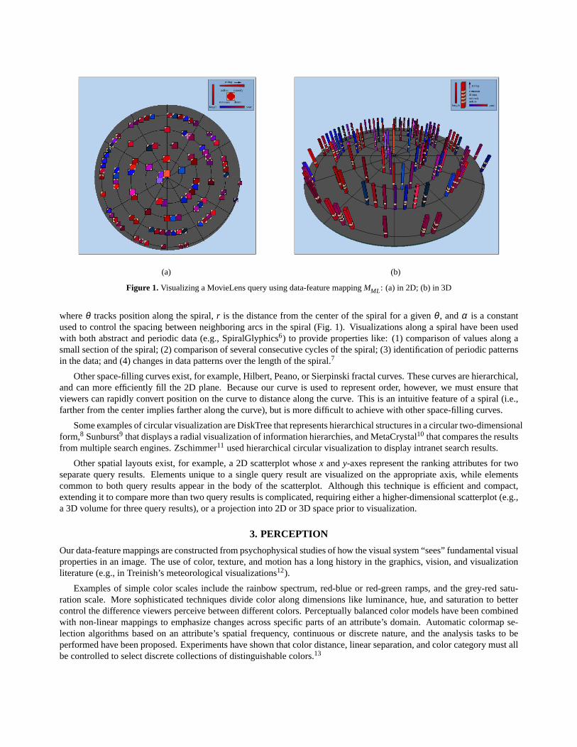
We display query results using a data-feature mapping that defines a visual feature to use to represent each data attribute.The mapping controls the appearance of a geometric glyph through the attribute values of the data element it visualizes. Ourmappings are built using experimental results that describe how the human visual system perceives different color, texture,and motion properties. Glyphs are positioned along a spiral embedded in a plane based on a scalar ranking attribute. Thevalue of the ranking attribute decreases as glyphs move away from the center of the spiral.
Correspondence between queries is represented with animations that morph between pairs of query results. A clusteringalgorithm identifies groups of spatially neighboring glyphs that are common across the queries. This technique allows aviewer to see both the similarities and the differences between different query results. Groups of glyphs are moved insequence to highlight elements that maintain their relative ranking with one another. This is important, since ranking isassumed to be an attribute of significant interest to the viewer.
We used the MovieLens recommender system (http://movielens.umn.edu) as a practical testbed for our tech-niques.1 Graduate students in our laboratory were asked to rate movies that they have seen. Based on this information,MovieLens matches their ratings with other users in the database. The resulting profile allows MovieLens to suggestmovies that the students have not seen, but would probably like. We used these recommendations, together with a varietyof additional information about each movie, as input to our visualization system. This allows students to see their recom-mendations, and to compare them with recommendations for their friends. We conducted a simple validation experimentwithin this real-world environment, to compare our animated design to a more traditional side-by-side visualization ofdifferent recommendations. Results showed that our design was as good or better than a side-by-side visualization for fourof the five tasks we studied.
2. INFORMATION VISUALIZATION
The basic steps in visualizing information are: (1) convert the raw data to a data table; (2) map the data table to a visualstructure; (3) apply view transformations to increase the amount of data that can be visualized; and (4) allow user interactionwith the mapping and the visual structures to create an information workspace for visual sense making.2 A number of well-known techniques exist for visualizing non-spatial datasets. These can be roughly classified as geometric projection, iconicdisplay, hierarchical, graph-based, pixel-oriented and dynamic.3,4 We decided a dynamic iconic display was most relevantto our goal of visualizing relationships between multidimensional query results. An iconic display is used to representpatterns within each query result. A dynamic animation is used to highlight similarities and differences between queries.
2.1. Visualizing Along a Spiral
A one-dimensional ordering is imposed on the data elements through a user-selected scalar attribute, or “ranking” attribute.We needed a way to map this ordering to a 2D spatial position for each element. We chose to use a 2D space-filling spiralto satisfy this requirement. Our algorithm is based on a technique introduced by Carlis and Konstan to display data alongan Archimedean spiral,5 represented in its polar form as:
r = αθx = r cosθy = r sinθ
0≤ θ ≤ θmax (1)
(a) (b)
Figure 1. Visualizing a MovieLens query using data-feature mappingMML: (a) in 2D; (b) in 3D
whereθ tracks position along the spiral,r is the distance from the center of the spiral for a givenθ , andα is a constantused to control the spacing between neighboring arcs in the spiral (Fig. 1). Visualizations along a spiral have been usedwith both abstract and periodic data (e.g., SpiralGlyphics6) to provide properties like: (1) comparison of values along asmall section of the spiral; (2) comparison of several consecutive cycles of the spiral; (3) identification of periodic patternsin the data; and (4) changes in data patterns over the length of the spiral.7
Other space-filling curves exist, for example, Hilbert, Peano, or Sierpinski fractal curves. These curves are hierarchical,and can more efficiently fill the 2D plane. Because our curve is used to represent order, however, we must ensure thatviewers can rapidly convert position on the curve to distance along the curve. This is an intuitive feature of a spiral (i.e.,farther from the center implies farther along the curve), but is more difficult to achieve with other space-filling curves.
Some examples of circular visualization are DiskTree that represents hierarchical structures in a circular two-dimensionalform,8 Sunburst9 that displays a radial visualization of information hierarchies, and MetaCrystal10 that compares the resultsfrom multiple search engines. Zschimmer11 used hierarchical circular visualization to display intranet search results.
Other spatial layouts exist, for example, a 2D scatterplot whosex andy-axes represent the ranking attributes for twoseparate query results. Elements unique to a single query result are visualized on the appropriate axis, while elementscommon to both query results appear in the body of the scatterplot. Although this technique is efficient and compact,extending it to compare more than two query results is complicated, requiring either a higher-dimensional scatterplot (e.g.,a 3D volume for three query results), or a projection into 2D or 3D space prior to visualization.
3. PERCEPTION
Our data-feature mappings are constructed from psychophysical studies of how the visual system “sees” fundamental visualproperties in an image. The use of color, texture, and motion has a long history in the graphics, vision, and visualizationliterature (e.g., in Treinish’s meteorological visualizations12).
Examples of simple color scales include the rainbow spectrum, red-blue or red-green ramps, and the grey-red satu-ration scale. More sophisticated techniques divide color along dimensions like luminance, hue, and saturation to bettercontrol the difference viewers perceive between different colors. Perceptually balanced color models have been combinedwith non-linear mappings to emphasize changes across specific parts of an attribute’s domain. Automatic colormap se-lection algorithms based on an attribute’s spatial frequency, continuous or discrete nature, and the analysis tasks to beperformed have been proposed. Experiments have shown that color distance, linear separation, and color category must allbe controlled to select discrete collections of distinguishable colors.13

Texture is often viewed as a single visual feature. Like color, however, it can be decomposed into a collection offundamental perceptual dimensions. One promising approach in visualization is the use of perceptual texture dimensionsto represent multiple data attributes. Individual values of an attribute control its corresponding texture dimension. Theresult is a texture pattern that changes its visual appearance based on data in the underlying dataset. Examples of perceptualdimensions include properties like size, density, orientation, and regularity of placement.13,14
A third visual feature we use is motion. Basic motion patterns are processed very rapidly by the low-level visualsystem.15 Perceptual dimensions of motion like flicker, direction, and velocity have been studied in the psychophysicalliterature, and are now being used for notification in real-time systems,16 for cognitive grouping of elements,17 and forvisualizing multiple independent data attributes.
We are particularly interested in applying motion through animations that visualize correspondence between queryresults. Researchers have demonstrated how animations can improve a visualization. Yee et al. explored trees by placinga user-selected node at the center of the screen, with child and parent nodes arranged in concentric circles around it.18 Asviewers choose new nodes to study, differences are introduced as a smooth, animated transition of nodes and edges fromtheir current to their new locations. Robertson et al. animated relationships between user-selected nodes embedded withindata hierarchies.19 User studies confirmed that viewers’ performance and preferences favored animation for transitioningbetween different hierarchies. Krasser et al. combined parallel coordinate plots with the animation of scatterplots toexamine 2D and 3D coordinated displays that provide insight into network activity.20
Our visualization designs choose visual features that are highly salient, both in isolation and in combination. We mapthe features to individual data attributes in ways that draw a viewer’s focus of attention to important areas in a visualization.The ability to harness the low-level human visual system is attractive, since:
• high-level exploration and analysis tasks are rapid and accurate, usually requiring 200 milliseconds or less to com-plete,
• analysis is display size insensitive, so the time to perform a task is independent of the number of elements in thedisplay, and
• different features can interact with one another to mask information; psychophysical experiments allow us to identifyand avoid these visual interference patterns.
We have combined our experimental results into a visualization assistant called ViA.21 ViA employs mixed initiative AItechniques that use information about a dataset and a list of perceptual guidelines to search intelligently the space ofall possible visualizations for the specific visualizations that are best-suited to the user’s data and analysis needs. ViAsuggested the initial data-feature mappings we used. These mappings were then extended to support an animated methodof comparing pairs of query results.
4. ANIMATION
Animation in computer graphics is a sequence of static images taken at small, discrete intervals of time and displayedat a speed fast enough to form the impression of smooth motion. A more theoretical description defines animation as achange function used to produce a successor image from a current image.7 Traditional computer animation techniques arecommon in visualization, for example, camera animations to zoom, spin, pan and track along a path inside a dataset. Thistype of animation is defined with the start and end positions of the camera, the path through the dataset, the number offrames to be displayed, the duration of the animation, the intermediate states to be highlighted in each step, and so on.22
This same technique (with possibly fewer view parameters changing) is used to visualize temporal properties of a dataset.Finally, individual data elements can be animated to visualize the values of the attributes they encode.16,23
The static visualizations we produce represent data elements as glyphs whose color, texture, and position vary basedon an element’s specific attribute values. Our visualization can be viewed as a graph, where glyphs represent nodes andsubsets of the spiral between pairs of glyphs represent edges. This formalism is useful, because it allows us to apply graphanimation techniques to highlight the similarities and differences between pairs of visualizations.

5. VISUALIZATION DESIGN
Our visualizations were designed by first constructing an object to represent a single data element. Next, the objects arepositioned to produce a static visualization of a single query result. Finally, an animation step is used morph between pairsof query results to highlight their similarities and differences.
5.1. Visualizing Data Elements
We designed both a 2D and 3D glyph (a square and a tower, respectively) to represent a data element (Fig. 1). A data-feature mapping built from our perceptual guidelines defines which visual feature to use to display values for a particularattribute. Our glyphs can vary different color and texture properties, including hue, luminance, size (or height for the 3Dglyph), spatial density, and regularity of placement. A glyph uses the attribute values of the data element it represents toselect specific values of the visual features to display.
There are many different objects we could have selected to represent our data elements, ranging from pixels,4 throughbasic 2D shapes,13,14and on to more complex 3D objects. Although 2D glyphs are “simpler”, a 3D glyph may be better forrepresenting multiple attribute values in certain situations, since it offers more surface area on which to place information.Psychophysical experiments have shown that viewers can properly identify and compare color and texture properties of 3Dobjects, as long as they are perceived as being displayed in a 3D environment.13,24 Visualizing glyphs on an underlyingplane is used to reinforce this perception. Overlap or occlusion is a problem for both types of glyphs, particularly whenmany data elements are being visualized. Our glyphs vary their positions slightly to try to minimize their overlap withone another. The heights of the 3D glyphs decrease as they move away from the center of the spiral, further reducing thepossibility of outer glyphs occluding inner ones.
5.2. Visualizing Query Results
Once glyphs are built for each data element in a query result, they must be positioned along an underlying spiral. The valueof a user-selected scalar attributeAr defines a glyph’s position. GivenAr,min ≤ ar ≤ Ar,max for all ar ∈ Ar , an elementei
with a ranking attribute valuear,i will have its glyph located at an(x,y) position defined by Eq. 1, where:
θ =Ar,max−ar,i
Ar,max−Ar,minθmax (2)
In other words, elements with high ranking values are positioned near the center of the spiral, while elements with lowranking values are positioned near the periphery.
5.3. Animating Pairs of Query Results
We use animation to morph between pairs of query resultsQ1 andQ2. Our animations are designed to visually identifyneighbors that maintain their relative positions (i.e., their relative ranking with one another) along the spiral. The animationconsists of three phases. We begin by displaying results fromQ1 using our visualization technique for individual queryresults. We then gradually remove glyphs that are not present inQ2. Next, the remaining glyphs that are common to bothqueries move to their new positions as defined byQ2. Clusters of glyphs that maintain their spatial neighborhood with oneanother move first, followed by individual glyphs that are not part of any shared cluster. Each move is animated over 900milliseconds (i.e., approximately one second). Finally, glyphs that are present only inQ2 gradually appear.
We explored different ways to build the paths the glyphs follow as they move from their starting position to their endingposition. In particular, we investigated: (1) straight linear paths, (2) angular polar paths, (3) angular B-Spline paths, and (4)equal arc B-Spline paths. A straight linear path (i.e., a linear interpolation of Cartesian coordinates) often crossed the spiralnumerous times along its length. This can produce collisions between moving and stationary glyphs. Collisions are visuallydisruptive, with viewers sometimes being confused about which glyph entered and which glyph left a collision location. Anangular polar path (i.e., a linear interpolation of polar coordinates) produced fewer collisions, but did not generate smoothanimations. Interpolating angular values can produce non-uniform distances between steps, which results in non-uniformvelocities along the animation path. We observed similar problems with angular B-Spline paths. We therefore chose to usean equal arc B-Spline path (i.e., a spline path divided into steps of uniform arc length), since it returns a smooth animationand minimizes collisions between glyphs.

5.4. Clustering
We applied a simple segmentation algorithm to partition a query result into clusters based on the user-chosen rankingattribute. All the elements in a cluster have “similar” ranking values. Two elements are said to be similar if the differencebetween their ranking attribute values is less than or equal to a user-chosen thresholdε.
Given ranking attributeAr , our clustering algorithm proceeds as follows:
1. Array the elementsei along the spiral based on their ranking attribute valuesai,r .
2. From the remaining elements that are not part of any cluster, choose the elemente1 closest to the center of the spiral.
3. Set a median ranking valuem for the new cluster toa1,r .
4. Choose the next non-clustered elementei that is closest on the spiral toe1. If |ai,r −m| ≤ ε for some user-chosenthresholdε, addei to the cluster and update the cluster’s median.
5. Continue until no more elements can be added to the cluster.
6. Repeat until every element in the query result has been assigned to a cluster.
The algorithm grows each cluster around a starting element. A new elementei is accepted if its ranking valueai,r is withina user-chosen thresholdε to the cluster’s median valuem, |ai,r −m| ≤ ε. ε is fixed whereasm is updated as new elementsare added. The granularity of the clusters depend onε, and on the method used to update the median value. We use themedian update method:
m=1
∑k−1x=0 wx
[w0a1,r +w1a2,r + ...+wk−1ak,r ] (3)
w is used to control how new elements affect the median value. On the range 0< w< 1, the maximum possible contributionof each new element is monotonically decreasing. Elements that are added to the cluster later in the process have a smallerand smaller influence on the median value. This allowsm to stabilize after the initial elements are added, and ensuresthat the cluster cannot grow in size without bound. We usedw = 7
8 to produce a good balance between each new elementhaving too much or too little impact on the median.
6. VISUALIZING MOVIE DATA
In order to test our system on a real dataset, we turned to the application that originally motivated our investigation:visualizing relationships within and between queries to the MovieLens recommender system.
6.1. Data Collection
MovieLens is a web-based recommender system for movies, built on collaborative filtering algorithms, and run by theGroupLens Research Group in the Department of Computer Science and Engineering at the University of Minnesota.MovieLens uses an experimental data source containing thousands of movies as a framework for studying user interfaceissues related to recommender systems.
MovieLens works as follows: users tell MovieLens about movies they have seen by providing a rating of each movie ona scale from one to five. One means a user did not like the movie at all, and five means a user liked the movie a lot. Once asufficient number of ratings are provided, MovieLens builds a profile of a user’s movie preferences. This profile is enteredinto a database, and matched against existing profiles to identify other users who share similar interests in movies. Oncematches are found, MovieLens can recommend movies that the other users have seen and liked, but that the current userhas not seen. This results in suggestions that are tailored to the personal tastes of a user. MovieLens includes a predicteduser ratingfor each movie it recommends. This is MovieLens’s estimate of how the current user would rate the movie ifhe or she had already seen it.
Graduate students from our laboratory volunteered to rate movies that they have seen. We used their profiles to producemultiple recommendations from MovieLens. MovieLens returns a movie’stitle, its genreand a predicteduser rating. We
augmented each recommendation with information taken from the Internet Movie Database∗ (IMDB) to include theyearthe movie was released, thelengthof the movie in minutes, and theIMDB rating of the movie.
MovieLens’s predicteduser ratingfalls along a nine-point scale ranging from 1 to 5 in12 point steps. We increased the
granularity of this result by first extending MovieLens’s predicteduser ratingto the range 1 to 10, then weighting it by theIMDB rating. The IMDB rating is the average of all IMDB users who have rated a particular movie. It ranges from 1 to10 in 1
10 point steps. The result is a predicteduser ratingover the range 1 to 100, with values rounded to produce a total of1000 discrete steps.
6.2. Data-Feature Mappings
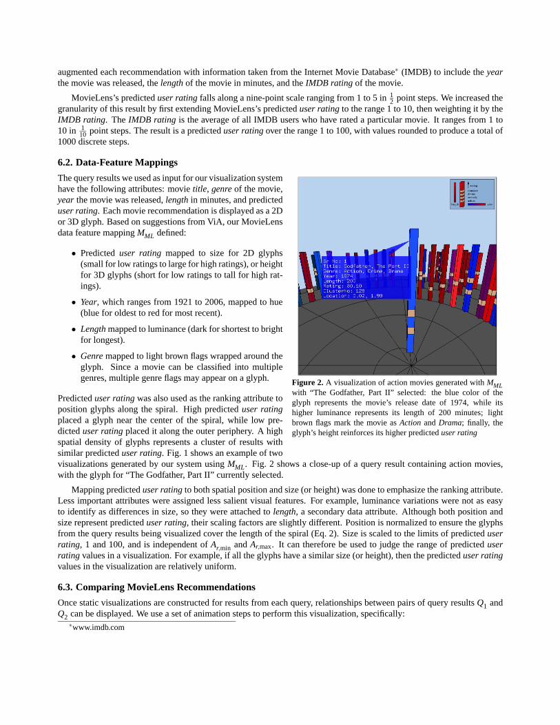
Figure 2. A visualization of action movies generated withMMLwith “The Godfather, Part II” selected: the blue color of theglyph represents the movie’s release date of 1974, while itshigher luminance represents its length of 200 minutes; lightbrown flags mark the movie asAction andDrama; finally, theglyph’s height reinforces its higher predicteduser rating
The query results we used as input for our visualization systemhave the following attributes: movietitle, genreof the movie,year the movie was released,lengthin minutes, and predicteduser rating. Each movie recommendation is displayed as a 2Dor 3D glyph. Based on suggestions from ViA, our MovieLensdata feature mappingMML defined:
• Predicteduser rating mapped to size for 2D glyphs(small for low ratings to large for high ratings), or heightfor 3D glyphs (short for low ratings to tall for high rat-ings).
• Year, which ranges from 1921 to 2006, mapped to hue(blue for oldest to red for most recent).
• Lengthmapped to luminance (dark for shortest to brightfor longest).
• Genremapped to light brown flags wrapped around theglyph. Since a movie can be classified into multiplegenres, multiple genre flags may appear on a glyph.
Predicteduser ratingwas also used as the ranking attribute toposition glyphs along the spiral. High predicteduser ratingplaced a glyph near the center of the spiral, while low pre-dicteduser ratingplaced it along the outer periphery. A highspatial density of glyphs represents a cluster of results withsimilar predicteduser rating. Fig. 1 shows an example of twovisualizations generated by our system usingMML. Fig. 2 shows a close-up of a query result containing action movies,with the glyph for “The Godfather, Part II” currently selected.
Mapping predicteduser ratingto both spatial position and size (or height) was done to emphasize the ranking attribute.Less important attributes were assigned less salient visual features. For example, luminance variations were not as easyto identify as differences in size, so they were attached tolength, a secondary data attribute. Although both position andsize represent predicteduser rating, their scaling factors are slightly different. Position is normalized to ensure the glyphsfrom the query results being visualized cover the length of the spiral (Eq. 2). Size is scaled to the limits of predicteduserrating, 1 and 100, and is independent ofAr,min andAr,max. It can therefore be used to judge the range of predicteduserrating values in a visualization. For example, if all the glyphs have a similar size (or height), then the predicteduser ratingvalues in the visualization are relatively uniform.
6.3. Comparing MovieLens Recommendations
Once static visualizations are constructed for results from each query, relationships between pairs of query resultsQ1 andQ2 can be displayed. We use a set of animation steps to perform this visualization, specifically:
∗www.imdb.com

(a) (b)
(c) (d)
Figure 3. Visualizing query results: (a) the first friend’s query resultsQ1 (step 2); (b) common elements with position based onQ1 (step3); (c) common elements with position based onQ2 (end of step 4); the second friend’s query results (step 5)
1. Groups of movies with similar rankings are identified in bothQ1 andQ2 using our spatial clustering algorithm.
2. Q1 is visualized.
3. Movies unique toQ1 are removed.
4. Movies common toQ1 andQ2 are moved from their current positions inQ1 to their new positions inQ2. Clusterscontaining multiple movies are moved first, followed by singletons. Movies closer to the center of the spiral movebefore movies on the periphery.
5. Movies unique toQ2 are added, producing the final visualization of all the elements inQ2.
Differences betweenQ1 andQ2 are shown in steps 3 and 5, as elements unique toQ1 are removed, and as elements uniqueto Q2 are added. Similarities betweenQ1 andQ2 are shown in step 4. Clusters of movies that maintain their positions

(a) (b)
Figure 4.Experiment displays: (a) the animation technique, with a single element selected (blue balloon); (b) the side-by-side technique,with a common element selected inQ1 (blue balloon) and its position shown inQ2 (green balloon)
relative to one another are highlighted first, followed by singletons. Starting with elements at the center of the spiral andcontinuing outwards to the periphery allows the viewer to track high rank (or low rank) movies fromQ1 to see how theyare valued inQ2.
6.4. Animating Query Results
Suppose two friends decided to see a movie together. Although MovieLens can produce a group recommendation ofmovies that both users would like, it might also be interesting for the friends to see additional information, for example,which movies one friend likes more than the other, or which movies one friend likes that the other does not like at all.Recommendations from MovieLens can be visualized to show both the intersection of movies they contain, and specificdetails about how the friends’ movie preferences differ. Fig. 3 demonstrates the different steps in our animations. Fig. 3arepresents step 2, visualizing the first friend’s resultsQ1. Thirty-five clusters are identified inQ1. Position on the spiralis controlled entirely by the predicteduser ratingvalue. Once the initial display is built, we remove glyphs that are notpresent inQ2 by gradually making them transparent (step 3). This produces a display of the intersection of the queryresults, with glyph positions still based onQ1. Fig. 3b shows fifteen clusters containing a total of twenty-seven glyphscommon to bothQ1 andQ2 (i.e., twenty-seven movies neither friend has seen). In the second phase of the animation, thecommon glyphs move to their new positions according to the predicteduser ratingin the second friend’s resultsQ2 (step4). During this phase the sizes of the glyphs increase or decrease depending on whether they are moving closer to or awayfrom the center of the spiral. At each point during the animation phase glyphs from a single cluster are moving from theiroriginal positions to their new positions. The other glyphs remain stationary, waiting for their turn to move. The secondphase ends when all the common glyphs have arrived at their new positions inQ2 (Fig. 3c). Finally, the glyphs that areunique toQ2 are faded in (step 5). When this step is complete, results fromQ2 are displayed in their entirety (Fig. 3d).
7. VALIDATION STUDIES
In order to further investigate our design choices, we conducted a simple validation experiment that compared our animatedtechnique to a more traditional side-by-side display (Fig. 4). Our experiment trials used 3D glyphs to visualize dataelements in each query result. Both systems allowed users to select elements to see information balloons describing theirproperties. This was most important for the side-by-side technique, since picking elements in one query result “brushes”the corresponding elements, if they exist, in the other result.
Subjects were asked to use each technique to answer five questions on pairs of query results. We wanted tasks that: (1)are representative of tasks users perform when comparing subsets of data elements; and (2) will help to highlight strengthsand weaknesses in each technique. We chose:
• T1: Determine the percentage of elements that are common across the two query resultsQ1 andQ2.
• T2: Locate the highest ranked element inQ1.
• T3: Locate the highest ranked element inQ2.
• T4: Locate the element that has the highest combined ranking overQ1 andQ2.
• T5: Identify a cluster of elements that maintains its local spatial neighborhood betweenQ1 andQ2.
Pairs of query results were constructed for use during the experiment. Every pair was built to contain exactly two commonclusters that existed in both queries, and exactly four unique clusters that existed in only one of the queries (two uniqueclusters inQ1, two in Q2). We also varied thepercentageof common elements (20, 40, 60, or 80%), the query result thatcontained thehighestranked element (Q1 or Q2), and thedifferencein predicteduser ratingbetween the highest elementsin the two query results (2.5% or 5.0% of total user rating). Two query result pairs for each of the 16 possible conditionswere built (fourpercentageby twohighestby twodifference), for a total of 32 pairs.
Nine faculty and graduate students from the Computer Science department (eight males and one female, all with normalor corrected vision) volunteered to participate during the experiment. Subjects were familiar with the PC computer and theWindows interface used to conduct the experiment, although none were experts in either visualization technique. Subjectsperformed the five tasks on all 32 query pairs, once with the animated technique, and once with the side-by-side technique.The technique each subject started with was randomized: half saw the animations first; the other half saw the side-by-sidesfirst. Practice trials were presented before the experiment began, to explain the techniques and the tasks to the subjects,and to allow subjects to become comfortable with both techniques. The order of the trials was randomized during theexperiment. Subjects completed all five tasks in order on each query pair. Subjects were told whether their answer wascorrect or incorrect immediately after they finished a task. Time to respond and subject accuracy were recorded for lateranalysis.
7.1. Results
Subject response timesrt and error ratese were used to measure performance during the experiment.rt was recorded inseconds.e was zero if subjects completed a task correctly, or one if they completed it incorrectly (i.e.,e represents per-centage error).rt ande were collapsed and averaged over all subjects for each of the 32 experiment conditions:technique(animated or side-by-side) bypercentage(20, 40, 60, or 80%) byhighest(Q1 or Q2) by difference(2.5 or 5.0%).t-tests andanalysis of variance (ANOVA) with a 95% confidence interval were used to locate significant differences in performance.Our main findings were:
1. The animation technique was significantly faster than the side-by-side technique for tasksT1 (percentage common),T4 (highest combined element), andT5 (locate a cluster).
2. The animation technique had significantly fewer errors for taskT4 (highest combined element).
3. The side-by-side technique was significantly faster for taskT3 (highest inQ2).
We comparedrt andeacrosstechniquefor all five tasks. The animation trials were significantly faster than the side-by-sidetrials for tasksT1, T4, andT5, t(62) = 5.382, p < 0.0001,t(62) = 12.842, p < 0.0001, andt(62) = 14.069, p < 0.0001,respectively. Average response times werert = 5.24, 9.61, and 1.49s during the animation trials, andrt = 6.88, 23.51, and6.18s during the side-by-side trials for each of the three tasks.e was also significantly lower during the animation trialsfor taskT4, t(62) = 2.312, p = 0.024, withe= 0.11 during the animation trials ande= 0.26 during the side-by-side trials.The side-by-side trials were faster than the animation trials for taskT3, t(62) = 6.46, p < 0.0001, withrt = 2.41 duringthe animation trials andrt = 1.92 during the side-by-side trials.
A number of other small but significant differences were found. For taskT4 during animation trials,rt varied signifi-cantly overpercentage, F(3,28) = 3.46, p = 0.03 (rt = 8.19, 10.36, 10.93, and 8.94s for 20, 40, 60, and 80% common,respectively). For taskT3 during animation trials,rt varied significantly overdifference, t(30) = 2.226, p= 0.034 (rt = 2.53and 2.29s forQ1 andQ2, respectively). Finally,rt varied significantly overpercentagefor tasksT1 andT5 during side-by-side trials,F(3,28) = 6.582, p = 0.002 andF(3,28) = 4.036, p = 0.017, respectively (rt = 5.569, 6.361, 8.236, and7.347s for taskT1 andrt = 6.069, 4.847, 6.097, and 7.708s for taskT5 for 20, 40, 60, and 80% common, respectively).

Figure 5. Graph ofrt ande for the animation and side-by-sidetechniques, for each task
Interpretation. Animations were statistically faster and moreaccurate for identifying the element with the highest combineduser ratingacrossQ1 and Q2. Users “scrubbed” back andforth through the animation to find these types of elements.In the side-by-side technique users were forced to select in-dividual elements in one query result, then look for their po-sition in the other result. The animated technique was alsofaster for estimating the percentage of common elements, andfor identifying clusters of elements that maintain their spatialneighborhood across both query results.
The side-by-side technique was faster for finding the twoelements inQ1 andQ2 with the highestuser rating, since both
results were visible simultaneously. Users had to scroll back and forth in the animation technique to change the queryresult being displayed.
We watched to try to see how subjects completed the tasks and why they made errors. Only taskT4, highest combineduser rating, had a large error rate (approximately 18.5%, Fig. 5). We noticed that the farther the target element movedbetween the query results, the harder it was to identify. Subjects also tended to “give up” in the side-by-side technique afterthey spent a certain amount of time searching for the target element. After completing the experiment, subjects voiced astrong preference for the animation technique.
8. CONCLUSIONS AND FUTURE WORK
Figure 6. A MovieLens query with 500 recommenda-tions
Our goal is a method to visualize patterns both within and betweenqueries on an underlying dataset. Query results are represented withperceptual glyphs positioned along a space-filling spiral, with colorand texture properties used to encode the element’s attribute values.Animations are used to highlight similarities and differences betweenpairs of query results. We used queries from a movie recommendersystem as a practical testbed for our visualization system. Exper-imental results from an initial validation study confirmed many ofour anecdotal observations about the capabilities of our visualizationtechnique.
Our technique is not restricted to movie data. For example, weare currently collaborating with bioinformatics researchers to visual-ize exons and associated GO terms across different transcripts froma genome database. We are also investigating how to increase thetotal number of data elements we can visualize at one time. For ex-ample, Fig. 6 shows 500 data elements along the spiral, which is ap-proaching the limit for maintaining distinguishable clusters of dataelements.
REFERENCES
1. J. B. Schafer, J. Konstan, and J. Riedl, “Recommender systems in e-commerce,” inProceedings 1st ACM Conferenceon Electronic Commerce (EC-99), pp. 158–166, (Denver, Colorado), 1999.
2. S. Card, J. Mackinlay, and B. Shneiderman,Reading In Information Visualization: Using Vision To Think, MorganKaufmann Publishers, San Francisco, California, 1999.
3. M. Foltz and R. Davis, “Query by attention: Visually searchable information maps,” inProceedings 5th InternationalConference on Information Visualisation, pp. 85–96, (London, England), 2001.
4. D. A. Keim, “Pixel-oriented database visualizations,”ACM SIGMOD Record25(4), pp. 35–39, 1996.
5. J. V. Carlis and J. Konstan, “Interactive visualization of serial periodic data,” inProceedings 11th ACM Symposiumon User Interface Software and Technology, pp. 29–38, (San Francisco, California), 1998.
6. M. O. Ward and B. N. Lipchak, “A visualization tool for exploratory analysis of cyclic multivariate data,”Metrika51(1), pp. 27–38, 2000.
7. M. Weber, M. Alexa, and W. Muller, “Visualizing time-series on spirals,” inProceedings IEEE Symposium on Infor-mation Visualization (InfoVis 2001), pp. 7–14, (Washington, D.C.), 2001.
8. E. H. Chi, J. Pitkow, J. Mackinlay, P. Pirolli, R. Gossweiler, and S. K. Card, “Visualizing the evolution of webecologies,” inCHI ’98: Proceedings of the SIGCHI conference on Human factors in computing systems, pp. 400–407, ACM Press/Addison-Wesley Publishing Co., (New York, NY, USA), 1998.
9. J. Stasko and E. Zhang, “Focus+context display and navigation techniques for enhancing radial, space-filling hierar-chy visualizations,” inINFOVIS ’00: Proceedings of the IEEE Symposium on Information Vizualization 2000, p. 57,IEEE Computer Society, (Washington, DC, USA), 2000.
10. A. Spoerri, “Visualizing meta search results: Evaluating the metacrystal toolset,” inProceedings 69th Annual Meetingof the American Society for Information Science and Technology (ASIST), (Austin, TX, USA), 2006.
11. A. J. Zschimmer and J. C. Roberts, “Bifocal Radial Visualization of Intranet Search Results using Image Caching,”in Proceedings of the fifth Theory and Practice of Computer Graphics, D. Duce and I. S. Lim, eds., pp. 115–122,Eurographics, June 2007.
12. L. A. Treinish, “Task-specific visualization design,”IEEE Computer Graphics & Applications19(5), pp. 72–77, 1999.13. C. G. Healey and J. T. Enns, “Large datasets at a glance: Combining textures and colors in scientific visualization,”
IEEE Transactions on Visualization and Computer Graphics5(2), pp. 145–167, 1999.14. C. Weigle, W. G. Emigh, G. Liu, R. M. Taylor, J. T. Enns, and C. G. Healey, “Oriented texture slivers: A technique
for local value estimation of multiple scalar fields,” inProceedings Graphics Interface 2000, pp. 163–170, (Montreal,Canada), 2000.
15. A. J. van Doorn and J. J. Koenderink, “Spatial properties of the visual detectability of moving spatial white noise,”Experimental Brian Research45, pp. 189–195, 1982.
16. L. Bartram, C. Ware, and T. Calvert, “Moticons: Detection, distraction, and task,”International Journal of Human-Computer Studies58(5), pp. 515–545, 2003.
17. C. Ware,Information Visualization: Perception for Design, Morgan Kaufmann Publishers, San Francisco, California,2000.
18. K.-P. Yee, D. Fisher, R. Dhamija, and M. Hearst, “Animated exploration of graphs with radial layout,” inProceedingsIEEE Symposium on Information Visualization (InfoVis 2001), pp. 43–50, (Washington, D.C.), 2001.
19. G. Robertson, K. Cameron, M. Czerwinski, and D. Robbins, “Animated visualization of multiple intersecting hierar-chies,”Information Visualization1(1), pp. 50–65, 2002.
20. S. Krasser, G. Conti, J. Grizzard, J. Gribschaw, and H. Owen, “Real-time and forensic network data analysis using an-imated and coordinated visualization,” inProceedings from the sixth IEEE Systems, Man and Cybernetics InformationAssurance Workshop, pp. 42–49, June 2005.
21. C. G. Healey, R. St. Amant, and J. Chang, “Assisted visualization of e-commerce auction agents,” inProceedingsGraphics Interface 2001, pp. 201–208, (Ottawa, Canada), 2001.
22. A. Sanchez and R. Orosco, “Applying animation constraints to 3D information visualization techniques,” inProceed-ings Congresso Brasileiro de Computacao (CBComp 2001), (Santa Catarina, Brazil), 2001.
23. C. Hurley and A. Buja, “Analyzing high-dimensional data with motion graphics,”SIAM Journal on Scientific andStatistical Computing11(6), pp. 1193–1211, 1990.
24. D. J. Aks and J. T. Enns, “Visual search for size is influenced by a background texture gradient,”Journal of Experi-mental Psychology: Human Perception & Performance22(6), pp. 1467–1481, 1996.