visualizing life zone boundary sensitivities across … · 2014-05-26 · visualizing life zone...
TRANSCRIPT

Available online at www.sciencedirect.com
1877–0509 © 2011 Published by Elsevier Ltd. Selection and/or peer-review under responsibility of Prof. Mitsuhisa Sato and Prof. Satoshi Matsuokadoi:10.1016/j.procs.2011.04.171
Procedia Computer Science 4 (2011) 1582–1591
International Conference on Computational Science, ICCS 2011
Visualizing Life Zone Boundary Sensitivities Across ClimateModels and Temporal Spans
Robert Sisnerosa, Jian Huangb, George Ostrouchova, Forrest Hoffmana
aOak Ridge National Laboratory, Oak Ridge, TN 37831, USAbUniversity of Tennessee, Knoxville, TN 37996, USA
Abstract
Life zones are a convenient and quantifiable method for delineating areas with similar plant and animal communi-ties based on bioclimatic conditions. Such ecoregionalization techniques have proved useful for defining habitats andfor studying how these habitats may shift due to environmental change. The ecological impacts of climate change areof particular interest. Here we show that visualizations of the geographic projection of life zones may be applied to theinvestigation of potential ecological impacts of climate change using the results of global climate model simulations.Using a multi-factor classification scheme, we show how life zones change over time based on quantitative modelresults into the next century. Using two straightforward metrics, we identify regions of high sensitivity to climatechanges from two global climate simulations under two different greenhouse gas emissions scenarios. Finally, weidentify how preferred human habitats may shift under these scenarios. We apply visualization methods developed forthe purpose of displaying multivariate relationships within data, especially for situations that involve a large numberof concurrent relationships. Our method is based on the concept of multivariate classification, and is implementeddirectly in VisIt, a production quality visualization package.
Keywords: visualization, life zones, climate change, climate modeling, multivariate classification
1. Introduction
When studying complex natural phenomena, it is very important to distinguish the normal vs. the unexpected. It isimportant to have the right set of tools to properly identify deviations from an expected pattern in the context of manypossible alternative situations. This question is very hard to answer in general. Beginning with methods developed in[1], we expand these capabilities to study complex relationships resulting from global climate change modeling.
In particular, we apply our methods to the study of the sensitivities of life zone boundary changes across multipleclimate change projections under different emissions scenarios. Our visualization technique provides a user-guidedway of concurrently and interactively controlling classification of more than 30 possible multivariate states. Theuser control that is allowed is more powerful and more effective than previous systems, yet without compromising
Email addresses: [email protected] (Robert Sisneros), [email protected] (Jian Huang), [email protected](George Ostrouchov), [email protected] (Forrest Hoffman)

Robert Sisneros et al. / Procedia Computer Science 4 (2011) 1582–1591 1583
convenience or scalability. Our classification system is also designed to handle application domains that requirenon-trivial statistical methods, such as the definition and visualization of life zones.
The concept of life zones was first developed by C. Hart Merriam in 1889 as a convenient way of delineatingareas with similar plant and animal communities. In 1947, Leslie Holdridge defined life zones in a quantitative waybased on empirical global bioclimate data [2, 3]. When mapped onto the Earth, the Holdridge life zones constitutegeneralized plant and animal habitats, assuming that soil properties and climate vegetation are broadly determinedby predominate climate conditions. Ecologists commonly use such ecoregionalization schemes to define and studybiomes, and to investigate potential impacts of climate change on plant and animal species ranges. Life zones havealso been used for studying issues that arise in climate models, such as time scales [4] and spatial resolutions [5].
Here we apply the Holdrige life zone classification scheme to visualize the results from two 100-year climatechange simulations based on two strategically chosen scenarios of greenhouse gas emissions. We demonstrate theutility of ecoregionalization for studying the influence of climate change on habitats and definitively visualize the waysand the degree in which life zones may grow, shrink, or shift across the landscape in the coming century depending onemission scenarios. Furthermore, we show these results together with two statistical metrics that reveal regions highlysensitive to climate change. In this process, we also validate the effectiveness of interactively controlled classificationfor studying relationships within complex multivariate problem spaces.
2. Background
In this section, we begin with a description of the system for the classification of land area that we use as aninput to our visualization scheme. We then introduce our target analysis data, along with differentiating emissionsscenarios. Finally, we detail the visualization approach for the classification of data via high dimensional target areas.
2.1. Holdridge Life Zones
Holdridge life zones [2, 3] refer to a system for classifying land areas of the globe based on surface atmosphericconditions. Although originally developed for use in tropical/subtropical areas, the system is globally applicable andhas even been used to analyze vegetation pattern alterations due to global warming [6]. Our specification of targetareas and resulting classification based on those targets naturally implement this classification system.
The target areas are specified in terms of three climatic measurements: biotemperature, annual precipitation,and the ratio of potential evapotranspiration (PET) to annual precipitation; all of these may be seen in Figure 1.Biotemperature is a measure of energy that a plant can use. It differs from actual temperature in that all temperaturesbelow/above a certain minimum/maximum are considered identical to that minimum/maximum. This reflects theconcept that plants receive no energy below the minimum and cannot utilize more energy from temperatures abovethe maximum [3]. PET is the measure of the total possible evaporation and transpiration if water were unlimited, andthe ratio of PET to annual precipitation is an aridity index: the greater precipitation is than PET the more humid anarea, while greater PET values correspond to more arid areas.
The space in which the Holdridge life zones are defined is not orthogonal. For instance, the PET ratio depends onboth annual precipitation and biotemperature. In fact, a life zone in Figure 1 may be indexed by any two of the threeclimatic measurements. However, when considering actual data, different choices of the two measurements may leadto different mappings. This is also noted in [7] and solved with a “fuzzy” adjustment on one coordinate. We addressthis by the Voronoi tesselation [8] generated by our three dimensional targets. All three climatic measurements definethe life zones on a logarithmic scale. Holdridge based this on well known Mitscherlich yield studies, which foundequal increases in yield in response to doubling of a limiting nutrient (see for example, [9]). As the life zones aredefined by upper and lower bounds on each of the three variables, our targets are simply the geometric averages ofthese bounds, which are the centroids of the life zone hexagons after the log transformation.
2.2. Community Climate System Model (CCSM)
Climate model simulation results used in this analysis were generated by the National Center for AtmosphericResearch (NCAR) Community Climate System Model version 3 (CCSM3) [11] for the Third Climate Model Inter-comparison Project (CMIP3). These simulations were analyzed as a part of the Intergovernmental Panel on ClimateChange (IPCC) Fourth Assessment Report (AR4). CCSM3 is a climate modeling system that includes component

1584 Robert Sisneros et al. / Procedia Computer Science 4 (2011) 1582–1591
Figure 1: Canonical representation of the Holdridge life zones [10].
models representing the atmosphere, oceans, land surface, and sea ice, coupled together into a single integrated sys-tem that runs primarily on supercomputers and parallel distributed memory compute clusters. CCSM3 is designedas a basic research tool useful for understanding Earth’s past, present, and future climate states. For the CMIP3simulations used here, CCSM3 was run using a Gaussian grid with 128 latitude and 256 longitude points for theatmosphere and land components and a variable one-degree grid for the ocean and sea ice components. The CCSM3simulation results used in this study were obtained from the Earth System Grid (ESG) at the U.S. Dept. of En-ergy’s Program for Climate Model Diagnosis and Intercomparison (PCMDI). These data were downloaded fromhttp://www.earthsystemgrid.org/.
2.3. Emissions ScenariosTo determine the sensitivities of life zone boundaries under possible climate change conditions at the end of the
next century, results from simulations following two different greenhouse gas emissions scenarios were chosen foranalysis. These two scenarios, labeled A2 and B1, represent high and low global emissions of radiatively activegreenhouse gases over the twenty-first century, respectively. As a result, the shift in life zone regions from these twomodel projections should bound expected changes in ecological habitats with minor shifts under the B1 scenario andmore significant shifts under the A2 scenario. The storylines for both scenarios are described in detail in [12], but aresummarized as follows.
The A2 storyline and scenario family describes a heterogeneous world with a continuously increasing population.The underlying theme is self-reliance and preservation of local identities. Economic development is primarily region-ally oriented and per capita economic growth and technological change are more fragmented and slower than in otherstorylines. The B1 storyline and scenario family describes a convergent world with a global population that peaksaround 2050 and declines thereafter. Economic structures change toward a service and information economy, withreductions in material intensity and the introduction of clean and resource-efficient technologies. The emphasis is onglobal solutions to economic, social, and environmental sustainability, including improved equity, but without climateinitiatives that implement emissions targets like those specified by the Kyoto Protocol.
2.4. Visualizing Multidimensional RelationshipsIn [1] the authors present an approach for classifying high-dimensional data, and presenting the results in a single
summary. Classifiers are user-defined and take the form of values of interest for a specific variable, or target values.
Robert Sisneros et al. / Procedia Computer Science 4 (2011) 1582–1591 1585
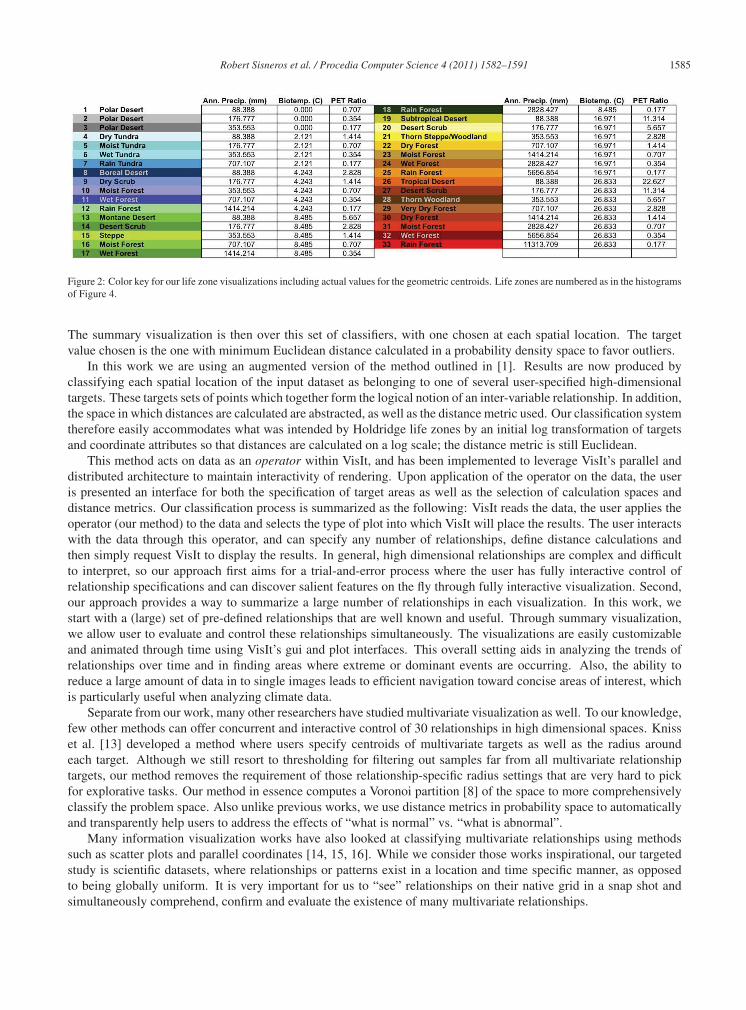
Figure 2: Color key for our life zone visualizations including actual values for the geometric centroids. Life zones are numbered as in the histogramsof Figure 4.
The summary visualization is then over this set of classifiers, with one chosen at each spatial location. The targetvalue chosen is the one with minimum Euclidean distance calculated in a probability density space to favor outliers.
In this work we are using an augmented version of the method outlined in [1]. Results are now produced byclassifying each spatial location of the input dataset as belonging to one of several user-specified high-dimensionaltargets. These targets sets of points which together form the logical notion of an inter-variable relationship. In addition,the space in which distances are calculated are abstracted, as well as the distance metric used. Our classification systemtherefore easily accommodates what was intended by Holdridge life zones by an initial log transformation of targetsand coordinate attributes so that distances are calculated on a log scale; the distance metric is still Euclidean.
This method acts on data as an operator within VisIt, and has been implemented to leverage VisIt’s parallel anddistributed architecture to maintain interactivity of rendering. Upon application of the operator on the data, the useris presented an interface for both the specification of target areas as well as the selection of calculation spaces anddistance metrics. Our classification process is summarized as the following: VisIt reads the data, the user applies theoperator (our method) to the data and selects the type of plot into which VisIt will place the results. The user interactswith the data through this operator, and can specify any number of relationships, define distance calculations andthen simply request VisIt to display the results. In general, high dimensional relationships are complex and difficultto interpret, so our approach first aims for a trial-and-error process where the user has fully interactive control ofrelationship specifications and can discover salient features on the fly through fully interactive visualization. Second,our approach provides a way to summarize a large number of relationships in each visualization. In this work, westart with a (large) set of pre-defined relationships that are well known and useful. Through summary visualization,we allow user to evaluate and control these relationships simultaneously. The visualizations are easily customizableand animated through time using VisIt’s gui and plot interfaces. This overall setting aids in analyzing the trends ofrelationships over time and in finding areas where extreme or dominant events are occurring. Also, the ability toreduce a large amount of data in to single images leads to efficient navigation toward concise areas of interest, whichis particularly useful when analyzing climate data.
Separate from our work, many other researchers have studied multivariate visualization as well. To our knowledge,few other methods can offer concurrent and interactive control of 30 relationships in high dimensional spaces. Knisset al. [13] developed a method where users specify centroids of multivariate targets as well as the radius aroundeach target. Although we still resort to thresholding for filtering out samples far from all multivariate relationshiptargets, our method removes the requirement of those relationship-specific radius settings that are very hard to pickfor explorative tasks. Our method in essence computes a Voronoi partition [8] of the space to more comprehensivelyclassify the problem space. Also unlike previous works, we use distance metrics in probability space to automaticallyand transparently help users to address the effects of “what is normal” vs. “what is abnormal”.
Many information visualization works have also looked at classifying multivariate relationships using methodssuch as scatter plots and parallel coordinates [14, 15, 16]. While we consider those works inspirational, our targetedstudy is scientific datasets, where relationships or patterns exist in a location and time specific manner, as opposedto being globally uniform. It is very important for us to “see” relationships on their native grid in a snap shot andsimultaneously comprehend, confirm and evaluate the existence of many multivariate relationships.

1586 Robert Sisneros et al. / Procedia Computer Science 4 (2011) 1582–1591
(a) (b)
(c) (d)
Figure 3: Life zone classifications of the present (2000–2009) for A2 (a) and B1 (b), and the future (2090–2099) for A2 (c) and B1 (d).
3. Approach
3.1. Life Zones in CCSMThe three variables defining life zones are not calculated in the CCSM simulations, but are readily derived from
other variables in CCSM. Biotemperature was calculated from CCSM’s 2-meter air temperature (TSA), which isconverted to degrees celsius, constrained to the range [0, 30] and averaged yearly. Annual precipitation was calculatedas the sum of all rain (RAIN) and snow (SNOW) and converted from mm s−1 to mm. Lastly, we calculate our PETby Thornthwaite’s original PET estimation [17]:
PET = 1.6(
L12
)(N30
)(10Ta
I
)α
α = (6.75×10⁻⁷)I3− (7.71×10⁻⁵)I2 +(1.792×10⁻²)I +0.49239
I =12
∑i=1
(Tai
5
)1.514
where Ta is the monthly average of temperature and Tai is the 12 monthly mean temperatures for the year. N is thenumber of days for the current month being calculated, and L is the average length of the day for the month. All ofthis is readily calculated directly from the CCSM data from TSA except L:
L = 24(
arccos(1−m)180
)
m = 1− tan(Lat) tan(
Axis× cos(
π×Day182.625
))
Where Axis is a constant (23.439), an estimation of the obliquity of the ecliptic. The CCSM variable needed to cal-culate L is the latitude at each spatial location (http://herbert.gandraxa.com/length of day.aspx).

Robert Sisneros et al. / Procedia Computer Science 4 (2011) 1582–1591 1587
(a) (b)
(c) (d)
Figure 4: Histograms showing the distribution of land areas classified into each life zone. The x and y axes are life zone numbers and land area,respectively. The clear/shaded bars in (a) show the classification distribution for the present (2000–2009)/future (2090–2099) decades for the A2scenario simulation. The same is shown for the B1 scenario simulation in (b). The clear/shaded bars in (c) show the classification distribution forthe present (2000–2009) decade for the A2/B1 scenario simulations. The same is shown for the future (2090–2099) decade for the A2/B1 scenariosimulations in (d).
It is clear that some properties of the variables are ignored, e.g. co-occurrence of statistical extremes and frequencyand timing of those co-occurrences. Holdridge’s life zones give only a general overview of environmental suitability;this represents an important challenge for future work.
Finally, we compute decadal averages for the three derived variables, and specifically focus on the averages of2000–2009 and 2090–2099.
3.2. Visualizing Life Zones
There is some similarity of our proposed visualization approach to the technique used in k-means clustering [18].It is equivalent to the “assignment step,” where items are assigned to their nearest means. The primary differencefrom a k-means algorithm is that our targets are user-specified, in this case they are simply the Holdridge life zonespecifications, rather than estimated from the data [19, 20, 21]. These two types of approaches were compared in [22].A further difference is that our distance computation takes place on a logarithmic scale where the geometric centroidsbecome arithmetic centroids. The resulting Voronoi tesselation of the three-measurement space into life zones is aself-consistent representation that approximates the graphical rendering of Holdridge life zones in Figure 1. Due tothe nature of the specification of the life zones, they are an ideal subject for our visualization approach. Figure 2

1588 Robert Sisneros et al. / Procedia Computer Science 4 (2011) 1582–1591
details the numbering from 0 to 33 and name of each life zone. It also specifies the color of each life zone as it isrepresented in our classification results as well as the geometric centroids for each life zone.
4. Results
Using our visualization approach, the functionality needed to concurrently view 33 separate three-dimensionalrelationships is readily available. Figure 3 shows the result of classifying both the A2 and B1 scenario simulationresults for the 33 life zones shown in Figure 2. For each scenario, the classification is done for the average of the first(2000–2009) and last (2090–2099) decades of the model simulations. Although all life zones are specified in input,not all are present in Figure 3, the output. Life zones are pre-defined by observed data, and therefore are likely notgeneral to our simulation data. Figure 4 shows the actual distribution of the life zones after classification, and moreclearly illuminates which life zones are not found in our data.
The geographic projection of these visualized life zones appears consistent with maps of ecoregions commonlyemployed by ecologists. Shifts in life zone regions between the present (Figure 3(a) and (b)) and future (Figure 3(c)and (d)) decadal averages due to climate change is evident in model results from both scenarios. Because both modelsimulations began from the end of the same historical simulation, there are few differences between the life zone mapsof the present decade (Figures 3(a) and (b)). However, significant differences appear in the maps of future life zonesunder the two different emissions scenarios (Figures 3(c) and (d)).
Under the A2 scenario, the model projects sizable decreases in global coverage of polar deserts and wet tundra,and increases in wet forest, moist forest, thorn woodland (particularly in Central Western Australia), and dry forest.These results are consistent with global increases in temperature, especially at high latitudes, and shifting hydrologicalregimes. The coastlines of Greenland shift from polar desert to tundra. In addition, life zones in Northern Hemispheremid- to high-latitudes exhibit an overall shift poleward. The changes in areal coverage can be seen in the histogramof land areas for the A2 scenario shown in Figure 4(a). Under the B1 scenario, the model projects similar but smallershifts in life zones, consistent with less significant increases in temperature. For instance, the conversion of Greenlandcoastlines to tundra are less significant in B1 than in A2, and Siberia does not experience the nearly complete loss oftundra in B1 as it does in A2. The changes in areal coverage for the B1 scenario are shown in the histogram of landareas in Figure 4(b). The histogram in Figure 4(c) shows the minor differences between the present (2000–2009) A2and B1 simulations, while the histogram in Figure 4(d) shows the more significant differences between the A2 and B1simulations for the future (2090–2099).
4.1. Sensitivity Analysis
In this section, we investigate the sensitivity of the classification across all decades from 2000–2099 via thecalculation of two sensitivity metrics and the comparison of these metrics applied to the simulation results for bothemissions scenarios. First, to identify regions that may be especially sensitive to changes in climate, we calculate the“persistence” of the life zone classifications for every decade between 2000–2099 for each spatial location. Regionsthat are classified into many different life zones in those nine decades are considered to be especially sensitive toclimate change, while regions that are classified into a single life zone in each of those nine decades are consideredto be relatively insensitive to changes in climate. Results for this “persistence” metric are shown in Figure 5 for theA2 and B1 scenario simulations. In this figure, white areas have the highest persistence (i.e., a single unique life zoneclassification), blue areas have high persistence and relatively low sensitivity (i.e., few unique life zone classifications)and red areas have low persistence and high sensitivity (i.e., many unique life zone classifications). As expected, theA2 scenario simulation exhibits lower overall persistence than the B1 scenario simulation. It is also evident that thereare latitudinal features in Figure 5. These reinforce the intuitive notion that the areas between life zones are thoseexhibiting the greatest number of changes. A possible contributing factor to this occurrence may be that points thatlie on the boundary between two life zones easily swap between the two. We hence need to analyze this metric alongside one that provides insight as to the significance of the changes as well.
Our second metric is a relative measure of the overall magnitude of change between the first (2000–2009) andlast (2090–2099) decades, we calculate the Euclidean distance between the centroid of the first life zone and the lastlife zone into which each spatial location is classified. This “magnitude of change” metric, which is calculated inthe log of the 3-dimensional phase space, highlights the regions most sensitive to changes in climate according to

Robert Sisneros et al. / Procedia Computer Science 4 (2011) 1582–1591 1589
(a) (b)
Figure 5: The “persistence” metric: A count of the total number of unique life zones seen at each location over all decades (2000–2099) for the A2(a), and the B1 (c) scenario simulations.
(a) (b)
Figure 6: The “magnitude of change” metric: The Euclidean distance between the life zone centroids for the present (2000–2009) and the future(2090–2099) decades under the A2 (a) and B1 (b) scenarios.
how significant those changes are. Maps of the results for both scenarios are shown in Figure 6. In this figure, whiteregions do not change, blue regions change by a relatively small distance in the 3-dimensional phase space, and redregions shift by a large distance in the 3-dimensional phase space. As expected, the overall magnitude of change ismuch greater for the A2 scenario simulation than for the B1 scenario simulation, with the largest changes occurringprimarily in high latitude regions.
To further compare the results of these metrics between the two scenario simulations, the differences betweenthe A2 and B1 metrics are directly visualized. Figure 7 (a) shows the difference between the two “persistence”metric images in Figure 5. Regions that experience the same number of unique life zones (although likely differenttransitions) in each decade across both simulations are shown in white. It is the colored regions, however, that giveinsight into the comparison of scenarios. Regions shown in red exhibited lower persistence and higher sensitivity underthe A2 scenario, while regions shown in blue exhibited lower persistence and higher sensitivity under the B1 scenario.This comparison suggests that some regions, like northeastern Greenland and some mid-latitude areas, realize morelife zone transitions under the more slowly changing climate conditions of the B1 emissions scenario. Similarly,Figure 7 (b) shows the difference between the two “magnitude of change” metric images in Figure 6. Regions shownin white represent identical distance in phase space across both scenarios. Red regions experienced a larger change ormore sensitivity under the A2 scenario, while regions shown in blue experienced a larger change or more sensitivityunder the B1 scenario. This comparison suggests that a few mid-latitude regions may exhibit larger shifts in life zonesunder the less severe climate change realized under the B1 emissions scenario. Both of these scenario comparisonstend to highlight the boundaries between life zones, which are the land areas likely to change the most under changingclimate conditions, confirming that life zone boundaries are the regions most sensitive to climate change.
4.2. Comfortable Places to Live
Holdridge, in his work [3], states that life zones bordering the PET ratio of 1 are the most comfortable places inwhich to live. Figure 8 contains a visualization with an extra operator, a threshold on PET with a range of 0.5 to 2.0,

1590 Robert Sisneros et al. / Procedia Computer Science 4 (2011) 1582–1591
(a) (b)
Figure 7: The most sensitive scenario: (a) the difference between the “persistence” metric for the A2 and B1 scenario simulations, and (b) thedifference between the “magnitude of change” metric for the A2 and B1 scenario simulations. White regions experience the same number of lifezone changes or magnitude of change. Red regions experienced more unique life zones or larger changes under the A2 scenario. Blue regionsexperienced more unique life zones or larger changes under the B1 scenario.
added to VisIt’s pipeline. This overview and drill-down process shows the relevant areas from Figure 3 for both the A2and B1 scenario simulations, and for both the present (2000-2009) and future (2090–2099) decades of the simulations.White areas in these maps have a PET ratio outside this “comfortable” range. Non-white areas are colored by theirlife zone classification. Under both the A2 and B1 scenarios, about 40% of the land area has a PET ratio near 1 inthe present (2000–2009) decade. In the future (2090–2099) decade under both scenarios, the regions have shifted andthe land surface area in the comfortable range has been reduced. Under the B1 scenario, the comfortable land area isreduced by less than half a percent from present, while under the A2 scenario, the comfortable land area is reducedby nearly 3% from present. Under the A2 scenario, large regions in the southern part of North America and tropicalSouth America depart from the comfortable range in the future. These results suggest that conservation efforts shouldconsider climate conditions when establishing habitats for preservation.
5. Conclusion
We have demonstrated a powerful method for exploring climate model predictions and interpreting the impactof projected climate change on habitats through visualization. Using a multi-factor classification scheme, we haveprojected Holdridge life zone classifications onto land areas for the present and future under two different greenhousegas emissions scenarios. We have shown that two straightforward metrics can identify regions of high sensitivity toclimate change. The “persistence” metric highlights regions that experience many life zone changes through time.The “magnitude of change” metric highlights regions that exhibit are large shift in the factors considered in life zoneclassifications. The results of applying these metrics suggest that borders between life zones are the most sensitive toclimate change.
References
[1] R. Sisneros, C. R. Johnson, J. Huang, Concurrent viewing of multiple attribute-specific subspaces, Computer Graphics Forum (special issuefor EuroVis) 27 (3) (2008) 783–790.
[2] L. R. Holdridge, Determination of world plant formations from simple climatic data, Science 105 (2727) (1947) 367–368.[3] L. Holdridge, Life Zone Ecology, Tropical Science Center, San Jose, Costa Rica, 1967.[4] C. Ciret, A. Henderson-Sellers, ’static’ vegetation and dynamic global climate: Preliminary analysis of the issues time steps and time scales,
Journal of Biogeography 22 (4/5) pp. 843–856.[5] C. Ciret, A. Henderson-Sellers, Sensitivity of ecosystem models to the spatial resolution of the ncar community climate model ccm2, Climate
Dynamics 14 409–429.[6] R. Leemans, Possible Changes in Natural Vegetation Patterns Due to a Global Warming, International Institute of Applied Systems Analysis,
Laxenburg, Austria, 1990, IIASA Working Paper WP90-08 and Publication Number 108 of the Biosphere Dynamics Project.[7] A. E. Lugo, S. L. Brown, R. Dodson, T. S. Smith, H. H. Shugart, The Holdridge life zones of the conterminous United States in relation to
ecosystem mapping, J. Biogeogr. 26 (1999) 1025–1038.[8] Q. Du, V. Faber, M. Gunzburger, Centroidal voronoi tessellations: Applications and algorithms, SIAM Review 41 (1999) 637–676.[9] C. A. Black, Soil fertility evaluation and control, CRC Press, 1992.

Robert Sisneros et al. / Procedia Computer Science 4 (2011) 1582–1591 1591
(a) (b)
(c) (d)
Figure 8: Life zones bordering PET ratio of 1 for the present (2000–2009) decade under the A2 scenario (a) and under the B1 scenario (b). Lifezones bordering PET ratio of 1 for future (2090–2099) decade under the A2 scenario (c) and under the B1 scenario (d).
[10] P. Halasz, Holdridge life zone, http://en.wikipedia.org/wiki/File:Lifezones Pengo.svg, downloaded Jan 29, 2011, Permission: Creative Com-mons BY SA (any version) (3 March 2007).
[11] W. D. Collins, C. M. Bitz, M. L. Blackmon, G. B. Bonan, C. S. Bretherton, J. A. Carton, P. Chang, S. C. Doney, J. J. Hack, T. B. Henderson,J. T. Kiehl, W. G. Large, D. S. McKenna, B. D. Santer, R. D. Smith, The Community Climate System Model version 3 (CCSM3), J. Clim.19 (11) (2006) 2122–2143.
[12] N. Nakicenovic, J. Alcamo, G. Davis, B. de Vries, J. Fenhann, S. Gaffin, K. Gregory, A. Grubler, T. Y. Jung, T. Kram, E. L. La Rovere,L. Michaelis, S. Mori, T. Morita, W. Pepper, H. Pitcher, L. Price, K. Riahi, A. Roehrl, H.-H. Rogner, A. Sankovski, M. Schlesinger, P. Shukla,S. Smith, R. Swart, S. van Rooijen, N. Victor, Z. Dadi, Special report on emissions scenarios, A Special Report of Working Group III of theIntergovernmental Panel on Climate Change, Cambridge, UK (Jul. 2000).
[13] J. Kniss, G. Kindlmann, C. Hansen, Multidimensional transfer functions for interactive volume rendering, IEEE Transactions on Visualizationand Computer Graphics 8 (3) (2002) 270–285.
[14] A. Inselberg, B. Dimsdale, Parallel coordinates: A tool for visualizing multi-dimensional geometry, in: Proceedings of IEEE Visualization,1990, pp. 361–378.
[15] E. Fanea, S. Carpendale, T. Isenberg, An interactive 3d integration of parallel coordinates and star glyphs, in: Proceedings of IEEE Symposiumon Information Visualization, IEEE Computer Society, Washington, DC, USA, 2005, p. 20.
[16] Y.-H. Fua, M. O. Ward, E. A. Rundensteiner, Hierarchical parallel coordinates for exploration of large datasets, in: Proceedings of IEEEVisualization, IEEE Computer Society, Washington, DC, USA, 1999.
[17] C. W. Thornthwaite, An approach toward a rational classification of climate, Geogr. Rev. 38 (1) 55–94.[18] J. A. Hartigan, Clustering Algorithms, John Wiley & Sons, New York, 1975.[19] F. M. Hoffman, W. W. Hargrove, D. J. Erickson, R. J. Oglesby, Using clustered climate regimes to analyze and compare predictions from
fully coupled general circulation models, Earth Interact. 9 (10) (2005) 1–27. doi:10.1175/EI110.1.[20] E. Saxon, B. Baker, W. Hargrove, F. Hoffman, C. Zganjar, Mapping environments at risk under different global climate change scenarios,
Ecol. Lett. 8 (1) (2005) 53–60. doi:10.1111/j.1461-0248.2004.00694.x.[21] W. W. Hargrove, F. M. Hoffman, Potential of multivariate quantitative methods for delineation and visualization of ecoregions, Environ.
Manage. 34 (Supplement 1) (2004) S39–S60. doi:10.1007/s00267-003-1084-0.[22] B. Baker, H. Diaz, W. Hargrove, F. Hoffman, Use of the Koppen-Trewartha climate classification to evaluate climatic refugia in statistically
derived ecoregions for the People’s Republic of China, Clim. Change 98 (1) (2010) 113–131. doi:10.1007/s10584-009-9622-2.