visual notation design 2.0: designing user- comprehensible diagramming notations · pdf...
TRANSCRIPT
Visual Notation Design 2.0: Designing User-Comprehensible Diagramming Notations
Daniel L. Moody
Ozemantics Pty Ltd Sydney Australia
Nicolas Genon, Patrick Heymans
PReCISE Research Centre Namur, Belgium
Patrice Caire
University of Luxembourg, Luxembourg
Abstract. Designing notations that business stakeholders can understand is one of the most difficult practical problems and greatest research challenges in the IS field. The success of IS development de-pends critically on effective communication between developers and end users, yet empirical studies show that business stakeholders understand IS models very poorly. This paper proposes a radical new approach to designing diagramming notations that actively involves end users in the process. We use i*, one of the leading requirements engineering notations, to demonstrate the approach, but the same approach could be applied to any notation intended for communicating with non-experts. We present the results of 6 related empirical studies (4 experiments and 2 nonreactive studies) that conclusively show that novices consistently outperform experts in designing symbols that are comprehensible to novices. The differences are both statistically significant and practically meaningful, so have implica-tions for IS theory and practice. Symbols designed by novices increased semantic transparency (their ability to be spontaneously interpreted by other novices) by almost 300% compared to the existing i* diagramming notation and reduced interpretation errors by a factor of 5. The results challenge the conventional wisdom about visual notation design, which has been accepted since the beginning of the IS field and is followed unquestioningly today by groups such as OMG: that it should be conducted by a small team of technical experts. Our research suggests that instead it should be conducted by large numbers of novices (members of the target audience). This approach is consistent with principles of Web 2.0, in that it harnesses the collective intelligence of end users and actively involves them as codevelopers (“prosumers”) in the notation design process rather than as passive consumers of the end product. The theoretical contribution of this paper is that it provides a way of empirically measuring the user comprehensibility of IS notations, which is quantitative and practical to apply. The practical contribution is that it describes (and empirically tests) a novel approach to developing user compre-hensible IS notations, which is generalised and repeatable. We believe this approach has the potential to revolutionise the practice of IS diagramming notation design and change the way that groups like OMG operate in the future. It also has potential interdisciplinary implications, as diagramming nota-tions are used in almost all disciplines.
Keywords: conceptual modelling, analysis, end user communication, diagrams, visual languages, graphical symbols, semiotics, visual perception, cognition, Web 2.0, crowdsourcing
1. Introduction
1.1 The problem addressed
The problem addressed by this paper – how to design user-comprehensible modelling nota-tions – is one of the most important issues in IS research and practice. The success of IS de-velopment depends critically on effective communication between developers and end users (i.e. customers). The modern concept of model driven development (MDD) is largely predicated on this assumption: that end users can verify the accuracy and completeness of models and that systems can then be automatically (or semi-automatically) generated from these models.
For this reason, the “Holy Grail” for IS researchers and practitioners has always been to de-velop notations that end users can understand. In the 1980s, the vision was that end users
DRAFT ONLY: Please do not distribute without prior permission from the authors Page 1
Visual Notation 2.0
would be able to model their own requirements (“application development without pro-grammers” [13, 47-49]). A quarter of a century later, this vision has not been realised and modern notations like BPMN and UML seem to getting further and further away from this ideal. The “voice of the customer” seems to have been lost in favour of consensus among technical experts (e.g. among members of OMG technical committees). This suggests that radical change is required to the current notation design process to achieve the goal of user comprehensible diagramming notations.
Empirical studies show that we have been spectacularly unsuccessful in designing user-comprehensible notations: both field and laboratory studies show that end users understand IS models very poorly [28-29, 58, 75]. One of the reasons why this is such an intractable problem is because it is difficult for experts to think like novices, something called the curse of knowledge [26]. There are well-known differences in the way experts and novices proc-ess diagrams [10, 40, 46, 60, 82-83] that are rarely taken into account in designing IS dia-gramming notations. Also, members of the target audience (end users) are rarely involved in the notation design process.
This paper suggests that we may have been going about this task the wrong way and that the solution has been under our noses the whole time: after all, most product problems have their roots in process problems [14]. We ask a rather obvious question: to design notations that are understandable to end users, why not involve them in the notation design process? If this works in developing information systems (e.g. participatory design [57], user-centred design), why shouldn’t it also work in developing diagramming notations?
1.2 Semantic Transparency: “visual onomatopoeia”
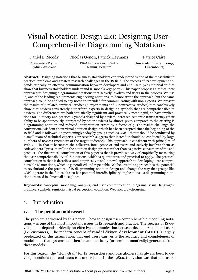
The key to designing diagramming notations that are understandable to end users is a prop-erty called semantic transparency [53]. Literally, this means that the meaning (seman-tics) of a symbol is clear (transparent) from its appearance alone. This is the equivalent of onomatopoeia in spoken language. Onomatopoeia is a literary device in which words are used whose sound suggests their meaning: their perceptual (auditory) form implies their content. Semantic transparency is the visual equivalent of this, where representations are used whose appearance suggests their meaning (e.g. in maps, the use of crosses to indicate churches and patches of blue to indicate bodies of water): their perceptual (visual) form im-plies their content. Semantic transparency formalises subjective notions like “intuitiveness” or “naturalness” that are often used informally when discussing diagramming notations (e.g. [24, 27]).
Semantic transparency is one of the most powerful tools in the visual notation designer’s “bag” for improving understanding by novices. One of the major overheads for novices in processing diagrams is that they have to consciously maintain the meanings of symbols in working memory [60, 83], leaving less cognitive resources available to interpret their content [83]. Semantically transparent symbols reduce cognitive load because they have built-in mnemonics, making it easier for people to learn and remember what they mean, and reduc-ing interpretation errors [65]. In general, the more semantically transparent a symbol is, the less mental effort is required to interpret its meaning [6]. Empirical studies show that seman-tically transparent representations improve both speed and accuracy of understanding by na-ïve users [8, 50].
Semantic transparency is not a binary state but a sliding scale (Figure 1) [52]:
• At the positive end of the scale, semantic transparency means that a novice reader could accurately infer the meaning of a symbol from its appearance alone.
DRAFT ONLY: Please do not distribute without prior permission from the authors Page 2
Visual Notation 2.0
• At the zero point, semantically opacity means there is an arbitrary association be-tween a symbol and its meaning. Such symbols require conscious effort to remember and must be learnt by rote. Most symbols in existing IS diagramming notations fit into this category, as they are abstract geometrical shapes.
• At the negative end, semantic perversity means a novice reader would be likely to guess an incorrect meaning from the symbol’s appearance (e.g. a green light to indicate “stop”). This often occurs when a familiar symbol is used for a different purpose. Such symbols require the most effort to learn and remember, as they require “unlearning” the natural meaning.
Semantically Perverse
(false mnemonic)
appearance suggests different or opposite
meaning
Semantically Transparent (mnemonic)
appearance suggests correct meaning
Semantically Opaque (conventional)
arbitrary relationship between appearance and meaning
0 +−
Person
ClassSTOP
Figure 1. Semantic Transparency is a Continuum
Natural mappings
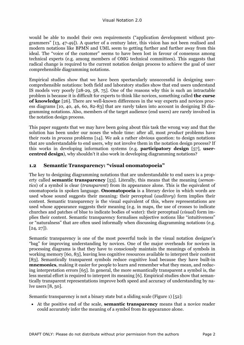
Semantic transparency is the equivalent for diagramming notations of Norman’s concept of natural mappings for physical objects (“The Design of Everyday Things” [59]). According to Norman, if everyday objects are well designed, they don’t need to be explained or labelled: their function can be inferred from their appearance: form implies function (Figure 2). Simi-larly, semantic transparency is about designing graphical symbols that don’t need to be ex-plained: whose meaning can be inferred from their appearance: form implies content. The ultimate in semantic transparency (though rarely achievable in an IS context) is a diagram that does not need any explanation or even a legend to define what symbols mean.
Figure 2. Norman’s concept of natural mappings [59]: a door should not need “push” or “pull” labels; if it does, it has been incorrectly designed
Operationalising semantic transparency
Semantic transparency is formally defined as “the extent to which a novice reader can infer the meaning of symbol from its appearance alone” [53]. However, it is usually evaluated in a subjective manner: experts (researchers or notation designers) try to estimate the likelihood that novices will be able to infer the meaning of symbols [e.g. 54, 55]. However experts are poorly qualified to do this because it is extraordinarily difficult for them to think like novices (cf. the curse of knowledge). Semantic transparency is a subjective concept that is highly de-pendent on background and experience: what is “natural” or “intuitive” to an expert is unlikely to be to a novice.
DRAFT ONLY: Please do not distribute without prior permission from the authors Page 3

Visual Notation 2.0
The “naturalness” of notations is a contentious issue in IS research, with researchers and no-tation designers often arguing that particular visual representations are more “natural” or “intuitive” to end users than others (e.g. [24, 27]). In most cases, such claims are based on opinion or conjecture. This paper defines a way of empirically measuring (operationalising [16]) semantic transparency, which provides a way of objectively resolving such debates.
1.3 Current approaches to visual notation design
Diagramming notations have a long history in the IT field, and have been used since the ear-liest beginnings of the field and even before. The first such notation is believed to be Gold-stine and von Neumann’s program flowcharts, developed in the 1940s [21], so predate the existence of the IT field by almost two decades. Program flowcharts are long since extinct and are no longer taught in introductory programming courses, but are the ancestors of all mod-ern IT diagramming notations [56]. Their legacy lives on to the present day, with diagram-ming notations being used in all areas and all levels of IT practice, from strategic planning down to the design of integrated circuits. They play a particularly critical role in communicat-ing with end users and customers, as they are believed to convey information more effectively to non-technical people than text [3].
Despite the fact that diagramming notations have been used since the earliest beginnings of the IT field, the practice of visual notation design has not progressed since Goldstine and von Neumann’s day. Current approaches to designing visual notations (e.g. as followed by OMG technical committees) consist of little more than dreaming up symbols and voting on them. Current visual notation design practice is characterised by:
• An unselfconscious design approach [1]: there is a lack of explicit principles for de-signing visual notations, meaning that designers rely on instinct, imitation and tradition [53].
• Lack of design rationale1 [43]: symbols are typically defined without any explanation or justification as to why they were chosen [28]. The inability to explain designs is a common characteristic of unselfconscious design cultures [1].
• Lack of variety of forms: the same or similar symbols (mostly geometrical shapes) are used over and over again for different purposes [60]. This is another characteristic of un-selfconscious design cultures: the inability to generate new forms [1]. Without explicit principles the range of symbols is limited by the imaginations of the design team: this ex-plains why IT diagramming notations use only a fraction of the graphic design space [53].
• Naïve decision making: decisions about choice of symbols are made based on intuition, opinion and social consensus (e.g. voting on alternatives) rather than theory and empiri-cal evidence. For this reason, most IS diagramming notations violate known principles of how the human visual system works [53].
• Lack of involvement by members of the target audience: visual notation design is con-ducted exclusively by technical experts, with little or no involvement of end users. This is in contrast to IS development, where it is generally accepted that users should be actively involved from the beginning.
• Lack of testing: the endpoint of visual notation design is when consensus is reached among the notation designers rather than when the notation has reached an acceptable level of efficacy as shown by testing with members of the target audience (e.g. as in user
1 Design rationale is an important concept in IS development and is the process of documenting design decisions made, the reasons why they were made and alternatives considered. This provides traceability in the design process, helps people understand the design and also helps justify the de-sign [43].
DRAFT ONLY: Please do not distribute without prior permission from the authors Page 4

Visual Notation 2.0
acceptance testing (UAT)2 of computer systems or clinical testing of drugs prior to their release). Notations are typically released to the public without testing their compre-hensibility to end users. Without such testing, notations could actually reduce productiv-ity in practice.
1.4 Visual Notation Design 2.0: empowering end users
Until now, the design of IS diagramming notations has been the exclusive domain of techni-cal experts (e.g. members of OMG technical committees). Even when notations are specifi-cally designed for communicating with end users, members of the target audience are rarely consulted or involved. For example, BPMN 2.0 [62] is a notation designed for communicat-ing with business stakeholders, yet no business representatives were involved in the notation design process [66, 78]. In the light of this, it is perhaps no surprise that IS notations are un-derstood so poorly by business stakeholders: this is analogous to designing a software system without involving end users.
Web 2.0 involves a radical change to the dynamics of content creation on the web. A Web 2.0 site allows end users to contribute their own content rather than being limited to viewing of content as in traditional websites [61]. In this way, they act as both producers and con-sumers (prosumers) of content rather than passive consumers. For example, Wikipedia is an on-line encyclopaedia based on the unlikely notion that any user can contribute to its con-tent, rather than being restricted to experts. As another example, Threadless is a T-shirt company that does not have its own designers but allows customers to submit their own de-signs, which are voted on by other customers: the most popular designs are then put into production. In this paper, we apply the Web 2.0 philosophy to designing IS diagramming no-tations. We define a process for actively involving end users in the notation design process as co-developers (prosumers) rather than as passive consumers.
1.5 Research objectives
The broad research questions addressed by this paper are:
RQ1. How can we objectively (i.e. empirically) measure the semantic transparency of dia-gramming notations?
RQ2. How can we improve the semantic transparency of diagramming notations?
RQ3. How can we actively (and constructively) involve end users in designing diagram-ming notations?
RQ4. How can we evaluate user comprehensibility of diagramming notations prior to their release (analogous to clinical trials for drugs or user acceptance testing for informa-tion systems)?
These questions are all “how” (process) questions so do not have simple yes/no answers.
2 User Acceptance Testing (UAT), also called beta testing, application testing or end user testing, is a phase of IS development in which the software is tested in the real world environment (or a simulated one) by the intended users of the system. This is the final stage of testing and is con-ducted after the system has passed all technical tests. It is usually a mandatory step before the sys-tem is put into production.
DRAFT ONLY: Please do not distribute without prior permission from the authors Page 5

Visual Notation 2.0
2. Previous Research
2.1 Goal-oriented modelling
Goal-oriented modelling is one of the most important developments in the requirements engineering (RE) field, which changes the focus from what and how (data and processes) as in traditional analysis to who and why (the actors and the goals they wish to achieve). i* is one of the leading goal modelling languages and one of the most influential notations in the RE field [22, 84-85]. Like all RE notations, it is primarily designed for communicating with business stakeholders.
Currently, i* makes very little use of semantic transparency, despite the known advantages of this for user communication [55]. Most symbols are abstract geometrical shapes (Figure 3), so are semantically opaque. Like most IS modelling notations, it lacks explicit design ra-tionale for its graphical conventions: symbols are defined without any explanation of why they were chosen. For example, why are Agents shown using a horizontal line at the top of a circle and Roles shown with a horizontal line at the bottom of the circle? If there was some rationale for this, it would help users to remember the distinction between the symbols as this is known to be a common source of confusion in practice [55]. The i* diagramming nota-tion has been used unchanged since it was originally proposed almost 2 decades ago, even though it violates some well-known principles of effective visual representation [55].
Actor
Agent
Goal Position Resource Role
Softgoal
Task
Actor Agent Belief Belief (alternative)
Goal Position Resource Role Softgoal Task
Figure 3. Standard i* symbol set [85]
We use i* as an example of an IS diagramming notation in this research but the results could be applied to any notation designed for communicating with novices.
2.2 The Physics of Notations
The IS field has developed mature methods for evaluating the semantics of notations (e.g. ontological analysis [19, 76]) but lacks equivalent methods for evaluating the syntax of notations. The Physics of Notations [53] defines a theory for designing cognitively effec-tive visual notations. Cognitive effectiveness is defined as the speed, ease and accuracy with which a representation can be processed by the human mind [41]. This provides an op-erational definition of visual notation “goodness” that can be empirically evaluated and is de-fined as the primary dependent variable for evaluating and comparing visual notations and the primary design goal in constructing them.
The theory defines 9 principles for designing visual notations, which were synthesised from theory and empirical evidence from a wide range of fields. Together these principles form a prescriptive (normative) theory, or in Gregor’s [23] terminology, a Type V theory: a theory for design and action. The principles provide a scientific basis for comparing, evaluat-ing, improving, and constructing visual notations, which has previously been lacking in the IS field.
DRAFT ONLY: Please do not distribute without prior permission from the authors Page 6

Visual Notation 2.0
Semantic Transparency
Visual Expressiveness
Graphic Economy
Dual Coding
Semiotic Clarity
Manageable Complexity
Perceptual Discriminability
Cognitive Fit
Cognitive Integration
Figure 4. The Physics of Notations: principles for designing cognitively effective visual notations
All principles represent desirable properties of notations: improving a visual notation with respect to any of the principles will increase its cognitive effectiveness (subject to tradeoffs among the principles). The Physics of Notations thus defines a causal theory, which posits positive causal relationships between each principle and cognitive effectiveness (Figure 5): the principles represent independent (causal) variables, while cognitive effectiveness is the sole dependent (outcome) variable.
1. Semiotic Clarity
2. Perceptual Discriminability
9. Cognitive Fit
Cognitive effectiveness
Dependent Variable (Effect, Outcome, End, Goal)
Independent Variables (Causal Factors, Means, Subgoals)
+
+
+3. Semantic
Transparency
4. Complexity Management
5. Cognitive Integration
6. Visual Expressiveness
7. Dual Coding
8. Graphic Economy
+
+
+
+
+
+
Figure 5. Causal structure of the Physics of Notations: there are also interactions among the principles (not shown on the diagram).
DRAFT ONLY: Please do not distribute without prior permission from the authors Page 7

Visual Notation 2.0
The Physics of Notations provides the basis for solving most of the problems with current visual notation design:
• Selfconscious design approach [1]: defining explicit principles turns visual notation design from an unselfconscious process (craft) into a selfconscious process (a design dis-cipline).
• Design rationale: the principles provide the basis for explicit design rationale, based on optimising the principles.
• Variety of forms: use of explicit principles (and the full range of visual variables [5]) en-ables more systematic exploration of the graphic design space.
• Evidence based decision making: the principles synthesise relevant theory and empirical evidence about effective visual representation, so provide the basis for choosing symbols based on scientific evidence.
• Testing: the Physics of Notations provides the basis for empirically testing notations, both in terms of how individual principles are satisfied and cognitive effectiveness.
However the Physics of Notations does not address process issues such as how to involve members of the target audience in the notation design process or how to generate appropri-ate symbols. This paper extends the theory by operationalising semantic transparency (one of the 9 principles) and defining a systematic way of building it into notations, so ad-dresses process aspects of visual notation design. It also empirically tests some of the predic-tions of the theory:
RQ5. Does using explicit design principles (selfconscious design) improve semantic trans-parency and cognitive effectiveness?
RQ6. Does improving semantic transparency improve comprehension by novices (i.e. cog-nitive effectiveness)?
RQ7. Does explicit design rationale improve understanding by novices (i.e. cognitive effec-tiveness)?
These predictions are based on theory, but need to be empirically validated.
2.3 Applying the Physics of Notations to i*
A previous paper [55] conducted an evaluation of the i* diagramming notation using the Physics of Notations principles and proposed a revised symbol set (Figure 6). These revisions were based on a number of principles, including Semiotic Clarity, Perceptual Discriminabil-ity, Semantic Transparency, Visual Expressiveness and Graphic Economy. Explicit design rationale was included for each symbol. We refer to this symbol set in the rest of the paper as PoN i*.
Actor Agent Role Position Goal Softgoal Task Resource Belief
Figure 6. Revised i* symbol set (PoN i*) [55]
This paper empirically tests several claims made in this paper, in particular:
RQ8. The standard i* diagramming notation is semantically opaque. All symbols were judged to be semantically opaque except for the cloud (alternate Belief symbol).
DRAFT ONLY: Please do not distribute without prior permission from the authors Page 8

Visual Notation 2.0
RQ9. The revised (PoN) symbol set is semantically transparent.
These claims were made based on expert judgement so need to be empirically validated. Test-ing both these claims requires a way of empirically measuring semantic transparency (RQ1).
3. Research Design
The research design consists of 6 related empirical studies (4 experiments and 2 non-reactive studies) and is summarised in Figure 7. As shown in the diagram, the results of ear-lier studies provide inputs to later studies.
1. Symbolisation experiment: naïve participants generated symbols for i* concepts, a task normally reserved for experts.
2. Stereotyping analysis: we analysed the results of Experiment 1 and identified the most common or median symbols produced for each i* concept. These defined the stereotype symbol set.
3. Prototyping experiment: naïve participants analysed the drawings produced in Ex-periment 1 and identified the “best” representations for each i* concept. These defined the prototype symbol set.
4. Semantic transparency experiment: naïve users were asked to infer the meaning of symbols from their appearance alone. The symbols were from one of 4 symbol sets, two designed by experts (standard i* and PoN i*) and two designed by novices (the stereotype and prototype symbol sets from experiments 2 and 3).
5. Recall/recognition experiment: naïve users were given the meanings of the symbols from one of the 4 symbol sets and then had to recall them. This experiment also evalu-ated the effect of design rationale and semantic transparency on their performance.
6. Identify “best of breed” symbols: based on the results of steps 4 and 5, we identified the most cognitively effective symbols for each i* construct across all symbol sets.
1. Symbolisation
experiment
2. Stereotyping analysis
3. Prototyping experiment
drawings
4. Semantic transparency experiment
stereotype symbol set
prototype symbol set
5. Recall/ recognition experiment
6. Identify "best
of breed" symbols
semantic transparency measures
recognition/recall accuracy measures
drawingsprototype symbol set
stereotype symbol set
semantic transparency measures
Figure 7. Research design
The research design combines quantitative and qualitative research methods, thus providing triangulation of method [36]: studies 1, 2, 3 primarily use qualitative methods, while studies 4, 5, 6 primarily use quantitative methods, although most use a combination of both. Unlike most qualitative studies, the data used is primarily in the form of pictures (drawings) rather than words. The quantitative studies use objective measures of performance (interpre-tation accuracy and recall/recognition accuracy) in combination with psychometric scales (for rating cognitive difficulty of tasks).
DRAFT ONLY: Please do not distribute without prior permission from the authors Page 9

Visual Notation 2.0
4. Experiment 1: Symbolisation
4.1 Research question
This experiment addresses RQ3: How can we actively (and constructively) involve end users in the visual notation design process? In particular, we address the question: can we get members of the target audience to help design diagramming notations? To do this, we used the sign production technique, originally developed by Howell and Fuchs [32] to design military intelligence symbols3. This involves asking members of the target audience to gener-ate symbols to represent concepts. The rationale behind this is that symbols produced by members of the target audience are more likely to be understood by other members of the target audience, due to their common cognitive profile. The results of such studies consis-tently show that symbols produced in this way are more accurately interpreted than symbols produced by experts. For example, in Howell and Fuchs’ original study, novice-generated symbols were 4 times less likely to be misinterpreted than expert-designed symbols. As an-other example, Howard et al [30] found that photocopier symbols produced by novices out-performed both international standard symbols and those produced by professional graphic designers. This approach has been used to design map symbols [32], public information symbols [86], safety symbols, office equipment controls [30], vehicle controls, [39], graphical user interface icons [37] but so far not to design IS diagramming notations, so this represents a novel application of the technique.
The main advantage of the sign production approach is that the symbols naïve participants generate are likely to be more understandable to other novices than anything we (as experts) could come up with: this provides an elegant way of overcoming the curse of knowledge. In addition, the resulting symbols should be easy to draw as they had to be drawn by hand in the experiment, thus satisfying two principles at once (easy of drawing relates to the Principle of Cognitive Fit in the Physics of Notations [53]). Ease of drawing is an important practical consideration in designing IS visual notations as especially in the early stages, models are de-veloped in an interactive manner by sketching on whiteboards or paper [55]. It is important that diagrams can be drawn quickly and easily so as not to impede the flow of ideas. Hand drawing presents special challenges for IS visual notation design because drawing is typically not a skill included in IT curricula and empirical studies show that IS practitioners have lower than average drawing ability [67].
4.2 Experimental design
A single group, post-test only experimental design was used, with one active within-subjects factor (i* construct).
• The independent variable was the set of i* constructs (referent concepts), which were used as stimuli for generating drawings. Each construct had a name and definition, taken from [22] and defines a different level of the independent variable.
• The primary dependent variable corresponded to the drawings (candidate sym-bols) produced by participants (their responses to the stimuli presented).
• The secondary dependent variable was difficulty of drawing, measured by a 5 point scale.
3 The technique appears to have been used even earlier than this by Karsh and Mudd [38] in an un-published US Army report.
DRAFT ONLY: Please do not distribute without prior permission from the authors Page 10

Visual Notation 2.0
The independent variable and primary dependent variable are both qualitative, the first in the form of words (names and definitions of constructs) and the second in the form of pic-tures (drawings).
i* construct (referent concept)
Drawing (candidate
symbol)
Difficulty of drawing
Difficulty rating
stimulus
response
Independent variable
Dependent variables Legend/Key
qualitative variab le
Quantitative variab le
measure
measurement relationship
causal relationship
Figure 8. Theoretical model tested by Experiment 1
4.3 Participants
There were 104 participants (53 females and 51 males) in this experiment, all undergraduate students in Economics and Management from the University of Namur. They had no previ-ous knowledge of goal modelling in general or i* in particular: this was a requirement for par-ticipation in the study (inclusion criterion), to ensure participants were truly naïve. We chose business students as proxies for end users, as they are similar in important character-istics to the target population: they have a business rather than technical orientation and have no previous knowledge of the notation being tested, so present a similar cognitive pro-file. IT students would not have been suitable participants, due to their technical orientation and knowledge (i.e. the curse of knowledge).
4.4 Materials
Each participant was provided with a 10-page booklet, a pencil and eraser. The first page was used to collect demographic data and ask the screening question (about prior knowledge of goal modelling and i*). The remaining 9 pages were dedicated to the i* constructs. Each con-struct and its definition was printed at the top of each page and participants were instructed to draw the construct in the space below. To control for the size of drawings, a frame measur-ing 7.5cm x 7.5cm was drawn in the middle of the page (Figure 9). Participants were asked to rate the difficulty of drawing each concept on a 5 point scale.
Figure 9. Example page from symbolisation experiment
DRAFT ONLY: Please do not distribute without prior permission from the authors Page 11

Visual Notation 2.0
4.5 Procedure
We followed similar procedures as used in previous sign production studies [e.g. 30, 32, 37, 68]. Participants were asked to draw the constructs in the order in which they appeared in the booklet. They were instructed to produce drawings that they felt most effectively con-veyed the meaning of the construct. It was emphasised that their drawings should be as sim-ple as possible and that artistic ability or quality of drawings was not important: the most important thing was to represent the meaning of the construct as clearly and unambiguously as possible. No time limit was set but participants were asked to sketch as quickly as possible. The time for completion of the experiment ranged between 15 and 25 minutes, which corre-sponds to around 2-3 minutes per symbol.
4.6 Results
The participants produced a total of 897 drawings (response rate = 95.8%), which was a rela-tively high response given the known difficulty in “concretizing” such abstract concepts [37]. Softgoal (9.62%) and Belief (8.65%) received the highest number of non-responses, with Ac-tor, Position and Goal receiving less than 1% (only 1 non-response out of 104).
Table 1: Response rates and difficulty ratings for symbolisation task
I* Construct Non-Responses Response Rate Difficulty Actor 1 99.0% ? Agent 5 95.2% ? Belief 9 91.3% ? Goal 1 99.0% ?
Position 1 99.0% ? Resource 5 95.2% ?
Role 5 95.2% ? Softgoal 10 90.4% ?
Task 2 98.1% ? Average 4.33 95.8% 95.8%
5. Stereotyping Analysis (non-reactive study)
5.1 Research question
This experiment addresses the question: what is the most common drawing produced for each i* construct? This defines the population stereotype or median4 drawing. The ra-tionale for doing this is that the image that most commonly springs to people’s minds when drawing a concept should also most effectively trigger that concept in other people’s minds, provided they are from the same target population [32, 37]. As Howell and Fuchs [32] argue:
“The notion of response consistency appears to offer the most logical basis for sign develop-ment. To the extent that a given stimulus evokes consistently the same or similar responses, such a stimulus can be said to have considerable potential for transmitting information”
4 This has traditionally been called the median drawing in the sign production literature but con-ceptually corresponds more closely to the mode (the most common value): median (the middle value) only makes sense for ordinal, ratio or interval variables.
DRAFT ONLY: Please do not distribute without prior permission from the authors Page 12
Visual Notation 2.0
Another advantage of stereotyping is that the drawings most commonly produced should be easy to draw by hand (Principle of Cognitive Fit).
5.2 Research design
This was a non-reactive study, as it involved analysing existing data (the results of Experi-ment 1). The input data was the set of 897 drawings (candidate symbols) produced in Ex-periment 1. The output data consisted of:
• A set of categories of drawings for each i* concept • The number of drawings in each category (degree of stereotypy) • A representative drawing for the most numerous category (the stereotype symbol).
5.3 Participants
The analysis was conducted by 2 of the authors of this paper plus one additional rater. Naïve participants were not required for this study as stereotype identification can be done rela-tively objectively by looking at similarity of drawings: it is a perceptual (pattern-matching) task rather than a cognitive task so less subject to expertise bias.
5.4 Materials
The drawings produced in Experiment 1 were used as input for this experiment. Three copies were made of the drawings, so participants could conduct the task independently.
5.5 Procedure
We followed similar procedures to identify population stereotypes as used in previous stud-ies, using multiple independent raters [e.g. 30, 32, 37, 69]. We used the judges’ ranking method [37], which is a common approach for achieving convergence on a set of categories. In the first round, each judge independently categorised the drawings produced for each con-cept by sorting them into piles based on their visual and conceptual similarity, following the approach described in [32]. They then compared their categories for each concept, agreed on a common set of categories and how each drawing should be classified. Finally, they selected the most representative drawing5 from the category with the most drawings for each concept (the stereotypical category), resulting in 9 stereotypical drawings. In some studies, a new drawing was constructed (usually by a professional artist) to represent the stereotypical cate-gory but we chose one of the actual drawings to make the experiment as naturalistic as possi-ble.
5.6 Results
The primary outcome of this experiment was a set of 9 stereotypical drawings, one per i* con-struct (Figure 10). It is interesting to note that all were concrete objects, in contrast to exist-ing IS modelling notations that consist almost exclusively of abstract geometrical shapes (usually the same ones used over and over again): if nothing else, this method provides a way
5 This might be called the “mean” drawing for that category, but statistical concepts don’t naturally translate to qualitative data: mode doesn’t apply as no two drawings will be exactly the same and median is the middle drawing (which only makes sense for ordinal data).
DRAFT ONLY: Please do not distribute without prior permission from the authors Page 13
Visual Notation 2.0
of expanding the variety of forms produced. Empirical studies show that people prefer con-crete objects to abstract shapes [4], so this would also improve the aesthetics of diagrams6.
Actor Agent Role Position Goal Softgoal Task Resource Belief
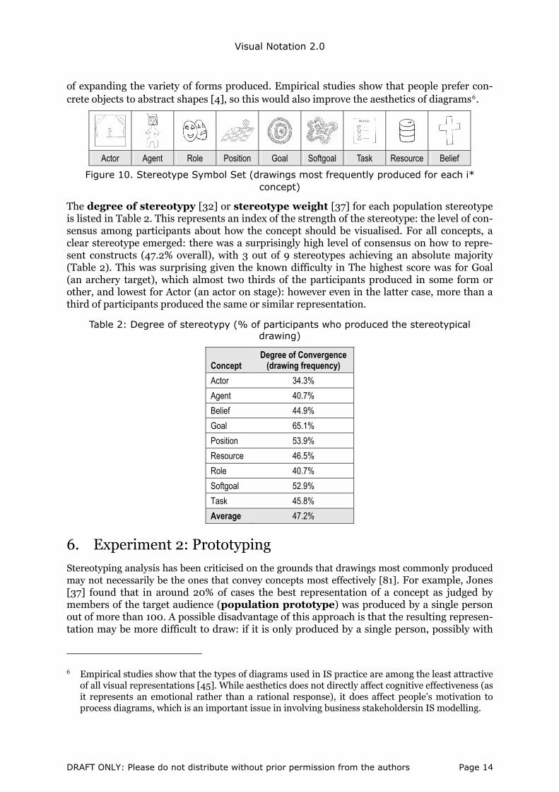
Figure 10. Stereotype Symbol Set (drawings most frequently produced for each i* concept)
The degree of stereotypy [32] or stereotype weight [37] for each population stereotype is listed in Table 2. This represents an index of the strength of the stereotype: the level of con-sensus among participants about how the concept should be visualised. For all concepts, a clear stereotype emerged: there was a surprisingly high level of consensus on how to repre-sent constructs (47.2% overall), with 3 out of 9 stereotypes achieving an absolute majority (Table 2). This was surprising given the known difficulty in The highest score was for Goal (an archery target), which almost two thirds of the participants produced in some form or other, and lowest for Actor (an actor on stage): however even in the latter case, more than a third of participants produced the same or similar representation.
Table 2: Degree of stereotypy (% of participants who produced the stereotypical drawing)
Concept Degree of Convergence
(drawing frequency)
Actor 34.3%
Agent 40.7%
Belief 44.9%
Goal 65.1%
Position 53.9%
Resource 46.5%
Role 40.7%
Softgoal 52.9%
Task 45.8%
Average 47.2%
6. Experiment 2: Prototyping
Stereotyping analysis has been criticised on the grounds that drawings most commonly produced may not necessarily be the ones that convey concepts most effectively [81]. For example, Jones [37] found that in around 20% of cases the best representation of a concept as judged by members of the target audience (population prototype) was produced by a single person out of more than 100. A possible disadvantage of this approach is that the resulting represen-tation may be more difficult to draw: if it is only produced by a single person, possibly with
6 Empirical studies show that the types of diagrams used in IS practice are among the least attractive of all visual representations [45]. While aesthetics does not directly affect cognitive effectiveness (as it represents an emotional rather than a rational response), it does affect people’s motivation to process diagrams, which is an important issue in involving business stakeholdersin IS modelling.
DRAFT ONLY: Please do not distribute without prior permission from the authors Page 14
Visual Notation 2.0
above average drawing ability, it may be beyond the capabilities of the average IS practitio-ner.
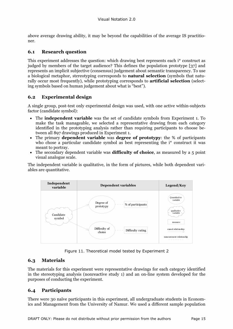
6.1 Research question
This experiment addresses the question: which drawing best represents each i* construct as judged by members of the target audience? This defines the population prototype [37] and represents an implicit subjective (consensus) judgement about semantic transparency. To use a biological metaphor, stereotyping corresponds to natural selection (symbols that natu-rally occur most frequently), while prototyping corresponds to artificial selection (select-ing symbols based on human judgement about what is “best”).
6.2 Experimental design
A single group, post-test only experimental design was used, with one active within-subjects factor (candidate symbol):
• The independent variable was the set of candidate symbols from Experiment 1. To make the task manageable, we selected a representative drawing from each category identified in the prototyping analysis rather than requiring participants to choose be-tween all 897 drawings produced in Experiment 1.
• The primary dependent variable was degree of prototypy: the % of participants who chose a particular candidate symbol as best representing the i* construct it was meant to portray.
• The secondary dependent variable was difficulty of choice, as measured by a 5 point visual analogue scale.
The independent variable is qualitative, in the form of pictures, while both dependent vari-ables are quantitative.
Candidate symbol
Degree of prototypy
Independent variable
Dependent variables Legend/Key
qualitative variab le
Quantitative variab le
measure
measurement relationship
causal relationshipDifficulty of choice
Difficulty rating
% of participants
Figure 11. Theoretical model tested by Experiment 2
6.3 Materials
The materials for this experiment were representative drawings for each category identified in the stereotyping analysis (nonreactive study 1) and an on-line system developed for the purposes of conducting the experiment.
6.4 Participants
There were 30 naïve participants in this experiment, all undergraduate students in Econom-ics and Management from the University of Namur. We used a different sample population
DRAFT ONLY: Please do not distribute without prior permission from the authors Page 15

Visual Notation 2.0
from Experiment 1 but drawn from the same underlying population. It would not have been appropriate for the authors to perform this analysis as, unlike stereotyping, it is not possible to do this objectively and it would be difficult for us to think like novices. It would also not have been appropriate to use the same participants as in Experiment 1, as their judgements may have been biased by their own drawings.
6.5 Procedure
We conducted this experiment using an on-line questionnaire, following [37]. The experi-ment was conducted in a computer room in which the experimental software was installed. On the first screen, participants were required to answer the selection question and enter their demographic data. They then navigated through 9 screens, one for each i* concept. The name and definition of the concept was displayed at the top of the screen with the candidate drawings (representatives from each category identified in the stereotyping study) displayed below. Participants were asked to select the drawing that most effectively conveyed each con-cept and to disregard the artistic quality of the drawings (Figure 12). Participants were re-quired to choose one and only drawing to represent each concept using radio buttons dis-played underneath each drawing. Both the order of the screen (concepts) and the position of the drawings on each screen were randomized to avoid sequence effects. Participants were also asked to rate the difficulty of drawing each concept on a 5 point visual analogue scale. No time limit was set but participants took between 5 and 15 minutes to complete the task.
Figure 12. Example screen from prototyping experiment
6.6 Results
The primary outcome of this experiment was a set of 9 prototypical drawings, one per i* con-cept (Figure 13). For 3 of the concepts, the prototypical drawings were the same as the stereo-typical drawings, showing that in a third of cases, the most common idea was the best. This is consistent with previous sign production studies and supports concerns expressed in the lit-erature about the validity of stereotyping as a basis for selecting the most appropriate sym-bols [37].
Actor Agent Role Position Goal Softgoal Task Resource Belief
Figure 13. Prototype Symbol Set
DRAFT ONLY: Please do not distribute without prior permission from the authors Page 16
Visual Notation 2.0
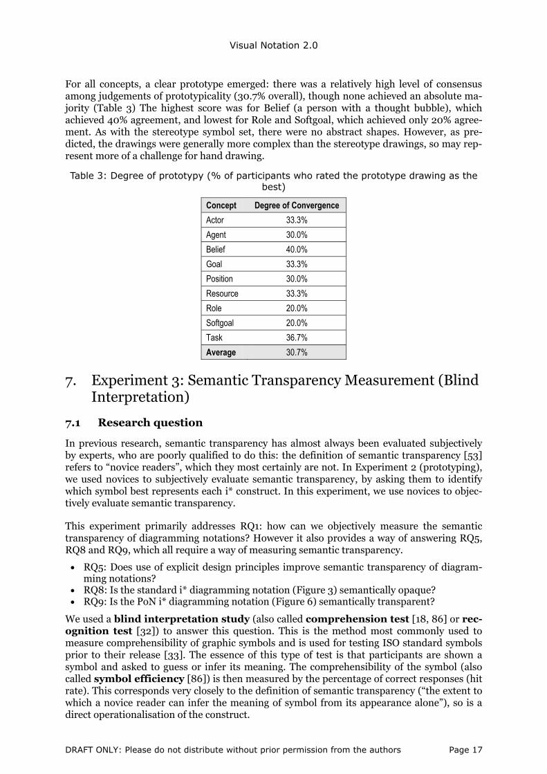
For all concepts, a clear prototype emerged: there was a relatively high level of consensus among judgements of prototypicality (30.7% overall), though none achieved an absolute ma-jority (Table 3) The highest score was for Belief (a person with a thought bubble), which achieved 40% agreement, and lowest for Role and Softgoal, which achieved only 20% agree-ment. As with the stereotype symbol set, there were no abstract shapes. However, as pre-dicted, the drawings were generally more complex than the stereotype drawings, so may rep-resent more of a challenge for hand drawing.
Table 3: Degree of prototypy (% of participants who rated the prototype drawing as the best)
Concept Degree of Convergence
Actor 33.3%
Agent 30.0%
Belief 40.0%
Goal 33.3%
Position 30.0%
Resource 33.3%
Role 20.0%
Softgoal 20.0%
Task 36.7%
Average 30.7%
7. Experiment 3: Semantic Transparency Measurement (Blind Interpretation)
7.1 Research question
In previous research, semantic transparency has almost always been evaluated subjectively by experts, who are poorly qualified to do this: the definition of semantic transparency [53] refers to “novice readers”, which they most certainly are not. In Experiment 2 (prototyping), we used novices to subjectively evaluate semantic transparency, by asking them to identify which symbol best represents each i* construct. In this experiment, we use novices to objec-tively evaluate semantic transparency.
This experiment primarily addresses RQ1: how can we objectively measure the semantic transparency of diagramming notations? However it also provides a way of answering RQ5, RQ8 and RQ9, which all require a way of measuring semantic transparency.
• RQ5: Does use of explicit design principles improve semantic transparency of diagram-ming notations?
• RQ8: Is the standard i* diagramming notation (Figure 3) semantically opaque? • RQ9: Is the PoN i* diagramming notation (Figure 6) semantically transparent?
We used a blind interpretation study (also called comprehension test [18, 86] or rec-ognition test [32]) to answer this question. This is the method most commonly used to measure comprehensibility of graphic symbols and is used for testing ISO standard symbols prior to their release [33]. The essence of this type of test is that participants are shown a symbol and asked to guess or infer its meaning. The comprehensibility of the symbol (also called symbol efficiency [86]) is then measured by the percentage of correct responses (hit rate). This corresponds very closely to the definition of semantic transparency (“the extent to which a novice reader can infer the meaning of symbol from its appearance alone”), so is a direct operationalisation of the construct.
DRAFT ONLY: Please do not distribute without prior permission from the authors Page 17

Visual Notation 2.0
7.2 Participants
There were 65 participants, all undergraduate students in Accountancy from the Haute Ecole Robert Schuman-Libramont or Interpretation and Translation from the Haute Ecole Marie HAPS-Bruxelles. As in studies 1 and 3, the participants had no prior knowledge of goal mod-elling or i*, so were truly naïve.
7.3 Experimental design
A 4 group, post-test only experimental design was used, with 1 active between-groups factor (symbol set). There were four experimental groups, corresponding to different levels of the independent variable:
• Standard i* (Figure 3): symbols produced by experts using intuition (unselfconscious design [1]). For the purposes of the experiment, we used the alternative Belief symbol: while this is not the standard symbol, it is most commonly used in practice.
• PoN i* (Figure 6): symbols produced by experts following explicit principles (selfcon-scious design [1]).
• Stereotype i* (Figure 10): the most common symbols produced by novices. • Prototype i* (Figure 13): the best symbols produced by novices (as judged by other nov-
ices).
The observed dependent variables were hit rate and semantic transparency coeffi-cient, which represent alternative but complementary measures (empirical indicators [16]) of semantic transparency (the latent dependent variable). The theoretical model tested by this experiment is summarised in Figure 14.
Expertise (2 levels)
Symbol set (4 levels)
Design culture (2 levels)
Semantic transparency
Hit rate (%)
Semantic transparency coefficient
Dependent (observed) variables
Selection method (2 levels)
Secondary independent
variables
Dependent (latent) variable
Primary independent
variable
Levels = 1. Expert (standard+PoN) 2. Novice (Stereo+Proto)
Levels = 1. Unselfconscious (standard) 2. Selfconscious (PoN)
Levels = 1. Stereotype 2. Prototype
Range: 0..100
Range: -1..1
Levels = 1. Standard 2. PoN 3. Stereotype 4. Prototype
Independent variable Dependent variables Legend/Key
Quantitative
variable
measure
measurement relationship
causal relationship
subset (specialisation) relationship
R5
R10
R11
Figure 14. Theoretical model for Experiment 3
The levels of the primary independent variable enable comparisons between unselfconscious and selfconscious design (group 1 vs 2), experts and novices (1+2 vs 3+4) and stereotyping and prototyping (3 vs 4): these represent secondary independent variables (design culture, expertise and selection method), as they are subsets or groupings of levels of the primary independent variable. This provides the basis for answering RQ5 plus two additional ques-tions:
RQ10. Can novices produce more semantically transparent symbols than experts?
RQ11. Does prototyping result in more semantically transparent symbols than stereotyp-ing?
DRAFT ONLY: Please do not distribute without prior permission from the authors Page 18

Visual Notation 2.0
7.4 Materials
4 sets of materials were prepared, one for each symbol set. As in Experiments 1 and 2, the first page was used to collect demographic data and ask the screening question. The remain-ing 9 pages were used to evaluate the semantic transparency of the symbols. One symbol was displayed at the top of each page (representing the stimulus) and the complete set of i* con-structs and definitions displayed in a table below (representing the possible responses). Participants were asked to indicate which construct they thought most likely corresponded to the symbol (Figure 15). In each case, there was one correct or target response and 8 incor-rect or distractor responses. Both the order in which the stimuli (symbols) were presented (i.e. order of pages) and the order in which the responses (concepts) were listed on each page were randomised to avoid sequence effects.
symbol(stimulus)
i* constructs and definitions
(candidate responses: target + distractors)
Figure 15. Example page from semantic transparency experiment
7.5 Procedure
Participants were randomly assigned to experimental groups and provided with the relevant set of experimental materials, a pencil and an eraser. They were instructed to work alone and not discuss their answers with any other participants. They were asked to answer each ques-tion in order and not to review previous answers. They were told to choose one and only one concept for each symbol presented but that each choice was independent: they could choose the same concept in response to multiple symbols. The purpose of this was to reduce the cog-nitive difficulty of the task (having to remember previous choices) and to tap directly into their intuition about what symbols meant. These instructions were repeated on each page of the questionnaire. Again, no time limit was set but participants took 10-15 minutes to com-plete the task.
7.6 Hypotheses
Given that sign production studies consistently show that symbols designed by novices are more accurately interpreted than those designed by experts, we predicted that the stereotype and prototype symbol sets would both outperform the standard i* and PoN symbol sets (RQ3): this is an empirically-derived prediction based on the results of previous sign produc-tion studies.
We also predicted that the prototype symbol set would outperform the stereotype set (RQ12) as it represents the best drawings rather than just the most common ones. This was a theory-derived prediction based on the sign production literature.
DRAFT ONLY: Please do not distribute without prior permission from the authors Page 19

Visual Notation 2.0
Finally, we predicted that the PoN symbol set would outperform the standard i* symbol set (RQ7) as it was designed based on explicit principles rather than intuition: this is a theory-derived prediction based on the Physics of Notations.
This results in a total ordering of the symbol sets:
Prototype > Stereotype > PoN > Standard i*
This corresponds to 12 separate hypotheses, representing all possible comparisons between groups on both dependent variables (hit rate and semantic transparency coefficient): the in-dividual hypotheses are listed in Table 8 and Table 9 and summarised in Figure 16.
Standard i*
Stereotype i*
Prototype i*
PoN i*
selection method
expertise
design culture
expertise
expertise
Experimental group
will be superior to
Legend/Key
Figure 16. Summary of a priori hypotheses for Experiment 3 (same for both dependent
variables)
7.7 Results
Statistical significance vs practical meaningfulness
In interpreting empirical results, it is important to distinguish between statistical significance and practical meaningfulness [12, 64]. Statistical significance measures whether an ob-served difference is a genuine difference or could be the result of random error. This is meas-ured by the p-value: the probability that the result could have occurred by chance. However, significance testing only provides a binary (yes/no) response as to whether there is a differ-ence (and therefore whether hypotheses should be accepted or rejected), without providing any information about how large the difference is [11-12]. Using large enough sample sizes, it is possible to achieve statistical significance for interventions that have little or no practical impact as the medical literature shows [70]. Effect size (ES) provides a way of measuring the size of differences and has been suggested as an index of practical meaningfulness [25, 71]. Statistical significance is most important in theoretical work (theory testing), while effect size is most important for applied research addressing practical problems [11].
Hit rate results
The traditional way of measuring comprehensibility of graphical symbols [34-35] is by meas-uring hit rates (percentage of correct responses). The ISO standard for testing graphical symbols defines 67% as the hit rate required for acceptance of public information and safety symbols. Only 6 out of the 36 symbols across the 4 symbol sets met the ISO threshold for
DRAFT ONLY: Please do not distribute without prior permission from the authors Page 20

Visual Notation 2.0
comprehensibility [18], with 5 of these from the stereotype symbol set (Table 4). Of the sym-bols with the highest hit rates for each i* concept (row maximums in Table 4), 7 were from the stereotype symbol set. In terms of overall comprehensibility (mean hit rate across all symbols), the stereotype symbol set also met the ISO threshold, which is a remarkable result given the abstract nature of the concepts. However none of the other symbol sets even came close (all were under 50%). The stereotype symbol set achieved a mean hit rate of almost 4 times that of standard i*, showing just how far from their potential for user comprehensibil-ity IS diagramming notations currently are.
Table 4. Hit rate results (descriptive statistics): green = above ISO comprehensibility threshold; underline = best of breed (row maximum)
Standard PoN Stereotype Prototype
Actor 11.1% 37.5% 62.5% 43.8%
Agent 11.1% 37.5% 50.0% 37.5%
Belief 33.3% 43.8% 93.8% 31.3%
Goal 11.8% 31.3% 56.3% 31.3%
Position 5.6% 12.5% 43.8% 50.0%
Resource 11.1% 50.0% 75.0% 37.5%
Role 11.1% 43.8% 75.0% 43.8%
Softgoal 50.0% 12.5% 75.0% 50.0%
Task 11.1% 81.3% 75.0% 50.0%
Mean hit rate 17.4% 38.9% 67.4% 41.7%
Std dev 14.5% 20.7% 15.6% 7.7%
Group size (n) 18 16 16 16
Interestingly, one of the PoN symbols (Softgoal) actually reduced semantic transparency compared to standard i* by 75%. This shows that conscious attempts to improve semantic transparency can sometimes have the opposite effect. It also shows the danger of relying on expert judgement to evaluate semantic transparency.
Semantic transparency coefficient results
The problem with conventional measures of symbol comprehension (e.g. hit rates, miss/error rates) is that they are simple percentages and can’t have negative values. Theoretically, se-mantic transparency is defined as a ratio scale, with a zero point, positive values and negative values. Hit rates also do not provide the basis for determining whether a symbol is semanti-cally opaque, transparent or perverse (apart from possibly defining arbitrary percentage cut-offs for each category). In this paper, we propose a new measure of semantic transparency called the semantic transparency coefficient (or visual-semantic correlation coef-ficient), based on the statistical concept of actual and expected response frequencies. Like a correlation coefficient, it varies from –1 (perfect negative correlation: novices will guess an incorrect meaning 100% of the time) to +1 (perfect positive correlation: novices will guess the correct meaning 100% of the time). Effectively, it measures the “correlation” between a symbol’s appearance and its meaning: positive values correspond to semantic transparency, negative values to semantic perversity and the zero point to semantic opacity, so is consistent with the theoretical definition of the construct.
The semantic transparency coefficient is calculated by forming a frequency table (semantic transparency matrix) with rows corresponding to symbols (stimuli), columns correspond-ing to concepts (responses), and response frequencies entered into the cells of the table. If symbols are semantically transparent, the diagonals (corresponding to the correct or target concept) will form the row maximum: that is, participants are more likely to infer the cor-
DRAFT ONLY: Please do not distribute without prior permission from the authors Page 21

Visual Notation 2.0
rect meaning (i.e. the target concept) than an incorrect meaning (i.e. a distractor concept). The semantic transparency coefficient for each symbol is calculated according to the follow-ing formula:
maximum frequency – expected frequency total responses – expected frequency
The expected frequency (the number of responses in each cell expected by chance) = n/s, where n is the number of participants in the experimental group and s is the number of sym-bols. This is subtracted from both the numerator and denominator to remove the effects of chance. If the row maximum is the target concept, the value will be positive (semantically transparent). If the row maximum is a distractor concept, the value will be negative (se-mantically perverse). If the target concept receives 100% of responses, the value will be +1 (the maximum value possible) and if one of the distractor concepts receives 100% of re-sponses, the value will be –1 (the minimum value possible), as required by the definition of semantic transparency. (Note: a more stringent definition of semantic transparency would be to sum the responses for all distractor concepts whose frequencies exceed the target concept.)
Table 5 shows the semantic transparency matrix for the standard i* symbol set. Only two of the symbols (Belief and Softgoal) formed row maximums: this partially confirms (and par-tially contradicts) the evaluation in [55], where the alternative Belief symbol was identified as the only semantically transparent symbol in the standard i* symbol set.
Table 5. Semantic transparency matrix (response frequency table) for standard i*: green = target concept forms row maximum; red = distractor concept forms row maximum
Actor Agent Belief Goal Position Resource Role Softgoal Task Semantic
TransparencyCoefficient
2 1 0 7(1) 3 5 0 0 0 -0.31
1 2 1 4 5(3)* 1 2 1 1 -0.19
2 2 6 2 1 1 1 1 2 0.25
1 1 1 2 3(4)* 2 2 2 3(2) -0.07
1 3 5(1) 4 1 2 0 1 1 -0.19
1 6(1) 1 2 3 2 0 2 1 -0.25
2 1 2 0 5(0) 1 2 3 2 -0.19
1 1 0 1 0 0 3 9 3 0.44
0 2 2 2 4(1) 3 3 0 2 -0.13
Mean semantic transparency of symbol set = -0.07
Such a matrix is also called a confusion matrix [86], as it can be used to identify which symbols are commonly mistaken for one another or for different concepts. The Position sym-bol caused the most confusions, forming the row maximum for no less than 4 concepts (Agent, Goal, Role, Task), though surprisingly not for its target concept. Some confusions were symmetric [86]: where symbols are confused with each other’s concepts (Agent-Position, Goal-Position).
DRAFT ONLY: Please do not distribute without prior permission from the authors Page 22

Visual Notation 2.0
Qualitative analysis
An important practical application of the semantic transparency matrix is to analyse it for common misinterpretations of symbols:
• The Actor symbol (circle) was most commonly interpreted (by 39% of participants) as a Goal, reflecting the fact that in sports, goals are often circular e.g. archery target, basket-ball hoop, dartboard. This was the rationale for proposing a circle as the symbol for Goal in [55], suggesting that this intuition was accurate. The symbols proposed for Goal in the stereotype and prototype symbol sets were both circular (archery targets).
• The Position symbol was most commonly interpreted as a Belief, most likely because it is similar to the cloud shape (it looks like a simplified version of a cloud). This may also have reduced the semantic transparency of the Belief symbol, which was lower than ex-pected. This suggests that a more clearly distinguishable shape should be used to avoid such confusion (this relates to the Principle of Perceptual Discriminability in the Physics of Notations).
• The Resource symbol (rectangle) was most commonly interpreted (by one third of par-ticipants) as an Agent. This seems hard to explain, but may be because in French (all par-ticipants were French speakers) Agent is commonly used to refer to a broker or financier: the rectangle may have been interpreted as representing a banknote.
• Both the Agent and Role symbols (represented as circles with horizontal lines inside) were most commonly interpreted as Positions. This may be because the horizontal lines were interpreted as representing a position marker: this shows the subtle perceptual cues that people respond to in interpreting the meaning of shapes.
This qualitative analysis complements the quantitative analysis (calculation of hit rates and semantic transparency coefficients) and can be used to identify and correct problems with symbols.
Static comparisons
The semantic transparency coefficients for all symbols are summarised in Table 6. The user designed symbols were all semantically transparent but only 2 of the standard symbols and 7 of the PoN symbols were. Overall, the standard i* symbol was found to be slightly semanti-cally perverse, but a one sample t-test (static comparison) showed that the mean was not significantly different to zero, meaning that it is semantically opaque: this confirms RQ9. All the other symbol sets were found to be semantically transparent, which confirms RQ10. The most semantically transparent symbol across all symbol sets was the PoN Task symbol (the yellow sticky note) and the most perverse symbol was the standard i* Actor symbol.
Table 6. Semantic transparency coefficient results: green = transparent; underline = row maximum (most semantically transparent symbol for that i* construct)
Standard PoN Stereotype Prototype Actor -0.31 0.30 0.58 0.37 Agent -0.19 0.30 0.39 0.30 Belief 0.25 0.37 0.83 0.23 Goal -0.07 0.23 0.45 0.23
Position -0.19 -0.30 0.33 0.44 Resource -0.25 0.44 0.64 0.30
Role -0.19 0.37 0.64 0.37 Softgoal 0.44 -0.16 0.64 0.44
Task -0.13 0.79 0.64 0.44 Mean -0.07 0.26 0.57 0.34
Std dev 0.25 0.32 0.15 0.09
≠ 0: one sample t-test
Opaque(p = .419)
Transparent(p = .042*)
Transparent(p = .000***)
Transparent (p = .000***)
DRAFT ONLY: Please do not distribute without prior permission from the authors Page 23

Visual Notation 2.0
These results probably overstate the true semantic transparency of standard i* as we used the cloud symbol for Belief, which is not the standard symbol but commonly used in practice: if the standard symbol (an oval) had been used, the symbol set would most likely have been semantically perverse. Interestingly, both the PoN Position and Softgoal symbols were found to be perverse. This shows that what notation designers (experts) perceive to be semantically transparent may not be perceived the same way by novices due to their different cognitive profiles. Both these PoN symbols decreased semantic transparency compared to the standard i* symbol, showing that conscious attempts to improve semantic transparency may some-times have the opposite effect. Also, the standard i* Softgoal symbol was evaluated by [55] to be semantically opaque, yet was found to be semantically transparent. This shows the danger of relying on expert judgement in making decisions about semantic transparency: such judgements represent conjecture only and need to empirically tested.
Ordinal scaling: semantic transparency bands
We define an ordinal scale for semantic transparency consisting of a progression of values based on effect size, shown visually in Figure 17. There are no effect size standards defined for semantic transparency coefficients, so we adopt those for correlation coefficients [12]:
• Strongly perverse (– – –): STC ≥ -.5 (large negative effect) • Moderately perverse (– –): .3 ≤ STC < -.5 (medium negative effect) • Slightly perverse (–): .1 ≤ STC < -.3 (small negative effect) • Opaque (±): -.1 < STC < .1 (no meaningful effect) • Slightly transparent (+): .1 ≤ STC < .3 (small positive effect) • Moderately transparent (++): .3 ≤ STC < .5 (medium positive effect) • Strongly transparent (+++): STC ≥ .5 (large positive effect)
− − − ± + ++ +++
-1 1-.5 -.3 -.1 .1 .3 .5
− − −
Figure 17. Ordinal scale for semantic transparency
This can be used to visualise the results in the form of a heat map (Table 7):
Table 7. “Heat map” summarising the results of semantic transparency testing using ordinal scale defined in Figure 17
Standard PoN Stereotype Prototype
Actor -0.31 0.30 0.58 0.37 Agent -0.19 0.30 0.39 0.30 Belief 0.25 0.37 0.83 0.23 Goal -0.07 0.23 0.45 0.23 Position -0.19 -0.30 0.33 0.44 Resource -0.25 0.44 0.64 0.30 Role -0.19 0.37 0.64 0.37 Softgoal 0.44 -0.16 0.64 0.44 Task -0.13 0.79 0.64 0.44
Mean -0.07 0.26 0.57 0.34
Hypothesis testing (differences between groups)
A one-way analysis of variance (ANOVA) was used to analyse differences between sym-bol sets on hit rate and semantic transparency. Hypothesis testing was conducted using pre-defined contrasts in the ANOVA procedure. The underlying assumptions of the ANOVA pro-cedure were verified using Levene’s test for homogeneity of variances and the Shapiro-Wilk
DRAFT ONLY: Please do not distribute without prior permission from the authors Page 24
Visual Notation 2.0
W test for multivariate normality. Cohen’s d [12] was used to analyse the practical meaning-fulness of the results (effect size).
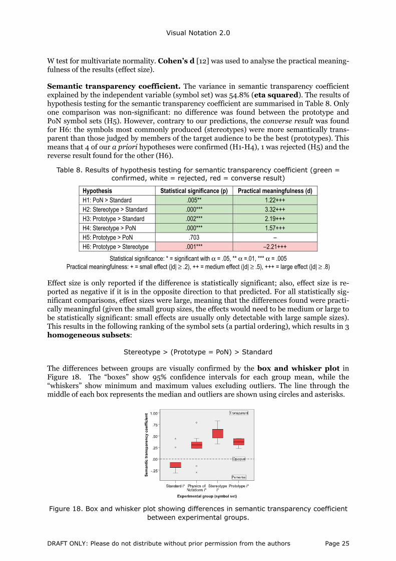
Semantic transparency coefficient. The variance in semantic transparency coefficient explained by the independent variable (symbol set) was 54.8% (eta squared). The results of hypothesis testing for the semantic transparency coefficient are summarised in Table 8. Only one comparison was non-significant: no difference was found between the prototype and PoN symbol sets (H5). However, contrary to our predictions, the converse result was found for H6: the symbols most commonly produced (stereotypes) were more semantically trans-parent than those judged by members of the target audience to be the best (prototypes). This means that 4 of our a priori hypotheses were confirmed (H1-H4), 1 was rejected (H5) and the reverse result found for the other (H6).
Table 8. Results of hypothesis testing for semantic transparency coefficient (green = confirmed, white = rejected, red = converse result)
Hypothesis Statistical significance (p) Practical meaningfulness (d) H1: PoN > Standard .005** 1.22+++ H2: Stereotype > Standard .000*** 3.32+++ H3: Prototype > Standard .002*** 2.19+++ H4: Stereotype > PoN .000*** 1.57+++ H5: Prototype > PoN .703 – H6: Prototype > Stereotype .001*** –2.21+++
Statistical significance: * = significant with α = .05, ** α =.01, *** α = .005 Practical meaningfulness: + = small effect (|d| ≥ .2), ++ = medium effect (|d| ≥ .5), +++ = large effect (|d| ≥ .8)
Effect size is only reported if the difference is statistically significant; also, effect size is re-ported as negative if it is in the opposite direction to that predicted. For all statistically sig-nificant comparisons, effect sizes were large, meaning that the differences found were practi-cally meaningful (given the small group sizes, the effects would need to be medium or large to be statistically significant: small effects are usually only detectable with large sample sizes). This results in the following ranking of the symbol sets (a partial ordering), which results in 3 homogeneous subsets:
Stereotype > (Prototype = PoN) > Standard
The differences between groups are visually confirmed by the box and whisker plot in Figure 18. The “boxes” show 95% confidence intervals for each group mean, while the “whiskers” show minimum and maximum values excluding outliers. The line through the middle of each box represents the median and outliers are shown using circles and asterisks.
Figure 18. Box and whisker plot showing differences in semantic transparency coefficient between experimental groups.
DRAFT ONLY: Please do not distribute without prior permission from the authors Page 25

Visual Notation 2.0
Hit rate. For hit rate, there were two ways to conduct the analysis: using each symbol as a separate case (with results aggregated across participants) or using each participant as a separate case (with results aggregated across symbols). This affects the sample size: n = number of symbols per symbol set or n= number of participants per group and therefore the power of the test. Note that it is not possible to do participant based analysis for the semantic transparency coefficient as by definition it is a symbol based metric.
The results of hypothesis testing for hit rate using symbol as the unit of analysis are summa-rised in Table 8. This replicates the same differences between groups found for the semantic transparency coefficient. The consistency of results for both two dependent variables is con-sistent with their being alternative measures of the same underlying theoretical construct. The overall variance in hit rate explained by the independent variable (symbol set) was 60.1% (eta squared).
Table 9. Results of hypothesis testing for hit rate using symbols as the unit of analysis (green = confirmed, white = rejected, red = converse result)
Hypothesis Statistical significance (p) Practical meaningfulness (d)
H7: PoN > Standard .003** 1.22+++
H8: Stereotype> Standard .000*** 3.32+++
H9: Prototype > Standard .000*** 2.19+++
H10: Stereotype > PoN .005*** 1.57+++
H11: Prototype > PoN .421 –
H12: Prototype > Stereotype .038*** –2.21+++
Statistical significance: * = significant with α = .05, ** α =.01, *** α = .005 Practical meaningfulness: + = small effect (|d| ≥ .2), ++ = medium effect (|d| ≥ .5), +++ = large effect (|d| ≥ .8)
The results for the analysis using participants as the unit of analysis are marginally more sta-tistically significant, due to the increase in sample size, though the effect sizes are marginally smaller due to the greater dispersion in the data. The overall variance in hit rate explained by the independent variable (symbol set) was 45.3% (eta squared).
Table 10. Results of hypothesis testing for hit rate using participants as the unit of analysis (green = confirmed, white = rejected, red = converse result)
Hypothesis Statistical significance (p)
Practical meaningfulness (d)
H7: PoN > Standard .001** 1.42+++
H8: Stereotype> Standard .000*** 2.72+++
H9: Prototype > Standard .000*** 1.67+++
H10: Stereotype > PoN .000*** 1.30+++
H11: Prototype > PoN .674 –
H12: Prototype > Stereotype .000*** –1.21+++
Statistical significance: * = significant with α = .05, ** α =.01, *** α = .005 Practical meaningfulness: + = small effect (|d| ≥ .2), ++ = medium effect (|d| ≥ .5), +++ = large effect (|d| ≥ .8)
7.8 Discussion
Out of a total of 12 a priori hypotheses, 8 were confirmed (H1–4, 7–10), 2 were rejected (H5, 11) and the reverse result found for the other two (H6, 12). All statistically significant differ-ences were also practical meaningful, with large effect sizes in all cases. The results of hy-pothesis testing are summarised in Figure 19:
DRAFT ONLY: Please do not distribute without prior permission from the authors Page 26

Visual Notation 2.0
Standard i*
Stereotype i*
Prototype i*
PoN i*
selection method
expertise
design culture
expertise
expertise
Experimental group
confirmed
Legend/Key
contra finding
rejected
C
C
Figure 19. Summary of results of hypothesis testing for Experiment 3 (same for both dependent variables)
In terms of our original research questions, the conclusions from this experiment are:
Effect of explicit design principles (RQ5)
Using explicit design principles (selfconscious design) significantly improves semantic trans-parency (supported by H1 and H7), showing that conscious efforts to improve semantic transparency are likely to be successful. The average hit rate for the PoN symbol set was more twice that of the standard i* notation, meaning that symbols were more than twice as likely to be correctly interpreted without prior explanation.
.0
.1
.2
.3
.4
.5
.6
.7
.8
.9
Actor
Agent
Belief
Goal
Positio
n
Resourc
eRole
Softgoal
Task
Standard
PoN
-.4
-.2
.0
.2
.4
.6
.8
1.0
Actor
Agent
Belief
Goal
Positio
n
Resourc
eRole
Softgoal
Task
Standard
PoN
Hit rate Semantic transparency coefficient
Figure 20. Comparison of semantic transparency results for unselfconscious and selfconscious notation design
Predictions of previous paper (RQ8, RQ9)
The standard i* notation is semantically opaque (RQ8) and the PoN notation is semantically transparent (RQ9) as argued in [55] (Table 6). However some of the predictions about indi-vidual symbols (e.g. the standard Softgoal symbol, the PoN Position and Softgoal symbols) were contradicted by the empirical results.
Effect of expertise (RQ10)
Novice generated symbols are more semantically transparent than those generated by ex-perts: this is supported by H2–H4, H8–H10 but not H5 and H11. When we pooled the results
DRAFT ONLY: Please do not distribute without prior permission from the authors Page 27

Visual Notation 2.0
of the two expert groups (standard and PoN i*) and the two novice groups (stereotype and prototype i*), we found a significant difference in favour of the novice groups (p = .000) with a large effect size (d = 1.47). Remarkably, the mean semantic transparency of novice-generated symbols was more than 5 times that of expert-generated symbols (.09 vs .46) with around half the variability (standard deviation = .17 vs .33), suggesting that novice-generated symbols are also more reliably interpreted. This is consistent with the results of sign produc-tion studies conducted in other domains but a surprising result in an IS context, where the assumption has always been that experts are best qualified to design symbols.
Effect of selection method (RQ11)
The superiority of the stereotype over prototype symbol set (H6, H12) is a surprising result and challenges the standard assumption in sign production studies that drawings rated as being the best really are the best. This may be an example of the preference performance paradox: what people prefer is not necessarily what is most effective [44]. Such judgements may be influenced by factors such as familiarity and aesthetics, which have nothing to do with comprehension. It also shows the danger of relying on subjective judgments about se-mantic transparency even by members of the target audience: objective, performance-based evaluations (e.g. conducting blind interpretation studies as in this experiment) provide a much more reliable basis for choosing appropriate symbols. As a dramatic example of this, the symbol rated by participants as the best symbol for Belief in the prototyping experiment received the worst semantic transparency score across all symbol sets. Overall, there was a significant negative correlation of -.46 between degree of prototypy and semantic transpar-ency, suggesting an inverse relationship between subjective judgements about semantic transparency and objective performance among members of the target population.
8. Experiment 4: Recall/Recognition Performance (unblinded interpretation)
8.1 Research questions
The purpose of this experiment was to evaluate participants’ ability to learn and remember symbols from the various symbol sets: the mnemonicity of symbols. They were given one of the symbol sets to learn and then had to recall their meanings. This is much closer to what end users have to do in practice than guessing what symbols mean (as in Experiment 3), so has greater ecological validity.
The comparison between symbol sets represents a further test of RQ5 (design culture), RQ10 (expertise) and RQ11 (selection) using a different dependent variable (recall/recognition per-formance instead of semantic transparency). Recall/recognition performance provides an early measure of cognitive effectiveness as accurate interpretation of symbols is a prerequi-site for accurate interpretation of diagrams.
The experiment also evaluated the effect of semantic transparency and design rationale on interpretation of symbols. This addresses RQ6 and RQ7, which test causal relationships pos-ited by the Physics of Notations.
• RQ6: Does semantic transparency improve interpretation of symbols by novices? • RQ7: Does explicit design rationale improve interpretation of symbols by novices?
8.2 Participants
There were 83 participants in this experiment, all undergraduate students in (a) Accountancy from Haute Ecole Robert Schuman-Libramont or (b) Interpretation and Translation from the
DRAFT ONLY: Please do not distribute without prior permission from the authors Page 28

Visual Notation 2.0
Haute Ecole Marie HAPS-Bruxelles. The participants had no previous knowledge of i* or goal modelling (this was the inclusion criterion as in all of the previous experiments).
8.3 Experimental design
A 5 group, post-test only experimental design was used, with two active between-groups fac-tors (symbol set and design rationale) and one passive within-groups factor (semantic transparency). The groups were the same as for the previous experiment with one addi-tional group: PoN with design rationale (PoN DR). The dependent (observed) variables were recall/recognition accuracy (% of people who correctly recalled meaning of symbol) and recall/recognition error rate (% of interpretation errors). These represent alternative but complementary (inverse) measures of recall/recognition performance (the dependent latent variable). The theoretical model tested by this experiment is summarised in Figure 21. Semantic transparency (using the results obtained from Experiment 3 for the 36 symbols) acts as a passive independent variable: in contrast to all the other independent variables, it is a continuous rather than discrete variable.
Expertise
Symbol setDesign culture
Recall/ recognition performance
Recall/recognition accuracy (%)
Recall/recognition error rate (%)
-1
Design rationale
Selection method
Semantic transparency
(inverse measure)
+1
Hit rate (%)
Semantic transparency coefficient
[Experiment 3]
Figure 21. Theoretical Model Tested by Experiment 4
8.4 Materials
5 sets of materials were prepared, one for each symbol set:
• Training materials: these defined all the symbols and their meanings for one of the sym-bol sets. The PoN DR symbol set included explicit design rationale for each symbol (an explanation why the symbol was chosen to represent that concept), taken from [55]. De-sign rationale could not be included for any of the other symbol sets because it was not available: like most IS diagramming notations, i* lacks design rationale for any of its symbols and the symbolisation experiment (Experiment 1) did not ask participants to provide design rationale for their drawings.
• Testing materials: these were used to evaluate participants’ ability to recall the meaning of symbols. The same test materials were used as in Experiment 3 (Figure 15), though in this case it was an “unblinded” interpretation test, as participants were told the meanings of the symbols prior to the test.
8.5 Procedure
Participants were asked to study the training materials until they understood all symbols and their meanings (learning phase). They then proceeded to the testing phase, where sym-
DRAFT ONLY: Please do not distribute without prior permission from the authors Page 29

Visual Notation 2.0
bols were presented one at a time and participants had to recall their meanings. Each re-sponse required choosing from the complete set of i* concepts (closed questions), so more closely approximated recognition rather than recall [44]. Participants were not allowed to take notes during the learning phase or to refer back to the training materials during the test-ing phase. No time limit was set but participants took 10-15 minutes to complete the task.
8.6 Hypotheses
6 of the hypotheses for this study (H13-H18) took the same general form as those in the pre-vious experiment, in that we predicted there would be the following ranking of symbol sets. Given that semantic transparency is a determinant of cognitive effectiveness, we expect the same differences between groups as in the previous experiment: semantic transparency thus acts as a mediating variable:
Prototype > Stereotype > PoN > Standard i*
We also predicted that design rationale would improve recall/recognition performance (H19): this involves a comparison between the PoN and PoN DR groups. No a priori hy-potheses were proposed between PoN DR and any of the other symbol sets as we had no theoretical basis for estimating the relative effects of design rationale vs the other independ-ent variables on recall/recognition accuracy: it only makes sense to evaluate the effect of de-sign rationale using the same symbol set, where all other characteristics of the symbol set are controlled.
Standard i*
Stereotype i*
Prototype i*
PoN i*
selection method
expertise
design culture
expertise
expertise
Experimental group
will be superior to
Legend/Key
PoN DRdesign
rationale
Figure 22. Summary of a priori hypotheses for differences between groups
Finally, we predicted that semantic transparency (using the results obtained in Experiment 3) would have a positive effect on recall/recognition performance (H20, using the semantic transparency coefficient and H21, using hit rate). H19-21 were based on predictions of the Physics of Notations.
8.7 Results
Descriptive statistics
The recall/recognition accuracy results for all symbols and symbol sets are summarised in Table 11. The stereotype symbol set was again the best performer and reduced interpretation errors by more than 5 times compared to standard i* (3.1% vs 16%). It received perfect (100%) scores for most symbols (5/9), compared to none for standard i*. The PoN DR group was a close second, with the same number of perfect scores. All symbol sets except for stan-
DRAFT ONLY: Please do not distribute without prior permission from the authors Page 30

Visual Notation 2.0
dard i* had an average recall accuracy rating of more than 90%. Interestingly, one of the symbols that was found to be semantically perverse in Experiment 4 (the PoN Softgoal sym-bol) received a perfect (100%) score once its design rationale was explained. This shows how even apparently counterintuitive symbols (at first glance) can be accurately interpreted if there are sound reasons behind their choice.
Table 11. Recall/recognition accuracy results (green = 100%)
Standard PoN Stereotype Prototype PoN DR
Actor 93.8% 100.0% 100.0% 94.1% 100.0%
Agent 75.0% 94.1% 94.4% 94.1% 100.0%
Belief 87.5% 94.1% 100.0% 100.0% 94.1%
Goal 81.3% 94.1% 94.4% 94.1% 94.4%
Position 75.0% 82.4% 100.0% 100.0% 88.9%
Resource 87.5% 88.2% 94.4% 100.0% 88.9%
Role 81.3% 83.3% 88.9% 94.1% 100.0%
Softgoal 93.8% 88.9% 100.0% 82.4% 100.0%
Task 81.3% 94.4% 100.0% 94.1% 100.0%
Mean accuracy 84.0% 91.1% 96.9% 94.1% 96.3%
Std dev 7.1% 5.8% 4.0% 5.1% 4.8%
Mean error rate 16.0% 8.9% 3.1% 5.9% 3.3%
n 16 18 18 17 18
Qualitative analysis
Analysis of recall/recognition errors revealed some systematic problems in the design of sym-bols in the standard i* and PoN symbol sets:
• The most common confusion in the standard i* symbol set was between Roles and Agents. This has been reported anecdotally in practice, but was confirmed by the empiri-cal results. The likely reason for this may be that the symbols are not discriminable enough (Principle of Perceptual Discriminability [53]): they are circles with hori-zontal bars inside, one at the top and one at the bottom. The Position symbol was also confused with Role, which may suggest a semantic confusion: it may be that the concepts are too similar as the symbols are clearly different.
• The most common confusion in the PoN symbol set was between Actor and Position: they are the same symbol (a stick figure), one with a face (Actor) and one without a face (Position). This was not satisfactorily resolved even by the inclusion of design rationale (i.e. that the Position symbol represented a “faceless” bureaucrat rather than a person). This may also be a perceptual discriminability problem.
These common confusions suggest that these symbols should be redesigned so they are more clearly distinguishable.
Differences between groups
As in the previous experiment, a one-way analysis of variance (ANOVA) was used to analyse differences between groups. The variance in recall/recognition accuracy explained by the dif-ferences between groups was 49.4% (eta squared). The results of hypothesis testing are sum-marised in Table 12. Only two comparisons were not significant: no difference was found be-tween the prototype and PoN symbol sets (as in Experiment 3) and between the prototype and stereotype symbol sets. All statistically significant differences were also practically mean-ingful, with large effect sizes in all cases.
DRAFT ONLY: Please do not distribute without prior permission from the authors Page 31
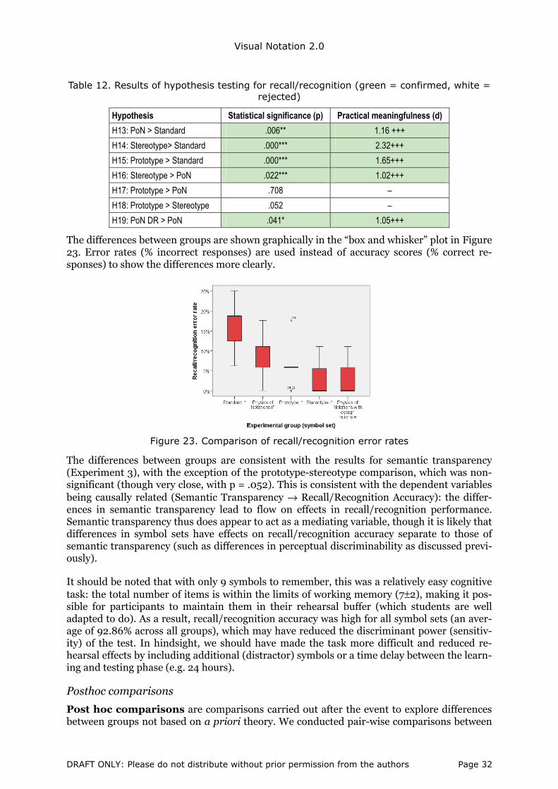
Visual Notation 2.0
Table 12. Results of hypothesis testing for recall/recognition (green = confirmed, white = rejected)
Hypothesis Statistical significance (p) Practical meaningfulness (d)
H13: PoN > Standard .006** 1.16 +++
H14: Stereotype> Standard .000*** 2.32+++
H15: Prototype > Standard .000*** 1.65+++
H16: Stereotype > PoN .022*** 1.02+++
H17: Prototype > PoN .708 –
H18: Prototype > Stereotype .052 –
H19: PoN DR > PoN .041* 1.05+++
The differences between groups are shown graphically in the “box and whisker” plot in Figure 23. Error rates (% incorrect responses) are used instead of accuracy scores (% correct re-sponses) to show the differences more clearly.
Figure 23. Comparison of recall/recognition error rates
The differences between groups are consistent with the results for semantic transparency (Experiment 3), with the exception of the prototype-stereotype comparison, which was non-significant (though very close, with p = .052). This is consistent with the dependent variables being causally related (Semantic Transparency → Recall/Recognition Accuracy): the differ-ences in semantic transparency lead to flow on effects in recall/recognition performance. Semantic transparency thus does appear to act as a mediating variable, though it is likely that differences in symbol sets have effects on recall/recognition accuracy separate to those of semantic transparency (such as differences in perceptual discriminability as discussed previ-ously).
It should be noted that with only 9 symbols to remember, this was a relatively easy cognitive task: the total number of items is within the limits of working memory (7±2), making it pos-sible for participants to maintain them in their rehearsal buffer (which students are well adapted to do). As a result, recall/recognition accuracy was high for all symbol sets (an aver-age of 92.86% across all groups), which may have reduced the discriminant power (sensitiv-ity) of the test. In hindsight, we should have made the task more difficult and reduced re-hearsal effects by including additional (distractor) symbols or a time delay between the learn-ing and testing phase (e.g. 24 hours).
Posthoc comparisons
Post hoc comparisons are comparisons carried out after the event to explore differences between groups not based on a priori theory. We conducted pair-wise comparisons between
DRAFT ONLY: Please do not distribute without prior permission from the authors Page 32

Visual Notation 2.0
all groups using Tukey’s Honestly Significant Difference (HSD) test, which is one of the most conservative of post-hoc tests. The only comparisons not covered by a priori predic-tions were those between PoN DR and the standard i*, stereotype and prototype groups. PoN DR was significantly different to standard i* (p = .000) (which follows transitively from two a priori predictions: PoN > standard and PoN DR > PoN) but not to the stereotype or proto-type groups.
Effect of semantic transparency on recall/ recognition performance
To evaluate RQ6, we conducted a linear regression analysis across all symbols and sym-bol sets using the semantic transparency coefficient as the independent (predictor) variable and recall/recognition accuracy as the dependent (outcome) variable. The re-sults show that semantic transparency explains 43% of the variance in recall/recognition per-formance (r2 = .43) [72]. The effect is both statistically significant (p = .000) and practically meaningful (r2 ≥ .25 = large effect size) [12]. The standardised regression coefficient (β) is .66, meaning that for a 1% increase in semantic transparency, there will be a corre-sponding .66% increase in recall/recognition accuracy. The resulting regression equation is:
Equation 1. Recall/recognition accuracy (%) = 15 * semantic transparency coefficient + 88
This confirms the prediction of the Physics of Notations that semantic transparency makes symbols easier for novices to learn and remember. The relationship between semantic trans-parency and recall/recognition is shown graphically in Figure 24.
Figure 24. Scatterplot of semantic transparency vs recall/recognition accuracy showing line of best fit and 95% confidence intervals
We also conducted a regression analysis using hit rate (the alternative measure for semantic transparency) as the predictor variable. This was also statistically significant (p = .000) but explained only 36% of the variation in recall/recognition performance. This suggests that the semantic transparency coefficient is a better predictor of interpretation accuracy, so has higher criterion validity.
Effect of design rationale on recall/recognition
The difference between the PoN and PoN DR experimental groups (H13) shows that design rationale significantly improves recall/recognition performance. Inclusion of design rationale improved recall/recognition accuracy (even if only marginally) for every symbol in the PoN symbol set. Overall, design rationale reduces the incidence of interpretation errors by more than half (57%). This confirms the prediction of the Physics of Notations that design rationale helps novices learn and remember what symbols mean.
DRAFT ONLY: Please do not distribute without prior permission from the authors Page 33
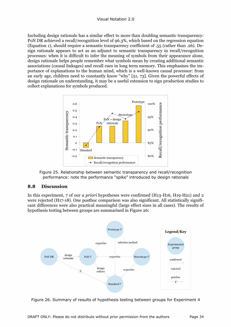
Visual Notation 2.0
Including design rationale has a similar effect to more than doubling semantic transparency: PoN DR achieved a recall/recognition level of 96.3%, which based on the regression equation (Equation 1), should require a semantic transparency coefficient of .55 (rather than .26). De-sign rationale appears to act as an adjunct to semantic transparency in recall/recognition processes: when it is difficult to infer the meaning of symbols from their appearance alone, design rationale helps people remember what symbols mean by creating additional semantic associations (causal linkages) and recall cues in long term memory. This emphasises the im-portance of explanations to the human mind, which is a well-known causal processor: from an early age, children need to constantly know “why” [51, 73]. Given the powerful effects of design rationale on understanding, it may be a useful extension to sign production studies to collect explanations for symbols produced.
Standard
PoNPoN + design
rationale
Stereotype
Prototype
-0.2
-0.1
0
0.1
0.2
0.3
0.4
0.5
0.6
Sem
anti
c tr
ansp
aren
cy
80%
85%
90%
95%
100%
Rec
all/
reco
gnit
ion
per
form
ance
Semantic transparency
Recall/recognition performance
Figure 25. Relationship between semantic transparency and recall/recognition performance: note the performance “spike” introduced by design rationale
8.8 Discussion
In this experiment, 7 of our a priori hypotheses were confirmed (H13-H16, H19-H21) and 2 were rejected (H17-18). One posthoc comparison was also significant. All statistically signifi-cant differences were also practical meaningful (large effect sizes in all cases). The results of hypothesis testing between groups are summarised in Figure 26:
Standard i*
Stereotype i*
Prototype i*
PoN i*
selection method
expertise
design culture
expertise
expertise
Experimental group
confirmed
Legend/Key
rejected
posthoc
PoN DRdesign
rationale
P
P
Figure 26. Summary of results of hypothesis testing between groups for Experiment 4
DRAFT ONLY: Please do not distribute without prior permission from the authors Page 34

Visual Notation 2.0
9. Identify “Best of Breed” Symbol Set (non-reactive study)
9.1 Research question
This analysis addresses the question: which are the most semantically transparent and mne-monic symbols across all symbol sets? This was a (quantitative) non-reactive study, as it in-volves meta-analysis of the results from Experiments 3 and 4. It represents a symbol-by-symbol comparison across all dependent variables and all symbol sets rather than compari-son of symbol sets as in Experiments 3 and 4. The purpose is to produce a “best of breed” symbol set that optimises semantic transparency and recall/recognition accuracy (i.e. “cogni-tively optimal i*”).
9.2 Most semantically transparent symbols
Table 13 shows the best and worst symbols across all symbol sets in terms of semantic trans-parency: in all cases, there was a clear winner and loser. The “best of breed” symbol set in-cludes 7 symbols from the stereotype symbol set, 1 from the prototype symbol set, 1 from the PoN symbol set and none from the standard i* symbol set. The mean semantic transparency of this symbol set is .6 and mean hit rate is 69%, which exceeds the ISO threshold for com-prehensibility of symbols.
Table 13. Comparison of semantic transparency of symbols: green = best of breed, red = worst of breed
Standard PoN Stereotype Prototype “Best of breed” symbol
Actor -0.31 0.30 0.58 0.37 0.58
Agent -0.19 0.30 0.39 0.30 0.39
Belief 0.25 0.37 0.83 0.23 0.83
Goal -0.07 0.23 0.45 0.23 0.45
Position -0.19 -0.30 0.33 0.44 0.44
Resource -0.25 0.44 0.64 0.30 0.64
Role -0.19 0.37 0.64 0.37 0.64
Softgoal 0.44 -0.16 0.64 0.44 0.64
Task -0.13 0.79 0.64 0.44 0.79
Total best 0 1 7 1 Mean ST = .6
Total worst 6 2 0 1 Mean hit rate = 69%
Of the worst (least transparent) symbols, 6 came from the standard i* symbol set, 2 from the PoN symbol set, 1 from the prototype symbol set and none from the stereotype symbol set. This leads us to the astonishing conclusion that 8 out of the 9 best performing symbols were designed by novices and 8 out of the 9 worst performing symbols were designed by experts!
9.3 Most mnemonic symbols
Table 14 shows the best and worst symbols across all symbol sets in terms of re-call/recognition accuracy: in all cases, there was a clear worst symbol but for 3 concepts there were ties for best symbol (all with perfect scores), making it impossible to produce a “best of breed” symbol set for recall/recognition accuracy. Of the best symbols, 6 came from the stereotype symbol set, 5 from the PoN DR symbol set, 3 from the prototype symbol set, 1 from the PoN symbol set and none from the standard i* symbol set. Of the worst symbols, 8 came from the standard i* symbol set and 1 from the prototype symbol set. In this case, 9 out of the 15 best performing symbols were designed by novices and 8 out of the 9 worst per-forming symbols were designed by experts!
DRAFT ONLY: Please do not distribute without prior permission from the authors Page 35
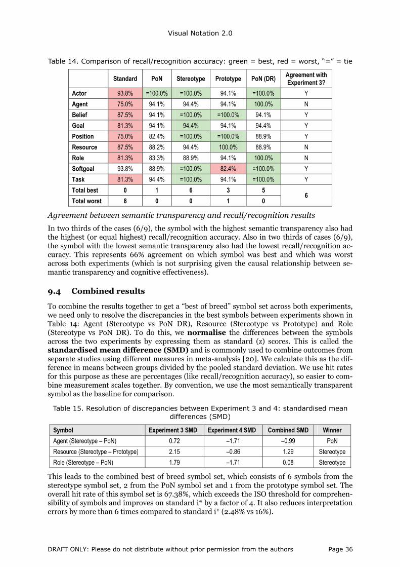
Visual Notation 2.0
Table 14. Comparison of recall/recognition accuracy: green = best, red = worst, “=” = tie
Standard PoN Stereotype Prototype PoN (DR) Agreement with Experiment 3?
Actor 93.8% =100.0% =100.0% 94.1% =100.0% Y
Agent 75.0% 94.1% 94.4% 94.1% 100.0% N
Belief 87.5% 94.1% =100.0% =100.0% 94.1% Y
Goal 81.3% 94.1% 94.4% 94.1% 94.4% Y
Position 75.0% 82.4% =100.0% =100.0% 88.9% Y
Resource 87.5% 88.2% 94.4% 100.0% 88.9% N
Role 81.3% 83.3% 88.9% 94.1% 100.0% N
Softgoal 93.8% 88.9% =100.0% 82.4% =100.0% Y
Task 81.3% 94.4% =100.0% 94.1% =100.0% Y
Total best 0 1 6 3 5
Total worst 8 0 0 1 0 6
Agreement between semantic transparency and recall/recognition results
In two thirds of the cases (6/9), the symbol with the highest semantic transparency also had the highest (or equal highest) recall/recognition accuracy. Also in two thirds of cases (6/9), the symbol with the lowest semantic transparency also had the lowest recall/recognition ac-curacy. This represents 66% agreement on which symbol was best and which was worst across both experiments (which is not surprising given the causal relationship between se-mantic transparency and cognitive effectiveness).
9.4 Combined results
To combine the results together to get a “best of breed” symbol set across both experiments, we need only to resolve the discrepancies in the best symbols between experiments shown in Table 14: Agent (Stereotype vs PoN DR), Resource (Stereotype vs Prototype) and Role (Stereotype vs PoN DR). To do this, we normalise the differences between the symbols across the two experiments by expressing them as standard (z) scores. This is called the standardised mean difference (SMD) and is commonly used to combine outcomes from separate studies using different measures in meta-analysis [20]. We calculate this as the dif-ference in means between groups divided by the pooled standard deviation. We use hit rates for this purpose as these are percentages (like recall/recognition accuracy), so easier to com-bine measurement scales together. By convention, we use the most semantically transparent symbol as the baseline for comparison.
Table 15. Resolution of discrepancies between Experiment 3 and 4: standardised mean differences (SMD)
Symbol Experiment 3 SMD Experiment 4 SMD Combined SMD Winner
Agent (Stereotype – PoN) 0.72 –1.71 –0.99 PoN
Resource (Stereotype – Prototype) 2.15 –0.86 1.29 Stereotype
Role (Stereotype – PoN) 1.79 –1.71 0.08 Stereotype
This leads to the combined best of breed symbol set, which consists of 6 symbols from the stereotype symbol set, 2 from the PoN symbol set and 1 from the prototype symbol set. The overall hit rate of this symbol set is 67.38%, which exceeds the ISO threshold for comprehen-sibility of symbols and improves on standard i* by a factor of 4. It also reduces interpretation errors by more than 6 times compared to standard i* (2.48% vs 16%).
DRAFT ONLY: Please do not distribute without prior permission from the authors Page 36
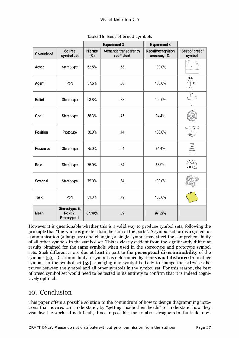
Visual Notation 2.0
Table 16. Best of breed symbols
Experiment 3 Experiment 4
i* construct Source symbol set
Hit rate (%)
Semantic transparency coefficient
Recall/recognition accuracy (%)
“Best of breed” symbol
Actor Stereotype 62.5% .58 100.0%
Agent PoN 37.5% .30 100.0%
Belief Stereotype 93.8% .83 100.0%
Goal Stereotype 56.3% .45 94.4%
Position Prototype 50.0% .44 100.0%
Resource Stereotype 75.0% .64 94.4%
Role Stereotype 75.0% .64 88.9%
Softgoal Stereotype 75.0% .64 100.0%
Task PoN 81.3% .79 100.0%
Mean Stereotype: 6,
PoN: 2, Prototype: 1
67.38% .59 97.52%
However it is questionable whether this is a valid way to produce symbol sets, following the principle that “the whole is greater than the sum of the parts”. A symbol set forms a system of communication (a language) and changing a single symbol may affect the comprehensibility of all other symbols in the symbol set. This is clearly evident from the significantly different results obtained for the same symbols when used in the stereotype and prototype symbol sets. Such differences are due at least in part to the perceptual discriminability of the symbols [53]. Discriminability of symbols is determined by their visual distance from other symbols in the symbol set [53]: changing one symbol is likely to change the pairwise dis-tances between the symbol and all other symbols in the symbol set. For this reason, the best of breed symbol set would need to be tested in its entirety to confirm that it is indeed cogni-tively optimal.
10. Conclusion
This paper offers a possible solution to the conundrum of how to design diagramming nota-tions that novices can understand, by “getting inside their heads” to understand how they visualise the world. It is difficult, if not impossible, for notation designers to think like nov-
DRAFT ONLY: Please do not distribute without prior permission from the authors Page 37
Visual Notation 2.0
ices, but this paper provides a practical way of overcoming the “curse of knowledge” by ac-tively involving end users in the notation design process. We call this Visual Notation De-sign 2.0 as it involves end users as co-developers (prosumers) of notations rather than as passive consumers as in traditional approaches.
Symbols designed this way increased semantic transparency by almost 300% and reduced interpretation errors by a factor of 5 compared to the existing i* diagramming notation. Re-quirements errors are the source of more than half the errors in IS development [17, 42, 48], are the most common cause of failure of IS development projects [17, 79-80] and are the most costly errors of all: it is more than 100 times more costly to correct a defect post-implementation than to correct it during the requirements phase [7]. Reducing interpretation errors by end users could therefore lead to significant cost savings and productivity im-provements in IS development.
For the entire history of the IS field, it has always been the case that end users have to learn our languages to communicate with us: by getting them to design the languages themselves, we may be able to overcome many of the communication problems that currently beset IS development.
10.1 Summary of findings
We summarise our findings by answering the research questions raised at the beginning of the paper:
RQ1. How can we objectively (empirically) measure the semantic transparency of dia-gramming notations?
A: Through blind interpretation experiments (e.g. experiment 3). In this paper, we defined a new metric (the semantic transparency coefficient), which has theoretical and practical ad-vantages over traditional measures such as hit rate. Hit rate and the semantic transparency coefficient represent alternative, complementary measures of the same underlying construct (semantic transparency), but the semantic transparency coefficient better reflects the theo-retical definition of the construct and provides better prediction of comprehensibility. The results of semantic transparency measurement were in several cases at odds with the expert assessments in [55], showing that expert judgement is an unreliable basis for such decisions.
RQ2. How can we improve the semantic transparency of diagramming notations?
A: Through symbolisation experiments to generate candidate symbols (e.g. Experiment 1) and stereotyping analysis to select the most common symbols. Using this approach, we were able to increase comprehensibility of symbols by naïve participants (as measured by “hit rates”) by a factor of almost 4 (from 17% to 67%: Table 4) and reduce interpretation errors by more than 80% (from 16% to 3.1%: Table 11) over notations designed in the traditional way (the existing i* symbol set). Even more surprisingly, it resulted in symbols that meet the ISO threshold for public information and safety symbols (67% hit rate): in other words, self-explanatory symbols.
RQ3. How can we actively (and productively) involve end users in the process of designing diagramming notations?
A: Through symbolisation experiments (e.g. Experiment 1), blind interpretation experiments (e.g. Experiment 3) and recall/recognition experiments (e.g. Experiment 4). Our research
DRAFT ONLY: Please do not distribute without prior permission from the authors Page 38
Visual Notation 2.0
shows that, as in IS development, members of the target audience should not just be involved at the end of the notation design process (e.g. in usability testing) but should be actively in-volved from the beginning (e.g. in generating candidate symbols).
RQ4. How can we evaluate user comprehensibility of diagramming notations prior to their release?
A: Through blind interpretation studies (e.g. Experiment 3) and recall/recognition studies (e.g. Experiment 4) using members of the target audience (or proxies as in our experiments). Such studies can be used to identify potential interpretation problems and to rectify them prior to releasing them into practice. Such testing is routinely carried out for public informa-tion and safety symbols and is a mandatory requirement for their acceptance as international standards [33], but is rarely, if ever, conducted for diagramming notations (even interna-tional standards like UML and BPMN). User acceptance testing is also a mandatory step in developing software systems.
RQ5. Does using explicit design principles (selfconscious design) improve semantic trans-parency and cognitive effectiveness?
A: Use of explicit design principles significantly improves both semantic transparency (Ex-periment 3) and recall/recognition performance, an early measure of cognitive effectiveness (Experiment 4). It more than doubled the average hit rate for symbols (Table 4) and reduced interpretation errors by almost 50% (Table 11).
RQ6. Does improving semantic transparency improve comprehension by novices (i.e. cog-nitive effectiveness)?
A: Semantic transparency has a powerful effect on interpretation of symbols by novices and explains more than 40% of the variation in recall/recognition performance (Experiment 4). In general, a 1% increase in semantic transparency leads to a .66% reduction in interpretation errors. This suggests that semantic transparency should be a major priority (perhaps even the major priority) in designing diagramming notations for consumption by business stake-holders.
RQ7. Does explicit design rationale improve understanding by novices (i.e. cognitive effec-tiveness)?
A: Design rationale improved recall/recognition accuracy for every symbol it was included for and reduced interpretation errors by novices by more than 50% overall (Table 11). This re-flects the inherent nature of the human mind as a causal processor [51, 73]. Currently, design rationale for symbols is conspicuously absent from IS diagramming notations [28], but our results suggest that it should be a mandatory requirement, given that it can help novices re-member what symbols mean. Including design rationale also has other benefits [55]:
• It forces designers to think carefully about symbolisation choices and consider alterna-tives rather than accepting the first and most obvious option (e.g. a geometrical shape).
• It forces designers to explicitly think about semantic transparency when designing sym-bols i.e. what is the association between this symbol and its meaning? Design rationale explanations are usually based on (explicit or implicit) notions of semantic transparency.
• It opens up the symbolisation debate beyond the notation design team. If notation users are aware of what the designers were trying to achieve in proposing certain symbols, they
DRAFT ONLY: Please do not distribute without prior permission from the authors Page 39

Visual Notation 2.0
can contribute alternative ideas, which will expand the range of symbols beyond the imaginations of the design team and increase the variety of forms.
RQ10. Can novices design more semantically transparent symbols than experts?
The answer to this question is emphatically “yes”. Remarkably, 8 of the 9 best (most semanti-cally transparent) symbols were designed by novices and 8 of the 9 worst (least semantically transparent) symbols were designed by experts (Table 6). The average semantic transparency of novice-generated symbols was more than 5 times that of expert-generated symbols, which challenges the longstanding (and rarely questioned) assumption in the IS field that experts are best qualified to design diagramming notations.
The empirical results were both statistically significant and practically meaningful, so have implications for both IS theory and practice.
10.2 Changing visual notation design practices
We have described a radical new approach to developing user comprehensible diagramming notations that actively involves members of the target audience (participative design), is gen-eralised and repeatable (the same approach could be applied to any notation intended for communicating with novices) and is practical to apply (all studies required less than 30 min-utes to complete and used easily accessible sample populations). We believe that this ap-proach has the potential to revolutionise IS visual notation design practice and change the way that groups like OMG operate in the future. In the same way that Threadless uses its cus-tomers to design its T-shirts, we could use our customers to design our diagramming nota-tions. This could finally deliver on the vision of the 1970s of end users being able to model their own requirements: “application development without programmers”. It is widely ac-cepted in the business world that to communicate effectively with customers, you need to speak their language. By getting our customers to design the languages we use to communi-cate with them, we may be able to go some way towards bridging the IT-business communi-cation gap, which appears to be widening over time.
The process for visual notation design proposed in this paper differs from traditional ap-proaches in two important ways:
• The number of people involved (the power of numbers): in traditional notation de-sign, only a single person (e.g. i* [84], ER [9]) or a small team (e.g. the “3 amigos” for UML 1.0 [63], technical committees for OMG standards [e.g. 62]) is involved. In our ap-proach, over 100 people were involved, which represents true “people power” in the style of Web 2.0.
• (Lack of) expertise of the participants (the blessing of ignorance): notation design is normally a task reserved exclusively for technical experts, with domain experts neither involved in generating symbols, choosing between them nor testing their comprehensi-bility. In our approach, we used novices to generate symbols (Experiment 1), to choose between them (Experiment 2) and to evaluate their comprehensibility (Experiments 3 and 4), which turns traditional notation design on its head. While ignorance is often seen as a weakness, in this context it is a strength, as it helps overcome the curse of knowledge that afflicts most notation designers.
10.3 The future of visual notation design: crowdsourcing?
The approach described in this paper represents an application of crowdsourcing: an ap-proach that enlists a multitude of humans to help solve a problem (also called peer produc-tion, user generated content, collective intelligence, crowd wisdom, mass collaboration) [15]. Any non-trivial problem can benefit from crowdsourcing, so there is no reason why visual
DRAFT ONLY: Please do not distribute without prior permission from the authors Page 40
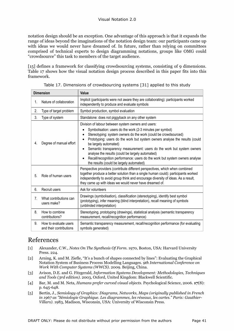
Visual Notation 2.0
notation design should be an exception. One advantage of this approach is that it expands the range of ideas beyond the imaginations of the notation design team: our participants came up with ideas we would never have dreamed of. In future, rather than relying on committees comprised of technical experts to design diagramming notations, groups like OMG could “crowdsource” this task to members of the target audience.
[15] defines a framework for classifying crowdsourcing systems, consisting of 9 dimensions. Table 17 shows how the visual notation design process described in this paper fits into this framework.
Table 17. Dimensions of crowdsourcing systems [31] applied to this study
Dimension Value
1. Nature of collaboration Implicit (participants were not aware they are collaborating): participants worked independently to produce and evaluate symbols
2. Type of target problem Symbol production, symbol evaluation
3. Type of system Standalone: does not piggyback on any other system
4. Degree of manual effort
Division of labour between system owners and users: • Symbolisation: users do the work (2-3 minutes per symbol) • Stereotyping: system owners do the work (could be crowdsourced) • Prototyping: users do the work but system owners analyse the results (could
be largely automated) • Semantic transparency measurement: users do the work but system owners
analyse the results (could be largely automated) • Recall/recognition performance: users do the work but system owners analyse
the results (could be largely automated)
5. Role of human users
Perspective providers (contribute different perspectives, which when combined together produce a better solution than a single human could): participants worked independently to avoid group think and encourage diversity of ideas. As a result, they came up with ideas we would never have dreamed of.
6. Recruit users Ask for volunteers
7. What contributions can users make?
Drawings (symbolisation), classification (stereotyping), identify best symbol (prototyping), infer meaning (blind interpretation), recall meaning of symbols (unblinded interpretation)
8. How to combine contributions?
Stereotyping, prototyping (drawings), statistical analysis (semantic transparency measurement, recall/recognition performance)
9. How to evaluate users and their contributions
Semantic transparency measurement, recall/recognition performance (for evaluating symbols generated)
References [1] Alexander, C.W., Notes On The Synthesis Of Form. 1970, Boston, USA: Harvard University
Press. 224.
[2] Arning, K. and M. Ziefle, “It’s a bunch of shapes connected by lines”: Evaluating the Graphical Notation System of Business Process Modelling Languages. 9th International Conference on Work With Computer Systems (WWCS). 2009. Beijing, China.
[3] Avison, D.E. and G. Fitzgerald, Information Systems Development: Methodologies, Techniques and Tools (3rd edition). 2003, Oxford, United Kingdom: Blackwell Scientific.
[4] Bar, M. and M. Neta, Humans prefer curved visual objects. Psychological Science, 2006. 17(8): p. 645-648.
[5] Bertin, J., Semiology of Graphics: Diagrams, Networks, Maps (originally published in French in 1967 as "Sémiologie Graphique. Les diagrammes, les réseaux, les cartes." Paris: Gauthier-Villars). 1983, Madison, Wisconsin, USA: University of Wisconsin Press.
DRAFT ONLY: Please do not distribute without prior permission from the authors Page 41
Visual Notation 2.0
[6] Blankenberger, S. and K. Hahn, Effects of icon design on human-computer interaction. International Journal of Man-Machine Studies, 1991. 35: p. 363-377.
[7] Boehm, B.W., Software Engineering Economics. 1981, Englewood Cliffs, USA: Prentice-Hall. 767.
[8] Britton, C. and S. Jones, The Untrained Eye: How Languages for Software Specification Support Understanding by Untrained Users. Human Computer Interaction, 1999. 14: p. 191-244.
[9] Chen, P.P., The Entity Relationship Model: Towards An Integrated View Of Data. ACM Transactions On Database Systems, 1976. 1(1): p. 9-36.
[10] Cheng, P.C.-H., R.K. Lowe, and M. Scaife, Cognitive Science Approaches To Understanding Diagrammatic Representations. Artificial Intelligence Review, 2001. 15(1/2): p. 79-94.
[11] Chow, S.L., Significance Test or Effect Size. Psychological Bulletin, 1988. 103(1): p. 105-110.
[12] Cohen, J., Statistical Power Analysis for the Behavioural Sciences (2nd ed.). 2nd ed. 1988, Hillsdale, NJ: Lawrence Earlbaum and Associates.
[13] De Marco, T., Structured Analysis And System Specification. 1978: Yourdon Press.
[14] Deming, W.E., Out of the Crisis. 1986, Cambridge, MA: MIT Center for Advanced Engineering.
[15] Doan, A., R. Ramakrishnan, and A.Y. Halevy, Crowdsourcing Systems on the World-Wide Web. Communications of the ACM, 2011. 54(4): p. 86-96.
[16] Dubin, R., Theory Building (revised edition). 1978, New York: The Free Press.
[17] Enders, A. and H.D. Rombach, A Handbook of Software and Systems Engineering: Empirical Observations, Laws and Theories. 2003, Reading, Massachusetts, USA: Addison-Wesley.
[18] Foster, J.J., Graphical Symbols: Test Methods for Judged Comprehensibility and for Comprehension. ISO Bulletin, 2001: p. 11-13.
[19] Gehlert, A. and W. Esswein, Towards a Formal Research Framework for Ontological Analyses. Advanced Engineering Informatics, 2007. 21: p. 119-131.
[20] Glass, G.V., B. McGaw, and M.L. Smith, Meta Analysis in Social Research. 1981, London: Sage Publications.
[21] Goldstine, H.H. and J. von Neumann, Planning and coding of problems for an electronic computing instrument 1947, Report prepared for the US Army Ordnance Department (reprinted in John von Neumann, Collected Works Volume V, Pergamon Press, 1963 pp 80-151).
[22] Grau, G., J. Horkoff, E. Yu, and S. Abdulhadi. i* Guide 3.0. 2007 February 10, 2009]; Available from: http://istar.rwth-aachen.de/tiki-index.php?page_ref_id=67.
[23] Gregor, S., The Nature of Theory in Information Systems. MIS Quarterly, 2006. 30 (3): p. 611-642.
[24] Halpin, T.A., ORM 2 Graphical Notation (Technical Report ORM2-01). 2005, Neumont University.
[25] Harris, M.J. and R. Rosenthal, Mediation of Interpersonal Expectancy Effects: 31 Meta-Analyses. Psychological Bulletin, 1985. 97: p. 363-386.
[26] Heath, C. and D. Heath, Made to Stick: Why Some Ideas Take Hold and Others Come Unstuck. 2008, London, England: Arrow Books.
[27] Henderson-Sellers, B. and D.G. Firesmith, Comparing OPEN and UML: the two third-generation OO development approaches. Information and Software Technology, 1999. 41 p. 139-156.
[28] Hitchman, S., The Details of Conceptual Modelling Notations are Important - A Comparison of Relationship Normative Language. Communications of the AIS, 2002. 9(10).
[29] Hitchman, S., Practitioner Perceptions on the use of Some Semantic Concepts in the Entity Relationship Model. European Journal of Information Systems, 1995. 4(1): p. 31-40.
[30] Howard, C., M.W. O'Boyle, V. Eastman, T. Andre, and T. Motoyama, The relative effectiveness of symbols and words to convey photocopier functions. Applied Ergonomics, 1991. 22(4): p. 218-224.
[31] Howe, J., The Rise of Crowdsourcing. Wired Magazine, 2006. June 14.
[32] Howell, W.C. and A.H. Fuchs, Population Stereotypy in Code Design. Organizational Behavior and Human Performance, 1968. 3: p. 310-339.
DRAFT ONLY: Please do not distribute without prior permission from the authors Page 42

Visual Notation 2.0
[33] ISO, Graphical symbols - Test methods - Part 1: Methods for testing comprehensibility (ISO 9186-1:2007). 2007, International Standards Organisation (ISO): Geneva, Switzerland.
[34] ISO, ISO Standard Graphical Symbols: Public Information Symbols (ISO 7001:2007). 2007, International Standards Organisation (ISO): Geneva, Switzerland.
[35] ISO, ISO Standard Graphical Symbols: Safety Colours and Safety Signs – Registered Safety Signs (ISO 7010:2003). 2003, International Standards Organisation (ISO): Geneva, Switzerland.
[36] Jick, T.D., Mixing Qualitative and Quantitative Methods: Triangulation in Action. Administrative Science Quarterly, 1979. 24: p. 602-611.
[37] Jones, S., Stereotypy in pictograms of abstract concepts. Ergonomics, 1983. 26(6): p. 605-611.
[38] Karsh, R. and D.A. Mudd, Design of a picture language to identify vehicle controls III: a comparative evaluation of selected picture symbol designs, in Technical Memo 15-62, AD No. 289544. 1961, U.S. Army Human Engineering Lab.
[39] Karsh, R. and D.A. Mudd, Design of a picture language to identify vehicle controls III: a comparative evaluation of selected picture symbol designs, in Technical Memo 15-62, AD No. 289544. 1962, U.S. Army Human Engineering Lab.
[40] Koedinger, K. and J. Anderson, Abstract Planning and Conceptual Chunks: Elements of Expertise in Geometry. Cognitive Science, 1990. 14: p. 511-550.
[41] Larkin, J.H. and H.A. Simon, Why a Diagram is (Sometimes) Worth Ten Thousand Words. Cognitive Science, 1987. 11(1).
[42] Lauesen, S. and O. Vinter (ed.), Preventing Requirement Defects. Proceedings of the Sixth International Workshop on Requirements Engineering: Foundation for Software Quality (REFSQ'2000). 2000. Stockholm, Sweden.
[43] Lee, J., Design Rationale Systems: Understanding the Issues. IEEE Expert, 1997. 12(3): p. 78–85.
[44] Lidwell, W., K. Holden, and J. Butler, Universal principles of design: a cross-disciplinary reference. 2003, Gloucester, Massachusetts: Rockport Publishers.
[45] Lohse, G.L., K. Biolsi, N. Walker, and H. Rueter, A Classification of Visual Representations. Communications of the ACM, 1994. 37(12): p. 36-49.
[46] Lohse, G.L., D. Min, and J.R. Olson, Cognitive Evaluation of System Representation Diagrams. Information & Management, 1995. 29: p. 79-94.
[47] Martin, J., Application Development Without Programmers. 1982, Englewood Cliffs, New Jersey, USA: Prentice-Hall. xvi, 350.
[48] Martin, J., Information Engineering. 1989, Englewood Cliffs, New Jersey, USA: Prentice Hall. 3 v.
[49] Martin, J. and C. Finkelstein, Information Engineering. 1981, Carnforth, England: Savant Institute.
[50] Masri, K., D. Parker, and A. Gemino, Using Iconic Graphics in Entity Relationship Diagrams: The Impact on Understanding. Journal of Database Management, 2008. 19(3): p. 22-41.
[51] Medina, J.J., Brain Rules: 12 Principles for Surviving and Thriving at Work, Home, and School 2008, Seattle, Washington, USA: Pear Press.
[52] Moody, D.L. (ed.), The Physics of Notations: Improving the Usability and Communicability of Visual Notations in Requirements Engineering (keynote address). 4th International Workshop on Requirements Engineering Visualization (REV’09). 2009. Atlanta, Georgia: IEEE Computer Society.
[53] Moody, D.L., The "Physics" of Notations: Towards a Scientific Basis for Constructing Visual Notations in Software Engineering. IEEE Transactions on Software Engineering, 2009. 35(5): p. 756-777.
[54] Moody, D.L., P. Heymans, and R. Matulevicius, Improving the Effectiveness of Visual Representations in Requirements Engineering: An Evaluation of the i* Visual Notation. 17th IEEE International Conference on Requirements Engineering (RE09). 2009. Atlanta, Georgia: IEEE Computer Society.
[55] Moody, D.L., P. Heymans, and R. Matulevicius, Visual Syntax Does Matter: Improving the Cognitive Effectiveness of the i* Visual Notation. Requirements Engineering Journal, 2010. 15(2): p. 141-175.
DRAFT ONLY: Please do not distribute without prior permission from the authors Page 43
Visual Notation 2.0
[56] Morris, S.J. and O.C.Z. Gotel (ed.), Flow Diagrams: Rise and Fall of the First Software Engineering Notation. Diagrams 2006. 2006. Stanford, USA: Springer-Verlag.
[57] Muller, M.J. and S. Kuhn, Participatory Design (Special Issue). Communications of the ACM, 1993. 36 (6): p. 24-28.
[58] Nordbotten, J.C. and M.E. Crosby, The Effect of Graphic Style on Data Model Interpretation. Information Systems Journal, 1999. 9(2): p. 139-156.
[59] Norman, D., The Design of Everyday Things. 1988, New York: Doubleday Business.
[60] Novick, L.P., The Importance of Both Diagrammatic Conventions and Domain-Specific Knowledge for Diagram Literacy in Science: The Hierarchy as an Illustrative Case in Diagrammatic Representation and Inference, D. Barker-Plummer, R. Cox, and N. Swoboda, Editors. 2006, Springer: Berlin.
[61] O’Reilly, T., What is Web 2.0: Design Patterns and Business Models for the Next Generation of Software. Communications & Strategies, 2007. 65(1): p. 17-37.
[62] OMG, Business Process Model and Notation (BPMN) Version 2.0 (Final). 2011: Object Management Group (OMG).
[63] OMG, Unified Modeling Language (UML) Specification, Version 1.5. 2003: Object Management Group (OMG).
[64] Pedhazur, E.J. and L.P. Schmelkin, Measurement, Design and Analysis: An Integrated Approach. 1991, Hillsdale, USA: Lawrence Erlbaum Associates.
[65] Petre, M., Why Looking Isn't Always Seeing: Readership Skills and Graphical Programming. Communications of the ACM, 1995. 38(6): p. 33-44.
[66] Recker, J., Opportunities and Constraints: The Current Struggle with BPMN. Business Process Management Journal, 2010. 16(1): p. 181-201.
[67] Recker, J.C., N. Safrudin, and M. Rosemann, How novices design business processes. Information Systems, 2012. 37(6): p. 557-573.
[68] Rogers, Y. and D.J. Oborne, Pictorial communication of abstract verbs in relation to human-computer interaction. British Journal of Psychology, 1987. 78: p. 99-112.
[69] Rogers, Y. and D.J. Oborne, Pictorial communication of abstract verbs in
relation to human-computer interaction. British Journal of Psychology, 1987. 78: p. 99-112.
[70] Rosenthal, R., Assessing the Statistical and Social Importance of the Effects of Psychotherapy. Journal of Consulting and Clinical Psychology, 1983. 51: p. 4-13.
[71] Rosenthal, R., Meta-Analytic Procedures for Social Research. 1991, Newbury Park, CA: Sage Publications.
[72] Rosenthal, R. and D.B. Rubin, A Note on Percent Variance Explained as a Measure of Importance of Effects. Journal of Educational Psychology, 1979. 74: p. 395-396.
[73] Sagan, C., The Demon-Haunted World: Science as a Candle in the Dark. 1997, New York: Random House.
[74] Schmider, E., M. Ziegler, E. Danay, L. Beyer, and M. Bühner, Is it really robust? Reinvestigating the robustness of ANOVA against violations of the normal distribution assumption. Methodology: European Journal of Research Methods for the Behavioral and Social Sciences, 2010. 6 (4): p. 147-151.
[75] Shanks, G.G., The Challenges Of Strategic Data Planning In Practice: An Interpretive Case Study. Journal of Strategic Information Systems, 1997. 6(1): p. 69-90.
[76] Shanks, G.G., E. Tansley, and R.A. Weber, Using Ontology to Validate Conceptual Models. Communications of the ACM, 2003. 46(10): p. 85-89.
[77] Shapiro, S.S. and M.B. Wilk, An Analysis of Variance Test for Normality. Biometrika, 1965. 52: p. 591-611.
[78] Silver, B., BPMN Method and Style: A levels-based methodology for BPM process modeling and improvement using BPMN 2.0. Vol. New York. 2009: Cody-Cassidy Press.
[79] Standish Group, The CHAOS Report. 1994, The Standish Group International, Available on-line at http://www.standishgroup.com/sample_research/chaos_1994_1.php.
[80] Standish Group, Unfinished Voyages. 1995, The Standish Group International, available on-line at http://www.standishgroup.com/sample_research/unfinished_voyages_1.php.
DRAFT ONLY: Please do not distribute without prior permission from the authors Page 44

Visual Notation 2.0
[81] Szlichcinski, K.P., The production and comprehension of pictorial instructions (PhD thesis). 1980, University of London.
[82] Verdi, M.P., s.M. Crooks, and D.R. White, Learning Effects of Print and Digital Geographic Maps. Journal of Research and Technology in Education, 2003. 35(2): p. 290-302.
[83] Winn, W.D., An Account of How Readers Search for Information in Diagrams. Contemporary Educational Psychology, 1993. 18: p. 162-185.
[84] Yu, E., Modelling Strategic Relationships for Process Reengineering (PhD thesis). 1995: Department of Computer Science, University of Toronto.
[85] Yu, E. (ed.), Towards Modelling and Reasoning Support for Early-Phase Requirements Engineering. Proceedings of the 3rd IEEE International Conference on Requirements Engineering (RE'97). 1997. Washington D.C., USA.
[86] Zwaga, H.J. and T. Boersema, Evaluation of a set of graphic symbols. Applied Ergonomics, 1983. 14(1): p. 43-54.
DRAFT ONLY: Please do not distribute without prior permission from the authors Page 45