visual analysis of electricity demand: energy dashboard graphics
TRANSCRIPT
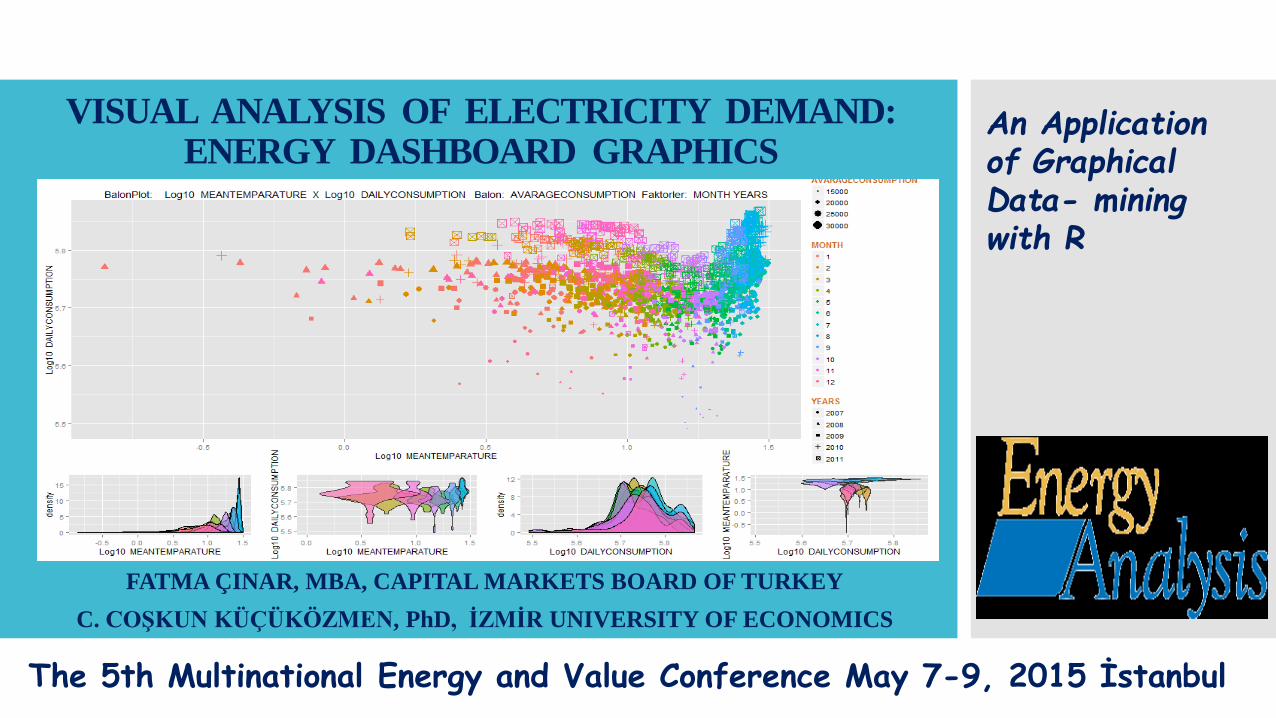
VISUAL ANALYSIS OF ELECTRICITY DEMAND:ENERGY DASHBOARD GRAPHICS
FATMA ÇINAR, MBA, CAPITAL MARKETS BOARD OF TURKEY
C. COŞKUN KÜÇÜKÖZMEN, PhD, İZMİR UNIVERSITY OF ECONOMICS
An Application of Graphical Data- mining with R
The 5th Multinational Energy and Value Conference May 7-9, 2015 İstanbul

Real Time Interactive Data Management for «Effect and Response Analysis»
Technique: Lattice and ggplot2 Graphical Packages using R
EnergyDatasetGraphics
Data-MiningAnalysis
VISUAL ANALYSIS OF ELECTRICITY DEMAND: ENERGY DASHBOARD GRAPHICS Thursday, May 21, 2015

Data Source: Republic of Turkey Ministry of Energy and Natural Resources
Period: July 2007 – July 2011
Temperature, consumption and year/month factors.
Visualization of electricity demand of Turkey during 2007 - 2011 through Graphical-Datamining analysis.
Thursday, May 21, 2015VISUAL ANALYSIS OF ELECTRICITY DEMAND:ENERGY DASHBOARD GRAPHICS
Agenda

Background information (day, month, year, weekdays, theweekNo1, theweekNo2)
Temperature information ([HDD, CDD]*, the average temperature, maximum temperature )
Consumer information (average consumption, peak consumption, daily consumption)
To minimize the «date problem» the day / month / year data has been converted into separate columns.
Electricity market is compensated on a per hour basis.
It requires an unconventional analysis technique to detectwhich factors exert pressure on the system.
Data Types of
theDataset
VISUAL ANALYSIS OF ELECTRICITY DEMAND: ENERGY DASHBOARD GRAPHICS Thursday, May 21, 2015

PTF - consisting of day-ahead prices, market clearing price
SMF- real time price or balancing power market price. The system operator gives loading and delodinginsructions to balancing units in order to stabilize thesystem according to the bid prices of these balancingunits.
SAM -> system purchase amount
SSM-> system sales amount
KGUP- > final day ahead amount of production
YAL -> take the load
YAT -> dispose the load
The systemwork as follows
VISUAL ANALYSIS OF ELECTRICITY DEMAND: ENERGY DASHBOARD GRAPHICS Thursday, May 21, 2015
Operations
The average temperature of each day for selected cities in Turkey, HDD, CDD values were calculated.
HDD - Heating Degree Days : Indicate the days which the temperature is measured below 17.5 Celsius degree
CDD - Cooling Degree Days : This is exactly the opposite of the HDD that indicates the difference between the temperature is above a certain temperature of that day
These variables constitute the whole data set to enable us to observing the fluctuations on a daily, monthly or yearly basis arising from changes in temperature
Thursday, May 21, 2015VISUAL ANALYSIS OF ELECTRICITY DEMAND: ENERGY DASHBOARD GRAPHICS

Thursday, May 21, 2015
Actions
Analyzing the demand for Electricity by the Factors
affecting the demand with multi-dimensional Matrix
Graphics based on Energy Dashboard Software to
analyze and visualize With this technique we can visually observe the
effect of temperature on energy consumption, andcorrelations
We developed an R-based graphics DASHBOARD program with the package ggplot2 for Graphical Data Mining analysis
VISUAL ANALYSIS OF ELECTRICITY DEMAND: ENERGY DASHBOARD GRAPHICS

Thursday, May 21, 2015
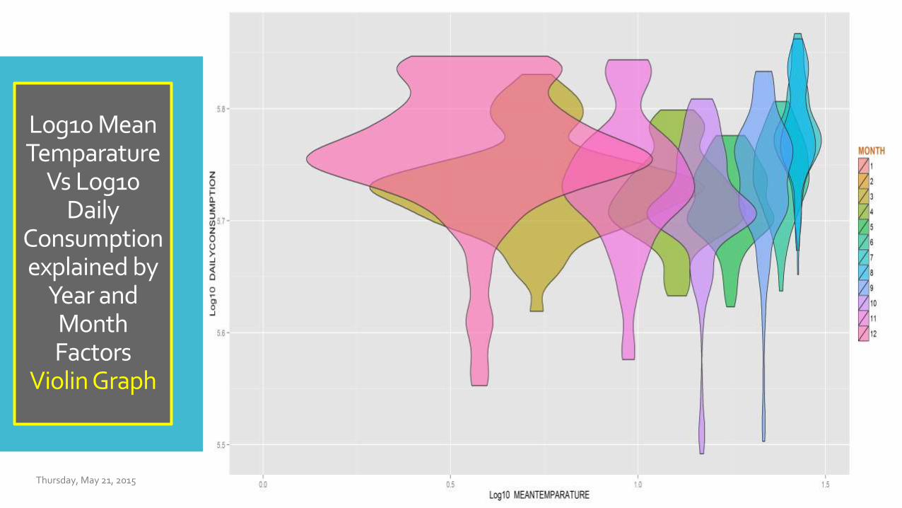
Log10 MeanTemparature
vs Log10 Daily
Consumptionexplained by
Year andMonthFactors
Grid Graphics

Thursday, May 21, 2015
Log10 MeanTemparatureVs
Log10 Daily Consumption
explained byYearand Month Factors
GridGraphics
We see the Avg Daily consumption trend against the temperature factor on the basis of 2007-2011 period and yoy basis with the grid graph (Dashboard)
There is a significant correlation between the daily consumption and the temperature
Avg Temperature increases in 6th 7th and 8th months also implies an increase in daily consumption
Each chart type (i.e. baloon, triangels etc) indicates a certain year. The year 2011 indicates that the average temperature displays a seasonal increase in temperature compared to other years and alsoindicates an increase in the daily consumption.
VISUAL ANALYSIS OF ELECTRICITY DEMAND: ENERGY DASHBOARD GRAPHICS
Thursday, May 21, 2015
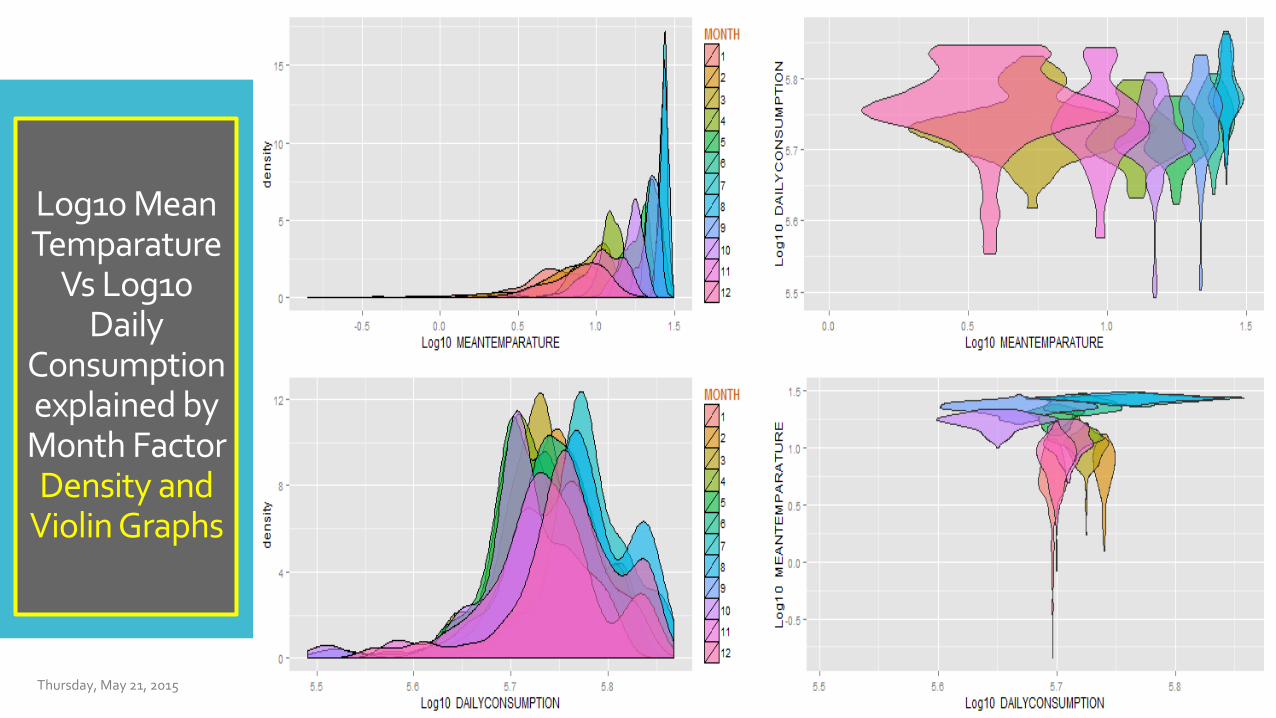
Log10 MeanTemparature
Vs Log10 Daily
Consumptionexplained byMonth FactorDensity and
Violin Graphs

Thursday, May 21, 2015
Log10 MeanTemparature Vs
Log10 Daily Consumptionexplained byYear FactorDensity and
Violin Graphs
Density and Violin Graphs with logarithmic scale show us that there is a strong positive correlation between temperature and daily consumption
We also observe that temperature tends to display double peak at some years which is an unexpected movement
There are also double peaked daily consumption related to such years
VISUAL ANALYSIS OF ELECTRICITY DEMAND: ENERGY DASHBOARD GRAPHICS
Thursday, May 21, 2015
Log10 MeanTemparature
Vs Log10 Daily Consumptionexplained by
Year andMonth Factors
SmoothedGrid Graphics

Thursday, May 21, 2015
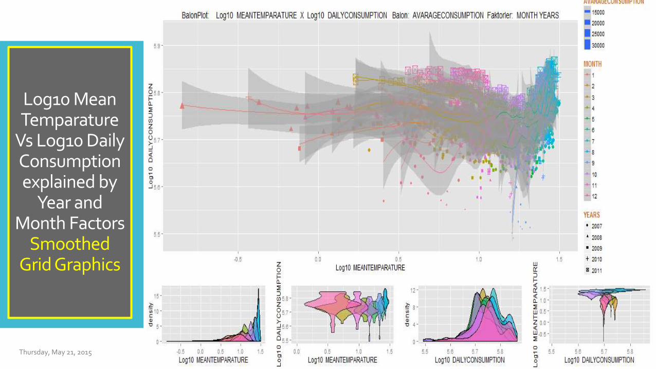
Log10 MeanTemparature Vs
Log10 Daily Consumptionexplained by
Year and MonthFactor
Smoothed GridGraphics
Linear regressions are convenient tools for the analytical world.
In a complex world, more complicated tools are needed for the analysis of data [such as Kernel Regression (Smoothing)]
Smooth option log ggplot2 captures the real trend of sequential data.
In this chart we can get more information than the simple regression analysis
Upper and lower bounds of dashed gray curves determines the 95% confidence interval while outside this range the data displays anomalies.
We need to monitor the effects of factors (year and month)
We observe anomaly during 2007 and 2009
There are points under smooth area for 9th and 10th months which show temperatures remained below normal course of months and thus the daily energy consumption rate showed a similar trend.
VISUAL ANALYSIS OF ELECTRICITY DEMAND: ENERGY DASHBOARD GRAPHICS

Thursday, May 21, 2015
Log10 MeanTemparature
Vs Log10 Daily Consumptionexplained by
Year andMonth FactorsBaloon Graph

Thursday, May 21, 2015
Log10 MeanTemparature vs
Log10 Daily Consumptionexplained by
Year and MonthFactor Baloon
Graph
Bubble Chart indicates log10 Mean Temperature vs.
log10 Daily Consumption
So, we can see the effect of year and month factors
on mean consumption
The size of the bubbles represents the magnitude of
Average Consumption where the shape of the
bubbles also implies the concentration with respect
to specific dates.
VISUAL ANALYSIS OF ELECTRICITY DEMAND: ENERGY DASHBOARD GRAPHICS
Log10 MeanTemparature
Vs Log10 Daily
Consumptionexplained by
Year andMonthFactors
Violin Graph
Thursday, May 21, 2015
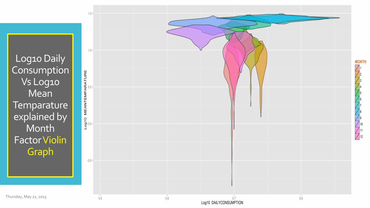
Log10 Daily Consumption
Vs Log10 Mean
Temparatureexplained by
MonthFactorViolin
Graph
Thursday, May 21, 2015

Log10 MeanTemparature
Vs Log10 Daily
Consumptionexplained byMonth Factor
DensityGraph
Thursday, May 21, 2015

Log10 Daily Consumption
Vs Log10 Mean
Temparatureexplained by
MonthFactor
DensityGraph
Thursday, May 21, 2015

Log10 Maximum
TemparatureVs Log10 Daily Consumptionexplained by
Year andMonth Factors
SmoothedGrid Graphics
Thursday, May 21, 2015

Log10 Maximum
TemparatureVs Log10 Daily Consumptionexplained by
Year andMonth FactorsBaloon Graph
Thursday, May 21, 2015

Log10 Maximum
TemparatureVs Log10 Daily Consumptionexplained by
Year andMonth FactorsGrid Graphics
Thursday, May 21, 2015

Log10 Maximum
TemparatureVsLog10 Daily
Consumptionexplained byMonth FactorViolin Graph
Thursday, May 21, 2015

Log10 Maximum
TemparatureVs Log10
Daily Consumption explainedby Month
FactorDensityGraph
Thursday, May 21, 2015

Thursday, May 21, 2015
Log10 Maximum
Temparature VsLog10 Daily
Consumptionexplained byYear FactorDensity and
Violin Graphics

Log10 MeanTemparature
Vs Log10 Mean
Consumptionexplained by
Year andMonthFactors
Grid Graph
Thursday, May 21, 2015

Log10 MeanTemparatureVs
Log10 MeanConsumptionexplained by
Year andMonth Factors
Grid Graph
Grid Graph of log10Mean Temperature vs. log10 Avg. Consumption explained by the Year-Month Factors
We observe seasonality and periodicity of the ratio of point demand to average peak demand.
Electricity has an interesting feature which must be balancedwith production and consumption at all times.
Therefore instantaneous consumption, can be obtained obtained by adding the production of all power generating unitsthat are running at that time.
Already we multiply the average consumption of 24h to obtain the daily consumption data.
Thursday, May 21, 2015VISUAL ANALYSIS OF ELECTRICITY DEMAND: ENERGY DASHBOARD GRAPHICS

CO
NC
LU
SIO
NThe electricity demand and temperature data are used to analyze the effect the average and maximum temperature on the mean and peak demand of electricity.
For this purpose we developed software based on R package of ggplot2 which is quite convenient to represent multi-dimensional data and used this application for visual analysis.
We hope this will help to arrange and regulate the production of electricity more economically
VISUAL ANALYSIS OF ELECTRICITY DEMAND: ENERGY DASHBOARD GRAPHICS
Thursday, May 21, 2015
http://www.ieu.edu.tr/tr
http://www.coskunkucukozmen.com
http://www.spk.gov.tr/
http://www.riskonomi.com
@fatma_cinar_ftm
@ckucukozmen
@Riskonometri
@Riskonomi
@RiskLabTurkey
@datanalitik
@Riskanaltigi
tr.linkedin.com/in/fatmacinar/
tr.linkedin.com/in/coskunkucukozmen
Contact

Küçüközmen, C. C. and Çınar F., (2014). “Modelling of Corporate Performance In Multi-Dimensional Complex Structured Organizations “CBBC” Management”, Submitted to the “2nd International Symposium on Chaos, Complexity and Leadership (ICCLS), December 17-19 at Middle East Technical University (METU), Ankara, Turkey.
Küçüközmen, C. C. ve Çınar F., (2014). “Finansal Karar Süreçlerinde Grafik-Datamining Analizi”, TROUGBI/DW SIG, Nisan 2014 İstanbul, http://www.troug.org/?p=684
Küçüközmen, C. C. ve Çınar F., (2014). “Görsel Veri Analizinde Devrim” Söyleşi, Ekonomik Çözüm, Temmuz 2014, http://ekonomik-cozum.com.tr/gorsel-veri-analizinde-devrim-mi.html.
Küçüközmen, C. C. ve Merih K., (2014). “Görsel Teknikler Çağı" Söyleşi, Ekonomik Çözüm, Temmuz 2014, http://ekonomik-cozum.com.tr/gorsel-teknikler-cagi.html
Küçüközmen, C. C. and Çınar F., (2014). “Banking Sector Analysis of Izmir Province: A Graphical Data Mining Approach”, Submitted to the 34th National Conference for Operations Research and Industrial Engineering (YAEM 2014), Görükle Campus of Uludağ University in Bursa, Turkey on 25-27 June 2014.
Küçüközmen, C. C. and Çınar F., (2014). “New Sectoral Incentive System and Credit Defaults: Graphic-Data Mining Analysis”, Submitted to the ICEF 2014 Conference, Yıldız Technical University in İstanbul, Turkey on 08-09 Sep. 2014.
Merih, K. ve Çınar, F., (2013). “Modelling of Corporate Performance In Multi-Dimensional Complex Structured Organizations: “Cbbc” Approach”, Submitted to the EconAnadolu 2013: AnadoluInternational Conference in Economics III June 19-21, 2013, Eskişehir. http://www.econanadolu.org/en/index.php/articles2013/3683
RE
SO
UR
CE
S
Thursday, May 21, 2015