vision · 2018-11-06 · chromatic harmony chart location grasslands marked by basalt rocks and...
TRANSCRIPT

CHROMATICHARMONY CHART
V I S I O N

a collaboration between Melanie Yonge (isis colour) and France Lavergne-Cler (Atelier France and Michel Cler), colour consultants for architecture and urban environments, based in Paris, for AVJennings.
CHROMATICHARMONY CHART
What are the goals of the Chromatic Guidelines?
- To strengthen the relationship between the buildings, the spaces they create, and the general environment.
- To generate a mood or feeling which relates to the culture and traditions of the area.- To provide friendly and comfortable environments for the inhabitants of Lyndarum North.- To introduce complementary ranges of materials relating to location, functions and
practices.- To assist home owners, specifiers and suppliers in the selection and provision of
materials.
• The guide uses the NCS (Natural Colour System) to describe colours.
How does the Chromatic Guideline help the home owner and the designer?
Eight site locations around Lyndarum North were studied, each with their own geography and topography, lighting, mood and historical background.
The major steps in producing the Chromatic Guideline were:- An Analysis and Diagnosis of the eight sites.- A Synthesis based on the Diagnoses : the architecture, the historical background and
the social context.- Discussions with designers and material suppliers on available materials and their
colour characteristics using the NCS.- Establishment of colour ranges for three neighbourhoods to reinforce the urban
design of the masterplanned community.
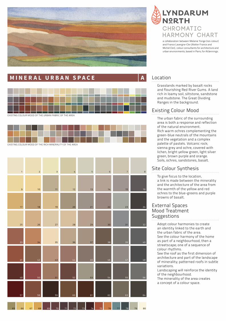
M I N E R A L U R B A N S P A C E A- inspired by the rich minerality and the urban fabric of the area.
F R A M I N G T H E P A R K B- inspired by the vegetation and the landscape of the area.
B O R D E R I N G T H E O P E N S P A C E C- inspired by the air, light and the aquatic environments of the area.
Clues to understand the spirit of the site:
- For each neighourhood, the Geographical Landscape suggests the dominant Chromatic aspects of the textures and materials; they partly reveal the “spirit of the site”.
- The orientation of the site and its quality of daylight suggest changes and rhythms in the values of colour.
- The relationships between the major elements help set the mood and suggest how this can be enhanced. e.g.
• Sky, earth and water acting as part of the background to the site.• Planting, rocks, water, sky in different seasons.• The shimmering or mirror effect of water.
- The view from inside and outside, from the centre of the park, the perspective along a street.
How does one grasp the spirit of the site and infuse it into a new house design?
Part of the secret is through aspects of colour and texture.
B
A
C
a collaboration between Melanie Yonge (isis colour) and France Lavergne-Cler (Atelier France and Michel Cler), colour consultants for architecture and urban environments, based in Paris, for AVJennings.
CHROMATICHARMONY CHART
LocationGrasslands marked by basalt rocks and flourishing Red River Gums. A land rich in loamy soil, siltstone, sandstone and mudstone. The Great Dividing Ranges in the background.
Existing Colour MoodThe urban fabric of the surrounding area is both a response and reflection of the natural environment.Rich warm ochres complementing the green-blue neutrals of the mountains and the vegetation and a complex palette of pastels. Volcanic rock; sienna grey and ochre, covered with lichen, bright yellow green, light silver green, brown purple and orange.Soils, ochres, sandstones, basalt.
Site Colour Synthesis To give focus to the location, a link is made between the minerality and the architecture of the area from the warmth of the yellow and red ochres to the blue-greens and purple browns of basalt.
External Spaces Mood Treatment Suggestions
Adopt colour harmonies to create an identity linked to the earth and the urban fabric of the area.See the colour harmony of the home as part of a neighbourhood, then a streetscape; one of a sequence of colour rhythms.See the roof as the first dimension of architecture and part of the landscape of minerality; patterned roofs in subtle variations.Landscaping will reinforce the identity of the neighbourhood.The minerality of the area creates a concept of a colour space.
60 6158 6259
41 42
56
1 2 3 4
12
5 6 7 8
16
17 18 20 21 22 23 24
25
33 34
26 27 28 29 30 31
39 40
32
9 10 11 13 14 15
35
43 44
36 37 38
55
47 48
49 51 52 54
19
50
45
53
46
57 63 64
EXISTING COLOUR MOOD OF THE URBAN FABRIC OF THE AREA
EXISTING COLOUR MOOD OF THE RICH MINERALITY OF THE AREA
M I N E R A L U R B A N S P A C E A
65 66 67 68 69 70 71 72 73 74 75 76 77 78 79 80

a collaboration between Melanie Yonge (isis colour) and France Lavergne-Cler (Atelier France and Michel Cler), colour consultants for architecture and urban environments, based in Paris, for AVJennings.
CHROMATICHARMONY CHART
LocationThe site of an ancient forest of River Red Gums. Each tree has its own character, the home to many birds and animals. Eons ago, volcanic activity created lava flows sculpting the land leaving formations of rises and gullies.The stony rises are vantage points, punctuated with basalt rock.
Existing Colour MoodThe living leaves of the Wurun (River Red Gum) are green yellow, adorned with yellow green seed pods. At the foot of each tree, protected by niches in the root system, leaves change in colour becoming gold, red, pink, orange and warm grey. The trunks of the Wurun appear white, grey or brown red in the distance. Layers of bark peeling off at different rates, revealing white, both warm and cool grey, ochres, red ochres and black. As trees recede in the distance, the yellow green darkens, some tinged with brown red. Then they blur, the yellow green blackens before fading into grey-blue.
Site Colour Synthesis In this transition, half way between earth and water, vegetation is an important link to be shaped. Many subtle gradations of green blue and grey, punctuated by flashes of colour.
External Spaces Mood Treatment Suggestions
Adopt colour harmonies to create an identity which creates links and contrasts with the Park. The Park as a focal point.See the roof as the first dimension of architecture and part of the landscape of trees and vegetation.Memories of the previous site activities may be the appropriate concept for this delicate vanishing site.The homes should have a pedestrian scale and an internal identity.The concept of houses surrounding the park create a frame of colour.
60 6158 6259
41 42
56
1 2 3 4
12
5 6 7 8
16
17 18 20 21 22 23 24
25
33 34
26 27 28 29 30 31
39 40
32
9 10 11 13 14 15
35
43 44
36 37 38
55
47 48
49 51 52 54
19
50
45
53
46
57 63 64
EXISTING COLOUR MOOD OF LANDSCAPE AND VEGETATION OF THE AREA
F R A M I N G T H E P A R K B
65 66 67 68 69 70 71 72 73 74 75 76 77 78 79 80

a collaboration between Melanie Yonge (isis colour) and France Lavergne-Cler (Atelier France and Michel Cler), colour consultants for architecture and urban environments, based in Paris, for AVJennings.
CHROMATICHARMONY CHART
LocationOrientation North East. A site on a path from South Morang to Portland; joining waterways, creeks, rivers, wetlands and lakes.
Existing Colour Mood Shimmering effect, light vibrations.Engaging with space.
Site Colour Synthesis This open area needs a light, dynamic effect.Pastel and pearly colours provide this mood.
External Spaces Mood Treatment Suggestions
Adopt colour harmonies to create an identity linked to the air, the light and water.See the roof as the first dimension of architecture and part of the space of light and air.Gentle harmony for the homes on the open space border. The use of blue-pink-yellow-turquoise to frame the public space.Dynamic perspectives of the mountains.The concept of a colour corridor or pathway.
EXISTING COLOUR MOOD OF THE AIR AND LIGHT OF THE AREA
EXISTING COLOUR MOOD OF AQUATIC ENVIRONMENTS OF THE AREA
60 6158 6259
41 42
56
1 2 3 4
12
5 6 7 8
16
17 18 20 21 22 23 24
25
33 34
26 27 28 29 30 31
39 40
32
9 10 11 13 14 15
35
43 44
36 37 38
55
47 48
49 51 52 54
19
50
45
53
46
57 63 64
B O R D E R I N G T H E O P E N S P A C E C
65 66 67 68 69 70 71 72 73 74 75 76 77 78 79 80
Further Information
• For further information please refer to the Chromatic Guidelines named: Mineral Urban Space, Framing The Park, Bordering The Open Space.