using data for improvement in...
TRANSCRIPT
6/12/2012
1
Using Data for
Improvement in Healthcare:
The Essential Toolkit
Sandra K. [email protected]
Objectives• Participants will be able to:
- Identify fundamental differences between data when used for improvement, accountability and research
- Appreciate the value of viewing data graphically and over time
- Learn when to use and how to interpret data on tools
Copyright © 2012
pfundamental to improvement:• Run chart to identify statistically significant signals of change• Shewhart Chart (Introduction only) • Pareto chart• Histogram (Frequency Plot)• Scatter Plot
- Select the appropriate tool for the question being asked
References Books: 1. The Health Care Data Guide: Learning from Data for Improvement. Lloyd Provost and Sandra Murray, Jossey-Bass, 2011. 2. Total Quality Tools For Health Care. Productivity-Quality Systems, Inc. Miamisburg Ohio. ISBN: 1-882683-04-8 Tel. 1-800-777-2255. 3. The Improvement Guide. Gerald J. Langley, Kevin M. Nolan, Thomas W. Nolan, Clifford L. Norman, Lloyd P. Provost, Jossey-Bass, 2009. Video: 1. Making Sense Out of Control Charts. NAHQ. 1-800-966-9392 Software Used to Produce Charts:
Copyright © 2012
1. ChartRunner. PQ Systems. 1-800-777-3020. 2. QI Charts. API, 1-512-708-0131 3. Minitab,1-814-238-3280
Articles: 1. The run chart: a simple analytical tool for learning from variation in healthcare
processes. Rocco J Perla, Lloyd P Provost and Sandra K Murray. BMJ Qual Saf 2011 20: 46-51.
I
Purpose of Measurement
• Measurement for Improvement
• Measurement for Accountability
Copyright © 2012
• Measurement for Research
The Three Faces of Performance Measurement: Improvement, Accountability and Research. Journal on Quality Improvement, Volume 23, Number 3, March, 1997.
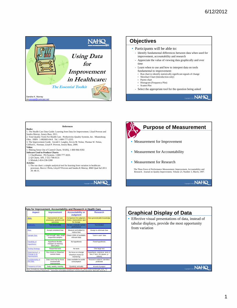
Data for Improvement, Accountability and Research in Health CareAspect Improvement Accountability or
JudgmentResearch
Aim: Improvement of care processes, systems and
outcomes
Comparison for judgment, choice, reassurance, spur
for change
New generalizable knowledge
Methods: Test observable No test, evaluate current performance
Test blinded
Bias: Accept consistent bias Measure and adjust to reduce bias
Design to eliminate bias
Sample Size: “Just enough” data, small sequential samples
Obtain 100% of available, relevant data
“Just in case” data
Copyright © 2012
Flexibility ofHypothesis:
Hypothesis flexible, changes as learning
takes place
No hypothesis Fixed hypothesis
Testing Strategy: Sequential tests No tests One large test
Determining if a Change is anImprovement:
Run charts or Shewhart control charts
No focus on changeShewhart charts for
monitoring
Hypothesis, statistical tests (t-test, F-test, chi square, p-
values)
Confidentiality ofthe Data:
Data used only by those involved with improvement
Data available for public consumption
Research subjects’ identities protected
Frequency of Use: Daily, weekly, monthly Quarterly, annually At end of projectSource: The Health Care Data Guide: Learning from Data for Improvement. Developed from Solberg, Leif I., Mosser, Gordon and McDonald, Susan. “The Three Faces of Performance Measurement: Improvement, Accountability and Research.” Journal on Quality Improvement. March 1997, Vol.23, No. 3.
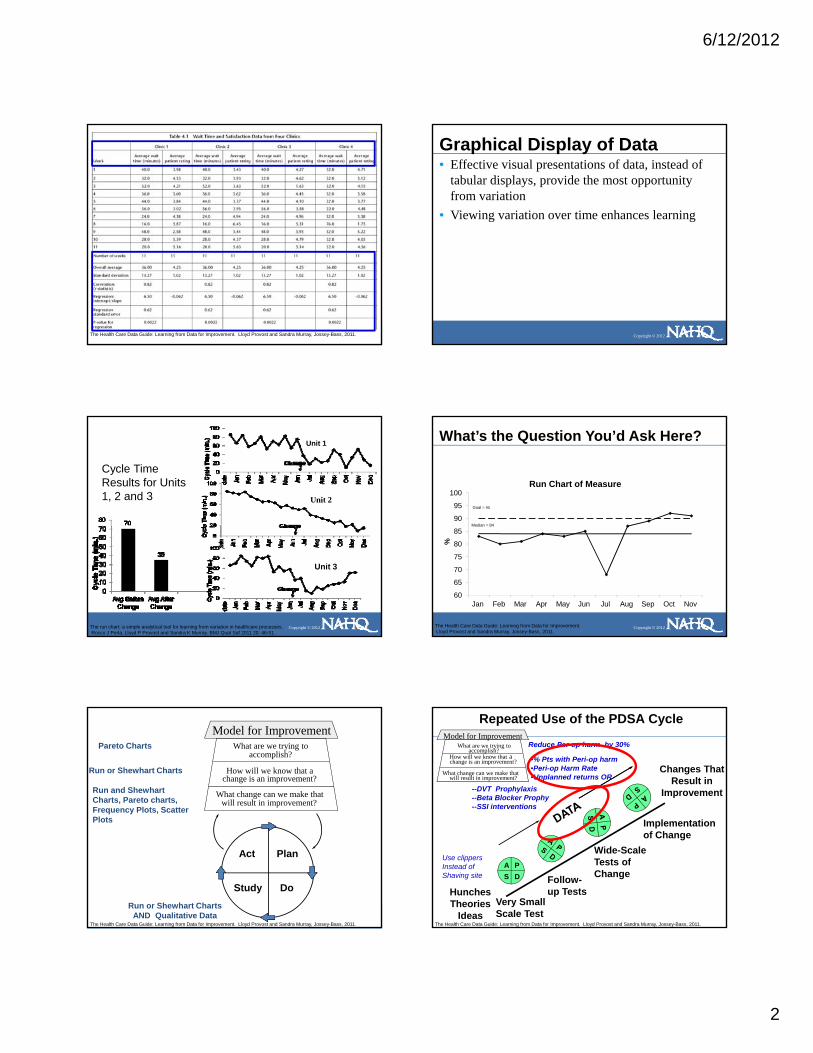
Graphical Display of Data • Effective visual presentations of data, instead of
tabular displays, provide the most opportunity from variation
Copyright © 2012
6/12/2012
2
Copyright © 2012The Health Care Data Guide: Learning from Data for Improvement. Lloyd Provost and Sandra Murray, Jossey-Bass, 2011.
Graphical Display of Data • Effective visual presentations of data, instead of
tabular displays, provide the most opportunity from variation
• Viewing variation over time enhances learning
Copyright © 2012
Cycle Time Results for Units 1, 2 and 3
Unit 1
Unit 2
Copyright © 2012
Unit 3
The run chart: a simple analytical tool for learning from variation in healthcare processes.Rocco J Perla, Lloyd P Provost and Sandra K Murray. BMJ Qual Saf 2011 20: 46-51.
90
95
100Run Chart of Measure
Median = 84
Goal = 90
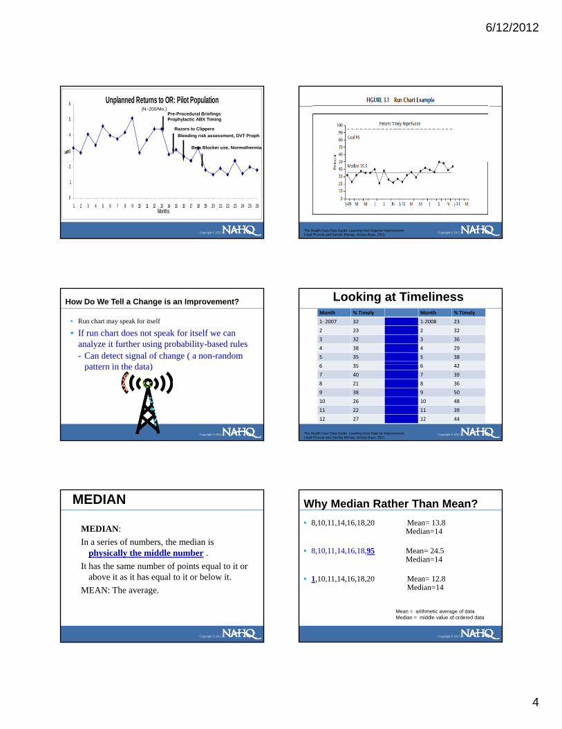
What’s the Question You’d Ask Here?
Copyright © 2012
60
65
70
75
80
85
Jan Feb Mar Apr May Jun Jul Aug Sep Oct Nov
%
Median 84
The Health Care Data Guide: Learning from Data for Improvement. Lloyd Provost and Sandra Murray, Jossey-Bass, 2011.
What are we trying toaccomplish?
How will we know that achange is an improvement?
What change can we make thatwill result in improvement?
Model for Improvement
Run and ShewhartCharts, Pareto charts, Frequency Plots, ScatterPl t
Run or Shewhart Charts
Pareto Charts
Copyright © 2012
Act Plan
Study Do
Plots
Run or Shewhart ChartsAND Qualitative Data
The Health Care Data Guide: Learning from Data for Improvement. Lloyd Provost and Sandra Murray, Jossey-Bass, 2011.
Repeated Use of the PDSA Cycle
Changes That Result in
Improvement
How will we know that a
What change can we make that
What are we trying toaccomplish?
change is an improvement?
will result in improvement?
Model for ImprovementReduce Per-op harm by 30%
•% Pts with Peri-op harm•Peri-op Harm Rate•Unplanned returns OR
--DVT Prophylaxis--Beta Blocker Prophy--SSI interventions
Copyright © 2012
Hunches Theories
Ideas
A PS D
Very Small Scale Test
Follow-up Tests
Wide-Scale Tests of Change
Implementation of Change
Use clippersInstead ofShaving site
The Health Care Data Guide: Learning from Data for Improvement. Lloyd Provost and Sandra Murray, Jossey-Bass, 2011.

6/12/2012
3
Tools for Understanding Variation
• Run Chart: Study variation in data over time; understand the impact of changes, detect signals of improvement.
• Shewhart Chart: Distinguish between special and common causes of variation. Is process stable, predictable?
• Pareto Chart: Where should we focus? Focus
Copyright © 2012
• Pareto Chart: Where should we focus? Focus improvement on area with greatest potential impact.
• Frequency Plot: Understand distribution of data (e,g, central location, spread, shape, and patterns).
• Scatter Plot: Analyze potential relationship between two variables.
Tools to Learn from Variation in Data
Copyright © 2012
Frequency Plot Pareto Chart Scatter Plot
The Health Care Data Guide: Learning from Data for Improvement. Lloyd Provost and Sandra Murray, Jossey-Bass, 2011.
Run Chart• Graphical display of data plotted in some type of order.
Also has been called a time series or a trend chart.
Copyright © 2012The Health Care Data Guide: Learning from Data for Improvement. Lloyd Provost and Sandra Murray, Jossey-Bass, 2011.
Fundamental Uses of Run Charts• How much variation do we have?
- Display data to make process performance visible
• Have our changes yielded improvement?- Determine whether a change resulted in evidence
Copyright © 2012
- Determine whether a change resulted in evidence of improvement
• Are the gains we made slipping away?- Determine whether we are holding the gain made
by our improvement
Copyright © 2012The Health Care Data Guide: Learning from Data for Improvement. Lloyd Provost and Sandra Murray, Jossey-Bass, 2011.
How Do We Tell a Change is an Improvement?
• Run charts speak for themselves…or..
Copyright © 2012
• Analyze with probability-based rules
6/12/2012
4
Unplanned Returns to OR: Pilot Population
3
4
5
6
%
Pre-Procedural BriefingsProphylactic ABX Timing
Razors to ClippersBleeding risk assessment, DVT Proph
Beta Blocker use, Normothermia
(N~200/Mo.)
Copyright © 2012
0
1
2
1 2 3 4 5 6 7 8 9 10 11 12 13 14 15 16 17 18 19 20 21 22 23 24 25 26Months
Copyright © 2012The Health Care Data Guide: Learning from Data for Improvement. Lloyd Provost and Sandra Murray, Jossey-Bass, 2011.
How Do We Tell a Change is an Improvement?
• Run chart may speak for itself
• If run chart does not speak for itself we can analyze it further using probability-based rules- Can detect signal of change ( a non-random
tt i th d t )
Copyright © 2012
pattern in the data)
Looking at TimelinessMonth % Timely Month % Timely
1‐ 2007 32 1‐2008 23
2 23 2 32
3 32 3 36
4 38 4 29
5 35 5 38
6 35 6 42
Copyright © 2012
6 35 6 42
7 40 7 39
8 21 8 36
9 38 9 50
10 26 10 48
11 22 11 39
12 27 12 44
The Health Care Data Guide: Learning from Data for Improvement. Lloyd Provost and Sandra Murray, Jossey-Bass, 2011.
MEDIAN
MEDIAN: In a series of numbers, the median is
physically the middle number . It has the same number of points equal to it or
Copyright © 2012
It has the same number of points equal to it or above it as it has equal to it or below it.
MEAN: The average.
Why Median Rather Than Mean?• 8,10,11,14,16,18,20 Mean= 13.8
Median=14
• 8,10,11,14,16,18,95 Mean= 24.5Median=14
Copyright © 2012
• 1,10,11,14,16,18,20 Mean= 12.8Median=14
Mean = arithmetic average of dataMedian = middle value of ordered data

6/12/2012
5
Finding the Median: Reordering the Data5048444240393938383836363535
• To find the median reorder the numbers from high to low and find the number physically in the middle. If you have two numbers left in the middle, add them together and divide by two.
i
Copyright © 2012
3532323229272623232221
• Excel: place cursor in blank cell and type=MEDIAN(A2:A21) where A2 is the first cell you want to include and A21 the last)
The Health Care Data Guide: Learning from Data for Improvement. Lloyd Provost and Sandra Murray, Jossey-Bass, 2011.
Copyright © 2012The Health Care Data Guide: Learning from Data for Improvement. Lloyd Provost and Sandra Murray, Jossey-Bass, 2011.
Why Bother..What Do we Do With A Signal?
• Signals can be evidence of improvement- That changes are adding up to improvement
• Signals can be evidence that things got worse- Changes caused unexpected degradation of process
Copyright © 2012
or outcome- Something else entered the process- resulting in a signal
• Our job when seeing a signal- Go learn from signal and take appropriate- action
Rule 1: Shift• Six or more consecutive POINTS either all above or all below the
median. Skip values on the median and continue counting points. Values on the median DO NOT make or break a shift.
Rule 1
20
25
ristic
Copyright © 2012
Median=10Median=110
5
10
15
20
1 2 3 4 5 6 7 8 9 10 11 12 13 14 15 16 17 18 19 20 21 22 23 24 25Mea
sure
or C
hara
cte
Median 10
The Health Care Data Guide: Learning from Data for Improvement. Lloyd Provost and Sandra Murray, Jossey-Bass, 2011.
Rule 1 YES
Copyright © 2012The Health Care Data Guide: Learning from Data for Improvement. Lloyd Provost and Sandra Murray, Jossey-Bass, 2011.
1
65
432 8
7
Rule 2: Trend•Five points all going up or all going down. If the value of two or more successive points is the same count the first one then ignore the identical points when counting; like values do not make or break a trend.
Rule 2
20
25
acte
ristic
Copyright © 2012
0
5
10
15
1 2 3 4 5 6 7 8 9 10 11 12 13 14 15 16 17 18 19 20 21 22 23 24 25
Mea
sure
or C
hara
Median 11
The Health Care Data Guide: Learning from Data for Improvement. Lloyd Provost and Sandra Murray, Jossey-Bass, 2011.

6/12/2012
6
Rule 1-YESRule 2-NO
Copyright © 2012The Health Care Data Guide: Learning from Data for Improvement. Lloyd Provost and Sandra Murray, Jossey-Bass, 2011.
Rule 3: Runs
To Determine The Number of Runs Above and Below the Median:- A run is a series of points in a row on one side of
the median. Some points fall right on the median, which makes it hard to decide which run these points b l t
Microsoft Word Document
Copyright © 2012
belong to. - So, an easy way to determine the number of runs is to
count the number of times the data line crosses the median and add one.
- Statistically significant change signaled by too few or too many runs.
Rule 3: NUMBER OF RUNS• Steps
- Count the # of data points not falling on the median (in this case 10)- Count the # of runs (# times data line crosses the median + 1) (in this case
2)- Go to table and find out if you have too few or too many runs
Microsoft WoDocumen
Rule 3
tic
Copyright © 2012
0
5
10
15
20
25
1 2 3 4 5 6 7 8 9 10Mea
sure
or C
hara
ceris
t
Median 11.4
Data line crosses onceToo few runs: total 2 runs
The Health Care Data Guide: Learning from Data for Improvement. Lloyd Provost and Sandra Murray, Jossey-Bass, 2011.
Rule 3: # of RunsTable for Checking for Too Many or Too Few Runs on a Run Chart
Total number of datapoints on the run chartthat do not fall on the
median
Lower limit for the number of runs(< than this number of runs is “too few”)
Upper limit for the number of runs(> than this number of runs is “too many”)
10 3 9
11 3 10
12 3 11
13 4 11
14 4 12
15 5 12
Copyright © 2012
16 5 13
17 5 13
18 6 14
19 6 15
20 6 16
21 7 16
22 7 17
23 7 17
24 8 18
25 8 18
Table is based on about a 5% risk of failing the run test for random patterns of data. Frieda S. Swed and Churchill Eisenhart,(1943). “Tables for Testing Randomness of Grouping in a Sequence of Alternatives. Annals of Mathematical Statistics. Vol. XIV, pp.66 and 87, Tables II and III
Rule 3• To Determine The Number of Runs Above and Below the Median:
- A run is a series of points in a row on one side of the median. Some points fall right on the median, which makes it hard to decide which run these points belong to.
- So, an easy way to determine the number of runs is to count the number of times the data line crosses the median and add one.
- Statistically significant change signaled by too few or too many runs.
Microsoft Word Document
6
7
8 Rule 3
Copyright © 2012
0
1
2
3
4
5
J-03
F M A M J J A S O N D J-04
F M A M J J A S
Median 3.66
20 data points not on median. 18 crossings +1= 19 Runs= Too many runs
The Health Care Data Guide: Learning from Data for Improvement. Lloyd Provost and Sandra Murray, Jossey-Bass, 2011.
Rule 3: # of RunsTable for Checking for Too Many or Too Few Runs on a Run Chart
Total number of datapoints on the run chartthat do not fall on the
median
Lower limit for the number of runs(< than this number of runs is “too few”)
Upper limit for the number of runs(> than this number of runs is “too many”)
10 3 9
11 3 10
12 3 11
13 4 11
14 4 12
15 5 12
Copyright © 2012
16 5 13
17 5 13
18 6 14
19 6 15
20 6 16
21 7 16
22 7 17
23 7 17
24 8 18
25 8 18
Table is based on about a 5% risk of failing the run test for random patterns of data. Frieda S. Swed and Churchill Eisenhart,(1943). “Tables for Testing Randomness of Grouping in a Sequence of Alternatives. Annals of Mathematical Statistics. Vol. XIV, pp.66 and 87, Tables II and III
6/12/2012
7
Rule 3: NUMBER OF RUNS• To Determine The Number of Runs
- A run is a series of points in a row on one side of the median. Some points fall right on the median, which makes it hard to decide which run these points belong to.
- So, an easy way to determine the number of runs is to count the number of times the data line crosses the median and add one.
- A signal is evidenced by too few, or too many runs.
• Steps- Count the # of data points not falling on the median (in this case 10)- Count the # of runs (# times data line crosses the median + 1) (in this case 2)
Microsoft WoDocumen
Copyright © 2012
( ) ( )- Go to table and find out if you have too few or too many runs ( in this case should have 3-9
runs. Only have 2, so too few runs.)
• What does it mean?- Too few runs with data going in our desired direction is signal
of improvement- Too few runs if data going in undesirable direction is signal of
degradation
Rule 1-YESRule 2-NO
7 + 1 + 8 Runs
Copyright © 2012The Health Care Data Guide: Learning from Data for Improvement. Lloyd Provost and Sandra Murray, Jossey-Bass, 2011.
Rule 3: # of RunsTable for Checking for Too Many or Too Few Runs on a Run Chart
Total number of datapoints on the run chartthat do not fall on the
median
Lower limit for the number of runs(< than this number of runs is “too few”)
Upper limit for the number of runs(> than this number of runs is “too many”)
10 3 9
11 3 10
12 3 11
13 4 11
14 4 12
15 5 12
Copyright © 2012
16 5 13
17 5 13
18 6 14
19 6 15
20 6 16
21 7 16
22 7 17
23 7 17
24 8 18
25 8 18
Table is based on about a 5% risk of failing the run test for random patterns of data. Frieda S. Swed and Churchill Eisenhart,(1943). “Tables for Testing Randomness of Grouping in a Sequence of Alternatives. Annals of Mathematical Statistics. Vol. XIV, pp.66 and 87, Tables II and III
Rule 1-YESRule 2-NORule 3-NO
Copyright © 2012The Health Care Data Guide: Learning from Data for Improvement. Lloyd Provost and Sandra Murray, Jossey-Bass, 2011.
RULE 4: AstronomicalFor detecting unusually large or small numbers:
• Data that is Blatantly Obvious as a different value• Everyone studying the chart agrees that it is unusual• Remember:
– Every data set will have a high and a low - this does not mean the high or low are astronomical
Copyright © 2012The Health Care Data Guide: Learning from Data for Improvement. Lloyd Provost and Sandra Murray, Jossey-Bass, 2011.
Rule 1-YESRule 2-NORule 3-NORule 4-NO
Copyright © 2012The Health Care Data Guide: Learning from Data for Improvement. Lloyd Provost and Sandra Murray, Jossey-Bass, 2011.

6/12/2012
8
How Do We Tell a Change is an Improvement?
• Run chart may speak for itself
• If run chart does not speak for itself we can analyze it further using probability-based rules- Can detect signal of change ( a non-random
tt i th d t )
Copyright © 2012
pattern in the data)- Signal could be improvement or
degradation
Let’s Practice
• Please work in pairs
• Evaluate the following run charts to determine :
Copyright © 2012
- Does the chart show a signal?
- If signal noted -which of the four rules did you use to find it?
Rules for Indentifying Non-Random Signals of Change
Copyright © 2012The Health Care Data Guide: Learning from Data for Improvement. Lloyd Provost and Sandra Murray, Jossey-Bass, 2011.
Hou
rs
Behavioral Health: Crisis Hours Provided In-Network625 556 492 699 435 553 526 675 611 700 727 647 664 695 602 789 710 761 710 723 722 712 743 729Hours
Run chart
Median line = 625
Desired Direction
600
700
800
900
1,000
Copyright © 2012
Chg. 1
Chg. 2
Chg. 3
Chg. 4
D J F M A M J J A S O N D J F M A M J J A S O N200
300
400
500
Per
cent
Percent Ventilator Associated Pneumonia Bundle Compliance71.0 68.2 84.9 89.9 81.0 62.0 92.3 91.2 95.4 94.1 96.0%
Run chart
Median = 89.9
75
80
85
90
95
100
Desired Direction
Copyright © 2012
P
J A S O N D J-12 F M A M50
55
60
65
70
75
Copyright © 2012
Change 1 Change 2 Change 3
6/12/2012
9
Why Bother..What Do we Do With A Signal?
• Signals can be evidence of improvement- That changes are adding up to improvement
• Signals can be evidence that things got worse- Changes caused unexpected degradation of process or outcome- Something else entered the process
resulting in a signal• Action when seeing a signal
- Go learn from signal and take appropriate action
Copyright © 2012
Go learn from signal and take appropriate action
• If testing change and see no signal:- Changes not strong enough- Changes really made?- Testing on such small scale--not impacting
system yet- Measure not sensitive
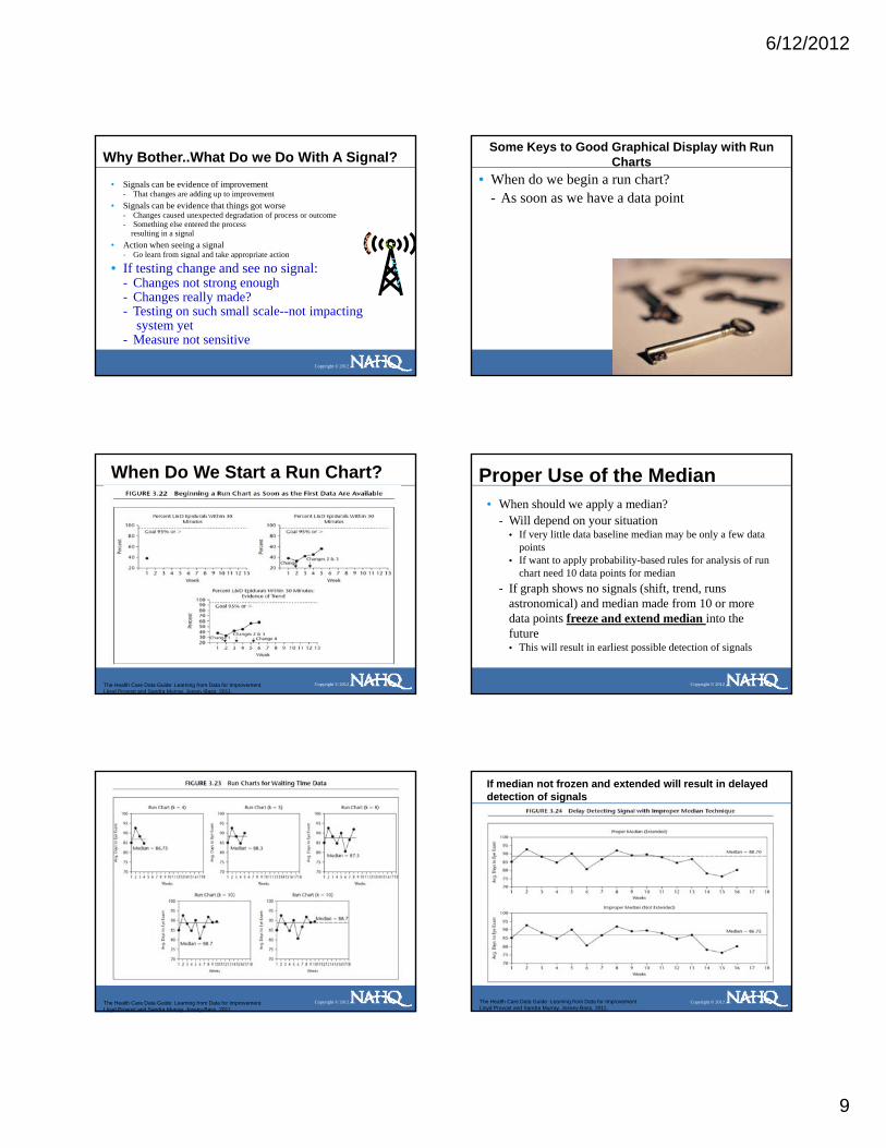
Some Keys to Good Graphical Display with Run Charts
• When do we begin a run chart?- As soon as we have a data point
Copyright © 2012
When Do We Start a Run Chart?
Copyright © 2012The Health Care Data Guide: Learning from Data for Improvement. Lloyd Provost and Sandra Murray, Jossey-Bass, 2011.
Proper Use of the Median • When should we apply a median?
- Will depend on your situation• If very little data baseline median may be only a few data
points• If want to apply probability-based rules for analysis of run
chart need 10 data points for median
Copyright © 2012
chart need 10 data points for median- If graph shows no signals (shift, trend, runs
astronomical) and median made from 10 or more data points freeze and extend median into the future• This will result in earliest possible detection of signals
Copyright © 2012The Health Care Data Guide: Learning from Data for Improvement. Lloyd Provost and Sandra Murray, Jossey-Bass, 2011.
If median not frozen and extended will result in delayed detection of signals
Copyright © 2012The Health Care Data Guide: Learning from Data for Improvement. Lloyd Provost and Sandra Murray, Jossey-Bass, 2011.
6/12/2012
10
A signal is detected utilizing both original and extended median
Copyright © 2012The Health Care Data Guide: Learning from Data for Improvement. Lloyd Provost and Sandra Murray, Jossey-Bass, 2011.
If a signal is detected and sustained a new median may be created for the new process performance
• When analyzing run chart with two separate medians rulesare must be applied separately to the data surrounding each median
Copyright © 2012The Health Care Data Guide: Learning from Data for Improvement. Lloyd Provost and Sandra Murray, Jossey-Bass, 2011.
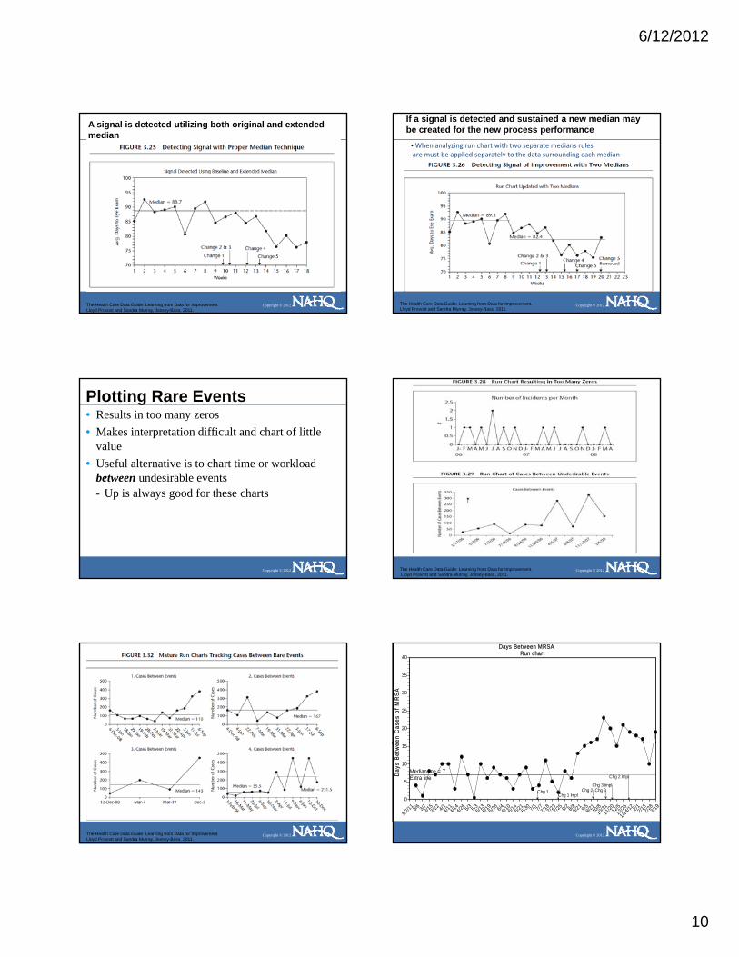
Plotting Rare Events• Results in too many zeros• Makes interpretation difficult and chart of little
value• Useful alternative is to chart time or workload
between undesirable events
Copyright © 2012
between undesirable events - Up is always good for these charts
Copyright © 2012The Health Care Data Guide: Learning from Data for Improvement. Lloyd Provost and Sandra Murray, Jossey-Bass, 2011.
Copyright © 2012The Health Care Data Guide: Learning from Data for Improvement. Lloyd Provost and Sandra Murray, Jossey-Bass, 2011.
en C
ases
of
MR
SA
Days Between MRSARun chart
20
25
30
35
40
Copyright © 2012
Day
s B
etw
e
Median line = 7Extra line
Chg 1Chg 1 Impl
Chg 2 Chg 3Chg 3 Impl
Chg 2 Impl
3/2/11 3/6 3/73/1
53/2
2 4/14/114/1
44/26 5/3 5/35/1
35/1
95/28 6/46/1
06/1
46/2
16/3
0 7/3 7/77/187/2
37/2
5 8/2 8/88/21 9/59/2
110
/810
/3111/2
012
/512/2
6
1/14/12 2/12/1
82/2
83/19
0
5
10
15

6/12/2012
11
Judgment Vs. Improvement
Copyright © 2012The Health Care Data Guide: Learning from Data for Improvement. Lloyd Provost and Sandra Murray, Jossey-Bass, 2011.
Nifty Things You Can Do With Run Charts
Copyright © 2012
Improvement Projects Require a Family of Measures
Copyright © 2012The Health Care Data Guide: Learning from Data for Improvement. Lloyd Provost and Sandra Murray, Jossey-Bass, 2011.
Improvement Projects Require a Family of Measures• 2-8 measures typically -Each on a graph -All viewed on one page
Copyright © 2012The Health Care Data Guide: Learning from Data for Improvement. Lloyd Provost and Sandra Murray, Jossey-Bass, 2011.
Fig 3.6: Improvement Evident Using a Set of Run Charts Viewed on One Page
Small Multiples• Multiple run charts viewed on one page• All these run charts are about the same measure
but for a different location, provider or segment of the population
• Each has the same scale vertically and
Copyright © 2012
• Each has the same scale vertically and horizontially
• Allows for rapid comparison
Copyright © 2012The Health Care Data Guide: Learning from Data for Improvement. Lloyd Provost and Sandra Murray, Jossey-Bass, 2011.

6/12/2012
12
May Display More Than One Measure on a Graph
Copyright © 2012The Health Care Data Guide: Learning from Data for Improvement. Lloyd Provost and Sandra Murray, Jossey-Bass, 2011.
May Use Different Measure for Each Axis
Copyright © 2012The Health Care Data Guide: Learning from Data for Improvement. Lloyd Provost and Sandra Murray, Jossey-Bass, 2011.
Sometimes We Don’t Have Much Data• May not be rich in data but that data may still lead to a high degree of belief
in the change(s) tested• Characterize the change by describing the before and after medians• Minimizes point-to-point variation
Copyright © 2012The Health Care Data Guide: Learning from Data for Improvement. Lloyd Provost and Sandra Murray, Jossey-Bass, 2011.
Stratification or Disaggregation
Copyright © 2012The Health Care Data Guide: Learning from Data for Improvement. Lloyd Provost and Sandra Murray, Jossey-Bass, 2011.
Cautions with Graphing Raw Data• Plotting raw data can be misleading if a useful denominator would
lead to another conclusion• Use of ratio minimizes confusion from changes in denominator
volume• Ratio = numerator for key measure
denominator (for unit of production or volume related to key measures)
Copyright © 2012
Key Measure (Numerator) Possible Denominator Ratio
# ADEs # Doses Dispensed ADE/Dose
OR Costs # Surgeries OR Cost/Surgery
# Peri‐operative Adverse Events
# Admissions POAE/Admission
Patients LWBS # Patients Registering in ED Patients LWBS/# Patients Registered
# Falls # Patient days Falls/Patient Day
6
8
10
12
Falls
Number of Falls
Copyright © 2012
0
2
4
M-07
A M J J A S O N D J-08
F M A M J J A S O N
# F
The Health Care Data Guide: Learning from Data for Improvement. Lloyd Provost and Sandra Murray, Jossey-Bass, 2011.
6/12/2012
13
Run Chart• A line graph of data plotted over time• Data is kept in time order• Can see flow of data• Helps answer questions:
Copyright © 2012
p q- What is our baseline variation?- How much variation do we have?- How is process changing over time? - Has our change resulted in an improvement?- Did I hold the improvement?
Tools to Learn from Variation in Data
Copyright © 2012
Frequency Plot Pareto Chart Scatter Plot
The Health Care Data Guide: Learning from Data for Improvement. Lloyd Provost and Sandra Murray, Jossey-Bass, 2011.
Tools for Understanding Variation• Run Chart: Study variation in data over time; understand
the impact of changes.
• Shewhart Chart: Is my process stable; predictable? Distinguish between special and common causes of variation.
Copyright © 2012
• Pareto Chart: Focus improvement on with greatest potential impact.
• Frequency Plot: Understand distribution of data (e,g, central location, spread, shape, and patterns).
• Scatter Plot: Analyze potential relationship between two variables.
Shewhart Control Charts: WhatAm I Looking At and Why Bother!
• What is Shewhart chart?• Special and common cause variation• How to interpret one• Uses of Shewhart charts• Why bother?
Copyright © 2012
• Why bother?• There are different kinds of Shewhart charts
Shewhart Chart:What Is It? • A tool to differentiate
special from common cause variation
• Data is usually displayed over time
Copyright © 2012
over time• Most often in time order
Shewhart chart will include:•Center line (usually mean)•Data points for measure•Statistically calculated upper and lower 3 sigma limits
(Limits typically created with 20 or more subgroups)
The Health Care Data Guide: Learning from Data for Improvement. Lloyd Provost and Sandra Murray, Jossey-Bass, 2011.
Introduction to Shewhart Chart• Statistical tool used to distinguish special from
common cause variation
Copyright © 2012
Straight limits indicateequal subgroup size
The Health Care Data Guide: Learning from Data for Improvement. Lloyd Provost and Sandra Murray, Jossey-Bass, 2011.

6/12/2012
14
Copyright © 2012The Health Care Data Guide: Learning from Data for Improvement. Lloyd Provost and Sandra Murray, Jossey-Bass, 2011.
Smaller subgroup = wider limitsLarger subgroup – tighter limits
Varying limits indicate unequal subgroup size
Types of Variation: Common Cause
• The variation is due to the process or system due to the process or system designdesign
• It is produced by interactions of inherent inherent variablesvariables in the process
• The causes affectaffect everyone working in the process
Copyright © 2012
• The causes affectaffect everyone working in the process and allall outcomesoutcomes of the process
• Process having only common cause affecting the common cause affecting the outcome is called stableoutcome is called stable-- Performance is predictable Performance is predictable
The Health Care Data Guide: Learning from Data for Improvement. Lloyd Provost and Sandra Murray, Jossey-Bass, 2011.
Management Strategy: Common Cause System
STRATEGY TO TAKE:
• Process Study and Redesign!!- Understand that process performance will not change unless
process design is fundamentally altered- Identify process variables contributing to common cause
variation- Determine which aspect of the process to change
Copyright © 2012
- Determine which aspect of the process to change - PDSA the process change
ACTIONS TO AVOID:
• Doing nothing at all!• Tampering• Trying to attach specific meaning to fluctuations in the data
(i.e. explain the difference between points that are high vs... low)
The Health Care Data Guide: Learning from Data for Improvement. Lloyd Provost and Sandra Murray, Jossey-Bass, 2011.
Types of Variation: Special Cause
• Variation in the process assignableassignable to a specific cause or causes - not part of not part of the usual processthe usual process
• This variation due to specific due to specific
Copyright © 2012
ppcircumstancescircumstances
• Process not stablenot stable-- Is not predictableIs not predictable
The Health Care Data Guide: Learning from Data for Improvement. Lloyd Provost and Sandra Murray, Jossey-Bass, 2011.
Management Strategy: Special Cause System
IMPROVEMENT STRATEGY:
• Investigate, learn and standardize the process!!- Immediately try to understand when Special Cause occurred- Study what was different when Special Cause occurred- Identify ways to prevent or use it, if understandable, to
standardize the processi h d di b k h h
Copyright © 2012
• either standardize back to where the process was• or standardize in a new better place
ACTIONS TO AVOID:• Doing nothing at all• Failing to involve the people who work in the process
in identifying special causes
The Health Care Data Guide: Learning from Data for Improvement. Lloyd Provost and Sandra Murray, Jossey-Bass, 2011.
Distinguishing Special from Common Cause Variation
Copyright © 2012The Health Care Data Guide: Learning from Data for Improvement. Lloyd Provost and Sandra Murray, Jossey-Bass, 2011.

6/12/2012
15
Understanding Variation• We can make two mistakes
- Mistake 1: thinking an outcome is due to a special cause when it was really due to common causes
- Mistake 2: thinking an outcome is due to
Copyright © 2012
gcommon causes when it was really due to a special cause
• Shewhart charts help minimize these two mistakes
The Health Care Data Guide: Learning from Data for Improvement. Lloyd Provost and Sandra Murray, Jossey-Bass, 2011.
Note: Ties between two consecutive points do notcancel or add to a trend.
Note: A point exactly on the centerline does not cancel or count towards a shift
Note: A point exactly on a control limit is not considered outside the limit When there is not a lower or upper control limit Rule 1 does not apply to the side missing limit
Rules or detecting a special cause
Copyright © 2012
pp y g
When there is not a lower or upper control limit Rule 4 does not apply to the side missing limit
The Health Care Data Guide: Learning from Data for Improvement. Lloyd Provost and Sandra Murray, Jossey-Bass, 2011.
Let’s Analyze One Together• We always apply all 5 rules to each chart
- Any one rule “activated” indicates special cause in that area
- Common cause is determined by “ruling out”
Copyright © 2012
special cause (none of 5 rules activated)• Let’s consider appropriate action based on your
analysis- Special cause action?- Common cause action?
%
Percent Handwashing Compliancep chart
UCL
CTL80
90
100
Copyright © 2012
LCL
J 08 F M A M J J A S O N D JAN 09 F M A M J J A50
60
70
Let’s Practice• Please analyze one of these charts• Apply all 5 rules to each chart• Circle special cause if you find it• What action would you take based on your
l i ?
Copyright © 2012
analysis?- Special cause action?- What would you do if it is solely common cause?
%
Percent Parent Satisfaction in Top Boxp chart
UCL = 23.95
CTL 11 73
15
20
25
30
Copyright © 2012
CTL = 11.73
1/1/200
7
2/1/200
7
3/1/200
7
4/1/200
7
5/1/200
7
6/1/200
7
7/1/200
7
8/1/200
7
9/1/200
7
10/1/
2007
11/1/
2007
12/1/
2007
1/1/200
8
2/1/200
8
3/1/200
8
4/1/200
8
5/1/200
8
6/1/200
80
5
10

6/12/2012
16
Hou
rs
Average Time to Acknowledge ReferralsIndividuals
UCL = 29.05
1416182022242628303234
Copyright © 2012
Weeks
Mean = 9.44
Chg 1 Chg 2 Chg 3 Chg 4
3/6 3/8 3/15
3/22 4/1 4/1
14/1
44/2
6 5/3 5/5 5/13
5/19
5/28 6/4 6/1
06/1
46/2
16/3
0 7/3 7/7 7/23
7/18
7/25 8/2 8/8
02468
1012
Why Distinguish Special From Common Cause Variation?
• When monitoring key processes- Can tell if they have remained the same,
degraded or improved• When working specifically to improve:
- Special cause:
Copyright © 2012
p• may be evidence of improvement• or… an unintended consequence such as degradation
in the results - Common cause:
• indicates that the changes have not resulted in improvement
Using a Control Chart• Learn how much variation exists in process
- If stable are predictable. Can use info in planning, communicate with staff, patients, family
• Assess stability and determine improvement strategy (common or special cause strategy)
• Monitor performance and correct as needed Fi d d l f i i
Copyright © 2012
• Find and evaluate causes of variation• Tell if our changes yielded improvements• See if improvements are “sticking”
Stable processPredictable
Are Our LOSs for DRG XXX Stable?
in D
ays
4 6 7 5 4 6 4 8 3 6 7 5 6 7 8 7 7 8 6 8 9 6 7 8 6DataIndividuals
8
10
12
14
UCL=11.1
Mean-6.2
Copyright © 2012
Sequential Cases
LOS
1 2 3 4 5 6 7 8 9 10 11 12 13 14 15 16 17 18 19 20 21 22 23 24 25
0
2
4
6
LCL=1.7
Using a Shewhart Chart• Learn how much variation exists in process• Assess stability and determine improvement strategy
(common or special cause strategy)- When sponsoring improvement effort it’s helpful, if data
readily available, to determine if process has only common cause or if special cause also present
• Monitor performance and correct as needed
Copyright © 2012
Monitor performance and correct as needed • Find and evaluate causes of variation• Tell if our changes yielded improvements• See if improvements are “sticking”
Stable processPredictable
Are Our LOSs for DRG XXX Stable?
S in
Day
s
4 6 7 5 4 6 4 8 3 6 7 5 6 7 8 7 7 8 6 8 9 6 7 8 6DataIndividuals
6
8
10
12
14
UCL=11.1
Mean-6.2
Stable but perhaps not good enoughRequires process redesign to improve
Copyright © 2012
Sequential Cases
LOS
1 2 3 4 5 6 7 8 9 10 11 12 13 14 15 16 17 18 19 20 21 22 23 24 25
0
2
4
6
LCL=1.7

6/12/2012
17
ing
Err
ors
Coding Errors per Groups of 20 Recordsc chart
UCL = 19.37
15
20
25
30Special Cause variationWhat is our action here?
Copyright © 2012
# C
odi
Sequential Subroups of 20 Records
Mean = 9.92
LCL = 0.47
1 2 3 4 5 6 7 8 9 10 11 12 13 14 15 16 17 18 19 20 21 22 23 24 250
5
10
Using a Shewhart Chart• Learn how much variation exists in process• Assess stability and determine improvement strategy
(common or special cause strategy)• Monitor performance and correct as needed • Find and evaluate causes of variation• Tell if our changes yielded improvements
Copyright © 2012
g y p• See if improvements are “sticking”
Copyright © 2012The Health Care Data Guide: Learning from Data for Improvement. Lloyd Provost and Sandra Murray, Jossey-Bass, 2011.
Using a Shewhart Chart• Assess stability and determine improvement
strategy (common or special cause strategy)• Monitor performance and correct as needed • Find and evaluate causes of variation• Tell if our changes yielded improvements
Copyright © 2012
g y p• See if improvements are “sticking”
Copyright © 2012The Health Care Data Guide: Learning from Data for Improvement. Lloyd Provost and Sandra Murray, Jossey-Bass, 2011.
Using a Shewhart Chart• Learn how much variation exists in process• Assess stability and determine improvement strategy
(common or special cause strategy)• Monitor performance and correct as needed • Find and evaluate causes of variation
T ll if h i ld d i t
Copyright © 2012
• Tell if our changes yielded improvements- When you intend to improve process you are on the lookout
for special cause indicative of improvement• See if improvements are “sticking”

6/12/2012
18
Per
cent
Percent Unplanned Returns to OR P chart984
27
982
20
996
25
998
23
1070
31
1031
17
886
21
964
28
1128
24
960
22
1193
19
998
24
1070
30
895
22
852
15
963
18
956
12
1001
22
956
8
995
2
987
9
943
6
965
20
980
6
923
2
1106
6
# Surgeries# Pts Return
p chart
UCL = 3.54
CTL = 2.16
2.0
2.5
3.0
3.5
4.0
Good
Copyright © 2012
P
LCL = 0.78
Goal = 0.5
Chg 1
Chg 2 & 3
Chg 4 & 5Chg 7 & 8
Chg 9
Chg 10 & 11Chg 12 & 13
Chg 14
Implement
F 04M A M J J A S O N DJ 05F M A M J J A S O N DJ 06F M A M0.0
0.5
1.0
1.5
2.0
Using a Shewhart Chart
• Learn how much variation exists in process• Assess stability and determine improvement
strategy (common or special cause strategy)
Copyright © 2012
• Monitor performance and correct as needed • Find and evaluate causes of variation• Tell if our changes yielded improvements• See if improvements are “sticking”
Copyright © 2012The Health Care Data Guide: Learning from Data for Improvement. Lloyd Provost and Sandra Murray, Jossey-Bass, 2011. Copyright © 2012
The Health Care Data Guide: Learning from Data for Improvement. Lloyd Provost and Sandra Murray, Jossey-Bass, 2011.
Run Vs. Shewhart Chart
Copyright © 2012The Health Care Data Guide: Learning from Data for Improvement. Lloyd Provost and Sandra Murray, Jossey-Bass, 2011.
Technique matters!-Obtain baseline mean/limits from stable period and freeze them-Minimum baseline 12, preferred 20-30
Copyright © 2012The Health Care Data Guide: Learning from Data for Improvement. Lloyd Provost and Sandra Murray, Jossey-Bass, 2011.

6/12/2012
19
Selecting the Appropriate Shewhart ChartType of Data
Count or Classification (Attribute Data)
Count (Nonconformities)
Classification (Nonconforming)
Continuous (Variable Data)
SubgroupSize of 1
Unequal or Equal SubgroupSize
Copyright © 2012
Equal Area of Opportunity
Unequal Area of Opportunity
Unequal or Equal Subgroup Size
C Chart U Chart P ChartI Chart (X chart) X‐Bar and S
chart
Number ofNonconformities
NonconformitiesPer Unit
PercentNonconforming
Individual Measures Average andStandard Deviation
Other types of control charts for attribute data:1. NP (for classification data)2. T-chart [time between rare events]3. Cumulative sum (CUSUM)4. Exponentially weighted moving average (EWMA)5 G chart (number of opportunities between rare events) 6. Standardized control chart
Other types of control charts for continuous data:7. X‐bar and Range8. Moving average9. Median and range10. Cumulative sum (CUSUM)11. Exponentially weighted moving average (EWMA)12. Standardized control chart
Source: The Health Care Data Guide. Provost and Murray Jossey-Bass, 2011
Tools to Learn from Variation in Data
Copyright © 2012
Frequency Plot Pareto Chart Scatter Plot
The Health Care Data Guide: Learning from Data for Improvement. Lloyd Provost and Sandra Murray, Jossey-Bass, 2011.
00 R
esid
ent D
ays
Fall Rate per 1000 Resident Days3.357
8
3.012
13
3.718
11
2.983
7
3.108
11
2.948
18
2.721
10
2.690
15
2.567
9
2.667
9
2.824
5
2.882
16
3.429
9
2.829
9
3.092
8
2.605
4
2.610
7
2.531
12
2.502
15
2.615
9
2.662
12
2.806
13
2.591
9
2.403
15
# Days/1000# Falls
u chart
UCL = 7.16
CTL = 3.734
5
6
7
Copyright © 2012
Rat
e pe
r 10
LCL = 0.29
Jan 1
0Feb
MarApr
MayJu
n Jul
AugSep
Oct NovDec
Jan 1
1Feb
MarApr
MayJu
n Jul
AugSep
OctNov
Dec0
1
2
3
of E
vent
s
Factors Associated with Resident FallsN=254
10440.94%
5220.47% 46
18.11%
of E
vent
s
Factors Associated with Resident FallsN=254
10440.94%
5220.47% 46
18.11%
of E
vent
s
Factors Associated with Resident FallsN=254
10440.94%
5220.47% 46
18.11%
of E
vent
s
Factors Associated with Resident FallsN=254
10440.94%
5220.47% 46
18.11%
of E
vent
s
Factors Associated with Resident FallsN=254
10440.94%
5220.47% 46
18.11%
of E
vent
s
Factors Associated with Resident FallsN=254
10440.94%
5220.47% 46
18.11%
of E
vent
s
Factors Associated with Resident FallsN=254
10440.94%
5220.47% 46
18.11%
of E
vent
s
Factors Associated with Resident FallsN=254
10440.94%
5220.47% 46
18.11%
of E
vent
s
Factors Associated with Resident FallsN=254
10440.94%
5220.47% 46
18.11%
of E
vent
s
Factors Associated with Resident FallsN=254
10440.94%
5220.47% 46
18.11%
of E
vent
s
Factors Associated with Resident FallsN=254
10440.94%
5220.47% 46
18.11%
Copyright © 2012
# o 21
8.27% 176.69%
62.36%
41.57%
20.79%
20.79%
Bend
ing
Ove
r
Get
ting
Out
of B
ed
Trip
Bum
ped
Usi
ng R
est R
oom
No
Gla
sses
Mis
sed
Cha
ir
Oth
er
Wet
Flo
or
# o 21
8.27% 176.69%
62.36%
41.57%
20.79%
20.79%
Bend
ing
Ove
r
Get
ting
Out
of B
ed
Trip
Bum
ped
Usi
ng R
est R
oom
No
Gla
sses
Mis
sed
Cha
ir
Oth
er
Wet
Flo
or
# o 21
8.27% 176.69%
62.36%
41.57%
20.79%
20.79%
Bend
ing
Ove
r
Get
ting
Out
of B
ed
Trip
Bum
ped
Usi
ng R
est R
oom
No
Gla
sses
Mis
sed
Cha
ir
Oth
er
Wet
Flo
or
# o 21
8.27% 176.69%
62.36%
41.57%
20.79%
20.79%
Bend
ing
Ove
r
Get
ting
Out
of B
ed
Trip
Bum
ped
Usi
ng R
est R
oom
No
Gla
sses
Mis
sed
Cha
ir
Oth
er
Wet
Flo
or
# o 21
8.27% 176.69%
62.36%
41.57%
20.79%
20.79%
Bend
ing
Ove
r
Get
ting
Out
of B
ed
Trip
Bum
ped
Usi
ng R
est R
oom
No
Gla
sses
Mis
sed
Cha
ir
Oth
er
Wet
Flo
or
# o 21
8.27% 176.69%
62.36%
41.57%
20.79%
20.79%
Bend
ing
Ove
r
Get
ting
Out
of B
ed
Trip
Bum
ped
Usi
ng R
est R
oom
No
Gla
sses
Mis
sed
Cha
ir
Oth
er
Wet
Flo
or
# o 21
8.27% 176.69%
62.36%
41.57%
20.79%
20.79%
Bend
ing
Ove
r
Get
ting
Out
of B
ed
Trip
Bum
ped
Usi
ng R
est R
oom
No
Gla
sses
Mis
sed
Cha
ir
Oth
er
Wet
Flo
or
# o 21
8.27% 176.69%
62.36%
41.57%
20.79%
20.79%
Bend
ing
Ove
r
Get
ting
Out
of B
ed
Trip
Bum
ped
Usi
ng R
est R
oom
No
Gla
sses
Mis
sed
Cha
ir
Oth
er
Wet
Flo
or
# o 21
8.27% 176.69%
62.36%
41.57%
20.79%
20.79%
Bend
ing
Ove
r
Get
ting
Out
of B
ed
Trip
Bum
ped
Usi
ng R
est R
oom
No
Gla
sses
Mis
sed
Cha
ir
Oth
er
Wet
Flo
or
# o 21
8.27% 176.69%
62.36%
41.57%
20.79%
20.79%
Bend
ing
Ove
r
Get
ting
Out
of B
ed
Trip
Bum
ped
Usi
ng R
est R
oom
No
Gla
sses
Mis
sed
Cha
ir
Oth
er
Wet
Flo
or
# o 21
8.27% 176.69%
62.36%
41.57%
20.79%
20.79%
Bend
ing
Ove
r
Get
ting
Out
of B
ed
Trip
Bum
ped
Usi
ng R
est R
oom
No
Gla
sses
Mis
sed
Cha
ir
Oth
er
Wet
Flo
or
Falls
Number of Falls by Time of Day Histogram
15
20
25
30
Copyright © 2012
#
T ime of Day (24 Hour Clock)0 2 4 6 8 10 12 14 16 18 20 22
0
5
10
Pareto Chart• Bar chart with bars in rank order• Each bar represents a different variable,
factor or problem • Becomes useful with 30-50 pieces of data
Copyright © 2012
p• Looking for 20% of bars representing 80% of
opportunity• Want to know where to focus our efforts
- Which are the vital few areas we should concentrate on? - Which variables out of many are occurring most?

6/12/2012
20
Pareto Chart: What Does One Look Like?
onse
s
Reasons Cited for Lack of Childhood Immunizations: Group A1,503
79152.63%
264
Count
400
500
600
700
onse
s
Reasons Cited for Lack of Childhood Immunizations: Group A1,503
79152.63%
264
Count
400
500
600
700
onse
s
Reasons Cited for Lack of Childhood Immunizations: Group A1,503
79152.63%
264
Count
400
500
600
700
onse
s
Reasons Cited for Lack of Childhood Immunizations: Group A1,503
79152.63%
264
Count
400
500
600
700
onse
s
Reasons Cited for Lack of Childhood Immunizations: Group A1,503
79152.63%
264
Count
400
500
600
700
onse
s
Reasons Cited for Lack of Childhood Immunizations: Group A1,503
79152.63%
264
Count
400
500
600
700
onse
s
Reasons Cited for Lack of Childhood Immunizations: Group A1,503
79152.63%
264
Count
400
500
600
700
onse
s
Reasons Cited for Lack of Childhood Immunizations: Group A1,503
79152.63%
264
Count
400
500
600
700
onse
s
Reasons Cited for Lack of Childhood Immunizations: Group A1,503
79152.63%
264
Count
400
500
600
700
onse
s
Reasons Cited for Lack of Childhood Immunizations: Group A1,503
79152.63%
264
Count
400
500
600
700
onse
s
Reasons Cited for Lack of Childhood Immunizations: Group A1,503
79152.63%
264
Count
400
500
600
700
Copyright © 2012The Health Care Data Guide: Learning from Data for Improvement. Lloyd Provost and Sandra Murray, Jossey-Bass, 2011.
# R
espo 264
17.56%134
8.92%128
8.52% 986.52% 45
2.99%43
2.86%
No
Tran
spor
t
Chi
ldca
re N
eeds
Cos
t of I
mm
.
No
Tim
e
No
Info
Don
't B
elie
ve
Oth
er
0
100
200
300
# R
espo 264
17.56%134
8.92%128
8.52% 986.52% 45
2.99%43
2.86%
No
Tran
spor
t
Chi
ldca
re N
eeds
Cos
t of I
mm
.
No
Tim
e
No
Info
Don
't B
elie
ve
Oth
er
0
100
200
300
# R
espo 264
17.56%134
8.92%128
8.52% 986.52% 45
2.99%43
2.86%
No
Tran
spor
t
Chi
ldca
re N
eeds
Cos
t of I
mm
.
No
Tim
e
No
Info
Don
't B
elie
ve
Oth
er
0
100
200
300
# R
espo 264
17.56%134
8.92%128
8.52% 986.52% 45
2.99%43
2.86%
No
Tran
spor
t
Chi
ldca
re N
eeds
Cos
t of I
mm
.
No
Tim
e
No
Info
Don
't B
elie
ve
Oth
er
0
100
200
300
# R
espo 264
17.56%134
8.92%128
8.52% 986.52% 45
2.99%43
2.86%
No
Tran
spor
t
Chi
ldca
re N
eeds
Cos
t of I
mm
.
No
Tim
e
No
Info
Don
't B
elie
ve
Oth
er
0
100
200
300
# R
espo 264
17.56%134
8.92%128
8.52% 986.52% 45
2.99%43
2.86%
No
Tran
spor
t
Chi
ldca
re N
eeds
Cos
t of I
mm
.
No
Tim
e
No
Info
Don
't B
elie
ve
Oth
er
0
100
200
300
# R
espo 264
17.56%134
8.92%128
8.52% 986.52% 45
2.99%43
2.86%
No
Tran
spor
t
Chi
ldca
re N
eeds
Cos
t of I
mm
.
No
Tim
e
No
Info
Don
't B
elie
ve
Oth
er
0
100
200
300
# R
espo 264
17.56%134
8.92%128
8.52% 986.52% 45
2.99%43
2.86%
No
Tran
spor
t
Chi
ldca
re N
eeds
Cos
t of I
mm
.
No
Tim
e
No
Info
Don
't B
elie
ve
Oth
er
0
100
200
300
# R
espo 264
17.56%134
8.92%128
8.52% 986.52% 45
2.99%43
2.86%
No
Tran
spor
t
Chi
ldca
re N
eeds
Cos
t of I
mm
.
No
Tim
e
No
Info
Don
't B
elie
ve
Oth
er
0
100
200
300
# R
espo 264
17.56%134
8.92%128
8.52% 986.52% 45
2.99%43
2.86%
No
Tran
spor
t
Chi
ldca
re N
eeds
Cos
t of I
mm
.
No
Tim
e
No
Info
Don
't B
elie
ve
Oth
er
0
100
200
300
# R
espo 264
17.56%134
8.92%128
8.52% 986.52% 45
2.99%43
2.86%
No
Tran
spor
t
Chi
ldca
re N
eeds
Cos
t of I
mm
.
No
Tim
e
No
Info
Don
't B
elie
ve
Oth
er
0
100
200
300
Pareto Chart: What Does One Look Like?
onse
s
Reasons Cited for Lack of Childhood Immunizations: Group A1,503
79152.63%
Count Percent
40%
60%
80%
100%
600
800
1,000
1,200
1,400
onse
s
Reasons Cited for Lack of Childhood Immunizations: Group A1,503
79152.63%
Count Percent
40%
60%
80%
100%
600
800
1,000
1,200
1,400
onse
s
Reasons Cited for Lack of Childhood Immunizations: Group A1,503
79152.63%
Count Percent
40%
60%
80%
100%
600
800
1,000
1,200
1,400
onse
s
Reasons Cited for Lack of Childhood Immunizations: Group A1,503
79152.63%
Count Percent
40%
60%
80%
100%
600
800
1,000
1,200
1,400
onse
s
Reasons Cited for Lack of Childhood Immunizations: Group A1,503
79152.63%
Count Percent
40%
60%
80%
100%
600
800
1,000
1,200
1,400
onse
s
Reasons Cited for Lack of Childhood Immunizations: Group A1,503
79152.63%
Count Percent
40%
60%
80%
100%
600
800
1,000
1,200
1,400
onse
s
Reasons Cited for Lack of Childhood Immunizations: Group A1,503
79152.63%
Count Percent
40%
60%
80%
100%
600
800
1,000
1,200
1,400
onse
s
Reasons Cited for Lack of Childhood Immunizations: Group A1,503
79152.63%
Count Percent
40%
60%
80%
100%
600
800
1,000
1,200
1,400
onse
s
Reasons Cited for Lack of Childhood Immunizations: Group A1,503
79152.63%
Count Percent
40%
60%
80%
100%
600
800
1,000
1,200
1,400
onse
s
Reasons Cited for Lack of Childhood Immunizations: Group A1,503
79152.63%
Count Percent
40%
60%
80%
100%
600
800
1,000
1,200
1,400
onse
s
Reasons Cited for Lack of Childhood Immunizations: Group A1,503
79152.63%
Count Percent
40%
60%
80%
100%
600
800
1,000
1,200
1,400
Copyright © 2012The Health Care Data Guide: Learning from Data for Improvement. Lloyd Provost and Sandra Murray, Jossey-Bass, 2011.
# R
espo
26417.56% 134
8.92%128
8.52%98
6.52% 452.99%
432.86%
No
Tran
spor
t
Chi
ldca
re N
eeds
Cos
t of I
mm
.
No
Tim
e
No
Info
Don
't B
elie
ve
Oth
er
0%
20%
40%
0
200
400
600
# R
espo
26417.56% 134
8.92%128
8.52%98
6.52% 452.99%
432.86%
No
Tran
spor
t
Chi
ldca
re N
eeds
Cos
t of I
mm
.
No
Tim
e
No
Info
Don
't B
elie
ve
Oth
er
0%
20%
40%
0
200
400
600
# R
espo
26417.56% 134
8.92%128
8.52%98
6.52% 452.99%
432.86%
No
Tran
spor
t
Chi
ldca
re N
eeds
Cos
t of I
mm
.
No
Tim
e
No
Info
Don
't B
elie
ve
Oth
er
0%
20%
40%
0
200
400
600
# R
espo
26417.56% 134
8.92%128
8.52%98
6.52% 452.99%
432.86%
No
Tran
spor
t
Chi
ldca
re N
eeds
Cos
t of I
mm
.
No
Tim
e
No
Info
Don
't B
elie
ve
Oth
er
0%
20%
40%
0
200
400
600
# R
espo
26417.56% 134
8.92%128
8.52%98
6.52% 452.99%
432.86%
No
Tran
spor
t
Chi
ldca
re N
eeds
Cos
t of I
mm
.
No
Tim
e
No
Info
Don
't B
elie
ve
Oth
er
0%
20%
40%
0
200
400
600
# R
espo
26417.56% 134
8.92%128
8.52%98
6.52% 452.99%
432.86%
No
Tran
spor
t
Chi
ldca
re N
eeds
Cos
t of I
mm
.
No
Tim
e
No
Info
Don
't B
elie
ve
Oth
er
0%
20%
40%
0
200
400
600
# R
espo
26417.56% 134
8.92%128
8.52%98
6.52% 452.99%
432.86%
No
Tran
spor
t
Chi
ldca
re N
eeds
Cos
t of I
mm
.
No
Tim
e
No
Info
Don
't B
elie
ve
Oth
er
0%
20%
40%
0
200
400
600
# R
espo
26417.56% 134
8.92%128
8.52%98
6.52% 452.99%
432.86%
No
Tran
spor
t
Chi
ldca
re N
eeds
Cos
t of I
mm
.
No
Tim
e
No
Info
Don
't B
elie
ve
Oth
er
0%
20%
40%
0
200
400
600
# R
espo
26417.56% 134
8.92%128
8.52%98
6.52% 452.99%
432.86%
No
Tran
spor
t
Chi
ldca
re N
eeds
Cos
t of I
mm
.
No
Tim
e
No
Info
Don
't B
elie
ve
Oth
er
0%
20%
40%
0
200
400
600
# R
espo
26417.56% 134
8.92%128
8.52%98
6.52% 452.99%
432.86%
No
Tran
spor
t
Chi
ldca
re N
eeds
Cos
t of I
mm
.
No
Tim
e
No
Info
Don
't B
elie
ve
Oth
er
0%
20%
40%
0
200
400
600
# R
espo
26417.56% 134
8.92%128
8.52%98
6.52% 452.99%
432.86%
No
Tran
spor
t
Chi
ldca
re N
eeds
Cos
t of I
mm
.
No
Tim
e
No
Info
Don
't B
elie
ve
Oth
er
0%
20%
40%
0
200
400
600
When Is It Used?
• When data can be arranged into categories
• When the rank of each category is important
Copyright © 2012
important• When we need to focus on the most
important problems or causes of variation
What are we trying toaccomplish?
How will we know that achange is an improvement?
What change can we make thatwill result in improvement?
Model for Improvement
Copyright © 2012
Act Plan
Check Do
The Health Care Data Guide: Learning from Data for Improvement. Lloyd Provost and Sandra Murray, Jossey-Bass, 2011.
Frequency Table: Where Are Needlesticks Occurring?
Variable Wk1 Wk 2 Wk 3 Wk 4 Total %3W 17 14 16 12 59 26.34ED 4 3 4 6 17 7.59ICU 4 7 2 3 16 7.142 N 1 3 5 3 12 5.363 N 7 2 3 5 17 7.59
Copyright © 2012
2 W 4 6 4 6 20 8.93Allergy/Imm 6 2 3 3 14 6.252S 10 13 12 13 48 21.43Lab 3 2 3 4 12 5.36Other 3 3 3 0 9 4.02Grand Total 224 100 %
Cou
nt
Needlesticks By Location (n=224)
59 26.34%
48 21.43%
Count Percent
15%
20%
25%
30
40
50
60
Copyright © 2012
C
20 8.93% 17
7.59% 17
7.59% 16
7.14% 14 6.25% 12
5.36% 12
5.36% 9 4.02% 5%
10%
10
20
30
3W 2S 2 W 3 N ED ICU Allergy/Imm. Lab 2 N Other

6/12/2012
21
How Is It Interpreted?• Look for the Pareto effect• We won’t always find it!
- Is entire chart speaking to us?- Can we re-stratify?
Copyright © 2012
Can we re stratify?- Last choice is selecting a column and
tackling it!
Cou
nt
Factors Related To Severely Mentally Disabled Adult Recidivism (Readmission)196
103 52.55%
Count Percent
30%
40%
50%
60
80
100
Copyright © 2012
C
38 19.39%
20 10.20%
14 7.14% 11
5.61% 8 4.08%
2 1.02%
10%
20%
20
40
Non-Comp.w/Meds ETOH/Oth Sub. Instablity Housing Non-Comp other TX. Lack Fam. Supt. Other Psyhosoc. Other
How Is It Interpreted?• Look for the Pareto effect• We won’t always find it!
- Is entire chart speaking to us?- Can we re-stratify?
Copyright © 2012
Can we re stratify?- Last choice is selecting a column
and tackling it!
ount
Factors Related to Pediatric Head Injury
20 29.41%
16 23.53%
14 20.59%
Count Percent
15%
20%
25%
30%
15
20
Copyright © 2012
C
6 8.82%
4 5.88%
2 2.94%
2 2.94%
2 2.94% 1
1.47% 1
1.47%
5%
10%
15%
5
10
Rollerblade Skateboard Bike Motor Veh. Fall Struck Pedestrian Motorcycle Other Fight
How Is It Interpreted?• Look for the Pareto effect• We won’t always find it!
- Is entire chart speaking to us?C t tif ?
Copyright © 2012
- Can we re-stratify? of F
alls
Location of Resident Falls# Falls
5320.87%
4316.93%
4216.54%
3714.57%
2911.42%
197 48%
Count
20
30
40
50
of F
alls
Location of Resident Falls# Falls
5320.87%
4316.93%
4216.54%
3714.57%
2911.42%
197 48%
Count
20
30
40
50
of F
alls
Location of Resident Falls# Falls
5320.87%
4316.93%
4216.54%
3714.57%
2911.42%
197 48%
Count
20
30
40
50
of F
alls
Location of Resident Falls# Falls
5320.87%
4316.93%
4216.54%
3714.57%
2911.42%
197 48%
Count
20
30
40
50
of F
alls
Location of Resident Falls# Falls
5320.87%
4316.93%
4216.54%
3714.57%
2911.42%
197 48%
Count
20
30
40
50
of F
alls
Location of Resident Falls# Falls
5320.87%
4316.93%
4216.54%
3714.57%
2911.42%
197 48%
Count
20
30
40
50
of F
alls
Location of Resident Falls# Falls
5320.87%
4316.93%
4216.54%
3714.57%
2911.42%
197 48%
Count
20
30
40
50
of F
alls
Location of Resident Falls# Falls
5320.87%
4316.93%
4216.54%
3714.57%
2911.42%
197 48%
Count
20
30
40
50
of F
alls
Location of Resident Falls# Falls
5320.87%
4316.93%
4216.54%
3714.57%
2911.42%
197 48%
Count
20
30
40
50
of F
alls
Location of Resident Falls# Falls
5320.87%
4316.93%
4216.54%
3714.57%
2911.42%
197 48%
Count
20
30
40
50
of F
alls
Location of Resident Falls# Falls
5320.87%
4316.93%
4216.54%
3714.57%
2911.42%
197 48%
Count
20
30
40
50
Copyright © 2012
#
7.48%14
5.51% 124.72%
51.97%
Roo
m
Hal
ls
Res
t Roo
ms
Din
ing
Area
Gar
dens
Trip
s
Loun
ge
Libr
ary
Oth
er
0
10
20#
7.48%14
5.51% 124.72%
51.97%
Roo
m
Hal
ls
Res
t Roo
ms
Din
ing
Area
Gar
dens
Trip
s
Loun
ge
Libr
ary
Oth
er
0
10
20#
7.48%14
5.51% 124.72%
51.97%
Roo
m
Hal
ls
Res
t Roo
ms
Din
ing
Area
Gar
dens
Trip
s
Loun
ge
Libr
ary
Oth
er
0
10
20#
7.48%14
5.51% 124.72%
51.97%
Roo
m
Hal
ls
Res
t Roo
ms
Din
ing
Area
Gar
dens
Trip
s
Loun
ge
Libr
ary
Oth
er
0
10
20#
7.48%14
5.51% 124.72%
51.97%
Roo
m
Hal
ls
Res
t Roo
ms
Din
ing
Area
Gar
dens
Trip
s
Loun
ge
Libr
ary
Oth
er
0
10
20#
7.48%14
5.51% 124.72%
51.97%
Roo
m
Hal
ls
Res
t Roo
ms
Din
ing
Area
Gar
dens
Trip
s
Loun
ge
Libr
ary
Oth
er
0
10
20#
7.48%14
5.51% 124.72%
51.97%
Roo
m
Hal
ls
Res
t Roo
ms
Din
ing
Area
Gar
dens
Trip
s
Loun
ge
Libr
ary
Oth
er
0
10
20#
7.48%14
5.51% 124.72%
51.97%
Roo
m
Hal
ls
Res
t Roo
ms
Din
ing
Area
Gar
dens
Trip
s
Loun
ge
Libr
ary
Oth
er
0
10
20#
7.48%14
5.51% 124.72%
51.97%
Roo
m
Hal
ls
Res
t Roo
ms
Din
ing
Area
Gar
dens
Trip
s
Loun
ge
Libr
ary
Oth
er
0
10
20#
7.48%14
5.51% 124.72%
51.97%
Roo
m
Hal
ls
Res
t Roo
ms
Din
ing
Area
Gar
dens
Trip
s
Loun
ge
Libr
ary
Oth
er
0
10
20#
7.48%14
5.51% 124.72%
51.97%
Roo
m
Hal
ls
Res
t Roo
ms
Din
ing
Area
Gar
dens
Trip
s
Loun
ge
Libr
ary
Oth
er
0
10
20

6/12/2012
22
f Eve
nts
Factors Associated with Resident FallsN=254
10440.94%
5220.47% 46
18.11%
f Eve
nts
Factors Associated with Resident FallsN=254
10440.94%
5220.47% 46
18.11%
f Eve
nts
Factors Associated with Resident FallsN=254
10440.94%
5220.47% 46
18.11%
f Eve
nts
Factors Associated with Resident FallsN=254
10440.94%
5220.47% 46
18.11%
f Eve
nts
Factors Associated with Resident FallsN=254
10440.94%
5220.47% 46
18.11%
f Eve
nts
Factors Associated with Resident FallsN=254
10440.94%
5220.47% 46
18.11%
f Eve
nts
Factors Associated with Resident FallsN=254
10440.94%
5220.47% 46
18.11%
f Eve
nts
Factors Associated with Resident FallsN=254
10440.94%
5220.47% 46
18.11%
f Eve
nts
Factors Associated with Resident FallsN=254
10440.94%
5220.47% 46
18.11%
f Eve
nts
Factors Associated with Resident FallsN=254
10440.94%
5220.47% 46
18.11%
f Eve
nts
Factors Associated with Resident FallsN=254
10440.94%
5220.47% 46
18.11%
Copyright © 2012
# o 21
8.27% 176.69%
62.36%
41.57%
20.79%
20.79%
Bend
ing
Ove
r
Get
ting
Out
of B
ed
Trip
Bum
ped
Usi
ng R
est R
oom
No
Gla
sses
Mis
sed
Cha
ir
Oth
er
Wet
Flo
or
# o 21
8.27% 176.69%
62.36%
41.57%
20.79%
20.79%
Bend
ing
Ove
r
Get
ting
Out
of B
ed
Trip
Bum
ped
Usi
ng R
est R
oom
No
Gla
sses
Mis
sed
Cha
ir
Oth
er
Wet
Flo
or
# o 21
8.27% 176.69%
62.36%
41.57%
20.79%
20.79%
Bend
ing
Ove
r
Get
ting
Out
of B
ed
Trip
Bum
ped
Usi
ng R
est R
oom
No
Gla
sses
Mis
sed
Cha
ir
Oth
er
Wet
Flo
or
# o 21
8.27% 176.69%
62.36%
41.57%
20.79%
20.79%
Bend
ing
Ove
r
Get
ting
Out
of B
ed
Trip
Bum
ped
Usi
ng R
est R
oom
No
Gla
sses
Mis
sed
Cha
ir
Oth
er
Wet
Flo
or
# o 21
8.27% 176.69%
62.36%
41.57%
20.79%
20.79%
Bend
ing
Ove
r
Get
ting
Out
of B
ed
Trip
Bum
ped
Usi
ng R
est R
oom
No
Gla
sses
Mis
sed
Cha
ir
Oth
er
Wet
Flo
or
# o 21
8.27% 176.69%
62.36%
41.57%
20.79%
20.79%
Bend
ing
Ove
r
Get
ting
Out
of B
ed
Trip
Bum
ped
Usi
ng R
est R
oom
No
Gla
sses
Mis
sed
Cha
ir
Oth
er
Wet
Flo
or
# o 21
8.27% 176.69%
62.36%
41.57%
20.79%
20.79%
Bend
ing
Ove
r
Get
ting
Out
of B
ed
Trip
Bum
ped
Usi
ng R
est R
oom
No
Gla
sses
Mis
sed
Cha
ir
Oth
er
Wet
Flo
or
# o 21
8.27% 176.69%
62.36%
41.57%
20.79%
20.79%
Bend
ing
Ove
r
Get
ting
Out
of B
ed
Trip
Bum
ped
Usi
ng R
est R
oom
No
Gla
sses
Mis
sed
Cha
ir
Oth
er
Wet
Flo
or
# o 21
8.27% 176.69%
62.36%
41.57%
20.79%
20.79%
Bend
ing
Ove
r
Get
ting
Out
of B
ed
Trip
Bum
ped
Usi
ng R
est R
oom
No
Gla
sses
Mis
sed
Cha
ir
Oth
er
Wet
Flo
or
# o 21
8.27% 176.69%
62.36%
41.57%
20.79%
20.79%
Bend
ing
Ove
r
Get
ting
Out
of B
ed
Trip
Bum
ped
Usi
ng R
est R
oom
No
Gla
sses
Mis
sed
Cha
ir
Oth
er
Wet
Flo
or
# o 21
8.27% 176.69%
62.36%
41.57%
20.79%
20.79%
Bend
ing
Ove
r
Get
ting
Out
of B
ed
Trip
Bum
ped
Usi
ng R
est R
oom
No
Gla
sses
Mis
sed
Cha
ir
Oth
er
Wet
Flo
or
Other Ways To Use Pareto
• Stratification
Copyright © 2012
Copyright © 2012The Health Care Data Guide: Learning from Data for Improvement. Lloyd Provost and Sandra Murray, Jossey-Bass, 2011.
Copyright © 2012The Health Care Data Guide: Learning from Data for Improvement. Lloyd Provost and Sandra Murray, Jossey-Bass, 2011.
Copyright © 2012The Health Care Data Guide: Learning from Data for Improvement. Lloyd Provost and Sandra Murray, Jossey-Bass, 2011.
Pareto Chart• Bar chart with bars in rank order• Each bar represents a different variable, factor or
problem • Looking for 20% of bars representing 80% of
opportunity
Copyright © 2012
opportunity• Want to know where to focus our efforts
- Which are the vital few areas we should concentrate on? - Which variables out of many are occurring most?

6/12/2012
23
Tools to Learn from Variation in Data
Copyright © 2012
Frequency Plot Pareto Chart Scatter Plot
The Health Care Data Guide: Learning from Data for Improvement. Lloyd Provost and Sandra Murray, Jossey-Bass, 2011.
Frequency Plot (Histogram): What Is It?• A bar chart for one variable only• Most often used with time, money, throughput or a scaled
measurement (i.e. dollars, weight, age, height) • Used to visualize central location, shape and spread of the
data • Each bar equal each distinct
Copyright © 2012
• Each bar equal, each distinct• Becomes useful with 30-50 pieces of data • Frequency Plot does little good for interpretation if process
not stable• Doesn’t show stability
The Tool List
• Frequency Plot: - How is this one variable
distributed (what is the spread of
Copyright © 2012
LOS, Cost, HA1C, etc. in our population)? ?
Age of People with Diabetes Who Have HbA1C> 8Count
100
120
140131
What Does a Histogram Look Like?
Copyright © 2012
0-9 10-19 20-29 30-39 40-49 50-59 60-69 70-79 80-89 90-99
20
40
60
80
40
29
16
40
52 5143 40
7
When Is It Used?1. Have a set of values related to your
question (i.e. arrival times in ED)2. Want to see central location, shape,
spread of data to learn about system
Copyright © 2012
spread of data to learn about system- Any patterns that bear looking into?- Does all of process fit within needs? (Our
standards)
What are we trying toaccomplish?
How will we know that achange is an improvement?
What change can we make thatwill result in improvement?
Model for Improvement
Copyright © 2012
Act Plan
Study Do
The Health Care Data Guide: Learning from Data for Improvement. Lloyd Provost and Sandra Murray, Jossey-Bass, 2011.
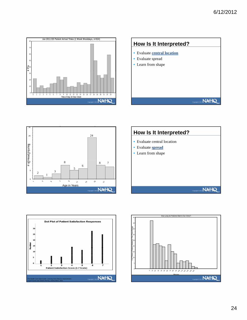
6/12/2012
24
# P
ts
Jun 2011 ED Patient Arrival Times (1 Week Weekdays, n=524)
40
50
60
70
80
Copyright © 2012
Time of Day 24 Hour Clock0 1 2 3 4 5 6 7 8 9 10 11 12 13 14 15 16 17 18 19 20 21 22 23
0
10
20
30
How Is It Interpreted?• Evaluate central location• Evaluate spread• Learn from shape
Copyright © 2012
g j
Hea
d In
jurie
s
15
20
25
30
24
Copyright © 2012
Age in Years
# of
H
0
5
10
21
3
8
56
8 7
How Is It Interpreted?• Evaluate central location• Evaluate spread• Learn from shape
Copyright © 2012
Copyright © 2012The Health Care Data Guide: Learning from Data for Improvement. Lloyd Provost and Sandra Murray, Jossey-Bass, 2011.
How Long do Patients Wait In Our Clinic?
ient
Wai
ted
in T
his
Tim
e R
ange
20
25
30
35
40
45
Copyright © 2012
Minutes
# of
Tim
es a
Pat
0
5
10
15

6/12/2012
25
How Is It Interpreted?• Evaluate central location• Evaluate spread• Learn from shape
Copyright © 2012
Common Frequency Plot Shapes
Copyright © 2012
Symmetrical•normal distribution
Bimodal•two peaks•data from two processes•separate and analyze each
How is Age Distributed Among Patients Who Fell in our Care?
in T
hat A
ge C
ateg
ory
15
20
25
30
Copyright © 2012
Age in Years
# of
Fal
ls
0
5
10
Common Frequency Plot Shapes
Uniform Random
Copyright © 2012
Uniform•provides little info•check to see if multiplesources variation combined
•if so, re-stratify and graph•may mean not enough bars
•if so, change bar width and graph
Random•provides little info•check to see if multiplesources variation combined
•if so, re-stratify and graph•May mean too many bars
•if so, change bar width and graph
What Time Do People Call the Crisis Hotline?
Cal
led
In T
his
Tim
efra
me
20
25
30
35
40
Copyright © 2012
Hours (24 Hour Clock)
# Ti
mes
Hot
line
C
0
5
10
15
What Time Do People Call the Crisis Hotline?
Cal
led
In T
his
Tim
efra
me
15
20
25
30
Copyright © 2012
Hours (24 Hour Clock)
# Ti
mes
Hot
line
C
0
5
10

6/12/2012
26
Shewhart’s Rules
• When average, range or histogram used to summarize data:- Summary should not mislead user into
taking any action user would not take
Copyright © 2012
if data were presented in a time series (graph)
- Averages, etc.. are useful, but seeing the sequence and variation in data is most meaningful
Are They the Same?
Clinic Avg. Annual Sat Capitated Cost
(1-5 Scale) AnnualA 3.9 $980
Copyright © 2012
$
B 3.9 $940
C 3.9 $945
Comparison of Averages, Frequency Plots and Run Charts
# M
onth
s F
allin
g in
Eac
h C
ateg
ory A verage Client Satis f ac t ion-Clinic A
Aver ag e Sat i s fac t i on Scor e
3.4 3.5 3.6 3.7 3.8 3.9 4.0 4.1 4.2 4.3
0
1
2
3
4
5
6
7
Eac
h C
ateg
ory A verage Client Satis f ac t ion-Clinic B
5
6
7
8
Client Satis f ac t ion -Clinic A
Month
Individuals
UCL = 4.47
Mean = 4.17
LCL = 3.88
1 2 3 4 5 6 7 8 9 10 11 12 13 14 15 16 17 18 19 20 21 22 23 24
3 . 0
3 . 2
3 . 4
3 . 6
3 . 8
4 . 0
4 . 2
4 . 4
4 . 6
4 . 8
5 . 0
Client Satis f ac t ion -Clinic A
Month
Individuals
UCL = 4.47
Mean = 4.17
LCL = 3.88
1 2 3 4 5 6 7 8 9 10 11 12 13 14 15 16 17 18 19 20 21 22 23 24
3 . 0
3 . 2
3 . 4
3 . 6
3 . 8
4 . 0
4 . 2
4 . 4
4 . 6
4 . 8
5 . 0
Client Satis f ac t ion -Clinic BIndividuals
UCL = 4.69
Mean = 4.174 . 2
4 . 4
4 . 6
4 . 8
5 . 0
Copyright © 2012
# M
onth
s F
allin
g in
E
Aver ag e Sat i s fac t i on Scor e
3.4 3.5 3.6 3.7 3.8 3.9 4.0 4.1 4.2 4.3 4.4
0
1
2
3
4
# M
onth
s F
allin
g in
Eac
h C
ateg
ory Average Cl ien t Satis faction-C l in ic C
Aver ag e Sat i s fac t i on Scor e
3.4 3.5 3.6 3.7 3.8 3.9 4.0 4.1 4.2 4.3 4.4
0
1
2
3
4
5
6
7
Month
LCL = 3.66
1 2 3 4 5 6 7 8 9 10 11 12 13 14 15 16 17 18 19 20 21 22 23 24
3 . 0
3 . 2
3 . 4
3 . 6
3 . 8
4 . 0
C l ient Satis faction -C l in ic C
Month
Individuals
UCL = 4.70
Mean = 4.17
LCL = 3.65
1 2 3 4 5 6 7 8 9 10 11 12 13 14 15 16 17 18 19 20 21 22 23 24
3 . 0
3 . 2
3 . 4
3 . 6
3 . 8
4 . 0
4 . 2
4 . 4
4 . 6
4 . 8
5 . 0
Stratification with Frequency Plot
Copyright © 2012The Health Care Data Guide: Learning from Data for Improvement. Lloyd Provost and Sandra Murray, Jossey-Bass, 2011.
Stratification with Frequency Plot
Copyright © 2012The Health Care Data Guide: Learning from Data for Improvement. Lloyd Provost and Sandra Murray, Jossey-Bass, 2011.
Another View of Stratification
tisfa
ctio
n
Average Satisfaction with Clinic (1-5 Scale)Indiv iduals
UCL = 4.68
Mean = 3.813.8
4.0
4.2
4.4
4.6
4.8
5.0
Copyright © 2012
Ave
rage
Sat
Sequential Weeks
LCL = 2.94
1 2 3 4 5 6 7 8 9 10 11 12 13 14 15 16 17 18 19 20 21 22 23
2.6
2.8
3.0
3.2
3.4
3.6
3.8
The Health Care Data Guide: Learning from Data for Improvement. Lloyd Provost and Sandra Murray, Jossey-Bass, 2011.

6/12/2012
27
Stratification
Copyright © 2012The Health Care Data Guide: Learning from Data for Improvement. Lloyd Provost and Sandra Murray, Jossey-Bass, 2011.
Various Formats
Copyright © 2012The Health Care Data Guide: Learning from Data for Improvement. Lloyd Provost and Sandra Murray, Jossey-Bass, 2011.
Frequency Plot (Histogram): What Is It?
• A bar chart for one variable• Used to visualize central location, shape and
spread of the data • Each bar equal, each distinct
Copyright © 2012
• Most often used with time, money, throughput or a scaled measurement (i.e. dollars, weight, age, height,) - Frequency Plot does little good for interpretation if process not
stable- Doesn’t show stability or capability in and of itself
Tools to Learn from Variation in Data
Copyright © 2012
Frequency Plot Pareto Chart Scatter Plot
The Health Care Data Guide: Learning from Data for Improvement. Lloyd Provost and Sandra Murray, Jossey-Bass, 2011.
SCATTER PLOT: What Is It?
• Graph to evaluate theory about relationship between one variable and another- Test for possible cause and effect- Does not prove a C & E relationship exists- A cause and effect relationship will be verified only when the
Copyright © 2012
improvement is tested and results studied using a control chart
• Each dot on the chart represents a pair of measures• Becomes useful between 30-50 data points
SCATTER PLOT: What Does It Look Like?
r atin
gs
Negative CorrelationYHigh
Does Customer Waiting Time AffectCustomer Satisfaction?
Copyright © 2012
Cus
tom
erSa
tisfa
ctio
n R
a
Customer Waiting Time XLow High

6/12/2012
28
What are we trying toaccomplish?
How will we know that achange is an improvement?
What change can we make thatwill result in improvement?
Model for Improvement
Copyright © 2012
Act Plan
Study Do
The Health Care Data Guide: Learning from Data for Improvement. Lloyd Provost and Sandra Murray, Jossey-Bass, 2011.
Data for Scatter Plot : Does wait time impact satisfaction with clinic?
Min Wait Sat Score Min Wait Sat Score Min Wait Sat Score
49 3.5 42 4 74 278 1 51 3.5 72 1.53 5 76 3 15 555 2.5 46 5 64 3.515 4 83 2 17 428 3 31 5 91 2
Copyright © 2012
28 3 31 5 91 296 1.5 60 2 10 4.547 3 85 2.5 5 515 3.5 70 1.5 9 482 1 5 5 71 1.524 4 50 3 7 568 3 74 2 55 364 1 21 4.5 74 2.5
Draw Graph•Independent Variable on X Axis (Horizontal)•Dependent Variable on Y Axis (Vertical)
•Values higher as go up on graph•Start scale with actual lowest value in your data set
Wait Time and Satisfaction-BlankSc attergram
3.5
4.0
4.5
5.0
pend
ent V
aria
ble
(49,3.5)
Copyright © 2012
10 20 30 40 50 60 70 80 90Wait time (Min) Independent Variable
1.0
1.5
2.0
2.5
3.0
Satis
fact
ion
(1-5
Sca
le) D
e
Wait Time and SatisfactionScat tergram
3.0
3.5
4.0
4.5
5.0
le) D
epen
dent
Var
iabl
eNegative Correlation
Copyright © 2012
10 20 30 40 50 60 70 80 90Wait time (Min) Independent Variable
1.0
1.5
2.0
2.5
Satis
fact
ion
(1-5
Sca
How Is It Interpreted?• Look for patterns in the scatter plot
- A narrow band of dots- A circular pattern- Peaks or troughs
Copyright © 2012 Copyright © 2012The Health Care Data Guide: Learning from Data for Improvement. Lloyd Provost and Sandra Murray, Jossey-Bass, 2011.

6/12/2012
29
How Is It Interpreted?• Outliers
- Points that do not fall into the pattern of the others
- Do not cluster with other points• Should investigate why appear
Copyright © 2012
Should investigate why appear• May be a measurement error• Possible may be a signal of a process change• Possible may be change in relationship between
the factors
Outliers
10
12
14
16
18
k Le
ave
Use
d
Case Load Related to Sick Leave
Copyright © 2012The Health Care Data Guide: Learning from Data for Improvement. Lloyd Provost and Sandra Murray, Jossey-Bass, 2011.
0
2
4
6
8
30 35 40 45 50 55 60 65 70
Day
s of
Sic
k
Case Load
All Departments: Does Case Load Impact Sick Leave Use?
30 35 40 45 50 55 60 65Case Load (X)
0
2
4
6
8
10
12
14
16
Day
s Si
ck (Y
)
All Departments: Does Case Load Impact Sick Leave Use?
30 35 40 45 50 55 60 65Case Load (X)
0
2
4
6
8
10
12
14
16
Day
s Si
ck (Y
)
Department A
30 35 40 45 50 55 60 65Case Load (X)
0
2
4
6
8
1 0
1 2
1 4
1 6
Day
s Si
ck (Y
)
Copyright © 2012
Department B
30 35 40 45 50 55 60 65Case Load (X)
0
2
4
6
8
10
12
14
16
Day
s Si
ck (Y
)
Department B
30 35 40 45 50 55 60 65Case Load (X)
0
2
4
6
8
10
12
14
16
Day
s Si
ck (Y
)
Department C
30 35 40 45 50 55 60 65Case Load (X)
0
2
4
6
8
1 0
1 2
1 4
1 6
Day
s Si
ck (Y
)
Stratification Using Symbols to Distinguish Each Department
Copyright © 2012The Health Care Data Guide: Learning from Data for Improvement. Lloyd Provost and Sandra Murray, Jossey-Bass, 2011.
Acuity vs Cost-TotalScattergram
3.0 3.5 4.0 4.5 5.0 5.5 6.0 6.5Acuity
0
1
2
3
4
5
6
7
8
$ in
Tho
usan
ds
Acuity vs Cost-Department AScattergram
3.0 3.5 4.0 4.5 5.0 5.5 6.0 6.5Acuity
0
1
2
3
4
5
6
7
8
$ in
Tho
usan
ds
Copyright © 2012
Acuity vs Cost-Department BScattergram
3.0 3.5 4.0 4.5 5.0 5.5 6.0 6.5Acuity
0
1
2
3
4
5
6
7
8
$ in
Tho
usan
ds
Acuity vs Cost-Department CScattergram
3.0 3.5 4.0 4.5 5.0 5.5 6.0 6.5Acuity
0
1
2
3
4
5
6
7
8
$ in
Tho
usan
ds
What Did We Address?• The value of displaying data graphically vs. table
of numbers or summary statistics• The differences between data used for
improvement, accountability and research• The value of displaying data over time:
Copyright © 2012
• The value of displaying data over time:- when working to determine impact of changes
being tested- To see if are sustaining gains
• The Model for Improvement
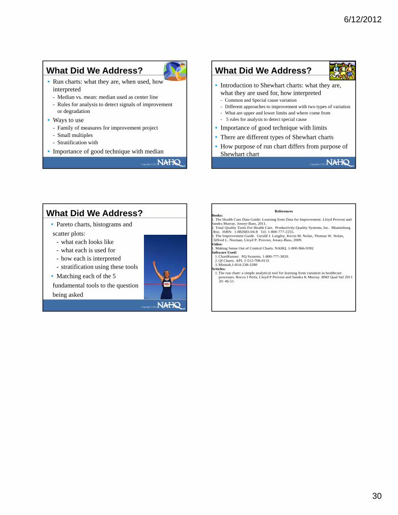
6/12/2012
30
What Did We Address?• Run charts: what they are, when used, how
interpreted- Median vs. mean: median used as center line- Rules for analysis to detect signals of improvement
or degradation
Copyright © 2012
• Ways to use- Family of measures for improvement project- Small multiples- Stratification with
• Importance of good technique with median
What Did We Address?• Introduction to Shewhart charts: what they are,
what they are used for, how interpreted- Common and Special cause variation- Different approaches to improvement with two types of variation- What are upper and lower limits and where come from
Copyright © 2012
pp- 5 rules for analysis to detect special cause
• Importance of good technique with limits• There are different types of Shewhart charts• How purpose of run chart differs from purpose of
Shewhart chart
What Did We Address?• Pareto charts, histograms andscatter plots:
- what each looks like- what each is used for
h h i i t t d
Copyright © 2012
- how each is interpreted- stratification using these tools
• Matching each of the 5fundamental tools to the questionbeing asked
References Books: 1. The Health Care Data Guide: Learning from Data for Improvement. Lloyd Provost and Sandra Murray, Jossey-Bass, 2011. 2. Total Quality Tools For Health Care. Productivity-Quality Systems, Inc. Miamisburg Ohio. ISBN: 1-882683-04-8 Tel. 1-800-777-2255. 3. The Improvement Guide. Gerald J. Langley, Kevin M. Nolan, Thomas W. Nolan, Clifford L. Norman, Lloyd P. Provost, Jossey-Bass, 2009. Video: 1. Making Sense Out of Control Charts. NAHQ. 1-800-966-9392 Software Used:
1. ChartRunner. PQ Systems. 1-800-777-3020.
Copyright © 2012
1. ChartRunner. PQ Systems. 1 800 777 3020. 2. QI Charts. API, 1-512-708-0131 3. Minitab,1-814-238-3280
Articles: 1. The run chart: a simple analytical tool for learning from variation in healthcare
processes. Rocco J Perla, Lloyd P Provost and Sandra K Murray. BMJ Qual Saf 2011 20: 46-51.
I