using aria and html5 to enhance the accessibility of...
TRANSCRIPT

Using ARIA and HTML5 to Enhance the Accessibility of
Modern Web Pages and Applications
Jared Smith, Karl Groves, and Billy Gregory
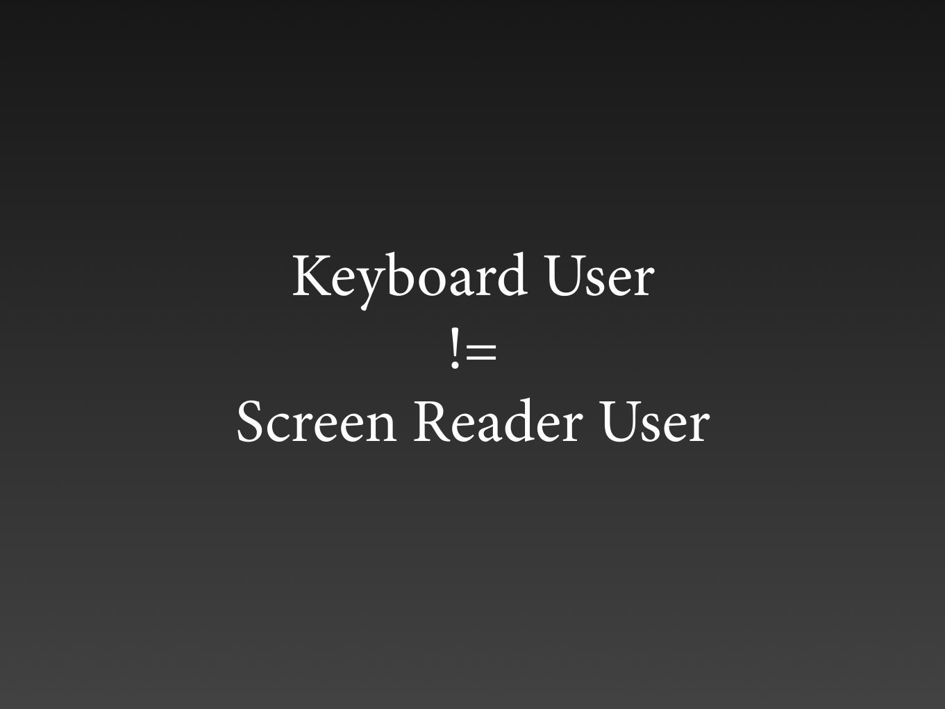
Keyboard User !=
Screen Reader User

Screen Reader User (usually) =
Keyboard User

Keyboard Accessibility Testing
+


Keyboard Accessibility is Different When a Screen
Reader is Running

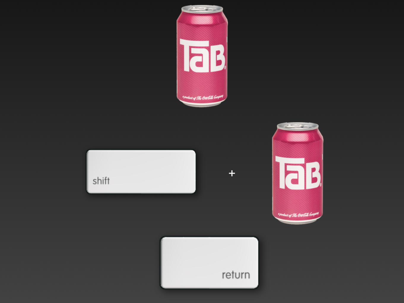
Source Code Order =
Navigation Order
and screen reader reading order too!

Screen Reader Navigation• Links and form controls
• Headings
• Landmarks
• Lists
• Forms
• Buttons
• etc.

Standard Browser Navigation
• Links and form controls

Ensure Interactive Elements are Links or
Form Controlsor...
make non-focusable elements focusable with tabindex

Use device independent event handlers or
combine mouse (e.g, onmouseover) and keyboard (e.g, onkeypress) dependent event
handlers
Device Independence
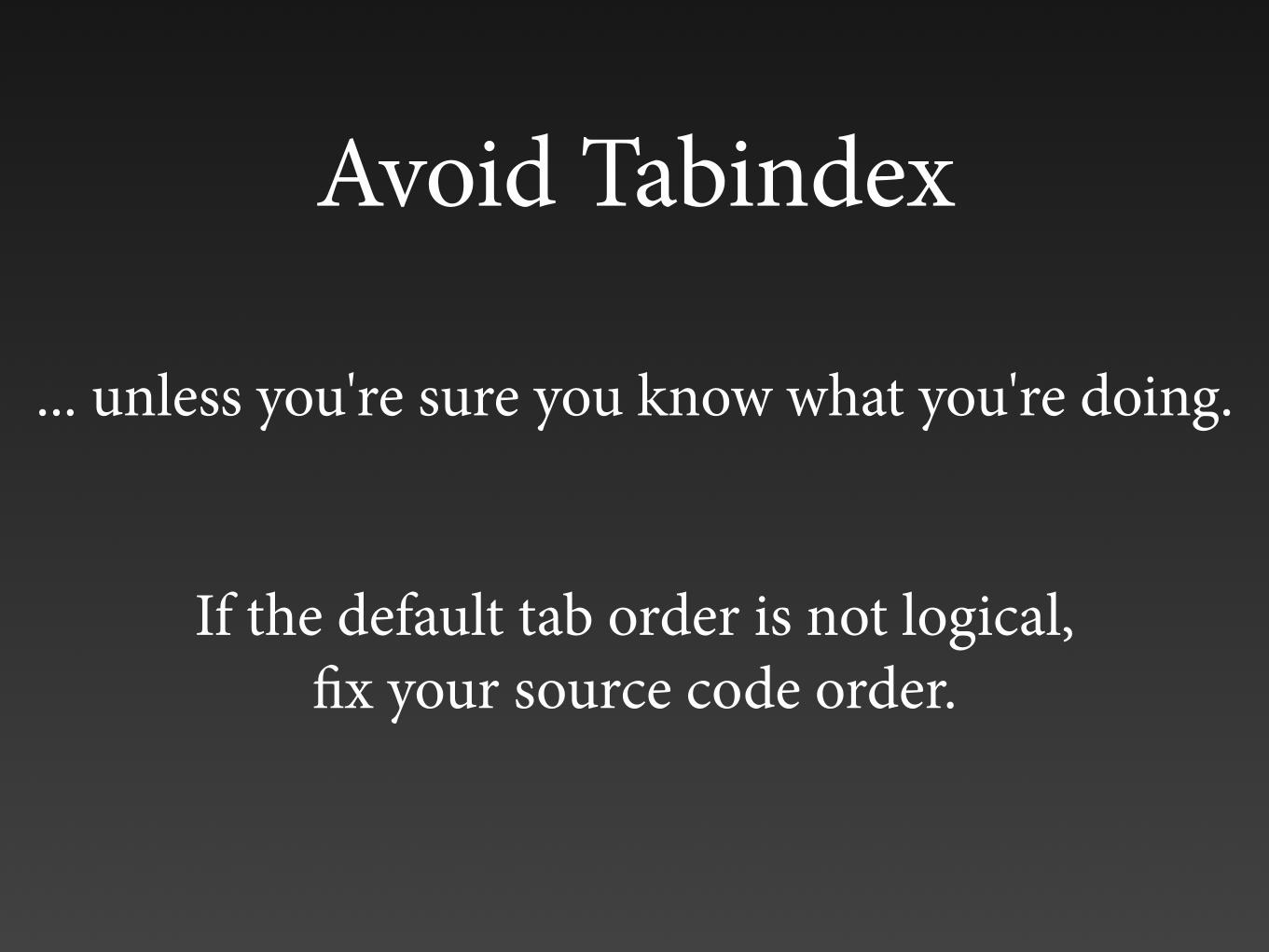
Avoid Tabindex
... unless you're sure you know what you're doing.
If the default tab order is not logical, fix your source code order.
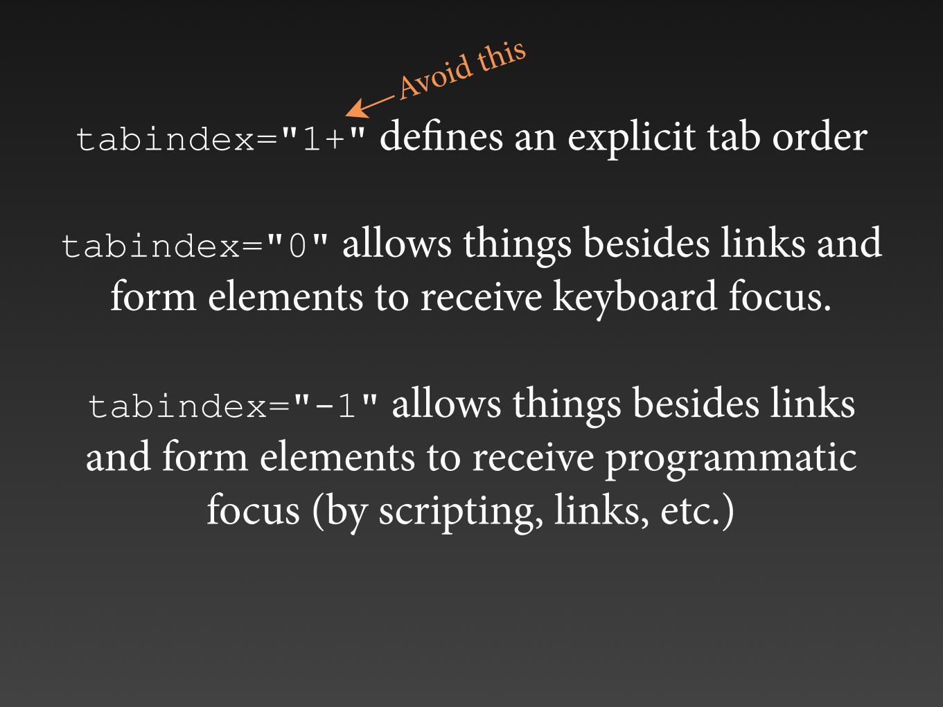
tabindex="1+" defines an explicit tab order
tabindex="0" allows things besides links and form elements to receive keyboard focus.
tabindex="-1" allows things besides links and form elements to receive programmatic
focus (by scripting, links, etc.)
Avoid this
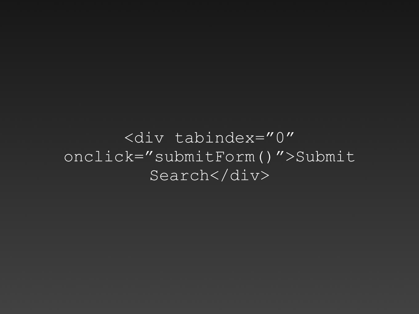
<div tabindex=”0” onclick=”submitForm()”>Submit
Search</div>

<a onclick=”submitForm()”>Submit Search</a>
is better, but
<input type=”submit” value=”Submit Search”>
or
<button onclick=”submitForm()”>Submit Search</button>
are best!

Click events do not always trigger via keyboard for things other than links or form controls...
... even with tabindex=”0”
WARNING!
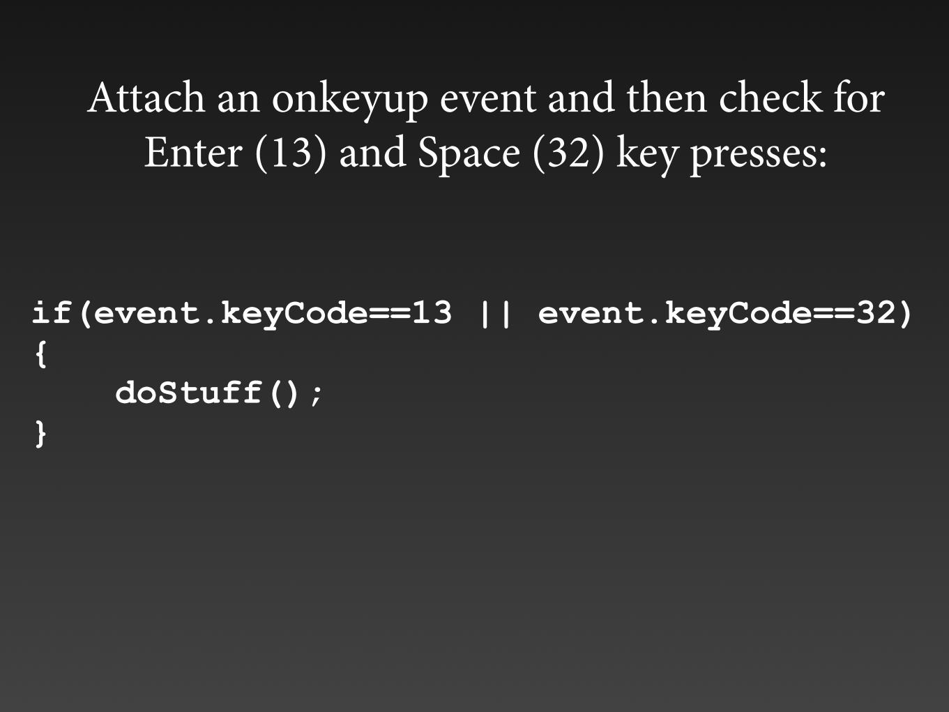
if(event.keyCode==13 || event.keyCode==32) { doStuff(); }
Attach an onkeyup event and then check for Enter (13) and Space (32) key presses:

• Allows non-focusable elements to receive programmatic focus (by scripting, links, etc.)
• Necessary for focusing dialog boxes, error messages, etc.
• WARNING: This removes the element from the default tab order.
tabindex=”-1”

Review• Ensure all interactive elements are links or
form controls, or make them focusable with tabindex=”0”.
• If using tabindex, detect Enter and Space key events.
• Ensure non-focusable elements (such as dialog windows) have tabindex=”-1” before focusing them programmatically.

Dialogs

Dialogs
Link, button, or tabindex=”0”
Maintains keyboard focus
if modal
Closes with ESC key
Returns focus when dismissed
tabindex=”-1” then set focus to dialog (or focus a control inside the dialog)

“Freak-out” Mode
When the currently focused element disappears or is significantly modified
Avoid it or address it with focus();

Roving tabindex• Useful for controlling focus within interactive widgets
(menus, tab panels, tree widgets, etc.).
• Set tabindex=”0” on currently active item. This places it in the tab order.
• Set tabindex=”-1” on all other items. This removes them from the tab order and makes them focusable with scripting.
• Use focus() to set focus as user navigates within widget (arrow keys, etc.).
• tabindex=”0” roves or follows the active item allowing users to return directly to it later.

http://hanshillen.github.io/jqtest/#goto_tabs

In an ARIA tab panel, the entire tab group functions as one tab stop, then arrow keys are used to select the active tab.
1
3
2

tabindex=0 tabindex=-1

tabindex=0
tabindex=-1 tabindex=-1
Press to select the next tab

tabindex=0
If you tab away from the tab panel and later return, “Cats” remains the active and focused tab because it has tabindex=0.

[tabindex=0] { background:#fff;
border-color:#ddd; border-bottom:none;
}
Focus on semantics and let CSS do the heavy lifting

ARIA

ARIA
• Accessible Rich Internet Applications
• Specification developed by the PFWG of the W3C’s WAI. Huh?
• W3C Candidate Recommendation
ARIA enhances accessibility of...
• ... dynamic content and AJAX
• ... scripted widgets and interactive controls
• ... keyboard interactions within a web page
Bridges the gap to future versions of HTML

ARIA Paves the Cow Paths

ARIA Paves the Cow Paths

ARIA Paves the Cow Paths
ARIA Paves the Cow Paths

ARIA Paves the Cow Paths

You can only make things more accessible by
implementing ARIA now
… if you do it correctly

Roles<form role="search">
States<input aria-disabled="true">
Properties<input aria-required="true">
ARIA Core Components

ARIA and Code Validation
If your (X)HTML is valid and your ARIA is valid... valid + valid = ???

ARIA Landmark Roles
• banner, complementary, contentinfo, main, navigation, and search
• Allows easy access to major page components
•The end of "skip" links? Oh yeah... browser keyboard accessibility still sucks.
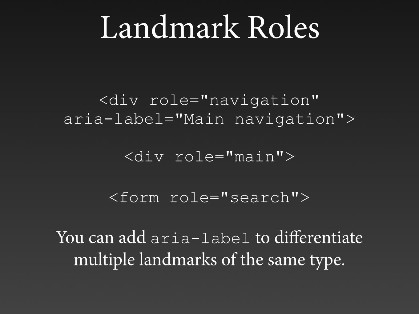
Landmark Roles
<div role="navigation" aria-label="Main navigation">
<div role="main">
<form role="search">
You can add aria-label to differentiate multiple landmarks of the same type.

HTML5 and Landmark Roles Mapping
<main> - role="main" <article> - role="article"
<footer> - role="contentinfo" <header> - role="banner" <nav> - role="navigation"
<aside> - role="complementary"
ARIA Support > HTML5 Support so use both... for now
<main role="main">

Modifying and Enhancing Roles
Bad: <img src="submit.jpg" onclick=...>
OK: <a onclick="..."><img src="submit.jpg"...
Better:<a role="button" onclick="..."> <img src="submit.jpg"...
Best: <button onclick="...">

role="application"
... disables standard A.T. keystrokes to allow the page to function like a desktop application
Be very careful with <body role="application">
Some ARIA elements (tree view, slider, table, tabs, dialog, toolbar, menus, etc.) have an assumed
application role.
role="document" enables reading mode.

role="presentation"
<ul role="presentation"> <li>menu item</li>
...
Hides native roles of elements (and all required descendants) from assistive technology. Useful
on layout tables, lists, etc.
Is ignored if the element is navigable (e.g., links and controls).

Alert Role
<div role="alert">Read me right now</div>
Also role="alertdialog"

<label for="name">First Name</label>: <input name="name" id="name"> <em>(required)</em>
The information about the element being required is outside the form element and its label, so it's ignored by a screen reader navigating the form.
First Name: (required)
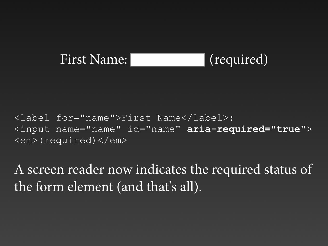
<label for="name">First Name</label>: <input name="name" id="name" aria-required="true"> <em>(required)</em>
A screen reader now indicates the required status of the form element (and that's all).
First Name: (required)

<label for="password">Password</label>: <input name="password" id="password" aria-invalid="true">
A screen reader now indicates that the field is invalid or broken (and that's all).
Use ARIA attributes to control styling: [aria-invalid=true] {border : 2px solid red;}
Password:

<input type="submit" disabled="disabled"> vs.
<input type="submit" aria-disabled="true">
Disabled HTML buttons are not keyboard focusable and have very poor contrast.

aria-hidden="true"
Indicates element (and all descendants) are hidden from all users.
You can't unhide a child element.
Use ARIA attributes to control visual appearance: [aria-hidden=true] {display:none;}

<label for="fname" id="fnamelabel">First name</label>: <input type="text" id="fname" aria-labelledby="fnamelabel">
Redundant, but doesn't cause any problems.
ARIA always overrides native semantics.
First Name:

Self destruct this page in 5 secondsEnter the number of seconds until self destruction... and then run.
<input type="text" id="time" aria-labelledby="label time seconds" aria-describedby="instructions">

<input type="button" value="Choose" onclick="showMessage('happy', 'aware');" aria-labelledby="happy aware">
Happy Aware
Unaware Sad

<input type="text" name="name" aria-labelledby="namelabel">
Name Age Phone

<input type="text" name="age1" aria-labelledby="jared agelabel">
Name Age Phone
Jared
Jonathan
Cyndi

ARIA Live Regions
aria-live="off | polite | assertive"
•aria-busy •aria-atomic -‐ read the entire region or only what has changed •aria-relevant -‐ additions, removals, text, or all •aria-controls • Special live regions: alert (important), status (not important), timer (always changing), marquee(same as aria-live="polite"), and log (updates added to the bottom)

ARIA Live Regions
Some highly dynamic content updates simply cannot be made accessible using ARIA
Give users control over content updates

Odds & Ends<div role="list" aria-describedby="listheader"> <div role="listitem">
<p id="question">What is the air-speed velocity...</p> <div role="radiogroup" aria-labelledby="question">
<a aria-haspopup="true">Open dialog</a>
<a aria-expanded="false">View details</a>

Odds & Ends
<ul role=“menu”>
<div role=“tablist | tab | tabpanel”>
<table role=“grid”>
etc.

ARIA Design Patterns for Widget Interaction
http://www.w3.org/WAI/PF/aria-practices/#aria_ex