usability testing report of the the european library website alpha
TRANSCRIPT

Usability testing report of the The European Library website
alpha version
http://www.theeuropeanlibrary.org/alpha/�
1�
The European Library March 2012
�
�
1 Introduction....................................................................................................................... 3
2 Executive summary ........................................................................................................ 4
3 Usability tests - results .................................................................................................. 6
3.1 Method........................................................................................................................ 6
3.2 Highlights .................................................................................................................. 7
3.3 Details ....................................................................................................................... 10
3.4 Roadmap.................................................................................................................. 15
4 Conclusions .................................................................................................................... 18
5 Bibliography.................................................................................................................... 19
2�

1 Introduction
In order to measure the usability and quality of the new European Library portal, The
European Library office conducted a series of tests on the alpha version of the website
(www.theeuropeanlibrary.org/alpha). In collaboration with its partner network, the
office prepared and circulated a usability testing kit. The kit included a testing guide
with detailed explanations about how to conduct the user-testing and a set of use
cases and tasks, as well as a report template (see appendix). The testing phase took
place in January and February 2012. The objective of the usability test was to adapt
the website to our target group. The usability testing was conducted by 21 partners of
The European Library who selected appropriate user candidates. Hamburg University
of Applied Sciences, namely Prof. Dr. Ulrike Spree and her students, who already
helped with the testing of the wireframes and the preparation of the usability testing kit,
conducted several tests as well. Additionally, The European Library office conducted
usability testing with five researchers at the Koninklijke Bibliotheek in The Hague.
Altogether, about 60 target users with different backgrounds and from different
countries tested the alpha version of the new portal.
We would like to thank our partners from the following organisations:
National Library of Azerbaijan
National Library of Croatia
National Library of Cyprus
National Library of the Czech Republic
National Library of Georgia
National Library of Latvia
National and University Library St. Kliment Ohridski – Skopje
National Library of Moldova
National Library of Montenegro
National Library of the Netherlands
National Library of Poland
Russian State Library
National Library of Slovakia
National Library of Slovenia
3�

British Library
Academic Library of Tallinn University
Bibliothèque cantonale et universitaire Lausanne
Uppsala University Library
Nicolaie Constantintescu, consultant
Hamburg University of Applied Science
University Carlos III
Their great work enabled us to gain a deeper understanding of the user needs and
helped us to identify problems. Specific results and feedback helped us identify the
scope of adjustments and the roadmap to achieve them.
In this report we will provide a detailed summary of the results. They include positive
findings as well as key usability issues that have been identified during the testing.
First, we will briefly introduce the testing method that was conducted.
2 Executive summary
In order to measure the quality of the new European Library portal, The European
Library office conducted a series of usability tests in January and February 2012 on
the alpha version of the website. Twenty volunteers -- about 30% -- from our partner
network conducted the testing, as well as Hamburg University of Applied Sciences and
The European Library itself, through the researchers’ focus group of the National
Library of the Netherlands. Altogether, about 60 target users with different
backgrounds and from different countries tested the alpha version of the new portal.
In summary, the test users spontaneously identified the main purpose of The
European Library portal: to offer quick and easy access to the collections of Europe’s
national and research libraries. As a whole, they expected the offering of a catalogue
search function with enhanced search and filter functions that ensure immediate
access to the indicated resources. Additionally, they expected a quick overview of the
collections.
4�

Specific results and feedback, as summarised in the full Usability Testing Report,
helped us identify the scope of necessary adjustments and the roadmap to achieve
them. Very briefly, here are the highlights:
- 85% of the users commenting on the design gave positive feedback on it.
- Some users mentioned that not enough data was available on the portal or that some
pages and links did not work yet. (Since the users tested the alpha version of the
portal, not all links and content were implemented yet. By the launch of the beta
version, all links and pages will be working and the entire content will be available.)
- Almost 50% of the test users struggled with understanding the results page;
however, they reacted positively once they comprehended all the components.
(Section 2.2-4 of the Usability Testing Report)
Further results of this important alpha testing confirm that we are on our way to
providing a highly useful and important tool for researchers.
As the following comment from one test user illustrates:
“Providing consistent and navigable access to one collection over time is a
challenge […] and I am impressed by the achievements that are represented
here, despite the shortcomings I have identified. People tend to be impatient
about getting results from any system. It's our job to minimise the causes of
impatience and I think you have gone some way to doing just that. The most
important thing is to provide a range of possibilities for a user to create their own
flow through the system, from arrival to sharing, and the main ingredients for that
are present.”
Test user
�
5�

3 Usability tests - results
3.1 Method
The usability test reveals how real people – under laboratory conditions – interacted
with the website. The analysis and evaluation of their behaviour allows us to identify
deficits of the website.
The selected test users did not know the website before they browsed through it. They
were asked to solve a number of different tasks, such as typical searches and
requests of future users. Therefore, different use cases were projected. The personas
that were created represented different groups of potential target-users of the new
European Library.
x Use case 1: Student1 (Bachelor) Student needs general support for academic (study-related) information.
x Use case 2: Researcher
(Doc./Post Doc.) Researcher wants to get specific information and documents on topics in the field of humanities.
x Use case 3 Teacher/Lecturer
Teacher/lecturer is looking for materials (textual documents, images, exhibitions, videos) he can use for his teaching.
x Use case 4: Librarian/Information Professional
Librarian/information professional uses the new European Library website to support the local users at his library (role of intermediary).
While browsing the website and solving the tasks, the test users were asked to “think
aloud”. This method consists of a constant verbal participation of the test person: S/he
is asked to say aloud whatever comes to his or her mind while performing a task.
Furthermore, the comments and navigation on the website were recorded on a report
template by the personnel that conducted the testing. This template was provided by
The European Library office.
�������������������������������������������������������
1�A�detailed�description�of�the�use�cases�and�the�task�list�can�be�found�in�the�userͲtesting�guideline.�
6�

3.2 Highlights
The graphs below summarise the main outcomes and highlights of the usability
testing, followed by a detailed list of positive and negative usability testing feedback
and issues.
1. Partners participating
100%
30%
0
10
20
30
40
50
60
70
80
90
100
All partners Partners conducting usability testing
�
Table 1: Participating partner organisations
This table shows the number of organisations that volunteered to conduct usability testing for the new European Library portal/alpha version. The European Library has 48 European National Library partners and 19 University and Research Libraries that joined the service through the Europeana Libraries project. Twenty-one partners (18 libraries and 3 other university partners) conducted the usability testing of the new portal, which represents about 30% of the partners. More than 60 test users tested the portal according to four different use cases and gave their feedback.
7�
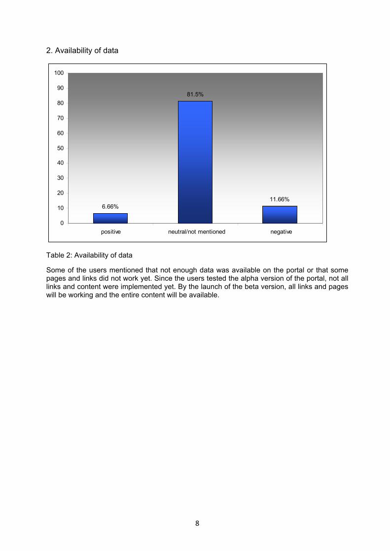
2. Availability of data
11.66%
81.5%
6.66%
0
10
20
30
40
50
60
70
80
90
100
positive neutral/not mentioned negative
�
Table 2: Availability of data
Some of the users mentioned that not enough data was available on the portal or that some pages and links did not work yet. Since the users tested the alpha version of the portal, not all links and content were implemented yet. By the launch of the beta version, all links and pages will be working and the entire content will be available.
8�

3. Design
5.00%
66.66%
28.33%
0
10
20
30
40
50
60
70
80
90
100
positive neutral/not mentioned negative
�
Table 3: Design
The design was mentioned by one-third of the test users. 28.33% of the users commented on the design and gave positive feedback on it.
4. Results page
51.66%
16.66%
46.66%
0
10
20
30
40
50
60
70
80
90
100
positive neutral/not mentioned negative
�
Table 4: Results page
9�

Almost 50% of the test users struggled with understanding the results page; however, they reacted positively once they comprehended all the components. The main problem was that they did not understand the difference between the various tabs on the results page (Everything, Digital content, Full text). A clarification and explanation of the three different categories is therefore needed. Additionally, the users would appreciate having a better understanding of the kind of content they found on the results page, i.e. book, video, image, etc.. Better understanding of both the tab and format information will be addressed in the beta version and further tested.
�
3.3 Details
This is a list of the main observations and problems that were reported by several
individuals. The recommendations and problems are being reviewed and prioritised by
The European Library office, to be followed by improvement of the portal from the beta
version to the official launch and beyond. To view the entire feedback, please refer to
the Appendix.
Landing page (Home page)
10�

¾ The page was evaluated as being “interesting-looking” and “well-organised”.
Additionally, test users said that the navigation was “easy” and “well-structured”.
¾ Many basic links were not implemented yet (About Us, Services for
Researchers, etc.)
¾ Users recognised what kind of website The European Library portal is;
however, they often could not immediately tell how they could benefit from the
site. Overall, they think that it is an interesting and useful service.
¾ The brevity of the introductory text was still perceived as too verbose and the
font size as too small.
¾ The focus was on the black section that appears at the top of the site. The black
colour was associated with important content and, in the perception of the test
users, content below the black section (i.e. the white sections including the
“Discover Contributors” and “Discover Collections” sections) was perceived as
less important. Depending on the size of the screen, “Discover Contributors“
effectively moves below the fold. Links such as “more contributors“ were not
noticed, as test users expected a linking of the headline and tried to click on it.
¾ “Recently added” items were regarded as not relevant.
¾ The connection to Europeana was not prominent enough.
Layout/Design
¾ The logo was positively described since it shows the connection to books and
makes it clear that the user is on a library site.
¾ The design was evaluated as attractive overall and inviting at first sight.
Regarding navigation and orientation on the site, it was positively noticed that
path information is provided on each subpage in order to indicate the user’s
location and the subpage’s relation to the main page. Furthermore, the logo
clearly identifies the website at all hierarchical levels.
¾ The images in “Discover Collections“ and “Discover Contributors“ do not appear
to support the users since they report not getting information about what is
behind the images.
11�

¾ The presentation (icons, images) of the contributors was confusing. Some users
did not know what was behind the image as only after a mouse-over was the
name of the library revealed. Some test persons expected it to be the other way
around, i.e. display of name first, then image on mouse-over.
Content/Language
¾ The option to use the portal in different languages was evaluated overall as
very positive.
¾ The “Discover“ category on the home page does not clearly communicate its
purpose and what you can find behind it.
12�

¾ “Discover by Discipline“ was perceived as very general, not comprehensive
enough and limited. Further subcategories were expected.
¾ It was difficult for some users to imagine what is behind “Discover Collections“,
and what “Collections“ refers to.
13�

Search function and presentation of search results
¾ The big search box was evaluated overall as very positive, inviting and easy
to use.
¾ The results description on the results page does not give sufficient information
about the kind of material retrieved. A clear and visible definition of the kind of
content that shows on the results page is therefore required. Test users also do
not understand the principle of ranking the results of their search. Furthermore,
they would prefer to be able to click through different pages of results (as on
Google).
¾ The difference between the “Everything“, “Digital content“ and “Full text“ tabs
was not clear enough.
¾ As “Digital content” is placed after the first few results on the “Everything”
results page, users do not expect more results below. In general, the digital
content banner is perceived as rather disturbing and pointless since there is a
separate “Digital content” tab.
14�

¾ A function to sort the results page according to relevance is missing.
¾ The options for further refinement on the right side of the results page, as well
as the graphic elements timeline and map, are appreciated. However, they tend
to be ignored at first sight.
¾ Refining the results via the “Year of publication“ (“Advanced“) caused
difficulties. Too many clicks are required to finally identify the desired year.
¾ Test users did not find a way to undo refinements and, instead, used the back
button on the browser.
¾ A “Save” or “Download” button would be appreciated.
¾ Thumbnails are missing for a large amount of the digital content.
¾ Domain limitations of the search function were not easily recognised. A number
of test users tried to solve the search question about finding information on the
“British Library“ via entering the search term in the search slot. They were
unable to find the information via “Discover Contributors“ (use case 4).
3.4 Roadmap
The problems and recommendations from the users have been reviewed and
prioritised by The European Library office, and an improvement roadmap of the portal
is being implemented from the beta version to the official launch and beyond. The list
below gives an overview of the priorities, divided into currently implemented, short-
term, mid-term and long-term improvements.
Currently implemented
¾ Adding more data: The alpha version corpus was limited. The data ingestion
process is ongoing and the beta version will provide the full data available in the
old European Library portal as well as the Europeana Libraries project partner
content. Specific, ongoing improvements are:
¾ Making sure that the relevant linked sections are activated from the Home page
(About, Services for Researcher, FAQ, “48 national libraries of Europe” and
“European research libraries” link)
15�

¾ Implementing “Advanced Search”
¾ Implementing Zotero and Mendeley
¾ Activating full text
¾ Implementing translations, following the adoption of the language policy by all
partners
Short-term improvements – Beta version
The list below shows scheduled short-term improvements for the beta version of
the portal, which will be ready in April 2012.
¾ Swapping wording and imagery in “Discover Contributors”
¾ Making sure that links open in a new tab, i.e. when a user clicks on an item that
links to the content provider page, the page will open in a new browser tab.
¾ Making sure that there are more books on the top banner (Home page) –
Imagery.
16�

¾ Making benefits for users clearer on the Home page, i.e. what tools are
available, what users can do with the portal, etc.
¾ Integrating the Europeana logo in the footer to show the family relation setup
between the two services.
¾ Improving the filtering option visibility (removing a pre-selection)
¾ Providing an introductory video about services, etc.
Mid-term improvements – Launch
The European Library aims to implement the following tasks by the planned launch
of the new portal in May 2012:
¾ Adding subcategories to CERIF top classification from the Home page and
Discover page
¾ Improving the results page understanding (i.e. ranking, refinement, number of
pages, etc.)
¾ Clarifying the available digital formats (audio, text, video, maps, etc.)
¾ Identifying the downloading services on the item level (not raw metadata but
also general view, thumbnail, etc.)
Longer-term improvements – End of 2012
The following list shows long-term improvements that do not have first priority,
though we aim to work on these issues in the course of the year and to fix them
and find solutions by the end of 2012:
¾ Providing nomad devices compatibilities
¾ Providing “bites” of content from the Home page. (“Recently added” or “recently
accessed” are not inviting enough.)
¾ Interlibrary loans and print on demand
17�

4 Conclusions
The European Library office would like to thank all partners and supporters who volunteered for the usability testing and, in particular, the test users. The work that has been done, in a very timely manner, and the feedback that was provided have been extremely valuable for the further development of the new European Library website.
In summary, the test users spontaneously identified the main purpose of The European Library portal: to offer quick and easy access to the collections of Europe’s national and research libraries. They immediately expected the offering of a catalogue search function with enhanced search and filter functions that ensure immediate access to the indicated resources. Additionally, they expected a quick overview of the collections.
Throughout this process, The European Library has successfully overcome a great amount of inherent challenges, and we are confident that we can solve the remaining ones in a second programme. This important alpha testing confirmed that we are on our way to providing a highly useful and important tool for researchers.
As the following comment from one test user illustrates:
“Providing consistent and navigable access to one collection over time is a challenge […] and I am impressed by the achievements that are represented here, despite the shortcomings I have identified. People tend to be impatient about getting results from any system. It's our job to minimise the causes of impatience and I think you have gone some way to doing just that. The most important thing is to provide a range of possibilities for a user to create their own flow through the system, from arrival to sharing, and the main ingredients for that are present.”
test user
We will further test the service with the network partners for data availability and languages, and with Hamburg University of Applied Sciences for usability improvements.
18�

19�
5 Bibliography
Garret, Jesse-Jambs: Elements of User Experience http://www.jjg.net/elements/pdf/elements.pdf Kalbach, James (2007): Designing Web Navigation. Sebastopol, CA: O'Reilly & Associates Krug, Steve (2000): Don‘t Make Me Think: A Common Sense Approach to Web Usability. Indianapolis, Ind.: New Riders Publ. Mathis, Lukas (2011): Designed for Use: Create Usable Interfaces for Applications and the Web. Raleigh, North Carolina: The Pragmatic Programmers (good read) Nielsen, Jakob: Jabob Nielsen‘s Website http://www.useit.com/
Rubin, Jeffrey; Chisnell, Dana. (2008): Handbook of usability testing: How to plan, design, and conduct effective tests. John Wiley and Sons U.S. Department of Health & Human Services: Usability.gov http://www.usability.gov/ UXmatters: Webmagazine on User Experience http://www.uxmatters.com/index.php