update on geographic distribution of covid-19 cases, lab
TRANSCRIPT
1
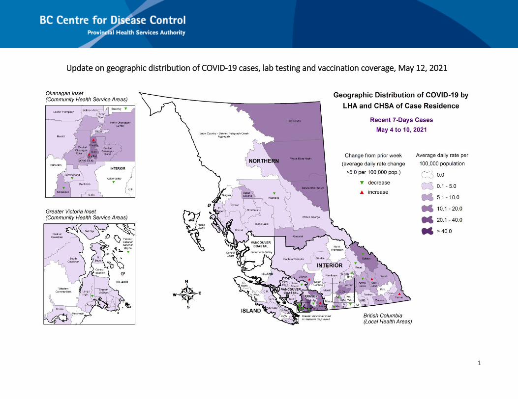
Update on geographic distribution of COVID-19 cases, lab testing and vaccination coverage, May 12, 2021
2
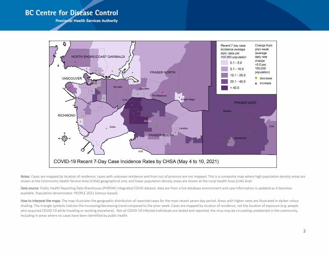
Notes: Cases are mapped by location of residence; cases with unknown residence and from out of province are not mapped. This is a composite map where high population density areas are shown at the Community Health Service Area (CHSA) geographical unit, and lower population density areas are shown at the Local Health Area (LHA) level.
Data source: Public Health Reporting Data Warehouse (PHRDW) integrated COVID dataset; data are from a live database environment and case information is updated as it becomes
available. Population denominator: PEOPLE 2021 (census-based).
How to interpret the maps: The map illustrates the geographic distribution of reported cases for the most recent seven-day period. Areas with higher rates are illustrated in darker colour
shading. The triangle symbols indicate the increasing/decreasing trend compared to the prior week. Cases are mapped by location of residence, not the location of exposure (e.g. people
who acquired COVID-19 while traveling or working elsewhere). Not all COVID-19 infected individuals are tested and reported; the virus may be circulating undetected in the community,
including in areas where no cases have been identified by public health.
3
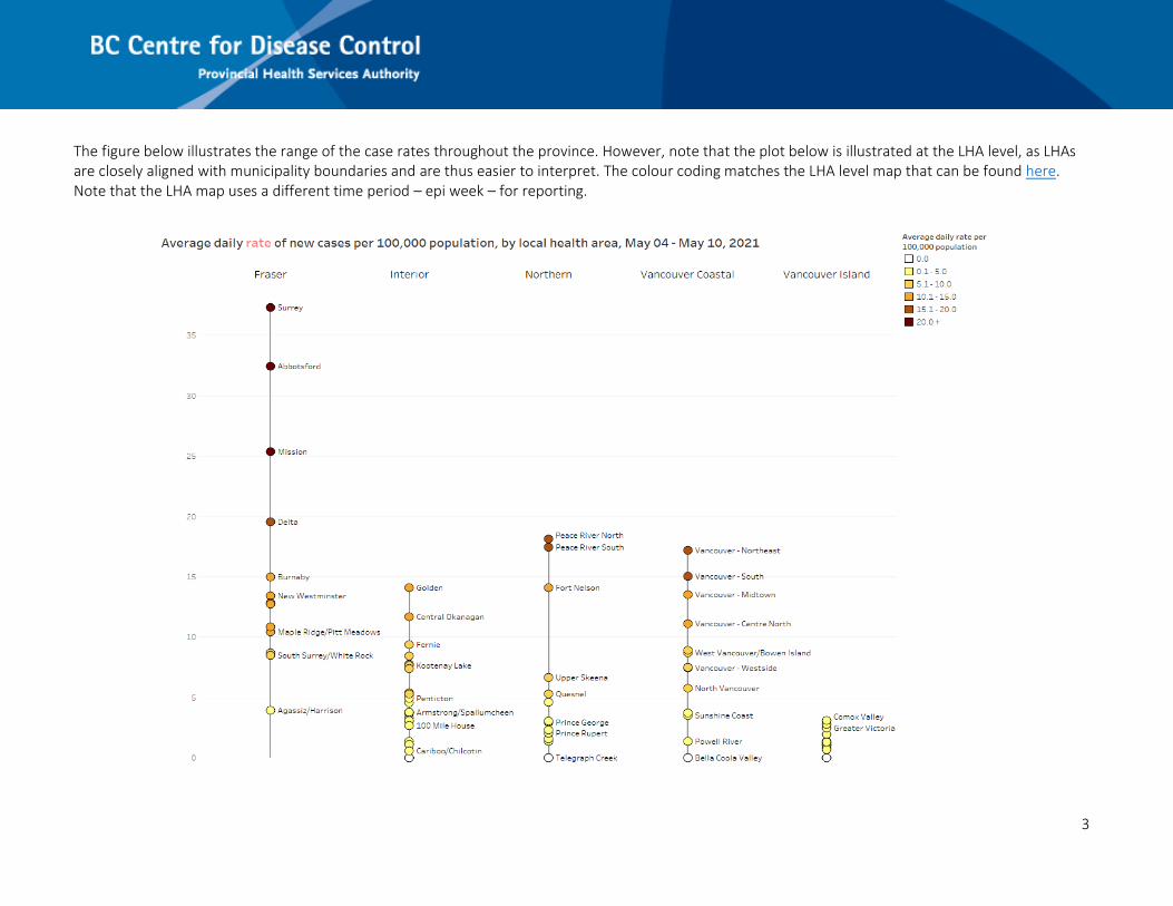
The figure below illustrates the range of the case rates throughout the province. However, note that the plot below is illustrated at the LHA level, as LHAs are closely aligned with municipality boundaries and are thus easier to interpret. The colour coding matches the LHA level map that can be found here. Note that the LHA map uses a different time period – epi week – for reporting.
4
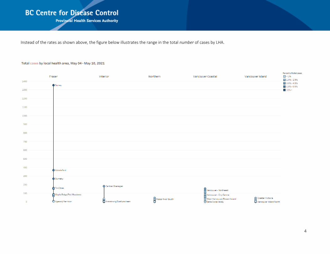
Instead of the rates as shown above, the figure below illustrates the range in the total number of cases by LHA.

5
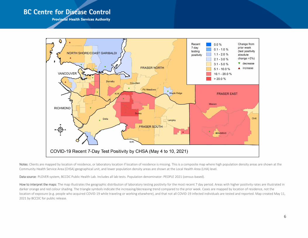
6
Notes: Clients are mapped by location of residence, or laboratory location if location of residence is missing. This is a composite map where high population density areas are shown at the
Community Health Service Area (CHSA) geographical unit, and lower population density areas are shown at the Local Health Area (LHA) level.
Data source: PLOVER system, BCCDC Public Health Lab. Includes all lab tests. Population denominator: PEOPLE 2021 (census-based).
How to interpret the maps: The map illustrates the geographic distribution of laboratory testing positivity for the most recent 7 day period. Areas with higher positivity rates are illustrated in
darker orange and red colour shading. The triangle symbols indicate the increasing/decreasing trend compared to the prior week. Cases are mapped by location of residence, not the
location of exposure (e.g. people who acquired COVID-19 while traveling or working elsewhere), and that not all COVID-19 infected individuals are tested and reported. Map created May 11,
2021 by BCCDC for public release.
7

8
9
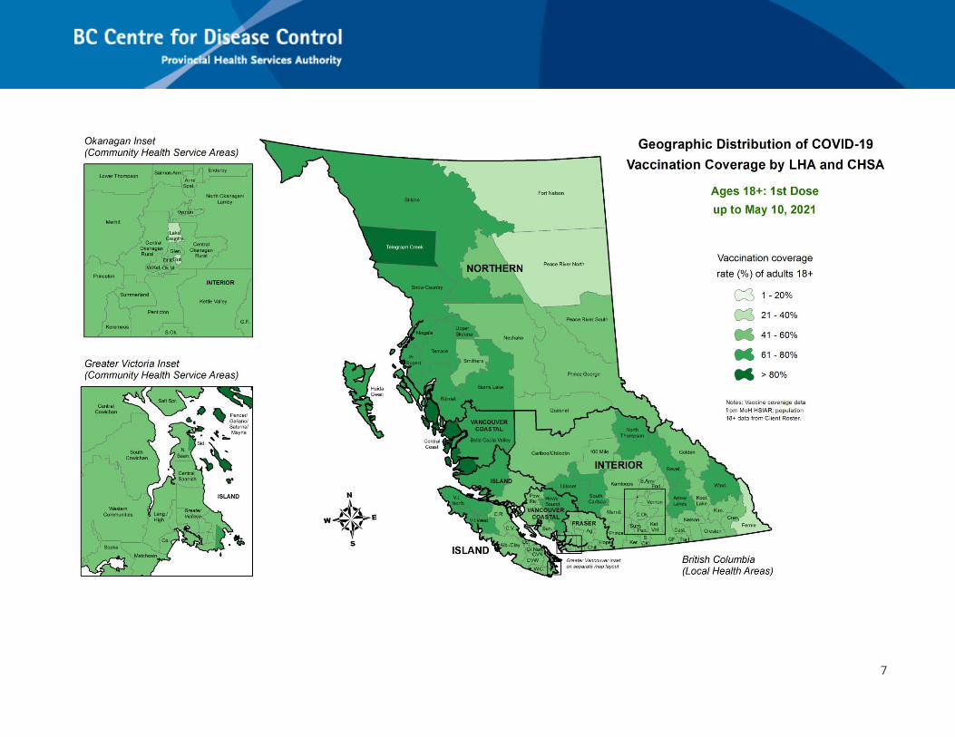
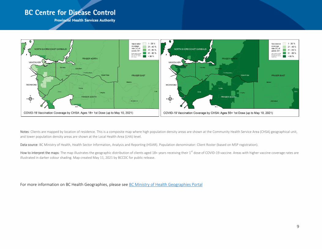
Notes: Clients are mapped by location of residence. This is a composite map where high population density areas are shown at the Community Health Service Area (CHSA) geographical unit,
and lower population density areas are shown at the Local Health Area (LHA) level.
Data source: BC Ministry of Health, Health Sector Information, Analysis and Reporting (HSIAR). Population denominator: Client Roster (based on MSP registration).
How to interpret the maps: The map illustrates the geographic distribution of clients aged 18+ years receiving their 1st
dose of COVID-19 vaccine. Areas with higher vaccine coverage rates are
illustrated in darker colour shading. Map created May 11, 2021 by BCCDC for public release.
For more information on BC Health Geographies, please see BC Ministry of Health Geographies Portal