unhcr dataviz guidelines
TRANSCRIPT
UNHCR Data Visualization Guidelines
September 2021
IntroductionThe Data Visualization Guidelines helps improve the quality of charts and
infographics made by UNHCR, the UN Refugee Agency. These guidelines
support the e�ective use of data driven-products to communicate to the
public the relevance and impact of UNHCR's work.
The simplification and standardization of chart elements and colour
palettes will make reading and interpretation of graphs and plots easier
and more comfortable. Consistent and highly recognizable visual
components will enhance UNHCR’s global brand identity. The guidelines
also simplify the chart production process by providing appropriate tools,
for both basic and advanced users.
Therefore, all charts created for UNHCR publications and websites should
follow the recommendations in this guidelines document.
The guidelines have been developed by Information Product
Development and Analysis Unit from the Global Data Service (GDS), with
the support of the Design Unit and the Global Brand Unit from the
Division of External Relations (DER). For further guidance or questions,
please contact [email protected].
1. Chart elements
3. Choose right chart type
2. Data visualization colour palette
4. Annex
• Colour palette • • • • • • • • • • • • • • • • • • • • • • • • • • • • • • • • • • • • • • • • • • • • • • • • • • 7
• Colour ramps • • • • • • • • • • • • • • • • • • • • • • • • • • • • • • • • • • • • • • • • • • • • • • • • • • • 8
• Colour combinations • • • • • • • • • • • • • • • • • • • • • • • • • • • • • • • • • • • • • • • • • • 9
• Chart elements: what, where and how • • • • • • • • • • • • • • • • • • • • • 4
• Chart elements: specifications • • • • • • • • • • • • • • • • • • • • • • • • • • • • • • • 5
• Chart examples • • • • • • • • • • • • • • • • • • • • • • • • • • • • • • • • • • • • • • • • • • • • • • • • 15
• Chart types • • • • • • • • • • • • • • • • • • • • • • • • • • • • • • • • • • • • • • • • • • • • • • • • • • • • • 12
Table of contents
2UNHCR Data Visualization Guidelines

Chart elements
Top bar
Figure number
Title
Subtitle
Legend
X-axis title
Y-axis title
X-axis label
Y-axis label
Grid line
Data label
Note
Source
Copyright
Set 1 Set 2
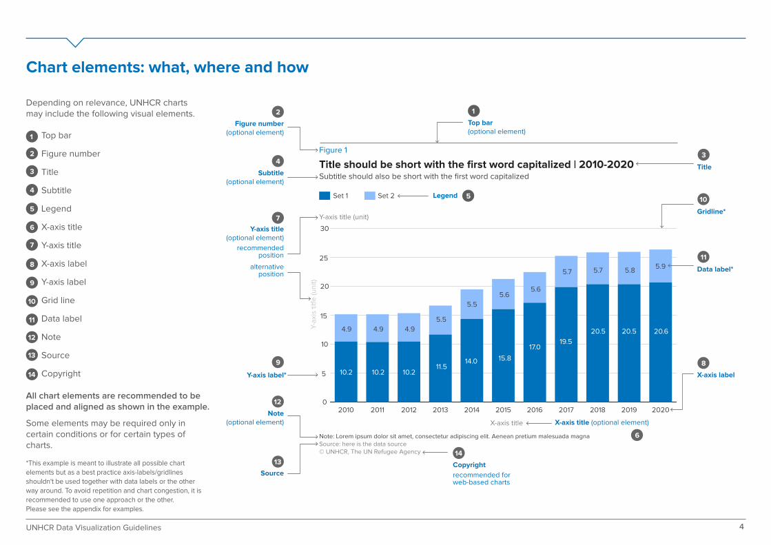
Chart elements: what, where and how
Figure 1
Title should be short with the first word capitalized | 2010-2020Subtitle should also be short with the first word capitalized
Y-axis title (unit)
Y-a
xis
titl
e (u
nit
)
X-axis title
Note: Lorem ipsum dolor sit amet, consectetur adipiscing elit. Aenean pretium malesuada magnaSource: here is the data source© UNHCR, The UN Refugee Agency
0
5
10
15
20
25
30
20202019201820172016201520142013201220112010
10.2 10.2 10.211.5
14.0 15.8
17.019.5
20.5 20.5 20.6
5.5
5.5
5.65.6
5.7 5.7 5.85.9
4.9 4.9 4.9
1
2
3
4
5
6
7
8
9
10
11
12
13
14
Title
Gridline*
Y-axis label*
Legend
X-axis label
Source
2
34
7
6
9 8
10
1
5
11
12
1314
Figure number(optional element)
Subtitle(optional element)
Y-axis title(optional element)
recommendedposition
alternativeposition
Data label*
X-axis title (optional element)Note
(optional element)
Top bar(optional element)
Copyright
recommended for web-based charts
Depending on relevance, UNHCR charts may include the following visual elements.
All chart elements are recommended to be placed and aligned as shown in the example.
Some elements may be required only in certain conditions or for certain types of charts.
*This example is meant to illustrate all possible chart
elements but as a best practice axis-labels/gridlines shouldn't be used together with data labels or the other way around. To avoid repetition and chart congestion, it is recommended to use one approach or the other. Please see the appendix for examples.
4UNHCR Data Visualization Guidelines
Set 1 Set 2
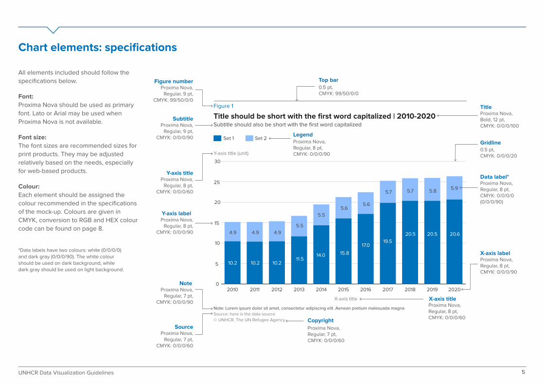
Chart elements: specifications
Figure 1
Title should be short with the first word capitalized | 2010-2020Subtitle should also be short with the first word capitalized
Y-axis title (unit)
X-axis title
Note: Lorem ipsum dolor sit amet, consectetur adipiscing elit. Aenean pretium malesuada magna
Source: here is the data source
© UNHCR, The UN Refugee Agency
0
5
10
15
20
25
30
20202019201820172016201520142013201220112010
10.2 10.2 10.211.5
14.0 15.8
17.019.5
20.5 20.5 20.6
5.5
5.5
5.65.6
5.7 5.7 5.85.9
4.9 4.9 4.9
Proxima Nova,Regular, 9 pt,
CMYK: 99/50/0/0
Proxima Nova,Bold, 12 pt, CMYK: 0/0/0/100
0.5 pt,CMYK: 0/0/0/20
Proxima Nova,Regular, 9 pt,
CMYK: 0/0/0/90
Proxima Nova,Regular, 8 pt,
CMYK: 0/0/0/60
Proxima Nova,Regular, 8 pt,
CMYK: 0/0/0/90
Proxima Nova, Regular, 8 pt, CMYK: 0/0/0/90
Proxima Nova, Regular, 8 pt, CMYK: 0/0/0/0(0/0/0/90)
Proxima Nova, Regular, 8 pt, CMYK: 0/0/0/90
Proxima Nova,Regular, 8 pt,CMYK: 0/0/0/60
Proxima Nova,Regular, 7 pt,
CMYK: 0/0/0/90
Proxima Nova,Regular, 7 pt,
CMYK: 0/0/0/60
0.5 pt, CMYK: 99/50/0/0
13Proxima Nova,Regular, 7 pt,CMYK: 0/0/0/60
Figure number
Subtitle
Y-axis title
Y-axis label
Note
SourceCopyright
Top bar
Legend
Title
Gridline
Data label*
X-axis title
X-axis label
All elements included should follow the
specifications below.
Font:
Proxima Nova should be used as primary
font. Lato or Arial may be used when
Proxima Nova is not available.
Font size:
The font sizes are recommended sizes for
print products. They may be adjusted
relatively based on the needs, especially
for web-based products.
Colour:
Each element should be assigned the
colour recommended in the specifications
of the mock-up. Colours are given in
CMYK, conversion to RGB and HEX colour
code can be found on page 8.
*Data labels have two colours: white (0/0/0/0) and dark gray (0/0/0/90). The white colour should be used on dark background, while dark gray should be used on light background.
5UNHCR Data Visualization Guidelines
Data visualization colour palette

Data visualization colour palette
This data visualization colour palette is an extended version of the UNHCR
colour palette. It is developed specifically for visualizing data in infographics,
maps or charts.
This palette includes six main colours: blue, navy, green, grey, red and yellow.
The five-value colour ramps found on page 8 were created based on these main
colours for visualizations requiring several shades of the same colour.
The blue colour is the primary colour and should be the predominant colour in
all UNHCR visuals. Try to limit the number of di�erent colours in a single graphic.
In some cases more colours may be used to ensure clarity, e.g. distinguishing
between di�erent categories within the data.
In this guide you will find recommendations on how to use and pair colours for
di�erent types of data:
Categorical: when data is non-numeric, contrasting colours are used for
each category.
Sequential: the same or similar hues are used, and saturation varies for a
single metric.
Diverging: two hues are used to indicate a division, such as positive and
negative values.
You will also find recommended colours to be used for UNHCR People of
Concern categories and UNHCR geographical regions/bureaux.
Consistent use of these colours contribute to a coherent and consistent look for
UNHCR products across all communication channels and platforms. A strong
visual identity improves audience recognition and distinguishes UNHCR from
other organisations. Therefore, we strongly recommend implementing these
guidelines to the extent possible for all visualizations.
Main colours
Blue (primary colour)CMYK: 99, 50, 0, 0RGB: 0, 114, 188 HEX: #0072BC
Yellow (accent colour)CMYK: 3, 1, 100, 0RGB: 250, 235, 0HEX: #FAEB00
GreyCMYK: 0, 0, 0, 60RGB: 102, 102, 102HEX: #666666
NavyCMYK: 99, 83, 36, 27RGB: 24, 55, 95 HEX: #18375F
GreenCMYK: 90, 0, 52, 0RGB: 0, 179, 152 HEX: #00B398
RedCMYK: 0, 87, 52, 0RGB: 239, 74, 96 HEX: #EF4A60
7UNHCR Data Visualization Guidelines
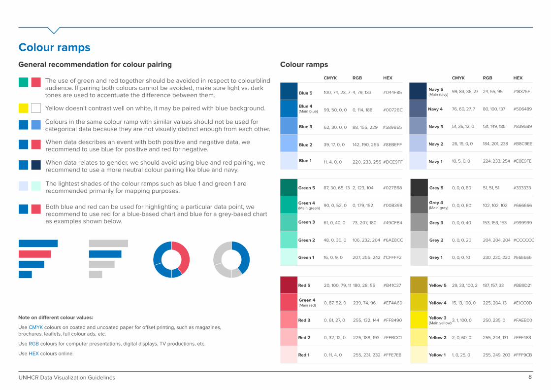
Note on di�erent colour values:
Use CMYK colours on coated and uncoated paper for o�set printing, such as magazines,
brochures, leaflets, full colour ads, etc.
Use RGB colours for computer presentations, digital displays, TV productions, etc.
Use HEX colours online.
Colour ramps
100, 74, 23, 7
Blue 4(Main blue)
Blue 5
Blue 3
Blue 2
Blue 1
4, 79, 133 #044F85
99, 50, 0, 0 0, 114, 188 #0072BC
62, 30, 0, 0 88, 155, 229 #589BE5
39, 17, 0, 0 142, 190, 255 #8EBEFF
11, 4, 0, 0 220, 233, 255 #DCE9FF
CMYK RGB HEX
Green 5
Green 3
Green 2
Green 1
87, 30, 65, 13
Green 4(Main green)
2, 123, 104 #027B68
90, 0, 52, 0 0, 179, 152 #00B398
61, 0, 40, 0 73, 207, 180 #49CFB4
48, 0, 30, 0 106, 232, 204 #6AE8CC
16, 0, 9, 0 207, 255, 242 #CFFFF2
Red 5
Red 3
Red 2
Red 1
20, 100, 79, 11
Green 4(Main red)
180, 28, 55 #B41C37
0, 87, 52, 0 239, 74, 96 #EF4A60
0, 61, 27, 0 255, 132, 144 #FF8490
0, 32, 12, 0 225, 188, 193 #FFBCC1
0, 11, 4, 0 255, 231, 232 #FFE7E8
Navy 5(Main navy)
Navy 3
Navy 2
Navy 1
RGB HEX
Navy 4
CMYK
99, 83, 36, 27
76, 60, 27, 7
51, 36, 12, 0
26, 15, 0, 0
10, 5, 0, 0
24, 55, 95
80, 100, 137
131, 149, 185
184, 201, 238
224, 233, 254
#18375F
#506489
#8395B9
#B8C9EE
#E0E9FE
Yellow 5
Yellow 3(Main yellow)
Yellow 2
Yellow 1
Yellow 4
29, 33, 100, 2
15, 13, 100, 0
3, 1, 100, 0
2, 0, 60, 0
1, 0, 25, 0
187, 157, 33
225, 204, 13
250, 235, 0
255, 244, 131
255, 249, 203
#BB9D21
#E1CC0D
#FAEB00
#FFF483
#FFF9CB
Grey 5
Grey 3
Grey 2
Grey 1
Grey 4(Main grey)
0, 0, 0, 80
0, 0, 0, 60
0, 0, 0, 40
0, 0, 0, 20
0, 0, 0, 10
51, 51, 51
102, 102, 102
153, 153, 153
204, 204, 204
230, 230, 230
#333333
#666666
#999999
#CCCCCC
#E6E6E6
General recommendation for colour pairing Colour ramps
The use of green and red together should be avoided in respect to colourblind audience. If pairing both colours cannot be avoided, make sure light vs. dark tones are used to accentuate the di�erence between them.
Colours in the same colour ramp with similar values should not be used for categorical data because they are not visually distinct enough from each other.
Yellow doesn’t contrast well on white, it may be paired with blue background.
When data describes an event with both positive and negative data, we recommend to use blue for positive and red for negative.
When data relates to gender, we should avoid using blue and red pairing, we recommend to use a more neutral colour pairing like blue and navy.
The lightest shades of the colour ramps such as blue 1 and green 1 are recommended primarily for mapping purposes.
Both blue and red can be used for highlighting a particular data point, we recommend to use red for a blue-based chart and blue for a grey-based chart as examples shown below.
8UNHCR Data Visualization Guidelines

Colour combination
Categorical
1 group
2 groups
3 groups
4 groups
5 groups
Categorical palette
A categorical palette is used when the variable is non-numeric. Categorical variables
are those that take on distinct labels without inherent ordering. Examples include
country or region, activity, and gender. Each possible value of the variable is
assigned with a contrasting colour from a categorical palette.
As part of dataviz best practices, it is not recommended to have more than five
groups in one single chart. If there are more than five groups, we suggest
consolidating the categories or breaking up the chart into two or more.
#0072BC
#0072BC
#0072BC #8EBEFF
#8EBEFF
#0072BC #8EBEFF#18375F
#18375F #666666#00B398
#0072BC #8EBEFF#18375F #00B398
9UNHCR Data Visualization Guidelines

Colour combination
Categorical People of concern palette
In UNHCR, there are two standing exceptions to the recommendation above: types
of People of Concern (PoC) and geographical regions/bureaux as both include
seven categories.
In order to be consistent, every category has been assigned with a specific colour.
People of Concern: we recommend to apply the colours as shown on the
People of Concern palette
Region/Bureau: we recommend to apply the colours as shown on the
Region/Bureau palette
The legend of chart should follow the same order as the colour palette if there’s no
specific data ordering or sorting requirement.
These colour palettes are for products in which all or most PoC's and/or geographi-
cal regions/bureaux are displayed in a single graphic. If there is a report/publication
only about IDPs, for example, the colour palette would use the main UNHCR
colour(s), i.e. Blue.
Region/Bureau palette
#18375F
#0072BC
Refugees
#0072BC
UNHCRrefugees
#8EBEFF
UNRWArefugees
#18375F
Asylum-seekers
#00B398
Internallydisplaced people
#E1CC0D
Statelesspersons
#EF4A60
Venezuelans displacedabroad
#8395B9
Returnedrefugeesand IDPs
Returnedrefugees
#999999
Others ofconcern
#B8C9EE
ReturnedIPDs
#0072BC
East andHorn of Africaand the GreatLakes
#589BE5 #8EBEFF
SouthernAfrica
West andCentralAfrica
The Americas
#00B398
Asia and the Pacific
#E1CC0D
Europe
#EF4A60
Middle Eastand NorthAfrica
Subset of PoC
10UNHCR Data Visualization Guidelines
#8395B9
Colour combination
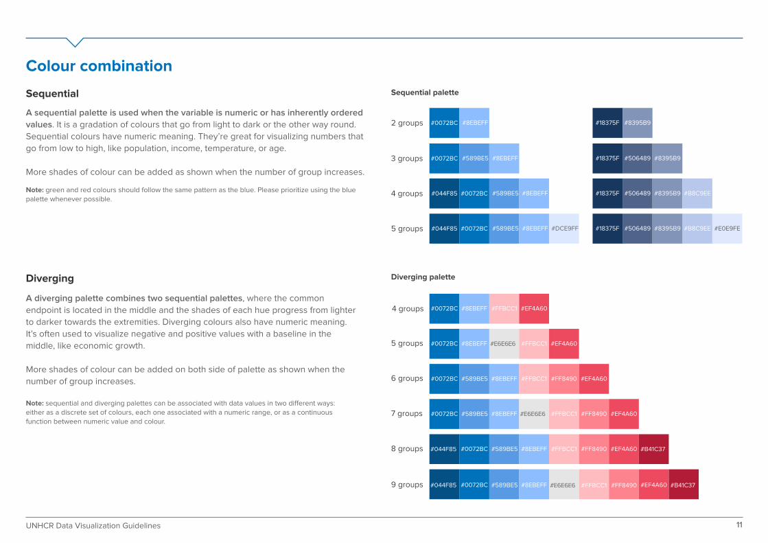
Sequential
Diverging
5 groups
4 groups
3 groups
2 groups
9 groups
7 groups
5 groups
#0072BC #589BE5 #8EBEFF
#0072BC #8EBEFF
#0072BC #8EBEFF#589BE5 #DCE9FF#044F85
#0072BC #8EBEFF#589BE5#044F85
8 groups
6 groups
4 groups
#18375F #506489 #8395B9
#18375F #8395B9
#18375F #506489 #8395B9 #B8C9EE
#18375F #506489 #8395B9 #B8C9EE #E0E9FE
Sequential palette
Diverging palette
A diverging palette combines two sequential palettes, where the common
endpoint is located in the middle and the shades of each hue progress from lighter
to darker towards the extremities. Diverging colours also have numeric meaning.
It’s often used to visualize negative and positive values with a baseline in the
middle, like economic growth.
More shades of colour can be added on both side of palette as shown when the
number of group increases.
Note: sequential and diverging palettes can be associated with data values in two di�erent ways: either as a discrete set of colours, each one associated with a numeric range, or as a continuous function between numeric value and colour.
A sequential palette is used when the variable is numeric or has inherently ordered
values. It is a gradation of colours that go from light to dark or the other way round.
Sequential colours have numeric meaning. They’re great for visualizing numbers that
go from low to high, like population, income, temperature, or age.
More shades of colour can be added as shown when the number of group increases.
Note: green and red colours should follow the same pattern as the blue. Please prioritize using the blue palette whenever possible.
11UNHCR Data Visualization Guidelines
#0072BC #FFBCC1#8EBEFF #EF4A60
#E6E6E6#0072BC #FFBCC1#8EBEFF #EF4A60
#0072BC #FFBCC1 #FF8490#8EBEFF#589BE5 #EF4A60
#E6E6E6#0072BC #FFBCC1 #FF8490#8EBEFF#589BE5 #EF4A60
#E6E6E6#0072BC #FFBCC1 #FF8490#8EBEFF#589BE5#044F85 #EF4A60 #B41C37
#0072BC #FFBCC1 #FF8490#8EBEFF#589BE5#044F85 #EF4A60 #B41C37
Choose right chart type

Chart type
Comparison
Charts that show a comparison between two or more variables within the data set. These can be relative or absolute.
Correlation
Charts that show how two or more variables relate to each other.
Change over time
Charts that show data over a certain period of time as a way to find trends or highlight changes.
Distribution
Charts that show how individual data points are grouped or spread out within the data set. It’s a great method to find the frequency of events.
Bar chart Column chart Grouped bar chart Grouped column chart Stacked bar chart Stacked column chart
Scatterplot Connected scatterplot Bubble chart Tree diagram Heatmap Venn diagram
Line chart Area chart Stacked area chart Stream graph
Histogram Population pyramid Boxplot Dot plot
Line column chart Slope chart
13UNHCR Data Visualization Guidelines
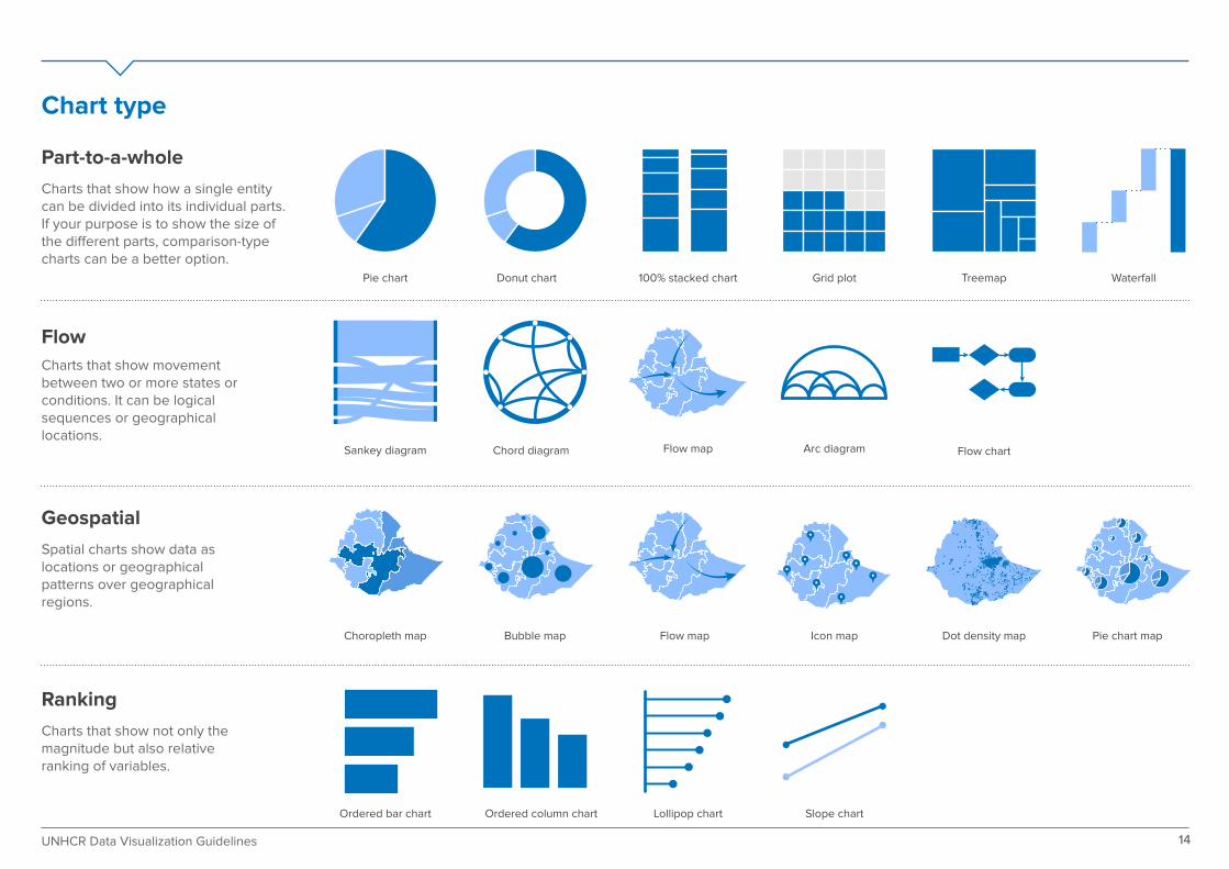
Chart type
Part-to-a-whole
Charts that show how a single entity can be divided into its individual parts. If your purpose is to show the size of the di�erent parts, comparison-type charts can be a better option.
Flow
Charts that show movement between two or more states or conditions. It can be logical sequences or geographical locations.
Geospatial
Spatial charts show data as locations or geographical patterns over geographical regions.
Ranking
Charts that show not only the magnitude but also relative ranking of variables.
Pie chart Donut chart 100% stacked chart Grid plot
Sankey diagram
Choropleth map Bubble map Icon map Dot density map Pie chart map
Chord diagram Flow map Arc diagram Flow chart
Slope chartLollipop chartOrdered column chartOrdered bar chart
Treemap Waterfall
Flow map
14UNHCR Data Visualization Guidelines

Annex
16UNHCR Data Visualization Guidelines
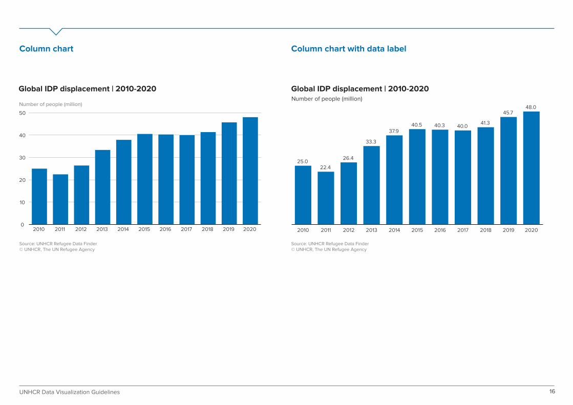
Global IDP displacement | 2010-2020
0
10
20
30
40
50
20202019201820172016201520142013201220112010
Number of people (million)Number of people (million)
Source: UNHCR Refugee Data Finder© UNHCR, The UN Refugee Agency
Global IDP displacement | 2010-2020
Source: UNHCR Refugee Data Finder© UNHCR, The UN Refugee Agency
25.022.4
26.4
33.3
37.940.5 40.3 40.0
41.3
45.748.0
20202019201820172016201520142013201220112010
Column chart Column chart with data label

People displaced across borders by country of origin | 2020
Number of people (million)
Number of people (million)
Source: UNHCR Refugee Data Finder© UNHCR, The UN Refugee Agency
0 1 2 3 4 5 6 7
Eritrea
Central African
Rep.
Sudan
Somalia
DRC
Myanmar
South Sudan
Afghanistan
Venezuela
Syria
People displaced across borders by country of origin | 2020
Source: UNHCR Refugee Data Finder© UNHCR, The UN Refugee Agency
6.69
4.03
2.60
2.19
1.10
0.84
0.81
0.79
0.64
0.52Eritrea
Central AfricanRep.
Sudan
Somalia
DRC
Myanmar
South Sudan
Afghanistan
Venezuela
Syria
17UNHCR Data Visualization Guidelines
Bar chart Bar chart with data label

IDPs of concern to UNHCR in Africa region | 2017-2020
Number of people (million)
Source: UNHCR Refugee Data Finder© UNHCR, The UN Refugee Agency
Southern AfricaEast and Horn of Africa, and Great Lakes West and Central Africa
0
2
4
6
8
10
2020201920182017
Number of people (thousand)
Individual asylum applications registered by region | 2019-2020
Source: UNHCR Refugee Data Finder© UNHCR, The UN Refugee Agency
20202019
6.7
3.90.9
2.6
2.2
1.1
0.8
0.8
0.8
0.6
0.5
0 200 400 600 800 1,000
West andCentral Africa
Southern Africa
Middle East/North Africa
Europe
East and Hornof Africa,
and Great Lakes
Asia and Pacific
Americas
18UNHCR Data Visualization Guidelines
Grouped column chart Grouped bar chart
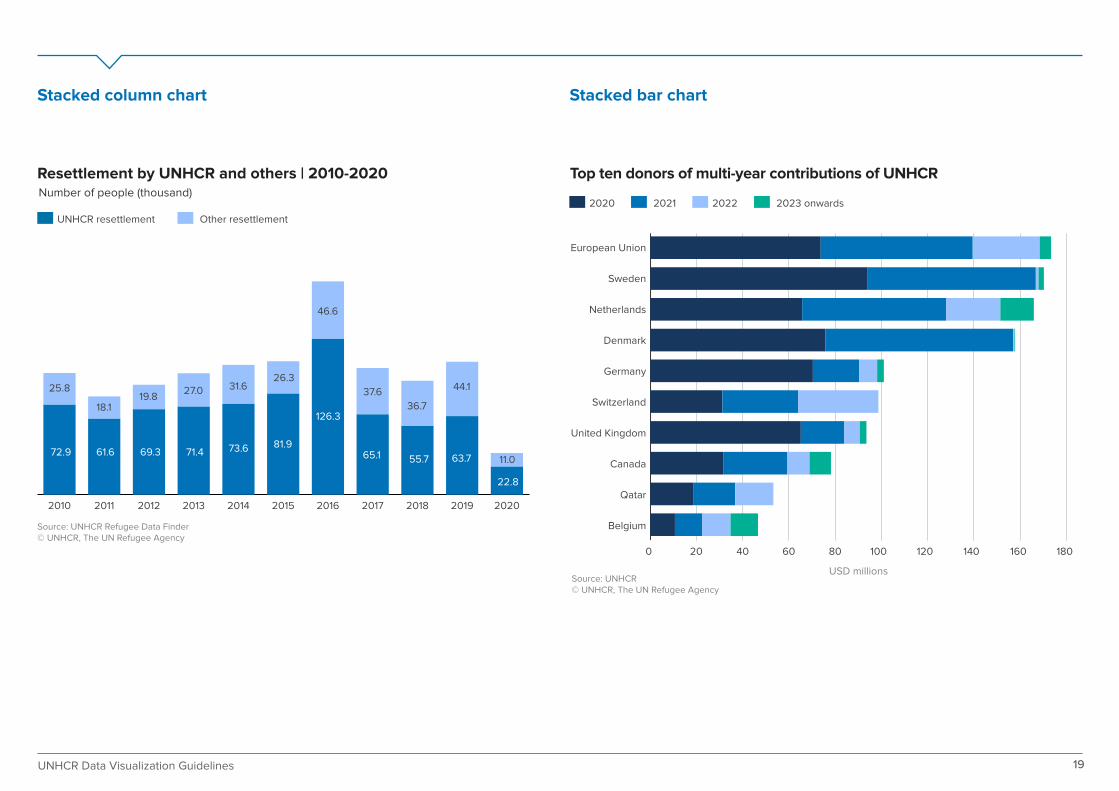
Resettlement by UNHCR and others | 2010-2020Number of people (thousand)
USD millions
Source: UNHCR Refugee Data Finder© UNHCR, The UN Refugee Agency
Source: UNHCR© UNHCR, The UN Refugee Agency
20202019201820172016201520142013201220112010
UNHCR resettlement Other resettlement
2020 2021 2022 2023 onwards
72.9 61.6 69.3 71.4 73.6 81.9
126.3
65.1 55.7 63.7
22.8
27.0 31.626.3
46.6
37.6
36.7
44.1
11.0
25.8
18.119.8
Top ten donors of multi-year contributions of UNHCR
19UNHCR Data Visualization Guidelines
Stacked column chart Stacked bar chart
0 20 40 60 80 100 120 140 160 180
Belgium
Qatar
Canada
United Kingdom
Switzerland
Germany
Denmark
Netherlands
Sweden
European Union

Levels of earmarking | 2012-2020
Source: UNHCR© UNHCR, The UN Refugee Agency
0%
20%
40%
60%
80%
100%
202020192018201720162015201420132012
Tightly earmarkedSoftly earmarked EarmarkedUnearmarked
20
100% stacked column chart Population pyramid
Estimated demographic composition of the global populationdisplaced across borders | 2020
0-4
5-11
12-17
18-59
60+ 2%
6%
9%
6%
2%
6%
9%
5%
25%29%
Note: figures do not add up to 100 per cent due to roundingSource: UNHCR Refugee Data Finder
© UNHCR, The UN Refugee Agency
Male Female
UNHCR Data Visualization Guidelines

Monthly evolution of funding in West and Central Africa region | 2020
Source: UNHCR© UNHCR, The UN Refugee Agency
USD millions
0
100
200
300
400
500
DecNovOctSepAugJulJunMayAprMarFebJan
21UNHCR Data Visualization Guidelines
Area Chart
Tightly earmarkedSoftly earmarked EarmarkedUnearmarked
Line chart
Number of refugees and IDPs of concern to UNHCR | 1990-2020
Number of people (million)
Source: UNHCR Refugee Data Finder© UNHCR, The UN Refugee Agency
0
10
20
30
40
50
2020201520102005200019951990
IDPs
Refugees

Source: UNHCR Refugee Data Finder© UNHCR, The UN Refugee Agency
22UNHCR Data Visualization Guidelines
Combined column and line chart
Displaced population Proportion displaced
0
20
40
60
80
100
0
2
4
6
8
10
2016201520142013201220112010200920082007
Displaced population (millions) Proportion displaced (number displaced per 1,000 world population)
Trend of global displacement | 2007 - 2016
Treemap
Note: figures do not add up to 100 per cent due to roundingSource: UNHCR
© UNHCR, The UN Refugee Agency
22%East and Horn of Africa and the Great Lakes
19%Middle East andNorth Africa
12%Asia andthe Pacific
11%SouthernAfrica
11%The Americas
10%Europe
9%HQ
5%West andCentral Africa
UNHCR global workforce by region | 2020

Source: UNHCR© UNHCR, The UN Refugee Agency
$144 MReceived to date(49%)
$150 MGap (51%)
UNHCR Funding (as of August 2021)
Source: UNHCR© UNHCR, The UN Refugee Agency
$144 MReceived to date(49%)
$150 MGap (51%)
UNHCR Funding (as of August 2021)
23UNHCR Data Visualization Guidelines
Pie chart Donut chart
$294 MTotal required
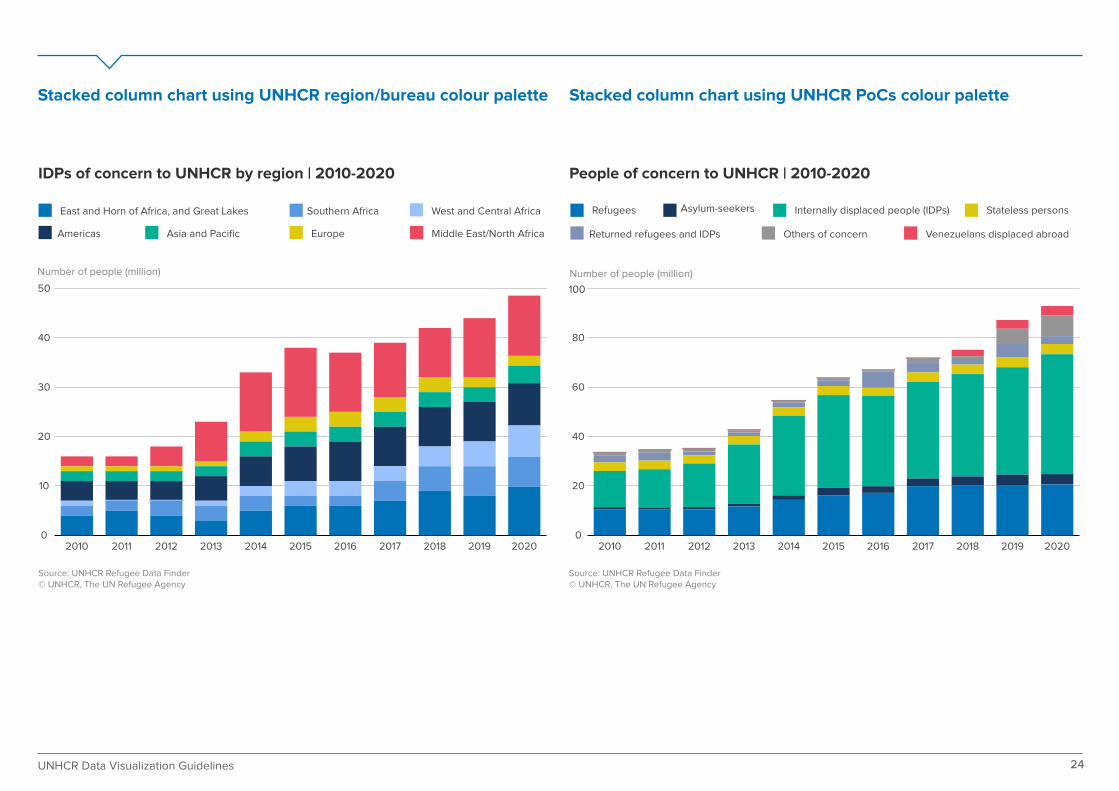
People of concern to UNHCR | 2010-2020
Source: UNHCR Refugee Data Finder© UNHCR, The UN Refugee Agency
IDPs of concern to UNHCR by region | 2010-2020
Source: UNHCR Refugee Data Finder© UNHCR, The UN Refugee Agency
East and Horn of Africa, and Great Lakes Southern Africa West and Central Africa
Americas Asia and Pacific Europe Middle East/North Africa
Refugees Asylum-seekers Internally displaced people (IDPs)
Returned refugees and IDPs
Stateless persons
Others of concern Venezuelans displaced abroad
Number of people (million) Number of people (million)
0
10
20
30
40
50
202020192018201720162015201420132012201120100
20
40
60
80
100
20202019201820172016201520142013201220112010
24UNHCR Data Visualization Guidelines
Stacked column chart using UNHCR region/bureau colour palette Stacked column chart using UNHCR PoCs colour palette
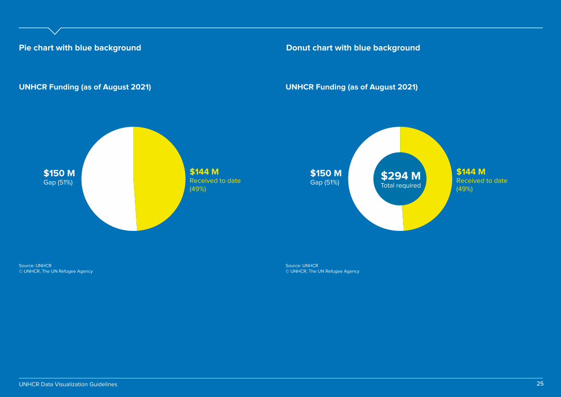
UNHCR Funding (as of August 2021)
Source: UNHCR© UNHCR, The UN Refugee Agency
$144 MReceived to date(49%)
$150 MGap (51%)
UNHCR Funding (as of August 2021)
Source: UNHCR© UNHCR, The UN Refugee Agency
$144 MReceived to date(49%)
$150 MGap (51%)
Pie chart with blue background Donut chart with blue background
25UNHCR Data Visualization Guidelines
$294 MTotal required
