trends in residential electricity consumption
TRANSCRIPT

Electricity Networks Association
Trends in Residential Electricity
Consumption
Dr Stephen Batstone
David Reeve
5 August 2014


Trends in Residential Demand Page i
About the Authors
Stephen Batstone has 18 years’ experience in the electricity sector, including wholesale and
derivative markets, portfolio and risk management, reservoir optimisation, long-term pricing,
market design and transmission. His management experience in business planning,
operations, and strategy analysis is complemented by being a specialist modeller in the field
of decision-making under uncertainty. He has authored a number of future demand and
supply scenario analyses for companies around the NZ industry. Stephen holds a PhD in
Operations Research from the University of Canterbury,
David Reeve is a technical expert and risk manager specialising in renewable generation
(hydro, geothermal and wind), electric power-system operation and electricity markets. He is
experienced in resolving complex issues affecting value and risk in electricity, including
renewable resource utilisation, energy and transmission pricing, electricity trading and
operation, ancillary services, revenue metering and risk management integration. He has
significant experience in regulatory policy, corporate policy, risk management and strategy in
energy businesses. David has extensive experience in the New Zealand power system and
market and has also worked in Australia, Philippines and Singapore.
About Sapere Research Group Limited
Sapere Research Group is one of the largest expert consulting firms in Australasia and a
leader in provision of independent economic, forensic accounting and public policy services.
Sapere provides independent expert testimony, strategic advisory services, data analytics and
other advice to Australasia’s private sector corporate clients, major law firms, government
agencies, and regulatory bodies.
Wellington
Level 9, 1 Willeston St PO Box 587 Wellington 6140 Ph: +64 4 915 7590 Fax: +64 4 915 7596
Auckland 1
Level 17, 3-5 Albert St PO Box 2475 Auckland 1140 Ph: +64 9 913 6240 Fax: +64 9 913 6241
Auckland 2
Level 1, 441 Queen St PO Box 2475 Auckland 1140 Ph: +64 9 354 4388
Sydney
Level 14, 68 Pitt St GPO Box 220 NSW 2001 Ph: +61 2 9234 0200 Fax: +61 2 9234 0201
Canberra
Unit 3, 97 Northbourne Ave Turner ACT 2612 GPO Box 252 Canberra City, ACT 2601 Ph: +61 2 6267 2700 Fax: +61 2 6267 2710
Melbourne
Level 2, 65 Southbank Boulevard GPO Box 3179 Melbourne, VIC 3001 Ph: +61 3 9626 4333 Fax: +61 3 9626 4231
For information on this report please contact:
Name: Stephen Batstone
Telephone: 027 225 1983
Email: [email protected]


Trends in Residential Demand Page iii
Contents
1. Background ....................................................................................................... 1
2. Residential Demand .......................................................................................... 4
2.1 Growth in households ............................................................................................. 4 2.2 Weather ...................................................................................................................... 5 2.3 Changes within the household ............................................................................... 7
2.3.1 Space Heating, Insulation and Building Size......................................... 8 2.3.2 Appliances and Electronics ................................................................... 12 2.3.3 Refrigerators and water heaters ............................................................. 15 2.3.4 Lighting ..................................................................................................... 17 2.3.5 Electric Vehicles ...................................................................................... 18 2.3.6 Solar PV .................................................................................................... 19 2.3.7 Prices, Income and Wealth .................................................................... 20
3. Future Predictions ........................................................................................... 26


Trends in Residential Demand Page 1
1. Background
National electricity demand in New Zealand has remained largely constant since 2007. This
is a major departure from the historical trend of relatively stable growth exhibited since the
1960s of, on average, 650GWh per annum.
Figure 1 - Annual electricity consumption in New Zealand (MBIE, Whiteboard
Energy)
Within this overall pattern, however, there are different effects manifesting at different levels
(Figure 2):
Industrial demand has substantially reduced since 2005, dominated by reductions in
consumption at Rio Tinto’s Tiwai Point Aluminium Smelter and Norske Skog
Tasman’s pulp and paper facility
Residential demand has experienced four successive years of flat or declining
growth.
Agricultural demand has continued to grow through the global recession
Commercial demand was flat during the recession, but is now at higher levels than
prior to the GFC
1920 1940 1960 1980 2000
NZ Electricity Consumption, 1920-2013
Year
Con
sum
ption
, G
Wh
01
0,0
00
20,0
00
30
,00
040
,000
Fit 1976 - 2007
1976

Page 2 Electricity Demand Drivers
Figure 2 - Consumption by major sector, 1975-2013 (MBIE)
Traditional econometric models, based on (for example) the number of households and
GDP, have struggled to capture this change in dynamic, although will invariably be re-
calibrated to accommodate this recent trend. However, re-calibrating regression parameters
does not tell us why this recent pattern has emerged, and shouldn’t necessarily give us any
confidence that we fully understand the underlying drivers.
Our focus in this paper is the residential sector. As we will show below, the reduction in
residential demand since 2009 is a function of both a reduction in the number of
households, but (more significantly) a reduction in the consumption per household.
Important questions for the sector include:
Did the demand “system” substantially change in 2007, or were the changes more
long term, reaching a turning point in 2007?
What were the underlying influencers of this change?
Are the changes temporary, persistent, or likely to undergo further changes?
The Commerce Commission, in its Low Cost Forecasting Approaches Paper1, has stated a
position that
“…electricity consumption by the average residential user is unlikely to fall over the next 5-7 years.
Electricity price increases are starting to moderate, economic activity is picking up, and electric cars are
becoming viable. Taken together, our expectation is that electricity use per user is more likely to remain
broadly constant.”
We find this prediction surprising given the significance of the recent trend, as will be
presented below. However, we note that, due to lack of a comprehensive dataset on the age
1 Commerce Commission, Low Cost Forecasting Approaches for Default Price-Quality Paths, 4 July 2014
0
2,000
4,000
6,000
8,000
10,000
12,000
14,000
16,000
18,000
1975
1977
1979
1981
1983
1985
1987
1989
1991
1993
1995
1997
1999
2001
2003
2005
2007
2009
2011
2013
GW
h
Annual Consumption, GWh
Residential
Commercial
Industrial
Agriculture

Trends in Residential Demand Page 3
and efficiency profile of current houses, we can only infer trends for the future. But a
prediction that consumption per household is unlikely to fall requires a particular (and, we
think, unreasonable) view on the nature of changes being experienced by households
currently, as we will show below.
Page 4 Electricity Demand Drivers
2. Residential Demand
There are two high-level effects that drive changes in total residential demand:
1. The growth in the number of households (driven by population growth)
2. Changes in per-household consumption, which includes the effect of prevailing
weather conditions
In the second category, we will focus on changes within the household. We do not consider
in any detail the (somewhat small) component of change in the national average household
consumption which is due to the population growth being dominated by warmer areas (e.g.,
Bay of Plenty and Auckland). Here, average household consumption is lower – ceteris
paribus - due to lower heating requirements. As a result, proportionally greater population
growth in these areas will bring the national average household consumption down.
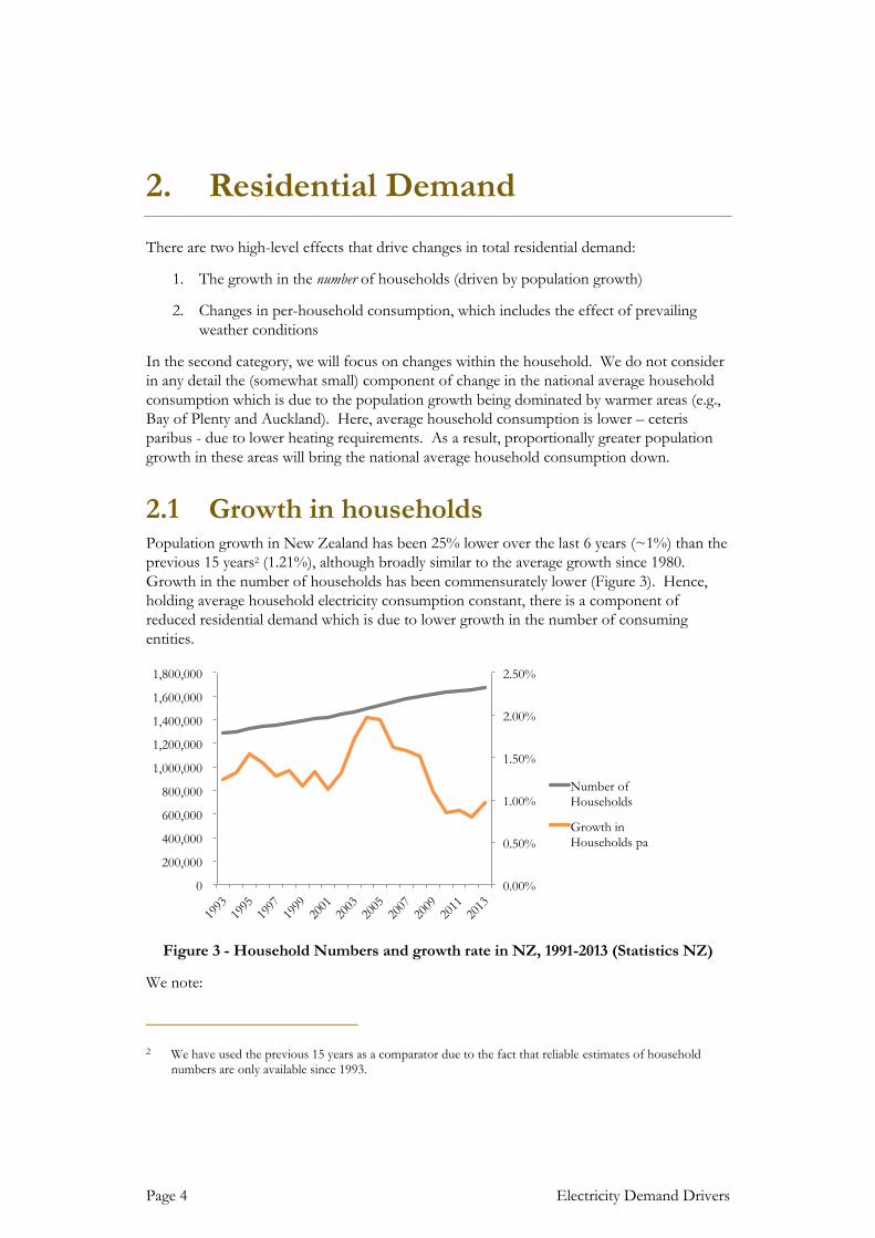
2.1 Growth in households Population growth in New Zealand has been 25% lower over the last 6 years (~1%) than the
previous 15 years2 (1.21%), although broadly similar to the average growth since 1980.
Growth in the number of households has been commensurately lower (Figure 3). Hence,
holding average household electricity consumption constant, there is a component of
reduced residential demand which is due to lower growth in the number of consuming
entities.
Figure 3 - Household Numbers and growth rate in NZ, 1991-2013 (Statistics NZ)
We note:
2 We have used the previous 15 years as a comparator due to the fact that reliable estimates of household
numbers are only available since 1993.
0.00%
0.50%
1.00%
1.50%
2.00%
2.50%
0
200,000
400,000
600,000
800,000
1,000,000
1,200,000
1,400,000
1,600,000
1,800,000
1993
1995
1997
1999
2001
2003
2005
2007
2009
2011
2013
Number of
Households
Growth in
Households pa

Trends in Residential Demand Page 5
The 15 year average growth rate in household numbers is ~21,500 households per
year.
The growth rate in households between 2003 and 2008 was 26,000 households per
year, 20% higher than the average rate since 1993. This would have put upwards
pressure on electricity demand (compared to the longer term trend).
Over the last 5 years, the growth rate dropped markedly to ~15,000 per year (a drop
of 75% compared to the previous 5 year period). If households had grown at the
same rate as experienced between 1993 and 2008, an additional 6,500 households
would have been created each year. Assuming that average household consumption
had remained constant at 8,000kWh), this factor alone have would have increased
residential growth by 30%, or 52GWh per annum.
2.2 Weather In order to provide an approximation of the impact of weather trends on residential
consumption, we have conducted a high-level “heating degree day” analysis (HDD). HDDs
measure the duration, specified in days, that the temperature fell below a reference
temperature3. Hence the number of HDDs for a year gives a good indication of how cold it
was4.
Figure 4 illustrates the relationship between per-household consumption, and the demand-
weighted sum of HDDs in Auckland, Wellington and Christchurch.
3 Data sourced from cliflo.niwa.co.nz. NIWA have used 18 degrees as the reference temperature. The
engineering standard is 15 degrees, however, 15deg HDDs are only available back to 2004. We have compared the two periods and the general trend is relatively unchanged for the period 2004-2012.
4 Cooling Degree Days, which effectively measure the need for cooling when temperatures exceed a reference
level, are also available. This may be a worthwhile analysis for Auckland. However, residential demand is not available for Auckland only.

Page 6 Electricity Demand Drivers
Figure 4 - National Heating Degree Days vs Average Household Consumption 1995-
2013 (NIWA, MBIE)
While only a modest sample (1995-2013), overall, there is an unsurprising increasing
relationship between HDDs and household consumption.
The points highlighted in red in this chart are 2007-2013. Other than perhaps 2010, these
points suggest lower consumption, for a given number of HDDs, than for the preceding
period (blue points), although we have not assessed whether the difference is statistically
significant. Of particular note:
2011 had a higher number of HDDs to 2010, but nearly 4% (314kWh) lower
consumption. However, the 2011 figure is undoubtedly impacted by the
Christchurch earthquake. As outlined above, the earthquake possibly reduced
national average demand by 56kWh in 2011, although this only explains 18% of the
reduction5.
2013 had the fewest HDDs in this limited record, and well below the other years in
the 2007-2013 period. However, we note that 1998 had a similar number of HDDs
(the left-most blue point in the figure), yet had nearly 10% higher average household
consumption.
5 We acknowledge that 2011 also contained one of the most extreme cold weather events of the last century
on August 15th. Snow fell in Auckland for the first time in 80 years. However, we suspect that a few cold days in Auckland wouldn’t greatly offset the impact of parts of Christchurch being without power for many weeks, even adjusting for the population effect.
2007
2008
2009
2010
2011
2012
2013
7300
7400
7500
7600
7700
7800
7900
8000
8100
8200
8300
1700 1800 1900 2000 2100 2200 2300
kW
h
HDDs
National HDDs vs Annual Residential Consumption per
household

Trends in Residential Demand Page 7
Normalising for temperature effects can be done in a relatively straightforward way, by
estimating the energy consumption (in kWh) that an extra HDD requires – effectively the
coefficient of a best-fit upward sloping line in Figure 4. However, it is not clear from Figure
4 which data points to use in order to estimate this coefficient. Using all data points would
clearly over-estimate the sensitivity to weather (a high slope), due to the effect of the 2011-
2013 data points which we have argued are outliers. There is no obvious answer to how to
estimate this relationship in the face of a changing dynamic that is unrelated to weather
effects. However, estimating this relationship using all data up to (and including) 2010
suggests that 2013 consumption – temperature adjusted – is still lower than 2012.
We also acknowledge that HDDs are not a conclusive measure of the effect of weather on
demand. Even the effect of temperature alone is likely to be non-linear. However, we
present this analysis here to illustrate that it is unlikely that the downward trend can be
explained by temperature effects.
2.3 Changes within the household
Figure 5 - Average Annual Household Consumption 1992-2013 (MBIE, Statistics NZ)
Figure 5 illustrates residential consumption per household between 1992 and 20136. 2011-
2013 are clear outliers, and follow a declining pattern which is unheralded in the 20-year
period illustrated.
We acknowledge that the Christchurch earthquake had a major impact on demand in 2011
and 2012. We estimate that the earthquake reduced non-industrial demand by 270GWh in
6 There is no reliable source of annual (occupied) households prior to 1992. Yearbook data has occupied
dwelling figures at each census, but these do not appear to correlate with Statistics NZ’s annual estimates for the period after 1992. The difference is relatively constant, however, and the historical census data suggests that average annual household consumption between the 1976 and 1991 censuses was between 7,900kWh and 8,500kWh.
7300
7400
7500
7600
7700
7800
7900
8000
8100
8200
8300
1990 1995 2000 2005 2010 2015
kWhperan
num
Average annual household consumption 1992-2012

Page 8 Electricity Demand Drivers
2011, 150GWh in 2012 and 40GWh in 2013. Assuming a third7 of this reduction occurred in
the residential sector, national average annual household consumption would have been
56kWh and 31kWh higher in 2011 and 2012 respectively. This is approximately 25% and
18% of the decline in each year (respectively).
In order to understand the materiality of each of the effects outlined in this Section, it is
useful to know how household consumption is broken down. Probably the most
comprehensive assessment of household consumption was BRANZ’s Household Energy
End-Use Project (HEEP). Unfortunately, the HEEP results are nearly a decade old, and
much could have changed by now. However, there is little more reliable data on what is
happening inside NZ homes.
Space and water heating 46%
Appliances 19%
Refrigeration 15%
Lighting 12%
Range 9%
Table 1 - Makeup of household consumption, 2005 (BRANZ)
In the sections that follow, after considering any weather effects on the recently observed
pattern, we consider changes underway in each of the top four categories in Table 1. We will
then consider changes that might have more relevance to the future (solar and electric
vehicles). We conclude by considering the role that price and income potentially has on
consumption.
2.3.1 Space Heating, Insulation and Building Size
The improvement of the thermal efficiency of homes – primarily through better insulation -
is often cited as a reason why residential demand is declining. Improvements in the home’s
ability to capture and hold heat (in a temperate zone) is a key driver of heating requirements.
Insulation is now a requirement under building standards. Minimum standards for insulation
were introduced in 1978, and have been revised periodically since. Since 1978 we have
consented approximately 700,000 residential dwellings (see Figure 6). Assuming all of those
consented were built, just over 40% of our current housing stock has been built since the
introduction of the building standards. Even for homes built prior to 1978, major
renovations require the renovated area to be brought up to the current standard, and in many
7 This is a difficult number to estimate. While total residential demand will be more than 33% of non-
industrial GXP demand, the question we are addressing here is what proportion of the reduction is in the residential sector. Once population effects have been accounted for (which may have been substantial in 2011), the resident population still consumed electricity in Christchurch, even if it wasn’t in their original home. However, many businesses ceased operation altogether for some time, and it appears likely this made up a greater proportion of the decrease

Trends in Residential Demand Page 9
cases, owners of older houses will elect to retrofit insulate anyway8. The materials available
to insulate has also improved.
More recently, EECA has run two subsidised domestic insulation programmes (“Warm up
New Zealand – Healthy Homes” and “Warm Up New Zealand – Heat Smart”). Overall,
295,000 homes have been retrofitted with subsidized insulation and/or clean energy heating.
Of these, EECA figures suggest only 59,000 procured subsidized insulation between 2009
and 2014. This of course does not account for those who insulated without the subsidy,
either during the subsidy period or prior to it.
However, an assessment of the impact of Warm Up New Zealand: Heat Smart9 concluded
that electricity consumption only decreased 1% after insulation was installed. An earlier
report by Taylor and Lloyd10 demonstrates that a house in a colder climate may use the
reduction in energy losses to increase the temperature in living rooms and bedrooms rather
than reduce energy consumption. The improvement in living conditions conferred significant
health and wealth benefits on those living in previously very cold homes.
Consistent with this, analysis by Saddler (2013)11 suggests that household insulation
programs in Australia also had a very minor effect on electricity consumption over recent
years (although, in the Australian case, it did slightly reduce overall consumption). However,
it is important to recognize that these studies were primarily of low-income households that
were retrofitted with insulation. It is unclear as to whether these results can be extrapolated to
the general population of houses, many of which were constructed with adequate insulation,
and by a higher-income demographic.
8 According to McChesney, Cox-Smith and Armitrano (2008), insulation of new houses had commenced well
prior to 1978, and at the 1976 Census, some 300,000 homes had some form of wall and/or ceiling insulation, a third of homes at the time. That said, the level of insulation would largely be considered inadequate under the current building standards.
9 Cost Benefit Analysis of the Warm Up New Zealand: Heat Smart Programme - Final Report October 2011 -
Arthur Grimes, Tim Denne, Philippa Howden-Chapman, Richard Arnold, Lucy Telfar-Barnard, Nicholas Preval and Chris Young - http://www.motu.org.nz/files/docs/NZIF_CBA_report_Final.pdf
10 A Cost-Benefit Analysis of an Insulation Retrofit to a Southern New Zealand State House - T.N. Taylor and
C.R.(Bob) Lloyd - http://solar.org.au/papers/03papers/Taylor.pdf
11 Saddler, H (2013) “Powering Down”, The Australia Institute

Page 10 Electricity Demand Drivers
Figure 6 - New Dwelling Consents in NZ 1974-2013 (Statistics NZ)
Over the period since insulation standards were introduced, we progressively built larger and
larger houses (Figure 6). House sizes have been generally increasing, with some fluctuation,
for at least the last 38 years.
Since 1976, we have nearly doubled the floor area of new dwellings12 (see Figure 6 above).
The volume-weighted average area of dwellings added since 1976 is 156m2. We might
speculate that the average house size in 1976 was less than 100m2, meaning we have
increased the average floor area of our overall housing stock by at least 25-30% over this
period.
Although there is some evidence to suggest that this effect may have reached a zenith.
One potential driver of this is the growth of apartments, especially in Auckland. Over the
period 1996 to 2006 the number of apartment dwellers in New Zealand almost quadrupled
to 19,020. 70% of this growth occurred in Auckland13. The growth in floor area in Figure 6
includes the effects of apartments. Apartment sizes averaged 90-100m2 over the period
2007-2013. Apartments are likely to have disproportionately better thermal efficiency than an
equivalent standalone house, due to the presence of common walls with other apartments,
but this may be offset with poorer natural lighting and solar gain. As apartments have
accounted for, on average, 12% of new domestic dwelling consents over the past 10 years14,
this may be a significant effect, especially in Auckland.
12 Note that these figures pertain to consents issued, rather than dwellings constructed, but we expect the
difference in general trend to be immaterial
13 Apartment dwellers: 2006 Census – Statistics New Zealand
14 We acknowledge that apartment consent numbers may not correctly represent the number actually built,
especially during the period of the global recession. But they are still a substantially more significant feature
100
120
140
160
180
200
220
0
5,000
10,000
15,000
20,000
25,000
30,000
35,000
40,000
1974 1976 1978 1980 1982 1984 1986 1988 1990 1992 1994 1996 1998 2000 2002 2004 2006 2008 2010 2012
metr
es
squ
are
d
Nu
mb
er
of
Co
nse
nts
New Building Consents
Non-Apartment New Dwellings Apartments New Dwelling Floor Area (RHS)

Trends in Residential Demand Page 11
The net effect of thermal efficiency and floor area on heating is unclear. The US Residential
Electricity Consumption Survey15 reports that, in the US, a 30% increase in the floor area of
new homes since 2000 (compared to homes built prior to that) has only led to a 2% increase
in space heating consumption16, due to the space heating requirements of the new homes
being 21% lower than those built prior to that period17. They attribute this to “improved
energy efficiency of heating equipment along with better window design and insulation to
more effectively seal homes, although some of the decline is associated with population
movements towards warmer areas”. The same could potentially be said of New Zealand,
with a population drift to Auckland reported above, although our increase in floor area has
been much more significant (around 60% since 2000, compared to homes built prior to
2000)18.
While exact conclusions are not possible, it does appear that:
The heating requirement, resulting from our aggregate choice to build bigger houses
(proliferation), is likely to have been substantially met by better thermal insulation
(efficiency).
Part of this may be only a feature at the aggregate level, due to an increasing number
of apartments, and the non-linear relationship between heating requirements and
floor areas.
Evidence suggests that retrofitting insulation to older homes is most likely to result
in little change in energy consumption, as the homeowner enjoys an increase in their
standard of living through warmer indoor temperatures. This is an increase in
efficiency, but not one which reduces electricity consumption.
In terms of the efficiency of heating appliances, heat-pumps are being increasingly installed
and supported by programmes such as EECAs Warm Up NZ programme. In many cases
heat-pumps will be offsetting less efficient sources of electrical heating, but they will also be
substituting for other fuels (particularly wood and coal burners). Again, the net effect is not
clear.
of the domestic building portfolio than they were in the period prior to 2000, when they averaged 5% of consents in the 1990s
15 Available from http://www.eia.gov/consumption/residential/
16 http://www.eia.gov/todayinenergy/detail.cfm?id=9951
17 For this reason we would approach BRANZ information on the energy requirements of a home with great
caution. The Household Energy End-use Project (HEEP) collected data over 1999-2005. The US data shows how out-of-date this information might be.
18 That said, American homes are historically much larger than in New Zealand, so were starting from a higher
base. The average American home built in 1976 was 148m2, compared to 112m2 in New Zealand

Page 12 Electricity Demand Drivers
Figure 7 - Sales and consumption of heat pumps sold in NZ 2004-2013 (EECA)
2.3.2 Appliances and Electronics
New Zealand is a participating jurisdiction in the Council of Australasian Government’s
National Strategy on Energy Efficiency (NSEE). New Zealand has implemented some
aspects of NSEE directly, such as appliance labelling and building codes, and the phasing out
of incandescent light bulbs.
Other aspects of the NSEE are likely to affect New Zealand indirectly even if they are not
mandated. This most notably relates to the availability of appliances and other equipment,
given that Australasia is a single market for these goods.
NSEE was first established in 1992. The first Minimum Energy
Performance Standards (MEPS) for appliances in New Zealand
were introduced for residential (refrigerators/freezers, and electric
water heaters), industrial (three phase electric motors) and
commercial (fluorescent lamp ballasts) appliances and equipment
in 200219. Minimum Energy Performance Labelling (i.e., Energy
Rating) was introduced at the same time.
As a result, efficiency labeling is now commonplace in the major energy-using appliances in
the household. While MEPS will strongly influence the products imported into New
Zealand, similar performance standards in bigger countries will actually be driving the
technological advancement process itself.
General Appliance Replacement and Proliferation
There is plenty of evidence of significant improvements in energy efficiency both in the
home and in electrical appliances, and we will outline this below. However, Figure 8 shows
that there has also been a significant increase in spending on electrical appliances, and that
(unlike overall retail spending) continued relatively unabated by the global recession.
19 Energy Efficiency (Energy Using Products) Regulations 2002
0
20,000
40,000
60,000
80,000
100,000
120,000
140,000
0.00
0.50
1.00
1.50
2.00
2.50
3.00
3.50
4.00
4.50
2004 2005 2006 2007 2008 2009 2010 2011 2012 2013
Sale
s
Eff
icie
ncy (
kW
/k
W)
Year (ending March 31)
Sales & energy use of Heat Pumps sold
Number Sold
Sales weighted COP

Trends in Residential Demand Page 13
Figure 8 - Annual Real Retail Spending in NZ ($m) - Statistics NZ
Most electrical goods have reduced in price at least in real terms over the past decade. A
large part of this has been the 20% appreciation in the New Zealand dollar over the same
period20, but even internationally competition, technological advancement and innovation
has driven the cost of appliances down significantly.
According to Statistics NZ, the average cost of an LCD TV dropped from $3,500 in 2004 to
$1,400 in 2008 (in nominal dollars). US data suggests that refrigerator prices have dropped
30% in real terms since 199921. Overall, Statistics NZ’s basket of home appliances has
dropped 10% in real terms since 199922.
Together, this makes the seven-fold increase in electrical good spending in the last decade an
impressive commentary on proliferation. Little public data is available in New Zealand on
the household landscape today, but the US Residential Energy Consumption Survey (RECS)
reports:
Appliances and Electronics now make up 31% of household consumption (compared
with 17% in 1978)
43% of households now have more than 4 rechargeable devices (8% have more than 9).
20 Real Trade-Weighted Index, Reserve Bank of NZ
21 Presentation by Ana Maria Carreno, CLASP, December 2012
22 http://www.stats.govt.nz/tools_and_services/newsletters/price-index-news/apr-13-article-chores.aspx
$-
$500
$1,000
$1,500
$2,000
$2,500
$3,000
$3,500
$4,000
$-
$10,000
$20,000
$30,000
$40,000
$50,000
$60,000
$70,000
$80,000
2003 2004 2005 2006 2007 2008 2009 2010 2011 2012 2013
$m
$m
Annual Retail Spending (Real, Dec 2010)
Total Retail Spending (LHS)
Electronic
Goods (RHS)

Page 14 Electricity Demand Drivers
In 1978, most households had only one television. In 2009, the average household had
2.5 televisions. Over 45 percent of homes have at least one television with a screen size
of 37 inches or larger.
DVD players and Digital Video Recorders (DVR), which did not exist 15 years
ago, are now widespread. As of 2009, 79 percent of homes had a DVD player, and
43 percent had a DVR
Set top boxes and gaming consoles are other examples of devices that did not exist 15
years ago but are now common.
Televisions
Television has been around for a comparatively long time – since 1920 in limited numbers
but increasingly until it has become ubiquitous. The energy hungry and large Cathode Ray
Tube has been the normal technology for most of that period. The CRT has been rather
quickly replaced by flat screen TVs. This began with plasma TVs, typically larger and more
energy hungry. However, more recently LCD screens and LED screens have significantly
increased the energy efficiency of TVs23.
New Zealand had 1.93m TVs in 200324 (1.5 per household). This is broadly consistent with
the RECS survey 6 years later in the US. In that survey, households had on average 2.5 TVs
and the largest proportion of TVs (44%) were still CRT with LCDs a close second at 40%.
However, it is likely that a general move to digital TV and the phasing out of analogue
(concluding in December 2013) will have increased the uptake of high-efficiency LCD
televisions. Statistics NZ report about 300,000 per annum “in recent years”, while EECA
reports 417,000 sold in 2013. It is not hard to believe that TV sales over the last 5 years was
equivalent to one for every household in New Zealand. Those sold in 2013 had a sales
weighted annual energy consumption of 128kWh, with most rated at greater than 6 energy
stars and therefore likely to be highly efficient LCDs.
Again, we have to make assumptions to estimate the net effect:
Assume that in 2003, our 1.93m TVs were made up of 90% CRTs and plasmas, with
an average annual energy consumption of 250kWh25, and 10% LCDs, with an
average consumption of 125kWh. Together, these would consume 475GWh per
annum, or 4% of residential consumption at the time.
23 Reliable historical data on the energy consumption or CRTs, plasmas and LCD TVs is difficult to come by.
A variety of web-based estimates suggest that Plasma TVs were approximately twice the consumption of a CRT at the time they were introduced, but were much larger screens. LCDs were approximately half the consumption of a CRT when they became mainstream.
24 http://www.nationmaster.com/country-info/profiles/New-Zealand/Media
25 In 2005, US figures indicate that more than half the number of TVs sold were over 200kWh. Hence an
assumption that the stock averaged 250kWh is entirely plausible. From National Resource Defence Council report on Televisions.

Trends in Residential Demand Page 15
Between then and now, we have reached 2 TVs per household (3.2m TVs). All new
TVs are LCDs/LEDs and 1.5m CRTs (and perhaps plasmas) have been replaced by
LCDs. Increases in the efficiency of LCD TVs has been offset by larger screen sizes.
This would result in 427GWh per annum being consumed by televisions, a net
reduction of ~50GWh.
While these are somewhat hypothetical numbers, they illustrate that under some plausible
assumptions proliferation is more than offset by efficiency.
Standby
International efficiency standards have drastically reduced the standby consumption of
appliances. In the middle of the last decade, Lawrence Berkeley Labs reported that the
standby consumption of a typical TV was between 20 and 50 watts. However, on 6 January
2010 the European Commission (EC) Regulation No 1275/2008 came into force. The
regulations mandated that "off mode" and standby power for electrical and electronic
household and office equipment shall not exceed 1 watt. While we acknowledge that it takes
some time for appliances that met these standards to infiltrate households and businesses,
due to the short replacement cycle outlined above, and the fact that major manufacturers are
likely to have moved in advance of these regulations, the standards are probably now having
an appreciable effect.
Mobile Devices
Manufacturers have strong commercial incentives to improve energy efficiency for mobile
devices. For mobile and portable devices consumers are demanding ever more powerful
devices with expectations of increasing battery life. While the incentives are not as strong,
influences such as increasing energy efficiency regulation, branding and social responsibility
means it is likely manufacturers will be increasingly use the advanced energy and power
management technology in static electronics, including battery chargers.
The mobile revolution drives other technology change as well. Already most new watches are
solar powered and will never need a battery change. Such recharging and energy recovery
techniques are also being developed for mobile phones, laptops and tablets. There is talk of
recharging small appliances using solar panels designed into clothing. There are already solar
charging devices available and a plethora of solar powered devices available. Few would now
wire in garden lights, for example.
The proliferation of small devices has been very dramatic but the energy efficiency,
generation and recovery developments have also been dramatic. It seems likely that
proliferation will probably slow before the energy efficiency gains. Although, if small devices
up to even small laptops can become energy self-sufficient, not beyond the bounds of
credibility, then proliferation won’t affect conventional energy consumption anyway.
2.3.3 Refrigerators and water heaters As outline in the previous section, proliferation is one side-effect of the increase in
affordability ushered in by low prices. Crucially relevant to the efficiency of the home is the
rate at which appliances are replaced with newer versions – “life-cycling”. Historically the
lifecycle of electrical appliances was quite long. Even small appliances were relatively
expensive and were expected to last a long time. The development of plastics, in particular,

Page 16 Electricity Demand Drivers
helped change this paradigm somewhat as appliances became cheaper and replacement could
occur more often. However, building the mechanical and structural components of devices
cheaper doesn’t necessarily mean they are always more energy efficient, but it does mean for
many appliances the lifecycle is now quite short and energy efficiency benefits can roll out
quite quickly.
Historically the household appliances with the greatest energy consumption have also been
those with the longest lifecycles – water heaters and refrigerators. Both these items have,
historically, been very expensive with long lives and therefore have not been replaced very
frequently. To an extent, though, both of these appliances have been through an energy
efficiency generation well before other appliances. Post the oil shocks of the 1970s and a
trend of generally increasing energy costs from that period on the two largest appliances in
the home received attention. There was significant effort over the 1980s in particular to
improve the plumbing on hot water systems (ensuring no leaks), install larger and better
insulated cylinders, install line tempering valves, cylinder wraps and lagging. On refrigerators
seals were replaced and there was a general replacement with far more compact and efficient
models. However, these new appliances were still expensive and were expected to last a long
time.
Nevertheless, significant gains in the efficiency of refrigerators seems to now be having a
marked effect on consumption – the average (sales-weighted) consumption of a new
refrigerator in NZ has dropped 25% since 2002 (Figure 9). But compounding this
improvement is the rate at which we have absorbed those efficiency improvements into our
homes: nearly 2m refrigerators have been sold over the same period (1.3 for every
household). This must have almost replaced the entire refrigerator stock.
Figure 9 - Refrigerator sales and consumption, 2002-2013 (EECA)
Conservatively assuming that:
The entire stock of refrigerators in 2002 had 1.5 times the average efficiency of a
new refrigerator at that time (1200kWh per year), refrigerator consumption would
0
100
200
300
400
500
600
700
0
20,000
40,000
60,000
80,000
100,000
120,000
140,000
160,000
180,000
200,000
2002
2003
2004
2005
2006
2007
2008
2009
2010
2011
2012
2013
kW
h p
er
an
nu
m
Sale
s p
er
an
nu
m
Total Sales
Sales weighted consumption
Trends in Residential Demand Page 17
have equaled approximately 1700GWh at a rate of 1 refrigerator per household.
This would have made up 15% of household consumption, in line with the
BRANZ estimates.
That this stock was replaced at the average efficiency of new refrigerators over the
period 2002-2012 (488kWh), even allowing an increase in ownership to 1.3 per
household, total consumption from refrigerators would have dropped 724GWh to
976GWh.
These assumptions are illustrative, but not unreasonable, indicating that the life-cycling of
refrigerators could have reduced household demand considerably, even in the face of some
increased proliferation. Since there is still a 14% gap between our assumed volume-
weighted efficiency, and currently available efficiency, more efficiency gains are possible.
We are aware that heat-pump technology for water heating is imminent. We have not
reviewed the technology in detail, but, given that hot water accounts for ~30% of household
consumption26, the significant efficiency improvements afforded by heat pumps could
significantly decrease household consumption.
2.3.4 Lighting
The Compact Fluorescent Light bulb (CFL) – with energy savings of over 50% - is now
relatively mainstream technology. Once considered economic, the in-service stock of
incandescent bulbs (with a much shorter life) can be replaced very quickly, especially if there
is an explicit assistance to overcoming consumer conservatism and capital constraints (which
occurred in New Zealand with EECA’s incandescent bulb replacement subsidy). In many
other countries incandescent light bulbs have been effectively banned.
At the same time, lighting has proliferated over the past decades. Older houses would
typically have a single globe in each room; now rooms may have more than a dozen ceiling-
mounted lights. Over a period from (say) the 1980s to the introduction of CFLs, we would
have expected proliferation to overwhelmingly dominate. But proliferation has a natural
limit – there are only so many bulbs that can be installed in a room. As proliferation reaches
its limit, the additional efficiency gains proffered by Light Emitting Diodes (LEDs), with
further energy savings, will have a more substantial effect. The difficulty here is that the
three phases – proliferation, transition to CFL, and transition to LEDs – are all overlapping,
and different parts of the housing stock are at different phases. Some households may even
skip the CFL phase altogether, and move straight to LEDs.
Canadian data suggests that 27% of light bulbs in residential homes in 2010 were CFLs. This
has led to a 21% reduction in the electricity use per household for lighting27.
New Zealand statistics on lighting are frustratingly thin28, and offer no help here. EECA has
only collected sales statistics for CFLs for 2013 (2.6m sold), and suggest that this was a
26 Energy Use in NZ Households, Report on the Year 10 Analysis for the Household Energy End-use Project,
BRANZ.
27 Energy Efficiency Trends in Canada, 1990-2010, Office of Energy Efficiency, Natural Resources Canada.

Page 18 Electricity Demand Drivers
market share of 27% of sales29. One data point is insufficient to base any assessment of the
absorption of CFLs into NZ homes. Even the Canadian statistic of 27% in situ is now four
years out of date; although it may point to more rapid uptake in the last 2-3 years, when we
have observed falling per-household demand.
A 10%-15% replacement rate (per annum) – of incandescents with CFLs – does not seem
implausible, given the 27% market share figure. Under this scenario, given the potential
savings from CFLs (75%) and their role in household consumption (12%), a 0.9% - 1.3% per
annum reduction in household demand due to lighting alone is possible.
Now, LEDs – even more efficient again – are starting to become widely available, although
their uptake could be slower due to the longevity of the CFL. Notwithstanding that, it is a
plausible scenario that LEDs will all but replace CFLs over the next 5-10 years.
2.3.5 Electric Vehicles Electric vehicles (EVs), including plug-in hybrids (PHEVs) are now readily available in New Zealand. While the current uptake is – at best – nascent, these could prove to add significant consumption to a household which has one, and therefore are worthy of consideration when taking a forward looking view.
The intensity of EVs ranges between 150W/km30 and 240W/km31. On average, New Zealanders drive over 12,000km (per car) each year32. We would reasonably expect that, due to limited range, that the average range driven in an electric vehicle might be lower. Should we assume this to be 10,000km, the annual consumption of an EV would be between 1,500kWh and 2,400kWh. Clearly, this would be a substantial increase in an average household’s consumption
However, we are at a very early stage of EV vehicle uptake. A study undertaken by Sapere for another client modeled EV uptake in New Zealand. Under a best case scenario, this presented an aggressive target predicated on possible interventions which resulted in an uptake which reached 33,000 vehicles by 2020. The impact on average residential usage – approximately annualized at 0.13% per annum - is illustrated in Table 1.
28 We find this remarkable, given they were an early focus of government efficiency campaigns over the last
decade.
29 http://www.scoop.co.nz/stories/BU1308/S01104/energy-efficient-light-bulb-sales-on-the-rise-in-nz.htm. We
note that, together with the EECA sales numbers, it suggests that 10m bulbs were sold in NZ in 2013, which appears extraordinarily high for the residential sector alone
30 Nissan Leaf, see http://www.nextgreencar.com/view-car/45426/NISSAN-Leaf-Electric-Car-80kW-Auto-
Electric-%28av-UK-mix%29
31 Range for Mitsubishi Outlander, see http://www.mmnz.co.nz/plug-in-hybrid/options/4wd-hybrid-
specifications/
32 The New Zealand Vehicle Fleet: Annual fleet statistics 2013, Ministry of Transport, February 2014

Trends in Residential Demand Page 19
Year Cars Consumption (GWh per annum)
Percentage of residential demand
Effect on average household demand (kWh/household)
2015 1,500 3.75 0.03% 2.3
2016 3,800 9.5 0.08% 5.8
2017 7,300 18.25 0.15% 11.2
2018 12,500 31.25 0.26% 19.3
2019 20,400 51 0.43% 31.4
2020 33,000 82.5 0.69% 50.9
Table 2 - Impact of EV uptake on average residential demand
In the MBIE’s Energy Outlook: Electricity Insight, MBIE have modeled uptake of EVs in a “Global Low Carbon” scenario. Here, MBIE assume:
“…electric vehicles do eventually become economic, with over a quarter of new car sales assumed to be electric in 2030, increasing to over 40% of new cars by 2040. Under these assumptions, electric vehicle electricity demand accounts for 3% of total electricity demand in 2040.”
3% of total electricity demand approximately equates to 9% of residential demand. At
current per-household residential demand, this equates to ~660kWh. Hence, EVs have the
potential to return per-household demand to its historic average of 8,000kWh, but not until
2040.
Based on these projects, we do not believe EVs are a material driver of increased per-
household consumption within the next 5 years.
2.3.6 Solar PV Solar PV has played a significant role in the reduction in electricity demand in Australia –
approximately 4,000GWh of an overall 11,000GWh decline in demand since 2007 is
attributed to solar installations.
In New Zealand, solar PV is yet to reach this level of penetration. There are a number of
differences between New Zealand and Australia:
The Australian rollout has been heavily subsidized by federal programs
Australia has a significant solar resource
Australian wholesale prices are more correlated with solar resource (i.e., peak prices
often occur mid-afternoon). Insofar as this profile correlation makes up the
business case from the customer’s perspective, the volume-weighted average price
effects will be superior.

Page 20 Electricity Demand Drivers
The Sustainable Energy Association of NZ have reported a 370% increase in solar
installations over the last two years, to 50 installations per week as at the end of 2013. While
the full survey is not available, SEANZ did report publicly that 77% of these installations
were on-grid33.
Electricity Authority data suggests there are currently 2,500 residential installations of solar34.
With an average 2.5kW average installation, and 14% yield, this would currently account for
around 8GWh per annum of substitution from grid-sourced power. Looking forward, if
SEANZ’s installation rate persists, and additional 7.6GWh per annum would be substituted
(equivalent to 0.02% downward pressure on demand).
We have not verified installation costs in NZ. One solar installer quotes an “average
installation” of 2.5kW costs around $6,500. At current mortgage rates and retail prices, this
implies a 10-12 year payback35.
2.3.7 Prices, Income and Wealth
Traditional economic theory suggests that there is an “elasticity” to consumption based on
the economic structure of the decision to consume. Typically it is assumed that the primary
response is to the electricity price, and the literature is replete with attempts to estimate what
the short, medium and long term elasticity of consumption with respect to the retail price
is36.
Prices
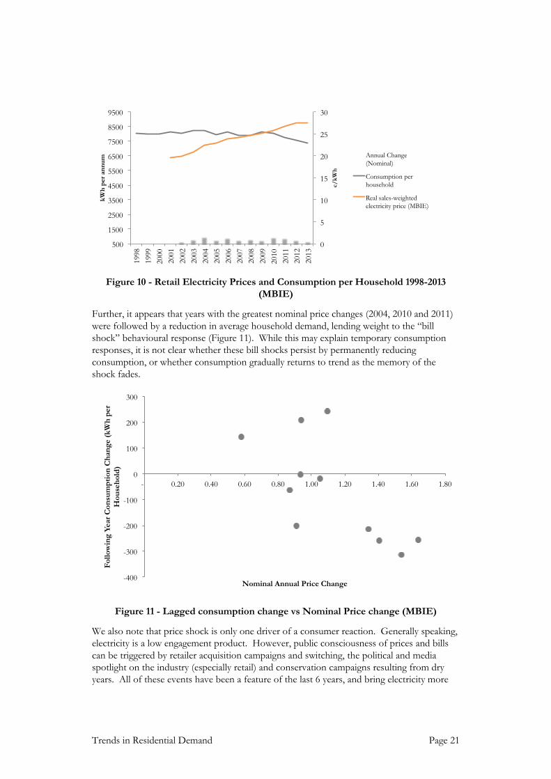
Retail electricity prices are highly political and have received some attention in the last 2-3
years. A consumer response to prices which have grown, in real terms, 41% since 2002
(88% nominal) is a plausible explanation for a reduction in demand growth (Figure 10).
33 http://www.nzherald.co.nz/business/news/article.cfm?c_id=3&objectid=11185248
34http://www.emi.ea.govt.nz/Reports/VisualChart?reportName=GUEHMT&categoryName=Retail&reportGro
upIndex=4&reportDisplayContext=Gallery#reportName=GUEHMT
35 Ibid
36 Specifically, price (income) elasticity is the percentage change in consumption for a percentage change in price
(income). Various studies suggest that the long-term price elasticity for electricity is between -0.3 and -0.7. See Fan and Hyndman, 2010, “The price elasticity of electricity demand in South Australia”, for a good summary of the international literature
Trends in Residential Demand Page 21
Figure 10 - Retail Electricity Prices and Consumption per Household 1998-2013
(MBIE)
Further, it appears that years with the greatest nominal price changes (2004, 2010 and 2011)
were followed by a reduction in average household demand, lending weight to the “bill
shock” behavioural response (Figure 11). While this may explain temporary consumption
responses, it is not clear whether these bill shocks persist by permanently reducing
consumption, or whether consumption gradually returns to trend as the memory of the
shock fades.
Figure 11 - Lagged consumption change vs Nominal Price change (MBIE)
We also note that price shock is only one driver of a consumer reaction. Generally speaking,
electricity is a low engagement product. However, public consciousness of prices and bills
can be triggered by retailer acquisition campaigns and switching, the political and media
spotlight on the industry (especially retail) and conservation campaigns resulting from dry
years. All of these events have been a feature of the last 6 years, and bring electricity more
0
5
10
15
20
25
30
500
1500
2500
3500
4500
5500
6500
7500
8500
9500
1998
1999
2000
2001
2002
2003
2004
2005
2006
2007
2008
2009
2010
2011
2012
2013
c/
kW
h
kW
h p
er
an
nu
m Annual Change
(Nominal)
Consumption per
household
Real sales-weighted
electricity price (MBIE)
-400
-300
-200
-100
0
100
200
300
- 0.20 0.40 0.60 0.80 1.00 1.20 1.40 1.60 1.80
Fo
llo
win
g Y
ear
Co
nsu
mp
tio
n C
han
ge (
kW
h p
er
Ho
use
ho
ld)
Nominal Annual Price Change

Page 22 Electricity Demand Drivers
firmly into the householder’s consciousness. Commensurately, opportunities for
conservation and efficiency will be considered.
It is tempting to conclude from Figure 10 that the period 2009-2013 confirms the presence
of a traditional “elasticity”, i.e., that rising prices led to reducing consumption. Consumption
per household dropped 10% over a period where prices rose 9%. While this elasticity is at
the upper end of those reported in international studies37, it naturally begs the question as to
why consumption stayed static over the previous period, when prices experienced a 28% rise.
Incomes
The householder’s response to a change in the retail price cannot be considered in isolation
of their economic context – income, purchasing power, and more broadly, wealth:
Firstly, a rise in retail prices may not trigger a consumption response if incomes increase at
the same rate or faster. Over the period 2002-2013, nominal average household incomes
rose nearly 45%. While this was still less than the nominal retail price rise, combined with
the gradual reduction in average household electricity consumption, it meant that average
household expenditure on electricity only grew from 2.26% of average income, to 2.45% of
average income38 (Figure 12).
Figure 12 - Average Weekly Income, Annual Power Bill and Power as a Proportion of
Income (Statistics NZ, MBIE)
The response of electricity consumption to changing incomes is complex. Holding price
constant, greater levels of income may lead to greater consumption, either through direct
additional consumption (e.g., more heating on colder days), but also through the affordability
of a greater number of appliances and other electricity-consuming devices. However, in
37 Ibid
38 Statistics NZ data suggests that Auckland experienced a greater proportional increase than the national average,
but this is for household energy costs, rather than electricity alone. However, this might (partly) explain why Vector’s per-household consumption displays a greater decreasing trend than the national average.
0.00%
0.50%
1.00%
1.50%
2.00%
2.50%
3.00%
$-
$500
$1,000
$1,500
$2,000
$2,500
1998
1999
2000
2001
2002
2003
2004
2005
2006
2007
2008
2009
2010
2011
2012
2013
Ave
rag
e W
eek
ly I
nco
me,
or
An
nu
al
Po
wer
Bil
l
AverageWeekly Income (Nominal)
Annual Power Bill (Nominal)
Power as proportion of average (RHS)

Trends in Residential Demand Page 23
recent times, the same argument applies to the replacement of existing appliances, which, as
discussed above, may usher into the home a greater level of electricity efficiency.
Intriguingly, the chart above shows that average household power expenditure has decreased
as a proportion of income over the period that per-household consumption has decreased.
This is somewhat a chicken-and-egg problem, for which there are a variety of possible
explanations:
The reduction in consumption (conservation) may have come about due to the
income constraint being hit in 2010, or
Consciousness of power price rises triggered investments in higher-efficiency
appliances which have had a consequential effect on consumption, or
Factors unrelated to price have triggered the downward trend in consumption, e.g.,
the desire to renew appliances.
Haas and Schipper (1998) considered the effect of energy efficiency on elasticity of
consumption. The authors show that, once household investment in “energy efficiency”
(new appliances, insulation, fuel switching etc) is explicitly modelled, price elasticity failed to
feature as a significant variable. This reflects the “irreversibility” of investment decisions and
the asymmetric effect inherent in elasticity; prices rises may trigger investment in energy
efficiency, but price reductions don’t result in people reversing their investment decisions.
The efficiency impacts on consumption are permanent, irrespective of the future direction of
price.
However, in their model, income elasticity then became very significant. Their conclusion is
that electricity consumption is far more responsive to income, and its commensurate ability
to fund the purchase of new/alternative appliances (which in turn has an indirect impact on
electricity consumption).
Haas and Schipper’s analysis reveals the importance of income elasticity, but did not
incorporate the additional purchasing power of income which comes about through falling
appliance prices. As outlined above, many of our energy-hungry devices are not only more
efficient, but also substantially cheaper. Hence the combined effect of greater incomes,
lower appliance costs and greater efficiency on consumption might be negative overall – for
a period.
One Australian analysis studied price and income elasticities over the period 1970 and 2012,
and found a “structural break” in income elasticity in 2005. At this break point, income
elasticity dropped from 1.0 to 0.3, i.e., prior to this point, a 10% increase in income led to a
10% increase in consumption, whereas after 2005, a 10% increase in income only led to a 3%
rise. A similar breakpoint (and reduction) in the 1980s was found for price elasticity. The
authors posit that the price elasticity reduction was due to the start of the proliferation of
energy intensive appliances (air conditioners, dishwashers), but have no explanation for the
breakpoint in income elasticity39. We would suggest that it reflects a point where income and
purchasing power driven life-cycling drove efficiency gains which offset proliferation.
39 They do suggest that the uptake of distributed generation – especially rooftop solar, which has grown from
nearly zero in 2006 to 4,000GWh in 2013 – has partly offset the drop in income elasticity. That is, rather

Page 24 Electricity Demand Drivers
Wealth
Finally, this discussion would not be complete without mentioning wealth. Beyond income,
New Zealand home-owners (and particularly Aucklanders) have enjoyed over a decade of
rising house prices. The resulting equity growth, combined with low interest rates, has led to
a substantial increase in housing investment. Notwithstanding the fact this has led to an
unprecedented level of household indebtedness, net household wealth has grown remarkably
over the first decade of the 21st century.
Figure 13 - Household Net Wealth vs Altered Building Consents 1998-2012 (Reserve
Bank, Statistics NZ)
Some of this wealth has been leveraged into renovations. Figure 13 illustrates that, for at
least the period 2000-2005, the growth in housing wealth was mirrored by an increase in
consents for altered residential buildings (a proxy for renovations). Renovations are typically
an opportunity for purchasing new appliances, heating options, lighting and bringing older
houses up to post 1978 insulation standards (or higher). Further, they can make better use
of solar gain and improve thermal efficiency through glazing.
Summary
There is not time in this paper to review the enormous – and sometimes contradictory –
literature on the price and income elasticity of demand. Irrespective, this discussion
highlights that prices, income and wealth are relevant, and highly interconnected.
It is likely that increasing prices over the past 10 years led to a budget constraint effect, and
that this effect played a role in reducing per-household consumption after 2007. However,
looking forward, the impact of moderating prices on consumption is a complex interplay of
than reducing overall consumption, consumers have substituted away from grid consumption to on-site generation.
0
5,000
10,000
15,000
20,000
25,000
0
100,000
200,000
300,000
400,000
500,000
600,000
700,000
800,000
900,000
1998
1999
2000
2001
2002
2003
2004
2005
2006
2007
2008
2009
2010
2011
2012
2013
Household Net Wealth
Renovations (RHS)

Trends in Residential Demand Page 25
many factors. If we could isolate the effect of price, we expect a stabilized price would lead
to a stabilizing effect. However, in reality, the impact of price needs to be considered in the
context of a number of other highly inter-related variables, for example:
It is possible that periodic price “events” trigger the consumption or investment
response, but only if incomes (or, more correctly, the purchasing power of incomes)
permit the investment in new technology. Further, it is not obvious that the
consumption response persists, or rebounds.
Further, the response to price takes place in the context of a broader consumer
consciousness – switching campaigns, the political spotlight, and hydro conservation
campaigns – which all bring the cost of electricity, and opportunities for
conservation and efficiency into the public consciousness. Hence a view on future
price changes is inadequate to predict future consumption response.
Income and wealth-driven renovations further accelerate the introduction of
efficiency through new technology. Moderation of electricity prices, along with
rising incomes, may – at the margin – incentivize greater investment in new
appliances (perhaps for reasons other than reducing energy consumption), as these
appliances become more affordable.
The consumption response via technology investment is permanent (since the
investment is irreversible), and behaves less like a symmetric response that the
traditional elasticity arguments suggests. Consequentially, the argument that price
reductions (in the limit) lead to increased consumption suggests that householders
have been withholding consumption (i.e., conserving energy) as a result of high prices.
While we accept that this is possible in some situations, we do not believe this is
likely to be material at an aggregate level.
Hence there is an equally plausible scenario where, under price moderation (or, in the limit,
price reductions), consumption per household continues to fall as a result of the reasons
proffered in the rest of Section 2.2, i.e., that, due to rising incomes and wealth, falling
appliance prices, and increasing efficiency, uptake of appliances (including lighting)
continues, and continues to dominate proliferation.

Page 26 Electricity Demand Drivers
3. Future Predictions
Unpacking why per-household consumption has fallen is complex. From even a cursory
consideration of the drivers we have considered, it is clear that there are many factors, and
they are often highly inter-related. For example, the growth in wealth arising from the
increase in house values has driven renovations, at which time home owners make appliance
and building envelope decisions.
We have presented an argument that residential consumption has declined due to a complex
dynamic between affordability, proliferation, life-cycling, technological advancement and
efficiency. The general theme outlined above is that efficiency has “fought” against
proliferation very dynamically. And the battle is a function of wider trends, fueled by factors
such as technological advancement, increasing income, wealth, increased energy and
environmental consciousness, retail prices and competition, and media scrutiny of the energy
industry.
We have argued how this helps explain why residential consumption was so stable for so
long. The rate of technology advancement, coupled with a slow replacement cycle and few
opportunities for proliferation, meant that this year’s household consumption was highly
likely to be the same as last years’ (adjusted for weather) – nothing had changed.
This is illustrated in a simplistic way in Figure 14.
Figure 14 - Proliferation vs Efficiency Dynamic
Below we summarise the factors we have discussed above, and the likely trajectory in the
future.
Factor Historical Trend Future Direction of
consumption
Heating and building envelope
Improved building envelopes (thermal
insulation, better solar gain) and
improvements in heating efficiency have
offset the increased heating need of larger
houses. In insulation retrofits,
householders have experienced an
increase in warmth, rather than a saving
in energy. It is possible that the average
floor area of a new house has reached a
Flat
Technological
Advancement
Wealth Increases
Technology
Prices ê
Life Cycling é
Proliferation é
Efficiency é
Consumption é
Consumption ê

Trends in Residential Demand Page 27
Factor Historical Trend Future Direction of
consumption
zenith, while there remain significant
efficiency gains in e.g., heatpump
efficiency which are likely to yet be
absorbed by households.
Lighting Improved lighting efficiency (CFLs) has
driven a reduction in lighting load. A
single CFL represents a 75% reduction in
lighting load compared to its incandescent
equivalent. Under a 10%-15% annual
bulb replacement scenario, this could
reduce household consumption by 0.9%-
1.3% per annum. Further, LEDs are now
being introduced, which will drive even
greater efficiency gains, albeit at a slower
rate
Decreasing
Refrigerators Refrigerator efficiency has increased
substantially over the last 10 years,
although appears to be levelling out.
However, even the current available
efficiency will take 5-10 years to be
absorbed into the population, which
allows for a further 14% reduction in
refrigerator efficiency. As refrigerator
consumption makes up approximately
15% of household load, we believe there
is a ~2.2% efficiency gain over the next
10 years (0.2% annually assuming no
further efficiency gains in technology),
since we doubt that much more
proliferation is likely.
Decreasing
Televisions In televisions, energy hungry CRTs have
all but been phased out due to the end of
analog broadcasting. Some early
generation plasma TVs have probably
also been replaced by high efficiency
LED/LCDs. Further, standby
regulations have eliminated standby
power in modern televisions. However,
given the affordability, TVs have probably
experienced the greatest proliferation
Flat

Page 28 Electricity Demand Drivers
Factor Historical Trend Future Direction of
consumption
inside the home, which may have offset
the efficiency gains.
Water heating We are aware that the next generation of
heat-pump water heaters is likely to begin
penetration soon. If they match the
coefficient of performance of those used
for heating space, this could hold
potential to dramatically reduce water
heating requirements.
Decreasing
Mobile electronics Likely continued proliferation, partly
offset by decreased energy requirements
as technology provides seek better battery
life through improved energy
consumption. Possibility of solar
charging.
Flat, possibly
increasing
Electric Vehicles Very small impact in
the next 5 years
Table 3 - Summary of factors influencing household demand
On balance, the factors in Table 3 suggest a continued dominance of efficiency over
proliferation40, especially since the efficiency gains are being experienced in the most energy-
hungry appliances, and proliferation in the small mobile devices. Even considering lighting
and refrigeration alone, we suspect that 1.1-1.5% per annum net efficiency gains over the
next 5 years are plausible (in the context of 1.7% over the past 4 years).
This may be partly offset by the uptake of EVs, continued proliferation of electronics and
the moderation of prices. However, we note:
Under some ambitious uptake assumptions, EVs are like to only add 0.13% to
demand growth over the next 5 years. This could, in turn, be largely offset by
uptake of rooftop solar, which is estimated to be 0.08% at current uptake rates.
40 Many of the questions about the future boil down to one key issue, for which we have little reliable data for
New Zealand: How far through the transition away from 20th century technology are we? We have used reliable
international estimates to proxy, but acknowledge this is an uncertainty in our analysis.

Trends in Residential Demand Page 29
While it has undoubtedly played some role, it is not clear the extent to which price
rises alone have driven decline of residential consumption. Real electricity prices, as
reported by MBIE, rose less than 1% in 2013, yet consumption continued its
downward trend41. The impact of price on behaviour is a complex interplay of
many variables, of which consciousness, income and wealth are important.
The net effect of proliferation and efficiency on electronic devices is not clear, but it
has not been sufficient to arrest a declining trend in consumption over the last four
years. This is despite rapid proliferation occurring over that time, and prior.
We conclude that the direction of movement in average household consumption will
continue to be downward for the next 5 years. We acknowledge that our analysis requires a
number of assumptions. We believe these are plausible, but are frustrated by a paucity of
relevant, current data on consumption inside the home.
That said, we certainly believe that our conclusions are no less plausible, and – in our view,
more likely – than a view that EVs, moderating prices and economic output will completely
offset the clear efficiency increases that are currently being absorbed into New Zealand
households.
41 Although weather played a role here too