title sequences: function with form - elsevierchapter_1.pdf · 2 chapter 1 title sequences:...
TRANSCRIPT

© 2011 Elsevier Inc. All rights reserved.doi: 10.1016/B978-0-240-81419-3.00001-5 1
1TITLE SEQUENCES: FUNCTION WITH FORM
You sit in a movie theater. The lights go down. The music and picture start. The opening titles fade in, and you know you're in for a journey! On the surface level, the primary purpose of title sequences is to accurately credit the cast and crew, or even more simply, to give the film's title. But if we dig a bit deeper, title sequences offer much more than that. In some ways, the func-tion of a title sequence is very similar to the cover of a book. It not only gives the title and relevant authorship information; it also attracts the curiosity of the audience, encouraging them to open it up and start reading.
The music of title sequences could be compared to the concert overture of a classical musical performance or opera. A typical overture precedes the main performance by introducing the main musical themes. It is like a musical call for attention, as if to say, “Everyone! We are starting now! So hold onto your seats!”
Title sequences are a powerful expression of motion graph-ics. They are a prelude to the movie. They engage the audience by hinting at what is about to start, whether it's a movie, TV show, or Web animation.
The Purpose and Functions of a Title Sequence
One of the primary functions of a title sequence is to set the tone of the movie you are about to see. Even if you didn't know anything about the movie—and whether you are watching at a movie theater, at a TV in your living room, or at your computer—you get a sense of the genre and pacing of the movie simply by experiencing the first few seconds of an opening title sequence.
Imagine watching the opening title sequence of a horror film such as Zach Snider's Dawn of the Dead (1994), created by Prologue, versus a comedy-drama such as Jason Reitman's Juno (2007), with a title sequence created by Shadowplay Studios. Or imagine watching the fast-paced sequence made by Jay Johnson

2 Chapter 1 TITLE SEQUENCES: FUNCTION WITH FORM
for David Lynch's Lost Highway (1997) as opposed to the calmer and dreamier pacing of the title sequence made by yU+co for Kevin Lima's Enchanted (2007). Even if you stumbled into any available room at a multiplex without checking the show title first, at the end of the title sequence you should know what genre you are about to experience.
Effective title sequences engage and excite the audience by hinting at some of the topics, themes, and, in some cases, the challenges that characters will be facing. The intention is to build anticipation, sometimes revealing some of the main char-acter's traits and possibly setting the stage for questions that will be answered later in the movie. Successful title sequences create an emotional reaction from the audience, leaving them glued to their seats, waiting for more.
Effective title sequences foreshadow themes of the movie without overshadowing the movie itself: They anticipate what will come later in the movie but do not give away key plot points. Title sequences shouldn't summarize the plot of the movie or give away a perpetrator's identity that is supposed to be revealed only at the ending.
Sometimes a title sequence can be designed so ingeniously that it adds additional meaning, or, even better, exposes some details that are missing from the movie or could go unno-ticed. Maybe the scenes that contained the specific details got cut; maybe the script wasn't developed enough, so the title sequences need to clarify a confusing detail; maybe the movie was taken in a different direction in the editing room; or maybe details were intentionally omitted in order to let them thrive in the titles.
At times, the most interesting and enduring title sequences offer the audience details whose significance will be revealed by the end of the movie or after a second viewing, such as the one created by Kyle Cooper for David Fincher's Se7en (1995).
While fulfilling these functions, the author(s) of a title sequence must visually capture the essence of the movie. You have an arsenal of elements at your disposal to accomplish this task. The following are some elements that as a designer and ani-mator you will have to keep in mind while beginning to work on a title sequence: • Typography • Color palette • Textures • Lighting • Camera/movement style • Editing
Functions of title sequences:
• Set the tone, pacing, and genre of the movie
• Build anticipation • Create an emotional
response; engage and excite the audience
• Foreshadow without overshadowing the plot

Chapter 1 TITLE SEQUENCES: FUNCTION WITH FORM 3
• Imagery (video footage, still images, 2D or 3D animation) • Styles/techniques (cell animation, CG animation, stop motion,
video, match moving, etc.) By carefully picking these elements, you are making a state-
ment about the look and feel of your work and carefully direct-ing the audience's emotional response toward the desired result. Before we dive into all these topics, we'll explore title sequence processes and their history.
Creative Process Overview There is no set formula on how to create an effective and
successful title sequence. Success depends on a variety of fac-tors, including objective, strategy, and the target audience of a movie.
A common tool that will help you navigate through the myriad options, keep the project on target, and avoid pitfalls is to com-pile a creative brief after the initial meeting with the client. This necessary document will help maintain the focus of your work and identify the best possible creative solution for a given client or project.
Every designer should compile this document at the incep-tion of a title sequence project and have it signed by the client. In larger agencies this document is generally prepared by a creative director and then given to the creative team, so that each mem-ber can keep the big picture of the project close by.
A typical creative brief might include all or some of the following sections: client and company/designer contact infor-mation, overview/background, objective, target audience, time-line, deliverables, and budget.
When working on larger projects that require large production teams, creative briefs could be quite elaborate and as long as 20 or 30 pages. For smaller projects, a creative brief of two or three pages is often sufficient.
To compile a creative brief, you'll want to meet with the client first, learn about the project, and then do as much research as possible. Part of this research includes: • Watching the movie, TV pilot, or series (at least once!) • Reading the treatment • Reading the script • Researching the themes and topics covered in the movie (this
includes thorough audio/visual research) Doing your homework will greatly affect your creative brief
and the successful completion of your project.

4 Chapter 1 TITLE SEQUENCES: FUNCTION WITH FORM
Creative Brief in Depth Here is a closer look at the common sections of a creative brief:
• Client contact information. Insert the client's name, phone number, and email address. Include the main contact person for this project; if there are multiple contact people, indicate the ultimate decision maker, the person who will sign off on your final project.
• Project name. Assign a name to your project (e.g., “ The Matrix opening and closing title sequence”). • Prepared by. Insert your name, role, company name, date, and contact information. • Overview/background. Provide a short overview of and background on the project. • Objective. What is/are the main objective(s) you are trying to achieve? What strategies will you utilize to achieve
these objectives? • Target audience. Describe the primary and secondary target audience. Include any relevant information regarding
demographics. • Timeline. Insert your project's milestones. These are due dates that need to be established at the start of the
project. Generally these dates are built forward in the calendar, from the actual date to the project's desired delivery date.
However, if there is already a set due date because of a fundraising event, theatrical release date, or other reason, an easy solution to determine your milestones is to work your way back rather than forward. For example, if your delivery date is April 16 and today's date is February 1, you'll need to build all the milestones backward from April to February. That will give you a rough idea of how many days or weeks you'll have to work on each of your design phases. Besides giving you more negotiating power before starting a project, having a detailed timeline at hand will help you by forcing you to create a realistic plan of what can or cannot be done.
Make sure that you reserve enough time for yourself or your team to complete the designated tasks. Most important, set deadlines for the client to provide feedback. A designer can do everything in her power to maintain her deliverables (e.g., three concepts for an opening title sequence by a set date), but if the client doesn't provide feedback (such as which one of the three concepts is the best) in a reasonable or designated timeframe, the designer is prevented from completing the next deliverable by its deadline.
• Another important step is to identify the client's deadline to deliver you a digital file with all the credits for the title sequence. More often than not, especially in smaller-scale projects, this is a task that is overlooked or left until the last minute, which could cause delays, especially when your project files require a long render time.
• Deliverables. Insert details on the exact deliverables that need to be delivered to the client, including file format, frame size, frame rate, color information, and video codec. Indicate whether there are any technical special instructions (such as alpha channels) or any practical instructions (for example, final deliverables must be sent to the film lab for a film-out).
• Additional remarks. Include any relevant information or special instructions received from the client that don't fit in the other categories. For example, you could list elements that the client wants or doesn't want to see in this project, such as specific fonts or color palettes.
• Budget. Indicate your compensation. This could be a flat fee, an hourly rate, or by accomplished task. When working for an hourly rate, indicate your estimated work hours per each milestone. It would be wise to also indicate the payment plan(s). Is there an advance? Will the payment happen after the deliverable of the final project? Or will there be multiple payments based on what's completed?

Chapter 1 TITLE SEQUENCES: FUNCTION WITH FORM 5
Typical Workflow Overview Now that you are familiar with what should be included in
a creative brief, and before moving forward, let's have a quick overview of a typical workflow. While creating a title sequence, a designer (or a creative team) will have to go through three major phases: preproduction, production, and postproduction. Each phase includes a variety of steps. These might be slightly differ-ent, depending on whether you are working for a company that has its own workflow in place or if you are working on a smaller-scale project on your own.
Typical steps in preproduction are: • Research. Perform any necessary research prior to compiling
a creative brief. Research can be carried out throughout the project, especially when researching reference images or while performing a fact or scientific check.
• Creative brief (see above) . After the creative brief is completed and approved by the client, the creative team can proceed in developing ideas, which will be consolidated into concepts to pitch to the client. A typical pitch might include a minimum of three different concepts. Each concept is generally presented to the client with (1) a treatment, (2) a storyboard, (3) style frames, and, optionally, (4) preliminary tests.
• Treatment. This is a paragraph describing the story and the look and feel of the concept. It is a good rule of thumb to sum-marize the action as it will be seen on-screen with one sentence per scene. After the description of the action is complete, you can spend a few lines talking about the look and feel of the title sequence: the color palette, textures, characters, sound effects, music, typography, camera movement, editing, and lighting.
• Storyboarding. A storyboard is a visual summary of the pre-sented concept. Storyboards consist of rough visuals (gen-erally hand-drawn) of key frames of the title sequence that summarize the story and the flow of the concept being pre-sented. By pointing at their progression, the designer can talk through the key elements of the title sequence: how the story unfolds, the main action of any characters or talent type movement, camera movement, cuts, and so on.
• Style frames. A style frame is a still frame that is 80–90% identi-cal to how the final title sequence will look. It could be created in a two-dimensional software (such as Illustrator or Photoshop) or in a two-and-a-half- or three-dimensional one (such as Cinema 4D or After Effects) and then saved as a still frame. Still frames are a necessary complement to the storyboard. Because the storyboards are generally hand-drawn, clients will have a bet-ter idea of the look and feel of the title sequence being pitched if they can see frame samples. A good number of style frames

6 Chapter 1 TITLE SEQUENCES: FUNCTION WITH FORM
ranges between 6 and 10, and ideally the frames should be picked throughout the title sequence, especially to visually rep-resent a turning point or a change in the story visuals.
• Preliminary testing (optional). If time allows, it is definitely impressive to present a preliminary test in support of one or all concepts. A few animated seconds are sufficient to give the client an idea of the direction in which the concept is going. If time allows for only one preliminary test, I'd recommend picking the idea that the designer (or team) feels the strongest about and creating a test for it.
• Pitch. Once the concepts are completed with storyboards, treatment, and style frames, they are pitched to the client. By the end of the meeting, a client should be instructed to pick one concept. Often a client likes elements from Concept #1 and others from Concept #2. The task and challenge of a title designer is to satisfy the client's request while still maintain-ing the original creative vision.
• Revised storyboards. Once one idea has been picked, the cre-ative team works on further developing the storyboard. A com-plete storyboard should include a frame for each cut, character or talent screen direction, visual cues to camera movements (including pan, tilt, dolly, ped, and zoom), title card numbering, dialogue, voice over, or any audio cues.
• Preliminary testing. Prior to devoting precious hours in produc-ing the title sequence, any appropriate preliminary testing must be done to guarantee a smooth production and post and to avoid any unexpected roadblocks. This could include testing green-screen live action keyed and composited onto animated back-grounds, any transitions that could be problematic, verifying the production and render time of particular shots, and so on.
• Animatics. Animatics are a preliminary motion animation that give a precise idea of the timing of the animation and type on-screen. The animatics could be presented to the client for approval and can be used as a guideline during the produc-tion phase to shoot or animate shots of the desired length. It is also a great way to test the animation with a soundtrack or voiceover in place, so that you can make sure that everything falls into the desired place. The animatics could be presented in the form of animated storyboards or, even better, an anima-tion that could include preliminary testing and rough anima-tion of the title sequence assets. If the title sequence requires live-action performances, you should consider shooting them (even with a low-resolution camera, without the high produc-tion value of a full crew) using substitutes for the talent you intend to cast in your actual shoot.
• Live-action shoot preproduction. Any location scouting, casting, permissions, and logistics must be dealt with around

Chapter 1 TITLE SEQUENCES: FUNCTION WITH FORM 7
this phase of the project. Depending on the scope and budget of the project, this is a step that ideally requires a full film or video camera crew. The shoot's organization and logistics can be delegated to a producer or outsourced to a production company so that the title designer can keep focusing on the testing and preproduction of the title sequence. Production:
• Additional testing. While getting ready for production, any testing that hasn't been performed must be done by now. Any unanswered questions should be dealt before beginning the title sequence production.
• Live-action shoot (if applicable). You should begin to film live action if your title sequence requires it. The title designer (or the art director or creative director of a motion design company) could act as director or even as on-set visual effects supervisor. It's a good idea to bring the animatics on set; a title designer could be involved to monitor the talent's per-formance and make sure it adheres to the action and timing of the animatics. Additionally, the cinematographer should have a deep understanding of the nature of the project so that he can frame, light, and compose the shots appropriately.
• Creating and animating assets. You should begin to create assets through illustration, modeling, and/or animation, if your title sequence requires it. If the workload is divided among various animators, modelers, or illustrators, an art director or creative director will make sure that all crew follow consistent style guides and guidelines so that the look and feel will be consistent throughout. Postproduction:
• Rough cut (offline editing). In this step everything begins to come together. Live action, animation, title cards—all should be combined in a rough cut. A rough cut is a rough prelimi-nary assembly of all assets of your title sequence, including sound.
• Fine cut (online editing). A fine cut is a refined version of a rough cut. Both editing and animation are tightened, and any placeholder assets need to be replaced with the final assets at full or “online” resolution.
• Final deliverable. This final step involves creating the final deliverable of your title sequence for your client. It could involve delivering a digital file—a QuickTime file, for exam-ple—or creating an edit decision list to conform the video to film, or even delivering an image sequence to create a film-out. You should make sure that the final project not only is delivered but also is received correctly; everything should be working, displayed, and playing back properly. Only then is your job over and you can begin working on your next one!

8 Chapter 1 TITLE SEQUENCES: FUNCTION WITH FORM
Title Sequence Positioning You now have a client. You have a movie or animation to cre-
ate a title sequence for. You have a creative brief and have started brainstorming or even storyboarding. Let's spend a moment thinking about how your title sequence could weave into the movie. The positioning of a title sequence within a movie or ani-mation is an important factor to keep in mind and will affect the execution of your title sequence. A title sequence could be positioned: • At the beginning of the movie (an opening title sequence) • In the middle of the movie (generally after the first scene) • At the end of the movie (a closing title sequence) • At the beginning and at the end of the movie (an opening and
closing title sequence) 1. At the beginning of the movie. This is a situation in which the
movie or animation is short and does not include many credits, so the end credits are omitted and opening titles are created. Typically this is the case for early silent films, independent short films, and homemade movies. Other mainstream direc-tors, such as Italian filmmaker Giuseppe Tornatore, also prefer adopting this approach; right after the main title card, they pre-fer to jump-start to the feature film instead of entertaining the audience with an opening title sequence.
2. In the middle of the movie. At times the opening title sequence could be placed in the middle of the movie, generally after the first scene. When the scene reaches its conclusion, that's gen-erally when the opening titles begin. This is the case for the title sequence made by Big Film Design for Intolerable Cruelty (2003), directed by Joel and Ethan Coen, and the title sequence of Delicatessen (1991), directed by Marc Caro and Jean-Pierre Jeunet.
This approach creates an unusual, unexpected, and direct beginning. The audience is not eased into the movie but is instead presented with a stark beginning. Only after the first scene has accomplished its goal of setting up the premise of the movie or introducing the main character can the audience relax, take a breather, and enjoy the title sequence.
3. At the end of the movie: the main-on-end titles. In the absence of an opening title sequence, the closing title sequence, also called the main-on-end titles , has a slightly different set of functions. In this case, the designer/animator will have to cre-ate such an engaging end title sequence that it will encourage the audience to keep watching instead of leaving the theater or turning their TVs off. The imagery and sound are not intended to introduce the movie but rather to create a closing statement. An effective main-on-end title sequence pulls the threads

Chapter 1 TITLE SEQUENCES: FUNCTION WITH FORM 9
of the movie together and offers the audience a moment of reflection while keeping them engaged and entertained. This is the case of the title sequence for Iron Man (2008), designed by Prologue.
4. At the beginning and end of the movie. This is the most com-mon format. The opening sequence generally includes the main title and the names of the director, director of photogra-phy, various producers, and lead actors. The lengths of these titles vary depending on the movie; they could be as long three-and-a-half minutes, as in the opening title sequence made by Pic Agency for Peter Berg's The Kingdom (2007), or as short as the 30-second opening titles for Paul Thomas Anderson's Magnolia (1999). Opening title sequences for TV shows are generally shorter, catering to a shorter-attention-span audi-ence and the tight limitations of airtime. The end title sequence generally includes all the credits from the opening titles plus the names of the rest of the cast and crew.
Title Sequence Style, Integration, and Transitions
How do you transition from the opening titles to the movie, and from the movie to the closing titles? This could appear to be a simple question with a simple answer, but it is indeed more complex. The most intuitive answer is to fade out the opening titles, then fade in the end titles. Although this is definitely a via-ble option, you should think outside the box and explore other options that could better facilitate the transition between titles to movie.
The options and eventual decision making for transitions are defined by the following factors: • How early in the production process the designer is involved.
Title designers who are involved at the very beginning of the project will have more creative options than those who start to work on the project when the movie is already completed and the picture locked. They will have a chance to discuss with the director the possibility of shooting extra footage to use in the title sequence. For example, simply shooting additional shots during principal photography, or even with a second camera crew, will provide additional footage for the designers to work with and guarantee that the look and feel decided on by the director of photography will carry through to the footage used in the title sequence.
• How much rough material is available to work with. This could be production still pictures, backstage footage, stills, footage from deleted scenes, or B-roll footage.

10 Chapter 1 TITLE SEQUENCES: FUNCTION WITH FORM
• How much of the budget is assigned to shoot additional foot-age or to create different assets. If principal photography is already completed, no additional source material is available for the title designer to use, and if the title concept that was pitched requires a video component, the title designer will need to organize a specific video shoot to get the needed foot-age. But that all depends on whether there is enough money in the budget.
• How much creative/editing power the director has already in place. Maybe the director has worked out an opening scene that has already reached the locked picture stage and she wants you to superimpose titles over it. Or maybe a scene has already been cut and the editor left space for you to animate your titles. Or maybe the director knows exactly what he needs in terms of concept, style, and execution. In this case, your creative freedom is limited, yet it's not impossible to achieve a level of quality and success. This doesn't necessarily mean you shouldn't pitch different approaches. By sharpening your presentation skills, you might succeed in steering the direc-tor's opinion toward the design direction that you think best fits the movie. The following are a few approaches to consider, whether you
are thinking of transitions from the title sequence to the movie (and vice versa) or whether you are exploring different styles and creative concepts:
Match Frame A match frame transition consists of a seamless transition
from the titles to the film (and vice versa) by matching the visual composition in the frame, regardless of their difference in styles. For example, an animated title sequence could seamlessly transi-tion via match frame into the live action of the movie. In an open-ing title sequence, the last frames of the title sequence will match the first frames of the film; the opposite happens in a closing title sequence. A match frame transition could be executed a variety of ways, but the most common are dissolving and masking or a combination of the two.
This approach requires the designer/animator to be involved at the beginning of the project. If they are working closely with the director and cinematographer, and sometimes the visual effects supervisor on the set, they will have a chance to get some test footage to see if their title sequence concepts will work as planned.
Consider the opening title sequence for Bad Education ( La Mala Educación ; 1994), a film by Pedro Almodóvar. The title cards reveal themselves, one after another, with a simple but

Chapter 1 TITLE SEQUENCES: FUNCTION WITH FORM 11
sophisticated design and artistry. The color palette consists of reds, black, and white; the imagery presents a photographic col-lage look and feel, using photographs that look like they were ripped from a magazine and photocopied larger to reveal their halftone pattern and further manipulated by handwritten notes and sketches. The look and feel of this title sequence is motivated by the fact that one of the main characters of the movie is a film director who, in search of new stories to tell in his next movie, makes newspaper clippings of odd news.
At first, the cast titles are revealed, then the main crew cred-its. The final title card is similar to the previous ones, but unex-pectedly it cross-dissolves into a full-color picture hanging on the wall. We are now gently transposed into the movie as the camera pans to the left to frame the actors in the opening scene. This transition was executed brilliantly in that the title sequence directly flows into the movie and carries the audience with it. The audience is seamlessly transported into the heart of the movie on a gentle ride, without bumps or interruptions.
Another notable title sequence is Guy Ritchie's RocknRolla (2008). This outstanding title sequence—designed by Prologue—features stylish title cards presenting each main character in a graphical sepia-and-black color palette. The camera move-ments are slick and slightly jittery, and they maximize the use of depth of field. At the end of the title sequence the camera zooms in between the last two characters to frame the main character, Archy (played by Mark Strong). The graphic look slowly fades out to reveal the exact match shot of the actual Archy, and the movie begins.
Titles Over Picture Another approach is to have a picture edit (an edited opening
or closing sequence) with titles superimposed over the picture (also referred to as being composited ). The opening scene might be a key prologue to the movie, so the designer will need to work with the material provided, rather than create a separate title sequence. Typically the director and editor have already worked on an opening scene, and they hire a title designer to create title cards that will be superimposed on the picture. If the picture is not locked, the title designer still might have some input on the picture edit and how it could work (or work better) with the titles.
In general, a live-action opening scene that functions as a pro-logue needs to come across to the audience so that they can fur-ther understand the unfolding of the movie. As a result, title cards should be simple and not too elaborate. They should not over-come the content of the footage and become a distraction to the audience.
12 Chapter 1 TITLE SEQUENCES: FUNCTION WITH FORM
This approach can be very elegant and effective in its simplic-ity. A few issues to keep in mind are readability, title placement (in two-dimensional space but also in temporal space), and the nature and quality of the footage . • Readability. The quality of the footage beneath a title card
can affect its readability (for more details, see Chapter 3 ). For example, do the luminosity or color values change dramati-cally within one shot? To solve this issue, you can explore a variety of solutions that might enhance the titles' readability. Some effective and quick solutions are as simple as adding a subtle drop shadow, an outline, or even a faint glow to your text (see Chapter 4 ).
• Title placement. The placement of title cards over footage is quite important and deserves adequate time and attention to detail. You should examine the edited footage and deter-mine whether there are any elements in the frame that are key pieces of information or other visual clues that need to come across to the audience. This could be as simple as an object or even the action of a person in the background. If that's the case, plan on placing your title cards so that they don't obscure any relevant visual information.
On the other hand, if a focal point is already established in the footage, you'll need to decide how the type articulates on the screen. Is it complementing or contradicting it? If a title complements the focal point, most likely it can be placed close to it. If it is intended to create a tension with the focal point, it can be placed far away from it, so that the audience will have to work a bit harder and longer to decipher all the elements in the shot.
How long a title is in place is important to consider as well. If you place a title card over a picture cut, it can be both visu-ally jarring and can distract the audience from the title card, so the title card might require additional screen time. That can also make that picture edit more evident and therefore less invisible and powerful. A good rule of thumb is to keep a title card over a picture shot without overlapping its editing point. It can be shorter t han or the same length as a shot but ideally not longer.
• Nature and quality of the footage. When you're examining the footage of an opening title sequence, you should pay par-ticular attention to the nature and quality of the footage. Is the footage static, jittery, or a handheld shot? Are there any major camera movements (pan, tilt, boom, dolly, track), or are there any movements in the screen (a person or a car entering or exiting the frame)? If so, you might want to explore embedding the titles in the footage so that they appear to be in sync with

Chapter 1 TITLE SEQUENCES: FUNCTION WITH FORM 13
the picture. If the footage is jittery, the titles will be jittery as well. To achieve this effect you could use a technical technique called two-dimensional motion tracking . You might also sepa-rate the titles from the footage, so if the footage is jittery, the titles stay still and the footage shakes. If there are any major camera movements or talent movements, you could attach a title to a particular movement (see motion tracking for a two-dimensional match, or match moving for a three-dimensional match) . . . or not! These are all possibilities to explore when you're creating titles. Whatever the case, you might need to work on each title card
individually to determine the best placement (without obscuring any relevant visual information), its best typographical form (to enhance its readability, depending on the background luminos-ity levels, color shifts, or content of the imagery and story), and its duration and movement (to offer an easy read to the audience by avoiding keeping a title card over a picture cut, and consid-ering embedding or molding the title into the picture when appropriate).
Alternating Title Cards and Footage Another viable solution is to alternate title cards with the
edited picture. In this case the title sequence alternates a live-action shot, then a cut to a title card, then back to live action, and so on. This approach leaves the footage pristine and unal-tered by any design or animation the title designer conceives. Each title card has a blank canvas and its own start and end time in which it can manifest as simple as static white type on black background or as elaborate typographic animations mov-ing in and out of frame. This approach is particularly effective when a musical score is already in place, so the edits can be synced to music.
In Requiem for a Dream (2000), the transitions from the open-ing scene to the main title card and subsequent editing between shots of the movie and the title cards are particularly successful, especially with the amazing soundtrack composed by Kronos Quartet.
This is a solution that allows minimal manipulation of the edited picture. In a scenario in which the footage has been shot on film, the titles can be printed directly on the film (in a pro-cess called film-out ), and once processed, the negative cutter can splice its negative together with the original film negative. When a digital intermediate is used, the titles can be provided digitally to the post-house, which will edit them with the entire sequence and then create a film-out.

14 Chapter 1 TITLE SEQUENCES: FUNCTION WITH FORM
Video-Based Title Sequence If shooting an additional live-action sequence is a possibil-
ity, you might as well have a party. Joking aside, this is probably the most desirable situation. This option gives you complete freedom to brainstorm and sketch out a variety of design con-cepts to propose to your client: footage with superimposed titles, footage and motion graphics . . . the possibilities seem to be endless.
In Park Chan Wook's Sympathy for Lady Vengeance (2005), yU+co directs a wonderful title sequence. After she has spent 13 years in prison for the murder of a boy, the heroine of the movie, Geum-ja Lee, is able to find herself a bakery job and reunite with her daughter while plotting her revenge on the man who is really responsible for the boy's murder.
The title sequence visuals alternate shots of growing rose stems and thorns animated onto beautifully photographed white hands, extreme close-ups of serrated knife blades, and close-up shots of baking. While the title cards are composed with elegant text in both Korean and English, the main title card is created on-screen out of a light stream of blood super-imposed over an extreme close-up of a hand's palm. The entire title sequence is dominated by white, minimal blacks, and red accents. The reds play a prominent role as the red of the rose flowers, droplets of blood, and red food coloring. The last shot is a close-up of a rose leaf that dissolves into an eye; the eye blinks, revealing red makeup on the eyelid, and the camera pulls out to reveal the close-up of a woman with a stark white face shed-ding a black tear, which generates the last title card crediting the director. The entire sequence is delightfully complemented by a harpsichord musical theme that is later coupled with a string orchestra.
The title sequence creates a dynamic tension between dark and light themes: The first shots that portray images of thorns, red droplets, and knives immediately evoke the feelings of dan-ger and murder that the movie later explores. But these shots are later contradicted by editing shots of a knife blade cutting a soft sponge cake, and the red—once believed to be blood—is revealed to be food coloring. The juxtaposition of the same imagery used in different contexts to evoke different meaning and emotion creates a fantastic dynamic tension—the same one that is later developed in the film itself.
For this title sequence, Art Director Synderela Peng of yU+co went as far as creating hand casts of the chosen talents, film-ing them, and then animating the typography and rose stems in postproduction as well as directing her own baking shoot to obtain the footage needed for her title sequence.

Chapter 1 TITLE SEQUENCES: FUNCTION WITH FORM 15
Case Study: Sympathy for Lady Vengeance Motion Graphics Studio: yU+co Art Director: Synderela Peng www.yuco.com
Preproduction. When we began the storyboarding process, I was very drawn to this image of a rose on a vine tattoo drawn onto the palm of the hand. During our phone call with the director Park Chan Wook (which required a Korean-to-English translator), he mentioned that he wanted to use the colors red and white. So we went forward with that simple design directive and presented two ideas. Director Park liked the vines a lot and asked for us to marry a few of the visuals from the other idea into it. The entire sequence was boarded out in detail, and once approved, we prepared for the shoot. The storyboarding phase was about two weeks (including revisions). Once the idea was signed off on, we had three weeks to shoot, composite, and deliver final. It was a quick turnaround.
Production. Sixty percent of the sequence comprised shots of the female body, painted bleach white, with these CG vines crawling and spreading. We had to go through a casting process to find a woman with a delicate hand and (per the director's request) a woman with eyes that matched the lead actress's. We ended up with two actresses. We brought in Scott Tebeau, a friend who won an Emmy for make-up in Six Feet Under , to create the casts and rigs that were needed to support the actor's bodies so they could hold these long poses without trembling and twitching.
Since we had to track the CG vines onto the bodies, it was important that there was minimal movement. Obviously, with the knowledge and the technology available to us now, it would have been fine if the bodies moved. But back then we were very restricted by our 10-day postproduction schedule and had to sacrifice some of that fluidity so as to get the job completed. The rigs and casts were crucial for that.
The supporting visual for the vines on the body was the cake. Since the movie narrative greatly revolved around the lead's experience out of jail as a pastry chef, the director wanted us to use a white cake as a metaphor for purity and introduce red for passion and vengeance. We asked another baker friend for a favor to help bake the cakes and create the white icing. There were a total of six cakes baked, followed by a lot of icing … the trick was to make sure they were heavy enough that they wouldn't melt under the lights. So none of the baked goods were edible.
We did run into a minor challenge with the shooting of the last scene. We asked (a very tall order) our eye model to cry on camera. Most of that footage looked too messy and too natural compared to our highly stylized sequence, so we opted for a clean plate and tracked a digital tear to run down her cheek. I am satisfied with the result we got but still wished we had more time to make that scene work better.
Postproduction. Once the shoot was completed, we began doing animation tests on the red vines. We used the paint effects module in Maya to generate the flowers and the crawling vines. While that was going on, the digitized footage (shot in HD with the Sony 900) was given to an editor to cut, to a Baroque trombone piece by Vivaldi. Meanwhile we started creating vine animation in Maya, followed by compositing of the vines in Shake.
I still hold this project very close to my heart because it was a labor of love. We had a small budget to work with but managed to make it work. Ultimately, anything that involves creative prop making (cakes, for example) will make for good stories.

16 Chapter 1 TITLE SEQUENCES: FUNCTION WITH FORM
Animation-Based Title Sequence In Cirque du Freak (Paul Weitz, 2009) we enter a journey
in perpetual movement. A spider web holds letters by a thread; they transform into a face whose mouth leads us into a grave-yard, which reveals the spider that evolves into the hands of a puppeteer (Mr. Tiny, the bad vampire in the movie) controlling two shadow-puppet boys as they become part of a chase scene through circus settings and surreal landscapes sprinkled with ominous trees, bats, and vampires. A tree trunk that becomes a waist and teeth becoming stair steps should be transformations of no surprise. “The journey of the two boys gave us a way to interweave all the characters they pass along the way, such as the Bearded Lady, Octa the Spider, Monkey Girl, and Snake Boy. The features of these characters are used as transitional devices that cleverly transform into other images to keep the action moving along from scene to scene,” says Garson Yu in an interview with Videography. Yu is the Creative Director and founder of yU+co, who directed this title sequence.
All along this title sequence the letters are hand-drawn as though they were engraved in wood. The film's credits are artfully woven into the animation of each title card; titles are engraved onto tombstones, they appear on the spider web threads, they are embedded in the marionettes' strings, and they interact with the boy puppets. Moreover, Yu says, “I also wanted to invent a new way of seeing how the credits behave. If you see the credits as actors on stage instead of just titles in the foreground, then we can imagine them to do anything that you want them to do as long as you direct them. They can dance and they can interact with the characters. In this case, they are truly the actor on stage with the puppets.”
Black stylized graphics and characters inspired by German Expressionist woodcut prints and paintings dominate the frames, coupled with a color palette of muted blues, oranges, and green accents. Subtle organic textures such as ink splatters are orches-trated throughout the title sequence, while the camera flows fluidly from title card to title card.
The title sequence is accompanied by a thrilling orchestral soundtrack; minimal sound effects emphasize the tension, dark humor, and ominous mood of the title sequence and the film.
Other notable animation-based title sequences include those of Monsoon Wedding (Mira Nair, 2001), designed by Trollbäck+co; Intolerable Cruelty (Joel and Ethan Coen, 2003), created by Big Film Design; Lemony Snicket's A Series of Unfortunate Events (Brad Silberling, 2004), created by Jamie Caliri, and The Kite Runner (Mike Forster, 2007), created by MK12.

Chapter 1 TITLE SEQUENCES: FUNCTION WITH FORM 17
Text as Character Panic Room (2002), directed by David Fincher, opens with
shots of Manhattan and slowly moves through New York all the way through the Upper West Side of the city, where the movie unfolds. Embedded in the shots of the city's buildings appear the gigantic titles, floating in air. They hover ominously over the city while they match the adjacent building perspectives and lighting, giving the impression that they are not merely “guests” of the scenes; they have actually gained an important role in it. Not only do they look like they belong to the city's architecture, but their prominence and stance in the frame almost suggest that they are treated as talents on-screen. Computer Cafe artist Akira Orikasa explains: “The titles themselves are constructed and fit so that they appear to be real and near but not attached to building façades. It was important to light and composite them so that the light shining on each title matches the lighting in the scene.”
Because most of the film takes place in a claustrophobic inte-rior location—the house that gets broken into, and its panic room—this opening title sequence, which features these vast exterior cityscape shots coupled with menacing titles, not only creates an interesting contrast but visually introduces the themes of this impenetrable architectural structure where the movie will unfold, while emotionally introducing the tense mood the audi-ence will experience in the film.
William Lebeda, Picture Mill's creative director, explains in an interview with DVD talk: “[Fincher's] main concern was to add some scope to the film. It starts outside in the middle of the day, but the bulk of movie takes place in the middle of the night over a short time inside the house. A lot of it takes place inside the panic room. He really wanted to have a sense that it's in New York. It ends outside as well, so he really wanted to bookend the film outside.”
Picture Mill and Computer Cafe worked together to create this powerful and elegant title sequence. David Fincher had the idea to use type, maybe floating in air. So, Lebeda digitized some of the production stills, and after importing them into 3D software, he added type in a variety of perspectives and fonts while keeping Fincher's inspiration in mind throughout the process.
After the title sequence's concept was approved, Fincher's production crew left for New York to shoot the production plates, and they returned with a variety of high- and low-angle shots. The sequence was edited in a rough cut and the typographical ele-ments had begun to be composited, but Fincher wanted to create some camera movements that didn't exist in the original footage, so the team realized that some of the shots needed to be recon-structed in 3D. Computer Cafe utilized IMAX still pictures of the

18 Chapter 1 TITLE SEQUENCES: FUNCTION WITH FORM
building—which were shot as a reference for the building in the background, in case they needed to be recreated—in a technique called photogrammetry . This method allowed them to reconstruct the geometry of the buildings in 3D and then move the camera around them. The final title sequence resulted in a combination of original film footage and 3D textured objects.
After considering a number of typefaces, the chosen font for this title sequence was a modified version of Copperplate because “It looked more like New York. That font fit the build-ings better and didn't take away from them. It looked important,” explains David Ebner, president and digital effects supervisor of Computer Cafe.
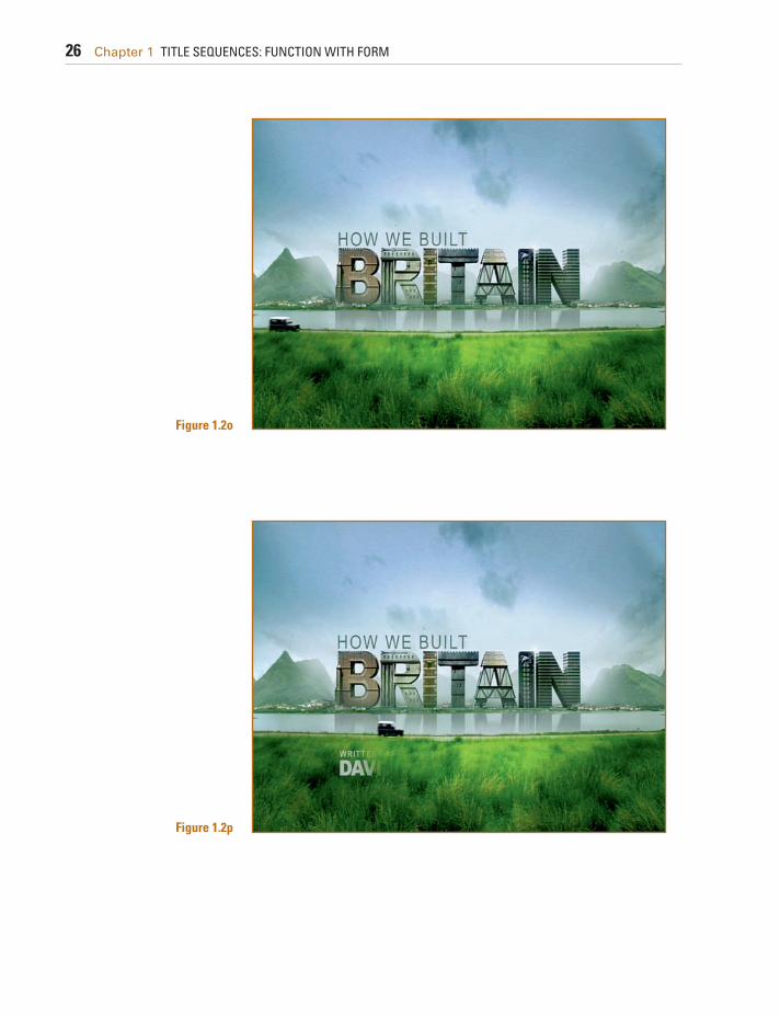
Combining Footage and Motion Graphics Gareth Edwards directs a gorgeous title sequence for the BBC
series How We Built Britain (2007). As far as the creative process, he proposed eight different concepts, which didn't quite win the client over. By the end of the meeting, with an increased under-standing of the scope of the project, Gareth pitched the winning idea: designing the letters of the show's title as buildings spread across Britain's landscapes. The letters would showcase the architectural styles explored in the series that spanned a thou-sand years of British architecture: medieval castles and churches, Scotland's buildings, Georgian houses, Victorian buildings, and modern skyscrapers.
Figure 1.1 Title Card from "Panic Room" (2002).

Chapter 1 TITLE SEQUENCES: FUNCTION WITH FORM 19
Gareth sifted through BBC's aerial video footage and selected some shots that would be appropriate for the concept. He tracked the footage using Boujou and composited on it the modeled and textured giant 3D letters he created with 3D Studio Max.
Figure 1.2b
Figure 1.2a Title Cards from "How We Built Britain" (2007).

20 Chapter 1 TITLE SEQUENCES: FUNCTION WITH FORM
Figure 1.2c
Figure 1.2d

Chapter 1 TITLE SEQUENCES: FUNCTION WITH FORM 21
Figure 1.2e
Figure 1.2f

22 Chapter 1 TITLE SEQUENCES: FUNCTION WITH FORM
Figure 1.2g
Figure 1.2h

Chapter 1 TITLE SEQUENCES: FUNCTION WITH FORM 23
Figure 1.2i
Figure 1.2j

24 Chapter 1 TITLE SEQUENCES: FUNCTION WITH FORM
Figure 1.2k
Figure 1.2l

Chapter 1 TITLE SEQUENCES: FUNCTION WITH FORM 25
Figure 1.2m
Figure 1.2n
26 Chapter 1 TITLE SEQUENCES: FUNCTION WITH FORM
Figure 1.2o
Figure 1.2p

Chapter 1 TITLE SEQUENCES: FUNCTION WITH FORM 27
The sequence begins with a view behind a Jeep starting a jour-ney on a desolate road. As the orchestral score builds and the cuts begin to be synced to music, we see a wide shot of an odd castle. Just to clear any doubts, the camera cuts in to confirm that what we are seeing is indeed the letter B. All other letters, R-I-T-A-I-N, are slowly revealed across the landscape in a variety of architec-tural styles that increasingly become more modern.
Throughout the piece we do not lose touch with our Jeep, which, as a narrator, is guiding us to explore all these landscapes and buildings in first person. The use of point-of-view shots from inside the Jeep reinforces the feeling that it is indeed the viewer who is the hero conducting the journey; this technique projects the audience into the story—not as a spectator but as the story's hero.
The final shot reveals the entire title BRITAIN , composed of the individual letters/buildings arranged neatly in a British sky-line, while our Jeep crosses the screen, revealing the director's credit.
Other notable title sequences that employ video and motion graphics include Run, Lola, Run (Tom Tykwer, 1998) and Stranger Than Fiction (Marc Forster, 2006), created by MK12.
Escamotage: Alternative Transitions A clever example of a nontraditional transition between the
title sequence and the movie is the one created by Imaginary Forces for the movie Dead Man on Campus (1998), directed by
Figure 1.2q

28 Chapter 1 TITLE SEQUENCES: FUNCTION WITH FORM
Alan Cohn. This film is a dark comedy that centers on two stu-dents who, after learning about a college clause stating that if your college roommate commits suicide, you are awarded A's for the semester, decide to find the most suicidal student on campus to live with them.
This title sequence, led by creative director Peter Frankfurt and art director Karin Fong, revolves around a SAT (Suicide Aptitude Test), an exam in which the film's credits are embedded among the multiple-choice questions, diagrams, and illustrations, created by Wayne Coe. The visual imagery and text formatting are with-out doubt reminiscent of the college test iconography, and the sequence progresses fluidly from one title card to the next, repro-ducing typical suicidal scenarios coupled with multiple-choice questions, wrapped in a comical veil that preludes the dark com-edy themes of the movie. Shots are tightly edited on the beat of a soundtrack by Marilyn Manson, whose lyrics hint at the irony of the title sequence. The color palette consists of the white back-ground of the test paper, black type, and orange text accents and a blue background of the main title card.
One of the powerful aspects of this title sequence is its transi-tion. By the end of the test—after the last title card dedicated to the film's director—we see a stop sign coming to full screen, we hear a camera-flash sound, the screen flashes to white, and we see the first shot of the movie, a close-up of a student whose pic-ture is being taken for a library card. This transition has a strong audio and visual component that directly catapults the viewer from this animated title sequence into the live action of the movie, without a blink.
A Story Within a Story In other situations, opening titles need to provide a bridge
between the audience and the film. There is nothing more frus-trating for an audience than to be distracted, especially during a documentary, because they don't know the background suf-ficiently to follow the story. Creating an opening sequence that offers the audience a basic historical or cultural background needed to properly enjoy the movie often bridges this gap.
Take a look at the title sequence of The Kingdom (2007). This Middle East action thriller directed by Peter Berg needed an open-ing title sequence to set up the movie and give it a political and historical context. Berg commissioned Pic Agency to handle the task. Creative director Jarik Van Sluijs, art director Stephan Burle, and producer Pamela Green created a 3-minute, 20- second open-ing title sequence presenting an audiovisual historical excursus of the controversy between Saudi Arabia and United States over oil during the last 80 years.

Chapter 1 TITLE SEQUENCES: FUNCTION WITH FORM 29
This sequence summarizes the political and historical events that unfolded from 1932 to 2001 by editing archival audio and video footage, by animating motion graphics summarizing key plot points, and by elegantly displaying simple typography on-screen. Nervous upbeat music underlines seamless transitions from video footage to three-dimensional graphic imagery, maps, graphics, timelines, charts, and pull quotes on-screen. The color palette of this title sequence focuses on desaturated reds, greens, and yellows; these muted colors help to not only achieve a his-torical look but to maintain a uniform look between all the dif-ferent source video footage sizes and compressions, from VHS to 16 mm.
Producing this opening sequence took nine months. Pic Agency wrote their own script and dedicated countless hours to researching archival audio and video footage. Once the 128 shots were selected, it took another long effort to obtain their clear-ances, from CNN to the Saudi Arabia government. They even per-formed additional interviews for the sequence's voiceover.
It is clear that this opening title sequence contains the essence of motion graphics and filmmaking: storytelling, entertaining, information, and design. “Symbolize and summarize,” as Saul Bass said. By the end, this opening sequence has offered the audience the necessary information in an exciting and compel-ling way. They are now ready for the film to begin.
Other notable “story within a story” title sequences include Catch Me If You Can (Steven Spielberg, 2002) and Lord of War (Andrew Niccol, 2005).
Pulling the Threads The end titles for An Inconvenient Truth (2006) are one-of-a-
kind. This powerful documentary, directed by Davis Guggenheim, deals with the issue of climate change and global warming. Al Gore plays a central character as he reveals necessary informa-tion through his traveling public presentations, interviews, and reflection on his life and politics.
After watching this emotionally compelling film, most viewers might ask themselves the question: “Yes, but what can I do?” And the answer is provided by the end titles. Elegantly designed by yU+co, the end titles provide practical tips on what to do to start positively affecting climate change on an individual and com-munity level. Suggestions such as “When you can, walk or ride a bicycle” are interspersed with the film's credits, to a soundtrack of Melissa Etheridge singing “I Need to Wake Up.” Transitions from one title card to the next are elegantly executed by leaving a few letters on-screen a bit longer so that they become part of the next title card.

30 Chapter 1 TITLE SEQUENCES: FUNCTION WITH FORM
This end title sequence successfully pulls the threads of the movie. Weaving its functional aspect (crediting cast and crew) with a call to action, this end title sequence complements and enhances the movie's themes in a brilliant way. It encourages the audience to reevaluate their daily behaviors and offers practical solutions to positively impact the future of our planet.
Conclusion Imagine that you've been hired at the last minute to create a title
sequence. The picture is locked and there is no additional footage, no still pictures, and no money to shoot additional footage. Even though you might feel that your hands are tied, there is always a solution to a given problem. Sometimes it might not be exactly as you originally imagined if you didn't have these limitations. Don't feel discouraged; when you have a limitation, that's when your survival instinct takes over and, with a bit more effort, you will be able to provide your client with an original solution. Sometimes the solution might come after a few days, sometimes overnight, but it will come to you if you don't give up and if you try all possible avenues with the time and resources you have available.
Opening and Closing Titles When you are starting to work on your opening titles, you might
want to organize the credit information you receive from the cli-ent and begin a rough sketch of how the titles will unfold over time (also called animatics ). The following terminology and concepts will help you organize your work and facilitate the communica-tion between you and your client. When we talk about a title card, we refer to a screen that displays the credit information of the cast and/or crew. Titles and title cards can be distinguished as follows: • A single title card contains one name credit. A single title
card is typically used in opening titles to display the name of the lead actors and the creative people involved in the movie (director, producers, writer, cinematographer, composer). These are generally referred to as the above-the-line credits.
• A double title card contains two name credits. A double title card typically is used to display the names of supporting actors and additional creative people involved in the movie.
• A triple title card contains three name credits. A triple title card is typically used to display the names of additional supporting actors.
• A multiple title card contains more than three name credits. A multiple title card is typically used to name additional supporting actors or extras.
• A main title card displays the main title of the movie.

Chapter 1 TITLE SEQUENCES: FUNCTION WITH FORM 31
• Scrolling titles are titles that move sequentially in and out of frame, generally used as end titles. End scrolling titles usually repeat the credits of the opening titles (the talent credits of the opening titles are reorganized either in order of appearance or alphabetically) and then display the below-the-line full crew and cast credits: the special effects, props, soundtrack, equip-ment and location rentals, film stock, and so on. A title designer can create the design and layout of the text blocks, but if digi-tal scrolling titles are needed (as opposed to a film-out), some companies in Hollywood specialize in digital scrolling titles that avoid flickering type and look nice and smooth.
• A lower third is a title placed on the lower-third of the screen (although there might be other screen placements you could consider), generally used to display the information—name and title—of a person being interviewed or a location.
• Subtitles are titles placed on the lower-third part of the screen (or sometimes on the top of the screen to avoid covering rel-evant information on-screen or previously existing lower thirds). These are generally used to translate dialogue in another language.
• Intertitles are title cards that display the time, place, prologue, or quotes. In silent films, an intertitle is often used to convey minimal dialogue or information that can't be deduced from the talent's body language or the scene's settings.
SINGLE TITLE CARD
Mac Guffin
DOUBLE TITLE CARD
Nick PorterBelinda Stern
TRIPLE TITLE CARD
Charlie GregorKen Lee Smith
Giovanni Stura
MULTIPLE TITLE CARD
and with:
Charlie GregorKen Lee SmithMike LeeGiovanni SturaNick PorterBelinda Stern
INTERTITLE CARD
In the center of Metropolis there was a strange house, forgotten by the centuries.
MAIN TITLE CARD
FILM TITLE
Charlie GregorKen Lee SmithMike LeeGiovanni SturaNick PorterBelinda SternMac GuffinRosetta LangCarrie DonovanMelinda ArabesAlexander ShinePickle
CharlieBen
SethCousin
Little cousinAunt FloNeighbor
Neighbor’s daughterFriend #1Friend#2Friend#3
Dog
SCROLLING TITLES LOWER THIRDS
Charlie Gregorproduction coordinator
SUBTITLE
“We all go a little mad sometimes.”
Figure 1.3 Title card examples.

32 Chapter 1 TITLE SEQUENCES: FUNCTION WITH FORM
Depending on the type of movie you are working with (home movie, independent flick, Hollywood movie, or something else), the order in which the credits in opening and closing titles appear on-screen and their font size, especially in large-budget produc-tions, are greatly determined by the talent's contracts, union con-tracts, and industry conventions. The designer will have very little (if any) say in that. For example, a clause in a talent's contract might dictate that his credit shouldn't be in a smaller font size than the one of the main title card. A different clause in another talent's contract might dictate that her title card be the first one, regardless of who else acts in the film.
Also, depending on the film's domestic and international dis-tribution, you might have to composite different studio logos at the head of your title sequence. Or you might even have to deliver a version of your title sequence without any text so that English titles can be replaced by titles in another language.
As you're approaching designing a title sequence, you should obtain any pertinent information about the talent or distribution contracts that might affect the title cards' order or text size.
Avoiding Typos Typos are the one mistake you want to avoid while working on a title sequence. After you worked long and hard on
a film or a TV show, would you want your name to be spelled wrong? I don't think so. The following are a series of tips that will help you avoid a number of headaches and keep your clients happy. • Ask the client to give you a digital file containing the typed credits of the movie, with numbered title cards. For example:
1. XYZ logo 2. ABC logo 3. DFG production presents 4. A film by First Name Last Name 5. With First Name Last Name 6. And First Name Last Name … and so on.
• Avoid typing anything else; use only the typed information with which you've been provided. • Copy and paste the names from the file the client provided you with into the software you're using to create the title cards. • Check the titles often for accidental letters you might have inserted from using common keyboard shortcuts (for
example, in Illustrator, watch out for extra t 's from using the Type tool or v 's from using the Selection tool). When you are pasting your title card text in your software and then pressing a keyboard shortcut, it's possible that instead of changing to a different tool you are actually typing an unwanted letter in the text box.
• When you're ready to show your title cards to your client, send the actual stills of your project file for review. Don't send an early version or alternate versions; simply send the stills taken from the latest version of the actual project you are working on. There are a number of quick ways to accomplish this task. You could take a snapshot of the title cards directly from the software interface or from your rendered QuickTime file, or you could even export a digital still frame from your software and then email or fax it to your client for approval.

Chapter 1 TITLE SEQUENCES: FUNCTION WITH FORM 33
The Video and Film Workflow Depending on whether your movie has been shot on film,
video, or CG animation, there are a number of possible workflows though which you will be able to deliver an accurate, foolproof title sequence that will match the client's desired specifications. To make an informed decision on the right workflow, when you're beginning to work on a title sequence you must ask your client these simple questions, the answers to which will better guide you in the creative process: 1. What is the source format? If your title sequence requires the
use of previously shot video or film footage, you must find out its source format.
2. What is the deliverable format? Knowing the destination and platform of your title sequence at the inception of your project will determine a variety of factors, including the size and resolution of your project, aspect ratio, and frame rate, to mention a few. If your direct client or contact person doesn't know the answers to these questions, find people working on this project who do. Here are a few tips that will help you through your project:
1. Any assets produced for the title sequence must be created at the adequate frame size. If you need to hire a photographer or videographer to shoot additional assets, you need to commu-nicate to them the resolution at which they need to be shot. If you are planning to do some work that requires panning and scanning in postproduction, you'll need to shoot at a higher frame size than the final output size.
Table 1.1 Common Frame Sizes
Width (Pixels)
Height (Pixels)
Screen Aspect Ratio
Description
640 480 4:3 An early standard for analog-to-digital video editing 720 480 4:3 NTSC DV and DVD image dimensions 720 486 4:3 NTSC SD video dimensions used for professional digital formats such as
Digital Betacam, D-1, and D-5 720 576 4:3 PAL SD video dimensions used for digital formats such as Digital Betacam,
D-1, and D-5 as well as DVD and DV1280 720 16:9 HD video format1920 1080 16:9 Higher-resolution HD video format1828 1332 1.37 Cineon half resolution3656 2664 1.37 Cineon full resolution2048 1556 1.32 Film 2K resolution, used when printing half resolution onto 35 mm fi lm with
a fi lm-out recorder; it offers a more affordable price than 4K resolution4096 3112 1.32 Film 4K resolution, used when printing high resolution onto 35 mm fi lm
with a fi lm-out recorder

34 Chapter 1 TITLE SEQUENCES: FUNCTION WITH FORM
2. Have your client decide early the exact deliverable (frame size, compression, frame rate). If you need to create graphics and animated type that require rasterization, you need to start working at an adequate resolution for the requested deliver-able. A common obstacle that you could encounter is when clients—especially ones who are going through this process for the first time—don't make up their minds about what the final output will be. Working with large formats takes time and money; you'll need extra hard drives to store the footage and rendered animation, and you'll need to budget extra time for rendering—so you will want to avoid working at a higher reso-lution than necessary.
For example, if you start working on sketches and creative proposals at an SD (Standard Definition) resolution and the client decides in the middle of the project that they also want an HD (High Definition) version, the SD frame size will be too small and will require you to start working on a larger frame size from scratch. If this situation ever happens to you, keep in mind that the deliverable should be one of the sections in your approved creative brief. So if the client changes their mind dur-ing the production of your title sequence, you will most likely be able to negotiate a fee for the additional work.
The general rule of thumb is to ask your client to indicate at the beginning of the project the exact format(s) of your final deliverable (DVD, video for Web, film). If the client is unaware of the exact specification, you should absolutely contact the
2K 2048x1556
4K 4096x3112
NTSC SD 720x486 pixels
HD 1280x720 pixels
HD 1920x1080 pixels
Figure 1.4

Chapter 1 TITLE SEQUENCES: FUNCTION WITH FORM 35
film lab, the postproduction company, or the programmer (if working for the Web) and find out that information.
3. Work at the highest resolution required for your project. If your client indicates that the final title sequence will need to be delivered in multiple formats for a variety of platforms (Web, DVD, theatrical release) you must work at the highest resolu-tion needed for any of the deliverables. Similar to the print design world, motion graphics can always be scaled down and maintain their quality; when they are scaled up they lose their sharpness and quality unless you are working with line-art graphics (see Chapter 4 ). If the multiple formats requested by your client include
versions with different aspect ratios (e.g., letterboxed HD and 4:3 SD), make sure that you clarify with your client whether the HD version will be cut on its sides to create the SD version or not.
SD 4:3
HD 16:9 (scaled down to match the SD height)
SD 4:3
HD 16:9 (scaled down to match the SD width)
Figure 1.5 High Definition and Standard Definition aspect ratio comparison.

36 Chapter 1 TITLE SEQUENCES: FUNCTION WITH FORM
If so, you will need to clarify with your client whether you need to create two different title sequence versions (one for HD, the other for SD) or if you need to create only one title sequence that will work for both the HD and SD versions; in this case the titles will be designed a bit more centered on-screen, not reaching the right and left margins to avoid being cut off during the HD-to-SD for-mat conversion.
Film Process and Transfer: The Digital Intermediate Process
Digital intermediate (DI) is a process that might be neces-sary while working on your title sequence if your project requires transposing your source footage from one medium to another—from digital video to film, for example, or from film to video and from film to digital, then back to film.
A typical digital intermediate workflow consists of three steps: 1. A film scanner scans the original film negative frame by
frame. A typical scanner, such as the Arriscan, flashes each frame with a red, green, and blue light, and each frame is cap-tured on a sensor as a “raw” file that is uncorrected. Based on an EDL (edit decision list) provided by the editor, the film scan-ner is capable of identifying and selecting each original roll of film to find the exact start and end frame of each needed shot. The scanning process varies from facility to facility and might offer a variety of image resolutions (2K, 4K, 6K; the higher the value, the sharper the image) and color bit depths (such as 10 bits per color channel). Each scanned frame is then recorded onto a hard drive and is numbered sequentially.
2. The image sequence is conformed and manipulated. The scanned film frames are delivered to the title designer as an image sequence so that titles can be composited over the foot-age. This is also the appropriate time to perform any necessary special effects or color corrections. Look-up tables (LUTs) are frequently used to make sure that the footage will match both the digital projector and the print film stock of choice. Once all the manipulation is completed, the image sequence needs to be prepared and exported so that it can be printed back onto film.
3. The image sequence is printed back onto film (film-out). This step involves the use of a film printer, which reads the informa-tion of each digital frame and uses a laser to engrave it frame by frame onto a film roll. Depending on the project you are working on, there might be
slight variables to this workflow. For example, if you are working on an opening title sequence that requires titles superimposed

Chapter 1 TITLE SEQUENCES: FUNCTION WITH FORM 37
Table 1.2 General Video and Film Workflows
Source Working Format/Process Final Deliverable
1. Digital video Digital video Digital video2. Film Digital intermediate Digital video3. Film Digital intermediate or fi lm Film4. Digital video Digital video Film
over the picture, a film lab will be requested to scan only the opening sequence (rather than the entire film!) so that once you complete your job, the sequence can be printed back onto film and spliced with the rest of the original negative.
Also, depending on the project, the digital intermediate could be performed only through its first part (film scanner scans the original film) or its latter one (film printer prints onto film).
Table 1.2 will help you understand the general video and film workflows while working on your titles.
1. If your source is digital video and your final deliverable is digital video, your best bet is to work in digital video as well. Before you begin working on your title sequence, you should make sure that the source footage is of equal or higher image resolution than your final deliverable. If your source footage is lower resolution, you must immediately notify your client that higher image resolution footage is needed to avoid the final deliverable being blurry or pixilated—unless your creative plan is to heavily manipulate the source footage so that the low quality of the footage will be unnoticed.
2. If your source footage is film and your final deliverable is digital video, you must go through the first half of the typical digital intermediate workflow. The film will need to be digitized and delivered to you so that you will be able to start working on it at your workstation. When the titles are completed, you can export the final digital deliverable using the requested frame size and codec.
3. If both your source footage and your final deliverable are film, you could either remain in film or go through a digital intermediate workflow. If your client decides to continue to work in film, two options are to (a) create titles with an animation stand, shoot them on film, and then splice them onto the film's

38 Chapter 1 TITLE SEQUENCES: FUNCTION WITH FORM
negative, or to (b) create titles (either handwritten or com-puter-generated), shoot them on film, and then go through an optical printing process that will allow you to superimpose your titles directly onto the film footage. If, on the other hand, your client has allocated enough budget to go through a digital intermediate, the footage needs to be scanned and delivered to you as an image sequence. Once digitized, the titles can be created, animated, and, if needed, composited over the digital footage. On completion, the titles need to be exported again as an image sequence so that each frame can be printed back onto film.
4. If your source footage is digital video and your final deliver-able is film, you must go through the second half of the typical digital intermediate workflow. You should make sure that the source digital video footage you are provided with is of a suf-ficient frame size to print on film without incurring any qual-ity loss (typically either 2K or 4K resolution). Before you begin working on your title sequence, make sure that you contact your client, the postproduction facility, or the film laboratory that will print the image sequence back onto film, to verify the resolution, file format, color bit depth, and any other file spec-ification they require the image sequence to be delivered in. Printing at 2K or 4K resolution will result in a considerable bud-get difference, so this decision will most likely need to involve the client, the studio, or the distributor. There are many variations of film and video frame size when
you begin to add codecs and frame rates, transferring from film to video and vice versa. Conversions could become a bit of a head-ache, especially when dealing with 3:2 pull-down (when convert-ing 24 fps to 29.97 fps) and its removal or reverse pull-down (when digitizing footage from an NTSC tape at 29.97 fps but you need to work at 24 fps so that you can output to film). The headaches immediately cease when: 1. You work entirely in a digital system. For example, suppose the
film was edited in Final Cut Pro and exported to After Effects via the Automatic Duck plug-in. The edits are preserved and there is no need for frame rate conversion.
2. The film has been scanned at a postproduction facility and you receive a 24 fps digital image sequence. You can create titles and then re-export a 24 fps image sequence to be output onto film. For more information on this topic, refer to Creating Motion
Graphics with After Effects , by Chris and Trish Meyer (Focal Press, 2007).
Chapter 1 TITLE SEQUENCES: FUNCTION WITH FORM 39
Interview Rock Ross: On Making Film Titles for Independent
Filmmakers Rock Ross is a title designer, independent filmmaker, and musician living and working in San Francisco.
He has created thousands of titles for independent films, shooting directly on film using his own animation stand, without even touching a computer. He has screened thousands of independent short films in his New Nothing Cinema and scored a number of films with his band, The Goat Family.
“It's more satisfaction if it's a hard job and you do it anyway, and quickly deliver those good-looking titles.”
What originally sparked your interest in filmmaking and film titles? I started making films when I was about 12, using my dad's regular 8 mm Bolex, which he was using to shoot home
movies. My sister and I started doing scenes ourselves, filming each other for fun, and acting like little hams. And then I started making longer films with my friends, playing reel-to-reel tape recorder soundtracks with them.
I went to Mercer University in Macon, Georgia, where I received a degree in history with a minor in art, and then I went to the San Francisco Art Institute, to the undergraduate and graduate school of filmmaking, where I received a BFA and an MFA. I was educated by film artists on art film, mainly; it wasn't a vocational school but ended up being my vocation.
I started off doing location sound recording, and it was unpleasant because I had to travel to film locations and deal with a lot of stressful people; I didn't enjoy it. I liked sound recording but I didn't enjoy working on crews. I started working on titles because I didn't have to go anywhere; I could sit in a room and work on titles whenever I wanted.
How does your life experience influence your work? I get to see lots of work, lots of independent work, since we have a little cinema here in the building, the New Nothing.
So I've seen thousands of short experimental works since 1971. That has influenced me: what not to do, what I don't want
Figure 1.6 Rock Ross.

40 Chapter 1 TITLE SEQUENCES: FUNCTION WITH FORM
to see, what works really well, when someone overdoes it, when it wears out its welcome, and when it's just right. When that works—when it's just right—it's sublime and transcendent. That's what remains with me—the good stuff.
Can you talk about your creative process when working on titles—from the early inspiration through development and to the final deliverable?
Usually filmmakers have a pretty good idea of what they want. Very often they direct you, or they will have an art director who will direct you, and I just follow the directions they give me or use the artwork they give me. When they have the artwork for the titles all done, ready to go, they might simply email it to me and tell me: “I want this seven seconds, no fades.” I want them to give me a log, the order they want me to shoot them in, how big they want the titles in the frame, if they want a colored gel, if they want white type on black or red on black, for example.
Sometimes some people say, “I just want simple titles, white on black, here they are. Easy to read. I want them to be TV safe.” And that's it. They won't tell me what their film is about; they'll say, “Shoot each title 10 seconds long and I'll cut them and I'll do the fades, and I'll decide how long they are going to be.” Sometimes I don't even meet the filmmaker; it will be over the phone or email. They'll just email the file, their credits and titles, and I get to pick out the typeface, the typesetting, and shoot the titles.
But sometimes people give me a lot more creative freedom. They might say: “This is what I want, help me realize it. Here's the theme, here's the mood, here's the music I want for the main titles. You can be creative and make something dynamic, and make something subtle.” And that's always fun to do. For example, I could do multiple passes, like having titles burn in on top of objects that are from the film: a leather jacket, or a bowl of onions, a wall, a knife or a gun, or a tire.
That's fun, laying an object down on the animation stand, like a leather jacket, and lighting it creatively with gels, and leaving a spot for the title to burn in and out of.
Or to go and shoot something that you know is going to be used for the titles. You go and shoot it with a precise plan in mind, then come back to the studio, and without processing it, you back up the film and burn in the titles on top of the live action that you've shot: that can be incredibly inexpensive and really satisfying. It's great to make something that looks good and satisfying to the filmmaker.
Figure 1.7 Rock Ross examining a 16mm film at his light table.

Chapter 1 TITLE SEQUENCES: FUNCTION WITH FORM 41
Can you elaborate on your creative process when you are given total creative freedom? If a filmmaker wants me to do the creative part of the titles, I'll ask them a lot of questions. I want to see their film's
work in progress, so I can study the colors and the mood of the film and try to accentuate that mood, or complement it, expand the mood of the music or of the opening scene. I need to get a feeling for the film, so I can pick a typeface and make the titles look right. Also, I pay attention to the pacing of the film—if it's moody or if it's peppy.
If someone is thoughtful, they can save themselves lots and lots of money by giving me a perfect log saying exactly how long the screen should be black, when the titles should pop on, how long they should be up, how long fades should be.
If they can give me a log like that, they've saved themselves many hundreds of dollars, instead of saying, “Shoot each one 10 seconds.” They should just ask me to edit the titles in camera and then they're done. And for the end title crawl they should know how long they need them to run.
Can you talk about readability when you are working with your title sequences? As a screen time guideline for readability, I generally calculate about a second per word, not including articles—the
a 's or the 's or is 's. The most important thing is that the titles can be read. Why have information up there if you can't read it or if it's
gone too quick or if it's too tiny to read or if, when they transfer it to video or digital, it starts falling apart? I like simple, clean fonts that are easy to read
and big and bold when they are up there on-screen. If they are going to burn through objects, they must burn through well, nothing too delicate or stylized that is hard to read. They shouldn't have elements that are too fragile. If you expose the film stock for the fragile elements of the titles, the big ones become bold and hot, and if you expose for the bold elements, the fragile ones fade out and they are almost indecipherable. Titles have to be clean and neat, I think—nothing too stylized.
For the titles of my own films, very often I use a tip and I scratch them directly into the film's emulsion, so they appear to be panning across the frame. I like that look. And it's easy to read, too, it's like scanning down a sentence.
Do you work on your titles with the score/soundtrack already in place? If so, how does that affect your work?
If the filmmaker has the music in mind that sets up the mood of the film, I can listen to that music and try to shoot the titles so that they are a complement or a juxtaposition of the music.
If there's peppy, wild music, sometimes it's nice to have slow, atmospheric titles. Sometimes it's nice to have a surprise, to have it be a different look. They seem
to complement each other if they are different looking. Figure 1.8 A film strip from “Thoughtless”, a 16mm film by Rock Ross made with press-type and hand painted.

42 Chapter 1 TITLE SEQUENCES: FUNCTION WITH FORM
And sometimes the opposite can be very effective, too. Sometimes it's nice to have peppy titles and peppy music. You can do all kinds of nice stuff—popping titles on with a slow fade-off, and you can cut right to the beat.
Do you do any preliminary tests before you shoot your titles? I've been designing titles for so long, I don't have to shoot preliminary tests anymore unless it's something I've
never done before. I've got tests for all types of situations, both in 35 mm and 16 mm film: top lit and bottom lit, and any combination of top lit and bottom lit titles, burn-throughs, titles on top of all kinds of things.
Since I've got all kinds of tests, I can usually get the titles right the first time I shoot them. And almost every time I shoot a job, I shoot a test at the end of the setup, a wedge, half stops all the way through. When I have the finished film titles, I usually get a mid-light workprint, and if it doesn't look right, then at least I'll have a reference to do it again if I have to.
Usually, color negative has a wide enough latitude that you can get it right the first time. There's some wiggle room for exposures in color negative. Hi-con film, which a lot of titles are shot in, has pretty much one or two f-stops [of latitude] and that's it. It has to be really hot [in terms of exposure] in order for the black to be rich and dark and the whites to burn though crisp and clean.
I did something recently with a bunch of broken windshield glass. A client brought in a big box of windshield glass—they wanted it bottom lit with other little pieces of glass in there, and they wanted the titles to burn through on top of that; top lit and bottom lit. So I had to do a test for that. They came out looking pretty nice.
Do you have any recommendation is regard to font size when working with 16 mm or 35 mm film? I'd say nothing smaller than 12 points. And, you know, it could be enormous if the title of the film is Yo , or M … so
you can fill a frame. Sometimes people want their titles to look so big that they are going out of the frame but you can still read it, just so it looks kind of ridiculously huge.
What's a typical length of a project? Usually the turnaround is one day to shoot the titles. Once I get the name credits, I'll take them to a typesetter,
and they'll output them to film negative the same or next day. Then I can bring them back here and do all the artwork, prepare it to make it camera-ready, and shoot it. If the client brings me the film negatives, the codaliths, then I can do it
Figure 1.9 Wedge test.

Chapter 1 TITLE SEQUENCES: FUNCTION WITH FORM 43
that same day. I cut them out; if they are bottom lit I mount them on paper animation cells with black tape, put them on the stand, add colored gels. I can do it in a day, unless it's a subtitled project or a longer and more elaborate project.
Then the film will be processed at a film lab. Wait for it to come back—about a week sometimes—and then you can look at it and call the client and tell them to come and get them.
The client needs to proofread it because very often I'll shoot something and they'll go: “Oh my God, I misspelled my mother's name! She gave me the money [to do the film],” so I'll have to do it again, and if it's a crawl, I'll have to do the whole thing again.
How do you control the kerning and leading of your titles? It used to be, when I was using press-type—Letraset—you'd have to do it all yourself by eye, but now you don't have to do
that much work anymore. Very often the typesetting equipment does a good enough job that doesn't need adjusting too much. Sometimes, though, I will still do some kerning myself. If the main title doesn't look right—if it looks crowded, for
example—I'll just cut it up and space the letters using black tape and make it look a little better, not so crammed. Or separate lines a little, just so that looks more balanced and fits in the frame neatly.
What are the most challenging aspects of your work? My experience has been that by the time independent filmmakers get to do their titles, they are frustrated, stressed out,
broke, and very impatient. So you've got to be patient with them, and you've got to work with a tiny budget. You try to give a
Figure 1.10 Rock Ross at his animation stand.

44 Chapter 1 TITLE SEQUENCES: FUNCTION WITH FORM
great production value for very little money. And that requires putting on your thinking cap and using a lot of elbow grease, and making it look as good as you can.
It's always a challenge, and it's going to be satisfying if you can take all these discomforts and still come out with a good job. It's more satisfaction if it's a hard job, and you do it anyway and quickly deliver those good-looking titles. And then, of course, the tough part after that is getting paid.
What are the most rewarding parts of your job? Well, if you go to a film's premiere and they have a great reception, they have a good audience, if the film was great
and titles look great, that's satisfying. How many movies do you think you have worked on, as a filmmaker and as a title designer? Thousands. I've kept all the invoices that I've sent people, and I thought that maybe one day I'd get all the client's
names and put them all together in a title sequence.
Figure 1.11 Rock Ross at his animation stand.