theory of color
DESCRIPTION
Theory of Color, By Marsha Gómez 12-4 (2013)TRANSCRIPT
THEORY
COLOR OF
TECHNICAL HIGHT SCHOOL OF CALLE BLANCOS
STUDENT’S NAME:
MARSHA GÓMEZ G.
PROGRAMMING

INTRODUCTION
Color theory is quite a complex topic which is
covered by several scientific disciplines. One
difficulty of getting a better understanding of color is
the different perspectives these disciplines take to
approach their object of research. This means you
can find a lot of material about color theory but the
different perspectives of the respective authors
might be confusing instead of adding to a better
understanding. So let's start with a list of disciplines
which cover color theory to prevent some possible
confusion upfront.
DEDICATION
For all my family.
With love.
Marsha JUSTIFICATION
I chose this topic because graphical
interface is the sub that I like.
I love everything about colors and
their meanings.
Colors express art, feelings and
thoughts. They have symbolic
meaning that changes amongst
different cultures and countries.
I love it….! <3


Index
COLOR THEORY .................................................................................................... 5
Basic Color Theory ............................................................................................... 5
The Meaning of Color ........................................................................................... 5
Warm Colors ........................................................................................................ 6
RED ..................................................................................................................... 7
ORANGE ............................................................................................................. 8
YELLOW .............................................................................................................. 9
Cool Colors ........................................................................................................ 10
BLUE .................................................................................................................. 11
GREEN .............................................................................................................. 12
PURPLE ............................................................................................................. 13
Neutrals .............................................................................................................. 14
............................................................................................................... 15 BLACK
WHITE ............................................................................................................... 16
GRAY ................................................................................................................. 17
BROWN ............................................................................................................. 18
BEIGE AND TAN ............................................................................................... 19
CREAM AND IVORY ......................................................................................... 19
In Brief ................................................................................................................ 20
Recommendations ............................................................................................. 21
Conclusions ....................................................................................................... 21
Bibliography ....................................................................................................... 22

COLOR THEORY
Basic Color Theory
Color theory encompasses a multitude of definitions, concepts and design
applications - enough to fill several encyclopedias. However, there are three basic
categories of color theory that are logical and useful: The color wheel, color
harmony, and the context of how colors are used.
Color theories create a logical structure for color. For example, if we have an
assortment of fruits and vegetables, we can organize them by color and place them
on a circle that shows the colors in relation to each other.
The Meaning of Color
Color in design is very subjective. What evokes one reaction in one person may
evoke a very different reaction in someone else. Sometimes this is due to personal
preference, and other times due to cultural background. Color theory is a science
in itself. Studying how colors affect different people, either individually or as a
group, is something some people build their careers on. And there’s a lot to it.
Something as simple as changing the exact hue or saturation of a color can evoke
a completely different feeling. Cultural differences mean that something that’s
happy and uplifting in one country can be depressing in another.
RED
ORANGE
YELLOW
GREEN
VIOLET
BLUE

This is the first in a three-part series on color theory. Here we’ll discuss the
meanings behind the different color families, and give some examples of how
these colors are used (with a bit of analysis for each).
Warm Colors
Warm colors include red, orange, and yellow, and variations of those three colors.
These are the colors of fire, of fall leaves, and of sunsets and sunrises, and are
generally energizing, passionate, and positive.
Red and yellow are both primary colors, with orange falling in the middle, which
means warm colors are all truly warm and aren’t created by combining a warm
color with a cool color. Use warm colors in your designs to reflect passion,
happiness, enthusiasm, and energy.

RED (PRIMARY COLOR)
Red is a very hot color. It’s associated with fire, violence, and warfare. It’s also
associated with love and passion. In history, it’s been associated with both the
Devil and Cupid. Red can actually have a physical effect on people, raising blood
pressure and respiration rates. It’s been shown to enhance human metabolism,
too.
Red can be associated with anger, but is also associated with importance (think of
the red carpet at awards shows and celebrity events). Red also indicates danger
(the reason stop lights and signs are red, and that most warning labels are red).
Outside the western world, red has different associations. For example, in China,
red is the color of prosperity and happiness. It can also be used to attract good
luck. In other eastern cultures, red is worn by brides on their wedding days. In
South Africa, however, red is the color of mourning. Red is also associated with
communism. Red has become the color associated with AIDS awareness in Africa
due to the popularity of the [RED] campaign.
In design, red can be a powerful accent color. It can have an overwhelming effect if
it’s used too much in designs, especially in its purest form. It’s a great color to use
when power or passion want to be portrayed in the design. Red can be very
versatile, though, with brighter versions being more energetic and darker shades
being more powerful and elegant.

(SECONDARY COLOR) ORANGE
Orange is a very vibrant and energetic color. In its muted forms, it can be
associated with the earth and with autumn. Because of its association with the
changing seasons, orange can represent change and movement in general.
Because orange is associated with the fruit of the same name, it can be associated
with health and vitality. In designs, orange commands attention without being as
overpowering as red. It’s often considered more friendly and inviting, and less in-
your-face.

YELLOW (PRIMARY COLOR)
Yellow is often considered the brightest and most energizing of the warm colors.
It’s associated with happiness and sunshine. Yellow can also be associated with
deceit and cowardice, though (calling someone yellow is calling them a coward).
Yellow is also associated with hope, as can be seen in some countries when
yellow ribbons are displayed by families who have loved ones at war. Yellow is
also associated with danger, though not as strongly as red.
In some countries, yellow has very different connotations. In Egypt, for example,
yellow is for mourning. In Japan, it represents courage, and in India it’s a color for
merchants.
In your designs, bright yellow can lend a sense of happiness and cheerfulness.
Softer yellows are commonly used as a gender-neutral color for babies (rather than
blue or pink) and young children. Light yellows also give a more calm feeling of
happiness than bright yellows. Dark yellows and gold-hued yellows can sometimes
look antique and be used in designs where a sense of permanence is desired.
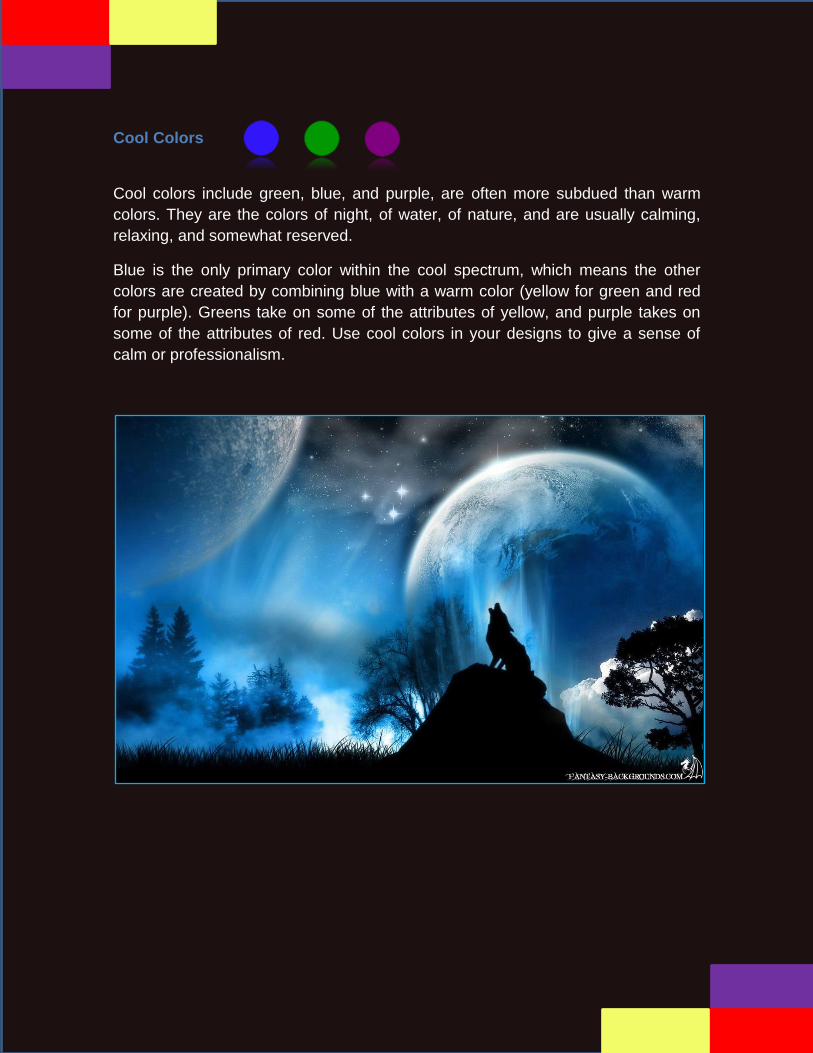
Cool Colors
Cool colors include green, blue, and purple, are often more subdued than warm
colors. They are the colors of night, of water, of nature, and are usually calming,
relaxing, and somewhat reserved.
Blue is the only primary color within the cool spectrum, which means the other
colors are created by combining blue with a warm color (yellow for green and red
for purple). Greens take on some of the attributes of yellow, and purple takes on
some of the attributes of red. Use cool colors in your designs to give a sense of
calm or professionalism.

BLUE (PRIMARY COLOR)
Blue is often associated with sadness in the English language. Blue is also used
extensively to represent calmness and responsibility. Light blues can be refreshing
and friendly. Dark blues are more strong and reliable. Blue is also associated with
peace, and has spiritual and religious connotations in many cultures and traditions
(for example, the Virgin Mary is generally depicted wearing blue robes).
The meaning of blue is widely affected depending on the exact shade and hue. In
design, the exact shade of blue you select will have a huge impact on how your
designs are perceived. Light blues are often relaxed and calming. Bright blues can
be energizing and refreshing. Dark blues are excellent for corporate sites or
designs where strength and reliability are important.

GREEN (SECONDARY COLOR)
Green is a very down-to-earth color. It can represent new beginnings and growth. It
also signifies renewal and abundance. Alternatively, green can also represent envy
or jealousy, and a lack of experience.
Green has many of the same calming attributes that blue has, but it also
incorporates some of the energy of yellow. In design, green can have a balancing
and harmonizing effect, and is very stable. It’s appropriate for designs related to
wealth, stability, renewal, and nature. Brighter greens are more energizing and
vibrant, while olive greens are more representative of the natural world. Dark
greens are the most stable and representative of affluence.

PURPLE (SECONDARY COLOR)
Purple was long associated with royalty. It’s a combination of red and blue, and
takes on some attributes of both. It’s associated with creativity and imagination,
too.
In Thailand, purple is the color of mourning for widows. Dark purples are
traditionally associated with wealth and royalty, while lighter purples (like lavender)
are considered more romantic.
In design, dark purples can give a sense wealth and luxury. Light purples are softer
and are associated with spring and romance.

Neutrals
Neutral colors often serve as the backdrop in design. They’re commonly combined
with brighter accent colors. But they can also be used on their own in designs, and
can create very sophisticated layouts. The meanings and impressions of neutral
colors are much more affected by the colors that surround them than are warm and
cool colors.

BLACK
Black is the strongest of the neutral colors. On the positive side, it’s commonly
associated with power, elegance, and formality. On the negative side, it can be
associated with evil, death, and mystery. Black is the traditional color of mourning
in many Western countries. It’s also associated with rebellion in some cultures, and
is associated with Halloween and the occult.
Black is commonly used in edgier designs, as well as in very elegant designs. It
can be either conservative or modern, traditional or unconventional, depending on
the colors it’s combined with. In design, black is commonly used for typography
and other functional parts, because of it’s neutrality. Black can make it easier to
convey a sense of sophistication and mystery in a design.

WHITE
White is at the opposite end of the spectrum from black, but like black, it can work
well with just about any other color. White is often associated with purity,
cleanliness, and virtue. In the West, white is commonly worn by brides on their
wedding day. It’s also associated with the health care industry, especially with
doctors, nurses and dentists. White is associated with goodness, and angels are
often depicted in white.
In design, white is generally considered a neutral backdrop that lets other colors in
a design have a larger voice. It can help to convey cleanliness and simplicity,
though, and is popular in minimalist designs. White in designs can also portray
either winter or summer, depending on the other design motifs and colors that
surround it.

GRAY
Gray is a neutral color, generally considered on the cool end of the color spectrum.
It can sometimes be considered moody or depressing. Light grays can be used in
place of white in some designs, and dark grays can be used in place of black.
Gray is generally conservative and formal, but can also be modern. It is sometimes
considered a color of mourning. It’s commonly used in corporate designs, where
formality and professionalism are key. It can be a very sophisticated color. Pure
grays are shades of black, though other grays may have blue or brown hues mixed
in. In design, gray backgrounds are very common, as is gray typography.

BROWN
Brown is associated with the earth, wood, and stone. It’s a completely natural color
and a warm neutral. Brown can be associated with dependability and reliability,
with steadfastness, and with earthiness. It can also be considered dull.
In design, brown is commonly used as a background color. It’s also seen in wood
textures and sometimes in stone textures. It helps bring a feeling of warmth and
wholesomeness to designs. It’s sometimes used in its darkest forms as a
replacement for black, either in backgrounds or typography.

BEIGE AND TAN
Beige is somewhat unique in the color spectrum, as it can take on cool or warm
tones depending on the colors surrounding it. It has the warmth of brown and the
coolness of white, and, like brown, is sometimes seen as dull. It’s a conservative
color in most instances, and is usually reserved for backgrounds. It can also
symbolize piety.
Beige in design is generally used in backgrounds, and is commonly seen in
backgrounds with a paper texture. It will take on the characteristics of colors
around it, meaning it has little effect in itself on the final impression a design gives
when used with other colors.
CREAM AND IVORY
Ivory and cream are sophisticated colors, with some of the warmth of brown and a
lot of the coolness of white. They’re generally quiet, and can often evoke a sense
of history. Ivory is a calm color, with some of the pureness associated with white,
though it’s a bit warmer.
In design, ivory can lend a sense of elegance and calm to a site. When combined
with earthy colors like peach or brown, it can take on an earthy quality. It can also
be used to lighten darker colors, without the stark contrast of using white.

In Brief
While the information contained here might seem just a bit overwhelming, color
theory is as much about the feeling a particular shade evokes than anything else.
But here’s a quick reference guide for the common meanings of the colors
discussed above:
Red: Passion, Love, Anger
Orange: Energy, Happiness, Vitality
Yellow: Happiness, Hope, Deceit
Green: New Beginnings, Abundance, Nature
Blue: Calm, Responsible, Sadness
Purple: Creativity, Royalty, Wealth
Black: Mystery, Elegance, Evil
Gray: Moody, Conservative, Formality
White: Purity, Cleanliness, Virtue
Brown: Nature, Wholesomeness, Dependability
Tan or Beige: Conservative, Piety, Dull
Cream or Ivory: Calm, Elegant, Purity

Recommendations
Whether you are designing a clean corporate website or a grunge portfolio site,
color is going to play a major role in how the design is perceived by the audience.
That’s why it’s important to get the colors right upfront. There are plenty of tools out
there made especially for this, but like anything else some are better than others.
Here are 6 recommendations color tools that I think are exceptionally useful.
Be Patient
Coordinate Decorating Samples
Really Study the Colors
Tried and True Formula for Colors
Trim it Out
Choose the Paint Finish for the Job
Conclusions
Color theory is a complex subject. It contains objective laws of psycho-optics as
well as subjective value judgments. This page is just a quick overview of a large
and complex topic. Each of these small sections is at least a chapter in text books
on the subject so I've only been able to cover selected highlights.
To my knowledge there is no book currently in print with detailed discussion of this
subject aimed specifically at photographers. The only one I know of was Harald
Manta’s Color Design in Photography published by Focal Press in the U.K. in 1970;
originally publication in German as Farb-Design. It has been long out of print but is
well worth searching for. The translation is poor (or the original German text may
have been badly written), but I owe much of what I've learned about colour over the
years to this book. (It is also the predominant source reference for this article).
The other book that deserves specific mention is Theory of Colours by Goethe,
published in 1810. Yes, that Goethe, of Faustian fame. In addition to being an
author and theatrical figure Goethe was an amateur scientist and was fascinated
by color. His book, though scientifically at odds even in its day with the wavelength
theory of color developed by Sir Isaac Newton, is still in print today, almost 200
years later, because of its beauty and philosophical insights. One review described
it as having, "excellent observations explained by an untenable theory."

Color theory is usually taught to student painters in the first-year of art school. It
makes sense for them to learn it because painters create their colour
environments, while photographers for the most part find them. Nevertheless,
photographers are well served understanding the basics so that they can
appreciate why some colour images "work" and others don't. Taste after
all does have its roots in objective reality.
Bibliography
Spiral Dynamics: Mastering Values, Leadership, and Change, Don Beck and
Christopher Cowan, 1996, ISBN 1-55786-940-5
Robinson, DA, Goleby, M, & Hosgood, N 2006 Entrepreneurship as a Values
and Leadership Paradigm Paper presented to Fourth AGSE International
Entrepreneurship RESEARCH Exchange 7–9 February 2007 BGSB, QUT,
Brisbane
The Never Ending Quest, Christopher Cowan and Natasha Todorovic,
2005, ISBN 978-0-9724742-1-4