the visual culture of planning -...
TRANSCRIPT

Article
The Visual Culture of Planning
Andrew M. Shanken1
AbstractOver the course of the twentieth century, American planners deployed an array of visual techniquesto analyze, represent, and promote the American city. Early planners looked to maps of poverty,disease, ethnicity, war, and land use, as well as archaeology, world’s fairs, and the photography ofsocial reform. They became adept at combining drawings, diagrams, and charts to map informationand make visual arguments for urban transformation. These techniques were tools of cultural cri-tique and anticipation that shaped American understandings and expectations of cities. This essaysurveys the imagery of urban planning as a prompt to historians to pay close attention to the visualculture of urban planning.
Keywordscartography, Kevin Lynch, Olmsted, John Nolen, Elbert Peets, Edmund Bacon, Gordon Cullen, IanMcHarg, New Urbanism, urban design
In 1944, Joseph Hudnut, the Dean of Harvard’s Graduate School of Design, likened the master plans
that filled the shelves of architecture and planning libraries to tombs. They were to Hudnut “bound in
bourgeois cloth . . . and fattened with statistics . . . like amorini above a rococo altar.”1 The maps,
charts, and diagrams of modern planning were as unconvincing to modernists as the late Baroque
had become. His condemnation hides a powerful insight: planners had aestheticized statistics and,
like the putti above an altar, made them sacred and buoyant. The observation deserves elaboration.
Planners indulges in the same world of image making that artists and advertisers do. Some of these
images are at once analytical and artful, even mesmerizing. If planners have opted most often for dry
imagery, it is still imagery, with all of the complicated and rich implications of that term. Every plan
is an act of persuasion, an argument for an alternative way of life that attempts to convince an
audience of a potential future based on the raw data of the present.
This essay sketches out the range of visual strategies American planners have used across the
twentieth century and suggests ways of reading images in urban planning.2 Such an expansive topic
demands broad disclaimers and stringent boundaries. Planning is many things and is done at many
scales, from Frederick Law Olmsted’s studies of parks, narrower traffic studies, and reports on
infrastructure to master plans, regional planning, urban design, and land use planning. Planners,
1 Department of Architecture, University of California, Berkeley, CA, USA
Corresponding Author:
Andrew M. Shanken, Department of Architecture, University of California, Berkeley, 232 Wurster Hall, Berkeley,
CA 94720, USA.
Email: [email protected]
Journal of Planning History2018, Vol. 17(4) 300-319ª 2018 The Author(s)Article reuse guidelines:sagepub.com/journals-permissionsDOI: 10.1177/1538513218775122journals.sagepub.com/home/jph

likewise, come from many backgrounds. Their strategies and tools and the nature of their work vary
according to their training and have changed over the twentieth century. Nonetheless, as cities have
pondered their futures, they have reached out to architects, landscape architects, engineers, and,
especially after World War II, to professional planners and urban designers to help them visualize
their cities. The way planners have presented this future in graphic terms forms the crux of this essay.
The essay situates the imagery of planners in a wide visual and cultural context and offers
readings of a number of types of images. These include Burnham and Bennett’s 1909 plan of
Chicago, an early attempt to map race, traffic flow diagrams, chloropleths, and circle diagrams.
A tale of the ideological and rhetorical power of these images is told through major figures and sites,
which are taken to be either formative or representative: Olmsted, Jr., and Pittsburgh, John Nolen
and Flint, Arthur Comey and Houston, and Clarence Stein and Radburn. Other figures who studied
and disseminated images play a central role as well: Clarence Perry, Willard Cope Brinton, Hege-
mann and Peets, Otto Neurath, Ludwig Hilberseimer, Kevin Lynch, Edmund Bacon, Gordon Cullen,
Ian McHarg, Christopher Alexander, and Allan B. Jacobs. The more anonymous planners who toiled
in New Deal agencies, municipal planning authorities, and at world’s fairs also play a role. In the
end, this imagery reveals how planners have reconciled technical necessities with artful preroga-
tives, ideological compulsions, and a range of other subjective issues. Where this historical sketch
necessarily leaves much of the canvas blank, I hope that it will encourage others to fill it in.
Mastering the Plan
By the time that modern planning arose in the early twentieth century, cartographers and geogra-
phers had worked out an array of techniques for displaying information graphically. Much of this
was based on cartography itself. The earliest maps of the young American republic were enmeshed
in political and administrative boundaries, settlement patterns, exploitation of land and resources,
and transportation systems, much of it in the service of the nation. In other words, mapping and
proto-planning evolved together and once planning began to come of age, it could turn to a mature
and sophisticated tradition of cartography and visual information. Commercial, military, disease,
and tourist maps like Baedeker’s guides, real estate atlases, and government maps for the Bureau of
Statistics, for instance, all advanced visual techniques for displaying information.
When Daniel H. Burnham and Edward H. Bennett published their plan of Chicago in 1909,
coding by color, texture, and pattern had been well explored, and the more diagrammatic experi-
ments of cartographers like Francis Amasa Walker or lithographer Julius Bien had been a generation
in the making.3 Planners could thus look to nineteenth-century isothermal diagrams of rainfall,
ethnographic charts, and maps of land classification to express bands or areas with shared charac-
teristics of any sort.
Planners quickly developed these and other cartographic techniques for their own purposes. The
work of the first self-conscious city planners was widely disseminated at rapid pace. Camillo Sitte’s
City Planning According to Artistic Principles (1889), Ebenezer Howard’s To-Morrow (1898,
published in 1902 as Garden Cities of To-Morrow), Der Stadtebau Monatsschrift (beginning
1904), Raymond Unwin’s Town Planning in Practice (1909), or the work of Frederick Law Olmsted
and his firm were all filled with vivid graphics, long before the City Scientific chastened the City
Beautiful.4 Images and techniques of image-making circulated widely in these early efforts. By
World War I, dozens of publications on planning would reach the Anglo-American audience. These
sources conventionalized planning, creating a shared corpus of examples, methods, and images. In
short, cartography had conquered statistics and planners reaped the reward.5
More work is needed on what nineteenth-century cartographic innovations and archaeology
bequeathed to twentieth-century urban planning—and, vitally, the ways in which that bequest came
freighted with cultural baggage. Both cartography and archaeology assimilated masses of crude data
Shanken 301

into arresting images. Urban planning evolved alongside reconstructions of ancient cities, which
planners used in their publications side by side with charts of present conditions. What did planning
learn about the possibilities of future cities from the example of exhumed strata from the past?6
Some of these ideas converged at the White City at the World Columbian Exposition in 1893.
Chicago’s fair influenced a generation of cities and informed the first comprehensive plans in
Washington, DC (1902), Cleveland (1903), St. Paul (1903), and San Francisco (1905), as well as
Philadelphia’s parkway (1902) and Burnham and Bennett’s plan of Chicago of 1909. These plans
benefited from changes in architectural education. Architects, now trained in the French manner at
the Ecole des Beaux-Arts, came to value the broad axes, hierarchical arrangement, public spaces
anchored by monuments, and tight compositions and rational order favored by this school—a
decisive departure from Sittean aesthetics. Yet, like the archaeologists, they were steeped in pre-
cedents going back to Greece.
More importantly, Beaux-Arts-trained architects returned from France with the ability to make
grand presentation drawings that doubled as forms of persuasion.7 The dry plans of the nineteenth
century quickly gave way to decorative geometries and poche, bold urban gestures, and exquisite
order. Although the planning of the first decade or so of the century is called the City Beautiful, it
reflects the rationality of Beaux-Arts training. Ideal or bird’s-eye views and partial prospects of
grand avenues, parks, or civic centers proliferated.8 These were sometimes painted by leading artists
or engraved for wide dissemination, including as exhibits at museums, further proof of their artful
nature.9 Planners quickly grasped the need for two layers of representation: technical plans for
official purposes and more promotional imagery that could sway the public.
Jules Guerin’s sublime paintings for the 1909 Plan of Chicago matched Daniel Burnham’s
bombast. Far more ambitious than any previous American effort, the so-called Burnham Plan was
equal parts manifesto, history, primer, and plan. Text and image work together with special force.
Chicago’s park area had become grossly inadequate. We learn that “Chicago has now dropped to the
seventh place in so far as park area is concerned, and when the relative density of population is taken
into consideration this city occupies the thirty-second place!”10 Statistics give way to alarm. With a
turn of the page, the book channeled the emotional impact of that exclamation point into a bold two-
page spread, an image of the proposed green belt and park system—a pictorial release of the tension
built up by the text that exactly parallels the way green space would relieve the urban density. The
book itself was understood as a visual technique, part of an argument both visual and textual.
Guerin’s views, even in their drastically reduced state, are nearly cosmically charged. In their
chromatic harmony and repetition of effects, they lent coherence and unity to immense scales of
physical, if not temporal, change. They also aestheticized that change, which, given the anxiety
associated with change itself, was a savvy strategy. Even more to the point, the same color scheme
Guerin introduced in his views infiltrated Burnham and Bennett’s diagrams: lime greens, softened
orange-reds over a wash of pale yellow with crepuscular purples, both in line and wash. The effect
culminates with a series of two-page plates in the middle of the volume. Here a dark figure-ground
plan of the streets and park system in black and white (Plate LXXXV) gives way to the same plan
with Guerinesque colors over a white background showing the boulevard system (Plate LXXXVI).
The next page delivered a revelation: a breathtaking view by Guerin (Plate LXXXVII). In his “View
looking west over the city,” the perspective tilts from plan to ideal view at dusk. A dramatic horizon
of hot orange replaces the blood orange arterial road and gives the city its unbounded edge: effulgent
nature overtakes the urban fabric; the parks and the plan in general have reconciled nature and the
city as the text promised.11
The Chicago Plan was an outlier in its own era. Few cities had the resources to commission such a
lavish document. But more modest plans could be visually innovative, in particular early attempts to
use maps analytically. Frederick Law Olmsted, Jr.’s 1910 street plan for Pittsburgh was particularly
influential (Figure 1). The “General Map of the Pittsburgh District” represents population with
302 Journal of Planning History 17(4)

concentrations of dots. This was typical enough, but Olmsted layered that onto manufacturing,
railroad property, major slopes, and parks and cemeteries using patterns and tones—a chloropleth
or statistical map rather than a strictly geographical one. Urban planning maps tended to show city
blocks, major buildings or institutions, and road networks, in short, the built environment; Olmsted’s
surveyed the urban datum.
The elision of these major features turns the map halfway into a diagram. With such strict limits
on what it analyzed, its pictorial nature advances. Sometime between his work on New Haven with
Cass Gilbert in 1910, which straddles the City Beautiful and City Functional movements, and his
plan for Pittsburgh, Olmsted had learned how to assimilate data into maps rather than segregate it
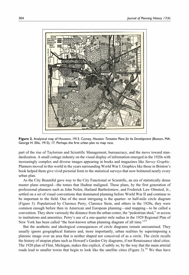
in ageographical charts and graphs.12 Soon such analytical maps would become common. In a
1913 plan for Houston, Arthur Coleman Comey mapped private property onto race and land use
(Figure 2).13 Such triangulation condensed into a single image everything developers and the
Federal Housing Administration and the Home Owners’ Loan Corporation would later need to
advance the system of redlining. Progressive Era measurement and representation could later
become the unexpected enabler of systematic segregation, disciplined by the authority of the map.
Scientific Persuasion
By the teens, many of the strategies for displaying information graphically had become common
knowledge. Planners could turn to the work of Willard Cope Brinton, the Edward Tufte of the early
twentieth century.14 His Graphic Methods for Presenting Facts (1914) exhaustively catalogued
graphic techniques. He collected and worked out the best ways to create graphs, charts, diagrams,
maps, and graphic expressions of temporal and spatial change. He had, furthermore, begun to show
how to incorporate images into technical diagrams, both to serve the statistical point and to ornament
it. Shading, hatching, patterning, population isotopes, traffic density, and direction diagrams became
conventionalized. More than compendia, Brinton’s work gave no-nonsense criticism of various
methods and simple instructions for how to make diagrams and maps. His graphic methods were
Figure 1. General map of the Pittsburgh district, 1910. F. Olmsted, Jr., Pittsburgh: Main Thoroughfares and theDown Town District (Pittsburgh: Pittsburgh Civic Commission, 1911), xvi. In mapping the urban datum and elidingstandard features like buildings and streets, Olmsted, Jr., turns the map halfway into a diagram.
Shanken 303
part of the rise of Taylorism and Scientific Management, bureaucracy, and the move toward stan-
dardization. A small cottage industry on the visual display of information emerged in the 1920s with
increasingly complex and diverse images appearing in books and magazines like Survey Graphic.
Planners moved in this world in the years surrounding World War I. Graphics like those in Brinton’s
book helped them give vivid pictorial form to the statistical surveys that now bolstered nearly every
urban plan.
As the City Beautiful gave way to the City Functional or Scientific, an era of statistically dense
master plans emerged—the tomes that Hudnut maligned. These plans, by the first generation of
professional planners such as John Nolen, Harland Bartholomew, and Frederick Law Olmsted, Jr.,
settled on a set of visual conventions that dominated planning before World War II and continue to
be important to the field. One of the most intriguing is the quarter- or half-mile circle diagram
(Figure 3). Popularized by Clarence Perry, Clarence Stein, and others in the 1920s, they were
common enough before then in American and European planning—and mapping—to be called a
convention. They show variously the distance from the urban center, the “pedestrian shed,” or access
to institutions and amenities. Perry’s use of a one-quarter mile radius in the 1929 Regional Plan of
New York has been called “the best-known urban planning diagram of all time.”15
But the aesthetic and ideological consequences of circle diagrams remain unexamined. They
usually ignore geographical features and, more importantly, urban realities by superimposing a
platonic image over an area that is neither shaped nor conceived of as a circle. The circle recalls
the history of utopian plans such as Howard’s Garden City diagrams, if not Renaissance ideal cities.
The 1920 plan of Flint, Michigan, makes this explicit, if subtly so, by the way that the main arterial
roads lead to smaller towns that begin to look like the satellite cities (Figure 3).16 We thus have
Figure 2. Analytical map of Houston, 1913. Comey, Houston: Tentative Plans for Its Development (Boston, MA:George H. Ellis, 1913), 17. Perhaps the first urban plan to map race.
304 Journal of Planning History 17(4)

reality bending to the abstraction of a powerful urban planning diagram and ideology. A second
powerful consequence: radiating waves of urban energy emanate from Flint. The image reinforces a
center–periphery relationship, when Detroit, a much larger city, is on the deepest periphery of this
map. The image diminishes Detroit and aggrandizes Flint just as the automobile was dramatically
altering the fates of both cities.
Circle diagrams are analytical, but their interest lies in their ambiguity, in the idea that they do
more than measure. At Radburn, for example, Clarence Stein and his collaborators used half-mile
and mile circle diagrams. In some of these images, the circle floats free of discernible measurement.
Here it is more like a moral boundary, a way of describing what lies within the collective that is a
town and, importantly, what does not. The circle, after all, is an ideal form, an abstraction free of
Figure 3. Circle diagram of Flint, MI, 1920. Nolen and Arnold, The City Plan of Flint, Michigan (Flint, MI: The CityPlanning Board, 1920), 5. The diagram inserts Flint into a near Garden City abstraction, diminishing Detroit andaggrandizing Flint just as the automobile was dramatically altering the fates of both cities.
Shanken 305

on-the-ground considerations. It is also a frame and like any picture frame it includes and excludes,
imposes order, and superimposes the universal language of geometry over the local, changeful, and
contingent reality of a particular city or place.17
Another unexamined graphic technique is the traffic flow diagram (Figure 4). Olmsted, Jr., used
simple ones in some of his earliest plans, but as a mapping technique, it dates back at least to Charles
Joseph Menard’s 1869 diagram of Napoleon’s Russian Campaign. Menard tidily collapsed move-
ment, weather conditions, and attrition in place and time—a terrific model for charting urban traffic.
The best of these diagrams gave a palpable sense of traffic choking the core of the city or diminish-
ing to slender tendrils in the deepest suburbs. They mapped the modern phenomenon of the commute
and did so not just as a measure of traffic on a map, but also to give it the figurative power to
overtake cities. With the same cool rationality of Menard’s chart of a catastrophic campaign, a
Figure 4. Traffic flow diagram for Peoria, IL, 1937. Harland Bartholomew and Associates, A Comprehensive CityPlan, Peoria, Illinois (Peoria: Greater Peoria Civic Association, 1937), plate 19. Such diagrams can make com-pelling arguments for decentralization and highway building programs.
306 Journal of Planning History 17(4)

planner could diagram urban defeat at the hands of the car or crowd—or the opposite: orderly flow.
What else did planning unwittingly inherit from military mapping?
Street sections, figure-ground diagrams, organization charts, traffic flow diagrams, circle maps,
and the very symbols, colors, patterns, and textures that fill the normative maps of urban planning all
are sorely neglected. All are packed with meaning that will enrich the history of American urbanism,
if not challenge some of the assumptions of the field. If visual conventions, like verbal cliches, take
hold based on tacit agreements or assumptions, historians can unpack those assumptions from the
history of planning imagery.
To take one example, the widely varying coding in planning maps raises the point that planners
resisted the graphic standards that arose in cartography in the nineteenth century and in architecture
early in the twentieth century.18 The absence is notable because architecture’s standards align with
the larger American interest in establishing standard weights and measures in the period. Planners,
who were closer to the bureaucracies of management than architects, oddly never mobilized uni-
versal graphics. Recent attempts to do so reveal just how long it has taken the profession to con-
ventionalize its graphic language fully.19 More research is needed to discover whether the absence of
formalized standards should to be taken as a kind of failure or as a form of resistance that allowed
planners a wider scope of expression.
Many of these techniques can be found nonetheless in books like Hegemann and Peets’s The
American Vitruvius (1922).20 A magnum opus of urban design, it was the first to elevate visual
above textual argument. Like a splendidly illustrated almanac, it is at once a treatise, polemic, and
visual menagerie for architect planners to plunder. This type of book reveals an overwhelmingly
aesthetic view of the city. In its visual complexity, it approximates its subject matter: it is the city
manque, full of the utopian promise and improvised chaos characteristic of American cities. Once
again, the visual culture of planning is palpable, in other words, at the scale of the book. For a field
that usually sees its work completed only in fragments, the book is an optimistic proxy.
Hegemann and Peets advanced the tradition of Camillo Sitte (Figure 5). They paired clusters
of Sitte’s figure-ground diagrams with larger photographs or drawings of monuments or plazas.
The analytical abstraction of the poche becomes fleshy reality and the reader can move freely
between thinking about urban space, morphology, and architectural form. Peets clearly longed
to express both together: his own “visualization” of Blondel’s plan for Strasbourg combines a
Sittean figure-ground with an idealized view from above that gives vertical expression to the
figure-ground diagram.
Another landmark publication of the period, the multivolume Regional Plan of New York was
graphically more culmination than innovation.21 Aside from Perry’s neighborhood unit, its many
Figure 5. Elbert Peets, perspectival figure-ground, 1921. W. Hegemann and E. Peets, The American Vitruvius: AnArchitects’ Handbook of Civic Art (New York: Architectural Book, 1922), 77. Peets attempted to achieve thereductive clarity of the figure ground and the revelatory impact of the aerial perspective in one drawing.
Shanken 307

volumes failed to produce a single forceful icon. Nonetheless, its hundreds of images together are a
kind of encyclopedia of visual techniques, from paintings by Jules Guerin to its hundreds of more
arid technical diagrams. More novel is the way the plan operated at multiple scales. As a regional
plan, it modeled how to think of a city in the larger context of secondary urban nuclei and its
suburban and rural hinterlands. At the same time, it popularized the neighborhood unit concept,
which broke down the task of planning massive cities into its atomic minimum. Perry’s enduring
diagrams for neighborhood units gave pictorial form to the organic metaphor so prevalent in
planning at the time.
Public Visions, Postwar Plans
Yet the 1929 Regional Plan of New York was also the end of an era. Soon the Depression would
spawn the abecedarian agencies of the New Deal that would transform the profession, among them
the Works Progress Administration, Public Works Administration, National Resources Planning
Board, and Tennessee Valley Authority. They brought planners of all stripes together to work on
tangible projects and forged new alliances between the profession and government, business, and the
academy. With the economic emergency forcing action, these agencies experimented widely with
new modes of describing urban phenomena and making graphic arguments accessible to the pro-
fessional and lay audience alike.22 Willard Brinton’s work from the period demonstrates the
change.23 Brinton incorporated a range of newer techniques, including Isotypes (ideograms), rela-
tionship charts, flow charts, and “quantitative cartoons” that had become standard in business and
planning. Some of these he had borrowed from the New York Regional Plan Commission and New
Deal planning organizations. Hereafter, the worlds of graphic information and planning were inti-
mately connected. The story could also be told through publications like Survey, later Survey
Graphic, whose diagrams and maps were part of the aestheticization of technocracy and social
critique. Soon Fortune would adopt similar graphics and present them to a decidedly different
readership.
Indeed, the 1930s and 1940s were a golden age of experimentation in visual strategies in plan-
ning. Alongside the New Deal and intersecting with it, Jacob L. Moreno’s Sociograms had their first
practical experiment, Otto Neurath’s Isotypes became ubiquitous, and Le Corbusier and Frank Lloyd
Wright’s ideas on urbanism were widely discussed.24 Much of the imagery that emerged in these
years attempted to discover a universal language for planning, in part to stimulate citizen partici-
pation. Dozens of books on the subject appeared during the war alone, in scholarly, professional, and
popular form.
Americans also encountered vivid visual polemics about cities at the world’s fairs of the 1930s.
At the 1939 New York World’s Fair, the nature of America’s future was fought out through urban
planning schemes, including Henry Dreyfus’s Democracity, a model of a decentralized worker’s
utopia—inside the theme building no less! For General Motors’s Futurama, Norman Bel Geddes’s
office created a model with several million structures to help people visualize the city of 1960.
Fairgoers could take the measure of these farsighted utopian plans against Mumford’s “The City,” a
film that proposed a future that was nearly in existence in the Resettlement Administration’s green
towns of the mid-1930s. Here were three alternative visions of the future city by two industrial
designers and a social critic. Both Bel Geddes and Dreyfus subverted the peephole effect of the
traditional diorama. They engaged the viewer bodily in a multisensorial experience of high drama,
including lighting effects, film, smoke, and movement. These sublime, propagandistic exhibits led
directly to theme park rides like Pirates of the Caribbean.25 They also brought serious progressive
planning before the public with cutting-edge exhibition strategies, including the sort of propagan-
distic film that would soon become a staple of the wartime cinema experience. How could maps and
diagrams compete with this?
308 Journal of Planning History 17(4)

One way is that World War II would put maps before the American public like never before.26
The home front’s cartographic awareness paralleled its intensified engagement with urban planning.
Magazines and newspapers commissioned maps and diagrams by the thousands. Advertisements
that forecasted the city of the future ran in Saturday Evening Post and other magazines. Pamphlets
associated with advertisements by Revere Copper and Brass, including a primer on citizen involve-
ment in urban planning by Louis Kahn and Oscar Stonorov, were widely disseminated. Stonorov
claimed that the company circulated as many as 100,000 copies of You and Your Neighborhood.27
Planning had become a populist venture. Alongside technical master plans, cities published popular
pamphlets to help engage citizens in the planning process. The San Francisco Planning Commission
started a cheap, popular news bulletin. Its Master Plan Primer of 1945 presented cartoon-like
Isotypes and diagrams drawn by graphic designers (Figure 6).
Figure 6. Diagram, San Francisco City Planning Commission, Master Plan Primer (San Francisco, NC: TheCommission, 1945), 2. Such cartoonish images, meant for public rather than professional consumption, beliethe complexity of ideas, if not ideological content, behind them.
Shanken 309

Paradoxically, the same moment that sponsored specific plans for reconstruction to stave off a
return to depression also searched for universals through abstract diagrams (Figure 7). Some of these
masquerade as data sets, but they are every bit as complicated as the abstract painting then coming
into vogue and which surely influenced their imagery.28 Ludwig Hilberseimer, in his book The New
City (1944), imagined replanning Chicago based on wind studies. Elbert Peets, who admitted that he
could not follow some of Hilberseimer’s “esoteric excursions,” nonetheless complimented him on
his “delightful” images.29 Peets, however, had a more practical reason for his query: “I want to ask
by what means one can determine what are or will be the actual movements of smoke. I have in the
past despaired of getting accurate data and of determining (upon such data) planning measures
which would justify town plans having precision of purpose and accomplishment—as do your
charming designs.”30 Peets informed Hilberseimer that the United States Housing Authority
(USHA) had once required wind diagrams but discontinued the requirement because “windroses
proved to have no reliability.” Architects, he added, often borrowed data from a nearby city and
inserted “a mere arrow.” “May I ask,” he finished, “what wind-data your plans are based upon?”31
Hilberseimer could only acknowledge that “it is very difficult to get the information on prevailing
winds.”32 He had fudged it; no real data lay beneath his diagram. The elegance and purity of his
abstraction had probably tipped off the superbly genteel Peets. And so should similar abstractions
trigger planning historians. This is not to denigrate the images. Abstractions like Hilberseimer’s play
with time and space; they canvass for a seductive future and soften the losses of wholesale erasure.
In short, they do work that more rigorously data-driven images might not be able to do.
Figure 7. Diagram of the proposed replanning of Chicago, 1940. L. Hilberseimer, The New City: Principles ofPlanning (Chicago: Paul Theobald, 1944), 143. An abstraction that pretended to be data-driven, it presentedorder and control in a moment in which neither existed.
310 Journal of Planning History 17(4)

Diagramming Urban Experience
A second golden age of representation in planning arrived in the 1960s with initiatives like the
Model Cities Program, the U.S. Department of Housing and Urban Development, urban renewal,
and area transportation studies, all backed by strong eminent domain practices. Systems theory,
information science, and the early use of computers propagated wholly new techniques for imagin-
ing cities. At the same time, urban design came of age and sponsored an array of formal approaches,
while more socially engaged planners advocated for citizen participation.
In Image of the City, Kevin Lynch’s focus on urban legibility set up expectations about the
“imageability” of the built environment.33 He coupled this with an interest in individual mental
maps and semiotics to deduce a series of purportedly universal elements (path, edge, district, node,
and landmark) that would make it possible to collapse urban experience into simple diagrams
(Figure 8). In a field now long habituated to seeing patterns and textures as demographic or
statistical—that is to say, legible as quantitative information—his maps were a major departure
into more purely formal ways of imagining the city. The Situationists aside, urban phenomenology
had found its first cartographer. Along with the smaller diagrams that sat in the margins like cartoon-
like glosses on the text, Lynch’s graphics would play an important role in the field.34 In The View
from the Road (1964), Lynch, along with Donald Appleyard and John R. Myer, produced one of the
most ambitious, if confusing, attempts to create a graphic language to express the experience of
moving through cities.35
Christopher Alexander’s diagrams of form and movement in space, which he bolstered with
mathematical formulas, could deliver a similar effect. Unlike Lynch’s work, they usually require
text to be understood and few of them have cartographic intentions.36 Instead, throughout his career,
Figure 8. Diagram of the visual form of Boston as seen in the field. K. Lynch, The Image of the City (Cambridge,MA: MIT Press, 1960), 19. Urban experience based in rough social science methods finds its first cartographer.
Shanken 311

Alexander has parsed urban phenomena, invented graphic languages to describe them, and proposed
urban solutions through an art of combination.
Edmund Bacon, by contrast, created a severely reductive notation for analyzing urban relation-
ships. In The Design of Cities, Bacon elaborated on the figure-ground diagram. He flipped the
ground from black to white and introduced limited color to pluck out major routes, monuments,
and spaces37 (Figure 9). In the sparest of these diagrams, the only things left are a few yellow lines
drawn between red or blue poche. The rest dissolves into the white of the page. Seen next to the
intensely lined engravings that fill his book, they can be understood, perhaps uncharitably, as
the graphic equivalent to the urban erasure that he oversaw in Philadelphia. The result melded two
of the most compelling and sustained traditions in planning imagery: ageographical abstractions
and analytical maps. He applied the method both to the study of canonical examples from the past
such as Beijing and Rome and as an urban design strategy for the contemporary city. The graphics,
along with the book, became standard fare in architecture and planning programs for at least a
generation. Venturi, Scott-Brown, and Izenour’s diagrams of Las Vegas learned from them.38
Bacon’s images continue to be used today.
Arguably of greater importance to planners is Gordon Cullen’s concept of “serial vision”39
(Figure 10). To Cullen, the city was experienced as a “sequence of revelations” produced by “sudden
contrasts” between buildings and spaces.40 This he showed through a series of sketches, each tagged
to a different spot on a plan. The method accounts for movement, change of perspective, and the
ways in which buildings impinge on spaces and vice versa. Serial vision became a method for urban
designers to envision and describe the unfolding experience of cities. Cullen wrote of capturing the
“sparkle and movement of the day,” the “impressions and sensations” of daily life.41 His designs for
New Marlow demonstrate serial vision, replete with the sorts of sharp contrasts that would, as he put
Figure 9. Diagram of movement toward the Piazza del Popolo, Rome. E. Bacon, Design of Cities (New York:The Viking Press, 1967), 139. An exquisite reduction of a fragment of Rome, the map becomes a diagram thatclears out the experiential maelstrom of urban experience. It could make a powerful argument for suchdiagrammatic simplicity in postwar urban design.
312 Journal of Planning History 17(4)

it, be “like nudging a man who is going to sleep in church.”42 Urban design could inspire secular
epiphanies. Lynch, Alexander, Bacon, and Cullen were all engaged with understanding and charting
urban experience and deriving a positive method of urban design from it. These concerns and
methods became widespread among planners.
In a different register, Ian McHarg’s “slope maps” or sections in Design with Nature (1969)
offered an analytical tool for planners to study the relationship of cities to their hinterlands. He was
not the first to diagram this relationship—Patrick Geddes’s valley section came earlier—but his
work met fertile ground in a profession increasingly concerned with sprawl and the environmental
impact of cities.43 McHarg charted nature against the city in “physiographic sections.” Perhaps his
greatest visual innovation was to key these on a single page to analytical landscape perspectives
(Figure 11). Here was a method that any keen observer with modest artistic talent could adopt by
going into the field with paper, pencil, and watercolor or crayon. McHarg’s work highlights the
importance of the sketch for urban design in the 1960s and 1970s. Vivid examples of the influence of
Figure 10. Serial vision. G. Cullen, Townscape (New York: Reinhold, 1961), 17. Cullen used a decidedlypicturesque and cinematic approach to string together visual experiences that he likened to epiphanies.
Shanken 313
this method can be found in the San Francisco Urban Design Plan of 1970. Andreas Duany’s
“transects” extend the tradition to the present day.44
Whereas the section in architecture is usually a vertical, measured cut keyed to tectonics—what
makes a building stand up—and, more pictorially, to bodily experience, the urban section is a
horizontal spread, often less strictly mathematical and certainly not structural, that reveals relation-
ships, flows, and contrasts at the scale of the land. Both can be instruments of narrative and
explorations of what Barbara Stafford calls “hidden terrains.”45 Just as graphic sections emerged
in the eighteenth century to reveal the insides of bodies, mountains, or ruins, which Stafford links to
the tradition of rational philosophy, so have planners carried on this Enlightenment tradition with
their section. The history of planning imagery would likewise show how planners reveal the hidden
terrains of the city: its demographic data, infrastructure, the relationships between bodies, buildings,
spaces, and transportation; and the raw experience of movement and interaction.
Figure 11. Section of the Great Valley. I. McHarg, Garden City (New York: Natural History Press, 1969), 148.The section rose to prominence in an era of environmental awareness.
314 Journal of Planning History 17(4)

In the last decades of the twentieth century, the computer became a dominant force in planning
and to write about the changes it has ushered in would require a separate monograph. With one tool,
planners can crunch and display data, albeit bounded, conventionalized, and regularized by the
limitations of software. As planning converges with computer science and planners write code,
some of these limitations dissolve. Whether their aesthetic sensibilities follow those of Apple,
Google, or Microsoft—and whatever takes their place—will determine a good deal of the future
of planning imagery. When tied to Geographic Information System (GIS) and other data-gathering
methods, the computer becomes a tool of parametric manipulation. Soon three-dimensional drawing
chambers now being worked out for architecture will allow planners to visualize the city with the
illusionism of IMAX films but in real time. Whether or not this is a revolution in representation and
perception on the scale of Renaissance perspective remains to be seen.
As planners have hitched their fate to computers and created ever more complicated diagrams for
cities, a reaction against computer-driven design can be found, for instance, in the diagrams of Leon
Krier and New Urbanists. Duany, Plater-Zyberk, and Aminana’s The New Civic Art (2003) returns to
Hegemann and Peets’s The New Vitruvius. It is, like its model, a guide, compendium, casual history,
and manifesto. The graphic techniques worked out over the last century continue to be useful and
inspiring. One wonders if books like this are more useful than graphic standards because they put on
Figure 12. Allan B. Jacobs, Desk Blotter (1971). Courtesy: Environmental Design Archives, University ofCalifornia, Berkeley. Where else but in San Francisco?
Shanken 315

display the variety of visual strategies planners have used throughout history and maintain an artful
domain in a profession increasingly dominated by policy and data.
Charting a Course for Future Scholarship
A fully fleshed out study of the visual culture of American planning would go well beyond this
essay, not just in content, but also in its conceptual ambitions. It would trace out the origins and
routes of transmission and conventionalization of the central graphic strategies. It would acknowl-
edge the invisible hands who drew the diagrams and maps—planning’s equivalent to architecture’s
anonymous draftsmen—with an understanding of the materials, technologies, and working methods
they used. And it would interweave this history with the planning pedagogy that disseminated and
elaborated planning’s visual culture. It would, furthermore, couch the images more fully in the
context of their making and analyze them in the context of their beholders. It would propose a
relationship between imagery and knowledge, image-making and communication, visuality and the
three-dimensional realities of the city. In short, it would do for planning what Barbara Stafford has
done for the imagery of Enlightenment science, Susan Schulten has done for American geography,
and J.B. Harley, Denis Cosgrove, and others have done for cartography.46
A visual culture of planning would also consider other classes of images that show the working
methods and not just the end results of the planning process, such as Allan B. Jacobs’s desk blotters
from the 1970s when he headed the San Francisco Department of City Planning (Figure 12). This
one shows the doodles of a professional planner at work before e-mail, when business was done by
phone and the planner was free to extemporize visually. Improvised over a five-month period in
1971, it shows him mulling over the issues that crossed his desk: landmarks legislation, redevelop-
ment, budgets, site planning, various sites in the city, staff turnover, and his academic future. Given
these concerns, no wonder “urban design” is written backward! As images, the blotters reveal how
local the visual culture of planning could be, even as worldly concerns invade the drawing. With the
same markers that colored the official plans of his department, Jacobs filtered the demands of his
office through the psychedelic aesthetic of Haight-Ashbury and album covers of the period. Could it
have been drawn anywhere else? In spite of the greatest efforts to subject planning to rational control
or to make it universal, it is the fallible, creative human hand that moves the pieces on the urban
chessboard. And this is what the artfully ordered imagery of planning has been telling us all along.
Acknowledgments
I would like to thank Waverly Lowell, Anthony Raynsford, Allan B. Jacobs, and the students in my
“Off the Map” seminar at Berkeley. Thanks also to the generosity of the Dedalus Foundation whose
Senior Fellowship sponsored some of this research.
Declaration of Conflicting Interests
The author(s) declared no potential conflicts of interest with respect to the research, authorship, and/
or publication of this article.
Funding
The author(s) received no financial support for the research, authorship, and/or publication of this
article.
Notes
1. Joseph Hudnut, “The Political Art of Planning,” reprinted in Architecture and the Spirit of Man (Cam-
bridge, MA: Harvard University Press, 1949), 185. Originally published in Architectural Record 94
(October, 1943), 44–48.
316 Journal of Planning History 17(4)

2. For recent attempts, see James Corner, “The Agency of Mapping: Speculation, Critique and Invention,” in
Mappings, ed. Denis Cosgrove (London, England: Reaktion Books, 1999), 213–52; Laura Kurgan, Close
Up at a Distance: Mapping, Technology, and Politics (Brooklyn, NY: Zone Books, 2013); Anthony
Raynsford, “Civic Art in an Age of Cultural Relativism: The Aesthetic Origins of Kevin Lynch’s Image
of the City,” Journal of Urban Design 16, no. 1 (February, 2011): 43–65; Rebecca Ross, “All Above:
Visual Culture and the Professionalization of City Planning, 1867–1933” (PhD diss., Harvard University,
2012); Brent D. Ryan, “Reading through a Plan,” Journal of the American Planning Association 77, no. 4
(Autumn, 2011): 309–27.
3. For the larger historical context, see Susan Schulten, Mapping the Nation: History and Cartography in
Nineteenth-century America (Chicago, IL: University of Chicago Press, 2012).
4. Camillo Sitte, City Planning According to Artistic Principles (Vienna: Verlag von Carl Graeser, 1889);
Ebenezer Howard, To-Morrow: A Peaceful Path to Real Reform (London: Swan Sonnenschein, 1898);
Raymond Unwin, Town Planning in Practice: An Introduction to the Art of Designing Cities and Suburbs
(London: T. F. Unwin, 1909).
5. Michael Southworth and Susan Southworth, Maps: A Visual Survey and Design Guide (Boston, MA: Little,
Brown and Company, 1982).
6. Anthony Raynsford, “Sites of Lost Dwelling: The Figure of the Archaic City in the Discourses of Urban
Design, 1938–1970” (PhD diss., University of Chicago, 2005).
7. Joan Draper, “Paris by the Lake: Sources of Burnham’s Plan of Chicago,” in Chicago Architecture 1872–1922,
ed. J. Zukowsky (Chicago, IL: Art Institute of Chicago; Munich, Germany: Prestel-Verlag, 1987), 107–19.
8. For close studies of the view from the air, see Gerard A. Danzer, “The Plan of Chicago by Daniel H.
Burnham and Edward H. Bennett: Cartographic and Historical Perspectives,” in Envisioning the City: Six
Studies in Urban Cartography, ed. D. Buissert (Chicago, IL: University of Chicago Press, 1998), 144–54.
Rebecca Ross, “Picturing the Profession: The View from Above and the Civic Imaginary in Burnham’s
Plans,” Journal of Planning History 12 (2013): 269–81. Wolfgang Sonne, Representing the State: Capital
City Planning in the Early Twentieth Century (Munich, Germany: Prestel, 2003).
9. Ross, “Picturing the Profession,” 273.
10. Daniel Burnham and Edward H. Bennet, in Plan of Chicago, ed. Charles Moore (New York, NY: Princeton
Architectural Press [1909] 1993), 44.
11. Ross, “Picturing the Profession,” 274.
12. Alan Plattus, “Introduction: The 1910 Civic Commission Report and the American City Planning
Tradition,” in Plan for New Haven, facsimile edition, ed. Frederick Law Olmsted, Jr., and Cass Gilbert
(San Antonio, TX: Trinity University Press, 2012).
13. Arthur Comey, Houston: Tentative Plans for Its Development (Boston, MA: George H. Ellis, 1913).
14. Willard Brinton, Graphic Methods for Presenting Facts (New York: The Engineering Magazine Company,
1914).
15. Andreas Duany, Elizabeth Plater-Zyberk, and Robert Alminana, The New Civic Art: Elements of Town
Planning (New York: Rizzoli International, 2003), 84.
16. John Nolen and B. J. Arnold, The City Plan of Flint, Michigan (Flint, MI: The City Planning Board, 1920).
17. Denis Cosgrove, Geography and Vision: Seeing, Imagining and Representing the World (London, Eng-
land: I. B. Tauris, 2010), especially 174–75. My student, Razieh Ghorbani Kharaji, stimulated this reading
in a seminar at Berkeley.
18. For a relatively early attempt to codify, see Joseph De Chiara and Lee E. Koppelman, Site Planning
Standards (New York: McGraw-Hill, 1978). For architectural codification, see George Johnston, Draft-
ing Culture: A Social History of Architectural Graphic Standards (Cambridge, MA: MIT Press, 2008);
Paul Emmons, “Diagrammatic Practices: The Office of Frederick L. Ackerman and Architectural Gra-
phic Standards,” Journal of the Society of Architectural Historians 64, no. 1 (March, 2005): 4–21. For
how conventions solidified in American cartography, see Susan Schulten, The Geographical Imagina-
tion in America, 1880–1950 (Chicago, IL: The University of Chicago Press, 2001).
Shanken 317

19. See Donald Watson, ed., Time Saver Standards for Urban Design (New York: McGraw-Hill, 2003);
Ray Grindroz, Donald Kaliszewski, David Lewis, and Karen Levine, The Urban Design Handbook
(New York: W.W. Norton, 2003); Emina Sendich, graphics ed., Planning and Urban Design Stan-
dards (Hoboken, NJ: John Wiley, 2006); Dhiru A. Thadani, The Language of Towns and Cities (New
York: Rizzoli, 2010).
20. Werner Hegemann and Elbert Peets, The American Vitruvius: An Architects’ Handbook of Civic Art (New
York: Princeton Architectural Press [1922] 1988).
21. Regional Plan of New York and Its Environs (New York: Regional Plan of New York) 1929–31.
22. Andrew M. Shanken, 194X: Architecture, Planning, and Consumer Culture on the American Home Front
(Minneapolis: University of Minnesota Press, 2009), 18–23.
23. Willard Brinton, Graphic Presentation (New York: Brinton Associates, 1939).
24. On Moreno, see Shepard Wolman, “Sociometric Planning of a New Community,” Sociometry 1 (July–
October, 1937): 220–54. On Neurath, see Nader Vossoughian, Otto Neurath: The Language of the Global
Polis (Rotterdam, the Netherlands: NAi, 2008); for the use of Isotypes in wartime America, see Shanken,
194X: Architecture, Planning, and Consumer Culture, 26–29, 36.
25. Roland Marchand, “The Designers Go to the Fair II: Norman Bel Geddes, the General Motors ‘Futurama,’
and the Visit to the Factory Transformed,” Design Issues 8, no. 2 (Spring, 1992): 22–40.
26. Schulten, The Geographical Imagination, 2001; Denis Cosgrove and Veronica Della Dora, “Mapping
Global War: Los Angeles, the Pacific, and Charles Owens’s Pictorial Cartography,” Annals of the Asso-
ciation of American Geographers 95, no. 2 (June, 2005): 373–90.
27. Shanken, 194X: Architecture, Planning, and Consumer Culture, 130–32.
28. Andrew M. Shanken, “The Uncharted Kahn: The Visuality of Planning and Promotion in the 1930s and
1940s,” Art Bulletin 88 (June, 2006): 310–27.
29. Elbert Peets to Ludwig Hilberseimer (April 19, 1945), Box 3, Elbert Peets Collection, Cornell University
Archives.
30. Ibid.
31. Ibid.
32. Ludwig Hilberseimer to Elbert Peets (May 12, 1945), Box 3, Elbert Peets Collection, Cornell University
Archives.
33. Kevin Lynch, The Image of the City (Cambridge, MA: MIT Press, 1960).
34. Kevin Lynch, Site Planning (Cambridge, MA: MIT Press, 1962); Southworth and Southworth, Maps: A
Visual Survey and Design, 126, 186, 190, 192–94.
35. Donald Appleyard, Kevin Lynch, and John R. Myer, The View from the Road (Cambridge, MA: MIT Press,
1964).
36. Serge Chermayeff and Christopher Alexander, Community and Privacy (Garden City, NY: Doubleday,
1963); Christopher Alexander, Notes on the Synthesis of Form (Cambridge, MA: Harvard University Press,
1964).
37. Edmund Bacon, The Design of Cities (New York: Viking Press, 1967). John Pinto first drew my attention to
Bacon’s ageographical images.
38. Robert Venturi, Denise Scott-Brown, and Steven Izenour, Learning from Las Vegas (Cambridge, MA: MIT
Press, 1972).
39. Gordon Cullen, Townscape (New York: Reinhold, 1961).
40. Ibid., 17.
41. Ibid., 241.
42. Ibid., 17.
43. Ian McHarg, Design with Nature (Garden City, NY: Natural History Press, 1969). For the development of
environmental design as a field, see Avigail Sachs, Environmental Design: Architecture, Politics, and
Science in Postwar America (Charlottesville, va: University of Virginia Press, 2018).
44. Duany, Plater-Zyberk, and Alminana, The New Civic Art, 82, 93–94, 145–46, 200.
318 Journal of Planning History 17(4)

45. Barbara Stafford, Good Looking: Essays on the Virtue of Images (Cambridge, MA: MIT Press,
1996), 35.
46. Barbara Stafford, Artful Science: Enlightenment Entertainment and the Eclipse of Visual Education (Cam-
bridge, MA: MIT Press, 1994); Schulten, The Geographical Imagination, 2001; J. B. Harley, The New
Nature of Maps (Baltimore, MD: Johns Hopkins Press, 2001); Denis Cosgrove (London, England: Reak-
tion Books, 1999).
Author Biography
Andrew M. Shanken is a professor in the Department of Architecture, University of California, Berkeley. His
book, 194X: Architecture, Planning, and Consumer Culture on the American Homefront, examines anticipatory
designs for postwar architecture and cities created during World War II. He has published widely on architec-
ture and memory, including a current project on the everyday life of memorials in cities. He recently published
Into the Void Pacific, a book on the San Francisco World’s Fair of 1939.
Shanken 319