the understanding performance in sixth form colleges project · pdf file ·...
TRANSCRIPT
Unpicking White RainbowsThe understanding performance in sixth
form colleges project report 2014Nicholas Allen
June 2015

0
SFCA works to lead and support a thriving and sustainable Sixth Form College sector by being an effective advocate, adviser and information provider for members and a reliable and authoritative source of insight, data and expertise for policy-makers and opinion-formers.
Chief Executive:
David Igoe
Chair of Council:
Eddie Playfair
Principal of Newham Sixth Form College
For more information about this report please contact Nicholas Allen:
Sixth Form Colleges’ Association
Local Government House
Smith Square
London
SW1P 3HZ
020 7187 7349
sixthformcolleges.org
© Sixth Form Colleges’ Association 2015
1
Unpicking White Rainbows
The understanding performance in sixth form colleges project report 2015
Contents Page
Introduction 1
Key findings 3
Engaging with the accountability context 4
Mathematics and English GCSE 15
So how are we all doing then 20
Great expectations 23
Appendix One: Understanding and interpreting six dimensions reports 28
Introduction
Add all the colours of the rainbow together and you get white. A rainbow is then, on average, white:
and that average disguises all that is beautiful, complicated, interesting and diverse about the
rainbow.
Attempting to boil down what goes on in a college to a single number is somewhat similar. While
overall performance at a college may be good, that ‘goodness’ will disguise significant variation in
student experience, and contrasting performance across different courses, at different levels of prior
attainment and between different groups of students. Unpicking the white rainbow is, in essence,
the guiding principle behind the development of the six dimensions reports: looking to unpick
different strands of performance, and separating out the different threads that make up the student
body. The same goes for the sector as a whole. Knowing what average performance is tells us little
of the constituent parts that make up that average: about individual colleges that may need support,
or about groups of students that are underperforming across the sector.
The standard six dimensions reports now illuminate eight different aspects of performance and
allow colleges to explore various aspects of performance at college and at subject level. To the
standard subject and qualification type reports we have added equality and diversity monitoring
reports, exploring performance by gender, ethnicity, learning difficulty and disability, prior
attainment band and socio‐economic group.
While the college reports have been concerned with unpicking white rainbows, the overall project
has been concerned with establishing what is normal as the backdrop to this analysis of variation.
The aims of the project report have always been to help colleges understand themselves better
through the exploration of national performance, to give colleges insights that can be used with

2
students to help to foster ambition and realism, and to engage with the national accountability
context to assist the SFCA in its lobbying work.
In this year’s report, we examine the national context of Maths and English GCSE re‐sit courses, we
look at some of the features of highly successful students though an analysis of students gaining
places at Russell Group universities, we reflect on changing performance in the sector over time and
examine some of the emerging measures in the league tables.
The main section of this year’s project report are
Engaging with the accountability context – one of the key proposals for the performance
tables for 2016 outcomes (and January 2017 publication) is the introduction of a retention
measure. We examine how fair such a measure might be.
English and Mathematics GCSE: in the programmes of study era performance in English and
Mathematics GCSE has come in for much ill‐informed scrutiny. We explore how performance
in re‐sit courses relates to prior performance in the subject being re‐sat, and look at how
performance varies across the sector.
So how are we all doing then: the maturity of the six dimensions model, and the data‐set
built up over the past six years allows us to conduct some intelligent analysis of how
performance has changed over the years.
Great expectations: in this section we look at the performance of those students who gain
places at Russell Group universities during the sixth form phase of their education, and look
more generally at the relationship between attendance and outcomes.
Understanding and interpreting six dimensions reports: this section works through the full
suite of six dimensions reports, exploring what each report is seeking to show, and how they
might be interpreted.
None of this work would be possible without the support of the colleges that agree to contribute
data and the MIS teams that put the data returns. As ever, I extend my admiration and thanks in
equal measure.
Nicholas Allen, June 2015

3
Key Findings:
There is a material danger that the performance tables’ retention measure will misrepresent
the quality of provision in a significant number of colleges, as it makes on adjustment for the
prior attainment of students at a particular institutions. There is a clear relationship between
prior attainment and the rate of retention over a two year programme. (Figures 1.0, 1.1, 1.4,
1.5)
The vast majority of colleges have very few students with a realistic chance of achieving the
‘AAB in two or more facilitating subjects’ measure (Figure 2.1)
There is a clear relationship between performance in Maths and English GCSE re‐sit courses,
and prior attainment in that subject (Figure 3.1, 3.3)
Performance in GCSE re‐sit courses with students holding a D grade at GCSE vary widely
between colleges (Figure 3.2, 3.4)
Over the last three years, success rates for students with average GCSE scores of 5.8 and
below have significantly improved. These students make up 43% of the AS level cohort
(Figure 4.1)
Students at sixth form colleges get similar grades to students with similar levels of prior
attainment studying elsewhere in the post‐16 sector. (Figure 4.5)
At AS level and A level, students securing Russell Group places significantly outperform
students with similar levels of prior attainment who do not secure places at the Russell
Group. This is the case across the prior attainment spectrum (Figures 5.1, 5.2, 5.3, 5.4)
There is a clear relationship between attendance and performance at AS level and A level
(Figure 5.5, 5.6)

4
Engaging with the accountability context
“O, that way madness lies. Let me shun that”1
In an era of massive funding and cost pressures and wholesale curriculum change, it would be easy
to lose sight of changes in the accountability context. Colleges are pretty much attuned to how
Ofsted is changing the focus, duration and nature of its inspections, but the changes to the
Department for Education’s achievement and attainment tables have passed by more or less un‐
noticed. Perhaps it is the pressing nature of other concerns, and the reasonably long lead time (the
new measures are not intended for publication until January 2017) that have distracted us. But the
emerging accountability measures are important for two distinct reasons. Firstly, the league tables
themselves play a huge role in shaping the discussion about where the best schools and colleges
may be found: in the eyes of the press, in the eyes of the public. Secondly, and, in time, perhaps
more importantly, Ofsted are expected (by the government at least) to use these measures as the
heart of the evidence base about outcomes for learners in inspection. If the new measures are not
fit for purpose, we should be very concerned indeed.
Retention
Perhaps the most overdue element of the revamp of the achievement and attainment tables is the
introduction of a measure of student retention. In some ways this is to be welcomed as, for the first
time, it will introduce a form of accountability that highlights the extent to which students at schools
successfully complete their programmes of study. For colleges, success rates have provided this form
of accountability for the best part of two decades, but it has long been suspected that the absence
of such a mechanism in schools has allowed poverty of student experience to go unchallenged.
The detail of the methodology the Department for Education plans to use has been outlined in 16‐19
Accountability Headline Measures: Technical Guide2. It is not entirely clear whether the
Department is clear about the implications of its proposals. There are some curious features to the
methodology, which might in turn create some perverse incentives. For example, a student starting
four AS levels who passes all four AS levels, progresses to the upper sixth to study A levels, and
leaves mid‐year through the upper sixth is counted as not retained. So far so good: the measure
seems to provide an honest mechanism to recognise the achievements of those schools and colleges
where students reach the end of a two year programme of study. However, a student who starts the
same four AS levels, drops three of them, and sits just the one exam at the end of the lower sixth
before leaving is counted as being retained. By extension the student at a rather selective school
who takes four AS levels, gets grade D in all of them and is refused entry into the upper sixth (and
there are many schools that would place such a barrier between progression from AS to A level) is
counted as retained. There will, we are told, be a separate measure capturing the proportion of AS
students that return for an A level but this will not be one of the headline measures.3
1 King Lear, Act III, Scene IV. 2 16‐19 Accountability Headline Measures: Technical Guide available at https://www.gov.uk/government/uploads/system/uploads/attachment_data/file/359909/Technical_Guide_final_for_publication.pdf 3 See 16‐19 Accountability Headline Measures: Technical Guide (ibid) paragraph 7.8

5
There are some interesting implications here for the ways in which colleges choose to record
student enrolments. If lower sixth students are placed on AS level programmes in the first instance,
and then (as now) are put on A level programmes once AS results are available, then all students
who leave between the lower and upper sixth would count as being retained. If students are put on
two year A level programmes from the outset, those who leave between the lower and the upper
sixth will count as being not retained. Using the data for students from the 2012‐14 cohort in sixth
form colleges we can model the implications of this. The advantage of recording AS level first and
only recording A level in the upper sixth is approaching fifteen percentage points. What we may end
up with, is a measure which measures the way you record programmes of study, rather than one
that measures you successful you are with the students you take on. Of course this is all
hypothetical: surely no‐one would be tempted to enrol all students as doing AS levels in the first
instance in order to avoid any statistical penalty. Not when Ofsted have been instructed to make
significant use of the new league tables measures.
Putting aside concerns about the finer details and consequent incentives, there is a more
fundamental reason to be concerned about the proposed retention measure, and that is that it takes
no account of the prior attainment profiles of the students concerned. This should be a concern to
any college that wants to ensure that its performance gets the recognition it deserves. These
concerns will be accentuated for any institutions that are operating in a fiercely competitive
environment, particularly those involving more selective colleges and school sixth forms.
To engage with this issue we can conduct an analysis that seeks to imitate the approach that the
Department is intending to adopt, but makes the crucial intervention of factoring in the prior
attainment of students. Our analysis takes the data from 57,628 students who started AS level
programmes in sixth form colleges in September 2012. In order to avoid any distortions from
students following mixed programmes, only students starting three or more AS levels have been
included in the analysis. The Department’s retention measure will count a student as being retained
if they get to the end of one or more qualifications, whether they pass any of these qualifications or
not. This analysis uses this approach too.
Figure 1.0 explores how the proportion of reaching the end of an A level programme varies by prior
attainment. Students have been divided into eleven prior attainment bands, based on average GCSE
score. We find that in the top prior attainment bands, more than 90% of students that start an AS
level programmes reach the end of a two year programme of study. By the time we reach an
average GCSE score of 5.8 to 6.1 (around straight B grades at GCSE) a full fifth are not getting to the
end. For those students with an average GCSE score below 5.5, less two‐thirds of students are
successfully achieving three A levels.

6
Figure 1.0: Retention by prior attainment band: sixth form college 2012‐14 cohort
GCSE Band Started 3 or more AS levels
Completed at least one A level
Retention (%)
0.0‐4.0 183 98 53.6
4.0‐4.7 2280 1254 55.0
4.7‐5.2 6915 4396 63.6
5.2‐5.5 6577 4604 70.0
5.5‐5.8 7940 6031 76.0
5.8‐6.1 7601 6104 80.3
6.1‐6.4 7287 6231 85.5
6.4‐6.7 6246 5560 89.0
6.7‐7.0 4566 4203 92.0
7.0‐7.5 5468 5191 94.9
7.5‐8.0 2565 2483 96.8
Overall, 80.1% of students that start AS level reach the end of A level study. Figure 1.1 expresses the
same outcomes graphically. Note how the proportion of students reaching the end of the
programme of study decreases towards the bottom end of the ability range.
Figure 1.1 Retention by prior attainment band: sixth form college 2012‐14 cohort
There is something very important revealed by Figures 1.0 and 1.1. Since the pioneering work done
by the ALIS team in 1990s is has been accepted that there is a relationship between the grades that
students achieve at GCSE and the grades that students get at the end of A level courses. What our
data shows very clearly is that there is a similar relationship occurring at student level in terms of the
likelihood of students reaching the end of their programmes of study. These are not trivial
differences, and the implications for accountability are not trivial implications. There are colleges
who draw their students almost exclusively from the top four prior attainment bands. We would
expect these institutions to have a 90% retention rate. There are other colleges that draw their
0.0
10.0
20.0
30.0
40.0
50.0
60.0
70.0
80.0
90.0
100.0
0.0‐4.0 4.0‐4.7 4.7‐5.2 5.2‐5.5 5.5‐5.8 5.8‐6.1 6.1‐6.4 6.4‐6.7 6.7‐7.0 7.0‐7.5 7.5‐8.0
Retention by GCSE band

7
students largely from the bottom four or five bands. These students have a retention rate of around
66%. To expect them to match a raw national average of 80.1% is a little unfair to say the least.
To tease out the implications of these patterns, we need to turn our attention to performance at
college level. Figure 1.2 gives us the retention rates for each of the 89 sixth form colleges in the data‐
set. These are the ‘raw’ retention rates, and are the retention rates of students, not the retention
rates on the qualifications they enrol on.
Figure 1.2 Retention rates in individual sixth form colleges: 2012‐14 cohort
We can see in Figure 1.2 that retention rates in individual colleges vary significantly. There are some
colleges where retention is well above the sector average (80.1% ‐ represented by the black
horizontal line). Indeed, there are some where retention is above 90%. There are others where
retention is far lower.
But what happens when we introduce prior attainment in the analysis, and instead of expecting
every college to be at the sector average, we calculate a new expected retention rate based on the
students a college is actually dealing with. If a college is dealing with relatively well qualified
students, we should expect the college to have a higher retention rate than one dealing with more
modestly qualified students.
0
10
20
30
40
50
60
70
80
90
100
Retention Rates 2012‐14
8
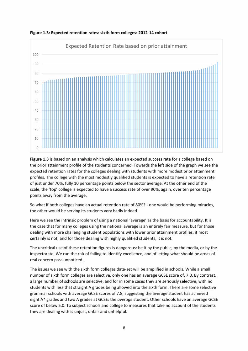
Figure 1.3: Expected retention rates: sixth form colleges: 2012‐14 cohort
Figure 1.3 is based on an analysis which calculates an expected success rate for a college based on
the prior attainment profile of the students concerned. Towards the left side of the graph we see the
expected retention rates for the colleges dealing with students with more modest prior attainment
profiles. The college with the most modestly qualified students is expected to have a retention rate
of just under 70%, fully 10 percentage points below the sector average. At the other end of the
scale, the ‘top’ college is expected to have a success rate of over 90%, again, over ten percentage
points away from the average.
So what if both colleges have an actual retention rate of 80%? ‐ one would be performing miracles,
the other would be serving its students very badly indeed.
Here we see the intrinsic problem of using a national ‘average’ as the basis for accountability. It is
the case that for many colleges using the national average is an entirely fair measure, but for those
dealing with more challenging student populations with lower prior attainment profiles, it most
certainly is not; and for those dealing with highly qualified students, it is not.
The uncritical use of these retention figures is dangerous: be it by the public, by the media, or by the
inspectorate. We run the risk of failing to identify excellence, and of letting what should be areas of
real concern pass unnoticed.
The issues we see with the sixth form colleges data‐set will be amplified in schools. While a small
number of sixth form colleges are selective, only one has an average GCSE score of. 7.0. By contrast,
a large number of schools are selective, and for in some cases they are seriously selective, with no
students with less that straight A grades being allowed into the sixth form. There are some selective
grammar schools with average GCSE scores of 7.8, suggesting the average student has achieved
eight A* grades and two A grades at GCSE: the average student. Other schools have an average GCSE
score of below 5.0. To subject schools and college to measures that take no account of the students
they are dealing with is unjust, unfair and unhelpful.
0
10
20
30
40
50
60
70
80
90
100
Expected Retention Rate based on prior attainment

9
One final analysis on retention can really highlight the nature of our concerns: looking at the
relationship between how the model predicts colleges should perform and how colleges actually
perform. For the sake of this analysis we can calculate and compare two different figures: The
expected retention rate and the actual retention rate achieved at each of the sixth form colleges in
the analysis.
Figure 1.4: Actual and expected retention rates: sixth form colleges
In Figure 1.4, each dot represents a sixth form college. The graph plots how the expected retention
rates and actual retention rates for each college compare. The expected retention rate (what would
be ‘normal’ if the students did as well as similarly qualified peers nationally) is plotted on the
horizontal axis; actual retention is plotted on the vertical axis. One dot (which we will return to
shortly) is coloured yellow. If this college had followed national patterns, it would have a retention
rate of 85%, the actual retention rate is 81%. The black diagonal line running toward the top right
hand corner represents where expected and actual retention rates are the same. If a college is above
the black line it means that performance is above what would be expected. If a college is below the
black line it means performance is below what would be expected. The blue diagonal lines represent
5% either side of this hitting the expected target. The colleges are also colour coded. The blue
colleges are within 5% of what would be expected. The red dots are more than 5% above what
would be expected, based on the prior attainment profiles of the students. The black dots are more
than 5% below what would be expected. The national average retention rate is represented by the
red horizontal line.
Figure 1.4 allows us to see how distorted a view a ‘raw’ retention rate would give. Take the example
of the yellow dot mentioned earlier. This college has a retention rate of 81%. It is above the national
average. However, when we adjust for prior attainment we find that this college is dealing with
50.0
55.0
60.0
65.0
70.0
75.0
80.0
85.0
90.0
95.0
100.0
50.0 55.0 60.0 65.0 70.0 75.0 80.0 85.0 90.0 95.0 100.0
Actual Reten
tion Rate
Expected retention rate
Actual and expected retention rates
10
rather well qualified students, and the model expects it to achieve a retention rate of 85%. It is
performing 4% below what would be expected of similarly qualified students nationally. One might
suggest that being 4% below national patterns is not much of an issue – but remember that we are
dealing with whole students here. Assume for a moment that the college in question has 1,000
students starting AS levels each year. Four per cent is equal to 40 students failing to reach the end of
their studies. These are not trivial numbers, and the consequences for the students are not trivial
either.
Each dot on our graph tells a story, and each story is underpinned by the educational lives of real
students. Some tell the story of performance in line with the national average that represents a
triumph for the students concerned. Other dots represent significant underperformance. Using a
raw national average causes us to celebrate colleges that we should not, and bewail others that do
not deserve our opprobrium. If Ofsted really do what they are told this time, and place the
achievement and attainment measures at the heart of what they do, the consequences could be far
reaching indeed.
We can express the information in a rather more straightforward, but if anything more powerful
form.
Figure 1.5: Raw and value added retention scores compared
Value Added Retention score
Bottom Third Middle Third Top third
Raw
Retention Score To
p Third
8 22
Middle Third
8
14 8
Bottom Third
22
7
Figure 1.5 provides a test of how accurately raw retention rates identify the top, middle, and bottom
third of colleges. The top row of data looks at those colleges that are in the top third for ‘raw’
retention scores. It shows how well these colleges perform when an adjustment for prior attainment
is made. We see that once the adjustment is made, 22 of the thirty colleges are still in the top third.
Eight, however have dropped to the middle third: the raw measure has incorrectly identified these

11
colleges as top performers. The middle third looks at those colleges who are, broadly speaking, in
line with what happens in the sixth form sector. Look at what happens when we introduce the
adjustment for prior attainment. Of the thirty colleges in this group, just fourteen remain in the
middle once the adjustment is made. Eight of these colleges are now in the top third, eight are in the
bottom third. The analysis of the bottom third shows a similar story. While no college are
transformed to the top third, there are seven colleges that are promoted to the middle third.
It is those colleges in the middle that should, perhaps be the biggest cause for concern. While
performance may be close to average in raw terms, the raw measure may be masking excellence,
and it may be concealing inadequacy.
Overall, there is a one in three chance that a raw measure will incorrectly categorise colleges: thirty‐
one colleges change tertiles, once the adjustment for prior attainment is made. I would be very
nervous about any accountability measure that had such a high fail rate, and extremely worried
about an inspectorate that exhibited a failure to be curious about the measures it is being asked to
use.
Accountability that takes no account of the ability of the students, is no accountability at all.

12
AAB in facilitating subjects
We can take a similar approach to the one we used to subject the retention measure to scrutiny to
establish the validity of the ‘AAB in two or more facilitating subjects’ measure.
The achievement and attainment tables are based on students attempting two or more A levels. Our
data‐set yielded 48,688 students who met this condition. The data‐set was divided into eleven prior
attainment bundles, and student records were reviewed to select those who had achieved grades of
AAB or higher, and then further reviewed to select those who had secured at least two of these
grades in facilitating subjects.
Overall, 9.7% of students achieved the ‘AAB in at least two facilitating subjects’ standard. Figure 2.0
examines how this relates to prior attainment. What we see here is a stark relationship between
prior attainment and the proportion of students attaining the AAB standard. The only students who
have a realistic prospect of attaining the AAB standard are those who achieved an average GCSE
score above 7.0 – equal to straight A grades at GCSE, and only those with an average GCSE score of
7.5 or higher have a better than 50:50 chance of meeting it.
Looking at those students with an average GCSE score below 6.0, we see that just 1% of students
achieve the AAB standard.
Figure 2.0: Achievement of AAB in two of more facilitating subjects: 2013‐14
GCSE Band Sat 2 or more A levels
Students attaining AAB in facilitating
subjects
Students attaining AAB in facilitating
subjects (%)
0.0‐4.0 171 7 4.1
4.0‐4.7 1558 20 1.3
4.7‐5.2 4908 16 0.3
5.2‐5.5 4887 27 0.6
5.5‐5.8 6260 34 0.5
5.8‐6.1 6531 72 1.1
6.1‐6.4 6376 144 2.3
6.4‐6.7 5677 345 6.1
6.7‐7.0 4315 625 14.5
7.0‐7.5 5433 1723 31.7
7.5‐8.0 2572 1733 67.4
Total 48688 4746 9.7
None of this would matter if students with different levels of prior attainment were evenly
distributed across the colleges: say if the 2,572 students in the top prior attainment band were
spread out, 29 per college. But in reality some colleges have hundreds of these students others have
none.
Figure 2.1 looks at the distribution of highly qualified students across the colleges in our analysis,
examining the proportion of students in each sixth form college who have an average GCSE score of
7.0 or higher: those in the top two bands. There are a few colleges with significant numbers of these
students (those towards the right hand side of the graph), but for the vast majority, less than 15% of
the students have an average GCSE score above 7.0. Note also those colleges towards the far left

13
hand side of the graph. The bottom two colleges had just one student in the top two bands between
them.
Figure 2.1: proportion of students with an average GCSE score of 7.0 or higher: sixth form colleges
Finally, there is something rather cruel about a system which disparages the achievement of some
students simply on the basis of their choice of subjects. Should we not be celebrating the
achievements of these students also? Figure 2.2 shows the proportion of students in each band
gaining AAB grades regardless of the subjects taken alongside the somewhat smaller proportion who
achieved AAB including two facilitating subjects. It is the middle bands where the contrast is most
pronounced… In the 5.8‐6.1 band (students averaging around a B at GCSE, four times as many
students secure the AAB without two facilitating subjects as achieve it with them.
Figure 2.2: Achievement of AAB in sixth form colleges: 2013‐14
GCSE Band Sat 2 or more A levels
Students attaining AAB in facilitating
subjects (%)
Students attaining AAB in any subjects
(%)
0.0‐4.0 171 4.1 7.6
4.0‐4.7 1558 1.3 2.1
4.7‐5.2 4908 0.3 1.0
5.2‐5.5 4887 0.6 1.6
5.5‐5.8 6260 0.5 2.6
5.8‐6.1 6531 1.1 4.3
6.1‐6.4 6376 2.3 7.5
6.4‐6.7 5677 6.1 14.5
6.7‐7.0 4315 14.5 26.3
7.0‐7.5 5433 31.7 46.2
7.5‐8.0 2572 67.4 78.8
Total 48688 9.7 15.6
0.0
10.0
20.0
30.0
40.0
50.0
60.0
70.0
80.0
90.0
100.0
Proportion of students with an average GCSE score of 7.0 or higher (%)
Proportion of students with an average GCSE score of 7.0 or higher

14
We have established that the only students with a significant chance of achieving the AAB measure
are those with an average GCSE score of 7.0 or higher, that these students are unevenly distributed
across the colleges and that that the vast majority of colleges have very few of these students. To
have a measure in the accountability tables which looks at the proportion of students that achieve
AAB in facilitating subjects is simply to have a measure that looks at the quality of a college’s intake.
It is, frankly, ridiculous.
There is no place in the accountability system for a measure by which some schools and colleges are
guaranteed success, and others are guaranteed to fail.

15
MATHS AND ENGLISH GCSE
“Do not worry about your difficulties in Mathematics. I can assure you mine are still greater.”
Albert Einstein
The story of the 2014‐15 inspection year is one of the inspection of programmes of study and the
meeting of the Maths and English GCSE requirements. The emphasis on GCSE Maths and English has
been almost absurd.
For some colleges the challenge in delivering GCSE re‐sit courses will have shifted. While many
colleges have always required that every student who lacks a pass grade in Maths and English
continues with the subject throughout their studies, others have insisted only that they attempt it in
the lower sixth year, others only that they attempt the subject again if they want to.
What is important here is to get an accurate sense of patterns in performance nationally. We do get
some clues as to how well people do nationally from the QSR reports produced by the Data Service,
but this provides the figures for all learning and skills providers (not simply SFCs), and makes no
effort to adjust for the prior attainment of the students.
Our view remains that overall performance of Maths and English GCSE re‐sit courses is actually
rather good. Bear in mind that students that fail GCSE Maths have been studying it for a minimum of
five hours per week, with those on the C/D borderline often given additional attention. A significant
proportion of these students, particularly in the London and the South East will have been having
receiving private tuition. The fact that sixth form colleges manage to get approaching 40% of these
students who have previously failed to pass the qualification with a good grade is something of a
triumph.
The 2013 Six Dimension project4 developed a model for establishing how good GCSE re‐sit provision
is. Crucially, an intervention was made that ensured that students were compared to others with
similar starting points. For this analysis we did not take average GCSE as the starting point, but
previous attainment in that subject. Figure 3.1 illustrates why this is such an important factor to take
into account.
What the data reveals, as one might expect, is that your chances of securing an A*‐C grade in a re‐sit
GCSE are closely related to the grade that you got in the subject the first time around. Once we see
what the patterns actually are, we can work towards producing a ‘fair’ analysis of provision.
The following analysis looks at the relationship between performance on GCSE re‐sit courses in
Maths and English and the previous grade achieved in that subject. Data is given for 2011‐12 (the
first year that the six dimensions project tackled performance in GCSE re‐sit courses) and 2013‐14,
the current year of analysis.
Note that what we are looking at is the proportion of students that achieve A*‐C grades of those
that start courses. As such this is a tougher measure than the A*‐C rate of completers which is more
usually quoted, but an entirely valid one. Note also that this measure is now the one in use in the
QSR reports (though, of course, no adjustment for prior attainment is made).
4 Six Dimensions of Performance: 2013 (available on the SFCA website)

16
Figure 3.1: Maths GCSE performance by prior attainment in Maths GCSE (2012 versus 2014)
2011‐12 2013‐14
GCSE grade
Starts Achievers: A*‐C grade
A*‐C grade (%)
Starts Achievers: A*‐C grade
A*‐C grade (%)
A 22 17 77.3 43 23 53.5
B 159 105 66.0 157 123 78.3
C 1068 645 60.4 1197 939 78.4
D 5330 2515 47.2 5331 1934 36.3
E 1560 330 21.2 1296 242 18.7
F 514 58 11.3 378 22 5.8
G 81 5 6.2 76 1 1.3
All given
8734 3675 42.0 8478 3284 38.7
Figure 3.1 gives us the picture for Maths GCSE. The first thing that is striking is that a good number
of students on Maths GCSE re‐sit courses have already secured Maths GCSE. The key row, however is
that for students who have previously secured a D grade. The vast majority of students are in this
band. We find that in 2011‐12, 47% of students in this band went on to secure a pass grade. For
those carrying an E grade, the figure is much lower: only 21% of students in this band secure an A*‐C
grade. In 2013‐14, however, performance has fallen, and fallen by some distance. Part of the story
here might be the requirement for all student to follow re‐sit courses where appropriate, but note
that the number of students starting re‐sit courses in Mathematics has actually fallen. In both years
of data, we see how unhelpful it is to have a measure of success that takes no account of the prior
attainment of students.
The key figure in all this is the A*‐C rate for students starting with a D grade. These are the students
who have a realistic chance of passing the qualification, and these are the ones under programmes
of study regulations who are required to be enrolled on the GCSE qualification in question. In GCSE
Mathematics, 36.3% of those who started the subject subsequently secured a C grade or higher. We
can also break down the data another way: looking at the A*‐C rate for individual institutions. The
top performing college has an A*‐C rate for D grade students of over 90%. A significant number are
under 25%.

17
Figure 3.2: Institution level A*‐C rates for students carrying a D grade at GCSE Mathematics
Figure 3.2 show us how much performance varies across institutions. Each bar represents an
individual college. The colleges with the higher A*‐C rate (of starters) are towards the left. The top
performer has a 92% A*‐C rate with students who had previously secured a D grade. Eleven colleges
have a rate below 25% for these students.
It strikes me here that there are two clear conclusions. Firstly, Ofsted needs to stop beating up
colleges where significant numbers of students are doing a difficult thing well. The key reason that
the national rate is what it is, is that passing something you have already failed (possibly on several
occasions) is challenging. If a college is doing better than is typical it should be commended, even if
‘only’ 60% of GCSE re‐sit students are being successful. Secondly, we do need to concede that Ofsted
do have a bit of a point. There are some colleges where the performance of those re‐sitting GCSE
Maths and English is simply not good enough, and given the significance of passing these
qualifications for the students concerned Ofsted are right to mention it. But there needs to be a
sense of proportion also. If a college has a thousand students, and 100 re‐sit Maths GCSE. If the
GCSE Mathematics success rate is 10% below the national rate, then that represents a negative
outcome for just 1% of the college population: there are better reasons for a requires improvement
judgement.
There is, one supposes, also the question as to why there is such variation. Partly, GCSE re‐sit
courses represent a game that some colleges are better at playing than others. The strategies that
colleges use around November re‐sit entry, and front‐loading teaching for the first two months of
the year are cases in point. There is also a matter of priority, and one thing that the flavour of recent
inspections has highlighted is that colleges need to have GCSE re‐sit courses as a priority. One
question worth asking at any college is how re‐sit courses are staffed. Are they the first thing that
are staffed or the last? Are they best teachers deployed on these courses, or do the best teachers
get the pleasures of Further Mathematics and A level English Literature? Getting the right staff is
key. We perhaps also need a bit of deeper thinking about ways of delivering these courses, about
liaison with feeder schools right at the start of the academic year, about different ways of balancing
contact time and class sizes and about additional one‐to‐one support.
0
10
20
30
40
50
60
70
80
90
100
A*‐C rate for D grade entry ‐Maths

18
Of course the real challenge for re‐sit provision will be 2016‐17. Students who have followed ‘old’
GCSE Maths and English specifications will only have the November re‐sit. Any student not
successful at this point will have to attempt the new ‘harder’ GCSEs, presumably in half the time that
the comparator group will have to prepare for it.
We find similar patterns when we repeat the analysis for English GCSE.
Figure 3.3: English GCSE performance by prior attainment in English GCSE 2012 versus 2014
GCSE grade
Starts Achievers: A*‐C grade
A*‐C grade (%)
Starts Achievers: A*‐C grade
A*‐C grade (%)
A 33 26 78.8 47 23 48.9
B 139 100 71.9 115 92 80.0
C 716 447 62.4 786 620 78.9
D 4654 1652 35.5 6390 2337 36.6
E 999 210 21.0 836 179 21.4
F 214 37 17.3 112 10 8.9
G 42 4 9.5 27 6 22.2
All given
6797 2476 36.4 8313 3267 39.3
The majority of English GCSE re‐sit students are those who have previously secured a D grade. In
2011‐12, just 35% of these students successfully gained an A*‐C grade. In 2013‐14, the number of
students re‐sitting this qualification significantly increased, but the proportion of students
converting a D grade into a C grade remains static, at around 36%.
Figure 3.4 examines the proportion of students carrying a D grade from school who subsequently
secure a C grade or higher in each of the institutions in our analysis. The top institution has a 100% C
grade pass rate with these students. The bottom ten institutions have an A*‐C rate below 25%.

19
Figure 3.4: Institution level A*‐C rates for students carrying a D grade at GCSE Mathematics
Our two conclusions from the analysis of Mathematics GCSE re‐sits hold for GCSE re‐sits in English.
Ofsted are being more than a little unreasonable overall, but performance in some individual
colleges is well below what happens nationally. It would be difficult to construct an argument as to
why any institution should be excused a GCSE re‐sit A*‐C rate of below 25% with D grade re‐sitters.
0
10
20
30
40
50
60
70
80
90
100
A*‐C rate for D grade entry ‐ English

20
PERFORMANCE IN SIXTH FORM COLLEGES OVER TIME
“We’re all doomed.” (Private Frazer, Dad’s Army)
Now that the six dimensions project is entering its sixth year, it is possible to offer some comment
on how performance has changed over time.
One thing that the project brought into sharp focus was success rates, and how success rates vary
with prior attainment. It is that which we turn to first. In the days before Maths and English GCSE
started to dominate the conversation, Ofsted seemed particularly worried about AS level success
rates. A number of colleges received inadequate judgements on the basis of this: either through
comment on the success rates themselves, or by suggesting that too many students had two AS level
years, reflecting inadequate pre‐course guidance and initial assessment.
Figure 4.1: AS level success rates: 2010‐11 and 2013‐14 compared
Figure 4.1 compares performance in 2010‐11 (the first year the project developed the full six
dimensions and the four outcome graphs) with that in 2013‐14. The shaded background area
represents AS level performance in 2010‐11. The outcomes for 2013‐14 are overlaid on this graph, in
the form of the darker, narrow bars. Towards the top end of the prior attainment spectrum,
performance in 2013‐14 is pretty much exactly in line with that from 2010‐11. Towards the lower
end of the prior attainment spectrum is a different matter entirely. Success rates (which are,
essentially, the two blue elements of the bar combined) have improved significantly in the bottom
five prior attainment bands (5.8 and below). This improvement has largely been driven by
improvements in retention.
0%
10%
20%
30%
40%
50%
60%
70%
80%
90%
100%
A*‐B grade
C‐E grade
Failed
Left course

21
The introduction and use of comparable outcomes methodology by the awarding bodies has
ensured that the overall national pass rate and grade profiles are static at both GCSE and AS/A level.
For the pass rate in SFCs to have improved significantly, it would have had to be at the expense of
students elsewhere in the post‐16 environment. It should be no surprise then that we have not seen
a significant change in the pass rate. The one aspect of performance not touched by comparable
outcomes methodology is retention – you can improve that as much as you like without having to
improve at the expense of someone else.
In an era of a crushing reduction in the unit of resource, sixth form colleges have seen significantly
improved success rates for those students with average GCSE scores below 5.8. One further analysis
we should complete is to look at whether the profile of students starting AS level courses has
changed in recent years.
Figure 4.2: enrolments on AS level courses 2010‐11 and 2013‐14
2010‐11 2013‐14
Band Starts % Starts %
0.0‐4.0 2355 0.8 1737 0.7
4.0‐4.7 15831 5.6 13164 5.0
4.7‐5.2 37262 13.2 33123 12.7
5.2‐5.5 31818 11.3 29698 11.4
5.5‐5.8 36745 13.0 34469 13.2
5.8‐6.1 35484 12.6 34306 13.2
6.1‐6.4 33471 11.9 31144 11.9
6.4‐6.7 28605 10.2 26380 10.1
6.7‐7.0 21915 7.8 20162 7.7
7.0‐7.5 26552 9.4 24624 9.4
7.5‐8.0 11541 4.1 11896 4.6
281579 260703
The number of AS enrolments in sixth form colleges has dropped by 7.4% since 2010‐11. There are
(at least) three forces at work here: the increasing use of BTEC qualifications for whole and mixed
programmes, the changing funding formula creating downward pressure on programme size, and
the reduction in enrolments in general studies.
With the surge in BTEC provision, one might have expected to see a significant reduction in the
proportion of students in the bottom bands. Actually, the proportion is pretty static. In 2010‐11, 44%
of starts were in the bottom five bands. In 2013‐14, 43% of enrolments were in the same five bands.
Not only have we seen significant improvements in success rates in the bottom five prior attainment
bands, but this represents significant improvement for approaching 50% of the sixth from college
cohort.

22
Figure 4.3: A2 level success rates: 2010‐11 and 2013‐14 compared
Again, we see significant improvement in the bottom five bands, with the success rate (the two blue
elements of the graph combined) hitting 90% across the ability range.
The one thing we can’t get from this analysis is a sense of how sixth form colleges have been
performing in comparison to other providers. The one measure we can use here is L3VA scores.
These of course tell us only a fraction of what we need to know, but they do tell us about an
important fraction – how they grades our students get at the end of A level programmes compare to
similarly qualified students nationally at the same point.
Figure 4.5: L3VA scores: 2023‐14 exam series
A level entries L3VA score
Sixth Form Colleges 144,557 0.0
Schools 439,439 0.1
GFE / Tertiary Colleges 54,108 ‐0.1
The current L3VA model reports in terms of fractions of a grade. The L3VA score for 2013‐14 for sixth
form colleges is 0.0, suggesting that students get exactly the A level grades that would be expected,
given the prior attainment profile of the students and the subjects being studied. Schools perform
fractionally better, and GFE and tertiary colleges fractionally worse. In previous years, sixth form
colleges have been ahead of other providers. The advantage that we did enjoy over other providers
has been eroded, and in fact eradicated. Note that the 2014 exam series was the first where
students and colleges have not had the benefit of January modules, which may have had the effect
of drawing exam grades back towards the middle.
0%
10%
20%
30%
40%
50%
60%
70%
80%
90%
100%
A*‐B grade
C‐E grade
Failed
Left course

23
Great Expectations
It strikes me that there could be few lines that more fully sum up what value added is about than
this line from Robert Browning.
“A man’s reach should exceed his grasp.”5
It is a line that works equally well when talking about individual students, when talking about
subject teams, or when talking about whole colleges. Let us pause a moment to consider it. The
notion of reach is about stretching beyond what is secure. It is of course exactly what the most
effective students do – they push themselves beyond what is normal, beyond what they are
comfortable with. They do not rest on what they have currently mastered. With each piece of work
they seek to improve further. It is a comment about ambition, about taking risks, about resilience
and about not being put off by the possibility of failure. This is also exactly what highly effective
colleagues, highly effective departments and highly effective colleges do. They have a clear sense of
where normal performance and current performance lies and an ambition to go beyond this – a
sense of not being satisfied with being in line with national averages, and a yearning to go beyond.
The analysis presented here emerges from some research conducted at Peter Symonds College
looking at the habits of highly effective students. In our explorations, one group we examined was
those that secured places at Russell Group universities. We identified important differences
between Russell Group students and the rest of the A level cohort. The sixth form colleges’ data‐set
allows us to explore these features with a much bigger group of students. We can isolate particular
groups of students and examine different aspects of their performance to see whether they differ
from other students.
Our analysis looks at the 8,972 students who secured places at Russell Group universities in the 2014
application cycle. This includes students who have secured a deferred entry place, but excludes any
that may be taking a gap year and pursuing post‐qualification applications. This group represents
23.0% of the 38,985 students completing A levels in 2013‐14.
Our first analysis goes back to the 2012‐13 year, and looks at how these students performed at AS
level.
Figure 5.1: AS level performance 2012‐13: students subsequently securing Russell group places.
Attendance Retention Achievement Success High Grades
Points per starter
Points per completer
Points per achiever
Expected 93.2 96.7 95.6 92.6 59.5 52.7 54.3 56.2
Actual 94.2 99.2 98.7 97.9 76.3 61.2 61.6 62.5
+/‐ 0.9 2.5 3.0 5.3 16.9 8.5 7.3 6.3
5 “Andrea del Sarto”, by Robert Browning

24
Figure 5.1 show us the six dimensions outcomes for the Russell Group students in 201‐23. The
Expected line gives us the level of performance for each measure which would be expected for
similarly qualified students pursuing the particular spread of subjects started by the Russell Group
students. The model expects (for example) 93.2% attendance. The Actual row shows us the level of
performance achieved by these students (94.2%), and the +/‐ figure shows us the difference (+0.9).
We see that the Russell group students complete more course than would be expected and pass
more of the qualifications they complete than would be expected, but is the high grades measure
and points measures that are most impressive. The students are getting touching 17% more high
grades than would be expected, and remember this has been adjusted for prior attainment, so it is
not simply a matter of these students being super‐bright. The points per completer measure is the
most useful here. It tells us, as fifteen points is equal to an AS level grade, that the students got a
grade higher than would be expected in half of the AS levels they sat.
Figure 5.2: A level performance 2013‐14: students subsequently securing Russell group places.
Attendance Retention Achievement Success High Grades
Points per starter
Points per completer
Points per achiever
Expected 92.9 98.5 98.7 97.2 66.4 117.7 119.4 120.6
Actual 94.2 99.6 99.6 99.2 87.0 136.3 136.8 137.4
+/‐ 1.3 1.1 0.9 2.0 20.6 18.5 17.4 16.7
Figure 5.2 looks at the A level performance of the same group of students. Performance is above
expectation in every category. But what is particularly interesting is how this performance compares
to performance at AS level. These students have not only consolidated the advantage the secured in
the AS units of the course, but have extended it.
Regardless of prior attainment, these students have outperformed their peers by some distance.
They have not simply met the expectations (and the target grades), they have exceeded them by
some distance. The reach of these students goes well beyond their grasp. Each time they grasp
something, they reach again.
Figure 5.3: A level performance 2013‐14: students subsequently securing Russell group places, by
prior attainment
PPC 7.5‐8.0
7.0‐7.5
6.7‐7.0
6.4‐6.7
6.1‐6.4
5.8‐6.1
5.5‐5.8
5.2‐5.5
4.7‐5.2
4.0‐4.7
0.0‐4.0
Count of subjects completed
All 9060 17933 13944 17971 19683 19591 18459 14165 14217 4697 524
Russell Group 6101 8542 4561 3963 2814 1725 1003 497 314 101 16
Points Per Completed A level subject
All 149.2 129.6 116.3 106.8 97.9 91.2 85.3 80.7 75.6 73.3 76.2
Russell Group 153.7 140.1 133.3 129.0 124.8 124.4 121.7 123.1 117.3 125.0 125.6
+/‐ 4.4 10.5 17.0 22.3 26.9 33.2 36.3 42.4 41.8 51.8 49.4
Gap – grades per entry
0.1 0.3 0.6 0.7 0.9 1.1 1.2 1.4 1.4 1.7 1.6

25
Figure 5.3 explores how the performance of the Russell group students compares with the
performance for ‘all’ students in each of the prior attainment bands. As one would expect, the
students securing Russell Group places are centred towards the top end of the prior attainment
profile. However, there are students gaining access to Russell Group universities in each of the
bands. In fact, there are good numbers of students in each of the bands from 5.2 upwards (2 grade
‘B’s and 8 grade ‘C’s at GCSE).
The points scale uses a measure where 30 points is equal to a grade. In the very top band, the
difference is slight. In this band students tend to get straight ‘A’ grades anyway. In the second band
down, things start to get very interesting indeed. A score of 10.5 suggests that in a three A level
programme, the Russell group students score on average one grade higher than their equally
qualified peers who do not secure places: on average, a profile of AAB rather than ABB. By the point
we reach an average GCSE score below 6.4, the students are scoring a grade higher than would be
expected on the basis of prior attainment and subject choice alone in each and every one of their A
level subjects.
We can explore this another way, looking at the typical grade outcomes of all students and the
typical grade outcomes of Russell group students.
Figure 5.4: A level performance 2013‐14: students subsequently securing Russell group places, by
prior attainment
Band All students Russell Group students
7.5‐8.0 AAA AAA
7.0‐7.5 ABB AAB
6.7‐7.0 BBB AAB/ABB
6.4‐6.7 BBC/BCC ABB
6.1‐6.4 BCC BBB
5.8‐6.1 CCC BBB
5.5‐5.8 CCC BBB
5.2‐5.5 CCD BBB
4.7‐5.2 CCD/CDD BBB
4.0‐4.7 CCD/CDD BBB
0.0‐4.0 CCD/CDD BBB
It strikes me that this data provides an excellent basis for a discussion with students at the start of
their A level studies. A discussion about the importance of ambition. A discussion about how a target
grade (and the column for ‘All students’ above can be read as a target grade) is a starting point for
discussion and not a limiting of ambition. It is not just what students have achieved at 16 that shapes
their future, it is how they approach A level study, and how they work over the two years.
These students hit the ground running and they don’t stop. They accelerate through the first year,
and then consolidate that advantage in the second. This is not simply a story about well qualified
students. It is a story about the impact of ambition, of hard work, and about seeking to improve. And
it is not just a story about the Russell Group – this group is simply a proxy for highly ambitious,
motivated resilient students, wherever their ambitions may lie.

26
Every college can model what behaviours these students have, especially those from the middle
bands. Perhaps in talking to new students about how to approach their time at college we should
focus a little less on the destination that students get to, and more on the journey that they make.
Every college will have examples of middle prior attainment band students that significantly
overachieved. Perhaps we should get them to tell the new intake how they achieved it.
We should use this information in conversations with individual students about their target grades.
Overall the message is simple: “Want to get to the Russell Group or some other challenging
destination? Add half a grade to you target grade and seek to exceed it. Target grade of a B? Aim for
AABB in your AS levels. TMG of C? Aim for BBCC.” A man’s reach should indeed exceed his grasp.
While we are looking at the importance of ambition and expectations it is perhaps worth returning
to one of the first analysis conducted by the six dimensions project: the analysis of the relationship
between attendance and outcomes.
While no‐one would suggest that there is a simple causal relationship here and that all failure could
be eliminated if students would just attend all the time, there is a value in sharing with students the
impact of poor attendance in terms of typical outcomes.
At one level examining attendance is an exercise in the blindingly obvious – those students that
attend more get better outcomes. It would also be quite reasonable to suggest that good
attendance is the consequence of educational success rather than the cause of it. However, there is
a real benefit to having some sense of the actual data around the impact of attendance: a sense
which gives us an additional lever in conversations with students and parents, and in the context of
this discussion, a way of framing thinking and expectations around attendance.
Figure 5.5: Attendance – AS level (2013‐14 data)
Points per entry 7.5‐8.0
7.0‐7.5
6.7‐7.0
6.4‐6.7
6.1‐6.4
5.8‐6.1
5.5‐5.8
5.2‐5.5
4.7‐5.2
4.0‐4.7
0.0‐4.0
Entries
All 10579 21529 17302 22371 26388 28628 29058 24134 26221 10144 1339
% above 95% 72.1 66.3 61.1 57.8 52.6 48.7 44.2 40.7 35.4 29.8 27.0
% 85‐95% 22.8 28.1 30.9 32.8 36.3 37.8 38.9 40.7 41.6 40.8 38.7
% below 85% 5.1 5.6 8.0 9.5 11.1 13.5 17.0 18.6 23.0 29.4 34.4
Average Attendance 95.6 95.1 94.3 93.8 93.2 92.4 91.6 91.0 89.9 88.1 86.6
Overall, attendance in the sector in AS level provision is 92.4%, but this average (as with many
averages) disguises significant variation. There are two features of the graph which are immediately
interesting. Firstly, there is a relationship between attendance and prior attainment. The better a
student performed in school, the better they are likely to attend in college. Students with an average
GCSE score of 7.0 attend 95% of the time, and those with an average GCSE score of 5.2 attend
around 90% of the time. These are not trivial differences. Each band is also divided into three
groups: those that attend over 95% of the time, those that attend above 85% but below 95%, and
those that attend below 85%. Note how the proportion of students that attend below 85% increases
steadily as prior attainment decreases. Only 5% of students with ‘A’ grades at GCSE attend less than

27
95% of the time, whereas almost a quarter of students with ‘C’ grades at GCSE attend below this
threshold.
If we look at the proportion of enrolments where attendance is below 85%, we find that for all
students, the figure is 18%. The school league tables include a figure for ‘persistent absence’, which
is defined as absence above 15%, dovetailing neatly with our threshold of 85%. The figure for
secondary schools in England for 2013‐14 is schools is 5.3%. In sixth form colleges the figure is 18%.
The emergence of persistent absence coincides with the post‐16 phase of education. We would be
foolish to pretend that there were not some serious questions we should be asking of ourselves.
Figure 5.6 takes this analysis further and looks at the relationship between levels of attendance and
performance at AS level in points per entry terms. A grade is equal to 15 points on the scale used.
Figure 5.6: Attendance, prior attainment and Points per subject – AS level (2013‐14 data)
Points per entry 7.5‐8.0
7.0‐7.5
6.7‐7.0
6.4‐6.7
6.1‐6.4
5.8‐6.1
5.5‐5.8
5.2‐5.5
4.7‐5.2
4.0‐4.7
0.0‐4.0
Points per entry
95% or higher attendance 70.1 62.3 55.4 50.8 46.1 42.1 38.2 35.5 32.8 31.3 36.6
85 – 95% attendance 68.1 58.2 51.1 46.8 42.0 38.0 34.2 31.2 28.2 27.0 31.0
Below 85% attendance 64.5 51.6 44.0 39.6 35.5 31.7 28.3 24.9 22.5 20.6 21.2
Gap: above 95% versus below 85% 5.6 10.7 11.4 11.2 10.6 10.4 9.9 10.6 10.3 10.7 15.4
For each of our three attendance bands, the points per entry is given. Look at the band for students
with an average GCSE score of 5.8 to 6.1. Those students who attend above 95% achieve 42 points
per entry – just short of a C grade, on average. For those attending below 85%, the points average is
31.7 – just above a D grade.
The final row of our table looks at the gap between those attending above 95% and those attending
below 85%. In all but the very top band, the gap is around 10 points per entry. In a three AS level
programme this equates to two whole grades per student – an outcome of BCC rather than BBB, for
example. In a four A level programme the impact is between two and three grade per student.
These differences represent a material difference in life chances, particularly in terms of university
applications.
In this analysis we have sought to develop insights that can be shared with students to help to try to
foster aspiration, ambition, and hard work. There is one rather neat way of drawing together the
main themes of our discussion, and that is to look at the attendance of those students who end up
at the Russell Group. Remember that for all students the proportion of enrolments where
attendance is below 85%, the figure is 18%. For students that end up at the Russell Group it is just
4.4%. Again we find an important association between attendance and success.

28
Appendix One: Understanding and interpreting individual college reports
Six dimensions reports provide an extended value added analysis of performance in an individual
school or college. Whereas traditional value added models restrict themselves to examining points
gained per exam completed, six dimensions reports consider a much wider basket of measures of
performance, and the analysis encompasses all students who started courses, not just those that
reached the end.
Core reports for college and subject performance all follow the same basic structure:
1. Student profile
2. Value added analysis
3. Performance by prior attainment band
4. Four year trend analysis
The idea here is to give management and subject teams the opportunity to examine the context in
terms of the characteristics of the students a department or college is dealing with, explore multiple
dimensions of performance, explore performance across the prior attainment spectrum and
examine performance over time.
Student profile
The student profile data is provided to give a sense of what the profile is in a particular institution,
how this is changing, and how it relates to national patterns. In our example here we see an
interesting switch in the gender profile, and a steady increase in the proportion of very well qualified
students taking the subject.
The prior attainment profile is summarised in the graph above. The right hand bar is the national
profile of all students taking the qualification concerned. The blue section represents those with an
average GCSE score below 5.8; the red section represents those students with an average GCSE
score of 6.7 or above. In our example, we can immediately see whether the profile is in line with
All MaleFemal
eWhite
Non‐
white
Below
5.8
5.8‐
6.76.7+
Ave
GCSE
% % % % % % %
2008‐09 191 58 42 93 7 18 46 36 6.4
2009‐10 193 53 47 98 2 20 36 44 6.5
2010‐11 234 44 56 96 4 20 33 47 6.5
2011‐12
Gender Ethnicity Prior attainment
0%10%20%30%40%50%60%70%80%90%100%
6.7+
5.8‐6.7
Below 5.8
29
what is typical nationally. We also see the increase in the proportion of well qualified students taking
the subject. Department heads often comment on how their students relate to those found in the
subject nationally – this analysis will allow such discussions to be based on actual evidence.
Value Added Analysis
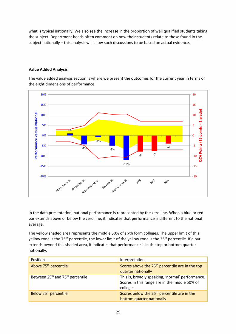
The value added analysis section is where we present the outcomes for the current year in terms of
the eight dimensions of performance.
In the data presentation, national performance is represented by the zero line. When a blue or red
bar extends above or below the zero line, it indicates that performance is different to the national
average.
The yellow shaded area represents the middle 50% of sixth form colleges. The upper limit of this
yellow zone is the 75th percentile, the lower limit of the yellow zone is the 25th percentile. If a bar
extends beyond this shaded area, it indicates that performance is in the top or bottom quarter
nationally.
Position Interpretation
Above 75th percentile Scores above the 75th percentile are in the top quarter nationally
Between 25th and 75th percentile This is, broadly speaking, ‘normal’ performance. Scores in this range are in the middle 50% of colleges
Below 25th percentile Scores below the 25th percentile are in the bottom quarter nationally
1%
‐4%
‐1%
‐5%
‐12%
‐8 ‐7
‐4
‐20
‐15
‐10
‐5
0
5
10
15
20
‐20%
‐15%
‐10%
‐5%
0%
5%
10%
15%
20%
QCA Points (15 points = 1 grade)
Perform
ance versus National
30
The red lines indicate the limits of one standard deviation around the national line. 68% of scores
will fall within this zone. A bar extending above this would be in the top 16% nationally.
In our example here, the department is not performing particularly well. We see that attendance is
1% above what would be expected in this particular subject for the profile of students the
department is serving. Retention is some way below expectation, though achievement is close to the
national line (again, a standard based on national patterns of prior attainment, retention and
achievement). The success rate is some 5% below what would be expected. We see the bar for
success extends below the yellow zone, indicating that this performance is in the bottom 25%
nationally. The high grades of starters figure is particularly worrying. Imagine a class of 25 students
starting a course in September. In this department three fewer would achieve a high grade than
would be typical nationally. Remember that this is high grades of starters: covering all the students
on the course, rather than just those that completed the course. Getting a high grade is a powerful
thing in terms of life chances for students. If in every class, three fewer students are getting a high
grade than would be expected, that is real cause for concern.
The subject level reports use three different points measures to explore performance:
a. Points per starter (PPS) – of those that start the course, is the number of QCA points gained per
student typical for the subject in question and the prior attainment profile of the students.
b. Points per completer (PPC) – of those that finish the course is the number of QCA points gained
per student typical for the subject in question and the prior attainment profile of the students.
c. Points per achiever (PPA) – of those that pass the qualification, is the number of QCA points
gained per student typical for the subject in question and the prior attainment profile of the
students.
The points measures use QCA points, which means that the scale used for AS level is different to that
used for A level. In the AS analysis 15 points is equal to a grade, in the A level analysis 30 points is
equal to a grade.
AS level points (15 points = one grade)
A level points(30 points = one grade)
% of a grade per student Fraction of a grade per student
0 0 0
1 2 7% 1/15
2 4 13% 2/15
3 6 20% 1/5
4 8 27% 4/15
5 10 33% 1/3
6 12 40% 2/5
7 14 47% 7/15
8 16 53% 8/15
9 18 60% 3/5
10 20 67% 2/3
11 22 73% 11/15
12 24 80% 4/5
13 26 87% 13/15
14 28 93% 14/15
15 30 100% 1/1

31
It is also vitally important to (literally) get a sense of proportion when interpreting scores. If there
were only twenty students on a course, then each student represents 5% of the total. On such a
course, a cohort could be 4% below the national rate, but would have been above the national rate
if one more student has achieved the qualification. Even with much larger cohorts it is important to
get a sense of how many additional ‘passes’ would have been required to achieve the national
average, 75th percentile and so forth.
For example, a sociology cohort of 250 students at a large sixth form college achieves a success rate
of 85.2%, but the value added success rates model expects it to achieve 88.3%: it is 3.1% below the
national average. As there are 250 students, each percentage point represents 2.5 students. 3.1%
equates to eight students. If eight more students had passed the qualification, the college would
have scored a positive figure and been above the national average. Of course, in this instance there
are 37 students who were not successful. The department needs to explore their case histories for
clues as to how the department might have responded better to the needs of the students
concerned. The discussion the department then needs to have is about the 37 students who were
not successful and what could be done to drive‐up success rates in the future.
Performance by Prior attainment band
In the performance by prior attainment band section we return to the graphical presentation we
used when exploring the relationship between prior attainment, subject and student outcomes. The
shaded background represents national performance in a subject; the narrow bars represent
performance in an individual subject.
Note that the display includes the number of students that started the course in each band. We
should be very cautious about over‐interpretation if the sample size in a particular band is small. For
example, in the 4.0‐4.7 band in the above, there are only four students, so each will represent 25%
of the total. It is performance in the bands where the majority of students lie that will prove most
useful.
It does, however, give us a really clear idea of what happens nationally, and if performance (for good
or bad) is significantly different to what happens nationally in a number of bands, then we need to
know why.
0%
10%
20%
30%
40%
50%
60%
70%
80%
90%
100%
0.0‐4.0 ‐0 Starts
4.0‐4.7 ‐4 Starts
4.7‐5.2 ‐7 Starts
5.2‐5.5 ‐16 Starts
5.5‐5.8 ‐20 Starts
5.8‐6.1 ‐22 Starts
6.1‐6.4 ‐23 Starts
6.4‐6.7 ‐32 Starts
6.7‐7.0 ‐36 Starts
7.0‐7.5 ‐53 Starts
7.5‐8.0 ‐21 Starts
A*‐B grade
C‐E grade
Failed
Left course

32
Four year trend analysis
The final presentation of data contrasts raw and value added performance. The value added scores
are colour coded. Performance in the bottom quarter uses a blue font, performance in the middle
half uses a black font, and performance in the top quarter is represented by a red font.
Destinations reports
The destinations report is designed to compare performance in an individual college with national
patterns of destination.
The report centres on those students starting at least two A2 level qualifications in 2012‐13. The
only destinations that are reported on are ‘secured destinations’ – when a student has a confirmed
university place (for direct entry of deferred entry) by the close of clearing. Students applying to
university in the year following A level results do not count as a ‘positive’ destination by this
methodology.
There are two key measures in this report:
1. The proportion of students that secure a university place, compared to a benchmark which
is adjusted according to prior attainment profile of students
2. The proportion of students that secure places at Russell Group universities, compared to a
benchmark which is adjusted according to prior attainment profile of students
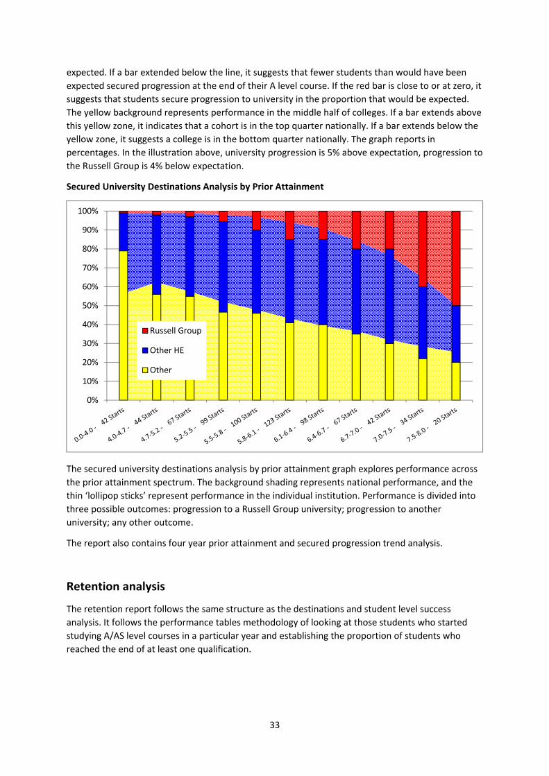
Secured University Destinations Analysis
This graph summarises the overall performance of an institution, which is represented by a red bar.
If the bar extends above the zero line, it indicates that more students progress than would be
(4) Four Year Trend Analysis
Starts Att Ret Ach Succ High PPS Att Ret Ach Succ High PPS
2008‐09 191 100.0 97.4 97.4 3.7 4.0 7.1
2009‐10 193 98.4 98.9 97.4 2.1 5.6 7.1
2010‐11 234 95.4 97.9 96.5 94.4 62.8 54.1 2.0 1.5 3.0 3.9 7.9 4.0
2011‐12
Raw Performance Value Added Performance
‐15
‐10
‐5
0
5
10
15
‐15
‐10
‐5
0
5
10
15
University Russell Group
33
expected. If a bar extended below the line, it suggests that fewer students than would have been
expected secured progression at the end of their A level course. If the red bar is close to or at zero, it
suggests that students secure progression to university in the proportion that would be expected.
The yellow background represents performance in the middle half of colleges. If a bar extends above
this yellow zone, it indicates that a cohort is in the top quarter nationally. If a bar extends below the
yellow zone, it suggests a college is in the bottom quarter nationally. The graph reports in
percentages. In the illustration above, university progression is 5% above expectation, progression to
the Russell Group is 4% below expectation.
Secured University Destinations Analysis by Prior Attainment
The secured university destinations analysis by prior attainment graph explores performance across
the prior attainment spectrum. The background shading represents national performance, and the
thin ‘lollipop sticks’ represent performance in the individual institution. Performance is divided into
three possible outcomes: progression to a Russell Group university; progression to another
university; any other outcome.
The report also contains four year prior attainment and secured progression trend analysis.
Retention analysis
The retention report follows the same structure as the destinations and student level success
analysis. It follows the performance tables methodology of looking at those students who started
studying A/AS level courses in a particular year and establishing the proportion of students who
reached the end of at least one qualification.
0%
10%
20%
30%
40%
50%
60%
70%
80%
90%
100%
Russell Group
Other HE
Other
34
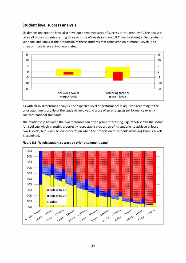
Student level success analysis
Six dimensions reports have also developed two measures of success at ‘student level’. The analysis
takes all those students starting three or more AS levels (and no BTEC qualifications) in September of
year one, and looks at the proportion of these students that achieved two or more A levels, and
three or more A levels two years later.
As with all six dimensions analysis, the expected level of performance is adjusted according to the
prior attainment profile of the students involved. A score of zero suggests performance exactly in
line with national standards.
The relationship between the two measures can often prove interesting. Figure 5.4 shows the scores
for a college which is getting a perfectly respectable proportion of its students to achieve at least
two A levels, but is well below expectation when the proportion of students achieving three A levels
is examined.
Figure 5.5: Whole student success by prior attainment band
‐15
‐10
‐5
0
5
10
15
‐15
‐10
‐5
0
5
10
15
Achieving two ormore A levels
Achieving three ormore A levels
0%
10%
20%
30%
40%
50%
60%
70%
80%
90%
100%
Achieving 3+
Achieving 2+
Other

35
Equal Opportunities Monitoring Reports
The equal opportunities monitoring reports compare success rates in a particular college with the
patterns found nationally. In the reports, national performance is represented by the cream
coloured bars, performance in the individual college is represented by black bars. The score in the
college is given in red.
Equal opportunities monitoring ‐ extract from an example report
It is worth being clear about what the national lines and college bars represent. Both bars have been
adjusted for prior attainment and subject choice. At national level, the line reports on the question
‘does the equality and diversity group in question perform in line with performance for all students
in terms of success rates once prior attainment and subject choice have been taken into account.’ In
the extract above we see that the national performance for male and female students is so close to
the national line that there is no cream bar extending above or below the zero line. There are a few
categories where national performance is above what would be expected, and we see a cream bar
extending from the zero line: White –Irish students and Asian‐Chinese for example. Including these
national variations allows us to avoid lazy assumptions about how well groups perform. It is often
assumed that black groups in particular underperform in the English educational system. A college
may explain away underperformance among black students by reference to the idea that such
underperformance is normal. The background national data in the equality and diversity graphs
reveals the true patterns of performance.
The performance in a particular college is overlaid on the national picture, and represented by the
black bars. If a black bar extends out of the cream bar, it means that performance is more extreme
than is found nationally. In the figure above we see that Asian – Chinese students have a success
rate 7.2+ above what would be expected of similarly qualified students doing similar subjects
nationally. Perhaps much more significant for this college is the figure for Asian – Bangladeshi
students, which is well short of what would be expected nationally, and in contrast to Bangladeshi
student nationally, who perform in line with expectation once prior attainment and subject are
factored in. Note also that this college has a large cohort of Bangladeshi students (483 starts), so we
cannot explain away difference to national performance by saying that the cohort is very small, and
therefore any variation is statistically meaningless.
7.2
‐4.3
‐3.2
9.1
4.0
1.0
‐3.3
2.3
‐15 ‐10 ‐5 0 5 10 15
Asian ‐ Chinese ‐ 29 starts
Asian ‐ Bangladeshi ‐ 483 starts
Asian ‐ any other Asian ‐ 80 starts
White ‐ Other ‐ 3514 starts
White ‐ Irish ‐ 605 starts
White ‐ British ‐ 3021 starts
Male ‐ 1998 starts
Female ‐ 2591 starts
‐15.0 ‐10.0 ‐5.0 0.0 5.0 10.0 15.0
36
The whole college reporting also includes a summary of performance by equality and diversity
category across three key measures: retention, success and points per completer.
Six Dimensions of Performance Report
Example College: E&D Summary Report 2013‐14
Performance by high level equality and diversity category: 2013‐14 outcomes: GCE AS level
Retention Success Points Per Completer
Starts Act Exp Act‐Exp Nat Act Exp
Act‐Exp Nat Act Exp
Act‐Exp Nat
All 3098 96.3 96.1 0.2 0.0 86.4 87.6 ‐1.1 0.0 45.0 45.7 ‐0.7 0.4
Female 1596 96.0 96.3 ‐0.3 ‐0.4 88.8 89.8 ‐1.0 ‐0.6 48.1 48.4 ‐0.4 0.0
Male 1501 96.7 95.9 0.8 0.5 83.9 85.2 ‐1.3 0.8 41.7 42.9 ‐1.1 0.9
White 2803 96.3 96.1 0.1 0.1 86.6 87.7 ‐1.1 ‐0.3 45.1 45.8 ‐0.6 0.6
All BME 294.3 97.2 96.0 1.2 ‐0.3 84.7 86.4 ‐1.7 1.0 43.6 45.3 ‐1.7 ‐0.2
This report provides a highly effective way to monitor performance, as the outcomes for each
category are placed alongside each other with direct reference to how the group in question
performs nationally. The extract below examines the data for retention.
The Act column gives, in effect, the raw retention rate for the college in question. The Exp column
indicates the level of performance that would be expected of similarly qualified students pursuing
the same courses nationally. The Act‐Exp column indicates whether performance at the college is
above or below national rates. The Nat column is designed to show whether the group in question
tends to do well nationally, and provides a useful reference point for the college score.
The rate expected
by the six
dimensions model
The actual rate for
the group concerned
The difference
between
actual
performance
and expected
performance
How the group
in question
performs
nationally
37
GCSE Maths and English reports
The GCSE Maths and English re‐sit analysis centres on looking at whether students in individual
colleges perform as well as students with similar levels of prior attainment in the individual subject
concerned. It is based on an analysis of all students attempting GCSE re‐sit courses in sixth form
colleges in 2013‐14. In short, it allows students carrying a grade D from their school GCSE sitting to
be compared with other students starting a re‐sit course with a grade D.
The graph above relates to GCSE Mathematics. The wide yellow bars represent national
performance; performance in the college concerned is represented by narrow blue bars. In the
above example, the college has 25 students doing GCSE Mathematics who had previously secured a
grade D in the subject. We see that nationally, 46% of these students secured an A*‐C grade when
they re‐sat the qualification. At the college in question, 55% of students secured an A*‐C grade.
Value Added Analysis
Actual A*‐C % Expected A*‐C % Act ‐ Exp
41.0 36.6 4.4
The analysis also indicated a value added score (Actual A*‐C passes – Expected A*‐C passes). This
summarises whether as many GCSE passes as expected were attained, having adjusted for the prior
attainment profile of the cohort. In our example, the proportion of students securing Maths GCSE is
41%. This initially looks worrying, but when national standards are factored into the analysis, we see
that the expected A*‐C rate would be just 36.6%, given the prior attainment profile of these
students in GCSE Mathematics.
The presentation for GCSE English follows the same format. Any differences in the appearance of the
graph are due to the different levels of performance in these subjects nationally.
A B C D E F G
Starts 0 1 1 25 8 4 2
National 100 66 60 46 21 11 6
College 100 0 60 12.5 0 0
0102030405060708090100
0102030405060708090
100
%