the trinity portfolio - home - cambria investments trinity portfolio a long-term investing framework...
TRANSCRIPT
The Trinity PortfolioA Long-Term Investing Framework Engineered for Simplicity, Safety, and Outperformance
Phone: 310.606.5555Fax: 310.606.5556
Meb Faber
2
The Trinity Portfolio
In other words, data, numbers, and verifiable results dictate my investment decisions. This makes it difficult for me to place my faith in any one investment strategy – much less advocate it to others. Yet that’s what I’m doing in this paper, as I find myself strongly believing in the investing framework I’ll detail in the following pages.
There are a few reasons why I’m willing to stand behind this strategy. First, based on my personal research, it produces returns that historically outperform those of common benchmark portfolios. Second, the same research suggests it does this with reduced volatility and drawdowns.
However, there are abundant investing strategies claiming great returns and/or lower volatility, many of which I’ve written about. In fact, over the last ten years, I’ve written five books, ten white papers, and over fifteen-hundred investing articles. Why is this portfolio different?
The answer leads us to the third reason why I believe in this framework: It addresses a major question facing many investors today — “how do I put it all together?”
Investors today have access to more market data and strategic information than at any other time in history. Yet from the perspective of the average investor, this huge volume of fragmented information presents a challenge — how should one actually implement everything?
So the third reason I’m advocating this framework is because it’s holistic. On one hand, the approach is broad and sturdy, rooted in respected, wealth-building investment principles. On the other hand, it’s strategic and intuitive, able to adapt to all sorts of market conditions. The result is a unified, complementary framework that can relieve investors of the handwringing and anxiety of “what’s the right strategy right now?”
If you’re an investor who’s struggled with generating long-term returns that make a real difference in your wealth, I believe this portfolio can help. If you want less anxiety during periods of heightened market volatility and drawdowns, I believe this portfolio can help. And if you’re unsure how to balance the simplicity of buy-and-hold with the various benefits of an active portfolio, I think the investing framework in this paper can help.
If that sounds like your type of investing, I hope you’ll read on.
I am a quant.
3
The Trinity Portfolio
I’ve named the portfolio you’re reading about today “The Trinity Portfolio.” Actually, a creative reader of my blog suggested the name, but as it’s appropriate, it stuck.
“Trinity” is a reference to the three core elements of the portfolio: 1) assets diversified across a global investment set, 2) tilts toward investments exhibiting value and momentum traits, and 3) exposure to trend following.
If you find any of these terms unfamiliar, don’t worry. We’ll detail each in the pages to come. At this point, I present them more as a set of guideposts.
You see, in addition to being the foundational elements of the Trinity Portfolio, these three pieces also provide us the sequence to follow when constructing the portfolio. Three chronological “steps,” if you will.
So as I introduce Trinity, we’ll follow this three-step roadmap. We’ll analyze the effect of each step on our portfolio, considering its impact on returns, volatility, as well as a few other metrics. This will enable you to see the exact engineering behind our final result.
Let’s dive in.
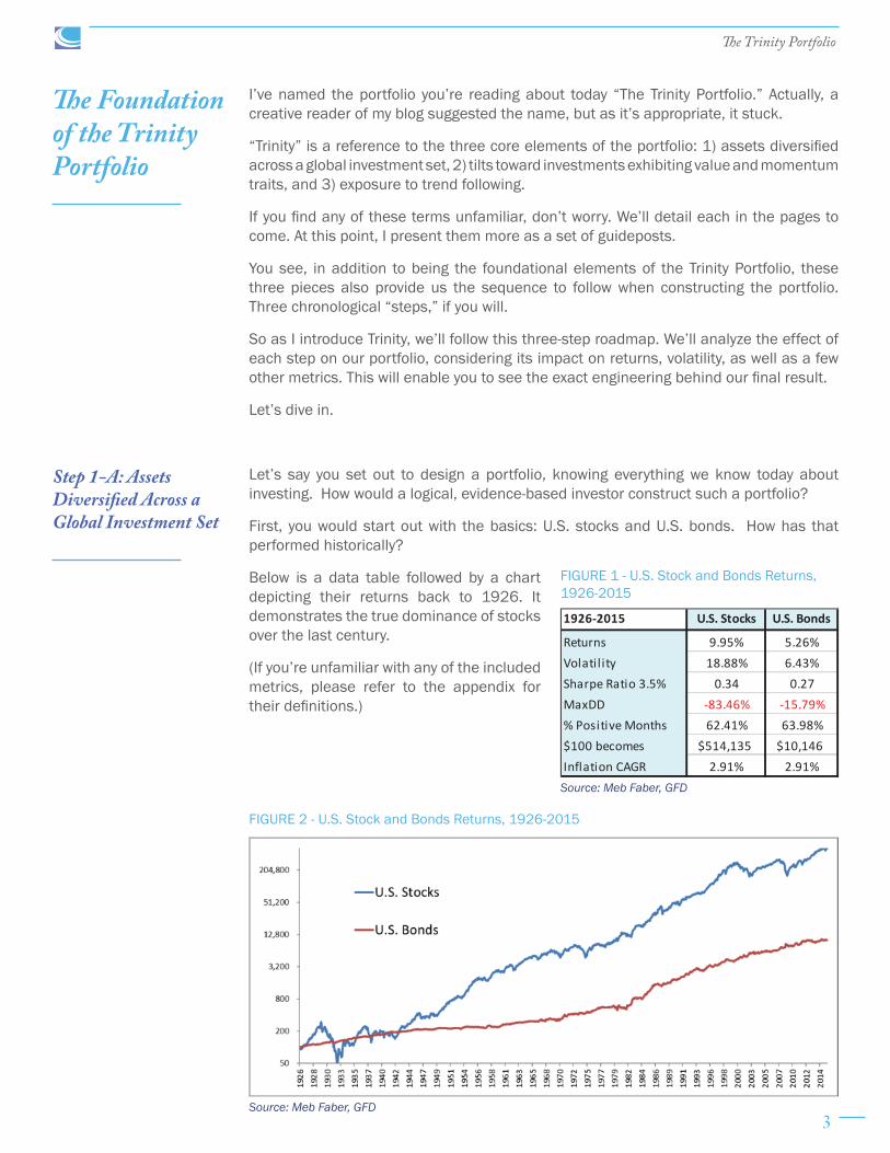
Let’s say you set out to design a portfolio, knowing everything we know today about investing. How would a logical, evidence-based investor construct such a portfolio?
First, you would start out with the basics: U.S. stocks and U.S. bonds. How has that performed historically?
Below is a data table followed by a chart depicting their returns back to 1926. It demonstrates the true dominance of stocks over the last century.
(If you’re unfamiliar with any of the included metrics, please refer to the appendix for their definitions.)
The Foundation of the Trinity Portfolio
1926-2015 U.S. Stocks U.S. Bonds
Returns 9.95% 5.26%Volatil ity 18.88% 6.43%Sharpe Ratio 3.5% 0.34 0.27MaxDD -83.46% -15.79%% Positive Months 62.41% 63.98%$100 becomes $514,135 $10,146Inflation CAGR 2.91% 2.91%
FIGURE 1 - U.S. Stock and Bonds Returns, 1926-2015
Source: Meb Faber, GFD
Source: Meb Faber, GFD
FIGURE 2 - U.S. Stock and Bonds Returns, 1926-2015
Step 1-A: Assets Diversified Across a Global Investment Set

4
The Trinity Portfolio
But while stocks experienced nearly double the annual returns of bonds, they were not without risk. As you’ll see in the chart below, stocks suffered numerous declines of “only” 40-50%, on top of the massive drawdown of over 80% during the Great Depression. The unfortunate mathematics of an 80% decline requires an investor to realize a 400% gain just to get back to even!
While “stocks for the long run” would have resulted in much higher ending wealth, very few investors could have sat through that bumpy ride to arrive unscathed at the finish. Picture your portfolio right now, and subtract 80% — could you sit through that?
However, comparing stock and bond returns is not totally fair. In order to accurately compare returns over time we need to include the impact of inflation on a portfolio.
Below are real returns of stocks and bonds (real returns are the returns of an asset after subtracting the wealth-eroding effect of inflation). We often describe real returns as “returns you can eat.”
Source: Meb Faber, GFD
Source: Meb Faber, GFD
FIGURE 3 – U.S. Stock and Bond Maximum Drawdowns, 1926-2015
FIGURE 4 – U.S. Stock and Bond Returns, Real Returns, 1926-2015
5
The Trinity Portfolio
Source: Meb Faber, GFD
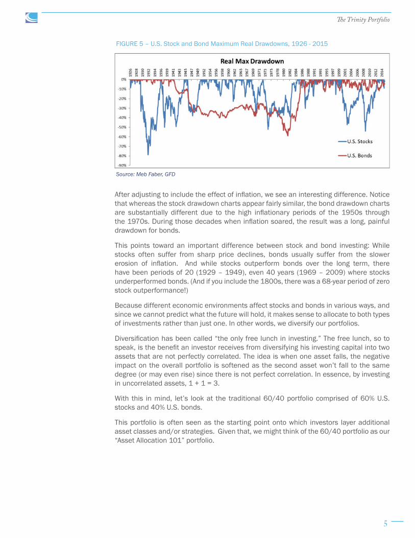
FIGURE 5 – U.S. Stock and Bond Maximum Real Drawdowns, 1926 - 2015
After adjusting to include the effect of inflation, we see an interesting difference. Notice that whereas the stock drawdown charts appear fairly similar, the bond drawdown charts are substantially different due to the high inflationary periods of the 1950s through the 1970s. During those decades when inflation soared, the result was a long, painful drawdown for bonds.
This points toward an important difference between stock and bond investing: While stocks often suffer from sharp price declines, bonds usually suffer from the slower erosion of inflation. And while stocks outperform bonds over the long term, there have been periods of 20 (1929 – 1949), even 40 years (1969 – 2009) where stocks underperformed bonds. (And if you include the 1800s, there was a 68-year period of zero stock outperformance!)
Because different economic environments affect stocks and bonds in various ways, and since we cannot predict what the future will hold, it makes sense to allocate to both types of investments rather than just one. In other words, we diversify our portfolios.
Diversification has been called “the only free lunch in investing.” The free lunch, so to speak, is the benefit an investor receives from diversifying his investing capital into two assets that are not perfectly correlated. The idea is when one asset falls, the negative impact on the overall portfolio is softened as the second asset won’t fall to the same degree (or may even rise) since there is not perfect correlation. In essence, by investing in uncorrelated assets, 1 + 1 = 3.
With this in mind, let’s look at the traditional 60/40 portfolio comprised of 60% U.S. stocks and 40% U.S. bonds.
This portfolio is often seen as the starting point onto which investors layer additional asset classes and/or strategies. Given that, we might think of the 60/40 portfolio as our “Asset Allocation 101” portfolio.
6
The Trinity Portfolio
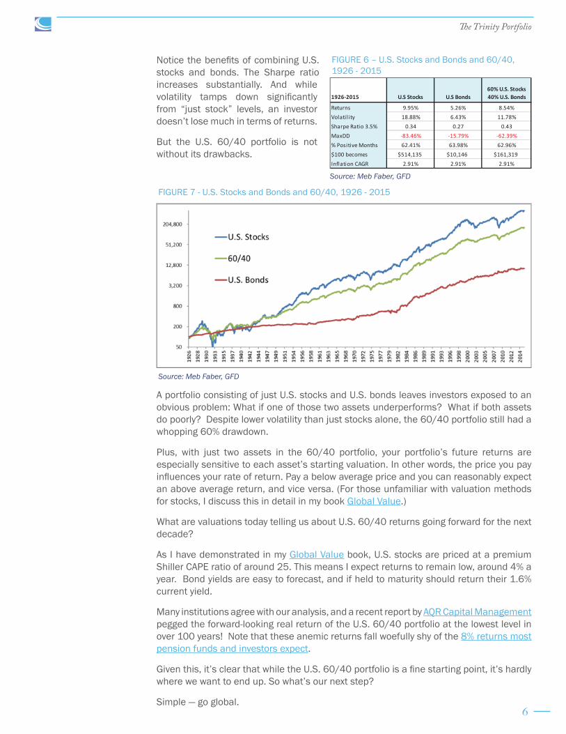
Notice the benefits of combining U.S. stocks and bonds. The Sharpe ratio increases substantially. And while volatility tamps down significantly from “just stock” levels, an investor doesn’t lose much in terms of returns.
But the U.S. 60/40 portfolio is not without its drawbacks.
A portfolio consisting of just U.S. stocks and U.S. bonds leaves investors exposed to an obvious problem: What if one of those two assets underperforms? What if both assets do poorly? Despite lower volatility than just stocks alone, the 60/40 portfolio still had a whopping 60% drawdown.
Plus, with just two assets in the 60/40 portfolio, your portfolio’s future returns are especially sensitive to each asset’s starting valuation. In other words, the price you pay influences your rate of return. Pay a below average price and you can reasonably expect an above average return, and vice versa. (For those unfamiliar with valuation methods for stocks, I discuss this in detail in my book Global Value.)
What are valuations today telling us about U.S. 60/40 returns going forward for the next decade?
As I have demonstrated in my Global Value book, U.S. stocks are priced at a premium Shiller CAPE ratio of around 25. This means I expect returns to remain low, around 4% a year. Bond yields are easy to forecast, and if held to maturity should return their 1.6% current yield.
Many institutions agree with our analysis, and a recent report by AQR Capital Management pegged the forward-looking real return of the U.S. 60/40 portfolio at the lowest level in over 100 years! Note that these anemic returns fall woefully shy of the 8% returns most pension funds and investors expect.
Given this, it’s clear that while the U.S. 60/40 portfolio is a fine starting point, it’s hardly where we want to end up. So what’s our next step?
Simple — go global.
FIGURE 6 – U.S. Stocks and Bonds and 60/40, 1926 - 2015
1926-2015 U.S Stocks U.S Bonds60% U.S. Stocks 40% U.S. Bonds
Returns 9.95% 5.26% 8.54%Volatil ity 18.88% 6.43% 11.78%Sharpe Ratio 3.5% 0.34 0.27 0.43MaxDD -83.46% -15.79% -62.39%% Positive Months 62.41% 63.98% 62.96%$100 becomes $514,135 $10,146 $161,319Inflation CAGR 2.91% 2.91% 2.91%
Source: Meb Faber, GFD
FIGURE 7 - U.S. Stocks and Bonds and 60/40, 1926 - 2015
Source: Meb Faber, GFD

7
The Trinity Portfolio
Step 1-B: Add Foreign Stocks and Bonds
“U.S. 60/40” is the classic portfolio benchmark, offering investors basic diversification. But as we just saw, it leaves investors exposed to the underperformance and huge drawdowns that can gut a portfolio when it’s entirely allocated to just the United States.
Of course, this isn’t just a U.S. problem. Any global market is susceptible to underperformance. The problem is you don’t always know which market it will be, or when. If you happen to be born in the wrong country at the wrong time, and limit your portfolio to domestic investments, the odds are stacked against you.
Now, if your response is that you’d simply avoid this by investing in some bullish market on the other side of the globe, the statistics suggest otherwise.
That’s because investors commonly fall victim to a pitfall called “home country bias.” It’s exactly what it sounds like — we tend to put most of our money into investments from our own country.
For instance, Vanguard has demonstrated that U.S. investors usually put around 70% of their stock allocation at home here in the U.S. when it should only be about 50%. But this isn’t unique to the United States, it occurs everywhere. Most investors around the world invest the majority of their assets in domestic markets. Vanguard details the “home country bias” effect in the U.S., but also in the U.K., Australia, and Canada. This shouldn’t be that surprising to most – after all I’m a Denver Broncos fan and my co-workers are Seahawks and Patriots fans.
While you might believe professional money managers wouldn’t make this mistake, they’re just as prone to home country bias as retail investors. The chart below shows where institutional investors are allocating their money. Unsurprisingly, North American institutional investors sink 75% of their funds into North American markets and we find similar results for Europe and Asia.
Given our tendency to invest in our home countries, and accounting for the reality that many times our home countries won’t produce adequate returns, how can we add a layer of safety to the U.S. 60/40 portfolio (or any single-country-weighted portfolio) that hedges us from “the wrong country and the wrong time?”
We expand to include a broader set of global investments.
By diversifying away from holding just one country, we greatly increase the odds of sliding toward the average. While this may not sound wonderful if we’re looking for outsized returns, it’s far more welcome when it protects us from outsized losses.
Source: JP Morgan
FIGURE 8 - Home Country Bias

8
The Trinity Portfolio
Remember, concentration is a double edged sword, and investing a large part of your wealth in one country or asset class can often be a terrible idea — just ask an investor in Brazil, Greece, Russia, or many other countries over the past few years!
In the chart below, I show that expanding our portfolio to include global investments slightly reduces our returns, but in exchange, we receive lower volatility and drawdowns. This results in a near identical Sharpe ratio.
Now, since the rest of the paper is going to use the common dates of 1973 – 2015, below I present the stock and bond returns again for just this period. (Historical data on the asset classes we’ll add going forward isn’t as readily available dating back to 1926.)
Many will look at the results below and conclude that adding foreign assets is a step backward. Indeed, it was during this period. However, that is why it is important to study market history to ensure you’re seeing the whole picture.
Consider the abysmal equity returns in the U.S. during the Great Depression. Let’s say we looked at U.S. equity returns only during that one decade. Would we have been correct to assume they would predict U.S. returns for the next five decades? Of course not. That’s why investors should never assume that the returns of short investment periods will be repeated in longer periods.
Back to foreign asset returns.
Though it surprises some investors, U.S. stock performance versus international stock performance has historically been a coin flip with both out/underperforming the other about 50% of the time. That doesn’t mean that both cannot go through stretches of outperformance. Indeed, there have been two periods since 1973 when foreign stocks have outperformed U.S. stocks for six years in a row. And this property of oscillating returns is timely right now, as U.S. stocks have outperformed foreign stocks five out of the last six years. Perhaps it is time for a foreign stock market rebound?
Source: Meb Faber, GFD
FIGURE 9 – U.S. and Global Stocks and Bonds, 1926 - 2015
1926-2015 U.S. Stocks U.S. Bonds60% U.S. Stocks 40% U.S. Bonds Global Stocks
60% Global Stocks 40% Global Bonds
Returns 9.95% 5.26% 8.54% 8.73% 7.41%Volatil ity 18.88% 6.43% 11.78% 14.44% 9.67%Sharpe Ratio 3.5% 0.34 0.27 0.43 0.36 0.40MaxDD -83.46% -15.79% -62.39% -71.33% -51.92%% Positive Months 62.41% 63.98% 62.96% 62.78% 64.44%$100 becomes $514,135 $10,146 $161,319 $188,107 $62,353Inflation CAGR 2.91% 2.91% 2.91% 2.91% 2.91%

9
The Trinity Portfolio
So even though foreign asset returns are lower in the results below, remember that they represent only a select, narrower time period. (All returns are in U.S. dollars and are from the perspective of a U.S. based investor.)
Source: Meb Faber, GFD
FIGURE 10 – U.S. and Foreign Stock 12-Month Rolling Performance
Source: Meb Faber, GFD
Source: Meb Faber, GFD
FIGURE 11 – U.S. Stocks and Bonds, 1973 - 2015
FIGURE 12 - Global Stocks and Bonds, 1973 - 2015
1973-2015 U.S. Stocks U.S. Bonds60% U.S. Stocks 40% U.S. Bonds
Returns 10.07% 7.65% 9.47%Volatil ity 15.38% 8.32% 10.05%Sharpe 5.02% 0.33 0.32 0.44MaxDD -50.95% -15.79% -29.28%% Positive Months 61.43% 60.66% 63.18%$100 becomes $6,246 $2,394 $4,941Inflation CAGR 4.06% 4.06% 4.06%
1973-2015 Global Stocks Global Bonds60% Global Stocks 40% Global Bonds
Returns 9.20% 7.47% 8.77%Volatil ity 15.00% 6.63% 10.18%Sharpe 5.02% 0.28 0.37 0.37MaxDD -53.65% -15.52% -38.56%% Positive Months 60.66% 65.89% 63.57%$100 becomes $4,429 $2,226 $3,743Inflation CAGR 4.06% 4.06% 4.06%

10
The Trinity Portfolio
Expanding to global investments is even more important as I write this here in summer 2016, as the U.S. stock market is one of the most expensive in the world. Foreign equity markets are much cheaper than U.S. markets, and emerging markets are cheaper still. (Here is an article I wrote at the beginning of 2016 on global stock market valuations.)
Pulling back to look at the larger picture now, the important takeaway is that by going global, we’ve protected ourselves from overconcentration in just one country (home country bias). We’ve also reduced our portfolio’s volatility and drawdown numbers. This has cost us a small bit of return, but that’s fine. At this point, we’ve been playing defense. Offense will come later.
A global 60/40 portfolio protects us from single country concentration exposure and drawdowns, but there’s a new problem – with just two principal asset classes (stocks/bonds), we’re limiting our global investment opportunity set.
We want to squeeze every bit of return out of the degree of risk we’re willing to accept. Historical data suggests we can help do this by adding other, non-correlated assets.
Investors can allocate to many other assets including the one we’ll add next – a category described as real assets.
For our purposes in this paper, “real assets” has a broad definition. We’re adding commodities, real estate (REITs), and gold. Investing in real assets isn’t a new idea, in fact the Talmud spoke to it over 2000 years ago! (Some also prefer the label “hard assets” but I will stick with real assets here.)
The exact allocation we’re using is below, and comes from our book Global Asset Allocation. This allocation resembles something called “the global market portfolio” (or Global Asset Allocation portfolio). In essence, that’s simply the portfolio you would own were you to wrap all global investments into one, composite portfolio.
Source: Meb Faber, GFD
FIGURE 13 – U.S. and Global Stocks and Bonds, 1973 - 2015
Step 1-C: Add Real Assets
11
The Trinity Portfolio
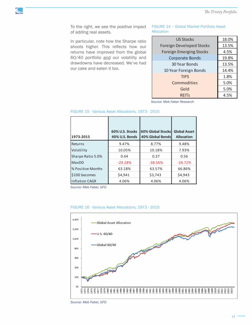
To the right, we see the positive impact of adding real assets.
In particular, note how the Sharpe ratio shoots higher. This reflects how our returns have improved from the global 60/40 portfolio and our volatility and drawdowns have decreased. We’ve had our cake and eaten it too.
Source: Meb Faber Research
FIGURE 14 – Global Market Portfolio Asset Allocation
US Stocks 18.0%Foreign Developed Stocks 13.5%Foreign Emerging Stocks 4.5%
Corporate Bonds 19.8%30 Year Bonds 13.5%
10 Year Foreign Bonds 14.4%TIPS 1.8%
Commodities 5.0%Gold 5.0%REITs 4.5%
Source: Meb Faber, GFD
Source: Meb Faber, GFD
FIGURE 15 - Various Asset Allocations, 1973 - 2015
FIGURE 16 - Various Asset Allocations, 1973 - 2015
1973-201560% U.S. Stocks 40% U.S. Bonds
60% Global Stocks 40% Global Bonds
Global Asset Allocation
Returns 9.47% 8.77% 9.48%Volatil ity 10.05% 10.18% 7.93%Sharpe Ratio 5.0% 0.44 0.37 0.56MaxDD -29.28% -38.56% -26.72%% Positive Months 63.18% 63.57% 66.86%$100 becomes $4,941 $3,743 $4,943Inflation CAGR 4.06% 4.06% 4.06%

12
The Trinity Portfolio
When we look at the Global Asset Allocation portfolio on a real basis after inflation, we see that adding real assets was a substantial help during the tough investment periods of the 1970s and 2000 bear market. Real assets usually perform well during times of inflation, as well as unexpected inflation.
Many investors could stop here. That would be fine, as this is a perfectly suitable portfolio (better than what many investors hold).
But I think we can do better. After all, up to this point the adjustments to the base U.S. 60/40 portfolio have been focused on reducing risk and optimization. What about improving our returns?
That takes us to Step 2.
We have a respectable portfolio at this point but we can borrow from academic research to improve the basic indexes that have led us here.
We have our portfolio’s building blocks in place — specifically, an assortment of asset classes, spread over the entire global investment set. Now it’s time to begin refining those building blocks.
In this case, we will use strategies that have been known for decades, namely value and momentum tilts within stock indexes.
For any readers less familiar with these terms, a “tilt” is simply a weighting toward a specific asset or investing style. A “value” tilt means we’re investing more heavily in global stocks exhibiting traditional traits of being priced at low valuations. This could be something as simple as ranking stocks on common measures of value like price-to-book or price-to-earnings ratios.
Source: Meb Faber, GFD
FIGURE 17 - Various Asset Allocations, Real Returns, 1973 – 2015
STEP 2: Add Value and Momentum

13
The Trinity Portfolio
A “momentum” tilt means we’re investing more heavily in global stocks that are enjoying more upward momentum in market pricing than other, similar stocks. For example, a traditional momentum strategy would be buying the stocks that have increased the most in price over the past 12 months. You might think of this as racecars speeding around a track – suddenly, one of them hits the gas and begins passing the other racecars as it pushes toward the front of the pack. This car would have the best momentum.
There are, of course, many flavors of both strategies. Yet, regardless of which specific variety you choose, the performance attained by combining value and momentum comes not just from investing in what is cheap and going up, but also by avoiding what is expensive and going down.
So what are the specific steps taken to tilt the portfolio toward value and momentum?
For our value tilt, I’ll substitute our U.S. equity exposure with the unhedged strategy from our paper “Value and Momentum.” I encourage you to read it for all the details, but in general, the strategy ranks stocks by value and momentum, then takes the average reading across both variables. One can then use the ratings to identify the stocks with the best aggregate scores. In doing this, our goal is to own only cheap stocks with rising market prices.
For foreign equity exposure, I use the strategy from our book Global Value. This strategy invests in the cheapest global markets around the world. (We don’t have sufficient history to include momentum as a variable here, but research shows it works in foreign markets too.)
A quick aside for any cynics who might believe I’m guilty of data mining. Ben Graham and Charles Dow were writing about similar investing strategies nearly 100 years ago, they have worked since and they remain viable strategies today. I don’t think that the exact factors or approaches matter greatly, and intrepid readers can download all of the French-Fama data and view similar results. Plus, any detractors should agree that any weighting that moves a portfolio away from a market cap weighting has benefitted the portfolio over time.
A detailed explanation of this point isn’t the focus of our paper. However, in order that I not leave anything dangling, market cap weightings often allocate to more heavily to over-priced assets. Therefore, if you’re an investor looking to buy at a discount, a market cap weighted portfolio may be working against you. This is why any weighting other than market cap often carries added benefits.
We can also tilt toward value in the global bond space with the methodology from “Finding Yield in a 2% World.” This strategy also moves away from the market cap weighted index, where 70% of the global debt comes from only five countries. Instead, it invests in the highest yielding sovereign bonds around the world. For perspective, as I write, the top five global bond issuers yield around 0.5%, whereas a value strategy applied to bonds would yield closer to 7% today.
Below you can see the impact of adding all of the value and momentum tilts, what some might call smart beta (referenced as Global Asset Allocation Plus). Notice the substantial increase in returns that we enjoy without giving up much in volatility and drawdowns. We see this positive effect manifested in the higher Sharpe ratio.

14
The Trinity Portfolio
Summary of Step 2:
As before, many investors could stop here, as this too is a perfectly fine portfolio. It would hold over 10,000 global securities in a handful of basic indexes. You could rebalance this portfolio once a year in tax-exempt accounts. Or in taxable accounts, an investor could employ tax-harvesting strategies using various inflows and outflows. Both should take about one hour per year.
The simplicity and returns of this portfolio make it very attractive. In fact, my company believes in it so much that we launched the first, and still only, ETF with a permanent 0% management fee based on a similar strategy (as of the time of publishing). (For more information visit www.cambriafunds.com.) Many automated investment solutions would be a good choice as well.
However, despite the benefits of this portfolio, I believe we can do better once again, which leads us to our final step.
Source: Meb Faber, GFD
FIGURE 18 – Various Asset Allocations, 1973 - 2015
1973-201560% U.S. Stocks 40% U.S. Bonds
60% Global Stocks 40% Global Bonds
Global Asset Allocation
Global Asset Allocation
Plus
Returns 9.47% 8.77% 9.48% 11.77%Volatil ity 10.05% 10.18% 7.93% 8.41%Sharpe Ratio 5.0% 0.44 0.37 0.56 0.80MaxDD -29.28% -38.56% -26.72% -30.79%% Positive Months 63.18% 63.57% 66.86% 68.02%$100 becomes $4,941 $3,743 $4,943 $12,079Inflation CAGR 4.06% 4.06% 4.06% 4.06%
Source: Meb Faber, GFD
FIGURE 19 - Various Asset Allocations, 1973 - 2015

15
The Trinity Portfolio
At this point, we have a buy-and-hold portfolio (minus occasional rebalancing). That’s a great starting point, but many investors struggle with buy-and-hold. It’s difficult to do nothing while watching your portfolio drop 10%, 30%, 50% or more.
This leads to all sorts of bad behavior including the most damaging – selling assets during bear markets and never re-entering again. Think back to any “I can’t take it any more” moments you may have had in 2008 or the tech bubble after 2000.
The alternative to buy-and-hold is any sort of active management, with one of our favorite strategies being a trend-following approach.
Many investors are confused as to the distinction between trend and momentum (from Step 2). Momentum refers to how a security is performing versus other securities. Remember our earlier example of the racecar speeding around the track, passing competing cars? In the case of stocks, it might be Apple outperforming, say, Google or IBM over the preceding 12 months.
Trend following, on the other hand, tries to answer the question: “Looking at just Apple, is it going up or down?” Though not a perfect analogy, you might think of this as “Will the racecar continue speeding around the track, or is it about to get sidetracked for a lengthy pit stop?”
We don’t want to be invested in securities that won’t be rising (stuck in a pit stop). So using this trend filter helps us weed them out of our portfolio.
The most famous trend following indicator is likely the 200-day simple moving average (this is simply an average of an investment’s closing price over the last 200 days). If the asset’s current market price is above that 200-day average trend-line, it would indicate a bullish trend, so you would be long the asset. But if the market price fell below the 200-day average it would indicate a bearish trend, so you would sell the asset to avoid taking additional losses.
The chart below shows the market price of SPY, an ETF which tracks the S&P 500 index, along with its 200-day moving average. Notice how the 200-day trend indicator would have gotten you out of SPY prior to several significant drawdowns, therein protecting your wealth.
STEP 3: Add Trend Following
Source: Stockcharts.com
FIGURE 20 – SPY ETF and the 200-Day Simple Moving Average

16
The Trinity Portfolio
A quick clarification: Many investors expect basic trend strategies to magically “time the market.” However, a basic trend strategy is not meant to be an outperformance strategy – rather, it is designed to produce similar returns as buy-and-hold, yet with lower volatility and drawdowns.
How then will we apply trend to the Trinity Portfolio?
We’ll borrow from the strategies from my first white paper in 2007, “A Quantitative Approach to Tactical Asset Allocation.” In it, I propose numerous models of varying degrees of risk and granularity, which I encourage you to read about in the whitepaper.
We’ll call the specific model we are going to use here “Global Trend,” and it is meant to be an aggressive and concentrated strategy that combines both momentum and trend. (It is similar to the “GTAA Aggressive” system as published in the paper.)
The general summary is we invest in the top half of the Global Asset Allocation Plus portfolio assets as sorted by momentum, but only if they are above their long-term trend. (The paper used the 10-month simple moving average, which is the monthly equivalent of the 200-day moving average.)
The portfolio would be updated just once each month. If the asset’s market price is above its long-term trend line (in this case, the 10-month SMA), the asset would remain in your portfolio. However, if its market price is below the trend line, you would sell the security and move to the safety of cash and T-Bills.
(Note: One could place the “cash” investment in 10-year U.S. bonds instead of T-Bills, and historically this would increase the returns of both strategies by another percentage point. However, the likelihood of a bull market in bonds similar to the one over the past 30 years is small, so I use the more conservative T-Bill figures.)
Applying trend to our portfolio has the benefit of increasing returns and lowering volatility, a double bonus. The effect is the Sharpe ratio jumps to over 1.0. That’s more than double where we started with our base U.S. 60/40 portfolio.
There are two principal ways to approach the trend application. The first would be to update the model every month, placing the suggested trades. Astute investors with time on their hands could do this.
Even though that approach has worked well since I originally published our paper, it comes with two challenges. One, it forces investors to regularly update and trade the
Source: Meb Faber, GFD
FIGURE 21 - Various Asset Allocations, 1973 - 2015
1973-201560% Stocks 40% Bonds
60% Global Stocks 40% Global Bonds
Global Asset Allocation
Global Asset Allocation
Plus Global Trend
Returns 9.47% 8.77% 9.48% 11.77% 15.53%Volatil ity 10.05% 10.18% 7.93% 8.41% 9.51%Sharpe Ratio 5.0% 0.44 0.37 0.56 0.80 1.10MaxDD -29.28% -38.56% -26.72% -30.79% -16.47%% Positive Months 63.18% 63.57% 66.86% 68.02% 69.38%$100 becomes $4,941 $3,743 $4,943 $12,079 $50,308Inflation CAGR 4.06% 4.06% 4.06% 4.06% 4.06%

17
The Trinity Portfolio
portfolio, which introduces opportunities to stray from the model. Two, it increases taxable events and commissions which erode returns, especially for smaller investors.
The second, easier way to apply a trend strategy is simply by investing in a fund, or ETF, that implements a similar model (we manage a similar aggressive global momentum and trend ETF).
So, with superior returns to buy and hold, why not just put all of your money into a trend following strategy?
At the beginning of the section, I introduced trend as an alternative to buy-and-hold. Again, many investors find buy-and-hold challenging when markets are headed south. But the irony is that those same investors also struggle with trend following, or being too different from the world in general.
The reason is because being a lone wolf investor, significantly different than the pack, can feel risky. Being different is great when your strategy is outperforming like 2008, but it’s a supreme challenge when it is lagging a roaring bull market in the years that followed or going through periods of underperformance, which every strategy experiences at some point (and even worse when lots of other investors are making big gains).
Because of this, many investors don’t like being different. But the challenge is that any active strategy, by definition, will be different than a buy-and-hold market strategy.
The below chart illustrates the back-and-forth many investors feel when comparing an active timing strategy with a passive buy-and-hold strategy. It shows the rolling 12-month performance of the Global Trend strategy (timing) versus the Global Asset Allocation Plus strategy (buy-and-hold). There were multiple periods when one strategy outperforms the other by over 30 percentage points!
Either strategy can go years underperforming the other, making you second-guess your choice. So with both buy-and-hold and trend following presenting their own unique challenges, what should an investor do?
The answer points us toward the final step we’ll take that will result in our completed Trinity Portfolio.
Source: Meb Faber, GFD
FIGURE 22 – Timing Strategy vs. Buy and Hold, 1973 - 2015
18
The Trinity Portfolio
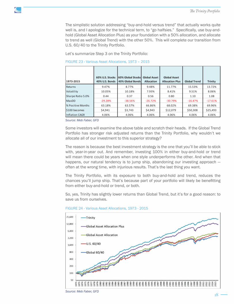
The simplistic solution addressing “buy-and-hold versus trend” that actually works quite well is, and I apologize for the technical term, to “go halfsies.” Specifically, use buy-and-hold (Global Asset Allocation Plus) as your foundation with a 50% allocation, and allocate to trend as well (Global Trend) with the other 50%. This will complete our transition from U.S. 60/40 to the Trinity Portfolio.
Let’s summarize Step 3 on the Trinity Portfolio:
Some investors will examine the above table and scratch their heads. If the Global Trend Portfolio has stronger risk adjusted returns than the Trinity Portfolio, why wouldn’t we allocate all of our investment to this superior strategy?
The reason is because the best investment strategy is the one that you’ll be able to stick with, year-in-year out. And remember, investing 100% in either buy-and-hold or trend will mean there could be years when one style underperforms the other. And when that happens, our natural tendency is to jump ship, abandoning our investing approach — often at the wrong time, with injurious results. That’s the last thing you want.
The Trinity Portfolio, with its exposure to both buy-and-hold and trend, reduces the chances you’ll jump ship. That’s because part of your portfolio will likely be benefitting from either buy-and-hold or trend, or both.
So, yes, Trinity has slightly lower returns than Global Trend, but it’s for a good reason: to save us from ourselves.
Source: Meb Faber, GFD
Source: Meb Faber, GFD
FIGURE 23 - Various Asset Allocations, 1973 – 2015
FIGURE 24 - Various Asset Allocations, 1973 - 2015
1973-201560% U.S. Stocks 40% U.S. Bonds
60% Global Stocks 40% Global Bonds
Global Asset Allocation
Global Asset Allocation Plus Global Trend Trinity
Returns 9.47% 8.77% 9.48% 11.77% 15.53% 13.72%Volatil ity 10.05% 10.18% 7.93% 8.41% 9.51% 8.06%Sharpe Ratio 5.0% 0.44 0.37 0.56 0.80 1.10 1.08MaxDD -29.28% -38.56% -26.72% -30.79% -16.47% -17.61%% Positive Months 63.18% 63.57% 66.86% 68.02% 69.38% 69.96%$100 becomes $4,941 $3,743 $4,943 $12,079 $50,308 $25,493Inflation CAGR 4.06% 4.06% 4.06% 4.06% 4.06% 4.06%

19
The Trinity Portfolio
We’ve come a long way from our initial U.S.-only, 60/40 portfolio. By going global, adding additional asset classes, and introducing tilts and active trend strategies, we’ve transformed the risk/return complexion of the entire portfolio.
Here’s a final side-by-side, “before-and-after” to help illustrate how far we’ve come.
We’ve increased our yearly average returns almost 40% despite slashing volatility. Meanwhile, the Sharpe ratio has more than doubled and our max drawdown has nearly been halved.
All of these improvements come together when we look at the difference in dollar growth between the two portfolios. The money going into our pocket with Trinity is more than four times versus where we started with U.S. 60/40.
Now, before we finish discussing the engineering behind Trinity, I’d like to point out one final attribute of the framework: its flexibility.
Despite Trinity’s balanced makeup, which results in low volatility, some conservative investors may prefer even less volatility. Fortunately, Trinity is easily customizable.
The simplest way to match Trinity’s volatility level to your personal investing temperament is by adjusting the fixed income allocation. For a less volatile portfolio, you would simply increase your exposure to fixed income (T-Bills or Treasuries), while decreasing your other allocations on a pro rata basis.
Below we examine the full spectrum of portfolio returns ranging from an all-fixed-income allocation on the left (in this example, T-Bills) to an all-Trinity allocation on the right. The changes in the middle portfolios come from incremental 10% reductions in the allocation to T-Bills, while increasing the allocation to Trinity by the same amount.
Note that both returns and the Sharpe ratio increase in lockstep as we move away from the T-Bill-heavy portfolio and toward the Trinity portfolio. This makes sense as increasing amounts of risk an investor is willing to take should be reflected in increased returns.
Also, note that drawdowns and volatility both increase, which is to be expected as an investor moves away from riskless T-Bills.
1973-201560% Stocks 40% Bonds Trinity
Returns 9.47% 13.72%Volatil ity 10.05% 8.06%Sharpe Ratio 5.0% 0.44 1.08MaxDD -29.28% -17.61%% Positive Months 63.18% 69.96%$100 becomes $4,941 $25,493Inflation CAGR 4.06% 4.06%
Source: Meb Faber, GFD
FIGURE 25 – U.S. 60/40 vs. the Trinity Portfolio
Nominal Returns T Bills 90% T Bills 80% T Bills 70% T Bills 60% T Bills 50% T Bills 40% T Bills 30% T Bills 20% T Bills 10% T Bills Trinity
1973-201510%
Trinity20%
Trinity30%
Trinity40%
Trinity50%
Trinity60%
Trinity70%
Trinity80%
Trinity90%
Trinity
Returns 5.02% 5.90% 6.77% 7.64% 8.51% 9.38% 10.25% 11.12% 11.99% 12.86% 13.72%Volatil ity 1.00% 1.22% 1.82% 2.54% 3.30% 4.07% 4.86% 5.66% 6.46% 7.26% 8.06%Sharpe Ratio 5.0% 0.00 0.71 0.96 1.03 1.06 1.07 1.08 1.08 1.08 1.08 1.08MaxDD 0.00% -1.49% -3.36% -5.22% -7.05% -8.86% -10.65% -12.42% -14.17% -15.90% -17.61%% Positive Months 99.22% 89.73% 86.43% 80.62% 76.74% 75.00% 74.03% 72.67% 72.09% 71.12% 69.96%$100 becomes $827 $1,181 $1,681 $2,386 $3,378 $4,766 $6,705 $9,405 $13,152 $18,338 $25,493Inflation CAGR 4.06% 4.06% 4.06% 4.06% 4.06% 4.06% 4.06% 4.06% 4.06% 4.06% 4.06%
Source: Meb Faber, GFD
FIGURE 26 – Various Asset Allocations, Differing Weights on T-Bills and Trinity, 1973 - 2015

20
The Trinity Portfolio
Below is a chart that draws out the “$100 becomes” data from the prior table. It helps provide a more visual representation of returns.
Let’s now see how replacing T-Bills with 10-year Treasury Bonds would affect this portfolio.
First, note that bonds yielded over 2 percentage points higher than bills over the period, largely due to the 30+ year bull market we’ve had in rates since the early 1980s. Drawdowns were mild.
However, it’s important to remember the distinction between nominal returns and real returns. A nominal return that might appear attractive at first glance could be camouflaging mediocre returns after adjusting for inflation. So let’s re-examine these two tables to reflect real returns after inflation.
80
800
8,000
1972 1974 1976 1978 1980 1982 1984 1986 1988 1990 1992 1994 1996 1998 2000 2002 2004 2006 2008 2010 2012 2014
TrinityandCash(T-Bill)Alloca>ons
TrinityTrinitywith20%cashTrinitywith40%cashTrinitywith60%cashTrinitywith80%cashAllcash
Nominal Returns10 Year Bonds
90% Bonds
80% Bonds
70% Bonds
60% Bonds
50% Bonds
40% Bonds
30% Bonds
20% Bonds
10% Bonds Trinity
1973-201510%
Trinity20%
Trinity30%
Trinity40%
Trinity50%
Trinity60%
Trinity70%
Trinity80%
Trinity90%
Trinity
Returns 7.65% 8.29% 8.92% 9.55% 10.17% 10.78% 11.39% 11.98% 12.57% 13.15% 13.72%Volatil ity 8.32% 7.75% 7.27% 6.89% 6.65% 6.54% 6.58% 6.77% 7.09% 7.52% 8.06%Sharpe Ratio 5.0% 0.32 0.42 0.54 0.66 0.77 0.88 0.97 1.03 1.06 1.08 1.08MaxDD -15.79% -12.92% -11.22% -9.51% -8.24% -9.07% -10.57% -12.06% -13.54% -15.09% -17.61%% Positive Months 60.66% 62.02% 64.15% 66.28% 68.99% 69.77% 69.57% 71.12% 71.12% 70.74% 69.96%$100 becomes $2,394 $3,091 $3,975 $5,088 $6,487 $8,235 $10,410 $13,105 $16,428 $20,508 $25,493Inflation CAGR 4.06% 4.06% 4.06% 4.06% 4.06% 4.06% 4.06% 4.06% 4.06% 4.06% 4.06%
Source: Meb Faber, GFD
Source: Meb Faber, GFD
FIGURE 27 – Various Asset Allocations, Dollar Returns, Differing Weights on T-Bills and Trinity, 1973 - 2015
FIGURE 28 – Various Asset Allocations, Differing Weights on 10-Year Bonds and Trinity, 1973 - 2015

21
The Trinity Portfolio
There are some big differences here, most notably the much larger drawdowns in 10-year bonds. This is due to the highly inflationary 1970s as rates rose over that decade. Also, note the decrease in real returns compared to our earlier nominal returns.
Another common customization question is: “I’m more of a buy-and-hold investor. What would it look like if I allocated, say, 70% to the GAA+ strategy and 30% to Global Trend instead of the traditional 50/50 split?” (Tweak that ratio however you’d like).
Below, we show that spectrum of returns, ranging from GAA+ on the left to Global Trend on the right. Again, the changes in the middle portfolios come from incremental 10% reductions in the allocation to GAA+, while increasing the allocation to Global Trend by the same amount.
The overall takeaway is that (as was the case with fixed income above), adjusting the ratio of GAA+ to Global Trend enables investors to target a specific portfolio profile that’s right for them.
Regardless of which customized Trinity portfolio best suits you, if you’re a serious investor with a long-term perspective and self-discipline, then I’m confident Trinity has the potential to provide you with significant wealth and peace of mind.
Real Returns T Bills 90% T Bills 80% T Bills 70% T Bills 60% T Bills 50% T Bills 40% T Bills 30% T Bills 20% T Bills 10% T Bills Trinity
1973-201510%
Trinity20%
Trinity30%
Trinity40%
Trinity50%
Trinity60%
Trinity70%
Trinity80%
Trinity90%
Trinity
Returns 0.91% 1.75% 2.59% 3.43% 4.27% 5.11% 5.95% 6.78% 7.62% 8.45% 9.29%Volatil ity 1.26% 1.53% 2.10% 2.79% 3.53% 4.30% 5.08% 5.87% 6.66% 7.46% 8.25%Sharpe Ratio 5.0% 0.00 0.55 0.80 0.90 0.95 0.98 0.99 1.00 1.01 1.01 1.01MaxDD -12.54% -7.67% -6.63% -7.44% -8.49% -10.13% -11.81% -13.46% -15.10% -16.71% -18.30%% Positive Months 59.69% 66.67% 67.05% 66.47% 66.09% 65.31% 64.73% 65.31% 65.31% 65.50% 65.31%$100 becomes $148 $211 $301 $428 $606 $856 $1,204 $1,690 $2,364 $3,298 $4,587Inflation CAGR 4.06% 4.06% 4.06% 4.06% 4.06% 4.06% 4.06% 4.06% 4.06% 4.06% 4.06%
Real Returns10 Year Bonds
90% Bonds
80% Bonds
70% Bonds
60% Bonds
50% Bonds
40% Bonds
30% Bonds
20% Bonds
10% Bonds Trinity
1973-201510%
Trinity20%
Trinity30%
Trinity40%
Trinity50%
Trinity60%
Trinity70%
Trinity80%
Trinity90%
Trinity
Returns 3.42% 4.04% 4.65% 5.25% 5.85% 6.44% 7.03% 7.60% 8.17% 8.73% 9.29%Volatil ity 8.64% 8.08% 7.60% 7.23% 6.98% 6.86% 6.89% 7.05% 7.34% 7.75% 8.25%Sharpe Ratio 5.0% 0.29 0.39 0.49 0.60 0.71 0.81 0.89 0.95 0.99 1.01 1.01MaxDD -44.75% -38.50% -32.24% -26.75% -21.78% -18.24% -16.00% -14.71% -15.47% -16.89% -18.30%% Positive Months 55.43% 55.62% 56.78% 58.33% 59.11% 60.85% 62.60% 64.34% 63.95% 64.53% 65.31%$100 becomes $425 $550 $708 $908 $1,159 $1,473 $1,865 $2,350 $2,949 $3,686 $4,587Inflation CAGR 4.06% 4.06% 4.06% 4.06% 4.06% 4.06% 4.06% 4.06% 4.06% 4.06% 4.06%
Nominal ReturnsGlobal Asset 90% GAA+ 80% GAA+ 70% GAA+ 60% GAA+ 50% GAA+ 40% GAA+ 30% GAA+ 20% GAA+ 10% GAA+ Global
1973-2015Allocation
Plus10%
Trend20%
Trend30%
Trend40%
Trend50%
Trend60%
Trend70%
Trend80%
Trend90%
Trend Trend
Returns 11.77% 12.17% 12.57% 12.96% 13.35% 13.72% 14.10% 14.47% 14.83% 15.18% 15.53%Volatil ity 8.41% 8.19% 8.04% 7.97% 7.97% 8.06% 8.22% 8.45% 8.75% 9.10% 9.51%Sharpe Ratio 5.0% 0.80 0.87 0.94 1.00 1.04 1.08 1.10 1.12 1.12 1.12 1.10MaxDD -30.79% -28.19% -25.60% -22.97% -20.27% -17.61% -15.40% -14.03% -13.88% -15.18% -16.47%% Positive Months 68.02% 69.77% 70.16% 69.57% 69.77% 69.96% 69.96% 69.96% 69.38% 69.57% 69.38%$100 becomes $12,079 $14,101 $16,418 $19,063 $22,074 $25,493 $29,361 $33,727 $38,638 $44,147 $50,308Inflation CAGR 4.06% 4.06% 4.06% 4.06% 4.06% 4.06% 4.06% 4.06% 4.06% 4.06% 4.06%
Source: Meb Faber, GFD
Source: Meb Faber, GFD
Source: Meb Faber, GFD
FIGURE 29 – Various Asset Allocations, Real Returns, 1973 - 2015
FIGURE 30 – Various Asset Allocations, Differing Weights on GAA+ and Global Trend, 1973 - 2015

22
The Trinity Portfolio
What we have with Trinity is a well-engineered portfolio that should outperform over time, even in varying market conditions…if we guard it from two common mistakes that trip up investors:
1. Paying excessive fees
2. Letting your emotions lead you astray
Let’s start with fees.
Investors tend to focus excessively on returns — something mostly out of their control — while not paying nearly enough attention to fees, which is totally within their control and has a huge effect on long-term wealth.
Below are some ballpark fees for perspective:
• The average mutual fund charges 1.25% per year.
• The average ETF charges 0.54% per year.
Source: Morgan Stanley ETF Semi-Annual Review, June 1, 2016
• The average financial advisor charges 1.02% per year. (Although the most expensive quarter of advisors charge over 2% per year.)
Source: http://www.investmentnews.com/article/20150405/REG/150409959/advisory-fees- show-signs-of-a-rebound
When you combine all these fees, their impact can gut your long-term returns.
Yet most people have little awareness of this. One, it isn’t the “fun” part of investing. Talk about fees, taxes, and other costs is not as sexy at cocktail parties as is chatter about the next hot stock, so it’s seldom top of mind. Two, fees are “skimmed” off the investment so you never see them (a brilliant move by Wall Street of course).
But don’t let this element of stealth mislead you. The report “The Real Cost of Fees” by Personal Capital demonstrates just how much people lose to fees over a lifetime.
Assuming you have a $1 million portfolio growing at 7% over 30 years, how much do you think you’ll pay in total fees (including management and underlying fund fees)?
According to Personal Capital, you could pay as much as $1.4 million. That’s obviously 40% more than your original investment!
Again, most investors don’t understand this since these fees are “invisible.” But what if you had to go to your bank, withdraw $19,800 in cash, then deliver it in a briefcase to your advisor? By year 30 that withdrawal is $86,000.
Would you do that?
For another illustration of the destructive power of fees, let’s rewind to Step 2. That’s where we added the tilts of value and momentum to the Global Asset Allocation Portfolio. These tilts increased returns by about two percentage points a year.
But let’s tweak this now.
Let’s say we’re going to apply the same tilts. The difference is we’ll ask an advisor to do it for us (and pay him), and we won’t notice that the advisor fulfills our request using expensive smart beta mutual funds.
How to Implement the Trinity Portfolio
23
The Trinity Portfolio
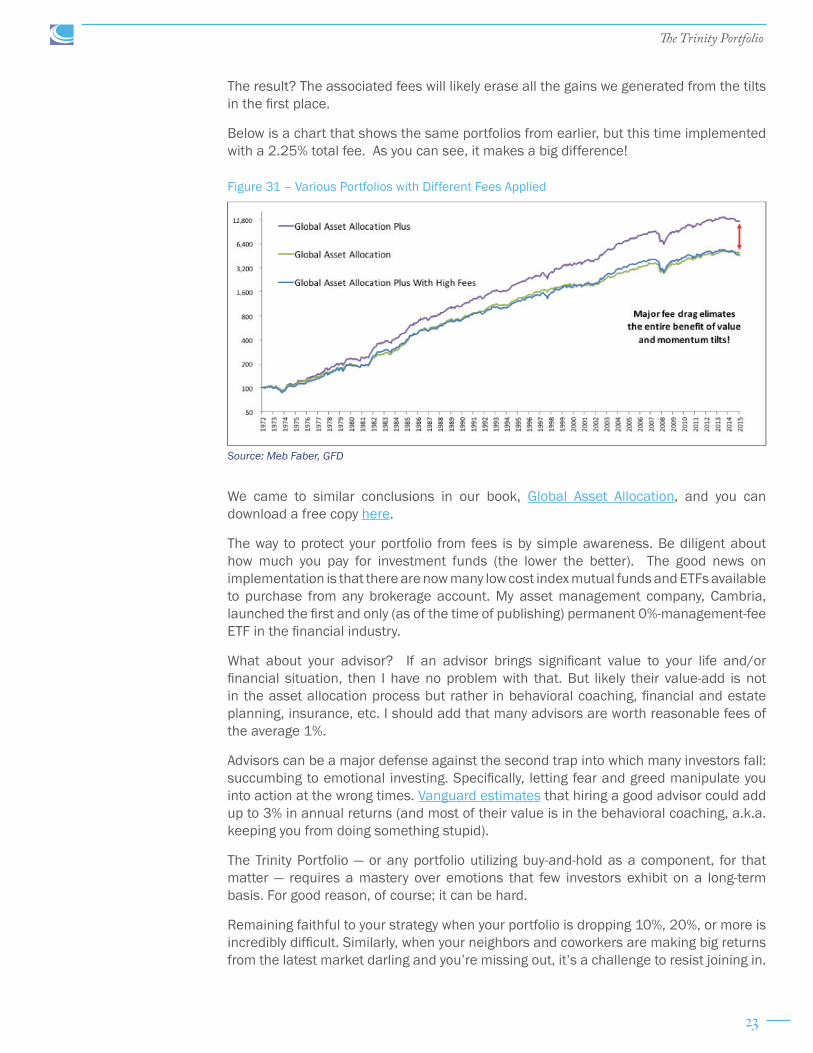
The result? The associated fees will likely erase all the gains we generated from the tilts in the first place.
Below is a chart that shows the same portfolios from earlier, but this time implemented with a 2.25% total fee. As you can see, it makes a big difference!
We came to similar conclusions in our book, Global Asset Allocation, and you can download a free copy here.
The way to protect your portfolio from fees is by simple awareness. Be diligent about how much you pay for investment funds (the lower the better). The good news on implementation is that there are now many low cost index mutual funds and ETFs available to purchase from any brokerage account. My asset management company, Cambria, launched the first and only (as of the time of publishing) permanent 0%-management-fee ETF in the financial industry.
What about your advisor? If an advisor brings significant value to your life and/or financial situation, then I have no problem with that. But likely their value-add is not in the asset allocation process but rather in behavioral coaching, financial and estate planning, insurance, etc. I should add that many advisors are worth reasonable fees of the average 1%.
Advisors can be a major defense against the second trap into which many investors fall: succumbing to emotional investing. Specifically, letting fear and greed manipulate you into action at the wrong times. Vanguard estimates that hiring a good advisor could add up to 3% in annual returns (and most of their value is in the behavioral coaching, a.k.a. keeping you from doing something stupid).
The Trinity Portfolio — or any portfolio utilizing buy-and-hold as a component, for that matter — requires a mastery over emotions that few investors exhibit on a long-term basis. For good reason, of course; it can be hard.
Remaining faithful to your strategy when your portfolio is dropping 10%, 20%, or more is incredibly difficult. Similarly, when your neighbors and coworkers are making big returns from the latest market darling and you’re missing out, it’s a challenge to resist joining in.
Source: Meb Faber, GFD
Figure 31 – Various Portfolios with Different Fees Applied

24
The Trinity Portfolio
So how do you prevent emotional decisions from ruining your returns?
Discipline.
Whatever strategy you decide to implement, simply stick with it. Whether 60/40, a global market portfolio, or even our Trinity Portfolio, find something that works for you and enables you to sleep well at night — then stick with it! Let the rules of your strategy dictate your actions, not your emotions. If that’s too difficult for you, then consider partnering with a cost-effective advisor who will help you stick with your plan.
In the meantime, let’s not lose sight of the bigger picture. From George Mallory:
“And joy is, after all, the end of life. We do not live to eat and make money. We eat and make money to be able to live. That is what life means and what life is for.”

25
The Trinity Portfolio
Appendix A: Definitions of the Metrics Used in the Charts
“Returns” is simply the annualized returns over the stated period.
“Volatility” measures the variability in an asset’s market price. In other words, how much an asset’s price bounces around. The lower the better.
“Sharpe Ratio” is a measure of risk adjusted return. The formula is (Asset returns – Treasury Bills) / Volatility. Most asset classes have a Sharpe ratio over long time frames of around 0.2 to 0.3. The higher the ratio, the greater the return a portfolio is generating per unit of risk. Sharpe ratios can be misleading when looking at an asset class or strategy at short periods of even a decade. The U.S. stock market has seen Sharpe ratios above 1, and even negative, in various decades in the past century.
“MaxDD” stands for “maximum drawdown.” This measures the greatest differential between a portfolio’s highest peak value and its lowest trough value. Basically, it is the maximum amount your portfolio could have been down at its worst point.
“% Positive Months” is simply the percentage of months where the portfolio posted positive returns.
“$100 becomes” indicates how much an investment of $100 into the portfolio would be worth at the end of 2015.
“Inflation CAGR” stands for “inflation compound annual growth rate.” This is the annual inflation rate over the period.