the seven color contrasts - marywood · pdf filethe seven color contrasts written and designed...
TRANSCRIPT

THESEVENCOLORCONTRASTS
Written and Designed by Peter Hoffer and Dennis CorriganTechnical Assistance by Sarah Schanke
BASED ON THE WORK OF
JOHANNES ITTEN
The Seven Color ContrastsAssignment Infomation and Materials
Materials- Winsor Newton designer’s gouache, primary set of six, 14 ml- Assorted lead pencils- Kneaded erasers- Bristol, pad, vellum, 11’ x 14”
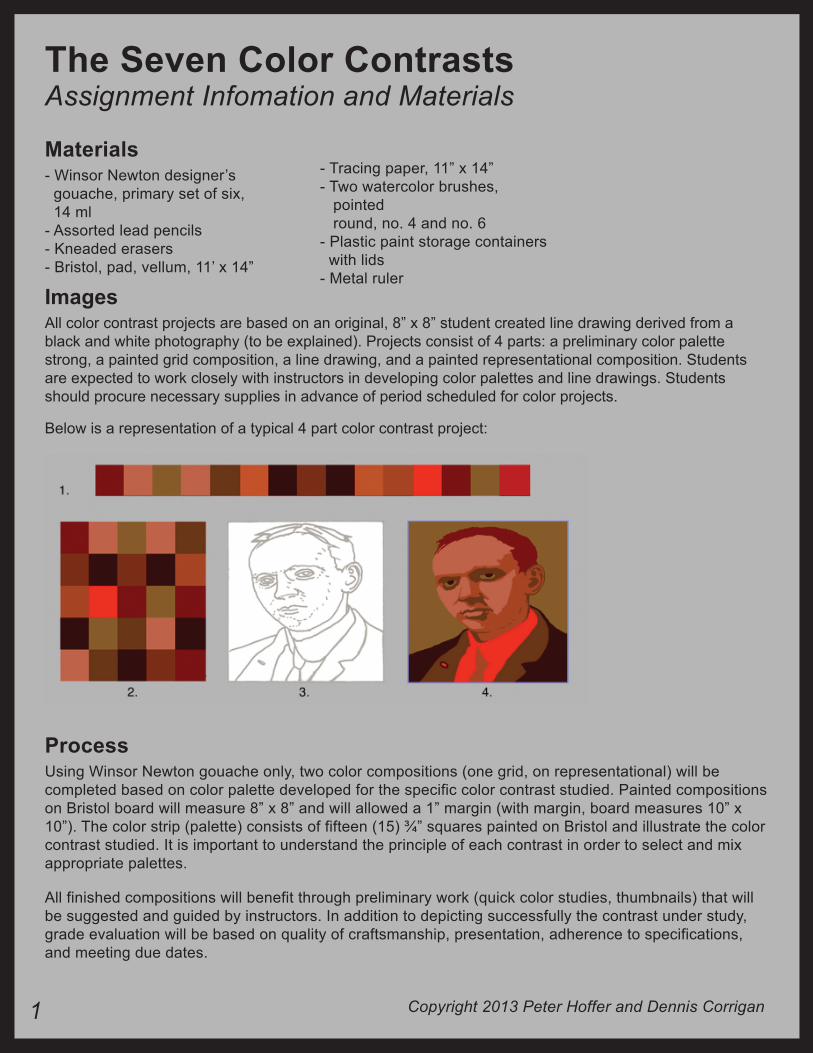
ImagesAll color contrast projects are based on an original, 8” x 8” student created line drawing derived from a black and white photography (to be explained). Projects consist of 4 parts: a preliminary color palette strong, a painted grid composition, a line drawing, and a painted representational composition. Students are expected to work closely with instructors in developing color palettes and line drawings. Students should procure necessary supplies in advance of period scheduled for color projects.
Below is a representation of a typical 4 part color contrast project:
ProcessUsing Winsor Newton gouache only, two color compositions (one grid, on representational) will be completed based on color palette developed for the specific color contrast studied. Painted compositions on Bristol board will measure 8” x 8” and will allowed a 1” margin (with margin, board measures 10” x 10”). The color strip (palette) consists of fifteen (15) ¾” squares painted on Bristol and illustrate the color contrast studied. It is important to understand the principle of each contrast in order to select and mix appropriate palettes.
All finished compositions will benefit through preliminary work (quick color studies, thumbnails) that will be suggested and guided by instructors. In addition to depicting successfully the contrast under study, grade evaluation will be based on quality of craftsmanship, presentation, adherence to specifications, and meeting due dates.
Copyright 2013 Peter Hoffer and Dennis Corrigan
- Tracing paper, 11” x 14”- Two watercolor brushes, pointed round, no. 4 and no. 6- Plastic paint storage containers with lids- Metal ruler
1
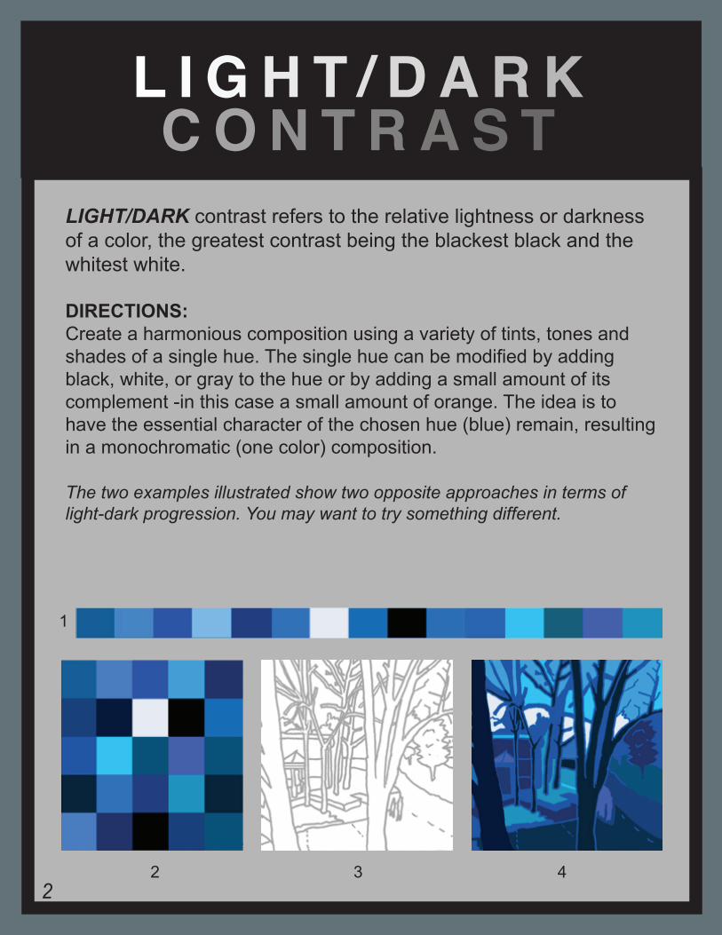
LIGHT/DARK contrast refers to the relative lightness or darkness of a color, the greatest contrast being the blackest black and the whitest white.
DIRECTIONS:Create a harmonious composition using a variety of tints, tones and shades of a single hue. The single hue can be modified by adding black, white, or gray to the hue or by adding a small amount of its complement -in this case a small amount of orange. The idea is to have the essential character of the chosen hue (blue) remain, resulting in a monochromatic (one color) composition.
The two examples illustrated show two opposite approaches in terms of light-dark progression. You may want to try something different.
L I G H T / D A R K C O N T R A S T
1
2 3 42
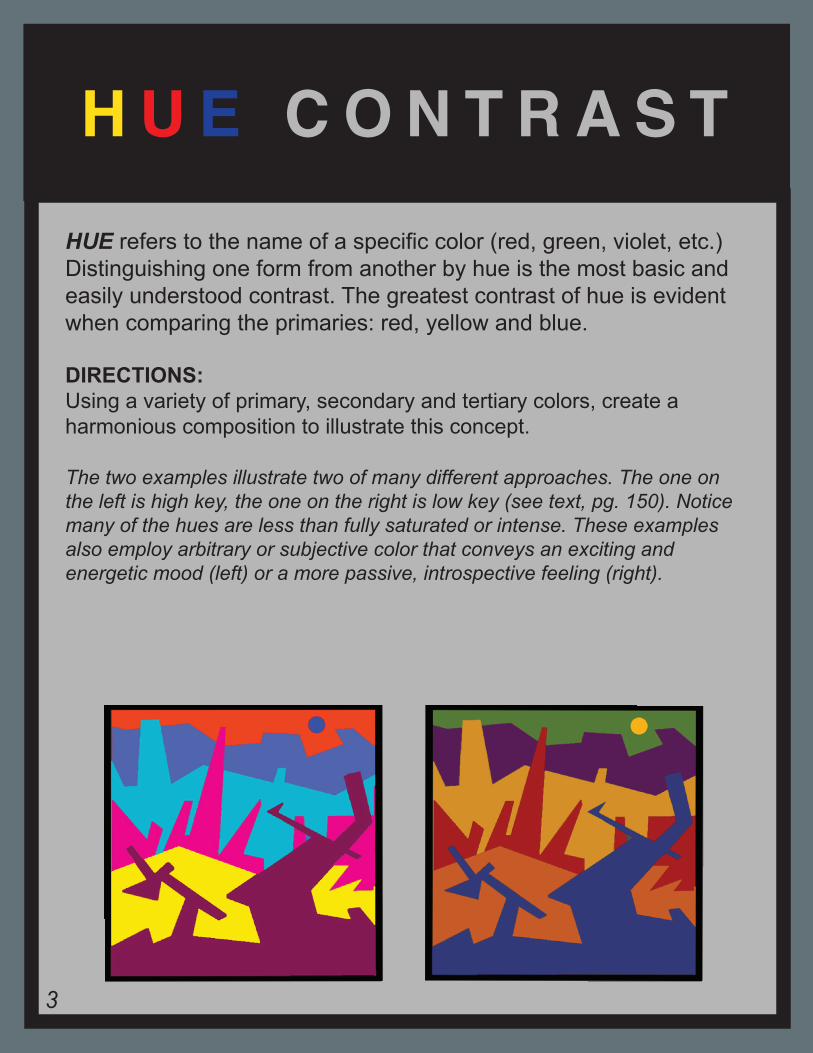
HUE refers to the name of a specific color (red, green, violet, etc.) Distinguishing one form from another by hue is the most basic and easily understood contrast. The greatest contrast of hue is evident when comparing the primaries: red, yellow and blue.
DIRECTIONS:Using a variety of primary, secondary and tertiary colors, create a harmonious composition to illustrate this concept.
The two examples illustrate two of many different approaches. The one on the left is high key, the one on the right is low key (see text, pg. 150). Notice many of the hues are less than fully saturated or intense. These examples also employ arbitrary or subjective color that conveys an exciting and energetic mood (left) or a more passive, introspective feeling (right).
H U E C O N T R A S T
3
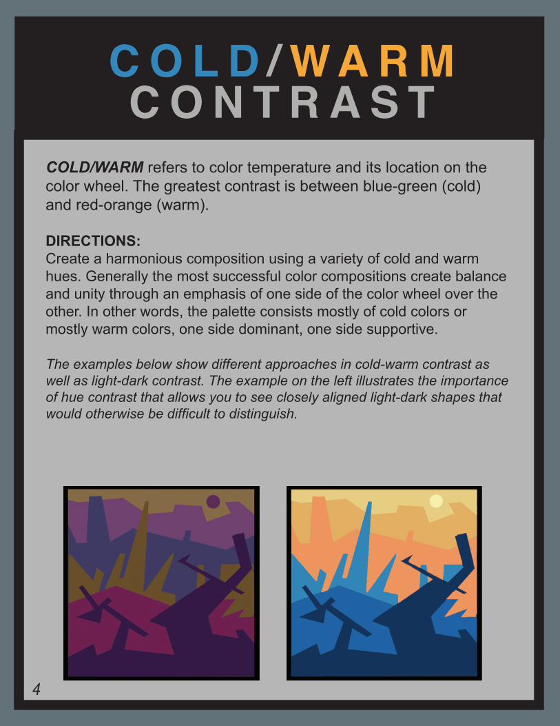
COLD/WARM refers to color temperature and its location on the color wheel. The greatest contrast is between blue-green (cold) and red-orange (warm).
DIRECTIONS:Create a harmonious composition using a variety of cold and warm hues. Generally the most successful color compositions create balance and unity through an emphasis of one side of the color wheel over the other. In other words, the palette consists mostly of cold colors or mostly warm colors, one side dominant, one side supportive.
The examples below show different approaches in cold-warm contrast as well as light-dark contrast. The example on the left illustrates the importance of hue contrast that allows you to see closely aligned light-dark shapes that would otherwise be difficult to distinguish.
C O L D / W A R M C O N T R A S T
4
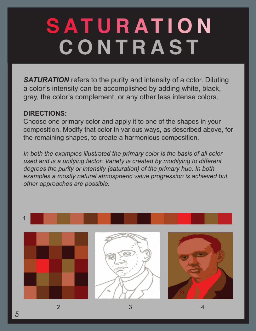
SATURATION refers to the purity and intensity of a color. Diluting a color’s intensity can be accomplished by adding white, black, gray, the color’s complement, or any other less intense colors.
DIRECTIONS:Choose one primary color and apply it to one of the shapes in your composition. Modify that color in various ways, as described above, for the remaining shapes, to create a harmonious composition.
In both the examples illustrated the primary color is the basis of all color used and is a unifying factor. Variety is created by modifying to different degrees the purity or intensity (saturation) of the primary hue. In both examples a mostly natural atmospheric value progression is achieved but other approaches are possible.
S AT U R AT I O N C O N T R A S T
1
2 3 45
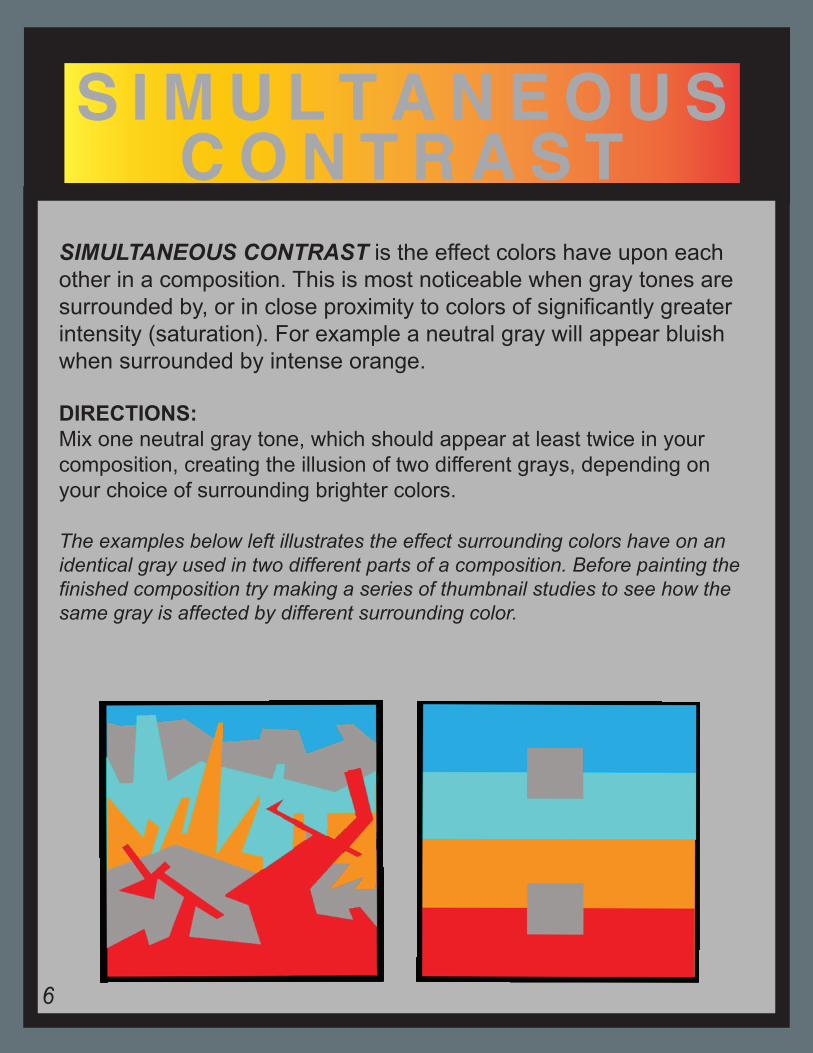
SIMULTANEOUS CONTRAST is the effect colors have upon each other in a composition. This is most noticeable when gray tones are surrounded by, or in close proximity to colors of significantly greater intensity (saturation). For example a neutral gray will appear bluish when surrounded by intense orange.
DIRECTIONS:Mix one neutral gray tone, which should appear at least twice in your composition, creating the illusion of two different grays, depending on your choice of surrounding brighter colors.
The examples below left illustrates the effect surrounding colors have on an identical gray used in two different parts of a composition. Before painting the finished composition try making a series of thumbnail studies to see how the same gray is affected by different surrounding color.
S I M U L T A N E O U S C O N T R A S T
6
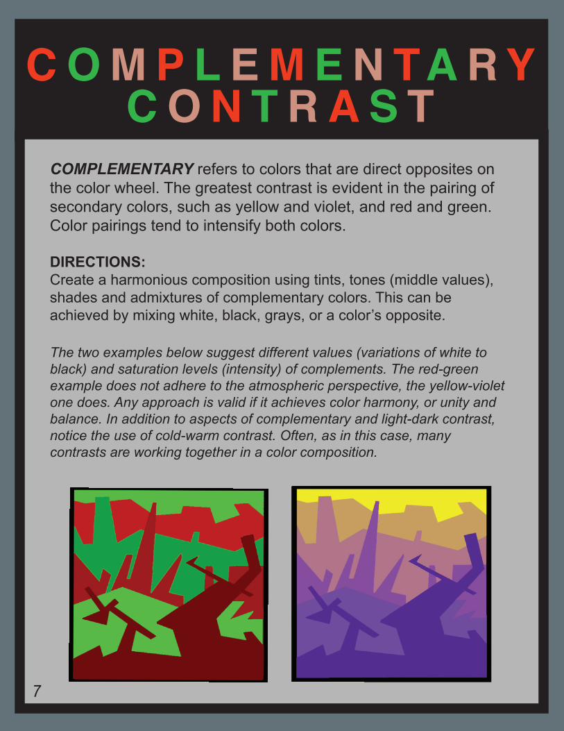
COMPLEMENTARY refers to colors that are direct opposites on the color wheel. The greatest contrast is evident in the pairing of secondary colors, such as yellow and violet, and red and green. Color pairings tend to intensify both colors.
DIRECTIONS:Create a harmonious composition using tints, tones (middle values), shades and admixtures of complementary colors. This can be achieved by mixing white, black, grays, or a color’s opposite.
The two examples below suggest different values (variations of white to black) and saturation levels (intensity) of complements. The red-green example does not adhere to the atmospheric perspective, the yellow-violet one does. Any approach is valid if it achieves color harmony, or unity and balance. In addition to aspects of complementary and light-dark contrast, notice the use of cold-warm contrast. Often, as in this case, many contrasts are working together in a color composition.
C O M P L E M E N TA R YC O N T R A S T
7
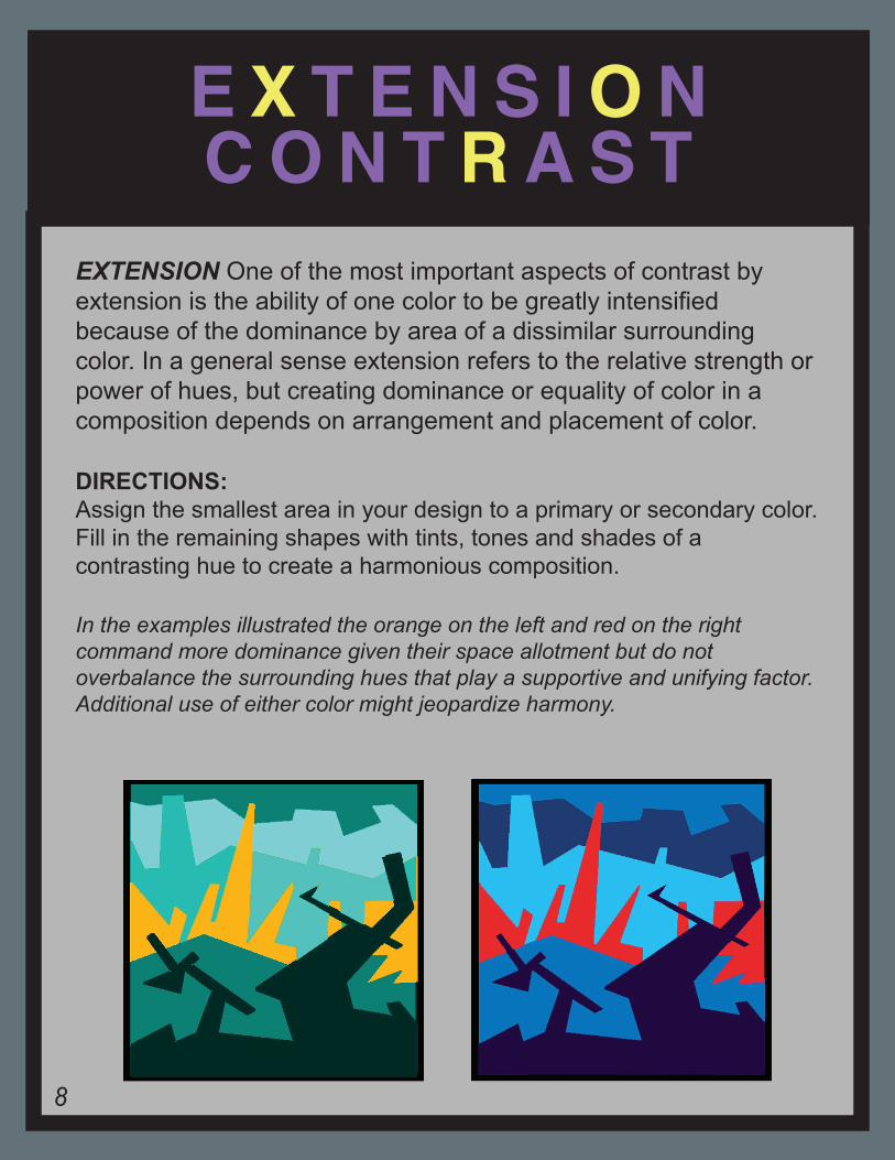
EXTENSION One of the most important aspects of contrast by extension is the ability of one color to be greatly intensified because of the dominance by area of a dissimilar surrounding color. In a general sense extension refers to the relative strength or power of hues, but creating dominance or equality of color in a composition depends on arrangement and placement of color.
DIRECTIONS: Assign the smallest area in your design to a primary or secondary color. Fill in the remaining shapes with tints, tones and shades of a contrasting hue to create a harmonious composition.
In the examples illustrated the orange on the left and red on the right command more dominance given their space allotment but do not overbalance the surrounding hues that play a supportive and unifying factor. Additional use of either color might jeopardize harmony.
E X T E N S I O N C O N T R A S T
8