the portfolio of jaren walker
DESCRIPTION
I created this porfolio to show of the work I created in my Graphic Design class (COMM 130)TRANSCRIPT


CONTENTSLogos
Letterhead
Buisness Card
Web Page
Brochure
Event Ad
Imaging
Flier
Montage

LOGOSDescription: Logo for my personal mark
Date: 10/31/15
Course/Instructor: COMM 130-07, Brother Pingel
Programs, Tools Used: Adobe Illustrator
Objectives: Create a variety of vogos to fit a company
or a personal image. Use the basic tools of Adobe Illus-
trator
Process: I’ve had the idea of using a star in a circle as
my own mark for some time, but all the ones I’ve tried
to come up with were somewhat lack luster. However,
when I got this assignment, it really got my creative
juices flowing. My rough I tried a few different varia-
tions, but I was right the first time as most voted for my
first logo. So in my final draft, I refined it further, adding
the starburst from my third design, and making the
star somewhat 3D.


LETTERHEADDescription: Design of a new letterhead for my Dad’s
Dental Office, in conjunction with the buisness card.
Date: 11/5/15
Course/Instructor: COMM 130-07, Brother Pingel
Programs, Tools Used: Adobe Illustrator, Adobe
InDesign
Objectives: Create a new logo to fit a company or per-
sonal image.Design consistent layouts for a business
card and letterhead.Use the basic tools of Illustrator &
InDesign.
Process: I liked this project because I was helping
out my Dad. His original logo and sign were decidedly
lackluster, so I helped him spruce it up. I used Adobe
Illustrator to create the logo, and then inserted the logo
into Adobe InDesign, where I laid out the final product,
added text, and then exported both. Indesign was a
clunky program to use, but if you know her ways, you
can work wonders.

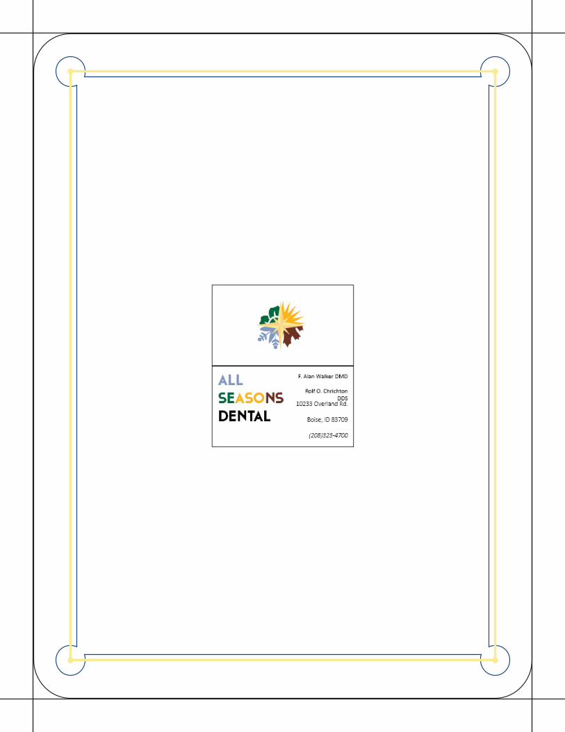
BUISNESS CARDDescription: Design of a new letterhead for my Dad’s
Dental Office, in conjunction with the buisness card.
Date: 11/5/15
Course/Instructor: COMM 130-07, Brother Pingel
Programs, Tools Used: Adobe Illustrator,
Adobe InDesign
Objectives: Create a new logo to fit a company or per-
sonal image.Design consistent layouts for a business
card and letterhead.Use the basic tools of Illustrator &
InDesign
Process: Just like the letter head, Dad’s buisness card
needed some sprucing up. Creating a 3x1.5 inch
buisness card was the easy part, then it was just a
matter of adding the details with the logo, the name,
and all the buisness information. The best part is that
Dad may use these in the future
WEBPAGEDescription: Webpage advertising a new logo I created.
Date: 11/21/15
Course/Instructor: COMM 130-07, Brother Pingel
Programs, Tools Used: Adobe Illustrator, CSS, HTML, and
Notepad ++
Objectives: Size and optimize an original logo as a .png
for a web page.Write content to describe the process of
creating your logo and how it appeals to a target audience.
Design a web page using HTML to display a logo and con-
tent.Acquire a working knowledge of HTML and basicunder-
standing of CSS.Identify hex colors for web design.Com-
press multiple files in a zipped folder to attach as one file
Process: Coding was a daunting prospect at first, but the
more I got into it, the more I found it came easy to me. Af-
ter Designing the Logo in Illustrator, I created the webpage
slowly but surely. The hardest part was getting the form-
mating right, as the code got trickier, but with some help
from tutors, I figured it out, and created a thing of beauty.


BROCHUREDescription: a stylized threefold brochure for a clas-
sic car company.
Date: 12/5/15
Course/Instructor: COMM 130-07, Brother Pingel
Programs, Tools Used: Adobe Illustrator, Adobe Photo-
shop, Adobe InDesign
Objectives: Set up and align a two-sided, folded doc-
ument.Learn how to wrap text around an image.Use
paragraph styles in InDesign.
Process: This was a fun project. Inspired by the retro
futuristic videogame, “Fallout 4”, I decided to create a
brochure advertising a line of classic atomic powered
cars. I first created the logo in Illustrator, and found
and refined the Images in Photoshop, then I took them
to InDesign, where I created the layout, and put every-
thing together. By far the hardest part was turning the
car on the front panel from white to red. I used alot of
filters, and clever brush work to make that possible. In
the end, its a classic design for some classic cars.
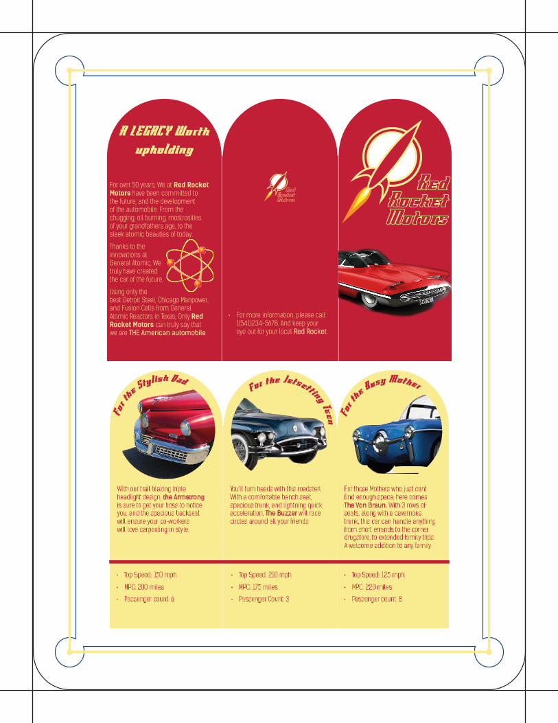
For over 50 years, We at Red Rocket Motors have been committed to the future, and the development of the automobile. From the chugging, oil burning, mostrosities of your grandfathers age, to the sleek atomic beauties of today.
Thanks to the innovations at General Atomic, We truly have created the car of the future.
Using only the best Detroit Steel, Chicago Manpower, and Fusion Cells from General Atomic Reactors in Texas; Only Red Rocket Motors can truly say that we are THE American automobile
A LEGACY Worth
upholding
• For more information, please call 1(541)234-5678. And keep your eye out for your local Red Rocket.

EVENT ADDescription: A advertisment for a On Campus event
Date: 10/10/15
Course/Instructor: COMM 130-07, Brother Pingel
Programs, Tools Used: Microsoft Word
Objectives: Find, scan and import a high-quality im-
age.Create a full-bleed designUse text boxes for layout
in Word. Insert and edit images in Word
Process: Firstly, this is where some of my designs get
a little lackluster. I am pleased with how this turned
out, but it could have been better. Firstly, after taking a
picture of my roommate and his fiance, I took the im-
age to word, found a border, and tried to make it look
as frilly as possible, focusing on making look some-
what like a wedding invatation.


IMAGINGDescription: A personal photo, Edited in Photoshop
Date: 10/13/15
Course/Instructor: COMM 130-07, Brother Pingel
Programs, Tools Used: Adobe Photoshop
Objectives: Learn basic photography skills.Use a digital
camera to take a quality image, then download it.Size
and crop the image. Adjust image brightness, contrast,
hue and saturation levels.Use a selection tool to isolate
a portion of the image.Desaturate the selected portion
of the image.Use a filter or colorize a portion of the
image
Process:
Special thanks to my Uncle Collin who gave me these
souvenirs, from when I toured Disney Studios. I ar-
ranged all my souviners on my bed, took the picture,
and brought it into photoshop, where I enhanced , and
brightened the image. The sharpen tool was a little
difficult to use, especially on this one, mainly because
I had no idea what I was doing, but I found it enhance
the lines on some of the drawings very well.

FLIERDescription: A flier for a On-Campus program
Date: 10/3/15
Course/Instructor: COMM 130-07, Brother Pingel
Programs, Tools Used:
Objectives: Apply the design principles and use ap-
propriate typography.Incorporate basic InDesign skills
to improve basic fier layout.Create a project folder with
image, logo and InDesigndocument to keep links in-
tact.
Process: This design project was fun to work on. When
I discovered more about Capoeria, the first word that
popped into my head was “Exotic” I tried to give it that
exotic feel without, seeming too foreign or threatening.
THe end result was good, but with the skills I have now,
I could’ve done alot more.
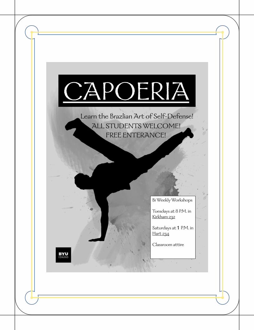
CAPOERIA
Bi Weekly Workshops
Tuesdays at 8 P.M. in Kirkham 232
Saturdays at 1 P.M. in Hart 234
Classroom attire
Learn the Brazlian Art of Self-Defense!ALL STUDENTS WELCOME!
FREE ENTERANCE!
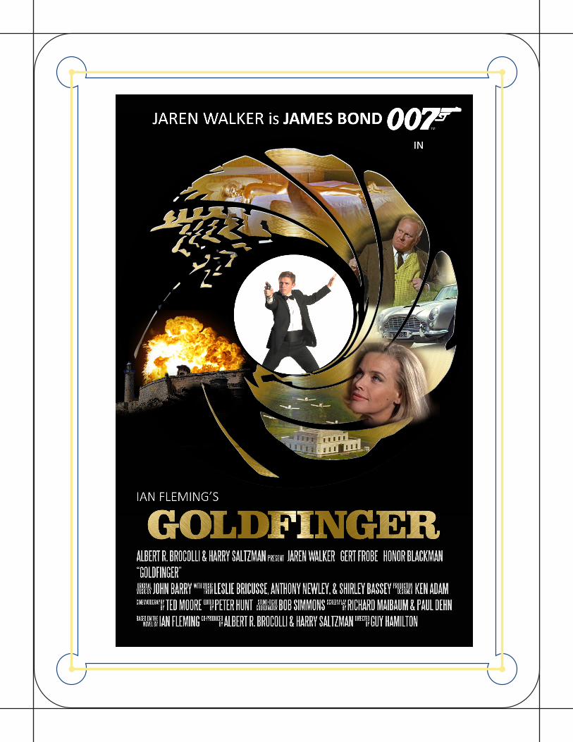
MOVIE POSTERDescription: Logo for my personal mark
Date: 11/20/15
Course/Instructor: COMM 130-07, Brother Pingel
Programs, Tools Used: Adobe Illustrator, Adobe Photoshop
Objectives: Extra Credit
Process: Being a James Bond Fan, I wanted to create a new
poster for one of the movies. I first brought in a image of a
textured gold circle and overlayed the bond gunbarrel logo
onto it. Then I input some other photohoped images of lo-
cations, characters, and setpieces, with me in the middle,
I then added several other layers to it, including the movie
title, and credits.