the periodic tableau: form and colours in the first 100 years
TRANSCRIPT

1
This is the peer reviewed version of the following article: Bock von Wülfingen, B. The periodic tableau: Form and colours in the first 100 years. Centaurus. 2019; 1– 26, which has been published in final form at https://doi.org/10.1111/1600-0498.12248. This article may be used for non-commercial purposes in accordance with Wiley Terms and Conditions for Use of Self-Archived Versions.
Bettina Bock von Wülfingen ORCID iD: https://orcid.org/0000-0002-0073-2274
The Periodic Tableau: Form and Colours in the first 100 years
Abstract
While symbolic colour use has always played a salient role in science research and
education, the use of colour in historic diagrams remains a lacuna within the history of
science. Investigating the colour use in diagrams often means uncovering a whole
cosmology otherwise not explicit in the diagram itself.
The periodic table is a salient and iconic example of non-mimetic colour use in science.
Famous is Andreas von Antropoff’s rectangular table of recurrent rainbow colours
(1924); Alcindo Flores Cabral’s (1949) application of colour in his round snail form
using the rgb scheme, Mazurs’ pine tree system (1967), speaking of warm and cold
colours that he attributed to specific groups of elements – an attribution that we can
relate back to humoralism and alchemy.
From the first periodic tables in the 19th century on, individual researchers have used
different colour regimes. While standardization may play an obvious role in chemistry
and its diagrams, all the more impressive is the anarchistic use of colour in the respective
diagrams up to today. This article focuses on periodical tables in chemical journals and
text books and explores and compares the development of colour codes found in the few
existing polychrome diagrams from the 1920s to the 1970s.
Scientific diagrams often present themselves to us like pieces of art. Yet, they are rarely
analyzed as to their visual qualities. It is imperative to do so, as the aesthetic dimension of
scientific images has proved to have contributed to a great extent to the success of scientific
ideas.1 Taking this as a point of departure, the present paper focuses on the diagrammatic
1 Gordin (2018), Kaiser (2005), Woody (2000).

2
reasoning of the periodic table and the role of colour within. The study of colour within the
history of science is a fairly recent field, and cultural connotations of colours or their symbolic
use are rarely mentioned.
In order to describe the utility of periodic tables for researchers, this article refers to the concept
of the “paper tool”.2 This term was introduced by the historian of science Ursula Klein in her
case study on the first chemical notation, the Berzelian formula at the beginning of the 19th
century. The chemical notation and diagrams are tools on paper, and as such allow for playful
interaction as placeholders for real objects. The periodic table, just as the symbolic world of
modern chemistry in general, has been evolving since the 19th century. Ursula Klein has applied
her term paper tool to specific images in science that emerged in this temporal window. This
concept has already been applied to the role of tables in chemistry and specifically to that of the
periodic table.3 But not just any scientific diagram drawn on paper counts as a paper tool with
the qualities described by Klein.4 Part of the paper tool’s power to replace its reference(s) lies
in its realism, the fact that it reliably represents specific topological or otherwise realistic
relational characteristics of the object it depicts.
While the graphic forms and symbols in chemistry have been studied by historians of science,
and while generally speaking, in recent years the study of colour within the history of science
has seemed to open up, the analysis of colour use in diagrams is rare. Colour use in diagrams is
specific: often in the sciences, and especially before the existance of colour photography,
drawings were meant to give a naturalistic impression of the represented object, e.g. of plants
or animals as the colours in original tissue would fade with time. The colour was thus mimetic,
meant to mimic the original in nature. In diagrams instead we find non-mimetic colour use.
2 Klein (2001). 3 Gordin (2018); Scerri (2007), Bensaude-Vincent (2001). 4 Klein (2001).

3
As this paper will demonstrate, colour has mainly been used in the periodic table as a relational
tool and differentiator. These are specific qualities of colour as a symbolic vehicle, in contrast
to others, such as graphic symbols.5 The study revolves around the monochrome table by
Dimitri Mendeleev (1834-1907), the first scientific periodic table in colour we know of to date,
produced by Henry D. Hubbard (1870-1943), and the three later and most frequently referenced
polychrome images by Andreas von Antropoff (1878-1956), Edward G. Mazurs (1894-1983)
and Alcindo Flores Cabral (1907-1982). Other polychrome tables appearing in popular media
formats will not be discussed in this essay, as the focus here is on the appearance of colour in
periodic tables in the scientific realm.6 Out of the no more than a dozen polychrome scientific
visualizations of the periodic tables published up to the mid 1960s, the following discussion
deals with those most often referenced.
The main part of the essay consists of four sections. The first section focuses on the essential
role of the table as a specific type of diagram in the history of chemistry as a scientific discipline.
Section two differentiates types of images, in order to advance the notions of the paper tool and
material image of the periodic table, and then moves on to discuss the use of colour in images.
The character of the periodic table as an image is the object of the last two sections. Section
three describes the development of the modern periodic table in the long form with its elements
in grid and boxes, while section four explores the use of colour in periodic tables from the
beginning of their existence to the early 1960s. The discussion of the role of colour as a special
symbolic vehicle in contrast to other graphic forms concludes the article.
5 Jameson (1979). 6 E.g. a periodic table by Clark (1933), that was coloured for a Time Magazine cover in 1949.
4
1. The periodic table as a visual form in the new chemistry
Merriam-Webster describes the table as “a systematic arrangement of data usually in rows and
columns for ready reference”; it is also a “condensed enumeration: a list”.7
The cultural practice of list keeping originated in trade and found its way into natural history
and medicine through Italian double-entry bookkeeping.8 However, in the early history of the
natural sciences, not only were objects listed, such as in Georges Cuvier's overview of his
observations on elephant fossils, but these order-techniques entered into the natural sciences
via the humanists as a method applied to any object.9
While the list is a way to organize data in one dimension, the table has two dimensions. In the
history of chemistry, the table played a major role during the self-proclaimed chemical
revolution: this shift is one from collecting ever-changing information in affinity tables, to the
analysis of the collected, and the formulation of guidelines for future findings on how to
generate new chemical knowledge.10 It is most notably marked by three studies that were
published in the 1780s.11 Quite exceptional and explicit in its aim to make knowledge more
transparent and internationally accessible, and thus to change the overall practices in chemistry,
was the fact that the multi-authored compilation by “MM. de Morveau, Lavoisier, Bertholet, &
de Fourcroy” includes tables with symbols corresponding to the new system of nomenclature
which differed from the alchemical symbols that were previously used.12 This new symbolic
language was intended for use as a short form in the international discourse. These studies
realized the need which had been recognized and declared in earlier studies: tables as tools for
7 Webster (2019). 8 Pugliano (2012), Müller-Wille & Charmantier (2012). 9 Daston (2012). 10 Cohen (2004), Bensaude-Vincent (2001), Duncan (1996), Roberts (1991); as an early example of these tables see Geoffroy (1718). 11 Guyton de Morveau (1782), Guyton de Morveau et al. (1787) and Lavoisier (1789). 12 Guyton de Morveau et al. (1787).

5
the advancement of chemistry.13 The table is much more than just a “literary technology”, a
term that Roberts borrows from Steven Shapin’s study on Boyle.14 Roberts denotes hereby the
inseparability of the production and transmission of knowledge in science. The essential act of
tabulating is to place objects in a specific two-dimensional order. The table thereby is “part of
the very act of classifying” and at the same time profits from the difference between written
symbols in the text (consisting of a sequence of symbols), and an image in which the position
of graphic elements in two-dimensional space can be used to transmit meaning. Furthermore,
the table as a pictorial visual tool in chemistry that joins symbols (such as the short forms for
substances or elements) cannot merely be replaced by written and readable text. 15 Cohen calls
it a “complex symbol”.16 In contrast to other symbolic elements, historians of science have not
yet subjected the role of colour, as well as its use and meaning in polychrome periodic tables to
any analysis.
2. Scientific images and colour
The study of images in science has received increased attention since the 1990s, and many
studies today describe the role of diagrams as a mediator between seeing and thinking.17 The
rising appreciation of the relevance of the visual in scientific texts is part of a general trend to
recognize what elsewhere has been called multimodality, a growing interdisciplinary approach
aiming at the analysis of the interplay of written or spoken language with other acoustic or
visual two- or three-dimensional modes of interaction.18
13 See e.g. Geoffroy (1718); Boerhave (1735); Bergman (1783); Cohen (2004); Duncan (1996); Roberts (1991). 14 Roberts (1991); Shapin (1984). 15 Cohen (2004, p. 44). 16 Cohen (2004, p. 35). 17 See i.a. Gerner (2010); Krämer (2010); Daston and Galison (2007); Cook (2005). 18 Norris & Maier (2014); Kress (2010).

6
A ‘diagram’ may be understood as a kind of symbolic representation of information. The
periodic table is such a diagram. In agreement with the broad and common understanding of
the image in the history of science, and in contrast to a narrower notion of the image or picture
by Charles Sanders Peirce (1839-1914), diagrams can be seen as pictures or synonymously, as
images.19 However, a distinction can be made between the image as a depiction of a real object
as in Pierce’s iconic sense, and the diagram as an abstract form. Periodic tables are both: they
are icons, since they can immediately be grasped visually as symbols (of themselves, of the
periodic table) without a detour in the form of a text to be read. At the same time diagrams are
graphic representations in their abstract form that do not necessarily have a depictive character,
but rather represent invisible qualities of objects, often relational aspects within the objects.
Most scientific diagrams therefore also have a special, complex relationship to the materiality
of the reference object.
Generally speaking, diagrams organize knowledge to make it easily accessable.20 They are
therefore relevant for epistemic reasons: Producing them, means ordering thought and
knowledge in specific ways, creating a mode of feedback, and testing for immediate next ideas
that might arise. Using knowledge that is visually well-integrated into graphs means to grasp
that knowledge quicker, than if it were to be referenced in written form. Furthermore, diverse
aspects of an object, or of various objects can be accessed at once instead of in a sequence when
we read. Diagrams also have an educational advantage in that they appeal to our capacity for
pattern recognition and shape perception (“gestalt vision”).21
19 Peirce (1933 [1906], par. 492–546), see also Campbell in this issue. 20 Kaiser (2005); Klein (2001). 21 Hand and Choi (2010); Krohn (1991); Krohn (1991); Lynch (1991, quotations on pp. 217-218).

7
All these criteria also apply to what Ursula Klein called “paper tool”.22 In accordance with
earlier studies on this subject, this notion of the paper tool is applied here to the periodic table
in order to emphasize specific characteristics of the periodic table.23 A paper tool can only work
well, when it contains sufficient ‘ontological’ overlap with the real object including the not
necessarily topological relation among different elements within the object. In her study on
orbital diagrams in chemistry, Andrea Woody claimed that it was the realism of the orbital
diagrams depicting quantum-mechanical binding potential that enabled researchers to gain
knowledge through the use of the diagrams well before it was possible to use formulas to come
to terms with what the diagrams represented.24
It is relevant to discuss the role of colour as it doesn’t share the characteristics of other symbolic
vehicles: it is not just an additional graphic symbol. Colour is able to structure an image in all
directions within the two-directional plane without the addition of further forms. Nevertheless,
it can carry additional meaning. Colour can thereby enhance the epistemic and educational
advantage of diagrams. To allow for this is a quality of the table as an image, in contrast to the
table as a text, where colour can only work in one (reading) direction. (Not) making use of
colour in a table is therefore an essential decision regarding how many dimensions are involved.
This article suggests that ideas of what a specific colour means, i.e. connotations of colour, are
learned in historical context. This is not self-evident as there are two existing positions within
the humanities: the universality of the connotations of specific colours, and the connotations of
22 Klein (2001). 23 Gordin (2018); Scerri (2017); Bensaude-Vincent (2001). 24 Woody (2000). Paper tools share relevant qualities with models: Paper tools are objects drawn on paper that function as placeholders for a real object, having ontological overlap with that object. A model in science represents a simplified version of a phenomenon of which it is a placeholder. The concept of the model is very diverse. It can be a three-dimensional object or a drawing, sometimes even a metaphor, or a model animal in lab sciences, and is as such difficult to categorize (Leonelli, 2006). Models play a significant role in science teaching (Gilbert et al., 2000). The paper tool however, refers concretely to sign systems on paper, which can be manipulated and worked with in experimental and classificatory practice in the lab sciences (and can also be used in teaching).

8
colour emerging in a specific historical context as demonstrated by art historians such as
Heather Pulliam, John Gage, Michel Pastoureau, Liz James and Herbert Kessler.25
Again, the history of science of colour is a recent field. The respective studies can be divided
into the history of colour ontology, which is most often found within the history of physics,
studies on the history of colour charts used for standardization in the sciences and technology,
studies that analyze the history of colour as a material substance, and those that relate mimetic
colour use to reproduce the living aspect of zoological or botanical objects as well as the
mimetic use of colour in other disciplines such as geology, meteorology or medicine.26
Colours in diagrams, however, do not imitate the colours of nature, but at best symbolize them
mimetically. Thus, for example, the colour green might represent botany. There are very few
studies in the history of science which examine the meaning of colour in diagrams.27 As will be
shown in section four of the following analysis, colour use in periodical systems is an excellent
case to demonstrate the way in which colours differ from other symbolic vehicles.
In the specific cultural European-American tradition, colours are ordered as primary and
secondary. Primary colours are red (vermillion), yellow and blue (ultramarine blue) while
secondary colours are orange, purple or light blue and green.28 This order, while at the time not
referred to as “primary”, ultimately goes back to classical antiquity, and was upheld through
Christianity and into modernity.29 Leonardo da Vinci naturalized this favoritism for the only
25 See e.g. on the universalist position in philosophy Byrne & Hilbert (1997) versus Wittgenstein as in Steingart (2016); for evolutionary psychology Berlin & Kay (1969); on basic colour terms in linguistics Vogt & Karliczek (2013); on colour in history of arts Pulliam (2012), Gage (1999), Pastoureau (2016, 2007), James (1996), Kessler (2004). 26 E.g. Karliczek (2018), Bushart & Steinle (2015), Hentschel (2014, 2006), Temkin et al. (2008), Altmann (2006), Métraux (2006), Nickelsen (2006), Baker et al. (2015), Dünkel (2006). 27 See more in Bock von Wülfingen (2019). 28 To be precise, we need to specify the red and blue hues in order to differentiate the colour traditions. Vermillion and ultramarine are the most frequently referenced red and blue hues when we speak of primary colours. In other cultures, red and blue appear in other tones – e.g. vermillion and ultramarine would not be found in the Asian Shinto system of ‘correct colours’ (Bock von Wülfingen 2019). 29 Bennewitz & Schindler (2011); Thürlemann (1988).

9
later to be so named ‘primary colours’, with the claim that these were the colours that could be
produced without mixing pigments.30 With Ewald Hering (1834-1918) and Hermann von
Helmholtz’s (1821-1894) suggestions of different three-colour perception theories between
1860 and 1918, came the rising competition with alternate primary trias using green instead of
yellow, resulting in the modern acronym rgb for the three primary colours red, green and blue.31
After this, when more than three colours (red, indigo-blue and yellow) were needed in technical
or natural science images, first green as a fourth, and then the remaining spectral colours (then
light blue,32 orange, violet) were used, giving the seven spectral colours as suggested by Isaac
Newton (1643-1727) in his theory of colour in light. Apart from the violet, all other six colours
are the very ones that make up the basic colours in the contemporaneous competing colour
wheel as produced by Johann Wolfgang von Goethe (1749-1832).
3. The making of a material image: stabilization of the periodic table representation
When approaching the question of the different ways and reasons for the use of specific colours
in the periodic system, the specific graphic form of the periodic system first needs to be
discussed, as well as how the modern, iconic long form emerged displaying 18 or even 32
columns instead of only eight groups. Was that an almost necessary structure resulting from the
chemical and physical nature of the elements? Apparently this was not the case. Instead the
graphic of the table in each different case resulted from contingent decisions dependent on its
respective use, and became only relatively stable in the modern form, the long rectangle, due to
unwritten convention. Already in the first hundred years of existence of the periodic law, at
least 146 different types emerged, according to grouping by the chemist Edward Mazurs, each
of which was meant to solve a specific problem.33 Many of these were not even tables, but had
30 Lawson (2019); Thürlemann (1988). 31 Thürlemann (1988). 32 This in today’s terms would be called light blue in contrast to indigo (Waldman 2002). 33 Mazurs (1974).

10
a circular or spiral form (see one of these as fig. 6). Yet, as the different periodic tables were
based on the material, chemical qualities of the elements in correspondence with the periodic
law, their form was never arbitrary. This is what qualifies the periodic table as a material image
(see more below).
In his first publication of the periodic table of 1869, Mendeleev started out with a structure very
different from the modern graphic form known today. Rather, he applied a structure similar to
those already produced by his predecessors William Odling (1829-1921) and John Alexander
Newlands (1837-1898).34 In contrast to them, he subjected the ordering process to his new
periodic law, resulting in his first version, a table of vertical periods (see fig. 1). The article of
1869 opened immediately with the argument about the table’s form: “If the elements are ordered
according to increasing atomic weights in vertical rows in such a way that the horizontal rows
contain analogous elements, again ordered according to increasing atomic weight, the following
compilation is obtained, from which some general conclusions can be derived”.35
34 Odling (1864); Newlands (1864). 35 Mendeleev (1869, p. 18).

11
Fig. 1: Mendeleev’s first table of the classification of the elements.36 This monochrome first
version of a periodic table still doesn’t utilize the typical grid structure.
As figure 1 illustrates, Mendeleev’s first periodic table is a table of mere text with no linear
grid. The radical opening of his first publication, immediately translated from Russian into
German, shows that Mendeleev attached great importance to explaining his thinking about the
aesthetics of the table in relation to atomic weight and the chemical properties of the elements.
Even more explicitly, he did so incrementally in a footnote, where he discussed different forms
of presenting the elements:
He argued that one could “more rationally” order the suggested table in a manner putting the
alkali metals lithium (Li), sodium (Natrium, Na), potassium (Kalium, K), rubidium (Rb),
cesium (Cs) and the transition metal titanium (Ti) in a row each next to one another on top,
while placing the halogens fluorine (F), chlorine (Cl), bromine (Br) and iodine (I) in the bottom
36 Mendeleev (1869, p. 18).

12
row. 37 The advantage being that the elements are “sharply different from one another” so that
“Cl and Na build the outer rows between which those elements of less sharply expressed
character could be placed. But then the center of the table would be nearly empty and of
doubtful character”.38
Interestingly and typically for the role of tables in the new chemistry mentioned in the first
section, Mendeleev’s very first phrase about the table connects the aesthetic form of the image
to the past (knowledge e.g. about weight determinations) and the future (e.g. possible new
elements).39 While, as he wrote, some further conclusions could still be derived from this way
of visually presenting these results, it allowed him to make predictions about yet to be
discovered elements.40
Other researchers before Mendeleev saw the regularity of the properties as well. It has been
argued by science historians that their tables have garnered less recognition partly due to the
lack of a similarly useful tool such as the periodical table.41 Michael Gordin adds that it was
the fact that Mendeleev exposed his reasoning underlying the format of the table which granted
him and his table priority over tables presented by Newlands between 1863 and 1866, as well
as others during those years.42 The direct reference of each part of Mendeleev’s table to the
37 Mendeleev (1869, quotations on p. 31). 38 Mendeleev (1869, quotations on p. 31); see also Bensaude-Vincent in this issue. 39 See his first quote above; Cohen (2004); Brush (1969). 40 More than a decade after his first system was presented, Mendeleev claimed that he originally thought of depicting the periodic law with a curve, arguing that “[t]he properties of the elements as well as the forms and properties of their compounds are in a periodic dependence or, expressing ourselves algebraically, form a periodic function of the atomic weight of the elements” (Mendeleev, 1891, p. 16). In the footnote from 1869 quoted above, however, Mendeleev explains that he discarded this idea, because of the lack of continuity in the change of properties of the elements – the function or curve “does not in any way indicate the existence of a limited number of elements in each period” (Mendeleev, 1891, p. 16). He similarly rejected the idea of a spiral, adopted by mineralogist Béguyer de Chancourtois, due to the arbitrariness it would involve (see below the solution in Cabral’s trichromatic spiral), as, again, it wouldn’t reflect the periodic reappearance of an element’s properties. For Mendeleev’s attitudes to mathematical representations of the periodic law, see Pulkkinen in this issue. 41 Scerri (2001). 42 Gordin (2018).
13
underlying theory and chemical ontology turned Mendeleev’s table into a useful paper tool, not
only for theoretical reasoning, but also for empirical use.43 As Gordin indicates, indeed, it was
neither the table nor the text alone that brought priority to Mendeleev’s exposition and
introduced the periodic law once and for all, but the sensitive matching of text and visualization.
The text made clear that the order in the table was based on the materiality of the respective
elements.
Mendeleev, in his second publication on the periodic law in 1871, followed up on his earlier
table with horizontal periods and continued working with this in all further versions.44 While
Mendeleev initially in fact didn’t “draw grids” in this publication of 1871, he rotated his table
90 degrees fitting it to the landscape format of the page. Vertical lines appear in the table to
separate the groups.45 In his 1873 publication, he used a short form of 12 (instead of the earlier
up to 18) series, which he would perfect in subsequent publications, and then use in his
chemistry text book published in different languages between 1890 and 1892. In a publication
of 1904, he used a table, again the short form, but with vertical periods, dividing the elements
by vertical and horizontal lines.46
From a chemical and history of science perspective, the question of the lines and drawn grid
may seem at first sight utterly irrelevant. However, in the discussion of the periodic table as a
picture, the lines are important aspects of its graphic appearance, which then again is
scientifically relevant for epistemic reasons, as indicated above. It seems to be with Alfred
Werner (1866-1919) that the periodic table is published for the first time with a grid showing
vertical and horizontal lines.47 This is relevant for the position of the elements in the table from
43 Gordin (2018). 44 Mendeleev (1871). 45 See the title by Gordin (2018, quotation on p. 30, emphasis added). 46 Mendeleev (1904). 47 Werner (1905, quotations on p. 169).

14
then onwards – boxes came to be used as a convention and allowed for the inclusion of further
information in the respective squares. This turned the table into an information chart with the
characteristic of first providing an overview and, when observed more closely, disclosing more
detailed information.
Fig. 2: Alfred Werner’s first, however still monochrome grid from 1905, with elements in
boxes: space for additional information.48
Werner’s grid seems to be the first published long version, appearing after the discovery of
many more rare earths around the turn of the century.49 With the grid and extension, it
approximates the modern form of 32 chemical elements with the periods in the bottom line.
With even more open spaces in the long version, Werner took up Mendeleev’s idea to indicate
where new elements should be found in the future.50
48 Werner (1905, p. 169). 49 Scerri (2007); (Scerri, 1998). 50 As indicated by Bensaude-Vincent (2001) the long-table version had thus not been Niels Bohr’s import after the new model of the atom as is often assumed (Bohr, 1922).

15
In her analysis of the changes and stabilization of the table in the 20th century, Bensaude-
Vincent summarizes that while in the 1930s both the long and the short table versions were still
published in the field of chemistry, in educational applications the long table was prioritized as
a simple and compact version that also associated the table with modernism and atomic
structure.51 It was with the adoption of the tabular format with 18 elements per period, blank
spaces in the first periods’ center, and two appended rows in the bottom for the lanthanides and
actinides in chemistry textbooks worldwide (except in the Soviet Union),52 that this version
became the conventional form. While standardization efforts by the International Union of Pure
and Applied Chemistry (IUPAC) was massive regarding names, acronyms, symbols and
formula, the Commission on the Nomenclature of Inorganic Chemistry (CNIC) only discussed
the table in its publications of 1970 and of the 1980s, and then only in regard to the numbering
of the groups, but not the form of visualization.53 The IUPAC apparently followed the most
common uses of the long table when it suggested numbering the groups in columns from 1 to
18.54 In addition, nuclear chemist Glenn T. Seaborg (1912-1999), who won the Nobel prize for
the discovery of ten transuranium elements, apparently assumed an influential role. He
advocated the long form and the use of the periodic table in textbooks and teaching materials
such as poster charts, i.e. the respective publishing houses did their part in conventionalizing
this form of the table in the second half of the twentieth century.55
4. Colors in periodic tables: the first 100 years
On Friday evening, 7 April 1865, the professor of chemistry and head of the Royal College of
Chemistry in London, August Wilhelm Hofmann (1818-1892), presented for the first time a
51 Bensaude-Vincent (2001). 52 The short table remained in use in the Soviet Union. 53 Fluck (1988); Bensaude-Vincent (2001). 54 Fluck (1988). 55 Bensaude-Vincent (2001).

16
polychrome ball-and-stick-model of molecules to an illustrious audience, including the Prince
of Wales and several dukes. Hofmann illustrated his lecture using balls from the popular
Victorian game, croquet. He used white for hydrogen and black for carbon, colours apparently
already in use in this way by earlier versions of the model, as produced by Hofmann and his
assistants since the end of 1864. That evening he presented new models with oxygen in red and
chlorine in green, out of which the colour code still in use today has emerged.56 While this
colour code is quite stable for three-dimensional models, this is not the case for elements, atoms
and molecules drawn on paper.
The colour code of 20th century European and American chemical science textbooks is made
up almost entirely of primary colours (see above). The primary colours of red and blue are
employed the most frequently. Further distinctions are made through the addition of the other
primary colours green or yellow. That they dominate in textbooks and scientific publications is
not self-evident. Other cultures have different ideas of colour in general, and in diagrams
specifically. Here the primary colours are not at all the dominant colours, and there are cases as
in Japan in which primary colours are almost entirely absent from historical and late modern
graphic design.57 Starting from the first days of three-colour-print by LeBon (since 1710) and
textbook lithography, any colour choice has been possible. There was obviously no technical
need for the reliance on primary colours, as atlases and medical text books from the 18th to 20th
century depict images of the most diverse skin tones and organ colours in often drastically lively
(or morbid) images. 58 Interviews with biochemical experts who drew biomedical molecular
pathways for wall charts and text books indicate that their own choice is ultimately responsible
for the two to four primary colour accompaniment of these texts.59
56 Meinel (2004); Russell (1987). 57 Takashina (2018); Hibi and Bester (2000); Harris (2001); Kageyama (1971). 58 Thürleman (1988). 59 Bock von Wülfingen (2019).
17
After having ploughed through hundreds of periodic systems including those over 700 diagrams
in Mazurs’ famous overview, Leach’s already mentioned internet database of periodic systems
as well as the individual sources used for the here presented study, we can conclude that in the
decades up to the cheaper colour printing in the 1960s, there are few published versions of
periodic systems in colour. None of these polychrome periodical system diagrams departs from
the spectrum of primary and secondary colours, as will be discussed in the following analysis
of colour choices from the first monochrome tables of the 19th century up to 1960.60
Hubbard’s trichromatic periodic table
The first periodic table to be mentioned here is a wall chart dated 1924. It is the first still
accessible published version in a multi-colour style, produced by Welch Scientific Company
and is based on the image construed by Henry D. Hubbard (1870-1943), a member of the US
Bureau of Standards.61 A version edited in 1963 is housed at the National Museum of American
History. Its title is “Periodic Table of the Atoms” – not of elements. Its boxes of elements all
share the same colour characteristics – the writing is in black, yellow, and red, with blue bars
adorning the right third of the boxes, containing more information, and thin green horizontal
and vertical bars. A book containing the key to Hubbard’s table on over twenty pages explains
the many symbols and colouring of specific information.62 Each element box and the adjunct
blue quadrangle contains 30 facts about the respective atom. While the key doesn’t explain
specific meanings or choices of colour, it is worth stressing that it is the primary colours
yellow/green, red and blue that were chosen for this table.
60 Mazurs (1974); Leach (2019b). 61 National Museum of American History (2019). 62 Hubbard and Meggers (1947).

18
As noted, yellow, red and blue is historically the earliest established colour trio, bearing a
religious connotation (see section 2) when constantly repeated since medieval times in icons of
Mary with the child (see section 2). In these icons, Mary’s aureole is held in gold or in bright
yellow and her clothes in red and blue which then also informed the colour choices in religious
images of different themes, as well as later secular images. In Hubbard’s table these primary
colours refer to different types of information. They don’t add a further dimension but highlight
distinctions between information types. Two more editions of Hubbard’s table by Welch are
published in the internet database by Mark Leach: one as a fixed wall chart of 1924 and another
one as the latest edition (undated).63
Later colour use in diagrams has served to distinguish chemical characteristics of different
elements. In the following, the diagrams by two prominent authors and their colour choices –
according to the access to accompanying material – are discussed at greater length. One lesser-
known diagram is briefly included to complete and contrast the exemplary diagrammatic
overview on the colour choices from the first monochrome tables of the 19th century up to the
1960s.
Antropoff’s seven-colour quadrangle
One of the first to present a periodical system in colour to a broad scientific audience was
Andreas von Antropoff (1878-1956), an Estonian born chemist living in Germany. He assumed
in 1918 a teaching position at the Technical College in Karlsruhe and was hired by Bonn
University as a full professor in physical chemistry in 1924. He developed a quadrangle
63 Leach (2019a). In the photo in the above mentioned database, the 1924 edition shows colours that differ from those in the 1965 edition hosted at the National Museum of American History and the latest one. Most strikingly the blue is a turquoise hue – instead of ultramarine as in the other two editions. As the wall chart of 1924 is very damaged and apparently sun exposed, the comment on the edition at the National Museum of American History (of April 2019) that a Japanese University owns a well preserved first edition (National Museum of American History 2019) might be of help. While the sources of the images and the original colour of all the versions need to be verified, any further conclusions about them will have to be object of subsequent publication.
19
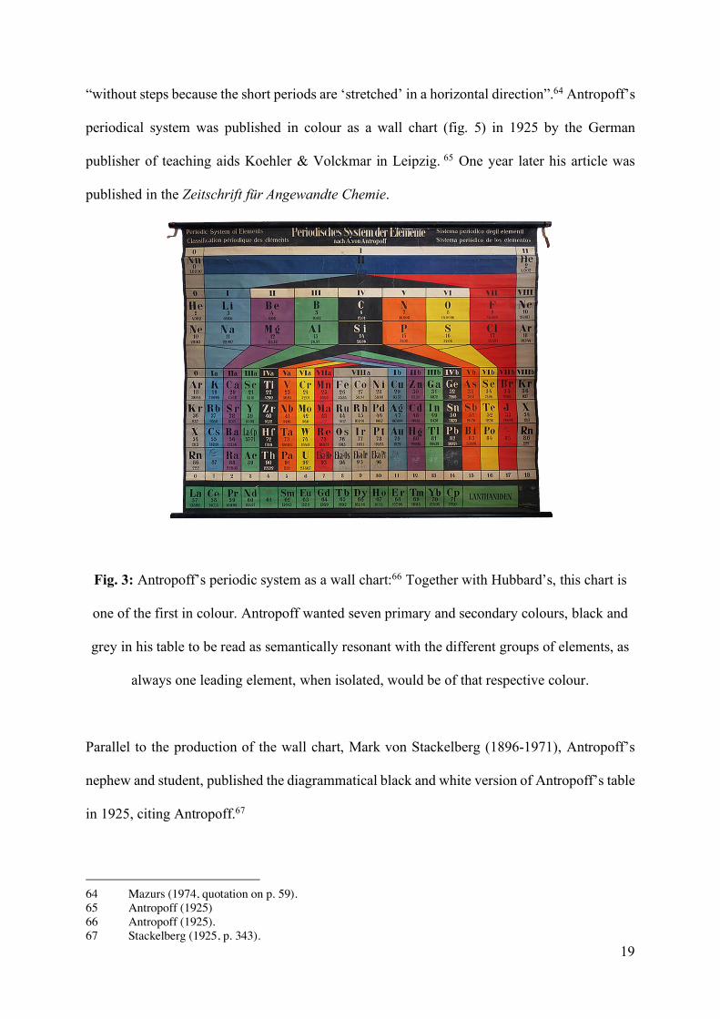
“without steps because the short periods are ‘stretched’ in a horizontal direction”.64 Antropoff’s
periodical system was published in colour as a wall chart (fig. 5) in 1925 by the German
publisher of teaching aids Koehler & Volckmar in Leipzig. 65 One year later his article was
published in the Zeitschrift für Angewandte Chemie.
Fig. 3: Antropoff’s periodic system as a wall chart:66 Together with Hubbard’s, this chart is
one of the first in colour. Antropoff wanted seven primary and secondary colours, black and
grey in his table to be read as semantically resonant with the different groups of elements, as
always one leading element, when isolated, would be of that respective colour.
Parallel to the production of the wall chart, Mark von Stackelberg (1896-1971), Antropoff’s
nephew and student, published the diagrammatical black and white version of Antropoff’s table
in 1925, citing Antropoff.67
64 Mazurs (1974, quotation on p. 59). 65 Antropoff (1925) 66 Antropoff (1925). 67 Stackelberg (1925, p. 343).

20
In addition, apart from the first article Antropoff published about his table in 1926, he was given
the opportunity to present his table once more to a French speaking audience by publishing it
in the Annales Guébhard-Severine in 1937.68 A year earlier his table was used to adorn the
walls of the University of Barcelona.69 Apparently, Antropoff’s table had gained some fame in
parts of continental Europe.
Others before him had already pondered the elimination of the blank spaces in the upper rows
of the periods. An antecedent of Antropoff’s quadrangle is a table by Ingo Hackh (1890-1938),
published in 1914, which already stretched the boxes for hydrogen and helium but didn’t
achieve the symmetry of Anropoff’s diagram (see fig. 5).70
Fig. 4: Hackh’s periodic table as a quadrangle71 – a monochrome antecedent to Antropoff’s
polychrome table.
68 Antropoff (1937). 69 Leach (2019b); Stewart (2007). 70 Hackh (1914, p. 4). 71 Hackh (1914, p. 4)

21
Mazurs called Antropoff’s version of the table “a successful one”, in which the term
“successful” was qualified as a table able to depict the family relations between the elements.72
Already in his first article in 1926, Antropoff laid out his decisions on form and colour. He first
explained that the relationships depicted between elements in the periodical system are
grounded in atomic structure.73 The search for a solution to balance theoretic accuracy and
aesthetic means was the driving force behind his version of the periodic table. The main
difficulty lay in the length of the periods, which increased with the numbers of discovered
elements. Antropoff concludes that the suggestions made since then differed according to
measures to overcome this problem of the length of the periods. Antropoff’s focus is on visual
didactics: according to Antropoff, apart from the increasing length of the periods, also the large
number of vertical columns became a challenge to those learning the system.74 In all attempts
at grouping, the problem has arisen as to which family relationships between which elements
are to be highlighted. The short form of the periodical system by Meyer and Mendeleev, he
explains, was never fully satisfactory, as it arbitrarily cut the periods. Antropoff found essential
qualities in the system to be lacking, which were later developed independently by other
chemists to solve this problem in a long-form: the double relationship of the elements between
groups, e.g. the magnesium with the calcium and zinc group, and the silicon with the titanium
and germanium group were not recognizable if one does not give these elements two boxes.
And, Antropoff goes on, while the variant proposed first by Joseph John Thomson (1856-1940),
and then by Bohr was a good representation of the theory, by showing all periods in a full but
different length in accordance with the number of elements, it had its educational shortcomings.
72 Mazurs (1974, quotations on p. 59). 73 Antropoff (1926). 74 Antropoff (1926, quotations on pp. 722-723).

22
Antropoff explains his own solution as mediating between the short and the long form,
represented in fig. 5:
Finally, however, there is still a possibility left to solve the problem to create periods
with different number of elements arranged on top of each other, which the author
proposed: We equal the different lengths of the periods by assigning to the fields of the
elements, various widths, depending on their number in the period. This produces the
picture […], which is also based on the model of Thomson-Bohr. The second important
innovation proposed to me first by [the inorganic chemist] H. Lux is to position
hydrogen in the middle.75
Fig. 5: Antropoff’s first publication of his periodic system in grayscale hatchings replacing
the colours.76 The colours were meant to give the image more clarity and serve for mnemotic
support.
75 Antropoff (1926, quotations on pp. 723-724). The translations by the author. 76 Antropoff (1926, p. 725).

23
This image would, he went on, gain even more clarityif the whole system was presented in
colours, so that the homologue elements are given the same colours. In this publication he had
to replace his colours by hatchings but his colour choices were very clear:
In order to give the colours a mnemonic meaning, the following relationships were used:
hydrogen - colour of the sea - ultramarine blue; alkali metals and halogens, the strongest
base and acid formers, after the lacmus [litmus] reaction blue and red; carbon group -
black; boron group - green spectrum of boron and thallium - green; nitrogen group -
nitrogen peroxide, antimony sulfide, pervanadic acid - reddish brown to ‘kress’
(orange); oxygen group - sulfur, chrome yellow - yellow; magnesium group -
magnesium and mercury, our sources of ultraviolet light – ‘veil’ (violet); noble gases
and metals of the iron-platinum group - colourless or silver gray.77
The colours used are not mimetic (in the sense of depicting how the respective elements appear
when isolated in their elementary form, see Lea 1896 on the appearance of the substances), but
Antropoff attempts to offer colour choices that are semantically resonant with one of the
elements in a group – resonant at least for experts in laboratory chemistry or pharmacy who are
familiar with the appearance and typical reactions of the respective substances. After stating
that “the image we receive in the new form of periodic systems is of an amazing, almost
monumental symmetry” he went on to describe the form of his table as a building with pillars
and crossbars.78 His chosen colour oalette represents Goethe and Newton's colour wheel
colours.
77 Antropoff (1926, quotations on p. 724). The translations by the author. 78 Antropoff (1926, quotation on p. 724).

24
At the moment Antropoff designed his colour chart, Bohr’s new atomic model had already been
in the world for ten years; chemistry had already made the shift from elements to physical
knowledge about the structure of atoms to explain the periodical system. It is a shift from the
idea of the table as depicting a periodical distribution of elements, to one dealing with the
constitution of atoms (sometimes naming it periodic table of the atoms).79 Bensaude-Vincent
describes the new meaning of the table in the 1920s as “a visualization of the inner organization
of the material world” with its “building blocks of nature”.80
At the time Antropoff produced his periodic table, the most bespoken technical designers and
architects deemed most advanced at the time – at least in the German speaking world – were
those of the Bauhaus school. The overall aspect of the table, with its allusion to architecture and
the strong primary and secondary colours seems Bauhaus inspired.
In the early 20th century, the education at technical schools in German speaking Europe and
beyond became influenced by the Bauhaus school, and in the 1920s, by the graphic trend of the
De Stijle. The interaction between scientific knowledge and technical design and again, the –
not only applied – sciences came full circle: Bauhaus teachers Wassily Kandinsky (1866-1944),
Paul Klee (1879-1940), Oskar Schlemmer (1888-1943) and a professorial chemist colleague of
Antropoff, the Bauhaus-involved colour-expert Wilhelm Ostwald (1853-1932), found it
necessary for the advancement of arts and design to simplify design to the most elemental in
order to make it more readily available to the people. Any aesthetic decision that drew design
nearer to the sciences was favorable. In terms of colour, they advanced the use of primary
colours, which they saw as the purest colours, which can then also be found frequently in the
works of the De Stijl artists, the fauvistes and in (technical) design starting from the late 1910s.
79 See above, Scerri (1998); (Scerri,1993); Bohr (1922). 80 Bensaude-Vincent (2001, quotations on p. 152).

25
While around the turn of the century light and opaque colours were still the trend (see images
of mathematical models in Friedman 2019), in the natural sciences and mathematics, technical
drawings and prints such as those of electrical circuits, when depicted in colour, favored the use
of the primary colours including vermillion, strong green and ultramarine blue since the 1920s.
The idea of the De Stijl artists was to go back to the most elementary. In terms of colour, the
most elementary was rooted culturally in the primary colours and, when necessary, secondary
colours. Propagated by the Bauhaus, they also inspired technical diagrams internationally as
can be demonstrated through the tube map of London, produced in 1933 initiated by the
electrical engineer Henry Charles “Harry” Beck (1902-1974).81
Cabral’s trichromatic spiral
Within the handful of Edward G. Mazurs’ mentions of periodic table images in colour (see
below), most of which in their publication turn out to be in gray-scale, is an image produced by
Alcindo Flores Cabral, published in 1951. It is one of the periodic systems in spiral form, which,
as already indicated above had been a solution presented before the existence of Mendeleev’s
table and which he also had taken into consideration but dismissed. Cabral was a professor
working at the Escola de Agronomia Eliseu Maciel, today part of the Federal University of
Pelotas in Brazil. He worked on the periodic system for years.82 His contribution to chemistry
is virtually unknown within the circles of chemistry and its history, even, as it seems, in Brazil,
as also indicated in more recent articles on his proposition on the chemical system.83 His
periodical spiral image is mentioned here to show that the above described choice of primary
colours was apparently not connected to the more conventional tabular periodic system alone.
In the spiral image, Cabral used colour to mark the sub-levels s, p, d, f. In atomic theory and
81 London Transport Museum (2018). 82 Cabral (1949, foldout). 83 Maar and Eder (2015).

26
quantum mechanics s, p, d and f denominate the orbitals, i.e. the statistically probable spaces
occupied by the wave-like behavior of either one electron or a pair of electrons in an atom.
Cabral’s first publication of this image in a small explanatory booklet dates from 1846, then
only highlighting all sub-levels in an orange-salmon colour, just differentiating them from the
graphic circle. Instead in the further editions in 1949 and 1951 he used different colours to
differentiate among the sub-levels (fig. 6): s is depicted in red, p in blue, d in yellow and f in
green.
Fig. 6: Periodic system as a spiral by Cabral 1949.84 The primary colours red, blue, yellow
and green are used to differentiate the orbitals s, p, d and f, which are the spaces of probability
in which the atom’s electrons are expected to move.
Cabral’s choice of colour addresses the orbital constitution of the electrons. The colours thus
add further information and another dimension to the graphic drawing itself. Cabral’s booklet
with his spiral image informs us that it was his agronomy student, of whom we only get to know
84 Cabral (1949).

27
the name C. L. Alves da Fonseca, who contributed the idea to use colours to differentiate the
sub-shells, s, p, d, f from one another, yet the text does not explain the concrete choice of the
primary colours.
Mazur’s tables in cool and warm colours
Another prominent example of colour use in periodical systems, also including a description of
colour choices is the development of periodic tables by Edward G. Mazurs. Mazurs was a
Latvian-born chemist who, during the Russian re-occupation, fled the country and finally
migrated to the United States.85 His earlier mentioned overview of over 700 periodic tables
from the early ones in the 19th century onwards, first self-published in 1957 and re-edited and
published in 1974, includes a series of three different polychrome tables.86 His tables had gained
fame as a result of his extremely industrious analysis of the advantages and disadvantages of
all the predecessors accessible to him, which already in its first version of 1957 had been called
“the most complete survey of […graphical representations of] the Mendeleev periodic law”.87
His three major periodic tables, all in colour, date from 1958, 1967, and 1969, respectively.
According to his retrospective description in 1974, these three images highlight the electronic
configuration. This image published 1967 (fig. 7) is a periodic table in the form of a pine tree.
From there, the others (the versions published 1958 and 1969, fig. 8 and 9) were developed by
moving some series to the right, to combine the advantages of chemical property and electronic
configuration-based tables.88
85 Science History Institute (2018). 86 Mazurs (1974). 87 Foster (1958, quotation on p. 415). 88 Mazurs (1974, back cover foldout).

28
Fig. 7: Mazurs’ periodic table as of 1967.89 His colour choices resonate with the classical
colour code of the four elements which, as he explained were yellow (and brown tones) for
earth, blue for air and red for anything connected to fire (metals) and green for water, here the
non-metals, the opposite of fire and white for hydrogen.
His concept of the design of the periodic table was to position the elements in accordance to
quantum theory. He explained:
The element symbols are in an order of increasing atomic numbers and no interruptions
occur in the reading since it goes down series by series. The series are cut according to
the length of subshells s, p, d, and f and are placed one below the other. With this
89 Mazurs (1974, foldout cover, published earlier in Mazurs, 1969, table 23).

29
arrangement the subshells are ordered according to [… the] mathematical expression of
the Periodic Law: t = n + I.90
The need for the use of colours resulted from the fact that the table was not structured in
columns relating to the vertical groups. The family relations were thus depicted by colouring
them, thus adding, as in Cabral’s image another dimension and information that the image
otherwise would have not have captured. Similar to Antropoff, whose publications Mazurs was
well-acquainted, Mazurs explained the assignment of colour to the homologue elements:
The chemical periodic tables have been constructed on the basis of the similarity in
chemical and physical properties of the elements and they reflect this similarity. In order
to retain this advantage, the proposed electronic configuration tables can be coloured to
show this relationship of elements. The nonmetals are coloured with cool colours (green,
blue, and violet) and metals with warm colours (red, orange, yellow, brown, and gray)
in agreement with the colour legend given in the conclusion of the book. Therefore, this
shell and subshell table does not entirely lose the purpose assigned to the periodic table
by D. I. Mendeleev in 1869, to show the element families and compare their properties.
By this colouration, the triangle of nonmetals in the p block is clearly shown.”91
In the conclusions of the book summarizing his choice of formatting the electronic
configuration tables (the versions of 1958, 1967 and 1969) in accordance with the then recent
experimental data, Mazurs spent nearly a whole book page explaining his colour choices and
ends with the colour legend:
90 Ta (1946); Mazurs (1974, cover foldout). 91 Mazurs (1974, on the front cover foldout).

30
The colour legend is as follows:
orange-inner transition metals (fl-f14) and rare metals (d1);
light brown-acidic metals (d2-d5);
gray-Fe and Pt metals (d6-d8);
dark brown-coin and volatile metals (d9 and d1);
yellow-metals of nonmetal groups (pl-p5);
light green-B and C nonmetals (p1 and p2);
dark green-N and 0 nonmetals (p3 and p4);
blue-halogens (p5);
violet-noble gases (p6) and helium (He);
carmine red-alkali metals (s1);
scarlet red-alkaline earth metals (s2);
white hydrogen (H).
Mazurs, 1974, pp. 140-141
The colour code is identical in all three multi-coloured tables by Mazurs. Already in Antropoff’s
image, there was little overlap with the colour code designed by Wilhelm Hofmann and his
atomic croquet ball code as described above (with carbon in black, oxygen in red, chlorine in
green and hydrogen in white). In Mazurs’ tables, only carbon remains black as in Hofmann’s
colour system, but instead of red for oxygen and the corresponding group it was depicted in
yellow as in Antropoff’s colour code. Hydrogen was depicted in blue instead of white.
Apart from oxygen and carbon, Mazurs’ colour choices differ in all other groups from that of
Antropoff, whose colours were not referenced in his book. Instead, they resonate with the
classical colour code of the four elements, carried into the modern age by Italian renaissance
painters and Christian traditions. According to this code, yellow (and brown tones) stand for

31
earth, blue for air,red for anything connected to fire (metals) and green for water, here the non-
metals, the opposite of fire.92 Black, absent in Mazur’s image, would represent darkness, while
white would represent light – Mazur only used white; here it seems to denote hydrogen’s
colourless characteristics.
Fig. 8: Mazurs’ periodic table as of 1958/1973,93 including the same colour choice as in his
1967 image.
92 Bennewitz & Schindler (2011); Thürlemann (1988). 93 Mazurs (1974, back cover foldout).

32
Fig. 9: Mazurs’ periodic table 1969,94 repeating the same colour attributions as above.
Mazurs even expanded his colour attributions to other authors’ tables. In his publication on the
different periodic systems, Mazurs included a table by Gardner depicting the elements in the
order of their electronic configurations.95 Mazurs assigned colours to the elements in this table.
Despite the order of the elements in Gardner and Mazzuchelli’s table being slightly different
from his own 1969 table, Mazurs assigned the elements to the same colours in both cases. The
goal was still the same: the colour added information (marking their properties as metals,
94 Mazurs (1974 back cover foldout); Mazurs (1969). 95 Mazurs (1974); Gardner (1930).

33
nonmetals etc.) and thereby also added another dimension otherwise depicted by the original
tabular form by Mendeleev.
Final reflections: color choices in the first hundred years of the periodic table
For the history of science, colour is a fairly recent object of study. While images in general, and
achromatic symbolic forms more concretely, have been studied in the past decades for their
important epistemic and educational role in the sciences, colour gained little attention as a
symbolic vehicle. As this study has demonstrated, the focus on colour as a symbolic element
puts the periodic table of elements into a new perspective regarding its aesthetic aspects.
The first periodic table as a short form with vertical and horizontal lines dividing the elements
was published by Mendeleev in 1904. In the discussion of the periodic table as a picture, the
lines are both an important aspect in terms of its graphic appearance, as well as being
scientifically relevant for epistemic reasons. It seems to be with Alfred Werner that the periodic
table is published for the first time as a grid showing vertical and horizontal lines. This defines
the space around each element in the table from then onwards – the typical boxes that allow
including future elements and further information in the respective squares or filling them with
colour.96
Out of hundreds of periodic systems published in a scientific context up to the 1960s, there
appear to be less than a dozen polychrome graphics. In the first decades of periodic systems,
colour appeared in the four-colour scheme consisting of the primary colours rgb and yellow,
and additional colours in accordance with Newton’s and Goethe’s seven, respectively six
prominent colours. Thus following the style of the time, Antropoff, Cabral and Mazurs, stayed
within the confines of European primary and secondary colours and the achromatic black and
white.
96 Werner (1905).

34
Even though, since the time of early lithography, printing houses already offered a palette that
could reproduce any colour extant in nature, it is only from the 1960s onwards that colours
diverging from the rgb and Newtonian colour system can be found. While printing costs
obviously played a role, there is no indication that specific colours were cheaper than others.
Instead, interviews have revealed the insistence on a certain colour code in chemistry textbooks
up to today as being rather due to conventions set by earlier authors and their books and
diagrams (Bock von Wülfingen 2019). In addition, images from more recent times or other
cultural contexts, such as Asia, show that without primary colours it is possible to create similar
brightness and contrast. This is also the case with cyan and magenta, which are, together with
yellow, the basic toners in use in printing today, but which often enough in chemistry text books
still serve to reproduce the very different ‘old’ primary colours rgb.
Antropoff’s image, similar to other technical drawings up to the 1950s, in form and colour
shows all marks of being inspired by the German art school Bauhaus, which operated between
1919 and 1933 combining arts and crafts, as well as the Dutch art movement De Stijl, which
propagated pure reduction to the essentials and – deemed – universality.97 Mazurs’ colour
choice and legend instead evokes the colour code of the four elements of the ancient classical
era.
Despite the fact that colours diverging from the above described scheme (which also included
pastel tones) appeared in scientific chemical publications (including periodic tables), the earlier
Newtonian colour code was again cited in a periodic table on the cover page of the Journal of
Chemical Education in 1989 for the 120th anniversary of the Mendeleev’s periodical system, ,
97 Their favoritism for European primary colours, as indicated before, was not universal of course, but, as the contrast with usual colour choices in other cultural contexts, such as Japan shows, bound to the local context (see author – full name here? - , 2019).

35
with a dominance of marine blue and light blue and in addition vermillion, green, yellow, violet
and orange (fig. 10).98
Fig. 10: Cover image for the 120th birthday of Mendeleev’s periodic table.99 Recurring to the
Newtownian colour code, using ultra marine blue and light blue and in addition vermillion,
green, yellow, violet and orange, the colours chronologically differentiate diverse phases of
the findings of the different elements.
The use of colours is dependent on the form the author wants to give their graphical display,
which in turn depends on what it is supposed to show. Without losing information, colour
98 The Journal of Chemical Education began in 1990 to show colour images in articles. At first only photographic images were shown, and since 1994, with an increasing tendency diagrams with polychrome elements as well. Out of the 84 articles on the periodic system that appeared until 2018, only five are in colour. 99 Journal for Chemical Education (Sept. 1988).

36
provided the opportunity to depart from Mendeleev’s grouping of elements according to their
properties. Disregarding the choices of the concrete colours, in the analysis above we can make
out five different uses of colour:
First, as in the use of blue in Hubbard’s table, colour is used as an adornment. Second, also in
Hubbard’s table, colour is used to highlight different types of information already provided by
letters and numbers.
Third, in the other periodic systems, as well as in the spiral and tables above, colour adds
information. To instead include even more gray-scale graphical symbols, would in many cases
lead to an overload of graphical signs and corrupt the gestalt aspect of the respective diagram.
In contrast to other symbolic vehicles of graphical sort, colour, as most beautifully
demonstrated in the periodic systems by Antropoff, Mazurs and Cabral, is able to add one more
dimension to a graphic, running through and crossing all forms. Colour can therefore not be
replaced by other graphical signifiers. Here, the colours were used not only to stress
relationships between elements already graphically visualized, but also served to denote
qualities of the elements (their pertinence to metals, non-metals etc.) that otherwise, by the very
structure of the diagrams, would go unnoticed.
This is the aim for which Antropoff’s contemporary, philosopher Charles Sanders Peirce, also
applied colours in his own graphs: in Prolegomena he used colour in his “existential graphs”
for what could be called a difference maker.100 More concretely, he gave colours the role for
which operators have in logic today. They serve to provide one more level of differentiation.
A fourth aspect is that in all the above systems, specific colours do not denote only one element
but possibly several related elements. This is also the way colours were used in three-
dimensional mathematical models at the end of the 19th century: to differentiate and relate.
Colour in the periodic systems above is thus also a relational category.
100 Antropoff’s (1933 [1906]).

37
A fifth use of colour is that in some of the above periodic systems, colour was selected so as to
not only differentiate and relate, as operators would do, but also to carry an additional meaning:
while in the existential graphs and in historic mathematical models, the specific colour didn’t
matter, making it irrelevant whether a layer or line was yellow or green, as in Hubbard’s table
and Cabral’s spiral, both Antropoff and Mazurs chose their colours in ways that make them
semantically resonant – not of course in an ontological understanding of a meaning of colour,
but readable for those acquainted with the respective colour traditions.101 In both cases these
meanings related to different properties of the elements. Colours can thereby work as symbolic
vehicles.
This is also the case, when used together with other colours in a certain traditional colour
compilation: they can jointly transpose a specific cultural context onto the image (as is the case
with the use of ‘pure’ primary colours, or as Mazur’s colour choice related to the ancient four
elements theory exemplifies). In addition, and in general, colour use even adds to and advances
the gestalt aspect of the image. By figuring as a differentiator and/or relational tool, colour
refines the periodic table as a paper tool.
Finally, colour can be used to provide information wholly unrelated to elemental properties as
in the case of fig. 10, where the colours denote the sequence of the discovery of the respective
elements. It served the celebration of the 120th birthday of Mendeleev’s laws, whose table
indicated future findings leaving those explicitly ‘white’ spaces mentioned in the beginning of
this article.
101 Friedmann (2018); Friedmann (2019).

38
Literature
Altmann, J. (2006). Färbung. Farbgestaltung und früher Farbdruck am Ende der Naturgeschichte. In V. Dünkel (Ed.), Bildwelten des Wissens. Kunsthistorisches Jahrbuch für Bildkritik, Bd. 4,1: Farbstrategien (69–77). Berlin: Akademie Verlag.
Antropoff, A. von (1925). Wall chart periodical system. Leipzig: Koehler & Volckmar. In Auction Catalogue Irenauskraus, Available online at: https://www.irenaeuskraus.com/shop/wissenschaft-technik-science-technology/periodisches-system/ (accessed 27 December 2018).
Antropoff, A. von (1926). Eine neue Form des periodischen Systems der Elemente. Angewandte Chemie, 39, 722–725. doi:10.1002/ange.19260392303.
Antropoff, A. von (1937). Les formes usuelles du systeme périodique des éléments. Annales Guébhard-Severine, 13, 161–174.
Baker, T., Dupré, S., Kusukawa, S., & Leonhard, K. (2015). Early modern colour worlds. Early Science and Medicine, 20(4–6), 289–591.
Bennewitz, I. & Schindler, A. (2011). Farbe im Mittelalter. Materialität – Medialität – Semantik. Berlin: Akademie Verlag.
Bensaude-Vincent, B. (2001). Graphic representations of the periodic system of chemical elements. In U. Klein (Ed.), Tools and modes of representation in the laboratory sciences (pp. 133–161). Dordrecht: Kluwer.
Bergman, T. O. (1783). An essay on the usefulness of chemistry, and its application to the various occasions of life. London: Murray.
Berlin, B., & Kay, P. (1991 [1969]). Basic colour terms: Their universality and evolution. Berkeley: University of California Press.
Bock von Wülfingen, B. (2019). Diagrammatic traditions: Color in metabolic maps. In B. Bock von Wülfingen (Ed.), Science in colour. Visualizing achromatic knowledge. Berlin/Boston: de Gruyter, pp 195-218.
Bohr, N. H. (1922). The structure of the atom and the physical and chemical properties of elements. In N. H. Bohr. The theory of spectra and atomic constitution (pp. 61–124). Cambridge: Cambridge University Press.
Brush, S. (1996). The reception of Mendeleev’s periodic law in America and Britain. Isis, 87(4). 595–628.
Bushart, M., & Steinle, F. (2015). Colour histories, science, art, and technology in the 17th and 18th centuries. Berlin/Boston: de Gruyter.
Byrne, A., & Hilbert, D. R. (1997). Readings on colour: The philosophy of colour. Cambridge: MIT Press.

39
Cabral, A. F. (1946). Classificação natural dos elementos. Encarte integrante da circular nº 1. Editora Instituto Agronômico do Sul, Pelotas. Othmer Library, Science History Institute, Philadelphia/PA; Archives Collection, Mazurs Periodic Systems, box 2, folder 1.
Cabral, A. F. (1949). Classificação natural dos elementos. Encarte integrante da circular nº 1. Editora Instituto Agronômico do Sul, Pelotas. Othmer Library, Science History Institute, Philadelphia/PA; Archives Collection, Mazurs Periodic Systems, box 2, folder 1.
Cabral, A. F. (1951). Classificação natural dos elementos. Boletim Didático nº 1. Escola de Agronomia Eliseu Maciel, Pelotas.
Cohen, B. R. (2004). The element of the table: Visual discourse and the preperiodic representation of chemical classification. Configurations, 12(1), 41–75.
Cook, S. (2005). Late victorian visual reasoning and Alfred Marshall’s economic science. The British Journal for the History of Science, 38(2), 179–195.
Daston, L., & Galison, P. (2007). Objectivity. New York: Zone Books.
Daston, L. (2012). The sciences of the archive. Osiris, 27(1), 156–187.
Duncan, A. M. (1996). Laws and order in eighteenth-century chemistry. Oxford: Oxford University Press.
Dünkel, V. (Ed.) (2006). Bildwelten des Wissens. Kunsthistorisches Jahrbuch für Bildkritik, Bd. 4,1: Farbstrategien. Berlin: Akademie Verlag.
Foster, L. S. (1958). Types of graphic representation of the periodic system of chemical elements (Mazurs, Edward G. G.). Journal of Chemical Education, 35(8), 415. doi: 10.1021/ed035p415.
Friedman, M. (2019). Coloring the fourth dimension? Coloring polytopes and complex curves at the end of the 19th century. In B. Bock von Wülfingen (ed.), Images of science. Coloring achromatic knowledge. Berlin/Boston: de Gruyter, 81-98.
Gage, J. (1999). Color and meaning: Art, science, and symbolism. Berkeley: University of California Press.
Galison, P. (1997). Image and logic: A material culture of microphysics. Chicago: University of Chicago Press.
Gardner, R. (1930). A table of electronic configurations of the elements. Nature 125, 146.
Geoffroy, E. T. (1718). Des differents Rapports observes en Chymie entre differentes substances. Histoire de l'Academie royale des sciences, avec memoires (pp. 256–269). Paris: Imprimerie Royale.
Gerner, A. (2010). Diagrammatic thinking. In Z. Baladran & V. Havranek (Eds.), Atlas of transformation (pp. 173–184). Zürich: J. R. P. Ringier.

40
Gilbert J.K., Boulter C.J., Elmer R. (2000). Positioning models in science education and in design and technology education. In J. K. Gilbert & C. J. Boulter (Eds) Developing models in science education. Springer, Dordrecht, 3-17.
Gordin, M. D. (2018). Paper tools and periodic tables: Newlands and Mendeleev draw grids. Ambix, 65(1), 30-51. doi: 10.1080/00026980.2017.1418251.
Groß, D., & Duncker, T. H. (Eds.) (2006). Farbe, Erkenntnis, Wissenschaft: zur epistemischen Bedeutung von Farbe in der Medizin. Münster: LIT Verlag.
Guyton de Morveau, L. B., Lavoisier, A., Berthollet, C. L., & de Fourcroy, A. F. (1787). Méthode de nomenclature chimique, proposée par MM. de Morveau, Lavoisier, Bertholet, & de Fourcroy. On y a joint un nouveau systême de caractères chimiques, adaptés à cette nomenclature, par MM. Hassenfratz & Adet. Paris: Cuchet.
Guyton de Morveau, L. B. (1782). Sur les dénominations chymiques. Observations sur la physique, sur l’histoire naturelle et sur les arts et métiers, 19, 370–382.
Hackh, I. W. D. (1914). Das synthetische System der Atome. Hamburg: Hephaestos.
Hand, B. and Choi, A. (2010). Examining the impact of student use of multiple modal representations in constructing arguments in organic chemistry laboratory classes. Research in Science Education, 40(1), 29–44.
Harris, V. (2001). Shintō: the sacred art of ancient Japan. London: British Museum.
Hentschel, K. (2014). Visual cultures in science and technology: A comparative history. Oxford: Oxford University Press.
Hentschel, K. (2006). Verengte Sichtweise. Folgen der Newtonschen Optik für die Farbwahrnehumung bis ins 19. Jahrhundert. In V. Dünkel (Ed.), Bildwelten des Wissens. Kunsthistorisches Jahrbuch für Bildkritik, Bd. 4,1: Farbstrategien (pp. 78–89). Berlin: Akademie Verlag.
Hibi, S., & Bester, J. (2000). The colours of Japan. New York: Kodansha.
Hubbard, H. D. & Meggers, W. F. (1947). Key to periodic chart of the atoms. Chicago: Welch. Othmer Library, Science History Institute, Philadelphia/PA; Monograph Collection.
Fluck, E. (1988). New notations in the periodic table. Pure & Applied Chemistry, 60(3), 431–436.
James, L. (1996). Light and colour in byzantine art. Oxford: Oxford University Press.
Jameson, F. (1979). Reification and Utopia in Mass Culture. Social Text, 1, 130-148.
Kageyama, H. (1971). The arts of Shintō, translated and adapted with an introd. by Christine Guth. New York: Weatherhill.
Kaiser, D. (2005). Drawing theories apart: The dispersion of Feynman diagrams in postwar

41
physics. Chicago: University of Chicago Press.
Karliczek, A. (2018). Zur Herausbildung von Farbstandards in den frühen Wissenschaften. Ferrum (Nachrichtenblatt der Eisenbibliothek), 90, 36–49.
Kessler, H. L. (2004). Seeing medieval art, rethinking the middle ages. Peterborough/Calgary: Broadview.
Klein, U. (2001). Berzelian formulas as paper tools in early nineteenth-century chemistry. Foundations of Chemistry, 3(7), 7–32.
Krämer, S. (2010). Zwischen Anschauung und Denken: Zur epistemologischen Bedeutung des Graphismus. In J. Bromand & G. Kreis (Eds.), Was sich nicht sagen lässt: Das Nicht-Begriffliche in Wissenschaft, Kunst und Religion (pp. 173–192). Berlin: Akademie Verlag.
Kress, G. R. (2010). Multimodality. London: Taylor and Francis.
Krohn, R. (1991). Why are graphs so central in science? Biology and Philosophy, 6(2), 181–203.
Lavoisier, A. L. (1789). Traite Elementaire de Chemie, presente dans un ordre et d’apres les decouvertes modernes; avec figures. Cuchet: Paris.
Lawson, I. (2019). Pigments, natural history, and primary qualities: How orange became a colour. In B. Bock von Wülfingen (Ed.), Science in colour. Visualizing achromatic knowledge. Berlin/Boston: de Gruyter, 133-146.
Lea, M. C. (1896). Über die Beziehung der Farben von Atom, Ion und Molekül. Zeitschrift für anorganische Chemie, 12.1, 340-352.
Leach, M. (2019a). Hubbard’s periodic tabel. Available online at: https://www.meta-synthesis.com/webbook/35_pt/pt_database.php?PT_id=31 (accessed 20 May 2019).
Leach, M. (2019b). Information received from Claudi Mans and Philipp Stewart. Available online at: https://www.meta-synthesis.com/webbook/35_pt/pt_database.php?PT_id=26 (accessed 20 May 2019).
Leonelli, S. (2006). What is in a model? In M. Laubichler, Müller, G. B. (Ed.): Modeling Biology. Cambridge, Ma.: MIT Press, 15-36.
London Transport Museum (2018). Harry Beck, biography. Available online at: https://www.ltmuseum.co.uk/collections/collections-online/people/item/1996-7354 (accessed 20 May 2019).
Lynch, M. (1991). Science in the age of mechanical reproduction: Moral and epistemic relations between diagrams and photograph. Biology and Philosophy, 6(2), 205–226.
Maar, J. H., & Eder, J. L. (2015). The Brazilian contribution of Alcindo Flores Cabral to the periodic classification. Foundations of Chemistry, 17(1), 5-22.

42
Mazurs, E. G. (1969). A new numeration of periods in the periodic system and the Kessler principle for the construction of the periodic table. Canadian Chemical Education, 4(3), 21–23.
Mazurs, E. G. (1974). Graphic representations of the periodic system during one hundred years. Alabama: The University of Alabama Press.
Meinel, C. (2004). Molecules and croquet balls. In S. De Chadarevian & N. Hopwood (Ed.), Models: The third dimension of science (pp. 242-275). Stanford: Stanford University Press.
Mendeleev, D. M. (1869). Über die Beziehungen der Eigenschaften zu den Atomgewichten der Elemente. Zeitschrift für Chemie, 12(5), 405-406.
Mendeleev, D. M. (1904). An attempt towards a chemical conception of the ether. London: Longmans, Green, and Co.
Mendeleev, D. M. (1891). Principles of chemistry, vol. 2. London: Longmans, Green, and Co.
Métraux, A. (2006). Farbstoffchemie, Farbexperimente und die französische Malerei. In V. Dünkel (Ed.), Bildwelten des Wissens. Kunsthistorisches Jahrbuch für Bildkritik, Bd. 4,1: Farbstrategien (61–68). Berlin: Akademie Verlag.
Mößner, N. (2018). Visual representations in science. London: Routledge.
Müller-Wille, S., & Charmantier, I. (2012). Lists as research technologies. Isis, 103(4), 743–752.
Newlands, A. (1864). Relations between equivalents. Chemical News, 10, 59–60.
Nickelsen, K. (2006). The challenge of colour: Eighteenth-century botanists and the hand-colouring of illustrations. Annals of Science, 63(1), 3–23.
Norris, S.; Maier, C. D. (2014) (Eds.). Interactions, images and texts. Berlin: De Gruyter.
Odling, W. (1864). On the proportional numbers of the elements. Quarterly Journal of Science, 1, 642–648.
Pastoureau, M. (2007). Dictionnaire des Couleurs de Notre Temps: Symbolique et Société. Paris: Christine Bonneton.
Pastoureau, M. (2016). Red: The history of a colour. Princeton: Princeton University Press.
Peirce, C. S. (1933 [1906]). Collected papers of Charles Sanders Peirce: Vol. 4, ed. by Ch. Hartshorne & P. Weiss (par. 492–546). Cambridge: Harvard University Press.
Pugliano, V. (2012). Specimen lists: Artisanal writing or natural historical paperwork? Isis, 103(4), 716–726.
Pulliam, H. (2012). Color. Studies in Iconography, 33, 3–14.

43
Roberts, L. (1991). Setting the tables: The disciplinary development of eighteenth-century. Chemistry as read through the changing structure of its table. In P. Dear (Ed.), The literary structure of scientific argument: Historical studies (pp. 99–132). Philadelphia: Penn Press.
Russell, C. A. (1987). The changing role of synthesis in organic chemistry. Ambix, 34, 169–180.
Scerri, E. R. (1998). The evolution of the periodic system. Scientific American, 279(3), 78–83.
Scerri, E. R. (2001). The periodic table: The ultimate paper tool in chemistry. In U. Klein (Ed.), Tools and modes of representation in the laboratory sciences (pp. 163–177). Dordrecht: Kluwer.
Scerri, E. R. (2007). The periodic table: Its story and its significance. New York: Oxford Univ. Press.
Science History Institute (2018). Finding Aid to Edward G. Mazurs Collection of Periodic System Images. Philadelphia: Science History Institute. Available online at: http://othmerlib.sciencehistory.org/record=b1069103~S6 (accessed 20 May 2019).
Shapin, S. (1984). Pump and circumstance: Robert Boyle’s literary technology. Social Studies of Science, 14(4), 481–520.
Smeenk, C. (2006). Tools without theories. Metascience, 15(2), 333–337.
Smithsonian (2018). Periodic chart of the atoms. Available online at: http://americanhistory.si.edu/collections/search/ object/nmah_1470 (accessed 20 May 2019).
Steingart, A. (2016). Mathematization. In C. Jones, D. Mather & R. Uchill (Eds.), Experience: Culture, cognition, and the common sense (pp. 111–118). Cambridge: MIT Press.
Stewart, P. J. (2007). A century on from Dmitrii Mendeleev: Tables and spirals, noble gases and Nobel prizes. Foundations of Chemistry, 9, 235–245. doi: 10.1007/s10698-007-9038-x.
Takashina, S. (2018). The Japanese sense of beauty, translated by Matt Treyvaud. Tokyo: Japan Publishing Industry Foundation for Culture (OPIC).
Temkin, A., Fer, B., & Ho, M. (2008). Color chart: reinventing colour, 1950 to today. New York: The Museum of Modern Art.
Thürleman, F. (1988). Grün – die verstoßene Vierte. Zur Genealogie des modernen Farbpurismus. In B. Bürgi (Ed.), Rot - Gelb - Blau: die Primärfarben in der Kunst des 20. Jahrhunderts (pp. 11-28). Kunstmuseum St. Gallen, Friedericianum, Kassel. Stuttgart: Gerd Hatje.
Vogt, M. and Karliczek, A. (eds.) (2013). Erkenntniswert Farbe. Jena: Institut für Geschichte der Medizin, Naturwissenschaften und Technik.
Waldman, G. (2002). Introduction to light: the physics of light, vision, and colour. Mineola:
44
Dover Publications.
Webster (2019). Table. Available online at: https://www.merriam-webster.com/ (accessed 20 May 2019).
Werner, A. (1905). Beitrag zum Ausbau des periodischen Systems. Berichte der Deutschen Chemischen Gesellschaft, 38, 914-921.
Woody, A. I (2000). Putting quantum mechanics to work in chemistry: The power of diagrammatic representation. Philosophy of Science, 67, S612–S627.