the new ‘normal’ – prospects for 2018 - imla
TRANSCRIPT

1
The new ‘normal’ – prospects for 2018
A decade after the financial crisis, how sustainable is the UK mortgage recovery?
March 2018

2
Executive summary The outlook
Falling inflation to underpin sentiment in 2018 and 2019. With inflation forecast to be falling through 2018 and 2019 and potentially undershooting the Bank of England target of 2% by 2019, sentiment in the housing market can be expected to improve both because real earnings growth should resume and as a result of receding concerns about further interest rate increases. With this positive background, we expect the recovery in gross and net mortgage lending to continue in 2018 and 2019 despite Brexit uncertainty.
Gross mortgage lending to reach £265 billion this year. We forecast that gross lending will rise for the eighth year in a row to reach its highest level since 2007. Similarly, we expect net mortgage lending to hit its highest level since 2007 at £47 billion, implying that the stock of mortgage debt will grow by 3.4%.
Remortgaging to reach £94 billion in 2018. We expect remortgage activity to continue to be more buoyant than lending for house purchase in 2018, with total remortgaging reaching £94 billion, up 4.4% to reach 35.5% of total lending. In 2019 we see the remortgage market growing further to £98 billion, still slightly faster than the growth of the wider mortgage market.
Gross buy-to-let lending to recover to £37 billion this year. After falling by 12% in 2017, we expect gross buy-to-let lending to recover in 2018 and 2019 despite the adverse tax changes. This not only reflects continued strong remortgage activity but also a recovery in house purchase lending to £11 billion in 2018 and £12 billion in 2019. But the improvement in house purchase lending is likely to reflect a higher level of churn in the market (more buy-to-let house purchasers and sellers) while net investment by buy-to-let landlords is likely to remain subdued and we expect the stock of mortgage debt to grow by only 2.6% in 2018.
Lending via intermediaries to continue to increase its share of lending. We expect regulated mortgage lending via intermediaries to rise to £158 billion this year and £164 billion in 2019. As a result, the share of regulated lending introduced by intermediaries should continue to rise slightly from 71.3% in 2017 to 72.2 % by 2019.
Market drivers
Continued economic recovery underpins housing and mortgage markets. In 2017 the weak but steady economic recovery, with unemployment down from 4.6% to 4.3% helped the mortgage market to enjoy its seventh year of recovery. Gross lending rose 4.3% to £257 billion and net lending was 8.2% ahead at £44 billion.

3
Cash continues to displace mortgage debt in the housing market. Although we have seen a fairly conventional recovery in the housing market since 2009 with rising house prices and transactions, we have not seen the normal cyclical displacement of cash by mortgage debt. Between 2008 and the middle of 2017, UK households injected £261 billion of equity into the housing market while the aggregate LTV ratio has fallen to below pre-financial crisis levels at 26%. The proportion of funds for house purchase that were borrowed fell from 52% in 2006 to 41% in 2016 with only a slight uptick to 41.5% in 2017.
Structural factors explain why mortgage recovery is subdued. Demographic factors have been dampening the normal cyclical trends that drive higher borrowing. The average age of homeowners increased from 52 in 1996 to 57 in 2016, far faster than the rate of aging in the population as a whole. In 2016, 76% of all owner-occupiers were aged 45 or above compared to 62% in 1996. This affects housing turnover and debt levels as older homeowners move less frequently and have lower average debt.
More first time buyers but fewer subsequent ‘steppers’. The number of first time buyers has increased in recent years to reach 366,000 in 2017, above the level in 2007. In contrast, home movers or subsequent steppers are down 42% over the same period and housing market liquidity as a whole remains at historically lows levels with households moving only once every 19.2 years on average compared to once every 7.4 years when housing transactions peaked back in 1988. Rates of mortgage churn are also low. The number of new mortgages expressed as a percentage of the total stock of mortgages was 10.6% in 2017, less than half 2003’s peak of 24.2%.

4
1. Introduction
1.1 A goldilocks recovery that frustrates the younger generation This report is the fifth in the Intermediary Mortgage Lenders Association (IMLA) annual series entitled the new ‘normal’. In this series, we have sought to describe what the new normal of the UK mortgage market looks like and to understand the factors driving it. This year, once again we have experienced a year of steady growth in lending against a backdrop of continued recovery in the broader economy. One interpretation of this recovery is that we are enjoying goldilocks conditions (not too hot and not too cold). The regulators who are tasked with identifying over-exuberance have tinkered here and there but have had little to keep them awake at night. But there is another narrative to describe these conditions: despite unprecedented government involvement to boost borrowing through schemes like the Term Funding Scheme and Help-to-Buy, borrowing remains weak by the standards of past recoveries. If the economy slows sharply the fear must be that we have few bullets left to fight a contraction in borrowing. It is hard to see mortgage rates going much lower and additional government interventions are unlikely to be welcomed. Moreover, if the purpose of debt is to help people achieve their material objectives earlier, then the UK mortgage market is failing to deliver for young families in the way that it did for previous generations. Circumstances have conspired to ossify the housing market: older homeowners own an unprecedented share of the housing stock and young families are finding it difficult to break into the market (see Section 4).
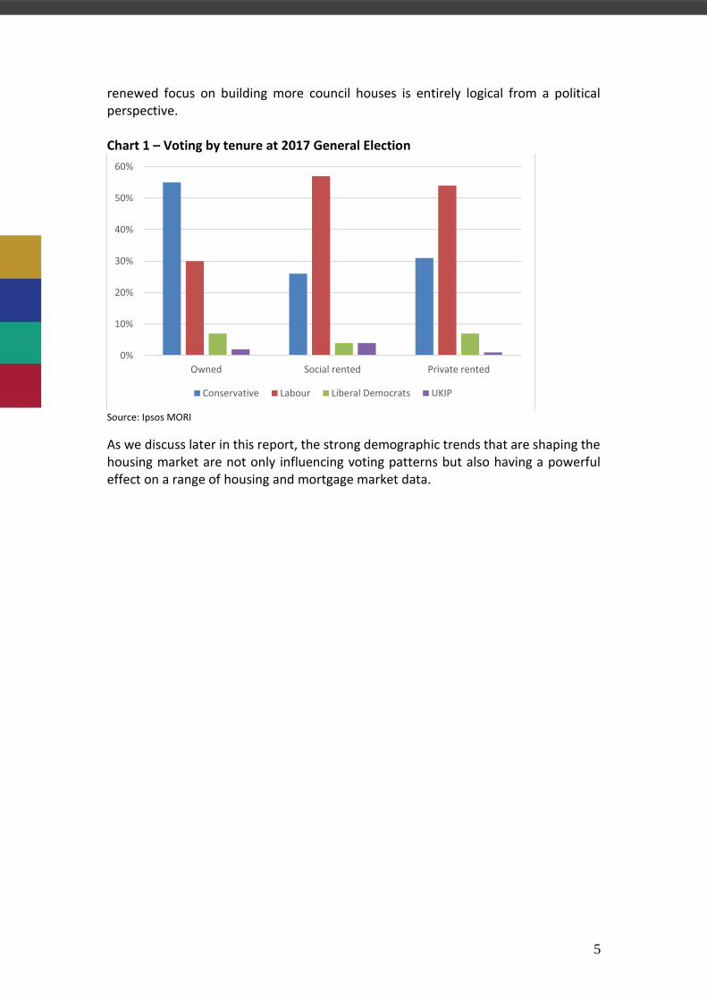
1.2 A generational and political divide There is a consensus across the political spectrum that the UK housing market is broken and housing has become an increasingly important issue politically. But for the Conservative government housing presents a dilemma that constrains its ability to deliver solutions to free up the market. Older homeowners, who have come to own an increasingly large share of the private housing stock, are the Conservative’s core voter base (see Chart 1), one they cannot afford to alienate. So while Conservative strategists understand the threat that falling owner-occupation amongst younger people poses to its share of younger votes, the party cannot afford to adopt policies that might alienate older homeowners. For example, this has made it nearly impossible for the Conservative government to endorse a serious re-evaluation of development on green belt land, even though it is understood that much of this land is unattractive and unproductive land on the edge of existing urban development. For Labour there is no such balancing act. Amongst social housing tenants they achieved a 31 percentage point lead in the 2017 General Election, so for Labour a
5
renewed focus on building more council houses is entirely logical from a political perspective. Chart 1 – Voting by tenure at 2017 General Election
Source: Ipsos MORI
As we discuss later in this report, the strong demographic trends that are shaping the housing market are not only influencing voting patterns but also having a powerful effect on a range of housing and mortgage market data.
0%
10%
20%
30%
40%
50%
60%
Owned Social rented Private rented
Conservative Labour Liberal Democrats UKIP

6
2. The mortgage market outlook for 2018 and 2019
2.1 Background environment in 2018 and 2019 Table 1 outlines our projections for key assumptions behind our mortgage market forecast. The background informing these forecasts is that we expect the UK to continue to enjoy the modest but stable economic recovery that started in 2009 despite the uncertainty engendered by the Brexit process. As stated previously, the largest potential threat from Brexit will come when it becomes clear what kind of trading arrangements the UK and EU will have going forward. This may not be settled by 2019 as the government has recognised in its push to obtain a transitional period. As a result, we do not see Brexit creating an added drag on the forecast in the interim. Table 1 – key forecast assumptions
Past values Forecast values Percentage changes
2016 2017 2018f 2019f 2017/16 2018/17f 2019/18f
GDP 1.70% 1.80% 1.90%
Unemployment (Q4) 4.80% 4.30% 4.40% 4.40% -10.4% 2.3% 0.0%
House prices (average for year) 211,685 221,790 227,000 230,000 4.8% 2.3% 1.3%
Housing transactions (UK, thousands) 1,235 1,221 1,250 1,275 -1.1% 2.4% 2.0%
Bank Rate (end of year) 0.25% 0.50% 0.75% 0.75% 100.0% 50.0% 0.0%
Source: IMLA, ONS and HMRC
Although the current economic recovery is quite long by historical standards, it has been unusually weak, suggesting that the forces that normally bring a recovery to an end (typically a monetary policy response to an overheating economy) may still be some years off. Although unemployment is at a 40-year low, wage inflation remains muted and the GDP growth we are forecasting does not suggest that the gap between potential and actual output will be shrinking materially. Chart 2 - OBR projections for earnings growth and inflation
Source: OBR
0.0
0.5
1.0
1.5
2.0
2.5
3.0
3.5
CPI inflation Average earnings growth

7
Chart 2 shows the Office for Budget Responsibility (OBR) forecasts for CPI inflation and earnings growth. With inflation expected to be falling over the course of 2018 and 2019 to below 2%, as the effect of sterling’s post-Brexit vote decline works its way through, real wages first stabilise and then start rising. However, the Bank of England has a slightly higher inflation forecast, with CPI inflation not returning to its 2% target over the next 2 years, suggesting that the Monetary Policy Committee (MPC) may still feel empowered to raise Bank Rate to 0.75%. But against a background of falling inflation and weak growth, we do not anticipate further rate increases before 2020.
2.2 Impact on UK housing market This stable economic environment of low rates, falling inflation and soon also rising real wages should underpin the continuation of the modest but stable housing market recovery witnessed since 2009. If the OBR is right and inflation begins a steady decline from the first quarter of this year, confidence should receive a boost as higher inflation has dented real earnings and raised the spectre of higher interest rates. Indeed, the impact on confidence of falling real wages and the expected rise in Bank Rate was evident in the latter part of 2017 with indices showing house price growth slowing and the November RICS survey showing the balance of surveyors reporting price increases at zero, the lowest reading since 2013. The regional pattern of house price growth is more even than in the recent past. According to the ONS, the weakest region during 2017 was London, the strongest Scotland but with the other regions within a narrow band of increases of between 2½-7½%. With affordability reasonably strong outside the south of England, this part of the country may well lead in price growth in 2018 and 2019, although southern regions will benefit most from the budget decision to raise the stamp duty threshold for first time buyers from £125,000 to £300,000. Chart 3 - Margin between 2-year fixed rate mortgage and Bank Rate
Source: Bank of England
0.00
1.00
2.00
3.00
4.00
5.00
6.00
31
Jan
12
30
Ap
r 1
2
31
Ju
l 12
31
Oct
12
31
Jan
13
30
Ap
r 1
3
31
Ju
l 13
31
Oct
13
31
Jan
14
30
Ap
r 1
4
31
Ju
l 14
31
Oct
14
31
Jan
15
30
Ap
r 1
5
31
Ju
l 15
31
Oct
15
31
Jan
16
30
Ap
r 1
6
31
Ju
l 16
31
Oct
16
31
Jan
17
30
Ap
r 1
7
31
Ju
l 17
31
Oct
17
75% LTV 90% LTV

8
Even if Bank Rate rises modestly over the forecast period, the erosion of mortgage margins over recent years, particularly at higher LTVs, should insulate the housing market. For example, the margin between the average 90% LTV 2 year fixed rate mortgage and Bank Rate was over 3% in 2014, when Bank Rate was 0.5% but was only 1.7% by the end of 2017, when Bank Rate was back up to 0.5% (see Chart 3), far out-weighting the impact of last year’s 0.25% rise in Bank Rate. We forecast only a modest 2.3% rise in house prices between 2017 and 2018 given the slow growth in house price data in the second half of 2017. Similarly, we expect little upward momentum in housing transactions during 2018. The 1,250,000 transactions we forecast for 2018 is in line with the average level of transactions seen in recent months. Combining our forecasts for house prices and transactions points to a reasonably healthy 4.8% rise in the aggregate value of transactions. But with the continued prominence of cash in property transactions, we do not expect such a large increase in mortgage lending for house purchase (see discussion on page 19).
2.3 Outturn relative to previous year’s forecast In last year’s report IMLA forecast gross mortgage lending of £260 billion and net lending of £45 billion for 2017. By way of comparison, the Council of Mortgage Lenders forecast gross and net lending of £248 billion and £30 billion respectively while the November 2016 OBR forecast net mortgage lending of £35 billion. The outturn was £257 billion and £44 billion respectively.
2.4 Mortgage market forecast Table 2 – Mortgage market forecast
Gross mortgage lending (£m) Percentage changes
2016 2017 2018f 2019f 2017/16 2018/17f 2019/18f
House purchase 153,351 154,977 158,000 163,000 1.1% 2.0% 3.2%
Remortgage 81,250 90,056 94,000 98,000 10.8% 4.4% 4.3%
Other 11,965 12,205 13,000 14,000 2.0% 6.5% 7.7%
Total 246,566 257,238 265,000 275,000 4.3% 3.0% 3.8%
of which:
Buy-to-let lending 40,600 35,800 37,000 38,000 -11.8% 3.4% 2.7% of which for house purchase 14,900 10,700 11,000 12,000 -28.2% 2.8% 9.1%
Buy-to-let share of total 16.5% 13.9% 14.0% 13.8% -15.5% 0.3% -1.0%
Lending via intermediaries* 136,500 153,100 158,000 164,000 12.2% 3.2% 3.8%
Share of total* 70.2% 71.3% 72.1% 72.2% 1.6% 1.2% 0.1%
Net lending 40,502 43,816 47,000 50,000 8.2% 7.3% 6.4%
* Regulated loans only Source: IMLA, Bank of England, UK Finance
Against the reasonably positive macroeconomic background we expect the steady mortgage market recovery to continue in 2018 and 2019 (see Table 2). We expect
9
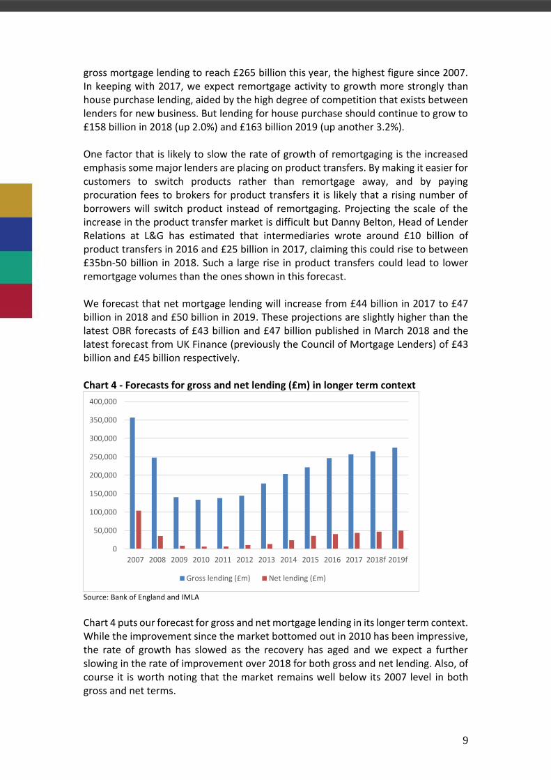
gross mortgage lending to reach £265 billion this year, the highest figure since 2007. In keeping with 2017, we expect remortgage activity to growth more strongly than house purchase lending, aided by the high degree of competition that exists between lenders for new business. But lending for house purchase should continue to grow to £158 billion in 2018 (up 2.0%) and £163 billion 2019 (up another 3.2%). One factor that is likely to slow the rate of growth of remortgaging is the increased emphasis some major lenders are placing on product transfers. By making it easier for customers to switch products rather than remortgage away, and by paying procuration fees to brokers for product transfers it is likely that a rising number of borrowers will switch product instead of remortgaging. Projecting the scale of the increase in the product transfer market is difficult but Danny Belton, Head of Lender Relations at L&G has estimated that intermediaries wrote around £10 billion of product transfers in 2016 and £25 billion in 2017, claiming this could rise to between £35bn-50 billion in 2018. Such a large rise in product transfers could lead to lower remortgage volumes than the ones shown in this forecast. We forecast that net mortgage lending will increase from £44 billion in 2017 to £47 billion in 2018 and £50 billion in 2019. These projections are slightly higher than the latest OBR forecasts of £43 billion and £47 billion published in March 2018 and the latest forecast from UK Finance (previously the Council of Mortgage Lenders) of £43 billion and £45 billion respectively. Chart 4 - Forecasts for gross and net lending (£m) in longer term context
Source: Bank of England and IMLA Chart 4 puts our forecast for gross and net mortgage lending in its longer term context. While the improvement since the market bottomed out in 2010 has been impressive, the rate of growth has slowed as the recovery has aged and we expect a further slowing in the rate of improvement over 2018 for both gross and net lending. Also, of course it is worth noting that the market remains well below its 2007 level in both gross and net terms.
0
50,000
100,000
150,000
200,000
250,000
300,000
350,000
400,000
2007 2008 2009 2010 2011 2012 2013 2014 2015 2016 2017 2018f 2019f
Gross lending (£m) Net lending (£m)

10
We expect the trend in intermediaries’ share of regulated mortgage lending to continue its recent gradual upward trajectory. In 2018, we expect intermediaries to support £158 billion of lending and £164 billion in 2019, slightly over 72% of total projected regulated lending (see Table 2). One segment of the mortgage market which showed exceptional growth in 2017 (with gross volumes up 44% in Q3 2017 on a year earlier) was lifetime mortgages. We expect this niche to continue to produce strong growth over the next two years and beyond, reflecting the growth in the number of older households with a combination of high housing wealth and disappointing retirement income, in part a reflection of the gradual transition from defined benefit to defined contribution pensions.
2.5 Buy-to-let mortgage market forecast The one weak spot in the mortgage market in 2017 was buy-to-let. Gross buy-to-let lending in 2017 was some 12% down at £36 billion but buy-to-let lending for house purchase saw a much larger fall of 28% to £11 billion. However, the profile of buy-to-let lending over 2017 suggests that the market has stabilised with monthly lending averaging £3.0 billion in 2017 against £2.9 billion in the final three quarters of 2016. Even house purchase lending in the buy-to-let sector is up over this period from a monthly average of £840 million to £890 million. Table 3 – Buy-to-let and wider mortgage market forecasts compared
Percentage changes
2016 2017 2018f 2019f 2017/16 2018/17f 2019/18f
Whole market
Outstanding debt (£m) 1,324,085 1,367,079 1,414,000 1,464,000 3.2% 3.4% 3.5%
House purchase lending (£m) 153,351 154,977 158,000 163,000 1.1% 2.0% 3.2%
House purchase % churn 11.7% 11.5% 11.4% 11.3% -1.9% -1.3% -0.3%
Remortgage 81,250 90,056 94,000 98,000 10.8% 4.4% 4.3%
Remortgage % churn 6.2% 6.7% 6.8% 6.8% 7.6% 1.0% 0.7%
Total % churn 18.9% 19.1% 19.1% 19.1% 1.3% -0.3% 0.3%
Buy-to-let market
Outstanding debt (£m) 228,500 237,800 244,000 251,000 4.1% 2.6% 2.9%
House purchase lending (£m) 14,900 10,700 11,000 12,000 -28.2% 2.8% 9.1%
House purchase % churn 6.7% 4.6% 4.6% 4.8% -31.9% -0.5% 6.2%
Remortgage 25,090 24,250 25,000 24,800 -3.3% 3.1% -0.8%
Remortgage % churn 11.4% 10.4% 10.4% 10.0% -8.4% -0.2% -3.4%
Total % churn 18.4% 15.4% 15.4% 15.4% -16.4% 0.0% 0.0%
Buy-to-let % of total market
Outstanding debt 17.3% 17.4% 17.3% 17.1% 0.8% -0.8% -0.6%
House purchase lending 9.7% 6.9% 7.0% 7.4% -28.9% 0.8% 5.7%
Remortgage 30.9% 26.9% 26.6% 25.3% -12.8% -1.2% -4.8%
Total lending 16.5% 13.9% 14.0% 13.8% -15.5% 0.3% -1.0%
Source: Bank of England, UK Finance and IMLA

11
We expect this modest recovery to continue despite the adverse tax changes affecting the PRS, with gross lending reaching £37 billion in 2018 and £38 billion in 2019 and house purchase lending rising to £11 billion and £12 billion (see Table 3). Our forecast for house purchase lending is consistent with 77,000 and 84,000 individual house purchase transactions in 2018 and 2019 respectively, compared to 75,000 in 2017. However, we expect the recent tax and regulatory changes in buy-to-let to lead to a restructuring by some landlords, for example higher rate tax payers with highly geared properties in their own name. Thus the higher house purchase activity we forecast reflects more churn in the market as more landlords sell and others take advantage by buying selectively. This pushes up the projected house purchase churn rate (house purchase lending as a percentage of the stock of mortgage debt) slightly from 4.6% in 2017 to 4.8% by 2019 (see Table 3). So despite a projected increase in the number of buy-to-let house purchase loans, because we also expect increased sales by landlords, on balance we expect the growth in the number of buy-to-let loans to slow further. As Table 3 shows, we expect the stock of buy-to-let mortgage debt to growth by only 2.6% in 2018 and 2.9% in 2019, more slowly than the growth in total mortgage debt. Prior to 2017, since the inception of the buy-to-let mortgage market it had always grown faster than that of the wider mortgage market. So it would seem that government policy changes have effectively tilted the market back in owner-occupiers’ favour.
2.6 Buy-to-let remortgages Buy-to-let remortgages require some discussion in their own right as they comprised more than two-thirds of buy-to-let lending in 2017. While the overall rate of churn (gross lending as a proportion of the stock of debt) is similar between the buy-to-let market and the broader mortgage market, in buy-to-let a far higher proportion is remortgaging. In 2017, total churn was 15.4% in the buy-to-let market and 19.1% in the wider mortgage market, but within this total remortgage churn was far higher in the buy-to-let sector (10.4% versus 6.7%) while house purchase churn is much higher for homeowners. These differences reflect a number of factors. As long term investors, buy-to-let landlords tend to hold properties for longer. They are also more commercially driven, so will be more alive to the opportunity to save money by remortgaging. Also, until recently lenders had not implemented the same customer retention strategies that they have employed in the owner-occupied lending market. As most large buy-to-let lenders now offer their customers competitive switching products and offer procuration fees for intermediaries on product switches, we expect buy-to-let churn rates to start to fall modestly. We may also see remortgaging reduce for a couple of other structural reasons: the increase in long term fixed rate lending we have seen; and the new PRA rules, which will make it more difficult for portfolio landlords to move from lender to lender. As a result, we see buy-to-let remortgage churn rates falling from 10.4% in 2017 in 10.0% in 2019 (see Table 3).

12
3. The mortgage recovery – a longer term perspective
3.1 Market overview Table 4 shows key full year housing and mortgage data over recent years. Note the steady growth in private residences (this includes both owner-occupied and rented properties) but the declining number of mortgaged properties, which largely reflects demographic trends with substantial numbers of homeowners in their fifties and sixties paying off their loans. Table 4 – Headline mortgage market data
Source: Bank of England, DCLG and UK Finance
3.2 Mortgage volumes 2017 was another year of growth in the mortgage market. Indeed, the market has expanded robustly since its low point in 2010. Gross mortgage lending hit £257 billion in 2017, 92% above the recession low of £134 billion recorded in 2010. This sounds like the kind of figure that might concern regulators but it requires context. Firstly, as Chart 5 shows, the market has not regained the volume of lending seen in the 2003-7 period, when gross lending average £309 billion a year and gross lending in 2017 was still 28% below the peak of £357 billion recorded in 2007.

13
Chart 5 – Gross UK mortgage lending (£ million, quarterly seasonally adjusted)
Source: Bank of England
Moreover, Chart 5 may overstate the strength of the current recovery in the mortgage market. Firstly, the strength of remortgage activity has buoyed the total, doubling since 2012 (see Chart 6, remortgage activity being the main component of the green area). Such increased churn may point to a healthy market and be good for consumers but does not necessarily point to underlying growth in mortgage indebtedness. Chart 6 – Gross lending by purpose of loan (£ million, annual)
Source: UK Finance
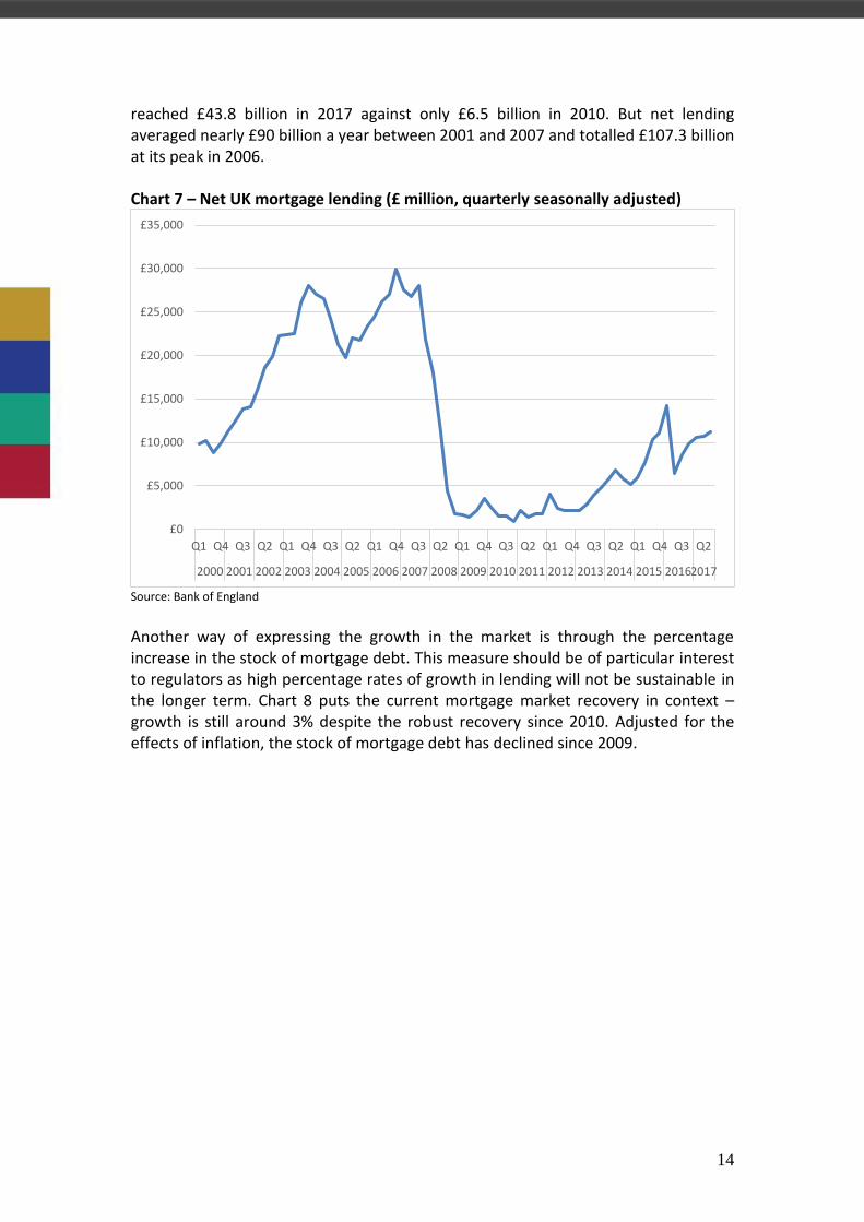
Net lending measures actual market growth and it experienced a much larger decline in the financial crisis (see Chart 7). The subsequent recovery is impressive: net lending
£0
£10,000
£20,000
£30,000
£40,000
£50,000
£60,000
£70,000
£80,000
£90,000
£100,000
Q1 Q4 Q3 Q2 Q1 Q4 Q3 Q2 Q1 Q4 Q3 Q2 Q1 Q4 Q3 Q2 Q1 Q4 Q3 Q2 Q1 Q4 Q3 Q2
2000 2001 2002 2003 2004 2005 2006 2007 2008 2009 2010 2011 2012 2013 2014 2015 2016 2017
0
50,000
100,000
150,000
200,000
250,000
300,000
350,000
400,000
450,000
2002 2003 2004 2005 2006 2007 2008 2009 2010 2011 2012 2013 2014 2015 2016 2017
Homeowner loans for house purchase Buy-to-let loans for house purchase
Other (including remortgage)
14
reached £43.8 billion in 2017 against only £6.5 billion in 2010. But net lending averaged nearly £90 billion a year between 2001 and 2007 and totalled £107.3 billion at its peak in 2006. Chart 7 – Net UK mortgage lending (£ million, quarterly seasonally adjusted)
Source: Bank of England
Another way of expressing the growth in the market is through the percentage increase in the stock of mortgage debt. This measure should be of particular interest to regulators as high percentage rates of growth in lending will not be sustainable in the longer term. Chart 8 puts the current mortgage market recovery in context – growth is still around 3% despite the robust recovery since 2010. Adjusted for the effects of inflation, the stock of mortgage debt has declined since 2009.
£0
£5,000
£10,000
£15,000
£20,000
£25,000
£30,000
£35,000
Q1 Q4 Q3 Q2 Q1 Q4 Q3 Q2 Q1 Q4 Q3 Q2 Q1 Q4 Q3 Q2 Q1 Q4 Q3 Q2 Q1 Q4 Q3 Q2
2000 2001 2002 2003 2004 2005 2006 2007 2008 2009 2010 2011 2012 2013 2014 2015 20162017

15
Chart 8 – % increase in UK mortgage stock
Source: Bank of England
Another key measure of the relative level of mortgage debt is the debt to income ratio. As Chart 9 illustrates, the level of mortgage debt as a percentage of aggregate household income has fallen since its peak of 114% in 2007. In 2015 it was 98%, rising slightly to 99% in 2016 and is likely to have risen slightly again 2017 but shows no sign yet of accelerating. Nor has there been a substantial rise in the level of unsecured debt relative to household income, which remains below the ratio recorded back in 2000. Chart 9 – Outstanding debt as a % of gross disposable household income
Source: ONS and Bank of England
While regulators will look at all of the above measures of market performance when considering the health of the market, the Bank of England has always paid particular attention to a more sophisticated measure: housing equity withdrawal (see Chart 10).
0.0%
2.0%
4.0%
6.0%
8.0%
10.0%
12.0%
14.0%
16.0%
Q1 Q4 Q3 Q2 Q1 Q4 Q3 Q2 Q1 Q4 Q3 Q2 Q1 Q4 Q3 Q2 Q1 Q4 Q3 Q2 Q1 Q4 Q3 Q2
2000 2001 2002 2003 2004 2005 2006 2007 2008 2009 2010 2011 2012 2013 2014 2015 2016 2017
0.0%
20.0%
40.0%
60.0%
80.0%
100.0%
120.0%
140.0%
160.0%
Outstanding mortgage debt Outstanding unsecured debt

16
Chart 10 – Housing equity withdrawal as % of post-tax incomes (seasonally adjusted)
Source: Bank of England
Housing equity withdrawal can be defined as net borrowing that is not used to finance physical investment in the housing stock (either in newly built properties or home improvements). Thus it is a measure of the extent to which households are using their housing wealth to finance other spending or investment. As you might expect, in the past housing equity withdrawal has been cyclical, increasing during economic booms and falling or turning negative during contractions. But never before has the housing market experienced such a prolonged period of negative housing equity withdrawal (or housing equity injection). Between 2008 and the middle of 2017, UK households injected £261 billion of equity into the housing market through a combination of regular mortgage repayments, lump sum repayments, cash deposits and other cash spending. This represents a substantial de-gearing of the housing stock given that total outstanding mortgage debt at the end of 2017 was £1,367 billion. Such an injection of equity into housing was understandable during the last recession as the constrained supply of mortgage credit and falling property values discouraged borrowers from taking equity out of the housing market. But what is surprising is how housing equity injection has continued even as the housing market has recovered. With a prolonged period of rising property values (at a national average) you would expect households to want to start spending against their capital gains, but this has failed to occur.
-4
-2
0
2
4
6
8
Q1 Q4 Q3 Q2 Q1 Q4 Q3 Q2 Q1 Q4 Q3 Q2 Q1 Q4 Q3 Q2 Q1 Q4 Q3 Q2 Q1 Q4 Q3 Q2
2000 2001 2002 2003 2004 2005 2006 2007 2008 2009 2010 2011 2012 2013 2014 2015 20162017

17
3.3 Aggregate housing equity Chart 11 – Aggregate UK housing LTV ratio
Source: Bank of England, ONS. Partly estimated
The combination of continued housing equity injection and rising property values has pushed down the UK housing market’s average LTV ratio to an estimated 26% (see Chart 11), a lower level of gearing than that seen prior to the financial crisis. In 2008, we calculate that the total value of the private housing stock in the UK was £3.6 trillion. This had risen to an estimated £5.3 trillion by last year. The level of housing equity rose by £1.6 trillion over this period, roughly £58,000 per household. This provides households in aggregate with a substantial additional cushion to absorb future shocks: three-quarters of the value of the UK housing market is equity.
3.4 Improved affordability Even more surprisingly this de-gearing of the housing market has occurred at a time of record low mortgage rates (see Chart 12) and correspondingly record mortgage affordability for both first time buyers and moving homeowners.
25.0%
26.0%
27.0%
28.0%
29.0%
30.0%
31.0%
32.0%
33.0%
34.0%
2005 2006 2007 2008 2009 2010 2011 2012 2013 2014 2015 2016 2017

18
Chart 12 – Average 2 year fixed rate mortgage rates
Source: Bank of England The average rate of a 2 year fixed rate mortgage at 75% LTV fell below 2% for the first time in 2015 and continued to fall into 2017, reaching a low of 1.35% in April. With the first Bank Rate increase in over a decade in November 2017, mortgage rates have risen but at 1.57% in December 2017 remained close to historical lows. The fall in rates for 90% LTV loans has been even greater, as Chart 12 shows. Rates were as high as 6% in 2012, but were below 3% by 2015 and continued to fall during 2017, despite the Bank Rate increase, to a new low of 2.21% in December. Chart 13 – Interest payments as % of income for new buyers
Source: UK Finance Cheap mortgage deals have supported buyer affordability despite house prices continuing to rise faster than wages. Measured by the proportion of income that the median home buyer spends on mortgage interest, affordability hit a new peak in Q4
0.00
1.00
2.00
3.00
4.00
5.00
6.00
7.00
31
Jan
12
30
Ap
r 1
2
31
Ju
l 12
31
Oct
12
31
Jan
13
30
Ap
r 1
3
31
Ju
l 13
31
Oct
13
31
Jan
14
30
Ap
r 1
4
31
Ju
l 14
31
Oct
14
31
Jan
15
30
Ap
r 1
5
31
Ju
l 15
31
Oct
15
31
Jan
16
30
Ap
r 1
6
31
Ju
l 16
31
Oct
16
31
Jan
17
30
Ap
r 1
7
31
Ju
l 17
31
Oct
17
75% LTV 90% LTV
0.0
5.0
10.0
15.0
20.0
25.0
Q1 Q4 Q3 Q2 Q1 Q4 Q3 Q2 Q1 Q4 Q3 Q2 Q1 Q4 Q3 Q2 Q1 Q4 Q3 Q2 Q1 Q4 Q3 Q2
200020012002200320042005200620072008200920102011201220132014201520162017
First time buyers Moving owner-occupiers
19
2017 with moving homeowners spending a record low 6.3% of their income on interest in Q4 2017 and first time buyers spending a new low of 7.9%.
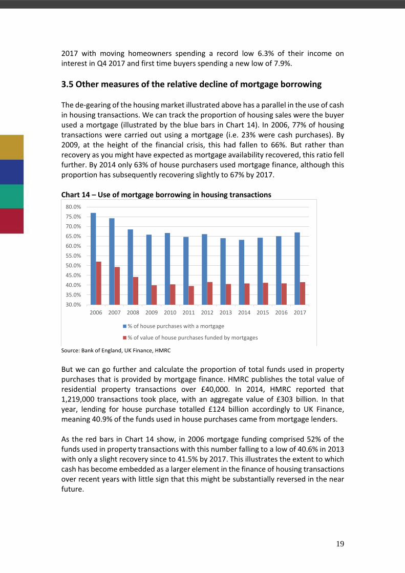
3.5 Other measures of the relative decline of mortgage borrowing The de-gearing of the housing market illustrated above has a parallel in the use of cash in housing transactions. We can track the proportion of housing sales were the buyer used a mortgage (illustrated by the blue bars in Chart 14). In 2006, 77% of housing transactions were carried out using a mortgage (i.e. 23% were cash purchases). By 2009, at the height of the financial crisis, this had fallen to 66%. But rather than recovery as you might have expected as mortgage availability recovered, this ratio fell further. By 2014 only 63% of house purchasers used mortgage finance, although this proportion has subsequently recovering slightly to 67% by 2017. Chart 14 – Use of mortgage borrowing in housing transactions
Source: Bank of England, UK Finance, HMRC But we can go further and calculate the proportion of total funds used in property purchases that is provided by mortgage finance. HMRC publishes the total value of residential property transactions over £40,000. In 2014, HMRC reported that 1,219,000 transactions took place, with an aggregate value of £303 billion. In that year, lending for house purchase totalled £124 billion accordingly to UK Finance, meaning 40.9% of the funds used in house purchases came from mortgage lenders. As the red bars in Chart 14 show, in 2006 mortgage funding comprised 52% of the funds used in property transactions with this number falling to a low of 40.6% in 2013 with only a slight recovery since to 41.5% by 2017. This illustrates the extent to which cash has become embedded as a larger element in the finance of housing transactions over recent years with little sign that this might be substantially reversed in the near future.
30.0%
35.0%
40.0%
45.0%
50.0%
55.0%
60.0%
65.0%
70.0%
75.0%
80.0%
2006 2007 2008 2009 2010 2011 2012 2013 2014 2015 2016 2017
% of house purchases with a mortgage
% of value of house purchases funded by mortgages

20
The narrowing availability of mortgages and higher deposit requirements seen since the financial crisis are likely to be part of the explanation as is the mortgage market review (MMR), which has reinforced the more conservative approach of lenders since its introduction in 2014. But structural factors have also played a critical role. While the average age of the UK population has increased in recent decades, the average age of homeowners has risen much more sharply. We turn to these structural factors now.
21
4. Explaining the subdued mortgage recovery
4.1 What is behind consumers’ subdued rate of mortgage borrowing? What the analysis in Section 3 illustrates is that what we are experiencing is far from a normal recovery in the mortgage market. When, after some 8 years of an economic upswing, the stock of mortgage debt is only growing broadly in line with the rate of inflation and net mortgage lending is not sufficient to cover the level of physical investment in the housing stock it is clear we are in an unprecedented environment. And this comes despite major interventions in the market by the Bank of England and the government to stimulate lending and borrowing activity including most recently the Term Funding Scheme and Help-to-Buy. It could be argued that regulators should be pleased with this result. The previous pattern of ‘boom and bust’ has not returned. However, there must be concerns that if economic recovery and government interventions have produced such a weak performance in the mortgage market, there will be nothing left in the locker to boost the market if and when the next economic downturn sets in. It is hard to see mortgage rates falling much lower and even deeper government support measures are unlikely to be welcomed by market participants. What is not immediately clear is the extent to which the de-gearing we have seen is the product of households’ choice or to what extent it reflects borrowing constraints facing households. There is anecdotal evidence that consumers are finding it harder to access mortgage finance as a result of tightened affordability requirements. But it seems unlikely that this can be the larger part of the explanation for such subdued borrowing.
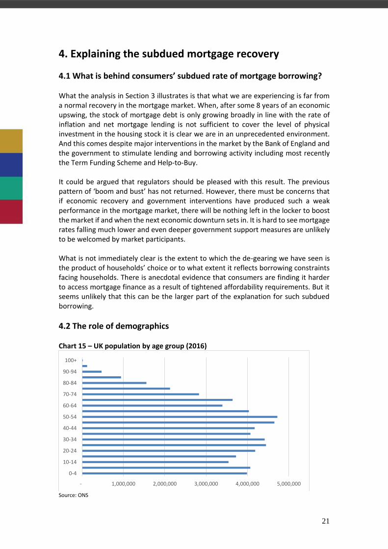
4.2 The role of demographics Chart 15 – UK population by age group (2016)
Source: ONS
- 1,000,000 2,000,000 3,000,000 4,000,000 5,000,000
0-4
10-14
20-24
30-34
40-44
50-54
60-64
70-74
80-84
90-94
100+

22
An alternative explanation lies in structural factors and in particular in demographics. Chart 15 shows the age profile of the UK population in 2016. The UK’s population has been aging as the ‘baby boom’ bulge has made its way up the age scale. There were in fact two distinct baby boom generations in the post war period; the immediate post war boom as birth rates spiked after 6 years of war, and its generational echo in the mid-1960s. Both are visible in Chart 15 as the spikes in the 65-69 age group and the 50-54 and 45-49 age groups. The 50-54 age group is the largest single cohort: out of a total population of 65.1 million in 2016 4.7 million were in this age range (7.3% of the population). This has particular significance for the housing market because both baby boom generations have enjoyed high rates of homeownership. So while the population as a whole is aging, homeowners are aging significantly more rapidly, rising from an estimated average age of 52 in 1996 to 57 in 2016. Chart 16 – Owner-occupied households by age group (2016)
Source: House of Commons Library Chart 16 shows the varying level of owner-occupation by age group, confirming that the higher age groups currently contain the largest number of owner-occupiers. The largest single age group of owner-occupiers was 45-54 year olds: there were 3.7 million owner-occupied households of this age in 2016. And 76% of all owner-occupiers were aged 45 or above compared to 62% in 1996. This shift is significant because older households behave differently: they move less frequently and are typically paying off or have paid off their mortgage.
- 1,000,000 2,000,000 3,000,000 4,000,000 5,000,000 6,000,000
16-24
25-34
35-44
45-54
55-64
65-74
75 and over
All households owner-occupiers
23
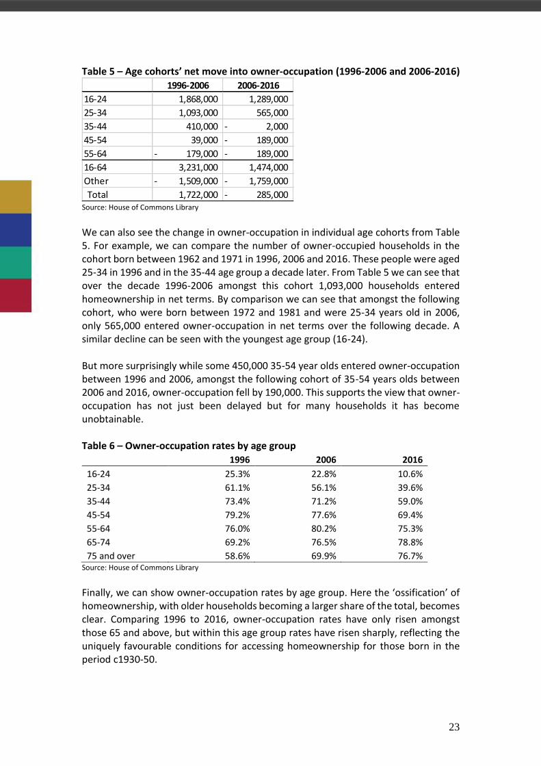
Table 5 – Age cohorts’ net move into owner-occupation (1996-2006 and 2006-2016)
Source: House of Commons Library We can also see the change in owner-occupation in individual age cohorts from Table 5. For example, we can compare the number of owner-occupied households in the cohort born between 1962 and 1971 in 1996, 2006 and 2016. These people were aged 25-34 in 1996 and in the 35-44 age group a decade later. From Table 5 we can see that over the decade 1996-2006 amongst this cohort 1,093,000 households entered homeownership in net terms. By comparison we can see that amongst the following cohort, who were born between 1972 and 1981 and were 25-34 years old in 2006, only 565,000 entered owner-occupation in net terms over the following decade. A similar decline can be seen with the youngest age group (16-24). But more surprisingly while some 450,000 35-54 year olds entered owner-occupation between 1996 and 2006, amongst the following cohort of 35-54 years olds between 2006 and 2016, owner-occupation fell by 190,000. This supports the view that owner-occupation has not just been delayed but for many households it has become unobtainable. Table 6 – Owner-occupation rates by age group
1996 2006 2016
16-24 25.3% 22.8% 10.6%
25-34 61.1% 56.1% 39.6%
35-44 73.4% 71.2% 59.0%
45-54 79.2% 77.6% 69.4%
55-64 76.0% 80.2% 75.3%
65-74 69.2% 76.5% 78.8%
75 and over 58.6% 69.9% 76.7% Source: House of Commons Library Finally, we can show owner-occupation rates by age group. Here the ‘ossification’ of homeownership, with older households becoming a larger share of the total, becomes clear. Comparing 1996 to 2016, owner-occupation rates have only risen amongst those 65 and above, but within this age group rates have risen sharply, reflecting the uniquely favourable conditions for accessing homeownership for those born in the period c1930-50.
1996-2006 2006-2016
16-24 1,868,000 1,289,000
25-34 1,093,000 565,000
35-44 410,000 2,000-
45-54 39,000 189,000-
55-64 179,000- 189,000-
16-64 3,231,000 1,474,000
Other 1,509,000- 1,759,000-
Total 1,722,000 285,000-

24
This increasing concentration of homeownership in older households helps to explain the increase in overall housing equity (older households have mostly paid off their mortgage) and the lack of aggregate equity withdrawal, which is strongest when there are large numbers of younger households entering owner-occupation with large mortgages. It also helps to explain the relatively low level of housing turnover as older households move less often and the high price of housing relative to incomes (as a large proportion of the housing stock is tied up by older households – what could be termed the baby boomer hoarding effect).
4.3 Demography’s implications for the long term market outlook These demographic factors can also inform a long term forecast of the housing and mortgage markets. With high rates of homeownership amongst those born between 1930 and 1950 and a bulge in people born in the late 1940s, the number of properties coming onto the market due to downsizing and death should be expected to rise quite rapidly going forward, although rising life expectancy should slow the rate of increase. This could ease the hoarding effect and may help more young households enter owner-occupation. But how these properties are recycled depends on the types of households that inherit them. If they are mostly inherited by young households (for example the grandchildren) this could ease pressure on housing demand but reduce the need for mortgage debt amongst these younger households. But if, as seems more likely, the main beneficiaries are the middle-aged children of the older generation, younger households may still find that a disproportionate stock of housing is held by older age groups, keeping prices relatively high.

25
5. Mortgage market balance of supply and demand There are a number of metrics which can be used to determine the extent to which the relatively subdued nature of the mortgage recovery is the product of a lack of mortgage availability or alternatively, a lack of appetite from borrowers. Firstly, we can assess the strength of growth in the supply of funds available from mortgage lenders versus the growth in demand in the mainstream market with reference to mortgage margins on new loans. Chart 17 - Margin between 2-year fixed rate mortgage and Bank Rate
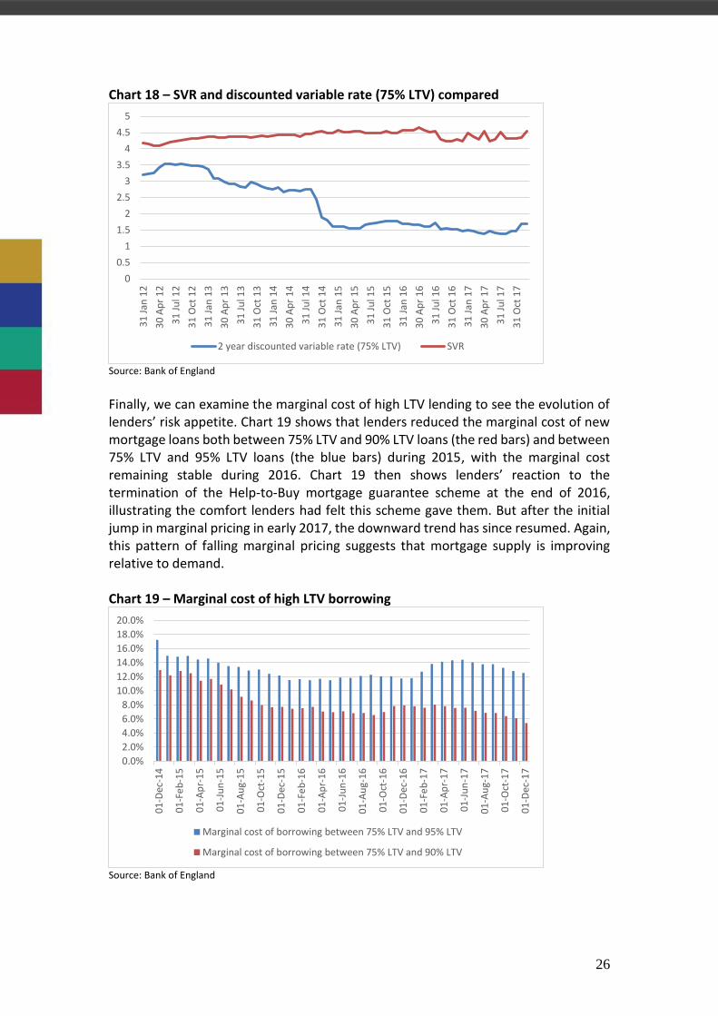
Source: Bank of England Chart 17 shows that the spread between Bank Rate and average new 2 year fixed rate mortgages has fallen substantially in recent years, a sign that the supply of mortgage credit is improving relative to demand. However, part of the reduction in margins is likely to have been due to government support schemes such as the Bank of England’s Term Funding Scheme that incentivises additional lending. As this scheme terminated in January 2018, the evolution of margins over the next few months will be useful guide to underlying credit supply conditions. We can also assess the extent of competition for new business by comparing the average 2 year discounted variable rate available on new loans with the average standard variable rate (SVR) paid by customers on the ‘back book’, as this shows the extent to which lenders are actively seeking new business. Chart 18 shows how these two rates have moved since 2012. The differential between the two rates soared in 2014 and 2015 and has remained at a record of close to 3 percentage points since. This certainly supports the view that competition amongst lenders for new business has increased significantly relative to demand since 2014.
0.00
1.00
2.00
3.00
4.00
5.00
6.00
31
Jan
12
30
Ap
r 1
2
31
Ju
l 12
31
Oct
12
31
Jan
13
30
Ap
r 1
3
31
Ju
l 13
31
Oct
13
31
Jan
14
30
Ap
r 1
4
31
Ju
l 14
31
Oct
14
31
Jan
15
30
Ap
r 1
5
31
Ju
l 15
31
Oct
15
31
Jan
16
30
Ap
r 1
6
31
Ju
l 16
31
Oct
16
31
Jan
17
30
Ap
r 1
7
31
Ju
l 17
31
Oct
17
75% LTV 90% LTV
26
Chart 18 – SVR and discounted variable rate (75% LTV) compared
Source: Bank of England Finally, we can examine the marginal cost of high LTV lending to see the evolution of lenders’ risk appetite. Chart 19 shows that lenders reduced the marginal cost of new mortgage loans both between 75% LTV and 90% LTV loans (the red bars) and between 75% LTV and 95% LTV loans (the blue bars) during 2015, with the marginal cost remaining stable during 2016. Chart 19 then shows lenders’ reaction to the termination of the Help-to-Buy mortgage guarantee scheme at the end of 2016, illustrating the comfort lenders had felt this scheme gave them. But after the initial jump in marginal pricing in early 2017, the downward trend has since resumed. Again, this pattern of falling marginal pricing suggests that mortgage supply is improving relative to demand. Chart 19 – Marginal cost of high LTV borrowing
Source: Bank of England
0
0.5
1
1.5
2
2.5
3
3.5
4
4.5
5
31
Jan
12
30
Ap
r 1
2
31
Ju
l 12
31
Oct
12
31
Jan
13
30
Ap
r 1
3
31
Ju
l 13
31
Oct
13
31
Jan
14
30
Ap
r 1
4
31
Ju
l 14
31
Oct
14
31
Jan
15
30
Ap
r 1
5
31
Ju
l 15
31
Oct
15
31
Jan
16
30
Ap
r 1
6
31
Ju
l 16
31
Oct
16
31
Jan
17
30
Ap
r 1
7
31
Ju
l 17
31
Oct
17
2 year discounted variable rate (75% LTV) SVR
0.0%
2.0%
4.0%
6.0%
8.0%
10.0%
12.0%
14.0%
16.0%
18.0%
20.0%
01
-Dec
-14
01
-Fe
b-1
5
01
-Ap
r-1
5
01
-Ju
n-1
5
01
-Au
g-1
5
01
-Oct
-15
01
-Dec
-15
01
-Fe
b-1
6
01
-Ap
r-1
6
01
-Ju
n-1
6
01
-Au
g-1
6
01
-Oct
-16
01
-Dec
-16
01
-Fe
b-1
7
01
-Ap
r-1
7
01
-Ju
n-1
7
01
-Au
g-1
7
01
-Oct
-17
01
-Dec
-17
Marginal cost of borrowing between 75% LTV and 95% LTV
Marginal cost of borrowing between 75% LTV and 90% LTV

27
On a more qualitative note, we can also assess the evolution of lenders’ appetite to cater to non-standard mortgage borrowers with reference to the IMLA broker lender survey. Brokers report that it has become easier to source mortgages for non-standard clients in recent years. More broadly, other measures of the health of the mortgage market have also been positive in recent years with an increase in the number of lenders and a widening of product choice in areas such as lending into retirement.

28
6. Housing turnover and mortgage churn Traditionally, the key driver of mortgage market activity has been housing turnover. As Chart 20 shows, housing turnover has been on a modest upward trend since 2009 but remains well below its 2007 level. This helps to explain the steady but gentle recovery in mortgage lending for house purchase. Chart 20 – Housing turnover in the UK (monthly)
Source: HMRC However, a longer run of housing turnover data shows that the experience since the financial crisis is not just a cyclical effect. In Chart 21 we have scaled housing turnover by the size of the privately owned housing stock, to show how often the average homeowner moves and it is clear that there has been a fundamental downward shift in the rate at which people move house. Chart 21 – Average number of years between housing moves
Source: HMRC and DCLG
0
20000
40000
60000
80000
100000
120000
140000
160000
180000
Jan
Jun
No
v
Ap
r
Sep
Feb
Jul
Dec
May Oct
Mar
Au
g
Jan
Jun
No
v
Ap
r
Sep
Feb
Jul
Dec
May Oct
Mar
Au
g
Jan
Jun
No
v
2007 2008 2009 2010 2011 2012 2013 2014 2015 2016 2017 2018
UK housing turnover (seasonally adjusted)
Turnover (12 month moving average)
0.0
5.0
10.0
15.0
20.0
25.0
30.0
1986 1988 1990 1992 1994 1996 1998 2000 2002 2004 2006 2008 2010 2012 2014 2016

29
We calculate that the average homeowner moved every 7.4 years in 1988, when turnover peaked at 2.3 million. Even before the financial crisis there was an upward trend in this number. More recently, despite the recovery in housing transactions since 2009, on the latest data people are moving only every 19.2 years (see Chart 21). Chart 22 – Rate of churn in the UK mortgage market (by number)
Source: Bank of England, UK Finance We can compare the rate of churn in the housing market with the corresponding rate of churn in the mortgage market. Chart 22 shows the number of new mortgages advanced as a proportion of the stock of mortgages. It confirms that mortgage churn resulting from house purchase (the blue bars in Chart 22) shows a structural as well as a cyclical shift: in recent years churn rates have even been substantially below those seen coming out of the last recession in the mid-1990s. Chart 23 – Rate of churn in the UK mortgage market (by value)
Source: Bank of England, UK Finance
0.0%
5.0%
10.0%
15.0%
20.0%
25.0%
30.0%
19
96
19
97
19
98
19
99
20
00
20
01
20
02
20
03
20
04
20
05
20
06
20
07
20
08
20
09
20
10
20
11
20
12
20
13
20
14
20
15
20
16
20
17
House purchase Remortgage
0.0%
5.0%
10.0%
15.0%
20.0%
25.0%
30.0%
35.0%
40.0%
19
96
19
97
19
98
19
99
20
00
20
01
20
02
20
03
20
04
20
05
20
06
20
07
20
08
20
09
20
10
20
11
20
12
20
13
20
14
20
15
20
16
20
17
House purchase Remortgage

30
Chart 23 confirms the same pattern but this time using the value of mortgage lending rather than number of mortgages. In 1996 the number of new mortgage loans for house purchase was equal to 9% of the stock of mortgage loans, rising to a peak of 12.3% in 2002 but down to only 6.7% in 2017. In value terms these loans went from 12.4% in 1996 to 19.3% in 2002 and 10.3% in 2017. In the remortgage market the profile of churn rates is somewhat different (this is represented by the red bars in Charts 22 and 23): churn rates are roughly back down to where they were in the mid-1990s but far below those recorded in the first decade of the twenty-first century. For example, remortgage churn in 2016 was less than a third of the peak level of 2003 in terms of both number and value.
Explaining reduced housing and mortgage churn Section 4 discussed how the increased concentration of homeownership in older age groups has impacted the housing market, slowing housing turnover as older households move less often on average. However, demographics is not the only factor that has slowed churn in the housing and mortgage markets. Younger households are also finding it harder to move because of a combination of factors including high house prices relative to earnings and stricter mortgage affordability criteria. As a result, while a reasonable number of households are managing to buy their first home, many of these households are finding it difficult to move up the property ladder. This is despite the fact that recent first time buyers are generally sitting on significant capital gains. According to the Halifax Second Stepper report of March 2017 today’s typical second stepper bought their first property in 2012, when the average price of a first time home was £140,004. With this price having increased to £205,723 second steppers now have average equity of £105,068 – around two-thirds of which has been boosted by house price growth over the last four years, with the rest coming from the initial deposit and mortgage repayments. For these recent first time buyers rising house prices are often insufficient to overcome the steep cost of moving up the housing ladder. Explaining the reduction in remortgage churn is more difficult. If households are moving less frequently, they should have more incentive to remortgage to ensure they are on the best rate, yet remortgage rates remain well below those of the early 2000s. And although lenders have made it easier for borrowers to switch products instead of remortgaging, this is not a full explanation as figures from the PRA show that product transfers are also lower than in the pre-crisis period. The rising popularity of longer term fixed rate mortgages explains some of the reduction however. But whatever the cause, while mortgage rates for new customers remain so much more competitive than lender SVRs as they are now (see Chart 18 on page 26) remortgage volumes should remain reasonably buoyant.

31
Media contacts For further information please contact:
Rob Thomas, Director of Research, on 020 7427 1406
Fran Hart and Amy Boekstein at Instinctif Partners, on 0207 427 1400
About IMLA The Intermediary Mortgage Lenders Association (IMLA) is the trade association that represents mortgage lenders who lend to UK consumers and businesses via the broker channel. Its membership unites 39 banks, building societies and specialist lenders, including 16 of the top 20 UK mortgage lenders responsible for almost £180bn of annual lending. IMLA provides a unique, democratic forum where intermediary lenders can work together with industry, regulators and government on initiatives to support a stable and inclusive mortgage market. Originally founded in 1988, IMLA has close working relationships with key stakeholders including the Association of Mortgage Intermediaries (AMI), UK Finance and the Financial Conduct Authority (FCA). Visit www.imla.org.uk to view the full list of IMLA members and associate members and learn more about IMLA’s work.
About the author Rob Thomas is a Director of Research at Instinctif Partners. He previously served as an economist at the Bank of England (1989-1994), a high profile analyst at the investment bank UBS (1994-2001) and as senior policy adviser to the Council of Mortgage Lenders (2005-12). He was also the project originator and manager at the European Mortgage Finance Agency project (2001-05) and created the blueprint for the government’s NewBuy mortgage scheme.