the man without qualities - michael b....
TRANSCRIPT
Catalogue addapted for screen
The Man Without Qualitiesand Symposium

The Man Without Qualitiesand Symposium
Paintings and Intaglio 2009Catalogue

Michael Chang The Man Without Qualities and Symposium
Catalogue
Paintings and Intaglio
Published by Michael Chang in conjunction with an exhibition
at CDS Art & Visibility, gallery for contemporary art, Copenhagen, Denmark
© 2009 Michael Chang — All Rights Reserved
Essays by Melissa E. Feldman and Trine Ross
Preface by Cath Alexandrine Danneskiold-Samsøe
CDS Art & Visibility, gallery for contemporary art, Copenhagen, Denmark
www.cdsartandvisibility.com
English translation by Justina Joy Miller
Photo credits:
Page 6: Scala Archives, DIGITAL IMAGE © 2009, The Museum of Modern Art/Scala, Florence
Page 37: Photo The Philadelphia Museum of Art/Art Resource/Scala, Florence
All works by Michael Chang © 2009 Michael Chang
Typeset in FF Clifford by Akira Kobayashi and Canvas Sans by Michael Chang
1st edition 2009
Printed in Denmark
Printed by Chronografisk A/S, Aarhus, Denmark, www.chronografisk.dk
Paper by Arctic Paper, Sweden, www.arcticpaper.com
Content: Munken Print Extra
Cover: Munken Lynx
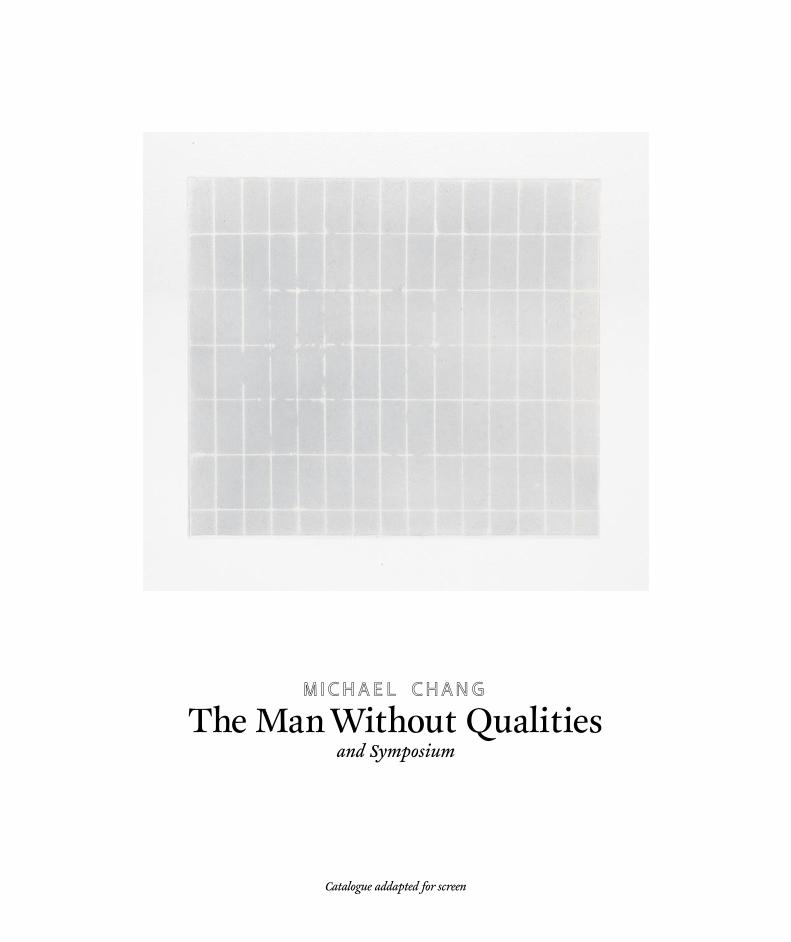
On the cover: Michael Chang, Déjà Vu, 2009
Located in a private collection, Ithaca New York, USA
Thanks to: Kathan Brown, Valerie Wade, Asa Muir-Harmony and Ianne Kjorlie at Crown Point Press
Marty McCutcheon, Hadi Tabatabai, Christy Walsh and Jan Kather
Also thanks to: The Danish Arts Foundation for a travel grant in 2009, www.kunst.dk
This title is on file with the Royal Danish Library and Museum of Modern Art (MoMa) New York
Catalogue screen version: ISBN 978-87-992964-3-9
Catalogue hard copy : ISBN 978-87-992964-2-2
III
The Man Without Qualitiesand Symposium

Contents
Preface
By Cath Alexandrine Danneskiold-Samsøe
Piero Manzoni, Merde d’artista, No. 014, 1961
Reje!ion
By Trine Ross
Michael Chang, Two Fish in a Glass Jar, 2006
Everyman
By Melissa E. Feldman
Plates The Man Without Qualities
Plates Symposium
Constantine Brancusi, The Kiss, 1916
5
6
7
9
10
12
16
37

There is one thing that dominates an encounter with Michael Chang and his art—calm. It is a calm that takes us on a long journey to unknown places. Just how an artist has come to possess that kind of calm at such a young age is something of a mystery. There is a sense that the secret lies locked in his art.
Michael Baastrup Chang is, as his name suggests, the product of a union between East and West. The cultural tension could just have well ended in chaos, but Chang has chosen to stand firm, subscribing neither to Socrates or Lao-Tse. Like a Janus head hovering over the arch between the rationalism of the West and the intuitionism of the East, Chang is a representative of both. This makes it difficult to imagine what ideas and thoughts motivate Chang to embark on art-adventures in Sweden, the USA, Serbia and Italy. Maybe he’s not thinking at all, but just looking thoughtful
while doing what he intuitively feels he must. Similarly instinctive is his choice of materials like graphite, emulsion, tempera, or the most refined: beeswax. Is it merely an attempt to conquer that calm, which will continue to grow at a disarming rate?
This catalogue has been produced in conjunction with our exhibition of Chang’s monochrome works. We have the pleasure of including contributions by two noted art critics: Melissa E. Feldman (USA) and Trine Ross (DK), both of whom write about their encounters with Michael Chang and his art.
CDS Art & Visibilitygallery for contemporary artCath Alexandrine Danneskiold-Samsøe
PrefaceBy Cath Alexandrine Danneskiold-Samsøe
Melissa E. Feldman is an independent curator and writer currently based in the Bay Area, California. A contributor to Art in America, Frieze, and Third Text, among other publications. She holds an MA in Art History from the Institute of Fine Arts, New York University. In the mid-1990s she was a curator at the Institute of Contemporary Art, University of Pennsylvania, Philadelphia.
Trine Ross is a writer and lecturer, an art critic and art reviewer for the daily newspaper Politiken. She holds an MA in Art History from the Institute of Fine Arts, Copenhagen University.
5

Piero Manzoni (1933-1963), Merda d’artista (Artist’s Shit), No. 014, 1961Metal, paper, and ’artist’s shit’, 1 7/8’ (4.8 cm) x 2 1/2’ (6.5 cm) in diameter
Gift of Jo Carole and Ronald S. Lauder. Acc. n.: 4.1999Digital image, The Museum of Modern Art, New York/Scala, Florence
Museum of Modern Art (MoMA) New York
6

Rejection is a strange word. A rejection can be a simple refusal, but it can also be a slap in the face. We’ve all experienced it, both as the rejecters and the rejected. Most of the time, we experience rejection as negative, even humiliating. We were weighed, but we were not heavy enough. We weren’t satisfactory. We were no good.
But rejection isn’t always disadvantageous. Some materials repel one another with exciting results, and in retrospect’s incandescent light, we can often appreciate the good fortune of a rejection. Maybe when meeting an old flame – and suddenly realizing that a relationship, had it developed, would have brought nothing but trouble. As the saying goes: When one door closes, another one opens. And maybe that other door leads to where we wanted to go all along.
We make choices continuously, and every choice bears its consequences. Perhaps we don’t give it much thought in our everyday life, but for an artist it’s quite different. These consequences are present in all of the artistic decisions with which s/he is faced, because they are the determiners of a project’s fate. Michael Chang speaks of a process with a long series of deselections which ultimately lead him to the place where he and his work are.
That place was hardly plotted on an imaginary map. Actually, he had never dreamed that he would or even wanted to work that way. But because he has always selected and deselected,
considered and reconsidered, the place where he has arrived as an artist is just right. For him. Right now. En route, Chang resolutely studies art and philosophy of the past, from the Byzantine Empire to the Romans to modern art in New York; from Plato to Freund and Heidegger.
All the while, Chang’s focus remains on the images he will produce, even if he hasn’t made the connection until he has begun working. Instead, those many thoughts and considerations serve as a sort of foundation for his work, a humanistic substructure, if you will. Vis-à-vis with one of Chang’s submitted (and rejected) works for Charlottenborg’s Spring Exhibition, one can’t help but think of building blocks – but that is on one’s own account.
In one of Michael Chang’s many notebooks is a diagram of how art moves from the familiar to the new. Chang has plotted two routes: one goes through tradition and proceeds to it’s renewal, while the other focuses on sensation, the absolutely new and hitherto unseen. However, as Chang rightly points out, new is not synonymous with relevant. He chooses to expand on tradition, thereby avoiding many of the pitfalls awaiting those who follow sensation’s path.
Concentrating exclusively on innovation, one is constantly faced with the fundamental problem of being overtaken, of not being original or new enough. In turn, one is constantly rushing
Reje!ion1
By Trine Ross
[1] First published in conjunction with a small self arranged exhibition entitled ”Rejection” in 2009 at café Kejzer in Copenhagen
7

along, which takes its toll on the quality of the art being produced. Moreover, other artists are automatically competitors instead of colleagues from whom one can learn, as Chang is fond of doing. He is inspired by old masters as well as young colleagues in the field of absolutely innovative art.
The result is art which refers to art’s history while defining itself as an issue. Thus, in the series of rejected works are the four large pieces which didn’t fit through the eye of the Spring Exhibition’s needle, as well as a number of other, smaller works taken from Chang’s sketchbooks. Michael Chang took on the role of censorship committee while perusing the many pages – on the lookout, he says, for the sketches that shine.
It’s clear enough up till there, but Chang adds an exciting extra dimension to his screening by consciously choosing a series of sketches which he himself does not like. He finds them too pretty, too decorative, too superficially entertaining. They expose him, he says. But he chooses to develop those sketches because he senses that they will bring him closer to something which he is seeking. And these pieces, in an interplay with the rejected works, will hopefully pose the viewer the same question which Chang posed himself during the screening: What shine to me? What doesn’t shine to me? And: Why?Many of the works are graphite on paper. As such, they are also a material study, of the meeting between graphite, linseed oil, beeswax and paper, and of their endless potential for nuance. And it is precisely nuances which are
crucial, especially when Chang works with non-figurative expression. The drawing itself is freehand and the measurements by rule of thumb, where Chang uses his own body as a ruler, so that the measurement of a repeated space is for example two finger’s breadth and one finger’s length. Far from tranquility of the finished piece is its conception, during which a great deal of energy and elbow grease is needed to massage the graphite into the paper.
On the one hand are order and contained space, while on the other hand the paper is leading a life of its own, making chance contributions. In some places, it can be seen as small white dots through the graphite; in yet others, the raw paper’s natural contours have been compressed so much that they appear distorted. Up close, Chang’s works contradict the exalted tranquility that they emit from a distance – here is the performance of drama in details. Go on to add that the character of the graphite ceaselessly changes according to the light which falls on it, and you have a series of works which are at once succinct and eternally in movement. They draw light to them and banish it. The fields adapt to one another, but remain forever separate. Rejection takes on a new dimension, because here, rejection is a sudden reflection of light and a definition of form against the white paper.
Trine Ross, Copenhagen 2009MA in Art HistoryArt Critic, Author, and Lecturer
8

Michael Chang, Two Fish in a Glass Jar, 2006 — overpainted in 2007
9

10
Michael Chang came into my life suddenly and vanished as quickly. We met last August (2009) when he was in San Francisco producing aquatints at Crown Point Press for this exhibition. His timing was perfect—I was in town briefly between summer trips and was able to meet him the next day. (It’s a good thing too, because the prints—and the artist—were shipping out in two days’ time to Copenhagen.) Arriving at Crown Point, a tall, dark-haired youngish man greeted me with an accent and a face I couldn’t place. He spoke English with confidence and apart from his height, Chang didn’t look particularly Scandinavian. He struck me as being a kind of Everyman, someone who could fit in any where, be it Lhasa or Manhattan.
We chatted and I asked a lot of questions and studied the prints, all aquatints in a minimalist style. Two of the series were complete: A handsome group of aquatint and chine collé, 77 by 55 cm, that starts out all white and ends, seven prints later, with an all-violet impression, and a smaller oblong series of four whose main drama is a diminishing midline dividing its washes of gray-greens and bronze,
some in a striped moiré pattern befitting a Renaissance waistcoat. There was also an unfinished set of gridded variations on a squarish, book-size paper. This set was to be editioned; all the others are unique. Chang showed me a digital image of an ambitious, 15 by 6-foot multi-panel painting, The Man Without Qualities (2009), that would accompany the new aquatints. This imposing work, a tour de force from what I could tell, comprises eight vertical panels, all 54 by 185 cm except for the central bone white one which is a bit wider, and each painted a different muted red, green, yellow, purple and black. It resembles the American artist Brice Marden’s classic minimalist works from the early 70s (also oil and wax), yet it is less formalist and studied. Chang’s shifts in color seem more naturally-occurring, an unforced sequencing that seems to mirror the shifting color of water under an overcast sky, or the way one thought leads—or leaps—to another. Chang explained the meticulous coding system involving the number of staples attaching the canvas to the stretcher and how he works on them flat and selects a different brush size
and directional stroke for each one. Yet when asked why he named the work after the novel by Robert Musil [1] he said the title just seemed apropos though he had not read the book. By now I was beginning to grasp Michael Chang’s paradoxical approach: Order colliding with chance and intuition.
It was completely by chance, for example, that he discovered the work of Brice Marden, one of the abstract American painters whose work was inspirational for him, and his first monochrome painting came about by accident. The monochrome stands as the ground zero of painting, a beginning and an end. That is how it went for Chang, when he made his first monochrome painting by inadvertently ruining his last—and he says best—figurative work. In Chang’s native Scandinavia, figurative traditions prevail over abstraction, both contemporary and historical, Chang himself made figurative work until two years ago (2007). Vaguely surrealist, these earlier paintings feature an isolated figure or object, such as two fish trapped in a glass jar, set in a tonal background of uncertain depth.
EverymanBy Melissa E. Feldman
[1] Robert Musil (1880 - 1942) Austrian. Author of the (unfinished) modernist novel, Der Mann ohne Eigenschaften.

11
Still Chang’s abstract work bears a Nordic sensibility that can be traced back to the late 19th century Scandinavian symbolists, whose most famous affiliate was Edvard Munch, in its reductive formal means and sense of interiority. Unlike the brilliant palette and empirical realism of their French counterparts, the moodier modernists in the North opted for Whistleresque tonal and monochromatic color, and flat, shadowless light.
As a cultural mistizo with a Danish mother, an Asian father , and a British education, his attraction to the monochrome begins to make even more sense. The idiom encompasses ancient archetypes and Eastern zen, modern architecture and Western doubt. This mutability, perhaps, accounts for its remarkable resilience. Kazimir Malevich is responsible for its modern identity. Since then (1917) the monochrome has been adopted by artists working all over the world from the early Italian conceptualists Piero Manzoni and Lucio Fontana, to the heady meditations of Yves Klein, Yayoi Kusama, James Lee Byars, and Wolfgang Laib. It serves the deconstructivist investigations characteristic of Americans Robert Ryman and Ad Reinhardt. More recently, in the work of Glenn Ligon, Byron Kim and Alejandro Otero, the monochrome bears the inscription of
identity politics. As a visual paradigm, it can be an image, a denial of imagery, a state of mind, an iconoclast.
“After more than 12 years of unsuccessful attempts at trying to find a connection to the art I felt that I was supposed to be making, I left Denmark and visited the USA for the first time.” [2] That was in 2007, before Chang’s interest in abstract painting took hold. Chang’s story recalls Agnes Martin’s rite of passage from abstract expressionism to her mature minimalist style: “I painted for 20 years without painting a painting that I liked.” [3] That is, until she got to New York and saw non-objective painting.
In the larger prints, Chang begins the series with lightness and darkness: A white image and a black one. The ones in between seem to build towards the symphonic finale, a bar code of irregular stripes comprising the colors—black, white, gray, and violet—isolated in the preceding prints. The white is actually an impression of the plate itself, including dirt and grease marks. The velvety bottomless black is the result of being “bitten” for two 50-minute sessions in an acid bath. The parameters of the printing process and visuality thus marked, the work moves into another basic measure of picture-making and seeing: dividing the plate equally between two blacks, whose difference is barely discernible, then
two whites. Such subtle variations in tone are a specialty of aquatint. Then the violet makes its entrance in a cloudy monochrome.
The new works demonstrate the classic Minimalist penchant for subtle geometries that operate on a perceptual level, but Chang’s approach is more dramatic and free-associative. There is a baroque quality to the contrasting forms and divided surfaces, as well as in his use of scale and sequencing. There is a touch of romanticism in Chang’s color choice. (The artist likes to contemplate his work in different natural light, including moonlight.) For example in the print with the two blacks and the print with smaller green/gold striped pieces in the oblong series, the tonal change comes across spatially, as if in bas relief, as well as pictorially in terms of color, hue, and pattern. One needs to shift position to determine whether external lighting accounts for the flashing stripes and shifting blacks or if these differentiations occur within the image itself. As always, the answer is yes—and no, in Michael Chang’s elusive, straight-forward art.
Melissa E. FeldmanPiedmont, California, 2009MA in Art HistoryIndependent curator and writer
[2] Quoted from e-mail exchange between the artist and curator, September 2009.
[3] Interview with Irving Sandler in Germano Celant, Agnes Martin: Paintings and Drawings 1977-91 (London: Serpentine Gallery, 1993), 13.

Plates The Man Without Qualities

Michael Chang, Caput Mortuum, 2009Egg tempera and oil on canvas
Three panels (each): 21r,,x 6
, f
,, | 54 x 185 cm
13

Michael Chang, Earth Green, 2009Oil on canvas
Two panels (each): 21r,,x 6
, f
,, | 54 x 185 cm
14

Michael Chang, Black Bone and Beyond, 2009Egg, oil and beeswax on canvas
Three panels: 21r,,x 6
, f
,, | 38f,,x 6
, f
,, | 21r,,x 6
, f
,,
54 x 185 cm | 99 x 185 cm | 54 x 185 cm
15

PlatesSymposium

Michael Chang, The Vehicle, 2009Embossing
30r,,x 21i
,, | 77 x 55 cm, monoprint
17

Michael Chang, Birth, 2009Aquatint
30r,,x 21i
,, | 77 x 55 cm, monoprint
18

Michael Chang, Breath, 2009Aquatint on gampi paper chine collé
30r,,x 21i
,, | 77 x 55 cm, monoprint
19

Michael Chang, Resonance, 2009Aquatint on gampi paper chine collé
30r,,x 21i
,, | 77 x 55 cm, monoprint
20

Michael Chang, Intuition, 2009Aquatint on gampi paper chine collé
30r,,x 21i
,, | 77 x 55 cm, monoprint
21

Michael Chang, Wanderlust, 2009Aquatint on gampi paper chine collé
30r,,x 21i
,, | 77 x 55 cm, monoprint
22

Michael Chang, Observations, 2009Aquatint on silk chine collé,
30r,,x 21i
,, | 77 x 55 cm, monoprint
23

Michael Chang, Ulterior, 2009Aquatint
30r,,x 21i
,, | 77 x 55 cm, monoprint
24

Michael Chang, Courses, 2009Aquatint with polishing and white ink applied by hand by the artist
30r,,x 21i
,, | 77 x 55 cm, monoprint
25

Michael Chang, Trails, 2009Aquatint with polishing
30r,,x 21i
,, | 77 x 55 cm, monoprint
26

Michael Chang, Paths, 2009Aquatint with polishing
30r,,x 21i
,, | 77 x 55 cm, monoprint
27

Michael Chang, Tracks, 2009Aquatint with polishing and transparant base with white ink applied by hand by the artist
30r,,x 21i
,, | 77 x 55 cm, monoprint
28
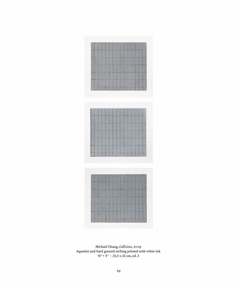
Michael Chang, Collisions, 2009Aquatint and hard ground etching printed with white ink
10,,x 9
,, | 25,5 x 23 cm, ed. 3
29

Michael Chang, Haptics I — Hugging, 2009Aquatint and hard ground etching printed with white ink and soft ground etching printed with graphite
10,,x 9
,, | 25,5 x 23 cm, monoprint
30

Michael Chang, Haptics II — Caressing, 2009Aquatint and hard ground etching printed with graphite and soft ground etching printed with black
10,,x 9
,, | 25,5 x 23 cm, monoprint
31

Michael Chang, Haptics III — Tickling, 2009Aquatint, hard ground etching and soft ground etching on gampi paper chine collé
10,,x 9
,, | 25,5 x 23 cm, monoprint
32

Michael Chang, Haptics IV — Kissing, 2009Aquatint, hard ground etching and soft ground etching printed with graphite on gampi paper chine collé
10,,x 9
,, | 25,5 x 23 cm, monoprint
33

Michael Chang, Haptics V — Closeness, 2009Ghostprint of Haptics IV — Kissing (Previous page)
10,,x 9
,, | 25,5 x 23 cm, ghostprint
34

Michael Chang, The Unknown, 2009Aquatint and hard ground etching on gampi paper chine collé
10,,x 9
,, | 25,5 x 23 cm, monoprint
35
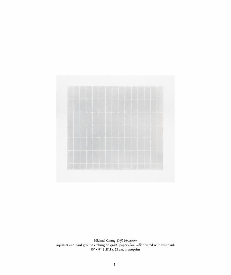
Michael Chang, Déjà Vu, 2009Aquatint and hard ground etching on gampi paper chine collé printed with white ink
10,,x 9
,, | 25,5 x 23 cm, monoprint
36

Constantin Brancusi, The Kiss, 1916Limestone, 23 x 13 1/4 x 10 inches
The Louise and Walter Arensberg Collection, 1950 Photo The Philadelphia Museum of Art/Art Resource/Scala, Florence
Philadelphia Museum of Art

I first met Trine in my Frederiksberg studio in autumn of 2008. I remember that it was raining. Trine drew inspiration for the text she later wrote about my monochromes from an oak tree in the courtyard outside my workshop, and the way the autumn rain outlined the tree’s contours on the quadrangle. It was then that I became aware of the secret brotherhood between the images we imagine and those we produce.
I met Melissa in the summer of 2009 at Crown Point Press in San Francisco, where I produced a series of aquatints. My experiences at Crown Point Press felt like an alignment with universal energies. Meeting Melissa was one of many déjà-vues I had while in the USA that summer. I don’t remember the words we exchanged, but the memory remains as a mixture of blue, green, brown and purple hues.
Between my plane and these two writers’ texts is a concordance, a sort of resonance. It is a human transmission, and I feel privileged to be on its wavelength.
Michael ChangPainter and PrintmakerCopenhagen – Østerbro
October 2009
Post Scriptum
Digital catalogue: ISBN 978-87-992964-3-9Hard copy: ISBN 978-87-992964-2-2