the impact of state borders on mobility and regional labor
TRANSCRIPT

The Impact of State Borders on Mobility and RegionalLabor Market Adjustments∗
Riley Wilson
December 29, 2020
Preliminary Do Not Cite or Circulate
Abstract
I document a new empirical pattern of internal migration in the US. Namely, thatcounty-to-county migration drops off discretely at state borders. In other words, peopleare three times as likely to move to a county 15 miles away, but in the same state, thanto move to an equally distant county in a different state. This gap remains evenamong neighboring counties, or counties in the same commuting zone. This pattern isnot explained by differences in county characteristics, is not driven by any particulardemographic group, and is not explained by pecuniary costs such as changes in stateoccupational licensing, taxes, or transfer program generosity. However, I find thatcounty-to-county commuting follows a similar pattern as does social connectedness (asmeasured by the number of Facebook linkages). This would be consistent with peoplelacking information about opportunities in other states, but also consistent with psychiccosts such as the loss of a social network or geographic identify playing a role. Thisempirical pattern has real economic impacts. Building on existing methods, I showthat employment in border counties adjusts more slowly after local economic shocksrelative to interior counties. These counties also exhibit less in-migration, suggestingthe lack of migration leads to slower labor market adjustment.Keywords: Internal Migration, Commuting, Social Networks, Border DiscontinuitiesJEL Codes: J6, R1
∗Department of Economics, 435 Crabtree Technology Building, Brigham Young University, Provo UT,84602. Phone: (801)422-0508. Fax: (801)422-0194. Email: riley [email protected]. I gratefully acknowledgehelpful comments from Enrico Moretti, Lars Lefgren, Abigail Wozniak, and participants at SEA and theBYU brownbag.
1 Introduction
The United States has traditionally been seen as a highly mobile country, with 18-20 per-
cent of people changing their county of residence in a five year period. Even with the steady
declines in internal migration over the last 40 years, the United States still exhibits higher
internal mobility than most European countries (Molloy et al., 2011). Migration is tradi-
tionally seen as an opportunity for individuals to encounter better labor market options and
a mechanism through which local labor markets adjust to both positive and negative shocks
(Blanchard and Katz, 1992). As such, it is often seen as an important component of labor
market fluidity and contributing to economic dynamism (Molloy et al., 2016).
I document a new aspect of US internal migration that potentially limits labor market
fluidity and to date has not been documented. It is well-known that migration rates fall
with distance as the cost of moving increases and places become more dissimilar. Using the
Internal Revenue Service (IRS) migration data, I show that county-to-county migration flows
gradually decline as the distance between two counties grows, but conditional on distance,
cross-state border flows are drop substantially. People are three times as likely to move to a
different county in the same state, than an equally distant county in a different state. This
pattern persists when I control for local characteristics or focus on close county pairs or
counties we would expect to be “connected”. In this paper, I explore why this cross-border
drop in migration exists, and whether or not it impacts the way local labor markets adjust
to economic shocks.
In the theoretical migration choice model, a discontinuous drop in migration rates at
state borders could be due to (1) differences in location specific characteristics and utility,
(2) differences in pecuniary moving costs, (3) differences in non-pecuniary moving costs, or
(4) frictions, market failures, or biases that lead people to behave differently than the classical
model would suggest. The discontinuity at state borders is not explained by characteristics of
the origin or the destination, or even differences between the origin and destination in labor
1

markets characteristics, industry composition, demographic composition, natural amenities,
political leaning, or home values. Suggesting this is not driven by differences in location
specific utility. Furthermore this gap persists when we focus on counties that we would
traditionally think of being more inter-connected, such as counties in the same commuting
zone or MSA and even neighboring counties.
Pecuniary costs that might differentially change at state borders from state-level regu-
lation, such as differences in occupational licensing, state income taxation, or state transfer
policy do not explain the gap. Furthermore, the same discontinuity is present when examin-
ing county-to-county commute flows, suggesting the discontinuity is not driven by pecuniary
adjustment costs that arise when moving from one state to another (e.g., updating vehicle
registration). In ACS microdata, the share of migrants that cross state borders do not sta-
tistically differ across age, race/ethnicity, gender, employment, or family structure groups,
suggesting differences in the preferences or costs across these groups do not explain the pat-
tern. More educated individuals and federal employees that do have significantly different
shares, have higher shares of cross-border migrants, which would work against the reduction
in migration across state borders. One dimension of heterogeneity that does lead to signif-
icant differences is whether or not the individual was initially residing in their birth state.
Migrants are half as likely to cross-state borders if they were originally in their birth state.
This might be related to the role of non-pecuniary costs. People might face differentially
weaker social networks or less institutional knowledge when they move across state lines.
Using the social connectedness index (Bailey et al., 2018), I find a similar geographic dis-
continuity in Facebook friendship rates across state borders. Although causal relationships
potentially run in both directions, it is clear that people are less socially connected to people
just across state borders. A lack of social connections might mean non-pecuniary psychic
costs associated with a cross-border move (such as loss of a social network) are high, but
might also be indicative of information frictions associated with moving to another state.
Adding origin/destination Facebook network controls explains most of the role of distance
2

on migration, and approximately two thirds of the gap between same-state and cross-state
migration, but a significant difference still remains. This would suggest most of the drop in
county-to-county migration across state borders can be explained by a lack of social networks
leading to higher pecuniary costs or information frictions.
This feature of US internal migration affects the dynamic adjustment of labor markets to
local shocks. Following existing methods exploring the persistence and recovery from reces-
sions (Hershbein and Stuart, 2020), I show that counties on a state border, where migration
to and from neighboring counties is smaller, see slower recoveries in employment. These
counties also see significantly less in-migration after the recession, leading to persistently
worse labor market outcomes. This suggests that state border will lead to differences in
local labor market dynamism.
2 Data
I briefly outline each main data sources here, with full detail in the data appendix. Most
of my data analysis relies on the annual IRS Statistics of Income (SOI) county-to-county
migration flows. This data is constructed by tracking the number of tax units and tax
exemptions (to proxy for households and people) that change their individual tax return
form 1040 filing county from one filing year to the next. I divide the number of exemptions
by the county population (in thousands) to measure the number of migrants per 1,000 people.
Because the IRS data does not provide migration flows for subpopulations, I supplement
this data with migration microdata from the American Community Survey (ACS). The ACS
is approximately a one percent sample of households in the US and documents individual
and household measures ranging from household structure and demographics to employment
and place of residency in the previous year. I use the ACS microdata to examine migration
differences across inidividual demographic characteristics, occupation, and estimated income
tax burden. I use microdata from the 2012-2017 waves.1
1I do not use data from earlier years, because the smallest geographic measure, public use micro-areas
3

I also explore commuting mobility using county-to-county commute flows constructed
from the LEHD Origin Destination Employment Statistics (LODES), which link where work-
ers live and work. In this data it is possible to observe annual cross-county and cross-state
commute flows.
To understand the impact of state borders on social networks I use the Social Connect-
edness Index (SCI) which maps county-to-county Facebook friendship networks Bailey et al.
(2018). This data takes a snapshot of active Facebook users in 2016 and reports the number
of Facebook friends in each county pair, scaled by an unobserved scalar multiple to maintain
privacy.
I supplement this data with annual Surveillance, Epidemiology, and End Result (SEER)
county population counts, which are population estimates from the Census Bureau and state
policy data from various sources. Each of these sources are documented in full in the data
appendix.
3 Documenting the Empirical Pattern: Relationship between State
Borders and County-to-County Migration
Even in the raw migration data there are distinct patterns in county-to-county migration by
both distance and state borders. For all county pairs in the contiguous US with population
centroids 15-60 miles apart, I plot the average number of migrants per 1,000 people in 2017
in one mile bins for counties in the same state, and counties in different states in Figure
1.2 For both series migration rates fall as distance increases. However, at the same distance
migration rates to same-state counties are approximately three times as high as migration
rates to cross-state counties.
I parameterize the above relationship to test the significance of the discontinuity by
(PUMA) definitions were updated in 2012.2There are no cross-border county pairs that have population centroids less than 6 miles apart. I restrict
the comparison to county pairs at least 15 miles apart to where there are more cross-border pairs so thepattern is not driven by a few observations. I also limit to counties 60 miles or less apart to avoid acompositional shift from small counties to large counties in the West.
4

estimating the following regression
Mig. Rateod =59∑b=15
βb(Diff. State*b Miles Apart) + γb(b Miles Apart) + εod (1)
The outcome is the origin destination specific number of migrants per 1,000 people at the
origin, and the explanatory variables are the interactions between an indicator for whether
the counties are in different states and a vector of one mile distance bins. The 60 mile bin is
omitted as the reference group. The γb coefficients trace out the migration rates for counties
in the same state, while the βb coefficients indicate how much lower the migration flows are
for counties that are in the same distance bin, but in a different state. Standard errors are
corrected for clustering at the origin county level. For clarity, I will present the coefficients
in figure form, with the γb coefficients and the total effect for counties in different states
(βb + γb) plotted with 95 percent confidence intervals. I use the final year of IRS migration
data, 2017, so there is only one observation per origin/destination pair. As I show in the
appendix, the state-border discontinuity is similar through all the years of data since 1992
(see Appendix Figure A2).
To test the sensitivity of the state-border discontinuity I adjust equation (1) to include
origin fixed effects to control for characteristics of the origin, destination fixed effects to
control for characteristics of the destination, and observable origin/destination pair specific
differences in local measures to control for pairwise differences as follows
Mig. Rateod =59∑b=15
βb(Diff. State*b Miles Apart) + γb(b Miles Apart) +X ′odΓ + φo + δd + εod
(2)
The Xod vector includes differences in origin and destination labor markets (unemployment
rates, employment to population ratios, average weekly wages, and industry shares); differ-
ences in the population, as well as the gender, racial, ethnic, and age composition of the
origin and destination; differences in natural amenities such as the average temperature in
January and July, average sunlight in January, average humidity in July, and USDA natural
5

amenity score; differences in the 2016 presidential Republican vote share; and differences in
average home values. As seen in Figure 1, controlling for any differences between the origin
and destination does not close the gap.
This pattern is not simply driven by the composition of counties that are close to or
border other states. If I restrict the sample to only include counties that are within 60 miles
of a county in a different state (thereby eliminating counties from state interiors as seen in
the map in Appendix Figure A1), migration patterns are nearly identical. Migration rates to
same-state counties in a close proximity are nearly twice as high as migration rates to equally
distant counties in a different state. Throughout my analysis I will focus on this subset of
counties, within 60 miles of a county across state lines, but the patterns are unchanged if we
include all county pairs within 60 miles of each other.
This is a pattern that has not been documented previously and is perhaps unexpected
given beliefs about high US mobility (Molloy et al., 2011). The first goal of this paper is
identify potential mechanisms that help explain the state-border discontinuity in migration
or that can be ruled out as a driving force. The second goal of this paper is to document
to what extent this migration friction impacts the dynamism of local labor markets and the
persistence of local economic shocks.
4 Potential Explanations
To codify potential explanatory mechanisms, I turn to the theoretical model of migration.
In its simplest form, the individual migration decision is modeled as a comparison between
the utility gain and the cost associated with moving from origin o to destination d (Sjaastad,
1962), as follows
Moveod =
1 if ui(Xd) − ui(Xo) ≥ ciod
0 else
(3)
6

where utility is a function of location specific characteristics. The cost of moving can be
decomposed into pecuniary costs associated with moving (γiod) and non-pecuniary, utility
costs associated with moving (ψiod), such has having to leave friends, family, and familiar
settings. Distance between o and d could plausibly impact both the pecuniary and non-
pecuniary costs of moving. The migration rate from o to d can be captured as the share of
the population at o for whom
ciod < c∗iod = ui(Xd) − ui(Xo). (4)
For state borders to matter in the migration decision they must (1) impact the local char-
acteristics that contribute to utility differences between the origin and destination d, (2)
impact the pecuniary cost of moving, (3) impact the non-pecuniary cost of moving, or (4) be
associated with some friction, market failure, or behavioral bias that disrupts the decision
in equation 3.3 Building on this theory and previous work exploring the drivers of migration
behavior, I next explore the role of leading potential mechanisms.
4.1 Differences in Utility
Discrete changes in labor market opportunities, demographic characteristics, natural ameni-
ties, or housing markets at state borders could result in discrete differences in utility across
state borders. To rule out discrete changes in local characteristics, I present evidence similar
to a regression discontinuity design plotting how average characteristics in 2017 change as the
distance between origin and destination decreases. If average origin/destination differences
in characteristics for same-state pairs and cross-state pairs diverge as the distance between
the origin and destination decreases, this could be a potential mechanism. For each county
pair there will be flows in two directions, so by construction differences between the origin
3Adding multiple potential destination turns the decision into a multinomial decision where the individualchooses the destination where ui(Xd) − ui(Xo) − ciod is the largest. For state borders to matter, the samepotential channels are present, but the relative importance of these channels in other potential destinationswill also matter.
7

and destination by distance will be mean zero. For this reason, I examine absolute differences
in county pair characteristics. I examine origin/destination differences in labor market mea-
sures (the unemployment rate, employment to population ratio, average weekly wages); in
industry shares (share in natural resources and mining, construction, manufacturing, trade,
information, finance, professional, education and health, hospitality, public sector, and all
others); in demographics (total population, share female, non-Hispanic White, non-Hispanic
Black, non-Hispanic other, Hispanic, under 20, 20-34, 35-49, 50-64, and 65 and older); in
natural amenities (the January average temperature, January average sunlight, July average
temperature, July average humidity, and the USDA natural amenities scale); in the 2016
presidential Republican vote share; and in the county housing price index, converted to dol-
lars using the median house value from 2000. These plots are presented in Appendix Figures
A3 and A4. Because there are few county pairs less than 15 miles apart my analysis focuses
on county pairs that are between 15 and 60 miles apart. For each measure I shade in gray
origin/destination pairs that are less than 15 miles apart. Consistent with few observations
within 15 miles of each other, the spread increases and standard errors on the local linear
polynominals become large as we approach zero.
There are no significant differences in average local labor market, demographic, natural
amenity, vote share, or housing market measures or systematically changing at state borders,
especially if we focus on counties 15 to 60 miles apart. Once again as we saw above in Figures
1 and 2, controlling for these differences does not impact the discontinuity in migration rates
at the state border. If anything, the difference in migration rates becomes larger.4
Another way to determine if the discontinuity is driven by differences in utility is to
focus on county pairs that are “close” or believed to be more connected, such as counties
that border each other or are in the same commuting zone (CZ) or metropolitan area (MSA).
These counties are more likely to be in the same markets (e.g., housing and labor markets)
4Appendix Figure A5 documents how the coefficient on the 20 mile bin changes as we add various groupsof controls on either a constrained sample that has all non-missing control measures or an unconstrainedsample. This pattern is not unique to the 20 mile bin.
8

and face more similar conditions. in Figure 3, we see the same distance gradient and cross-
border penalty for counties in the same CZ, in the same MSA, or that border each other.
People are at least twice as likely to move to a neighboring county in the same state then
move to a neighboring county in a different state.5 As seen in Appendix Figure A6, this
pattern also holds for individual MSA when we focus on counties in well-known cross-state
MSAs like New York City, Washington DC, or Kansas City.
4.2 Differences in Pecuniary, Adjustment Costs
The drop in migration across state borders does not appear to be driven by differential
changes in the benefit of migration, but there might be differential changes in the cost.
There are many pecuniary costs associated with moving (e.g., renting a moving truck, or
hiring movers). Most of these would be incurred whether the move was across a state-border
or not. However, there are some pecuniary costs associated with moving that differentially
impact in-state and cross-state moves. For example, you are required to renew your license
and car registration when you moved to another state, but not if you move to a different
county in the same state. State laws, policies, and requirements might also lead to differential
pecuniary costs associated with cross-state moves. I explore several potential themes that
have been highlighted in the internal migration literature.
Occupational Licensing
Some states require licenses, certificates or education/training requirements for someone to
work in pre-specified occupations.6 In some cases, these requirements do not include state
reciprocity, meaning a qualification in one state is void in another. Johnson and Kleiner
(2020) show that among 22 universally licensed occupations where licensing exams are ei-
ther state-specific or nationally administered, state-specific licensing rules reduce interstate
5Among the sub-sample of neighboring counties standard errors are large when using one mile bins. Thisis because there are relatively fewer observations in each one mile bin. The differences are more preciselyestimated when larger bins, that contain more observations, are used.
6See Kleiner and Soltas (2019) for a full treatment of the welfare impacts of occupational licenses.
9

migration by approximately 7 percent. However, they note that these effect sizes can only
explain a small share of the aggregate trends in interstate migration. To determine if oc-
cupational licenses produce the drop in migration across state borders I explore total and
cross-state migration rates by occupation in the ACS in Figure 4. First I plot the share of
individuals in each non-licensed occupation that moved in the last year on the x-axis, and
the share that moved out-of-state on the y-axis. Each occupation is weighted by the summed
sampling weights for all of the workers in that occupation. The linear relationship between
these two migration shares is plotted in black with 95 percent confidence intervals. In gen-
eral, occupations that have a higher migrant share have a higher out-of-state migrant share.
Using occupational licensing measures from the State Policy Index and Johnson and Kleiner
(2020), I then overlay the plot for occupations that have a recorded occupational license.
If low out-of-state migration was caused by occupation licenses, we would expect licensed
occupations to be systematically lower on the y-axis. However, this is not the case, licensed
occupations are not outliers and the linear relationship (in gray) for licensed occupations
is not significantly different than the relationship for unlicensed occupations. State occu-
pational licenses do not seem to drive the drop in migration at the border, consistent with
previous work suggesting licensing only explains a small share of aggregate state-to-state
migration trends (Johnson and Kleiner, 2020).
State Taxation
Taxation also varies across state lines, leading to large differences in tax burden across state
borders. State income tax rates vary between 0 and 13.3 percent (Loughead, 2020). Moretti
and Wilson (2017) find that star scientists are sensitive to these income tax differences.
Differences in tax burden and state income taxes could lead to discontinuous changes in mi-
gration at state borders. However, if it is driven by tax burden, we would expect asymmetric
behavior across borders with different state tax policy. I will estimate the following equation
to determine of cross-border county-to-county migration rates differ when the tax burden is
10

larger, when the tax burden is smaller, or when the counties are in the same state.
Mig. Rateod =59∑b=15
βb(Higher*Diff. State*b Miles Apart)+θb(Lower*Diff. State*b Miles Apart)+γb(b Miles Apart)+X ′odΓ+φo+δd+εod
(5)
Where Higher indicates that the state income tax burden in the potential destination
county is greater than the state income tax burden in the origin county. Lower indicates
that the state income tax burden in the destination is less than or equal to the burden at
the origin. The βb represent the differential migration to counties in different states with a
higher tax burden, while the θb represent the differential migration to counties in a different
state with a tax burden less than or equal to the origin. Using tax burden estimates from
the NBER TAXSIM I examine how the role of state borders differ in Figure 5 when I split
by the tax burden for households that are married and filing jointly with two children, and
income of either $25,000, $50,000, $75,000, or $100,000.7
Across all income levels, the tax burden split yield similar migration patterns to counties
in states with higher or lower income tax burdens. For county pairs between 15 and 25
miles apart, the point estimates are slightly larger when the state income tax burden in the
destination state is weakly less than the origin, but these estimates are not statistically dif-
ferent than those for destinations with a higher income tax burden. Conditional on distance,
migration to both cross-border groups is still less than half the level within state.
Unfortunately the IRS migration data does not allow me to link households to their
individual income tax burden. To focus on household specific tax burden I turn to the ACS
microdata. For family units in the 2012-2017 ACS microdata I use TAXSIM to calculate their
income specific state and federal income tax burden. By moving the focus to a household,
rather than a county-to-county migration flow, identifying the potential destination is not
straightforward. To focus on the origin/destination decisions that ex ante are the most
7Income details for the TAXSIM calculations are available in Appendix C. Estimates for householdswith $10,000 of income are also available in Appendix Figure A7. Estimates for single head of householdsand married filing jointly (with no children) households at the same income levels are available in AppendixFigure A8 and A9.
11
likely, I limit the sample to families originally living in commuting zones that cross state
lines, and then calculate the average income tax burden the family would face in the other
state(s) in the commuting zone.8 I then calculate the percent change in total federal and
state tax burden between the original state and the other state in the commuting zone.9 In
Appendix Figure A10 I plot the share of migrants who move out-of-state in one percentage
point bins of the change in the total tax burden. If state income tax policy led to the
reduction in migration across the state border, we would expect the share of migrants that
move out-of-state to decrease as the income tax burden increases with a cross-state move.
Consistent with state taxes playing a role, the share of migrants that move across state
lines is often higher when there is a large reduction in tax burden, but it is more disperse.
However, it is also higher with more dispersion when there is a large increase in tax burden.
There is no significant linear relationship between the change in tax burden and the out-
of-state migration share. Although some subpopulations might be sensitive to tax burden
changes (such as star scientists (Moretti and Wilson, 2017)), it does not appear to drive the
discontinuity at state lines.
State Transfer Policy and “Welfare Migration”
State transfer programs also differ, leading to discontinuities in potential low-income benefits
at state lines. This could affect costs, but could also differentially affect the utility associated
with a cross-border move. There is a long literature exploring interstate migration in response
to state low-income benefit generosity, or “welfare migration.” Gelbach (2004) find that
low-income populations that move across state lines tend to move to higher benefit states,
while Borjas (1999) documents a similar pattern among non-native immigrants. McKinnish
(2007) and McKinnish (2007) find higher welfare expenditures in high-benefit states on
the border of high and low benefit states. Welfare reform policy changes in the 1990s
8For commuting zones with multiple states, I compare the tax burden in the origin state to the averagetax burden in the other states.
9As some states do not have an income tax, I consider the federal plus state income tax burden.
12

reduced interstate migration of less-educated unmarried mothers (Kaestner et al., 2003),
while medicaid expansions associated with the Affordable Care Act (ACA) did not increase
migration to expansion states (Goodman, 2017). McCauley (2019) finds that migration to
health care benefits in the UK depends on access to information.
Based on the existing work, I focus on three state transfer policies that affect low income
households and vary across state lines: Temporary Aid for Needy Families (TANF), ACA
medicaid expansions, and earned income tax credit (EITC) state supplements. I also exam-
ine the role of the effective state or national minimum wage, another policy that impacts
the income of low-income households. For each of these policies I estimate a model similar
to equation (5), but Higher and Lower now reference the benefit generosity in the destina-
tion state relative to the origin state. These estimates are plotted in Figure 6. Migration
rates to cross-border destinations with higher minimum wages, higher state EITCs, higher
TANF benefits, and medicaid expansions were not significantly different that migration rates
to cross-border destinations with lower benefits, respectively. In all cases, cross-border mi-
gration was significantly lower than within state migration, conditional on distance. For
close counties the point estimates among lower EITC states were lower than among higher
EITC states, while the point estimates among non-medicaid expansion states were lower
than among expansion states, but these differences are not significant. The discontinuity in
migration across state borders does not appear to be driven by differences in state transfer
policy.
Other Adjustment Costs
There might be other pecuniary moving costs that add up but are difficult to record or
measure. Commuters can cross state-lines without incurring many of these adjustment costs
associated with moving (such as updating registration), so if there is a similar state-border
drop in commuting, it is likely not driven by these factors. I estimate equations (1) and (2),
with county-to-county commute flows from the LEHD LODES as the outcome. In Figure
13

7, we see that county-to-county commute rates follow a similar pattern. Commuting rates
decreases with distance, but are significantly lower for cross-state border county pairs, even
conditional on distance. This gap remains when controlling for origin and destination fixed
effects as well as differences in local characteristics. Because commuters do not face the same
adjustment costs but respond similarly, the drop in migration at state borders is likely not
solely driven by pecuniary adjustment costs.10
Consistent with this evidence, cross-border migration rates are similar across demo-
graphic groups that might face different adjustment costs. Using microdata from the 2012-
2017 American Community Survey (ACS), I calculate the fraction of migrants that move
across state lines by age, gender, race/ethnicity, education, living arrangements, and em-
ployment (see Figure 8). Among migrants, the share that cross state borders is fairly stable
across most groups, between 15 and 22 percent.11 There is an education gradient, with the
share of migrants moving across state lines increasing with education. Migrants that are
federal workers are also substantially more likely to move across state borders, at roughly 43
percent.12 Both of these patterns would work against a drop in migration at state borders.
Consistent with the gap not being driven by pecuniary costs, we don’t see lower out-of-state
migration for families with children (e.g., changing school district adjustment costs) or state
and local employees who are more likely to have state-specific pension benefits. The group
with the lowest point estimate is migrants that originally resided in their birth state, while
migrants originally residing outside their birth state are over twice as likely to move out of
state.
10One potential adjustment cost commuters would still face is the ease with which you can cross theborder. This might be particularly challenging if the state border follows a river and there are limitedcrossings. In Appendix Figure A12 I plot estimates from a specification similar to equation (5), where stateswith and without river borders are treated separately. There are several points between 18 and 24 miles apartwhere migration rates across non-river borders is not significantly different from within state migration, butoverall the estimates are still lower and significantly different.
11The patterns are similar if I restrict the sample to migrants originally living in cross-state commutingzones.
12This share is similar if I exclude people initially in the Washington DC area (DC, MD, and VA).
14

4.3 Differences in Non-Pecuniary Costs
Individuals also face non-pecuniary psychic costs associated with moving. People might face
weaker social network connections or lose institutional knowledge when moving to a new area.
As we saw in Figure 8, migrants were much less likely to cross state lines if they originally
resided in their birth state. In Figure 9 I explore this further by estimating equation (1)
with the scaled number of Facebook friends between each county pair divided by the origin
population as the outcome. This measure is known as the SCI and is constructed from a
snapshot of active Facebook users in 2016. There is a similar distance gradient in the number
of Facebook friends, but once again, friendship rates are significantly lower for cross-border
county pairs than for counties in the same state. Including origin and destination fixed
effects or differences in labor market, demographic, natural amenities, or housing markets
between the origin and destination do no significantly impact the pattern.
In Figure 10 I estimate equation (2) but also control for the origin/destination Facebook
friendship rate. The difference between same-state and cross-border county pairs is com-
pressed significantly, but still significant. For close counties 15-25 miles apart) the gap falls
from 3-6 migrants per 1,000 people to 0.5-2 migrants per 1,000 people. Interestingly, the
distance gradient for cross-state pairs completely disappears when we control for the social
network (consistent with Diemer (2020)), but there is still a slight distance gradient for
same-state county pairs. A causal relationship between migration and social networks could
go in either (or both) directions. A lack of social network could imply large non-pecuniary
costs, leading to high migration costs and low levels of migration. Alternatively, low levels
of migration for other reasons, could lead to more regional isolation and lower social network
spread.
4.4 Migration Frictions and Market Failures
Frictions, behavioral biases, and market imperfections could also exist that keep people from
following the behavior in equation (3). Since social networks become more sparse across
15

state lines, it is plausible information frictions exist that differentially keep people from
fully understanding returns and conditions in counties outside of their home state. Previous
work has found that access to information about government programs increases welfare
migration (McCauley, 2019) and information about labor demand shocks increases migration
to economic opportunities (Wilson, 2020). Without an exogenous source of information or
change in the social network, we can not disentangle whether the pattern in social networks
relates to migration through non-pecuniary costs of social network strength or a lack of
information.
Other behavioral biases and frictions might also exist. For example, people might exhibit
“home bias” and systematically discount the return at non-home locations because they
identify with a given location. This would be consistent with less cross-state migration from
people in their birth state and more cross-state migration from people originally outside of
their birth state. In order for these frictions and biases to explain the state-border discon-
tinuity, they must have differential impacts at state borders and even impact counties that
are close or in the same market (CZ or MSA).13
5 Impact of State-Border Discontinuities on Local Labor Market
Adjustment to Shocks
Reduced social network strength across state borders seem like a plausible mechanism that
leads to an empirical reduction in migration at state borders, either by increasing non-
pecuniary costs or introducing information frictions. Whether the reduction in migration is
due to social networks or some other factor, it is unclear if this empirical pattern has real
impacts.
13One mechanism for “home bias” would be the in-state preference among public universities. In AppendixFigure A13 I test to see if cross-state migration is different in origin states where the share of public universityenrollment that comes from within state is above or below the median. This does not appear to affect thedrop in migration across state borders. Having a university with students enrolled from nearly all of thestates (45) in the state also does not appear to explain the drop in cross-state migration, although theestimates are less precise here.
16

Migration flows are thought to be an important mechanism for labor markets to adjust
to local shocks (Blanchard and Katz, 1992). Reduced mobility between neighboring counties
on state borders might inhibit the rate at which labor markets adjust. In recent work,
Hershbein and Stuart (2020) use event study methods to explore the employment dynamics
of local labor markets after recessions in the US. They find that although employment starts
to return to previous levels, negative effects persist for up to ten years.
Following their framework, I estimate a similar event study framework, but allow the
dynamics of border and non-border counties to differ, as follow
ln(Yct) =τ=2017∑τ=2003
γτ (CZ shock* Year τ) + βτ (Border*CZ shock* Year τ) + δc + αt + εct (6)
The outcome of interest is the natural log of total employment, population, the employment
to population ratio, or migration flows (in or out) in county c in year t. This is regressed on a
set of year fixed effect interacted with the size of the recession in the local labor market (com-
muting zone). This is measured as the change in commuting zone log employment between
2007 and 2009. Following Hershbein and Stuart (2020), 2005 is used as the omitted year.14
I also include a second set of interactions, that allow the effect to deviate for counties on the
state border (Border = 1). The dynamic effects for non-border counties are represented by
the γτ coefficients while the dynamic effects for border counties are represented by γτ + βτ .
County and year fixed effects are also included. Standard errors are corrected for clustering
at the level the recession shock is measured, the commuting zone. Event study plots are
presented in Figure 11.
For both border and non-border counties, recessions lead to a large, persistent decrease
in employment and the employment to population ratio. However, in border counties both
employment and the employment to population ratio are persistently lower and there is
14Results are similar if I control for the 2005 outcome rather than the county fixed effect, as Hershbeinand Stuart (2020) suggest (see Appendix Figure A14. Because the shock is constructed at the commutingzone rather than the county-level the mechanical relationship between the “treatment” and the outcome isbroken.
17
virtually no recovery up to ten years after the shock. These gaps are large, with employment
and employment to population remaining 0.2-0.4 log points lower in border counties.15 A
one percent drop in local employment is associated with 0.5 percent lower employment in
2017 in non-border counties, but an effect twice that size in border counties. In short,
border counties still have not experienced an employment recovery 10 years after the start of
the Great Recession. Consistent with the overall migration patterns documented here, this
appears to be driven by differences in in-migration. In-migration to border counties is nearly
0.4 log points lower for the 6 years after the end of the recession. Out-migration from border
counties is also lower, but significantly different. This pattern is consistent with prior work,
showing that in-migration is more responsive to local economic shocks (Monras, 2018), and
appears to be amplified in border counties.
Consistent with the drop in in-migration, total population also falls. Point estimates
in border counties are marginally larger, but not significantly different. The impacts on
employment would suggest that the employment propensity of in-migrants must be different
in border and non-border counties. County border status does not appear to have differential
impacts on average weekly wages.
Being a border county and experiencing less migration from neighboring counties leads to
less labor market recovery after a recession, and more persistent negative impacts. Regardless
of the mechanism behind the state-border discontinuity in migration, this empirical pattern
has large and lasting impacts on labor market dynamism.
6 Conclusion
I present new evidence that county-to-county migration in the US falls discontinuously across
state borders. The drop in cross-state migration is large (a 60-70 percent reduction for close
counties), persists when examining border counties or counties in the same labor market,
15Year-to-year effects are only significantly different between border and non-border counties in the lateryears, but outcomes from 2008 on are jointly significantly different.
18
and is not confined to particular demographic groups. Using the theoretical migration choice
model to infer potential causes of this pattern, I find that differences in local characteristics
which could differentially impact utility do not drive the difference. Occupational licensing
and state income taxation do not appear to drive the gap, and other pecuniary adjustment
costs are unlikely to be the sole driving force as county-to-county commuting follows a similar
pattern.
Non-pecuniary costs and frictions play a potentially important role. Facebook friend
networks exhibit a similar drop across state borders, and controlling for the Facebook network
drastically mitigates the cross-state migration gap. This would suggest that the lack of social
connections or the lack of information that might be transferred through social networks is
associated with lower county-to-county migration.
This empirical pattern has real economic impacts. Border counties see lower in-migration
after local economic shocks, and see persistently lower levels of employment and employment
to population ratios. This sheds new light on how we should view and evaluate geographic
differences in labor market dynamism. Future work is needed to better pinpoint (1) if the
network effect is due to non-pecuniary costs or information frictions, (2) if other frictions,
behavioral biases, or mechanisms drive the empirical pattern, and (3) if there are policy tools
that can mitigate or offset the economic impact of this type of migration behavior.
19

References
Bailey, M., Cao, R., Kuchler, T., Stroebel, J., and Wong, A. (2018). Social connectedness:
Measurement, determinants, and effects. Journal of Economic Perspectives, 32(3):259–
280.
Blanchard, O. J. and Katz, L. F. (1992). Regional evolutions. Brookings Papers on Economic
Activity, 1.
Borjas, G. J. (1999). Immigration and welfare magnets. Journal of Labor Economics, 17:125–
135.
Diemer, A. (2020). Spatial diffusion of local economic shocks in social networks: Evidence
from the us fracking boom. Papers in Economic Geography and Spatial Economics, No.
13, LSE Geography and Environment Discussion Paper Series.
Gelbach, J. (2004). Migration, the life cycle, and state benefits: How low is the bottom?
Journal of Political Economy, 112:1091–1130.
Goodman, L. (2017). The effect of the affordable care act medicaid expansion on migration.
Journal of Policy Analysis and Management, 36(1):211–238.
Hershbein, B. and Stuart, B. (2020). Recessions and local labor market hysteresis. working
paper.
Johnson, J. E. and Kleiner, M. M. (2020). Is occupational licensing a barrier to interstate
migration? American Economic Journal: Economic Policy, 12(3):347–373.
Kaestner, R., Kaushal, N., and Ryzin, G. V. (2003). Migration consequences of welfare
reform. Journal of Urban Economics, 53(3):357–376.
Kleiner, M. M. and Soltas, E. J. (2019). A welfare analysis of occupational licensing in u.s.
states. NBER Working Paper No. 26383.
20

Loughead, K. (2020). State individual income tax rates and brackets for 2020. Tax Founda-
tion, Fiscal Fact No. 693.
McCauley, J. (2019). The role of information in explaining the lack of welfare-induced
migration. Working Paper, University of Bristol.
McKinnish, T. (2007). Welfare-induced migration at state borders: New evidence from
micro-data. Journal of Public Economics, 91(3-4):437–450.
Molloy, R., Smith, C. L., Trezzi, R., and Wozniak, A. (2016). Understanding declining
fluidity in the u.s. labor market. Brookings Papers on Economic Activity.
Molloy, R., Smith, C. L., and Wozniak, A. (2011). Internal migration in the united states.
Journal of Economic Perspectives, 25(2):1–42.
Monras, J. (2018). Economic shocks and internal migration. CEPR Discussion Paper No.
DP12977.
Moretti, E. and Wilson, D. J. (2017). The effect of state taxes on the geographic location of
top earners: Evidence from star scientists. American Economic Review, 107(7):1858–1903.
Sjaastad, L. (1962). The costs and returns of human migration. Journal of Political Economy,
70(5):80–93.
Wilson, R. (2020). Moving to jobs: The role of information in migration decisions. Journal
of Labor Economics, Forthcoming.
21

Tables and Figures
Figure 1: County-to-County Migration Rates by Distance and for Same-State and Different-State Counties
Notes: Outcome is number of migrants per one thousand people at the origin county using the IRS SOIcounty-to-county flows from 2017. This is then averaged into 1-mile bins for county pairs in the same state andcounty pairs in different states. Distance is the distance between the population weighted county centroids.The ”with Controls” plots coefficients for one-mile bins from equation (2) , accounting for origin fixed effects,destination fixed effects, and differences between the origin and destination county in labor market measures(the unemployment rate, employment to population ratio, average weekly wages), differences in industryshares (share in natural resources and mining, construction, manufacturing, trade, information, finance,professional, education and health, hospitality, public sector, and all others), differences in demographics(total population, share female, non-Hispanic White, non-Hispanic Black, non-Hispanic other, Hispanic,under 20, 20-34, 35-49, 50-64, and 65 and older) differences in natural amenities (the January averagetemperature, January average sunlight, July average temperature, July average humidity, and the USDAnatural amenities scale), the 2016 presidential Republican vote share, and differences in the county housingprice index, converted to dollars using the median house value from 2000. 95-percent confidence intervalsare provided.
Source: Author’s own calculations using the 2017 IRS SOI.
22

Figure 2: County-to-County Migration Rates by Distance and for Same-State and Different-State Counties, Counties Within 60 Miles of State Border
Notes: Sample restricted to counties that are less than 60 miles from another county in a different state.Outcome is number of migrants per one thousand people at the origin county using the IRS SOI county-to-county flows from 2017. This is then averaged into 1-mile bins for county pairs in the same state and countypairs in different states. Distance is the distance between the population weighted county centroids. The”with Controls” plots coefficients for one-mile bins from equation (2) , accounting for origin fixed effects,destination fixed effects, and differences between the origin and destination county in labor market measures(the unemployment rate, employment to population ratio, average weekly wages), differences in industryshares (share in natural resources and mining, construction, manufacturing, trade, information, finance,professional, education and health, hospitality, public sector, and all others), differences in demographics(total population, share female, non-Hispanic White, non-Hispanic Black, non-Hispanic other, Hispanic,under 20, 20-34, 35-49, 50-64, and 65 and older) differences in natural amenities (the January averagetemperature, January average sunlight, July average temperature, July average humidity, and the USDAnatural amenities scale), the 2016 presidential Republican vote share, and differences in the county housingprice index, converted to dollars using the median house value from 2000. 95-percent confidence intervalsare provided.
Source: Author’s own calculations using the 2017 IRS SOI.
23

Figure 3: County-to-County Migration Rates by Distance for Connected and Close Counties
Notes: Sample restricted to counties that are less than 60 miles from another county in a different state.Each panel plots the coefficients from equations (1) and (2) for a different subset of counties. In Panel A,only counties in a cross-state CZ are included. In Panel B, only counties in a cross-state MSA are included.In Panel C, only contiguous counties are included. 95-percent confidence intervals are provided.
Source: Author’s own calculations using the 2017 IRS SOI.
24
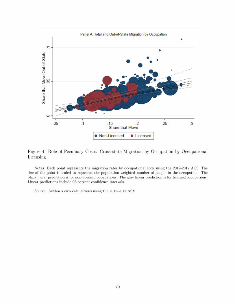
Figure 4: Role of Pecuniary Costs: Cross-state Migration by Occupation by OccupationalLicensing
Notes: Each point represents the migration rates by occupational code using the 2012-2017 ACS. Thesize of the point is scaled to represent the population weighted number of people in the occupation. Theblack linear prediction is for non-licensed occupations. The gray linear prediction is for licensed occupations.Linear predictions include 95-percent confidence intervals.
Source: Author’s own calculations using the 2012-2017 ACS.
25

Figure 5: Role of Pecuniary Costs: Differences in State Income Tax Burden by Income Level
Notes: Sample restricted to counties that are less than 60 miles from another county in a different state.Each panel plots the coefficients from equation (5) with and without controls, where Higher is having ahigher state income tax burden. For each income level, the state income tax burden is calculated for amarried household filing jointly with 2 children using Taxsim. Cross-border county pairs classified as havinga state income tax burden that is less than or equal to the tax burden in the origin state or greater than inthe origin state. 95-percent confidence intervals are provided.
Source: Author’s own calculations using the 2017 IRS SOI.
26

Figure 6: Role of Pecuniary Costs: Differences in State Transfer Policy and “Welfare Migra-tion”
Notes: Sample restricted to counties that are less than 60 miles from another county in a different state.Each panel plots the coefficients from equation (5) with and without controls, where Higher is having amore generous state policy specified. Cross-border county pairs classified as having a state benefit that isless than or equal to the benefit in the origin state or greater than in the origin state. 95-percent confidenceintervals are provided.
Source: Author’s own calculations using the 2017 IRS SOI.
27

Figure 7: Role of Pecuniary Costs: Impact of State Borders on County-to-County CommuteFlows
Notes: Point estimates from equation (1) and (2) are plotted, where the outcome is the number ofcommuters per 1,000 people at the origin, from the 2017 LODES. 95-percent confidence intervals are included.
Source: Author’s own calculations using the 2017 LODES.
28

Figure 8: Role of Pecuniary Costs: Cross-State Migration Across Demographic Groups
Notes: Each point represents the share of migrants that move across state borders within the last yearusing the 2012-2017 ACS.
Source: Author’s own calculations using the 2012-2017 ACS.
29

Figure 9: Role of Non-Pecuniary Costs: Impact of State Borders on County-to-County Facebook Friendship Rates
Notes: Coefficients from equations (1) and (2) are plotted where the outcome is the number of Facebook Friends of residents in the destinationcounty per person in the origin county in 2000 using the SCI. 95-percent confidence intervals are included.
Source: Author’s own calculations using the 2016 SCI and 2017 IRS SOI.
30

Figure 10: Role of Non-Pecuniary Costs: Mediating Role of Facebook network on Migration Rates
Notes: Coefficients from equation (2) where the outcome is the migration rate and when we also control for the county-to-county Facebookfriendship rate are plotted. 95-percent confidence intervals are included.
Source: Author’s own calculations using the 2016 SCI and 2017 IRS SOI.
31

Figure 11: Impact of State Borders on Labor Market Recovery After the Great Recession
Notes: Event study coefficients from the equation (6) are plotted with 95 percent confidence intervals, andrepresent the percent change in outcomes relative to 2005, for each percentage point increase in commutingzone employment reduction between 2007 and 2009. Observation at the county by year level. County, state-by-year fixed effects, as well as an indicator for being a border county interacted with year fixed effects areincluded. Standard errors corrected for clustering at the commuting zone level.
Source: Author’s own calculations using the 2000-2017 QCEW and 2000-2017 IRS SOI.
32

Appendix Tables and Figures
Figure A1: Counties within 60 Miles of a County in a Different State
Notes: Counties with a population centroid less than 60 miles from the population centroid of anothercounty in a different state are indicated.
Source: Author’s own calculations.
33

Figure A2: Impact of State Borders on County-to-County Migration from 1992 to 2017
Notes: Average migration rates for same-state and cross-state county pairs in the 20 mile bin are plottedfor 1992-2017. Also estimates for the 20 mile bin are obtained by regressing equation (2) for each yearfrom 1992 to 2017 separately are plotted. 95-percent confidence intervals are provided. IRS migration datameasures changed significantly in 2011 and 2013. In 2011, the IRS extended the data collection period fromSeptember to the end of the year, which includes more complicated returns. They also used the informationof other household members to identify links over time. Prior to 2013, county-to-county flows below 10 taxunits (households) was suppressed. In 2013 that limit increased to 20.
Source: Author’s own calculations using the IRS county-to-county flows from 1992 to 2017.
34

Figure A3: Role of Differences in Utility: Changes in Local Characteristics at State Border
Notes: Average difference in characteristics in one mile bins for county pairs in the same state anddifferent states are plotted with local linear polynomial regressions and 95-percent confidence intervals.There are few county pairs within 15 miles of each other, and these are excluded from my main analysis.These pairs are shaded in gray for reference.
Source: Author’s own calculations using the SEER 2017 data, NCSL 2016 vote data, and FHFA HPI2017 data.
35

Figure A4: Role of Differences in Utility: Changes in Local Industry Composition at StateBorder
Notes: Average difference in characteristics in one mile bins for county pairs in the same state anddifferent states are plotted with local linear polynomial regressions and 95-percent confidence intervals.There are few county pairs within 15 miles of each other, and these are excluded from my main analysis.These pairs are shaded in gray for reference.
Source: Author’s own calculations using the QCEW 2017 data.
36

Figure A5: Estimate Sensitivity to Each Separate Group of Controls
Notes: Point estimates for the 20 mile bin are obtained by regressing equation (2) including each group of controls separately are plotted. 95-percent confidence intervals are provided. The panel on the left does not constrain the sample to be the same across all specifications. The panel onthe right constrains the sample to be the same, requiring non-missing controls across all types of controls.
Source: Author’s own calculations using the IRS county-to-county flows from 2017.
37
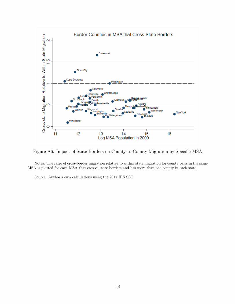
Figure A6: Impact of State Borders on County-to-County Migration by Specific MSA
Notes: The ratio of cross-border migration relative to within state migration for county pairs in the sameMSA is plotted for each MSA that crosses state borders and has more than one county in each state.
Source: Author’s own calculations using the 2017 IRS SOI.
38

Figure A7: Role of Pecuniary Costs: Differences in State Income Tax Burden for JointHouseholds with 2 Children, $10,000 Income
Notes: Sample restricted to counties that are less than 60 miles from another county in a different state.Each panel plots the coefficients from equation (5) with and without controls, where Higher is having ahigher state income tax burden. For each income level, the state income tax burden is calculated for amarried household filing jointly with 2 children using Taxsim. Cross-border county pairs classified as havinga state income tax burden that is less than or equal to the tax burden in the origin state or greater than inthe origin state. 95-percent confidence intervals are provided.
Source: Author’s own calculations using the 2017 IRS SOI.
39

Figure A8: Role of Pecuniary Costs: Differences in State Income Tax Burden by IncomeLevel for Single Households
Notes: Sample restricted to counties that are less than 60 miles from another county in a different state.Each panel plots the coefficients from equation (5) with and without controls, where Higher is having ahigher state income tax burden. For each income level, the state income tax burden is calculated for a singlehouseholder using Taxsim. Cross-border county pairs classified as having a state income tax burden thatis less than or equal to the tax burden in the origin state or greater than in the origin state. 95-percentconfidence intervals are provided.
Source: Author’s own calculations using the 2017 IRS SOI.
40

Figure A9: Role of Pecuniary Costs: Differences in State Income Tax Burden by IncomeLevel for joint Households
Notes: Sample restricted to counties that are less than 60 miles from another county in a differentstate. Each panel plots the coefficients from equation (5) with and without controls, where Higher is havinga higher state income tax burden. For each income level, the state income tax burden is calculated fora married household filing jointly without children using Taxsim. Cross-border county pairs classified ashaving a state income tax burden that is less than or equal to the tax burden in the origin state or greaterthan in the origin state. 95-percent confidence intervals are provided.
Source: Author’s own calculations using the 2017 IRS SOI.
41

Figure A10: Share of Households that Move Out-of-State by Expected Percent Increase inTax Burden
Notes: Sample is limited to families originally living in a commuting zone that crosses a state border.Each point represents the share of migrants that moved across state borders, by the difference in the averagetotal income tax burden associated with moving between the origin state and the other state(s) in thecommuting zone. The black line indicates the linear relationship.
Source: Author’s own calculations using the 2012-2017 ACS Microdata.
42

Figure A11: Role of Pecuniary Costs: Differences in State Sales Tax Burden
Notes: Sample restricted to counties that are less than 60 miles from another county in a different state.Each panel plots the coefficients from equations (1) and (2) where the characteristic is the state incometax burden. For each income level, the state income tax burden is calculated for a married household filingjointly using Taxsim. Cross-border county pairs classified as having a state income tax burden that is lessthan or equal to the tax burden in the origin state or greater than in the origin state. 95-percent confidenceintervals are provided.
Source: Author’s own calculations using the 2017 IRS SOI.
43

Figure A12: Role of Pecuniary Costs: States Separated by Rivers vs. Arbitrary Borders
Notes: Sample restricted to counties that are less than 60 miles from another county in a different state.Coefficients from equation (2) where the characteristic is the presence of a river border between states.95-percent confidence intervals are provided.
Source: Author’s own calculations using the 2017 IRS SOI.
44
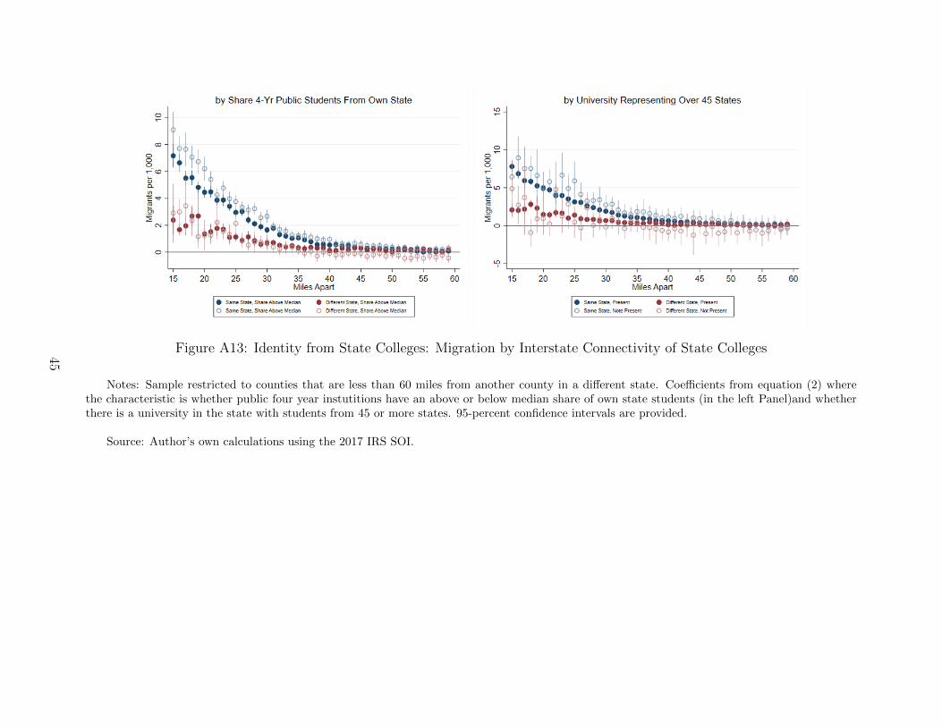
Figure A13: Identity from State Colleges: Migration by Interstate Connectivity of State Colleges
Notes: Sample restricted to counties that are less than 60 miles from another county in a different state. Coefficients from equation (2) wherethe characteristic is whether public four year instutitions have an above or below median share of own state students (in the left Panel)and whetherthere is a university in the state with students from 45 or more states. 95-percent confidence intervals are provided.
Source: Author’s own calculations using the 2017 IRS SOI.
45
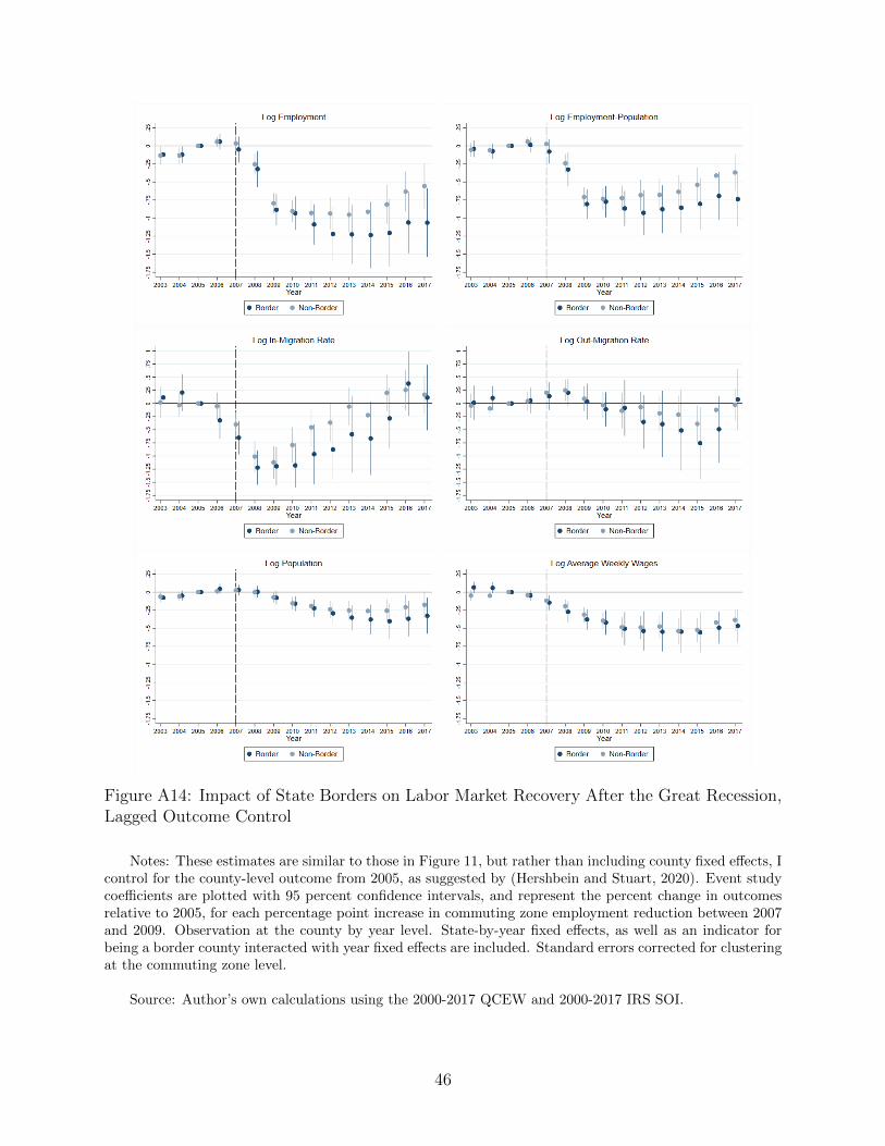
Figure A14: Impact of State Borders on Labor Market Recovery After the Great Recession,Lagged Outcome Control
Notes: These estimates are similar to those in Figure 11, but rather than including county fixed effects, Icontrol for the county-level outcome from 2005, as suggested by (Hershbein and Stuart, 2020). Event studycoefficients are plotted with 95 percent confidence intervals, and represent the percent change in outcomesrelative to 2005, for each percentage point increase in commuting zone employment reduction between 2007and 2009. Observation at the county by year level. State-by-year fixed effects, as well as an indicator forbeing a border county interacted with year fixed effects are included. Standard errors corrected for clusteringat the commuting zone level.
Source: Author’s own calculations using the 2000-2017 QCEW and 2000-2017 IRS SOI.
46