the impact of air pollution on infant … · the impact of air pollution on infant mortality:...
TRANSCRIPT

NBER WORKING PAPER SERIES
THE IMPACT OF AIR POLLUTION ON INFANT MORTALITY:EVIDENCE FROM GEOGRAPHIC VARIATION IN POLLUTION
SHOCKS INDUCED BY A RECESSION
Kenneth Y. Chay Michael Greenstone
Working Paper 7442http://www.nber.org/papers/w7442
NATIONAL BUREAU OF ECONOMIC RESEARCH1050 Massachusetts Avenue
Cambridge, MA 02138December 1999
We are grateful to Richard Blundell, David Card, Anne Case, Angus Deaton, Bill Evans, Richard Freeman,Jon Gruber, Michael Hanemann, Judy Hellerstein, Han Hong, Bo Honoré, Caroline Hoxby, Hilary Hoynes,Ted Joyce, Larry Katz, Jeff Kling, Helen Levy, Ellen Meara, Aviv Nevo, Anne Piehl, Jack Porter, Jim Powell,Chris Ruhm, Doug Staiger and participants of seminars at Princeton, UC-Berkeley, Harvard, and Maryland,and the NBER Summer Institute Child Studies Workshop for helpful comments. Paul Torelli, Doug Almond,Justine Hastings, and Joshua Roth provided excellent research assistance. Funding from NSF Grant No.SBR-9730212 is gratefully acknowledged. The views expressed herein are those of the authors and notnecessarily those of the National Bureau of Economic Research.
© 1999 by Kenneth Y. Chay and Michael Greenstone. All rights reserved. Short sections of text, not toexceed two paragraphs, may be quoted without explicit permission provided that full credit, including © notice,is given to the source.

The Impact of Air Pollution on Infant Mortality: Evidence from Geographic Variation in Pollution Shocks Induced by a RecessionKenneth Y. Chay and Michael GreenstoneNBER Working Paper No. 7442December 1999JEL No. I12, Q25, Q28
ABSTRACT
This study uses sharp, differential air quality changes across sites attributable to geographic variation
in the effects of the 1981-82 recession to estimate the relationship between infant mortality and particulates
air pollution. It is shown that in the narrow period of 1980-82, there was substantial variation across
counties in changes in particulates pollution, and that these differential pollution reductions appear to be
orthogonal to changes in a multitude of other factors that may be related to infant mortality.
Using the most detailed and comprehensive data available, we find that a 1 mg/m3 reduction in
particulates results in about 4-8 fewer infant deaths per 100,000 live births at the county level (a 0.35-0.45
elasticity). The estimated effects are driven almost entirely by fewer deaths occurring within one month and
one day of birth, suggesting that fetal exposure to pollution has adverse health consequences. The
estimated effects of the pollution reductions on infant birth weight provide evidence consistent with this
potential pathophysiologic mechanism. The analysis also reveals a nonlinear relationship between pollution
and infant mortality at the county level. Importantly, the estimates are remarkably stable across a variety
of specifications. All of these findings are masked in “conventional” analyses based on less credible
research designs.
Kenneth Y. Chay Michael GreenstoneDepartment of Economics Robert Wood Johnson FellowUniversity of California, Berkeley University of California, Berkeley549 Evans Hall 140 Warren HallBerkeley, CA 94720 Berkeley, CA 94720and NBER [email protected]@econ.berkeley.edu

Introduction
The impact of air pollution on infant health is a topic of considerable interest to a wide range of
researchers and policy analysts. Previous research has documented a statistical association between
differential pollution levels across sites and variation in adult health outcomes. Evidence on the
pollution-health relationship comes from three types of studies: 1) cross-sectional investigations of the
correlation between adult mortality rates and pollution levels across U.S. cities; 2) time-series analyses of
the correlation between daily adult mortality rates and pollution levels within a given site; and 3) cohort-
based longitudinal studies of adults which suggest that particulates pollution results in excess mortality.
However, a heated debate has arisen about whether these documented correlations are causal. At
issue is the possibility that since air pollution is not randomly assigned across localities, previous studies
may not adequately control for a number of confounding determinants of mortality. These include the
length of exposure and the characteristics of the exposed population. For example, areas with higher
pollution levels also tend to have higher population densities, different economic conditions, and higher
crime rates; all of which could contribute to differential adult health outcomes.
This basic “omitted variables” problem is analogous to the confounding that arises from the
individual choice-based nature of cigarette smoking that complicates studies of the relation between
smoking and lung cancer (Cook 1980). In the ideal controlled experiment, subjects would be randomly
assigned to different levels of air pollution exposure, and then subsequent health outcomes in the high and
low pollution exposure groups would be compared. Any observed differences in outcomes could be
causally attributed to pollution since random assignment ensures that differential pollution exposure
would be independent of all other factors determining mortality.
Since randomized clinical trials are not feasible, our solution to this evaluation problem is to use
an event that caused sharp differential changes in air pollution across sites within a narrow time frame to
identify the effects of particulate matter pollution on infant mortality. In particular, this study exploits
geographic variation in pollution changes from 1980 to 1982 induced by the 1981-82 recession. The
1981-82 recession caused extremely large reductions in suspended particulates pollution in heavily
industrialized sites, such as Pittsburgh, PA, where many manufacturing plants were shut down. Not

2
surprisingly, locations that neighbored the areas where the recession had a heavy impact also experienced
air quality improvements. On the other hand, sites that did not contain pollution-intensive manufacturing
and did not neighbor such counties experienced minimal pollution changes.
The analysis compares changes in infant mortality rates in counties that had large reductions in
pollution to the changes in counties with small or no pollution reductions. To implement our approach,
we bring together the most detailed and comprehensive data available on air pollution, infant births and
deaths, and other potential determinants of infant health; including parental characteristics, the health
endowment and medical history of the mother, the utilization of medical services such as prenatal care,
and transfer payments from programs such as Medicaid. While there is substantial variation across
counties in changes in particulates pollution from 1980-82, there appear to be virtually no confounding
changes in any of the other measured factors. The 1980-82 period is unique in this regard, since there
appears to be a much greater potential for confounding in cross-sectional analyses. Since the pollution
changes vary substantially and many of the reductions are quite large, another advantage of the 1980-82
period is that it allows us to examine potential nonlinearities or thresholds in the relationship between
pollution and infant mortality. Knowledge about these potential thresholds is crucial for determining the
optimal design of federal regulatory policy for air pollution.
The evidence suggests that this quasi-experimental research design provides a more credible basis
for evaluating the pollution-infant mortality relationship than those used in previous studies. The
conventional cross-sectional estimates are very sensitive to specification and provide little evidence of a
systematic relationship between pollution and infant mortality. Based on the research design of this
study, however, we find a significant impact of pollution reductions on decreases in infant mortality rates
at the county level, with a 1 mg/m3 particulates reduction resulting in about 4-8 fewer infant deaths per
100,000 live births (a 0.35-0.45 elasticity). The estimated effects are driven almost entirely by fewer
deaths occurring within one month and one day of birth, suggesting that fetal exposure to pollution has an
adverse impact on health. The estimated effects of the pollution changes on infant birth weight provide
evidence consistent with this potential pathophysiologic mechanism and exhibit similarities to previously
documented findings on the birth weight effects of maternal smoking.

3
Just as importantly, the estimated impact of pollution is remarkably stable across a variety of
specifications. For example, the estimates are insensitive to the inclusion of many, detailed covariates as
controls. As a test of internal validity, we also find that air pollution appears to have no effect on infant
deaths attributable to accidents and homicides. Since county-level income changes appear to be the most
relevant potential confounder, we further refine the treatment and control group analysis by matching
counties with similar income shocks. We find no evidence of an interaction effect between pollution
changes and income changes. However, the analysis reveals a nonlinear relationship between pollution
and infant mortality at the county level. In addition, there is some evidence that black infant mortality
may be more sensitive to county-level pollution reductions than infant mortality as a whole, while female
infant mortality may be less sensitive. All of these findings are masked in “conventional” analyses based
on less credible research designs. The timing and location of the dramatic reductions in suspended
particulates pollution and the abrupt shifts in infant mortality rates from 1980-82 provide evidence that air
pollution has a causal effect on infant health.
Previous Findings on the Association between Air Pollution and Mortality
For many centuries, it has been suspected that there is a relationship between air pollution and
human health.1 The strongest evidence comes from developing countries and a few historical episodes of
extreme pollution concentrations. Since randomized experiments are unethical, it has been difficult to
determine whether there are adverse health consequences at the lower levels of pollution that prevail
today in developed nations. Ultimately, this question can only be resolved by using convincing research
designs to estimate the function that maps pollution into mortality rates. Here, we review the previous
empirical literature and describe the barriers to obtaining credible estimates of this relationship.
The first generation of research on the relationship between air pollution and human health comes
from studies in which pollution concentrations dramatically exceed the levels that currently predominate
in the United States. For example, Wang, et al. (1997) document a positive correlation between total
1 Concerned about his citizens’ “bodily health,” King Edward I banned the burning of coal in 1307.

4
suspended particulates (TSPs) concentrations and the risk of low birth weight in China, where TSPs
concentrations are six times greater than those recorded in this study. A number of other studies have
examined historical “episodes” in which pollution concentrations reached unprecedented levels due to
weather inversions that trapped air pollution in valleys. In one instance, people could not see objects as
close as 20 feet away. In the best known examples of these episodes in Donora, PA (1948), London,
England (1952), and the Meuse Valley of Belgium (1930), researchers reported dramatic increases in the
rates of morbidity and mortality. Although the biological mechanisms through which pollution harms the
body are still poorly understood, a consensus exists on the link between health and radically elevated
concentrations of air pollution (Holland, et al. 1979, Wilson 1996).
The current generation of research has explored whether human health is affected by the lower
levels of pollution that prevail on a more typical day. This research can be categorized into three types of
studies: 1) cross-sectional investigations of the correlation between adult mortality rates and pollution
levels across U.S. cities; 2) time-series analyses of the correlation between daily adult mortality rates and
pollution levels within a particular city; and 3) cohort-based longitudinal studies of adults which have
shown associations between fine particulate pollution and excess mortality.
The cross-sectional studies have found that cities and counties with higher concentrations of
particulates pollution tend to have higher rates of adult and infant mortality (Lave and Seskin 1977,
Mendelsohn and Orcutt 1979, Chappie and Lave 1982, Lipfert 1984, Joyce, Grossman, and Goldman
1989, Özkaynak and Thurston 1987, Woodruff, Grillo, and Schoendorf 1997). The estimates from the
adult mortality studies suggest that a 10 mg/m3 increase in particulates pollution is associated with a 3-9%
increase in total mortality. However, some observers believe that the magnitude of these effects is
implausibly large, particularly in light of the relatively low levels of pollution that currently prevail (Pope
and Dockery 1996). Moreover, the strength of the associations is sensitive to the inclusion of social and
demographic control variables, such as cigarette smoking rates and access to health care, and to the
particular cities included in the sample; all of which mitigates confidence in the findings.
Another concern with these studies is that they implicitly assume that the current citywide
pollution concentration accurately measures each resident’s lifetime exposure to pollution. A simple

5
example highlights the problems with this assumption. Consider the case of two 30 year-old women
living in St. Louis. Suppose that the first woman has lived there her entire life. The “lifetime exposure”
assumption implies that pollution concentrations have been constant in St. Louis over the last 30 years.
Suppose the second woman moved to St. Louis at age 29. In her case, the assumption implies that the
unknown location(s) where she previously lived had the same pollution levels that St. Louis currently
does. Given the dramatic changes in pollution levels that have occurred both within and across cities over
the last 50 years, this assumption is unlikely to hold for either person. Due to the inability to precisely
determine individuals’ lifetime exposure to air pollution, it is questionable whether the cross-sectional
estimates solely reflect the effects of air pollution.
A second body of evidence comes from time-series studies of acute exposure, in which (typically)
daily changes in air pollution are linked to daily changes in health outcomes within a city. These studies
have found increased rates of cardiovascular and respiratory deaths, asthma attacks, and respiratory
problems on days with higher levels of particulates pollution (Dockery and Pope 1996). The reliability of
these findings rests on the reasonable presumption that confounding is less likely than in cross-sectional
studies since many of the potential confounding variables (i.e., cigarette smoking patterns, access to
medical care, etc.) are constant within a city over short periods of time. These studies also find that TSPs
pollution, particularly finer particles, which result from the combustion of fuels, has the strongest
associations with adult mortality across all types of air pollution.
A substantive criticism of these studies, particularly the ones that focus on mortality as the
outcome of interest, is that air pollution may have caused individuals who were already very ill to die
slightly earlier than they would have otherwise, and that the life expectancy loss is minimal.2 This
hypothesis suggests that the individuals who constituted the “excess” deaths were likely to die in a few
days anyway. Spix, et al. (1994) and Lipfert and Wyzga (1995) find that daily mortality rates declined on
2 Epidemiologists refer to this phenomenon as “harvesting,” while statistically it is referred to as negative serialcorrelation. Interestingly, there was no evidence of negative serial correlation in mortality rates in the previouslymentioned episodes of extreme pollution concentrations.

6
the days immediately following the high pollution days. Consequently, some believe that these studies
fail to provide strong evidence that current levels of air pollution have substantial long-run health effects.
The third, most recent, set of studies is prospective cohort studies of adult mortality. These
studies have the attractive feature of tracking individuals over time, not a group of ill-defined individuals
in a community, and contain detailed individual-level data on alternative risk factors, including cigarette
smoking histories, body mass indices, education levels, alcohol use, and occupational exposure to
pollution. The two most widely known studies found that adjusted mortality rates are higher in cities with
greater concentrations of particulate pollution (Dockery, et al. 1993; Pope, et al. 1995).3
There are several concerns regarding the reliability of these results. As before, the measures of
ambient pollution concentration used may not be representative of the subject’s long-term cumulative
exposure, particularly in the dirtiest cities. For example, Dockery, et al. (1993) use only the measures of
pollution at the beginning of their study, and Pope, et al. (1995) only use pollution concentrations in the
1979-1981 period although they examine health outcomes from 1983-1989. The individual’s lifetime
exposure to pollution is unknown. In addition, Chay and Greenstone (1998) document that federal air
pollution regulations caused particulates concentrations to decline disproportionately more in the dirtiest
cities. Consequently, an analysis that only uses initial levels of pollution as a measure of exposure will
not account for the large differential changes in particulates pollution that may have occurred across the
cities of interest. Finally, some have suggested that these studies are prone to substantial biases due to
unobserved factors (Fumento 1997). For example, the Dockery study did not control for a number of
factors, including income and citywide characteristics.
In summary, the previous literature has documented an association between air pollution and
adult mortality. However, the reliability of this evidence has been seriously questioned for several
reasons. First, since air pollution is not randomly assigned across locations, previous studies may not be
adequately controlling for a number of potential confounding determinants of adult mortality. It is known
3 Interestingly, Dockery, et. al. (1993) did not find a statistically significant effect of pollution on health when thesample was limited to either nonsmokers or those without occupational exposure to “gases, fumes, or dust.”

7
that areas with higher pollution levels also tend to have higher population densities, different economic
conditions, and higher crime rates; all of which could contribute to differential health outcomes. In
addition, the lifetime exposure of the individual to pollution is unknown in all three types of studies.
Finally, it is possible that the excess adult deaths that are attributed to changes in air pollution occur
among the already sick and represent little loss in life expectancy.
A New Research Design for Evaluating the Pollution-Infant Mortality Relationship
This study attempts to circumvent these “identification” problems by examining the effects of
pollution on infant mortality in a narrow two-year window with one of the most striking changes in
pollution over the last thirty years. First, the problem of unknown lifetime exposure to pollution is
significantly mitigated, if not solved, by the low migration rates of pregnant women and infants. Here,
pollution levels are assigned to infants based on the exposure of the mother during the gestational period
and the exposure of the newborn during the first few months after birth (the analysis focuses on infant
deaths within 24 hours, 28 days, and 1 year of birth).4 In addition, given that the mortality rate is higher
in the first year of life than in the next 20 years combined (NCHS 1999), it seems reasonable to presume
that infant deaths represent a large loss in life expectancy.5
Most importantly, our analysis is based on a research design in which it is plausible that the
variation in air pollution changes across counties that is used is orthogonal to changes in the potential
confounding factors. Since the ideal of randomized clinical trials is not feasible, our “solution” to this
evaluation problem is to use an event that caused sharp differential changes in air quality across sites
within a narrow time frame to identify the impact of particulate matter on infant mortality. Specifically,
this study exploits geographic variation in pollution changes from 1980 to 1982 induced by the 1981-82
recession. The availability of an event that causes differential changes in air pollution but is unrelated to
unobserved determinants of infant health allows for unbiased inference on this relation.
4 It is possible that a mother’s lifetime exposure to air pollution, and not just exposure while pregnant, may alsoimpact infant health. One would expect any bias arising from unknown lifetime exposure of the mother to be small.5 Relative to the adult mortality studies, another advantage of an analysis which focuses on infant deaths within 1-day, 1-month, and 1-year of birth is that it circumvents the measurement problem of unpredictable time delays(“delayed causation”) in the impact of pollution exposure on eventual death.

8
Figure 1A presents trends for the U.S. in average total suspended particulates (TSPs) pollution
and average ozone concentrations across counties for the years 1971-1990 (the data sources are described
below).6 From the figure, it is clear that air quality, as measured by TSPs pollution, improved
dramatically in the 1970s and 1980s with particulate emissions falling from an average of above 75
mg/m3 to less than 50 mg/m3. All of these improvements occurred in two punctuated periods, 1971-1975
and 1980-1982. Chay and Greenstone (1998) show that most of the improvements in 1971-75 can be
attributed to the federal air pollution regulations imposed at the county-level by the EPA after the 1970
Clean Air Act Amendment (CAAA). On the other hand, most of the 1980-82 pollution changes can be
attributed to the differential impacts of the 1981-82 recession across counties. Remarkably, the air quality
improvements in this two-year period are as large as those that occurred in the five years following the
1970 CAAA. The figure also suggests that TSPs pollution levels are particularly sensitive to economic
shocks when compared to ozone pollution levels, which are relatively stable throughout the period.7
The 1981-82 recession caused extremely large reductions in suspended particulates pollution in
heavily industrialized sites, such as Pittsburgh, PA, where many manufacturing plants were shut down.8
Not surprisingly, locations that neighbored the areas where the recession had a heavy impact also
experienced air quality improvements.9 On the other hand, sites that did not contain pollution-intensive
manufacturing and did not neighbor such counties experienced minimal pollution changes. Our analysis
compares the changes in infant mortality rates in counties that had large reductions in pollution to the
changes in counties with small or no pollution reductions for the 1980-1982 period. Below, we further
refine the treatment and control group analysis by comparing infant mortality changes in counties that had
no pollution reductions to changes in counties that had large pollution reductions because they neighbor
6 Average TSPs pollution is based on about 1,000-1,300 counties a year, and average ozone concentrations are basedon about 300-450 counties a year. The counties with TSPs data account for almost the entire U.S. population.7 Carbon monoxide pollution, while trending down during this period, also appears to be insensitive to the cycle.8 The death of heavily polluting, older plants, such as steel plants, that were never reopened accounts for therelatively mild reversion back of pollution levels during the post-1982 recovery period. Also, new plant openingsand investment at existing plants fell under the purview of the stricter 1977 Clean Air Act Amendment, whichrequired the installation of state of the art pollution abatement technology and the acquisition of offsets for thepollution arising from these new investments.9 Cleveland, et. al. (1976) and Cleveland and Graedel (1979) provide evidence on the “trans-boundary” nature of airpollution (e.g., wind patterns often transport air pollution hundreds of miles).

9
counties that were impacted by the recession and not because they themselves experienced an economic
shock. To implement our approach, we bring together the most detailed and comprehensive data
available on air pollution, infant births and deaths, and other potential determinants of infant health.
This quasi-experimental research design may provide a more credible basis for evaluating the
pollution-infant mortality relationship than those used in previous studies. First, the differential changes
in TSPs pollution across counties in this very narrow time-frame are both dramatic and abrupt.
Consequently, this study has the feature of an interrupted time-series design with many control groups
(Cook and Campbell 1979). Second, while there is substantial variation across counties in changes in
TSPs pollution from 1980-82, we find little evidence of confounding changes in any of the unprecedented
number of factors that we can control for. Also, presuming that pollution should have no effect on infant
deaths attributable to accidents and homicides, we use these “external” causes of death to check the
internal validity of our findings. The unique circumstances that prevailed in the 1980-82 period provide
an invaluable opportunity to falsify the hypothesis that pollution and infant mortality are causally related.
Finally, potential “thresholds” or nonlinearities in the relationship between pollution and infant
mortality are a controversial point in the epidemiological literature. Since the pollution changes vary
substantially and many of the reductions are quite large, another advantage of the 1980-82 period is that it
may allow for an examination of these potential nonlinearities. The existence of thresholds has immense
implications for determining the optimal design of federal regulatory policy for particulates pollution.
For example, as a result of the 1970 CAAA, the EPA established federal pollution standards to be applied
at the county-level. In the case of TSPs pollution, if a county’s emissions exceeded an annual geometric
mean of 75 mg/m3 in a given year, then the county would be designated as “non-attainment” and its plants
would be subject to strict EPA regulations in the following year. If the county’s emissions were below
this ceiling, then it would be classified as “attainment” and its plants would be subject to much less
regulation (see Chay and Greenstone 1998). Clearly, the optimality of this regulatory ceiling depends
crucially on the existence and magnitude of the health effects of pollution above and below it.
Before proceeding, a case study of changes in TSPs pollution and infant mortality in
Pennsylvania before and after the 1981-82 recession illustrates many of the basic findings of this study.

10
As mentioned above, Pennsylvania is a particularly compelling example since it is known that many steel
plants, a major emitter of particulate matter, shut down during this period, especially in and around
Pittsburgh.10 In all of Pennsylvania, mean TSPs pollution was relatively stable at about 70-74 units from
1978-80 and then declined precipitously to about 53 units by 1982-83. At the same time, in 1978-80
infant deaths within one year of birth attributable to “internal” causes (e.g., respiratory and
cardiopulmonary deaths) were stable and occurred at the rate of about 1315-1380 per 100,000 births. But
from 1980-82, the internal infant mortality rate declined from 1,315 to 1,131, and remained at this lower
level in 1983-84. While not controlling for all changes that may have occurred in the absence of the
pollution decline, these numbers imply that a 1 mg/m3 decline in TSPs pollution may result in about 10-
11 fewer infant deaths per 100,000 births, which is an elasticity of 0.5-0.6. Figure 2 illustrates the
striking correspondence of these time-series patterns.
Underlying this 1980-82 change was a decrease in the number of infant deaths of 220, from 1,815
to 1,595, and an increase in the total number of births from 138,075 to 141,011. The 1980-82 decline in
the number of infant deaths occurring within 28 days of birth was 215, suggesting that the results are
driven almost entirely by a reduction in neonatal mortality. Also, it is noteworthy that while the total
number of births monotonically increased from 1978-82, they declined in 1983-84, suggesting that births
respond to the recession with a lag. Specifically, per-capita incomes in Pennsylvania fell in 1979-82
before rebounding by 1984.11
The timing of the changes alone could support a causal interpretation of this case study since it is
unlikely that other factors were changing as precipitously from 1980-82. However, our analysis utilizes
every “case study” available in the U.S. from 1980-82 while using control groups and adjustment for
10 Ransom and Pope (1995) use the “intermittent operation of a steel mill” as a quasi-experiment for examining thehealth effects of pollution in Utah Valley, using a neighboring valley as a control group.11 A similar analysis of the Pittsburgh metropolitan area, consisting of Allegheny, Beaver, Butler, Fayette,Washington, and Westmoreland counties, reveals nearly identical results. From 1980-82, TSP levels declined from82.1 to 55.7 units, and the internal infant mortality rate fell from 1,273 to 1,043, implying that a one-unit decline inTSPs results in almost 9 fewer infant deaths per 100,000 births. Pittsburgh accounts for one-third of the total 1980-82 decline in neonatal infant deaths in Pennsylvania, but only one-fifth of all births. Particularly striking is the factthat in Pittsburgh, the bulk of the pollution declines (18.4 out of 26.4 units) and infant mortality declines (e.g., 61out of the 71 less neonatal infant deaths) occurred in 1981-82. Taken literally, the results for PA and Pittsburghimply that there may be a nonlinearity in the effect of TSPs pollution on infant mortality at about 65-70 units.

11
potential confounding to account for changes in infant mortality rates that would have occurred in the
absence of the pollution declines.
Data Sources and Factors Associated with Infant Mortality
To implement our evaluation strategy, we brought together an unprecedented amount of unique
and comprehensive data on county-level air pollution, infant births and deaths, county economic
conditions and characteristics, and other potential determinants of infant mortality for the 1978-1984
period. This database allows for a much broader examination, both across sites and over time, than has
previously been conducted. Here, we describe the data used in this study and review the factors that are
believed to be associated with infant mortality. More details are provided in the Data Appendix.
Data Sources
Since infant death certificates cannot be directly linked to individual birth certificates for the
1978-84 period, the data for our analysis comes from merging a number of comprehensive databases.
The infant mortality information comes from the annual 1978-84 National Mortality Detail Files, which
are derived from the universe of death certificates. In addition to providing a census of all deaths in the
U.S., these files contain information on the date and cause of death and on the age, race, gender and
county of residence of the deceased. The births data come from the annual 1978-84 National Natality
Detail Files, which are derived from the universe of birth certificates and provide a census of all births in
the U.S. They contain information on the county of residence of the mother, the newborn’s healthiness,
the parents’ demographic characteristics, and the pregnancy and prenatal care histories of the mother.
The infant births and deaths microdata were merged at the county by demographic group level for
each year to create infant age, race, and gender cells for each county. For each cell, the infant mortality
rate was calculated as the ratio of the total number of infant deaths of a certain type (age and cause of
death) in a cell in a given year relative to the total number of births in that cell in the same year.12 For
12 There may be some measurement error in our measures of the infant mortality rate in each cell. For example,suppose that two infants are born on November 1, 1980, and one dies on December 31, 1980, while the other dies onJanuary 1, 1981. The first infant’s birth and death will be used in the 1980 one-year infant mortality rate calculation.The second infant’s birth will be used in the denominator of the 1980 rate, but his death will be counted in the

12
each year, the cell-level rates of death within 24 hours and 28 days of birth were also computed. The
individual microdata on the control variables available in the Natality Files were also aggregated into
annual demographic-county cells.
The resulting annual infant mortality rate data, with the multitude of control variables from the
births data files, were then merged at the county level to annual information on total suspended
particulates (TSPs) pollution concentrations, per-capita income and unemployment rates, payments from
various transfer programs, and other county characteristics. The TSPs data were obtained by filing a
Freedom of Information Act request with the EPA that yielded the Quick Look Report data file, which
comes from the EPA’s Air Quality Subsystem (AQS) database. From this file, which provides the
location of each state and national pollution monitor as well as annual statistics on the number of recorded
observations and the annual geometric mean reading, we calculated the mean TSPs concentrations for
about 1,200 counties a year (see the Data Appendix).
The per-capita income in each county during the period of interest comes from the Bureau of
Economic Analysis’ annual county-level series, which is the most comprehensive county income data
available. The county unemployment rate data come from the Employment and Unemployment for State
and Local Areas publications of the BLS. We obtained county-level information on several different
categories of transfer payments from the Regional Economic Information System (REIS). These include
separate series for expenditures on medical care for low-income individuals (primarily Medicaid and local
assistance programs); Medicare; AFDC; Food Stamps; SSI; other forms of income maintenance; and
Unemployment Insurance.
Although county-level information on Medicaid recipiency is unavailable for our period, we
obtained state-level data from the Health Care Financing Administration on the number of Medicaid
recipients, the cost per recipient, and Medicaid payments to medical vendors. Since weather conditions
are viewed by some as a potential confounder (Samet, et al. 1998), we obtained monthly temperature and
numerator of the 1981 one-year death rate. However, since about 40% and 70% of all infant deaths within a year ofbirth occur in the first 24 hours and 28 days after birth, respectively, the magnitude of this measurement error isunlikely to be substantial. Also, there will be virtually no measurement error in our measures of the infant deathrates within one-day and one-month of birth.

13
precipitation data for each state from the National Weather Service. Our annual data on manufacturing
and non-manufacturing employment levels in each county come from the County Business Patterns files.
Finally, for 1980, we collected a wealth of additional information on county characteristics, including
demographic and socioeconomic variables, crime rates, physician and hospital bed to population rates,
and fiscal and tax variables from the 1983 County and City Data Book. The Data Appendix describes the
data in greater detail and lists the full set of control variables used in this study.
The proposed research design applied to this array of detailed data provides a unique opportunity
to examine the validity of the claim that pollution has a causal impact on infant mortality. Table 1
presents summary information, by year, on the 1,077 counties with TSPs pollution data in both 1980 and
1982, which is the sample used in the pre-post quasi-experimental comparisons. First, note that these
counties consistently account for about 80% of all 3.3-3.7 million births that occur in the U.S. in a given
year, which makes this the most comprehensive study to date.13 As with Pennsylvania, the number of
births in the entire country appears to respond to the recession with a lag. While trending up from 1978-
82, the number of births declined in 1983.
The next set of rows of Table 1 present infant fatalities per 100,000 live births. “Internal” causes
are deaths associated with common health problems such as respiratory or cardiopulmonary deaths.
“External” causes are “non-health” related deaths attributable to factors such as accidents and
homicides.14 The internal infant mortality rate is about 1.1-1.3 deaths within a year of birth per 100
births, while infant deaths due to external causes are much rarer.15 40 and 70 percent of all “internal”
infant deaths within a year of birth occur within the first 24 hours and 28 days of birth, respectively.
13 Most states rely on the World Health Organization’s definition of a live birth, which is “the complete expulsion orextraction from its mother of a product of conception, irrespective of the duration of pregnancy, which, after suchseparation, breathes or shows any other evidence of life, such as the beating of the heart, pulsation of the umbilicalcord, or definite movement of voluntary muscles…” (National Center for Health Statistics 1981).14 “Internal” and “external” deaths span all possible causes of death. Deaths with a 9th International Classification ofDiseases (ICD) code from 001 to 799 are classified as internal, while those with ICD codes from 800 to 999 are inthe external category. The 1979-84 mortality files use the 9th ICD, while the 1978 file uses the 8th ICD. Wedeveloped a cross-walk from the 8th to 9th ICDs.15 Although external deaths account for only about 0.4% and 3% of all deaths within one-month and one-year ofbirth, respectively, their relative importance increases dramatically among older children. For example, in 1984external deaths accounted for 43.5% of all deaths among 1-4 year olds and 77.2% of deaths among 15-19 year olds.

14
Consequently, post-neonatal deaths make up a small fraction of all internally related deaths within the
first year of birth. On the other hand, about 90 percent of all “external” infant deaths within a year of
birth occur in the post-neonatal period. Finally, the black infant mortality rate is nearly two times greater
than the white infant death rate (OTA 1988), and increased slightly from 1978-84 (a 1.91 to a 1.98 ratio).
Figure 1B presents national trends in the internal infant mortality rate, average TSPs pollution,
and per-capita income across counties from 1978-84. From the figure, it is clear that air quality improved
dramatically from 1980-82 in percentage terms. Per-capita income decreased by less than 3% from 1978-
80 and remained relatively stable during the key 1980-82 period before rebounding in 1983 and 1984.
TSPs, on the other hand, fell by over 20% in 1980-82 (from 70.6 to 56.3 units) but were relatively steady
in the “pre” period and exhibit some mean reversion in the “post” period. Internal infant mortality within
a year of birth decreased steadily from 1978-84, with slightly larger percentage declines from 1980-82
than in the rest of the period.16
The rest of Table 1 presents 1978-84 trends for a subset of the large number of control variables
used in the analysis. Next, we discuss the factors that are believed to be associated with infant health and
how our analysis adjusts for them. Importantly, we find that: 1) the magnitude of changes in these
variables is small when compared to the pollution changes that occurred in the 1980-82 period; 2) there
are virtually no confounding changes in any of these factors; and 3) the estimates from our research
design are insensitive to the inclusion of these covariates as controls.
Socioeconomic Status, Health Behaviors, and Access to Medical Care
A correlation between socioeconomic status (SES) and infant mortality has been documented in
the U.S. and abroad.17 One channel through which SES may affect health outcomes is through maternal
health habits. Maternal cigarette smoking, drug usage, and alcohol intake are all associated with SES and
infant health outcomes (Meara 1998). Since direct information on these behaviors is unavailable for
16 At the beginning of the century, about 14 infants died within a year of birth out of every 100 births. This figurewas 10, 5, 3, and 2 by 1918, 1938, 1950, and 1970, respectively. By 1989 less than 1 out of every 100 infants diedwithin a year of birth, and currently about 0.75% of infants die before 1 year of age (Vital Statistics of the UnitedStates and Historical Statistics of the United States).17 There is a contentious debate about whether these associations are causal, or whether they reflect the influence ofan unobserved factor that is correlated with both measures of socioeconomic status and health. See Meara (1998).
15
1978-84, we use measures of income, education, race, marital status, and other demographic
characteristics of the parents to control for these factors. Controlling for income may be particularly
important since, although small when compared to the pollution shocks, there were differential income
shocks across counties during the 1980-82 period. In addition, income is believed by many to have a
direct effect on health (e.g., Ettner 1996).18 In Table 1 our measures of parental demographic and SES
characteristics suggest that the SES status of parents is generally rising from 1978-84, although the
fraction of births to single mothers and to immigrant mothers increase during the period.19 Since Ruhm
(1999) find a negative correlation between changes in unemployment rates and mortality at the state level,
our analysis also controls for changes in unemployment rates at the county level.20
SES status may also operate through access to quality health care. Prenatal care visits,
particularly those in the first trimester, are believed to be effective at increasing birth weights and
reducing infant mortality (Rosenzweig and Schultz 1983, Institute of Medicine 1985). Our data contains
information on the number of prenatal care visits, the month in the pregnancy of the first visit, whether
the birth occurred outside of a hospital, and whether a doctor was present at delivery. Table 1 shows that
while the average number of prenatal care visits was stable during the period, the likelihood that the first
visit was in the first trimester increased slightly.
There are other medical interventions that may affect an infant’s health. For example, the
presence of a local specialized neonatal intensive care unit or a public clinic is correlated with a decrease
in infant mortality rates (Institute of Medicine 1985, Menard, et al. 1998). Also, some researchers have
found that expansions of state Medicaid programs are associated with improved infant health outcomes
(Currie and Gruber 1996).21 Since these expansions did not begin in earnest until 1984, they are unlikely
18 It should be noted that our measures of income are at the county level.19 The following states do not report the mother’s marital status until 1980: California, Connecticut, Georgia,Maryland, Michigan, Montana, New York, Nevada, Ohio, and Texas. These states are not used in the % SingleMother calculations for 1978 and 1979 in Table 1.20 Ruhm (1999) uses a fixed-effects analysis of stacked 1972-91 state-level data. Interestingly, he finds littleevidence of a systematic relationship between changes in income and mortality. We find no evidence that changesin either per-capita income or unemployment rates at the county level are related to infant mortality changes.21 Hanratty (1996) also documents a health insurance-infant health relation. In both cases, the “treatment” ismeasured at a much more aggregate level than the county level.

16
to be a source of confounding in this study. Nevertheless, we have county-level controls for transfer
payments from Medicaid and other medical assistance programs for low-income individuals and state-
level controls for the number of Medicaid recipients and the cost per recipient. Notably, 1980-82 changes
in Medicaid expenditures were almost identical in counties with large and small pollution reductions.
More generally, since our key variables are measured at the county level, the analysis controls for
all unobserved infant health determinants that vary differentially across states over time by including
unrestricted state-time effects. The estimates are insensitive to their inclusion. The analysis also controls
for all permanent unobserved differences in geographic or population characteristics across counties since
it is based on within county first-differences. Finally, we find abrupt trend breaks in differences across
counties in TSPs pollution and infant mortality rates centered in 1980-82. Therefore, any alternative
explanation for the observed relationship between changes in infant mortality and pollution needs to
exhibit similar trend breaks in differences across counties within the same state in order to be viable.22
Maternal and Infant Health Endowments
The literature on the “production” of infant health emphasizes the importance of a mother’s
ability to support a fetus for nine months. This ability, frequently referred to as the maternal health
endowment, is believed to affect an infant’s survival probabilities (Rosenzweig and Schultz 1983,
Rosenzweig and Wolpin 1991).23
Although maternal health endowments are not directly observable, the natality files contain
several variables that should be associated with these endowments. Table 1 presents information on the
22 This rules out many unobservable factors such as the diffusion of birth technology. The two most notable,discrete changes in birth technology during the last 30 years were the advent of respiratory therapy techniques andimprovements in mechanical ventilation in 1974 and the introduction of surfactant therapy in October 1989. Theimpact of advances in the former had largely been diffused by the late 1970s (OTA 1988: 41).23 In addition to its direct effects, the maternal health endowment may interact with the local availability of abortionservices to affect the distribution of health outcomes for fetuses that are brought to term (Grossman and Joyce 1990).That said, 1980-82 is one of the few periods in which both pregnancy and abortion rates are stable among allfemales and among teenage women in the U.S. According to the OTA (1988: 41), “Among adolescents, thepercentage of pregnancies ended by abortion remained virtually unchanged between 1980 and 1982.” Some stateschanged Medicaid funding for abortions in 1981. However, these policies may not have impacted pregnancy andabortion rates until 1984 (Levine, Trainor, and Zimmerman 1995), and our analysis absorbs any differential changesin pregnancy and abortion rates across states by including state-time effects. Reliable county-level information onabortion providers and the number of abortions performed is not publicly available for the 1978-84 period.

17
fraction of mothers who are teenagers; the fraction who are 35 years or older; the share of mothers who
had a prior fetal death; and the percentages with at least two previous live births and with no prior
pregnancies. The first two variables, in particular, are strongly associated with poor infant health.24 The
percentage of births attributable to teenagers declined from 16% in 1978 to 13% in 1984, while the share
of births from women over 35 climbed from 4.6% to 6.3%. The fraction of mothers who had previously
had a fetal death rose from 16% to 20%, while more than one-third of mothers had not given birth before.
Measures of the newborn’s health endowment at birth also predict infant mortality. Chief among
them is birth weight. For example, 75 percent of all neonatal deaths and 30 percent of all post-neonatal
infant deaths occur among low birth weight infants, whose weight is less than 2,500 grams or about 5.5
pounds (OTA 1988). Coory (1997) finds that gestational age (e.g., prematurity) has an independent effect
on infant mortality even after controlling for low birth weight status. Similarly, congenital
malformations, such as incomplete pulmonary development and genetic disorders, are predictors of
mortality (Stewart and Hersh 1995, Philip 1995). It has also been documented that twins have lower
survival rates than singleton births. Finally, the APGAR test, which is administered to newborns 1
minute and 5 minutes after their birth, is designed to provide a snapshot of the newborn’s general
condition. This test is scored on a scale of 1 to 10 and scores below 7 indicate problems.
Table 1 presents national averages for these measures of the healthiness of newborns from 1978-
84. Although small in magnitude, most of these variables exhibit changes during the period of interest. It
is plausible that TSPs concentrations may also affect these factors. Consequently, in addition to using
these variables as controls in the infant mortality analysis, this study also examines the impact of changes
in particulates pollution on infant birth weight.
Evidence on the Pathophysiologic Link between Air Pollution and Infant Death
Strong theory and evidence in the biological literature on the pathophysiological mechanism
through which air pollution may affect infant health would increase the credibility of any findings.
24 Rees et. al. (1996) find that much of the correlation between poor infant health outcomes and mother’s age may beattributable to the higher incidence of low birth weight for infants of teenagers and women older than 35.

18
Unfortunately, the underlying biological pathways that link air pollution and infant mortality are largely
unknown. The strongest evidence on the mechanism comes from controlled experiments on animals
ranging from guinea pigs to monkeys. These studies have found that increased exposure to air pollution
can cause the bronchial system to constrict, which impairs lung functioning (Amdur 1996). Although
these findings are consistent with some non-experimental evidence from humans, the confidence with
which they can be extrapolated to humans is unknown. As one review article noted, “Neither clinical
experience nor review of the literature identify a direct pathophysiologic mechanism that can be used to
explain the relationship between inhaled particles and mortality” (Utell and Samet 1996: 187).25 There is
even less evidence on the mechanism for infants.
Consequently, it is not surprising that the few previous studies that have examined pollution and
infant mortality have used different outcome variables. For example, while one study limits its analysis
to neonatal deaths (Joyce, Grossman, and Goldman 1986), another argues that post-neonatal mortality is
more likely to be affected by environmental factors (Woodruff, Grillo, and Schoendorf 1997). Similarly,
these studies disagree on which causes of death are more likely to be related to pollution. One study
examines all infant deaths, while another emphasizes deaths attributable to sudden infant death syndrome
(SIDS). These disagreements can only be resolved by direct evidence on the biological pathways.
As a result of this uncertainty, we examine infant deaths within 24 hours, 28 days (neonatal), and
one year of birth. In addition, we separately examine infant deaths due to internal health reasons and
deaths due to external “non-health” related causes such as accidents and homicides. Internal infant deaths
are not disaggregated further, since coroners assign the vast majority of them to two vague categories.
That is, roughly 70% of all deaths are classified as resulting either from “certain conditions originating in
the perinatal period” or from “congenital anomalies.” Since there is no obvious causal pathway through
which air pollution should affect external causes of death, the observed association between the external
mortality rate and TSPs pollution is used as a check on the internal consistency of our findings.26
25 Pope, et. al. (1999) is an example of a study that attempts to identify the biological mechanisms through whichparticulate air pollution and cardiopulmonary deaths are linked. Using a time-series of daily information on 90elderly subjects, they find a relationship between PM10 particulate pollution and elevated pulse rates.26 In other words, the measured association between pollution and external infant deaths may account for

19
Finally, despite the scarcity of evidence on causal pathways in the biological literature, this study
attempts to address whether fetal exposure to pollution has adverse health consequences. There is strong
evidence that maternal cigarette smoking can retard fetal development and reduce the birth weight of
infants.27 Since air pollution may work through a similar mechanism, we examine the effects of pollution
changes on infant birth weight. In addition, fatalities that occur soon after birth are thought to reflect poor
fetal development. Consequently, the estimated effects of particulates pollution reductions on death rates
within 24 hours and 28 days of birth also provide evidence on this potential pathophysiologic pathway.
Differential Changes in Air Pollution and Infant Mortality during the Recession
Figures 3A, B, and C provide an overview of trends from 1978-84 in TSPs concentrations,
internal infant mortality rates, and per-capita income, by TSP change groups. The counties are divided
into three groups with “Big, Middle, and Small” 1980-82 changes in pollution (based on change
quartiles).28 First, Figure 3A illustrates the striking differences across counties in pollution reductions
from 1980-82. The quartile of counties with the largest reduction experienced a 35% decline in TSPs
from 1980-82, on average, while the county group with the smallest reduction had almost no average
change in pollution. The “Middle Change” set of counties experienced a 20% pollution reduction. Also
note that the “Big Change” group exhibits more reversion to the mean in pollution in 1983 and 1984.
Figure 3B shows that the group of counties that had the largest pollution reductions during the
recession also had the biggest declines in internal infant mortality in the narrow 1980-82 period. While
the infant mortality rates of the three groups track each other reasonably well before 1980, there is a clear
relative shift down in infant mortality in the largest pollution decline group in the key period. There is
unobserved secular factors that affect all types of infant death. Using the language of “quasi-experimentation”, ourresearch design has the feature of an interrupted time series design with both nonequivalent control groups andnonequivalent dependent variables (see Cook and Campbell 1979).27 For example, Sexton and Hebel (1984) and Evans and Ringel (1999) provide experimental and “quasi-experimental” evidence, respectively, that maternal smoking reduces infant birth weight by up to 430-550 grams.One potential mechanism is that smoking slows fetal growth by depriving the fetus of oxygen.28 Figure 3B is for deaths within one year of birth. The Small Change and Big Change groups consist of thequartiles of counties with TSP changes greater than –7.4 units and less than –20.4 units, respectively. The MiddleChange group consists of all other counties (see Table 3).

20
also a trend break in the infant mortality rates of the “Middle Change” county group relative to the “Small
Change” group during 1980-82. In fact, the relative trends in pollution and infant mortality correspond
with each other remarkably well for the entire 1978-84 period. For example, in the post-recession period,
there is a reversion back in both the pollution levels and infant mortality rates of the counties with large
pollution reductions relative to the other counties. Other noteworthy facts are that the three county groups
have similar baselines for infant mortality rates in 1978 (about 1.3 deaths per 100 births) and that they
have nearly identical percentage increases (about 4%) in the number of live births from 1980-82.
Based on these raw numbers, the elasticity of infant mortality rate changes with respect to
pollution changes varies between 0.2-0.5, depending on the groups and years used for comparison. The
fall in infant mortality that may be due to differential pollution declines is not implausibly large when
compared to the secular fall in deaths that occurred during the period. A rough calculation suggests that
these extremely large pollution reductions may account for about 20-30% of the overall decline in infant
mortality rates from 1978-84. Taken together, these plots of the raw data seem to provide “smoking gun”
evidence of a link between pollution and infant mortality.
Since we show below that income changes are the most important observable confounder in our
research design, Figure 3C plots per-capita income for each of the three pollution change groups in Figure
3A. There is some systematic covariance between pollution changes and income changes in 1980-82.
However, the figure shows that the differences in income shocks across counties with big and small
pollution reductions are very small in magnitude during the 1980-82 evaluation period. Specifically,
income fell by only 2.6% more in big pollution change counties than in small pollution change counties,
on average. Interestingly, counties with large pollution declines rebounded from the recession at a slower
rate than other counties, and the initial differences across county groups in per-capita income in 1978 are
not large, varying between about $12,600-$13,000 (in $1982-84).
Figures 4A and 4B provide a geographical overview of the location of counties that experienced
the largest pollution and infant mortality declines from 1980-82, respectively. In the figures, a county’s
shading indicates the size of the reductions in TSPs pollution concentrations and in the internal infant
death rate, with darker shading implying a larger reduction. Two noteworthy points are that the two maps

21
correlate very well visually, and that the relationship between changes in TSPs pollution and infant
mortality that was apparent in the Pennsylvania “case study” (recall Figure 2) can also be seen here. The
comprehensiveness of this study is unique.
Research Design and Econometric Specification
Here, we lay out the research designs and implied econometric models used to estimate the
impact of air pollution on infant mortality. For simplicity, it is assumed that the “true” effect of exposure
to particulates pollution is homogeneous across infants and over time.
Conventional Cross-Sectional Designs
A general cross-sectional model of the determination of infant mortality can be written as:
(1) yjt = f(xjt, zjt, wjt) + εjt,
where yjt is the infant mortality rate in county j in year t, xjt is the average particulate pollution reading
across all monitors in the county, zjt is per-capita income, wjt is the vector of all other determinants of
county-level infant mortality rates (parental attributes and behavior, county characteristics, etc.), and f is
the “non-parametric” conditional mean function of yjt. f(•) and wjt are defined so that E(εjt|xjt, zjt, wjt) = 0.
Empirical implementation of equation (1) is not practical for two reasons. First, the model
presumes that the researcher can measure and control for all of the confounding determinants of infant
mortality, wjt. In reality, wjt could be of extremely high dimension, and many of its elements may not be
observable to the researcher (e.g., maternal behaviors). Second, f(•) is a general conditional expectation
that is a function of the joint distribution of yjt, xjt, zjt, and wjt. Consequently, estimation of the effects of
interest is practically infeasible due to the “curse of dimensionality”.
One common approach to reducing the dimensionality of this evaluation problem is to assume
that the effects of the covariates are additive and linear. This results in the linear regression model:
(2) yjt = xjtβ + zjtθ + wjt′Π + εjt, εjt = αj + ujt,
where αj are permanent unobserved determinants of mortality. Standard least-squares analysis of
equation (2) will lead to inconsistent inference if there are any nonlinearities or interactions in the true
effects, or if the researcher cannot control for all of the factors in wjt that covary with pollution levels.

22
Table 2 presents the associations of TSPs pollution levels with other potential correlates of infant
mortality across counties in 1980.29 The Small and Big categories correspond to the counties in the
lowest and highest quartiles of pollution, respectively. The Middle category is comprised of the counties
in the middle two quartiles. The table presents the means of the variables for each group and the F-
statistic testing for significant differences in these means. If pollution levels were randomly assigned
across counties, one would expect very few significant differences. However, it is clear that TSP levels
covary with many potential determinants of infant health. The differences in the sample means across the
pollution groups are significant for almost every variable, particularly for mother’s education, race, and
marital status, prenatal care usage, the fraction of mothers who are teenagers, and county-level
demographics, population densities, crime rates, and government revenues.30
These differences are meaningful only to the extent that the variables predict infant mortality. A
direct measure of the importance of confounding due to observables is the sample correlation between
TSP levels and the predicted internal infant mortality rates from a regression of mortality on the other
covariates. This correlation, which measures the association between pollution and the component of the
outcome that can be predicted by the controls, is consistently 0.12-0.16 for each cross-section from 1978-
84.31 In addition, a regression of the predicted mortality rates (per 100,000 live births) on a constant and
TSPs concentrations results in estimated pollution slope coefficients that vary between 1.6-2.5 and are
always significant at well below the 1-percent level (t-ratios of 4.1-5.3). We conclude that “conventional”
cross-sectional comparisons will not credibly account for all competing explanations. Below, we find that
estimates based on cross-sectional research designs may be downwardly biased due to confounding.
29 We focus on 1980 since the County Data Book variables can be added. The cross-sectional correlation of TSPswith the other covariates is similarly large in all years from 1978-84.30 The R-squared from a regression of TSP levels on the variables in Table 2, the county-level transfer paymentsvariables, and the state-level Medicaid variables is 0.69 for 1980. For the years in which the County Data Bookvariables are not measured, the R-squareds from the TSPs pollution regressions vary from 0.60-0.73. An analogousanalysis reveals that per-capita income appears to be even more strongly associated with many factors.31 The variables used to predict infant mortality rates are income, the unemployment rate, the natality file variables,the transfer payment variables, and the state-level weather and Medicaid variables. The sample for these regressionsis all counties for which data exists (about 2,300-2,600 counties), and the R-squareds vary between 0.39-0.44. Thecorrelations are very similar when the transfer payment, weather, and Medicaid variables are excluded from theregressions. All calculations use the number of births in each county as weights.

23
Quasi-Experimental Design
The ideal research design that reduces the dimensionality of the inference problem is a controlled
experiment in which different levels of pollution exposure are randomly assigned across mothers/infants.
Random assignment ensures that differential pollution exposure is independent of other factors that
determine infant mortality. Consequently, it would not be necessary to measure and control for zjt and wjt
in order to obtain unbiased estimates of the effect of pollution on infant mortality. However, randomized
clinical trials are unethical.
Our solution is to use sharp, differential changes in air pollution across sites in 1980-82 to
account for confounding changes in a multitude of other factors. This “quasi-experimental” research
design compares changes in infant mortality rates in counties that had large reductions in pollution to
changes in counties with small or no pollution reductions during the recession. A plausible presumption
is that the omitted variables problem is dramatically reduced when the research design moves from cross-
sectional comparisons to comparisons of changes across counties during the narrow 1980-82 time frame.
We divided counties into three groups with “Big, Middle, and Small” 1980-82 changes in
pollution (based on change quartiles) and performed an analysis similar to Table 2. Few variables exhibit
changes that vary systematically with pollution changes, and the magnitudes of the F-statistics testing for
systematic differences across the groups are much smaller (table available from the authors). Not
surprisingly, per-capita income changes do appear to covary with pollution changes since recessionary
shocks drive some of the pollution changes. In addition, the variation in TSPs pollution changes across
counties from 1980-82 is quite substantial.32
More direct evidence on the quality of the design comes from the sample correlation between
1980-82 changes in TSPs pollution and predicted changes in the internal infant mortality rate from a
regression of mortality changes on changes in the other covariates.33 This correlation is 0.007, which is
32 The R-squared from a regression relating 1980-82 TSP changes to changes in all other control variables, pre-adjusted for income changes, is only 0.14. Based on the sum of squares, the variation in 1980-82 changes inpollution is 65-70% as much as the variation in pollution levels across counties in 1980, and 110-120% whencompared to the 1983 cross-sectional variation in pollution levels (see Appendix Figures for the scatter plots).33 The variables used to predict 1980-82 changes in the infant mortality rate are the lag change in the mortality rate,changes in income, the unemployment rate, the natality file variables, the transfer payment variables, and the state-

24
about 20-times smaller in magnitude than the cross-sectional correlations. Also, the pollution slope
coefficient from a regression of predicted mortality rate changes on TSPs changes is 0.5 and insignificant
(t-ratio around 0.2).
We conclude that there is little systematic correlation between the 1980-82 pollution changes and
changes in our vast list of observable predictors of infant death. At least with respect to the observable
controls, this research design appears to emulate the dimensionality reduction ensured by controlled
experiments. Consequently, the large, sharp, and precisely timed reductions in pollution from 1980-82
provide a compelling test of the pollution-infant mortality link.
Assuming linearity of the effects of pollution, the quasi-experimental model in the ideal case is:
(3) dyjt = yj82 – yj80 = xj82β - xj80β + εj82 - εj80 = dxjtβ + dεjt.
We use a fixed effects estimator applied to the pooled three years of data from 1980-82 to implement this
model. In the “almost ideal” situation, there may be a weak relation between pollution changes and
changes in the other determinants of infant mortality, which can be controlled for using linear regression
adjustment. This generates the model:
(4) dyjt = dxjtβ + dzjtθ + dwjt′Π + dεjt.
A comparison of the estimates from equations (3) and (4) provides an indirect test of the validity of our
“quasi-experimental” assumption that the treatment is close to randomly assigned. We find that the quasi-
experimental estimates are insensitive to the inclusion of a plethora of detailed controls, which is
reassuring evidence on the quality of the research design.
Since the analysis is based on first-differences, any permanent unobserved differences across
counties, αj, are controlled for. Also, given that the key variables are measured at the county level, the
analysis can “non-parametrically” absorb all unobserved health determinants that vary across states over
time by including unrestricted state-time effects. In this case, only comparisons across counties within
the same state are used to identify the treatment effect. Further, since differences across counties in pre-
level weather and Medicaid variables. The sample for the regression is all counties for which data exists (about2,500 counties), and the R-squared is 0.77. The sum of 1980 and 1982 births in each county are used as weights.

25
recession trends in infant mortality may be another confounder, the analysis controls for lag changes in
infant mortality rates before the recession.
More formally, we estimate the following dynamic model of changes in infant mortality:
(5) dyjt = dxjtβ + dzjtθ + dwjt′Π + dyjt-1γ + dεjt, dεjt = λst + dujt,
where dyjt-1 is the 1979-80 change in infant mortality for county j, and λst are state effects in mortality
changes. Define Ttj =(xj1,…,xjt,zj1,…,zjt); then the assumption that E(ujt|Ttj ) = 0 implies that the lag levels
of pollution and income before the recession, as well as lags of the mortality rates, can be used as
instrumental variables for dxjt, dzjt, and dyjt-1.34 This condition, which makes the reasonable presumption
that the treatments are pre-determined, allows for differential trends and dynamic feedback from y to T of
an unspecified form. Consequently, it is much weaker than the strict exogeneity condition underlying
identification of equations (3) and (4). Again, we find that the estimated effects of pollution changes are
almost identical across these various specifications. This is not surprising given that Figure 3B suggests
that the differential trends are small and will tend to lead to understatements of the impact of pollution.
Finally, income shocks have the greatest systematic correlation with 1980-82 pollution changes
out of all the observables we can measure. If higher incomes lead to improved infant health outcomes,
then these confounding shocks may bias our estimates of the pollution effects downward. As a result, we
further refine our treatment and control group analysis by “matching” counties with differential pollution
changes but identical income changes in the 1980-82 period. This approach admits the possibility that
income shocks have a nonlinear effect on infant mortality and allows one to examine potential
interactions in the effects of pollution shocks and income shocks.
Table 3 presents the F-statistics testing for significant differences in the sample means of 1980-82
changes in the control variables across groups of counties with different pollution reductions but similar
income changes. The groups of counties are classified and matched based on the quartiles of pollution
34 We focus on total changes over the entire 1980-82 window due to the ambiguity concerning the exact timing ofthe changes. For example, some of the measured 1980-81 decline in TSPs may have been concentrated in the finalmonths of 1981 and, therefore, impacted infants born in 1982. In addition, it is not obvious whether per-capitaincome in 1982 is a “pre- or post-exposure” variable. Using the accumulated 1980-82 changes in the treatment andcontrols as a proxy for true changes circumvents many of these timing issues.

26
and income changes during the period (see the table notes). It appears that matching counties based on
this crude subclassification scheme effectively eliminates most of the perceptible differences in changes
in the observables between counties with different pollution changes. Only one-in-five F-statistics are
significant at conventional levels, and the magnitude of the F-statistics is particularly small for key
controls, such as mother’s education, race, and marital status, the usage of prenatal care, and the fraction
of mothers who are teenagers. Therefore, 1980-82 income shocks may provide a reasonable single-index
summary of changes in all of the confounding factors. Figure 3C suggests that the magnitude of potential
biases is very small. These same county groups are matched and compared in the below analysis.
Before proceeding, we note the potential for censoring bias in our estimates of the impact of
pollution. The analysis is based on the population of live births. Since air pollution may damage the
fetus before birth, it may also affect the likelihood of a miscarriage or stillbirth. Consequently, the large
pollution reductions during the recession may have resulted in a reduction in fetal deaths, and our analysis
will understate the impact of pollution on infant mortality by conditioning on fetuses that make it to a live
birth. To the extent that a disproportionate number of the “marginal” fetuses that are born alive are in the
low end of the birth weight distribution, our estimates of the effects of pollution changes on infant birth
weight will also be contaminated by these selection biases. To preview the results, we find evidence
consistent with this potential selection mechanism. Since machine-readable data on fetal deaths at the
county level are not available for the period of interest, a direct examination of the impact of the pollution
reductions on fetal deaths is left for future research.
“Conventional” Estimates of the Effects of Air Pollution
For the series of cross-sections from 1978-84, we replicate the conventional cross-sectional
approach to estimating the association between particulates pollution and infant mortality across counties.
Table 4 presents the cross-sectional regression estimates for 1980, which is of interest since the analysis
can control for the county characteristics available in the County Data Book. The first set of rows contain
the estimates of the effects of mean TSPs pollution and per-capita income on the number of internal infant
deaths within a year of birth per 100,000 live births. Since Ruhm (1999) suggests that infant mortality

27
rates may fall during a recession, we also present the estimated unemployment rate effects. The table
columns correspond to regression specifications in which additional sets of covariates are controlled for.
In column 1, the unadjusted correlation between air pollution and internal infant death rates is a
very imprecise zero. Columns 2 and 3 show that controlling for per-capita income and unemployment
rates has little effect on the estimated pollution coefficient and that none of the variables have a
systematic relation with infant mortality. Parental demographic and socioeconomic characteristics,
maternal health endowment and medical history, prenatal care usage, and infant health endowment are
included as controls in columns 4 and 5. Although the pollution coefficient has the expected sign and
grows in magnitude, it is still very imprecisely estimated. The estimated effects of per-capita income and
unemployment rates are also insignificant.
The specifications in columns 6-10 sequentially control for the county characteristics variables,
state-level information on temperatures and precipitation, the state-level Medicaid variables, the county-
level transfer payments variables, and unrestricted state effects. It now appears that TSPs pollution has a
systematic impact on the internal infant mortality rate. The estimates suggest that a one-unit reduction in
mean TSP levels results in about 1-1.1 fewer internal infant deaths per 100,000 live births, which implies
an elasticity of approximately 0.06. These estimates are about one-tenth as large as the pollution effects
derived from the Pennsylvania case study and from Figures 3A and B. On one hand, the pollution
estimates are very stable across these columns, even when unrestricted state effects are included to absorb
any systematic differences across states. For the most part, however, the table provides no evidence that
the effect of pollution on infant mortality is either large or important.
The fit of the regressions in columns 6-10 is quite good, with R-squareds ranging from 0.61 to
0.98 when state indicators are included. This reduction in the mean squared error of the regressions
explains the gain in the precision of the estimates. Although the estimated effects of per-capita income
and unemployment rates have intuitive signs, they are small in magnitude, rarely significant at
conventional levels, and not stable across specifications. For example, they fall by about 40% and 25%,
respectively, when transfer payments and Medicaid assistance are controlled for.

28
Table 5 summarizes the cross-sectional regression results for each of the other years. The first
four columns present the estimated effect of air pollution on internal infant death rates from four different
specifications for each cross-section (the rows). The second set of columns provides the estimated per-
capita income effects from the same specifications. The sample sizes and R-squareds of the regressions
are shown in brackets.
There is wide variability in the estimated pollution effects, both across specifications within a
given year and also across the years. The estimates from the 1978 and 1982 cross-sections are
particularly imprecise due to the very poor fit of the regressions. For the 1979, 1981, and 1984 cross-
sections, the R-squareds of the regressions are quite high. However, the estimated pollution coefficients
are not significant and their sign is either positive or negative, depending on the set of variables controlled
for. In fact, when state effects are controlled for in column 4, the estimates from all three years imply that
counties with higher pollution levels have fewer internal infant deaths. The 1983 cross-section is the only
year, other than 1980, in which pollution concentrations seem to have a significant impact on infant
mortality rates (see Appendix Figures for the scatter plots and regression lines). However, the estimates
are somewhat sensitive to the set of control variables.
While the largest estimates from the cross-sectional analyses imply that a 1 mg/m3 decline in TSP
levels results in about 1-2 fewer infant deaths per 100,000 births, the modal estimate suggests an
imprecise, zero-impact of pollution. Overall, there is little evidence of a systematic association between
particulates pollution and infant survival rates in these cross-sectional research designs. In addition, the
results are very sensitive to the year analyzed and the set of variables used as controls. Finally, Tables 4
and 5 also provide little evidence that per-capita income has a significant impact on infant mortality.
“Quasi-Experimental” Estimates
Basic Results
The national average concentration of total suspended particulates pollution fell by more than
20% in the 1980-82 period. This is, by far, the largest two-year decline in air pollution ever recorded in
the U.S. In addition, the average 1980-82 change in TSPs in the quartile of counties with the smallest

29
decline was only –1.3 mg/m3, while the average change in the quartile of counties with the largest decline
was –30.2 mg/m3. This difference is 1.5 times larger than the standard deviation of TSP levels before the
recession (e.g., 20 units in 1980). Given these discontinuous differences across counties in pollution
reductions, it seems unlikely that any other factors changed in a way that could lead to a spurious
correlation between declines in infant mortality and pollution.
Table 6 presents the results from estimating equations (3) and (5) relating 1980-82 changes in
internal infant death rates within one year of birth to changes in air pollution. The first column contains
the “fixed-effects” results, in which all three years of mortality data from 1980-82 are pooled and
regressed on pollution levels, per-capita incomes, and county-specific intercepts. Strikingly, the pollution
coefficient is about 3-4 times larger than the largest estimate from the cross-sectional regressions. In
addition, it is very precisely estimated. Changes in particulate matter concentrations appear to have a
substantive and significant impact on changes in internal infant death rates, with a one-unit decline in
TSPs associated with 3.6 fewer infant deaths per 100,000 births. The estimate implies that in areas with a
25-30 mg/m3 reduction in TSP levels during the recession (e.g., Pittsburgh), there were about 100 fewer
infant deaths per 100,000 births than there otherwise would have been. This is almost a 10 percent
decrease in the average rate of infant deaths in a county, and suggests an infant mortality-pollution
elasticity of about 0.3. The estimated effect of per-capita income changes, on the other hand, is small and
insignificant, and the pollution estimate is insensitive to the inclusion of income as a control.
The next six columns of the table present the results from various specifications of equation (5).
Here, pollution and income levels in 1979 and 1980 and infant mortality rates in 1978 and 1979 are used
as instruments for the 1980-82 changes in pollution and income and the 1979-80 lagged change in infant
mortality rates. The lagged levels of the variables of interest are valid instruments for their changes under
the assumption that these variables are pre-determined conditional on the county effects. This approach is
robust to differential trends in infant mortality rates before the recession and dynamic feedback of an
unrestricted form. Consequently, the resulting two-stage least squares estimates are purged of biases due
to non-stationarities and mean reversion that may contaminate the fixed-effects estimates. The
“Instrumental Variables” columns 1-6 sequentially control for additional sets of covariates.

30
Although specification 1 controls for the lagged mortality rate change and for differential pre-
recession trends, the estimated effect of pollution on infant mortality is identical to the fixed-effects
estimate. The sampling errors are larger since the estimate is based only on the variation in overall 1980-
82 changes in pollution attributable to across county differences in pre-recession levels. The estimate is
significant at the 5-percent level, however. As large sets of controls are added in specifications 2-6, the
estimated pollution effect remains very stable at about 3.5-4.5 per unit of TSPs, even when unrestricted
state-year effects are included in the final two specifications. This is remarkable given that these models
explain approximately 85-percent of the variation in 1980-82 changes in infant mortality rates across
counties (R-squareds of 0.81-0.87). Among the counties in our sample, the internal infant death rate fell
by an average of about 101 per 100,000 births from 1980-82. Since these counties experienced an
average pollution decline of about 14 units, the estimates suggest that about 55-percent of the overall
reduction in infant mortality from 1980-82 may be the result of the dramatic pollution reductions.
In direct contrast to the “conventional” estimates, the estimates of the pollution effects based on a
simple comparison of 1980-82 “pre-post” changes across counties are much larger in magnitude,
significant at conventional levels, and very stable across specifications. The stability of the estimates, in
particular, suggests that the analysis may be uncovering a true causal relationship between particulates
pollution and infant mortality. In addition, among all of the other coefficients, only the coefficients on the
indicators for birth weights less than 1000 grams and between 1000-1500 grams have t-ratios as large as
the pollution coefficient t-ratio. This suggests that the evaluation “signal-to-noise” ratio in this design for
identifying the pollution effects is quite high. The estimated effects of changes in per-capita income, on
the other hand, are very imprecise and unstable, as are the estimated unemployment rate effects.
The final three columns of the table show the results from specifications in which changes in
pollution and income are not instrumented for by lagged levels. Here, only the lagged change in mortality
is instrumented for since it is clearly not exogenous. These estimates of the pollution effects may be
attenuated if correcting for differential trends and feedback relations is important. However, they provide
a benchmark for the analysis below that matches counties based on income shock subclassifications.
Although slightly reduced, the pollution coefficient estimates are significant at well below the one-percent

31
level and only vary between 3.3-3.5 across specifications, even when state-year effects are included. The
smaller sampling errors highlight the efficiency loss associated with the more robust IV estimates. The
estimated income and unemployment rate effects are inconsequential and unstable.
In both the “IV” and “No IV” cases, controlling for the health of the infant at birth leads to
reduced estimates of the mortality effects of pollution. This suggests that declines in pollution may also
impact other health outcomes such as birth weight. It also implies, however, that air pollution has a direct
effect on survival probabilities even conditioning on the birth weight of the infant.
Evidence on a Potential Pathophysiologic Mechanism
As discussed above, there is convincing evidence that maternal cigarette smoking damages the
health of the fetus before birth. For example, Sexton and Hebel (1984) analyze a clinical trial in which
pregnant smokers are randomly assigned to treatment and control groups, and women in the former group
are discouraged from smoking. They find that smoking rates at the eighth month of pregnancy are lower
in the treatment group than in the control group and that the mean birth weight of the infants of the
mothers in the treatment group is significantly higher.35 The effects of air pollution and cigarette smoking
may work through similar mechanisms. The results presented in Panels A and B of Table 7 are used to
address whether fetal exposure to particulates pollution has adverse health consequences.
The first four columns of Panel A show the estimated impact of the 1980-82 pollution reductions
on infant death rates within 28 days and 24 hours of birth, based on regression equation (5). Columns 1
and 3 correspond to a specification that does not include the natality file control variables. The estimated
pollution coefficients for neonatal deaths and deaths within one day are 3.9 and 2.3, respectively. In
addition, they are both significant at conventional levels. Columns 2 and 4 show that controlling for the
natality file variables has almost no impact on the estimated pollution effects, even though these
regressions explain about 90-percent of the variation in mortality rate changes (R-squareds of 0.87 and
0.92). The estimated effects of per-capita income are imprecise and insignificant, and changes in
unemployment rates have virtually no association with changes in mortality rates.
35 They find no evidence of impacts on the gestational age (e.g., premature births) or the Apgar scores of the infant.

32
When compared to the same specifications in Table 6, the estimates imply that reductions in
neonatal mortality account for practically all of the total decrease in internal infant deaths from 1980-82
attributable to the pollution declines. Similarly, about 55 percent of the infant mortality rate changes
induced by the pollution reductions are driven by fewer deaths within the first 24 hours after birth. These
findings are particularly striking since only about 70 and 40 percent of all internal infant deaths occur
within the first month and day after birth, respectively (see Table 1).
Air pollution appears to have a disproportionate impact on the probability of death immediately
after birth. When compared to the dependent variable means, the estimates imply that about 75-percent of
the overall decrease in neonatal mortality rates from 1980-82 may be due to the pollution declines. They
also imply that death rates within 24 hours of birth would have increased from 1980-82 in the absence of
the pollution reductions. These findings suggest that maternal exposure to particulates pollution during
the gestation period compromises fetal health.
The effect of the pollution changes on the average birth weight of infants is presented in the final
column of Panel A. Here, we use a fixed-effects analysis of the pooled, annual data from 1980-82 due to
the increased precision of the estimates. A one-unit reduction in TSPs concentrations is associated with a
0.2 gram increase in the average birth weight of infants in a county. While it is statistically significant,
the estimated pollution coefficient is small in magnitude. It suggests that in counties in which pollution
levels declined 25-30 units, infant birth weights increased by only 6 grams, on average, which is an
elasticity of about 0.006. The estimated effect of income changes on birth weight is insignificant.
Panel B of Table 7 provides a more detailed picture of the effects of air pollution on the entire
distribution of birth weights. Here, the fixed-effects model is used to estimate the effect of pollution
changes on changes in the probability of an infant being born in a particular birth weight category. The
columns correspond to eight different outcome variables that are equal to the cumulative fraction of births
in birth weight categories ranging from 1000g to 4500g.
There are two striking results. First, the incidences of both low (less than 2500g) and “relatively”
low (less than 3000g) birth weight births fall substantially with declines in pollution (columns 4 and 5).
For every unit reduction in particulates pollution, there are 3.0 and 13.6 fewer infants born with a birth

33
weight less than 2500g and 3000g, respectively, per 100,000 births. While the implied elasticities are
about 0.04-0.05, the estimated effects are both highly significant and of the same order of magnitude as
the estimates of the infant mortality effects. Second, these estimates prevail despite the fact that pollution
reductions are also associated with increased probabilities of “extremely” low (less than 1000g) and
“very” low (less than 1500g) birth weight births (columns 1 and 2).
These results imply that our estimates of the impact of the pollution reductions on infant birth
weight may be biased down due to censoring. That is, if higher pollution concentrations also increase the
likelihood of a miscarriage or stillbirth, then conditioning on fetuses that are born alive will lead to
selection bias since declines in pollution levels may also result in lower fetal death rates. If a
disproportionate number of the “marginal” fetuses that survive are in the very low end of the birth weight
distribution, then the estimated effects on the incidence of very low and extremely low birth weight births
will be contaminated by particularly severe biases. The evidence in Panel B is consistent with this
potential biological mechanism as a selection mechanism.
Interestingly, the pattern of these results is nearly identical to the patterns found in experimental
and “quasi-experimental” studies of the birth weight effects of maternal smoking. Sexton and Hebel
(1984) find that the incidence of low birth weight births is lower in the treatment group, which is
encouraged to stop smoking, than in the control group, which is not. However, the probability of a very
low birth weight birth, as defined above, is slightly higher in the treatment group. In fact, the ratio of the
magnitudes of these opposing effects (2.63) is virtually identical to the one derived from Panel B (2.34 =
0.297/0.127). Similar evidence comes from the study by Evans and Ringel (1999), which uses state-level
excise taxes on cigarettes as an instrumental variable for the smoking rates of pregnant women. The
authors also document opposing effects in these birth weight categories, with a ratio equal to 2.09.36
To gauge the credibility of our sample selection theory, we examined 1980-82 changes in fetal
death rates in Pennsylvania and in the six counties comprising the Pittsburgh metropolitan area.37 The
36 It is worth noting that the estimates in Panel B are more precise than the estimates in both of the smoking studies.37 Machine-readable data on fetal deaths are unavailable for this period. Consequently, we obtained fetal deathinformation from the 1980, 1981, and 1982 publications of the Vital Statistics of the United States. In the VitalStatistics, fetal deaths include stillbirths, miscarriages, and abortions. Our analysis examines all fetal deaths.

34
data indicate that fetal death rates in Pennsylvania and Pittsburgh fell in the same years in which the large
pollution reductions occurred; at the rate of about 2 fewer fetal deaths per 100,000 pregnancies for every
unit decline in TSPs.38 Suppose that the vulnerable fetuses that survive have extremely low birth weights.
This figure is large enough to reverse the sign of the estimated effects on the incidence of very low birth
weight in Panel B. It also suggests that the estimated effects on the probability of low birth weight may
be biased down by 40-percent. The implied bias for the incidence of birth weights less than 3000g is
small. These crude calculations suggest that information on the resolution of all pregnancies, not just
those that end in a live birth, is needed for a complete analysis of the effects of pollution, or any other
factor, on infant health. We will address this issue in future research.
Effects by Race and Gender of the Infant
One advantage of having births and deaths microdata is that the race and gender of all infants in
each county are known. As a result, infant death rates and mean values of the natality file controls can be
separately calculated for each race-gender cell within a county. We stratify our analysis by race for two
related reasons: 1) the black infant mortality rate is almost two-times greater than the white rate; and 2)
race is correlated with many important factors, including the socioeconomic status of the parents and their
access to quality health care. We also bifurcate the analysis by gender since there is evidence that infant
boys may be more susceptible to relevant risk factors such as respiratory distress syndrome than infant
girls (Papageorgiou, et al. 1981).
The first set of columns of Table 8 present the estimated impact of county-level pollution changes
on the death rates of black infants. The pooled fixed-effects estimate in the first column implies that
black infant mortality rates may be more sensitive to pollution reductions than infant mortality as a whole.
The estimated pollution coefficient, 5.7, is highly significant and about 1.6 times greater than the estimate
for the whole population, although the implied elasticity is similar to before. The next four columns show
that the pollution coefficient increases when the lagged levels of the variables are used as instruments. Its
38 Although their sample size of 935 women is too small for a reliable conclusion, Sexton and Hebel find thatpregnant women in the group discouraged from smoking have a lower incidence of still births than their counterpartsin the control group.

35
magnitude suggests that nearly the entire overall decline in black mortality rates from 1980-82 is
attributable to declining pollution levels. However, compared to the estimates in Table 6, these estimates
are imprecise and less stable across specifications, particularly when state-year effects are included. This
is not surprising given the much smaller population used in this analysis.
Although the sampling errors are large, these results indicate that black survival rates respond
more to pollution reductions.39 There are several potential explanations for this. First, black infants may
be particularly susceptible to pollution for biological reasons, although this seems unlikely. Another,
more likely possibility is that there are racial differences in both the health endowment of pregnant
women and their access to medical care which may interact with the effects of declines in pollution.
Thirdly, since pollution levels are measured at the county level, different racial groups may experience
different pollution changes within the same county if there is residential segregation. Finally, black
women may be disproportionately located in the counties that were more heavily impacted by the
pollution reductions. We revisit these issues below.
The rest of Table 8 presents the estimated effects of pollution on the mortality rate of female
infants. The fixed-effects estimate is significant and precise and suggests that the impact of pollution on
girls is slightly lower than for boys. The instrumental variables estimates are noticeably lower and
statistically insignificant, but revert back to the fixed-effects estimate when controls for birth weight and
state-year effects are included. It appears that female infant deaths are less responsive to air pollution and
that pollution reductions account for a smaller proportion of the overall decline in female mortality rates
from 1980-82. However, the effects of the pollution changes on the birth weights of girls are very similar
to the results shown in Panel B of Table 7 (results available from the authors). This suggests that boys are
less likely to survive for more than a year at a given birth weight than girls. Neither per-capita incomes
nor unemployment rates have a significant association with either black or female infant mortality rates.
39 We also examined the effects of pollution changes on the birth weights of black infants, as in Panel B of Table 7(results available from the authors). The pattern of effects across birth weight categories suggests that the fetal deathsample selection problem may be more severe for black fetuses than for the whole population. Consistent with thispossibility, we found that while the black neonatal mortality rate in Pennsylvania declined slightly more than thewhite rate from 1980-82, the relative decline in the fetal death rate of blacks was much greater (U.S. Vital Statistics).

36
The Internal Validity of the Results
One test of the internal consistency of our results is the estimated association between 1980-82
pollution changes and changes in infant mortality attributable to external causes, such as accidents and
homicides. On one hand, a weak association does not necessarily prove that our estimates of the pollution
effects are identifying the true causal impact. On the other hand, a significant, positive relationship would
mitigate confidence in our findings since there is no obvious reason why air pollution should impact
accident and homicide rates among infants.
Table 9 presents estimates of the association between the recession-induced pollution reductions
and the external infant mortality rate from various specifications of equations (3) and (5). Column one
shows that the “fixed-effects” relationship is small and statistically insignificant. The next four columns
show a small and insignificant negative correlation between changes in pollution and external mortality
rates from 1980-82 when the lagged external rate is controlled for. When lagged pollution levels are used
as instruments for pollution changes in columns 6-8, this negative association becomes stronger,
potentially due to the negative serial dependence in external infant deaths. Accounting for state-year
effects reduces the estimated correlation substantially. The final two columns show that there is also a
very weak, negative relation between air pollution and neonatal deaths due to accidents and homicides.
On the whole, these correlations provide no evidence that our estimates of the pollution effects in
Tables 6 and 7 are the result of spurious relations. In fact, there is weak evidence that external infant
death rates increased slightly in counties with large pollution reductions, perhaps due to the unobservable
effects of the recession (e.g., behavioral changes).40
Estimates by Subclassification on Income Shocks
As discussed earlier, differential income shocks across counties are the most substantive
observable confounder in our research design. In addition, Table 3 suggests that 1980-82 changes in
income may provide a reasonable single-index summary of changes in almost all of our control variables.
40 For the 1980 cross-section, TSP pollution levels have a statistically significant, positive association with infantdeaths attributable to external causes, based on the same specifications as in columns 6-10 in Table 4. This furtherhighlights the problems with using cross-sectional research designs to make causal inferences.

37
However, the functional forms of the relations between income changes and changes in infant mortality
rates and TSPs pollution are not known. As a result, we derive another set of estimates in which counties
are classified into groups on the basis of the sizes of their pollution and income changes during the period.
Our procedure matches and compares county groups with different changes in air pollution but nearly
identical changes in per-capita income during the recession. This approach is more robust to confounding
due to income shocks and allows us to examine potential interaction effects of pollution and income
shocks on changes in infant mortality rates. In addition, adjustment by subclassification on per-capita
income shocks will remove most sources of bias if this subclassifying variable is a valid single index for
most confounding changes (Cochran 1968, Rosenbaum and Rubin 1984, and Powell 1987).
To implement this matching estimator, we classified counties into “Small/Middle/Big” pollution
shock and income shock categories based on the magnitudes of their 1980-82 declines in TSPs pollution
and per-capita income, respectively. The Small and Big categories consist of the counties in the bottom
and top quartiles of pollution changes and income changes, while the Middle category contains the 25-75
interquartile range of counties. The intersection of these two sets of subclassifications yields nine cells
(e.g., Big TSPs Shock/Small Income Shock, Small TSPs Shock/Small Income Shock, etc.).
Table 10 presents the “first-stage” changes in pollution and income (first 2 columns) and the
“reduced-form” change in the internal infant mortality rate (column 3) from 1980-82 for each of these
county groups. County groups within the same subset of rows (the 3-row groups divided by solid lines)
have similar pollution shocks, on average, while the corresponding county groups across subsets of rows
have similar income shocks. Consequently, the effects of pollution changes, holding income shocks
constant, can be estimated by comparing corresponding county groups across sets of rows, while the
effects of income changes are derived by comparing groups within a set of rows. The estimated changes
have been adjusted using the “No Instruments” (1) specification in Table 6. The results are insensitive to
regression adjustment, as the unadjusted, raw changes produce very similar results. To provide an
overview of the baseline conditions that prevailed in counties before the recession, the remaining columns
of the table present the average characteristics of the counties in each county group in 1980.

38
The “first-stage” results suggest that our crude subclassification scheme works reasonably well,
as the matched county groups have fairly similar pollution and income shocks. Comparing the relevant
county groups in column 3 reveals an impressive relationship between air pollution changes and internal
infant mortality rate changes and little association between income changes and infant deaths. All of the
counties with large and medium-sized pollution reductions from 1980-82 (first six rows) experienced
much larger declines in the infant mortality rate than the counties with small pollution reductions (last
three rows). In fact, there is little change in the infant death rate in the county groups with no reduction in
pollution, suggesting that infant mortality rates would have been stationary from 1980-82 in the absence
of the unprecedented fall in pollution levels. Also, with the exception of 1980 TSP levels, the baseline
average characteristics of counties in 1980 are similar in the county groups being compared. Finally,
even the smallest county group cell contains 64 counties with over 100,000 births per year.
Table 11 presents estimates of the impact of particulates pollution derived from Table 10. They
are calculated by dividing the differences between matched groups in 1980-82 average mortality rate
changes by the matched group differences in 1980-82 average pollution changes. We show the estimates
based on comparing “Medium and Small” and “Large and Small” pollution change groups with Small,
Medium, and Big income shocks that are, on average, similar between the matched comparison groups.
The brackets contain the difference in average income changes between the matched groups, and show
that the matching is reasonably accurate. While the estimated effects of pollution changes vary from
about 4 to 12, the estimates are very stable across the different income shock categories within both sets
of pollution change comparisons. There appear to be virtually no interaction effects between pollution
changes and income changes in the determination of changes in infant mortality.
Figure 5 illustrates the 1979-83 time-series patterns of differences in pollution levels and internal
infant death rates between the medium and small pollution change groups that had small income shocks
from 1980-82 (the first entry in Table 11). Both the unadjusted raw differences (Panel A) and the
regression-adjusted differences (Panel B), using the covariates in the “No Instruments” (1) specification
in Table 6, are plotted. In both graphs, the correspondence of the two series, especially the timing of the
abrupt trend breaks centered in 1980-82, is remarkable. The striking “saw-tooth” patterns that emerge in

39
both series provide compelling evidence of a causal relationship between changes in pollution and infant
mortality. In particular, it seems unlikely that any unobserved factors changed differentially in these
comparison groups in the same saw-tooth manner during the key period. The graphs for the five other
matched comparison groups in Table 11 exhibit similar saw-tooth patterns in pollution levels and infant
death rates from 1979-83.
Although there are no obvious interaction effects between changes in pollution and income, the
estimated impact of pollution reductions is systematically higher in the comparisons between medium and
small pollution change county groups than in the comparisons between big and small pollution change
groups. The last row of Table 11 presents the weighted average of the estimated pollution effects within
each column, with weights equal to the total number of births in the comparison groups in 1980 and 1982.
The average elasticities are shown in parentheses. For every one-unit reduction in mean TSPs, there are
about 8.4 and 4.4 fewer infant deaths per 100,000 births in counties with medium and large declines in
pollution, respectively, when compared to counties with no change in pollution. Due to the differences in
initial pollution levels in 1980, the implied elasticities of 0.45 and 0.35 are closer.
In order to “cross validate” these results, we chose another, possibly more arbitrary, method of
deriving matched group comparison estimates for the 1980-82 period. In particular, we matched counties
with differential pollution changes but similar levels of manufacturing employment in 1980. Since
manufacturing activity in 1980 may be a reasonable proxy for the likely economic impact of the
recession, matching counties with similar manufacturing employment levels may absorb confounding
economic shocks in a similar, albeit less direct, way as matching on income shocks. This approach is
intuitively appealing when counties with very low 1980 manufacturing employment are matched. In this
case, it may be that neither county group was economically impacted by the recession; however, one of
the two groups experienced a pollution reduction due to its proximity to neighboring counties that were
heavily impacted. Similar to the previous classification scheme, we subclassify counties into the bottom
and top quartiles and the 25-75 interquartile range of 1980 manufacturing employment.
The full results from this matching design are reported in the Appendix Table, Panels A and B.
The weighted averages of the Medium vs. Small and Big vs. Small pollution change estimates are 8.4 and

40
5.0, respectively. These findings are virtually identical to before, even though the compositions of
counties in these groups are different from the compositions in the “matched income change” groups.41
Nonlinearities in the Pollution-Infant Mortality Relationship
The matched group analysis appears to reveal a systematic nonlinearity in the impact of pollution
reductions on internal infant mortality rates at the county level. Besides being a point of debate in the
epidemiological literature, the identification of potential nonlinearities and discontinuities in the
pollution-infant health relationship is crucial for determining the optimal design of air pollution
regulatory policy. Although a definitive analysis of this question is not possible with the available data
from this period, we describe our attempts at addressing this issue.
There are several potential explanations for the differential responses observed at the county
level. First, individual infants may have nonlinear reactions to pollution reductions that depend on the
initial level of exposure. Second, if there are heterogeneous responses to pollution declines, then
differences in average population characteristics across counties could generate variation in the estimated
pollution effects. Third, since TSPs pollution is measured at the county level, one could observe different
responses across counties if different populations are benefiting from the pollution reductions due to
residential segregation. Finally, differential responses could also result from differences across counties
in the within-county distribution of maternal health endowments and other predictors of infant mortality.
Given the data constraints, we cannot directly examine the plausibility of the final two
explanations. However, the right panel of Table 10 provides some evidence on the relevance of the first
two hypotheses. Although most of the observable characteristics of counties in 1980 are similar in the big
and medium pollution change groups, air pollution levels in 1980 are a notable exception. Also, the
fraction of mothers who are nonwhite is slightly higher in the medium change group than in the big
change group. Consequently, another rationale for the racial differences in the estimated pollution effects
documented in Table 8 is that black mothers may have different baseline exposure levels to particulates.
41 We also derived estimates of the pollution effects by matching counties on the basis of 1980-82 unemploymentrate changes. Using identical procedures, the weighted averages of the pollution effect estimates are 9.6 and 4.9.

41
Although our analysis cannot convincingly pinpoint the relative importance of the first two
hypotheses, the evidence indicates that both may play a role. We included interactions of 1980-82
pollution changes with 1980 county characteristics in regression equation (5). While the estimated main
effects of pollution remain highly significant, none of the interactions have significant coefficients.
However, the interaction with 1980 pollution levels has the largest t-ratio (1.7), and the interaction with
the fraction of mothers who are black in 1980 has the second largest t-ratio (1.0). The t-ratios are much
smaller for all of the other interactions, including the variables in the final columns of Table 10.
Focusing on the infant nonlinear response hypothesis, we estimated the impact of the 1980-82
pollution changes separately for county groups formed from the intersection of quartiles of 1980 pollution
levels and quintiles of 1980-82 pollution changes (results available from the authors). The analysis
reveals apparent discontinuities and thresholds in the effects of particulates pollution.42 Although the
sampling errors are large enough to preclude definitive conclusions, the hypothesis of nonlinear infant
responses cannot be rejected. Interestingly, this implies that comparisons between the big and medium
pollution change groups in Table 10 will lead to biased estimates of the impact of pollution, since the
medium change groups have lower initial levels of TSPs. Only the small change groups provide valid
counterfactuals since they experienced virtually no change in TSP levels, on average.
Conclusion
Based on our quasi-experimental research design, we find a significant impact of pollution
reductions on decreases in infant mortality rates at the county level, with a 1 µg/m3 decline in suspended
particulates associated with about 4-8 fewer infant deaths per 100,000 live births (a 0.35-0.45 elasticity).
The results are driven almost entirely by fewer deaths occurring within one month and one day of birth,
suggesting that pollution exposure adversely impacts the fetus before birth. The estimated birth weight
42 We examined two other methods for estimating the response function. First, we used the one-step series approachsuggested by Porter (1997) to estimate the equation: dyjt = m(xj82) – m(xj80) + dεjt = g(xj82, xj80) + dεjt, where m(•) isthe “nonparametric” conditional mean function of interest. We also used locally weighted regressions (Cleveland1979) to estimate m(•). In both cases, the estimated response functions were broadly consistent with the resultsfrom “binning” the county groups. However, the estimated threshold points were very sensitive to the specificationof the polynomial series in the first approach and to the choice of bandwidth in the second approach.

42
effects of the pollution changes provide evidence consistent with this pathophysiologic mechanism and
exhibit similarities to previous findings on the birth weight effects of maternal smoking. Importantly, the
estimates are remarkably stable across a variety of specifications. The analysis also reveals potential
nonlinearearities in the relationship between particulates pollution and infant mortality at the county level.
All of these findings are masked in “conventional” analyses based on less credible research designs. The
timing and location of the abrupt trend breaks in both pollution levels and infant mortality rates centered
in 1980-82 provide convincing evidence that particulate matter has a causal impact on infant health.
Overall, the estimates imply that about 2,500 fewer infants died from 1980-82 than would have in
the absence of the dramatic reductions in particulates pollution. The relative health effects of fine and
large particles have recently become an extremely controversial topic in the public debate on federal air
pollution regulations.43 Since reliable measures of the concentrations of finer particles are not available
for the 1978-84 period, this study has focused on the health consequences of total suspended particulates,
which include both large and small particles. Consequently, our findings cannot be used to shed any light
on the current controversy.
Future work should focus on developing both credible theory and evidence on the biological
pathways through which air pollution affects infant health (e.g., the ways in which pollution may affect
fetal development before birth). A serious examination of the factors underlying the nonlinear pollution-
infant death relation observed at the county level is also called for. Finally, we will use the large
differences across counties in pollution reductions induced by the 1970 Clean Air Act Amendment as
another quasi-experimental design for evaluating the infant health-pollution relation. Mean TSP levels
were higher in the early 1970s and their changes were nearly as large as the ones documented for the
1980-82 period. Consequently, in addition to cross validating the results from this study, this research
design may identify a different range of the pollution-infant death function.
43 With the passage of the 1970 Clean Air Act Amendment, the EPA began regulation of the emission of allparticulates (a.k.a., TSPs). Since 1987, the EPA has shifted its regulatory efforts to curbing the emission of finerparticles. In 1987 and 1997 the regulations were changed to apply only to emitters of PM-10s, which are particleswith an aerodynamic diameter less than or equal to 10 micrometers, and emitters of PM-2.5s, respectively.

43
DATA APPENDIX
Variables from the 1978-1984 National Mortality Detail FilesThe 1978-1984 National Mortality Detail Files are an annual census of deaths in the U.S, derived
from the Standard Certificate of Death. The data contain the universe of deaths and information on thedeceased’s county of residence, race, gender, age at death, and cause of death. Since infant deaths cannotbe directly linked to individual births for this period, the microdata are aggregated into race-gender-age atdeath by county of residence cells. The total number of infant deaths (deaths within 1-day, 28 days, and1-year of birth) within a demographic-county cell is used as the numerator for the infant mortality rate.
Variables from the 1978-1984 National Natality Detail FilesThe 1978-1984 National Natality Detail Files are an annual census of births in the U.S, derived
from the Standard Certificate of Live Birth. Each file contains the universe of births and information onthe county of residence of the mother, socioeconomic and demographic characteristics of the parents, themother’s usage of medical services, the health endowment and medical history of the mother, and theinfant health endowment. The microdata on births are aggregated into race-gender by maternal county ofresidence cells. The total number of births within a demographic-county cell is used as the denominatorfor the infant mortality rate. The following variables are used as controls in the analysis. The word“indicator” refers to an indicator variable at the individual-level. The cell observation contains thefraction of individual observations for which the indicator is one.
Socioeconomic and Demographic CharacteristicsMothercounty of residencecontinuous years of educationindicators for years of education < 12, 12-15, 16+unmarried indicatorimmigrant indicator
Fathercontinuous years of educationindicators for years of education < 12, 12-15, 16+age
Infantwhite skin color indicator
Medical System Utilizationnumber of prenatal care visitsfirst prenatal care visit in months 1 or 2, indicatorfirst prenatal care visit in month 3, indicatorfirst prenatal care visit in months 4, 5, or 6, indicatorfirst prenatal care visit in months 7, 8, or 9, indicatordelivery outside of hospital, indicatorphysician present at delivery, indicator
Maternal Health Endowment and Medical Historyindicators for mother’s age 10-14, 15-19, 20-24, 25-29, 30-34, 35-39, 40+1 previous fetal death, indicator2 or more previous fetal deaths, indicatorlast pregnancy terminated in live birth, indicator

44
last pregnancy did not terminate with a live birth, indicatoronly 1 previous live birth, indicator2 or more previous live births, indicator1-11 months since termination of last pregnancy, indicator12-17 months since termination of last pregnancy, indicator18 or more months since termination of last pregnancy, indicator1 previous termination before week 20 of gestation, indicator2 or more previous terminations before week 20 of gestation, indicator
Infant Health Endowmentindicator for gender of birthnot a singleton indicator (twins or greater birth)indicators for weeks of gestation < 20, 20-30, 31-35, 36-38, 39-40, 41, 42+continuous birth weightindicators for birth weight < 1000 grams, 1000-1499, 1500-1999, 2000-2499, 2500-2999, 3000-3499,
3500-3999, 4000-4499, 4500+interaction of low birth weight (<2,500 grams) and premature birth (gestation<36 weeks) indicatorsany reported congenital malformation, indicator1 minute apgar score5 minute apgar score
Total Suspended Particulates (TSPs) Pollution DataThe data on suspended particulates pollution levels in each county were obtained by filing a
Freedom of Information Act request with the EPA. This yielded the Quick Look Report data file, which isderived from the EPA’s Air Quality Subsystem (AQS) database. This file contains the universe ofrecordings of TSPs pollution concentrations from each of the approximately 4,000 EPA air monitors thatwere located throughout the U.S. during the period of interest, as well as the location of each monitor.For each county, the annual concentration of TSPs used in this study is the weighted average of theannual geometric means of each monitor in the county, with the number of observations per monitor usedas weights.
Our analysis relies on the presumption that the pollution concentration readings used accuratelyreflect the “true” exposure of individuals to TSPs. The readings from the TSPs monitors are used todetermine which counties are heavily regulated under the Clean Air Act Amendments. To preclude thepossibility that counties or states place monitors to fabricate the appearance of favorable pollutionconcentrations, the Code of Federal Regulations contains very precise criteria that govern the siting of amonitor.44 Among the most important criteria is that the monitors capture representative pollutionconcentrations in high population areas. Moreover, the EPA must approve the location of all monitorsand requires documentation that the monitors are actually placed in the approved locations.
County-Level Per-Capita Income Data and Unemployment Rate DataIdeally, data would be available on the incomes of women giving birth in each county. In its
absence, the analysis uses the Bureau of Economic Analysis’ annual county-level series on per-capitaincome (deflated to $1982-84). It is “the sum of wage and salary disbursements, other labor income,proprietors’ income with inventory valuation and capital consumption adjustments, rental income ofpersons with capital consumption adjustment, personal dividend income, and transfer payments topersons, less personal contribution for social insurance” (Bureau of Economic Analysis 1994). This is the
44 This discussion results from the Code of Federal Regulations (CFR) 1995, title 40, part 58 and a conversation withManny Aquilania and Bob Palorino of the EPA’s District 9 Regional Office.

45
most comprehensive measure of income available at the county level and is superior to less broadmeasures, such as labor income, which do not capture all of the resources available to individuals.
The analysis also controls for the annual, civilian unemployment rate in each county, whichcomes from the Employment and Unemployment for State and Local Areas, published annually by theU.S. Bureau of Labor Statistics.
County-Level Data on Transfer PaymentsFrom the Regional Economic Information System (REIS), we obtained county-level information
on medical transfer payments and payments for income maintenance and unemployment insurance. Theanalysis controls for each of the following payment sub-categories, both in terms of total payments to thecounty and per-capita payments (in $1982-84):
Medical Care for Low Income Individuals (primarily Medicaid and state and local government generalassistance medical programs)
Medicare PaymentsAid to Families with Dependent Children (AFDC)Food Stamp PaymentsSupplemental Security Income (SSI)Other Income Maintenance Payments (e.g., general assistance benefits and earned income tax credits)Unemployment Insurance Benefit Payments (UI)
In addition, we also collected data on the number of AFDC recipients and the number of AFDCrecipient children in each county from the U.S. Department of Health and Human Services. However,these series are available for only a few years (1980, 1982, 1983, and 1984) and cover most of thecounties in our sample only in 1980.
State-Level Medicaid DataCounty-level data on Medicaid recipiency is unavailable for the period of interest. Instead, from
the Health Care Financing Administration we obtained annual, state-level information on the number ofMedicaid recipients, the average cost per Medicaid recipient, and payments to medical vendors from theMedicaid program. Data for Arizona is missing in all years.
State-Level Temperature and Precipitation DataWe obtained data on precipitation and temperature from the National Weather Service, which is a
subdivision of the National Oceanic and Atmospheric Administration. The National Weather Service hasweather stations located throughout the United States that record local precipitation and temperature. Thepublicly available annual data contain state-level averages of precipitation and temperature in each monthof the year. These variables are used as controls in the analysis since temperature and precipitationcovary with pollution levels, and it is thought that they may also affect health (Samet, et al. 1998).
County Manufacturing Employment DataIn some of our analysis, we match and compare counties with similar levels of manufacturing
activity before the recession. Consequently, we use data on employment levels in manufacturing in eachcounty from the annual County Business Patterns data files.
Variables from the Bureau of Health Professionals Area Resource FileCounty-level data are available on a number of medical variables for a subset of the counties in oursample. These include (years of availability in parentheses):
# of health care facilities with “intermediate” Medicaid beds (1978, 1980, 1982)# of “intermediate” Medicaid beds (1978, 1980, 1982)# of health care facilities with Medicaid beds of any type (1978, 1980)

46
# of Medicaid beds of any type (1978, 1980)
Variables from the 1983 County and City Data BooksThe following are the list of variables taken from the 1983 County and City Data Book (CCDB).
Approximately every 5 years, the Census Bureau releases a new version of the CCDB, which containscounty-level information that is not readily available on an annual basis. Most of the information comesfrom the 1980 Census of Population and Housing. The crime data comes from the U.S. Federal Bureau ofInvestigation; the medical data comes from the American Hospital Association and the American MedicalAssociation; the spending and tax variables come from the Census of Governments. See “Source Notesand Explanations” in the CCDB for more detailed explanations of the variables and their sources. Thesevariables are used as controls in the 1980 cross-sectional regressions.
Presence of Health Care Providers and Facilitiesphysicians per 100,000 in 1980hospital beds per 100,000 in 1980
Population and Demographic Variablespopulation per square mile in 1980% of population white in 1980% of population female in 1980% of population aged 65 and over in 1980% of population over 25 with at least a high school degree in 1980% of population over 25 with at least a college degree in 1980% of population in urban area
Socioeconomic Variablescivilian labor force (aged 16 or older) unemployment rate% of employment in manufacturing in 1980% of families below the poverty level in 1979log-median value of owner occupied housing units in 1980
Crime Variablescrime rate per 100,000 in 1981all serious crimes known to police per 100,000 in 1981property crimes per 100,000 in 1981
Spending and Tax Variablesper-capita government revenue in 1977per-capita total taxes in 1977per-capita property taxes in 1977per-capita general expenditures in 1977% of spending on education in 1977% of spending for police protection in 1977% of spending on public welfare in 1977% of spending on health in 1977% of spending on highways in 1977

47
REFERENCES
Amdur, Mary. 1996. “Animal Toxicology.” In Richard Wilson and John Spengler, editors. 1996.Particles in Our Air. Cambridge, MA: Harvard University Press.
Chappie, Mike and Lester B. Lave. 1982. “The Health Effects of Air Pollution: A Reanalysis.” Journalof Urban Economics, 12: 346-76.
Chay, Kenneth Y., and Michael Greenstone. 1998. “Does Air Quality Matter? Evidence from theHousing Market.” National Bureau of Economic Research Working Paper No. 6826.
Cleveland, William S. 1979. “Robust Locally Weighted Regression and Smoothing Scatterplots.”Journal of the American Statistical Association, 74: 829-36.
Cleveland, William S., and T.E. Graedel. 1979. “Photochemical Air Pollution in the Northeast UnitedStates.” Science, 204: 1273-78.
Cleveland, William S., B. Kleinder, J. E. McRae, and J. L. Warner. 1976. “Photochemical Air Pollution:Transport from the New York City Area into Connecticut and Massachusetts.” Science, 191: 179-81.
Cochran, William. 1968. “The Effectiveness of Adjustment by Subclassification in Removing Bias inObservational Studies.” Biometrics, 24: 205-13.
Cook, R. Dennis. 1980. “Smoking and Lung Cancer,” in R. A. Fisher: An Appreciation, eds. S. Fienbergand D. Hinkley, New York: Springer-Verlag, pp. 182-91.
Cook, Thomas D., and Donald T. Campbell. 1979. Quasi-Experimentation: Design and Analysis Issuesfor Field Settings. Boston, MA: Houghton Mifflin.
Coory M. 1997. “Does Gestational Age in Combination with Birthweight Provide Better StatisticalAdjustment of Neonatal Mortality Rates than Birthweight Alone?” Pediatric and Perinatal Epidemiology,11(4): 385-91.
Currie, Janet and Jonathan Gruber. 1996. “Saving Babies: The Efficacy and Cost of Recent Changes inthe Medicaid Eligibility of Pregnant Women.” Journal of Political Economy, 104(6): 1263-96.
Dockery, Douglas W., et al. 1993. “An Association Between Air Pollution and Mortality in Six U.S.Cities.” The New England Journal of Medicine, 329(24): 1753-9.
Dockery, Douglas W. and C. Arden Pope. 1996. “Epidemiology of Acute Health Effects: Summary ofTime Series Studies.” In Richard Wilson and John Spengler, editors. Particles in Our Air. Cambridge,MA: Harvard University Press.
Ettner, Susan. 1996. “New Evidence on the Relationship Between Income and Health,” Journal ofHealth Economics, 15: 67-85.
Evans, William N. and Jeanne S. Ringel. 1999. “Can Higher Cigarette Taxes Improve Birth Outcomes?”Journal of Public Economics, 72: 135-54.
Fumento, Michael. 1997. Polluted Science, American Enterprise Institute: Washington, D.C.

48
Grossman, Michael and Theodore J. Joyce. 1990. “Unobservables, Pregnancy Resolutions, and BirthWeight Production Functions in New York City.” Journal of Political Economy, 98 (5, pt. 1): 983-1007.
Hanratty, Maria, 1996. “Canadian National Health Insurance and Infant Health.” American EconomicReview, 86(1): 276-84.
Hastie, T. J., and R. J. Tibshirani. 1990. Generalized Additive Models. Monographs on Statistics andApplied Probability No. 43. Chapman and Hall: London.
Holland, W. W., A. E. Bennet, I. R. Cameron, et al. 1979. “Health Effects of Particulate Pollution:Reappraising the Evidence.” American Journal of Epidemiology, 110: 625-59.
Institute of Medicine. 1985. Preventing Low Birthweight. National Academy Press: Washington, D.C.
Joyce, Theodore J., Michael Grossman, and Fred Goldman. 1989. “An Assessment of the Benefits of AirPollution Control: The Case of Infant Health.” Journal of Urban Economics, 25(1): 32-51.
Lave, Lester B. and Eugene P. Seskin 1977. Air Pollution and Human Health. Baltimore, MD: JohnsHopkins University Press.
Levine, Phillip B., Amy B. Trainor, and David J. Zimmerman. 1995. “The Effect of Medicaid AbortionFunding Restrictions on Abortions, Pregnancies, and Births.” NBER Working Paper No. 5066, March.
Lipfert, Frederick W. 1984. “Air Pollution and Mortality: Specification Searches Using SMSA-BasedData.” Journal of Environmental Economics and Management, 11: 208-43.
Lipfert, Frederick W. and Ronald E. Wyzga. 1995. “Air Pollution and Mortality: Issues andUncertainties.” Journal of Air Waste Management Association, 45: 949-66.
Meara, Ellen. 1998. “Why is Health Related to Socioeconomic Status?” Mimeograph, Department ofEconomics, Harvard University.
Menard M.K., Q. Liu, E. A. Holgren, W. M. Sappenfield. 1998. “Neonatal Mortality for Very Low BirthWeight Deliveries in South Carolina by Level of Hospital Perinatal Service.” American Journal ofObstetrics and Gynecology, 179(2): 374-81.
Mendelsohn, Robert and Guy Orcutt. 1979. “An Empirical Analysis of Air Pollution Dose-ResonseCurves.” Journal of Environmental Economics and Management, 6.
National Center for Health Statistics. 1981. State Definitions and Reporting Requirements for LiveBirths, Fetal Deaths, and Induced Terminations of Pregnancy. Hyattsville, MD.
Özkaynak H. and G.D. Thurston. 1987. “Associations Between 1980 U.S. Mortality Rates andAlternative Measures of Airborne Particle Concentration.” Risk Analysis, 7:449-61.
Papageorgiou, A.N., E. Colle, E. Farri-Kostopoulos, and M.M. Gelfand. 1981. “Incidence of RespiratoryDistress Syndrome following Antenatal Betamethasone: Role of Sex, Type of Delivery, and ProlongedRupture of Membranes.” Pediatrics, 67(5): 614-17.
Philip, Alistair G. S. 1995. “Neonatal Mortality Rate: Is Further Improvement Possible?” Journal ofPediatrics, March, 126 (3): 427-33.

49
Pope, C. Arden, III, et. al. 1995. “Particulate Air Pollution as a Predictor of Mortality in a ProspectiveStudy of U.S. Adults.” American Journal of Respiratory Critical Care Medicine, 151: 669-74.
Pope, C. Arden and Douglas W. Dockery. 1996. “Epidemiology of Chronic Health Effects: Cross-Sectional Studies.” In Richard Wilson and John Spengler, editors. Particles in Our Air. Cambridge, MA:Harvard University Press.
Pope, C. Arden III, et. al. 1999. “Oxygen Saturation, Pulse Rate, and Particulate Air Pollution: A DailyTime-Series Panel Study.” American Journal of Respiratory Critical Care Medicine, 159: 365-72.
Porter, Jack. 1997. “Nonparametric Regression Estimation for a Panel Data Model with AdditiveIndividual Effects.” Mimeograph, Department of Economics, Harvard University.
Powell, James. 1987. “Semiparametric Estimation of Bivariate Latent Variable Models.” Social SystemsResearch Institute, University of Wisconsin-Madison, Working Paper 8704.
Ransom, Michael R., and C. Arden Pope III. 1995. “External Health Costs of a Steel Mill.”Contemporary Economic Policy, 8: 86-97.
Rees J.M., S.A. Lederman, and J.L. Kiely. 1996. “Birth Weight Associated with Lowest NeonatalMortality: Infants of Adolescent and Adult Mothers.” Pediatrics, 98(6 Pt. 1): 1161-6.
Rosenbaum, Paul and Donald Rubin. 1984. “Reducing Bias in Observational Studies UsingSubclassification on the Propensity Score.” Journal of the American Statistical Association, 79: 516-24.
Rosenzweig, Mark R. and T. Paul Schultz. 1983. “Estimating a Household Production Function:Heterogeneity and the Demand for Health Inputs, and Their Effects on Birthweight.” Journal of PoliticalEconomy, 91 (4); 723-46.
Rosenzweig, Mark. R. and Kenneth I. Wolpin. 1991. “Inequality at Birth: The Scope for PolicyIntervention.” Journal of Econometrics. 50: 205-28.
Ruhm, Christopher J. 1999. “Are Recessions Good for Your Health?” Mimeograph, University of NorthCarolina Greensboro.
Samet, Jonathan, Scott Zeger, Julia Kelsall, Jing Xu, and Laurence Kalstein. 1998. “Does WeatherConfound or Modify the Association of Particulate Air Pollution with Mortality?” EnvironmentalResearch Section A, 77: 9-19.
Sexton, Mary and J. Richard Hebel. 1984. “A Clinical Trial of Change in Maternal Smoking and ItsEffect on Birth Weight.” Journal of the American Medical Association, 251: 911-15.
Spix, C., J. Heinrich, D. Dockery, J. Schwartz, G. Volksch, K. Scwinkowski, C. Collen, and H.E.Wichmann. 1994. “Summary of the Analysis and Reanalysis Corresponding to the Publication on AirPollution and Daily Mortality in Erfurt, E. Germany 1980-1989,” in Critical Evaluation Workshop onParticulate Matter: Mortality Epidemiology Studies. Raleigh, NC.
Stewart D.L. and J.H. Hersh. 1995. “The Impact of Major Congenital Malformations on Mortality in aNeonatal Intensive Care Unit.” Journal of the Kentucky Medical Association, August, 93(8): 329-32.

50
U.S. Congress, Office of Technology Assessment. 1988. Healthy Children: Investing in the Future,OTA-H-345. U.S. Government Printing Office: Washington D.C.
Utell, Mark and Jonathan Samet. 1996. “Airborne Particles and Respiratory Disease: Clinical andPathogenetic Considerations.” In Richard Wilson and John Spengler, editors. 1996. Particles in Our Air.Cambridge, MA: Harvard University Press.
Wang, Xiaobin, Hui Ding, Louise Ryan, and Xiping Xu. 1997. “Association Between Air Pollution andLow Birth Weight: A Community-based Study.” Environmental Health Perspectives, 105: 514-20.
Wilson, Richard. “Introduction.” In Richard Wilson and John Spengler, editors. 1996. Particles in OurAir. Cambridge, MA: Harvard University Press.
Woodruff, Tracey J., et al. 1997. “The Relationship Between Selected Causes of Postneonatal InfantMortality and Particulate Air Pollution in the United States.” Environmental Health Perspectives, 105(6):608-12.

Table 1: Sample Statistics, 1978-1984
1978 1979 1980 1981 1982 1983 1984
Number of Counties in Sample 1,024 1,044 1,077 1,072 1,077 1,016 980Total Births in Sample 2,604,110 2,746,661 2,854,529 2,876,724 2,937,341 2,782,800 2,788,988Total Births in U.S. 3,338,300 3,499,795 3,617,981 3,635,515 3,685,457 3,642,821 3,673,568
Fatalites Per 100,000 Live Births
Internal Causes At 1 Day 515.2 492.0 471.7 453.2 450.3 431.8 417.3 At 1 Month 950.5 898.6 855.7 811.8 778.6 729.7 704.0 At 1 Year 1337.2 1278.8 1229.2 1168.4 1124.5 1080.1 1050.8
External Causes At 1 Month 4.6 3.5 2.7 4.4 4.3 2.8 3.2 At 1 Year 41.6 35.4 38.4 33.9 33.9 30.7 28.5
At 1 Year All Causes, by Race Whites 1194.4 1142 1099.4 1048.2 1003.8 963.4 937.6 Blacks 2284.6 2160.3 2128.1 2006.5 1971.5 1918.9 1854.4
Mean County-Level Pollution, Income, and Unemployment RateTSPs Concentration 69.1 69.0 70.5 66.4 56.1 56.8 59.6Per Capita Income (1982$s) $12,804 $12,779 $12,449 $12,500 $12,406 $12,745 $13,333% Unemployment Rate 6.1 5.9 7.2 7.7 9.8 9.7 7.6
Mean Parental Demographic and Socioeconomic Characteristics% Mother H.S. Dropout 22.8 18.1 17.6 16.8 16.3 15.4 14.7Mother's Years of Education 12.2 12.4 12.4 12.4 12.5 12.6 12.7
Father's Years of Education 12.8 12.9 12.9 13.0 12.9 13.1 13.2
% Single Mother 17.6 18.3 19.6 20.0 20.4 21.4 22.1% Black 17.8 17.7 17.4 17.2 17.2 16.7 16.8% Immigrant Mother 11.0 11.3 11.8 12.6 12.7 12.4 12.7
Mean Medical Services Utilization% Prenatal Care in 1st Trimester 72.0 73.7 74.6 74.8 74.9 75.6 75.8Number of Prenatal Visits 9.6 8.8 9.2 9.2 9.3 9.3 9.3
% Born Outside Hospital 0.87 0.90 0.96 1.01 1.01 1.07 1.02% Doctor Present at Birth 96.9 97.4 97.1 96.3 97.0 96.7 96.5
Mean Maternal Health Endowment% Teenage Mother 16.1 15.5 15.0 14.3 13.7 13.2 12.5% Mom >34 Years 4.6 4.7 4.7 4.8 5.4 5.9 6.3% Prior Fetal Death 16.1 17.1 17.7 18.9 19.3 19.8 20.5% >= 2 Prior Births 24.7 24.6 24.3 24.3 24.3 24.4 24.5% No Prior Pregnancy 37.2 37.1 36.6 36.8 36.3 35.9 35.2
Mean Infant Health Endowment% Extremely Low Birth Weight 0.56 0.55 0.56 0.57 0.58 0.59 0.60% Very Low Birth Weight 1.20 1.18 1.18 1.19 1.20 1.21 1.21% Low Birth Weight 7.2 7.0 6.9 6.9 6.8 6.9 6.7% Gestation < 31 Weeks 0.9 0.9 1.0 1.4 1.4 1.4 1.4% Gestation > 40 Weeks 23.9 23.7 25.3 29.7 29.4 28.8 29.1% Congenital Malformation ----- 0.92 0.84 0.92 0.98 1.00 1.03APGAR 1 Minute 8.10 8.06 7.99 8.00 7.96 7.95 7.94APGAR 5 Minute 9.11 9.08 9.01 9.03 8.98 8.95 8.94
Notes: All of the sample statistics, except the fatality, pollution, income, and unemployment rate measures were calculated from the 1978-1984 Detail Natality Public-Use files. The number of deaths and their causes are derived from the 1978-1984 National Mortality Detail Files. The county-level pollution concentrations are the weighted average of the geometric mean concentrations of each monitor in the county, using the number of observations per monitor as weights. TSPs are measured in micrograms per cubic meter. The per-capita income data come from the Bureau of Economic Analysis' county-level series and are deflated to $1982-84 by the CPI. The unemployment rates come from the Bureau of Labor Statistics. The total number of births in each county are used as weights in calculating the sample means. The birth weight categories are defined as follows: extremely low birth weight is less than 1000 grams; very low birth weight is less than 1,500 grams; and low birth weight is less than 2,500 grams. The sample consists of the 1,077 counties with data on TSPs concentrations in both 1980 and 1982.
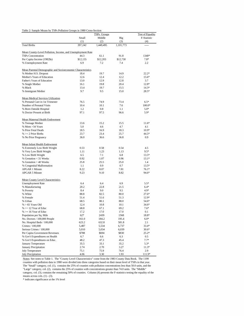
Table 2: Sample Means by TSPs Pollution Groups in 1980 Cross-SectionTSPs Groups Test of Equality
Small Middle Big F-Statistic(1) (2) (3) (4)
Total Births 397,242 1,449,495 1,101,773 -----
Mean County-Level Pollution, Income, and Unemployment RateTSPs Concentration 44.3 61.1 91.8 1340*Per Capita Income (1982$s) $12,135 $12,203 $12,730 7.8*% Unemployment Rate 6.9 7.2 7.4 2.2
Mean Parental Demographic and Socioeconomic Characteristics% Mother H.S. Dropout 18.4 19.7 14.9 22.2*Mother's Years of Education 12.6 12.4 12.2 15.6*Father's Years of Education 13.0 12.9 12.8 3.7% Single Mother 16.1 19.8 20.4 12.8*% Black 13.4 19.7 15.5 14.3*% Immigrant Mother 9.7 9.5 15.0 28.5*
Mean Medical Services Utilization% Prenatal Care in 1st Trimester 76.5 74.9 73.4 6.5*Number of Prenatal Visits 10.4 10.1 7.6 100.0*% Born Outside Hospital 1.2 0.8 1.1 5.0*% Doctor Present at Birth 97.1 97.5 96.6 5.9*
Mean Maternal Health Endowment% Teenage Mother 13.6 15.2 15.5 11.6*% Mom >34 Years 5.0 4.6 4.7 4.1% Prior Fetal Death 18.5 16.9 18.3 10.9*% >= 2 Prior Births 23.7 23.4 25.7 44.5*% No Prior Pregnancy 36.0 36.6 36.8 0.9
Mean Infant Health Endowment% Extremely Low Birth Weight 0.53 0.58 0.54 4.5% Very Low Birth Weight 1.11 1.23 1.13 9.5*% Low Birth Weight 6.5 7.1 6.8 13.5*% Gestation < 31 Weeks 0.92 1.07 0.96 13.1*% Gestation > 40 Weeks 25.8 25.5 25.0 1.4% Congenital Malformation 1.1 0.9 0.7 13.5*APGAR 1 Minute 8.22 8.07 7.81 76.1*APGAR 5 Minute 9.23 9.10 8.82 94.6*
Mean County Level CharacteristicsUnemployment Rate 6.4 6.4 6.9 5.5*% Manufacturing 20.2 22.8 21.5 6.4*% Poverty 8.4 9.0 9.5 4.9*% White 88.8 82.5 80.0 27.6*% Female 51.4 51.6 51.3 12.9*% Urban 68.5 80.1 88.0 54.6*% > 65 Years Old 12.4 10.8 10.1 34.6*% >= 12 Year of Educ 68.8 67.1 69.2 7.6*% >= 16 Year of Educ 17.2 17.0 17.0 0.1Population per Sq. Mile 627 2439 1568 18.8*No. Doctors / 100,000 People 161.0 184.2 195.4 6.0*No. Hospital Beds / 100,000 623.2 632.8 581.8 2.1Crimes / 100,000 5,487 5,534 6,737 33.4*Serious Crimes / 100,000 5,010 5,034 6,039 30.6*Per Capita Government Revenues $788 $694 $830 25.2*% Gov't Expenditures on Health 6.7 6.6 6.3 0.5% Gov't Expenditures on Educ. 48.2 47.3 45.4 7.7*January Temperature 35.5 33.1 35.2 5.3*January Precipitation 2.74 2.70 3.27 11.3*July Temperature 75.1 75.9 76.4 2.9July Precipitation 4.06 3.30 1.93 111.9*
Notes: See notes to Table 1. The "County Level Characteristics" come from the 1983 County Data Book. The 1199 counties with pollution data in 1980 were divided into three categories based on their mean level of TSPs in that year. The "Small" category, col. (1), contains the 25% of counties with pollution concentrations less than 50.0 units, and the "Large" category, col. (2), contains the 25% of counties with concentrations greater than 74.0 units. The "Middle" category, col. (3), contains the remaining 50% of counties. Column (4) presents the F-statistics testing the equality of the means across cols. (1) - (3).* indicates significance at the 1% level

Table 3: F-Statistics for 1980-82 Changes in Observables by TSPs Pollution Shock Groups, Matching on Income Shock Groups
Big TSPs - Small TSPs Medium TSPs - Small TSPs Big TSPs - Medium TSPsIncome Shock: Income Shock: Income Shock:
Small Medium Big Small Medium Big Small Medium Big(1) (2) (3) (4) (5) (6) (7) (8) (9)
% Change in Births 1980-82 0.01 1.58 0.01 0.02 0.01 0.01 0.01 3.14 0.02
Change in Mean County-Level Pollution and IncomeTSPs Concentration 664.80* 1219.91* 760.21* 278.61* 289.47* 83.58* 210.77* 607.20* 575.64*Per Capita Income (1982$s) 0.07 8.98* 8.68* 4.69 5.22 0.17 2.79 1.25 17.11*% Unemployment Rate 6.85* 2.03 29.2* 11.68* 4.49 10.67* 0.09 0.53 8.93*
Change in Mean Parental Demographic and Socioeconomic Characteristics% Mother H.S. Dropout 0.22 0.68 0.21 19.34* 3.24 1.45 5.77 10.44* 0.65Mother's Years of Education 0.29 18.55* 0.28 0.46 5.70 0.01 0.01 7.24* 0.48Father's Years of Education 0.01 11.20* 8.38* 1.20 5.47 0.01 0.48 2.28 13.60*% Single Mother 0.09 1.48 0.03 8.33* 0.06 0.41 4.71 1.63 0.88% Black 0.28 2.46 0.58 23.46* 0.06 0.02 6.92* 5.40 1.24% Immigrant Mother 6.78* 1.47 1.71 7.06* 1.64 36.27* 0.70 9.68* 27.20*
Change in Mean Medical Services Utilization% Prenatal Care in 1st Trimester 0.22 0.29 0.11 0.16 0.79 1.07 0.52 3.13 0.58Number of Prenatal Visits 2.22 0.01 0.76 3.07 0.53 0.01 0.11 0.54 1.09% Born Outside Hospital 7.06* 0.85 5.10 0.01 7.09* 2.52 6.59 4.05 1.02% Doctor Present at Birth 1.95 2.87 8.32* 0.70 1.07 3.47 3.67 0.90 2.19
Change in Mean Maternal Health Endowment% Teenage Mother 1.12 1.29 0.08 12.95* 1.63 0.03 1.69 0.01 0.03% Mom >34 Years 4.79 0.01 2.02 6.10 0.01 0.15 14.14* 0.01 1.78% Prior Fetal Death 7.59* 9.36* 15.31* 5.01 2.49 0.74 1.58 4.21 34.28*% >= 2 Prior Births 0.47 16.41* 1.87 0.10 2.30 1.03 0.78 11.63* 8.19*% No Prior Pregnancy 14.17* 6.12 1.15 30.55* 3.32 3.51 0.01 1.01 0.62
Change in Mean Infant Health Endowment% Extremely Low Birth Weight 0.25 6.47 1.27 0.36 1.77 0.71 0.79 2.84 5.56% Very Low Birth Weight 1.41 0.80 0.25 0.24 0.04 1.52 2.21 0.82 0.60% Low Birth Weight 0.01 3.25 3.26 3.39 0.03 2.32 1.51 4.56 0.27% Gestation < 31 Weeks 0.28 1.91 3.15 8.37* 0.39 0.14 1.86 6.44 6.94*% Gestation > 40 Weeks 0.89 0.05 0.35 1.37 0.14 1.69 0.03 0.54 4.91% Congenital Malformation 0.11 1.90 1.48 69.39* 8.49* 0.30 33.01* 2.99 0.80APGAR 1 Minute 0.07 11.86* 4.14 0.92 0.04 0.08 0.13 22.01* 4.90APGAR 5 Minute 4.14 15.29* 4.73 1.47 0.01 0.25 1.48 26.56* 4.62
Notes: See notes to Tables 1 and 2. The entries are F-statistics testing the equality of 1980-82 mean changes in the variables for the two groups of counties being compared. The county groups that are compared in each column have differential changes in TSPs but similar changes in per-capita income, on average. The "Small" and "Big" categories consist of the counties in the bottom and top quartiles of pollution changes and income changes, while the Middle category contains the 25-75 interquartile range of counties. Each column compares two of the nine cells that can be formed from the intersection of the two sets of subclassifications. For example, column (1) tests whether the mean change in each variable is equal in the Big TSPs Shock/Small Income Shock and Small TSPs Shock/Small Income Shock cells. See the notes to Table 10 for more details on the nine county groups. * indicates significance at the 1% level

Table 4: 1980 Cross-Sectional Estimates of the Effect of Pollution on Infant Mortality RatesInternal Infant Deaths, Within 1-Year of Birth
(estimated standard errors in parentheses)Infant Deaths Due to Internal Causes (per 100,000 Births)
(1) (2) (3) (4) (5) (6) (7) (8) (9) (10)
Mean TSP 0.005 0.070 -0.135 5.391 3.608 1.092 1.068 1.025 1.102 1.025(12.087) (12.150) (12.223) (15.078) (16.128) (0.523) (0.543) (0.538) (0.543) (0.567)
Per-Capita Income -0.607 0.081 -7.850 -9.940 -1.390 -0.876 -0.822 -1.540 -0.930(1/100) (11.026) (11.850) (17.179) (17.902) (0.749) (0.984) (0.975) (0.784) (1.052)
Unemployment Rate 0.182 0.914 1.265 -0.123 -0.094 -0.089 -0.112 -0.097(1.146) (1.226) (1.277) (0.050) (0.072) (0.071) (0.053) (0.075)
1979 Mortality Rate 0.123(0.028)
Parent Demographics N N N Y Y Y Y Y Y YMedical History N N N Y Y Y Y Y Y YPrenatal Care N N N Y Y Y Y Y Y YInfant Health at Birth N N N N Y Y Y Y Y YWeather N N N N N Y Y Y N NCounty Data Book N N N N N Y Y Y Y YState Medicaid N N N N N N Y Y N NInc. Assist. Sources N N N N N N Y Y N YState Effects N N N N N N N N Y Y
R-squared 0.00 0.00 0.00 0.18 0.19 0.61 0.61 0.62 0.97 0.98Dep. Variable Mean 1228 1228 1228 1229 1229 1217 1212 1212 1221 1222Sample Size 1199 1199 1199 1186 1169 1152 1097 1097 1153 1106Notes: See notes to Tables 1-3. The regressions use data from 1980 only and are weighted by the total number of births in each county. The underlying microdata are aggregatedto the county-level. Internal causes of death are from common health problems, such as respiratory and cardiopulmonary deaths. The control variables are listed in the DataAppendix and in Tables 1-3: Parental Demographics [mother’s age, education, marital status, foreign-born: father’s age, education], Medical History [gender and race of baby, #previous fetal deaths, # previous terminations, twins or greater birth, last pregnancy live vs. terminated, order of child (1st, 2nd, 3rd or more), time since last pregnancy, born inhospital, physician present], Prenatal Care [dummies for first visit (e.g., 1st trimester), total # of visits], Infant Health at Birth [birth weight, length of gestation (e.g., prematurebirth), Apgar scores (1 and 5 minute), reported congenital malformation, interaction of low birth weight and premature birth]. The Weather variables are temperature andprecipitation in each month, by state. The County Data Book variables are measured at the county-level. They include population density, poverty rate, overall crime rate, seriouscrime rate, property crime rate, physicians per-capita, hospital beds per-capita, fraction of the population in urban area, fraction of the population white, female, over the age of 65,with at least a high school degree, with at least a college degree, fraction employed in manufacturing, median value of houses, county taxes, revenues, and expenditures, propertytaxes, fraction of expenditures on health, welfare, police, education, and highways. State Medicaid includes # of Medicaid recipients, avg. cost per Medicaid recipient, andMedicaid payments to medical vendors all measured at the state-level. Income Assistance Sources are measured at the county-level and include # of AFDC recipients, # of AFDCrecipient children, income assistance from food stamps, AFDC payments, SSI, other income maintenance, Medicaid and medical vendor payments, Medicare, Chamus, andUnemployment Insurance all in total amounts and per-capita. State Effects are separate indicator variables for each state.

Table 5: Cross-Sectional Estimates of the Effect of Pollution and Income on Infant Mortality RatesInternal Infant Deaths, Within 1-Year of Birth
(estimated standard errors in parentheses)Effect of Mean TSP Effect of Income (1/100)
(1) (2) (3) (4) (1) (2) (3) (4)
1978 Cross-Section -0.722 -2.147 -7.670 -5.591 -8.640 -8.120 -2.280 -8.480(18.453) (19.463) (25.693) (26.785) (22.001) (23.251) (39.618) (42.115)
[1219, 0.02] [1185, 0.02] [1065, 0.03] [1074, 0.05] [1219, 0.02] [1185, 0.02] [1065, 0.03] [1074, 0.05]
1979 Cross-Section 0.483 -0.011 -0.364 -0.384 -0.203 -0.300 -1.250 -1.420(0.456) (0.429) (0.513) (0.534) (0.528) (0.485) (0.767) (0.791)
[1200, 0.46] [1178, 0.58] [1079, 0.60] [1088, 0.98] [1200, 0.46] [1178, 0.58] [1079, 0.60] [1088, 0.98]
1981 Cross-Section 0.360 0.171 -0.108 -0.107 1.550 0.740 0.497 0.306(0.531) (0.478) (0.596) (0.624) (0.516) (0.452) (0.697) (0.714)
[1136, 0.44] [1129, 0.59] [1067, 0.60] [1076, 0.97] [1136, 0.44] [1129, 0.59] [1067, 0.60] [1076, 0.97]
1982 Cross-Section 3.950 2.897 -7.663 -8.108 -1.820 -4.000 -27.020 -25.160(19.75) (20.847) (26.149) (26.921) (15.611) (16.008) (25.788) (24.669)
[1134, 0.21] [1128, 0.23] [1058, 0.26] [1074, 0.28] [1134, 0.21] [1128, 0.23] [1058, 0.26] [1074, 0.28]
1983 Cross-Section 1.499 0.945 1.729 2.001 -0.320 -0.514 -0.743 -0.516(0.550) (0.523) (0.672) (0.692) (0.441) (0.403) (0.561) (0.551)
[1109, 0.47] [1106, 0.58] [1039, 0.59] [1055, 0.98] [1109, 0.47] [1106, 0.58] [1039, 0.59] [1055, 0.98]
1984 Cross-Section 0.659 -0.712 -0.609 -0.714 -0.048 -0.054 0.548 0.638(0.542) (0.514) (0.655) (0.661) (0.442) (0.388) (0.648) (0.633)
[1071, 0.44] [1067, 0.59] [998, 0.60] [1014, 0.98] [1071, 0.44] [1067, 0.59] [998, 0.60] [1014, 0.98]
Parent Demographics Y Y Y Y Y Y Y YMedical History Y Y Y Y Y Y Y YPrenatal Care Y Y Y Y Y Y Y YInfant Health at Birth N Y Y Y N Y Y YWeather N N Y N N N Y NState Medicaid N N Y N N N Y NInc. Assist. Sources N N Y Y N N Y YState Effects N N N Y N N N YNotes: See notes to Table 4. The numbers in brackets are the number of counties and R-squareds, respectively, for the internal infant mortality rate regressions. The dependentvariable is the number of infant deaths attributable to internal causes per 100,000 live births.

Table 6: Estimated Effects of Pollution Based on 1980-82 Changes, Internal Infant Deaths Within 1-Year of Birth(estimated standard errors in parentheses)
Infant Deaths Due to Internal Causes (per 100,000 Births)Fixed Instrumental Variables No Instruments
Effects (1) (2) (3) (4) (5) (6) (1) (2) (3)
Mean TSP 3.601 3.602 4.319 3.483 4.227 4.720 3.607 3.477 3.314 3.218(0.545) (1.833) (1.988) (1.935) (2.296) (2.686) (2.454) (1.200) (1.233) (1.407)
Per-Capita Income -0.228 -10.230 -17.580 -7.480 -19.540 -30.850 -22.203 0.019 1.400 -1.390(1/100) (2.028) (9.946) (16.651) (16.279) (24.183) (28.682) (23.193) (3.611) (3.598) (4.470)
Unemployment Rate -0.202 -0.124 0.031 -0.062 -0.000 0.019 -0.005 0.191(0.210) (0.203) (0.293) (0.262) (0.286) (0.092) (0.092) (0.105)
Lag Mortality Change 0.725 0.751 0.752 0.752 0.752 0.753 0.750 0.751 0.752(0.043) (0.011) (0.011) (0.011) (0.010) (0.010) (0.012) (0.012) (0.011)
Parent Demographics N N Y Y Y Y Y Y Y YMedical History N N Y Y Y Y Y Y Y YPrenatal Care N N Y Y Y Y Y Y Y YInfant Health at Birth N N N Y Y Y Y N Y YWeather N N N N Y N N N N NState Medicaid N N N N Y N N N N NInc. Assist. Sources N N N N Y N Y N N NYear Effects N Y Y Y Y N N Y Y NState-Year Effects N N N N N Y Y N N YCounty Effects Y Y Y Y Y Y Y Y Y Y
R-squared 0.99* 0.57 0.81 0.84 0.86 0.86 0.87 0.81 0.84 0.86Dep. Variable Mean 1171 -101.5 -101.4 -101.5 -101.0 -101.5 -101.9 -101.2 -101.5 -101.5Sample Size 3488 1044 1035 1021 967 1021 975 1065 1049 1049Notes: See notes to previous tables. There are 1077 counties with pollution observations in both 1980 and 1982. The regressions are weighted by the total number of births ineach county and year. The estimates of the standard errors are based on the Eicker-White formula to correct for heteroskedasticity. The “Fixed Effects” column is based on aregression which uses the pooled 1980, 1981, and 1982 data and includes county indicators. All other columns are based on regressions of 1980-82 changes in the infant mortalityrate on changes in the other variables. In the “Instrumental Variables” columns, 1979 and 1980 TSP concentrations and per-capita incomes and 1978 and 1979 infant mortalityrates are used as instruments for 1980-82 changes in TSPs and income and 1979-80 changes in the infant mortality rate. In the “No Instruments” columns, 1979-80 changes in theinfant mortality rate are instrumented with 1978 and 1979 infant mortality rates.(*) indicates the R-squared in the levels regression. All other R-squareds are from regressions in changes.

Table 7: Effects of Pollution on Death Rates within 28 Days and 24 Hours of Birth and on Birth Weight,Based on 1980-82 Changes
(estimated standard errors in parentheses)
A. Effects on Early Infant Mortality Rates and Birth WeightInfant Deaths Infant Deaths Birth
Within 28 Days Within 24 Hours Weight
Mean TSP 3.927 3.451 2.265 2.047 -0.213(1.581) (1.709) (1.202) (1.194) (0.056)
Per-Capita Income -14.240 -14.670 -4.900 -6.460 15.636(1/100) (8.293) (13.997) (6.382) (10.209) (21.293)
Unemployment Rate -0.090 -0.027(0.175) (0.125)
Lag Mortality Change 0.729 0.755 0.731 0.757(0.040) (0.009) (0.039) (0.005)
Parent Demographics N Y N Y NMedical History N Y N Y NPrenatal Care N Y N Y NYear Effects Y Y Y Y NCounty Effects Y Y Y Y Y
R-squared 0.61 0.87 0.66 0.92 0.96*Dep. Variable Mean -74.7 -74.2 -19.2 -19.1 3337.3Sample Size 1044 1035 1044 1035 3488
B. Effects on Birth Weight by Birth Weight CategoryCumulative Birth Weight Categories
<1000g <1500g <2000g <2500g <3000g <3500g <4000g <4500g
Mean TSP -0.086 -0.127 0.018 0.297 1.355 1.490 0.353 -0.249(1/10,000) (0.041) (0.058) (0.074) (0.124) (0.226) (0.297) (0.233) (0.198)
Per-Capita Income 0.010 0.077 -0.446 -1.122 -2.050 -0.239 0.105 0.305(1/1,000,000) (0.152) (0.237) (0.302) (0.500) (0.920) (1.210) (0.950) (0.800)
County Effects Y Y Y Y Y Y Y Y
Dep. Var. Mean 0.006 0.012 0.025 0.069 0.233 0.603 0.892 0.980
Notes: See notes to Table 6. The regressions are weighted by the total number of births in each county and year. The estimatesof the standard errors are based on the Eicker-White formula to correct for heteroskedasticity. For the “Infant Deaths Within 28Days and 24 Hours” columns, 1979 and 1980 TSP concentrations and per-capita incomes and 1978 and 1979 infant mortalityrates are used as instruments for 1980-82 changes in TSPs and income and 1979-80 changes in the infant mortality rate. All ofthe birth weight results are based on fixed-effects analyses of the pooled 1980, 1981, and 1982 data. The dependent variables inthe “Cumulative Birth Weight Categories” are equal to the fraction of births with birth weights less than the specified amount.(*) indicates the R-squared in the levels regression.

Table 8: Estimated Effects of Pollution by Race and Gender of Infant, Based on 1980-82 ChangesInternal Infant Deaths, Within 1-Year of Birth
(estimated standard errors in parentheses)
Black Infant Deaths Female Infant DeathsFixed Instrumental Variables Fixed Instrumental Variables
Effects (1) (2) (3) (4) Effects (1) (2) (3) (4)
Mean TSP 5.725 11.272 7.380 10.807 30.097 3.078 1.254 1.303 2.462 2.923(1.545) (4.259) (4.265) (4.983) (20.220) (0.626) (1.714) (1.778) (1.653) (2.433)
Per-Capita Income -0.819 -17.060 -15.710 -21.800 -286.34 2.949 -3.020 -11.850 -16.560 -11.340(1/100) (6.314) (18.474) (24.438) (24.422) (214.68) (2.551) (8.443) (13.436) (13.222) (25.779)
Unemployment Rate 0.122 0.090 -1.422 -0.250 -0.291 -0.117(0.333) (0.320) (1.332) (0.172) (0.167) (0.228)
Lag Mortality Change 0.030 0.032 0.032 0.033 0.001 -0.042 0.011 -0.002(0.044) (0.048) (0.043) (0.061) (0.052) (0.050) (0.048) (0.046)
Parent Demographics N N Y Y Y N N Y Y YMedical History N N Y Y Y N N Y Y YPrenatal Care N N Y Y Y N N Y Y YInfant Health at Birth N N N Y Y N N N Y YYear Effects N Y Y Y N N Y Y Y NState-Year Effects N N N N Y N N N N YCounty Effects Y Y Y Y Y Y Y Y Y Y
R-squared 0.54* 0.01 0.05 0.26 0.22 0.60* 0.00 0.07 0.23 0.32Dep. Variable Mean 1972 -141.0 -136.4 -130.8 -130.8 1044 -96.2 -97.6 -96.3 -96.3Sample Size 3030 843 767 731 731 3486 1043 1024 1003 1003
Notes: See notes to Table 6. In the “Black Infant Deaths” and “Female Infant Deaths” columns, the dependent variables are the black and female infant death rates within one-yearof birth per 100,000 live births, respectively. The Natality File variables are also measured separately by race and gender in each county. The regressions are weighted by the totalnumber of black and female births in each county and year. The estimates of the standard errors are based on the Eicker-White formula to correct for heteroskedasticity.(*) indicates the R-squareds in the levels regressions. All other R-squareds are from regressions in changes.

Table 9: Estimated Effect of Pollution on Infant Deaths Attributable to External Causes (e.g., Accidents and Homicides),Based on 1980-82 Changes
(estimated standard error in parentheses)
Infant Deaths Due to External Causes (per 100,000 Births)Fixed No Instrumental Variables Instrumental Variables
Effects Deaths Within 1-Year of Birth Deaths Within 1-Year of Birth Neonatal Deaths
Mean TSP 0.173 -0.188 -0.235 -0.195 -0.224 -0.874 -0.809 -0.577 -0.145 -0.167(0.152) (0.210) (0.232) (0.239) (0.299) (0.410) (0.398) (0.524) (0.124) (0.138)
Per-Capita Income -0.311 0.123 0.052 -0.029 -0.755 4.980 4.490 -1.950 0.923 2.470(1/100) (0.618) (0.563) (0.691) (0.710) (0.889) (2.676) (2.719) (5.627) (0.612) (1.126)
Unemployment Rate -0.016 -0.018 -0.017 0.040 0.032 -0.024 0.035(0.017) (0.018) (0.021) (0.035) (0.036) (0.051) (0.014)
Lag Mortality Change -1.345 -1.356 -1.380 -1.406 -1.392 -1.403 -1.424 -1.926 -1.930(0.449) (0.449) (0.443) (0.443) (0.433) (0.433) (0.435) (0.072) (0.070)
Parent Demographics N N Y Y Y Y Y Y N YMedical History N N Y Y Y Y Y Y N YPrenatal Care N N Y Y Y Y Y Y N YInfant Health at Birth N N N Y Y N Y Y N NYear Effects N Y Y Y N N Y N Y YState-Year Effects N N N N Y Y N Y N NCounty Effects Y Y Y Y Y Y Y Y Y Y
R-squared 0.56* 0.65 0.66 0.67 0.68 0.65 0.65 0.66 0.94 0.94Dep. Variable Mean 35.3 -4.52 -4.43 -4.19 -4.19 -4.33 -4.06 -4.06 1.68 1.68Sample Size 3488 1077 1065 1049 1049 1035 1021 1021 1044 1035
Notes: See notes to Table 6. The dependent variable is the number of infant deaths attributable to external causes, such as accidents and homicides, per 100,000 live births. Theregressions are weighted by the total number of births in each county and year. The estimates of the standard errors are based on the Eicker-White formula to correct forheteroskedasticity.(*) indicates the R-squared in the levels regression.
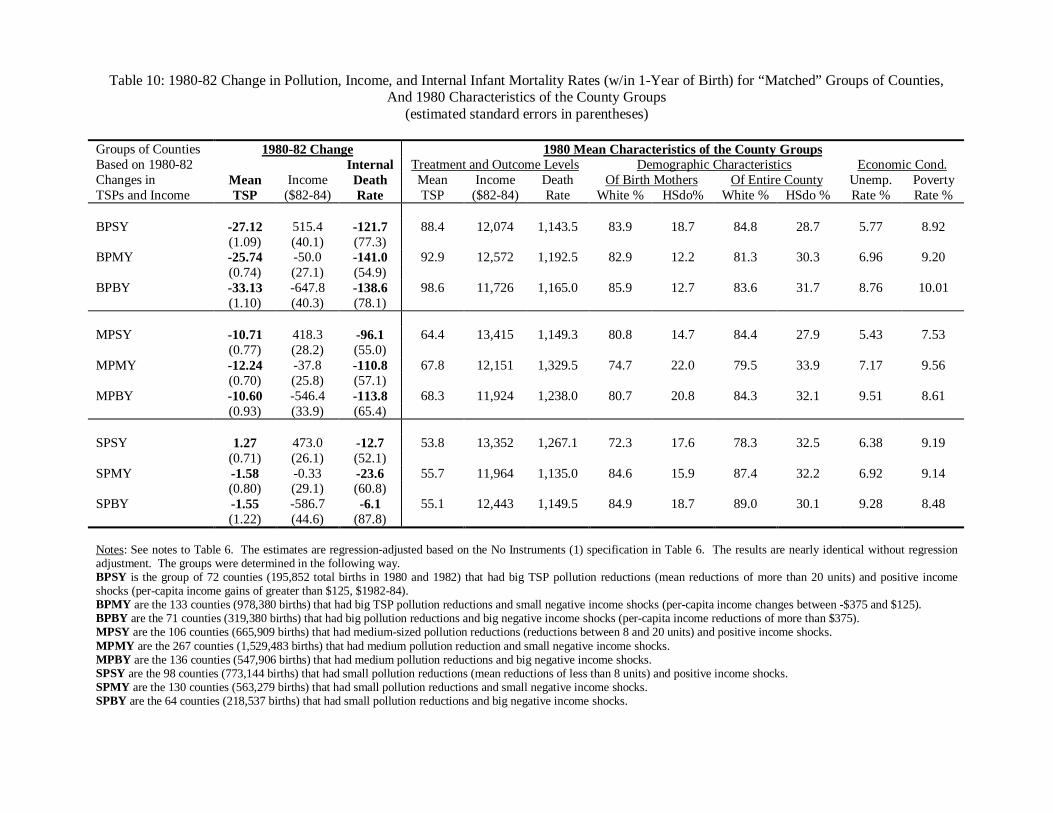
Table 10: 1980-82 Change in Pollution, Income, and Internal Infant Mortality Rates (w/in 1-Year of Birth) for “Matched” Groups of Counties,And 1980 Characteristics of the County Groups
(estimated standard errors in parentheses)
Groups of Counties 1980-82 Change 1980 Mean Characteristics of the County GroupsBased on 1980-82 Internal Treatment and Outcome Levels Demographic Characteristics Economic Cond.Changes in Mean Income Death Mean Income Death Of Birth Mothers Of Entire County Unemp. PovertyTSPs and Income TSP ($82-84) Rate TSP ($82-84) Rate White % HSdo% White % HSdo % Rate % Rate %
BPSY -27.12 515.4 -121.7 88.4 12,074 1,143.5 83.9 18.7 84.8 28.7 5.77 8.92(1.09) (40.1) (77.3)
BPMY -25.74 -50.0 -141.0 92.9 12,572 1,192.5 82.9 12.2 81.3 30.3 6.96 9.20(0.74) (27.1) (54.9)
BPBY -33.13 -647.8 -138.6 98.6 11,726 1,165.0 85.9 12.7 83.6 31.7 8.76 10.01(1.10) (40.3) (78.1)
MPSY -10.71 418.3 -96.1 64.4 13,415 1,149.3 80.8 14.7 84.4 27.9 5.43 7.53(0.77) (28.2) (55.0)
MPMY -12.24 -37.8 -110.8 67.8 12,151 1,329.5 74.7 22.0 79.5 33.9 7.17 9.56(0.70) (25.8) (57.1)
MPBY -10.60 -546.4 -113.8 68.3 11,924 1,238.0 80.7 20.8 84.3 32.1 9.51 8.61(0.93) (33.9) (65.4)
SPSY 1.27 473.0 -12.7 53.8 13,352 1,267.1 72.3 17.6 78.3 32.5 6.38 9.19(0.71) (26.1) (52.1)
SPMY -1.58 -0.33 -23.6 55.7 11,964 1,135.0 84.6 15.9 87.4 32.2 6.92 9.14(0.80) (29.1) (60.8)
SPBY -1.55 -586.7 -6.1 55.1 12,443 1,149.5 84.9 18.7 89.0 30.1 9.28 8.48(1.22) (44.6) (87.8)
Notes: See notes to Table 6. The estimates are regression-adjusted based on the No Instruments (1) specification in Table 6. The results are nearly identical without regressionadjustment. The groups were determined in the following way.BPSY is the group of 72 counties (195,852 total births in 1980 and 1982) that had big TSP pollution reductions (mean reductions of more than 20 units) and positive incomeshocks (per-capita income gains of greater than $125, $1982-84).BPMY are the 133 counties (978,380 births) that had big TSP pollution reductions and small negative income shocks (per-capita income changes between -$375 and $125).BPBY are the 71 counties (319,380 births) that had big pollution reductions and big negative income shocks (per-capita income reductions of more than $375).MPSY are the 106 counties (665,909 births) that had medium-sized pollution reductions (reductions between 8 and 20 units) and positive income shocks.MPMY are the 267 counties (1,529,483 births) that had medium pollution reduction and small negative income shocks.MPBY are the 136 counties (547,906 births) that had medium pollution reductions and big negative income shocks.SPSY are the 98 counties (773,144 births) that had small pollution reductions (mean reductions of less than 8 units) and positive income shocks.SPMY are the 130 counties (563,279 births) that had small pollution reductions and small negative income shocks.SPBY are the 64 counties (218,537 births) that had small pollution reductions and big negative income shocks.

Table 11: Grouped Estimates of Pollution Effects Based on “Matching” on 1980-82 Income ChangesInternal Infant Deaths, Within 1-Year of Birth
[difference in income changes between groups in brackets]
Medium vs. Small Poll. Change Big vs. Small Poll. Change
Small Income Shock 6.96 3.84[-54.7] [42.5]
Medium Income Shock 8.19 4.86[-37.4] [-49.7]
Big Income Shock 11.89 4.19[40.2] [-61.1]
Weighted Average 8.44 4.42(elasticity in parentheses) (0.45) (0.35)
Notes: Table entries are the ratio of the difference in internal mortality rate changes and the difference in TSPs pollution changesbetween county groups, 1980-82. Calculations are based on the entries in Table 10. The total numbers of births in thecomparison groups are used as weights in calculating the weighted averages and elasticities.

Appendix Table: Grouped Estimates of Pollution Effects Based on Matching on the1980 Level of Manufacturing Employment
Internal Infant Deaths, Within 1-Year of Birth
A. Reduced-Form 1980-82 Changes(estimated standard errors in parentheses)County Groups Based on First-Stage Changes in Treatment Outcome ChangeTSPs and Manf. Employ. Mean TSP Income Internal DeathsBPSE [89.9, $10,329] -34.52 26.1 -142.3
(1.67) (116.2) (123.7)BPME [87.0, $10,281] -29.75 -115.7 -102.9
(0.87) (60.8) (64.8)BPBE [95.8, $13,113] -26.99 -17.8 -138.3
(0.68) (47.7) (50.8)MPSE [61.2, $10,952] -12.45 -32.9 -308.5
(1.39) (97.0) (103.2)MPME [61.4, $10,691] -12.43 -20.3 -100.7
(0.72) (50.3) (53.6)MPBE [69.3, $13,048] -12.46 22.1 -77.2
(0.62) (43.5) (46.3)SPSE [50.0, $9,953] 0.30 128.0 14.7
(1.84) (128.3) (136.6)SPME [55.1, $11,069] 0.24 65.6 -26.5
(0.81) (56.5) (60.1)SPBE [54.8, $13,529] -2.20 250.7 7.7
(0.70) (47.9) (51.7)
Notes: See notes to Table 6. The estimates are regression-adjusted based on the No Instruments (1) specification in Table 6. Thenumbers in brackets are the 1980 mean level of TSPs pollution and the 1980 mean income per-capita (in $1982-84) of thespecified group, respectively. The information on county manufacturing employment levels comes from County BusinessPatterns data. The groups were determined in the following way.BPSE is the group of 83 counties (75,717 total births in 1980 and 1982) that had big TSP pollution reductions and a small levelof employment in manufacturing in 1980 (manufacturing employment less than 1,600).BPME are the 138 counties (340,694 births) that had big TSP pollution reductions and a medium level of employment inmanufacturing in 1980 (manufacturing employment between 1,600 and 14,000).BPBE are the 55 counties (1,077,201 births) that had big pollution reductions and a high level of employment in manufacturingin 1980 manufacturing employment greater than 14,000).MPSE are the 106 counties (111,847 births) that had medium-sized pollution reductions and small manufacturing employment.MPME are the 252 counties (639,986 births) that had medium pollution reduction and medium manufacturing employment.MPBE are the 151 counties (1,991,465 births) that had medium pollution reductions and high manufacturing employment.SPSE are the 82 counties (67,566 births) that had small pollution reductions and small manufacturing employment.SPME are the 143 counties (412,343 births) that had small pollution reductions and medium manufacturing employment.SPBE are the 67 counties (1,075,051 births) that had small pollution reductions and high manufacturing employment.

B: “Matched” Group Estimates of Pollution Effects on Internal Infant Death Rates[difference in income changes between groups in brackets]
Medium vs. Small Poll. Change Big vs. Small Poll. Change
Small Employ. in Manf. in 1980 25.33 4.51 (“Neighboring Counties”) [-161.0] [-102.0]
Medium Employ. in Manf. in 1980 5.85 2.54[-85.9] [-181.3]
High Employ. in Manf. in 1980 8.27 5.89[-228.6] [-268.5]
Weighted Average 8.39 5.00
Notes: Table entries are the ratio of the difference in internal mortality rate changes and the difference in TSPs pollution changesbetween county groups, 1980-82. Calculations are based on the entries in Panel A. The total numbers of births in thecomparison groups are used as weights in calculating the weighted averages and elasticities.

Figure 1: National Trends in Pollution, Income Per-Capita, and Infant Mortality Rates
A. National Trends in Total Suspended Particulates and Ozone Concentrations
40
45
50
55
60
65
70
75
80
71 72 73 74 75 76 77 78 79 80 81 82 83 84 85 86 87 88 89 90
Year
TS
Ps
Con
cent
ratio
n (M
icro
gram
s P
er C
ubic
Met
er)
0.04
0.045
0.05
0.055
0.06
0.065
0.07
0.075
0.08
Ozo
ne C
once
ntra
tion
(Par
ts p
er M
illio
n)
Mean Hourly TSPs Concentration Mean Hourly Ozone Concentration
Note: In the years 1971-3, the number of ozone monitors was insufficient to obtain a reliable estimate of national ozone concentrations.Source: Authors' tabulations from EPA's "Quick Look Reports" data file.
B. National Trends in Internal Infant Mortality Rates, Per-Capita Income, and Total Suspended Particulates Concentrations, 1978-1984
0.7
0.8
0.9
1
1.1
78 79 80 81 82 83 84
Year
Rel
ativ
e to
197
8 Le
vel
Mean TSPs Concentration Internal Fatalities per 100,000 Live Births Per Capita Income

Figure 2: Mean TSPs Concentrations and Internal Infant Mortality Rates,Trends in Pennsylvania, 1978-1984
900
1000
1100
1200
1300
1400
1500
78 79 80 81 82 83 84
Year
Dea
ths
in 1
st Y
ear
Due
to In
tern
al C
ause
s P
er
10
0,0
00
Liv
e B
irth
s
45
50
55
60
65
70
75
80
Mea
n T
SP
s C
once
ntra
tion
Internal Infant Mortality Rate Mean TSPs Concentration

Figure 3: Trends in Pollution, Infant Mortality Rates, and Income Per-CapitaBy 1980-1982 Change in TSPs Concentration Groups
A. Trends in Mean TSPs Concentrations, by 1980-1982 TSPs Change Group
0.7
0.75
0.8
0.85
0.9
0.95
1
1.05
1.1
1.15
78 79 80 81 82 83 84
Year
Rel
ativ
e to
197
8
Small Change (1978 TSPs = 57.6) Middle Change (1978 TSPs = 66.6) Big Change (1978 TSPs = 86.7)
B. Trends in Internal Infant Mortalit y Rate, by 1980-1982 TSPs Change Group
0.7
0.75
0.8
0.85
0.9
0.95
1
1.05
1.1
1.15
78 79 80 81 82 83 84
Year
Rel
ativ
e to
197
8
Small Change (1978 IMR = 1,315) Middle Change (1978 IMR = 1,366) Big Change (1978 IMR = 1,301)

C. Trends in Per-Capita Income, by 1980-1982 TSPs Change Group
0.7
0.75
0.8
0.85
0.9
0.95
1
1.05
1.1
1.15
78 79 80 81 82 83 84
Year
Rel
ativ
e to
197
8
Small Change (1978 Incm = $13,033) Middle Change (1978 Incm = $12,772) Big Change (1978 Incm = $12,627)

Figure 4: 1980-1982 Changes in Pollution and Internal Infant Mortality Rates by County
A. 1980-82 Change in Mean TSPs Concentrations
B. 1980-82 Change in Internal Infant Mortality Rates
Notes: For Figure 3A Small Change refers to the 25% of counties where the change in mean TSPs concentrations was greaterthan –7.4 mg/m3. Big Change are the 25% of counties where the change in mean TSPs was less than –20.4 mg/m3. MiddleChange are the remaining 50% of counties. For Figure 3B Small Change is the quartile of counties where the change in theinternal infant mortality rate was greater than 160.9 per 100,000 live births. Big Change is the quartile of counties where thechange in the internal infant mortality rate was less than –402 per 100,000 live births. Middle Change are the remaining counties.

Figure 5: Annual Differences in Internal Infant Mortality and TSPs PollutionBetween Comparison Groups Used in Table 11
A. Unadjusted Differences Between the Groups with Medium and Small TSPs Changes
and Small Income Shocks during 1980-821
-220
-200
-180
-160
-140
-120
-100
-80
-60
79 80 81 82 83
Year
Diff
eren
ce in
Inte
rnal
Infa
nt M
orta
lity
Per
100
,000
Liv
e B
irths
-3
0
3
6
9
12
Diff
eren
ce in
Mea
n T
SP
s C
once
ntra
tions
Internal Infant Mortality Rate Mean TSPs1 See text for how the Big/Medium/Small categories were determined for 1980-82 TSPs and per-capita income changes.
B. Adjusted Differences Between the Groups with Medium and Small TSPs Changes
and Small Income Shocks during 1980-821
-2000
-1500
-1000
-500
0
500
1000
1500
2000
79 80 81 82 83
Year
Diff
eren
ce in
Inte
rnal
Infa
nt M
orta
lity
Per
100
,000
Liv
e B
irths
-3
0
3
6
9
12
Diff
eren
ce in
Mea
n T
SP
s C
once
ntra
tions
Internal Infant Mortality Rate Mean TSPs1 See text for how the Big/Medium/Small categories were determined for 1980-82 TSPs and per-capita income changes.

Appendix Figures: Scatter Plots of Internal Infant Mortality Rates and Mean TSPs Pollution
1980 Unadjusted Scatter PlotIn
tern
al
Mo
rta
lity
Ra
te
1980 Mean TSP0 50 100 150
0
2000
4000
6000
8000
1980 Scatter Plot Adjusted for Other Covariates.
1980 Mean TSP0 25 50 75 100 125 150
-2000
-1000
0
1000
2000
3000
4000
5000
6000
7000
8000

1983 Unadjusted Scatter PlotIn
tern
al
Mo
rta
lity
Ra
te
1983 Mean TSP0 50 100 150
0
2000
4000
6000
8000
1983 Scatter Plot Adjusted for Other Covariates.
1983 Mean TSP0 25 50 75 100 125 150
-2000
-1000
0
1000
2000
3000
4000
5000
6000
7000
8000

Unadjusted Scatter Plot for 1980-82 ChangesIn
tern
al
Mo
rta
lity
Ra
te C
ha
ng
e
1980-82 Change in Mean TSP-100 -50 0 50
-4000
-2000
0
2000
4000
Scatter Plot for 1980-82 Changes Adjusted for Other Covariates.
1980-82 Change in Mean TSP-100 -75 -50 -25 0 25 50
-5000
-4000
-3000
-2000
-1000
0
1000
2000
3000
4000
5000