the dot plot: a graphical display for labeled quantitative...
TRANSCRIPT
THE DOT PLOT: A GRAPHICALDISPLAY FOR LABELEDQUANTITATIVE VALUES
William G. JacobyDepartment of Political Science
Michigan State University303 South Kedzie HallEast Lansing, MI 48824
E-mail: [email protected]: http:\\polisci.msu.edu\jacoby
June 2006
I would like to thank David Armstrong, Michael Colaresi, and Saundra Schneiderfor their excellent comments and suggestions on earlier drafts of this paper.
The dot plot is an extremely useful tool for obtaining pictorial representations of quan-
titative information. This display method is very flexible and potentially applicable to any
situation where numeric values are associated with descriptive labels. For example, dot plots
can be used to depict raw data, frequency counts, descriptive statistics, and parameter esti-
mates from statistical models. A carefully constructed dot plot contains an enormous amount
of information. More important, a dot plot can convey that information in a way that over-
comes some of the problems frequently encountered with other graphical displays.
DEFINITION AND EXAMPLES
A dot plot is a two-dimensional graphical display of objects, showing some quantitative
characteristic of those objects. One axis of the dot plot (usually the horizontal) is a scale
covering the range of quantitative values to be plotted. The other axis (usually the vertical)
shows descriptive labels that are associated with each of the numeric values. The data objects
usually are sorted according to the quantitative values. Plotting symbols are placed within
the display area of the dot plot, locating each data object at the intersection position for
its label on the vertical axis and associated numeric value on the horizontal axis. While
this simple definition covers the basic features of the dot plot, it is important to emphasize
that the utility and flexibility of such a display come from the details that are included in
its construction. Let us consider several examples that will illustrate the dot plot’s various
features and advantages.
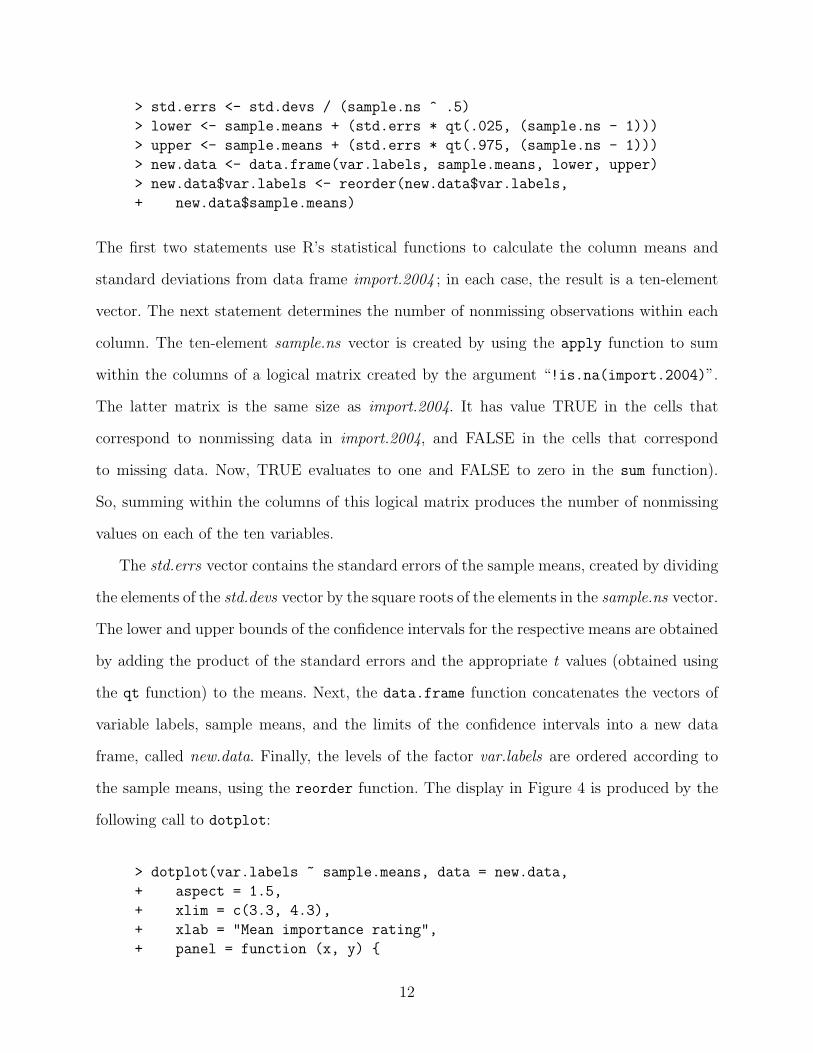
The simplest application of the dot plot is to display the empirical distribution of values
on a single variable. Figure 1 shows a dot plot of policy priority scores for the American states
in 1992. This is an interval-level variable obtained from an unfolding analysis of the states’
proportionate spending levels across fifteen program areas (Jacoby and Schneider 2001).
Larger values on this variable indicate that a state spent more on a set of policies that Jacoby
and Schneider labeled “collective goods” such as highways, parks, and law enforcement.
Smaller values correspond to more spending on “particularized benefits,” including welfare,
health care, and employment security.

Figure 1 is very easy to interpret. The labels in the margin of the vertical axis are the
state names. The spending priority score for each state can be determined from the horizontal
position of the plotted point within that row: The farther to the right, the larger the data
value (i.e., higher spending on collective goods); the farther to the left, the lower the data
value (i.e., more spending on particularized benefits).
Note the efficiency with which the information is presented in Figure 1. The horizontal
dotted lines facilitate table look-up without being too intrusive on the data points. And,
because the observations are sorted by the data values, the graph is, effectively, a transposed
quantile plot. Therefore, the display provides information about the shape of the distribution.
It is also very easy to obtain visual estimates of the “important” quantiles, such as the median
(the value that occurs at the midpoint along the vertical axis), the quartiles (the values that
occur one-fourth of the way in from the top and bottom of the graph), and the extremes
(the first and last values along the vertical axis). Thus, a dot plot enables the analyst to see
both “the forest” (i.e., the distribution) and “the trees” (i.e., the individual observations).
Figure 2 illustrates a variation of the basic dot plot, showing state education spending
for fiscal year 2000, in dollars per capita. This display provides exactly the same kind of
information as Figure 1. But here, the varying-length horizontal lines emphasize the shape
of the point array (and, hence, of the distribution, itself) more clearly. Note also that the
dashed lines in Figure 2 all emanate from the zero point on the horizontal axis. Therefore,
the line lengths for different states can be compared to facilitate magnitude judgments about
the data values.
The basic dot plot data display can be adapted very easily to allow comparisons across
subgroups of observations. For example, Figure 3 is a divided dot plot, showing individual
state policy priority scores within separate regions. Again, a great deal of information can be
extracted from this display. The data values are sorted within the regions. The order of the
regions, themselves, within the plot is determined by their respective medians. Intra-region
variability can be assessed through the slope of the point array for a particular region, or
2
through the spread of its points along the horizontal axis. And, the graphical display makes
it easy to see potentially misleading elements of the data, such as within-region outliers, that
might affect the calculated values of region-specific summary statistics.
Dot plots are certainly not limited to displays of raw data. They can also be used very
effectively to show quantitative summaries of data values within partitions of an overall
dataset either across subsets of the observations or across separate variables (or both). As
an example, Figure 4 uses data from the 2004 CPS National Election Study to show the mean
importance ratings that survey respondents assigned to ten issues (scored on a one-to-five
scale, with larger values indicating the issue is more important). The symmetric horizontal
“wings” around each plotted point correspond to the 95% confidence interval for each mean.
Horizontal reference lines are omitted from this dot plot, not only because of the relatively
small number of points, but also because they would interfere with visual perception of the
error bars.
The dot plots presented here should hint at the variety of ways this kind of display can
be used. Of course, there are many other possibilities. For example: The plotted points could
be arranged according to some substantive scheme, rather than sorted by the data values;
repeated measures of a variable could be handled by including more than one plotting symbol
on each horizontal line; parameter estimates from statistical models (e.g., cell frequencies
from a contingency table or coefficients from a regression equation) could be displayed; and
so on. Regardless of specific context, the “trick” in constructing an effective dot plot lies in
adjusting the details to facilitate the kinds of judgments that the analyst wants readers to
make when interpreting the graphical information in the display.
ADVANTAGES OF DOT PLOTS
Dot plots are covered extensively in Cleveland’s work (e.g., 1993; 1994) and my own
monograph (Jacoby 1997) on statistical graphics. However, it is definitely accurate to say
that the dot plot is a relatively uncommon graphical display in the political science research
3
literature. This is unfortunate, because dot plots have some clear advantages over their
“competitors” for displaying labeled data: pie charts and bar charts.
First, there is a simple, practical advantage: Dot plots can show a larger number of data
points than either pie charts or bar charts. A dot plot can include a surprisingly large number
of points– it is really only limited by the space available in the display medium. Pie charts
are limited to a fairly small number of distinct “wedges;” otherwise, visual perception of the
quantitative information becomes nearly impossible. With bar charts, the width of the bars
necessarily becomes narrower as the number of distinct data values increases. In fact, with
a large number of plotted values, a bar chart becomes virtually indistinguishable from a dot
plot.
A second, theory-based, advantage is that dot plots facilitate relatively accurate graph-
ical perception. Visual processing of a pie chart requires the observer to make comparative
judgments about the angles, arcs, and/or sizes of the various wedges within the circular di-
agram. In contrast, a dot plot only involves comparisons of point locations along a common
scale. Cleveland and McGill (1984) show that the latter task is usually carried out much
more accurately than the former.
With bar charts, a different problem emerges. A bar chart should be interpreted using the
relative heights (or widths) of the bars along a common scale. But, Cleveland (1984) argues
that bar charts actually encourage observers to make judgments based upon the relative sizes
of the bars within the display. And, if the scale in the bar chart begins at some arbitrary
value, then it is inappropriate to regard the lengths and/or areas of the bars as any sort
of meaningful information about the relative magnitudes of the quantitative values being
displayed in the chart.
A properly-constructed dot plot avoids these problems by either extending the horizontal
reference lines across the entire width of the plotting region (as in Figures 1 and 3) or
omitting them entirely (as in Figure 4). In either case, the display provides no visual cues
that would encourage inappropriate judgments about the relative sizes of the data values. If
4

magnitude judgments are appropriate for the data, then the reference lines in a dot plot can
be extended from the origin of the scale out to the plotted data values (as in Figure 2).
A third potential advantage emerges when a dot plot is used to display the distribution
of values on a single variable. As explained earlier, such a display can be viewed as a trans-
posed quantile plot. It shows all of the data and, therefore, provides a particularly accurate
depiction of distributional shape. Just as with a quantile plot, a dot plot avoids potential
distortions that may be introduced by the binning process required to construct a more
traditional histogram.
CREATING DOT PLOTS IN R
Most statistical software can be used to generate dot plots. STATA, SPSS, and SYSTAT
all have routines that are either explicitly designed, or easily adapted, for this purpose.
Friendly (1991) provides macros that create dot plots in SAS. But, as is often the case,
R provides the most powerful facility and flexibility for constructing this kind of graphical
display (R Development Core Team 2006). In the discussion below, I will focus on the
dotplot function in the lattice package (Sarkar 2006). Note, however, that most of the
displays could also be produced with the dotchart function of the traditional R graphics
system.
General Principles
In order to produce a dot plot of values stored in variable x, with labels in variable y,
and both x and y contained in an R data frame called dataset, one could use the following
R commands:
> library(lattice)
> dotplot(y ~ x, data = dataset, other optional arguments)
The first statement loads the lattice package. The second statement calls the dotplot
function. Since the results of the function call are not assigned to an object, they are listed
5
on the current output device (probably a window in the screen display). The only required
argument in the dotplot function is y ~ x. This is actually a simple formula in the R
modeling language; it will produce a dot plot with the labels from y listed along the vertical
axis, and corresponding points located at the proper horizontal location according to their
respective x values. The data argument is optional, but, it is very convenient specifying the
data frame containing x and y.
Before proceeding to specific examples, it is useful to consider several general principles
about the lattice package and the dotplot function. First, trellis graphs (i.e., the type pro-
duced by the lattice package) are created by issuing a general display function which, in
turn, calls a panel function. The general display function sets up the exterior components of
the graph (i.e., axes, scales, titles, and so on) while the panel function deals with everything
within the plotting region, itself (i.e., points, reference lines, etc.). In the present context,
general display function dotplot calls panel function panel.dotplot. Distinguishing be-
tween these two components is important for specifying non-default parameter values in a
graph (e.g., axis labels, plotting symbols, line characteristics, and so on).
Second, the lattice package effectively regards a dot plot as a scatterplot between a
categorical variable (or a factor in R nomenclature) and a quantitative variable (a vector in
R-speak). It is very useful to keep this in mind when trying to produce non-standard displays
and also when trying to understand why the dotplot function sometimes produces strange
and unexpected results!
Third, R defaults to an alphabetical ordering of the levels (i.e., the unique values) within
a factor. This is usually problematic for dot plots because data values are typically random
with respect to such an arrangement. Therefore, the plotted points in a dot plot created
with an alphabetized factor would look like a shapeless “cloud.” In order to prevent this
from occurring, it is usually necessary to change the order of the factor’s levels before calling
the dotplot function. Given the factor, y and the quantitative variable, x (both contained
6
in the data frame called dataset), the reorder function can be used to sort the factor’s levels
so that they are ordered according to the values of the variable:
> dataset$y <- reorder(dataset$y, dataset$x)
Note the use of the fully-qualified names (i.e., for each variable, the data frame is given
first, followed by the dollar sign and the variable name) in the preceding R command. This
is necessary in order to direct R to the proper data frame and also to guarantee that the
newly-sorted factor is added to that data frame (thereby replacing the original version of
factor y), rather than left as a separate object.
R Commands for Specific Examples
Let us begin by reproducing the dot plot shown back in Figure 1. The data are contained
in an R data frame called policy, which contains two variables: state and priority for the
state names and policy priority scores, respectively. Figure 1 is created with the following
statements:
> policy$state <- reorder(policy$state, policy$priority)
> dotplot(state ~ priority, data = policy,
+ aspect = 1.5,
+ xlab = "State policy priority scores, 1992",
+ scales = list(cex = .6),
+ panel = function (x, y) {
+ panel.dotplot(x, y, col = "black", lty = 2)})
The first statement sorts the levels of the factor, state, by the values of the vector, priority.
The second statement (which extends across six lines) calls the dotplot function. The first
line of the function should be self-explanatory. The next three lines contain arguments that
are part of the general display function. First, aspect sets the aspect ratio, so that the height
of the graph is one and one-half times the size of the width (the default is an aspect ratio
of 1.0). Next, xlab provides a label for the horizontal axis (the default is the variable name,
which is often uninformative to readers). The scales argument provides a list; in this case,
7
the list only contains a single element which uses the cex argument to set the size of the
tick labels on the axes to 60% of their default size (otherwise, the state names would collide
along the vertical axis).
The panel argument explicitly creates the panel function for this graph, by modifying the
default elements of panel.dotplot. In this panel function, “x” and “y” are the horizontal
and vertical axis variables in the dotplot (i.e., priority and state, respectively)— they are
passed to the panel function from the general display function. The col argument sets the
color of the plotting symbols (the default color is blue) and the lty argument (for “line
type”) specifies dashed horizontal lines, rather than the default lines (which are solid).
In fact, panel.dotplot actually calls two further panel functions: panel.xyplot to con-
trol the plotting symbols and panel.abline to control the reference lines. So, we could
bypass panel.dotplot entirely and use the following function call to produce Figure 1:
> dotplot(state ~ priority, data = policy,
+ aspect = 1.5,
+ xlab = "State policy priority scores, 1992",
+ scales = list(cex = .65),
+ panel = function (x, y) {
+ panel.abline(h = as.numeric(y), col = "gray", lty = 2)
+ panel.xyplot(x, as.numeric(y), col = "black", pch = 16)})
Here, “as numeric(y)” appears as an argument to both panel.xyplot and panel.abline.
This specification coerces the vertical-axis variable into a numeric vector; the result is the
ordering of the factor’s levels. This enables panel.xyplot to treat the graph as a simple
scatterplot. And, in panel.abline, the “h = as.numeric(y)” instruction places a horizon-
tal line at each distinct location along the vertical axis. The remaining arguments in the
panel functions should be fairly obvious.
In recreating Figure 1, the explicit use of the panel functions was not really necessary.
Instead, the col and lty arguments simply could have been included as part of the dotplot
general display function; in that case, dotplot would pass them along to the panel function
when it is implicitly (but invisibly) called to construct the plotting region of the display.
8

However, there are many situations where explicit use of the panel function is necessary in
order to modify the default specifications of the dotplot function.
For example, assume that we want to construct a dot plot of a ratio-level variable, with
horizontal reference lines that only extend from the origin to the plotted points. This is
problematic, because panel.dotplot creates lines that extend across the entire width of the
plotting region. The easiest way to change this is to modify the panel functions. To show
how this is done, we will recreate the display from Figure 2. The data are contained in an R
data frame called spending which contains the factor state and the vector educ.per.cap. The
former are the state names, and the latter are the 2000 education expenditures from each
state. The following R statements produce the dot plot in Figure 2:
> spending$state <- reorder(spending$state, spending$educ.per.cap)
> dotplot(state ~ educ.per.cap, data = spending,
+ aspect = 1.5,
+ scales = list(cex = .65),
+ xlim = c(-100, 2300),
+ xlab = "State education spending, fiscal year 2000",
+ panel = function (x, y) {
+ panel.segments(rep(0, length(x)), as.numeric(y),
+ x, as.numeric(y), lty = 2, col = "gray")
+ panel.xyplot(x, as.numeric(y), pch = 16, col = "black")} )
Once again, the first statement sorts the levels of the factor (state in this case) by the values
of the quantitative vector (here, educ.per.cap). In the call to dotplot, the xlim argument
specifies the range of values for the horizontal axis. Here, the minimum is set to -100 in order
to provide a small margin to the left of the reference lines within the plotting region.
Turning to the panel function, the first two arguments to panel.segments are vectors
containing the horizontal and vertical coordinates of the starting positions for the line seg-
ments. The rep function creates a vector of zeroes. The size of this vector is equal to the
number of values being plotted (i.e., “length(x)”). So, this vector contains the horizontal
coordinate for the starting point of each observation’s line segment (i.e., they all begin at
zero). The third and fourth arguments to panel.segments are vectors containing the coordi-
9

nates of the terminal points for the line segments. The horizontal coordinate of the terminal
point for each observation is simply the value of the variable being plotted (i.e., x). The
vertical coordinates for the initial and terminal points of the line segments are both supplied
by “as.numeric(y)”.
Next, panel.xyplot plots the data points, themselves. Once again, the function replaces
“x” and “y” with the actual variable names, which are passed from the general display
function. The “pch = 16” specification sets the plotting symbol to a solid circle. The re-
maining arguments in both the general display function and the panel function should be
self-explanatory.
Next, we will recreate the divided dot plot shown back in Figure 3. Producing this kind
of display with the dotplot function is a bit tricky and it involves as much work in preparing
the dataset as it does in specifying the function. The data are contained in a data frame
called regions ; the contents of the text file used to create this data frame are shown in
Table 1. The first line is a header record, giving the variable names. The observations are
grouped by region and, within each region, they are sorted by values of the priority variable.
Following the last observation for each region, there is a “dummy” observation. In each one,
the value of state is the region name and the value of priority is -9. The latter is an arbitrary,
meaningless, value which falls outside the actual range of the variable.
The first step in creating the divided dot plot is to fix the order of the factor, state, to
that shown in Table 1. This can be accomplished by using the following R commands:
> regions$sequence <- seq(1, length(regions$priority))
> regions$state <- reorder(regions$state, regions$sequence)
This newly-ordered factor is employed as the vertical axis variable in the dot plot, as follows:
> dotplot(state ~ priority, data = regions,
+ aspect = 1.5,
+ xlab = "State policy priority scores, 1992",
+ xlim = c(.49, .55),
+ scales = list(cex = .65),
10
+ panel = function (x, y) {
+ panel.dotplot(x[x > 0], y[x > 0],
+ pch = 16, col = "black", lty = 2)} )
Most elements of the preceding function should be familiar to the reader. The only new
technique is the use of logical conditions within the square brackets following the x and y
variables specified in panel.dotplot. The panel function will only carry out the plotting
tasks for those observations where the condition is true. Since the region labels were given
values of -9 on the priority variable (i.e., x in panel.dotplot), the condition is false for
those observations. Therefore, no horizontal lines or data points are plotted in those cases.
The panel function only affects the interior of the plotting region. Therefore, all 52 levels
of the factor, state (i.e., the 48 state names plus the four region names), still appear along
the vertical axis (which is, of course, outside the plotting region). In this case, it is important
to specify the xlim argument so that it just contains the legitimate values of the priority
variable. Otherwise, the general display function for dotplot would regard the nonsense
value, -9, as the minimum value of priority for purposes of constructing the horizontal axis.
As our final example, we will examine the R commands used to create Figure 4, the
dot plot of ten sample means with error bars representing confidence intervals. R makes it
very easy to pass information from a statistical analysis over to a graphing function, with
a minimum of manual copying or cutting-and-pasting. Assume that the raw data used to
calculate the statistics plotted in Figure 4 are contained in a data frame, import.2004, with
1212 rows (i.e., the sample size for the 2004 NES) and ten columns (one for each of the
importance ratings). The task is complicated a bit by the presence of missing values (coded
as NA’s) within the data. Descriptive labels for the ten variables in import.2004 are contained
in the separate vector, var.labels. The means and confidence intervals for the dot plot are
created with the following statements:
> sample.means <- mean(import.2004, na.rm = T)
> std.devs <- sd(import.2004, na.rm = T)
> sample.ns <- apply(!is.na(import.2004), 2, sum)
11
> std.errs <- std.devs / (sample.ns ^ .5)
> lower <- sample.means + (std.errs * qt(.025, (sample.ns - 1)))
> upper <- sample.means + (std.errs * qt(.975, (sample.ns - 1)))
> new.data <- data.frame(var.labels, sample.means, lower, upper)
> new.data$var.labels <- reorder(new.data$var.labels,
+ new.data$sample.means)
The first two statements use R’s statistical functions to calculate the column means and
standard deviations from data frame import.2004 ; in each case, the result is a ten-element
vector. The next statement determines the number of nonmissing observations within each
column. The ten-element sample.ns vector is created by using the apply function to sum
within the columns of a logical matrix created by the argument “!is.na(import.2004)”.
The latter matrix is the same size as import.2004. It has value TRUE in the cells that
correspond to nonmissing data in import.2004, and FALSE in the cells that correspond
to missing data. Now, TRUE evaluates to one and FALSE to zero in the sum function).
So, summing within the columns of this logical matrix produces the number of nonmissing
values on each of the ten variables.
The std.errs vector contains the standard errors of the sample means, created by dividing
the elements of the std.devs vector by the square roots of the elements in the sample.ns vector.
The lower and upper bounds of the confidence intervals for the respective means are obtained
by adding the product of the standard errors and the appropriate t values (obtained using
the qt function) to the means. Next, the data.frame function concatenates the vectors of
variable labels, sample means, and the limits of the confidence intervals into a new data
frame, called new.data. Finally, the levels of the factor var.labels are ordered according to
the sample means, using the reorder function. The display in Figure 4 is produced by the
following call to dotplot:
> dotplot(var.labels ~ sample.means, data = new.data,
+ aspect = 1.5,
+ xlim = c(3.3, 4.3),
+ xlab = "Mean importance rating",
+ panel = function (x, y) {
12

+ panel.xyplot(x, y, pch = 16, col = "black")
+ panel.segments(new.data$lower, as.numeric(y),
+ new.data$upper, as.numeric(y), lty = 1, col = "black")} )
Once again, we use panel.xyplot rather than panel.dotplot in order to eliminate the
horizontal reference lines. The panel.segments function draws the error bars using the
variables lower and upper as the horizontal coordinates for the ends of the line segments.
Note that the fully-qualified variable names must be specified, since the general display
function does not pass the name of the data frame from the data argument to the panel
function.
FURTHER RESOURCES AND CONCLUSIONS
Hopefully, the examples presented above will help readers use the R statistical computing
environment in order to generate not only basic dot plots, but also more complex versions of
this graphical display. As with any set of specific examples, those provided here only scratch
the surface of a potentially vast subject. For that reason, further documentation would be
very helpful. As a starting point, there are a number of relevant materials on my own web
site, including a longer version of this article, a number of datasets, and R scripts to produce
not only the dot plots discussed here but also many others as well. The URL is:
http://polisci.msu.edu/jacoby/
More generally, the most convenient source of information is the R online help system.
However, many users find the help files for lattice functions to be a bit terse. As a more user-
friendly alternative, the S-Plus Trellis Graphics User’s Manual is an excellent guide to the
entire trellis system and its general usage. Another extremely helpful source of information
is “A Tour of Trellis Graphics,” by Richard A. Becker, William S. Cleveland, Ming-Jen
Shyu, and Stephen P. Kaluzny. This paper expands upon the basic information provided in
the User’s Manual and provides detailed examples illustrating how to create and modify
trellis graphs. While these documents were written for the trellis graphics system in the
13

commercially-available S-Plus computing environment, virtually all of their content applies
directly to the lattice package in R, as well. Both are available on the Trellis Display web
site:
http://cm.bell-labs.com/cm/ms/departments/sia/project/trellis/
I have also included copies of these two documents on my own web site. Still another source
of information is the book, R Graphics, by Paul Murrell. This is a general reference work
which provides comprehensive and readily-accessible treatment of both the traditional and
the grid (which contains the lattice package) graphics systems in R. Finally, John Fox’s
book, An R and S-Plus Companion to Applied Regression, provides an enormous amount of
information and advice about working with the statistical and graphics functions in R.
In conclusion, dot plots are excellent graphical displays for labeled quantitative data val-
ues. They contain a great deal of information, are easy to interpret, and overcome a number
of the problems associated with other kinds of displays. Dot plots are also extremely flexi-
ble; they can be modified in various ways to handle many different data analysis situations.
They are useful both for analytic purposes (to paraphrase Tukey, they show the researcher
features that he/she never expected to see) and for presentational displays (i.e., they guide
the observer to perceive the researcher’s conceptions of the most important features in the
data). For all of these reasons, dot plots (along with the requisite programming knowledge
to create them) constitute a very useful addition to the methodologist’s ”toolbox.”
14

REFERENCES
Becker, Richard A.; William S. Cleveland; David A. James. (1996) S-Plus Trellis GraphicsUser’s Manual (Trellis Versions 2.0 & 2.1). Seattle, WA: MathSoft, Inc.
Becker, Richard A.; William S. Cleveland; Ming-Jen Shyu; Stephen P. Kaluzny. (1996) “ATour of Trellis Graphics.” Unpublished manuscript.
Cleveland, William S. (1984) “Graphical Methods for Data Presentation: Full Scale Breaks,Dot Charts, and Multibased Logging.” American Statistician 38: 270-280.
Cleveland, William S. (1993) Visualizing Data. Summit, NJ: Hobart Press.
Cleveland, William S. (1994) The Elements of Graphing Data (Revised Edition). Summit,NJ: Hobart Press.
Cleveland, William S. and Robert McGill. (1984) “Graphical Perception: Theory, Exper-imentation, and Application to the Development of Graphical Methods.” Journal ofthe American Statistical Association 79: 531-553.
Fox, John. (2002) An R and S-Plus Companion to Applied Regression. Thousand Oaks,CA: Sage.
Friendly, Michael. (1991) SAS System for Statistical Graphics. Cary, NC: SAS Institute.
Jacoby, William G. (1997) Statistical Graphics for Univariate and Bivariate Data. ThousandOaks, CA: Sage.
Jacoby, William G. and Saundra K. Schneider. (2001) “Variability in State Policy Priorities:An Empirical Analysis.” Journal of Politics 63: 544-568.
Murrell, Paul. (2006) R Graphics. Boca Rotan, FL: Chapman & Hall/CRC.
R Development Core Team (2006). “R: A Language and Environment for Statistical Com-puting.” Vienna, Austria: R Foundation for Statistical Computing.
Sarkar, Deepayan. (2006). “lattice: Lattice Graphics.” R Package, Version 0.13-8.
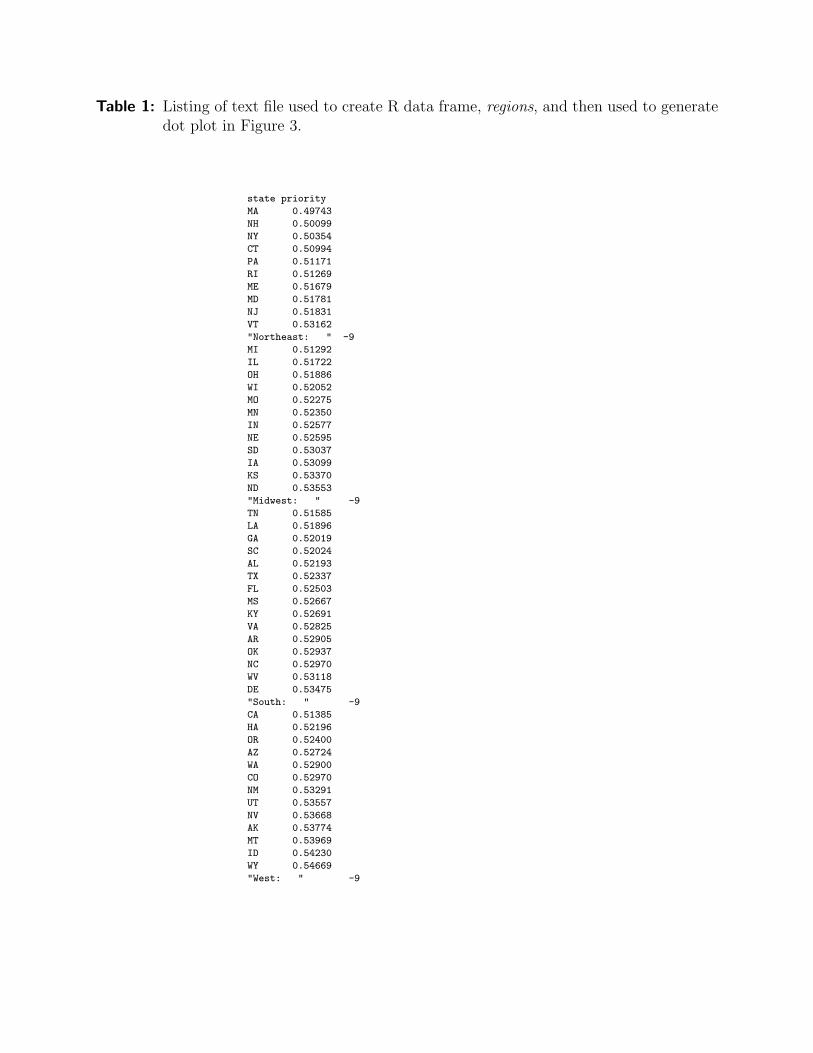
Table 1: Listing of text file used to create R data frame, regions, and then used to generatedot plot in Figure 3.
state priority
MA 0.49743
NH 0.50099
NY 0.50354
CT 0.50994
PA 0.51171
RI 0.51269
ME 0.51679
MD 0.51781
NJ 0.51831
VT 0.53162
"Northeast: " -9
MI 0.51292
IL 0.51722
OH 0.51886
WI 0.52052
MO 0.52275
MN 0.52350
IN 0.52577
NE 0.52595
SD 0.53037
IA 0.53099
KS 0.53370
ND 0.53553
"Midwest: " -9
TN 0.51585
LA 0.51896
GA 0.52019
SC 0.52024
AL 0.52193
TX 0.52337
FL 0.52503
MS 0.52667
KY 0.52691
VA 0.52825
AR 0.52905
OK 0.52937
NC 0.52970
WV 0.53118
DE 0.53475
"South: " -9
CA 0.51385
HA 0.52196
OR 0.52400
AZ 0.52724
WA 0.52900
CO 0.52970
NM 0.53291
UT 0.53557
NV 0.53668
AK 0.53774
MT 0.53969
ID 0.54230
WY 0.54669
"West: " -9
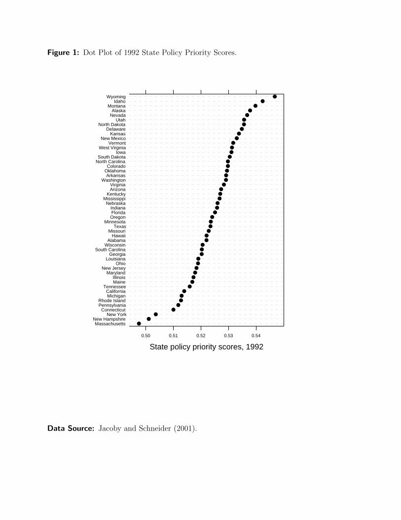
Figure 1: Dot Plot of 1992 State Policy Priority Scores.
State policy priority scores, 1992
MassachusettsNew Hampshire
New YorkConnecticut
PennsylvaniaRhode Island
MichiganCalifornia
TennesseeMaineIllinois
MarylandNew Jersey
OhioLouisiana
GeorgiaSouth Carolina
WisconsinAlabama
HawaiiMissouri
TexasMinnesota
OregonFloridaIndiana
NebraskaMississippi
KentuckyArizonaVirginia
WashingtonArkansas
OklahomaColorado
North CarolinaSouth Dakota
IowaWest Virginia
VermontNew Mexico
KansasDelaware
North DakotaUtah
NevadaAlaska
MontanaIdaho
Wyoming
0.50 0.51 0.52 0.53 0.54
●●
●●
●●●
●●
●●●●●●
●●●
●●●●●●
●●●●●●
●●●●
●●
●●●●
●●
●●●
●●
●●
●
Data Source: Jacoby and Schneider (2001).
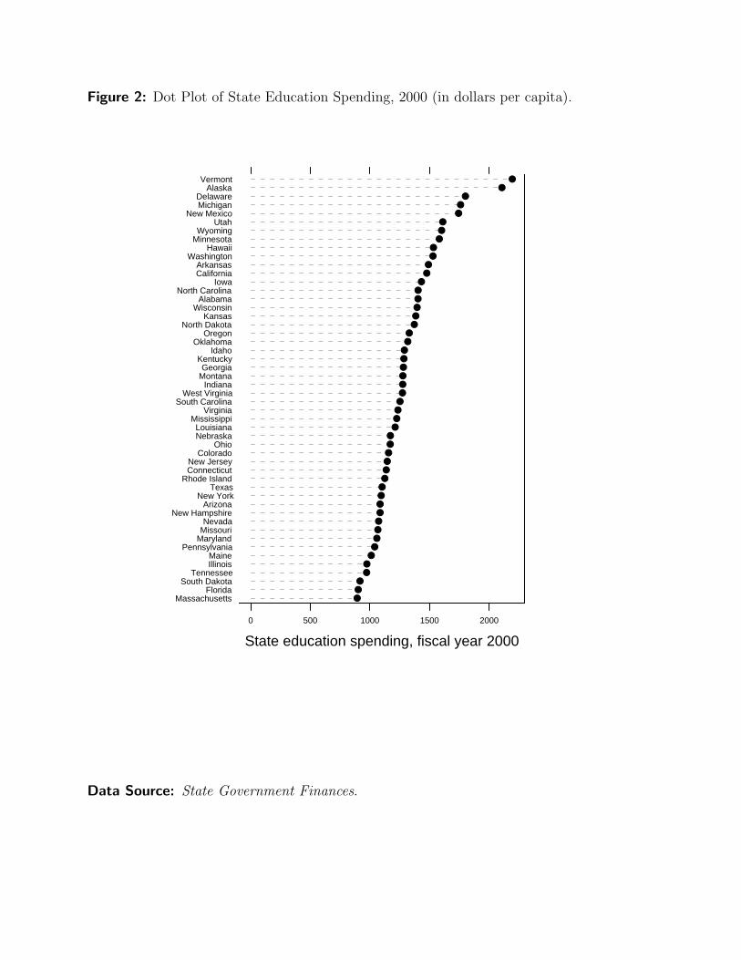
Figure 2: Dot Plot of State Education Spending, 2000 (in dollars per capita).
State education spending, fiscal year 2000
MassachusettsFlorida
South DakotaTennessee
IllinoisMaine
PennsylvaniaMarylandMissouriNevada
New HampshireArizona
New YorkTexas
Rhode IslandConnecticutNew Jersey
ColoradoOhio
NebraskaLouisiana
MississippiVirginia
South CarolinaWest Virginia
IndianaMontanaGeorgia
KentuckyIdaho
OklahomaOregon
North DakotaKansas
WisconsinAlabama
North CarolinaIowa
CaliforniaArkansas
WashingtonHawaii
MinnesotaWyoming
UtahNew Mexico
MichiganDelaware
AlaskaVermont
0 500 1000 1500 2000
●●●
●●●●●●●●●●●●●●●●●
●●●●●●●●●●●●
●●●●●●
●●
●●
●●●
●●
●●
●
Data Source: State Government Finances.

Figure 3: Dot Plot of 1992 State Policy Priority Scores, by Region.
State policy priority scores, 1992
MANHNYCTPARI
MEMDNJVT
Northeast: MIIL
OHWI
MOMNIN
NESDIA
KSND
Midwest: TNLAGASCALTXFL
MSKYVAAROKNCWVDE
South: CAHAORAZ
WACONMUTNVAKMTID
WYWest:
0.50 0.51 0.52 0.53 0.54
●●
●●
●●
●●●
●
●●
●●
●●
●●
●●
●●
●●
●●
●●
●●●
●●●●
●●
●●
●●
●●
●●
●●
●●
●
Data Source: Jacoby and Schneider (2001).
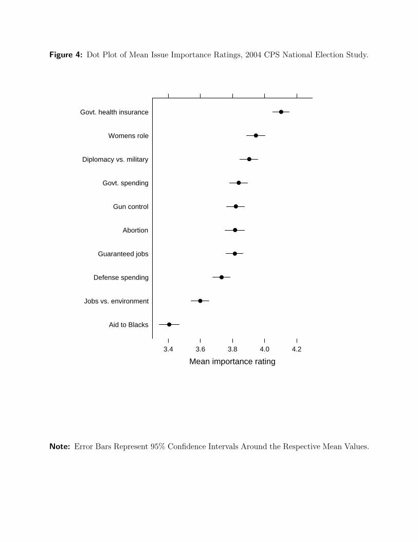
Figure 4: Dot Plot of Mean Issue Importance Ratings, 2004 CPS National Election Study.
Mean importance rating
Aid to Blacks
Jobs vs. environment
Defense spending
Guaranteed jobs
Abortion
Gun control
Govt. spending
Diplomacy vs. military
Womens role
Govt. health insurance
3.4 3.6 3.8 4.0 4.2
●
●
●
●
●
●
●
●
●
●
Note: Error Bars Represent 95% Confidence Intervals Around the Respective Mean Values.