the domino designer quickstart tutorial · pdf file• the introduction to domino designer...
TRANSCRIPT

The Domino Designer
QuickStart Tutorial

1. Welcome
The Domino Designer QuickStart Tutorial
You've installed Domino Designer, you've taken the Designer Guided Tour, and maybe
you've even read some of the Designer Help. Now you're sitting in front of the screen,
but you're not sure how to get started. That's where QuickStart comes in. QuickStart is a
hands-on tutorial that takes you through the steps of creating your first Domino
application.
Audience
QuickStart is for anyone who is new to the Domino Designer R5 development
environment. Even if you're an experienced Domino application developer, you'll find
that Designer R5 has a brand new user interface, and greatly expanded support for
developing sophisticated, interactive applications for Web and Notes clients.
QuickStart will be especially useful for you if you're an experienced Web application
developer new to the Domino Designer environment. As you'll see, Designer provides
the building blocks you're already familiar with, such as pages, framesets, JavaScript,
etc. in a powerful framework that helps you pull all the elements together. But you'll
need some help learning that framework. QuickStart helps get you quickly up to speed
working in the Designer environment to leverage your Web development skills.
Creating Domino applications is fun!
Designing applications in Domino may not be what you're used to... It's better! As you'll
see, Domino provides a rich and robust development environment that enables you to
focus on the application you're creating, without bogging you down with the effort of
keeping track of everything.
Notice, as you go along, how much you accomplish by simply pointing and clicking to
create new elements and specify their appearance and behavior.
The Designer environment makes it easy to organize the elements of your application.
No more having to worry about a proliferation of files and keeping track of fragile links.
Instead, the Designer provides an organized way of viewing all the elements of your
application, and easy ways to connect everything together.
You'll see this for yourself as you go through the tutorial.

2. What You'll Be Building
In this section...
This section provides an overview of what you'll be building as you go through the
lessons of the QuickStart Tutorial. The idea is to give you the big picture so that as you
work your way through the tutorial you'll know how the pieces fit in.
Scenario - WaterWorks Intranet Web Site
The tutorial takes you through the steps of building an actual application. The scenario
involves building a corporate Intranet Web site for a fictional company called
WaterWorks.
You can run the applications you build with Designer from both the Notes client and
from Web browsers. In this tutorial we'll focus on steps needed for optimizing the
application for the Web. You'll preview the application, as you build it, using the Web
browser of your choice.
You can explore the application you're building in its completed state. The completed
application is provided in a Domino database called "WaterWorks Sample". The file
name is <Notes root>\data\qstart\wwsample.nsf (the path may be different, depending
on where you put the files when you downloaded the tutorial). Note: Although you can
use this sample database to obtain portions of the site to copy and paste, it's
recommended that you follow the steps and build everything by hand. You'll learn
better that way.
Home Page
The WaterWorks Web site provides information for the use of all the departments in the
company. The home page looks like this:

We won't provide information for all the departments listed in the home page. We'll
dive deeper only into the Sales Department link.
Sales Department Frameset
The Sales Department link brings up a frameset that looks like this:
The frames contain the following information:
• The top frame displays the Sales Department banner.
• The left frame displays the links to the various parts of the Sales
Department. As you'll see in the tutorial, you can implement the set of
links you see above with a Domino design element called an outline.
You'll learn about outlines in the tutorial. Note: We'll build content for
the "Contact Management" and "Industry News" links only. The other
links won't actually be developed.
• The right frame displays the information selected by clicking the links in
the left frame. The picture above shows the Contact Management
information. The Contact Management information is implemented with
a Domino design element called a view. You'll learn about views,
documents and forms in the tutorial.
Step-by-Step
To create the frameset above, we'll first need to create the elements that display in the
frames that make up the frameset. It will take several lessons to create these elements.
As we near the end of the tutorial we'll pull all the pieces together into the frameset, and
see the entire site in action.

3. Before You Begin
In this section...
The purpose of the QuickStart Tutorial is to get you right into creating your first
Domino application. The information you need to complete a task is provided as you go
along. However, before you get started, there are some fundamental concepts you
should know about. This section briefly explains those concepts.
If you prefer, you can refer to the following sources for additional background
information, but it's not required.
• The Designer Guided Tour (from the Designer window, choose Help -
Guided Tour)
• The Introduction to Domino Designer in Domino 5 Designer Help
What is a Domino database?
If you've developed for the Web before, you probably created HTML files, GIF files,
and other file types, and organized the files into directories. It doesn't take long before
you have lots of files and directories to keep track of.
In contrast, when you create an application with Domino, everything is stored in
Domino databases. A Domino database holds all the elements of an application, such as
the pages, forms, images, framesets and any scripts you write to automate the
application.
A Domino application can consist of a single Domino database, as is the case with the
application you'll build with this tutorial. Larger applications can consist of several
Domino databases, each of which holds the elements of some portion of the application.
What is Domino Designer?
Domino Designer is where you create and edit Domino databases. The following screen
shows the Designer window:
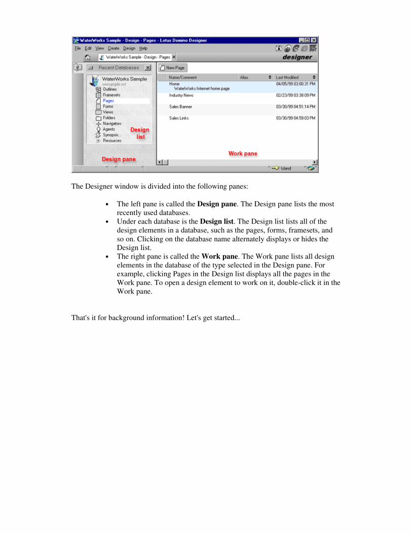
The Designer window is divided into the following panes:
• The left pane is called the Design pane. The Design pane lists the most
recently used databases.
• Under each database is the Design list. The Design list lists all of the
design elements in a database, such as the pages, forms, framesets, and
so on. Clicking on the database name alternately displays or hides the
Design list.
• The right pane is called the Work pane. The Work pane lists all design
elements in the database of the type selected in the Design pane. For
example, clicking Pages in the Design list displays all the pages in the
Work pane. To open a design element to work on it, double-click it in the
Work pane.
That's it for background information! Let's get started...
4. Starting a New Application
In this section...
As explained in the previous section, the database is the fundamental building block of
Domino applications. In this section we'll create the database in which we'll be building
the WaterWorks application.
Create your first Domino database...
Step 1. Launch the Designer
You can launch Designer from the Windows desktop or from the Notes client.
To launch Designer from the Windows desktop, choose Designer from the Start menu
or double-click the Designer launch icon:
To start the Designer from the Notes client, click the Designer icon in the bookmarks
area along the left side of the Notes window:
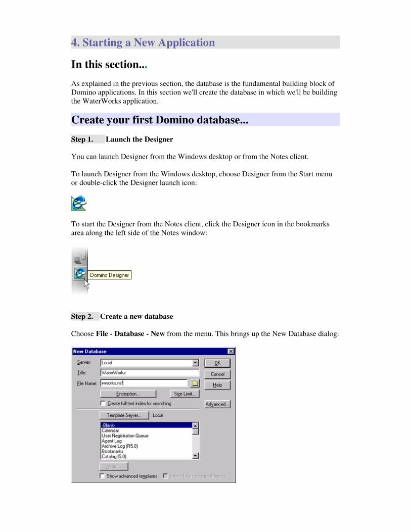
Step 2. Create a new database
Choose File - Database - New from the menu. This brings up the New Database dialog:

Since we'll be developing an Intranet site for WaterWorks, set the database title to
WaterWorks, and specify the file name wworks.nsf. Note: "nsf" is the file extension
for Notes databases.
In the lower half of the dialog you can select a template to use for this new database.
Templates are predefined designs for databases that enable you to quickly and easily
create new applications of a variety of types, such as Discussion, Document Library,
and so on. For the purpose of this tutorial, choose "Blank". You'll create the
WaterWorks application from scratch to learn all the steps.
Click OK. The new database now appears in the Design pane.

5. Your First Page
In this section...
Pages are a fundamental building block of applications you build in Designer. You're
probably familiar with the process of using a text editor or Web development package to
create HTML files. With Designer, pages are a built-in design element.
In this section you'll create your first page. You'll use the simple WYSIWYG editing
environment to create content for the page. You'll also learn about the Properties box - a
floating window where you set the properties of all the elements you create.
You'll also see how to preview your work in the Web browser of your choice as you
develop your application.
The page you build will look something like this when viewed in a browser:
Create a new page...
Step 1. Select the Pages element in the Design pane
The Design list for the WaterWorks database lists all the design element types. Select
Pages:
When you select Pages, the Work pane lists all the pages in the database. At this stage,
the Work pane is empty because you haven't created any pages yet.
Step 2. Create a new page
The New Page button displays in the bar at the top of the Work pane:

Click New Page to create a new page. The new page displays in the Work pane.
Add content to the page...
You don't need to know HTML to add content to your application. You enter and
format text directly on the page. When your application is served to a Web browser,
Domino automatically generates the necessary HTML tags and attributes.
To get warmed up, we'll start with a simple page with just a few lines of text. This page
will be an "Industry News" page that provides some news of interest to WaterWorks
employees.
Step 1. Set focus
Click anywhere in the empty page. You'll see the flashing text cursor in the upper-left of
the page.
Step 2. Type in your text
Enter the following text:
Industry News
Lotus announces Domino 5.0
WaterWorks announces its new Intranet site built with Domino 5.0
The page should look something like this:
Step 3. Save your work
Choose File - Save, or press Ctrl+S to save your work. Since you haven't yet named the
page, Designer prompts you to provide a name. Enter "Industry News" (without the
quotes):

Note: You'll be reminded at various points in the tutorial to save your work. You can, of
course, save you're work whenever you wish.
Set Properties with the Properties box...
You'll now learn about the Properties box. The Properties box is a floating window that
you use to set the properties of all the objects you work with. As you'll see, much of the
work you do in the Designer revolves around creating objects and setting their
properties with the Properties box.
In this section we'll bring up the Properties box and use it to set some text properties.
We'll also explore the key features of the Properties box that let you use it effectively.
Step 1. Bring up the Properties box for the selected object
Whenever you have an object selected, there's a command in the menu bar associated
with that object. To see this in action, select the text "Industry News".
Notice the Text command in the menu bar. Choose the Text - Text Properties
command to bring up the Text Properties box:
You use the Properties box to modify all the properties of the selected object.
The Properties box is relatively small so it won't take up much space on the screen. You
can drag it anywhere you want by clicking on the title bar at the top and dragging. Drag
it now to make sure it's not covering the text you selected.
Step 2. Set properties with the Properties box

We'll update a few settings now.
Select the text "Industry News" if it's not still selected:
Update the following settings in the Properties box:
• In the Font listbox, select Arial.
• In the Size listbox, select 14
• In the Style listbox, select Bold
• Click the Color dropdown listbox to bring up the color picker. Choose
the blue color shown below:
Notice that as you change properties, the changes appear immediately in the text.
Note: You can also press Ctrl+B to toggle the selected text between bold and plain.
(See Designer Help for a full list of keyboard shortcuts.)
Step 3. Choose another object and continue setting properties
Unlike a regular dialog box, you don't have to close down and reopen the Properties box
to update the properties of another object. You can keep the Properties box up, and
simply select the next object to modify.
Select all the news item text, (all the text other than "Industry News"):

Set the following properties:
• In the Font listbox, select Arial.
• In the Size listbox, select 9
Step 4. Choose the Paragraph tab in the Properties box
You may have noticed that the Properties box has tabs across the top. These tabs each
provide a different set of properties. So far we've worked only in the first tab in the
Properties box - the Basics tab where you set font-related properties. Now we'll set
some properties that apply to paragraphs of text.
Select the Paragraph tab (the second tab):
Step 5. Center the "Industry News" text
Select the text "Industry News".
Still in the "Paragraph" tab of the Properties box, click the center alignment button to
center-align the text:
Step 6. Set the news items to bulleted text
Select the news item text (all the text other than "Industry News").
Still in the Paragraph tab of the Properties box, click the List dropdown control to

bring up the list of formatting choices:
Choose Bullet.
Choose File - Save, or press Ctrl+S to save your work
Preview your work...
You can preview your application in the Notes client or a Web browser at any time by
clicking on any of the preview buttons in the upper-right of the Designer window:
• The Notes Client preview button is always available. Use it to preview
the design element you are working on in the Notes Client.
• The Notes Browser preview button brings up the browser you have
specified as the browser to use when you're in the Notes Client. This can
be the built-in browser, or it can be set to bring up any other browser you
have on your machine.
• Domino automatically detects the browsers installed on your machine
and displays a preview button for each.
Step 1. Click on a preview button
Click on the preview button for the browser of your choice.
The browser opens up, and displays the "Industry News" page. It should look something
like this:

Step 2. Close the page
Now that you've confirmed the page looks as it should in a browser, you can close the
page.
To close the page, click back in the Designer window, and do one of the following:
choose File - Close, press <Escape> or click the "X" in the "Industry News" element in
the tab bar:
Congratulations - you've completed your first page!
But don't go on to the next lesson yet! Keep reading below for more tips about how to
make the best use of the Properties box.
More about the Properties box...
You'll be spending a lot of time using the Properties box as you work your way through
this tutorial. This section provides a few useful tips for using the Properties box
effectively.
Step 1. Other ways to bring up the Properties box
In the lesson above, we opened the Properties box by choosing the Text - Text
Properties command.
There are several other ways to bring up the Properties box:
• Right-click menu: You can right-click on any object to bring up a menu
of commands. The right-click menu always includes the Properties box
command. To see this, right-click anywhere in the "Industry News" page.
Notice that there's a Text Properties command and a Page Properties
command in the menu.

• The Properties box icon: Click the Properties box button in the upper
right of the Designer window:
• Keyboard Shortcut: You an also press Alt+Enter to alternately open
and close the Properties box.
Step 2. Use the Object Selector to choose a different object
Whenever you select an object, there are often other objects that contain that object, or
that are contained by that object.
For example, when you click on text in a page, it may be that you intended to select the
text, but you could also have intended to select the page. There's no way for the
Designer to know which you mean. Designer guesses that you mean the smallest
contained object, in this case the text, not the page.
If Designer guesses wrong, you can use the Object Selector at the top of the Properties
box to choose a different object.
To see this in action, click on any of the text in the page. The Properties box displays
the label "Text" at the top of the box. This is the Object Selector. Click on the Object
Selector to drop down the object list:
This dropdown list displays the object hierarchy to which the selected text belongs. The
text you selected is part of the page, which is part of the database. You can select any of
the objects in this list to bring up the properties for that object.
For example, select Page from the list. This brings up the properties of the page you're
working on. Notice that the Name field is set to "Industry News" which you entered
earlier.
Step 3. Collapse the Properties box
It's often convenient to leave the Properties box up rather than repeatedly opening and
closing it. However, even though the box is small, it can get in your way. That's why

there's a "Collapse" button in the title bar of the Properties box:
When you click the Collapse button, the Properties box changes to a condensed form
with just two rows of buttons:
The collapsed form of the Properties box does not include all the options available in
the expanded form, but it may be exactly what you need in many cases.
To go back to the expanded form, click the "Expand" button (indicated by the arrow in
the picture above).
Step 4. Close the Properties box
When you don't want the Properties box to display any longer, you can close it by
clicking the "X" in the upper-right corner:
As mentioned earlier in this lesson, you can also press Alt+Enter to alternately open
and close the Properties box.
You're now armed with all the tips you'll need to use the Properties box effectively as
you work your way through the lessons in this tutorial.

6. Working With Images
In this section...
Images are an integral part of any great looking application, but they can be a chore to
work with. You're probably familiar with creating graphic files, such as GIFs or JPEGs,
and adding image tags to your pages. The resulting tangle of files and links can be hard
to manage and maintain. With Domino, your images are stored in the databases that use
them, so you don't have to worry about managing files and links.
In this section you'll learn how to store images in your Domino database as Image
Resources, and use images in your application. To demonstrate working with images,
we're going to create the "Sales Banner" page.
The page will look something like this when viewed on its own in a browser (in a later
section we'll incorporate it into the Sales frameset):
Import Image Resources...
Step 1. Select the Resources - Images design element
Select Resources in the Design list. Resources expands to list all of the resource types
in Domino. Click Images to display the image resources in the Work pane:
Step 2. Create a new image resource
Click the New Image Resource button:

This brings up a dialog box in which to choose the image resource file.
Step 3. Find the image files
You're now in the Open dialog shown below. You use this dialog to specify the image
files to bring in as resources.
Note the Files of Type dropdown list. This lets you choose the file formats GIF, JPEG
or BMP. Set the choice to GIF Image if it's not already set.
Navigate to the directory <Notes root>\data\QuickStart. All of the images we'll be
using for this tutorial are in that directory.
Step 4. Import the images
We need only the salesbanner.gif image for the page we're creating now, but while
we're here, we can make things easy and import all of the images.
Select all the images by clicking on the first image, then hold down the Shift key and
click on the last image.
Click Open to bring all the images in as image resource. The imported images are now
displayed in the Work pane:

Double-click any image to see its properties.
Create the Sales Banner page...
Now we'll create the Sales Banner page.
Step 1. Select the Pages element
Select the Pages element in the Design pane:
Step 2. Create a new page
Click the New Page button at the top of the Work pane:
The Work pane now displays the new page.
Step 3. Name the page
Choose Design - Page Properties to bring up the Page Properties box:

Set Name to "Sales Banner" (without the quotes).
Note: When you enter text in a field in the Properties box, small buttons appear to the
right of the field for "Confirm" and "Cancel". To confirm the text you've entered, click
the confirm button or press <Enter>. To cancel the text you've entered, click the cancel
button or press <Esc>:
Add the image to the page...
Now we're ready to add the Sales Banner image to the page.
Step 1. Add the image to the page
In the previous section we brought in all the images as image resources. All we need to
do now is insert the Sales Banner image on this page.
Choose Create - Image Resource. This brings up the Insert Image Resource dialog
box:

Select the salesbanner.gif image. Click OK to add the image to the page.
Choose File - Save, or press Ctrl+S to save your work.
Preview your work...
Click the preview button of your choice to see the Sales Banner page in a browser. It
should look something like this:
We'll incorporate this page into the Sales frameset in a later lesson.
You can now click back in the Designer window and close the "Sales Banner" page
(choose File - Close, press <Escape> or click the "X" in the "Sales Banner" element in
the tab bar).

7. Creating a Form
In this section...
In the sample application we're building for WaterWorks, we're focusing on the Sales
Department portion of the site. One of the features we'll develop for the Sales
Department is the ability for visitors to enter and view information about sales contacts.
The mechanism for entering information into a Domino database is the form. You may
be familiar with forms from the Web and other computer applications. Forms provide
fields for entering information, such as text, checkboxes, dropdown lists, and so on. The
user enters information into the fields of the form, and then clicks a button, often called
"Submit" on the Web, and the information is sent to the server.
As you'll see in later lessons, the concept of forms in Domino is intimately related to the
concepts of documents and views. When a site visitor enters information about a
contact into the contact form, a contact document is created to store that information in
the Domino database. We need a way to view those stored contact documents. That's
where Domino Views come in. Views provide a way organizing documents for display,
such as displaying documents sorted by date, or contact name, etc.
In this lesson we'll create the Contact form for gathering information about sales
contacts. The form will look something like this when viewed in a browser:
You'll also learn about the Designer table element. Tables provide a convenient and
flexible mechanism for organizing the information on forms and pages. We'll use a table
for organizing the labels and fields in the form.

Create a new form...
Step 1. Select the Forms design element
Select the Forms element in the Design list:
Step 2. Create a new form
Click the New Form button to create a new form:
The new form displays in the Work pane.
Step 3. Set a background color for the form
Setting a subtle background color can help to highlight the input fields in the form.
We'll set the background to a light gray.
Choose Design - Form Properties to open the Form Properties box.
Select the fourth tab of the Form Properties box, this is the Background tab:
This tab lets you specify a color or a graphic as the background for the form. In this case
we're setting the background to a light gray. Select the Color dropdown list, and choose
the shade of gray indicated below:

Step 5. Save your work
Choose File - Save or press CTRL+S to save the form.
Since you haven't yet provided a name for the form, Designer prompts you for a name.
Enter "Contact" (without the quotes).
Enter the "Contact Information" label...
It's a good idea to provide a label at the top of any form to identify its purpose.
Step 1. Enter the text "Contact Information:"
• Click anywhere in the form. The cursor positions itself at the top-left of
the form.
• Press <Enter> to enter a blank line to provide some breathing room at the
top of the form.
• Enter the text "Contact Information:"
• Press <Enter>.
Step 2. Set the text properties
• Select the text "Contact Information:"
• Bring up the Properties box by right-clicking in the selected text, and
choosing Text Properties from the popup menu. (Note: If the Properties
box is already up, this step won't be needed. The Properties box
automatically displays the properties of the selected object.)
• Set the Font to Arial. (Note: The font defaults to "Default Sans Serif".
When you use this font, the browser displays the text with the browser's
default font. Choosing Arial causes slightly more HTML to be generated
when the page is sent to the browser, but it gives you more control over
the font that the site visitor sees.)
• Set the Size to 9.
• Set the Style to Bold.
Create a table for laying out the form...
As mentioned in the introduction to this lesson, tables are often used to help lay out
pages and forms. We'll now create a table for this purpose.
Step 1. Enter a blank line below the label
Click below the "Contact Information" text, and press <Enter> to provide a blank line
between the label and the table. The cursor is now located one line below the title. This
is where we want the table to go.
Step 2. Create a new table
Choose Create - Table.
This brings up the Create Table dialog box:
Set Rows to 3, and Columns to 3. These are the dimensions we'll need to hold the
labels and fields we'll be creating.
Table width is set to Fixed width by default. In a fixed width table, you specify the
width for each column in the table. With the other choice, Fit to Window, one or more
of the columns adjust automatically when the window size changes. For this example,
keep Fixed width selected.
You choose the Table Type by clicking on one of the type buttons in the Table Type
section. The default is the basic table option, represented by the leftmost button
(highlighted in the diagram). Leave the Table Type as Basic. (You can click on the
other icons to see the descriptions that come up in the dialog, but make sure to click
back on the Basic choice.)
Click OK.
Step 3. Adjust the column widths

The columns widths of the table are not yet what we want them to be. We'll use the
Properties box to set the column widths.
Set the width of column #1 to 1 inch:
• Select the first column by clicking in any of the cells in the column.
• Set the Properties box to display Table properties by clicking the Object
Selector at the top of the Properties box, and choosing Table from the
dropdown list.
• The first column will be used for labels for the input fields. We need
approximately 1 inch for that. Set the column width to 1.00 inch:
Set the width of column #2 to .125 inches:
• Click anywhere in the second column.
• The second column will be used to provide space between the label
column and the fields column. Set the width to .125 inches.
Set the width of column #3 to 3.5 inches:
• Click anywhere in the third column.
• The third column will hold the input fields. Set the width to 3.5 inches.
At this point the form should look something like this:
Step 4. Remove table borders
By default, the table has 1-pixel borders around every cell. For the form we're creating,
there's no need for table borders.
To modify the table borders, select the second tab of the Table Properties box (circled
below):

With the controls on this tab, you can modify the color, style and thickness of the table
borders for any set of cells you select.
We want to remove the borders for all the cells in the table. To do this:
• Select all the cells in the table. As you drag through the cells, an invert
highlight shows what you have selected.
• Click the Set All To 0 button. This sets all the borders to 0 thickness, or
in other words, removes all the borders.
Note: When you remove the borders, they're represented as dotted lines in the Designer.
This is so that you can see the cells of the table and work with them. When you view
this form on the Web, or in the Notes Client, the dotted borders don't display.
Step 5. Set basic text properties for the whole table
One of the useful features of tables is that you can set text properties in the table before
you've entered text. We'll take advantage of this now and set the text properties so that
we won't have to do this later every time we enter a label or a field in the table.
Select all the cells in the table.
Bring up the text properties in the Properties box by clicking the Object Selector and
choosing Text.
In the first tab of the Text Properties box:
• Set Font to Arial.
• Set Size to 9.
Choose File - Save, or press CTRL+S to save your work.
Add the field labels...
Input fields in a form should have labels for identification. We'll use column #1 for the
labels.

Step 1. Add the label text
• Click in the top cell of column #1. Enter the text "Contact:"
• Click in the second cell in column #1. Enter the text "Company:"
• Click in the third cell in column #1. Enter the text "Account Type:"
Step 2. Set the labels to Bold
• Select all of the cells in column #1 by clicking anywhere in the top-left
cell, and dragging down to the bottom-left cell.
• If Text properties aren't displayed in the Properties box, click the Object
Selector and choose Text.
• Set Style to Bold.
Step 3. Right-justify the labels
Select the second tab of the Properties box, and click the Right-Justified button:
The labels are now right-justified in their cells:
Step 4. Add the Comments Label below the table
• Click in the space below the table, and press <Enter> to add some white
space
• Enter the text "Comments:"
• Select this text. Notice that the Properties box is automatically set to Text
properties
• Set the Font to Arial
• Set the Size to 9
• Set the Style to Bold.
The form should look something like this:
Choose File - Save, or press CTRL+S to save your work.

Add the "Contact" field...
Domino provides a number of different input field types. Some types you're probably
familiar with, such as Text, Checkbox, Radio button, Combobox, and so on. Others,
such as Date/Time, Authors and Names you're probably not familiar with unless you're
an experience Domino application developer. It's beyond the scope of this tutorial to go
into detailed descriptions of the behavior and uses of all these field types. What we'll do
here is add a few fields to take you through the basic steps of creating and formatting
input fields. The idea is to get you started so you'll know what to look for in the more
detailed assistance provided in the Designer Help.
Let's start by adding the Contact field.
Step 1. Create the new field.
Click in the cell in the top row, third column.
Choose Create - Field.
This creates a new, untitled field in the selected location. Also, the Field Properties box
is automatically displayed to show the properties of the new field, with the Name field
highlighted and ready for you to enter the field name:
Enter the name "Contact" (without the quotes).
Step 2. Set the field properties
There are many field properties that you can set. There are too many settings to cover
them all here, but since we're building this application for the Web, let's specify the
width of the field when the form is viewed in a browser.
Click on the field. The Properties box should update to display Field properties. If not,
click the Object Selector and choose Field from the dropdown list.
Select the Web properties tab (circled in the diagram below):

This tab lets you set various HTML tags to control the appearance of the field on the
Web.
Enter "size=25", (without the quotes), in the Other field. This is equivalent to
specifying the size attribute in an HTML Input tag.
Add the "Company" field...
Now we'll add the Company field. The steps are similar to what we did for the Contact
field.
Step 1. Create the new field.
Click in the cell immediately below the cell that contains the Contact field.
Choose Create - Field.
This creates a new field, and automatically brings up the Field Properties box, with the
Name field highlighted. Enter the name "Company".
Step 2. Set the field properties
Select the Web properties tab.
In the Other field, enter "size=25" (without the quotes).
Add the "Account Type" field...
Visitors to the WaterWorks Web site use the Account Type field is used to indicate one
of three account types: Client, Supplier, Wholesaler. Since an account can be only one
of these types, this calls out for a radio button group.
Step 1. Create the new field.
Click in the cell immediately below the cell that contains the Company field.
Choose Create - Field.
This creates a new field, and automatically brings up the Field Properties box, with the

Name field highlighted. Enter the name "AccountType". Notice that spaces are not
allowed in field names.
Step 2. Set the Type to Radio button
We want this field to display as a group of radio button choices.
Click in the Type dropdown list. This displays the full list of data type choices:
Choose Radio button.
Step 3. Specify the radio button choices
Select the second tab of the Field Properties box. You use this tab to specify the details
for the field type you have chosen:
In the Choices field, type in the Account Type choices, one per line, as shown in the
diagram above. Press <Enter> to start a new line after each entry:
Client
Supplier
Wholesaler
The Number of columns option lets you control how the radio buttons are layed out.
The current setting, 1, means that the buttons will be organized vertically in a single
column.
You can explore different options for Border Style, or just leave this as is.

Add the "Comments" field...
The purpose of the Comments field is to provide a place for the user to enter additional
comments about the contact. We'll use a Rich Text field, which allows users to apply
formatting to the entered text, such as bulleted text, bold text, and so on.
Formatted text is not supported by the native HTML text input field. As you'll see in
this section, Designer lets you specify the use of an applet for entering Rich Text on the
Web. Let's see how this works.
Step 1. Create the new field.
Click to the right of the "Comments" label below the table and press <Enter>. This
places the cursor immediately below the label.
Choose Create - Field.
This creates a new field, and automatically brings up the Field Properties box, with the
Name field highlighted. Enter the name "Comments".
Step 2. Set the field properties
The settings we need are in the first pane of the Field Properties box:
For Type, choose Rich text.
In the Web Access section (still on the first pane), set Display to Using Java Applet.
This is the setting that tells Domino to use the Rich Text applet when rendering this
field on the Web.
Choose File - Save, or press CTRL+S to save your work.

Using the Programmer's pane...
So far in this tutorial we haven't used the Programmer's pane. In this section we'll take a
brief look at the Programmer's pane and use it to specify the default value for the
Account Type field.
The Programmer's pane is below the Work pane. You use the frame splitter between the
two frames to expand or collapse the Programmer's pane, as shown below:
Step 1. Open the Programmer's pane
If the Programmer's pane is not already displayed on your screen, click and drag on the
frame splitter at the bottom of the Work pane to open it up.
Click on the Account Type field in the Work pane. When you select a field in the Work
pane, its events are displayed in the Objects tab in the Programmer's pane:
Notice that one of the events listed for the Account Type field is Default Value
(selected in the diagram above).
Step 2. Set the default value for Account Type
Click on the Default Value event.
Enter the text "Client" (with the quotes) in the Script area, as shown below:

Choose File - Save, or press CTRL+S to save your work.
Create the Action Bar...
Every form needs at least one button to submit the input to the server. Domino provides
several ways to add buttons to forms. You can add buttons any place in the form you
wish, but Domino also provides a feature called the Action Bar. The Action Bar is a
region across the top of the form dedicated to the purpose of displaying buttons. The
buttons in the action Bar are called Action Buttons.
Here's how the Action Bar appears on the Web in the form you're building:
Some of the benefits of using an Action Bar to display buttons are:
• The bar provides a standard, consistent location for buttons.
• You can set each button so that it is hidden under certain circumstances,
independently of the other buttons. (Note: Domino provides this
hide/show ability for all elements in a form or page, but this property
applies to entire paragraphs, it cannot be set separately for items in the
same paragraph. The action bar is more flexible in that you can hide or
show each button independently of the others.)
• Domino supports a feature called subforms. Subforms are building
blocks that can be reused in multiple forms. You can assign buttons to
the Action Bar for each subform, and Domino automatically gathers all
the buttons from all the subforms that are in a form. We won't go into
this in this tutorial, but it's a good thing to know about.
In the following sections we'll create several action buttons. In this section, we'll set
some properties for the Action Bar itself.
Step 1. Open the Action pane
The Action pane is where you specify the Action Bar properties and create actions. To
open the Action pane, drag the frame splitter at the right edge of the Designer window
to the size you want:

There are several default actions with *'s next to them. These are built-in actions that
are useful for several common operations. We'll be creating new actions from scratch
because we need the actions to do things that are not handled by the built-in actions.
Step 2. Bring up the Action Bar Properties box
Click anywhere in the Action pane to select the pane. Choose Design - Action Bar
Properties. This brings up the Action Bar Properties box.
Step 3. Specify the Action Bar color
Choose the light-blue Color shown below:
Step 4. Specify Web access
When Domino serves up the application to a Web browser, the Action Bar can be
represented either in HTML or it can use the built-in Action Bar applet provided with
Domino. We want to use the action Bar applet because it provides better appearance and
full action bar behavior such as mouse-over highlighting of the action buttons.
Specify the use of the Action Bar applet in the Web Access section of the Action Bar
Properties box by setting Display to Using Java Applet.

Step 5. Specify button properties
The second tab of the Action Bar Properties box lets you specify aspects of the
appearance of the action buttons. The properties set in this tab apply to all the action
buttons.
Notice that in the Button Border section, Display is set to On Mouse Over. This
means that when the user mouses over a button, a beveled border displays to provide
feedback that the cursor is over a button. We could also specify that the button bevel
should always display, but the dynamic display of the bevel on mouse-over provides a
sense of interaction that users appreciate. Leave this setting as is, on On Mouse Over.
To complete the effect a button bevel displaying only on mouse-over, we need to set the
buttons to be transparent. To do this, click the Color control to bring up the color
palette. Along the top of the color palette are icons that represent special color choices.
Choose the None icon (circled above).
Step 6. Specify button label properties
The third tab of the Action Bar Properties box is for specifying the appearance of the
button labels. As with the button properties, these settings apply to all the button labels.
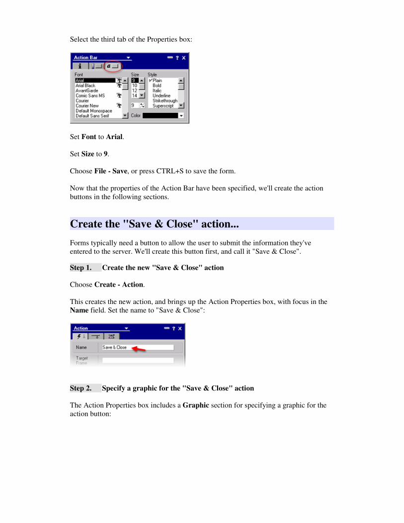
Select the third tab of the Properties box:
Set Font to Arial.
Set Size to 9.
Choose File - Save, or press CTRL+S to save the form.
Now that the properties of the Action Bar have been specified, we'll create the action
buttons in the following sections.
Create the "Save & Close" action...
Forms typically need a button to allow the user to submit the information they've
entered to the server. We'll create this button first, and call it "Save & Close".
Step 1. Create the new "Save & Close" action
Choose Create - Action.
This creates the new action, and brings up the Action Properties box, with focus in the
Name field. Set the name to "Save & Close":
Step 2. Specify a graphic for the "Save & Close" action
The Action Properties box includes a Graphic section for specifying a graphic for the
action button:

Set Graphic to Custom (circled above). This allows you to specify an image resource
to use for the graphic.
The Image field is where you enter the name of the image resource to use for this
button. You can enter the image resource name manually, or make things easy on
yourself by clicking the folder icon (indicated by arrow above) to bring up the Insert
Image Resource dialog. The list of image resources is populated with the images we
imported way back in the "Working with images" lesson. Choose the image
"act_saveclosecontact.gif".
Step 3. Script the "Save & Close" action
Now to the important aspect of the button - the action it carries out!
Designer lets you script in several languages: the Notes Formula language, LotusScript
and JavaScript. There's also a Simple Action method which lets you put together some
simple actions by making easy point-and-click choices. It's beyond the scope of this
tutorial to provide a full introduction to scripting, but you're encouraged to refer to the
Designer Help for more information. For this tutorial, we'll script action buttons with
simple formulas using the Notes Formula language.
You enter scripts in the Programmer's pane, which was introduced earlier in this Form
lesson when we set the default value for the AccountType field. We'll now use the
Programmer's pane to enter the script for the Save & Close button.
If the Programmer's pane isn't already displayed, open it up by dragging the frame
splitter from the bottom edge of the Designer window to the desired size:

Enter the following Formula script into the Programmer's pane (you can copy and paste
the text):
@Command([FileSave]);
@Command([FileCloseWindow]);
@Command([OpenFrameset];"Sales")
Click the checkmark button (circled above) to enter the script.
Choose File - Save, or press CTRL+S to save your work.
Now that we've been through the steps of creating the Save & Close action, we'll move
quickly through creating several more actions.
Create the "Cancel" action...
Forms typically need a "Cancel" button. Clicking this button closes the form without
saving any of the information entered.
Step 1. Create the new "Cancel" action
Choose the menu command Create - Action.
This creates the new action, and brings up the Action Properties box, with focus in the
Name field. Set the name to "Cancel".
Step 2. Specify a graphic for the "Cancel" action
Still in the first panel of the Action Properties box, set Graphic to Custom.
In the Image field, click the folder icon to bring up the list of image resources. Choose
"act_cancelcontact.gif".
Step 3. Script the "Cancel" action
Enter the following Formula script into the Programmer's pane (you can copy and paste

the text):
@Command([FileCloseWindow]);
@Command([OpenFrameset];"Sales")
Click the checkmark button to save the script.
Choose File - Save, or press CTRL+S to save your work.
Create the "Edit Contact" action...
So far we've created the actions that apply when a visitor to the Web site creates a new
Contact document. But as you'll see later in the tutorial, the application also supports
opening an existing contact form just to read it. When you open a document for reading,
this is called Read mode.
When a Contact document is opened in Read mode, it requires two additional actions:
"Edit Contact", and "Close".
"Edit Contact" puts the document into Edit mode - which allows the visitor to update
the information in the form.
"Close" simply closes the form. It actually does the exact same thing as "Cancel".
However, in Read mode, it's more appropriate to have a button that says "Close", than it
is to have "Cancel", because the user cannot make any changes that require cancelling.
We'll create these buttons first. Then in a later section, we'll see how to set the Hide
properties of the actions to get the right buttons to display in Edit mode and Read mode.
Step 1. Create the new "Edit Contact" action
Choose Create - Action.
This creates the new action, and brings up the Action Properties box, with focus in the
Name field. Set the name to "Edit Contact".
Step 2. Specify a graphic for the "Edit Contact" action
Still in the first panel of the Action Properties box, set Graphic to Custom.
In the Image field, click the folder icon to bring up the list of image resources. Choose
"act_editcontact.gif".
Step 3. Script the "Edit Contact" action
Enter the following Formula script into the Programmer's pane (you can copy and paste
the text):
@Command([EditDocument])

Click the checkmark button to save the script.
Create the "Close" action...
As explained above, the "Close" action simply closes a document that is open in read
mode.
Step 1. Create the new "Close" action
Choose Create - Action.
This creates the new action, and brings up the Action Properties box, with focus in the
Name field. Set the name to "Close".
Step 2. Specify a graphic for the "Close" action
Still in the first panel of the Action Properties box, set Graphic to Custom.
In the Image field, click the folder icon to bring up the list of image resources. Choose
"act_closecontact.gif".
Step 3. Script the "Close" action
Enter the following Formula script into the Programmer's pane (you can copy and paste
the text):
@Command([FileCloseWindow]);
@Command([OpenFrameset];"Sales")
Click the checkmark button to save the script.
Choose File - Save, or press CTRL+S to save your work.
Set the "Hide" property for the actions
We've created all the action buttons for the Contact form, but there's one more thing to
do before we're done. The final step is to set the Hide property for the buttons.
Select the second tab of the Action Properties box:

There are several options on the Hide tab.
The Hide action from section lets you hide or show the actions based on whether the
user is using the Notes client to view your application, or a Web browser.
The Hide action if formula is true section gives you full control over when to hide or
show a button by specifying a formula.
For the action buttons in the Contact form, we'll use the Hide action when document is
section. This lets you easily specify which buttons are visible in Read mode, and which
are visible in Edit mode.
Step 1. Specify when to hide the "Save & Close" action
"Save & Close" should be available when in Edit mode, so it should be hidden when in
Read mode.
Select the "Save & Close" action in the Action pane.
Select the checkboxes Previewed for reading and Opened for reading as shown
below:
Note: We won't be using the "Previewed for reading" feature in this tutorial. This refers
to designing the application so that a document is opened for reading in a separate frame
when it's selected in a View frame. However, when setting the Hide property, it's
typically the case that the actions you want hidden for "Previewed for reading" and
"Opened for reading" are the same.
Step 2. Specify when to hide the "Cancel" action
"Cancel" should be available when in Edit mode, so it should be hidden when in Read
mode.
Select the "Cancel" action in the Action pane.

Select the checkboxes Previewed for reading and Opened for reading as shown
below:
Step 3. Specify when to hide the "Edit Contact" action
"Edit Contact" should be available when in Read mode, so it should be hidden when in
Edit mode.
Select the "Edit Contact" action in the Action pane.
Select the checkboxes Previewed for editing and Opened for editing as shown below:
Step 4. Specify when to hide the "Close" action
"Close" should be available when in Read mode, so it should be hidden when in Edit
mode.
Select the "Close" action in the Action pane.
Select the checkboxes Previewed for editing and Opened for editing as shown below:
Choose File - Save, or press CTRL+S to save your work.
Preview your work...
Click the preview button of your choice to see the form you've created. It should look
something like this:

Notice several of the things we worked on in this lesson:
• The action bar across the top of the form
• Account Type defaults to Client.
• The Comments field makes use of the Rich Text Editor Applet. Try out
entering some text, and making it bold, bulleted, etc.
Congratulations - You've created your first form!
You can now click back in the Designer window and close the "Contact" form.

8. Creating a View to Organize and Display Documents
In this section...
As explained in the previous lesson, "Creating a Form", when a site visitor enters
information about a contact into the contact form, a contact document is created to store
that information in the Domino database. Now we need a way to view those stored
contact documents. That's where views come in. Views provide a way to organize and
display documents.
Unlike some of the other building blocks we've covered so far, even if you're familiar
with other Web development environments, you may not have seen anything like
Domino views before!
From the point of view of the application developer, (you, that is), you don't have to
resort to CGI scripts or other difficult mechanisms for handling input from users. As
you'll see, you specify the properties of one or more Views, and Domino takes care of
creating documents from the information submitted by users, and displaying the
documents in views.
From the point of view of the end user, views provide a flexible and intuitive way for
documents to be organized. Users can easily see lists of documents, sort the lists in
different ways, open documents for reading or editing, and create new documents. This
will all become more clear when you see views in action.
In this section we'll create a view called "Contact Management" for displaying contact
information documents. The view will look something like this when viewed from a
Web browser:
Notice some of the key points of what you see in the view above:
• Each contact document takes up one row in the view.
• Some key fields from the Contact form are displayed in columns in the
view (for example, a Company column, a Contact column, and so on...).
• There's an action bar across the top. Like forms, views can have action
bars to hold their actions.
• You can't tell from the picture, but if you double-click on a document in
the view, it opens up for reading.
Let's get started creating a view...
Start with the default view...
Databases always start with a default view titled "untitled". The easiest way to create a
view is to start with the default view and modify it.
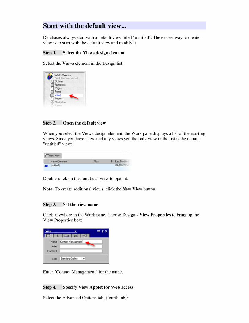
Step 1. Select the Views design element
Select the Views element in the Design list:
Step 2. Open the default view
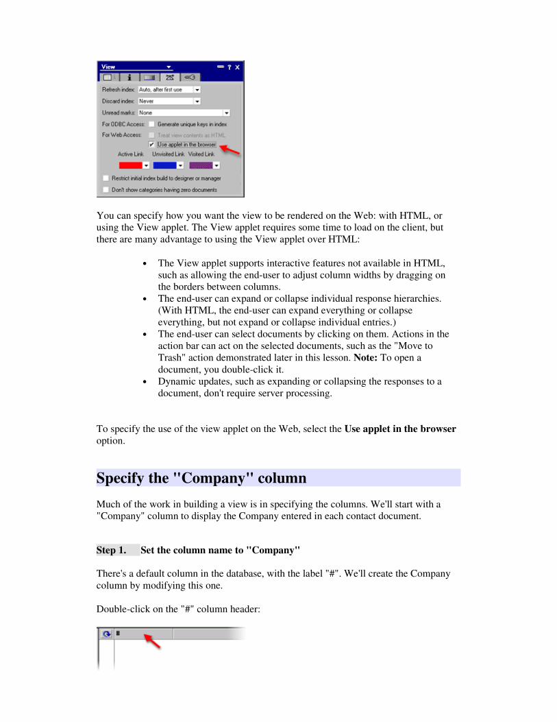
When you select the Views design element, the Work pane displays a list of the existing
views. Since you haven't created any views yet, the only view in the list is the default
"untitled" view:
Double-click on the "untitled" view to open it.
Note: To create additional views, click the New View button.
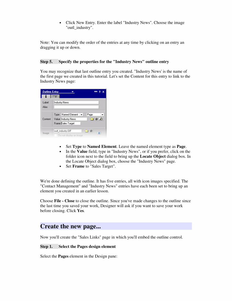
Step 3. Set the view name
Click anywhere in the Work pane. Choose Design - View Properties to bring up the
View Properties box:
Enter "Contact Management" for the name.
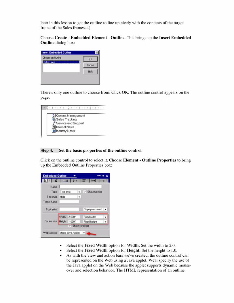
Step 4. Specify View Applet for Web access
Select the Advanced Options tab, (fourth tab):
You can specify how you want the view to be rendered on the Web: with HTML, or
using the View applet. The View applet requires some time to load on the client, but
there are many advantage to using the View applet over HTML:
• The View applet supports interactive features not available in HTML,
such as allowing the end-user to adjust column widths by dragging on
the borders between columns.
• The end-user can expand or collapse individual response hierarchies.
(With HTML, the end-user can expand everything or collapse
everything, but not expand or collapse individual entries.)
• The end-user can select documents by clicking on them. Actions in the
action bar can act on the selected documents, such as the "Move to
Trash" action demonstrated later in this lesson. Note: To open a
document, you double-click it.
• Dynamic updates, such as expanding or collapsing the responses to a
document, don't require server processing.
To specify the use of the view applet on the Web, select the Use applet in the browser
option.
Specify the "Company" column
Much of the work in building a view is in specifying the columns. We'll start with a
"Company" column to display the Company entered in each contact document.
Step 1. Set the column name to "Company"
There's a default column in the database, with the label "#". We'll create the Company
column by modifying this one.
Double-click on the "#" column header:

This brings up the Column Properties box:
Set the Title to "Company".
Step 2. Set the sorting behavior for the "Company" column
Select the second tab of the Column Properties box. This is the sorting tab:
There are a number of different options for sorting and categorizing. The option we'll
set is to allow the end user to adjust the sorting option on the fly.
Select Click on column header to sort. In the dropdown list, choose Both. The user
can now sort on the Company column by clicking once to sort ascending, clicking again
to sort descending, and clicking again to remove the sort on this column.
Step 3. Set the value to display in the "Company" column
The Programmer's pane is where you set the value to display in the selected column. If
the Programmer's pane isn't currently open, open it by clicking on the frame selector at
the bottom edge of the Designer window and drag up to the desired size:
The Display option let's you specify the method to use for specifying what to display in
the column. We'll use the Field method, which lets you simply pick a field from a list.

The list displays the names of all the fields in the Contact form. Select Company from
the list.
Choose File - Save, or press Ctrl+S to save your work.
Specify the "Contact" column
Step 1. Create a new column
Select the "Company" column.
Choose Create - Append New Column. This creates a new column immediately after
the selected column.
Step 2. Set the column title to "Contact"
Double-click the new column to bring up the Column Properties box. Set the title to
"Contact".
Step 3. Set the sorting behavior of the "Contact" column
Select the Sorting tab, (second tab), of the Column Properties box. Select Click on
column header to sort. In the dropdown list, choose Both.
Step 4. Set the value to display in the "Contact" column
In the Programmer;s pane, set Display to Field. Choose Contact from the list of fields.
Specify the "Account Type" column
Step 1. Create a new column
Select the "Contact" column.
Choose Create - Append New Column. This creates a new column immediately after
the selected column.
Step 2. Set the column title to "Type"
Double-click the new column to bring up the Column Properties box. Set the title to
"Type".
Step 3. Set the sorting behavior of the "Account Type" column
Select the Sorting tab, (second tab), of the Column Properties box. Select Click on

column header to sort. In the dropdown list, choose Both.
Step 4. Set the value to display in the "Account Type" column
In the Programmer;s pane, set Display to Field. Choose Account Type from the list of
fields.
Step 5. Adjust the column widths
Now that all the columns are specified, you can adjust the column widths by simply
clicking and dragging on the dividers between the columns:
Drag the divider between the "Company" and "Contact" columns to increase the width
of the "Company" column. Drag the divider between the "Contact" and "Type" columns
to increase the width of the Contact column.
Choose File - Save, or press Ctrl+S to save your work.
Create the action bar
You've already familiar with Action Bars from the Contact form lesson. Views can have
action bars too. We'll create the following actions for the Contact Management view:
• New Contact: This action opens up a new Contact form for the user to
fill out and submit.
• Move to Trash: To delete documents, first select them, then choose
Move to Trash. Documents moved to trash are not deleted immediately -
they're marked with a trash bin icon.
• Empty Trash: This action deletes the documents that the user has
moved to trash.
Step 1. Open the Action pane
The Action pane is where you specify the Action Bar properties and create actions. To
open the Action pane, drag the frame splitter at the right edge of the Designer window
to the size you want:
Step 2. Bring up the Action Bar Properties box
Click anywhere in the Action pane to select the pane. Choose Design - Action Bar
Properties to bring up the Action Bar Properties box.

Step 3. Specify the Action Bar color
Choose the light-blue Color shown below:
Step 4. Specify Web access
As we did for the action bar in the Contact form, specify the use of the Action Bar
applet when displaying on the Web by setting Display to Using Java Applet.
Step 5. Specify button properties
Select the second tab of the Action Bar Properties box to specify general action button
properties:

Click the Color control to bring up the color palette. Along the top of the color palette
are icons that represent special color choices. Choose the None icon (circled above).
Step 6. Specify button label properties
Select the third tab of the Action Bar Properties box to specify the appearance of button
labels:
Set Font to Arial.
Set Size to 9.
Choose File - Save, or press CTRL+S to save your work.
Now that you've specified the properties of the Action Bar, you'll create the action
buttons in the following sections.
Create the "New Contact" action
You've already created action buttons in the Contact form. The process is the same here.
Step 1. Create the new "New Contact" action button
Choose Create - Action.

This creates the new action, and brings up the Action Properties box, with focus in the
Name field. Set the name to "New Contact".
Step 2. Specify a graphic for the "New Contact" action
Still in the first panel of the Action Properties box, set Graphic to Custom.
In the Image field, click the folder icon to bring up the list of image resources. Choose
"act_newcontact.gif".
Step 3. Script the "New Contact" action
Enter the following Formula script into the Programmer's pane (you can copy and paste
the text):
@SetTargetFrame("_top");
@Command([Compose]; "Contact")
Click the checkmark button to save the script.
Create the "Move to Trash" action
Step 1. Create the new "Move to Trash" action button
Choose the menu command Create - Action.
This creates the new action, and brings up the Action Properties box, with focus in the
Name field. Set the name to "Move to Trash".
Step 2. Specify a graphic for the "Move to Trash" action
Still in the first panel of the Action Properties box, set Graphic to Custom.
In the Image field, click the folder icon to bring up the list of image resources. Choose
"act_movetotrash.gif".
Step 3. Script the "Move to Trash" action
Enter the following Formula script into the Programmer's pane (you can copy and paste
the text):
@Command([MoveToTrash])
Click the checkmark button to save the script.

Create the "Empty Trash" action
Step 1. Create the new "Empty Trash" action button
Choose the menu command Create - Action.
This creates the new action, and brings up the Action Properties box, with focus in the
Name field. Set the name to "Empty Trash".
Step 2. Specify a graphic for the "Empty Trash" action
Still in the first panel of the Action Properties box, set Graphic to Custom.
In the Image field, click the folder icon to bring up the list of image resources. Choose
"act_emptytrash.gif".
Step 3. Script the "Empty Trash" action
Enter the following Formula script into the Programmer's pane (you can copy and paste
the text):
@Command([EmptyTrash])
Click the checkmark button to save the script.
Choose File - Save, or press CTRL+S to save your work.
Preview your work
Click the preview button of your choice to see the view you've created. It should look
something like this:
• Use the "New Contact" button to create new contacts to populate the
view.
• Try using "Move to Trash" and "Empty Trash" to delete contacts.
• Click the column headers to see the dynamic sorting capabilities in
action.
Congratulations - you've created your first view!
You can now click back in the Designer window and close the "Contact Management"
view.

9. Creating an Outline
In this section...
Outlines provide a robust and flexible way to display links to destinations in your site.
An example of the use of an outline is in the frameset we're building for the Sales
Department part of the WaterWorks site. The Sales frameset will look something like
this when we're done:
Notice the outline control highlighted in the picture. The outline presents links to parts
of the Sales Department site, such as "Contact Management", "Sales Tracking", etc.
Some of the features of outlines are:
• Outlines can be relatively simple, like the one we'll construct for this
sample site, or they can be complex, with entries organized into a
hierarchy that you expand and collapse.
• You can use text color and background color to specify how to display
outline entries on mouse-over and selection.
• You can specify images to use as the background for outline entries, or a
icons that display next to the label (as we'll do in the WaterWorks
example).
Outlines are an ideal way to present site maps providing links to all the destinations in a
site. In the example we're building, the outline is the site map for the Sales Department
part of the site.
There are two parts to using an outline in your site:
1. Defining the outline: An outline element must first be created. This
includes specifying all the entries in the outline, the links that the entries
point to, and the icons or background images used for the outline entries.
2. Embedding an outline control in a page or form: For end users to see
an outline, you must embed an outline control in a page or form. When

you embed an outline control, you specify which outline to display in the
control. One outline can appear in multiple places in your application by
creating multiple outline controls that refer to that one outline. You can
further customize the appearance of each outline control by changing the
text font, the color and size, the spacing between entries, and so on.
In this section you'll create the outline for the Sales Department site. You'll create a new
page called "Sales Links", and you'll embed the outline in the page.
Create a new outline...
Step 1. Select the Outlines design element
Select the Outlines element in the Design pane:
Step 2. Create a new outline
Click the New Outline button to create a new outline:
The new outline displays in the Work pane:
New outlines always start with one entry at the top of the pane (indicated by the arrow).
This entry serves as a "root" for the outline entries you subsequently create.
Notice the row of buttons across the top of the pane. These perform various functions
related to the outline. You use the New Entry button to create new outline entries.
Step 3. Name the new outline
Double-click on the outline root to bring up the Outline Properties box:

Set the name to "Sales Links".
Create the outline entries...
You'll now create five outline entries, as shown in the picture at the beginning of this
lesson.
Step 1. Create the outline entry for "Contact Management"
Click the New Entry button. A new, untitled outline entry appears below the outline
root, and the Outline Entry Properties box opens, with the focus in the Label field. Enter
the label "Contact Management".
Step 2. Set the content for "Contact Management"
Now you'll specify the behavior of the outline entry. Use the Content section of the
Properties box:
The Content section lets you specify what item to display when the user clicks on this
outline entry, and what frame to display it in.
First - what item to display:
• Set Type to Named Element.

• Choose View as the type of Named Element.
• In the Value field, type in "Contact Management", or if you prefer, click
on the folder button next to the field to bring up the Locate Object
dialog box. In the Locate Object dialog box, choose the "Contact
Management" view.
Second - where to display the object:
• We haven't yet created the Sales frameset, but when we do, the frame on
the right-hand side will be called "Sales Target". This frame will be
where we want to display the Contact Management view. Therefore, in
the Frame field, enter "Sales Target".
Step 3. Specify an icon to display next to "Contact Management"
Now you'll specify an icon to display next to the Contact Management outline entry.
You do this in the Image section of the Properties box:
In the Image field, enter "outl_contact.gif". Or, if you prefer, click the folder icon,
(indicated by the arrow), to bring up the Insert Image Resource dialog box. Choose
"outl_contact.gif" from the list of images.
Choose File - Save or press Ctrl+S to save your work.
Step 4. Create the remaining outline entries
Now we'll add several more outline entries. All but the last one are just dummy entries -
we're putting them there to fill out the outline control, but there's no destination to
actually link to. We'll specify a label and icon for each:
• Click New Entry. Enter the label "Sales Tracking". Choose the image
"outl_salestrack.gif".
• Click New Entry. Enter the label "Service and Support". Choose the
image "outl_service".
• Click New Entry. Enter the label "Internal News". Choose the image
"outl_internal".
• Click New Entry. Enter the label "Industry News". Choose the image
"outl_industry".
Note: You can modify the order of the entries at any time by clicking on an entry an
dragging it up or down.
Step 5. Specify the properties for the "Industry News" outline entry
You may recognize that last outline entry you created. "Industry News' is the name of
the first page we created in this tutorial. Let's set the Content for this entry to link to the
Industry News page:
• Set Type to Named Element. Leave the named element type as Page.
• In the Value field, type in "Industry News", or if you prefer, click on the
folder icon next to the field to bring up the Locate Object dialog box. In
the Locate Object dialog box, choose the "Industry News" page.
• Set Frame to "Sales Target".
We're done defining the outline. It has five entries, all with icon images specified. The
"Contact Management" and "Industry News" entries have each been set to bring up an
element you created in an earlier lesson.
Choose File - Close to close the outline. Since you've made changes to the outline since
the last time you saved your work, Designer will ask if you want to save your work
before closing. Click Yes.
Create the new page...
Now you'll create the "Sales Links" page in which you'll embed the outline control.
Step 1. Select the Pages design element
Select the Pages element in the Design pane:

Step 2. Click the New Page button
Click the New Page button at the top of the Work pane:
The Work pane now displays the new page.
Step 3. Name the page
Choose Design - Page Properties to bring up the Page Properties box:
Set Name to "Sales Links".
Embed the outline control...
Now we're ready to add the Sales Links outline to the page.
Step 3. Add an outline control to the Sales Links page
Click anywhere in the blank page to set the focus at the top of the page.
Press <Enter> to enter a blank line before embedding the outline. (We'll use this space
later in this lesson to get the outline to line up nicely with the contents of the target
frame of the Sales frameset.)
Choose Create - Embedded Element - Outline. This brings up the Insert Embedded
Outline dialog box:
There's only one outline to choose from. Click OK. The outline control appears on the
page:
Step 4. Set the basic properties of the outline control
Click on the outline control to select it. Choose Element - Outline Properties to bring
up the Embedded Outline Properties box:
• Select the Fixed Width option for Width. Set the width to 2.0.
• Select the Fixed Width option for Height. Set the height to 1.0.
• As with the view and action bars we've created, the outline control can
be represented on the Web using a Java applet. We'll specify the use of
the Java applet on the Web because the applet supports dynamic mouse-
over and selection behavior. The HTML representation of an outline

control is quicker to load, but it doesn't support the dynamic behavior of
an outline. Set Web Access to Use Java Applet.
Step 5. Set the text properties of the outline control
Select the second tab of the Properties box:
• Set Font to Arial.
• Set Size to 9.
• Set Style to Bold.
• Set the On Mouse color the shade of blue indicated by the arrow above.
Step 6. Set the background properties of the outline control
Select the third tab of the Properties box:
• Set the selector dropdown, (indicated by the arrow above), to Top-Level
Background.
• Set the On Select background color as indicated in the diagram above.

Choose File - Save or press Ctrl+S to save your work.
Using Passthrough HTML to fine-tune the page...
Domino supports a feature called "Passthrough" HTML. Normally, you don't write
HTML when creating your application. You create your application using the Designer,
as we're doing in this tutorial, and Domino takes care of generating the HTML when the
application is accessed by a browser.
Sometimes, however, you may have the need to enter some specific HTML in your
application. For example:
• Domino generates standard HTML so as to work as uniformly across the
popular browsers. You can use passthrough HTML when you need to
take advantage of an HTML effect specific to a particular browser.
• HTML is always evolving, and therefore a particular release of Domino
may not automatically generate some recent addition to HTML. You can
use passthrough HTML to incorporate that HTML into your application.
• Web browsers sometimes don't display the contents of a page or form in
exactly the same way as the Notes client. You can use passthrough
HTML to fine tune the appearance of design elements on the Web.
For these situations, you can enter HTML into a design element, and use the Text -
Pass-Thru HTML command to set these paragraphs to be passthrough HTML.
Domino then knows, when generating HTML, that the paragraphs specified as HTML
should be sent as it, without the usual conversion to HTML.
What we'll do now is use passthrough HTML to generate the right amount of blank
space above the outline control so that the outline control will line up nicely with the
contents of the target frame of the Sales frameset (which we create in the next lesson).
Step 1. Enter HTML line breaks
Click in the blank line above the outline control.
Press <Enter> to enter one more blank line.
Enter the HTML line break tag "<br>" (without quotes) in each of the blank lines.
Step 2. Set the Passthrough HTML property
Select the two lines of <br>'s.
Choose the menu command Text - Pass-Thru HTML.
Paragraphs that have been set to be Passthrough HTML are represented with a gray
background. The page should now look something like this:

Step 3. Hide the passthrough HTML lines from the Notes client
We're focusing only on how the application looks when viewed from a browser for this
tutorial, but you may often want your applications to run in the Notes client as well as in
browsers. Using the Hide feature you can assure that the passthrough HTML will not
display when the application is viewed from the Notes client.
With the passthrough HTML lines still selected, choose the menu command Text - Text
Properties to bring up the Text Properties box:
Set Hide paragraph from to Notes R4.6 or later.
Choose File - Save or press Ctrl+S to save your work.
Preview your work...
Click the browser preview button of your choice to preview the Sales Links page. We'll
see this page in the context of the Sales Frameset in the next lesson. For now, this is a
preview of the page on its own:
You can now click back in the Designer window and close the "Sales Links" page.

10. Creating a Frame Set
In this section...
Now that the individual elements have been created, we can create the Sales frameset.
As you'll see in this lesson, it's easy to create and set the properties for framesets in
Domino.
The frameset will look something like this when previewed in a browser:
The frameset consists of three frames:
1. Top: In the top frame, we'll display the Sales Banner page.
2. Left: In the left frame, we'll display the Sales Links page which contains
the links to all the parts of the Sales Department site.
3. Right: The right frame is the target for all the links in the left frame.
We'll set the initial contents of the right frame to be the Contact
Management view. After that, the user will control what displays in the
right frame by clicking the links in the left frame.
Create the frameset...
Step 1. Choose Framesets in the Design pane
Choose Framesets in the Design pane:

This displays Frameset design elements in the Work pane. Since you haven't yet created
any framesets the pane is empty.
Step 2. Choose the New Frameset action
In the Work pane, click the New Frameset action:
This brings up the Create New Frameset dialog:
• Set Number of frames to 3.
• The buttons across the top of the dialog box represent the common
arrangements of frames for the number of frames specified in the
Number of frames field. Click the second arrangement (indicated by the
arrow in the diagram above).
Click OK. The new frameset displays in the Work pane:
Step 3. Specify a name for the frameset

Right-click anywhere in the frameset to bring up the popup menu. Choose the Frameset
Properties command. This brings up the Frameset Properties box:
Set Name to "Sales".
Choose File - Save, or press Ctrl+S to save your work.
In the sections below we specify contents for each of the frames.
Set the top frame...
The top frame is where we'll display the "Sales Banner" page.
Step 1. Bring up the Frame Properties box
Right-click inside the top frame to bring up the popup menu. Choose the Frame
Properties command. This brings up the Frame Properties box:
Step 2. Specify the frame properties
• Set Name to "Sales Banner".
• Set Type to Named Element.
• When you choose the Named Element type, another field pops up for
you to specify the type of named element. Set the named element type to
Page.
• The Value field is where you specify the name of the page to display.
You can type in the element name if you know it, but a much easier way
is to click the folder button (indicated by the arrow in the picture below):

This brings up the Locate Object dialog box which lets you point-and-
click your way to the design element you want:
Click the Page dropdown list and choose the "Sales Banner" page. Click
OK.
At this point you should see the "Sales Banner" page displaying in the frame:
Step 3. Specify the frame size properties
The height of the frame should be set to match the height of the sales banner. Also,
since this frame is displaying a static image, there's no need for scrollbars.
Select the second tab of the Frame Properties box:
• Set the Height units to Pixels.
• Set Height to 160.
• Set Scrolling to Off.

Step 4. Specify the frame border properties
Whether or not you want the frames to have borders is a matter of taste. 3-D borders are
displayed by default. To turn the borders off for a cleaner look, use the borders tab of
the Properties box.
Select the third tab of the Frame Properties box:
• Deselect the 3-D border checkbox.
• Click the Apply to all frames button. This turns the border off for all the
frames.
Choose File - Save, or press Ctrl+S to save your work.
Set the left frame...
The left frame is where we'll display the Sales Links page.
Step 1. Bring up the Frame Properties box
Right-click inside the left frame to bring up the popup menu. Choose the Frame
Properties command. This brings up the Frame Properties box:
Step 2. Specify the frame properties
• Set Name to "Sales Links".
• Set Type to Named Element.
• When you choose the Named Element type, another field pops up for
you to specify the type of named element. Set the named element type to
Page.

• In the Value field, type in "Sales Links", or click the folder button to
bring up the Locate Object dialog where you can choose "Sales Links"
from the Page dropdown list.
• In the Default target for links in frame, enter "Sales Target". This
specifies that when the user clicks on links in the "Sales Links" frame,
the object will display in the "Sales Target" frame.
At this point you should see the "Sales Links" page displaying in the frame.
Step 3. Specify the frame size properties
The width of the frame should be set to match the width of the contents of the Sales
Links page. Also, since this frame is displaying a static image, there's no need for
scrollbars.
Select the second tab of the Frame Properties box:
• Set the Width units to Pixels.
• Set Width to 180.
• Set Scrolling to Off.
Choose File - Save, or press Ctrl+S to save your work.
Set the right frame...
The right frame is the target frame. This means that when the user clicks on a link in the
"Sales Links" frame, the contents of the right frame update to display the new object.
But we still need to specify the initial contents for this frame. We'll set the default
contents to the "Contact Management" view.
Step 1. Bring up the Frame Properties box
Right-click inside the right frame to bring up the popup menu. Choose the Frame
Properties command. This brings up the Frame Properties box:

Step 2. Specify the frame properties
• Set Name to "Sales Target".
• Set Type to Named Element.
• When you choose the Named Element type, another field pops up for
you to specify the type of named element. Set the named element type to
View.
• In the Value field, type in "Contact Management", or click the folder
button to bring up the Locate Object dialog where you can choose
"Contact Management" from the View dropdown list.
At this point you should see the Contact Management view displaying in the frame.
Step 3. Specify the frame size properties
There is no need to set the width or height of this frame. This is because the other
frames have their sizes specified in pixels. Given the sizes specified for those frames,
this frame has no choice. We do want to specify that there should be no scrollbars
because this keeps the display cleaner.
Select the second tab of the Frame Properties box:
• Set Scrolling to Off.
Choose File - Save, or press Ctrl+S to save your work.
Preview your work...
Click the preview button of your choice to see the frameset you created. It should look
something like this:

Congratulations - you have created your first frameset!
You can now click back in the Designer window and close the "Sales" frameset.

11. Creating the Home Page
In this section...
We'll complete the WaterWorks site now by creating the home page. We'll also create a
link on the Home page to the Sales frameset. Here's how the home page will look (with
an indication of the link we'll be adding):
Also, to complete the navigation structure of the site, we'll go back to the "Sales Links"
page, (the page that provides all the Sales Department links in the left frame), to create a
link from the Sales Frameset back to the home page.
Create the home page...
First we'll create the home page.
Step 1. Select the Pages element
Select the Pages element in the Design pane:
Step 2. Create a new page
Click the New Page button at the top of the Work pane:

The Work pane now displays the new page.
Step 3. Name the page
Choose the menu command Design - Page Properties to bring up the Page Properties
box:
Set Name to "Home".
Add the image to the page...
We brought all the images into the database as Image Resources in the "Working with
Images" lesson. Now it's a simple matter to insert the image resource on the page.
Step 1. Add the image to the page
Choose Create - Image Resource. This brings up the Insert Image Resource dialog
box:
Select the homemap.gif image. Click OK to add the image to the page.
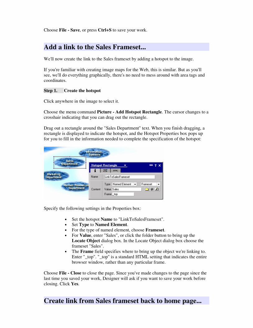
Choose File - Save, or press Ctrl+S to save your work.
Add a link to the Sales Frameset...
We'll now create the link to the Sales frameset by adding a hotspot to the image.
If you're familiar with creating image maps for the Web, this is similar. But as you'll
see, we'll do everything graphically, there's no need to mess around with area tags and
coordinates.
Step 1. Create the hotspot
Click anywhere in the image to select it.
Choose the menu command Picture - Add Hotspot Rectangle. The cursor changes to a
crosshair indicating that you can drag out the rectangle.
Drag out a rectangle around the "Sales Department" text. When you finish dragging, a
rectangle is displayed to indicate the hotspot, and the Hotspot Properties box pops up
for you to fill in the information needed to complete the specification of the hotspot:
Specify the following settings in the Properties box:
• Set the hotspot Name to "LinkToSalesFrameset".
• Set Type to Named Element.
• For the type of named element, choose Frameset.
• For Value, enter "Sales", or click the folder button to bring up the
Locate Object dialog box. In the Locate Object dialog box choose the
frameset "Sales".
• The Frame field specifies where to bring up the object we're linking to.
Enter "_top". "_top" is a standard HTML setting that indicates the entire
browser window, rather than any particular frame.
Choose File - Close to close the page. Since you've made changes to the page since the
last time you saved your work, Designer will ask if you want to save your work before
closing. Click Yes.
Create link from Sales frameset back to home page...

To complete the navigation structure of the site, we'll now go back to the "Sales Links"
page and add a link to go from the Sales frameset back to the home page.
Step 1. Open the "Sales Links" page
Select the Pages element in the WaterWorks Design list:
This brings up the list of pages in the Work pane. Double-click the "Sales Links" page
to open it.
Step 2. Position the cursor below the Sales links outline control
Click to the right of the Sales links outline control and press <Enter> twice to create a
line below the outline control and add a blank line for some spacing.
Step 3. Add the "Home page" icon
Choose Create - Image Resource to bring up the Insert Image Resource dialog box:
Choose "homeicon.gif".
Step 4. Add alternate text to the icon
Alternate text is a short description provided for users who cannot view graphics,
either because they are visually impaired or because they have turned off image loading

in their browser. The description will appear on the page, in place of the graphic. It is
generally good practice to fill out alt text for all graphics in an application which has the
possibility of reaching a wide audience.
Choose Picture - Picture Properties to bring up the Picture Properties box
Enter "Link to WaterWorks Home Page" into the Alternate Text field and close the
properties box.
Step 5. Add a label for the icon
Immediately to the right of the home icon, enter the text "Home".
Choose Text - Text Properties to bring up the Text Properties box:
• Set Font to Arial.
• Set Size to 9.
• Set Style to Bold.
The page should now look something like this:
Step 6. Create the link
Now we'll set up the icon and "Home" text to be a link back to the home page by
specifying these elements to be a Link Hotspot.
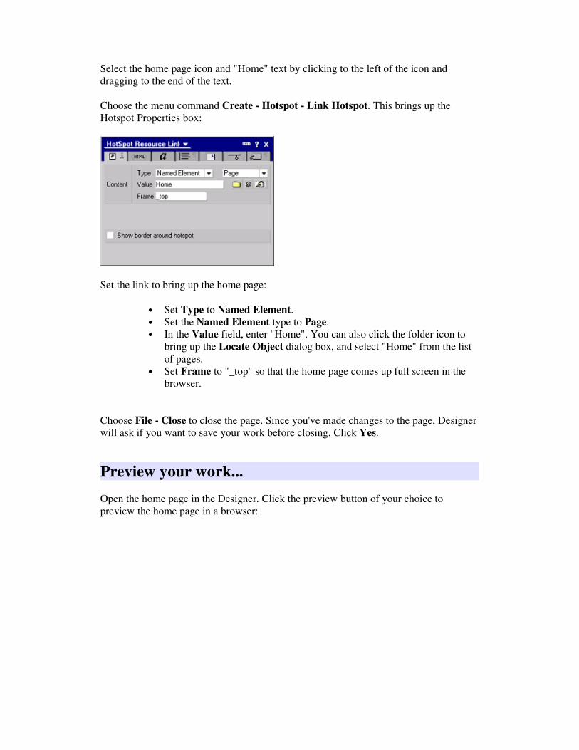
Select the home page icon and "Home" text by clicking to the left of the icon and
dragging to the end of the text.
Choose the menu command Create - Hotspot - Link Hotspot. This brings up the
Hotspot Properties box:
Set the link to bring up the home page:
• Set Type to Named Element.
• Set the Named Element type to Page.
• In the Value field, enter "Home". You can also click the folder icon to
bring up the Locate Object dialog box, and select "Home" from the list
of pages.
• Set Frame to "_top" so that the home page comes up full screen in the
browser.
Choose File - Close to close the page. Since you've made changes to the page, Designer
will ask if you want to save your work before closing. Click Yes.
Preview your work...
Open the home page in the Designer. Click the preview button of your choice to
preview the home page in a browser:
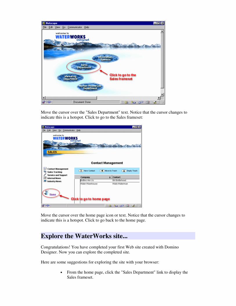
Move the cursor over the "Sales Department" text. Notice that the cursor changes to
indicate this is a hotspot. Click to go to the Sales frameset:
Move the cursor over the home page icon or text. Notice that the cursor changes to
indicate this is a hotspot. Click to go back to the home page.
Explore the WaterWorks site...
Congratulations! You have completed your first Web site created with Domino
Designer. Now you can explore the completed site.
Here are some suggestions for exploring the site with your browser:
• From the home page, click the "Sales Department" link to display the
Sales frameset.

• Click the "Industry News" link to display the Industry News page in the
right-hand frame.
• Click the "Contact Management" link to display the Contact
Management view in the right-hand frame.
• Click the "New Contact" action button to create a new contact form.
• Create several contact documents.
• Double-click a contact document to open in for reading.
• Click the "Edit Contact" action button to edit an existing contact. Update
the information and save the document.
• Select one or more contact documents and click the "Move to Trash"
action button to mark the documents for deletion. Click the "Empty
Trash" action button to delete the marked documents.
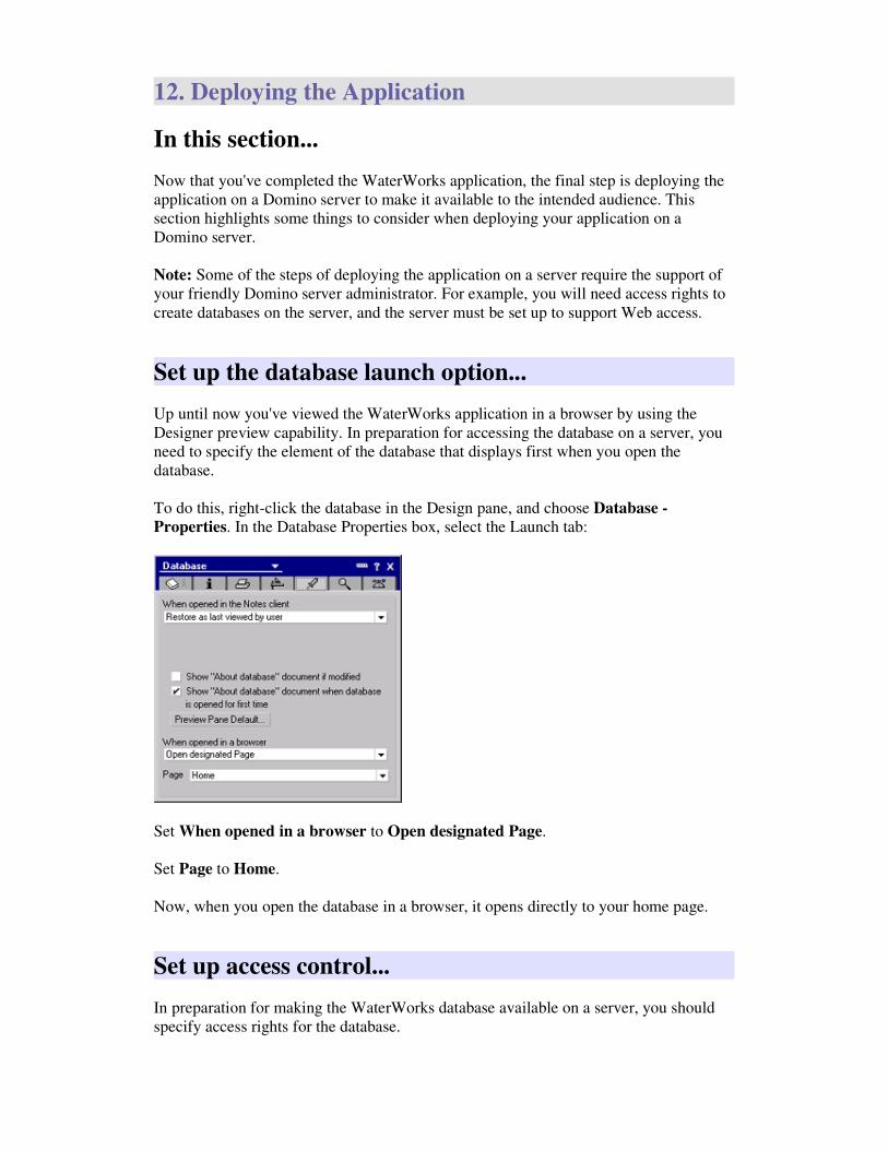
12. Deploying the Application
In this section...
Now that you've completed the WaterWorks application, the final step is deploying the
application on a Domino server to make it available to the intended audience. This
section highlights some things to consider when deploying your application on a
Domino server.
Note: Some of the steps of deploying the application on a server require the support of
your friendly Domino server administrator. For example, you will need access rights to
create databases on the server, and the server must be set up to support Web access.
Set up the database launch option...
Up until now you've viewed the WaterWorks application in a browser by using the
Designer preview capability. In preparation for accessing the database on a server, you
need to specify the element of the database that displays first when you open the
database.
To do this, right-click the database in the Design pane, and choose Database -
Properties. In the Database Properties box, select the Launch tab:
Set When opened in a browser to Open designated Page.
Set Page to Home.
Now, when you open the database in a browser, it opens directly to your home page.
Set up access control...
In preparation for making the WaterWorks database available on a server, you should
specify access rights for the database.

Domino gives you extensive support for controlling who can access your applications
and what they can do. A fundamental component of this support is the access control
list (ACL). The ACL is a list of who has access to your application, and what rights
they have. Every Domino database has an ACL.
To set up the ACL for the WaterWorks database, right-click the database in the Design
pane, and choose Database - Access Control. This brings up the Access Control List
dialog box:
The ACL dialog box lets you specify the level of access to the database for people and
servers. The access levels, from most access to least access, are Manager, Designer,
Editor, Author, Reader, Depositor, and No Access. Each level includes the rights of the
levels below it, with the addition of some additional access. For example, Reader access
allows a person to view the contents of a database, but not the right to create or edit any
content. The level higher, Author, includes all the rights of Reader, but also adds the
right to author new documents.
Notice that your name is in the list, (represented by the entry "Your Name" in the
picture above), and you're specified as having Manager access. When you create a
Domino database, you're name is automatically added to the ACL and set to Manager
level. The Manager level is the highest access level. It means that you have complete
access to the design and management of the database.
There's always an entry called Default in the list. The access level you set for Default
specifies the access for all entities that you do not explicitly add to the list. For example,
if you want everyone in your company to view the WaterWorks database and add or
edit contacts, simply set Default access to Editor. To do this, select Default in the list,
and set Access to Editor.
On the other hand, it's often the case that you don't want to provide full access to the site
for everyone. For example, let's say you want everyone in your company to be able to
view the site, but you want only people from the Sales Department to be able to add and
edit contacts. To achieve this, do the following:

• Open the Access Control List dialog box. Select Default, and set Access
to Reader. This specifies that anyone in your company can visit the site
and read the contents.
• Add an entry for each person in the Sales Department by clicking the
Add button and specifying the name. Set the Access to Editor for each
person you add. This specifies that the people you add have the right to
create and edit contacts. Note: If there are more than just a few people in
the Sales Department, it's not recommended that you add all the names to
the ACL. Instead, you should create a Group called "Sales Department"
in the Domino Directory, and add all the people to that group. You
would then simply add the Sales Department group to the ACL. For
information on the Domino Directory, see Designer Help.
This section only scratches the surface of access control. The goal is to point you in the
right direction to make use of access control in your applications. For more information
on security and access control see Domino 5 Designer Help - Database Management.
Deploy the application on a server...
The final step is to get the WaterWorks database onto a server.
To get the WaterWorks database onto a server, you'll make use of a powerful capability
of Notes and Domino called Replication. A Replica of a database is a copy of the
database with the same internal Replica ID as the original database. Domino lets you
create one or more replicas of a database on other servers or workstations. Through the
process of replication, Domino exchanges modifications made on any replica of a
database to the other replicas, thus synchronizing the contents of the replicas.
Replication has several important uses in Notes and Domino:
• Access when you're disconnected from the network: When you can't
be connected to your network, such as when you're travelling on an
airplane, you can still access a database by creating a replica of it on your
laptop computer before you go on your trip. You can then modify the
database as needed on your laptop, and then replicate the changes back to
the database on the server when you return.
• Providing access for geographically separated locations: Your
company may have branches around the world, such as in Boston and
Singapore. To allow people at both locations to access a database,
replicas can be created at each location. People work on the replica of the
database at their location. Behind the scenes, Domino replicates changes
between the two replicas on a scheduled basis.
• Providing a staging area for application development: Multiple
people can create and modify databases on a "staging" server to create
and test an application. When the application is ready, or when
modifications are made, you can replicate the databases to the
"production" server. We'll make use of this staging/production concept to
deploy the WaterWorks application on a server.
In an actual production environment, you can set up two stages of replication:

• Stage 1: You work on database replicas locally on your workstation.
When the changes are ready, you replicate to the staging server.
• Stage 2: The staging server is used for collecting the work of all the
people working on the project, and for testing the application. When the
application is ready, you replicate to the production server.
To illustrate replication, we'll now create a replica of the WaterWorks database on a
server. To do this, you first need to have the access to create databases on a server. If
you don't already have this, see your Domino server administrator.
Select the WaterWorks database in the Design pane.
Choose File - Replication - New Replica to bring up the New Replica dialog box:
Enter the name of the server on which you want to create the replica. In the example
above, the server name is "Production".
Click OK. When the replication is complete, a status message displays in the status bar
along the bottom of the Designer window. A replica of the WaterWorks database is now
on the Production server.
This section only scratches the surface of replication and deploying your application on
a server. For more information see Domino 5 Designer Help - Database Management
and Domino 5 Administration Help.
Access WaterWorks from a browser...
Now that you've completed all the steps of setting up the WaterWorks database on a
server, you can use your browser to access the application.
You will need to find out the URL of the server from your server administrator. Let's
say it's "server.yourcompany.com". Enter the following URL to open up the
WaterWorks application:
server.yourcompany.com/wworks.nsf
This URL displays the WaterWorks database in your browser. Since you set the launch
option to bring up the home page of the database, you should now be looking at the
WaterWorks home page in your browser.
Explore on your own...
Congratulations! You have completed the QuickStart Tutorial and created your first
application with Domino Designer! There's much more to learn about Designer and
Domino. With the foundation provided by this tutorial, you are now encouraged to
continue exploring on your own!