the death map - peoplejburkardt/presentations/death_map_2009... · golden square: the death map the...
TRANSCRIPT

The Death Map
John Burkardt (ARC/ICAM)ARC: Advanced Research Computing
ICAM: Interdisciplinary Center for Applied MathematicsVirginia Tech
..........A Presentation for Hollins College Visitors
..........http://people.sc.fsu.edu/∼jburkardt/presentations/...
death map 2009 vt.pdf
10 November 2009
1 / 68

Voronoi Clustering
1 Death in Golden Square
2 The Voronoi Diagram
3 Voronoi Computation
4 Centered Voronoi Diagrams
5 Conclusion
2 / 68
Golden Square: The Spread of Cholera
3 / 68
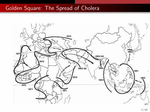
Golden Square: The Spread of Cholera
In the early nineteenth century, European doctors working in Indiareported a strange new disease called cholera.
Cholera was agonizing and fatal. It would strike a village, firstsickening a few people, then more and more. Most of the victimswould die within three days.
Suddenly, the disease would be gone from the village - but ithadn’t disappeared - it would suddenly break out in a few nearbyvillages, and repeat its destruction.
Then there came reports of cholera in Persia, and Turkey. Thedisease was moving, and it was heading straight for England.
4 / 68
Golden Square: The Death Map
5 / 68

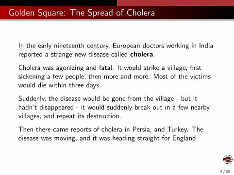
Golden Square: The Death Map
The picture illustrates the theory that cholera was transmitted bymiasm: an invisible evil-smelling cloud of disease.
Miasm explained why cholera victims often lived in poor areas fullof tanneries, butcher shops, and general dirty conditions.
It also explained why cholera did not simply spread out across theentire population, but seemed to stay in one location for a time,devastate a neighborhood, then move on.
It also suggested that little could be done to prevent the disease.
Only 30 years later would the actual cause of cholera be identified.
6 / 68

Golden Square: The Cholera Bacteria
7 / 68

Golden Square: Dr John Snow
But in the 1850’s, no one knew about cholera bacteria;the miasm theory was the standard explanation.
Dr John Snow argued that the miasm theory was unscientific.
Even though he could not show what was causing the disease, hefelt strongly that it was transmitted by water.
Not being able to see bacteria, this is somewhat like trying to dophysics without any proof of atoms!
Without knowing what caused the disease, Dr Snow concentratedon how the disease was spreading.
8 / 68

Golden Square: Dr John Snow
9 / 68

Golden Square: Evidence That Miasms Were a Bad Model
The miasm theory didn’t satisfy Dr Snow because it didn’t try toexplain the patterns he had noticed.
1 In one small outbreak of cholera, only people living near theThames river got sick. To Dr Snow, this suggested somethingin the river water. To the miasm defenders, there must havebeen a disease cloud floating along the low-lying river areas.
2 A second outbreak occurred away from the river, in an areawith piped-in water. People getting water from one companywere healthy, while others got sick. The intake pipes for thatone company were located upstream from London. The miasmdefenders were not impressed by the small amount of data.
10 / 68
Golden Square: Cholera Outbreak of 1854
11 / 68

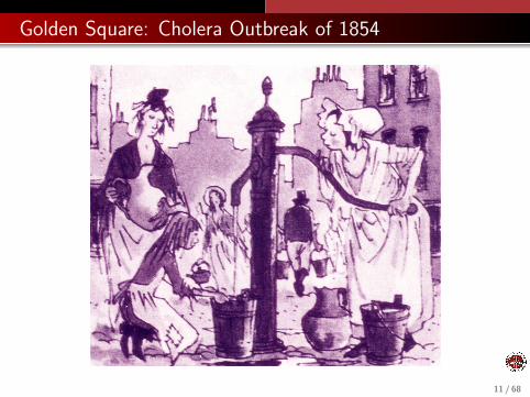
Golden Square: How Water Was Polluted
For most people in London, there was no running water. Fordrinking, cooking, cleaning and bathing, they went to one of thetown pumps which drew water directly from the ground.
Most people had no sewage system. People used chamberpotsand buckets, which were emptied into cisterns and carted off by aninformal network of night-soil carters.
People were used to getting sick from the water now and then, butin 1854, in an area called Golden Square, hundreds of people beganto die. The cholera bacteria had arrived in London.
12 / 68

Golden Square: A Map
13 / 68
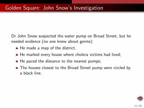
Golden Square: John Snow’s Investigation
Dr John Snow suspected the water pump on Broad Street, but heneeded evidence (no one knew about germs):
He made a map of the district.
He marked every house where cholera victims had lived;
He paced the distance to the nearest pumps;
The houses closest to the Broad Street pump were circled bya black line.
14 / 68

Golden Square: The Pump and its Neighborhood
15 / 68

Golden Square: John Snow’s Investigation
He personally interviewed people to explain exceptions to thepattern he found:
healthy workers at a beer factory didn’t drink any water!;
some sick children lived outside the district, but came toschool there;
a woman who lived miles away had her son deliver “fresh”water from the Broad Street pump because she liked its taste.
16 / 68
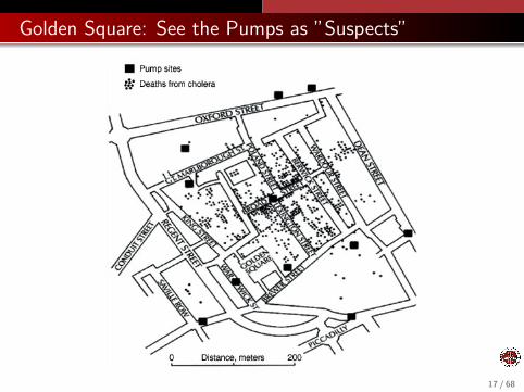
Golden Square: See the Pumps as ”Suspects”
17 / 68

Golden Square: Conclusion
Snow’s map strongly suggested that people who died were preciselythose for whom the Golden Square pump was the closest.
The miasmic cloud theory required the miasm, purely by chance,to settle only over people who used the Golden Square pump.
Dr Snow’s map destroyed the miasm theory, because it could showwhere deaths occurred in a way that suggested how the diseasewas transmitted. (It was only 30 years later that scientists foundout what caused the disease.)
Dr Snow was doing epidemiology, but also mathematics.His map is an interesting example of what mathematicians call aVoronoi diagram.
18 / 68
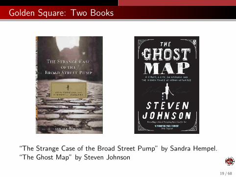
Golden Square: Two Books
“The Strange Case of the Broad Street Pump” by Sandra Hempel.“The Ghost Map” by Steven Johnson
19 / 68
Voronoi Clustering
1 Death in Golden Square
2 THE VORONOI DIAGRAM
3 Voronoi Computation
4 Centered Voronoi Diagrams
5 Conclusion
20 / 68

Voronoi Diagram: Definition
Suppose that in some D-dimensional region Rwe have a (huge) set P of “data points”which might be the entire plane, for instance;
we have a (small) set C of “centers”;
we have a distance function d(pi , cj).
A Voronoi diagram V(P, C, d(∗, ∗)) assigns each data point pi tothe center ci with smallest distance d(pi , cj).
This induces a partition of the data points into clusters.
21 / 68
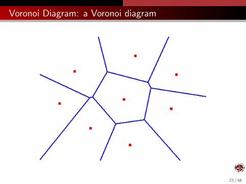
Voronoi Diagram: a Voronoi diagram
22 / 68
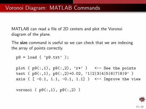
Voronoi Diagram: MATLAB Commands
MATLAB can read a file of 2D centers and plot the Voronoidiagram of the plane.
The size command is useful so we can check that we are indexingthe array of points correctly.
p9 = load ( ’p9.txt’ );
plot ( p9(:,1), p9(:,2), ’r*’ ) <-- See the pointstext ( p9(:,1), p9(:,2)+0.02, ’1|2|3|4|5|6|7|8|9’ )axis ( [ -0.1, 1.1, -0.1, 1.1] ) <-- Improve the view
voronoi ( p9(:,1), p9(:,2) )
23 / 68

Voronoi Diagram: 9 points
24 / 68

Voronoi Diagram: 9 point Voronoi diagram
25 / 68

Voronoi Diagram: Properties of the Voronoi Regions
For the continuous case, it can be more natural to refer to regionsrather than clusters; in both cases, we mean the subsets of thedata points that are closest to a particular center.
If we are using the usual (Euclidean) measurement of distance:
All regions are convex (no indentations);
All regions are polygonal;
Any center’s region can be found by starting with the entireplane, and “slicing off” the half plane closest to each othercenter;
The infinite regions have centers on the convex hull.
26 / 68
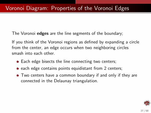
Voronoi Diagram: Properties of the Voronoi Edges
The Voronoi edges are the line segments of the boundary;
If you think of the Voronoi regions as defined by expanding a circlefrom the center, an edge occurs when two neighboring circlessmash into each other.
Each edge bisects the line connecting two centers;
each edge contains points equidistant from 2 centers;
Two centers have a common boundary if and only if they areconnected in the Delaunay triangulation.
27 / 68
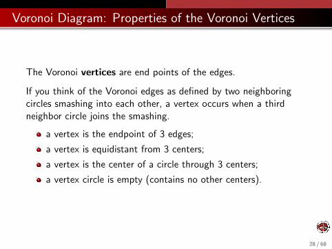
Voronoi Diagram: Properties of the Voronoi Vertices
The Voronoi vertices are end points of the edges.
If you think of the Voronoi edges as defined by two neighboringcircles smashing into each other, a vertex occurs when a thirdneighbor circle joins the smashing.
a vertex is the endpoint of 3 edges;
a vertex is equidistant from 3 centers;
a vertex is the center of a circle through 3 centers;
a vertex circle is empty (contains no other centers).
28 / 68
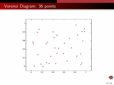
Voronoi Diagram: 36 points
29 / 68
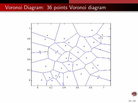
Voronoi Diagram: 36 points Voronoi diagram
30 / 68

Voronoi Diagram: Related Problems
Most algorithms and software for the Voronoi diagram only work inthe (infinite) plane with the Euclidean distance.
It’s easy to want to extend these ideas to related problems:
Restrict to some finite shape (perhaps with holes);
”Wrap-around” regions (like a torus, or Asteroid);
Define Voronoi diagrams on a surface;
Problems in higher dimensions.
Include a “density” function;
The sphere is one important region for which exact andapproximate Voronoi algorithms have been developed.
31 / 68
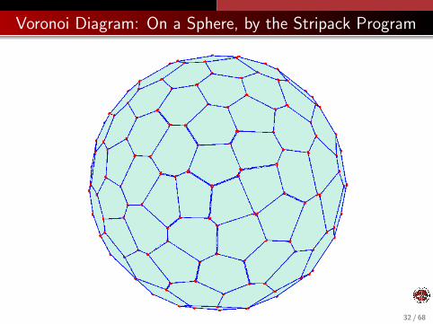
Voronoi Diagram: On a Sphere, by the Stripack Program
32 / 68

Voronoi Diagram: On a Torus, by the Voro++ Program
33 / 68

Voronoi Clustering
1 Death in Golden Square
2 The Voronoi Diagram
3 VORONOI COMPUTATION
4 Centered Voronoi Diagrams
5 Conclusion
34 / 68
Voronoi Computation
In some ways, a Voronoi diagram is just a picture; in other ways,it is a data structure which stores geometric information aboutboundaries, edges, nearest neighbors, and so on.
How would you compute and store this information in a computer?
It’s almost a bunch of polygons, but of different shapes and sizesand orders - and some polygons are “infinite”.
If you need to compute the exact locations of vertices and edges,then this is a hard computation, and you need someone else’ssoftware.
35 / 68

Voronoi Computation: A Geometric Calculation
MATLAB’s voronoi command returns the vertices:
[vx,vy] = voronoi ( px, py )
The first Voronoi edge: (vx(1,1),vy(1,1)) to (vx(2,1),vy(2,1));
The 17-th Voronoi edge: (vx(1,17),vy(1,17)) to(vx(2,17),vy(2,17));
The semi-infinite Voronoi edges are “suggested” by finite linesegments.
A suitable plot command can draw the edges.
36 / 68
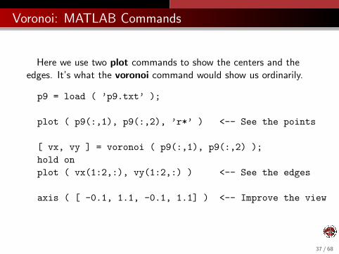
Voronoi: MATLAB Commands
Here we use two plot commands to show the centers and theedges. It’s what the voronoi command would show us ordinarily.
p9 = load ( ’p9.txt’ );
plot ( p9(:,1), p9(:,2), ’r*’ ) <-- See the points
[ vx, vy ] = voronoi ( p9(:,1), p9(:,2) );hold onplot ( vx(1:2,:), vy(1:2,:) ) <-- See the edges
axis ( [ -0.1, 1.1, -0.1, 1.1] ) <-- Improve the view
37 / 68

Voronoi Computation: Algorithms
Prewritten software is not needed if you only want to see anapproximate picture of a Voronoi diagram, and you don’t need thedetails,
And if you are working on an unusual geometry, higher dimensions,strange distance functions, or have other conditions, there usuallyisn’t any prewritten software available.
This is a situation in which a sampling method can be useful.
38 / 68
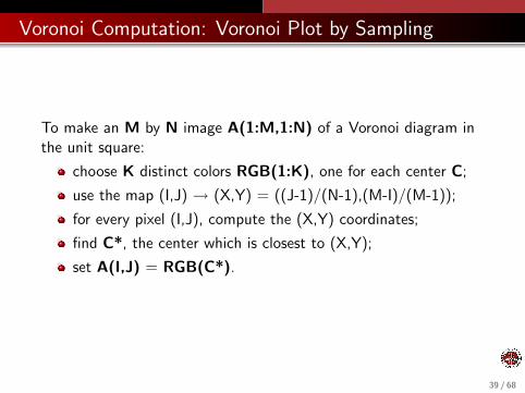
Voronoi Computation: Voronoi Plot by Sampling
To make an M by N image A(1:M,1:N) of a Voronoi diagram inthe unit square:
choose K distinct colors RGB(1:K), one for each center C;
use the map (I,J) → (X,Y) = ((J-1)/(N-1),(M-I)/(M-1));
for every pixel (I,J), compute the (X,Y) coordinates;
find C*, the center which is closest to (X,Y);
set A(I,J) = RGB(C*).
39 / 68
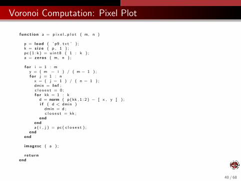
Voronoi Computation: Pixel Plot
f u n c t i o n a = p i x e l p l o t ( m, n )
p = l oad ( ’ p9 . t x t ’ ) ;k = s i z e ( p , 1 ) ;pc ( 1 : k ) = u i n t 8 ( 1 : k ) ;a = ze ro s ( m, n ) ;
f o r i = 1 : my = ( m − i ) / ( m − 1 ) ;f o r j = 1 : n
x = ( j − 1 ) / ( n − 1 ) ;dmin = I n f ;c l o s e s t = 0 ;f o r kk = 1 : k
d = norm ( p ( kk , 1 : 2 ) − [ x , y ] ) ;i f ( d < dmin )
dmin = d ;c l o s e s t = kk ;
endenda ( i , j ) = pc ( c l o s e s t ) ;
endend
imagesc ( a ) ;
r e t u r nend
40 / 68

Voronoi Computation: pixel plot(10,10)
41 / 68

Voronoi Computation: pixel plot(100,100)
42 / 68
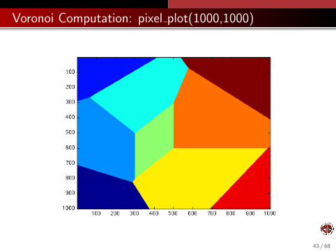
Voronoi Computation: pixel plot(1000,1000)
43 / 68

Voronoi Computation: Advantages of Sampling Method
Now that we have a code that works (well enough, anyway), wecan easily do any of the following:
estimate the area of the Voronoi regions;
double the distance value whenever center 5 is involved;
make a map in which each point chooses the furthest center;
replace Euclidean distance by L1 or L∞ distance;
44 / 68
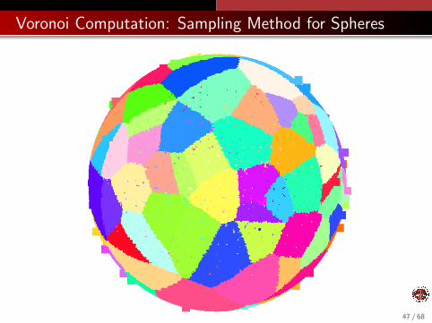
Voronoi Computation: Sampling Method for Spheres
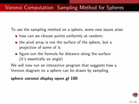
To use the sampling method on a sphere, some new issues arise:
how can we choose points uniformly at random;
the pixel array is not the surface of the sphere, but aprojection of some of it;
figure out the formula for distance along the surface(it’s essentially an angle)
We will now run an interactive program that suggests how aVoronoi diagram on a sphere can be drawn by sampling.
sphere voronoi display open gl 100
45 / 68

Voronoi Computation: Sampling Method for Spheres
46 / 68
Voronoi Computation: Sampling Method for Spheres
47 / 68

Voronoi Clustering
1 Death in Golden Square
2 The Voronoi Diagram
3 Voronoi Computation
4 CENTERED VORONOI DIAGRAMS
5 Conclusion
48 / 68
Centered Voronoi Diagrams
The Voronoi diagram seems to exhibit the ordering imposed by aset of center points that attract their nearest points.
However, since the placement of the centers is arbitrary, the overallpicture can vary a lot. The shape and size of the regions inparticular seem somewhat random.
Is there a way that we can impose more order?
Yes! ... if we are willing to allow the centers to move.
The Voronoi diagram is really a “snapshot” of the situation at thebeginning of one step of the continuous K-Means algorithm, whenwe have updated the clusters.
49 / 68

Centered Voronoi Diagrams: Center the Generators
We can take a given set of centers with a “disorderly” Voronoidiagram, and repeatedly replace the centers by centroids.
This will gradually produce a more orderly pattern in which theclusters are roughly the same size and shape, and the centers aretruly at the center.
The key to this approach is to be able to compute or estimate thecentroid of a set of points that are defined implicitly by thenearness relation.
50 / 68
Centered Voronoi Diagrams: Algorithm
This algorithm needs the centroid (xi , yi ) of each cluster Ci .
If Ci is a polygon, we use geometry to find the centroid.
If Ci is more complicated, we must use calculus:
xi =
∫Ci
x dx dy∫Ci
dx dy, yi =
∫Ci
y dx dy∫Ci
dx dy,
But exact calculations are limited to simple,small, regular problems!
51 / 68

Centered Voronoi Diagrams: Algorithm
We can estimate the centroid using sampling.
Generate a large number of sample points p in the entire region.
The centroid of cluster Ci is approximately the average of thesample points p that belong to Ci !
xi =
∑p∈Ci
xp∑p∈Ci
1, yi =
∑p∈Ci
yp∑p∈Ci
1
This allows us to work with complicated shapes, spheres, higherdimensions and so on!
52 / 68
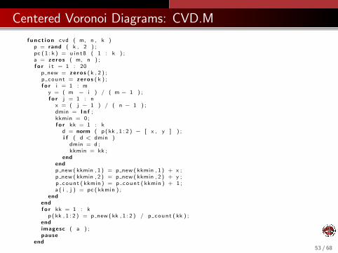
Centered Voronoi Diagrams: CVD.M
f u n c t i o n cvd ( m, n , k )p = rand ( k , 2 ) ;pc ( 1 : k ) = u i n t 8 ( 1 : k ) ;a = ze ro s ( m, n ) ;f o r i t = 1 : 20
p new = ze ro s ( k , 2 ) ;p count = ze ro s ( k ) ;f o r i = 1 : m
y = ( m − i ) / ( m − 1 ) ;f o r j = 1 : n
x = ( j − 1 ) / ( n − 1 ) ;dmin = I n f ;kkmin = 0 ;f o r kk = 1 : k
d = norm ( p ( kk , 1 : 2 ) − [ x , y ] ) ;i f ( d < dmin )
dmin = d ;kkmin = kk ;
endendp new ( kkmin , 1 ) = p new ( kkmin , 1 ) + x ;p new ( kkmin , 2 ) = p new ( kkmin , 2 ) + y ;p count ( kkmin ) = p count ( kkmin ) + 1 ;a ( i , j ) = pc ( kkmin ) ;
endendf o r kk = 1 : k
p ( kk , 1 : 2 ) = p new ( kk , 1 : 2 ) / p count ( kk ) ;endimagesc ( a ) ;pause
end
r e tu rnend
53 / 68
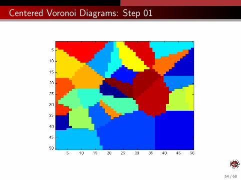
Centered Voronoi Diagrams: Step 01
54 / 68
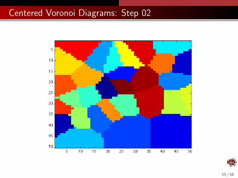
Centered Voronoi Diagrams: Step 02
55 / 68

Centered Voronoi Diagrams: Step 03
56 / 68
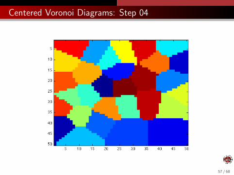
Centered Voronoi Diagrams: Step 04
57 / 68
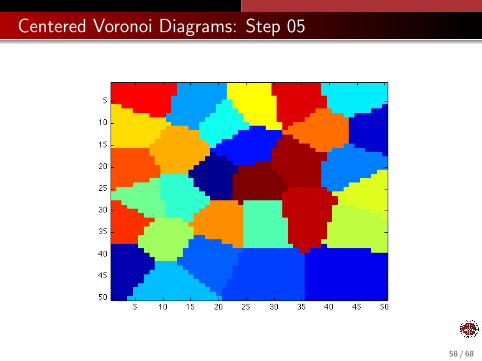
Centered Voronoi Diagrams: Step 05
58 / 68

Centered Voronoi Diagrams: Step 10
59 / 68
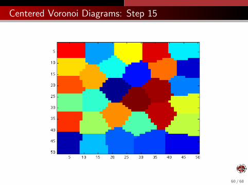
Centered Voronoi Diagrams: Step 15
60 / 68

Centered Voronoi Diagrams: Step 20
61 / 68
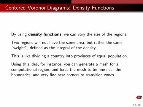
Centered Voronoi Diagrams: Density Functions
By using density functions, we can vary the size of the regions.
Two regions will not have the same area, but rather the same“weight”, defined as the integral of the density.
This is like dividing a country into provinces of equal population.
Using this idea, for instance, you can generate a mesh for acomputational region, and force the mesh to be fine near theboundaries, and very fine near corners or transition zones.
62 / 68
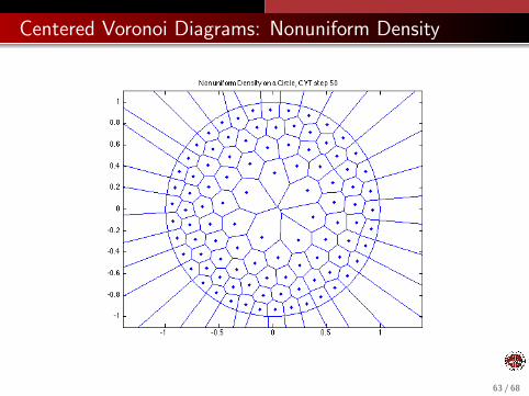
Centered Voronoi Diagrams: Nonuniform Density
63 / 68

THE DEATH MAP
1 Death in Golden Square
2 The Voronoi Diagram
3 Voronoi Computation
4 Centered Voronoi Diagrams
5 CONCLUSION
64 / 68
Conclusion: Voronoi Diagrams
The Voronoi diagram is a mathematical tool for analyzingsituations in which geometric space is to broken up into subregionsaccording to the placement of special center points.
Recognizing that the pattern of disease in Golden Squarecorresponded to the clustering induced by the pumps was JohnSnow’s key insight.
In biological systems, such as tissue made up of cells with nuclei, itis the case that the cells compete for space, and that the nucleican move towards the center of the cell.
In such adaptive situations, where the centers are not permanentlyfixed in one position but can move, we’d expect that the clusterswould have roughly the same shape and size, like a centeredVoronoi Diagram.
65 / 68
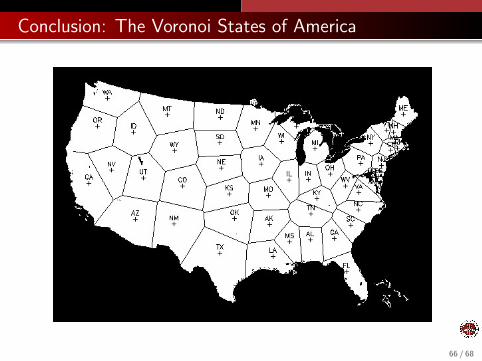
Conclusion: The Voronoi States of America
66 / 68

Conclusion: Computational Geometry
The Voronoi diagram is one topic from the field of computationalgeometry.
distances, areas, volumes, angles of complicated shapes;
nearest neighbors;
shortest paths, and best arrangements of points;
convex hulls, triangulations, Voronoi diagrams;
meshes, decomposition of shapes into triangles ortetrahedrons;
motion of an object through a field of obstacles.
visibility.
67 / 68

Conclusion: The John Snow Memorial
68 / 68