the art of presentation: improve your presentations in 20 pages
Post on 19-Oct-2014
1.874 views
DESCRIPTION
Handout for our presentation delivered on 20/10/2011 in Internal Auditing European Conference 2011: http://www.internalaudit2011.eu/TRANSCRIPT
THE ART OF PRESENTATION
IMPROVE YOUR PRESENTATIONS IN JUST 20 PAGES
Eduardo S. de la Fuente
Alberto de Vega Luna
Welcome. We've got something to share with you today. Something we're really excited
about. This is "The Art of Presentation".
Any of you not having made a single presentation? Ever?
How many of you didn't have to endure the Death by Powerpoint?. Do you know what I mean? Endless presentations made of slide after slide full of text and bullet points?. What's more, how many among you have not inflicted Death by Powerpoint among your fellow humans.
Do you really think that's the right way?. Do you really think you're engaging your audience that way? Boring them to death?
Before even trying to change that, before even trying to put forward a solution, let's review
the state of the art.
Seth Godin is a marketing guru. As such, he delivers lots of presentations every year. Perhaps
you've read some of Seth latest books but, some years ago, Seth wrote a booklet under the
name "Really bad PowerPoint." This is a quotation from that book: "Almost every PowerPoint
presentation sucks rotten eggs"
Guy Kawasakiis a former Apple evangelist, serial entrepreneur & current CEO of Garage
Technology Ventures -one of the most important Venture Capital companies in the States.
As a VC, he's got to listen pitches of hundreds of entrepreneurs; entrepreneurs looking to raise
hundreds of thousand, sometimes millions of dollars. Now, the response they generate is this.
95% of presentations suck.
Funny thing?, this is an exaggeration. He says that actually, 99% of presentations suck!
But we have another quotation from a famous person: I’ve seen presentations that would
make a billy goat puke.
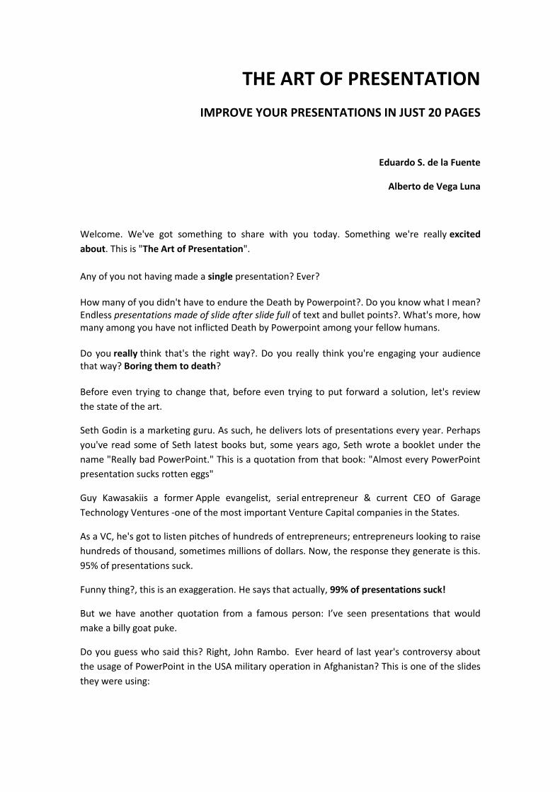
Do you guess who said this? Right, John Rambo. Ever heard of last year's controversy about
the usage of PowerPoint in the USA military operation in Afghanistan? This is one of the slides
they were using:

Any doubt why the USA hasn't won the war yet?
This is crazy!
Shall we now review the most common errors with presentations?
Probably the most common one, by far:
Teleprompting
Think about me reading this slide aloud:.
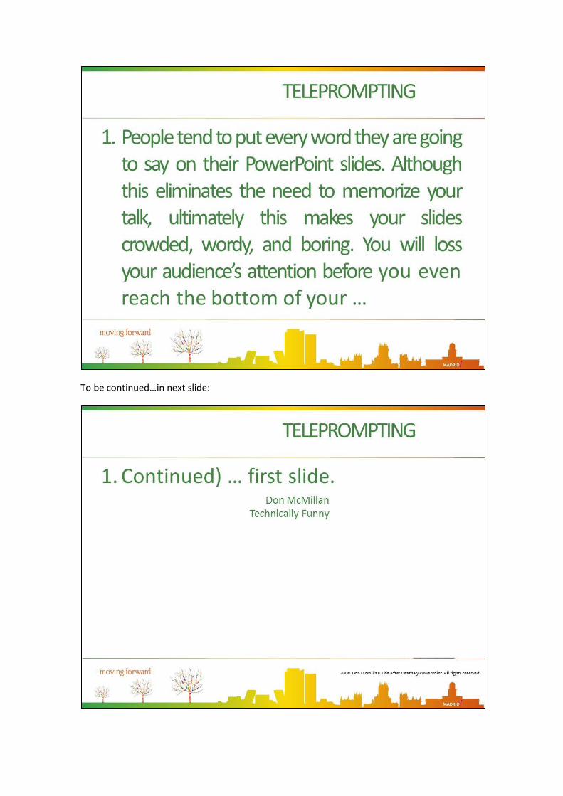
To be continued…in next slide:
If I read these two slides, will you be thrilled about my body language? Will you like it? How
many TV hosts have you seen turning their back on the camera? Let me tell you one thing, It is
not about being polite. It is about keeping eye contact!.
If you pay attention to the slides, you won't pay attention to your audience, no feedback,
you'll be lost and so the audience will be.
Besides, if everything you're going to say is already written please tell me what on Earth are
you doing there! Believe me, people can read. Don't need you to read on their behalf. In fact
they read way faster than you do! You're wasting your time and even worst, you're wasting
their time as well.
Now, one last thing. What's the impression you're gonna make? Don't know about you but,
whenever I see someone reading a slide, in the bottom of my heart I secretly wish for the
laptop to break down. I muse about what will happen to that presenter once their
cue/teleprompter is gone.
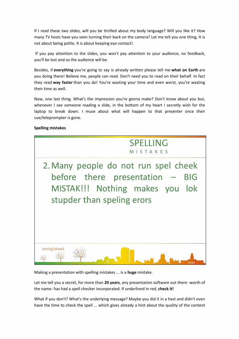
Spelling mistakes
Making a presentation with spelling mistakes ... is a huge mistake.
Let me tell you a secret, for more than 20 years, any presentation software out there -worth of
the name- has had a spell checker incorporated. If underlined in red, check it!
What if you don't? What's the underlying message? Maybe you did it in a hast and didn't even
have the time to check the spell ... which gives already a hint about the quality of the content

you're presenting. Or maybe you simply don't care. Don't care about your audience, don't care
about the contents you're presenting, up to the point that you didn't considered it worth to
spellcheck it.
Bullet pointing & too many indentations.
Funny? ... but real, right? Ever made, or suffered, a slide like that? And if you use too much
indentation, your slide becomes a vision test. Do not turn your presentations into a vision test.
In big auditoriums, people won't be able to read the outline. Your slides must be back-row
ready!
Wrong color schemes
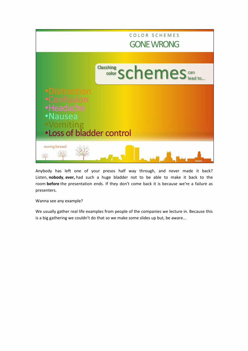
Anybody has left one of your presos half way through, and never made it back?
Listen, nobody, ever, had such a huge bladder not to be able to make it back to the
room before the presentation ends. If they don't come back it is because we're a failure as
presenters.
Wanna see any example?
We usually gather real life examples from people of the companies we lecture in. Because this
is a big gathering we couldn't do that so we make some slides up but, be aware...
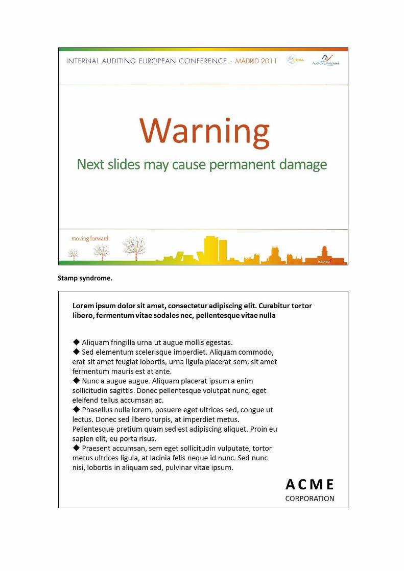
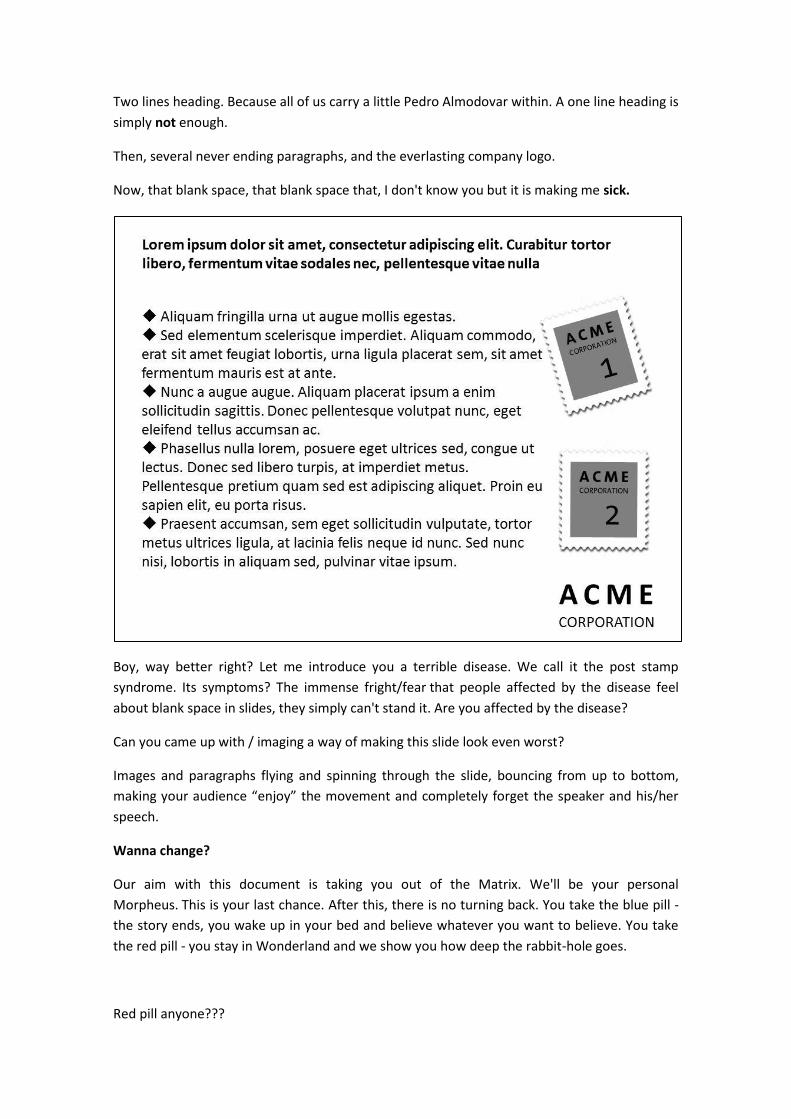
Stamp syndrome.
Two lines heading. Because all of us carry a little Pedro Almodovar within. A one line heading is
simply not enough.
Then, several never ending paragraphs, and the everlasting company logo.
Now, that blank space, that blank space that, I don't know you but it is making me sick.
Boy, way better right? Let me introduce you a terrible disease. We call it the post stamp
syndrome. Its symptoms? The immense fright/fear that people affected by the disease feel
about blank space in slides, they simply can't stand it. Are you affected by the disease?
Can you came up with / imaging a way of making this slide look even worst?
Images and paragraphs flying and spinning through the slide, bouncing from up to bottom,
making your audience “enjoy” the movement and completely forget the speaker and his/her
speech.
Wanna change?
Our aim with this document is taking you out of the Matrix. We'll be your personal
Morpheus. This is your last chance. After this, there is no turning back. You take the blue pill -
the story ends, you wake up in your bed and believe whatever you want to believe. You take
the red pill - you stay in Wonderland and we show you how deep the rabbit-hole goes.
Red pill anyone???

The three steps
We have just shown us how horrible our presentations are. So let’s see how we can improve
them.
First of all, let’s see three features our presentations MUST have. The first one is that our
presentations MUST be visual, because a picture is worth a thousand words. Because images –
- always related to what we are saying, of course - will reinforce our speech, making our words
easier to remember for our audience.
2nd feature: our presentations MUST transmit a message: one single thing we want our
audience to remember. Because they have such a bad memory that they will forget everything
once they go through that door. The message is the answer to the main question: why your
audience has come? For example, our message is “Because there is another way of
understanding presentations and engaging with your audience”
3rd feature: our presentation MUST tell a story. If your presentation is a story instead of a
collection of unrelated slides, the information will be easier to remember and understand. A
movie isn’t a collection of unrelated pictures: they tell a story.
And how we can create a story for a presentation? Well, when I was young I learnt that every
story is made of Exposition (where you introduce the characters and the context for the story),
Plot (where the bad guys make bad things to the good guys, there are weddings, love,
violence, etc) and Resolution (the prince marries the princess, the bad guy dies and everybody
is happy for ever)
You may think: “this guy is crazy, we work in a company (or civil administration or university)
and you’re talking about fairy tales”. Ok, let’s change a couple of things…
Instead of Exposition, we will talk about the Current Situation, where we introduce the
characters and the context. Instead of Plot, we will say Problem, and this part of the story is
where the bad guy starts to cause problems to the good guys. And finally, we will have the
Solution, where the bad guy dies and the main characters are happy forever.
And who are the main characters, the good guys here? Your specific audience for that
presentation. They are the main characters of your story, the good guys who have a problem
with the bad guy.
Ok, so let’s start to write our story. Forget the computer for now: paper and a pen is all we
need for now. Let’s work in analogue mode.
The three steps
Let’s take a look at the three steps we need to learn for creating our presentation. The first
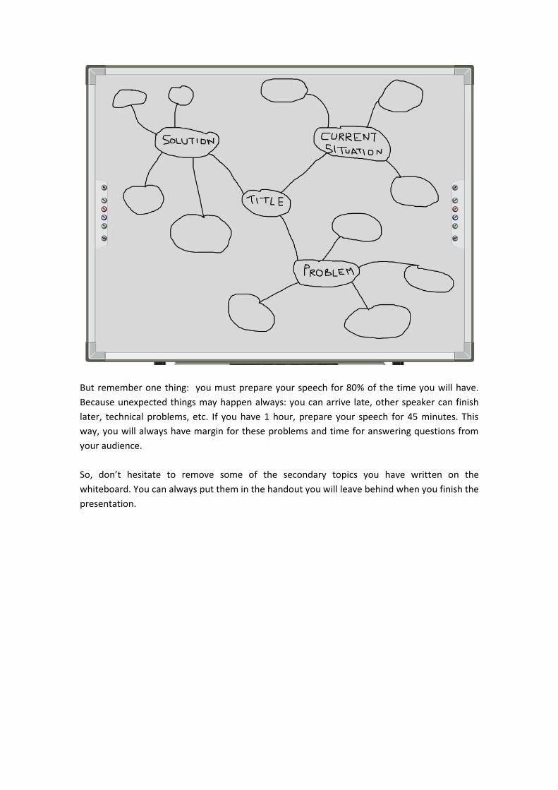
one is the mind map.
Get a big piece of paper or a whiteboard and start writing the title of your presentation in the
center. You don’t need the final version of the title for now: it’s just to know what we are going
to talk about.

Around the title, put the parts of a story we have seen some minutes ago:
- Current Situation, where we explain the context for our audience.
- Problem (for our audience).
- And the Solution for our audience
And now, start developing each of these parts, adding details for them. You don’t need to put
everything you know in the whiteboard: remember a presentation is about the audience not
about how much do you know about the topic.
But remember one thing: you must prepare your speech for 80% of the time you will have.
Because unexpected things may happen always: you can arrive late, other speaker can finish
later, technical problems, etc. If you have 1 hour, prepare your speech for 45 minutes. This
way, you will always have margin for these problems and time for answering questions from
your audience.
So, don’t hesitate to remove some of the secondary topics you have written on the
whiteboard. You can always put them in the handout you will leave behind when you finish the
presentation.

And remember to stick to your message through your story: your whole presentation should
be summarized in the message.
Let’s go with the 2nd step: the storyboard. This is the visual script for your story and it’s based
on how a movie is filmed. You have a visual script so every member of the crew knows what to
do when the director says “Action!”. In the storyboard, you will see where the actors will be,
how the camera will be moved and some lines to describe what is happening.
So let’s create our storyboard, using the mind map we did some minutes ago as a guide. We
can use postits to represent each of the steps of our story.
1) Title (the final one) and author. Something to attract the audience to your
presentation
2) Current situation. The context for your audience. We will write some sentences
explaining what we want to say in this part on the back of the postit. Yes, there’s no
room for too much text, so be brief. If there are several ideas to tell about, just grab
another postit: one postit=one idea.
3) Problem. The problem your audience has. We will do the same as in the previous
postit
4) Solution & benefits. Because we need to focus on benefits and not on features. If the
boot of a car is 500 litres, what does it mean? That I can put all my family’s baggage
inside it…including the several cases of my wife. That’s the benefit.
5) Sumary & call to action. The summary should be your message: the one single thing,
the most important benefit for your audience. Regarding the call to action, sometimes

is easy to guess (as buying the new iPhone once the keynote is finished), but
sometimes you must mention it explicitly so your audience can understand the next
step
You can end with a wall covered with postits if you have many things to say, but remember to
prepare your presentation for the 80% of the time you will have.
What’s next? If we want to create a visual presentation, we will need to include some images,
right? Ok, let’s draw. Does anybody in the room know how to draw?
Do you know what happens if I ask this same question in a 5yr old class? All children will raise
their hands! So don’t be shy: everybody knows how to draw sticks and circles…
We are going to see again the storyboard we did for this presentation.
1) Title: the art of presentation. Because we think this is really an art
2) Current situation: everyday, more than 30 Millions of presentations are delivered.
3) Problem: That means a lot of wasted time if they are boring and don’t achieve their
objective of transmitting information. We draw our audience sleeping.
4) Solution: your presentations must be visual, transmit a message and tell a story. We
draw an eye, a message in a bottle and a fairy. Of course, in a real situation we should
split this postit into three, but we have drawn everything on the same note so all the
postits could fit in the same slide.

5) Summary: there is another way of understanding presentations and engaging with
your audience. We draw a person delivering a presentation in front of a lot of people
listening to the speech.
You don’t need to be Michaelangelo or Picasso, but you get the idea, don’t you? Just draw
some lines when preparing your storyboard. It helps a lot when you are trying to visualize
your story.
And now it’s time to create the slides, based on the storyboard we’ve just done.
So let’s boot our computer now: remember we haven’t used it in any part of this process.
But we need it know for the slides…
The first thing to know is that is very useful to have a template for our slides, as the one
shown here. We have used a 6x6 grid, using the 4 central rows as the working area, where
we’ll put the images and text. We will use the upper row for the title of the slide and this
row and the lower one will allow the audience (and the slide) to breathe…
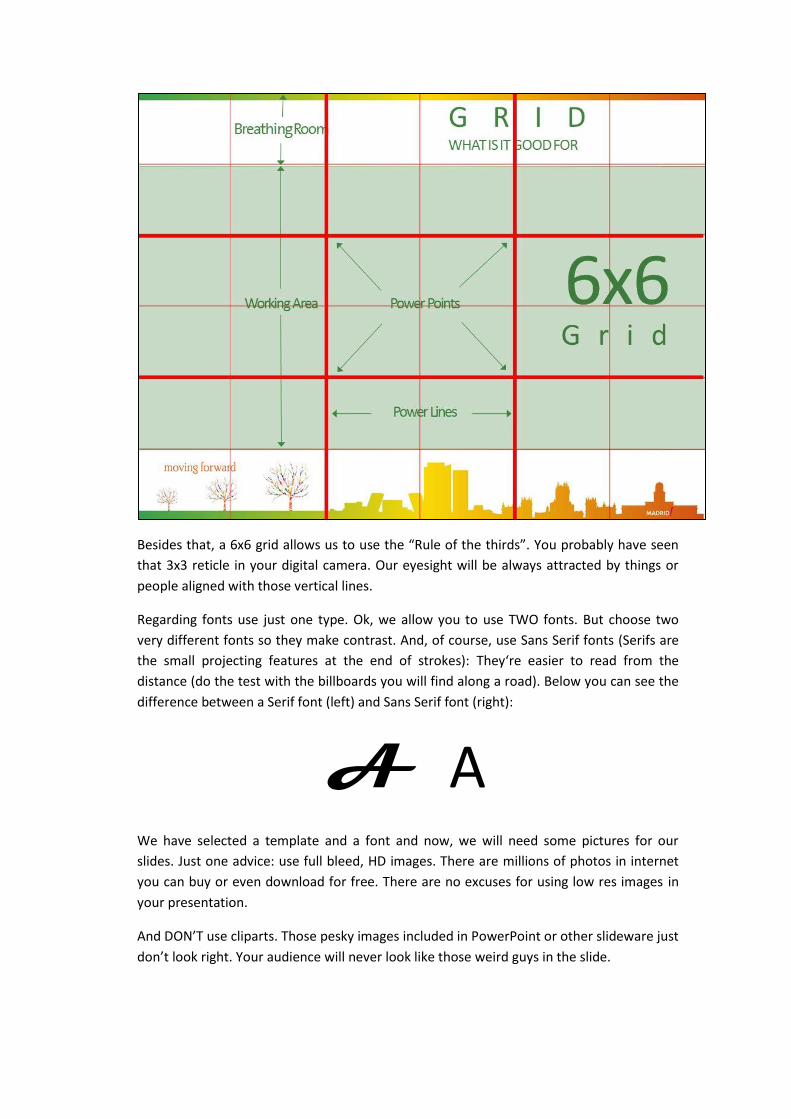
Besides that, a 6x6 grid allows us to use the “Rule of the thirds”. You probably have seen
that 3x3 reticle in your digital camera. Our eyesight will be always attracted by things or
people aligned with those vertical lines.
Regarding fonts use just one type. Ok, we allow you to use TWO fonts. But choose two
very different fonts so they make contrast. And, of course, use Sans Serif fonts (Serifs are
the small projecting features at the end of strokes): They‘re easier to read from the
distance (do the test with the billboards you will find along a road). Below you can see the
difference between a Serif font (left) and Sans Serif font (right):
A A We have selected a template and a font and now, we will need some pictures for our
slides. Just one advice: use full bleed, HD images. There are millions of photos in internet
you can buy or even download for free. There are no excuses for using low res images in
your presentation.
And DON’T use cliparts. Those pesky images included in PowerPoint or other slideware just
don’t look right. Your audience will never look like those weird guys in the slide.

Just see how the slide is improved when you use real people in it. Do you see the
difference? Do you feel the difference?

And remember this: do not try to cram everything you know in your presentation. Don’t
put more than one idea in each slide. Adding new slides to your presentation is free: they
cost no money. Stick to the time you have for your presentation, the number of slides is
not important.
Resources
Probably you‘re wondering now “where can I find more information about this new way of
doing presentations”? Glad you asked.
You can read our book (El Arte de la Presentación), available worldwide in Lulu.com. Ok,
it’s only in Spanish for now, but you can also visit our website (I will give you the URL later)
where we have published all of our presentations in English and Spanish and additional
documentation in both languages. There are other books in English like PresentationZen by
Garr Reynolds or Slideology by Nancy Duarte, which were the first ones we read about this
topic.
And “Where can I find HD photos?” For example, in this website with thousands of free
and premium photos: PhotoXPress. They are HD and with a professional look and you can
download 10 of the free ones each day (more than enough for a presentation). You can
also search for photos in Flickr where there are millions of photos under Creative
Commons license.
As summary, we will use the summary slide we use in our seminars.

The document ends here but not our mission. We firmly believe there’s another way of
understanding presentations and engaging with your audience. And we believe everybody
can start creating presentations which are visual, transmit a message and tell a story. Joint
us at PresentacionesArtesanas.es. Now, it’s your turn to spread the word: tell everybody
that presentations can be entertaining. Just join us and let’s finish with the death by
PowerPoint. Thank you very much for reading.

More information
Web: http://www.presentacionesartesanas.com
Twitter: @presArtesanas
Facebook: Presentaciones Artesanas
Flickr: http://www.flickr.com/photos/presentacionesartesanas/
YouTube: http://www.youtube.com/user/presArtesanas
Mail:
Eduardo de la Fuente ([email protected])
Alberto de Vega ([email protected])
License
THE ART OF PRESENTATION: IMPROVE YOUR PRESENTATIONS IN JUST 20 PAGES by Alberto de Vega, Eduardo S. de la Fuente is licensed under a Creative Commons Attribution-NonComercial-NonDerivative 3.0 Unported License.
Photo credits
Based on © Adam Borkowski / PhotoXpress.com
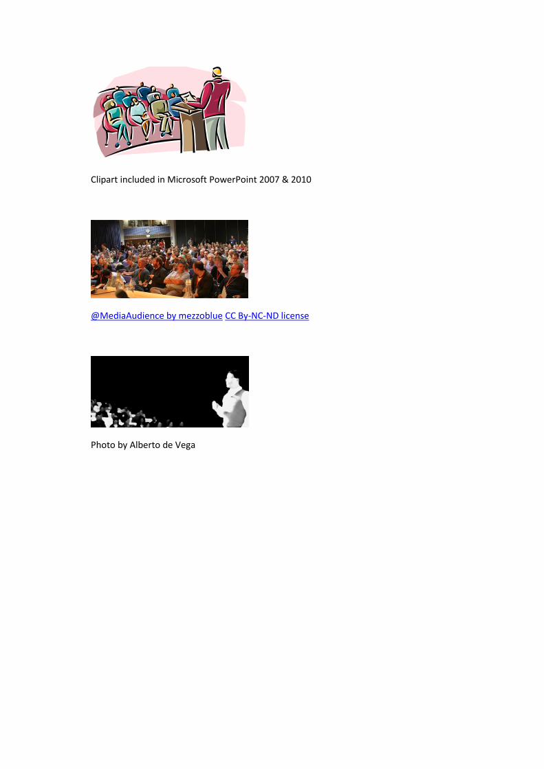
Clipart included in Microsoft PowerPoint 2007 & 2010
@MediaAudience by mezzoblue CC By-NC-ND license
Photo by Alberto de Vega