textual analysis covers
TRANSCRIPT

Textual Analysis- Front covers
Mary spencer

Skyline
The skyline for this magazine has been put in the same font and color theme as the rest of the magazine. The color of the text varies from black to white this has been done to make it stand out. The word ‘the wanted’ which is the name of the band that the article insides about, has been put in white to ensure the reader knows its about that particular band when scam reading over the cover. It also stands out more against the bright pink background. Also they’ve used an exclamation mark and a question marker. This makes the article seem more exciting by using the exclamation mark and the question mark has been used to leave the reader curious and wanting to know more.

Main image
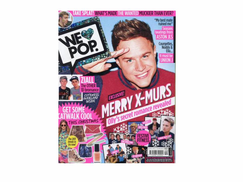
The main image is of a pop artist. The photo is a mid shot bordering on being a close up shot this is because you can mainly see his face and the top part of his body. But the its covered in writing so its hard to tell what type of shot it is. In the image the artist is smiling, this creates a happy and positive vibe for the magazine. This is a typical for every pop magazine, as their aim to create a fun and current theme to represent pop music in general. Also from having this particular image as the front cover it will attract fans of that particular artist as they will want to buy it and find out more.

Mast head
A mast head is usually the name of the magazine, and in this case its called ‘we love pop’ . So just by reading this you automatically know it’s a pop magazine. Something else that indicates that it’s a pop magazine is that the writing and design of the mast head bold and black with a blue heart glittery heart instead of the word love. Also the fact the writing is in a black bold speech bubble with the same blue glittery border as the heart makes it stand out even more, and because the black writing is on a white background and black always stands out against white.

Main sell lines and other sell lines
The main sell line for magazines is usually related to whatever the main image is like in this one its related to the artist on the cover. As this this was a December issue the whole magazine theme was Christmas related, so the main sell line was wrote to tie in with the Christmas theme but still remained to be about the artist on the front. Also when looking at the other sell lines some of them also tie into the Christmas theme, but even though they are doing this they are still managing to keep it looking like a pop magazine by the way there still creating the fun and exciting sell lines.

Color
The color scheme of the cover is mainly blue as this relates to Christmas but is also quite a fun color of blue which a pop magazine would use anyway. Another reason why the color might be blue might have been used as it’s a male pop artist on the front, and blue is typically associated with boys. But it still does have a pop of pink within it still in the skyline and some of the sell lines.

Issue number and price
Like most magazines the price and issue number has been placed in the bottom right hand corner along with the barcode. Underneath this is the website address and the company that owns that magazine which is Egmont.
Main Image
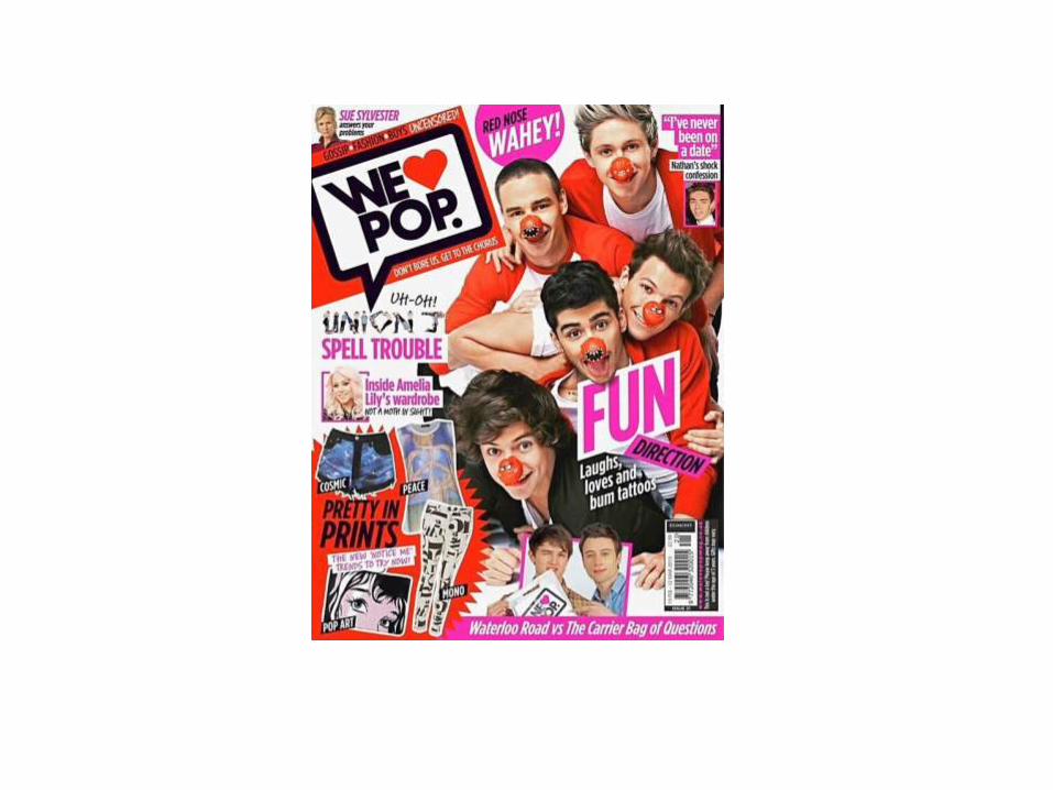
The main image is related to the to the event of red nose day. This is clearly represented throughout the full of the magazine cover. But specifically in the image. The shot is a mid shot as you can only see their faces and shoulders within the image and they are positioned on the right hand side of the image leaving room at the other side of the magazine for text. They are also all wearing red and wearing red noses to support red nose day, but the way they are posing within the shot is in a very fun and positive way. You can tell this by the way they are smiling having a good time.

Mast head
The mast head for each ‘we love pop’ magazine usually has a black speech bubble with the name of the magazine inside and then it has another color for the heart and the background of the speech bubble. They’ve chosen red to match up with the rest of the theme of red nose day, the type of red they’ve used though is still vibrant and quite bright this is important as they need to still remember to keep it looking like a pop magazine. Something else they’ve done to keep it still looking like a pop magazine is include a pop of the color pink in the writing now and again rather than just having it all one color, and it also makes it look more exciting.
Main sell line and other sell lines
The main sell line was again related to the main image of the pop artists. The first word of the main sell line was ‘fun’ and this was in big bold pink lettering to make it stand out as the magazine wants to give off a happy and positive image. Another reason the word fun is highlighted bigger and bolder than the rest of the text is because its linked to the image where they seem to be having fun and a laugh within the photo. The other sell lines are also in pink, this is good as the pink stands out for people to read and so people don’t forget about other articles just because they aren't wrote as bold. Another thing that all the sell lines have in common is that they all have an image next to them that links to what's been wrote.

Color
The main color used throughout the cover is red. This is because the magazine was supporting red nose day as the image and some sell lines also indicate. The color red has been used in the background, the mast head and in their outfits. Like I mentioned when talking about the mast head the color red that they have chosen is still quite bright and vibrant, which is key to keep it still looking like a pop magazine. Another color that’s been used to keep the ‘pop magazine look’ is pink. This color goes well with red and makes the cover look way more exciting rather than it just focusing on red. Like most magazines the color white has been used, this is because its good to make a certain area stand out.
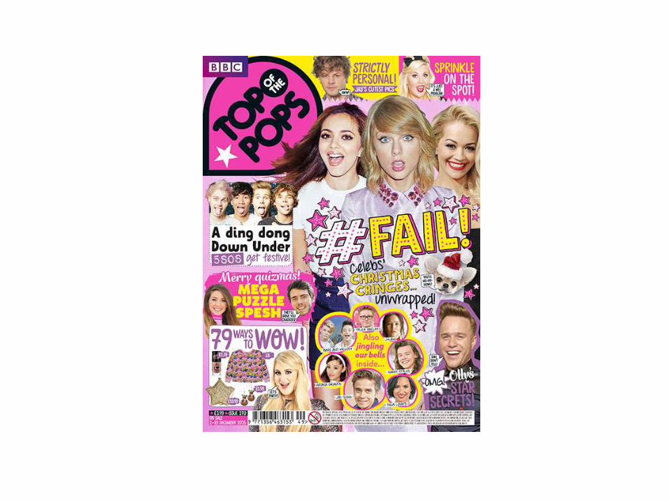

Mast Head
The mast head is again the title ’top of the pops’. Which tells you straight away that it’s a pop music magazine. Just like the two previous mast heads it is in the top left hand corner of the page. The writing is in black bold font to make it stand out against the pink background. The writing has also been put into speech bubble type shape just like the other pop magazine had. This is good for making sure that it stands out and has been made clear that this is the name of the magazine. The words ’top’ and ‘pops’ have been made much bigger than the words ‘of the’ this is because they are the most important words within the title and they need to make sure they stand out the most.

Main image
With this particular magazine there isn't just one singular artist that has been used for the main image there is 3 of them. The artist at the front has a shocked expression on her face while the 2 behind her are smiling and laughing. As there has been more than one artist used for the front cover this could indicate that the main article has been based on more than one person. Another thing you could take from this image is that what you can actually see of them is that all of their makeup looks and outfits are light or bright colors, this is another reason that you can tell this is a pop magazine.

Main sell line and other sell lines
The main sell line doesn’t really tell you weather or not its talking about anyone in particular, this might be why they have multiple artists on the cover rather than just one main artist. The general look of the text of the main sell line looks very eye-catching and the colours of it look like they belong to a pop magazine. The word ‘ fail’ is in big bold yellow capital letters, it has been made to stand out most on the page for a reason. The image of the artist looking shocked could link to this. The other words in the title still stand out but just havent been made as bold as it was obviously important for the people creating the magazine that the first word was the main focus

Colour
The colour scheme for this magazine is mainly pink and yellow , with some purple. The colours are typical pop magazine colours, as they are bright fun and exiting. The main image is of three different artists who are all girls, the colour pink is usually associated with girls and that’s who the target audience is for this magazine.

Reflection
• I chose the first front cover to analyse because it has a similar theme to it which I want to do with mine. And it had interesting layout which I liked
• I chose the second one because it had a lot going on which and a lot of colour too.
• The last one I chose as it had typical pop magazine colours on it which I wanted to include as it had a lot to talk about and learn from.