textual analysis
TRANSCRIPT
Textual Analysis.
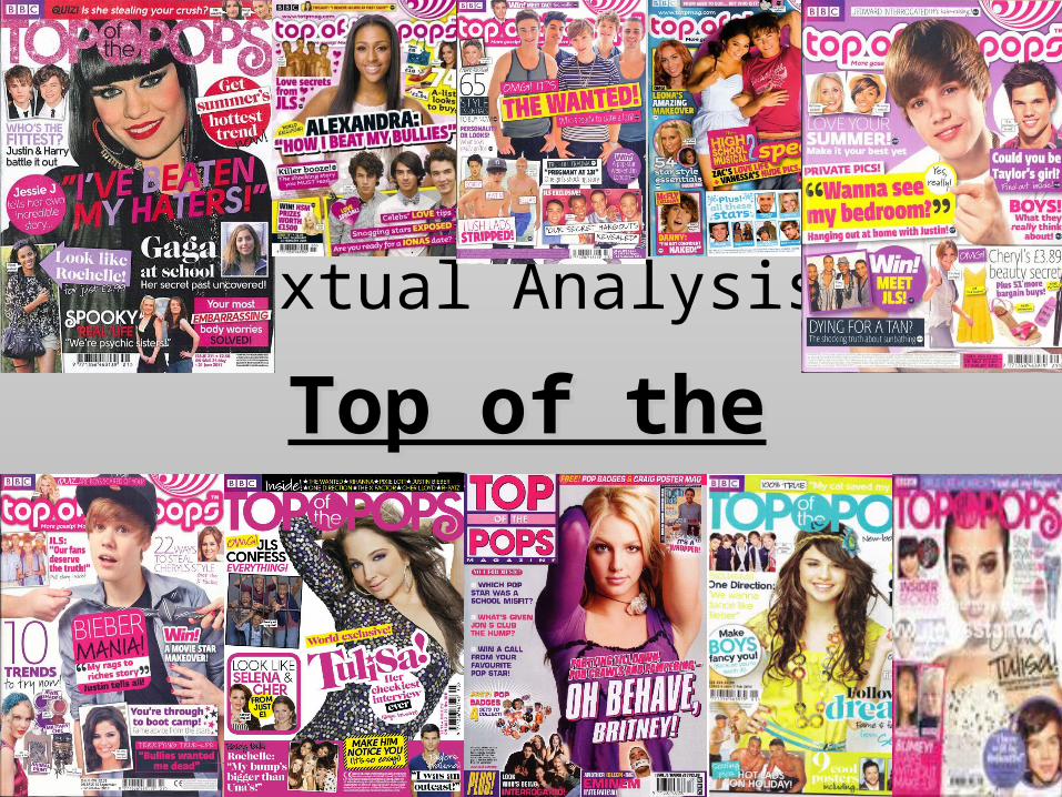
Top of the PopsTop of the Pops
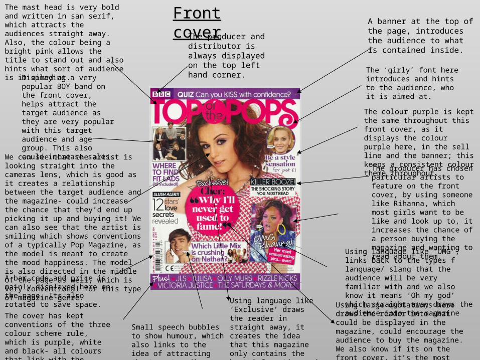
Front coverFront coverThe mast head is very bold and written in san serif, which attracts the audiences straight away. Also, the colour being a bright pink allows the title to stand out and also hints what sort of audience is it aimed at.
The producer and distributor is always displayed on the top left hand corner.
A banner at the top of the page, introduces the audience to what is contained inside.
The ‘girly’ font here introduces and hints to the audience, who it is aimed at.
The colour purple is kept the same throughout this front cover, as it displays the colour purple here, in the sell line and the banner; this keeps a consistent colour theme throughout.
Displaying a very popular BOY band on the front cover, helps attract the target audience as they are very popular with this target audience and age group. This also could increase sales.
We can see that the artist is looking straight into the cameras lens, which is good as it creates a relationship between the target audience and the magazine- could increase the chance that they’d end up picking it up and buying it! We can also see that the artist is smiling which shows conventions of a typically Pop Magazine, as the model is meant to create the mood happiness. The model is also directed in the middle of the page as well, which is very conventional for this type of magazine genre.
A bar code and price is mainly displayed here on the page. Its also rotated to save space.
The cover has kept conventions of the three colour scheme rule, which is purple, white and black- all colours that link with the target audience.
Using language like ‘Exclusive’ draws the reader in straight away, it creates the idea that this magazine only contains the best information and artists.
Small speech bubbles to show humour, which also links to the idea of attracting the target audience.
Using large quotations here draws the reader into what could be displayed in the magazine, could encourage the audience to buy the magazine. We also know if its on the front cover, it’s the most important information.
Using language like ‘OMG’, links back to the types f language/ slang that the audience will be very familiar with and we also know it means ‘Oh my god’ which straight away draws the audience into the magazine
The producer has chosen particular artists to feature on the front cover, by using someone like Rihanna, which most girls want to be like and look up to, it increases the chance of a person buying the magazine and wanting to read about them.
Contents Page.Contents Page.
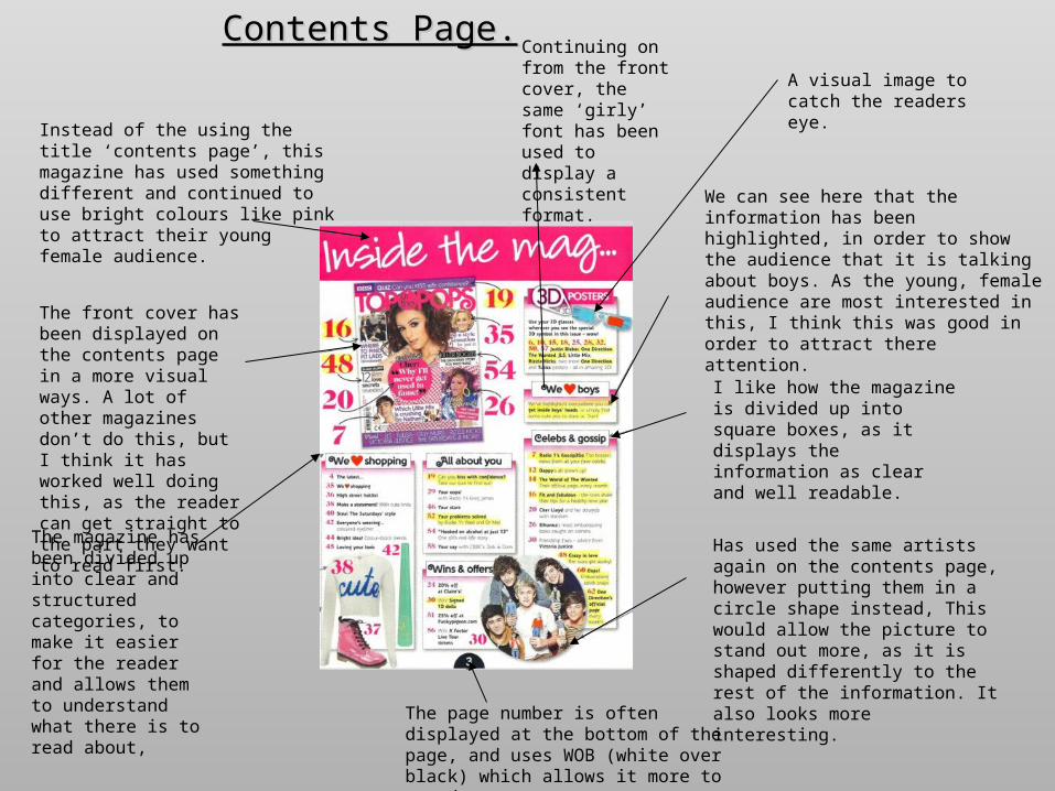
Instead of the using the title ‘contents page’, this magazine has used something different and continued to use bright colours like pink to attract their young female audience.
The front cover has been displayed on the contents page in a more visual ways. A lot of other magazines don’t do this, but I think it has worked well doing this, as the reader can get straight to the part they want to read first.
The magazine has been divided up into clear and structured categories, to make it easier for the reader and allows them to understand what there is to read about,
Continuing on from the front cover, the same ‘girly’ font has been used to display a consistent format.
The page number is often displayed at the bottom of the page, and uses WOB (white over black) which allows it more to stand out.
Has used the same artists again on the contents page, however putting them in a circle shape instead, This would allow the picture to stand out more, as it is shaped differently to the rest of the information. It also looks more interesting.
I like how the magazine is divided up into square boxes, as it displays the information as clear and well readable.
We can see here that the information has been highlighted, in order to show the audience that it is talking about boys. As the young, female audience are most interested in this, I think this was good in order to attract there attention.
A visual image to catch the readers eye.
Double Page Spread.Double Page Spread.
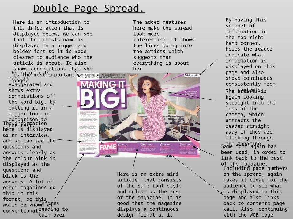
Informs reading to turn over the page.
The information here is displayed as an interview, and we can see the questions and answers clearly as the colour pink is displayed as the questions and black is the answers. A lot of other magazines do this in this format, so this would be known as conventional.
The main title here is exaggerated and shows extra connotations off the word big, by putting it in a bigger font in comparison to the rest.
Here is an introduction to this information that is displayed below, we can see that the artists name is displayed in a bigger and bolder font so it is made clearer to audience who the article is about. It also shows connotations that she is the most important on this page.
Here is an extra mini article, that consists of the same font style and colour as the rest of the magazine. It is good that the magazine displays a continuous design format as it makes the magazine seem more professional.
The added features here make the spread look more interesting, it shows the lines going into the artists which suggests that everything is about her
By having this snippet of information in the top right hand corner, helps the reader indicate what information is displayed on this page and also shows continuous consistently from the contents page.
The artists is again looking straight into the lens of the camera, which attracts the reader straight away if they are flicking through the magazine.
Including page numbers on the spread, again makes it clear for the audience to see what is displayed on this page and also links back to contents page well. Also, continuing with the WOB page numbers, makes the magazine look professional.
Same font again has been used, in order to link back to the rest of the magazine.