tennivis: visualization for tennis match...
TRANSCRIPT
IEEE TRANSACTIONS ON VISUALIZATION AND COMPUTER GRAPHICS, VOL. 20, NO. 12, DECEMBER 2014 2339
1077-2626 © 2014 IEEE. Personal use is permitted, but republication/redistribution requires IEEE permission.See http://www.ieee.org/publications_standards/publications/rights/index.html for more information.
TenniVis: Visualization for Tennis Match Analysis
Tom Polk, Member, IEEE, Jing Yang, Yueqi Hu, and Ye Zhao
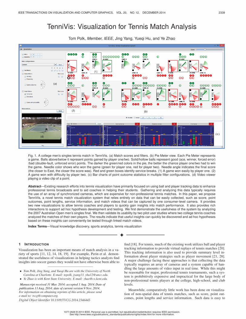
Fig. 1. A college men’s singles tennis match in TenniVis. (a) Match scores and filters. (b) Pie Meter view. Each Pie Meter representsa game. Balls above/below it represent points gained by player one/two. Solid/hollow balls represent good (ace, winner, forced error)/bad (double-fault, unforced error) points. The darker the green/red colors in the pie, the better the chance player one/two had to winthe game. Needle color shows who won the game (green for player one, red for player two). Needle angle indicates the final score(the closer to East, the closer the score was). Red and green boxes identify service breaks. (1) A game won easily by player one. (2)A game won with difficulty by player two. (c) Bar charts of point outcome statistics in multiple filter configurations. (d) Video viewerplaying a video clip of a point.
Abstract—Existing research efforts into tennis visualization have primarily focused on using ball and player tracking data to enhanceprofessional tennis broadcasts and to aid coaches in helping their students. Gathering and analyzing this data typically requiresthe use of an array of synchronized cameras, which are expensive for non-professional tennis matches. In this paper, we proposeTenniVis, a novel tennis match visualization system that relies entirely on data that can be easily collected, such as score, pointoutcomes, point lengths, service information, and match videos that can be captured by one consumer-level camera. It providestwo new visualizations to allow tennis coaches and players to quickly gain insights into match performance. It also provides richinteractions to support ad hoc hypothesis development and testing. We first demonstrate the usefulness of the system by analyzingthe 2007 Australian Open men’s singles final. We then validate its usability by two pilot user studies where two college tennis coachesanalyzed the matches of their own players. The results indicate that useful insights can quickly be discovered and ad hoc hypothesesbased on these insights can conveniently be tested through linked match videos.
Index Terms—Visual knowledge discovery, sports analytics, tennis visualization
1 INTRODUCTION
Visualization has been an important means of match analysis in a va-riety of sports [11, 12, 14, 18, 19]. For example, Perin et al. demon-strated the usefulness of visualizations in helping tactics analysts findinsights into soccer games they would not have otherwise been able to
• Tom Polk, Jing Yang, and Yueqi Hu are with the University of NorthCarolina at Charlotte. E-mail: tepolk, jyang13, [email protected].
• Ye Zhao is with Kent State University. E-mail: [email protected].
find [18]. For tennis, much of the existing work utilizes ball and playertracking information to provide virtual replays of tennis matches [20].This tracking information is also used to provide summary level in-formation about player strategies such as player movement [21, 28].A major challenge facing these approaches is that collecting the datatypically requires an array of cameras and a system capable of han-dling the large amounts of video input in real time. While this mightbe reasonable for major, professional tennis tournaments, such a sys-tem is prohibitively expensive and impractical for the large body ofnon-professional tennis players at the college, high-school, and clublevels.
Meanwhile, comparatively little work has been done on visualiza-tion of non-spatial data of tennis matches, such as score, point out-comes, point lengths and service information. Such data is easy to
For information on obtaining reprints of this article, please sende-mail to: [email protected].
Manuscript received 31 Mar. 2014; accepted 1 Aug. 2014 ate ofpublication 2014; date of current version 2014.11 Aug. 9 Nov.
D.
Digital Object Identifier 10.1109/TVCG.2014.2346445

2340 IEEE TRANSACTIONS ON VISUALIZATION AND COMPUTER GRAPHICS, VOL. 20, NO. 12, DECEMBER 2014
Fig. 2. Fish Grid views of the Federer-Gonzalez match (won by Federer 7-6, 6-4, 6-4). (a)-(c) are captured from a zoomed-in view and (d) is azoomed out view. Each Fish Grid is a score matrix rotated 45 degrees with point outcomes mapped on it as balls (green/red: point gained byFederer/Gonzalez; solid/hollow: good/bad shot). The horizontal order of the balls indicates the temporal order of the points. The vertical positionof a ball indicate who was in lead before the point (above the horizontal, Federer is in the lead; below the horizontal, Gonzalez is in the lead). (a) Agame won easily by Federer. (b) The longest game in the match (won by Gonzalez). (c) A game with a “choke” point for Gonzalez, identified usingfilters. (d) Fish Grids for the entire match. Although shown small here, they still convey trend information for each game. (e) Sample Point OutcomeGlyphs (balls) at different zoom levels. At the maximum zoom level, tick marks represent point length in seconds and triangles represent serviceside (left/right) and first vs. second serve (solid/hollow).
collect by non-professional players and carries both high level sum-maries and low level details about a match. Unfortunately, this datais usually analyzed in aggregated statistics and thus valuable insightsabout local details and trends are often missing.
The above observation inspired us to build a tennis visualizationsystem for non-professional players based on non-spatial data. Wethus develop a new system with the following goals:
• To be economically and technologically feasible for non-professional tennis players. In other words, no expensive balland player tracking equipment and analysis software will be re-quired.
• To provide easy to learn visualizations and easy to use interac-tions. Therefore, tennis coaches and players will be able to usethe system without the accompaniment of visualization experts.
• To support users quickly discovering patterns about players andmatches; to facilitate them in ad hoc hypothesis generation andevaluation.
• To allow coaches and players to easily share insights gained fromthe visualizations.
Our new system, named TenniVis, provides the following featuresto meet the above goals:
• Easy-to-collect data input: TenniVis merely requires the follow-ing information as its inputs: (1) the match video captured bya single consumer-level video camera and (2) non-spatial datathat can be easily collected by someone spectating a match (i.e.,parent, coach, or teammate) in real time. It includes timestampsmarking the start and end of each point, indication of secondserve, and point outcome (i.e., ace, double-fault, winner, forcederror, or unforced error). Other information, including score in-formation, who is serving, service side (ad or deuce court), gamelength (i.e., number of points), point length, and service breaks,can be derived from the data and the inherent structure of a tennismatch.
• Easily learnable visualizations: TenniVis provides two novelviews that can be quickly learned and understood by noviceusers: the Pie Meter view and the Fish Grid view. The Pie Meterview (see Figure 1 (b)) provides a high-level overview of an en-tire match. It reveals who won a game and the degree to whichthe score in the game fluctuated in favor of one player. The FishGrid view (see Figure 2) provides more details at the game levelby displaying each point outcome as the game score progresses.The game length, trend, and critical points can be easily observedfrom this view.
• Ad hoc hypothesis generation and evaluation: A variety ofplayer, set, game, and point level filters are provided, allowingusers to generate hypotheses about point outcomes. Users canevaluate these hypotheses using the outcome bar chart snapshots(see Figure 1 (c)) as well as by reviewing the video associatedwith specific points.
• Result sharing: Users can annotate individual points with theirobservations from the associated video clips (see Figure 1 (d)).These points are highlighted in the visualizations for easy review.The annotated video clips are automatically assembled into anHTML report that can easily be shared with players or coaches.
Non-professional tennis players and coaches have participated andprovided important input to the development of TenniVis. First, thefirst author, who is also the developer of the system, has over 35 yearsof tennis playing experience. Second, a set of face-to-face meetings,phone interviews, and user studies have been conducted with non-professional tennis coaches. The coaches confirmed the feasibility ofdata collection for TenniVis. They also confirmed the usefulness ofTenniVis in two pilot user studies where matches of their own playerswere analyzed.
The rest of the paper is organized as follows: Section 2 pro-vides background knowledge on tennis and discusses challenges fac-ing non-professional players when analyzing tennis matches. Section3 presents related work. Section 4 presents TenniVis and illustrates itsfeatures using the case of a professional tennis match between RogerFederer and Fernando Gonzalez from the 2007 Australian Open Fi-nals, won by Federer in three sets (7-6, 6-4, 6-4). Section 5 presents
two pilot user studies of college tennis matches, where the analysis wasperformed by the coaches themselves. Section 6 presents our conclu-sions and future work.
2 BACKGROUND AND REQUIREMENTS ANALYSIS
In this section, we introduce background knowledge of tennis, pointout match information that is important for match analysis, and high-light the requirements it brings to tennis visualization systems in boldfonts. The important information and requirements were identified ac-cording to the first author’s own experience and intensive phone andface-to-face discussions with four club and college coaches.
Tennis lends itself to analysis due to its structured, hierarchical na-ture. A typical non-professional tennis match consists of the best twoout of three sets, where each set is awarded to the player who gets sixgames first (with at least a two game margin). Each game is awardedto the player who gets four points first (with at least a two point mar-gin). One player serves all the points in a game. Players alternateserving each game. They also change sides of the court after the firstgame and then after every two games. Serving is considered an advan-tage in tennis, so it is important to highlight games where the servingplayer loses the game. This is called a service break. Who is servingand service breaks should be immediately noticeable to users. Ifthe game score within a set reaches six-six, a 12-point tiebreaker isplayed. In this tiebreaker one player serves one point and then eachplayer takes turns serving two points. The player to get to seven pointsfirst with a margin of at least two points wins the tiebreaker and isawarded the set. If players get to six-six in the tiebreaker, they con-tinue playing until one player gets a two point lead.
The scoring progression in a game is as follows: 0 (or love), 15,30, 40, game. If, in a game, both players each get three points (calleddeuce), then play continues until one of the players gets a two pointlead over the other player, thus winning the game. After a deuce pointhas been reached, when a player gets a point we say that player has theadvantage. The score is usually reported from the server’s viewpoint.In terms of risk, not all points within a game are equal. For example,a player serving at 40-0 in a game needs only to win one of the nextthree points to win the game. From the server’s perspective, this is a farmore comfortable position to be in relative to a score of 0-40 (knownas a break point). Visually encoding the risks associated with thepoints will help users understand the pressure on the players ateach point.
As with many sports, there is a psychological component to tennisthat affects players differently. Some players ease off in their intensityafter getting a lead just to see their lead slipping away (known as chok-ing). Other players are able to step up and recover after being downin a match (known as rallying back). Choking and rallying backshould be easy to spot in visualizations because they may identifyplayer patterns that need to be modified.
A tennis point begins with a serve by one of the players. The start-ing location of the serve is behind the baseline on either the right halfof the court (called the deuce side) or the left half (called the ad side).See [2] for an explanation of the various parts of a tennis court. If theserver misses the first serve (i.e., it does not land in the correct servicebox), this is called a fault and the player gets to try again. If the playermisses the second serve, this is called a double-fault and the point isawarded to the receiving player.
When analyzing a tennis match, information about whether a pointstarted off on a first versus a second serve is very important becausea player’s second serve is usually not as powerful or effective as theirfirst serve (thereby giving the receiving player an easier opportunity toreturn the serve). If the server hits the ball in the opponent’s servicebox and the opponent does not touch the ball, this is called an ace andthe point is awarded to the serving player.
Tennis points can end one of three additional ways besides bydouble-fault or ace: winner, forced error, or unforced error. A win-ner is when a player hits a legal shot (other than a serve) to his or heropponent and the opponent does not touch the ball. A forced error issimilar to a winner except that the opponent is able to touch the ball.Both winners and forced errors (as well as aces) are “good” shots at-
tributed to the “good” shot made by a player. An unforced error iswhen a player, despite having enough time to get to the ball and exe-cute a good shot, ends up instead hitting the ball out of bounds or intothe net. An unforced error, like a double-fault, is considered a “bad”shot attributed to the player that made the error because it gives a pointto the opponent.
In analyzing tennis matches, understanding how points end is vi-tally important to understanding why a player is winning or losinghis or her matches. The coaches that we talked to during our pilotuser studies indicated that unforced errors help them identify poten-tial shots a player needs to work on. They also indicated that winnersmade by an opposing player are often the result of poor shot selectionon previous shots by a player. Thus, examining winners helps identifyareas where strategies may need to be improved. Visually presentingpoint information, such as service information, good or bad shots,and point outcome types, can provide useful insights to coachesand players.
In addition to having information about the outcome of a point (ace,winner, unforced error etc.) and the service information (first versussecond serve), the score of a game at which a specific outcome occursis also important. For example, some players may have a tendency tostart off games slowly and get behind. Seeing this in the visualization,coaches can work with a player to change their tactics or teach themhow to be more mentally prepared at the start of a game. Therefore, itis very useful for visualization systems to visually present the pointoutcomes within the context of the score where they occur.
While video analysis is fairly common in many sports, such asAmerican football, this is not as common in tennis matches, due pri-marily to the expense of analyzing this data. Unlike team sports wherethere is one match in which all members of the team participate, teamtennis matches involve multiple, separate matches being played simul-taneously. In NCAA [6] tennis matches, teams play three doublesmatches followed by six singles matches. A typical singles match maylast two or more hours, leading to 12 hours of video (for just singles)to be analyzed per team match. Many teams play 2 or 3 matches perweek, resulting in 36 hours of video per week. It is time consumingfor the coaches to analyze such a large volume of video. Meanwhile, itis important for coaches and players to watch the video of interestingpoints. Thus there is a dire need for visualization systems that canhelp coaches (or the players themselves) quickly identify points ina match that may lead to insights and watch the video clips associ-ated with them, without having to sift through all of the raw videodata.
3 RELATED WORK
Many tennis visualization systems have been developed for enhancingcommercial broadcasts of professional tennis matches at major tourna-ments or improving player performance. Most of them require ball andplayer tracking information. Jin and Banks [13] visualize tennis shotsas two-dimensional ball traces and use a magic-lens to allow usersto filter interesting points and to step through all points in a matchthrough a time-varying display. However, they relied on a synthesizeddata set rather than on any actual ball trajectories. Systems such asHawkEye [17], LucentVision [22] and Tennissense [9, 10] requirethe use of an array of synchronized cameras to collect ball and playertracking information. HawkEye [17] and LucentVision [22] provideplayer movement data and ball landing positions for serves and shotsduring each point. This enables insights such as patterns, strengths,and weakness of players to be gained from the tracking data. Theseinsights are provided to professional tennis analysts to enhance livebroadcasts and are also used for novel visualizations for tennis fans,including the capability for fans to experience serves from the player’sperspective. Tennissense [9, 10] automatically extracts key eventssuch as games, change of ends, and serves from match videos. Itpresents a coaching interface where users can quickly jump to anyevent in a match to examine it from the perspective of any of thenine arrayed camera angles. The drawback of the above approachesis that they are prohibitively expensive and impractical for most non-professional tennis players. In addition, they can only be used for

2341POLK ET AL.: TENNIVIS: VISUALIZATION FOR TENNIS MATCH ANALYSIS
Fig. 2. Fish Grid views of the Federer-Gonzalez match (won by Federer 7-6, 6-4, 6-4). (a)-(c) are captured from a zoomed-in view and (d) is azoomed out view. Each Fish Grid is a score matrix rotated 45 degrees with point outcomes mapped on it as balls (green/red: point gained byFederer/Gonzalez; solid/hollow: good/bad shot). The horizontal order of the balls indicates the temporal order of the points. The vertical positionof a ball indicate who was in lead before the point (above the horizontal, Federer is in the lead; below the horizontal, Gonzalez is in the lead). (a) Agame won easily by Federer. (b) The longest game in the match (won by Gonzalez). (c) A game with a “choke” point for Gonzalez, identified usingfilters. (d) Fish Grids for the entire match. Although shown small here, they still convey trend information for each game. (e) Sample Point OutcomeGlyphs (balls) at different zoom levels. At the maximum zoom level, tick marks represent point length in seconds and triangles represent serviceside (left/right) and first vs. second serve (solid/hollow).
collect by non-professional players and carries both high level sum-maries and low level details about a match. Unfortunately, this datais usually analyzed in aggregated statistics and thus valuable insightsabout local details and trends are often missing.
The above observation inspired us to build a tennis visualizationsystem for non-professional players based on non-spatial data. Wethus develop a new system with the following goals:
• To be economically and technologically feasible for non-professional tennis players. In other words, no expensive balland player tracking equipment and analysis software will be re-quired.
• To provide easy to learn visualizations and easy to use interac-tions. Therefore, tennis coaches and players will be able to usethe system without the accompaniment of visualization experts.
• To support users quickly discovering patterns about players andmatches; to facilitate them in ad hoc hypothesis generation andevaluation.
• To allow coaches and players to easily share insights gained fromthe visualizations.
Our new system, named TenniVis, provides the following featuresto meet the above goals:
• Easy-to-collect data input: TenniVis merely requires the follow-ing information as its inputs: (1) the match video captured bya single consumer-level video camera and (2) non-spatial datathat can be easily collected by someone spectating a match (i.e.,parent, coach, or teammate) in real time. It includes timestampsmarking the start and end of each point, indication of secondserve, and point outcome (i.e., ace, double-fault, winner, forcederror, or unforced error). Other information, including score in-formation, who is serving, service side (ad or deuce court), gamelength (i.e., number of points), point length, and service breaks,can be derived from the data and the inherent structure of a tennismatch.
• Easily learnable visualizations: TenniVis provides two novelviews that can be quickly learned and understood by noviceusers: the Pie Meter view and the Fish Grid view. The Pie Meterview (see Figure 1 (b)) provides a high-level overview of an en-tire match. It reveals who won a game and the degree to whichthe score in the game fluctuated in favor of one player. The FishGrid view (see Figure 2) provides more details at the game levelby displaying each point outcome as the game score progresses.The game length, trend, and critical points can be easily observedfrom this view.
• Ad hoc hypothesis generation and evaluation: A variety ofplayer, set, game, and point level filters are provided, allowingusers to generate hypotheses about point outcomes. Users canevaluate these hypotheses using the outcome bar chart snapshots(see Figure 1 (c)) as well as by reviewing the video associatedwith specific points.
• Result sharing: Users can annotate individual points with theirobservations from the associated video clips (see Figure 1 (d)).These points are highlighted in the visualizations for easy review.The annotated video clips are automatically assembled into anHTML report that can easily be shared with players or coaches.
Non-professional tennis players and coaches have participated andprovided important input to the development of TenniVis. First, thefirst author, who is also the developer of the system, has over 35 yearsof tennis playing experience. Second, a set of face-to-face meetings,phone interviews, and user studies have been conducted with non-professional tennis coaches. The coaches confirmed the feasibility ofdata collection for TenniVis. They also confirmed the usefulness ofTenniVis in two pilot user studies where matches of their own playerswere analyzed.
The rest of the paper is organized as follows: Section 2 pro-vides background knowledge on tennis and discusses challenges fac-ing non-professional players when analyzing tennis matches. Section3 presents related work. Section 4 presents TenniVis and illustrates itsfeatures using the case of a professional tennis match between RogerFederer and Fernando Gonzalez from the 2007 Australian Open Fi-nals, won by Federer in three sets (7-6, 6-4, 6-4). Section 5 presents
two pilot user studies of college tennis matches, where the analysis wasperformed by the coaches themselves. Section 6 presents our conclu-sions and future work.
2 BACKGROUND AND REQUIREMENTS ANALYSIS
In this section, we introduce background knowledge of tennis, pointout match information that is important for match analysis, and high-light the requirements it brings to tennis visualization systems in boldfonts. The important information and requirements were identified ac-cording to the first author’s own experience and intensive phone andface-to-face discussions with four club and college coaches.
Tennis lends itself to analysis due to its structured, hierarchical na-ture. A typical non-professional tennis match consists of the best twoout of three sets, where each set is awarded to the player who gets sixgames first (with at least a two game margin). Each game is awardedto the player who gets four points first (with at least a two point mar-gin). One player serves all the points in a game. Players alternateserving each game. They also change sides of the court after the firstgame and then after every two games. Serving is considered an advan-tage in tennis, so it is important to highlight games where the servingplayer loses the game. This is called a service break. Who is servingand service breaks should be immediately noticeable to users. Ifthe game score within a set reaches six-six, a 12-point tiebreaker isplayed. In this tiebreaker one player serves one point and then eachplayer takes turns serving two points. The player to get to seven pointsfirst with a margin of at least two points wins the tiebreaker and isawarded the set. If players get to six-six in the tiebreaker, they con-tinue playing until one player gets a two point lead.
The scoring progression in a game is as follows: 0 (or love), 15,30, 40, game. If, in a game, both players each get three points (calleddeuce), then play continues until one of the players gets a two pointlead over the other player, thus winning the game. After a deuce pointhas been reached, when a player gets a point we say that player has theadvantage. The score is usually reported from the server’s viewpoint.In terms of risk, not all points within a game are equal. For example,a player serving at 40-0 in a game needs only to win one of the nextthree points to win the game. From the server’s perspective, this is a farmore comfortable position to be in relative to a score of 0-40 (knownas a break point). Visually encoding the risks associated with thepoints will help users understand the pressure on the players ateach point.
As with many sports, there is a psychological component to tennisthat affects players differently. Some players ease off in their intensityafter getting a lead just to see their lead slipping away (known as chok-ing). Other players are able to step up and recover after being downin a match (known as rallying back). Choking and rallying backshould be easy to spot in visualizations because they may identifyplayer patterns that need to be modified.
A tennis point begins with a serve by one of the players. The start-ing location of the serve is behind the baseline on either the right halfof the court (called the deuce side) or the left half (called the ad side).See [2] for an explanation of the various parts of a tennis court. If theserver misses the first serve (i.e., it does not land in the correct servicebox), this is called a fault and the player gets to try again. If the playermisses the second serve, this is called a double-fault and the point isawarded to the receiving player.
When analyzing a tennis match, information about whether a pointstarted off on a first versus a second serve is very important becausea player’s second serve is usually not as powerful or effective as theirfirst serve (thereby giving the receiving player an easier opportunity toreturn the serve). If the server hits the ball in the opponent’s servicebox and the opponent does not touch the ball, this is called an ace andthe point is awarded to the serving player.
Tennis points can end one of three additional ways besides bydouble-fault or ace: winner, forced error, or unforced error. A win-ner is when a player hits a legal shot (other than a serve) to his or heropponent and the opponent does not touch the ball. A forced error issimilar to a winner except that the opponent is able to touch the ball.Both winners and forced errors (as well as aces) are “good” shots at-
tributed to the “good” shot made by a player. An unforced error iswhen a player, despite having enough time to get to the ball and exe-cute a good shot, ends up instead hitting the ball out of bounds or intothe net. An unforced error, like a double-fault, is considered a “bad”shot attributed to the player that made the error because it gives a pointto the opponent.
In analyzing tennis matches, understanding how points end is vi-tally important to understanding why a player is winning or losinghis or her matches. The coaches that we talked to during our pilotuser studies indicated that unforced errors help them identify poten-tial shots a player needs to work on. They also indicated that winnersmade by an opposing player are often the result of poor shot selectionon previous shots by a player. Thus, examining winners helps identifyareas where strategies may need to be improved. Visually presentingpoint information, such as service information, good or bad shots,and point outcome types, can provide useful insights to coachesand players.
In addition to having information about the outcome of a point (ace,winner, unforced error etc.) and the service information (first versussecond serve), the score of a game at which a specific outcome occursis also important. For example, some players may have a tendency tostart off games slowly and get behind. Seeing this in the visualization,coaches can work with a player to change their tactics or teach themhow to be more mentally prepared at the start of a game. Therefore, itis very useful for visualization systems to visually present the pointoutcomes within the context of the score where they occur.
While video analysis is fairly common in many sports, such asAmerican football, this is not as common in tennis matches, due pri-marily to the expense of analyzing this data. Unlike team sports wherethere is one match in which all members of the team participate, teamtennis matches involve multiple, separate matches being played simul-taneously. In NCAA [6] tennis matches, teams play three doublesmatches followed by six singles matches. A typical singles match maylast two or more hours, leading to 12 hours of video (for just singles)to be analyzed per team match. Many teams play 2 or 3 matches perweek, resulting in 36 hours of video per week. It is time consumingfor the coaches to analyze such a large volume of video. Meanwhile, itis important for coaches and players to watch the video of interestingpoints. Thus there is a dire need for visualization systems that canhelp coaches (or the players themselves) quickly identify points ina match that may lead to insights and watch the video clips associ-ated with them, without having to sift through all of the raw videodata.
3 RELATED WORK
Many tennis visualization systems have been developed for enhancingcommercial broadcasts of professional tennis matches at major tourna-ments or improving player performance. Most of them require ball andplayer tracking information. Jin and Banks [13] visualize tennis shotsas two-dimensional ball traces and use a magic-lens to allow usersto filter interesting points and to step through all points in a matchthrough a time-varying display. However, they relied on a synthesizeddata set rather than on any actual ball trajectories. Systems such asHawkEye [17], LucentVision [22] and Tennissense [9, 10] requirethe use of an array of synchronized cameras to collect ball and playertracking information. HawkEye [17] and LucentVision [22] provideplayer movement data and ball landing positions for serves and shotsduring each point. This enables insights such as patterns, strengths,and weakness of players to be gained from the tracking data. Theseinsights are provided to professional tennis analysts to enhance livebroadcasts and are also used for novel visualizations for tennis fans,including the capability for fans to experience serves from the player’sperspective. Tennissense [9, 10] automatically extracts key eventssuch as games, change of ends, and serves from match videos. Itpresents a coaching interface where users can quickly jump to anyevent in a match to examine it from the perspective of any of thenine arrayed camera angles. The drawback of the above approachesis that they are prohibitively expensive and impractical for most non-professional tennis players. In addition, they can only be used for
2342 IEEE TRANSACTIONS ON VISUALIZATION AND COMPUTER GRAPHICS, VOL. 20, NO. 12, DECEMBER 2014
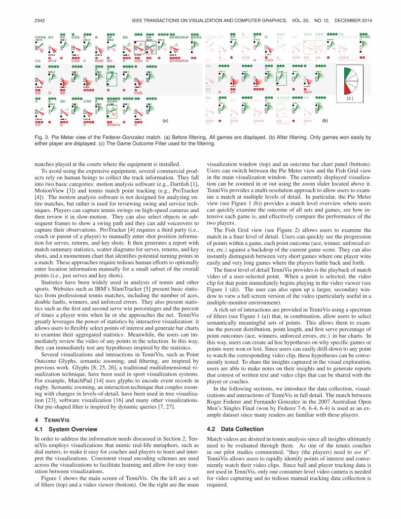
Fig. 3. Pie Meter view of the Federer-Gonzalez match. (a) Before filtering. All games are displayed. (b) After filtering. Only games won easily byeither player are displayed. (c) The Game Outcome Filter used for the filtering.
matches played at the courts where the equipment is installed.To avoid using the expensive equipment, several commercial prod-
ucts rely on human beings to collect the track information. They fallinto two basic categories: motion analysis software (e.g., Dartfish [1],MotionView [3]) and tennis match point tracking (e.g., ProTracker[4]). The motion analysis software is not designed for analyzing en-tire matches, but rather is used for reviewing swing and service tech-niques. Players can capture tennis swings on high-speed cameras andthen review it in slow-motion. They can also select objects in sub-sequent frames to show a swing path and they can add voiceovers tocapture their observations. ProTracker [4] requires a third party (i.e.,coach or parent of a player) to manually enter shot position informa-tion for serves, returns, and key shots. It then generates a report withmatch summary statistics, scatter diagrams for serves, returns, and keyshots, and a momentum chart that identifies potential turning points ina match. These approaches require tedious human efforts to optionallyenter location information manually for a small subset of the overallpoints (i.e., just serves and key shots).
Statistics have been widely used in analysis of tennis and othersports. Websites such as IBM’s SlamTracker [5] present basic statis-tics from professional tennis matches, including the number of aces,double faults, winners, and unforced errors. They also present statis-tics such as the first and second serve win percentages and the percentof times a player wins when he or she approaches the net. TenniVisgreatly leverages the power of statistics by interactive visualization: itallows users to flexibly select points of interest and generate bar chartsto examine their aggregated statistics. Meanwhile, the users can im-mediately review the video of any points in the selection. In this way,they can immediately test any hypotheses inspired by the statistics.
Several visualizations and interactions in TenniVis, such as PointOutcome Glyphs, semantic zooming, and filtering, are inspired byprevious work. Glyphs [8, 25, 26], a traditional multidimensional vi-sualization technique, have been used in sport visualization systems.For example, MatchPad [14] uses glyphs to encode event records inrugby. Semantic zooming, an interaction technique that couples zoom-ing with changes in levels-of-detail, have been used in tree visualiza-tion [23], software visualization [16] and many other visualizations.Our pie-shaped filter is inspired by dynamic queries [7, 27].
4 TENNIVIS
4.1 System Overview
In order to address the information needs discussed in Section 2, Ten-niVis employs visualizations that mimic real-life metaphors, such asdial meters, to make it easy for coaches and players to learn and inter-pret the visualizations. Consistent visual encoding schemes are usedacross the visualizations to facilitate learning and allow for easy tran-sition between visualizations.
Figure 1 shows the main screen of TenniVis. On the left are a setof filters (top) and a video viewer (bottom). On the right are the main
visualization window (top) and an outcome bar chart panel (bottom).Users can switch between the Pie Meter view and the Fish Grid viewin the main visualization window. The currently displayed visualiza-tion can be zoomed in or out using the zoom slider located above it.TenniVis provides a multi-resolution approach to allow users to exam-ine a match at multiple levels of detail. In particular, the Pie Meterview (see Figure 1 (b)) provides a match level overview where userscan quickly examine the outcome of all sets and games, see how in-tensive each game is, and effectively compare the performance of thetwo players.
The Fish Grid view (see Figure 2) allows users to examine thematch in a finer level of detail. Users can quickly see the progressionof points within a game, each point outcome (ace, winner, unforced er-ror, etc.) against a backdrop of the current game score. They can alsoinstantly distinguish between very short games where one player winseasily and very long games where the players battle back and forth.
The finest level of detail TenniVis provides is the playback of matchvideo of a user-selected point. When a point is selected, the videoclip for that point immediately begins playing in the video viewer (seeFigure 1 (d)). The user can also open up a larger, secondary win-dow to view a full screen version of the video (particularly useful in amultiple-monitor environment).
A rich set of interactions are provided in TenniVis using a spectrumof filters (see Figure 1 (a)) that, in combination, allow users to selectsemantically meaningful sets of points. This allows them to exam-ine the percent distribution, point length, and first serve percentage ofpoint outcomes (ace, winners, unforced errors, etc.) in bar charts. Inthis way, users can create ad hoc hypotheses on why specific games orpoints were won or lost. Since users can easily drill-down to any pointto watch the corresponding video clip, these hypotheses can be conve-niently tested. To share the insights captured in the visual exploration,users are able to make notes on their insights and to generate reportsthat consist of written text and video clips that can be shared with theplayer or coaches.
In the following sections, we introduce the data collection, visual-izations and interactions of TenniVis in full detail. The match betweenRoger Federer and Fernando Gonzalez in the 2007 Australian OpenMen’s Singles Final (won by Federer 7-6, 6-4, 6-4) is used as an ex-ample dataset since many readers are familiar with these players.
4.2 Data Collection
Match videos are desired in tennis analysis since all insights ultimatelyneed to be evaluated through them. As one of the tennis coachesin our pilot studies commented, “they (the players) need to see it”.TenniVis allows users to rapidly identify points of interest and conve-niently watch their video clips. Since ball and player tracking data isnot used in TenniVis, only one consumer-level video camera is neededfor video capturing and no tedious manual tracking data collection isrequired.
The non-spatial data is manually collected on-the-fly by a personspectating a match. In order to support point-based selection of spe-cific video clips, the start time and the end time of each point as well aswho won the point, the type of outcome (i.e., ace, double-fault, winner,forced error, or unforced error), and service faults (i.e. missed serves)are recorded. This approach, while requiring the attention of the datacollector throughout the match, can be easily collected using either asmart phone or smart watch app. The spectator only needs to synchro-nize the start time of the data collection app with the camera (beforeor after the match) and click a few buttons when a point starts andends. There is ample time between points to perform this task. Thedata collection app can keep track of score and who is serving basedon the rigid structure of a tennis match. Only one video per match isrequired. The TenniVis system simply indexes into specific points inthe video based on the synchronized timestamps collected.
Data for historical matches can be collected in a similar way, withthe only difference being that the spectator watches the match videosrather than the live matches. We asked several coaches about the fea-sibility of the players themselves collecting this data during a match(using a smart watch app) and they indicated this is not realistic. Theynoted, however, that they often have players who are not playing ina particular match who would be able to collect this data. The rigidstructure of a tennis match allows a great deal of derived data to becollected from the trivial data items collected manually, including in-formation such as score, who is serving, service breaks, break pointopportunities, and point lengths (which is a surrogate measure for thenumber of shots in a rally).
4.3 Pie Meter View
Figure 3 (a) displays the Pie Meter view of the match between Federerand Gonzalez. It provides an overview of the match and also can beanimated to present the dynamic process of the match. The visualiza-tion consists of multiple blocks. Each block visually presents a game.It contains a needle gauge-like glyph called a Pie Meter and rows ofballs representing points called Point Outcome Glyphs (see Section4.4). Games of the same set are placed in the same row, sorted fromleft to right by play order. The sets are ordered from top to bottomby play order. The score panels on the left of each Pie Meter showthe game score within the set just prior to that game. A black ballshown at the top left of the Pie Meter indicates player one is serving,while a black ball on the bottom left indicates player two is serving.To highlight service breaks, games with a service break are surroundedby a red box (player two broke the serve of player one) or a green box(player one broke player two’s serve).
Please note that in TenniVis, information about player 1 is alwayspositioned in the top half of the visualization graphics and informa-tion about player 2 is always positioned in the bottom half of the vi-sualization graphics, as exemplified by positioning of the black ballindicating who is serving. Similarly, green is always used to representsomething good for player one and red is used to represent somethinggood for player two. The highlight of service breaks is an example ofthis scheme. These encoding themes will be seen again and again inthe rest of the paper. They are used in TenniVis since (1) A versus Bis the most important information in tennis, an A versus B style sport;(2) According to Mackinlay [15], position and color hue are the mostrelevant encodings for perceptual tasks with nominal data. Thus theyshould be used for the most important information; and (3) Consistentvisual encoding facilitates learning.
The needle gauge metaphor is employed in the Pie Meter since therotation of a needle on a gauge is a familiar and natural way to revealhow a game progresses in favor of player one or player two. In ourinitial design, a full gauge covering 180 degrees is displayed and aneedle dynamically traverses within the gauge as the game progresses.The position and the background color of the needle indicate whetherthe game is currently at a score in favor of player one or player two.After the initial prototype was implemented, we soon realized that thearea traversed by the needle in a game reveals interesting informationsuch as whether a game was dominated by one player or swung backand forth. Therefore, we revised the design and removed the part of a
Fig. 4. Succession of points from left to right and their correspondingneedle angle changes in the Pie Meter for a game. Needle color showsthat player 2 won. The green gradient colors indicate advantage forplayer 1 and the red gradient colors indicate advantage for player 2.
gauge not traversed by the needle in the game (so it looks like a pie).The details of the Pie Meter visual encoding is introduced below.
Following the color scheme, needle color shows who won the game(green for player one, red for player two). The gauge background(the pie) is divided into many sectors. Each of them is mapped toa range of conditional probabilities of player one winning the game(probabilities in short). The probabilities are encoded by colors of thesectors. Here again, green means player one has a better chance to winand red means player two has a better chance to win. The darker thecolor is, the higher the chance. The gauge is positioned vertically, withgreen sectors on the top half and red sectors on the bottom half.
All possible game scores are assigned a probability using a coin-flip simulation, assuming that players are equally skilled. When agame progresses, the needle is placed in the gauge according to theprobability of the current score. When the game score is equal, theneedle is placed at a white sector oriented to the East. When the scoreis more favorable to player one/two, the needle moves to the green/redsectors, indicating player one/two has a bigger chance to win. Afterremoving the sectors not traversed by the needle in a game, the dis-play only consists of sectors covering all possibilities happening in thegame. Therefore, users can judge the intensity of a game by the colorand angles of its Pie Meter. As Figure 3 demonstrates, even when thePie Meters are relatively small, games where one player dominated areeasily distinguishable from close games that swung back and forth.
The above simplistic approach assumes that players are equallyskilled, which, of course, is often not the case. Better players are ableto come back and win a game, even when they are behind in the score.However, this color coding scheme still makes it easy to distinguishsituations that are more favorable to a player winning a game (shadesof green) from those that are less favorable (shades of red).
The Pie Meter can be used in a static mode or an animation mode.In the static mode, the needle angle indicates how close the final gamescore was. There are eight possible final game scores: Game-40,Game-30, Game-15, Game-0, 0-Game, 15-Game, 30-Game, and 40-Game. These eight scores are mapped to needle angles ranging from+90 to -90 degrees (assuming East is considered 0 degrees). Oncea game goes to deuce, the number of deuces is not considered: thescore is mapped as Game-40. A similar approach is used for tie-breakgames.
A Pie Meter can be animated to step through the games (see Figure4 for an example). When switching to the animation mode, all ofthe needles reset to a neutral, horizontal position (indicating neitherplayer has an advantage). When player one wins a point, the needleangle moves up in a counter-clockwise direction and when player twowins a point, it moves down in a clockwise direction. Therefore, theangle of the needle indicates the current advantage (i.e., conditionalprobability of winning the game) one player has over the other and thefinal needle angle indicates how close the game was. In Figure 4 wecan see that player one wins two points in a row, giving him a majoradvantage. Player two then rallies back, winning four points in a rowto win the game.
Example 1 Figure 3 (a) reveals a few patterns about the match in

2343POLK ET AL.: TENNIVIS: VISUALIZATION FOR TENNIS MATCH ANALYSIS
Fig. 3. Pie Meter view of the Federer-Gonzalez match. (a) Before filtering. All games are displayed. (b) After filtering. Only games won easily byeither player are displayed. (c) The Game Outcome Filter used for the filtering.
matches played at the courts where the equipment is installed.To avoid using the expensive equipment, several commercial prod-
ucts rely on human beings to collect the track information. They fallinto two basic categories: motion analysis software (e.g., Dartfish [1],MotionView [3]) and tennis match point tracking (e.g., ProTracker[4]). The motion analysis software is not designed for analyzing en-tire matches, but rather is used for reviewing swing and service tech-niques. Players can capture tennis swings on high-speed cameras andthen review it in slow-motion. They can also select objects in sub-sequent frames to show a swing path and they can add voiceovers tocapture their observations. ProTracker [4] requires a third party (i.e.,coach or parent of a player) to manually enter shot position informa-tion for serves, returns, and key shots. It then generates a report withmatch summary statistics, scatter diagrams for serves, returns, and keyshots, and a momentum chart that identifies potential turning points ina match. These approaches require tedious human efforts to optionallyenter location information manually for a small subset of the overallpoints (i.e., just serves and key shots).
Statistics have been widely used in analysis of tennis and othersports. Websites such as IBM’s SlamTracker [5] present basic statis-tics from professional tennis matches, including the number of aces,double faults, winners, and unforced errors. They also present statis-tics such as the first and second serve win percentages and the percentof times a player wins when he or she approaches the net. TenniVisgreatly leverages the power of statistics by interactive visualization: itallows users to flexibly select points of interest and generate bar chartsto examine their aggregated statistics. Meanwhile, the users can im-mediately review the video of any points in the selection. In this way,they can immediately test any hypotheses inspired by the statistics.
Several visualizations and interactions in TenniVis, such as PointOutcome Glyphs, semantic zooming, and filtering, are inspired byprevious work. Glyphs [8, 25, 26], a traditional multidimensional vi-sualization technique, have been used in sport visualization systems.For example, MatchPad [14] uses glyphs to encode event records inrugby. Semantic zooming, an interaction technique that couples zoom-ing with changes in levels-of-detail, have been used in tree visualiza-tion [23], software visualization [16] and many other visualizations.Our pie-shaped filter is inspired by dynamic queries [7, 27].
4 TENNIVIS
4.1 System Overview
In order to address the information needs discussed in Section 2, Ten-niVis employs visualizations that mimic real-life metaphors, such asdial meters, to make it easy for coaches and players to learn and inter-pret the visualizations. Consistent visual encoding schemes are usedacross the visualizations to facilitate learning and allow for easy tran-sition between visualizations.
Figure 1 shows the main screen of TenniVis. On the left are a setof filters (top) and a video viewer (bottom). On the right are the main
visualization window (top) and an outcome bar chart panel (bottom).Users can switch between the Pie Meter view and the Fish Grid viewin the main visualization window. The currently displayed visualiza-tion can be zoomed in or out using the zoom slider located above it.TenniVis provides a multi-resolution approach to allow users to exam-ine a match at multiple levels of detail. In particular, the Pie Meterview (see Figure 1 (b)) provides a match level overview where userscan quickly examine the outcome of all sets and games, see how in-tensive each game is, and effectively compare the performance of thetwo players.
The Fish Grid view (see Figure 2) allows users to examine thematch in a finer level of detail. Users can quickly see the progressionof points within a game, each point outcome (ace, winner, unforced er-ror, etc.) against a backdrop of the current game score. They can alsoinstantly distinguish between very short games where one player winseasily and very long games where the players battle back and forth.
The finest level of detail TenniVis provides is the playback of matchvideo of a user-selected point. When a point is selected, the videoclip for that point immediately begins playing in the video viewer (seeFigure 1 (d)). The user can also open up a larger, secondary win-dow to view a full screen version of the video (particularly useful in amultiple-monitor environment).
A rich set of interactions are provided in TenniVis using a spectrumof filters (see Figure 1 (a)) that, in combination, allow users to selectsemantically meaningful sets of points. This allows them to exam-ine the percent distribution, point length, and first serve percentage ofpoint outcomes (ace, winners, unforced errors, etc.) in bar charts. Inthis way, users can create ad hoc hypotheses on why specific games orpoints were won or lost. Since users can easily drill-down to any pointto watch the corresponding video clip, these hypotheses can be conve-niently tested. To share the insights captured in the visual exploration,users are able to make notes on their insights and to generate reportsthat consist of written text and video clips that can be shared with theplayer or coaches.
In the following sections, we introduce the data collection, visual-izations and interactions of TenniVis in full detail. The match betweenRoger Federer and Fernando Gonzalez in the 2007 Australian OpenMen’s Singles Final (won by Federer 7-6, 6-4, 6-4) is used as an ex-ample dataset since many readers are familiar with these players.
4.2 Data Collection
Match videos are desired in tennis analysis since all insights ultimatelyneed to be evaluated through them. As one of the tennis coachesin our pilot studies commented, “they (the players) need to see it”.TenniVis allows users to rapidly identify points of interest and conve-niently watch their video clips. Since ball and player tracking data isnot used in TenniVis, only one consumer-level video camera is neededfor video capturing and no tedious manual tracking data collection isrequired.
The non-spatial data is manually collected on-the-fly by a personspectating a match. In order to support point-based selection of spe-cific video clips, the start time and the end time of each point as well aswho won the point, the type of outcome (i.e., ace, double-fault, winner,forced error, or unforced error), and service faults (i.e. missed serves)are recorded. This approach, while requiring the attention of the datacollector throughout the match, can be easily collected using either asmart phone or smart watch app. The spectator only needs to synchro-nize the start time of the data collection app with the camera (beforeor after the match) and click a few buttons when a point starts andends. There is ample time between points to perform this task. Thedata collection app can keep track of score and who is serving basedon the rigid structure of a tennis match. Only one video per match isrequired. The TenniVis system simply indexes into specific points inthe video based on the synchronized timestamps collected.
Data for historical matches can be collected in a similar way, withthe only difference being that the spectator watches the match videosrather than the live matches. We asked several coaches about the fea-sibility of the players themselves collecting this data during a match(using a smart watch app) and they indicated this is not realistic. Theynoted, however, that they often have players who are not playing ina particular match who would be able to collect this data. The rigidstructure of a tennis match allows a great deal of derived data to becollected from the trivial data items collected manually, including in-formation such as score, who is serving, service breaks, break pointopportunities, and point lengths (which is a surrogate measure for thenumber of shots in a rally).
4.3 Pie Meter View
Figure 3 (a) displays the Pie Meter view of the match between Federerand Gonzalez. It provides an overview of the match and also can beanimated to present the dynamic process of the match. The visualiza-tion consists of multiple blocks. Each block visually presents a game.It contains a needle gauge-like glyph called a Pie Meter and rows ofballs representing points called Point Outcome Glyphs (see Section4.4). Games of the same set are placed in the same row, sorted fromleft to right by play order. The sets are ordered from top to bottomby play order. The score panels on the left of each Pie Meter showthe game score within the set just prior to that game. A black ballshown at the top left of the Pie Meter indicates player one is serving,while a black ball on the bottom left indicates player two is serving.To highlight service breaks, games with a service break are surroundedby a red box (player two broke the serve of player one) or a green box(player one broke player two’s serve).
Please note that in TenniVis, information about player 1 is alwayspositioned in the top half of the visualization graphics and informa-tion about player 2 is always positioned in the bottom half of the vi-sualization graphics, as exemplified by positioning of the black ballindicating who is serving. Similarly, green is always used to representsomething good for player one and red is used to represent somethinggood for player two. The highlight of service breaks is an example ofthis scheme. These encoding themes will be seen again and again inthe rest of the paper. They are used in TenniVis since (1) A versus Bis the most important information in tennis, an A versus B style sport;(2) According to Mackinlay [15], position and color hue are the mostrelevant encodings for perceptual tasks with nominal data. Thus theyshould be used for the most important information; and (3) Consistentvisual encoding facilitates learning.
The needle gauge metaphor is employed in the Pie Meter since therotation of a needle on a gauge is a familiar and natural way to revealhow a game progresses in favor of player one or player two. In ourinitial design, a full gauge covering 180 degrees is displayed and aneedle dynamically traverses within the gauge as the game progresses.The position and the background color of the needle indicate whetherthe game is currently at a score in favor of player one or player two.After the initial prototype was implemented, we soon realized that thearea traversed by the needle in a game reveals interesting informationsuch as whether a game was dominated by one player or swung backand forth. Therefore, we revised the design and removed the part of a
Fig. 4. Succession of points from left to right and their correspondingneedle angle changes in the Pie Meter for a game. Needle color showsthat player 2 won. The green gradient colors indicate advantage forplayer 1 and the red gradient colors indicate advantage for player 2.
gauge not traversed by the needle in the game (so it looks like a pie).The details of the Pie Meter visual encoding is introduced below.
Following the color scheme, needle color shows who won the game(green for player one, red for player two). The gauge background(the pie) is divided into many sectors. Each of them is mapped toa range of conditional probabilities of player one winning the game(probabilities in short). The probabilities are encoded by colors of thesectors. Here again, green means player one has a better chance to winand red means player two has a better chance to win. The darker thecolor is, the higher the chance. The gauge is positioned vertically, withgreen sectors on the top half and red sectors on the bottom half.
All possible game scores are assigned a probability using a coin-flip simulation, assuming that players are equally skilled. When agame progresses, the needle is placed in the gauge according to theprobability of the current score. When the game score is equal, theneedle is placed at a white sector oriented to the East. When the scoreis more favorable to player one/two, the needle moves to the green/redsectors, indicating player one/two has a bigger chance to win. Afterremoving the sectors not traversed by the needle in a game, the dis-play only consists of sectors covering all possibilities happening in thegame. Therefore, users can judge the intensity of a game by the colorand angles of its Pie Meter. As Figure 3 demonstrates, even when thePie Meters are relatively small, games where one player dominated areeasily distinguishable from close games that swung back and forth.
The above simplistic approach assumes that players are equallyskilled, which, of course, is often not the case. Better players are ableto come back and win a game, even when they are behind in the score.However, this color coding scheme still makes it easy to distinguishsituations that are more favorable to a player winning a game (shadesof green) from those that are less favorable (shades of red).
The Pie Meter can be used in a static mode or an animation mode.In the static mode, the needle angle indicates how close the final gamescore was. There are eight possible final game scores: Game-40,Game-30, Game-15, Game-0, 0-Game, 15-Game, 30-Game, and 40-Game. These eight scores are mapped to needle angles ranging from+90 to -90 degrees (assuming East is considered 0 degrees). Oncea game goes to deuce, the number of deuces is not considered: thescore is mapped as Game-40. A similar approach is used for tie-breakgames.
A Pie Meter can be animated to step through the games (see Figure4 for an example). When switching to the animation mode, all ofthe needles reset to a neutral, horizontal position (indicating neitherplayer has an advantage). When player one wins a point, the needleangle moves up in a counter-clockwise direction and when player twowins a point, it moves down in a clockwise direction. Therefore, theangle of the needle indicates the current advantage (i.e., conditionalprobability of winning the game) one player has over the other and thefinal needle angle indicates how close the game was. In Figure 4 wecan see that player one wins two points in a row, giving him a majoradvantage. Player two then rallies back, winning four points in a rowto win the game.
Example 1 Figure 3 (a) reveals a few patterns about the match in

2344 IEEE TRANSACTIONS ON VISUALIZATION AND COMPUTER GRAPHICS, VOL. 20, NO. 12, DECEMBER 2014
which Federer (player one) won in straight sets (7-6, 6-4, 6-4). First,we see that Gonzalez (player two) broke Federer’s serve first (indicatedby the red box in the first set); but Federer broke right back. In sets twoand three, there were only two service breaks (both by Federer) whichgave him the match. The second pattern that emerges is that many ofthe games in the first and third sets involved swings from one playerto another (indicated by Pie Meters with both red and green gradientsdisplayed), while all games in set two were won fairly easily by oneplayer or another.
4.4 Point Outcome Glyphs
According to the requirements analysis (see Section 2), the followinginformation about point outcomes are desired, sorted by importance:(1) who won each point; (2) whether the outcome was due to a “good”shot by the player winning the point or a “bad” shot by her/his op-ponent; (3) the specific type of the point outcome; (4) at which scorethe point outcome was generated; (5) details about the point, such ashow long the point was and service information. The Point OutcomeGlyphs (the green and red balls in the Pie Meter and Fish Grids) areproposed to encode the above information for individual point out-comes.
Since there are many point outcomes in a game, the glyph repre-senting an individual point outcome can’t be too big. We select a ball-shaped glyph design (see Figure 2 (e) for an example) since (1) it iseasy for users to associate a ball with a point outcome; (2) it providesa maximum amount of interior space in which to write the outcomeletter (i.e., ‘a’ for ace, ‘w’ for winner, etc.); and (3) it allows us touse the stopwatch metaphor to encode time as tick marks. To be con-sistent with our color scheme, green balls indicate points awarded toplayer one since they are good for player one. Red balls are for pointsawarded to player two since they are in favor of player two. In ad-dition, solid balls represent good shots (aces, winners, and forced er-rors). Hollow balls represent bad shots (double faults and unforcederrors). Following our positioning scheme, points awarded to playerone were placed above the Pie Meters and points awarded to playertwo were placed beneath the Pie Meters. In the Fish Grid View, theballs are placed at the game score (e.g., 30-15) at which the point out-come occurred.
To allow users to examine the point outcome information at multi-ple levels of detail, the Point Outcome Glyphs have three visual statesbased on the current zoom level. Additional semantic details are pro-vided at greater zoom levels (see Figure 2 (e)). At the lowest seman-tic zoom level, the Point Outcome Glyphs only reveal who won thepoint and whether the point resulted from a good or a bad shot. Atthe medium semantic zoom level, we add the detail about the spe-cific type of outcome using a single lower-case letter: (a)ce, (w)inner,(f)orced error, (u)nforced error, and (d)ouble fault. At the highest se-mantic zoom level, we encode point length and sevice information.Point length is encoded using white tick marks designed to look likefive-second intervals on a stopwatch. For service information, we usea triangle to encode whether the point started on a first versus sec-ond serve (solid black versus hollow white triangle) and service side(deuce = right, ad = left).
Example 2 From Figure 3 (a), we can see a preponderance of badshots (unforced errors), indicated by hollow balls, in the first set versusthe second and third sets. In sets two and three there are more goodshots (winners and forced errors), which are indicated by solid balls.
4.5 Fish Grid View
The Fish Grid view (see Figure 2(a-d)) provides detailed informationabout each point within the context of the whole match. A Fish Gridis essentially a 4X4 matrix where the row indices represent points wonby player one and the column indices represent points won by playertwo. To be consistent with our positioning scheme, this matrix is ro-tated 45 degrees (resembling a fish) so that all the matrix cells locatedabove the horizontal represent scores where player one is in the lead,cells below the horizontal represent a lead for player two, and cells onthe horizontal represent even scores. This maintains the same visual
metaphor established for the Pie Meters. Additional cells are addedfor deuce and ad points, making up the tail of the fish.
If a game goes beyond a single deuce, the tail of the Fish Grid growsto accommodate the extra points, thus making long games readily ap-parent. For example, in Figure 2 (b), we can see the longest gamein the match (20 points). This occurred in the first set with Gonzalez(player 2) serving at 5 games to 6.
Each cell location in a Fish Grid represents a specific game score(e.g., 30-15). To help users navigate in a grid, a background color isassigned to each cell to indicate whether the score is in favor of playerone or player two. In particular, a game win probability (from playerone’s perspective) for a given score is generated using the same coin-flip simulation discussed in Section 4.3. The probabilities are mappedto shades of green (win probabilities >50%), pure white (win proba-bility = 50%), and shades of red (win probabilities <50%). Therefore,green cells represent scores in favor of player one while red cells rep-resent scores in favor of player two.
In order to emphasize the scores that actually occurred in the game,only cells corresponding to those scores are colored. In this way, theFish Grids essentially become sparklines [24], showing the basic tem-poral trend of each game, even when zoomed out. The vertical posi-tion of a Point Outcome Glyph indicates who is currently ahead in thegame and its horizontal position encodes point sequence information.For example, Figure 2(a) shows that the game was led by Gonzalezat the very beginning as the result of a winning shot. But this wasfollowed by four good shots in a row by Federer (three winners and aforced error), allowing him to win the game easily. We can also seefrom the point lengths encoded on the glyphs that both the 0-15 and40-15 points started with a first serve and were very short. This indi-cates that Federer’s serves on these points was probably effective. Weverified this hypothesis by reviewing the video for these two points.
As with the Pie Meters, the current game score is shown to the leftof each Fish Grid and the black ball indicates who is serving. Thelayout of the games is also the same as in the Pie Meter view.
Users can click on a Point Outcome Glyph in either a Fish Grid ora Pie Meter to play its corresponding match video clip in the videoviewer (see Figure 1 (d)) or a standalone window. After watching avideo clip, users can manually record their insights associated with thepoint through the text entry above the video viewer. Points with userobservations are highlighted in yellow in both the Pie Meter and FishGrid views (not shown in the figures). When a user hovers the mousepointer over a highlighted point, their observations will be presentedas a tooltip. When the users reload the video of a point by clickingon its Point Outcome Glyph, the observation will also be displayed inthe text entry field above the video viewer so that the user can edit theobservation.
Fig. 5. Fish Grids for games 3, 5, and 7 in the second set showingGonzalez holding serve easily in games 3 and 5 but then getting brokeneasily by Federer in game 7.
Example 3 In examining the second set, shown in Figure 2 (d),we see that in almost all the games, the serving player won easily. Theglaring exception is the one and only service break where Federer wonfour of the five points on Gonzalez’ serve. Using the zoom control, wetake a closer look at games 3, 5, and 7 in the second set (shown inFigure 5). These show two service games won easily by Gonzalezfollowed by a service game in which Federer won by a large margin.To understand more closely why Gonzalez was able to win his twoservice games prior to the service break so easily and then lose theservice break game so easily, we click on individual Point Outcome
Glyphs in the Fish Grid (one at a time) to load them into the videoviewer. In examining the videos of the 13 points for these three games,we saw that seven out of the nine points won by Gonzalez started witha serve to Federer’s backhand and that all four points won by Federerstarted with a serve to his forehand.
4.6 Filters and Bar Charts
Fig. 6. Bar charts comparing all points in the first set (left) to all pointsin sets two and three (right). The first set contains a lot of unforcederrors and fewer winners and forced errors. Sets two and three have farfewer unforced errors and more winners and forced errors, particularlyby Federer (the solid green bars).
The filters (see Figure 1 (a)) allow users to interactively select sets,games and points for further analysis. They can also select an individ-ual player to examine just their shots. When the filters are activated,the unselected games and points in both the Pie Meter and Fish Gridviews fade out so that users can focus on the selected ones. Sets areselected by their set numbers. Games can be selected in terms of whois serving and/or who won the game.
A novel game filter called the Game Outcome Filter (see Figure3 (c)) allows users to distinguish easily won games from close games.Users simply click on one or more pie sectors and only those gameswhose needle ended within the selected sectors are displayed. Individ-ual points can be selected in terms of who won the point and whether ornot the point started from a first or a second serve. There is also a novelpie-shaped filter called the Game Win Probability Filter (shown inFigure 1 (a)) that allows the user to only display points that occurredat specific needle angles (which represent conditional probabilities ofwinning a game for any given score).
Filters can be turned on and off individually to provide basic in-sights or used in combination to support various investigative linesof inference. For example, coaches may want to look at all of theirplayer’s first serves. To focus on just these points, the coach would se-lect the Serving game filter and the First Serve point filter. To facilitateefficient game analysis (particularly for novice users), a predefined setof common filter configurations is provided in the Filter Configura-tions Drop-Down (see Figure 1 (a)). The set of predefined filters wasadded based on feedback from the coaches in our pilot studies. Moreadvanced users can also create, name, and save their own filter config-urations.
TenniVis provides a bar chart panel from which users can visuallyexamine the aggregated statistics of outcomes of all points they se-lected using the filters. In the bar charts (see Figure 6 for examples),the relative percentage of each outcome type (aces, winners, unforcederrors, etc.) is displayed. The same visual scheme used to encode in-formation into the Point Outcome Glyphs is used in the design of thebars. Green bars are for points won by player one and red bars forpoints won by player two. Solid bars refer to good shots and hollowbars refer to bad shots. Users can see the actual number of each type ofoutcome by hovering the mouse pointer over a bar. A user-selectablesecondary Y-axis can also be displayed on the bar charts. Users canchoose to view average point lengths or first serve percentages. Theycan also toggle off this secondary axis completely.
The bar chart panel keeps one or more bar charts side-by-side (seeFigure 1 (c)). The leftmost bar chart shows the statistics of the currentselection and automatically updates whenever the filters are changed.The other bar charts are snapshots of previous filter configurations.To save a snapshot, users click a button to capture the snapshot for
the current filter configuration before they modify the filters to a newconfiguration. They assign a name to it, which helps when recallingthe meaning of the filter configuration. The snapshots enable users tocompare a set of point outcomes for one filter configuration with thoseresulting from different filter configurations. When a new snapshot iscreated, the vertical scales of all existing bar charts are automaticallyadjusted to the same to enable comparison. Moreover, users can toggleon a horizontal ruler that spans across all snapshots to compare the barcharts more accurately.
Snapshots also serve for the purpose of insight management. First,clicking on the name of a snapshot brings the filters (and hence thePie Meter and Fish Grid views) back to the status when the snapshotwas captured. Second, observations related to a snapshot can be en-tered and saved with the snapshot. Third, the snapshot and its relatedobservations are automatically added to the match report for sharing.
Example 4 In the Pie Meter view of the match (see Figure 3 (a))we noticed a preponderance of bad shots in the first set versus sets twoand three. We confirm this by making two bar chart snapshots: onefor the first set and one for sets two and three combined (see Figure6). Comparing these two bar chart snapshots, we see that most of thepoints in the first set were the result of unforced errors by the players(indicated by the hollow green and red bars). In sets two and threethere were far fewer unforced errors and more good shots (winnersand forced errors).
Example 5 The Pie Meters in Figure 3 (a) show that there appearsto be a majority of short games in favor of Federer. This is easilyverified using the Game Outcome Filter (Figure 3 (c)). By selecting thetopmost and bottommost pie sectors, we can filter out the close gamesso we only see games won easily by one player or the other. In doingso, we see that, in Figure 3 (b), Federer won 15 games easily (includingthe first set tie breaker), while Gonzalez only won four games easily.
Example 6 To finish out our brief analysis of this match, we usethe Game Win Probability filter in conjunction with the Game Winfilter (see Figure 1 (a)) to identify any “choke” points by the players.A choke point is one where, despite a significant lead in a game by aplayer, the game is lost. Clicking on the lowest pie sector in the GameWin Probability filter will filter on just those points where Gonzalezwas up 40-0 or 40-15. By also clicking on the Game Win filter toonly show games won by player one (Federer), we are able to quicklyisolate what is perhaps the most critical point in the match. This isshown in the selected point in a Fish Grid from the first set (Figure2 (c)). This occurred in the first set where Gonzalez was serving at40-15 with a chance to win the set. At this point in the match, helost four points in a row, allowing Federer to break his serve. From agame psychology perspective, we see that Federer then won the nextgame easily on his serve while Gonzalez had to struggle through sevendeuces to win his serve. This brought the match to a tie-breaker whichwas then won easily by Federer.
4.7 Insight sharing and report generation
In the previous sections, we saw that users can record insights by anno-tating points and bar chart snapshots. Therefore, it is straightforwardfor a user to share his or her insights with others since the annotatedvideo clips and bar chart snapshots are automatically added to a matchreport. At the present time, only a rudimentary match report is createdthat consists of a simple HTML page containing the text observationsalong with their corresponding bar chart snapshot images or links tothe associated video clips. In the next iteration of TenniVis, we planto expand and enhance the report generation capabilities by elicitingfeedback from tennis coaches and players concerning what informa-tion to include and how to include it effectively.
5 PILOT USER STUDIES
To test the effectiveness and usability of the visualizations presented inTenniVis, we conducted two pilot user studies: one with the women’stennis coach and one with the men’s tennis coach at a local university.Since TenniVis was designed specifically to be used as an interactivetool for tennis coaches and players, it was important to demonstrate

2345POLK ET AL.: TENNIVIS: VISUALIZATION FOR TENNIS MATCH ANALYSIS
which Federer (player one) won in straight sets (7-6, 6-4, 6-4). First,we see that Gonzalez (player two) broke Federer’s serve first (indicatedby the red box in the first set); but Federer broke right back. In sets twoand three, there were only two service breaks (both by Federer) whichgave him the match. The second pattern that emerges is that many ofthe games in the first and third sets involved swings from one playerto another (indicated by Pie Meters with both red and green gradientsdisplayed), while all games in set two were won fairly easily by oneplayer or another.
4.4 Point Outcome Glyphs
According to the requirements analysis (see Section 2), the followinginformation about point outcomes are desired, sorted by importance:(1) who won each point; (2) whether the outcome was due to a “good”shot by the player winning the point or a “bad” shot by her/his op-ponent; (3) the specific type of the point outcome; (4) at which scorethe point outcome was generated; (5) details about the point, such ashow long the point was and service information. The Point OutcomeGlyphs (the green and red balls in the Pie Meter and Fish Grids) areproposed to encode the above information for individual point out-comes.
Since there are many point outcomes in a game, the glyph repre-senting an individual point outcome can’t be too big. We select a ball-shaped glyph design (see Figure 2 (e) for an example) since (1) it iseasy for users to associate a ball with a point outcome; (2) it providesa maximum amount of interior space in which to write the outcomeletter (i.e., ‘a’ for ace, ‘w’ for winner, etc.); and (3) it allows us touse the stopwatch metaphor to encode time as tick marks. To be con-sistent with our color scheme, green balls indicate points awarded toplayer one since they are good for player one. Red balls are for pointsawarded to player two since they are in favor of player two. In ad-dition, solid balls represent good shots (aces, winners, and forced er-rors). Hollow balls represent bad shots (double faults and unforcederrors). Following our positioning scheme, points awarded to playerone were placed above the Pie Meters and points awarded to playertwo were placed beneath the Pie Meters. In the Fish Grid View, theballs are placed at the game score (e.g., 30-15) at which the point out-come occurred.
To allow users to examine the point outcome information at multi-ple levels of detail, the Point Outcome Glyphs have three visual statesbased on the current zoom level. Additional semantic details are pro-vided at greater zoom levels (see Figure 2 (e)). At the lowest seman-tic zoom level, the Point Outcome Glyphs only reveal who won thepoint and whether the point resulted from a good or a bad shot. Atthe medium semantic zoom level, we add the detail about the spe-cific type of outcome using a single lower-case letter: (a)ce, (w)inner,(f)orced error, (u)nforced error, and (d)ouble fault. At the highest se-mantic zoom level, we encode point length and sevice information.Point length is encoded using white tick marks designed to look likefive-second intervals on a stopwatch. For service information, we usea triangle to encode whether the point started on a first versus sec-ond serve (solid black versus hollow white triangle) and service side(deuce = right, ad = left).
Example 2 From Figure 3 (a), we can see a preponderance of badshots (unforced errors), indicated by hollow balls, in the first set versusthe second and third sets. In sets two and three there are more goodshots (winners and forced errors), which are indicated by solid balls.
4.5 Fish Grid View
The Fish Grid view (see Figure 2(a-d)) provides detailed informationabout each point within the context of the whole match. A Fish Gridis essentially a 4X4 matrix where the row indices represent points wonby player one and the column indices represent points won by playertwo. To be consistent with our positioning scheme, this matrix is ro-tated 45 degrees (resembling a fish) so that all the matrix cells locatedabove the horizontal represent scores where player one is in the lead,cells below the horizontal represent a lead for player two, and cells onthe horizontal represent even scores. This maintains the same visual
metaphor established for the Pie Meters. Additional cells are addedfor deuce and ad points, making up the tail of the fish.
If a game goes beyond a single deuce, the tail of the Fish Grid growsto accommodate the extra points, thus making long games readily ap-parent. For example, in Figure 2 (b), we can see the longest gamein the match (20 points). This occurred in the first set with Gonzalez(player 2) serving at 5 games to 6.
Each cell location in a Fish Grid represents a specific game score(e.g., 30-15). To help users navigate in a grid, a background color isassigned to each cell to indicate whether the score is in favor of playerone or player two. In particular, a game win probability (from playerone’s perspective) for a given score is generated using the same coin-flip simulation discussed in Section 4.3. The probabilities are mappedto shades of green (win probabilities >50%), pure white (win proba-bility = 50%), and shades of red (win probabilities <50%). Therefore,green cells represent scores in favor of player one while red cells rep-resent scores in favor of player two.
In order to emphasize the scores that actually occurred in the game,only cells corresponding to those scores are colored. In this way, theFish Grids essentially become sparklines [24], showing the basic tem-poral trend of each game, even when zoomed out. The vertical posi-tion of a Point Outcome Glyph indicates who is currently ahead in thegame and its horizontal position encodes point sequence information.For example, Figure 2(a) shows that the game was led by Gonzalezat the very beginning as the result of a winning shot. But this wasfollowed by four good shots in a row by Federer (three winners and aforced error), allowing him to win the game easily. We can also seefrom the point lengths encoded on the glyphs that both the 0-15 and40-15 points started with a first serve and were very short. This indi-cates that Federer’s serves on these points was probably effective. Weverified this hypothesis by reviewing the video for these two points.
As with the Pie Meters, the current game score is shown to the leftof each Fish Grid and the black ball indicates who is serving. Thelayout of the games is also the same as in the Pie Meter view.
Users can click on a Point Outcome Glyph in either a Fish Grid ora Pie Meter to play its corresponding match video clip in the videoviewer (see Figure 1 (d)) or a standalone window. After watching avideo clip, users can manually record their insights associated with thepoint through the text entry above the video viewer. Points with userobservations are highlighted in yellow in both the Pie Meter and FishGrid views (not shown in the figures). When a user hovers the mousepointer over a highlighted point, their observations will be presentedas a tooltip. When the users reload the video of a point by clickingon its Point Outcome Glyph, the observation will also be displayed inthe text entry field above the video viewer so that the user can edit theobservation.
Fig. 5. Fish Grids for games 3, 5, and 7 in the second set showingGonzalez holding serve easily in games 3 and 5 but then getting brokeneasily by Federer in game 7.
Example 3 In examining the second set, shown in Figure 2 (d),we see that in almost all the games, the serving player won easily. Theglaring exception is the one and only service break where Federer wonfour of the five points on Gonzalez’ serve. Using the zoom control, wetake a closer look at games 3, 5, and 7 in the second set (shown inFigure 5). These show two service games won easily by Gonzalezfollowed by a service game in which Federer won by a large margin.To understand more closely why Gonzalez was able to win his twoservice games prior to the service break so easily and then lose theservice break game so easily, we click on individual Point Outcome
Glyphs in the Fish Grid (one at a time) to load them into the videoviewer. In examining the videos of the 13 points for these three games,we saw that seven out of the nine points won by Gonzalez started witha serve to Federer’s backhand and that all four points won by Federerstarted with a serve to his forehand.
4.6 Filters and Bar Charts
Fig. 6. Bar charts comparing all points in the first set (left) to all pointsin sets two and three (right). The first set contains a lot of unforcederrors and fewer winners and forced errors. Sets two and three have farfewer unforced errors and more winners and forced errors, particularlyby Federer (the solid green bars).
The filters (see Figure 1 (a)) allow users to interactively select sets,games and points for further analysis. They can also select an individ-ual player to examine just their shots. When the filters are activated,the unselected games and points in both the Pie Meter and Fish Gridviews fade out so that users can focus on the selected ones. Sets areselected by their set numbers. Games can be selected in terms of whois serving and/or who won the game.
A novel game filter called the Game Outcome Filter (see Figure3 (c)) allows users to distinguish easily won games from close games.Users simply click on one or more pie sectors and only those gameswhose needle ended within the selected sectors are displayed. Individ-ual points can be selected in terms of who won the point and whether ornot the point started from a first or a second serve. There is also a novelpie-shaped filter called the Game Win Probability Filter (shown inFigure 1 (a)) that allows the user to only display points that occurredat specific needle angles (which represent conditional probabilities ofwinning a game for any given score).
Filters can be turned on and off individually to provide basic in-sights or used in combination to support various investigative linesof inference. For example, coaches may want to look at all of theirplayer’s first serves. To focus on just these points, the coach would se-lect the Serving game filter and the First Serve point filter. To facilitateefficient game analysis (particularly for novice users), a predefined setof common filter configurations is provided in the Filter Configura-tions Drop-Down (see Figure 1 (a)). The set of predefined filters wasadded based on feedback from the coaches in our pilot studies. Moreadvanced users can also create, name, and save their own filter config-urations.
TenniVis provides a bar chart panel from which users can visuallyexamine the aggregated statistics of outcomes of all points they se-lected using the filters. In the bar charts (see Figure 6 for examples),the relative percentage of each outcome type (aces, winners, unforcederrors, etc.) is displayed. The same visual scheme used to encode in-formation into the Point Outcome Glyphs is used in the design of thebars. Green bars are for points won by player one and red bars forpoints won by player two. Solid bars refer to good shots and hollowbars refer to bad shots. Users can see the actual number of each type ofoutcome by hovering the mouse pointer over a bar. A user-selectablesecondary Y-axis can also be displayed on the bar charts. Users canchoose to view average point lengths or first serve percentages. Theycan also toggle off this secondary axis completely.
The bar chart panel keeps one or more bar charts side-by-side (seeFigure 1 (c)). The leftmost bar chart shows the statistics of the currentselection and automatically updates whenever the filters are changed.The other bar charts are snapshots of previous filter configurations.To save a snapshot, users click a button to capture the snapshot for
the current filter configuration before they modify the filters to a newconfiguration. They assign a name to it, which helps when recallingthe meaning of the filter configuration. The snapshots enable users tocompare a set of point outcomes for one filter configuration with thoseresulting from different filter configurations. When a new snapshot iscreated, the vertical scales of all existing bar charts are automaticallyadjusted to the same to enable comparison. Moreover, users can toggleon a horizontal ruler that spans across all snapshots to compare the barcharts more accurately.
Snapshots also serve for the purpose of insight management. First,clicking on the name of a snapshot brings the filters (and hence thePie Meter and Fish Grid views) back to the status when the snapshotwas captured. Second, observations related to a snapshot can be en-tered and saved with the snapshot. Third, the snapshot and its relatedobservations are automatically added to the match report for sharing.
Example 4 In the Pie Meter view of the match (see Figure 3 (a))we noticed a preponderance of bad shots in the first set versus sets twoand three. We confirm this by making two bar chart snapshots: onefor the first set and one for sets two and three combined (see Figure6). Comparing these two bar chart snapshots, we see that most of thepoints in the first set were the result of unforced errors by the players(indicated by the hollow green and red bars). In sets two and threethere were far fewer unforced errors and more good shots (winnersand forced errors).
Example 5 The Pie Meters in Figure 3 (a) show that there appearsto be a majority of short games in favor of Federer. This is easilyverified using the Game Outcome Filter (Figure 3 (c)). By selecting thetopmost and bottommost pie sectors, we can filter out the close gamesso we only see games won easily by one player or the other. In doingso, we see that, in Figure 3 (b), Federer won 15 games easily (includingthe first set tie breaker), while Gonzalez only won four games easily.
Example 6 To finish out our brief analysis of this match, we usethe Game Win Probability filter in conjunction with the Game Winfilter (see Figure 1 (a)) to identify any “choke” points by the players.A choke point is one where, despite a significant lead in a game by aplayer, the game is lost. Clicking on the lowest pie sector in the GameWin Probability filter will filter on just those points where Gonzalezwas up 40-0 or 40-15. By also clicking on the Game Win filter toonly show games won by player one (Federer), we are able to quicklyisolate what is perhaps the most critical point in the match. This isshown in the selected point in a Fish Grid from the first set (Figure2 (c)). This occurred in the first set where Gonzalez was serving at40-15 with a chance to win the set. At this point in the match, helost four points in a row, allowing Federer to break his serve. From agame psychology perspective, we see that Federer then won the nextgame easily on his serve while Gonzalez had to struggle through sevendeuces to win his serve. This brought the match to a tie-breaker whichwas then won easily by Federer.
4.7 Insight sharing and report generation
In the previous sections, we saw that users can record insights by anno-tating points and bar chart snapshots. Therefore, it is straightforwardfor a user to share his or her insights with others since the annotatedvideo clips and bar chart snapshots are automatically added to a matchreport. At the present time, only a rudimentary match report is createdthat consists of a simple HTML page containing the text observationsalong with their corresponding bar chart snapshot images or links tothe associated video clips. In the next iteration of TenniVis, we planto expand and enhance the report generation capabilities by elicitingfeedback from tennis coaches and players concerning what informa-tion to include and how to include it effectively.
5 PILOT USER STUDIES
To test the effectiveness and usability of the visualizations presented inTenniVis, we conducted two pilot user studies: one with the women’stennis coach and one with the men’s tennis coach at a local university.Since TenniVis was designed specifically to be used as an interactivetool for tennis coaches and players, it was important to demonstrate

2346 IEEE TRANSACTIONS ON VISUALIZATION AND COMPUTER GRAPHICS, VOL. 20, NO. 12, DECEMBER 2014
Fig. 7. Fish Grids for a women’s singles college match. The coach analyzing this match was particularly interested in games 3 and 4 of the secondset (a,b).
that it could be quickly learned by domain experts who don’t neces-sarily have any expertise in visualizations. The goals of these stud-ies were as follows: (1) assess the understandability of visualizationgraphics (i.e., Pie Meters, Fish Grids, and Bar Charts); (2) assess theperceived efficiency and effectiveness of TenniVis match analysis; and(3) elicit opinions on what type of information and features are neededin the match report (the report generation functions were not in thesystem during the studies).
5.1 ProcedureUsing a two-monitor display (24 inch external monitor and a 15 inchlaptop monitor), the TenniVis system was setup at the participant’swork location in a meeting room. The main TenniVis application wasdisplayed on the external monitor while the laptop monitor was usedto display the pop-up video player window. Each pilot study was con-ducted in three parts: system demonstration, hands-on match analysis,and follow-up questionnaire. After a brief introduction in which thepurpose and overview of the study were presented to the participant,the instructor spent 15 minutes demonstrating the various componentsof TenniVis using the Federer-Gonzalez match. Each of the visualiza-tions and all of the controls were briefly explained to the participantand any questions were answered. The participant was then allowed10 minutes to explore the system on their own using the same data set.
In the second part of the study, the instructor opened up one of twodata sets. For the women’s team coach, the data set consisted of atwo set singles tennis match of the best singles player on her teamrecorded a few days earlier (shown in Figure 7). For the men’s coach,the data set was a two-set tennis match for the best singles player onhis team, also recorded a few days earlier. In both cases, the coacheswere present at their respective players’ live matches, although theywere also watching five other matches simultaneously. The participantwas asked to use the TenniVis system to evaluate their player’s matchand to “think out loud” as they performed this task. Participants theninteracted directly with TenniVis as the instructor took notes aboutwhich visualizations and components the participants were using andthe comments they were making. Since the primary goal of the pilotstudy was to assess the understandability and usefulness of the visual-izations, (and not to assess TenniVis as a finished product) the instruc-tor provided assistance as needed.
After approximately 30 minutes of self-directed interaction withTenniVis, the instructor presented the participant with a brief ques-tionnaire. In this questionnaire, the participant assessed the usefulnessand understandability of the overall TenniVis system, the Pie Meters,the Fish Grids, the Point Outcome Glyphs, the Bar Charts, and thevideo player. Assessments were indicated using Likert scale ratingswhere users were asked the degree to which they agreed or disagreedwith various statements about the TenniVis system. They also had theopportunity to indicate what they liked most about the system, leastabout the system, and for additional features that would make it moreuseful. The results of each of these pilot studies are presented next.
5.2 Pilot Study 1 - Women’s Tennis CoachWhen analyzing the women’s tennis match, the coach only spent a fewminutes on the Pie Meter view (which is the default view when theapplication is started). She noticed the very high number of service
breaks as indicated by the red and green boxes. She then switched tothe Fish Grid view (see Figure 7). After scanning through all of thepoints in order in the Fish Grids, she stopped to more closely examinegames three and four in the second set (Figure 7(a) and (b)).
When zoomed into the second semantic zoom level, she was able tosee the outcomes of each point in these games (represented by lower-case letters). In game three, she noticed from the Fish Grid how herplayer (player one) broke her opponent’s serve with three solid shots(i.e., two forced errors and one winner) plus an unforced error madeby her opponent. She then noted, however, that her player committedtwo double faults and two unforced errors in her next service game(game four).
Based on prior experience with her player, the participant suspectedthat her player may have committed the two unforced errors by tryingto hit too many down-the-line shots (a potentially risky shot) versusgoing cross-court. She commented that “I’ve really been trying towork on her [the player] hitting the ball cross-court more because shegoes down the line and then she either misses it or then they make herrun cross-court. . . so I was immediately thinking ‘How did she lose thispoint?”’. She loaded several points one-by-one into the video playerand was able to find several examples that confirmed her hypothesis.She then decided to focus on serving and, using the zoom slider, fur-ther zoomed into game four to see more details such as first serves vs.second serves. From Figure 7(b), she noticed that five of the six pointswere from second serves (including two double-faults).
The results of the post-analysis questionnaire indicated that this par-ticipant did not fully understand the Pie Meters or the bar charts butfound the Fish Grid and video player components very easy to use andunderstand. The participant commented that she liked the Fish Gridview since it was well organized. We attribute this to the fact that theFish Grids display all points in the order they occurred and at the gamescore where they occurred. She indicated that having the supportingevidence provided by the video was useful because, “whenever I askthe girls, ‘How do you learn best? ’, they always say ‘By seeing it;by seeing what you are talking about”’. She said she liked the factthat TenniVis allowed her to directly access video clips for points ofinterest.
The participant described herself as somewhat averse to technologyand indicated that as the primary reason she did not bother to use anyof the filters or pay attention to the bar charts. She also had someinitial confusion over interpreting the color coding used for the out-come balls, but indicated that having a key would probably solve thisproblem. Despite some of her issues with specific components of thesystem, she rated the system overall as easy to understand and use andstrongly agreed that it provided her with useful insights that are notcurrently available to her.
The participant indicated that there is the need to generate simple,compelling reports that communicate her insights in a tangible wayher players can readily grasp. She envisioned some type of electronicreport that would include her observations along with the supportingvideo evidence.
5.3 Pilot Study 2 - Men’s Tennis Coach
The men’s tennis coach described himself as a data and statistics junkiewith a firm belief in the power of statistics and analysis to be used as a
Fig. 8. (a) Histogram of a men’s singles college match. The coachnoticed that, even though his player (player one) made fewer unforcederrors (hollow red bar) than the opponent (hollow green bar), these werenot enough to make up for the large number of winners and forced errorsmade by the opponent (red solid bars) versus his player (green solidbars). (b) Eighth game in the second set showing a critical point at 30-0where the player setup his opponent for a winner.
tool to complement his training program. He was able to quickly graspthe meaning of the color coding used in the Pie Meters and for thePoint Outcome Glyphs, commenting “the color coding is nice. . . thered and green is good because that’s intuitive”. In looking at the PieMeters from the Federer-Gonzalez match, he commented “it looks likeright off the bat he [Federer] was dictating play. . . because he has alot of solid green points which means he’s winning a lot of points”(as opposed to getting points due to bad shots from Gonzalez). At-tention was then turned to the Fish Grid view where the participantcommented that “you see kind of trends, up and down. . . and you seewhat the momentum looks like”.
Once the data set for his own player was brought up, he immediatelylooked at the histogram (see Figure 8 (a)) coupled with the Pie Meterview to get an overall sense of the difference between the two playersin terms of point outcomes. He commented that “overall, their guyhit certainly more winners. . . he also had more forced errors and ourguy had less unforced errors. . . our guy doubled less and had a fewmore aces. . . but that looks a little negligible in terms of risk/reward”.He then began using various filter combinations to create individualhistogram snapshots for comparison, noticing that his player had a lotof points that started from his second serve.
Continuing his analysis after switching to the Fish Grid view, henoticed a key game in set two when his player was serving at fivegames to three (see Figure 8 (b)). He focused in on the point when hisplayer was up 30-15 (only two points away from winning the set) andhis opponent hit a winner (see Figure 8 (b)). The opponent then wasable to regain the upper hand in the match and ultimately win it. Heanalyzed why his player lost this point by selecting it to view in thevideo player. He noticed that, although his player served his opponentwith a tough serve out wide, he failed to capitalize on this advantageand gave his opponent an easy putaway shot at the net. This insight ledthe coach to indicate he would discuss shot selection with his playerto avoid giving away the momentum in a match.
The results of the post-analysis questionnaire indicated the partic-ipant found the system to be very useful and easy to understand. Heagreed strongly that it gave him useful match insights he is not cur-rently able to get. He commented that, with the system, he can lookat trends and get a visual sense of what was going on. The Pie Me-ter, Fish Grid, and video player components got very high marks forusefulness. The participant indicated that, while he liked the abilityto animate the Pie Meter needles to “see what was going on”, he pre-ferred the Fish Grid over the Pie Meter because it was like a timelinethat presented the ups and downs.
Both the Point Outcome Glyphs and the histograms got neutralusefulness ratings. The participant explained that the reason for thelower usefulness score for the Point Outcome Glyphs was that he re-ally would like to see if the outcome was from a backhand or forehand.This issue can be addressed by collecting the backhand/forehand infor-mation in data collection and encoding it in the Point Outcome Glyphs.
He gave several useful suggestions on improving the usability ofthe histograms. First, he suggested allowing users to manually selectgames to be displayed in a histogram, rather than just relying on thefilters. Second, he suggested a set of pre-defined filter configurationsrepresenting some of the standard statistics, such as service games,first serves, etc. Third, he recommended displaying actual numbersof outcomes instead of just percentages. These features were not inthe system during the pilot user studies, but were added later basedon this feedback. He indicated that giving his players actual numbersinstead of just percentages would resonate more with them. Overall,the participant commented that he liked the fact that there are multipleways to visualize the data in TenniVis.
The participant also confirmed the need for generating reports tocommunicate his insights to his players. He envisioned being able touse this system and then generate a report he could tape to a player’slocker that provided specific insights that player needed to focus on.
6 CONCLUSION AND FUTURE WORK
In this paper, we present TenniVis, a novel tennis visualization sys-tem. It demonstrates how visualizations useful for tennis coaches andplayers can be generated using only the easily collected non-spatialgame data and a video from a consumer level camera. Two new visualmetaphors, namely the Pie Meter and the Fish Grid, are proposed andimplemented in TenniVis. They convey summary and detailed infor-mation about a match in an organized way that is understandable byusers with tennis domain expertise. The multi-resolution visualizationpipeline, dynamic query capabilities, and ad hoc hypothesis develop-ment and testing capabilities provided by TenniVis make it an effectivetool for tennis match analysis.
Through two pilot user studies, we verified that tennis coaches werequickly able to gain insights into their players’ tennis matches throughTenniVis and found the visualizations easy to use and understand.With only a minimal amount of training, coaches were able to interactwith TenniVis to confirm suspicions they already had about a tennismatch and to find new insights. They were excited about the prospectof having a tool to help them share their observations with their play-ers. One of the coaches actually contacted us after the study to requesta copy of the Fish Grid view for her player.
While we have demonstrated the utility of TenniVis to analyze in-dividual matches, we plan to expand it to be able to visualize multiplematches in order to see longer term trends. This may also then leadto the need to view multiple video segments simultaneously. For ex-ample, a coach may want to view specific video segments before acoaching intervention is made and then after to see if the advice givenwas followed by a player. We plan on working with coaches to deter-mine how to most effectively capture their analysis findings and com-municate them to their players. We also plan to work with players todetermine their ability to grasp the meaning of the visualizations andto see if they can find useful insights in their own games.
We acknowledge the insightful benefits provided by systems relyingon tracking data and see our efforts as complementary to them. Inthe future, we would like to extend TenniVis for professional playersby integrating the visual analytics of tracking data. In addition, wewould also like to explore whether the visualizations in TenniVis canbe applied to other sports such as table tennis and badminton, sincethey have structures similar to tennis.
Acknowledgements We would like to thank Daniel Keim for histimely suggestions on improving the visualizations presented in thispaper. We would also like to thank the reviewers for their highly con-structive feedback that allowed us to fill several key gaps. This work ispartially supported by National Science Foundation under grant num-bers IIS-1352893 and IIS-1352927.
REFERENCES
[1] Dartfish sports analysis software. http://www.dartfish.com/, 2013.[2] Information about a tennis court from Wikipedia.
http://en.wikipedia.org/wiki/Tennis court/, 2013.[3] MotionView Tennis Video Analysis Software.
http://www.tenniscoachsystems.com/, 2013.
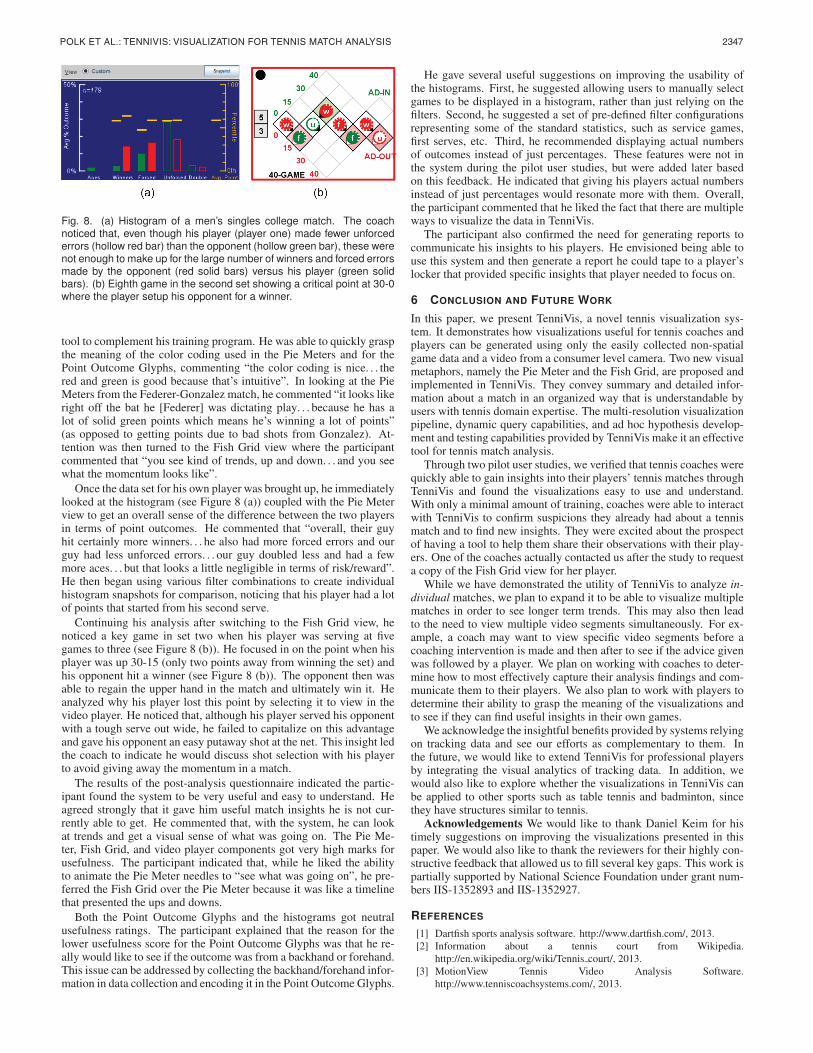
2347POLK ET AL.: TENNIVIS: VISUALIZATION FOR TENNIS MATCH ANALYSIS
Fig. 7. Fish Grids for a women’s singles college match. The coach analyzing this match was particularly interested in games 3 and 4 of the secondset (a,b).
that it could be quickly learned by domain experts who don’t neces-sarily have any expertise in visualizations. The goals of these stud-ies were as follows: (1) assess the understandability of visualizationgraphics (i.e., Pie Meters, Fish Grids, and Bar Charts); (2) assess theperceived efficiency and effectiveness of TenniVis match analysis; and(3) elicit opinions on what type of information and features are neededin the match report (the report generation functions were not in thesystem during the studies).
5.1 ProcedureUsing a two-monitor display (24 inch external monitor and a 15 inchlaptop monitor), the TenniVis system was setup at the participant’swork location in a meeting room. The main TenniVis application wasdisplayed on the external monitor while the laptop monitor was usedto display the pop-up video player window. Each pilot study was con-ducted in three parts: system demonstration, hands-on match analysis,and follow-up questionnaire. After a brief introduction in which thepurpose and overview of the study were presented to the participant,the instructor spent 15 minutes demonstrating the various componentsof TenniVis using the Federer-Gonzalez match. Each of the visualiza-tions and all of the controls were briefly explained to the participantand any questions were answered. The participant was then allowed10 minutes to explore the system on their own using the same data set.
In the second part of the study, the instructor opened up one of twodata sets. For the women’s team coach, the data set consisted of atwo set singles tennis match of the best singles player on her teamrecorded a few days earlier (shown in Figure 7). For the men’s coach,the data set was a two-set tennis match for the best singles player onhis team, also recorded a few days earlier. In both cases, the coacheswere present at their respective players’ live matches, although theywere also watching five other matches simultaneously. The participantwas asked to use the TenniVis system to evaluate their player’s matchand to “think out loud” as they performed this task. Participants theninteracted directly with TenniVis as the instructor took notes aboutwhich visualizations and components the participants were using andthe comments they were making. Since the primary goal of the pilotstudy was to assess the understandability and usefulness of the visual-izations, (and not to assess TenniVis as a finished product) the instruc-tor provided assistance as needed.
After approximately 30 minutes of self-directed interaction withTenniVis, the instructor presented the participant with a brief ques-tionnaire. In this questionnaire, the participant assessed the usefulnessand understandability of the overall TenniVis system, the Pie Meters,the Fish Grids, the Point Outcome Glyphs, the Bar Charts, and thevideo player. Assessments were indicated using Likert scale ratingswhere users were asked the degree to which they agreed or disagreedwith various statements about the TenniVis system. They also had theopportunity to indicate what they liked most about the system, leastabout the system, and for additional features that would make it moreuseful. The results of each of these pilot studies are presented next.
5.2 Pilot Study 1 - Women’s Tennis CoachWhen analyzing the women’s tennis match, the coach only spent a fewminutes on the Pie Meter view (which is the default view when theapplication is started). She noticed the very high number of service
breaks as indicated by the red and green boxes. She then switched tothe Fish Grid view (see Figure 7). After scanning through all of thepoints in order in the Fish Grids, she stopped to more closely examinegames three and four in the second set (Figure 7(a) and (b)).
When zoomed into the second semantic zoom level, she was able tosee the outcomes of each point in these games (represented by lower-case letters). In game three, she noticed from the Fish Grid how herplayer (player one) broke her opponent’s serve with three solid shots(i.e., two forced errors and one winner) plus an unforced error madeby her opponent. She then noted, however, that her player committedtwo double faults and two unforced errors in her next service game(game four).
Based on prior experience with her player, the participant suspectedthat her player may have committed the two unforced errors by tryingto hit too many down-the-line shots (a potentially risky shot) versusgoing cross-court. She commented that “I’ve really been trying towork on her [the player] hitting the ball cross-court more because shegoes down the line and then she either misses it or then they make herrun cross-court. . . so I was immediately thinking ‘How did she lose thispoint?”’. She loaded several points one-by-one into the video playerand was able to find several examples that confirmed her hypothesis.She then decided to focus on serving and, using the zoom slider, fur-ther zoomed into game four to see more details such as first serves vs.second serves. From Figure 7(b), she noticed that five of the six pointswere from second serves (including two double-faults).
The results of the post-analysis questionnaire indicated that this par-ticipant did not fully understand the Pie Meters or the bar charts butfound the Fish Grid and video player components very easy to use andunderstand. The participant commented that she liked the Fish Gridview since it was well organized. We attribute this to the fact that theFish Grids display all points in the order they occurred and at the gamescore where they occurred. She indicated that having the supportingevidence provided by the video was useful because, “whenever I askthe girls, ‘How do you learn best? ’, they always say ‘By seeing it;by seeing what you are talking about”’. She said she liked the factthat TenniVis allowed her to directly access video clips for points ofinterest.
The participant described herself as somewhat averse to technologyand indicated that as the primary reason she did not bother to use anyof the filters or pay attention to the bar charts. She also had someinitial confusion over interpreting the color coding used for the out-come balls, but indicated that having a key would probably solve thisproblem. Despite some of her issues with specific components of thesystem, she rated the system overall as easy to understand and use andstrongly agreed that it provided her with useful insights that are notcurrently available to her.
The participant indicated that there is the need to generate simple,compelling reports that communicate her insights in a tangible wayher players can readily grasp. She envisioned some type of electronicreport that would include her observations along with the supportingvideo evidence.
5.3 Pilot Study 2 - Men’s Tennis Coach
The men’s tennis coach described himself as a data and statistics junkiewith a firm belief in the power of statistics and analysis to be used as a
Fig. 8. (a) Histogram of a men’s singles college match. The coachnoticed that, even though his player (player one) made fewer unforcederrors (hollow red bar) than the opponent (hollow green bar), these werenot enough to make up for the large number of winners and forced errorsmade by the opponent (red solid bars) versus his player (green solidbars). (b) Eighth game in the second set showing a critical point at 30-0where the player setup his opponent for a winner.
tool to complement his training program. He was able to quickly graspthe meaning of the color coding used in the Pie Meters and for thePoint Outcome Glyphs, commenting “the color coding is nice. . . thered and green is good because that’s intuitive”. In looking at the PieMeters from the Federer-Gonzalez match, he commented “it looks likeright off the bat he [Federer] was dictating play. . . because he has alot of solid green points which means he’s winning a lot of points”(as opposed to getting points due to bad shots from Gonzalez). At-tention was then turned to the Fish Grid view where the participantcommented that “you see kind of trends, up and down. . . and you seewhat the momentum looks like”.
Once the data set for his own player was brought up, he immediatelylooked at the histogram (see Figure 8 (a)) coupled with the Pie Meterview to get an overall sense of the difference between the two playersin terms of point outcomes. He commented that “overall, their guyhit certainly more winners. . . he also had more forced errors and ourguy had less unforced errors. . . our guy doubled less and had a fewmore aces. . . but that looks a little negligible in terms of risk/reward”.He then began using various filter combinations to create individualhistogram snapshots for comparison, noticing that his player had a lotof points that started from his second serve.
Continuing his analysis after switching to the Fish Grid view, henoticed a key game in set two when his player was serving at fivegames to three (see Figure 8 (b)). He focused in on the point when hisplayer was up 30-15 (only two points away from winning the set) andhis opponent hit a winner (see Figure 8 (b)). The opponent then wasable to regain the upper hand in the match and ultimately win it. Heanalyzed why his player lost this point by selecting it to view in thevideo player. He noticed that, although his player served his opponentwith a tough serve out wide, he failed to capitalize on this advantageand gave his opponent an easy putaway shot at the net. This insight ledthe coach to indicate he would discuss shot selection with his playerto avoid giving away the momentum in a match.
The results of the post-analysis questionnaire indicated the partic-ipant found the system to be very useful and easy to understand. Heagreed strongly that it gave him useful match insights he is not cur-rently able to get. He commented that, with the system, he can lookat trends and get a visual sense of what was going on. The Pie Me-ter, Fish Grid, and video player components got very high marks forusefulness. The participant indicated that, while he liked the abilityto animate the Pie Meter needles to “see what was going on”, he pre-ferred the Fish Grid over the Pie Meter because it was like a timelinethat presented the ups and downs.
Both the Point Outcome Glyphs and the histograms got neutralusefulness ratings. The participant explained that the reason for thelower usefulness score for the Point Outcome Glyphs was that he re-ally would like to see if the outcome was from a backhand or forehand.This issue can be addressed by collecting the backhand/forehand infor-mation in data collection and encoding it in the Point Outcome Glyphs.
He gave several useful suggestions on improving the usability ofthe histograms. First, he suggested allowing users to manually selectgames to be displayed in a histogram, rather than just relying on thefilters. Second, he suggested a set of pre-defined filter configurationsrepresenting some of the standard statistics, such as service games,first serves, etc. Third, he recommended displaying actual numbersof outcomes instead of just percentages. These features were not inthe system during the pilot user studies, but were added later basedon this feedback. He indicated that giving his players actual numbersinstead of just percentages would resonate more with them. Overall,the participant commented that he liked the fact that there are multipleways to visualize the data in TenniVis.
The participant also confirmed the need for generating reports tocommunicate his insights to his players. He envisioned being able touse this system and then generate a report he could tape to a player’slocker that provided specific insights that player needed to focus on.
6 CONCLUSION AND FUTURE WORK
In this paper, we present TenniVis, a novel tennis visualization sys-tem. It demonstrates how visualizations useful for tennis coaches andplayers can be generated using only the easily collected non-spatialgame data and a video from a consumer level camera. Two new visualmetaphors, namely the Pie Meter and the Fish Grid, are proposed andimplemented in TenniVis. They convey summary and detailed infor-mation about a match in an organized way that is understandable byusers with tennis domain expertise. The multi-resolution visualizationpipeline, dynamic query capabilities, and ad hoc hypothesis develop-ment and testing capabilities provided by TenniVis make it an effectivetool for tennis match analysis.
Through two pilot user studies, we verified that tennis coaches werequickly able to gain insights into their players’ tennis matches throughTenniVis and found the visualizations easy to use and understand.With only a minimal amount of training, coaches were able to interactwith TenniVis to confirm suspicions they already had about a tennismatch and to find new insights. They were excited about the prospectof having a tool to help them share their observations with their play-ers. One of the coaches actually contacted us after the study to requesta copy of the Fish Grid view for her player.
While we have demonstrated the utility of TenniVis to analyze in-dividual matches, we plan to expand it to be able to visualize multiplematches in order to see longer term trends. This may also then leadto the need to view multiple video segments simultaneously. For ex-ample, a coach may want to view specific video segments before acoaching intervention is made and then after to see if the advice givenwas followed by a player. We plan on working with coaches to deter-mine how to most effectively capture their analysis findings and com-municate them to their players. We also plan to work with players todetermine their ability to grasp the meaning of the visualizations andto see if they can find useful insights in their own games.
We acknowledge the insightful benefits provided by systems relyingon tracking data and see our efforts as complementary to them. Inthe future, we would like to extend TenniVis for professional playersby integrating the visual analytics of tracking data. In addition, wewould also like to explore whether the visualizations in TenniVis canbe applied to other sports such as table tennis and badminton, sincethey have structures similar to tennis.
Acknowledgements We would like to thank Daniel Keim for histimely suggestions on improving the visualizations presented in thispaper. We would also like to thank the reviewers for their highly con-structive feedback that allowed us to fill several key gaps. This work ispartially supported by National Science Foundation under grant num-bers IIS-1352893 and IIS-1352927.
REFERENCES
[1] Dartfish sports analysis software. http://www.dartfish.com/, 2013.[2] Information about a tennis court from Wikipedia.
http://en.wikipedia.org/wiki/Tennis court/, 2013.[3] MotionView Tennis Video Analysis Software.
http://www.tenniscoachsystems.com/, 2013.

2348 IEEE TRANSACTIONS ON VISUALIZATION AND COMPUTER GRAPHICS, VOL. 20, NO. 12, DECEMBER 2014
[4] ProTracker Tennis Software. http://www.protrackertennis.com/, 2013.[5] IBM SlamTracker used at the 2014 Australian Open.
http://www.ausopen.com/en AU/slamtracker/, 2014.[6] USTA Friend at Court 2014. http://www.itatennis.com/, 2014.[7] C. Ahlberg, C. Williamson, and B. Shneiderman. Dynamic queries for
information exploration: An implementation and evaluation. In Proceed-ings of the SIGCHI conference on Human factors in computing systems,pages 619–626. ACM, 1992.
[8] R. Borgo, J. Kehrer, D. H. Chung, E. Maguire, R. S. Laramee, H. Hauser,M. Ward, and M. Chen. Glyph-based visualization: Foundations, designguidelines, techniques and applications. In Eurographics 2013-State ofthe Art Reports, pages 39–63. The Eurographics Association, 2012.
[9] C. O. Conaire, P. Kelly, D. Connaghan, and N. E. O’Connor. Tennissense:A platform for extracting semantic information from multi-camera tennisdata. In Digital Signal Processing, 2009 16th International Conferenceon, pages 1–6. IEEE, 2009.
[10] D. Connaghan, P. Kelly, and N. E. O’Connor. Game, shot and match:Event-based indexing of tennis. In Content-Based Multimedia Indexing(CBMI), 2011 9th International Workshop on, pages 97–102. IEEE, 2011.
[11] A. Cox and J. Stasko. Sportsvis: Discovering meaning in sports statis-tics through information visualization. In Compendium of Symposium onInformation Visualization, pages 114–115, 2006.
[12] K. Goldsberry. Courtvision: New visual and spatial analytics for the nba.MIT Sloan Sports Analytics Conference, 2012.
[13] L. Jin and D. C. Banks. Visualizing a tennis match. In Information Vi-sualization’96, Proceedings IEEE Symposium on, pages 108–114. IEEE,1996.
[14] P. A. Legg, D. H. Chung, M. L. Parry, M. W. Jones, R. Long, I. W. Grif-fiths, and M. Chen. Matchpad: Interactive glyph-based visualization forreal-time sports performance analysis. In Computer Graphics Forum,volume 31, pages 1255–1264. Wiley Online Library, 2012.
[15] J. Mackinlay. Automating the design of graphical presentations of re-lational information. ACM Transactions on Graphics (TOG), 5(2):110–141, 1986.
[16] J. Muthukumarasamy and J. T. Stasko. Visualising Program Executionson Large Data Sets Using Semantic Zooming. Graphics, Visualization &Usability Center, College of Computing, Georgia Institute of Technology,Technical Report GIT-GVU-95-02, 1995.
[17] N. Owens, C. Harris, and C. Stennett. Hawk-eye tennis system. In IEEconference publication, pages 182–185. Institution of Electrical Engi-neers, 2003.
[18] C. Perin, R. Vuillemot, and J.-D. Fekete. Soccerstories: A kick-off for vi-sual soccer analysis. Visualization and Computer Graphics, IEEE Trans-actions on, 19(12):2506–2515, 2013.
[19] H. Pileggi, C. D. Stolper, J. M. Boyle, and J. T. Stasko. Snapshot: Vi-sualization to propel ice hockey analytics. Visualization and ComputerGraphics, IEEE Transactions on, 18(12):2819–2828, 2012.
[20] G. Pingali, A. Opalach, and Y. Jean. Ball tracking and virtual replays forinnovative tennis broadcasts. In Pattern Recognition, 2000. Proceedings.15th International Conference on, volume 4, pages 152–156. IEEE, 2000.
[21] G. Pingali, A. Opalach, Y. Jean, and I. Carlbom. Visualization of sportsusing motion trajectories: providing insights into performance, style, andstrategy. In Proceedings of the conference on Visualization’01, pages 75–82. IEEE Computer Society, 2001.
[22] G. S. Pingali, Y. Jean, and I. Carlbom. Lucentvision: A system for en-hanced sports viewing. In Visual Information and Information Systems,pages 691–698. Springer, 1999.
[23] C. Plaisant, J. Grosjean, and B. B. Bederson. Spacetree: Supporting ex-ploration in large node link tree, design evolution and empirical evalua-tion. In Information Visualization, 2002. INFOVIS 2002. IEEE Sympo-sium on, pages 57–64. IEEE, 2002.
[24] E. Tufte. Sparklines: Intense, simple. Word-Sized Graphics, 2004.[25] M. O. Ward. A taxonomy of glyph placement strategies for multidi-
mensional data visualization. Information Visualization, 1(3-4):194–210,2002.
[26] M. O. Ward. Multivariate data glyphs: Principles and practice. In Hand-book of Data Visualization, pages 179–198. Springer, 2008.
[27] C. Williamson and B. Shneiderman. The dynamic homefinder: Eval-uating dynamic queries in a real-estate information exploration system.In Proceedings of the 15th annual international ACM SIGIR conferenceon Research and development in information retrieval, pages 338–346.ACM, 1992.
[28] G. Zhu, C. Xu, Q. Huang, W. Gao, and L. Xing. Player action recognition
in broadcast tennis video with applications to semantic analysis of sportsgame. In Proceedings of the 14th annual ACM international conferenceon Multimedia, pages 431–440. ACM, 2006.