task 4 final images review work sheet portrait
TRANSCRIPT

Unit 57: Photography and Photographic Practice
Selection of final images & review (P4, M4, D4)
Image No:Paste image here
1
2
3

4
5

6
7

8
9

10
Theme or focus of image & reasons for choice1. For this image I wanted to show a lone band member because of some magazine covers .
I wanted the band to be an Indy rock band , and in most Indy rock bands have a sad motionless look on their face this Is something that I wanted to mimic so I told my modal to give off a blank exasperation . I put a guitar in the photo to make sure the music theme managed to get across
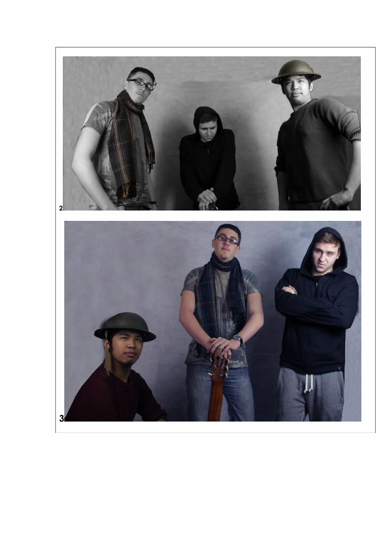
2. For this one I wanted to make it back an white because this is done a lot in music magerzens . This is something that I used as a theme with a lot of my images . If I just left it as black and white I feel that it would not stand out well so I made some of key items in colour to make the image stand out more . During these shoots I wanted Reece (the one in the middle)too look like the mysterious one in the group so I told him put his hood up

and to stand where the shadows are too give him a dark and mysterious look .3. I wanted to keep the same Indy rock theme with this one so I told every one to try to keep
the same stern exasperation . I also wanted to make Anthony(the one with glasses) the main band member because I can see him having the same look as someone in a Indy band . Because of this It told him to stand in the middle of this shot so the audient look at him first .
4. For this one I wanted to get a different angles and positions so on this one I decided that I wanted an extreme close up to show of the facial features of the band . Yet again I made Anthony in the middle because I wanted him the be the main band member. I also tod them all to look into the camera lenses as though they was looking directly at the audience
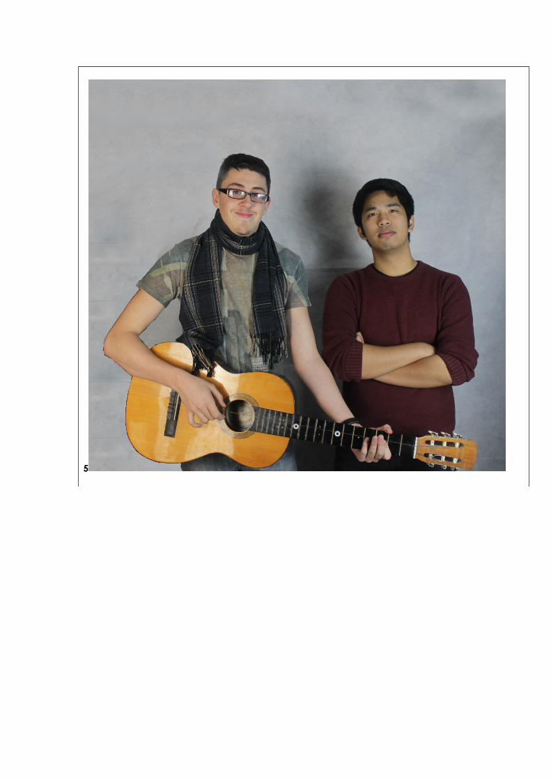
5. For this I wanted to get some shots with just two of the band members so then I could add some variation with the people who I am taking photos of . The goal of this image is to show two of the people on band .
6. For this image like the last I wanted to show some variation on the people that I used I did not want to keep using three people in all of the shots . I also wanted to make a contrast between the red , white and black .I told him to give a blank exasperation and look directly at the camera . I wanted to do this so then it looked like he was looking directly to the audience this will persuade people to buy the magazine .
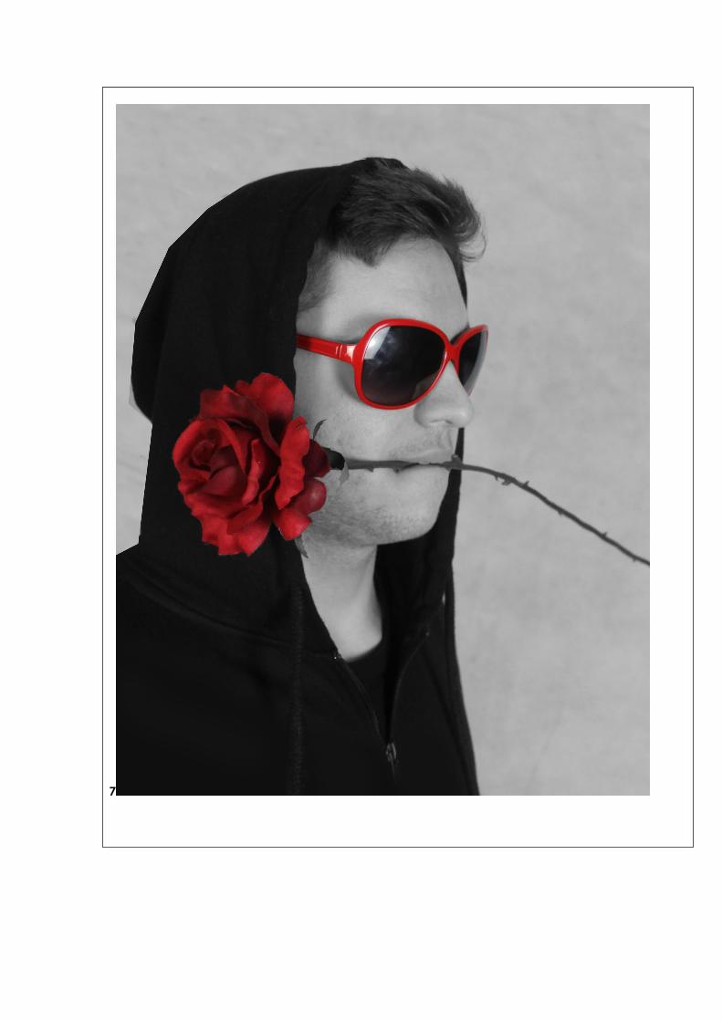
7. For this one I pretty much kept the same theme as the last one to mix the contrast of the red ,black and white In order to make a good looking image . The difference is that I wanted to change the position of the modal so that he was looking away from the camera of into the distance this makes it look like he is deep in thought.
8. This is the least favourite one out of my work I had something in mind which I wanted to do but because of the lighting on the day of shooting I could not to the effect which I wanted. But the original goal on this one was to show off the use of shadows on Reece to the left by using colour correction but I could not copy that effect on the other people so I decided to leave it like this.
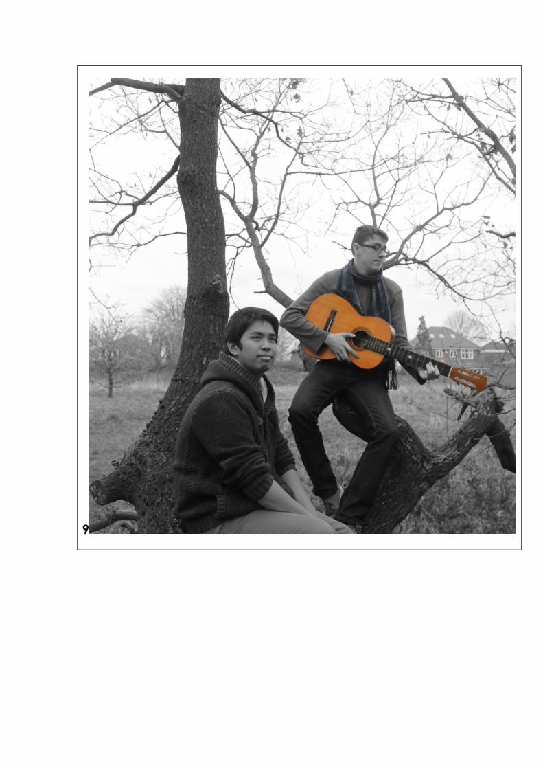
9. For the next two shots I decided to change the location where I take my shots. I wanted t get a nicer background so I went outside at the three sisters park. For this shot I told them to sit on a tree and told Anthony to start playing the guitar . and then told Lawrence to look off to the distance as though he was in heavy thought .
10. I kept the same theme with this one as I did in the last . But instead of having two people in it I only had Anthony looking off into the distance while playing the guitar . I wanted to make the scarf and guitar in colour to make the image stand out more
techniques I have made sure that I have used the rules of thirds on all of my photos . To make the modals be on the integrating lines . By doing this the audience will look at the people first before they look at anything else this will allow me to direct the audience’s attention to what I want them to look at.
I also used a fairly low shutter speed so that if one of my modals moved a bit during the shoot then they will not have any motion bluer on the photo .Which would make the photos look bad
I have also used aperture an all the shots to make the lighting right 1 to 8 I only needed to adjust it lightly. Whereas 9 and 10 I needed change it a lot since I was using natural lighting .
Strengths & suggested improvements1. some of the things that I have done good on this photo are I believed that it has been
framed and sized correctly. By doing this It allows the audience to focus on the person in the centre and not be distracted by anything in the background. I also think that the pose of the model is very good it looks like something that somebody in a Indy rock band would

pose like. Some of the disadvantages are the stool looks out of place I think that on the day of shooting I should of changed it to something fitting the theme more.
2. An advantage is the poses of all the models look similar to how Indy rock bands pose on magazine covers. I also think that the scarf in colour and the background black and white looks good and makes the contras work well . But I do not like that I made the helmet in colour I think it makes it look out of place.
3. I like the poses of the people on the right and middle they both look quite good in the image . But the person on the left looks like he has been Photoshoped in which he has not . I also like the background colour of the image I think that I complements the clothing that they are wearing
4. One of the good things about this image is that positioning of the people are very well done the pose could defiantly be seen on a magazine cover .I also think that making the photo black and white but the scarf and eyes in colour will certainly draw the eyes of its audience. I think that I is a little too dark so I think that I should improve the lighting of the photo.
5. For this one I think that the it is positioned well and leave very little extra room at the sides so people eyes don’t drift off from the main focus. A bad thing is that I think the image can be very boring and does not grab attention of the audience very well.]
6. For this image I love the contrast of the red white and black it believe that it works very well on the photo. I also think the positioning of the shot looks well so there is nothing in the background which will take things away from the main focus .A bad thing about this photo is that it can be considered to be a bit too bright.
7. Just like the last image I like the way that I made the black ,white and red contrast with each other . I also like the positioning of the modal is very good I think that it is even better than the last image . A bad thing about It is that the image is that the hood has been a bit sharply cut .
8. For this one I like the positioning of the people in the photo and I like the colour of the background I think that works well with the colour clothing . But because of the shadows on the day of shooting so the colour dose not suit throughout the photo . If I did this again I would fix the lighting on the day.
9. For this one I like the positioning I could defiantly image seeing this on a magazine cover . I also like the area of the shoot I adds some more emotion if it has been shot there compared to the previous shots . Although there is a house in the background which I should of edited out .
10. Just like the last one I enjoy the positioning on the shots . And I also like the contrast between the black and white with the colour with the guitar and the scarf. But just like the previous I should of removed the house in the background .
Editing details 1.For this image I cropped the image and then used the polygon lasso tool to go round a thine gradient layer atop of the background so that I could change the colour of the background to something a bit nicer than plain white . I also used brightness and contrast to up the brightness
2.For this one I started off by adding the black and white tool and then I added a copy layer underneath so then I could use the polygon also around the scarf and helmet . I also did the usual colour correction and brightness contrast . I also went over the background that was not plain with the clone tool to make it look the same throughout .
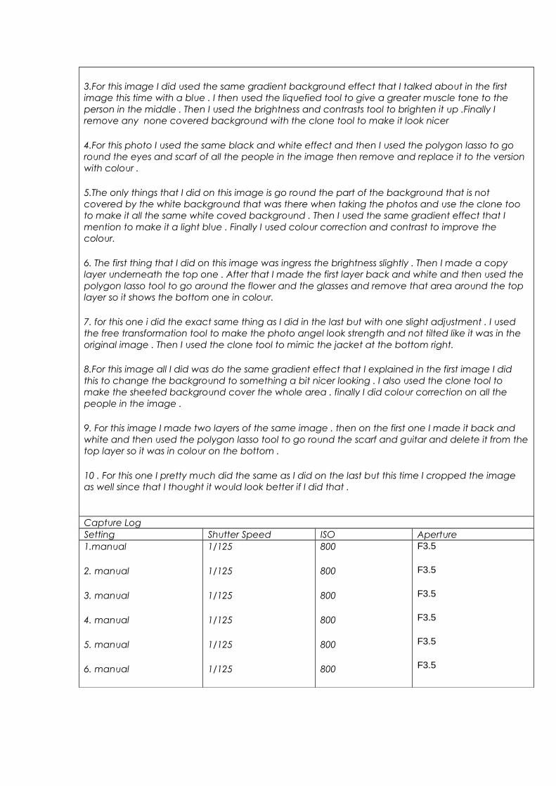
3.For this image I did used the same gradient background effect that I talked about in the first image this time with a blue . I then used the liquefied tool to give a greater muscle tone to the person in the middle . Then I used the brightness and contrasts tool to brighten it up .Finally I remove any none covered background with the clone tool to make it look nicer
4.For this photo I used the same black and white effect and then I used the polygon lasso to go round the eyes and scarf of all the people in the image then remove and replace it to the version with colour .
5.The only things that I did on this image is go round the part of the background that is not covered by the white background that was there when taking the photos and use the clone too to make it all the same white coved background . Then I used the same gradient effect that I mention to make it a light blue . Finally I used colour correction and contrast to improve the colour.
6. The first thing that I did on this image was ingress the brightness slightly . Then I made a copy layer underneath the top one . After that I made the first layer back and white and then used the polygon lasso tool to go around the flower and the glasses and remove that area around the top layer so it shows the bottom one in colour.
7. for this one i did the exact same thing as I did in the last but with one slight adjustment . I used the free transformation tool to make the photo angel look strength and not tilted like it was in the original image . Then I used the clone tool to mimic the jacket at the bottom right.
8.For this image all I did was do the same gradient effect that I explained in the first image I did this to change the background to something a bit nicer looking . I also used the clone tool to make the sheeted background cover the whole area . finally I did colour correction on all the people in the image .
9. For this image I made two layers of the same image . then on the first one I made it back and white and then used the polygon lasso tool to go round the scarf and guitar and delete it from the top layer so it was in colour on the bottom .
10 . For this one I pretty much did the same as I did on the last but this time I cropped the image as well since that I thought it would look better if I did that .
Capture LogSetting Shutter Speed ISO Aperture1.manual
2. manual
3. manual
4. manual
5. manual
6. manual
1/125
1/125
1/125
1/125
1/125
1/125
800
800
800
800
800
800
F3.5
F3.5
F3.5
F3.5
F3.5
F3.5

7. manual
8. manual
9. manual
10. manual
1/125
1/125
1/160
1/160
800
800
200
200
F3.5
F4.5
F4.5