task 3 product research
TRANSCRIPT
T3: Product Research
Henry Buckham
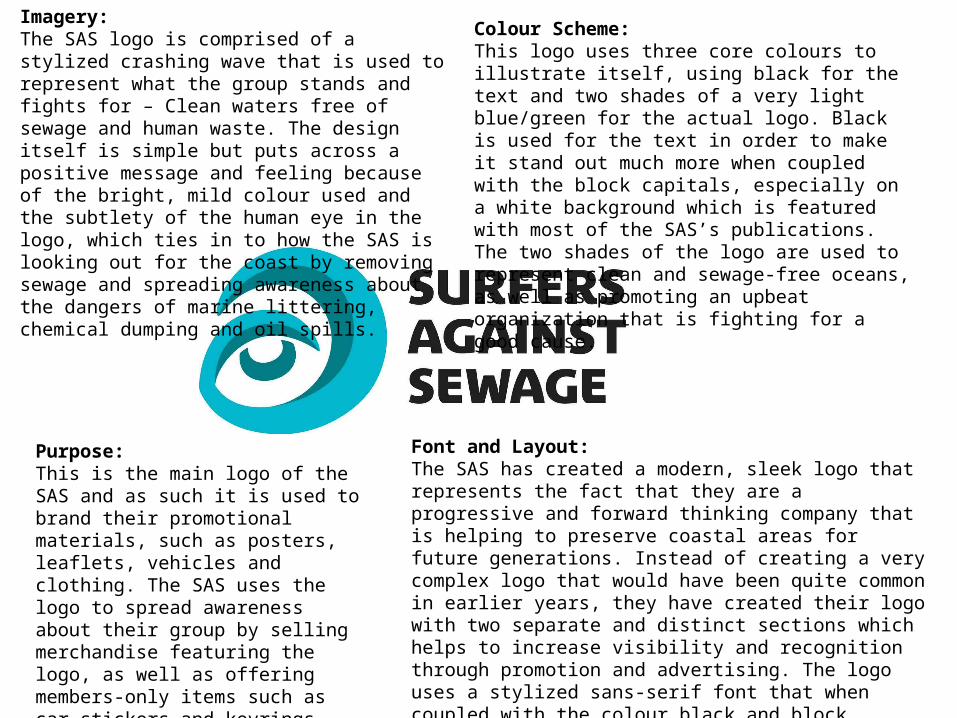
Imagery:The SAS logo is comprised of a stylized crashing wave that is used to represent what the group stands and fights for – Clean waters free of sewage and human waste. The design itself is simple but puts across a positive message and feeling because of the bright, mild colour used and the subtlety of the human eye in the logo, which ties in to how the SAS is looking out for the coast by removing sewage and spreading awareness about the dangers of marine littering, chemical dumping and oil spills.
Purpose:This is the main logo of the SAS and as such it is used to brand their promotional materials, such as posters, leaflets, vehicles and clothing. The SAS uses the logo to spread awareness about their group by selling merchandise featuring the logo, as well as offering members-only items such as car stickers and keyrings featuring this logo.
Colour Scheme:This logo uses three core colours to illustrate itself, using black for the text and two shades of a very light blue/green for the actual logo. Black is used for the text in order to make it stand out much more when coupled with the block capitals, especially on a white background which is featured with most of the SAS’s publications. The two shades of the logo are used to represent clean and sewage-free oceans, as well as promoting an upbeat organization that is fighting for a good cause.
Font and Layout:The SAS has created a modern, sleek logo that represents the fact that they are a progressive and forward thinking company that is helping to preserve coastal areas for future generations. Instead of creating a very complex logo that would have been quite common in earlier years, they have created their logo with two separate and distinct sections which helps to increase visibility and recognition through promotion and advertising. The logo uses a stylized sans-serif font that when coupled with the colour black and block capitals, makes the logo very distinct and visible of items such as clothing and vehicle branding.

Purpose:This leaflet produced by the SAS has been created to inform the public about the organization and spread awareness about their charity work to clean up coastal and marine areas. Its intended audience is people it can entice to become members of the SAS by listing the benefits that members will receive over non-members, as well as including a membership form on the back of the leaflet for people to send off.
Font and Colour Scheme:This leaflet uses a variety of different fonts and colours in the headings and copy, which are used to highlight and illustrate different pieces of information in the leaflet. The main headings use a very bold and abstract heading with a dark blue background that looks like it has been coloured in with a pen. This gives the leaflet quite a young and carefree attitude while still retaining a sense of charity and the desire to perform something good, which ties in with the charity’s mission. It also helps to split up the copy of the leaflet into separate sections for easier legibility.
Copy:The leaflet’s main purpose is to inform the public about the activities of the SAS and it uses a lot of copy to explain their actions and fundraising events which help it perform its cleanup operations around the country. In addition to this, to improve the organization’s image they have included several testimonials from famous sportsmen such as Ben Ainslie, who praised the charity for its actions in cleaning up the British coastlines.
Imagery:The organization has used this leaflet to promote their activities and mission in a very positive light, and they have done this primarily with the inclusion of the photographs at the top of the leaflet. These photographs depict SAS members taking part in cleanup operations on the coastline and there is also a lot of imagery that shows the members in teams, promoting unity and cooperation as one of the charity’s main strengths. On the cover of the leaflet the SAS has sculpted a person from the waste they have collected on one of the beaches and posed it next to a surfboard. This highlights how much waste is collected on the beaches during the charity’s organized cleanups and motivates people to join up and do their part, as well as tying in their activities to an activity that is threatened by an abundance of marine litter. Finally, the organization has also included a picture of their ‘ideal’ ocean in the bottom left – clean and free of waste. This serves as an aspiration to the charity and potential members, who may join the SAS to make this a reality.
Intended Audience:This leaflet has created with the clear intention of recruiting new members to the charity, judging by their long descriptions of the charity’s aims and operations that wouldn’t be found on a leaflet aimed at existing members. This leaflet could be interpreted as an introduction of sorts to the charity because of how shows off their activities in details and what the charity does with money from fundraising. To support the fact that this is intended to hire new members, the leaflet contains a section listing all the benefits an SAS member would receive compared to a non-member, as well as a section titled ‘Why support SAS?” which contains testimonials from famous people who give potential members more incentive to join the cause.

Imagery:This leaflet relies heavily on imagery to put across its main point of highlighting the extreme times it takes for some types of rubbish to decompose naturally. The top half of the leaflet is dominated by a large shot of a beach to compliment the infographic, which features several different types of rubbish such as plastic bottles, netting and cigarette butts. This is then supported by a flow chart that really highlights the extreme lengths of time for decomposition by comparing them to ancient events in history. By giving them a comparison the SAS helps people reading the leaflet to understand the problem of marine littering and how it will not go away by itself.
Copy:Copy is much more prevalent in this leaflet than It was in the previous publication, making it much more informative and relying on cold hard facts to entice people into joining. The main point as state before is to highlight how long biodegradation can take for rubbish, so this leaflets explains this with facts and information which allows people to get a bigger grasp on the situation through relatable events. The leaflet also goes on to say what happens to most litter when it is dumped into the sea, such as being swept away for thousands of miles by wind and currents.
Purpose:Unlike the previous leaflet which was more casual about recruiting members and providing information about the charity, this leaflet is much more upfront about the litter problem that plagues Britain’s coastlines, using the aforementioned scale of time with comparisons to historical events to prove how long some items take to decompose naturally. The purpose of this leaflet is to mostly educate the general public about the litter problem ,and hopefully entice them into joining the cause and doing what they can to tackle the problem. To support this, the SAS has included their contact details on the back of the leaflet, as well as offering the links to their social media pages where people can find out more about the charity and its mission.
Font and Colour Scheme:The fonts used in this leaflet vary with their application. The majority of the copy in this leaflet uses a basic sans-serif font, with bold and italic variants used to draw attention to taglines or the briefing that is placed at the start of the text. This font was used for maximum legibility and is not written in an obnoxious abstract font that could draw attention away from the leaflet’s main graphic at the top. The titles of this leaflet however use a scruffy, youthful font to catch people’s eyes, and to tie in the nature of surfers being young and carefree. It also show that the leaflet is not taking itself completely seriously in order to entice a young crowd to the cause.

ImageryThe main imagery that this poster is trying to put forward is the death of surfing. It has done this by posing a surfing wristband hanging from a dead tree, creating the illusion of a hangman’s noose which symbolizes the death of the sport because of rubbish destroying surf spots. By creating this image, the SAS hopes that dramatizing the death of surfing will make people feel threatened and will entice them to join or donate to the charity.
Font and Colour SchemeThe colour palette of this poster relies on dark, murky shades of grey and green. It has been manipulated to appear foreboding and mournful which ties in to the imagery of the noose, symbolizing surfing’s demise. Using these colours helps to create the feeling that it is a serious issue and people must do what they can to help prevent it. In the background the original colours of the shot have been preserved somewhat, giving the illusion that there may be a brighter future for the sport and SAS is fighting to prevent its death.
The font used for this poster is a serif font, which helps to create a more mature and serious feeling as opposed to a sleek sans-serif font, which is evident in the SAS logo in the top right. The poster appears to be aimed more at an older audience rather than children, as previous publications marketed towards younger people use lots of colourful graphics and artwork with sans-serif copy.
PurposeThis poster has been created to signify the impending death of surfing as a pastime and sport because of abundant sewage and litter changing the course of waves in prime surfing spots. This poster is primarily aimed at garnering more interest and support for the SAS campaign by way of dramatizing the issue and making people feel as if the death is nearer than previously thought. This is supported by the fact that the poster includes the tagline ‘sign our petition to save them’ and then including the SAS website address.
CopyThis poster has been created with visual imagery in mind and as such there is a much bigger emphasis on the picture than the text, which acts as context for the campaign. The simple tagline ‘No waves, No surf’ is used to set off the campaign and summarize what the problem is and what SAS is trying to do. The copy is to the point and states that sewage and offshore developments are changing the course of waves and this will eventually cause the death of surfing, tying back the the imagery in the poster.
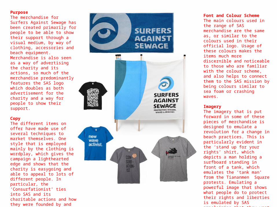
PurposeThe merchandise for Surfers Against Sewage has been created primarily for people to be able to show their support through a visual medium, by way of clothing, accessories and beach equipment. Merchandise is also seen as a way of advertising the charity and its actions, so much of the merchandise predominantly features the SAS logo which doubles as both advertisement for the charity and a way for people to show their support.
CopyThe different items on offer have made use of several techniques to market themselves. One style that is employed mainly by the clothing is wordplay, which gives the campaign a lighthearted edge and shows that the charity is easygoing and able to appeal to lots of different people. In particular, the ‘Consurfationist’ ties into SAS and its charitable actions and how they were founded by and base their theme around surfers. ‘The new wave activist’ shirt, aimed at children, is a play on the term new wave, a genre of music. It can also be interpreted as a shirt for someone new to the charity, or as a new group of people hoping to bring about real change to the coastlines.
Font and Colour SchemeThe main colours used in the range of SAS merchandise are the same as, or similar to the colours used in their official logo. Usage of these colours makes the items much more discernible and noticeable to those who are familiar with the colour scheme, and also helps to connect them to the SAS mission by being colours similar to sea foam or crashing waves.
ImageryThe imagery that is put forward in some of these pieces of merchandise is designed to emulate a revolution for a change in beach practices. This is particularly evident in the ‘stand up for your rights’ shirt, which depicts a man holding a surfboard standing in front of a tank, which emulates the ‘tank man’ from the Tiananmen Square protests. Emulating a powerful image that shows what people do to protect their rights and liberties is emulated by SAS proclaiming that they want free access to a prime surfing beach closed off for military use.

Purpose:The leaflet’s purpose is to educate the general population about the dangers that killing sharks for their fins has on the global shark population. As this is an issue that not many people would know about in detail, WWF has included lots of figures that highlight the scale of the problem in including how many shark species are now threatened thanks to overfishing, and the percentage of finning that is done by Hong Kong, used as the leaflet’s scapegoat for the majority of shark finning. This leaflet also aims to entice people to support the WWF’s cause and become involved by joining the organization, making a cash donation, or boycotting the consumption of shark fin.
Font and Colour Scheme:This leaflet has a very bold colour scheme that utilizes several different shades of blue and green for its background and some of the image. The WWF used these colours to link the design of the leaflet to the subject matter, which is the endangering of sharks, and as such the general public can make a quick connection thanks to the connotation of these shades of blue and green to the ocean and marine life. The font used throughout this leaflet is a simple sans-serif font in white, which is used for a no-nonsense explanation of the problem and for easier legibility against the detailed background. The lack of more abstract fonts as seen in some of the SAS publications shows that this leaflet takes itself a lot more seriously and is telling the public that the problem addressed in this leaflet is an urgent matter.
Copy:The copy in this leaflet mostly refers to the problem that the shark population is facing with the use of official figures and hyperbole (such as referring to the finning issue being the ‘biggest threat ever’ that sharks are facing) along with a section that is dedicated to enticing people to join the WWF in this campaign. To support its points, the leaflet includes a small table listing the amount of shark species that are becoming endangered every year as a way to scaremonger people into taking action, with the threat that if the overfishing problem is not addressed, it is likely that many shark species will become extinct. In the section dealing with how people can help the WWF, the leaflet has included the organization’s web address for the campaign, where people can visit for more information than this leaflet can share by itself.
Imagery:An underwater image of the ocean has been used as the background of this leaflet as a way to tie itself in to the endangered shark issue by showing off the beauty and majesty of the creatures, as well as attempting to make the audience feel sympathy for these creatures. This is also highlighted in the small inset pictures used to compliment the copy on the left. These are once again used to show off the beauty of the ocean and imply how overfishing is damaging the fragile ecosystem. At the top of the image, a graphic of a school of sharks is shown with some in bold and some as an outline, which represents how many sharks are disappearing thanks to overfishing. Finally, in the top left, the WWF has included their logo for the audience to immediately know who was behind the leaflet and increase aware of the organization.

Purpose:The purpose of this leaflet is to encourage members of the charity as well as the general public to make ‘one big final push’ in order to secure a big enough vote for a clean energy bill. The leaflet has done this by using a flowchart of the organization’s efforts, such as emailing MPs, organizing meetings and distributing campaign leaflets. It motivates the audience with the promises of what the energy bill will bring, and ends with the contact details of the organization so that people who are interested can get in touch.
Imagery:This leaflet uses lots of different graphics to highlight the copy and the points that the charity is making. At the top of the background, dirty power such as coal and oil is depicted in a dull gray and with lots of smoke, while on the right side, renewable energy like solar and wind power is depicted as green and bright surrounded by lots of trees. This helps to create quite an inspirational and hopeful feeling, and helps depict the alignment of the organization and how they feel about different types of power, allowing people to know what this charity is aiming for and where it stands.
Font and Colour Scheme:Throughout this leaflet a combination of white and orange has been used for coloring the fonts. Orange is the most prominent colour, which is also used in the arrows of the flow chart and some of the other graphics, as it is one of the charity’s trademark colours and found in their official logo, allowing people to form a connection without the group using their logo with great prominence on the leaflet. The colours are also building on the bright and bold style found throughout this publication, which is pushing for renewable and clean energy. The fonts used on this leaflet are all a basic sans-serif font, which reinforces the leaflet’s modern and sleek style and also provides a much high level of legibility when compared to more artistic and abstract fonts used by other charities.
Copy:Because this leaflet is primarily based on an infographic, most of the copy present is directly related to the statistics shown by the graphics, instead of having a section dedicated to explaining the campaign in detail. The captions used big bold numbers to highlight the scale of the operation and entice the audience into helping the charity reach their target.
Use of Branding:This leaflet has not used their logo and branding to a massive extent, preferring to keep the main focus of the leaflet on the infographic. Although their logo is not massively visible, being relegated to the bottom left, connections can be made from the use of colour in the text and details, which can be tied in to the familiar sense of orange that the charity uses. Branding has also been used in the charity’s email addresses, which are placed at the bottom of the leaflet.
Intended Audience:While there is no clear intended age targeted with this leaflet, it appears that from the content and the references to different aspects of the charity that it is targeted at existing members of the charity and people who are aware of the campaign. This is because the leaflets lacks any sort of lengthy description that describes the energy bill campaign and instead devotes all the space to the infographic, listing all the different aspects of the charity’s effort and the extend of their campaigning. There is also no proper contact details anywhere on the leaflet aside from links to pages related to the campaign, which is to be expected from a leaflet aimed towards recruiting new members to the cause.