table of contents - peru philatelic study circle · table of contents page 2 editor’s notes page...
TRANSCRIPT
Table of Contents
Page 2 Editor’s Notes
Page 3 Peru Olympic Issues
Page 4 Temática: las Olimpiadas
Page 5 Peru - Timbres Y Estampillas De Seguro Social Obligatorio
Page 15 A Study of The First Three Official Seals Of Peru
Page 20 Virtual Library Update
Page 21 Colareta Revisited
2
We are back! Again!
Our Peruvian Philately journal is back again. At our annual meeting at the 2016 New York World Stamp Show,
Henry asked for a volunteer to edit the newsletter. I thought about it and at the dinner at Raymi (highly
recommended if you are in New York). I agreed to give it a try. I do have prior experience editing other
newsletters, but none in the philatelic arena. I have published two articles in The American Philatelist,
however. This will be a new experience for me. I have been a collector of Latin America for about three years
now, and do not claim to be an expert in any particular area, meaning that I will be relying on the expertise of
the members to supply material for the newsletter. My goal is to make it a quarterly publication, but that
depends on your submissions. Right now we will publish as material becomes available without a set schedule.
– David Paddock, Editor.
Y en español también…
Gran parte de nuestros miembros leen tanto ingles como español razón por la cual a partir de este numero
podrán encontrarse artículos escritos en uno u otro idioma. Envíennos para su publicación sus estudios, notas
etc. para su publicación indistintamente en español o en ingles.
President: Chuck Wooster [email protected]
Vice President & Webmaster Henry Marquez [email protected]
Secretary: Richard Abrams [email protected]
Editor: David Paddock [email protected]
Web Site: www.peru-philatelic-study-circle.com
E-mail Addresses: Post a message: [email protected]
Subscribe: [email protected]
List Owner: [email protected]
3
Peru Olympic Issues
Willem de Gelder
Over the years Peru has issued stamps to commemorate the Olympic Games. Those interested in Philately of
the Peru wanting to start a thematic collection with the theme 'The Olympics', can start at home! The first
issue with the theme is the series of four values commemorating the 1948 Olympics in London (Scott C78-C81,
plus a souvenir sheet, C81a). Peru continued to issue Olympic commemorative series for the following
Olympics:
Melbourne (1956, see Editor’s note below)
Rome (1960, Scott C172-173)
Mexico (1968, Scott C226-C231)
Munich (1972, Scott C342)
Los Angeles (1984, Scott 821-822)
Barcelona (1996, Scott 1140 block of four)
Beijing (2008, Scott 1626, Block of four plus label)
In 1988 Peru issued a stamp commemorating half a century of participation in the Berlin Olympics of 1936 (the
stamp was issued with a delay of two years, and has a date of 1936 printed on it). It is curious that a stamp was
issued just to memorize those Olympic Games since the 1936 Olympics has been one of the most disputed in
Olympic history (together with the Moscow in 1980).
It is curious that they did not issue a 50-year commemorative in 1998 to honor the only gold medal that Peru
ever won at the Olympics. Edwin Vázquez won the gold medal in London in 1948 for the free pistol shoot at 50
meters.
Many of the series were accompanied by souvenir sheets or blocks, making it an interesting topic to collect.
The series, which in my opinion is notable for its elegance, is the Rome Olympics in 1960 (Scott C172-C173).
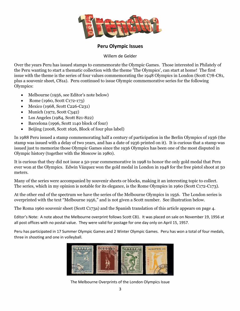
At the other end of the spectrum we have the series of the Melbourne Olympics in 1956. The London series is
overprinted with the text “Melbourne 1956,” and is not given a Scott number. See illustration below.
The Roma 1960 souvenir sheet (Scott C173a) and the Spanish translation of this article appears on page 4.
Editor’s Note: A note about the Melbourne overprint follows Scott C81. It was placed on sale on November 19, 1956 at
all post offices with no postal value. They were valid for postage for one day only on April 15, 1957.
Peru has participated in 17 Summer Olympic Games and 2 Winter Olympic Games. Peru has won a total of four medals,
three in shooting and one in volleyball.
The Melbourne Overprints of the London Olympics Issue
4
Temática: las Olimpiadas
Willem de Gelder
El Perú a lo largo de los años emitió estampillas para conmemorar los Juegos Olímpicos. Los interesados en
filatelia del Perú que quisieran empezar una colección temática con el tema 'Las Olimpiadas', pueden empezar
en casa!! La primera emisión con el tema, es la serie de cuatro valores conmemorando las Olimpiadas de 1948
en Londres. Luego el Perú emitió series conmemorativas para las Olimpiadas de:
Melbourne (1956)
Roma (1960, Scott C 172-173)
México (1968, Scott C226-C231)
Munich (1972, (1972, Scott C342)
Los Ángeles (1984, 1984, Scott 821-822)
Barcelona (1996, Scott 1140 block of four)
Bejing (2008, 2008, Scott 1626, Block of four plus label)
Además, en 1988 el Perú emitió una estampilla conmemorando el medio siglo de la participación en las
Olimpiadas de Berlín de 1936 (la estampilla se emitió con un retraso de dos años).
Es curioso que se emitió una estampilla justamente para memorizar esos Juegos Olímpicos. Las Olimpiadas de
1936 han sido unas de las más cuestionadas en la historia Olímpica (juntas con las de Moscú en 1980).
Además, los resultados del Perú en el campo Olímpico no pueden haber sido la razón de esta emisión, pues la
única medalla de oro que Perú jamás ganó en los Juegos Olímpicos ha sido la de Edwin Vázquez en Londres,
1948 (tiro de pistola libre a 50 metros).
Muchas de las series fueron acompañadas de hojas-souvenir o bloques. Todo un tema interesante para
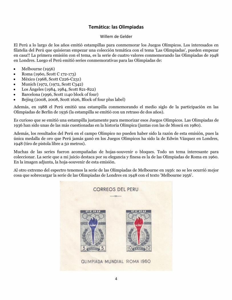
coleccionar. La serie que a mi juicio destaca por su elegancia y finesa es la de las Olimpiadas de Roma en 1960.
En la imagen adjunta, la hoja-souvenir de esta emisión.
Al otro extremo del espectro tenemos la serie de las Olimpiadas de Melbourne en 1956: no se les ocurrió mejor
cosa que sobrecargar la serie de las Olimpiadas de Londres en 1948 con el texto 'Melbourne 1956'.
5
PERU - TIMBRES Y ESTAMPILLAS DE SEGURO SOCIAL OBLIGATORIO
Dr. Roque Castillo ([email protected])
Dr. Ricardo Castillo ([email protected])
El 12 de Agosto de 1936, el Presidente de la República Don Oscar R. Benavides Larrea, estableció mediante la Ley
8433 el Seguro Social Obligatorio, que cubría los riegos de enfermedad, maternidad, invalidez y muerte; para
todas las personas menores de 60 años que trabajan bajo dependencia de un patrono. (Se conocía como el Seguro
Obrero).
En el artículo 7º. se indican los recursos para su financiación:
a)- Con las cuotas de los asegurado, de los patronos y del Estado;
b)- Con del producto de las multas por infracciones de la presente Ley;
c)- Con los intereses de sus capitales y reservas;
d)- Con los legados y donaciones que se le hicieren y las herencias que se le dejaren;
e)- Con un impuesto del 1 por ciento sobre el valor de las cancelaciones o pagos que hagan el
Estado, los Concejos Municipales y las Compañías Fiscalizadas; (considera excepciones).
f)- Con un impuesto adicional del 2 por ciento al tabaco;
g)- Con un impuesto adicional del 2 por ciento a los alcoholes y bebidas alcohólicas.
Las cuotas a que se refiere el inciso a) mencionado son variables, según se refiera a asegurados dependientes,
independientes, facultativos o que tomen un seguro de familia. Las cuotas de los asegurados
dependientes son las siguientes: 2.5% el asegurado; 4.5 % el patrono y 1 % el Estado. El pago de las cuotas
patrono-obrero las hará efectivo el patrono para lo cual adquirirá estampillas emitidas por la Caja Nacional de
Seguro Social (entidad con personería jurídica, creada para cumplir con los fines indicados en la presente Ley)
y las colocará en libretas especiales que se entregaran a los asegurados.
La recaudación de las cuotas patronales y obreras se planeó que se iniciarían el 1 de Setiembre de 1936, pero al
no organizarse debidamente el servicio, el 2 de Setiembre se dio un Decreto que postergaba la cobranza de las
mismas hasta el 1 de Noviembre de 1936.
El Decreto Supremo del 30 de Noviembre de 1936 prorrogó hasta el 1º de marzo de 1937 la fecha para la
iniciación de la cobranza de las cuotas con que deben contribuir el Estado y los patronos a la financiación del
Seguro Social Obligatorio. Con relación a la cuota de los trabajadores el artículo 2 del anterior Decreto, a la letra
dice: “El pago de las cuotas de los trabajadores sólo se hará efectivo después de establecerse en sus respectivas
circunscripciones los servicios médicos y asistenciales que requieren la atención de los riesgos de enfermedad
y maternidad”.
En Lima, después de la inauguración del Hospital Obrero -hoy Guillermo Almenara- se inició la recaudación de
las contribuciones obrero-patronales, en el año de 1941.
La Ley hace una distinción precisa entre Estampillas y Timbres. Denomina estampillas a las especies valoradas
que pagan las cuotas obrero-patronales, las del seguro de familia y del seguro facultativo y timbres a los signos
de impuesto a las cancelaciones.
Hasta la fecha, no se ha encontrado las estampillas del seguro de familia o del seguro facultativo.
6
Timbres de Impuesto a las Cancelaciones.
El impuesto del 1 por ciento sobre el valor de las cancelaciones que hacían el Estado, los Concejos Municipales y
las Compañías Fiscalizadas, no se aplicaba a los servicios de las deudas externa e interna, subvenciones a
instituciones de beneficencia o de instrucción gratuita, emolumentos, sueldos, pensiones y jornales. Se hacía
efectivo adhiriendo los respectivos timbres a los libramientos, facturas u órdenes de pago que presentaban los
interesados para su cobranza. Estos se anulaban como se hacía con los timbres fiscales.
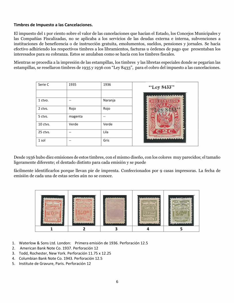
Mientras se procedía a la impresión de las estampillas, los timbres y las libretas especiales donde se pegarían las
estampillas, se resellaron timbres de 1935 y 1936 con “Ley 8433”, para el cobro del impuesto a las cancelaciones.
Serie C 1935 1936
1 ctvo. -- Naranja
2 ctvs. Rojo Rojo
5 ctvs. magenta --
10 ctvs. Verde Verde
25 ctvs. -- Lila
1 sol -- Gris
Desde 1936 hubo diez emisiones de estos timbres, con el mismo diseño, con los colores muy parecidos; el tamaño
ligeramente diferente; el dentado distinto para cada emisión y se puede
fácilmente identificarlos porque llevan pie de imprenta. Confeccionados por 9 casas impresoras. La fecha de
emisión de cada una de estas series aún no se conoce.
1 2 3 4 5
1. Waterlow & Sons Ltd. London: Primera emisión de 1936. Perforación 12.5 2. American Bank Note Co. 1937. Perforación 12 3. Todd, Rochester, New York. Perforación 11.75 x 12.25 4. Columbian Bank Note Co. 1943. Perforación 12.5 5. Institute de Gravure, Paris. Perforación 12
7
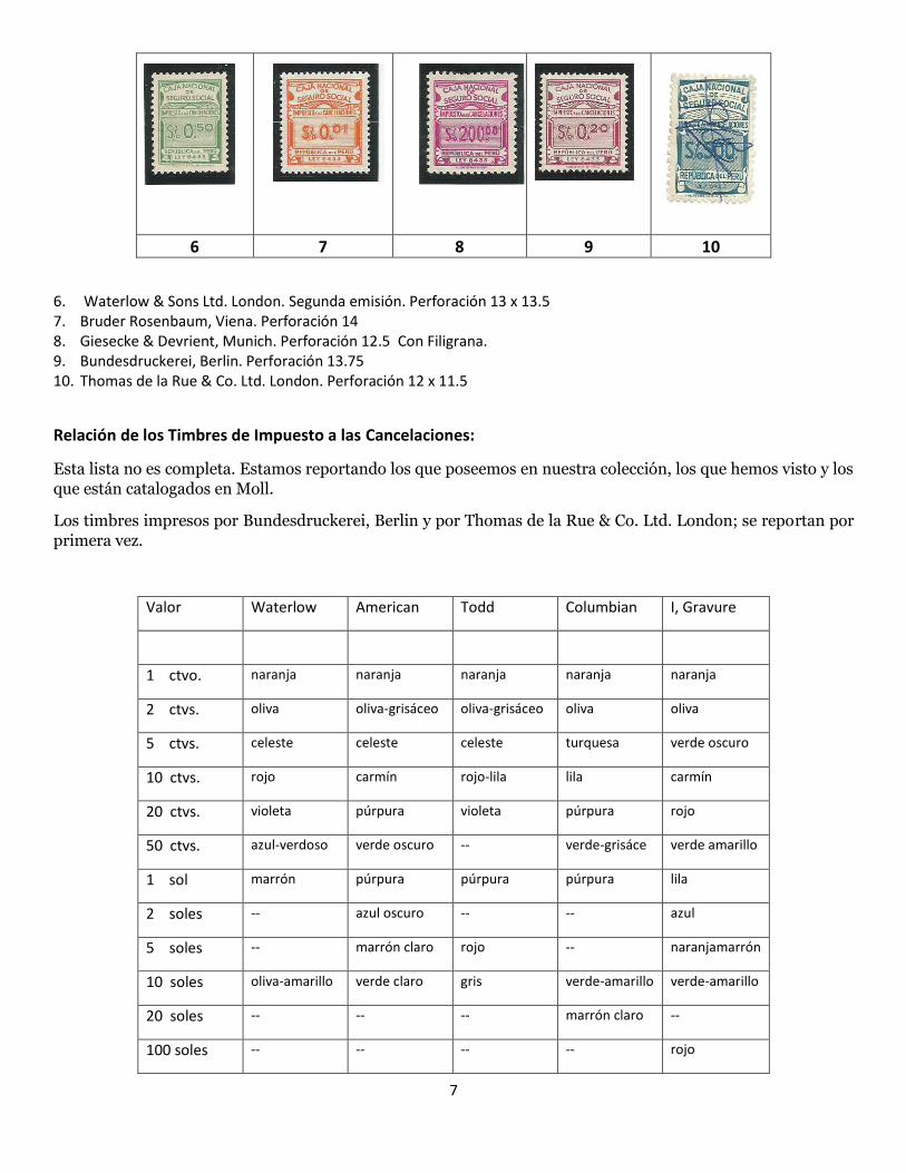
6 7 8 9 10
6. Waterlow & Sons Ltd. London. Segunda emisión. Perforación 13 x 13.5 7. Bruder Rosenbaum, Viena. Perforación 14 8. Giesecke & Devrient, Munich. Perforación 12.5 Con Filigrana. 9. Bundesdruckerei, Berlin. Perforación 13.75 10. Thomas de la Rue & Co. Ltd. London. Perforación 12 x 11.5
Relación de los Timbres de Impuesto a las Cancelaciones:
Esta lista no es completa. Estamos reportando los que poseemos en nuestra colección, los que hemos visto y los
que están catalogados en Moll.
Los timbres impresos por Bundesdruckerei, Berlin y por Thomas de la Rue & Co. Ltd. London; se reportan por
primera vez.
Valor Waterlow American Todd Columbian I, Gravure
1 ctvo. naranja naranja naranja naranja naranja
2 ctvs. oliva oliva-grisáceo oliva-grisáceo oliva oliva
5 ctvs. celeste celeste celeste turquesa verde oscuro
10 ctvs. rojo carmín rojo-lila lila carmín
20 ctvs. violeta púrpura violeta púrpura rojo
50 ctvs. azul-verdoso verde oscuro -- verde-grisáce verde amarillo
1 sol marrón púrpura púrpura púrpura lila
2 soles -- azul oscuro -- -- azul
5 soles -- marrón claro rojo -- naranjamarrón
10 soles oliva-amarillo verde claro gris verde-amarillo verde-amarillo
20 soles -- -- -- marrón claro --
100 soles -- -- -- -- rojo
8
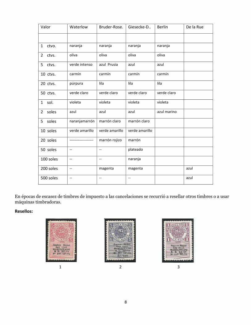
Valor Waterlow Bruder-Rose. Giesecke-D.. Berlin De la Rue
1 ctvo. naranja naranja naranja naranja
2 ctvs. oliva oliva oliva oliva
5 ctvs. verde intenso azul Prusia azul azul
10 ctvs. carmín carmín carmín carmín
20 ctvs. púrpura lila lila lila
50 ctvs. verde claro verde claro verde claro verde claro
1 sol. violeta violeta violeta violeta
2 soles azul azul azul azul marino
5 soles naranjamarrón marrón claro marrón claro
10 soles verde amarillo verde amarillo verde amarillo
20 soles ------------------- marrón rojizo marrón
50 soles -- -- plateado
100 soles -- -- naranja
200 soles -- magenta magenta azul
500 soles -- -- -- azul
En épocas de escasez de timbres de impuesto a las cancelaciones se recurrió a resellar otros timbres o a usar
máquinas timbradoras.
Resellos:
1 2 3
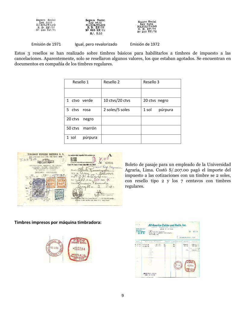
9
Emisión de 1971 Igual, pero revalorizado Emisión de 1972
Estos 3 resellos se han realizado sobre timbres básicos para habilitarlos a timbres de impuesto a las
cancelaciones. Aparentemente, solo se resellaron algunos valores, los que estaban agotados. Se encuentran en
documentos en compañía de los timbres regulares.
Resello 1 Resello 2 Resello 3
1 ctvo verde 10 ctvs/20 ctvs 20 ctvs negro
5 ctvs rosa 2 soles/5 soles 1 sol púrpura
20 ctvs negro
50 ctvs marrón
1 sol púrpura
Boleto de pasaje para un empleado de la Universidad
Agraria, Lima. Costó S/.207.00 pagó el importe del
impuesto a las cotizaciones con un timbre se 2 soles,
con resello tipo 2 y los 7 centavos con timbres
regulares.
Timbres impresos por máquina timbradora:
10
Cuando no había timbres disponibles, los interesados pagaban el impuesto correspondiente en las oficinas de la
Caja de Depósitos y Consignaciones, Departamento de Recaudación, donde se aplicaba el valor pagado mediante
un timbre impreso por máquina
timbradora. Igual gestión podía hacerse en las oficinas de la Caja Nacional del Seguro Social.
Estampillas para las Contribuciones Obrero-Patronales:
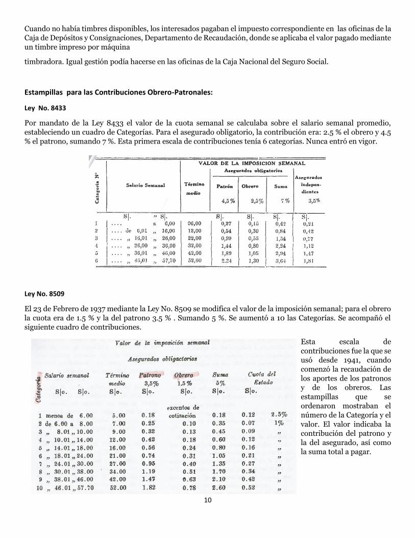
Ley No. 8433
Por mandato de la Ley 8433 el valor de la cuota semanal se calculaba sobre el salario semanal promedio,
estableciendo un cuadro de Categorías. Para el asegurado obligatorio, la contribución era: 2.5 % el obrero y 4.5
% el patrono, sumando 7 %. Esta primera escala de contribuciones tenía 6 categorías. Nunca entró en vigor.
Ley No. 8509
El 23 de Febrero de 1937 mediante la Ley No. 8509 se modifica el valor de la imposición semanal; para el obrero
la cuota era de 1.5 % y la del patrono 3.5 % . Sumando 5 %. Se aumentó a 10 las Categorías. Se acompañó el
siguiente cuadro de contribuciones.
Esta escala de
contribuciones fue la que se
usó desde 1941, cuando
comenzó la recaudación de
los aportes de los patronos
y de los obreros. Las
estampillas que se
ordenaron mostraban el
número de la Categoría y el
valor. El valor indicaba la
contribución del patrono y
la del asegurado, así como
la suma total a pagar.
11
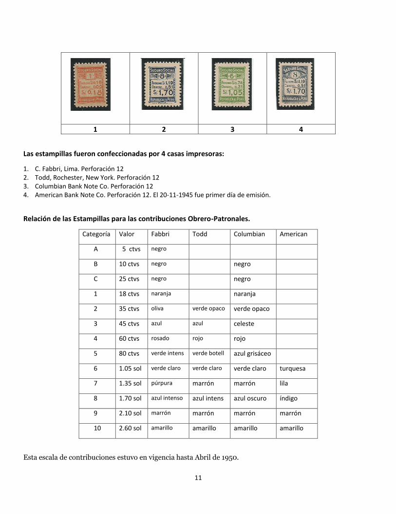
1 2 3 4
Las estampillas fueron confeccionadas por 4 casas impresoras:
1. C. Fabbri, Lima. Perforación 12 2. Todd, Rochester, New York. Perforación 12 3. Columbian Bank Note Co. Perforación 12 4. American Bank Note Co. Perforación 12. El 20-11-1945 fue primer día de emisión.
Relación de las Estampillas para las contribuciones Obrero-Patronales.
Categoría Valor Fabbri Todd Columbian American
A 5 ctvs negro
B 10 ctvs negro negro
C 25 ctvs negro negro
1 18 ctvs naranja naranja
2 35 ctvs oliva verde opaco verde opaco
3 45 ctvs azul azul celeste
4 60 ctvs rosado rojo rojo
5 80 ctvs verde intens verde botell azul grisáceo
6 1.05 sol verde claro verde claro verde claro turquesa
7 1.35 sol púrpura marrón marrón lila
8 1.70 sol azul intenso azul intens azul oscuro índigo
9 2.10 sol marrón marrón marrón marrón
10 2.60 sol amarillo amarillo amarillo amarillo
Esta escala de contribuciones estuvo en vigencia hasta Abril de 1950.
12
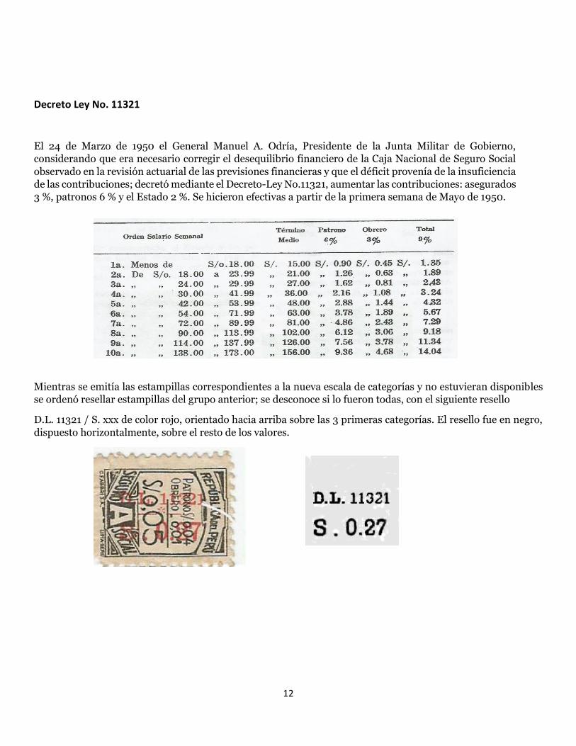
Decreto Ley No. 11321
El 24 de Marzo de 1950 el General Manuel A. Odría, Presidente de la Junta Militar de Gobierno,
considerando que era necesario corregir el desequilibrio financiero de la Caja Nacional de Seguro Social
observado en la revisión actuarial de las previsiones financieras y que el déficit provenía de la insuficiencia
de las contribuciones; decretó mediante el Decreto-Ley No.11321, aumentar las contribuciones: asegurados
3 %, patronos 6 % y el Estado 2 %. Se hicieron efectivas a partir de la primera semana de Mayo de 1950.
Mientras se emitía las estampillas correspondientes a la nueva escala de categorías y no estuvieran disponibles
se ordenó resellar estampillas del grupo anterior; se desconoce si lo fueron todas, con el siguiente resello
D.L. 11321 / S. xxx de color rojo, orientado hacia arriba sobre las 3 primeras categorías. El resello fue en negro,
dispuesto horizontalmente, sobre el resto de los valores.
13
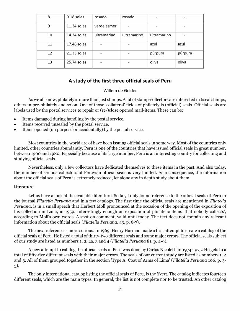
Relación de las estampillas reselladas que se conoce:
Categoría Valor Fabbri Columbian American
A 27 ctvs negro
B 54 ctvs negro
C 1.08 soles negro
1 1.35 soles naranja
2 1.89 soles verde opaco
3 2.43 soles celeste
4 3.24 soles rojo rojo
5 4.32 soles verde botella
6 5.67 soles turquesa
7 7.29 soles lila
8 9.18 soles índigo
9 11.34 soles marrón
10 14.04 soles amarillo
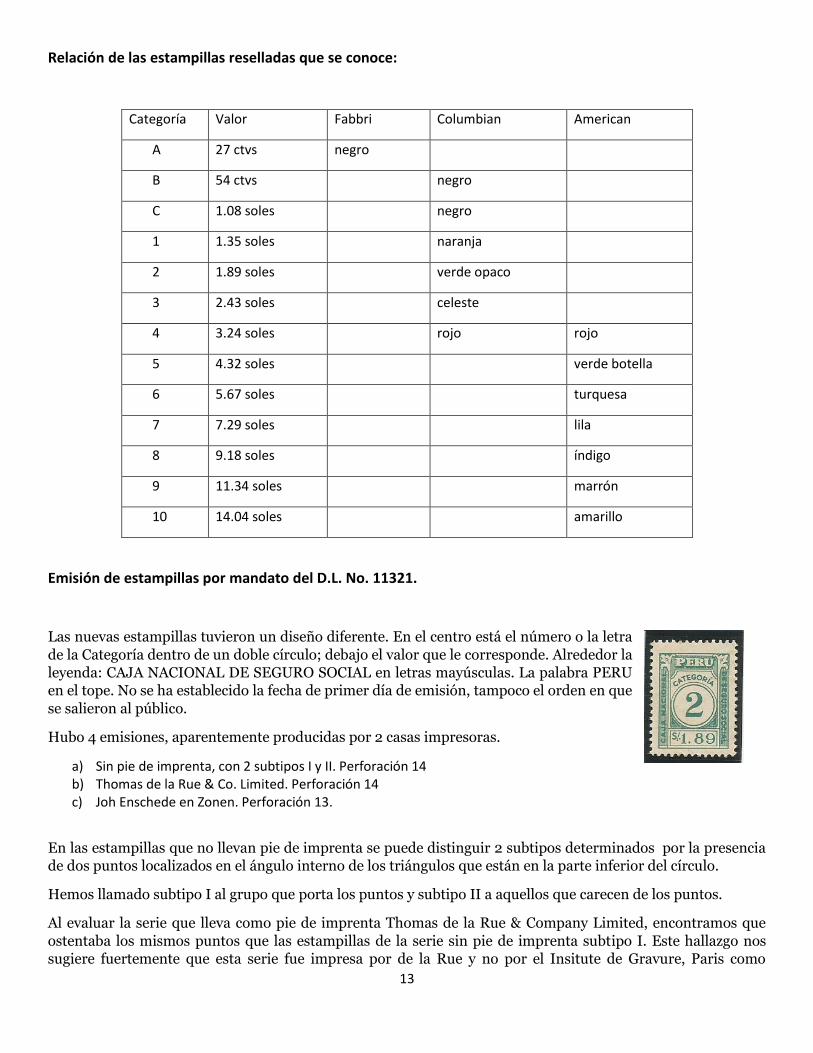
Emisión de estampillas por mandato del D.L. No. 11321.
Las nuevas estampillas tuvieron un diseño diferente. En el centro está el número o la letra
de la Categoría dentro de un doble círculo; debajo el valor que le corresponde. Alrededor la
leyenda: CAJA NACIONAL DE SEGURO SOCIAL en letras mayúsculas. La palabra PERU
en el tope. No se ha establecido la fecha de primer día de emisión, tampoco el orden en que
se salieron al público.
Hubo 4 emisiones, aparentemente producidas por 2 casas impresoras.
a) Sin pie de imprenta, con 2 subtipos I y II. Perforación 14 b) Thomas de la Rue & Co. Limited. Perforación 14 c) Joh Enschede en Zonen. Perforación 13.
En las estampillas que no llevan pie de imprenta se puede distinguir 2 subtipos determinados por la presencia
de dos puntos localizados en el ángulo interno de los triángulos que están en la parte inferior del círculo.
Hemos llamado subtipo I al grupo que porta los puntos y subtipo II a aquellos que carecen de los puntos.
Al evaluar la serie que lleva como pie de imprenta Thomas de la Rue & Company Limited, encontramos que
ostentaba los mismos puntos que las estampillas de la serie sin pie de imprenta subtipo I. Este hallazgo nos
sugiere fuertemente que esta serie fue impresa por de la Rue y no por el Insitute de Gravure, Paris como

14
sospechaba Moll. De igual manera creemos que la serie sin pie de imprenta, subtipo II también fue impresa por
de la Rue.
En alguna fecha, aún no ubicada se agregaron 3 categorías, (11,12,13). Estas las hallamos en la serie con pie de
imprenta de la Rue. De la casa impresora Joh Enschede en Zonen solo se han encontrado estampillas de estas 3
nuevas categorías.
1) Sin pie de imprenta:
Subtipo I Ampliación mostrando los puntos Subtipo II .
. en el ángulo interno del triángulo.
2) Thomas de la Rue & Company Limited. 3) Joh Enschede en Zonen
En la tabla se ha ordenado los timbres encontrados hasta ahora. Los espacios ocupados por una raya indican
que no los hemos visto ni han sido reportados.
Categoría Valor Sin pie de imprenta de la Rue Joh
Subtipo I Subtipo II -
A 27 ctvs - - - -
B 54 ctvs verde-amaril - - -
C 1.08 soles - - rosado -
1 1.35 soles amarillo-mar - amarillo-mar -
2 1.89 soles azul-verdoso - azul-verdoso -
3 2.43 soles marrón claro marrón claro marrón claro -
4 3.24 soles magenta magenta magenta clar -
5 4.32 soles naranja naranja naranja -
6 5.67 soles violeta violeta violeta -
7 7.29 soles oliva claro oliva claro oliva claro -
15
8 9.18 soles rosado rosado - -
9 11.34 soles verde esmer - - -
10 14.34 soles ultramarino ultramarino ultramarino -
11 17.46 soles - - azul azul
12 21.33 soles - - púrpura púrpura
13 25.74 soles - - oliva oliva
A study of the first three official seals of Peru
Willem de Gelder
As we all know, philately is more than just stamps. A lot of stamp-collectors are interested in fiscal stamps,
others in pre-philately and so on. One of those 'collateral' fields of philately is (official) seals. Official seals are
labels used by the postal services to repair or (re-)close opened mail-items. These can be:
Items damaged during handling by the postal service.
Items received unsealed by the postal service.
Items opened (on purpose or accidentally) by the postal service.
Most countries in the world are of have been issuing official seals in some way. Most of the countries only
limited, other countries abundantly. Peru is one of the countries that have issued official seals in great number,
between 1900 and 1980. Especially because of its large number, Peru is an interesting country for collecting and
studying official seals.
Nevertheless, only a few collectors have dedicated themselves to these items in the past. And also today,
the number of serious collectors of Peruvian official seals is very limited. As a consequence, the information
about the official seals of Peru is extremely reduced, let alone any in depth study about them.
Literature
Let us have a look at the available literature. So far, I only found reference to the official seals of Peru in
the journal Filatelia Peruana and in a few catalogs. The first time the official seals are mentioned in Filatelia
Peruana, is in a small speech that Herbert Moll pronounced at the occasion of the opening of the exposition of
his collection in Lima, in 1959. Interestingly enough an exposition of philatelic items 'that nobody collects',
according to Moll's own words. A spot-on comment, valid until today. The text does not contain any relevant
information about the official seals (Filatelia Peruana, 43, p. 6-7).
The next reference is more serious. In 1969, Henry Harman made a first attempt to create a catalog of the
official seals of Peru. He listed a total of thirty-two different seals and some major errors. The official seals subject
of our study are listed as numbers 1, 2, 2a, 3 and 4 (Filatelia Peruana 81, p. 4-9).
A new attempt to catalog the official seals of Peru was done by Carlos Nicoletti in 1974-1975. He gets to a
total of fifty-five different seals with their major errors. The seals of our current study are listed as numbers 1, 2
and 3. All of them grouped together in the section 'Type A: Coat of Arms of Lima' (Filatelia Peruana 106, p. 3-
5).
The only international catalog listing the official seals of Peru, is the Yvert. The catalog indicates fourteen
different seals, which are the main types. In general, the list is not complete nor to be trusted. An other catalog
16
listing the official seals is the specialized catalog of Bustamante from 1981. It follows the listing made by Nicoletti
some eight years earlier.
Finally, a very fine piece of work is the catalog Official Seals of the World, written by James N. Drummond
and published in 2007. This is by far the best and most extensive catalog for the official seals of Peru (and all
other countries that have ever issued official seals). This catalog recollects all available information that is known
today and is the basis for all current collections and study of the official seals issued by Peru.
Available knowledge
Now, what do we learn from the literature and catalogs, about the first three official seals issued by Peru?
Seal 1
Coat of Arms of the City of Lima within a laurel wrath, with the text 'CIERRO OFICIAL / ADMINISTRACIÓN PRINCIPAL / DE / CORREOS DE LIMA / PERU'. All of it on a yellow background which consists in little ornaments. The design has a blue border consisting of little flowers, which runs clock-wise.
Printed in panes of 4 (2x2) with the top horizontal pair inverted relative to the bottom pair (i.e. vertical tête-bèche).
Issued in 1900.
Perforation 12, cross-wise (which implies that all seals have only two perforated sides).
The design has a dimension of 40x74mm.
The word 'PERU' is 11mm wide.
The word 'PRINCIPAL' has an accent on the letter 'A' (which is an orthographic error).
Apparently only destined for use in Lima.
Errors or variants: ✔ Shifted or misplaced colors are known.
Seal 2
Same design as seal 1.
Issued in 1902.
Sheets or panes are not listed. Tête-bèches are not known.
Perforation 12. All seals are perforated on all four sides.
The design has a dimension of 40x75mm.
The word 'PERU' is 16mm wide.
The word 'PRINCIPAL' has no accents (which is orthographically correct).
Apparently only destined for use in Lima.
Errors and variants: ✔ Third 'i' in 'Administación' omitted.
✔ 'S' character over 'ión' in 'Administración' with short tails.
✔ 'PPRU' instead of 'PERU'.
✔ 'S' character over 'ión' in 'Administración' with short tails in combination with 'PPRU instead of 'PERU'.
Seal 3
Coat of Arms of the City of Lima within a laurel wrath, with the text 'CIERRO OFICIAL / CORREOS DEL PERU / LIMA' (with the word 'LIMA' obliterated with a dark blue block). All of it on a plain yellow background. The design has a blue border consisting of little flowers, which runs clock-wise.
Issued in 1904.
Printed in panes of 4 (2x2) with the top horizontal pair inverted relative to the bottom pair (i.e. vertical tête-bèche).
Perforation 12, cross-wise (which implies that all seals have only two perforated sides).
17
The design has a dimension of 38x74mm.
Apparently in first instance only meant to be used in Lima, but before issue date this was changed to a nation-wide use, which lead to the obliteration of the word 'LIMA'. This seal never circulated without this obliteration (contrary to what Harman stated in 1969).
Errors and variants: ✔ Shifted or misplaced colors are known.
✔ Inverted blue frame (running counter clock-wise).
✔ Inverted blue frame and coat of arms on red background.
✔ Without obliteration of the word 'LIMA'.
Additional information, based on new material
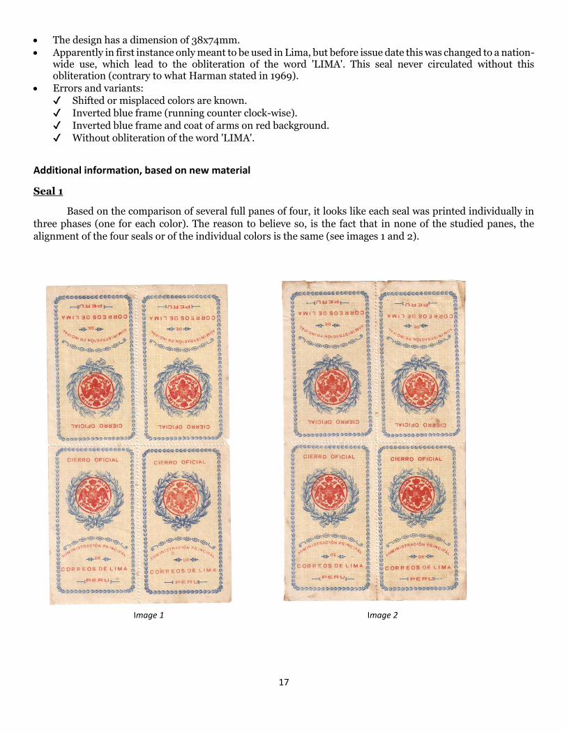
Seal 1
Based on the comparison of several full panes of four, it looks like each seal was printed individually in
three phases (one for each color). The reason to believe so, is the fact that in none of the studied panes, the
alignment of the four seals or of the individual colors is the same (see images 1 and 2).
Image 1 Image 2

18
Seal 2
This seal was printed in sheets of ten (see image 3). The fact that the sheets have a border, explains why
all seals have perforation on all four sides. The way of printing also explains the absence of tête-bèches.
The error 'PPRU' instead of 'PERU' is on the top row, extreme left. This implies that the error exists on
10% of the issue (not precisely 'rare', as Harman thought back in 1969). This seems to be consistent, as I have
once seen a pair from the upper left corner of the sheet, in which the same seal came with the 'PPRU' error.
The short-tailed ornament that looks like a letter 'S' is on the bottom row, the two seals at the extreme
right. This error seems to be due to insufficient inking, as according to the catalog of Drummond, this error also
exists in combination with the 'PPRU' error (but which is not the case on the sheet shown here). As this error
seems to occur inconsistently, we might consider this more a random printing flaw than a real error.
The error of a missing letter in the word 'ADMINISTRACIÓN' seems to be due to the fact that the third
letter 'I' is pretty weak and tends to fall away in case the inking is insufficient. This explains why this error might
occur in combination with the other errors. The same comment is valid here as with the short-tailed ornament:
this is a random printing flaw more than a real error.
Image 3
19
Seal 3
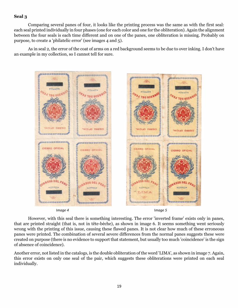
Comparing several panes of four, it looks like the printing process was the same as with the first seal:
each seal printed individually in four phases (one for each color and one for the obliteration). Again the alignment
between the four seals is each time different and on one of the panes, one obliteration is missing. Probably on
purpose, to create a 'philatelic error' (see images 4 and 5).
As in seal 2, the error of the coat of arms on a red background seems to be due to over inking. I don't have
an example in my collection, so I cannot tell for sure.
Image 4 Image 5
However, with this seal there is something interesting. The error 'inverted frame' exists only in panes,
that are printed straight (that is, not in tête-bèche), as shown in image 6. It seems something went seriously
wrong with the printing of this issue, causing these flawed panes. It is not clear how much of these erroneous
panes were printed. The combination of several severe differences from the normal panes suggests these were
created on purpose (there is no evidence to support that statement, but usually too much 'coincidence' is the sign
of absence of coincidence).
Another error, not listed in the catalogs, is the double obliteration of the word 'LIMA', as shown in image 7. Again,
this error exists on only one seal of the pair, which suggests these obliterations were printed on each seal
individually.
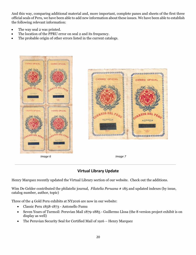
20
And this way, comparing additional material and, more important, complete panes and sheets of the first three
official seals of Peru, we have been able to add new information about these issues. We have been able to establish
the following relevant information:
The way seal 2 was printed.
The location of the PPRU error on seal 2 and its frequency.
The probable origin of other errors listed in the current catalogs.
Image 6 Image 7
Virtual Library Update
Henry Marquez recently updated the Virtual Library section of our website. Check out the additions.
Wim De Gelder contributed the philatelic journal, Filatelia Peruana # 185 and updated indexes (by issue, catalog number, author, topic)
Three of the 4 Gold Peru exhibits at NY2016 are now in our website:
Classic Peru 1858-1873 - Antonello Fumu
Seven Years of Turmoil: Peruvian Mail 1879-1885 - Guillermo Llosa (the 8 version project exhibit is on display as well)
The Peruvian Security Seal for Certified Mail of 1916 – Henry Marquez
21
Colareta Revisited
Chuck Wooster
In 1979, Jose F. Colareta published Prefilatelia Peruana, his catalog of pre-stamp cancels from Peru. This was
followed in 1981 by Prefilatelia Peruana Primier Supplemento which included more cancels as well as
corrections to the original volume. These two books soon became the defining reference for Peruvian cancels
up to 1858 when Peru issued its first postage stamps. Thirty-five years have gone by since the Primier
Supplemento was published and it is now time to once again update this reference. Over the next several issues
of El Trencito 2, I hope to illustrate newly discovered cancels and to correct what I feel may be errors in
Colareta’s catalogs. I would be pleased to hear from other collectors who may have discovered other cancels or
who may be able to revise early use dates or ink colors that would expand Colareta’s information.
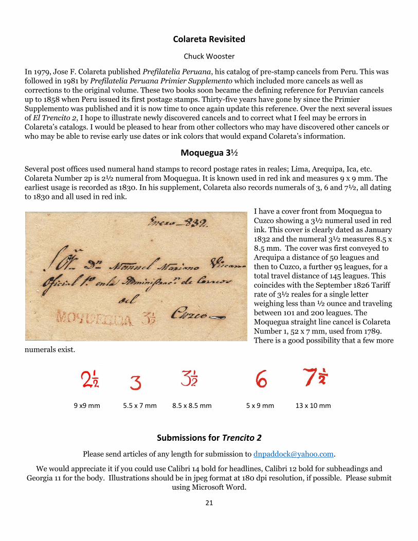
Moquegua 3½
Several post offices used numeral hand stamps to record postage rates in reales; Lima, Arequipa, Ica, etc.
Colareta Number 2p is 2½ numeral from Moquegua. It is known used in red ink and measures 9 x 9 mm. The
earliest usage is recorded as 1830. In his supplement, Colareta also records numerals of 3, 6 and 7½, all dating
to 1830 and all used in red ink.
I have a cover front from Moquegua to
Cuzco showing a 3½ numeral used in red
ink. This cover is clearly dated as January
1832 and the numeral 3½ measures 8.5 x
8.5 mm. The cover was first conveyed to
Arequipa a distance of 50 leagues and
then to Cuzco, a further 95 leagues, for a
total travel distance of 145 leagues. This
coincides with the September 1826 Tariff
rate of 3½ reales for a single letter
weighing less than ½ ounce and traveling
between 101 and 200 leagues. The
Moquegua straight line cancel is Colareta
Number 1, 52 x 7 mm, used from 1789.
There is a good possibility that a few more
numerals exist.
9 x9 mm 5.5 x 7 mm 8.5 x 8.5 mm 5 x 9 mm 13 x 10 mm
Submissions for Trencito 2
Please send articles of any length for submission to [email protected].
We would appreciate it if you could use Calibri 14 bold for headlines, Calibri 12 bold for subheadings and
Georgia 11 for the body. Illustrations should be in jpeg format at 180 dpi resolution, if possible. Please submit
using Microsoft Word.