supertooltip for winformshelp.grapecity.com/componentone/pdf/winforms/winforms.supertooltip.pdf ·...
TRANSCRIPT

ComponentOne
SuperTooltip for WinForms
GrapeCity US
GrapeCity201 South Highland Avenue, Suite 301Pittsburgh, PA 15206Tel: 1.800.858.2739 | 412.681.4343Fax: 412.681.4384Website: https://www.grapecity.com/en/E-mail: [email protected]
Trademarks
The ComponentOne product name is a trademark and ComponentOne is a registered trademark of GrapeCity, Inc. Allother trademarks used herein are the properties of their respective owners.
Warranty
ComponentOne warrants that the media on which the software is delivered is free from defects in material andworkmanship, assuming normal use, for a period of 90 days from the date of purchase. If a defect occurs during thistime, you may return the defective media to ComponentOne, along with a dated proof of purchase, andComponentOne will replace it at no charge. After 90 days, you can obtain a replacement for the defective media bysending it and a check for $2 5 (to cover postage and handling) to ComponentOne.
Except for the express warranty of the original media on which the software is delivered is set forth here,ComponentOne makes no other warranties, express or implied. Every attempt has been made to ensure that theinformation contained in this manual is correct as of the time it was written. ComponentOne is not responsible for anyerrors or omissions. ComponentOne’s liability is limited to the amount you paid for the product. ComponentOne isnot liable for any special, consequential, or other damages for any reason.
Copying and Distribution
While you are welcome to make backup copies of the software for your own use and protection, you are notpermitted to make copies for the use of anyone else. We put a lot of time and effort into creating this product, and weappreciate your support in seeing that it is used by licensed users only.

Table of ContentsSuperTooltip for WinForms Overview 3
Help with WinForms Edition 3
Key Features 4-5
SuperTooltip for WinForms Quick Start 6
Step 1 of 4: Adding a C1SuperLabel to a Project 6-8
Step 2 of 4: Creating a Vista-style C1SuperTooltip for a Control 8-10
Step 3 of 4: Creating a C1SuperTooltip with HTML Code 10
Step 4 of 4: Adding Code for the Buttons and Running the Project 10-12
SuperTooltip for WinForms Top Tips 13-14
Design-Time Support 15
C1SuperTooltip Menus 15
C1SuperTooltip Tasks and Context Menus 15-16
C1SuperLabel Tasks and Context Menus 16
C1SuperErrorProvider Tasks and Context Menus 16-17
C1SuperTooltip Editors 17
C1SuperTooltip Editor 17-18
Office tab 18-19
Html tab 19-20
Properties tab 20
Preview pane 20-21
C1SuperLabel Editor 21
Edit Image Collection Editor 21-22
C1SuperTooltip Elements 23
ToolTip Elements 23-24
Label Elements 24
ErrorProvider Elements 24
C1SuperTooltip Appearance 25
C1SuperTooltip Background Gradient 25-26
C1SuperTooltip Shape 26
C1SuperTooltip Shadow 26-27
SuperTooltip for WinForms Samples 28
SuperTooltip for WinForms Task-Based Help 29
Creating C1SuperTooltips 29
Creating C1SuperTooltips at Design Time 29-30
SuperTooltip for WinForms 1
Copyright © 2019 GrapeCity, Inc. All rights reserved.

Creating a C1SuperTooltip Programmatically 30-32
Creating a C1SuperTooltip using a Cascading Style Sheet 32-35
Adding a C1SuperTootip using HTML 35
Adding Multiple C1SuperTooltips 35-36
Changing the C1SuperTooltip Appearance and Behavior Settings 36-37
Adding an Image to C1SuperTooltip 37-38
Creating C1SuperLabels 38
Creating C1SuperLabels at Design Time 38-39
Creating a C1SuperLabel Programmatically 39-40
Adding an Image to C1SuperLabel 40-41
Creating C1SuperErrorProvider Error Messages 41
Creating an Error Message 41
Changing the Error Message Icon 41-42
Changing the Error Message Blink Style 42
Showing an Image when the Error Icon is Hovered 42-43
Using C1SuperErrorProvider with Data Sources 43-44
SuperTooltip for WinForms 2
Copyright © 2019 GrapeCity, Inc. All rights reserved.

SuperTooltip for WinForms OverviewSuperTooltip for WinForms allows you to create visually rich WinForms applications with Vista-style ToolTips andlabels that can display HTML content. SuperTooltip for WinForms loads and displays HTML content much fasterthan its standard counterparts and without the security concerns often associated with the WebBrowser control sinceit doesn't depend on Internet Explorer.
SuperTooltip for WinForms supports virtually all HTML constructs, including cascading style sheets, mixed fonts andtext colors, preformatted text, tables, bulleted and numbered lists, and more. With SuperTooltip for WinForms, thepossibilities for your customized ToolTips and labels are endless.
Help with WinForms Edition
Getting StartedFor information on installing ComponentOne Studio WinForms Edition, licensing, technical support, namespacesand creating a project with the control, please visit Getting Started with WinForms Edition.
SuperTooltip for WinForms 3
Copyright © 2019 GrapeCity, Inc. All rights reserved.
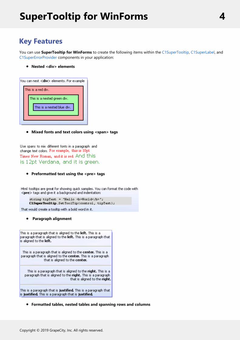
Key FeaturesYou can use SuperTooltip for WinForms to create the following items within the C1SuperTooltip, C1SuperLabel, andC1SuperErrorProvider components in your application:
Nested <div> elements
Mixed fonts and text colors using <span> tags
Preformatted text using the <pre> tags
Paragraph alignment
Formatted tables, nested tables and spanning rows and columns
SuperTooltip for WinForms 4
Copyright © 2019 GrapeCity, Inc. All rights reserved.

Nested, bulleted and numbered lists
Images loaded from the application resources
Richly formatted HTML error messages
Plain text and cascading style sheets
SuperTooltip for WinForms 5
Copyright © 2019 GrapeCity, Inc. All rights reserved.
SuperTooltip for WinForms Quick StartThis quick start guide explains how to add two Microsoft Vista-style C1SuperTooltips and a C1SuperLabel control toyour form.
Step 1 of 4: Adding a C1SuperLabel to a ProjectStart by adding a C1SuperLabel control to your project and adding some HTML code for it.
To add a C1SuperLabel to a project, complete the following steps:
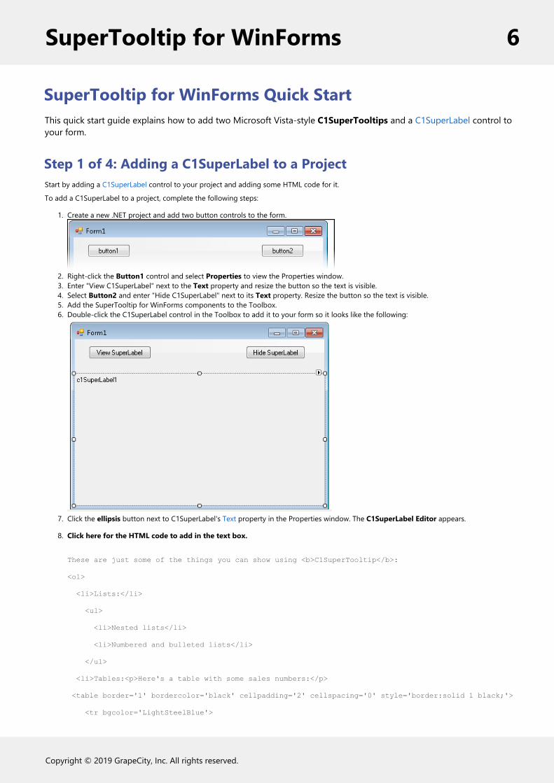
1. Create a new .NET project and add two button controls to the form.
2. Right-click the Button1 control and select Properties to view the Properties window.3. Enter "View C1SuperLabel" next to the Text property and resize the button so the text is visible.4. Select Button2 and enter "Hide C1SuperLabel" next to its Text property. Resize the button so the text is visible.5. Add the SuperTooltip for WinForms components to the Toolbox.6. Double-click the C1SuperLabel control in the Toolbox to add it to your form so it looks like the following:
7. Click the ellipsis button next to C1SuperLabel's Text property in the Properties window. The C1SuperLabel Editor appears.
8. Click here for the HTML code to add in the text box.
These are just some of the things you can show using <b>C1SuperTooltip</b>:
<ol>
<li>Lists:</li>
<ul>
<li>Nested lists</li>
<li>Numbered and bulleted lists</li>
</ul>
<li>Tables:<p>Here's a table with some sales numbers:</p>
<table border='1' bordercolor='black' cellpadding='2' cellspacing='0' style='border:solid 1 black;'>
<tr bgcolor='LightSteelBlue'>
SuperTooltip for WinForms 6
Copyright © 2019 GrapeCity, Inc. All rights reserved.

<th style="width:150px; text-align: center;" rowspan='3'>
<p>This cell spans<br />three rows.</p></th>
<th align='center' colspan='6'>Semester 1</th>
</tr>
<tr bgcolor='LightSteelBlue'>
<th align='center' colspan='3'>Quarter 1</th>
<th align='center' colspan='3'>Quarter 2</th>
</tr>
<tr bgcolor='LightSteelBlue'>
<td align='center'>Jan</td>
<td align='center'>Feb</td>
<td align='center'>Mar</td>
<td align='center'>Apr</td>
<td align='center'>May</td>
<td align='center'>Jun</td>
</tr>
<tr>
<td align='right' style='width: 150px'><strong>Widgets</strong></td>
<td>12</td>
<td>23</td>
<td>23</td>
<td>43</td>
<td>23</td>
<td>34</td>
</tr>
<tr>
<td align='right' style='width: 150px'><strong>Sprockets</strong></td>
<td>45</td>
<td>32</td>
<td>23</td>
<td>23</td>
<td>34</td>
<td>43</td>
</tr>
</table>
</li>
<li>Images: The background of this C1SuperLabel is an image. </li>
<li>Borders:<p style='border: #336633 thick'>Here's a thick border.</p>
SuperTooltip for WinForms 7
Copyright © 2019 GrapeCity, Inc. All rights reserved.
</li>
<li>Preformatted Text:
<pre style="background-color:#dddddd; margin:0 20pt 0 20pt;">
string tipText = "Hello <b>World</b>";
<b>C1SuperTooltip</b>.SetToolTip(control, tipText);
</pre>
</li>
<li>Nesting:
<div style="background-color:#ffaaaa;border:solid thin black;margin:10px;padding:4px">
This is a red div.
<div style="background-color:#aaffaa;border:solid thin black;margin:10px;padding:4px">
This is a nested green div.
<div style="background-color:#aaaaff;border:solid thin black;margin:10px;padding:4px">
This is a nested blue div.
</div>
</div>
</div>
</li>
</ol>9. In the Properties window, click the drop-down arrow next to the BackColor property, select the Web tab, and select White.
10. Add an image to the C1SuperLabel control:Click the ellipsis button next to the BackgroundImage property. The Select Resource dialog box appears.Select Local resource and click the Import button. The Open dialog box appears.Locate and select the TipBackground.png or another graphic of your choice and then click Open. The TipBackground.png image isinstalled, by default, with the SuperTooltip for WinForms samples and is located in Documents\ComponentOneSamples\WinForms.Click OK.
11. Click the drop-down arrow next to the BackgroundImageLayout property and select Stretch.12. Set the Visible property to False.
Step 2 of 4: Creating a Vista-style C1SuperTooltip for a ControlNext, create a Microsoft Vista-style C1SuperTooltip using the Office tab in the C1SuperTooltip Editor. To do this, completethe following steps:
1. Double-click the C1SuperTooltip control in the Toolbox to add it to your form.2. First, we will add an image to the ToolTip's image collection. We are using a small Help graphic to be used as the
Subimage in our ToolTip.a. Select C1SuperTooltip1 and click the ellipsis button next to the Images property in the Properties window.
The Edit Image Collection editor appears.b. Click the Add button, and find and select the desired image file.c. Once the image is added to the collection, click OK. We will specify this image in the ToolTip a little later.
3. Right-click the Button1 control and select Properties to view the Properties window.4. Click the ellipsis button next to the ToolTip on C1SuperTooltip1 property and the C1SuperTooltip Editor appears.5. On the Office tab, enter View C1SuperLabel in the Title text box.6. Enter the following text in the Body Text text box:
Click here to view a C1SuperLabel showing some of the cool features of C1SuperTooltip.
SuperTooltip for WinForms 8
Copyright © 2019 GrapeCity, Inc. All rights reserved.

Notice a preview of the C1SuperTooltip appears in the Preview window.
7. To make the ToolTip appear on multiple lines, place the cursor after the word showing in the Body Text and pressENTER.
8. You can also format the body text from within the Office tab. Select and right-click C1SuperLabel, and then chooseBold from the context menu or click Ctrl+B on the keyboard. Do the same for C1SuperTooltip.
9. Check the Bottom Separator check box.10. Enter the following text in the Subtitle text box:
Press F1 for more help.
11. Click the Subimage drop-down arrow and select the image you added to the collection in the previous step 2.
SuperTooltip for WinForms 9
Copyright © 2019 GrapeCity, Inc. All rights reserved.
Note that C1SuperTooltip automatically creates the HTML used to format your ToolTip so you don't have to. To viewthe HTML code, click the Html tab. We will create a ToolTip using only HTML code in the Creating a C1SuperTooltipwith HTML Code topic of this quick start.
12. Click the Properties tab in the editor.13. Click the drop-down arrow next to the BackgroundGradient property and choose Vista. The background and layout of
the ToolTip now have the Microsoft Vista ToolTip style.14. Click OK to close the C1SuperTooltip Editor.
Step 3 of 4: Creating a C1SuperTooltip with HTML CodeThen create a C1SuperTooltip in the C1SuperTooltip Editor using only HTML code. Complete the following steps:
1. Select the Button2 control.2. Click the ellipsis button next to the ToolTip on C1SuperTooltip1 property to open the C1SuperTooltip
Editor.3. Click the Html tab and enter the following HTML markup:
<table><tr><parm></parm>
<th><parm>Hide C1SuperLabel</parm></th>
</table>
<parm></parm>
<div style='margin:1 12'><parm> Click here to hide the <b>C1SuperLabel</b><br>once you are done viewing it.
</parm></div>
<parm><hr noshade size=1 style='margin:2' color=Darker></parm>
<table><tr>
<th><parm><img src='HelpButton.png'></parm></th>
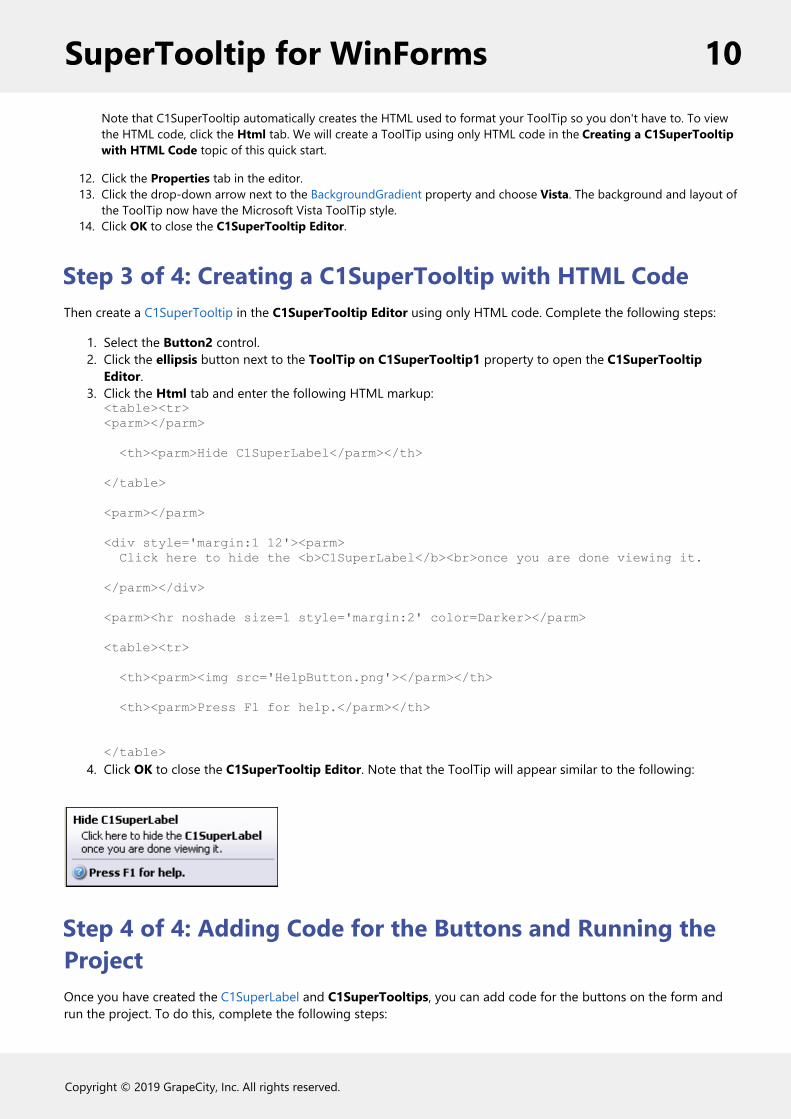
<th><parm>Press F1 for help.</parm></th>
</table>4. Click OK to close the C1SuperTooltip Editor. Note that the ToolTip will appear similar to the following:
Step 4 of 4: Adding Code for the Buttons and Running theProjectOnce you have created the C1SuperLabel and C1SuperTooltips, you can add code for the buttons on the form andrun the project. To do this, complete the following steps:
SuperTooltip for WinForms 10
Copyright © 2019 GrapeCity, Inc. All rights reserved.

1. Double-click Button1 and add the following code to the Button1_Click event:
To write code in Visual Basic
Visual Basic
C1SuperLabel1.Visible = True
To write code in C#
C#
c1SuperLabel1.Visible = true;
2. Double-click Button2 and add the following code to the Button2_Click event:
To write code in Visual Basic
Visual Basic
C1SuperLabel1.Visible = False
To write code in C#
C#
c1SuperLabel1.Visible = False;
3. Run the project and mouse over Button1. Notice the ToolTip is a Vista-style C1SuperTooltip:
4. Click View C1SuperLabel. The C1SuperLabel appears.
SuperTooltip for WinForms 11
Copyright © 2019 GrapeCity, Inc. All rights reserved.

5. Mouse over Button2. The Vista-style C1SuperTooltip looks like this:
The text in the ToolTip for Button2 was applied through HTML markup, but you will notice the C1SuperTooltipVista background style appears in both ToolTips. Any properties you set via the C1SuperTooltip Editor will bethe same in all ToolTips for controls associated with that C1SuperTooltip.
6. Click Hide C1SuperLabel, and the C1SuperLabel is hidden.
SuperTooltip for WinForms 12
Copyright © 2019 GrapeCity, Inc. All rights reserved.
SuperTooltip for WinForms Top TipsThe following tips were compiled from frequently asked user questions posted in the Studio for ASP.NET forum.
Tip 1: Use Visual Studio to create the HTML that goes into the supertooltips.The C1SuperTooltip has a designer that makes it easy to create standard Office 2007-style tooltips with images,headers, and footers.
But you have a lot more flexibility than that. The C1SuperTooltip has a powerful HTML parser, so you can use it todisplay virtually any HTML you want. For example, you can create HTML content in Visual Studio (File | New | File... |HTML Page), with style sheets, lists, tables, and so on, and use that as your tooltip contents. Just paste the resultingHTML into the “Tooltip on c1SuperTooltip” extender property for any control.
See Adding a C1SuperTooltip using HTML for an example.
Tip 2: Use the MaximumWidth property to make the tooltip contentwrap.By default, the C1SuperTooltip will break lines only at the end of paragraphs or at explicit line breaks. By setting theMaximumWidth property, you can have the content wrap automatically, which makes maintaining the content mucheasier.
Note: C1SuperTooltip now supports word wrapping for Eastern languages, including Japanese, Chinese, andKorean.
Tip 3: Use the Images collection to add images to theC1SuperTooltip and C1SuperLabel.Both the C1SuperTooltip and C1SuperLabel have an Images property that you can use to define a list of images thatyou want to display in the controls. Simply add as many images as you want to the Images collection, and then referto the images in your HTML content by using IMG tags with a “res://” qualifier. For example, if you add an imagecalled “MyBitmap.png” to the Images collection, you can use it in your HTML text as follows:
<img src= "res://mybitmap.png" />
See Adding an Image to C1SuperTooltip and Adding an Image to C1SuperLabel for examples.
Tip 4: Use the Opacity property to provide see-through tips.The C1SuperToolTip has an Opacity property that takes a value between zero (transparent) and one (solid). By settingthe Opacity property to 0.5 for example, you can provide tooltips that allow users to see the content underneath thetip. This can be especially useful if the tooltips are large.
Tip 5: Use the IsBalloon and BackgroundGradient properties toprovide tips that stand out.
SuperTooltip for WinForms 13
Copyright © 2019 GrapeCity, Inc. All rights reserved.
In addition to the rich HTML rendering, the C1SuperToolTip has several properties that allow you to customize theappearance of the tooltips themselves. The IsBalloon and BackgroundGradient properties for example are very easy touse and allow you to provide tooltips that really stand out.
See C1SuperToolTip Background Gradient and C1SuperToolTip Shape for more information on these properties.
SuperTooltip for WinForms 14
Copyright © 2019 GrapeCity, Inc. All rights reserved.
Design-Time SupportSuperTooltip for WinForms provides visual editing to make it easier to create a ToolTip. The following sectionsdescribe how to use C1SuperTooltip's design-time environment to configure the SuperTooltip for WinFormscontrols:
Tasks MenusA smart tag represents a short-cut tasks menu that provides the most commonly used properties in each control. Youcan invoke each control's tasks menu by clicking on the smart tag ( ) in the upper-right corner of the control. Formore information, see C1SuperTooltip Menus.
Context MenusYou can also access some of the short-cuts found in the tasks menu through each control's context menu. You caninvoke each control's context menu by right-clicking on the control.
Properties WindowYou can also easily configure C1SuperTooltip at design time using the Properties window in Visual Studio. You canaccess the Properties window by right-clicking the control and selecting Properties.
EditorsYou can also quickly configure C1SuperTooltip at design time using the C1SuperTooltip Editors. You can access theEditors through the Properties window. For more information, see C1SuperTooltip Editors.
C1SuperTooltip MenusThe following sections describe how to use C1SuperTooltip's tasks and context menus to configure theSuperTooltip for WinForms controls.
C1SuperTooltip Tasks and Context Menus
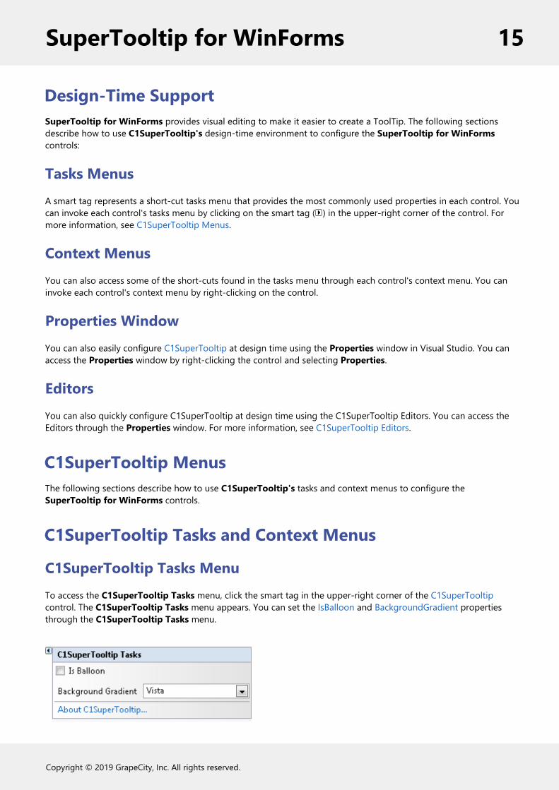
C1SuperTooltip Tasks MenuTo access the C1SuperTooltip Tasks menu, click the smart tag in the upper-right corner of the C1SuperTooltipcontrol. The C1SuperTooltip Tasks menu appears. You can set the IsBalloon and BackgroundGradient propertiesthrough the C1SuperTooltip Tasks menu.
SuperTooltip for WinForms 15
Copyright © 2019 GrapeCity, Inc. All rights reserved.

Is BalloonCheck this checkbox if you want the ToolTip to appear within a balloon shape rather than in a rectangular box.Background GradientSpecifies the background gradient for the ToolTip. You can choose Automatic (current system Visual Style),Blue, Gold, None, Olive, Silver or Vista (Microsoft Vista style).About C1SuperTooltipDisplays the About C1SuperTooltip dialog box containing the version number, along with licensing,registration and purchasing information, and additional online resources.
C1SuperTooltip Context MenuTo access C1SuperTooltip's context menu, right-click the C1SuperTooltip component. The C1SuperTooltip contextmenu appears.
C1SuperLabel Tasks and Context Menus
C1SuperLabel Tasks MenuTo access the C1SuperLabel Tasks menu, click the smart tag in the upper-right corner of the C1SuperLabel control.The C1Label Tasks menu appears. By clicking Edit label you can open the C1SuperLabel Editor.
About C1SuperLabelDisplays the About C1SuperTooltip dialog box containing the version number, along with licensing,registration and purchasing information, and additional online resources.Edit labelOpens the C1SuperLabel Editor so you can begin adding HTML code to create a C1SuperLabel.
C1SuperTooltip Context MenuTo access C1SuperTooltip's context menu, right-click on the C1SuperTooltip component. The C1SuperTooltip contextmenu appears. By selecting Edit label you can open the C1SuperLabel Editor.
C1SuperErrorProvider Tasks and Context Menus
C1SuperErrorProvider Tasks MenuTo access the C1SuperErrorProvider Tasks menu, click the smart tag in the upper-right corner of theC1SuperErrorProvider control. The C1SuperErrorProvider Tasks menu appears.
SuperTooltip for WinForms 16
Copyright © 2019 GrapeCity, Inc. All rights reserved.
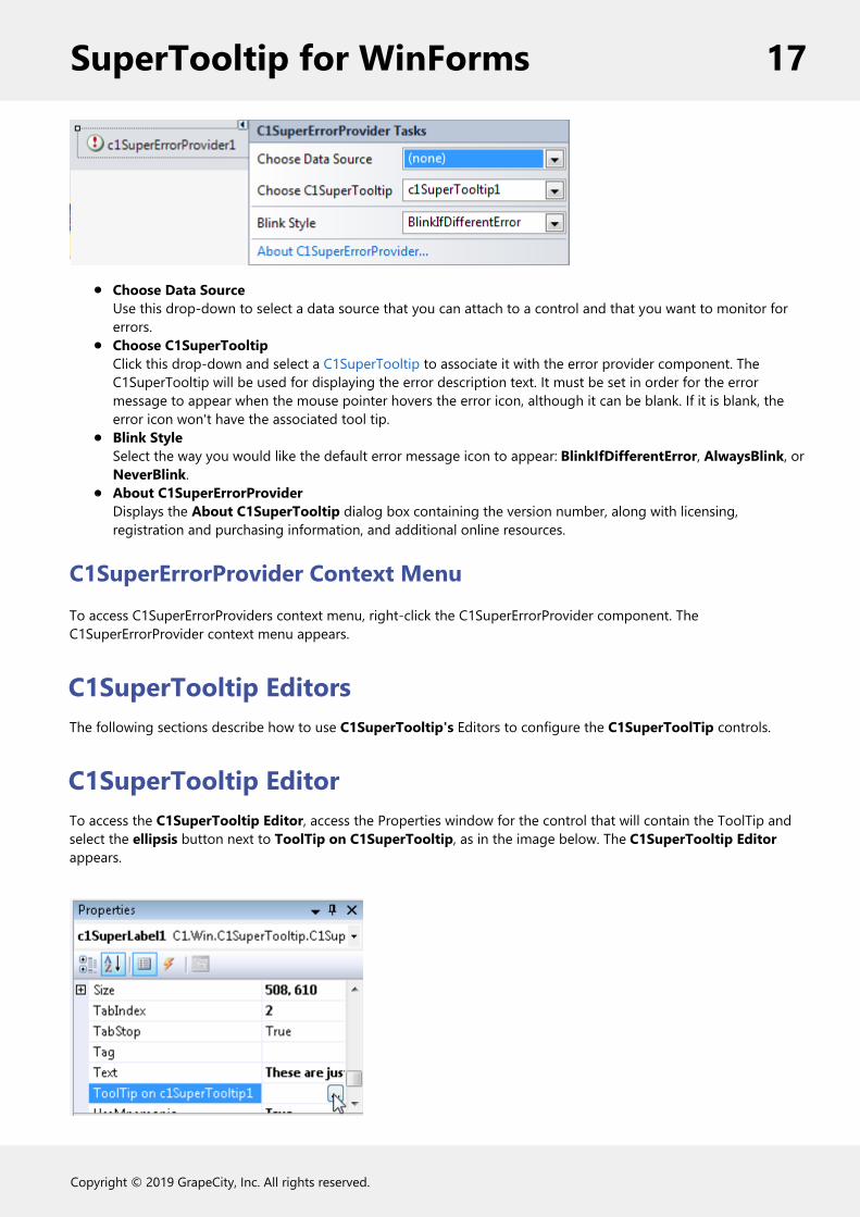
Choose Data SourceUse this drop-down to select a data source that you can attach to a control and that you want to monitor forerrors.Choose C1SuperTooltipClick this drop-down and select a C1SuperTooltip to associate it with the error provider component. TheC1SuperTooltip will be used for displaying the error description text. It must be set in order for the errormessage to appear when the mouse pointer hovers the error icon, although it can be blank. If it is blank, theerror icon won't have the associated tool tip.Blink StyleSelect the way you would like the default error message icon to appear: BlinkIfDifferentError, AlwaysBlink, orNeverBlink.About C1SuperErrorProviderDisplays the About C1SuperTooltip dialog box containing the version number, along with licensing,registration and purchasing information, and additional online resources.
C1SuperErrorProvider Context MenuTo access C1SuperErrorProviders context menu, right-click the C1SuperErrorProvider component. TheC1SuperErrorProvider context menu appears.
C1SuperTooltip EditorsThe following sections describe how to use C1SuperTooltip's Editors to configure the C1SuperToolTip controls.
C1SuperTooltip EditorTo access the C1SuperTooltip Editor, access the Properties window for the control that will contain the ToolTip andselect the ellipsis button next to ToolTip on C1SuperTooltip, as in the image below. The C1SuperTooltip Editorappears.
SuperTooltip for WinForms 17
Copyright © 2019 GrapeCity, Inc. All rights reserved.

The C1SuperTooltip Editor consists of a tabbed design pane on the left, where you can change the appearance andcontent of the ToolTip, and a preview pane on the right, where you can view changes that have been made to theToolTip.
At design time, there are two ways you can create the content of a ToolTip: using the Office tab or using Html tab tomanually enter your own HTML code. You can use the Properties tab to change the ToolTip's appearance andbehavior settings.
Office tabIn the C1SuperToolTip Editor you can use the Office tab to add images, a title, a subtitle, and the body text of theToolTip. C1SuperTooltip automatically creates all of the HTML code behind the ToolTip, saving you time and work.The various elements in the Office tab allow you to quickly customize the content of your ToolTip, for example as inthe image below.
SuperTooltip for WinForms 18
Copyright © 2019 GrapeCity, Inc. All rights reserved.

TitleThis is the text that appears at the top of the ToolTip; you can add HTML code to customize the appearance of thetitle text.
ImageThis is the image that appears to the left of the Title. You can add an image by clicking the drop-down arrow andselecting Add image. Images that you have added using the Edit Image Collection Editor are listed and can be addedto the ToolTip.
Top SeparatorBy checking this check box, you will add the top separator to the ToolTip. The top separator is a horizontal, dark greyrule that appears between the ToolTip's title and the body text.
Body TextThe body text is the main content of the ToolTip; you can add HTML to customize the appearance of the body text.
Bottom SeparatorBy checking this check box, you will add the bottom separator to the ToolTip. The top separator is a horizontal, darkgrey rule that appears between the ToolTip's body text and subtitle text.
SubtitleThis is text that appears below the ToolTip's body text; you can add HTML code to customize the appearance of thetitle text.
SubimageThis is the image that appears to the left of the subtitle. You can add an image by clicking the drop-down arrow andselecting Add image. Images that you have added using the Edit Image Collection Editor are listed and can be addedto the ToolTip.
For more information about creating a ToolTip using the Office tab, see the Creating C1SuperTooltips at Design Timetopic.
Html tabIn the Html tab of the C1SuperToolTip Editor you can view and edit HTML code that reflects changes you havemade in the Office tab. You can also use the Html tab to create a ToolTip by entering all of your own HTML code ifyou choose not to have the editor do it for you. By creating a ToolTip in the Html tab you have more control overeach line of the ToolTip.
The Html tab provides a formatting toolstrip with the following buttons: Cut, Copy, Paste, Bold, Italic, Underline,Bulleted List, Numbered List, and Insert Image.
SuperTooltip for WinForms 19
Copyright © 2019 GrapeCity, Inc. All rights reserved.
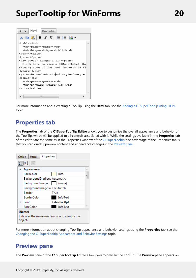
For more information about creating a ToolTip using the Html tab, see the Adding a C1SuperTooltip using HTMLtopic.
Properties tabThe Properties tab of the C1SuperToolTip Editor allows you to customize the overall appearance and behavior ofthe ToolTip, which will be applied to all controls associated with it. While the settings available in the Properties tabof the editor are the same as in the Properties window of the C1SuperTooltip, the advantage of the Properties tab isthat you can quickly preview content and appearance changes in the Preview pane.
For more information about changing ToolTip appearance and behavior settings using the Properties tab, see theChanging the C1SuperTooltip Appearance and Behavior Settings topic.
Preview paneThe Preview pane of the C1SuperToolTip Editor allows you to preview the ToolTip. The Preview pane appears on
SuperTooltip for WinForms 20
Copyright © 2019 GrapeCity, Inc. All rights reserved.

the right side of the C1SuperToolTip Editor and reflects any changes that you make to the ToolTip allowing you tomore easily visualize and change the ToolTip's content and appearance.
C1SuperLabel EditorTo access the C1SuperLabel Editor, select Edit label from the C1SuperLabel Tasks menu. The C1SuperLabel Editorappears.
Using the C1SuperLabel Editor, you can control the content and appearance of the C1SuperLabel. You can enter textand HTML code in the left-side text area of the C1SuperLabel Editor and preview the content in the right-sidepreview area, as in the example below.
The C1SuperLabel Editor also provides a formatting toolstrip with the following buttons: Cut, Copy, Paste, Bold,Italic, Underline, Bulleted List, Numbered List, and Insert Image.
Edit Image Collection EditorYou can add images to be used in the C1SuperToolTip components through the Edit Image Collection editor. Youcan access the Edit Image Collection editor through the Properties window of the C1SuperTooltip component andthe C1SuperLabel control.
Accessing the Edit Image Collection editor from C1SuperTooltip
SuperTooltip for WinForms 21
Copyright © 2019 GrapeCity, Inc. All rights reserved.

To open the Edit Image Collection editor select the C1SuperTooltip control and click the ellipsis button next to theImages property in the Properties window. The Edit Image Collection editor appears.
Accessing the Edit Image Collection editor from C1SuperLabel
To open the Edit Image Collection editor select the C1SuperLabel control and click the ellipsis button next to theImages property in the Properties window. The Edit Image Collection editor appears.
In the left pane of the Edit Image Collection editor you can see what image members have been added and can addand remove images from the collection. In the right pane you can view and change each image's properties, as in theimage below.
Adding an image to C1SuperTooltip controls is easy; for more information see Adding an Image to C1SuperTooltipand Adding an Image to C1SuperLabel.
SuperTooltip for WinForms 22
Copyright © 2019 GrapeCity, Inc. All rights reserved.

C1SuperTooltip ElementsThis section provides a visual and descriptive overview of the elements that comprise the C1SuperToolTip andC1SuperLabel controls.
ToolTip ElementsThe C1SuperTooltip control consists of several elements that can be modified through the Office tab of theC1SuperTooltip Editor. For more information about the C1SuperTooltip Editor and these elements, please see theOffice tab topic.
Note: If you choose to add HTML code directly to the C1SuperTooltip or add a C1SuperTooltipprogrammatically, elements will not be automatically added and must be formatted manually through the HTMLcode (for example adding a separator by adding the <hr> horizontal rule tag).
TitleThis is the text that appears at the top of the ToolTip; you can add HTML code to customize the appearance of thetitle text.
ImageThis is the image that appears to the left of the Title. You can add an image through the C1SuperTooltip Editor oryou can add an image to the collection by using the Edit Image Collection Editor.
Top SeparatorThe top separator is a horizontal rule that appears between the ToolTip's title and the body text. You can add a topseparator through the Office tab of the C1SuperTooltip Editor or you can add a horizontal rule to the HTML code byusing the <hr> tag.
Body TextThe body text is the main content of the ToolTip; you can add HTML to customize the appearance of the body text.
SuperTooltip for WinForms 23
Copyright © 2019 GrapeCity, Inc. All rights reserved.

Bottom SeparatorThe bottom separator is a horizontal rule that appears between the ToolTip's body text and subtitle. You can add abottom separator through the Office tab of the C1SuperTooltip Editor or you can add a horizontal rule to the HTMLcode by using the <hr> tag.
SubtitleThis is text that appears below the ToolTip's body text; you can add HTML code to customize the appearance of thesubtitle text.
SubimageThis is the image that appears to the left of the subimage. You can add an image through the C1SuperTooltip Editoror you can add an image to the collection by using the Edit Image Collection Editor.
For more information about creating a ToolTip using the Office tab, see the Creating C1SuperTooltips at Design Timetopic.
Label ElementsThe C1SuperLabel control consists of a main body in which HTML content can be added. In the following example, atable was added to the label using HTML. For more information, see the Creating C1SuperLabels topic.
You can also quickly add and preview content using the C1SuperLabel Editor. For more information about the editor,see the C1SuperLabel Editor topic.
ErrorProvider ElementsThe C1SuperErrorProvider control consists of an icon image, along with any formatted HTML text you want to includeto indicate an error.
For more information on providing error messages, see the Creating C1SuperErrorProvider Error Messages topic.
SuperTooltip for WinForms 24
Copyright © 2019 GrapeCity, Inc. All rights reserved.
C1SuperTooltip AppearanceThis section provides a visual and descriptive overview of the settings available to customize the appearance of theSuperTooltip for WinForms controls.
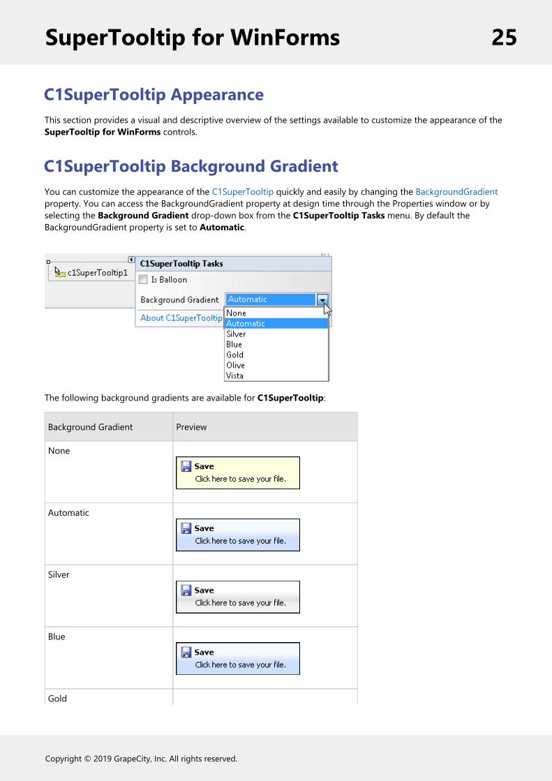
C1SuperTooltip Background GradientYou can customize the appearance of the C1SuperTooltip quickly and easily by changing the BackgroundGradientproperty. You can access the BackgroundGradient property at design time through the Properties window or byselecting the Background Gradient drop-down box from the C1SuperTooltip Tasks menu. By default theBackgroundGradient property is set to Automatic.
The following background gradients are available for C1SuperTooltip:
Background Gradient Preview
None
Automatic
Silver
Blue
Gold
SuperTooltip for WinForms 25
Copyright © 2019 GrapeCity, Inc. All rights reserved.
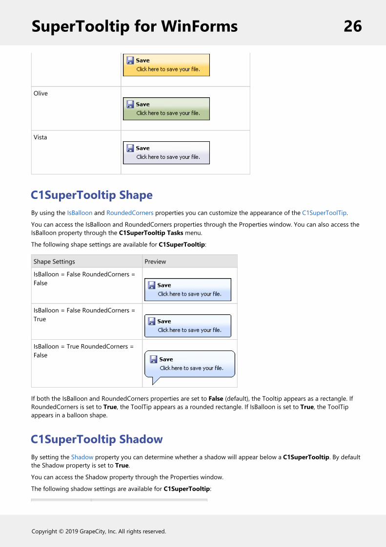
Olive
Vista
C1SuperTooltip ShapeBy using the IsBalloon and RoundedCorners properties you can customize the appearance of the C1SuperToolTip.
You can access the IsBalloon and RoundedCorners properties through the Properties window. You can also access theIsBalloon property through the C1SuperTooltip Tasks menu.
The following shape settings are available for C1SuperTooltip:
Shape Settings Preview
IsBalloon = False RoundedCorners =False
IsBalloon = False RoundedCorners =True
IsBalloon = True RoundedCorners =False
If both the IsBalloon and RoundedCorners properties are set to False (default), the Tooltip appears as a rectangle. IfRoundedCorners is set to True, the ToolTip appears as a rounded rectangle. If IsBalloon is set to True, the ToolTipappears in a balloon shape.
C1SuperTooltip ShadowBy setting the Shadow property you can determine whether a shadow will appear below a C1SuperTooltip. By defaultthe Shadow property is set to True.
You can access the Shadow property through the Properties window.
The following shadow settings are available for C1SuperTooltip:
SuperTooltip for WinForms 26
Copyright © 2019 GrapeCity, Inc. All rights reserved.

Shape Settings Preview
Shadow = True
Shadow = False
SuperTooltip for WinForms 27
Copyright © 2019 GrapeCity, Inc. All rights reserved.

SuperTooltip for WinForms SamplesPlease be advised that this ComponentOne software tool is accompanied by various sample projects and/or demoswhich may make use of other development tools included with the ComponentOne Studio.
Please refer to the pre-installed product samples through the following path:
Documents\ComponentOne Samples\WinFormsThe following tables provide a short description for each sample.
Visual Basic and C# SamplesSuperTooltip for WinForms includes the following Visual Basic and C# samples:
Sample Description
SuperErrorProvider This sample shows how to use the C1SuperErrorProvider component with data sources andindividual controls.
SuperLabels Demonstrates the different items that can be place within C1SuperLabel controls, such aslists, tables, preformatted text and images. This sample uses the C1SuperLabel control.
SuperTooltips Demonstrates the different items that can be placed within C1SuperTooltip controls, suchas lists, tables, preformatted text and images. This sample uses the C1SuperTooltip control.
GridTips Demonstrates two methods that can be used to show a C1SuperTooltip control ondemand. This sample uses the C1SuperTooltip and C1FlexGrid controls.
ShowTooltips Demonstrates the Show() and Hide() methods in the standard ToolTip and C1SuperTooltipcontrols. This sample uses the C1SuperTooltip control.
TextDrivenSuperTooltip(C# only)
Shows how you can load SuperTooltips from an XML file at run time.
ThumbnailTips Demonstrates how to build ToolTips with dynamically generated thumbnail images. Thissample uses the C1Chart, C1FlexGrid, and C1SuperTooltip controls.
SuperTooltip for WinForms 28
Copyright © 2019 GrapeCity, Inc. All rights reserved.

SuperTooltip for WinForms Task-Based HelpThe task-based help assumes that you are familiar with programming in Visual Studio, and know how to use boundand unbound controls in general. If you are a novice to the SuperTooltip for WinForms product, please see theSuperTooltip for WinForms Quick Start first.
Each topic provides a solution for specific tasks using the SuperTooltip for WinForms product. By following the stepsoutlined in the help, you will be able to create projects demonstrating a variety of SuperTooltip for WinFormsfeatures.
Each task-based help topic also assumes that you have created a new .NET project.
Creating C1SuperTooltipsThe following topics explain how to create C1SuperTooltips at design time using the C1SuperTooltip Editor, incode, by using cascading style sheets, and using HTML, as well as how to add multiple ToolTips, adjustC1SuperTooltip appearance and behavior settings, and add images to ToolTips.
Creating C1SuperTooltips at Design TimeC1SuperTooltip provides a design-time editor, C1SuperTooltip Editor, to simplify the process of creating ToolTips inyour applications. The following topic will show you how to create ToolTips and change their appearance andbehavior using this editor. A ToolTip is used to display helpful information when a mouse hovers over an item in anapplication. Usually ToolTips contain only plain text. Using C1SuperTooltip, you can display HTML content, includingimages, tables, and numbered, bulleted, or nested lists.
You can associate C1SuperTooltip with any System.Windows.Forms control or System.Windows.Forms.ToolStripItem.
To add a C1SuperTooltip to your application:
1. Double-click the C1SuperTooltip component in the Toolbox to add it to your form.2. Select the control you would like associated with the C1SuperTooltip.3. In the Properties window, click the ellipsis button next to the ToolTip on C1SuperTooltip1 property. The
C1SuperTooltip Editor appears.
SuperTooltip for WinForms 29
Copyright © 2019 GrapeCity, Inc. All rights reserved.

At design time, there are two ways you can create the content of your ToolTip: either using the Office tab orusing Html tab to manually enter your own HTML code. In this example, we will use the Office tab, but clickthe Html tab and enter your code there, if desired. When you use the Office tab, C1SuperTooltipautomatically creates the HTML code behind the ToolTip for you.
4. To set up your ToolTip:1. Enter a title for the ToolTip in the Title field. The title will appear to the right of the image, if any.2. Click the drop-down arrow next to the Image property to find and select an image to appear next to
the ToolTip title.3. Check the Top Separator checkbox if you want a divider line to appear after the title text, separating
the title from the body text of the ToolTip.4. Enter the text for the C1SuperTooltip in the Body Text field.5. Check the Bottom Separator check box if you want a divider line to appear after the body text of the
ToolTip, separating it from the subtitle.6. Enter a subtitle for the ToolTip in the Subtitle filed. The subtitle will appear to the right of the subimage,
if any.7. Click the drop-down arrow next to the Subimage property to find and select an image to appear next
to the subtitle.
A preview of the ToolTip appears in the Preview window.
5. Select the Properties tab and set the desired properties for C1SuperTooltip1. You can do things such as:change ToolTip text and background color, add a background image, or modify how long and how quickly aToolTip window is displayed. For a complete list of properties, see C1SuperTooltip Properties.
When you run the application and mouse over the control associated with a C1SuperTooltip, the ToolTipappears.
Creating a C1SuperTooltip ProgrammaticallyThe following topic explains how to create C1SuperTooltips in code. You can specify the C1SuperTooltip text andassociate it with a control using the SetToolTip method.
In the SetToolTip method, specify the control or Windows.Forms.ToolStripItem to associate with the ToolTip first,and then add the string, or the HTML code used to create the ToolTip text.
The code for the SetToolTip method looks like this:
C1SuperTooltip1.SetToolTip(Control, String)
or
C1SuperTooltip1.SetToolTip(ToolStripItem, String)
SuperTooltip for WinForms 30
Copyright © 2019 GrapeCity, Inc. All rights reserved.

Note: In the following examples an embedded resource containing an image is used. To embed a resource,select Project | YourProjectName Properties. Select Add Resource and choose to add an existing file,NewDoc.png in this example, or add a new one. Then, in the Solution Explorer, select the resource file and setBuild Action to Embedded Resource in the Properties window.
To create a C1SuperTooltip for a control programmatically:1. Add a C1SuperTooltip control and the control to associate it with to your form. In this example, we will use a
Button1 control.2. Add the following code to the Form_Load event. This code uses an embedded resource that contains an
image, NewDoc.png, but any image can be used.
To write code in Visual Basic
Visual Basic
C1SuperTooltip1.SetToolTip(Button1, "<table><tr>" + _"<td><img src='NewDoc.png'></td>" + _"<th>New Document</th>" + "</tr></table>")
To write code in C#
C#
c1SuperTooltip1.SetToolTip(button1, "<table><tr>" +"<td><img src='NewDoc.png'></td>" +"<th>New Document</th>" + "</tr></table>");
3. Run your project. The code creates a C1SuperTooltip like the following.
To create a C1SuperTooltip for a ToolStripItem programmatically:1. Add a C1SuperTooltip control and a System.Windows.ToolStrip control to your form. In this example, we
have added buttons to the ToolStrip.2. Add the following code to the Form_Load event. This code uses an embedded resource that contains an
image, NewDoc.png, but any image can be used.
To write code in Visual Basic
Visual Basic
' hide the default ToolTip so only the C1SuperTooltip is visibleToolStripButton1.AutoToolTip = FalseC1SuperTooltip1.SetToolTip(ToolStripButton1, "<table><tr>" + _
SuperTooltip for WinForms 31
Copyright © 2019 GrapeCity, Inc. All rights reserved.

"<td><img src='NewDoc.png'></td>" + _"<th>New Document</th>" + "</tr></table>")
To write code in C#
C#
// hide the default ToolTip so only the C1SuperTooltip is visibletoolStripButton1.AutoToolTip = false;c1SuperTooltip1.SetToolTip(toolStripButton1, "<table><tr>" +"<td><img src='NewDoc.png'></td>" +"<th>New Document</th>" + "</tr></table>");
3. Run your project. The code creates a C1SuperTooltip like the following:
For more information, see the SetToolTip method.
Creating a C1SuperTooltip using a Cascading Style SheetThe following topic explains how to apply a cascading style sheet to your ToolTips for complete control over how andwhere they appear within your application. SuperTooltip for WinForms supports most HTML features, includingcascading style sheets, which offer you greater control over how and where ToolTips appear in your applications.Simply create a cascading style sheet within your code, create your ToolTip, and apply the style sheet styles to theToolTip.
In the following example, we will create a Microsoft Vista-style ToolTip identical to the one created using theC1SuperTooltip Editor in the Creating C1SuperTooltips at Design Time topic, only this ToolTip will be created in codeand use a cascading style sheet. The code in the following steps was placed within the Form_Load event.
1. Create the cascading style sheet.
To write code in Visual Basic
Visual Basic
Dim myCSS As String
'create the cascading style sheetmyCSS = "<style type='text/css'>" + _".header{font-family: tahoma; font-weight: bold; margin-left: 2px; vertical-align:middle}" + _".body{font-family: tahoma; margin-left: 8px}" + _"img{vertical-align: middle}" + _"td{vertical-align:middle}" + _"p{border-bottom: medium solid #999999; border-bottom-width:1px}" + _"</style>"
SuperTooltip for WinForms 32
Copyright © 2019 GrapeCity, Inc. All rights reserved.

To write code in C#
C#
string myCSS;
//create the cascading style sheetmyCSS = "<style type='text/css'>" +".header{font-family: tahoma; font-weight: bold; margin-left: 2px; vertical-align:middle}" +".body{font-family: tahoma; margin-left: 8px}" +"img{vertical-align: middle}" +"td{vertical-align:middle}" +"p{border-bottom: medium solid #999999; border-bottom-width:1px}" +"</style>";
2. Create the header and body text of the ToolTip, and apply styles from the cascading style sheet.
To write code in Visual Basic
Visual Basic
Dim TipBuilder, TipBody, TipHeader As String ' create the header, or title, of the ToolTipTipHeader = "<div class='header'>" + "Copy" + "</div>" 'create the body text of the ToolTipTipBody = "<table width=160px>" + _ "<tr>" + _ "<td>" + _ "<div class='body'>" + "Copy the selection and put" + "it<br>on the Clipboard." + "</div>" + _ "</td>" + _ "</tr>" + _ "</table>" + _ "<p></p>" + _ "<table cellpadding=0>" + _ "<tr>" + _ "<td>" + _ "<img src='HelpButton.png'>" + _ "</td>" + _ "<td>" + _ "<div class='header'>" + _ "Press F1 for help." + _ "</div>" + _ "</tr>" + _ "</table>"
To write code in C#
C#
string TipBuilder, TipBody, TipHeader; // create the header, or title, of the ToolTip
SuperTooltip for WinForms 33
Copyright © 2019 GrapeCity, Inc. All rights reserved.

TipHeader = "<div class='header'>" + "Copy" + "</div>";//create the body text of the ToolTipTipBody = "<table width=160px>" + "<tr>" + "<td>" + "<div class='body'>" + "Copy the selection and put" + "it<br>on the Clipboard." + "</div>" + "</td>" + "</tr>" + "</table>" + "<p></p>" + "<table cellpadding=0>" + "<tr>" + "<td>" + "<img src='HelpButton.png'>" + "</td>" + "<td>" + "<div class='header'>" + "Press F1 for help." + "</div>" + "</tr>" + "</table>";
Note: In this example an embedded resource containing an image is used. To embed a resource, selectProject | YourProjectName Properties. Select Add Resource and choose to add an existing file,HelpButton.png in this example, or add a new one. Then, in the Solution Explorer, select the resource fileand set Build Action to Embedded Resource in the Properties window.
3. Combine the separate parts of the ToolTip, and apply the cascading style sheet.
To write code in Visual Basic
Visual Basic
' Combine the ToolTip header and body, and apply the cascading style sheet.TipBuilder = myCSS + TipHeader + TipBody
To write code in C#
C#
// Combine the ToolTip header and body, and apply the cascading style sheet.TipBuilder = myCSS + TipHeader + TipBody;
4. Add the Vista formatting and associate the ToolTip with the button control.
To write code in Visual Basic
Visual Basic
' apply the Vista background gradient and associate the ToolTip with Button1C1SuperTooltip1.BackgroundGradient = C1.Win.C1SuperTooltip.BackgroundGradient.VistaC1SuperTooltip1.SetToolTip(Button1, TipBuilder)
To write code in C#
SuperTooltip for WinForms 34
Copyright © 2019 GrapeCity, Inc. All rights reserved.

C#
// apply the Vista background gradient and associate the ToolTip with Button1c1SuperTooltip1.BackgroundGradient = C1.Win.C1SuperTooltip.BackgroundGradient.Vista;c1SuperTooltip1.SetToolTip(button1, TipBuilder);
5. Run the project and mouse over the button associated with C1SuperTooltip1. The Vista-style ToolTip appears.
Adding a C1SuperTootip using HTMLIf you choose to create a ToolTip by using all of your own HTML code, you can enter it on the Html tab of the C1SuperTooltip Editor.
To add a C1SuperTooltip using HTML, complete the following steps:
1. In your project, select the control for which you are creating a C1SuperTooltip.2. In the Properties window, click the ellipsis button next to the ToolTip on C1SuperTooltip1 property for the control to open the C1SuperTooltip Editor.3. Select the Html tab.4. Enter the following HTML code in the Html text box:
<span style='font: 12pt Arial; color:blue'>Click here to view a <b>C1SuperLabel</b> showing<br> some of the cool features of <b>C1SuperTooltip</b>.</span>
A preview of the C1SuperTooltip appears in the Preview window.
5. Click the Properties tab. Notice the ForeColor property is set to InfoText and the Font property is set to Tahoma, 8pt, by default, but the preview of the ToolTip shows the forecolor as blue and the font as Arial,12pt. This is because when <span> tags are used to format the text in your HTML code, they cannot be overwritten by the properties specified in the Properties tab of the editor.
6. Click OK to close the editor.
Adding Multiple C1SuperTooltipsYou can also add multiple ToolTips to a project. You may want to do this if you are not formatting the ToolTips withyour own HTML code and you want the appearance properties of the ToolTips to be different. You could also do thiswhen you want the behavior properties of the ToolTips to be different, regardless of how you created them.
When you add more than one ToolTip, make sure you specify the correct ToolTip for the control with which you wantit to be associated. If you specify multiple ToolTips for one control, all specified ToolTips appear when you run theproject and mouse over the control.
1. Suppose you have a project with two buttons on the form. Add two C1SuperTooltip controls.2. Select Button1 and click the ellipsis button next to the ToolTip on C1SuperTooltip1 property in the
Properties window. The C1SuperTooltip Editor appears.
SuperTooltip for WinForms 35
Copyright © 2019 GrapeCity, Inc. All rights reserved.

3. Create your ToolTip using the Office tab or by adding HTML code on the Html tab.4. Set some of the properties on the Properties tab and click OK.5. Select Button2 and click the ellipsis button next to the ToolTip on C1SuperTooltip2 property in the
Properties window.6. In the C1SuperTooltip Editor, create the second ToolTip and click the Properties tab.7. Set some properties using different values than you used for C1SuperTooltip1.8. Click OK to close the editor. The ToolTip on C1SuperTooltip1 property will remain empty for Button2.9. Run the project and mouse over each button. Notice how the C1SuperTooltip1 appears when you mouse over
Button1, and C1SuperTooltip2 appears when you mouse over Button2. The styles and behaviors will bedifferent, depending on the settings you used.
Changing the C1SuperTooltip Appearance and BehaviorSettingsYou can change the appearance and behavior settings of your ToolTips two different ways: using the C1SuperTooltipEditor or using the C1SuperTooltip control, through its smart tag and the Properties window.
Changing the settings in the C1SuperTooltip Editor
In the C1SuperTooltip Editor, you can use the Office tab to add images, a title, a subtitle, and the body text of theToolTip. C1SuperTooltip automatically creates all of the HTML code behind the ToolTip, saving you time and work.You can create the same ToolTip by entering all of your own HTML code on the Html tab of the editor if you choosenot to have the editor do it for you. When using these two tabs, the changes you make and the settings you specifyare applied only to the ToolTip for the control you have selected in your form.
The Properties tab, however, allows you to change the overall appearance and behavior of the ToolTip, which will beapplied to all controls associated with it.
1. In your project, select the control for which you are creating a C1SuperTooltip.2. In the Properties window, click the ellipsis button next to the ToolTip on C1SuperTooltip1 property for the
control to open the C1SuperTooltip Editor.3. Select the Properties tab.
SuperTooltip for WinForms 36
Copyright © 2019 GrapeCity, Inc. All rights reserved.
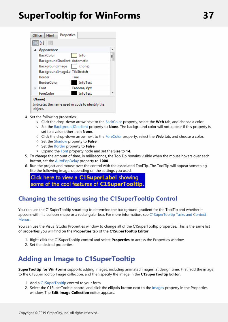
4. Set the following properties:Click the drop-down arrow next to the BackColor property, select the Web tab, and choose a color.Set the BackgroundGradient property to None. The background color will not appear if this property isset to a value other than None.Click the drop-down arrow next to the ForeColor property, select the Web tab, and choose a color.Set the Shadow property to False.Set the Border property to False.Expand the Font property node and set the Size to 14.
5. To change the amount of time, in milliseconds, the ToolTip remains visible when the mouse hovers over eachbutton, set the AutoPopDelay property to 1000.
6. Run the project and mouse over the control with the associated ToolTip. The ToolTip will appear somethinglike the following image, depending on the settings you used.
Changing the settings using the C1SuperTooltip ControlYou can use the C1SuperTooltip smart tag to determine the background gradient for the ToolTip and whether itappears within a balloon shape or a rectangular box. For more information, see C1SuperTooltip Tasks and ContextMenus.
You can use the Visual Studio Properties window to change all of the C1SuperTooltip properties. This is the same listof properties you will find on the Properties tab of the C1SuperTooltip Editor.
1. Right-click the C1SuperTooltip control and select Properties to access the Properties window.2. Set the desired properties.
Adding an Image to C1SuperTooltipSuperTooltip for WinForms supports adding images, including animated images, at design time. First, add the imageto the C1SuperTooltip Image collection, and then specify the image in the C1SuperTooltip Editor.
1. Add a C1SuperTooltip control to your form.2. Select the C1SuperTooltip control and click the ellipsis button next to the Images property in the Properties
window. The Edit Image Collection editor appears.
SuperTooltip for WinForms 37
Copyright © 2019 GrapeCity, Inc. All rights reserved.
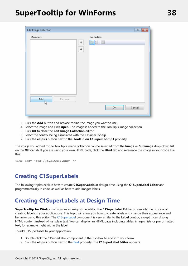
3. Click the Add button and browse to find the image you want to use.4. Select the image and click Open. The image is added to the ToolTip's image collection.5. Click OK to close the Edit Image Collection editor.6. Select the control being associated with the C1SuperTooltip.7. Click the ellipsis button next to the ToolTip on C1SuperTooltip1 property.
The image you added to the ToolTip's image collection can be selected from the Image or Subimage drop-down liston the Office tab. If you are using your own HTML code, click the Html tab and reference the image in your code likethis:
<img src= "res://mybitmap.png" />
Creating C1SuperLabelsThe following topics explain how to create C1SuperLabels at design time using the C1SuperLabel Editor andprogrammatically in code, as well as how to add images labels.
Creating C1SuperLabels at Design TimeSuperTooltip for WinForms provides a design-time editor, the C1SuperLabel Editor, to simplify the process ofcreating labels in your applications. This topic will show you how to create labels and change their appearance andbehavior using this editor. The C1SuperLabel component is very similar to the Label control, except it can displayHTML content instead of just plain text. You can display an HTML page including tables, images, lists or preformattedtext, for example, right within the label.
To add C1SuperLabel to your application:
1. Double-click the C1SuperLabel component in the Toolbox to add it to your form.2. Click the ellipsis button next to the Text property. The C1SuperLabel Editor appears.
SuperTooltip for WinForms 38
Copyright © 2019 GrapeCity, Inc. All rights reserved.
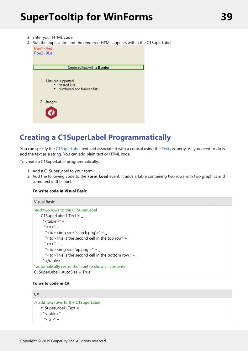
3. Enter your HTML code.4. Run the application and the rendered HTML appears within the C1SuperLabel.
Creating a C1SuperLabel ProgrammaticallyYou can specify the C1SuperLabel text and associate it with a control using the Text property. All you need to do isadd the text as a string. You can add plain text or HTML code.
To create a C1SuperLabel programmatically:
1. Add a C1SuperLabel to your form.2. Add the following code to the Form_Load event. It adds a table containing two rows with two graphics and
some text in the label:
To write code in Visual Basic
Visual Basic
'add two rows to the C1SuperLabel C1SuperLabel1.Text = _ "<table>" + _ "<tr>" + _ "<td><img src='search.png'>" + _ "<td>This is the second cell in the top row" + _ "<tr>" + _ "<td><img src='up.png'>" + _ "<td>This is the second cell in the bottom row." + _ "</table>"' automatically resize the label to show all contentsC1SuperLabel1.AutoSize = True
To write code in C#
C#
// add two rows to the C1SuperLabel c1SuperLabel1.Text = "<table>" + "<tr>" +
SuperTooltip for WinForms 39
Copyright © 2019 GrapeCity, Inc. All rights reserved.
"<td><img src='search.png'>" + "<td>This is the second cell in the top row" + "<tr>" + "<td><img src='up.png'>" + "<td>This is the second cell in the bottom row." + "</table>";// automatically resize the label to show all contentsc1SuperLabel1.AutoSize = true;
3. Run your project. The code creates a C1SuperLabel like the following:
Note: In this example embedded resources containing images are used: search.png and up.png. To embed aresource, select Project | YourProjectName Properties. Select Add Resource and choose to add an existingfile or add a new one. Then, in the Solution Explorer, select the resource file and set Build Action to EmbeddedResource in the Properties window.
For more information, see the Text property.
Adding an Image to C1SuperLabelSuperTooltip for WinForms supports adding images, including animated images, at design time. First, add the imageto the C1SuperTooltip Image collection, and then specify the image in the C1SuperTooltip Editor.
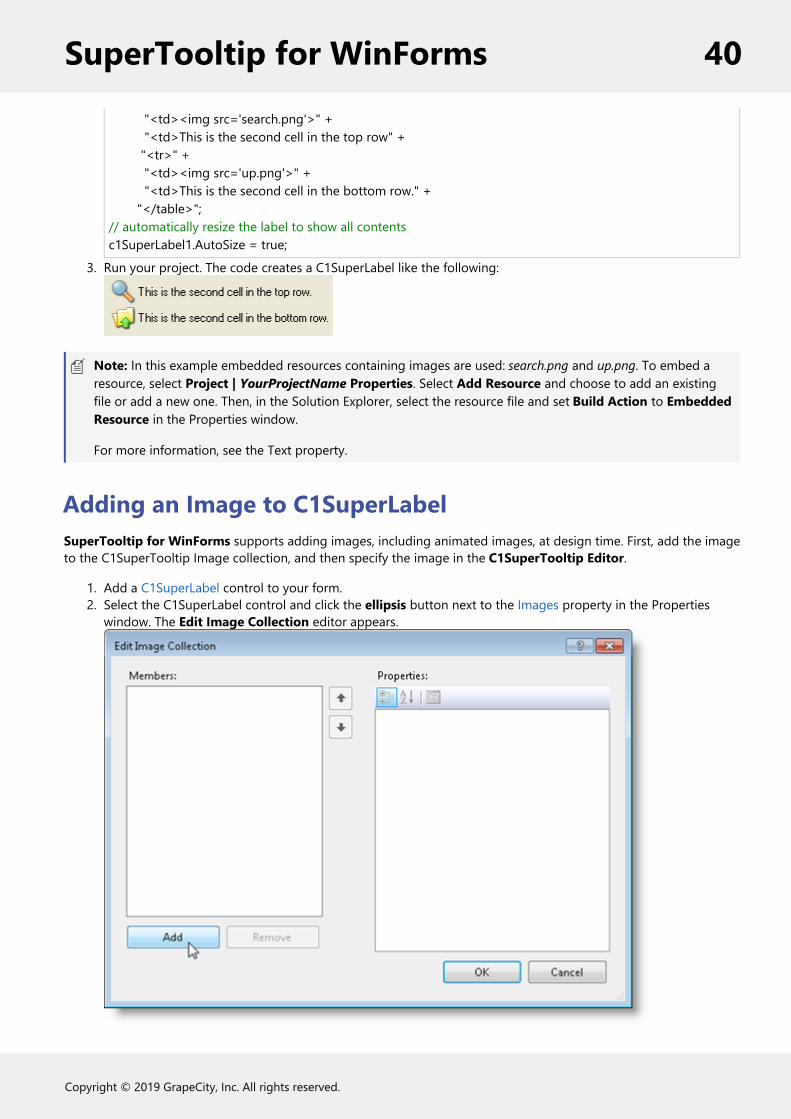
1. Add a C1SuperLabel control to your form.2. Select the C1SuperLabel control and click the ellipsis button next to the Images property in the Properties
window. The Edit Image Collection editor appears.
SuperTooltip for WinForms 40
Copyright © 2019 GrapeCity, Inc. All rights reserved.

3. Click the Add button and browse to find the image you want to use.4. Select the image and click Open. The image is added to the ToolTip's image collection.5. Click OK to close the Edit Image Collection editor.6. Click the ellipsis button next to the Text property.
When you enter your HTML code, the image you added to the label's image collection can be referenced in the codelike this:
<img src= "res://mybitmap.png" />
Creating C1SuperErrorProvider Error MessagesThe following topics explain how to create an error message, change the error message icon, use theC1SuperErrorProvider control with a data source, and more.
Creating an Error MessageYou can create an HTML formatted error message to pop up for a control. In this example, we'll add an error messagefor a text box named txtCountry.
1. Add a C1SuperErrorProvider control to your form. A C1SuperTooltip is automatically added to the form andconnected with the C1SuperErrorProvider control.
2. Select Code in the Visual Studio View menu.3. Add the following code to the Form_Load event:
To write code in Visual Basic
Visual Basic
C1SuperErrorProvider1.SetError(txtCountry,"<b>Invalid Country</b><br/>" & "<p>The <b>Country</b> field is required. We need it in order to ship the product.</p>")
To write code in C#
C#
c1SuperErrorProvider1.SetError(txtCountry, "<b>Invalid Country</b><br/>" + "<p>The <b>Country</b> field is required. We need it in order to ship the product.</p>");
When you run the project and mouse over the error message icon, the error message looks like the followingexample:
SuperTooltip for WinForms 41
Copyright © 2019 GrapeCity, Inc. All rights reserved.

Changing the Error Message IconWhen you create an error message with C1SuperErrorProvider, a default warning icon is used . You can change thisto any icon file you like using the Icon property. Assuming you have a C1SuperErrorProvider control on you form,follow these steps to change the error message icon:
1. Right-click the C1SuperErrorProvider control and select Properties to open the Visual Studio Propertieswindow.
2. Click the ellipsis button next to the Icon property.3. Choose an icon file (*.ico) and click Open.
When you run your project, notice the new icon image used for the error message.
Changing the Error Message Blink StyleWhen you create an error message with C1SuperErrorProvider, by default, the error message icon blinks. You have theoption of making it blink sometimes, always, or never. It stops blinking when you click on it. To specify the blink style,follow these steps:
1. Add a C1SuperErrorProvider control to your form.2. Click the C1SuperErrorProvider smart tag to open the Tasks menu.3. Click the drop-down arrow next to the BlinkStyle property and select BlinkIfDifferentError, AlwaysBlink, or
NeverBlink.
Showing an Image when the Error Icon is HoveredYou can use the ImageHot property to provide feedback in the form of an image when the mouse pointer hovers overthe error icon.
To show an image when the error icon is hovered, follow these steps:
1. Add a C1SuperErrorProvider control to your form. A C1SuperTooltip is automatically added to the form andconnected with the C1SuperErrorProvider control.
2. Select Code in the Visual Studio View menu.3. Add the following code to the Form_Load event:
To write code in Visual Basic
Visual Basic
C1SuperErrorProvider1.ImageHot = System.Drawing.Image.FromFile("c:\\MyFiles\\Level1Warning.bmp")
To write code in C#
SuperTooltip for WinForms 42
Copyright © 2019 GrapeCity, Inc. All rights reserved.

C#
c1SuperErrorProvider1.ImageHot = System.Drawing.Image.FromFile("c:\\MyFiles\\Level1Warning.bmp");
Using C1SuperErrorProvider with Data SourcesUse the C1SuperErrorProvider control with a data source to indicate an error to users. The C1SuperErrorProvider mustbe associated with a C1SuperTooltip in order to appear, although the tooltip can be blank. When you add aC1SuperErrorProvider control to your form, a C1SuperTooltip is automatically added and connected with it.
This topic assumes you have a button, text box, and data source on your form, similar to the following image:
1. Add a C1SuperErrorProvider control to your form.2. Click the C1SuperErrorProvider smart tag to open the Tasks menu.3. Click the drop-down arrow next to Choose DataSource and select the data source on your form.4. Use the DataRow.SetColumnError method to associate an error message with the given data field:
To write code in Visual Basic
Visual Basic
Private Sub Button1_Click(ByVal sender As System.Object, ByVal e As System.EventArgs) Handles Button1.Click DirectCast(bs.Current, DataRowView).Row.SetColumnError("LastName", "Here is the warning message!")End Sub
To write code in C#
C#
private void button1_Click(object sender, EventArgs e) { ((DataRowView)bs.Current).Row.SetColumnError("LastName", "Here is the warning message!"); }
SuperTooltip for WinForms 43
Copyright © 2019 GrapeCity, Inc. All rights reserved.

5. Add the necessary code to the Form_Load event to bind the text box to the data source. In this example, thetext box is bound to an .xml file.
To write code in Visual Basic
Visual Basic
Private Sub Form1_Load(ByVal sender As System.Object, ByVal e As System.EventArgs) Handles MyBase.Load ds.DataSetName = "AuthorsDataSet" ds.ReadXml("..\..\authors.xml", System.Data.XmlReadMode.Auto) bs.DataMember = "authors" TextBox1.DataBindings.Add(New Binding("Text", bs, "LastName"))End Sub
To write code in C#
C#
private void Form1_Load(object sender, EventArgs e) { ds.DataSetName = "AuthorsDataSet"; ds.ReadXml(@"..\..\authors.xml", System.Data.XmlReadMode.Auto); bs.DataMember = "authors"; textBox1.DataBindings.Add(new Binding("Text", bs, "LastName")); }
6. Press F5 to run the project and then click the button. The warning icon appears, and if you mouse over it, themessage appears.
SuperTooltip for WinForms 44
Copyright © 2019 GrapeCity, Inc. All rights reserved.