summarizing data graphically - information for...
TRANSCRIPT

211
4Summarizing
Data Graphically
O U T L I N E
4.1 Introduction
4.2 What Are We Summarizing?
4.2.1 Types of Variables4.2.2 What? How? Who? When?4.2.3 Distribution of a Variable
4.3 Displaying Distributions—Qualitative Variables
4.3.1 Pie Charts4.3.2 Bar Graphs4.3.3 Displaying Relationships between Two
Qualitative Variables
4.4 Displaying Distributions—QuantitativeVariables
4.4.1 Frequency Plots4.4.2 Shapes of Distributions4.4.3 Stem-and-Leaf Plots4.4.4 Histograms4.4.5 Time Plots4.4.6 Scatterplots
4.5 Guidelines for Plots, Graphs, and Pictures
■ Introduce different graphical displays and the role they play in the decision-making process.
■ Distinguish between qualitative and quantitative variables.
■ Learn how to formulate and display the distribution of a variable.
■ Learn how to read information from a pie chart and a bar graph.
■ Understand when to use a frequency plot, a histogram, and a time plot.
■ Be able to recognize the various shapes for distributions.
■ Understand how to display relationships between two variables.
■ Understand and follow the guidelines for plots, graphs, and pictures.
O B J E C T I V E S
*Optional sections
ALIAMC04_0131497561.QXD 04/14/2005 03:23 PM Page 211

212 CHAPTER 4 SUMMARIZING DATA GRAPHICALLY
4.1 INTRODUCTIONWe have a theory that we wish to test. Wecollect data to help us check the theory. Welook at the data and summarize the results.In Chapters 2 and 3, we studied how thedata are obtained. Once we have collectedthe data, we must “get acquainted” with thedata. In Chapters 4, 5, and 6, we will learnhow to take our data, our collection of meas-urements, and summarize them in usefulways. One of the most useful ways to look atdata is through an appropriate picture of thedata—a graph or a plot. Chapter 4 will focuson how to produce graphical displays of ourdata.We will enhance our graphical displaysby presenting various numerical summariesof the data in Chapter 5.A common numerical summary is the mean or average. In Chapter 6,we will take the graphical display of our data, which is based on a sample, and try to find acorresponding model to represent the results for the population.
We start out in this chapter by noting that there are different types of data. We mightmeasure a subject’s gender (say, male) and height (say, 69.5 inches). Sometimes the meas-urement may be a name; sometimes it will be a numerical value. Different types of data leadto different types of graphical displays. We will learn which graphical displays are appropri-ate for which types of data, and how to make them.We will include examples of common mis-takes that are made in presenting the data pictorially, which can lead to misinterpretation ofthe results.The goal of this chapter is to demonstrate the usefulness of a plot or graph, whendone well, in providing a visual summary of the data that have been collected.
4.2 WHAT ARE WE SUMMARIZING?Data Set 1 contains various measurements on 20 individuals. These individuals were part ofa medical study assessing both the ability of a new drug to reduce blood pressure and therelationship between the dosage of the drug and the amount of reduction in blood pressure.Important characteristics that could influence blood pressure are gender, age, and amount ofblood-pressure-reducing medicine taken daily.
Formulatetheories
Summarizeresults
Interpretresults &
makedecision
Collectdata
YOUARE
HERE
Subject Dosage Diastolic Blood PressureNumber Gender Age # Tablets Taken Start of Study End of Study
1001 M 45 2 100.2 100.1
1002 M 41 1 98.5 100.0
1003 F 51 2 100.8 101.1
1004 F 46 2 101.1 100.9
1005 F 47 3 100.0 99.8
1006 M 42 2 99.0 100.2
1007 M 43 4 100.7 100.7
Data Set 1
(continued)
ALIAMC04_0131497561.QXD 04/14/2005 03:23 PM Page 212

4.2 WHAT ARE WE SUMMARIZING? 213
Data Set 2 gives the length in centimeters of 20 consecutive parts coming off an assembly line.The data are presented in order from left to right.
What do you notice about these two data sets? Characteristics on individual people orthings are variable; repeated measurements on the same individual are variable. Data vary!Because data vary, conclusions based on data are uncertain. Statistics helps us produce usefuldata that can be analyzed so that we may draw conclusions with a small degree of uncer-tainty. For example, a doctor considering prescribing a new drug for a patient would like toknow how much reduction in blood pressure might be expected at various dosages. Care-fully monitoring the dosage and blood pressure of the subjects in the study would provideinformation about the expected blood-pressure reduction for various dosage levels of thedrug. Statistical reasoning allows us to quantify how uncertain our conclusions are.
Data Set 2 consists of just one variable, length, which was measured for 20 units. Data Set 1consists of five variables measured on each of 20 subjects.Two of the variables of interest werediastolic blood pressure and gender. How are these two variables different?
DEFINITIONS: A unit is the item or object we observe. When the object is a person, werefer to the unit as a subject.An observation is the information or characteristic recorded for one unit.A characteristic that can vary from unit to unit is called a variable.A collection of observations on one or more variables is called a data set.
Part # 1 2 3 4 5 6 7 8 9 10
Length (cm) 20.011 19.985 19.998 19.992 20.008 20.001 19.994 20.004 20.008 20.000
Part # 11 12 13 14 15 16 17 18 19 20
Length (cm) 20.007 20.004 20.001 19.997 19.984 19.975 19.969 19.984 20.004 20.002
Data Set 2
Subject Dosage Diastolic Blood PressureNumber Gender Age # Tablets Taken Start of Study End of Study
1008 F 50 2 100.3 100.9
1009 M 39 1 100.6 101.0
1010 M 32 1 99.9 98.5
1011 M 41 2 101.0 101.4
1012 M 44 2 100.9 100.8
1013 F 47 2 97.4 96.2
1014 F 49 3 98.8 99.6
1015 M 45 3 100.9 100.0
1016 F 42 1 101.1 100.1
1017 M 41 2 100.7 100.3
1018 F 40 1 97.8 98.1
1019 M 45 2 100.0 100.4
1020 M 37 3 101.5 100.8
ALIAMC04_0131497561.QXD 04/14/2005 03:23 PM Page 213

214 CHAPTER 4 SUMMARIZING DATA GRAPHICALLY
Think About ItA Discrete Variable can only take on a finite (or countable) number of possible
values. For example, the number of correct answers on a five-question, multiple-choice test is a discrete variable.
A Continuous Variable can take on any value in an interval (or collection of inter-vals). For example, the amount of water poured into a 50-mLglass container is a continuous variable.
4.2.1 Types of VariablesVariables can be either qualitative or quantitative. Qualitative variables assume values thatare not necessarily numerical, but can be categorized. Gender has two possible values: femaleand male.These two values can be arbitrarily coded numerically as and We just need to remember the coding scheme.Adding, subtracting, or averaging such valueshas no meaning. Phone numbers are also qualitative with values that are numerical, but youwould not add, subtract, or average a set of phone numbers.Type of job would also be a qual-itative variable. Observations made on qualitative variables are often called categorical data.
Quantitative variables take on numerical values for which adding, subtracting, or aver-aging such values does have meaning. Examples of quantitative variables are weight, height,and number of children. Sometimes a quantitative variable can be changed to be qualitative.Income, recorded in dollars, is quantitative. However, we could record income as “less than$30,000, $30,000 to under $60,000, and $60,000 or more” and treat income as a qualitativevariable.
There are two main types of quantitative variables: discrete and continuous. A quanti-tative variable is said to be discrete if its set of possible outcomes is finite or countable. Thenumber of floors in an apartment building in a township with an ordinance that restricts suchbuildings to a maximum of 20 floors would be a discrete variable. The number of possiblevalues is finite: or 20. The number of floors could not be 2.1 or 7.6. Thegrade on your last quiz, which had five questions each worth 0 or 1 point, is discrete.The pos-sible values would be 0, 1, 2, 3, 4, or 5.The number of phone calls made by a salesperson untilshe makes a sale is also discrete, with a countable number of possible values: Fora given set of salespeople who have made a sale, there would be a maximum value, but itwould be possible that the next salesperson to be observed could have a value that exceedsthat maximum.A quantitative variable is said to be continuous if its set of possible outcomesis an interval or a collection of intervals of real numbers. Height of a newborn baby can beany value between the minimum possible height, and the maximum possible height, hmax.hmin,
1, 2, 3, Á .
1, 2, 3, Á , 18, 19,
2 = male.1 = female
0 1 2 3 4 5
50 mL
20 mL
0 mL
0 50
ALIAMC04_0131497561.QXD 04/14/2005 03:23 PM Page 214

4.2 WHAT ARE WE SUMMARIZING? 215
QualitativeType of religion
Zip code
Type ofvariable Continuous
Length
DiscreteNumber of children
Quantitative
Sometimes a variable can be treated as discrete or continuous. Consider the propor-tion of women in a population. If the population consists of only 10 people, then the possi-ble proportions are or 1.0. There are a finite number of possibleoutcomes, so we have a discrete variable. However, if the population is very large, then thenumber of possible values for the proportion is also very large (a lot of the values between0 and 1 are now possible), and for practical purposes, we would treat the proportion of womenas a continuous variable. A continuous variable may seem to be discrete because of the wayin which it was measured (to some nearest unit).Age is, in fact, continuous (we are constantlygrowing older with time). However, we often measure age discretely in years.
Data Set 2 consists of one continuous variable, length, measured on 20 units. A unit isa part from the production line. In Data Set 1, gender is a qualitative variable, while age andblood pressure are continuous, and the number of tablets is a discrete variable.
0.0, 0.1, 0.2, Á , 0.9,
DEFINITIONS: Qualitative variables are those that classify the units into categories. Thecategories may or may not have a natural ordering. Qualitative variables are also calledcategorical variables.Quantitative variables have numerical values that are measurements (length, weight, andso on) or counts (of how many).Arithmetic operations on such numerical values do havemeaning.We further distinguish quantitative variables based on whether or not the valuesfall on a continuum.A discrete variable is one for which you can count the number of pos-sible values. A continuous variable can take on any value within a given interval.
Example 4.1 ◆ What Type of Variable?ProblemIn each case determine whether the variable is qualitative or quantitative. If the variable isquantitative, state whether it is discrete or continuous.(a) The number of people entering the bank between 12:00 noon and 1:00 P.M. on Friday(b) The length of time to run a 50-yard dash.(c) You roll two dice and record whether or not the resulting values on the two dice match.(d) The numbers on the uniforms of a basketball team.(e) A children’s meal is purchased and you record which prize was received with the meal.(f) A woman is selected at random from a city. You record whether or not the selected
woman has breast cancer.
ALIAMC04_0131497561.QXD 04/14/2005 03:23 PM Page 215

216 CHAPTER 4 SUMMARIZING DATA GRAPHICALLY
Let's Do It!
4.1What Type of Variable?
Hurricane Charles, in August 2004, has been blamed for at least 16 deaths. Listed below isinformation on other major storms and hurricanes that occurred from 1994 to 2003.
Solution(a) quantitative—discrete
The possible values are 0, 1, 2, 3, up to the maximum capacity of the bank.(b) quantitative—continuous
The possible values are any value in an interval.(c) qualitative
The possible values are either yes or no.(d) qualitative
Since adding and subtracting of uniform or player numbers has no meaning.(e) qualitative
The possible values are the names of the prizes.(f) qualitative
The possible values are either yes or no.
What We’ve Learned: Just because the possible values of the variable are numerical doesnot make the variable quantitative. To be quantitative, algebraic operations using the possi-ble values of the variable should be meaningful.
Á ,
4.1
Storm Name Date Category Estimated Damage/Cost* Deaths
Tropical Storm Alberto July 1994 n/a $1.2 billion 32
Hurricane Marilyn September 1995 2 $2.5 billion 13
Hurricane Opal October 1995 3 $3.6 billion 27
Hurricane Fran September 1996 3 $5.8 billion 37
Hurricane Bonnie August 1998 3 $1.1 billion 3
Hurricane Georges September 1998 2 $6.5 billion 16
Hurricane Floyd September 1999 2 $6.5 billion 77
Tropical Storm Allison June 2001 n/a $5.1 billion 43
Hurricane Isabel September 2003 2 $4.0 billion 47
Source: NOAA *Damage and cost totals are estimates.
For each variable, determine whether it is qualitative or quantitative. If the variable isquantitative, state whether it is discrete or continuous.
(a) The name of the storm.(b) The date the storm occurred.(c) The category of the storm.(d) The estimated amount of damage or cost of the storm.(e) The number of deaths that occurred.
ALIAMC04_0131497561.QXD 04/14/2005 03:23 PM Page 216
4.2 WHAT ARE WE SUMMARIZING? 217
4.2.2 What? How? Who? When?A data set is a set of observations or measurements.Whenever you are confronted with a setof data, it is important to ask some questions. Of course, you need to know what is beingmeasured. But the what of measurement cannot be separated from the how of measurement.You need to know how the measurements were taken, as well as what instrument was usedto make the measurement.
It is also important to record other information along with the actual variables of interest,if possible. For example, who made the measurement? What day and time was it made? Whatwas the environment like when the measurement was made? Such information is very use-ful. When looking at the data, if an observation seems to stand apart from the rest (a poten-tial outlier), then the extra information recorded may help you to understand why thisobservation was different and may warrant excluding it from further analyses.
Consider the following data on graduation rates, presented in the July 23, 1993 editionof the New York Times:
Think About ItA number of packages are brought to a mailing center. The packages are weighed and theresults are recorded as 9 pounds, 5 pounds, 4 pounds, 12 pounds, 20 pounds, and so on.Thesevalues are all whole numbers. Does this imply that the variable “weight” is discrete? The vari-able “weight” is continuous. We have just measuredweight to the nearest pound. A package having a valuefor weight of 12 pounds could actually weigh 12.2 pounds,or 11.9975 pounds, or any value in the interval from 11.5to 12.5.
Consider again the variable “weight.” Packages weighing under 5 pounds are classified aslight and cost a fixed amount to ship. Packages weighingover 20 pounds are classified as heavy and cost a fixedamount to ship. Packages weighing between 5 and20 pounds are classified as medium and cost a fixedamount to ship. We record the variable “weight,” whichtakes on the values light, medium, or heavy. Now the vari-able “weight” is qualitative.
It is important to ask many questions about the data and how they were obtained, as dis-cussed in the next section.
All students Athletes All students Athletes
Yale 96 * Univ. of S. California 66 69
Princeton 95 * Indiana 65 62
Notre Dame 94 84 Syracuse 64 69
Virginia 92 88 Texas (Austin) 63 55
Graduation rates at selected colleges and universities, as reported to the National Collegiate AthleticAssociation. Figures are for freshmen who entered in 1986 and had graduated by summer 1992.Athletes are those who had athletic scholarships. (Source: Chronicle of Higher Education.)
(continued)
Don’t let the appearance of the data after theyare recorded be misleading as to their type. ◆
The type of variable depends mainly on themeasuring process, not on the property
being measured. ◆
ALIAMC04_0131497561.QXD 04/14/2005 03:23 PM Page 217

218 CHAPTER 4 SUMMARIZING DATA GRAPHICALLY
Which college or institution listed had the highest graduation rate for all students? Which hadthe lowest graduation rate for all students?
The article “Seeking Data, Useful Data, on Graduates,” by William Celis, starts out dis-cussing the Student Right to Know and Campus Security Act passed by Congress. This lawrequires institutions to report campus crime and graduation rates. Graduation rates are oftenused as a marketing tool by colleges and universities to draw students to their institution. Howuseful do you find the data in this report?
The article raises questions regarding just what a “graduation rate” is. Is it the percent-age of students who graduate in four years? Are there some programs that typically takelonger than four years? How are transfer students handled? The primary problem in the re-porting of these data is that there are no standards—no guidelines for what constitutes a“graduation rate” (that is, the what and how of measurement). Therefore, the data may notbe comparable and not very useful.
Because of the variety of approaches to producing a graduation rate, it is possible forconclusions to change. For example, Stanford has higher graduation rates than Penn State inboth categories. But perhaps if we break down the results by science versus nonscience de-gree students, Penn State may have higher graduation rates. Recording extra information, suchas type of degree, may provide potential subgroups for which data should be examined sep-arately to see if the overall results generalize across the subgroups.
This particular article recognizes the problems in reporting such data. Not all articlesreporting data bring such questions to our attention.Asking such questions helps us to digestthe information we receive so that we may use it to make good, sound decisions and conclusions.
*Institution does not award athletic scholarships.
Let's Do It!
4.24.2Missing Information
City records indicated that over the past month 12 car accidents occurred at a particular busystreet corner.A man was the driver in 10 of the accidents and a woman was the driver in theother 2 accidents. You are asked to compare the car-accident results for men versus womendrivers.
(a) What would be your conclusion if approximately 1000 male drivers and 20 female drivershad passed through that intersection over the past month?
All students Athletes All students Athletes
Georgetown 92 95 Alabama (Tuscaloosa) 55 57
Stanford 92 86 Miami (Fla.) 55 52
Cornell 90 * Ohio State 54 69
Rice 87 78 Brigham Young 48 42
Penn State 77 78 Howard 45 49
California (Berkeley) 77 61 Houston 31 20
U.S. Military Academy 76 * Morgan State 16 40
ALIAMC04_0131497561.QXD 04/14/2005 03:23 PM Page 218

4.2 WHAT ARE WE SUMMARIZING? 219
4.2.3 Distribution of a VariableIf we were to pick a variable and measure the value of this variable for one unit, then anotherunit, and another unit, and continue measuring for a large number of units, we would find thatthe values vary from one unit to the next. Variation is present in data (that is, we expect thevalues of a variable to vary). The distribution of a variable is just the collection of the possi-ble values of that variable along with how often each possible value occurs.
The distribution of a variable can be summarized graphically, numerically, and with amodel.There are many graphical ways to display a distribution.The method used will dependon the type of variable and the idea to be presented. In Section 4.3, we will examine pie chartsand bar graphs for displaying qualitative data. In Section 4.4, we will see how to use frequencyplots, stem-and-leaf plots, and histograms to display the distribution of a quantitative vari-able. We will learn how to use time plots to view quantitative data that have been gatheredover time. Finally, we will use a graph called a scatterplot to examine the relationship betweentwo quantitative variables.
(b) What would be your conclusion if approximately 100 male drivers and 200 female drivershad passed through that intersection over the past month?
(c) List various what, how, who, and when questions that you would want to ask before youcompare the results for men versus women.
DEFINITION: The distribution of a variable provides the possible values that a variablecan take on and how often these possible values occur.The distribution of a variable showsthe pattern of variation of the variable.
4.2 EXERCISES4.1 State what type of variable each of the following is. If a variable is quantitative, say whether
it is discrete or continuous.(a) Religious preference.(b) Amount of milk in a glass.(c) Credit-card numbers.(d) The number of students in a class of 35 who turn in a term paper on time.(e) The brand of personal computer purchased by a customer.(f) The amount of fluid dispensed by a machine used to fill cups with coffee.
4.2 Determine whether the following variables are qualitative, quantitative discrete, or quanti-tative continuous:(a) The total number of high-school students graduating in 2005 in the state of Virginia.(b) The average combined SAT score of undergraduate applicants to Michigan’s Depart-
ment of Mathematics.(c) The number of students who apply to universities in the country that are women.(d) The average GPA (grade point average) for undergraduate applicants to the Medical
School in New York.
ALIAMC04_0131497561.QXD 04/14/2005 03:23 PM Page 219

220 CHAPTER 4 SUMMARIZING DATA GRAPHICALLY
4.3 A person’s occupation, as classified by the Bureau of Labor Statistics, is coded by number.For example, the occupation class “managerial and professional” is assigned the number 1,the class “technical” is assigned the number 2, the class “sales” is assigned the number 3, andso on. These data are best described as (select one)(a) discrete.(b) qualitative.(c) continuous.(d) quantitative.(e) none of the above.(f) not enough information given.
4.4 Two government proposals are being considered for adoption. Proposal A is predicted toresult in a 10% unemployment rate, while Proposal B is predicted to result in a 5% unem-ployment rate. Can you conclude that adoption of both proposals would result in a 15%unemployment rate? Explain.
4.5 A friend tells you that in his English class only 5 students failed the midterm exam, while inhis chemistry class a total of 20 students failed the midterm exam. Is the total number ofstudents failing the midterm a valid measure of the difficulty of the class (or perhaps thetoughness of the professor)? If it is a valid measure, explain why it is. If it is not a valid meas-ure, suggest a better one.
4.3 DISPLAYING DISTRIBUTIONS—QUALITATIVE VARIABLESQualitative variables are usually not measured on a numerical scale. They can be catego-rized. Two common types of graphs for qualitative variables are pie charts and bar graphs.
4.3.1 Pie ChartsTo picture the distribution of a qualitative variable, we might use a pie chart. A circle or pierepresents the whole (that is, all of the units).The pie is divided into slices or wedges, one foreach category or possible value of the qualitative variable. The size of each pie slice (name-ly, the angle spanned by each wedge) is proportional to the percentage of units falling intoeach category. Figure 4.1(a) shows a pie chart with one shaded slice representing 25% of the
(b)
87.5%
12.5%
(a)
25.0%
75.0%
Figure 4.1(a) Pie chart with one-fourth of the items having some property(b) Pie chart with seven-eighths of the items having someproperty
ALIAMC04_0131497561.QXD 04/14/2005 03:23 PM Page 220

4.3 DISPLAYING DISTRIBUTIONS—QUALITATIVE VARIABLES 221
whole.To represent that of a group of people are women, we would divide up the whole pieinto eight equal parts and shade in seven of them, as shown in Figure 4.1(b). Pie charts showwhat percentage of the whole falls into each category.They are fairly simple to interpret andprovide a visual picture of the size of each category relative to the whole.
78
Example 4.2ProblemOne of the potential errors when preparing a pie chart is the incorrect use of percentages.Consider the following pie chart representing the answer to the question: Do you plan toapply to a Ph.D. program in Statistics?
Maybe 3.01%
Yes96%
No.99%
What We’ve Learned: The visual impact of the pie chart is decisive. Be sure that the piechart is correctly done.
Maybe3.01%
No.99%
Yes96%
(a) Discuss this pie chart.(b) How would you correct this pie chart to better represent the data?
Solution(a) Although the sum of the three percentages is 1, the graph has the percentages in the in-
correct sections of the pie. Unfortunately, if published it might leave the wrong impres-sion on readers.
(b)
ALIAMC04_0131497561.QXD 04/14/2005 03:23 PM Page 221

222 CHAPTER 4 SUMMARIZING DATA GRAPHICALLY
Let's Do It!
4.34.3College Admissions
The following pie chart shows the breakdown ofundergraduate enrollment by race at the University ofMichigan for the fall term of 1996. The total numberof undergraduates enrolled for that term was 22,604.(Source: “Lawmakers Attack U-M Admissions,” The Ann Arbor News, May 2,
1997, page A1.)
(a) What percentage of undergraduates enrolled wereof nonwhite race?
(b) How many undergraduates enrolled had no racialcategory listed?
White70.1 %
Source: U-M News and Information Service
Asian11.6%
African-American9.2%
Hispanic 4.6%American Indian 0.7%
No racialcategory
listed3.8%
U-M ENROLLMENT
Let's Do It!
4.44.4
Allied Van Lines surveyed 1000 respondents in May 2004. The question asked was, “Wouldyou move if your mate had to relocate overseas because of work?”The results are summarizedin the following pie chart.
Not Sure2%
No � .99%
No68%
Yes30%
(a) What percentage of the respondents said that they would actually move if their materelocated overseas?
ALIAMC04_0131497561.QXD 04/14/2005 03:23 PM Page 222

4.3 DISPLAYING DISTRIBUTIONS—QUALITATIVE VARIABLES 223
4.3.2 Bar GraphsBar graphs also show the percentage of items that fall into each category. A bar graph dis-plays one bar for each category.The height of each bar is the proportion or percentage of itemsin each category. The width of the bars has no meaning, but should be the same for all cate-gories. Figure 4.2(a) is a bar graph of gender for the 20 subjects in the blood-pressure-reducingmedical study. Figure 4.2(b) is a bar graph of the same data using count or frequency on thevertical axis.
(b) What questions would you ask about the sample selection before using this informationto draw formal conclusions?
Male Female
Gender
(a)
Gender by percentage
0
10
20
30
40
50
60
70
Per
cent
Male Female
Gender
(b)
Gender by count or frequency
0
2
4
6
8
10
12
14C
ount
Figure 4.2(a) Bar graph of gender showing percentages.(b) Bar graph of gender showing counts or frequencies.
Example 4.3 ◆ Bar Graph for Race ProblemThe accompanying bar graph displays the breakdown of undergraduate enrollment by raceat the University of Michigan for the fall term of 1996. Is the order of the categories impor-tant? Why was this order used?
ALIAMC04_0131497561.QXD 04/14/2005 03:23 PM Page 223

224 CHAPTER 4 SUMMARIZING DATA GRAPHICALLY
SolutionThere is no natural order tothe race categories. In this bargraph, the categories are pre-sented in order from thesmallest percentage to thelargest percentage. The bargraph makes it clear thatmore undergraduates werewhite than any of the otherrace categories—the “white”bar is tallest. For this bargraph the percentages sumto 100%.
What We’ve Learned: Unless there is a natural order for the bars, like in a bar graph, whichrepresents data by year, the bars are often presented in order from the smallest percentageto the largest percentage. This helps us to see readily the categories with the smallest andlargest number of outcomes.
Let's Do It!4.54.5
Nothing Really MattersThe bar graph shown here displays the percentageof respondents who think a particular problem isthe most important problem facing America fortwo different years. (Source: The Economist, March 30–April 5,
1996, page 33.)
(a) In January 1992, which problem category hadthe highest percentage of responses?
Was this the same problem category thathad the highest percentage of responses inJanuary 1996?
(b) In January 1992, what percentage of respon-dents reported crime as the most importantproblem facing America?
CBS/New York Times poll:
Percent
Deficit
Crime, violence
Economy
Unemployment/jobs
Homelessness
Drugs
Education
Inflation
0 5 10 15 20 25 30
Jan 92Jan 96
Source: American Enterprise Institute
nil
Nothing really mattersWhat do you think is the most important problem facing America today?
The bars of a bar graph can be either vertical, as in Figure 4.2 and Example 4.3, or horizontalas in Let’s do it! 4.5. Bar graphs can be used to represent two qualitative variables at the sametime. One variable is used to label an axis and the other to label each of the bars in a group.
A bar graph allows us to compare several groups or categories by comparing the heightof the corresponding bars. Our eyes, however, tend to focus on not just the height of the bars,but their area. This is why it is important to keep the width of the bars the same.
No categorylisted
Hispanic African-American
Asian White0
80
70
60
50
40
30
20
10
Per
cent
AmericanIndian
Race
Undergraduate Enrollment by Race
ALIAMC04_0131497561.QXD 04/14/2005 03:23 PM Page 224

4.3 DISPLAYING DISTRIBUTIONS—QUALITATIVE VARIABLES 225
(a) How does the height of the home for Realtor 1 compare to that for Realtor 3?(b) How does the area of the home for Realtor 1 compare to that for Realtor 3?
Solution(a) The height for Realtor 1 is just slightly over twice that of Realtor 3. The heights are at
the correct total sales levels.(b) To avoid distortion of the pictures, the area of the home for Realtor 1 is more than four
times the area of the home for Realtor 3.
What We’ve Learned: When you see a pictogram, be careful to interpret the resultsappropriately, and do not allow the area of the pictures to mislead you.
In January 1996, what percentage of respondents reported crime as the most importantproblem facing America?
(c) What is the approximate sum of the percentage of respondents across all of the listedproblem categories for January 1992? Is this sum approximately 100%? If not, give a pos-sible reason why not.
Example 4.4 ◆ A Misleading Bar Graph ProblemThe bar graph that follows presents the total sales figures for three realtors.When the bars arereplaced with pictures, often related to the topic of the graph, the graph is called a pictogram.
0
5
10
15
25
20
Tota
l Sal
es $
(m
illio
ns)
No. 3No. 1 No. 2
Realtor
$ $ $
DEFINITIONS: A pie chart displays the distribution of a qualitative variable by dividinga circle into wedges corresponding to the categories of the variable such that the size(angle) of each wedge is proportional to the percentage of items in that category.A bar graph displays the distribution of a qualitative variable by listing the categories ofthe variable along one axis and drawing a bar over each category with a height (or length)equal to the percentage of items in that category. The bars should be of equal width.
ALIAMC04_0131497561.QXD 04/14/2005 03:23 PM Page 225

226 CHAPTER 4 SUMMARIZING DATA GRAPHICALLY
4.3 EXERCISES4.6 The pie chart shown here
presents informationabout how students haveperceived their gradesto have changed since theyhave started using acomputer. (Source: USA
Today, March 4, 1997, page D1.)
(a) Do the percentagesadd up to 100%?
(b) What percentage ofstudents feel that theirgrades have improved,either some or a lot?
(c) Present this sameinformation in theform of a bar graph.
(d) If you were a parentof a 12- to 18-year-old student who did not have a computer for doing homework, whatfurther questions would you have regarding these data before you might head out topurchase a computer system? What information is not presented that you would like toknow?
4.7 According to the National Center for Health Statistics, in the year 1940, the percentage ofpeople age 65 who were expected to survive to the age of 90 was 7%. For the year 1960, thatpercentage was 14%. For the year 1980, that percentage was 25%. Based on projections, thepercentages for the years 2000 and 2050 are 26% and 42%, respectively. (Source: “The Old Get
Older,” The Ann Arbor News, February 25, 1997, page A1.) Present a bar graph to display the percent-age of people age 65 who are expected to live to the age of 90 for the years 1940, 1960, 1980,and projections for the years 2000 and 2050.
4.8 Shown here is a re-creation of a graph that was presented in the Country SamplerDecorating Ideas magazine (October 2000). Is this an appropriate statistical presentation ofthe data? Explain.
Stayed thesame54%
Don’t know 1%
Improveda lot9%
Improvedsome36%
Computers making grade?
Slow Cooker60%
Toaster71%
Blow Dryer84%
ElectricSkillet39%
BreadMachine27%
Indoor Grill15%
AromatherapyMachine
7%
PLUGGED-IN NATION
ALIAMC04_0131497561.QXD 04/14/2005 03:23 PM Page 226

4.3 DISPLAYING DISTRIBUTIONS—QUALITATIVE VARIABLES 227
4.9 Thinking of You An overwhelming number of cards are bought to celebrate Christmasand Valentine’s Day. The accompanying graph shows how many cards were exchanged onvarious holidays. (Source: The New York Times, May 15, 1995, page F9.)
Christmas
1993 Greeting CardSales Figures
Valentine’s Day
Mother’s Day
Father’s Day
Thanksgiving
New Year’s Day
2,300million
900
155
102
42
10
(a) For Valentine’s Day, there were 900 million in card sales, while for Christmas there wereover 2.5 times that level (namely, 2300 million). However, the length of the Christmas baris not 2.5 times the length of the Valentine’s Day bar. Explain why this is the case (noticethe width of the bars).
(b) Display the sales-figures data for greeting cards with a bar graph using bars of equalwidths.
4.10 To learn about Americans’ thoughts on health, Parade Magazine surveyed a nationally rep-resentative sample of 1752 men and women, ages 19 and older. Do we run to the doctor,reach for the medicine cabinet, or tough it out? Here’s how the survey respondents treatedcommon health complaints:
Ailment
BackacheHeadacheCold or flu0
90
70
80
60
50
40Per
cent
30
20
10
Went to doctor
No response
Did nothing
Self-medicated
ALIAMC04_0131497561.QXD 04/14/2005 03:23 PM Page 227

228 CHAPTER 4 SUMMARIZING DATA GRAPHICALLY
(a) Approximately % of the respondents stated they self-medicate for a coldor flu.
(b) Approximately how many respondents did nothing for a backache?
4.11 A large survey was conducted on high-ranking officers serving in the army. One of the vari-ables measured was his/her background before joining the army. The following graph dis-plays the information on this variable:
Other0
40
30
20
10
Per
cent
Military Law BusinessBackground
Politics Agriculture
(a) If 620 high-ranking army officers responded to the survey, how many reported a back-ground of business?
(b) In a draft of the written report summarizing the graph for this study, the following state-ment was given:“The distribution of background for high-ranking army officers is skewedto the right.” Is this a correct statement to make? Explain.
4.3.3 Displaying Relationships between Two Qualitative VariablesMany studies are conducted in an attempt to learn about the relationship between two ormore variables. Does having a pet increase the length of survival for patients with coronaryheart disease? Is there a relationship between the nutritional status of elementary schoolchildren and their academic performance? Frequency tables or contingency tables are usedto present the count data on two qualitative variables. As we shall see, the relationship be-tween the two qualitative variables will be better seen if we compute appropriate percentsand use a bar graph to display these percents.
Is there a relationship between the nutritional status of elementary school children andtheir academic performance? The nutritional status of 1000 elementary school children was as-sessed and recorded as “poor,”“adequate,” or “excellent.”The academic performance for thesechildren was rated as “below average,”“average,” or “above average.”The data are displayed.
Nutritional Status
Poor Adequate Excellent TOTALS
Below Average 70 95 35 200Academic Average 130 450 30 610Performance
Above Average 90 30 70 190
TOTALS 290 575 135 1000
ALIAMC04_0131497561.QXD 04/14/2005 03:23 PM Page 228

4.3 DISPLAYING DISTRIBUTIONS—QUALITATIVE VARIABLES 229
This frequency table shows how many observations fall into the various categories. Each rowand column combination is called a cell in the table.The value of 130 in the first column andsecond row of the table tells us that 130 of the 1000 elementary students, or 13%, were clas-sified as having a poor nutritional status and average academic performance. In the preced-ing table there were 90 students with poor nutritional status who had above averageperformance, while there were only 70 students with excellent nutritional status who hadabove average performance. However, the 90 students were from a total of 290 students withpoor nutritional status, for only 31%, while the 70 students were from a total of 135 studentswith excellent nutritional status, for 52%.The relationship between the two variables will bebetter seen if we compute appropriate percents. Let’s take a closer look at the informationthat can be obtained from a frequency table.
What Information Can We Get from This Table?From the two-way table for nutritional status and academic performance, we can get themarginal distribution for each variable. The marginal distribution of a variable summarizesthe percentage of items having each of the possible values of that variable by looking at therow or column totals.To find the marginal distribution for nutritional status, the column vari-able, we take the column totals and divide by the overall total of 1000. Multiplying this resultby 100 allows us to report the percentage for each nutritional level. We see that a little overhalf of the elementary school children have an adequate nutritional status and just shy ofone-third have a poor nutritional status.
The marginal distribution for academic performance, the row variable, can be found ina similar manner.The values are found by taking the row totals, dividing by the overall totalof 1000, and then multiplying by 100 to report the percent.
Let's Do It!
4.64.6The Other Marginal Distribution
Give the marginal distribution for academic performance.
Academic Performance
Below Average Average Above Average TOTAL
Percent % % % 100%
What percent of the elementary school children had an above average academic performancerating? an average rating? a below average rating?
From the two-way table for nutritional status and academic performance we can also get theconditional distribution of one variable given the other variable.The conditional distributionof the row variable, given the column variable, is found by expressing the entries in the originaltable as percentages of the column totals.The conditional distribution of the column variable,
Nutritional Status
Poor Adequate Excellent TOTAL
Percent 29% 57.5% 13.5% 100%
ALIAMC04_0131497561.QXD 04/14/2005 03:23 PM Page 229

230 CHAPTER 4 SUMMARIZING DATA GRAPHICALLY
given the row variable, is found by expressing the entries in the original table as percentagesof the row totals.
To find the conditional distribution of academic performance, the row variable, given nu-tritional status, the column variable, we go to the original two-way table and write out eachcolumn of values as a percent of that column’s total. Starting with the first column, for poornutrition, we would take the first value of 70, divide by 290 (which is the first column total),and multiply by 100 to give a percent:
The second value in the first column, 130, would also be divided by 290 and expressed as apercent:
For the third and last value in the first column, 90, we could divide it by 290 and express it asa percent:
We could also obtain this last value by taking the sum of the previous two percentages andsubtracting it from 100%:
The two numbers are off a bit due to rounding of the percentages to the nearest tenth.These percentages of 24.1%, 44.8%, and 31.1% give the conditional distribution of academicperformance given a poor nutritional status. The conditional distribution of academicperformance given an adequate nutritional status and given an excellent nutritional statuswould be found similarly.The divisors would be 575 and 135, respectively, instead of 290.Thecomplete table summarizing the conditional distribution of academic performance givennutritional status is given:
100 - 124.1 + 44.82 = 100 - 68.9 = 31.1%.
a 90290b * 100% = 31.0%.
a 130290b * 100% = 44.8%.
a 70290b * 100% = 24.1%.
Nutritional Status
Poor Adequate Excellent
Below Average 24.1 16.5 25.9Academic Average 44.8 78.3 22.2Performance
Above Average 31.1 5.2 51.9
TOTALS 100% 100% 100%
First, notice that when reporting the conditional distribution of the row variable giventhe column variable, the column totals are equal to 100%. What do we see when we exam-ine this table? In general, as the nutritional status improves, we see a shift, a higher propor-tion of children, toward the higher academic performance class.
ALIAMC04_0131497561.QXD 04/14/2005 03:23 PM Page 230

4.3 DISPLAYING DISTRIBUTIONS—QUALITATIVE VARIABLES 231
The following bar graph displays the conditional distribution of academic performancegiven nutritional status.
0
20
40
60
80
Per
cent
Below
AverageAbove
Below
AverageAbove
Below
AverageAbove
Poornutrition
Adequatenutrition
Excellentnutrition
Let's Do It!
4.74.7Which Conditional Distribution?
On March 19, 1995, the New York Times printedan article, “Abortion Foes Worry About WelfareCutoffs,” which contained the display shown atthe right. The top portion of the display givesinformation on two variables: income (poor, low,higher) and unplanned pregnancy status (endedin abortion, did not end in abortion).
(a) Of the poor women (aged 15–44), whatpercent did not have their unplanned preg-nancy end in abortion in 1988?
Answer � %
(b) Name the conditional distribution that isbeing summarized in the top portion of thedisplay:
The conditional distribution of
given
.
Poor women are less likely than other women to terminate an unplanned pregnancy by abortion…
…especially if they are teenagers.
43%51% 51%
Poor LowIncome
HigherIncome
Poor LowIncome
HigherIncome
39%54%
70%
Poor Women & Abortion
ALIAMC04_0131497561.QXD 04/14/2005 03:23 PM Page 231

232 CHAPTER 4 SUMMARIZING DATA GRAPHICALLY
DEFINITIONS: Data on two qualitative variables are often presented in the form of a two-way frequency table.The marginal distribution of the row variable is found by computingthe percentage of each row total based on the grand total (the entire sample size). Themarginal distribution of the column variable is found by computing the percentage of eachcolumn total based on the grand total.The association between two qualitative variables is reported by computing some well-chosen percents in the form of a conditional distribution. The conditional distribution ofthe row variable, given the column variable, is found by expressing the entries in the orig-inal table as percentages of the column totals. The conditional distribution of the columnvariable, given the row variable, is found by expressing the entries in the original table aspercentages of the row totals. If one variable is considered the explanatory variable andthe other is the response variable, then the conditional distribution of the response vari-able, given the explanatory variable, should be examined.
Let's Do It!
4.84.8
Beer Preference
Light Regular Dark
GenderMale 60 120 60
Female 90 90 30
drinkers was selected.After taste-testing each of the three beers, the individuals were askedto state their preference, defined as their first choice. The preceding table summarizes theresponses.
Beer TastesThe New Brew Pub manufacturesand distributes three types of beers: alow-calorie light beer, a regular beer,and a dark beer. To investigate therelationship between gender and beerpreference, a sample of 450 beer
Beer Preference
Light Regular Dark
GenderMale
Female
(a) Describe briefly in words what the value of 30 in the table represents.
(b) Using the empty table at the right,give the conditional distributionof beer preference given gender.
(c) Based on your calculations in part (b), should The New Brew Pub initiate a singleadvertising campaign for all of its beers, or tailor its promotions toward different targetmarkets, such as male versus female? Explain.
ALIAMC04_0131497561.QXD 04/14/2005 03:23 PM Page 232

4.3 DISPLAYING DISTRIBUTIONS—QUALITATIVE VARIABLES 233
Researchers are often interested in assessing whether or not the relationship between thetwo qualitative variables is significant. This can be achieved by testing the hypothesis of noassociation. The technique for actually doing the test involves computing a chi-squared sta-tistic and reporting the corresponding p-value.The chi-squared statistic can be thought of asa measure of the distance between the observed counts present in the two-way table and thecounts that we would expect to see if there really was no association in the population. Manystatistical computer packages and even some calculators can perform this test for you. Detailson conducting a chi-square test of independence (or association) are presented in Chapter 14.
(d) Present the conditional distribution in part (b) in the form of a bar graph.
Example 4.5 ◆ Having a PetProblemThe following table contains the data from a study involving patients with coronary heartdisease. Each patient was classified as having a pet or not and whether the patient survivedfor one year. The objective of the study was to assess if having a pet increased the length ofsurvival for such patients.
Pet Status
No Pet Pet
Survival Alive 28 50Status Dead 11 3
(Source: E. Friedmann, “Animal Companies and 1-Year Survival of Patients after Discharge from Coronary Unit,” PublicHealth Reports, 96 (1980) pp. 307–312.)
(a) What is the explanatory variable for this study?(b) What is the response variable for this study?(c) Fill in the table below to provide the conditional distribution of survival status given pet
status.
Pet Status
No Pet Pet
Survival AliveStatus Dead
Conditional Distribution
ALIAMC04_0131497561.QXD 04/14/2005 03:23 PM Page 233

234 CHAPTER 4 SUMMARIZING DATA GRAPHICALLY
(d) From a descriptive standpoint there does seem to be an advantage to having a pet.Approximately 94.3% of the patients with a pet survived for one year, while only 71.8%of those without a pet survived for one year. Is this difference of 22.5% significant?
(e) The p-value is 0.00293.(f) Since this p-value is quite small, it supports that there is a statistically significant rela-
tionship between pet status and survival status. The chi-squared statistic on which thistest is based can be thought of as a measure of the distance between the observed counts
(d) From a descriptive viewpoint, does there appear to be a relationship between pet statusand survival status? Explain.
(e) The output for assessing if having a pet is associated with a higher survival rate using theSPSS computer package is shown below. The p-value for the test of no association islocated under the column with the heading Significance.What is the p-value of the test?
(f) Does there appear to be a statistically significant relationship between pet status andsurvival status? Explain.
Solution(a) The explanatory variable is pet status.(b) The response variable is survival status.(c) The conditional distribution of survival status given pet status is given in the table
below.
SURVIVAL Survival Status by PETSTATU Pet Status
PETSTATUCount |
|No Pet |Pet| | | Row| 1.00| 2.00| Total
SURVIVAL ————————+————————+————————+1.00 | 28 | 50 | 78
Alive | | | 84.8————————+————————+————————+2.00 | 11 | 3 | 14
Dead | | | 15.2————————+————————+————————+Column 39 53 | 92Total 42.4 57.6 100.0
Chi-Square Value DF Significance—————————————————— ———————— ———— ————————————Pearson 8.85109 1 .00293
Pet Status
No Pet Pet
Survival Alive 71.8% 94.3%Status Dead 28.2% 5.7%
TOTAL 100% 100%
Conditional Distribution
ALIAMC04_0131497561.QXD 04/14/2005 03:23 PM Page 234

4.3 DISPLAYING DISTRIBUTIONS—QUALITATIVE VARIABLES 235
present in the two-way table and the counts that we would expect to see if there reallywas no association in the population. Many statistical computer packages and even somecalculators can perform this test for you. Details on conducting a chi-square test ofindependence (or association) are presented in Chapter 14.
What We’ve Learned: If the p-value for assessing the significance of a relationship is largeso the decision is not to reject the hypothesis of no association, it does not imply that a rela-tionship was not observed. It means that the observed relationship was not strong enough tobe statistically significant. It is possible that the lack of significance is partly attributed to thesmall sample size.With a small sample, a very strong relationship must exist in order for it tobe detected statistically.
Let's Do It!
4.94.9About Your Class
As a class, select two variables for which you would like to examine the association, if any,between the two variables. Be sure that at least one of the two variables is qualitative.
Variables:Gather the count data and create a frequency table of the results.
Summarize the results by reporting the two marginal distributions and the conditionaldistribution of one variable given the other variable. Think about which conditionaldistribution you are most interested in.
Write a brief summary of your results in words. If you have a computer or calculator available,obtain the p-value for assessing if the relationship is statistically significant.
ALIAMC04_0131497561.QXD 04/14/2005 03:23 PM Page 235

236 CHAPTER 4 SUMMARIZING DATA GRAPHICALLY
4.3 EXERCISES4.12 As part of standard course evaluation, students are asked to rate the course as either poor,
good, or excellent. The course evaluation form also asks students to indicate whether thecourse taken was a required part of their academic program or was taken as an elective. Thedata are summarized in the following table.
Rating
Poor Good Excellent
ReasonRequired 16 38 16
Elective 4 10 16
(a) Explain what the value of 4 in the preceding table represents.(b) Give the conditional distribution of course rating given the reason for taking the course.(c) Briefly describe your results in part (b)—that is, comment on how the distribution of
course rating by students for whom the course is required compares to the distributionof course rating by students for whom the course is an elective.
4.13 Qualifications of male and female head and assistant college athletic coaches were com-pared in a recent paper. Each of 2225 male coaches and 1144 female coaches was classifiedaccording to the number of years of coaching experience. The data are given in the follow-ing table.
Years of Experience
1–6 7–12 13 or more
GenderMale 571 843 811
Female 484 402 258
(a) Compute (in percents) the conditional distribution of years of coaching experience givengender and report it in a table, as shown.
Years of Experience
1–6 7–12 13 or more
GenderMale
Female
(b) Write a brief description of the relationship between years of coaching experience andgender.
4.14 An insurance company has examined a large number of insurance claims and has classifiedthem according to type of insurance and according to whether the claim was fraudulent. Thedata are shown.
Type of Policy
Fire Auto Other
CategoryFraudulent 360 20 60
Nonfraudulent 840 580 940
(a) Based on these data, what proportion of claims are fraudulent?
ALIAMC04_0131497561.QXD 04/14/2005 03:23 PM Page 236

4.3 DISPLAYING DISTRIBUTIONS—QUALITATIVE VARIABLES 237
(b) The company would like to learn more about the relationship between claim categoryand type of policy. That is, it wishes to compare the fraudulent rates for each type ofpolicy. What conditional distribution should the company compute? The conditionaldistribution of given .
(c) Provide the conditional distribution stated in part (b).
4.15 More Americans take their own lives with guns than have their lives taken from them. In 1991,18,526 of the nation’s 38,317 gun deaths were suicides—outnumbering the 17,746 firearmhomicides. Additional data are displayed below. (Source: “Silent but Deadly Statistic in Gun-Control
Debate: Suicide,” USA Today, April 4, 1994.)
Suicide leading causeof firearm death
Method of suicide: Most 1991 suicides committed with guns
Who commits suicideSuicides per 100,000 people, 1992:
Homicides get more attention in the gun control debate, but more people die in gun suicides. Men are more likely than women to shoot themselves, while 60% of all suicides are committed with guns — up from 50% in 1970.
White men
White women
Black men
Black women
19.3
4.3
11.5
2.0
18526 17746
Gun deaths, 1991
Suicide Homicides Accidents Other1
1441 604
1 – Includes undetermined and legally justified firearm injuries
Note: 1992 suicide rates for Hispanics are not available, but earlier data indicate Hispanics commit suicide about as frequently as blacks. Data for Asians are not available.
Firearms16120
Firearms2406
MEN WOMEN
Drugs,medication
1462
Hanging,strangulation,
suffocation3751
Gases, vapors 1708
Other 1728
Drugs,medication
1633
Hanging,strangulation,
suffocation810
Gases, vapors 522
Other 670
Guns and Suicide
(a) What percentage of men who committed suicide used a gun? What percentage of womenwho committed suicide used a gun?
(b) Use the figures in the display to produce the conditional distribution of method of suicidegiven gender.
(c) Sketch the corresponding bar chart to display the conditional distribution in part (b).(d) Comment on the conditional distribution.
4.16 Travelers who visited the Welcome Center restrooms showed the following results (at left).
Quality of Restroom Facilities
Below AboveAverage Average Average
GenderFemale 60 30 10
Male 5 25 70
Quality of Restroom Facilities
Below Above Average Average Average
GenderFemale
Male
In the empty table (at right), give the conditional distribution of quality of facilities givengender.
ALIAMC04_0131497561.QXD 04/14/2005 03:23 PM Page 237

238 CHAPTER 4 SUMMARIZING DATA GRAPHICALLY
4.17 A geneticist wanted to learn whether the gene that could cause someone to have a Morton’stoe (second toe bigger than the first toe) was related to the gene that allowed people to rolltheir tongues. A simple random sample of 100 people was obtained and for each persontheir toe status (BIG TOE: ) and tongue status(TONGUE: ) were recorded. The data were entered intoSPSS and the following output was produced.
1 = Can Roll, 2 = Can’t Roll1 = Morton’s Toe, 2 = Not Morton’s Toe
BIGTOE by TONGUETONGUE Page 1 of 1
Count |Exp Val |
|Can Roll Can't Roll Row| 1.00| 2.00| Total
BIGTOE ————————+————————+————————+1.00 | 36 | 14 | 50Morton | 30.0 | 20.0 | 50.0%————————+————————+————————+2.00 | 24 | 26 | 50
Not Morton| 30.0 | 20.0 | 50.0%————————+————————+————————+Column 60 40 100Total 60.0% 40.0% 100.0%
Chi-Square Value DF Significance—————————————————— ———————— ———— ————————————Pearson 6.00000 1 .01431
(a) What proportion of subjects with a Morton’s toe could roll their tongue?(b) What proportion of subjects without a Morton’s toe could roll their tongue?(c) Do these data support a statistically significant relationship between these two genes? Use
a significance level of 5%. Explain.
4.4 DISPLAYING DISTRIBUTIONS—QUANTITATIVE VARIABLESQuantitative variables are measured on a numerical scale. Common types of graphs for quan-titative variables are frequency plots, stem-and-leaf plots, and histograms. If the data for aquantitative variable have been gathered over time, we might examine the values througha time plot.
4.4.1 Frequency PlotsA frequency plot is a quick way to display the distribution for the data on the real line.We made use of frequency plots in our Bag A and Bag B examples in Chapter 1. With most frequency plots, the actual values are retained. Each piece of data is represented byan X positioned along a scale. The scale is generally the horizontal scale, but could be thevertical scale.As the name implies, the frequency or count of the values is represented on theother scale.
ALIAMC04_0131497561.QXD 04/14/2005 03:23 PM Page 238

4.4 DISPLAYING DISTRIBUTIONS—QUANTITATIVE VARIABLES 239
Some texts use a dot instead of an X and refer to the frequency plot as a dot plot.•
Basic Steps for Creating a Frequency Plot
■ Draw a real line.■ On the real-line axis, mark the minimum and the maximum values of the data.■ Fill in the scale for the numbers on the line in between the minimum and maximum in
equal-spaced increments. The scale should cover the whole range of values in the data.If the data go from 1 to 29, you might make the scale start at 0 and go to 30.
■ Mark each data value with an X above the appropriate location on the scale. If thereare two or more items with the same value, stack them vertically.
Example 4.6 ◆ Ice-Cream-Cone PricesProblemIn September 1985, the prices (in cents) of a single-scoop ice cream coneat 17 Los Angeles stores were as follows:
25, 53, 70, 75, 90, 90, 91, 95, 95, 95, 95, 96, 100, 105, 110, 115, 120.
(a) Determine the minimum value and the maximum value.(b) Draw the corresponding frequency plot.(c) Describe the distribution of ice cream cone prices.
Solution(a) The minimum value is 25 cents and the maximum value is 120 cents.(b) The corresponding frequency plot is given below.
(c) We can see how the data are “bunched” near the nineties. We also see a few values farremoved from the rest of the data, the values of 25 and 53. The values 25 and 53 arecalled outliers.These values stand out due to the gaps in the data between 25 and 53 andbetween 53 and 70.There is also a slight gap between 75 and 90.A group of observationsseparated from the rest of the data form a cluster. A gap is a large distance betweenobservations.
What We’ve Learned: A frequency plot is a useful graphical display to show how often datavalues occur. The distribution of measurements, such as prices, can be seen far more clearlyin the frequency plot than in a listing of the values.
x x x x xx
x
xx
x
x
x
x x x x x
25 30
Frequency Plot
35 40 45 50 55 60 65 70
Price
75 80 85 90 95 100 105 110 115 120
ALIAMC04_0131497561.QXD 04/14/2005 03:23 PM Page 239

240 CHAPTER 4 SUMMARIZING DATA GRAPHICALLY
Let's Do It!
4.104.10Random Number Generator
Many computers and calculators have the ability to produce a list of random integers. Usingyour calculator with a seed value of 22, generate 50 random integers between 1 and 10. If youdo not have a calculator, use the random number table starting at Row 6, Column 1, andread off the first 50 digits between 0 and 9. Construct a frequency plot of the resulting integers.Note that all integers are used, including repeats.
Describe the distribution.
TI ShortcutWith a TI, the following steps willgenerate a sorted L1 list of 50randomly generated integersbetween 1 and 10. You can easilymake a frequency plot from thesorted L1 list.
DEFINITIONS: If one or two observations are far removed from the rest of the data, theseobservations are called outliers.A group of observations separated from the rest of the dataform a cluster. A gap is a large distance between observations.
The TI screen shouldlook like this:
0
01
1
1
1
2 2
5
5
ENTER ENTER MATHMATH
STAT STAT
2nd
2nd
, ,
)
)
STO
STO
ENTER
2 ENTER ENTER
ALIAMC04_0131497561.QXD 04/14/2005 03:23 PM Page 240

4.4 DISPLAYING DISTRIBUTIONS—QUANTITATIVE VARIABLES 241
Let's Do It!
4.114.11How Many Keys?
Question
How many keys do you have withyou at this time?
Responses
# Keys
# Students
Make a frequency plot of your results.Write a summary of the information included in yourfrequency plot. Be sure to discuss if there are any outliers, gaps, or clusters.
4.4 EXERCISES4.18 A researcher is interested in learning about the exploratory behavior of a particular strain
of rats. He has taken 20 such rats and deposited a rat individually (one at a time) on the bot-tom of a circular box. The floor of the box has been laid off with a grid, and the number ofsquares into which each rat stepped in a 30-second interval is recorded. This is a commonlyused index of exploratory behavior called the “open-field test.” The following data are thenumber of squares for each of the 20 rats:
Rat 1 2 3 4 5 6 7 8 9 10 11 12 13 14 15 16 17 18 19 20
# squares 3 2 4 4 6 5 6 7 7 6 8 8 7 9 7 8 9 9 11 10
(a) Make a frequency plot of the data.(b) State an appropriate description for what the plot tells you about the open-field test
responses for these rats. (To guide you in writing up this description, recall the paragraphdescription for the ice cream cone prices given in Example 4.6.)
ALIAMC04_0131497561.QXD 04/14/2005 03:23 PM Page 241

242 CHAPTER 4 SUMMARIZING DATA GRAPHICALLY
4.19 Students Who Would Benefit Most Are Least Likely to Get Effective Teachers(Source: Sitha Babu and Robert Mendro, “Teacher Accountability: HLM-Based Teacher EffectivenessIndices in the Investigation of Teacher Effects in a State Assessment Program,” Annual EducationalResearch Association (AERA) Annual Meeting, 2003.)
When low-achieving fourth-grade students were assigned to effective teachers three years in arow, 90% pass the seventh-grade math test. They were twice as likely to pass the seventh-grademath test than the students assigned to ineffective teachers three years in a row.
Almost all high-achieving fourth graders passed, regardless of teachers, 100% with effec-tive teachers three years in a row compared with 90% with ineffective teachers three years in a row.
But the low-achieving fourth-grade students were twice as likely to be assigned to ineffec-tive teachers three years in a row. Forty low-achieving students were assigned to effectiveteachers three years in a row, and 77 low-achieving to ineffective teachers three years in a row.Eighty high-achieving students were assigned to effective teachers three years in a row and30 high-achieving fourth-grade students were assigned to ineffective teachers for three years ina row.
(a) Make a table to show the numerical information described above.(b) Draw an appropriate graph to display the information described above.
4.20 Construct a frequency plot of the month of birth for all the students in your class. Thendo the same but one graph for females and one graph for males. Is there any difference?Explain.
4.21 Obtain the scores for your class on a recent exam or quiz and present the distribution ofthose scores with a frequency plot.
4.4.2 Shapes of DistributionsBased on most plots, we can comment on the overall shape of the distribution, the approximatecenter of the distribution, and any deviations from the overall shape. Next is a summary of thegeneral shapes of distributions that often arise with real data. You can think of these curvesarising from tracing out the overall pattern that is displayed in a plot such as a stem-and-leafplot or histogram. One example of a characteristic whose distribution may have the specifiedshape is provided.
Uniform
Characteristic—A number pickedat random between a and b
Skewed to the right(skewed positively)
Characteristic—Income
Skewed to the left(skewed negatively)
Characteristic—Grades in astatistics class
Symmetric, bell-shaped, unimodal Bimodal
Characteristic—SAT scores forstudents at a university
Characteristic—Heights of populationwith women and men
ALIAMC04_0131497561.QXD 04/14/2005 03:23 PM Page 242

4.4 DISPLAYING DISTRIBUTIONS—QUANTITATIVE VARIABLES 243
*This section is optional.
4.4.3 Stem-and-Leaf Plots*A stem-and-leaf plot, also called a stemplot, is a quick way to display the distribution for adata set with a relatively small number of units. It has the added benefit of retaining theactual values of the variables.
Shapes of Distributions
■ Symmetric The distribution can be divided into two parts around a central value, andeach part is the reflection of the other.
■ Unimodal The distribution has a single peak that shows the most common value(s) inthe data.
■ Bimodal The distribution has two peaks. This often results when two populations arebeing sampled.
■ Uniform The possible values appear with equal frequency.■ Skewed One side of the distribution is stretched out longer than the other side. The
direction of the skewness is the direction of the longer side.
Basic Steps for a Stem-and-Leaf Plot
■ Separate each measurement into a stem and a leaf—generally the leaf consists ofexactly one digit (the last one) and the stem consists of one or more digits. For example,
Sometimes the decimal is left out of the stem, but a note is added on how to read eachvalue. For the 2.345 example, we would state that should be read as 2.345.Sometimes, when the observed values have many digits, it may be helpful either toround the numbers (round 2.345 to 2.35, with and ) or truncate(or drop) digits (truncate 2.345 to 2.34).
■ Write out the stems, in equal-spaced increments, in order increasing vertically (fromtop to bottom) and draw a line to the right of the stems.
■ Attach each leaf to the appropriate stem.■ Arrange the leaves in increasing order (from left to right).
leaf = 5stem = 2.3
234 ƒ5
734 : stem = 73, leaf = 4 or 2.345 : stem = 2.34, leaf = 5.
Example 4.7 ◆ Basic Stem-and-Leaf Plot for Age ProblemConsider the ages of the 20 subjects from Data Set 1 (page 212).
45, 41, 51, 46, 47, 42, 43, 50, 39, 32, 41, 44, 47, 49, 45, 42, 41, 40, 45, 37.
(a) Construct the basic stem-and-leaf plot of this data set. Use for 32 years old.(b) The range is defined to be the maximum value less the minimum value. What is the
range of this data set?
3 ƒ2
ALIAMC04_0131497561.QXD 04/14/2005 03:23 PM Page 243

244 CHAPTER 4 SUMMARIZING DATA GRAPHICALLY
(d) The distribution is roughly symmetric, centered at approximately 43–44 with no apparentoutliers.
What We’ve Learned: If too many leaves end up on just a few stems, then splitting thestems may be useful and provide a better picture of the distribution of the variable. Notealso that stemplots are most useful for smaller data sets. If the number of observations ismore than say 50, it would take too long make the stem-and-leaf plot by hand. Instead wemight construct a graph called a histogram, described in the next section.
334455
27 90 1 1 1 2 2 3 45 5 5 6 7 7 90 1
3*4*5*
27 90 1 1 1 2 2 3 45 5 5 6 7 7 90 1
For some statisticalpackages, the stem-and-leaf plot outputlooks like this.
Stem-and-Leaf Plot for Age with Split Stems
Note: 3 2 represents 32 years.
345
2 7 90 1 1 1 2 2 3 4 5 5 5 6 7 7 90 1
Note: 3 2 represents 32 years
(c) One useful modification to the basic stem-and-leaf plot is to use split stems. Instead ofhaving all of the digits 0 through 9 represented on the same stem, we can have two stemsthat are the same. One of the stems is for the digits 0 to 4 and the other (second) stemis for the digits 5 to 9. Use split-stems with the same data. Construct the new stem-and-leaf plot.
(d) Describe the shape of the distribution of age based on the split stem plot.
Solution(a)
(b) The range is given by (c)
51 - 32 = 19 years.
Example 4.8 ◆ Length of Parts ProblemConsider the lengths of the 20 consecutives parts form Data Set 2 in Section 4.2. The partswere targeted to have a length of 20 centimeters. An important criterion in the manufac-turing of parts is to maintain consistent output as close to the target as possible.These meas-urements show small deviations from 20 cm, with the smallest value being 19.969 and thelargest value being 20.011.
Part # 1 2 3 4 5 6 7 8 9 10
Length (cm) 20.011 19.985 19.998 19.992 20.008 20.001 19.994 20.004 20.008 20.000
Part # 11 12 13 14 15 16 17 18 19 20
Length (cm) 20.007 20.004 20.001 19.997 19.984 19.975 19.969 19.984 20.004 20.002
(a) Using the last digit as the leaf and the remaining digits to determine the stem, constructthe stem-and-leaf plot.
(b) Is the distribution approximately symmetric, skewed to the right, or skewed to the left?
ALIAMC04_0131497561.QXD 04/14/2005 03:23 PM Page 244

4.4 DISPLAYING DISTRIBUTIONS—QUANTITATIVE VARIABLES 245
(b) Here we have a nonsymmetric distribution, with more variation below the targeted20 cm than above it. The tail of the distribution trails off to the lower values. If we turnthe stem-and-leaf plot on its side, the tail appears to trail off to the left. Such a distri-bution is skewed to the left, or negatively skewed.
(c) For the center of the distribution,we might actually find the center value—that is, the valuethat divides the distribution in half. With observations, we might simply take the tenthobservation (when listed in ascending order), which is 20.000. The average of the tenthand eleventh observations, which is 20.0005, is the center value, in that exactly half of theobservations fall below it and the other half fall above it. (Note: This measure of centeris called the median.We will study measures of center more formally in Section 5.2.)
(d) The back-to-back stem-and-leaf plot is
(c) What is the approximate center for this distribution?(d) Suppose that we want to compare a second production process to the one that generated
the Data Set 2 results.The lengths of 20 consecutive parts produced by the second processwere obtained. Construct the back-to-back stem-and-leaf plot with the leaves for thesecond process arranged in increasing order away from the stem (from right to left).
Part # 1 2 3 4 5 6 7 8 9 10
Length (cm) 19.989 19.994 19.994 19.996 20.000 20.000 20.000 20.000 20.001 20.001
Part # 11 12 13 14 15 16 17 18 19 20
Length (cm) 20.001 20.003 20.005 20.007 20.007 20.008 20.009 20.010 20.010 20.011
(e) Compare the two production processes. How are they different?
Solution(a) The stem-and-leaf plot using the data in Data Set 2 is
199619971998199920002001
954 4 52 4 7 80 1 1 2 4 4 4 7 8 81
Note: 1996 9 represents 19.969 cm.
199619971998199920002001
954 4 52 4 7 80 1 1 2 4 4 4 7 8 81
96 4 4
9 8 7 7 5 3 1 1 1 0 0 0 01 0 0
Process 1Process 2
Note: 1998 4 represents19.984 cm.
Note: 9 1998 represents19.989 cm.
(e) It appears that the second process produces a more symmetric, less variable distribution(as compared to the first process), and 20.001 is the center value, for which exactly halfof the observations fall below it and the other half fall above it.
What We’ve Learned: Stem-and-leaf plots give a useful picture of the distribution, providinginformation about the shape and the ability to easily find the middle observation.A back-to-back stem-and-leaf plot is useful for comparing two distributions.We will examine Data Set 2using another useful graphical technique, called a boxplot, in Chapter 5.
ALIAMC04_0131497561.QXD 04/14/2005 03:23 PM Page 245

246 CHAPTER 4 SUMMARIZING DATA GRAPHICALLY
Let's Do It!
4.124.12
represents .Note :
Increase in IncomeThe accompanying data are the percentage gain in per capita personal income by state (from1993 to 1994). (Reported in the article “What Do People Earn?” Parade Magazine, June 18, 1995. SOURCE: Bureau of
Economic Analysis, U.S. Department of Commerce.)
AL 5.1 HI 2.4 MA 4.9 NM 4.6 SD 9.5AK 3.1 ID 4.1 MI 8.5 NY 4.7 TN 5.7AZ 5.1 IL 5.4 MN 7.0 NC 5.4 TX 3.7AR 5.6 IN 6.1 MS 7.4 ND 8.6 UT 5.6CA 2.7 IA 10.9 MO 5.9 OH 6.3 VT 4.0CO 3.9 KS 5.3 MT 2.8 OK 4.2 VA 4.3CT 4.4 KY 5.4 NE 4.1 OR 5.1 WA 3.8DE 4.5 LA 6.3 NV 4.9 PA 4.9 WV 6.4FL 5.0 ME 4.7 NH 4.8 RI 4.7 WI 6.1GA 5.2 MD 4.3 NJ 4.3 SC 4.9 WY 3.6
(a) Make a stem-and-leaf plot of these data. Be sure to include a note on how to representeach value.
(b) Describe the shape of the distribution. Is it roughly symmetric or distinctly skewed?What is the approximate center of this distribution? Are there any clear outliers?
(c) Which state had the highest percentage gain? Is this state necessarily the best state tobe in with respect to personal income? Note: The 1994 per capita income ranged from$16,898 for Arkansas to $29,402 for Connecticut. For Iowa, it was $20,265.
ALIAMC04_0131497561.QXD 04/14/2005 03:23 PM Page 246

4.4 DISPLAYING DISTRIBUTIONS—QUANTITATIVE VARIABLES 247
Let's Do It!
4.134.13Length of Names
Question How many total letters and spaces make up your full name? (e.g., for the nameFernando Morney, the number of letter spaces is 15.)
Data Gather this response for 20 people and record the results below.
Number of Number ofFull Name Letter Spaces Full Name Letter Spaces
1. 11.
2. 12.
3. 13.
4. 14.
5. 15.
6. 16.
7. 17.
8. 18.
9. 19.
10. 20.
(a) Make a stem-and-leaf plot of your results. You may wish to try split stems.
(b) Write a brief summary of the distribution of name length based on your plot.
represents .Note:
ALIAMC04_0131497561.QXD 04/14/2005 03:23 PM Page 247

248 CHAPTER 4 SUMMARIZING DATA GRAPHICALLY
Think About It
Stem-and-leaf Plot 3
181920212223242526272829303132333435
10
1 2 807
5 82 30 51 2 9276
0
0
Stem-and-leaf Plot 2
234
1 1 2 2 2 3 4 4 5 5 6 7 7 8 90 2 2 3 3 4 6 7 80 1 1
Stem-and-leaf Plot 1
27323334354158
90 1 1 7 81 2 2 5 90 3 41 106
Note: 27 9 represents 279. Note: 18 1 represents 181.Note: 2 1 represents 21.
What Is Wrong?Explain why each of the following stem-and-leaf plots does not provide a very good displayof the distribution:
4.4 EXERCISES4.22 For each shape presented on page 242 provide another real-life example of a characteristic
whose distribution may look like the specified shape.
4.23 The following data on octane ratings for various gasoline blends were gathered by a con-sumers’ organization:
90.5, 88.0, 86.7, 83.4, 87.7, 89.1, 88.8, 88.4, 87.5, 88.5.
Construct a stem-and-leaf plot such that the leaves correspond to the first digit after thedecimal point. Be sure to include a note on how to represent each value.
(Note: | represents .)
4.24 The following data are the percentage gain in per capita personal income by state (from 1996to 1997). (Reported in the article “What Do People Earn?” Parade Magazine, June 14, 1998. SOURCE: Bureau
of Economic Analysis, U.S. Department of Commerce.)
Be sure your increments are equally spaced.Use split stems, rounding, or truncating if
you have too few stems with too many leaves or if you have too many stems with too
few leaves. ◆
ALIAMC04_0131497561.QXD 04/14/2005 03:24 PM Page 248

4.4 DISPLAYING DISTRIBUTIONS—QUANTITATIVE VARIABLES 249
AL 3.9 HI 2.4 MA 5.8 NM 4.1 SD 3.4AK 2.9 ID 3.1 MI 4.0 NY 5.2 TN 4.5AZ 4.8 IL 5.0 MN 4.3 NC 4.9 TX 6.0AR 3.3 IN 4.3 MS 4.0 ND �1.0 UT 5.4CA 4.7 IA 3.5 MO 4.4 OH 5.0 VT 3.8CO 5.1 KS 5.4 MT 4.0 OK 5.0 VA 4.7CT 6.1 KY 4.5 NE 3.6 OR 5.5 WA 5.7DE 4.5 LA 4.9 NV 2.8 PA 4.9 WV 4.0FL 4.4 ME 4.7 NH 4.8 RI 4.7 WI 4.6GA 4.5 MD 4.7 NJ 4.4 SC 4.3 WY 4.9
(a) Make a stem-and-leaf plot. Be sure to include a note on how to represent each value.
(Note: | represents .)
(b) Describe the shape of the distribution. Is it roughly symmetric or distinctly skewed?What is the approximate center of this distribution? Are there clear outliers?
(c) Which state had the highest percentage gain?(d) Compare the income distribution for 1993–94 (in Let’s do it! 4.12) to the distribution for
1996–97 by making a back-to-back stem-and-leaf plot using split stems.
4.25 The following is a list of homework scores for two students:Student A: 80, 52, 86, 94, 76, 48, 92, 69, 79, 45.Student B: 73, 87, 81, 75, 78, 82, 84, 74, 80, 76.
(a) Construct a back-to-back stem-and-leaf plot of the data.(b) Which student do you think has done better work? Explain your answer.
4.26 Seafood: Fit or Fat? Believe it or not, some types of seafood are high in fat. The followingchart provides the fat, saturated-fat, cholesterol, and caloric content for various 3-ounceservings of seafood.
Type Fat Saturated Fat Cholesterol(3 oz) (g) (g) (mg) Calories
Salmon (Chinook) 11.4 2.7 72 196
Salmon (Atlantic) 6.9 1.1 60 155
Tuna (Bluefin) 5.3 1.4 42 157
Swordfish 4.4 1.2 43 132
Oysters (Eastern) (12 medium) 4.2 1.1 93 117
Salmon (Pink) 3.8 0.6 57 127
Halibut 2.5 0.4 35 119
Clams (19 small) 1.7 0.2 57 126
Snapper 1.5 0.3 40 109
Crab (Alaska king) 1.3 0.1 45 82
Shrimp 0.9 0.2 166 84
Orange Roughy 0.8 0.0 22 75
Lobster 0.5 0.1 61 83
(a) Which of the four properties are most important to you?(b) Make a stem-and-leaf plot for the property you listed in (a). Describe its distribution.
ALIAMC04_0131497561.QXD 04/14/2005 03:24 PM Page 249

250 CHAPTER 4 SUMMARIZING DATA GRAPHICALLY
(c) Which type of seafood performed the best according to your choice in (a)? the worst?(d) Pick another of the four properties and make a stem-and-leaf plot for it. Describe its
distribution.(e) Was the best type in (c) still the best? Was the worst type in (c) still the worst?
4.27 The following stem-and-leaf plot shows the lifetime in hours of 15 Longlife light bulbs and15 Everbright light bulbs:
Note: 72 5 represents 725 hours and 0 73 represents 730 hours.
717273747576777879
51620 2 2 5 71 1 3 4 6 8
6 3 1 09 9 8 7 6 2
9 7 3 0
1
EverbrightLonglife
(a) What is the longest that any light bulb lasted?(b) Give a good reason why someone might prefer a Longlife light bulb. Give supporting
details.(c) Give a good reason why someone might prefer an Everbright light bulb. Give support-
ing details.
4.28 Financially distressed firms can gain protection from their creditors while they restructureby filing for protection under U.S. Bankruptcy Codes. In a prepackaged bankruptcy, a firmnegotiates a reorganization plan with its creditors prior to filing for bankruptcy. This canresult in a much quicker exit from bankruptcy than traditional bankruptcy filings. BrianBetker conducted a study of 49 prepackaged bankruptcies that were filed between 1986 and1993 and reported the results in Financial management (spring 1995). The table below liststhe time in bankruptcy (in months) for these 49 companies. The table also lists the results ofa vote by each company’s board of directors concerning their preferred reorganizationplan.(Note: exchange offer with the prepackaged bankruptcy solicitationonly and prefiling vote held.)“None” = no
“Joint” = joint
Time in BankruptcyCompany Prefiling Votes (months)
AM International None 3.9
Anglo Energy Prepack 1.5
Arizona Biltmore* Prepack 1.0
Astrex None 10.1
Barry’s Jewelers None 4.1
Calton Prepack 1.9
Cencor Joint 1.4
Charter Medical* Prepack 1.3
Cherokee* Joint 1.2
Circle Express Prepack 4.1
Cook Inlet Comm. Prepack 1.1
(continued)
ALIAMC04_0131497561.QXD 04/14/2005 03:24 PM Page 250

4.4 DISPLAYING DISTRIBUTIONS—QUANTITATIVE VARIABLES 251
*Leveraged buyout.
Source: Betker, B. L. “An Empirical Examination of Prepackaged Bankruptcy.” Financial Management,Vol. 24, No. 1, Spring 1995. p. 6 (Table 2).
Time in BankruptcyCompany Prefiling Votes (months)
Crystal Oil None 3.0
Divi Hotels None 3.2
Edgell Comm.* Prepack 1.0
Endevco Prepack 3.8
Gaylord Container Joint 1.2
Great Amer. Comm.* Prepack 1.0
Hadson Prepack 1.5
In-Store Advertising Prepack 1.0
JPS Textiles* Prepack 1.4
Kendall* Prepack 1.2
Kinder-Care None 4.2
Kroy* Prepack 3.0
Ladish* Joint 1.5
LaSalle Energy* Prepack 1.6
LIVE Entertainment Joint 1.4
Mayflower Group* Prepack 1.4
Memorex Telex* Prepack 1.1
Munsingwear None 2.9
Nat’l Environmental Joint 5.2
Petrolane Gas Prepack 1.2
Price Communications None 2.4
Republic Health* Joint 4.5
Resorts Int’l* None 7.8
Restaurant Enterprises* Prepack 1.5
Rymer Foods Joint 2.1
SCI TV* Prepack 2.1
Southland* Joint 3.9
Specialty Equipment* None 2.6
SPI Holdings* Joint 1.4
Sprouse-Reitz Prepack 1.4
Sunshine Metals Joint 5.4
TIE/Communications None 2.4
Trump Plaza Prepack 1.7
Trump Taj Mahal Prepack 1.4
Trump’s Castle Prepack 2.7
USG Prepack 1.2
Vyquest Prepack 4.1
West Point Acq.* Prepack 2.9
ALIAMC04_0131497561.QXD 04/14/2005 03:24 PM Page 251

252 CHAPTER 4 SUMMARIZING DATA GRAPHICALLY
(a) Construct a stem-and-leaf plot for the length time in bankruptcy for all 49 companies.(b) Make a general statement about the length of time in bankruptcy for firms using “prepacks.”(c) Select a graphical technique that will permit a comparison of the time in bankruptcy dis-
tributions for the three type of “prepack” firms: those who held no prefiling vote, thosewho voted their preference for a joint solution, and those who voted their preferencefor a prepack.
(d) The companies that were reorganized through a leveraged buyout are identified by anasterisk in the above table. Identify these firms on the stem-and-leaf plot in part (a)by circling their bankruptcy times. Do you observe any pattern in the graph?
4.29 The table shown here reports percentages of on-time arrivals and on-time departures at22 major U.S. airports for the fourth quarter of 1991.
1*2
% On-Time % On-Time Airport Arrivals Departures
Boston 75.4 83.3
Seattle–Tacoma 75.6 86.6
Los Angeles 76.0 83.9
Chicago 77.0 80.8
Denver 77.0 83.1
Dallas 77.1 84.3
Miami 77.8 88.6
San Francisco 79.6 85.7
Newark 80.1 87.0
Atlanta 81.1 88.1
Minneapolis 81.1 83.8
St. Louis 81.2 85.7
Philadelphia 81.5 86.1
San Diego 82.5 86.5
New York (LaGuardia) 83.1 88.9
Orlando 84.1 91.3
Washington 84.9 89.9
Dulles Int. 85.8 88.8
Las Vegas 86.0 89.0
Charlotte 86.4 87.6
Detroit 87.9 89.8
Raleigh 90.3 92.6
(a) Make a back-to-back stem-and-leaf plot of these data.(b) Compare the distributions.(c) Do airports perform better overall with respect to on-time arrivals or on-time depar-
tures? Explain.
4.4.4 HistogramsA histogram is another way to display the distribution of a quantitative variable.A histogramis better than a stem-and-leaf plot for larger data sets, but does not retain the actual numer-ical values. It displays the distribution of a variable by showing the frequency (count) orpercent of the values that are in various ranges.
ALIAMC04_0131497561.QXD 04/14/2005 03:24 PM Page 252

4.4 DISPLAYING DISTRIBUTIONS—QUANTITATIVE VARIABLES 253
(b) Construct the corresponding histogram. Be sure to label your axes.
Solution(a) The completed table is shown below.
Basic Steps for Creating a Histogram
■ Find the minimum value, maximum value, and overall range of the data.■ Divide the range of the data (smallest to largest) into classes of equal width.The classes
should cover the whole range of values, but they should not overlap. If the data go from0 to 29, you might make your classes start at 0 and go to 30 with a width of 5.
■ Count the number of observations that fall into each class. Recall that the counts arealso called frequencies.
■ Draw a horizontal axis and mark off the classes along this axis.■ The vertical axis can be the count, the proportion, or the percentage.■ Draw a rectangle (a vertical bar) above each class with the height equal to the count,
the proportion, or the percentage.
Example 4.9 ◆ Histogram of Age ProblemConsider the ages of the 20 subjects from Data Set 1 (page 212):
45, 41, 51, 46, 47, 42, 43, 50, 39, 32, 41, 44, 47, 49, 45, 42, 41, 40, 45, 37.
They range from 32 to 51, so for a histogram we might create classes starting at 30 withincrements of 5 through 55 (Why? It is convenient!). You may have to try different num-bers of classes with different widths until you get a good picture.(a) Given the five classes in the following table, complete the other entries of the table.
Note: The notation [30, 35) represents the interval —that is, the observa-tions whose values are 30 or greater, but strictly less than 35.The bracket “[” on the leftmeans to include the endpoint 30, and the parenthesis “)” on the right means to considerobservations up to, but not including, the endpoint 35.
30 … x 6 35
Class Tally #Observations Percentage
[30, 35)
[35, 40)
[40, 45)
[45, 50)
[50, 55)
Class Tally #Observations Percentage
[30, 35) / 1
[35, 40) // 2
[40, 45) /////// 8
[45, 50) ////// 7
[50, 55) // 2 2>20 = 0.10 : 10%
7>20 = 0.35 : 35%
8>20 = 0.40 : 40%
2>20 = 0.10 : 10%
1>20 = 0.05 : 5%
ALIAMC04_0131497561.QXD 04/14/2005 03:24 PM Page 253

254 CHAPTER 4 SUMMARIZING DATA GRAPHICALLY
30 35 40 45 50 55Age
30 35 40 45 50 55Age
0
2
4
6
8C
ount
0
10
20
30
40
Per
cent
What We’ve Learned: Again we can see that the distribution of the ages of the subjects isroughly symmetric with no apparent outliers. Many of the ages are between 40 and 45 years.Note the visual impact of area. In particular, the area of each rectangle is proportional tothe frequency or count for each class. The concept of area will come up again when we talkabout models for continuous variables or density curves in the next chapter.
The visual perception of the distribution couldchange dramatically if you change the width of theclasses. For example, suppose that data were recordedon the time that accidents at an intersection took place.A histogram with the data grouped by hours might tellyou that there were 10 accidents that took place between9:00 and 10:00 A.M. However, with a histogram in whichthe data are grouped by the half hour, you might dis-cover that all of the accidents occurred between 9:00 and9:30 A.M. and none between 9:30 and 10:00 A.M.
Shown here is a histogram of the age data fromData Set 1 in which the width of the class is two yearsinstead of five years. Does your perception of the distribution change? Is there any newinformation portrayed in this histogram?
The visual perceptionof the distribution couldalso change if you changethe scaling on one or bothaxes.The following two his-tograms are displaying thesame data. The histogramon the left portrays a tightlyclustered distribution withlittle spread, while the his-togram on the right por-trays a distribution withgreater variation.
0
0.10
0.05
0.15
0.20
0.25
0
2
1
3
4
5
Pro
port
ion
per
bar
Cou
nt30 36 42 48 54 60
Age (years)
0
0.3
0.4
0.1
0.2
0.5
0.6
0.7
0.8
Pro
port
ion
per
bar
0 60 90 15030 120
Age (years)
0
0.8
0.6
0.4
0.2
Pro
port
ion
per
bar
30 50 6040
Age (years)
0
5
10
15
Cou
nt
0
10
5
15
20
Cou
nt
(b) Here we show two histograms for the age data—one with count as the vertical-axis scaleand the other with percent as the vertical-axis scale.
ALIAMC04_0131497561.QXD 04/14/2005 03:24 PM Page 254

4.4 DISPLAYING DISTRIBUTIONS—QUANTITATIVE VARIABLES 255
Finally, if we wanted to compare two distributionsbased on two sets of data, we might prefer to use per-cents instead of counts when constructing the his-tograms, especially if the data sets have differentnumbers of observations.Also, both histograms need tohave the same scaling on the horizontal axis.
Back-to-back stem-and-leaf plots are useful forcomparing two distributions. Back-to-back histogramscan also be used. A common horizontal x-axis is used,and the bars for one group go up (as in a regular his-togram), while the bars for the other group go down.
Back-to-back histograms for the data on the life-time of light bulbs from Exercise 4.27 are shown here.The vertical axis of count is appropriate here since therewere 15 light bulbs of each brand.
0
1
2
3
4
5
6
0
1
2
3
4
5
6
Cou
ntC
ount
710 740 750 760 790720 780730 770
Longlife
Everbright
Let's Do It!
4.144.14Histogram of Household Income
The average yearly household income in each state and Washington, D.C., for 1995–96 isgiven in the accompanying tables. (Source: U.S. Bureau of the Census, March 1997, Current Population Survey.)
State Income ($)
AL 28,530
AK 51,074
AZ 31,706
AR 26,850
CA 38,457
CO 41,429
CN 41,775
DE 37,634
Wash, DC 31,811
FL 30,632
GA 33,801
HI 42,944
ID 34,175
IL 39,375
IN 34,759
IA 34,888
KS 31,911
State Income ($)
KY 31,552
LA 29,518
ME 34,777
MD 43,123
MA 39,604
MI 38,364
MN 40,022
MS 27,000
MO 35,059
MT 28,631
NE 33,958
NV 37,845
NH 39,868
NJ 46,345
NM 25,922
NY 34,707
NC 34,262
State Income ($)
ND 30,709
OH 35,022
OK 27,263
OR 36,470
PA 35,221
RI 36,695
SC 32,297
SD 29,989
TN 30,331
TX 33,029
UT 37,298
VT 33,591
VA 38,252
WA 36,647
WV 25,431
WI 41,082
WY 31,707
You are asked to construct a histogram of these data.
(a) Find the smallest and the largest average yearly household income.
Minimum income $ Maximum income $==
ALIAMC04_0131497561.QXD 04/14/2005 03:24 PM Page 255

256 CHAPTER 4 SUMMARIZING DATA GRAPHICALLY
(b) Using about 9 or 10 classes, determine the lower limit, the upper limit, and the classwidth you will use to make your histogram.
Lower limit Upper limit Class width
(c) Use your calculator or make a frequency table (like the one on page 253) to constructyour histogram. Sketch the histogram using the axes provided below. Be sure to labelthe axes and provide some values on each.
===
(d) Describe the distribution of average yearly household income. Include a comment aboutthe overall shape, the approximate center, and any deviations from the overall shape.
Let's Do It!
4.154.15Money, Money, Money!
QuestionHow much money in coins, expressed in cents, do you have with you today?
Data
Make a histogram of your group’s results. You might need to try different options for thewidth of each class. Write a summary of the information included in your histogram.
ALIAMC04_0131497561.QXD 04/14/2005 03:24 PM Page 256

4.4 DISPLAYING DISTRIBUTIONS—QUANTITATIVE VARIABLES 257
Let's Do It!
4.164.16Matching Shapes to Characteristics
Consider the following four distributions and four characteristics listed. Your task is todetermine which distribution best matches which characteristic.
Characteristic �
Distribution 1
Characteristic �
Distribution 2
Characteristic �
Distribution 3
Characteristic �
Distribution 4
Characteristics
1. The age for the population of the United States in the year 1980. Describe and explainthe shape of the distribution.
2. The miles of coastline for the 50 United States. Describe and explain the shape of thedistribution. Which states do you think would be in the last class furthest to the right?
3. The number of miles traveled to work (that is, commuting distance) for employedadults in a city. Describe and explain the shape of the distribution.
4. The age at death for the population of the United States in the year 1980. Describe andexplain the shape of the distribution.
ALIAMC04_0131497561.QXD 04/14/2005 03:24 PM Page 257

258 CHAPTER 4 SUMMARIZING DATA GRAPHICALLY
Example 4.10 ◆ Histogram versus Bar Graph For each of the following four problems, classify the graph as a histogram or a bar graph.Justify your answer.
Problem 1
Solution 1This is a histogram because the variable on the x-axis is length, which is quantitative andcontinuous, and the y-axis represents count. There are five classes.
Problem 2
Solution 2This is a histogram because the variable on the x-axis is length, which is quantitative andcontinuous, and the y-axis represents count. There are five classes. Some classes just happento have no observations, so there is no bar over those classes.
Problem 3
Solution 3This is a bar graph because the variable on the x-axis is qualitative (color). The categorieson the x-axis could be listed in any order.
1 2 3 4 5 6
Graph ICount
Length
1 2 3 4 5 6
Graph IICount
Length
Green Blue Red White Yellow
Graph IIICount
Color
ALIAMC04_0131497561.QXD 04/14/2005 03:24 PM Page 258

4.4 DISPLAYING DISTRIBUTIONS—QUANTITATIVE VARIABLES 259
Problem 4
Solution 4This is a bar graph, not a histogram. The variable on the x-axis is qualitative (color). Thebars have no space in between. We should not discuss shape (like skewness) for a bargraph.
What We’ve Learned: When you look at a graph, the variable on the x-axis can give youa clue as to whether the graph is a histogram or a bar graph. A histogram will have a quan-titative and continuous variable on the x-axis, and count or percentage on the y-axis.
Green Blue Red White YellowColor
Graph IVCount
4.4 EXERCISES4.30 Students in a college are asked to fill out a course evaluation questionnaire upon comple-
tion of their courses. It consists of a variety of questions that have a five-category responsescale. One of the questions is stated below:
Compared to other courses you are now taking, what is the overall quality of this course?
Poor Fair Good Very Good Excellent
A sample of randomly selected students completing a course in statistics during the wintersemester of 2004 provided the following responses. To aid in computer processing of thequestionnaire results, a numeric scale was used with 1 Poor, 2 Fair, 3 Good, 4 VeryGood, and
3 4 4 5 1 5 3 4 5 24 5 3 4 4 4 5 5 4 14 5 4 2 5 4 2 4 4 45 5 3 4 5 5 2 4 3 45 4 3 5 4 4 3 5 4 54 3 5 3 4 4 3 5 3 3
(a) Is the variable quality of the course qualitative or quantitative?(b) What graphs would be appropriate to summarize this type of variable? Make one pos-
sible graph and comment on the students’ overall evaluation of the quality of this course.
4.31 A study was conducted to find out the number of hours children aged 8 to 12 years spentwatching television. Out of all of the 100 households in a certain housing area identified ashaving children aged 8 to 12 years, 20 households were to be selected at random, and all
5 = Excellent.====
ALIAMC04_0131497561.QXD 04/14/2005 03:24 PM Page 259

260 CHAPTER 4 SUMMARIZING DATA GRAPHICALLY
0-1 1-2 2-3 3-4 4-5
Number of hours watching TV
0
4
2
6
8
10
12
3
1
5
7
9
11
Cou
nt
(a) Assuming that all children interviewed are represented in the histogram, what is the totalnumber of children interviewed?
(b) What proportion of children spent less than two hours watching television?
4.32 Get together with friends. Let’s assume that you form a team with 10 friends. Get a measur-ing tape.(a) Designate a team leader by choosing the person on your team who celebrated his or her
last birthday most recently.(b) The team leader should measure and record the head size (measured as the circumfer-
ence at the widest part of the forehead) of each of the other members of the team. Recordthe head sizes for the individuals on the team as measured by the team leader.
Person 1 2 3 4 5 6 7 8 9 10
Head Size
(c) Next, each individual on the team should measure the head size of the team leader. Donot share your measurement with the other team members until all team members havemeasured the team leader’s head size. Record the measurements obtained by the indi-viduals on your team.
Person 1 2 3 4 5 6 7 8 9 10
Leader’s Head Size
(d) Using the data from part (b), construct a frequency plot of the team leader’s measure-ments of team head sizes.Then, using the same scale, construct a separate frequency plotof the different measurements of the team leader’s head size from part(c).
(e) Do you think the team leader’s head size changed in between measurements? If not,explain why the measurements of the team leader’s head size are not all the same.
(f) Which data set was more variable overall—the head size measurements of the differentindividuals on your team or the different measurements of the team leader’s head size?Explain your choice.
(g) Consider the following scheme (you don’t actually have to carry this out): Suppose agroup of 10 people measured head sizes by first assigning each person in the group a num-ber between 1 and 10. Then person #1 measured person #2’s head size, person #2 meas-ured person #3’s head size, and so on, with person #10 finally measuring person #1’s head
children aged 8 to 12 years in the selected households were interviewed. The followinghistogram was obtained for all the children aged 8 to 12 years interviewed:
ALIAMC04_0131497561.QXD 04/14/2005 03:24 PM Page 260
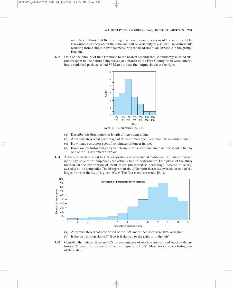
4.4 DISPLAYING DISTRIBUTIONS—QUANTITATIVE VARIABLES 261
size. Do you think that the resulting head size measurements would be more variable,less variable, or show about the same amount of variability as a set of 10 measurementsresulting from a single individual measuring the head size of all 10 people in the group?Explain.
4.33 Data on the amount of time (rounded to the nearest second) that 31 randomly selected cus-tomers spent in line before being served at a branch of the First County Bank were enteredinto a statistical package called SPSS to produce the output shown at the right.
50-100
100-150
150-200
200-250
250-300
300-350
350-400
Time
0
4
2
6
8
10
12
Cou
nt
Note: 50�100 represents [50, 100).
0
900
800
1000
700
600
500
400
300
200
100
Num
ber
of e
mpl
oyee
s
Percentage merit increase
0
Histogram of percentage merit increase
1 2 3 4 5 6 7 8 9 10 11 12
(a) Approximately what proportion of the 3990 merit increases were 10% or higher?(b) Is the distribution skewed? If so, is it skewed to the right or to the left?
4.35 Consider the data in Exercise 4.29 on percentages of on-time arrivals and on-time depar-tures at 22 major U.S. airports for the fourth quarter of 1991. Make back-to-back histogramsof these data.
(a) Describe this distribution of length of time spent in line.(b) Approximately what percentage of the customers spent less than 100 seconds in line?(c) How many customers spent five minutes or longer in line?(d) Based on this histogram, can you determine the maximum length of time spent in line by
one of the 31 customers? Explain.
4.34 A study of merit raises at 16 U.S. corporations was conducted to discover the extent to whichmerit-pay policies for employees are actually tied to performance. One phase of the studyfocused on the distribution of merit raises (measured as percentage increase in salary)awarded at the companies. The histogram of the 3990 merit increases awarded at one of thelargest firms in the study is given. Note: The first class represents [0, 1).
ALIAMC04_0131497561.QXD 04/14/2005 03:24 PM Page 261

262 CHAPTER 4 SUMMARIZING DATA GRAPHICALLY
(a) How many different shoes produced by Plant A were priced at $40 or higher?(b) The following are prices of all 20 sports shoes produced by Plant B:
27, 37, 29, 44, 31, 33, 34, 46, 58, 59, 32, 32, 56, 57, 63, 33, 56, 58, 62, 51.
Make a histogram of shoe prices for Plant B.(Use a lower limit 20, an upper limit 65,and a class width 5.) Sketch the histogram in the space provided.
(c) Select the description(s) appropriate for the distribution of shoe prices for Plant A(hint: can be more than one):
(i) symmetric.(ii) unimodal.
(iii) bimodal.(iv) skewed left.(v) skewed right.
(vi) uniform.(d) Select the description(s) appropriate for the distribution of shoe prices for Plant B
(hint: can be more than one):(i) symmetric.
(ii) unimodal.(iii) bimodal.(iv) skewed left.(v) skewed right.
(vi) uniform.(e) An unknown shoe (that is, it is not known whether it was produced at Plant A or Plant B)
has a price tag of $55. We wish to test the following hypotheses:
Unknown shoe comes from Plant A.Unknown shoe comes from Plant B.
(i) What is the direction of extreme?(ii) Find the p-value corresponding to the observed price of $55.
(iii) At what is your decision?
4.37 Distributions in the stock market The Investor’s Business Daily (July 10, 1995) ran an arti-cle entitled “Splits As Popular As Ever, Despite Debate.” This article discusses the questionof why stock splits are so popular. (In a stock split, instead of owning, say, one $80 share ofstock, you might own two $40 shares of stock after a stock split.) The distribution of NYSE
a = 0.15,
H1:H0:
=
==
7
Cou
nt
6
5
4
3
2
1
020 25 30 35 40
Prices of Shoes ($) for Plant A
45 50 55 60 7065
7
Cou
nt
6
5
4
3
2
1
020 25 30 35 40
Prices of Shoes ($) for Plant B
45 50 55 60 7065
4.36 Manufacturing Plants A and B produce sports shoes. The histogram of all 20 shoe prices forthe 20 different shoes made at Plant A is given by the following figure:
ALIAMC04_0131497561.QXD 04/14/2005 03:24 PM Page 262

4.4 DISPLAYING DISTRIBUTIONS—QUANTITATIVE VARIABLES 263
(New York Stock Exchange) prices is presented for the year end of 1925, 1960, and 1994(Source: The Puzzle of Stock Splits, by Roger Huang and Martin Weingartner). All three histograms arepresented on one graph so comparisons can be made. For example, at the end of 1994, over20% of the stocks had prices in the range of $10–15, while approximately 6% of the stocksat the end of 1925 had prices in that range.
0-5
5-10
10-15
15-20
20-25
25-30
30-35
35-40
40-45
45-50
50-55
55-60
60-65
65-70
70-75
75-80
80-85
85-90
90-95
95-100
100�
Stock price ranges
1925 1960 1994
Distribution of NYSE PricesAs a percentage of total number of prices for year-end 1925, 1960, and 1994.
0
5
10
15
20
25
Per
cent
(a) Describe the distribution of stock prices for each year (shape, most frequent price class,gaps, clusters).
(b) How has the distribution of stock prices changed over these years?(c) Does this change or shift in the distribution agree with the idea that stock splits have
been so popular lately? Think about what happens to the price of a stock when it splits.
Note: Sometimes, plots can be more confusing than clear. There may be too much informa-tion being displayed in the preceding histogram.
4.38 More distributions in the stock market. In the same Investor’s Business Daily article onstock splits, two additional distributions are presented—the distribution of presplit stockprices and the distribution of postsplit stock prices.(a) Compare these two distributions: Do the two distributions look very different? Does it
look like there has been a significant change in the distribution? It is difficult to comparethese two distributions accurately since they are not on the same scale. A change in thescale of a graph can drastically distort the way information is presented and lead to mis-representations. The price-range (x) axis ranges from $10–70 for presplit, but $ 0–40+
0
50
100
150
200
Num
ber
of N
YS
E s
tock
s
Dollars
Distribution of PresplitStock Prices
250
0
100
200
300
400
Num
ber
of N
YS
E s
tock
s
Dollars
Distribution of PostsplitStock Prices
500
10-20
20-30
30-40
40-50
50-60
below
1010-20
20-30
30-40
above
4060-70
ALIAMC04_0131497561.QXD 04/14/2005 03:24 PM Page 263

264 CHAPTER 4 SUMMARIZING DATA GRAPHICALLY
for postsplit. The vertical (y) axis reports the number of stocks and not the proportion(or percent) of stocks.After a stock split, there will be more stocks than before the split.
(b) Produce histograms of these two distributions, adjusting for these two factors andremoving the space between the consecutive classes. Summarize how the distributionhas changed.
4.4.5 Time PlotsWhen data on a variable are gathered over time,it may be informative to plot the data againsteither time or the order in which the data wereobtained.
A time plot, also called a time series plot, isa plot of observations against time, or the orderin which they were obtained. The consecutivepoints are connected with lines to help us deter-mine whether the distribution appears to be changing over time. Figure 4.3 shows a distri-bution of the lengths of incoming parts that appears to be changing with respect to the locationof the center. Perhaps the shift in the distribution’s center is the result of a change in theincoming material.
Time (order)
Obs
erva
tion
s
Time
19.990
19.995
20.000
20.005
20.010
20.015
Len
gth
Figure 4.3An example of a time series plotshowing a decreasing trend
Time
19.990
19.995
20.000
20.005
20.010
20.015
Len
gth
Figure 4.4An example of a time series plotshowing an increasing variation
Figure 4.4 shows a distribution that appears to be changing with respect to spread or varia-tion. The increasing variation could be the result of tool or machine wear.
Patterns that we might see in a time plot are as follows:
■ Trends—increasing or decreasing, changes in location of the center, changes in variationor spread.
■ Seasonal variation or cycles—fairly regular increasing or decreasing movements.
ALIAMC04_0131497561.QXD 04/14/2005 03:24 PM Page 264

4.4 DISPLAYING DISTRIBUTIONS—QUANTITATIVE VARIABLES 265
Remember, we expect to see some variation in a set of data. But if a pattern is apparent, itis important to ask questions. What may be the cause of that pattern?
In many industries, enhanced versions of the basic time plot are used to monitor thevarious processes.These enhanced plots are called control charts.They are used to study thestability of a process.The basic idea is that an interval is identified, using probability and sta-tistics, within which all or most of the plotted observations should fall; points falling outsidethe limits are highly improbable and therefore suggest that the process may be unstable (outof control). Such unstable patterns or points may lead to a search for a special cause of theinstability; and then appropriate action, such as changing the tool or adjusting some settings,may be taken to try to bring the process back under control.
It should be noted that a process that is out of control is not necessarily bad. It mayindicate that the process is better. Being in control implies that the distribution of the processis not changing. These series plots will be useful for checking assumptions for some of ourinference techniques. Most techniques require that the data be a random sample (that is, thedata look like they came from one population with one distribution, not a series of popula-tions with the distribution changing). So a plot of the data against the order in which they wereobtained will provide a check that the random-sample assumption is plausible.
Let's Do It!
4.174.17Lateness Patterns?
The following data are the number of students who were tardy (late in arriving) to schoolduring a three-week period:
Monday Tuesday Wednesday Thursday Friday
Week 1 10 7 6 8 11
Week 2 14 5 10 8 7
Week 3 9 3 6 4 6
Examine the data through atime plot and comment on whatyou see. Is there a relationshipbetween the day of the weekand the number of late arrivals?Explain.
ALIAMC04_0131497561.QXD 04/14/2005 03:24 PM Page 265

266 CHAPTER 4 SUMMARIZING DATA GRAPHICALLY
(a) Construct a time plot of these data. Use the axes provided. Comment on the resulting plot.
Example 4.11 ◆ Two Ways to “See” the Data ProblemConsider the following data on the lengths of parts produced from a manufacturing plant.The lengths are given in centimeters and in the order that the parts were produced.
Part # 1 2 3 4 5 6 7
Length (cm) 20.002 19.998 19.998 20.001 20.003 19.998 19.997
Part # 8 9 10 11 12 13 14
Length (cm) 20.004 19.998 19.994 20.003 19.994 20.006 19.996
Time
19.990
19.995
20.000
20.005
20.010
Len
gth
1 2 3 4 5 6 7 8 9 10 11 12 13 14
(b) On the same plot in part (a), use the y-axis to construct a dot plot of the data. Commenton the frequency plot.
Solution(a) The time plot is shown below. We can see initially that the lengths were very consistent
but after some time the variation in the lengths increased.
4 5 6 7 8 9 10 11 12 13 14Time
19.990
19.995
20.000
20.005
20.010
Len
gth
1 2 3
Here, you have someinformation—namely, that the
distribution is roughly symmetric.
The time plot also givesyou some information—namely, that the
variability appears to be increasing with time.
(b) The frequency plot (also shown in part (a)) provides additional information, namely,that the distribution is roughly symmetric. However, since the time plot revealed evi-dence of instability in the variance, it is not appropriate to treat the data as coming fromone overall population and make a frequency plot. We would instead want to investi-gate the reason for the increase in variability.
ALIAMC04_0131497561.QXD 04/14/2005 03:24 PM Page 266

4.4 DISPLAYING DISTRIBUTIONS—QUANTITATIVE VARIABLES 267
Let's Do It!
4.184.18Tension Data
The data shown here are measurements of the tension on a wire grid behind the screen in acomputer display.The targeted tension level is about 310, with some variation around this levelbeing tolerable. However, if the tension is very low or very high, the display may not workcorrectly. Thus, the manufacturer measures the tension of a small group of displays sampledeach hour from the production line. Here are the hourly averages (means) for 20 consecutivehours of production (starting at the first row and reading from left to right):
269.5 297.0 269.6 283.3 304.8 280.4 283.5 257.4 317.5 327.4
264.7 307.7 310.0 343.3 328.1 342.6 338.8 340.1 374.6 336.1
(a) Make a stem-and-leaf plot or a histogram of the tension data.
represents .Note:
What We’ve Learned: Whenver data are collected over time, it is important to first ex-amine a time plot of the data. This plot can provide useful information. In this case we seethat the variability appears to be increasing over time. A frequency plot can be a useful toolto display the distribution, but is only appropriate to make for a set of homogeneous data.Overall, the information from both of these plots can be displayed on the same graph, eachproviding a different look at the data.
(b) Describe the shape of the distribution based on your plot in part (a). What might themanufacturer conclude based on this plot alone? (Note: There will be some variationin the data; this is expected.)
ALIAMC04_0131497561.QXD 04/14/2005 03:24 PM Page 267

268 CHAPTER 4 SUMMARIZING DATA GRAPHICALLY
4.4 EXERCISES4.39 Consider the accompanying two time series plots and two descriptions listed. Your task is to
determine which time series best depicts which characteristic. Give an explanation for yourmatch.
(c) Make a time plot of the tension data.
(d) Describe the pattern apparent from this time plot. Based on this plot, what might yourecommend that the manufacturer do?
1 2 3 4 5 6 7 8 9 10 11 12
1 2 3 4 5 6 7 8 9 10 11 12
Time Series I
Time Series II
Descriptions
1. A plot of the proportion of girls born each month over the past year for the three hos-pitals in a city.
2. A plot of the cumulative number of failed batteries each day over the past 12 days.
ALIAMC04_0131497561.QXD 04/14/2005 03:24 PM Page 268

4.4 DISPLAYING DISTRIBUTIONS—QUANTITATIVE VARIABLES 269
4.40 The graph shown here is from a recent article in the Ann Arbor News (May 13, 2001) thatdiscussed whether the bottle-returns law should be expanded to other bottled drinks, suchas water, tea, and sports drinks.(a) Based on the graph, in 1996, approximately how many units of sports drinks were sold
in the U.S.?(b) Consider the following statement regarding this graph:
“The distribution of noncarbonated bottled water is skewed to the left.”
Water, water everywhereAmericans are still drinking plenty of softdrinks, but other bottled drinks are seeingnew popularity. Sports drinks and ready-to-drink tea are surging, but good old plainuncarbonated water is leading the wave.
Noncarbonated bottled water
Tea
Sports drinks2 billion
4 billion
6 billion
8 billion
10 billion
1994 1995 1996 1997 1998 1999
Units (bottles orcans) sold in U.S.
Is this a correct statement to make? Explain.
4.41 The following data are the sales figures (in $1000s) for a grocery store for 12 consecutivemonths:
140, 131, 136, 139, 141, 145, 149, 148, 151, 152, 151, 154.
(a) Construct a time plot of the data. Be sure that you label your axes.(b) The time plot in part (a) shows (select all that are correct)
(i) an increasing trend.(ii) a decreasing trend.
(iii) increasing cycles.(iv) decreasing cycles.
4.42 The following data are the times (in seconds) for a person to attach a component inside amachine in an assembly line for 15 consecutive trials:
150, 152, 148, 140, 141, 136, 134, 130, 125, 128, 125, 118, 120, 110, 112.
(a) Construct a time plot of the data. Be sure that you label your axes.(b) The time plot in part (a) shows (select all that are correct)
(i) an increasing trend.(ii) a decreasing trend.
(iii) increasing cycles.(iv) decreasing cycles.
ALIAMC04_0131497561.QXD 04/14/2005 03:24 PM Page 269
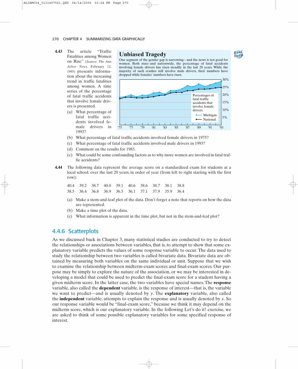
270 CHAPTER 4 SUMMARIZING DATA GRAPHICALLY
4.43 The article “TrafficFatalities among Womenon Rise” (Source: The Ann
Arbor News, February 12,
1995) presents informa-tion about the increasingtrend in traffic fatalitiesamong women. A timeseries of the percentageof fatal traffic accidentsthat involve female driv-ers is presented.(a) What percentage of
fatal traffic acci-dents involved fe-male drivers in1993?
(b) What percentage of fatal traffic accidents involved female drivers in 1975?(c) What percentage of fatal traffic accidents involved male drivers in 1993?(d) Comment on the results for 1983.(e) What could be some confounding factors as to why more women are involved in fatal traf-
fic accidents?
4.44 The following data represent the average score on a standardized exam for students at alocal school, over the last 20 years, in order of year (from left to right starting with the firstrow):
40.4 39.2 38.7 40.0 39.1 40.6 38.6 38.7 38.1 38.838.5 36.4 36.8 36.9 36.5 36.1 37.1 37.9 35.9 36.4
(a) Make a stem-and-leaf plot of the data. Don’t forget a note that reports on how the dataare represented.
(b) Make a time plot of the data.(c) What information is apparent in the time plot, but not in the stem-and-leaf plot?
4.4.6 ScatterplotsAs we discussed back in Chapter 3, many statistical studies are conducted to try to detectthe relationships or associations between variables, that is, to attempt to show that some ex-planatory variable predicts the values of some response variable to occur. The data used tostudy the relationship between two variables is called bivariate data. Bivariate data are ob-tained by measuring both variables on the same individual or unit. Suppose that we wishto examine the relationship between midterm-exam scores and final-exam scores. Our pur-pose may be simply to explore the nature of the association, or we may be interested in de-veloping a model that could be used to predict the final-exam score for a student having agiven midterm score. In the latter case, the two variables have special names. The responsevariable, also called the dependent variable, is the response of interest—that is, the variablewe want to predict—and is usually denoted by y. The explanatory variable, also calledthe independent variable, attempts to explain the response and is usually denoted by x. Soour response variable would be “final-exam score,” because we think it may depend on themidterm score, which is our explanatory variable. In the following Let’s do it! exercise, weare asked to think of some possible explanatory variables for some specified response ofinterest.
’75 ’77 ’79 ’81 ’83 ’85 ’87 ’89 ’91 ’93
30%
25%
20%
15%
10%
5%
Percentages of fatal traffic accidents that involve female drivers
MichiganNational
Unbiased Tragedy
ALIAMC04_0131497561.QXD 04/14/2005 03:24 PM Page 270

4.4 DISPLAYING DISTRIBUTIONS—QUANTITATIVE VARIABLES 271
Let's Do It!
4.194.19Possible Explanations
For each of the following response or dependent variables, list one or more possibleexplanatory or independent variables (the first one is done for you):
Response Variable Possible Explanatory Variable(s)
Height of a son Height of the father, height of the mother, age
Weight
GPA at end of a semester
Exam 2 score
Quantity demand for a product
One graphical display of the relationship betweentwo quantitative variables is called a scatterplot. In Sec-tion 4.4.5, we actually constructed a certain type ofscatterplot—namely, a series or time plot, which is ascatterplot of the response versus the order or time. Ina scatterplot, the values of one variable, generally theindependent variable, are marked on the horizontalaxis. The values of the other variable, generally thedependent variable, are marked on the vertical axis.Each point on the scatterplot represents a single pairof observations measured on a particular unit (that is,a single data point or case), and is generically repre-sented as for where n is the totalnumber of pairs of observations or the total numberof units in our sample. The midterm and final examscores for a sample of 25 students in a statistics class arelisted in the accompanying table and the correspon-ding scatterplot is shown.
i = 1, 2, Á , n,1xi, yi2,
Midterm0 10
The tenth student(21, 38)
20 30 40 50
10
20
30
40
50
60
70
80
90
100
0
Fin
al
Scatterplot of final versus midterm scores
Student x Midterm y Final Number Score Score
1 39 62
2 44 69
3 32 68
4 40 86
5 45 88.5
6 46 88.5
7 33 76
8 39 66.5
9 32.5 75
10 21 38
11 30 71
12 39 88
13 44 96.5
14 28.5 71.5
15 38 96
16 43 82.5
17 42 85
18 25.5 28
19 47 95
20 36 39
21 31.5 58
22 32 49
23 42 62
24 21 59
25 41 90
ALIAMC04_0131497561.QXD 04/14/2005 03:24 PM Page 271

272 CHAPTER 4 SUMMARIZING DATA GRAPHICALLY
As with histograms, stem-and-leaf plots, and other graphical techniques, we first want to lookfor the overall pattern and then look for deviations from the overall pattern. In assessing theoverall pattern in a scatterplot, we might comment on the direction, form, and strength. Fordirection, we say the two variables are positively associated when larger values of one vari-able tend to go with larger values of the other, as shown in Figure A. The two variables aresaid to be negatively associated when larger values of one variable tend to go with smallervalues of the other, as shown in Figure B.
Let's Do It!
4.204.20Some Data Points
(a) The point of the scatterplot that corresponds to the scores for Student 10 has beenmarked. Circle the point that corresponds to the scores for Student 4.
(b) Suppose that a new student scored 30 on the midterm and 40 on the final.Add this pointto the scatterplot.
(c) Using your calculator or computer, enter the data and reproduce the above scatterplot.
10 20
40
30
50
60
70
80
90
100
30 40 50
Figure A—Positive Associationy
x 10 20
40
30
50
60
70
80
90
100
30 40 50
y
x
Figure B—Negative Association
The underlying form of the relationship might be linear, curved, quadratic, seasonal, orcyclical, or perhaps there is no clear underlying structure. In Figure A, we might say the un-derlying form is linear, while there is some curvature in Figure B.When a scatterplot does notshow a particular direction, neither positive nor negative, such as Figures C and D, we say thatthere is no linear association. Although there is an association between the two variables inFigure D, the association is not a linear one.
10 20
40
30
50
60
70
80
90
100
30 40 50
Figure C—No Linear Associationy
x10 20
40
30
50
60
70
80
90
100
30 40 50
y
x
Figure D—No Linear Association
ALIAMC04_0131497561.QXD 04/14/2005 03:24 PM Page 272

4.4 DISPLAYING DISTRIBUTIONS—QUANTITATIVE VARIABLES 273
By strength we mean how tightly clustered the points are about the underlying form.Here, we have to be a bit careful, because a change in the scale of the axes can “change” thepicture to our eye. Since Figures A and B are on the same scales, we can say that the rela-tionship in Figure B is stronger than in Figure A. Later, we will discuss a measure of thestrength of the linear relationship, called the correlation coefficient. Observations that appearto deviate from the underlying form may also become evident in a scatterplot. In Figure A,the data point (21, 39), although following the overall linear pattern, does stand apart fromthe rest. To summarize the relationships shown in the figures, we have the following:
■ Figure A shows a moderately strong, positive, linear relationship.
■ Figure B shows a strong, negative, slightly curved to linear relationship.
■ Figure C shows no association between the two variables.
■ Figure D shows a very strong association, not a linear one, but rather more quadratic.
How might we interpret the scatterplot of the final exam scores versus the midterm-examscores? The association is certainly positive. Higher midterm scores generally go with high-er final exam scores. But there are some exceptions.The pattern is generally linear and of mod-erate strength.
DEFINITIONS: Studies are often conducted to attempt to show that some explanatoryvariable “causes” the values of some response variable to occur.The response or dependentvariable is the response of interest—that is, the variable we want to predict—and is usuallydenoted by y. The explanatory or independent variable attempts to explain the responseand is usually denoted by x.A scatterplot shows the relationship between two quantitative variables x and y.The valuesof the x variable are marked on the horizontal axis, and the values of the y variable aremarked on the vertical axis. Each pair of observations is represented as a point inthe plot.Two variables are said to be positively associated if, as x increases, the values of y tend toincrease. Two variables are said to be negatively associated if, as x increases, the values ofy tend to decrease.When a scatterplot does not show a particular direction, neither positive nor negative, wesay that there is no linear association.
1xi, yi2,
Let's Do It!
4.214.21What Direction?
For each of the following pairs of variables, would you expect a negative linear association,a positive linear association, or no apparent linear association?
(a) age (in years) of a car and its price
(b) number of calories consumed per day and a person’s weight
(c) a person’s height and IQ
ALIAMC04_0131497561.QXD 04/14/2005 03:24 PM Page 273

274 CHAPTER 4 SUMMARIZING DATA GRAPHICALLY
Let's Do It!
4.224.22Applications to Medical School
Applications to medical schools in the United States inched up in 2004 for the second con-secutive year, with women outnumbering men and both black and Hispanic students makingsignificant gains, theAssociation ofAmerican Medical Colleges announced in October of 2004.
The following table gives the annual fall and rise in medical-school applications inpercent from the previous year.
1994 1995 1996 1997 1998 1999 2000 2001 2002 2003 2004
6% 2.7% 0.8% �8.4% �4.7% �6.2% �3.5% �6% �3.5% 3.5% 2.7%
Source: Association of American Medical Colleges
Use two different graphs to summarize this data.
Let's Do It!4.234.23
Right versus LeftWhen the instructor gives you the signal, begin X’ing in the boxes with your pencil or pen.Use your right hand.The instructor will ask you to stop after one minute. Cross out as manyboxes as you can during that time.
ALIAMC04_0131497561.QXD 04/14/2005 03:24 PM Page 274

4.4 DISPLAYING DISTRIBUTIONS—QUANTITATIVE VARIABLES 275
Number of boxes crossed out .
Now at the signal, do the same, but with your left hand.
=
Data
x (right count)
y (left count)
x (right count)
y (left count)
Number of boxes crossed out .
Let’s examine the relationship between right-hand counts and left-hand counts.
y = the number of boxes crossed out with the left hand.
Record your class data on x = the number of boxes crossed out with the right hand.
=
(a) Construct a scatterplot of the data.
(b) Draw the 45-degree line where x would equal y on your scatterplot. This line wouldgenerally divide the observations into two groups. What are those two groups?
ALIAMC04_0131497561.QXD 04/14/2005 03:24 PM Page 275

276 CHAPTER 4 SUMMARIZING DATA GRAPHICALLY
Plot A
x
yPlot C
x
yPlot B
x
yPlot D
x
y
4.4 EXERCISES4.45 (a) Which of the following scatterplots best resembles a positive linear association between
the variables x and y?
(c) If you needed to hire a person who could write quickly and well with both hands, whichperson would you select?
(d) If you needed to hire a person who could write quickly and well with just their right hand,which person would you select?
(b) Write a description of the relationship between x and y that is shown in Plot A.
4.46 A student was writing a paper about the income levelsof people and religions in which people believed. Thestudent wanted to know if there was any associationbetween these two variables. Religious denominationwas selected as the explanatory variable (x) andincome as the response (or predicted) variable (y).Data were collected on these two variables, and thescatterplot at the right was obtained. The student con-cluded that a strong negative association existsbetween religion and income. Do you agree with thestudent’s conclusion? Explain.
4.47 For each of the descriptions given,(a) Identify the two characteristics that vary and decide which should be the independent
variable and which should be the dependent variable.(b) Sketch a graph that you think best represents the relationship between the two variables.
(You don’t have to plot individual points, but do label your axes and draw the generalshape.)
(c) Write a sentence that explains the shape and behavior shown in your graph.(i) The population of the United States for each census since 1800 (census taken every
10 years)(ii) The temperature of an ice-cold drink left in a warm room for a period of time
Religious denomination
Inco
me
ALIAMC04_0131497561.QXD 04/14/2005 03:24 PM Page 276

4.4 DISPLAYING DISTRIBUTIONS—QUANTITATIVE VARIABLES 277
4.48 Give a realistic example of two quantitative variables that would have a positive association.
4.49 Give a realistic example of two quantitative variables that would have a negative association.
4.50 A random sample of seven households was obtained, and information on income and foodexpenditures for the past month was collected. The data (in $100s) are given.
Income ($100s) (x) 22 32 16 37 12 27 17
Food Expense ($100s) (y) 7 8 5 10 4 6 6
Make a scatterplot of the data and briefly describe the overall pattern.
4.51 A student wonders if people of similar heights tend to date each other. She measures her-self, her dormitory roommate, and the women in the adjoining rooms; then she measures thenext man each woman dates. The data (heights in inches) are as follows:
Height of Woman (x) 66 64 66 65 70 65
Height of Man (y) 72 68 70 68 71 65
Make a scatterplot of these data and briefly describe the overall pattern.
% On-Time % On-Time Airport Arrivals Departures
Boston 75.4 83.3
Seattle–Tacoma 75.6 86.6
Los Angeles 76.0 83.9
Chicago 77.0 80.8
Denver 77.0 83.1
Dallas 77.1 84.3
Miami 77.8 88.6
San Francisco 79.6 85.7
Newark 80.1 87.0
Atlanta 81.1 88.1
Minneapolis 81.1 83.8
St. Louis 81.2 85.7
Philadelphia 81.5 86.1
San Diego 82.5 86.5
New York (LaGuardia) 83.1 88.9
Orlando 84.1 91.3
Washington 84.9 89.9
Dulles Int. 85.8 88.8
Las Vegas 86.0 89.0
Charlotte 86.4 87.6
Detroit 87.9 89.8
Raleigh 90.3 92.6
4.52 The table below reports percentages of on-time arrivals and on-time departures at 22 majorU.S. airports for the fourth quarter of 1991. Make a scatterplot of these data and brieflydescribe the overall pattern.
ALIAMC04_0131497561.QXD 04/14/2005 03:24 PM Page 277

278 CHAPTER 4 SUMMARIZING DATA GRAPHICALLY
(a) Make a scatterplot of these data. Be sure to label your axes.(b) Is airfare linearly associated with distance? If so, is the association positive or negative?(c) Would you characterize the association as weak, moderate, or strong? Explain.
4.54 The golf scores of 12 members of a women’s golf team in two rounds of tournament play areshown in the following table (a golf score is the number of strokes required to complete thecourse, so low scores are better). Construct a scatterplot of the scores from round 2 versusthe scores from round 1 and briefly describe the overall pattern.
Observation Destination Distance (x) Airfare (y)
1 Atlanta 576 178
2 Boston 370 138
3 Chicago 612 94
4 Dallas/Fort Worth 1216 278
5 Detroit 409 158
6 Denver 1502 258
7 Miami 946 198
8 New Orleans 998 188
9 New York 189 98
10 Orlando 787 179
11 Pittsburgh 210 138
12 St. Louis 737 98
Player 1 2 3 4 5 6 7 8 9 10 11 12
Round 1 (x) 79 91 88 83 106 101 81 85 96 88 91 90
Round 2 (y) 81 89 90 86 90 105 78 81 89 90 96 93
4.5 GUIDELINES FOR PLOTS, GRAPHS, AND PICTURESThere are a number of common errors that appear in graphs and plots. Sometimes theseerrors lead to misinterpretation of the information that is summarized. Here are some guide-lines to check before you interpret a plot or as you construct your own graphs:
■ Provide an appropriate title of the picture.
■ Include the source of the data and relevant details of the sample size and how the datawere collected.
■ Be sure to label the axes appropriately.
■ Check to see if the frequency, proportion, or percentage axis starts at zero.
■ Check to see if the axes maintain a constant scale.
■ Include the measuring units of the variables being summarized.
4.53 The following table lists distances (the explanatory variable, in miles) and cheapest airlinefares (the response variable, in dollars) to certain destinations for passengers flying out ofBaltimore, Maryland (for January 8, 1995):
ALIAMC04_0131497561.QXD 04/14/2005 03:24 PM Page 278

4.5 GUIDELINES FOR PLOTS, GRAPHS, AND PICTURES 279
Think About It
4.55.56.57.5
9.510.511.512.5
14.5
8.5
13.5
15.516.517.5
Per
cent
1 2 3 4 5
Year
0
10
20
30
50
60
70
80
40
90
100
Per
cent
1 2 3 4 5
Year
Time plot 1 shows the percentage of incoming students at a college who have had a statisticscourse in high school over a five-year period.
Time Plot 1:
Time plot 1 gives the appearance that over time the percentage has (circle one)
dramatically increased. moderately increased. slightly increased.
Time plot 2 gives the percentage of incoming students at a college who have had a statisticscourse in high school over a five-year period.
Time Plot 2:
Time plot 2 gives the appearance that over time the percentage has (circle one)
dramatically increased. moderately increased. slightly increased.
Look carefully at the two time plots. They display the same data. Notice in Time plot 1 thatthe vertical axis starts at 4.5 instead of 0. This suppressed zero axis shows a more dramaticincrease in the percentage of incoming students than if we had started the axis at zero. Bystretching the vertical axis in Time plot 2, we have the appearance of a slightly increasingtrend.
ALIAMC04_0131497561.QXD 04/14/2005 03:24 PM Page 279

280 CHAPTER 4 SUMMARIZING DATA GRAPHICALLY
The proper way to display these data is shown in Fig-ure 4.5. The vertical axis starts out at zero but is notstretched out so much that it distorts the graph.
0
2
4
8
10
12
14
6
16
18
Per
cent
1 2 3 4 5
Year
Figure 4.5Proper time plot of thepercentage of incomingstudents who have had astatistics course in highschool over a 5-year period
Example 4.12 ◆ Statistical Process Control ProblemA large industrial fermentation reaction takes approximately three days to reach comple-tion. An optimal temperature and pH have to be maintained during the three days.Statistical process control is used to determine if the procedure appears to be under con-trol. If the procedure is under control, no action is needed to be taken by the operators.
The following table gives the hourly temperature readings from the fermentation reactorover the three day interval.
Hour 1 2 3 4 5 6 7 8 9 10 11 12
June 3 36.8 36.2 36.8 37.2 35.0 37.6 35.9 36.9 36.2 37.0 36.7 34.4
June 4 36.0 37.2 36.8 35.9 36.9 35.5 35.8 36.0 36.9 35.8 36.6 36.6.
June 5 36.6 35.5 36.0 36.5 36.3 35.7 36.6 36.8 36.7 35.8 37.4 37.4
Source: Quality Control Charts in Biotechnology, AMATYC Conference, November 18, 2004.
(a) Construct a histogram to summarize the 72 temperature observations.(b) Explain why you selected the width and/or the number of intervals that you used for con-
structing the histogram in part (a).
Hour 13 14 14 16 17 18 19 20 21 22 23 24
June 3 37.1 36.3 36.2 36.5 36.9 36.2 37.0 34.0 36.2 37.4 35.9 36.8
June 4 36.8 36.2 35.5 36.7 36.7 36.4 34.5 36.5 36.0 36.4 36.7 37.1
June 5 36.6 34.4 37.3 36.0 36.9 35.5 38.1 35.5 36.8 35.1 36.7 36.2
Check out the scaling of the axis! ◆
ALIAMC04_0131497561.QXD 04/14/2005 03:24 PM Page 280

4.5 GUIDELINES FOR PLOTS, GRAPHS, AND PICTURES 281
34.0–34.4
34.5–34.9
35.0–35.4
35.5–35.9
38.0–38.4
37.5–37.9
37.0–37.4
36.5–36.9
36.0–36.4
Celsius Temperature
0
10
5
15
20
25
30
Freq
uenc
y V
alue
s
Cel
sius
Tem
pera
ture
Run Time in Hours10 20 30 40 50 60 70 800
39.0
38.0
37.0
36.0
35.0
34.0
33.0
x_
� 3�
x_
� 2�
x_
� 2�
x_
� 3�
x_
� �
x_
� �
mean, x_
(c) Construct a time plot where the x-axis has the hourly time interval over the 3 days from1 to 72 and the y-axis shows the temperatures.
(d) We will see more about statistical process control (SPC) after we learn to calculate themean and the standard deviation of a data set in Chapter 5. For the moment we needto know that to be in control all the data points should to be randomly scattered inroughly a horizontal band (i.e., within two horizontal lines). Does this appear to be thecase for this data set?
Solution(a) Histograms may vary. One possible histogram is shown below.
(b) As a rule of thumb we could use the square root of the number of values in the data setas the approximate number of intervals. Since we had 72 data points, this would be about9 in our case. The histogram above has nine intervals, each of width 1.4.
(c)
(d) Yes, it does appear to be in control.
What We’ve Learned: There is more than one way to look at a set of data. Since thesedata were gathered over time, a time plot is an important graph to examine. In this case, sincethe process appears to be in control, it is reasonable to examine a histogram to display thedistribution of temperatures for this in control process.
ALIAMC04_0131497561.QXD 04/14/2005 03:24 PM Page 281

282 CHAPTER 4 SUMMARIZING DATA GRAPHICALLY
4.5 EXERCISES4.55 A letter to the editor entitled “What Wealth
Gap?” (Source: The Wall Street Journal, July 11, 1995)
presents some statistics on wealth inAmerica. Often, information is reported anda comparison is made between where we arenow and where we were. The present figuresare compared to one single data point fromthe past rather than reporting the trend or thetime series over the past to the present.(Note: The median is the center value suchthat half of the observations are at or belowthat value and half of the observations areat or above that value. The median will bediscussed in detail in Chapter 5.) Considerthe following statement from the letter:“Regarding income, [the labor secretary] often repeats the line, ‘for a decade and a half,ordinary families have been working harder and getting less.’ But that is only partly true.True, real median family income was $1300 higher in 1979 ($38,248) than it was in 1993($36,959). Taking only the endpoints, that looks like a straight downhill line. But the actualline looks more like the one seen in the table.” What happened during the years (a) 1979–1981?(b) 1982–1989?(c) 1990–1993?(d) Based on this series, would you feel confident in making predictions about future
observations?(The complete time series is more informative.)
4.56 Find an example in a newspaper or journal that makes a comparison by taking only twopoints from the time series. Do these two points give an adequate picture? What might thecomplete time series look like? You might see if you can actually find the rest of the data inthe complete time series.
4.57 The time series plot shown here is from theInvestor’s Business Daily (July 10, 1995) article enti-tled “What Is Clinton Fighting For?” This graph istwo time series in one, with the left vertical axis forspending and the right vertical axis for SAT scores.The graph is shown to demonstrate that morespending on schools has not paid off in studentachievement.(a) What are some questions that you would ask in
order to better understand the data presentedhere?
(b) With the current scales, there does appear to bea dramatic increase in spending and pronounceddecrease in SAT scores.What is the actual rangefor SAT scores? Provide a sketch of the datausing the actual SAT-score range for the rightaxis and a range from 0 to 10 (in thousands of1993 constant dollars) for the left axis.How do things appear now?What is the effect of this change in scale?
Á
$41,000
$40,000
$39,000
$38,000
$37,000
$36,000
$35,0001979 ’81 ’83 ’85 ’87 ’89 ’91 ’93
Real median income rose under ReaganEveryone Got Richer…
3
4
5
6
7
$8
800
825
875
850
900
925
950
’70 ’74 ’78 ’82 ’86 ’90
SAT scores(right scale)
Spending(left scale)
Success Story?
ALIAMC04_0131497561.QXD 04/14/2005 03:24 PM Page 282

KEY TERMS 283
SUMMARY
■ Graphing our data helps us to “get acquainted” with our data and provides a visual sum-mary of the data.
■ Many graphical summaries display the distribution of the variable of interest—that is, thepattern of variation.
■ Looking at our data with a visual summary is often our first step toward drawing conclu-sions from the data. By having an idea of the distribution of a variable, other observationscan be compared to it to assess whether the observation is consistent with the distribution.
■ The distribution of a qualitative variable can be displayed using a pie chart or a bar graph.■ The relationship between two qualitative variables is best seen by computing the condi-
tional distribution of one variable given the other variable. A bar graph can also be usedto display the conditional distribution.
■ To display the distribution of a quantitative variable, we might use a frequency plot, astem-and-leaf plot, or a histogram.
■ If the quantitative data have been collected over time, it may be useful to examine the dataover time by constructing a time plot.
■ A scatterplot can be used to display and examine the relationship or association betweentwo quantitative variables.
■ When looking at a graph, focus on the overall pattern being displayed and don’t get lostin the details. Once we have captured the overall pattern, focus on any apparent departuresfrom the overall pattern.
■ Graphs are a very powerful way to communicate the data. A visual impression is muchstronger than data presented in numerical form. But we must also remember that there aregood graphs and graphs that can be misleading and lead to false impressions. Graphs canbe used to distort the picture. Changing the scale or class intervals can change the visualoutcome.
■ Looking ahead: We continue our discussion about summarizing data by presenting vari-ous numerical summaries that are appropriate for quantitative data.
KEY TERMS
Be sure that you can describe, in your own words, and give an example of each of the followingkey terms from this chapter:
Unit 213Observation 213Variable 213Data Set 213Qualitative Variable 215Quantitative Variable 215Categorical Variable 215Discrete Variable 215Continuous Variable 215Distribution of a
Variable 219
Pie Chart 225Bar Graph 225Frequency Table 232Marginal Distribution of a
Row Variable 232Marginal Distribution of a
Column Variable 232Conditional
Distribution 232Frequency Plots 239Outlier 240
Cluster of Observations 240
Gap between Observations 240
Shapes of Distributions 243
Symmetric Distributions 243
Unimodal Distributions 243
Bimodal Distributions 243
ALIAMC04_0131497561.QXD 04/14/2005 03:24 PM Page 283

284 CHAPTER 4 SUMMARIZING DATA GRAPHICALLY
Uniform Distributions 243Skewed Distribution
(Right or Left) 243Stem-and-Leaf Plots 243Split Stem 244Back-to-Back Stem-and-
Leaf Plot 245Histograms 253Time Plots 264Scatterplots 271
Explanatory Variable/Independent Variable 273
Response Variable/Dependent Variable 273
Form of a Relationship 273
Direction of a Relationship 273
Strength of a Relationship 273
Positive AssociatedVariables 273
Negative AssociatedVariables 273
No Linear AssociatedVariables 273
EXERCISES
4.58 For each of the variables that follow, state whether it is qualitative or quantitative. If a vari-able is quantitative, say whether it is discrete or continuous.(a) Marital status.(b) The diameter of pebbles from a stream.(c) The number of automobile accidents per year in Virginia.(d) The length of time to play 18 holes of golf.(e) The number of building permits issued each month in a particular city.
4.59 Determine whether the following variables are qualitative, quantitative discrete, or quanti-tative continuous:(a) The height of senior students at a college.(b) The amount of time (measured by a stop watch) it takes an adult to chug a beer.(c) The temperature at noon during the month of June in International Falls, Minnesota.(d) The number of countries a student has visited in his or her lifetime.(e) Whether or not the student has been to Australia.(f) The number of visitors per day to Walt Disney World in Florida during the month of
December.(g) The amount of gas in a 1-gallon gas can.
4.60 A study was conducted to examine the differences in job performance of white-collarworkers with Type A (active) and Type B (passive) behavior. Data were collected for severalworkers on the variables listed. For each variable, state whether it is qualitative or quantita-tive. If quantitative, state whether it is discrete or continuous.(a) Behavior type (A or B).(b) Age (in years).(c) Number of employees supervised.
4.61 Pie charts are often used to summarize qualitative data. The accompanying picture showsthree pie charts for race, one chart for each of the three possible ways a student may beselected for admission. (Source: University of California at Berkeley, from “Gains in Diversity Facing Attack
at University of California,” The New York Times, June 4, 1995.)
Of all of the students, 51%, or 4179, were selected based on grades and test scores alone.Of these students, 1701 were white, 1960 Asian, 136 Hispanic, 33 Black, and the remaining349 were of other races or no data available.(a) How many students were there in all?
ALIAMC04_0131497561.QXD 04/14/2005 03:24 PM Page 284

(b) Name the conditional distribution that isbeing summarized in the display and pre-ceding table:
The conditional distribution of given .
EXERCISES 285
(b) What proportion of students selected by a special decision of the admissions committeewere Hispanic?
(c) Sketch a pie chart for the students selected by a special decision of the admissions com-mittee that portrays the percent of students in each race category rather than the count.
4.62 On March 25, 1995, The New York Times printedan article “HMO’s on Rise in New York State”that contained the display shown at the right.(a) Using the information presented for 1994,
fill in the appropriate percentages in thefollowing table.
At Berkeley, the freshman class is selected in a three-part process. Here is how high school seniors applying for the 1994–95 school year were selected. Other races and students for which there are no data are omitted.
Grades and testscores alone
51% or 4179 students
White1701
White975
White43 Asian
17
Black88
Asian1960
Asian984
Hispanic1151
Hispanic88
Black437
Black33
Hispanic136
Grades, test scores,essays and background
46% or 3766 students
Special decision ofadmissions committee
3% or 251 students
Percentage of insured workers in different types of health insurance.
’93 ’94
Traditional insurance
H.M.O.
Other managed care
Northeast
26
8 66%42 37%
21
Midwest
South
West
20
3149%
37 40%
23
21
36
43%29
30
42%
4228%
31
20%
2951
Source: Foster Higgins National Survey of Employer SponsoredHealth Plans
Shifting to H.M.O.’s
Insurance Program
Traditional H.M.O. Other
Northeast
RegionMidwest
South
West
ALIAMC04_0131497561.QXD 04/14/2005 03:24 PM Page 285

286 CHAPTER 4 SUMMARIZING DATA GRAPHICALLY
4.63 An American Red Cross brochure provided the following information about the blood of itsdonors.
Blood Type
Type O Type A Type B Type AB
Rh FactorPositive (�) 45.1% 37.8% 12.2% 4.9%
Negative (�) 44.4% 38.9% 11.1% 5.6%
This table displays: (select one)(a) The marginal distribution of blood type.(b) The marginal distribution of Rh factor.(c) The overall distribution of blood type and Rh factor.(d) The conditional distribution of blood type given Rh factor.(e) The conditional distribution of Rh factor given blood type.
4.64 The following table gives the number of students of a certain college in various categories.
Undergraduate
Gender First Year Second Year Third Year Fourth Year Graduate
Male 1520 1035 876 950 1210
Female 600 610 1465 1328 2120
(a) What percentage of the students in this college are undergraduate students?(b) What percentage of the students in this college are male and undergraduate students?(c) Considering only the female students, what percentage of them are either first-year or
second-year undergraduate students?(d) Considering only the graduate students, what percentage of them are male?(e) Overall there are more undergraduate students than graduate students at this college.
If each student belongs to one and only one department, then we can conclude that(select one)
(i) for each department, there are more undergraduate students than graduatestudents.
(ii) for each department, there are more graduate students than undergraduatestudents.
(iii) there are some departments that have more undergraduate students than graduatestudents.
(iv) none of the above can be concluded.(f) The table at the right gives (select one)
(i) the percentage of males out of thethird-year undergraduate studentsand the percentage of females outof the fourth-year undergraduatestudents.
(ii) the conditional distribution of the third-year and fourth-year undergraduatestudents given they are male.
(iii) the overall distribution of gender and number of years in school.
Third Year Fourth Year
Male 37.4% 41.7%
Female 62.6% 58.3%
ALIAMC04_0131497561.QXD 04/14/2005 03:24 PM Page 286

EXERCISES 287
(g) The table at the right gives (select one)(i) the percentage of female students.
(ii) the percentage of undergraduatestudents and the percentage of grad-uate students.
(iii) the percentage of undergraduate and graduate students among all female students.
4.65 A study was conducted in a small town on the possible influence of gender on color blindness.A simple random sample of size 200 was taken from among the 1158 female adult residents ofthe town. Another simple random sample of 200 was taken from among the 1005 male adultresidents of the town. Among the 200 selected female residents, 4 had color-blindness, for aproportion of 0.02. Among the 200 selected male residents, 10 had color-blindness, for a pro-portion of 0.05.The results are presented below.
Undergraduate Graduate
Female 65.4% 34.6%
(a) This is an example of (select one) an observational study an experiment.(b) What was the response variable?(c) What was the explanatory variable?(d) The proportion of 0.02 is a (select one): parameter statistic.(e) What type of sampling technique was used to obtain the 400 selected adult residents?(f) One set of hypotheses tested was as follows:
There is no association between gender and color blindness status.There is an association between gender and color blindness status.
Based on the results, the null hypothesis was not rejected at a level of 0.05.For each of the following questions, select your answers:
(i) Would you fail to reject at a level of 0.02? Yes No Can’t Tell(ii) Would you fail to reject at a level of 0.10? Yes No Can’t Tell
(iii) Are the results statistically significant at 0.05? Yes No Can’t Tell(g) The table below summarizes the (select one)
H0
H0
H0
H1:H0:
Gender
Male Female TOTAL
Color Yes 10 4 14Blindness
No 190 196 386Status
TOTAL 200 200 400
Gender
Male Female
Color Yes 5% 2%BlindnessStatus No 95% 98%
(i) joint distribution of color blindness status and gender(ii) conditional distribution of color blindness status given gender
(iii) conditional distribution of gender given color blindness status
ALIAMC04_0131497561.QXD 04/14/2005 03:24 PM Page 287

288 CHAPTER 4 SUMMARIZING DATA GRAPHICALLY
Letter Grade A B C D E
Before 36%
After 23%
(b) What percentage of students had a GPA equivalent to a letter grade of A before theyattended the New School? What percentage of students had a GPA equivalent to a lettergrade of A after they attended the New School?
(c) What percentage of students had a GPA equivalent to a letter grade of E before theyattended the New School? What percentage of students had a GPA equivalent to a lettergrade of E after they attended the New School?
(d) Can it be concluded that performance has improved? Is this an appropriate type of sum-mary to assess if the New School is better? What if the grading policy (how grades aredetermined) at the New School is different from that at the public high school? Whatother information would you want to know before comparing this before-and-after gradedata?
4.67 One of the problems with which health service administra-tors must deal is patient dissatisfaction. One common com-plaint focuses on the amount of time that a patient mustwait to see a doctor. In a survey to investigate waiting times,medical-clinic secretaries were asked to record patient wait-ing times (measured from the time of their arrival at theclinic until they saw the doctor) for a sample of patients.Thedata for one day (30 patients) are summarized here with astem-and-leaf plot.(a) Is waiting time discrete or continuous? Explain.(b) Describe this distribution.(c) What is the approximate center of this distribution?(d) How do you think the sample was selected? Was it a simple random sample? Explain.
0123456789
10
50 5 5 50 0 0 5 5 5 50 0 0 5 5 50 5 5 50 50 505 5
5
Waiting Time (recorded to thenearest five minute interval)
Note: 0 5 represents 5 minutes.
4.66 A new high school in Ann Arbor,Michigan, called the New School,has a loose educational systemwith an emphasis on student-driven projects. It provides one-on-one attention and a sense ofbelonging to many students whofeel lost in a large public highschool.A review was conducted toevaluate the school and provideinformation to assess the futurefate of this alternative high school.The graph given below was part ofthe evaluation report. (Source: The
Ann Arbor News, January 18, 2000.)
(a) The information in the graphcan also be presented ina table. Complete the tableby providing the missingpercentages.
9%
18%
A
18%
23%
B
36%
9%
CLETTER GRADES
23%
27%
D
14%
23%
E*
Source: New School evaluation
GPA before enrollmentat New School
GPA after enrollmentat New School
* Failing grade
Grading New School
ALIAMC04_0131497561.QXD 04/14/2005 03:24 PM Page 288

EXERCISES 289
4.68 Health-care issues are receivingmuch attention in both academicand political arenas. A sociolo-gist recently conducted a surveyof citizens over 60 years of agewhose net worth is too high toqualify for Medicaid, but whohave no private health insur-ance. The ages of 25 uninsuredsenior citizens were entered intoSPSS, and the histogram shownhere was produced.(a) What percentage of unin-
sured senior citizens were atleast 70, but less than 80, years old?
(b) Are the ages relatively uniformly distributed, or are they predominately the younger orolder segment of the senior-citizen population? If they are skewed, in which direction isthe skewness?
4.69 In department stores, the amount of radiation emitted by a display of color television sets ina relatively confined area may pose a health problem. The following histogram summarizesreadings of radiation (in milliroentgens per hour, i.e., mR/hr) for 20 different stores, eachhaving at least five sets in their display areas:
60–65
Note: 60–65 represents [60, 65).
65–70 70–75 75–80 80–85 90–9585–90
Age
0
1
2
3
4
5
6
Cou
nt
1.0
2.0
3.0
Cou
nt
00.20.1 0.3 0.4 0.5 0.6 0.7 0.8 0.9
Label:
Note: Left endpoint of each class is included; for example [0.1, 0.2).
(a) Give a label to the bottom axis of the graph (i.e., what variable is represented there).(b) Based on the histogram, can you give the exact range of measurements? If yes, give the
exact range. If no, explain why not.(c) The recommended safety limit for radiation exposure has been set at 0.5 mR/hr by the
National Council on Radiation protection.What percentage of the stores have values ator above that limit?
(d) If a small television set emits 0.08 mR/hr, what is the maximum number of sets that youmay put in your room (and turn on) before you exceed the safety limit?
4.70 A long-term study of the environmental conditions in a bay gave the following annual aver-age salinity readings for 12 consecutive years (given in order from left to right):
9, 12, 14, 15, 13, 15, 15, 15, 13, 17, 17, 16.
(a) Obtain a time plot for the average salinity readings. Be sure that you label the axes andprovide the minimum and maximum values on each axis.
(b) Which of the following is (are) an appropriate description of the plot in (a):(i) increasing trend.
(ii) decreasing variability.
ALIAMC04_0131497561.QXD 04/14/2005 03:24 PM Page 289

290 CHAPTER 4 SUMMARIZING DATA GRAPHICALLY
(iii) multimodal.(iv) skewed right.(v) decreasing trend.
4.71 A graduate student kept track of the amount of sleep that she has had over the three weeksleading up to midterm exams. The sleeping times in hours are given in the following table:
(a) The statistician decides that it is important to have opinions from parents of infants andparents of toddlers. So in the first stage, she divides the centers into two groups by typeof care (infant versus toddler) and randomly selects one of the infant-care centers andtwo of the toddler-care centers. For the next three Mondays, she goes to one of theselected centers at the end of the day and interviews the first eight parents who arriveto pick up their child on that Monday.
(i) What type of sampling technique is described in the second stage for selecting theparents to be interviewed at the selected centers?
(ii) If a family does not have their child signed up for daycare on Mondays (e.g., onlyTuesdays and Thursdays), then they would not have a chance to be included in thesurvey. This is an example of what type of bias?
(b) The rankings by the 24 parents that were interviewed are given in the accompanying table.A higher ranking implies a more favorable opinion about the care received.
Sun Mon Tue Wed Thu Fri Sat
Week 1 9 9.5 9 8 8 9 9
Week 2 8.5 7.5 8 7 7.5 8 7.5
Week 3 7.5 7 7 6 6.5 6 6
(a) Obtain a time plot for the sleeping times shown above. Label the axes and provide theminimum and maximum values on each axis.
(b) Which of the following is an appropriate description of the plot in (a)?(i) increasing trend.
(ii) decreasing variability.(iii) in control.(iv) skewed right.(v) decreasing trend.
4.72 A local daycare business has six separate daycare centers in Ann Arbor, Michigan. Theowner has asked a statistician to conduct a survey to obtain information on the parents’opinions about various aspects of the care their child receives. The ID numbers for the fam-ilies who have a child attending one of the centers are as follows:
Type of care Infant Toddler Toddler Toddler Infant Toddler
Center #1 #2 #3 #4 #5 #6
ID numbers 1 through 20 21 through 70 71 through 110 111 through 158 159 through 180 181 through 240
81 86 84 41 87 69 76 61 77 79 73 77
77 80 52 78 67 71 64 56 72 65 71 82
(i) Make a histogram of the rankings by these 24 parents. (Use a lower anupper and a ) Be sure to label your axes and include a valueon the y-axis also.
(ii) Which description(s) is (are) appropriate for the distribution of rankings? (Selectall that apply.) symmetric, unimodal, bimodal, skewed left, skewed right, uniform
width = 5.limit = 90,limit = 40,
ALIAMC04_0131497561.QXD 04/14/2005 03:24 PM Page 290

EXERCISES 291
(c) The statistician also produced the following time plot of the monthly costs for the day-care business over the past 12 months:
Cos
t ($
1000
s)
100
200
300
400
500
600
700
800
900
1 2 3 4 5 6
Month
7 8 9 10 11 12
Which description(s) is (are) appropriate for describing this cost time plot? (Select all thatapply.) skewed left, more than one mode, increasing trend, increasing variability
4.73 Recall the lengths of the 20 consecutive parts from Data Set 2. The parts were targetedto have a length of 20 cm. We have already examined a stem-and-leaf plot and a histogramfor these data which showed some left skewness and more variation below 20 cm thanabove it.
Part # 1 2 3 4 5 6 7 8 9 10Length (cm) 20.011 19.985 19.998 19.992 20.008 20.001 19.994 20.004 20.008 20.000
Part # 11 12 13 14 15 16 17 18 19 20Length (cm) 20.007 20.004 20.001 19.997 19.984 19.975 19.969 19.984 20.004 20.002
(a) Make a time plot of these data.(b) What do the data tell you?(c) What questions would you want to ask regarding what you see?
4.74 A math teacher is interested in studying the relationship between the level of stress astudent had before taking a final math exam and the score on the exam. In particular, shewishes to develop a model for predicting the final math exam score from the stress test score.The following table gives the stress scores before the exam (a higher stress score indicates ahigher level of stress) and the final math exam score for 12 students:
Stress test score (x) 6.5 4 2.5 7.2 8.1 3.4 5.5 9.1 7.5 3.8 6.9 2.9
Final math exam score (y) 81 96 93 68 63 84 71 57 70 86 64 90
(a) Make a scatterplot for examining the relationship between math score and stress score.Be sure to label your axes and include values on the axes for the last student with a stressscore of 2.9 points and a math score of 90 points.
(b) Based on the scatterplot, does the relationship between math score and stress scoreappear to be linear?
(c) Based on the scatterplot, does the association between math score and stress score appearto be positive or negative?
(d) Based on the scatterplot, are there any apparent unusual values or outliers?
ALIAMC04_0131497561.QXD 04/14/2005 03:24 PM Page 291

292 CHAPTER 4 SUMMARIZING DATA GRAPHICALLY
4.75 The PJH&D Company is in the process of deciding whether or not to purchase a mainte-nance contract for its new word-processing system. They feel that maintenance expenseshould be related to usage and have collected the following information on weekly usage (inhours) and annual maintenance expense:
Observation # 1 2 3 4 5 6 7 8 9 10
x � Weekly Usage (in hours) 13 10 20 28 32 17 24 31 40 38
y � Annual Expense (in $100s) 17 22 30 37 47 30.5 32.5 39 51.5 40
(a) Make a scatterplot for examining the relationship between weekly usage and annualmaintenance expense. Be sure to label your axes and include some values on the axes.
(b) Based on the scatterplot, does the relationship between weekly usage and annual main-tenance expense appear to be linear?
(c) Based on the scatterplot, does the association between weekly usage and annual main-tenance expense appear to be positive or negative?
(d) Based on the scatterplot, are there any apparent unusual values or outliers?
4.76 In 1929, Edwin Hubble investigated the relationship between distance and radial velocity ofextragalactic nebulae (celestial objects). It was hoped that some knowledge of this relation-ship would give clues as to the way in which the universe was formed and what may happenlater. His findings revolutionized astronomy and are the source of much research today.Given here are the data that Hubble used for 24 nebulae.The two variables recorded are thedistance (in megaparsecs) from earth and the recession velocity (in km/sec). (Source: Hubble,
E. (1929), “RA Relationship between Distance and Radial Velocity among Extra-galactic Nebulae.” Proceedings of
the National Academy of Science, 168.)
Distance Recession Velocity
0.032 170
0.034 290
0.214 �130
0.263 �70
0.275 �185
0.275 �220
0.45 200
0.5 290
0.5 270
0.63 200
0.8 300
0.9 �30
Distance Recession Velocity
0.9 650
0.9 150
0.9 500
1.0 920
1.1 450
1.1 500
1.4 500
1.7 960
2.0 500
2.0 850
2.0 800
2.0 1090
(a) Draw a scatterplot of these data.(b) Comment on the direction and the shape of the relationship (if any).(c) Are there any observations that stand apart from the rest?
4.77 An article from the November 9, 1998 edition of The Ann Arbor News (page A1) includedthe following graphs to show the distribution of population age for southeast Michigan forthe years 1965, 1995, and 2025 (projected):
ALIAMC04_0131497561.QXD 04/14/2005 03:24 PM Page 292

EXERCISES 293
85�
60-64
40-44
20-24
0-4
1965‘Pyramid’
1995‘Potbelly’
2025 ‘Column’
Sources: Detroit Regional Transportation, ‘data base,’ 1965; Grimes. ‘Michigan Forecast,’ 1998. Wang, ‘Population Projections,’ 1994, and SEMCOG Data Center.
Age
People born between 1946 and 1964 — baby boomers — totaled 1,867,000 in 1965, creating a populationpyramid. That group reached their 30s and 40s by 1995, forming the bulge in the middle. By 2025, they will be in their 60s and 70s, requiring major shifts in political, social, and cultural policies.
SOUTHEAST MICHIGAN POPULATION AGE GROUPS
1, 122,0000
1, 509,000
1, 867,000
(a) The graphic summary states that “people born between 1946 and 1964—baby boomers—totaled 1,867,000 in 1965.” Why does the first graph for 1965 show these 1,867,000 peo-ple covering the ages of 0 to 19 years of age?
(b) The graphic reports that a highlighted section totals only 1,509,000 for 1995. Why is thiscount less than the 1,867,000 count for 1965, but represents the same baby boomers?
(c) Based on the graphs as provided, can you determine the approximate number of peoplewho were 20 to 24 years old in the year 1965? If yes, give the approximate number. If not,explain what information is missing in the graphs.
(d) Describe the shape of the age distribution in 1965, in 1995, and for the projected year 2025.
4.78 An article entitled “Lucky to Be Alive” fromthe June 12, 2001 edition of The Ann ArborNews (page D1) included the following graphto provide information on the automobilefatalities for young drivers:(a) How many people between the ages of 16
and 25 were killed in a fatal car crash inthe year 1998? 1999? 2000?
(b) What percentage of the fatal car crasheswere of people between the ages of 16and 25 for the year 1998? 1999? 2000?
(c) What percentage of the fatal car crasheswere of people over 25 (other) for theyear 1998? 1999? 2000?
(d) Comment on the readability of this graph.Is there any information provided in thegraph that is not clear? Explain.
(e) Provide an alternative graph to displaythe information from parts (b) and (c). Becreative.
Young drivers and fatal crashes
Since 1998:1171628
37.6%62.4%
Total crashes21-25 year olds killed16-20 year olds killedTotal of 16-25 year olds killedTotal of others killed
Source: Washtenaw County Sheriff’s Department*Year to date
9
443% 17
47%
53
23%
2777%
11
743%
2427
17
47%
32
50%5
50%
1998 1999 2000 2001*
21-25 yearolds killed16-20 yearolds killedOthers
ALIAMC04_0131497561.QXD 04/14/2005 03:24 PM Page 293

294 CHAPTER 4 SUMMARIZING DATA GRAPHICALLY
4.79 What time of the day are crimes most likely to happen?Many states summarize their crime statistics each year. In the article “Expanding the Roleof the Bar Chart in Representing Crime Data” (Chance magazine, Vol. 5, No. 3–4, 1992), data fromUtah crime reports were used to produce the following two figures:
12
6
12
6PM
AM
Midnight
Noon
5 10 15 20 25Percent
25 20 15 10Percent
Utah Law Enforcement Officers Assaultedby Hour of the Day
Number � 23691981–1990
12–2 2–4 4–6 6–8 8–10 10–12 12–2 2–4 4–6 6–8 8–10 10–12AM PM
Time of Day
Utah Law Enforcement Officers Assaultedby Hour of the Day
Number � 23691981–1990
0
5
10
15
20
25
Per
cent
(a) Give a brief summary of what the figures show regarding the time of day that Utah lawenforcement officers were assaulted.
(b) Discuss the effectiveness of the two figures in displaying this crime data. Include the prosand cons for each figure. Do you prefer one figure over the other? Why?
(c) What questions arise when you attempt to interpret these data?
ALIAMC04_0131497561.QXD 04/14/2005 03:24 PM Page 294
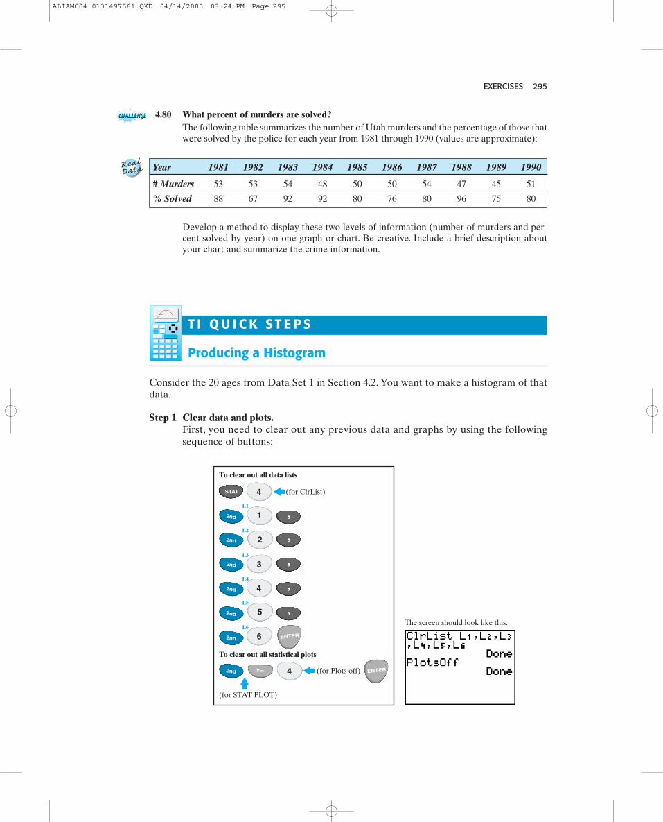
EXERCISES 295
4.80 What percent of murders are solved?The following table summarizes the number of Utah murders and the percentage of those thatwere solved by the police for each year from 1981 through 1990 (values are approximate):
Year 1981 1982 1983 1984 1985 1986 1987 1988 1989 1990
# Murders 53 53 54 48 50 50 54 47 45 51
% Solved 88 67 92 92 80 76 80 96 75 80
Develop a method to display these two levels of information (number of murders and per-cent solved by year) on one graph or chart. Be creative. Include a brief description aboutyour chart and summarize the crime information.
T I Q U I C K S T E P S
Producing a Histogram
Consider the 20 ages from Data Set 1 in Section 4.2. You want to make a histogram of thatdata.
Step 1 Clear data and plots.First, you need to clear out any previous data and graphs by using the followingsequence of buttons:
1
2
To clear out all data lists
(for ClrList)
To clear out all statistical plots
(for Plots off)
(for STAT PLOT)
The screen should look like this:
L2
L3
L4
L5
L6
L1
ENTER
ENTER
STAT
2nd
2nd
2nd
2nd
2nd
2nd
2nd
,
,
,
,
,
Y�
3
4
4
4
6
5
ALIAMC04_0131497561.QXD 04/14/2005 03:24 PM Page 295

296 CHAPTER 4 SUMMARIZING DATA GRAPHICALLY
The screen should look like this:
(for Edit)
and so on to enter all 20 values…
1
3
24
4 5
7
ENTER
ENTER
ENTER
STAT
Step 2 Enter data to be plotted.Next, you need to enter your data in Column L1 using the following sequence ofbuttons:
Step 3 Setting the data range and class width.To generate a histogram, you need to specify the range of the values that youwant to display and the size of the classes. For our age data, we will start classes at30 (Xmin) with increments of 5 (Xscl) through 55 (Xmax). We want the y-scale toreflect the count so that the scaling of this axis is set at 1 We will startthe axis at a negative value, say, (if it were set at 0, we would not be able to seethe x-axis, which would be hidden on the bottom edge of the screen), and the maxi-mum value must be at least the largest number of observations in a given class (youmay need to try various values for Ymax until you can see the complete histogramin your display).
-21Yscl = 12.
Press the WINDOW button and change the entries to read
Xres = 1Yscl = 1Ymax = 9Ymin = -2Xscl = 5Xmax = 55Xmin = 30
Note that there is an additional line at the end called Xres, which should be set to 1,Xres = 1.
ALIAMC04_0131497561.QXD 04/14/2005 03:24 PM Page 296

Press the ZOOM button and then “9” to have the time plot displayed. Use the TRACE but-ton and the right and left arrow keys to see values of each point plotted.
EXERCISES 297
Step 4 Set the STAT PLOT options for a histogram.Finally, set theSTAT PLOToptions for pro-ducing a his-togram of thedata in L1 asPlot 1.
Press theGRAPH but-ton to have thehistogram dis-played. Use theTRACE buttonand the rightand left arrowkeys to see the endpoints for each class and the number of observations in each class.
The Plot 1 screenshould look like this:
(for STAT PLOT) (PLOT 1) (PLOT 1 on)
(to select the histogram Type)
then enter L1 in the Xlist
and be sure 1 is entered in the Freq list ENTER
ENTER
ENTERENTER2nd Y�
Producing a Time Plot
Consider the 20 lengths of parts from Data Set 2 in Section 4.2.You want to make a time plotof that data.
Step 1 Clear data and plots.First you need to clear out any previous data and graphs.
Step 2 Enter data to be plotted.You need to enter the data and a variable to represent the time or order variable.Enter into L1 the values 1, 2, 3, to 20. Enter into L2 the length data for the 20 con-secutive parts.
Step 3 Set the STAT PLOT options for a time plot.The sequence of steps is as follows:
Á
The Plot 1 screenshould look like this:
(for STAT PLOT) (PLOT 1) (PLOT 1 on)
(to select the connected scatterplotType, which is the second icon)
then select L1 in the Xlist
and select L2 in the Ylist ENTER
ENTERENTER
ENTER
2nd Y�
ALIAMC04_0131497561.QXD 04/14/2005 03:24 PM Page 297

298 CHAPTER 4 SUMMARIZING DATA GRAPHICALLY
Producing a Scatterplot
The TI graphing calculator can be used to make a scatterplot. The steps are given using asmall set of data on Test 1 and Test 2 scores.
Your screen should look like this:
For Plot 1,
to turn on the plot we wantthe “on” to be blinking,
to highlight the scatterplot icon,
to “see” the plotin the window.
STATPLOT
check that your Xlist and Ylistcontain the correct dataL1 for Xlist and L2 for Ylist, and
9
ENTER
ENTER
ENTER
2nd
ZOOM
Y�
You can either enter point by point asx � L1 y � L2
or you can enter all the values of x first
to enter all the values of yin the correct order in L2.
8 9
10 13
12 14
14 15
16 19
etc.
Your screenshould look
like this:
Be sure that youhave all previousdata cleared out!
Then press
and you areready to start.
01
1 6
98
ENTER
ENTER ENTER
8 ENTER
ENTER
ENTER
STAT
Obtaining a Scatterplot of the Data in and
Be sure that all graphs have been cleared out! Once thescatterplot is produced, we can comment on the overallform, direction, and strength of the association. We canalso assess if there are any observations that seemunusual.
Y � L2X � L1
ALIAMC04_0131497561.QXD 04/14/2005 03:24 PM Page 298