structgraphics: flexible visualization design through data
TRANSCRIPT

HAL Id: hal-02929811https://hal.archives-ouvertes.fr/hal-02929811
Submitted on 3 Sep 2020
HAL is a multi-disciplinary open accessarchive for the deposit and dissemination of sci-entific research documents, whether they are pub-lished or not. The documents may come fromteaching and research institutions in France orabroad, or from public or private research centers.
L’archive ouverte pluridisciplinaire HAL, estdestinée au dépôt et à la diffusion de documentsscientifiques de niveau recherche, publiés ou non,émanant des établissements d’enseignement et derecherche français ou étrangers, des laboratoirespublics ou privés.
StructGraphics: Flexible Visualization Design throughData-Agnostic and Reusable Graphical Structures
Theophanis Tsandilas
To cite this version:Theophanis Tsandilas. StructGraphics: Flexible Visualization Design through Data-Agnostic andReusable Graphical Structures. IEEE Transactions on Visualization and Computer Graphics, Instituteof Electrical and Electronics Engineers, 2020, TVCG 2021 (InfoVis 2020), 27 (2), pp.315-325. �hal-02929811�

StructGraphics: Flexible Visualization Design throughData-Agnostic and Reusable Graphical Structures
Theophanis Tsandilas
a b c d
Fig. 1. The StructGrapher’s user interface consists of: (a) a library of reusable visualization structures, (b) a visualization sketcher fordrawing basic shapes and grouping them into collections, (c) a property inspector for exposing and structuring graphical properties,and (d) a spreadsheet for creating mappings between properties and data. The approach enables designers to construct data-agnosticvisualizations and create flexible bindings with data. The bottom visualization design was originally published in the Financial Times [22].See our gallery at: https://www.lri.fr/˜fanis/StructGraphics
Abstract—Information visualization research has developed powerful systems that enable users to author custom data visualizationswithout textual programming. These systems can support graphics-driven practices by bridging lazy data-binding mechanisms withvector-graphics editing tools. Yet, despite their expressive power, visualization authoring systems often assume that users want togenerate visual representations that they already have in mind rather than explore designs. They also impose a data-to-graphicsworkflow, where binding data dimensions to graphical properties is a necessary step for generating visualization layouts. In this paper,we introduce StructGraphics, an approach for creating data-agnostic and fully reusable visualization designs. StructGraphics enablesdesigners to construct visualization designs by drawing graphics on a canvas and then structuring their visual properties without relyingon a concrete dataset or data schema. In StructGraphics, tabular data structures are derived directly from the structure of the graphics.Later, designers can link these structures with real datasets through a spreadsheet user interface. StructGraphics supports the designand reuse of complex data visualizations by combining graphical property sharing, by-example design specification, and persistentlayout constraints. We demonstrate the power of the approach through a gallery of visualization examples and reflect on its strengthsand limitations in interaction with graphic designers and data visualization experts.
Index Terms—Visualization design, graphical structures, visualization grammars, layout constraints, infographics, flexible data binding.
1 INTRODUCTION
Visualization systems make use of diverse data representations to helppeople make sense of data. However, previous research has argued thattraditional visualization systems have focused on data exploration andanalysis tasks, paying less attention to presentation purposes [19]. Paststudies [9, 51] also suggest that traditional tools do not target designersand thus often fail to meet real design practices; some tools give littledesign freedom, while others require users to program. Recent systemsaddress this limitation by integrating graphic design tools into thevisualization creation process. Some systems focus on how to supportexpressive data-driven infographics [18, 53, 56, 59]. Others [33, 40, 49]
• Theophanis Tsandilas is with Universite Paris-Saclay, Inria & CNRS,France. E-mail: [email protected]
© 2020 IEEE. This is the author’s version of the article. The final version willbe published in the IEEE Transactions on Visualization and ComputerGraphics.
help visualization authors to produce rich layouts. Each approach hasits own strengths and limitations and presents different solutions onhow to produce expressive visualizations without programming.
Liu et al. [21] argue that “designers use familiar tools to draw, se-lect and manipulate vector graphics, and apply data encoding onlywhen it is necessary.” The above systems generally adopt a lazy data-binding approach to support such practices, where the design of graph-ics precedes the data-binding step. Even so, these systems are largelydata-driven and still rely on a specific dataset to derive a visualizationstructure. For example, Data Illustrator [21] requires its users to as-sign data dimensions at the very beginning of the authoring process.Satyanarayan et al. [41] collectively reflect on the assumptions andcapabilities of Lyra [40], Data Illustrator [21], and Charticulator [33].They conclude that these systems target authoring rather than designtasks since they assume that users start their task with an “appropriatelyformatted dataset” and have a “specific chart design in mind.”
In this paper, we target design tasks. Our goal is to help users explorevisualization layouts without being constrained by data encodings. We

adopt a data-agnostic approach that produces reusable visualizationstructures without programming. The approach combines techniquesof graphical properties sharing [15], by-example specification [27, 31],and persistent alignment and distribution [13] into a new frameworkof nested property structures. We call it StructGraphics (in distinctionwith “Infographics”) to emphasize its focus on graphical structuresrather than data. StructGraphics enables designers to draw their vi-sualization primitives and structure the constraints of their propertieswithout relying on any specific dataset or data schema. Rather thanbeing predefined, data structures are generated on the fly, as design-ers interactively construct their visualizations. Yet, as Liu et al. [21]report, it is sometimes “beneficial to bring in real data” even duringthe shape-drawing phase. StructGraphics does not require real data butlets designers fully or partially link data to their designs at any moment.Such data bindings are flexible and not persistent, and allow designersto test a design with alternative encodings. Our data-binding mecha-nism is facilitated by a spreadsheet user interface that complements themanual entry of data [9] with the constraints of a visualization structure.
Overall, StructGraphics follows the inverse workflow than traditionalvisualization-design systems. Rather than transforming data dependen-cies into visualization constraints, it allows users to interactively definethe property and layout constraints of their visualization designs andthen translate these graphical constraints into alternative data structures.Since visualization designs are data-agnostic, they can be easily reusedand combined with different datasets.
2 RELATED WORK
StructGraphics builds upon a vast volume of research on InformationVisualization, Human-Computer Interaction, and Computer Graphics.
2.1 Visualization Grammars and Toolkits
Wilkinson’s [55] and Wickham’s [54] seminal work on visualizationgrammars has led to powerful visualization creation systems such asggplot2 [2]. Other systems, such as Polaris [45] and its commercial suc-cessor Tableau [6], provide expressive interaction tools that help usersinteractively visualize their data. A third stream of research has investi-gated programming toolkits [11, 12] and declarative grammars [42, 44]that support interactive data visualization. Finally, hybrid approachessuch as VisComposer [24] combine rapid prototyping through interac-tive controls with visual or textual programming.
A number of authors [21, 33, 50, 56] have pointed out that suchsystems impose a bottom-up workflow, where design is driven by datarather than by graphics, layout, and aesthetics.
2.2 Studies of Design Practices
A number of past studies have investigated how professionals or novicesdesign visual representations or work with graphics. Bigelow et al. [9]studied how designers approach data and how data affect their visual-ization designs. They observed that designers prefer a “flexible designenvironment that does not enforce a specific order of operations” andcreate visualizations in a “top-down, graphical process.” These obser-vations are corroborated by Walny et al. [51] who report that designerswho tried to think in terms of “concepts extrinsic to the dataset” endedup with deeper observations about the data. Mendez et al. [25] experi-mentally compared a bottom-up approach (Tableau [6]) to a top-downapproach (iVoLVER [26]) with 10 non-expert participants. Their resultsshow that although a top-down approach is more laborious and slower,it can help users get a better understanding of the creation process, feelmore in control, and produce more varied designs.
Others have looked on how designers work with graphical structures.In particular, Maudet et al. [23] point out that the creation of layoutstructures is an essential part of the graphics design process but alsoobserve that many designers struggle when having to go beyond grid-based layouts. The authors argue that graphical properties must bedescribed instead through versatile rules or constraints that they call
“graphical substrates.” How to describe the property constraints of avisualization design is a key challenge that we address in this paper.
2.3 Design-Oriented Visualization Authoring Tools
Several systems aim to bring visualization tools closer to the graphicsdesign process. Roth et al. [35] are probably the first to describe toolsfor binding data to the properties of graphical objects. Years later, BretVictor [49] demonstrates an interactive data-driven system for creatingcustom data visualizations through a loop-based workflow that resem-bles programming. Research systems that combine graphics-drivenvisualization authoring with programming workflows (either textual orvisual) include iVoLVER [26], Hanpuku [10], and d3-gridding [50].
Meanwhile, the information visualization research has introduced arange of systems that support expressive visualization design withoutprogramming: Lyra [40], iVisDesigner [32], Data-Driven Guides [18],InfoNice [53], DataInk [56], Data Illustrator [21], Charticulator [33],and DataQuilt [59] are representative examples. Satyanarayan et al. [41]describe these systems as visual builders. Some visual builders [18, 53,56, 59] focus on how to help designers produce creative infographics.For example, Data-Driven Guides [18] combines a vector graphicseditor with a flexible data-binding mechanism to produce data-driveninfographics. InfoNice [53] offers similar functionality but targets userswho are not design experts.
A second group of visual builders [21, 33, 40] focus on how to au-thor visualizations with complex (e.g., layered or nested) visualizationlayouts. In particular, Data Illustrator [21] provides tools for groupinggraphical primitives, defining nested collections of similar objects, ap-plying graphical layouts, and establishing lazy data bindings that act asconstraints. Charticulator [33], instead, uses a constraint-based layoutspecification framework that can infer complex visualization layoutsfrom partial user-driven specifications.
Despite their power, these systems still require users to bind datato graphics at the very first steps of the design process. Satyanarayanet al. [41] acknowledge that these systems address the “the narroweractivity of visualization authoring, where the author already has adesired visualization in mind, and has a dataset in the appropriateformat.” StructGraphics’ approach is fully graphics-driven. Its goalis to encourage users to explore designs by directly interacting with avisualization’s graphics, before dealing with concrete data.
2.4 Sketch-Based Data Visualizations
Other systems focus on how to support visualization analysis and pre-sentation tasks through expressive free-from sketches. For example,Sketchstory [20] allows analysts to communicate results through infor-mal sketch-based representations. SketchSliders [47] support mobiledata exploration through interactive sketch-based controllers. Data-toon [17] allows users to produce “data comics” by sketching infor-mal data presentations based on directed node-link diagrams. Finally,DataInk [56] supports expressive shape primitives and free-form layoutpatterns but does not handle nested layouts. How to support sketch-based visualizations is beyond the scope of our work.
2.5 Visualization by Example
Gold [27] was probably the first system to support visualization creationby demonstration. Gold used various heuristics to interpret examplegraphics but supported a limited number of charts and required a well-formatted dataset. Visualization research has also looked at how to infervisual transformations from user-driven interactive demonstrations [37,38]. The approach supports visualization transformation tasks, ratherthan visualization authoring tasks, and is largely data-driven. Wang etal. [52] have recently introduced a visualization-by-example techniquethat infers a visualization grammar from a partial visual sketch anda dataset. Unfortunately, the technique requires the pre-specificationof inference rules for each visualization type (e.g., scatter plot, barchart, and line chart) and further assumes that the input dataset is wellformatted and labeled in accordance to the visualization example.
In StructGraphics, an example defines the bindings of graphicalobjects at one level each time, and from those, the system also infers thestructure of data. Other approaches use Convolutional Neural Networksto extract the data [16] or the grammar [30] from a visualization image,but their success depends on the size and quality of a training dataset.
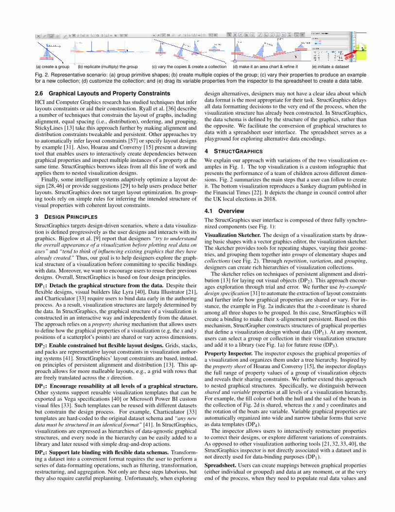
(a) create a group (b) replicate (multiply) the group (c) vary the copies & create a collection (d) make it an area chart & refine it (e) initiate a dataset
drag
Fig. 2. Representative scenario: (a) group primitive shapes; (b) create multiple copies of the group; (c) vary their properties to produce an examplefor a new collection; (d) customize the collection; and (e) drag its variable properties from the inspector to the spreadsheet to create a data table.
2.6 Graphical Layouts and Property ConstraintsHCI and Computer Graphics research has studied techniques that inferlayouts constraints or aid their construction. Ryall et al. [36] describea number of techniques that constrain the layout of graphs, includingalignment, equal spacing (i.e., distribution), ordering, and grouping.StickyLines [13] take this approach further by making alignment anddistribution constraints tweakable and persistent. Other approaches tryto automatically infer layout constraints [57] or specify layout designsby example [31]. Also, Hoarau and Conversy [15] present a drawingtool that enables users to interactively create dependencies betweengraphical properties and inspect multiple instances of a property at thesame time. StructGraphics borrows ideas from all this line of work andapplies them to nested visualization designs.
Finally, some intelligent systems adaptively optimize a layout de-sign [28, 46] or provide suggestions [29] to help users produce betterlayouts. StructGraphics does not target layout optimization. Its group-ing tools rely on simple rules for inferring the intended structure ofvisual properties with coherent layout constraints.
3 DESIGN PRINCIPLES
StructGraphics targets design-driven scenarios, where a data visualiza-tion is defined progressively as the user designs and interacts with itsgraphics. Bigelow et al. [9] report that designers “try to understandthe overall appearance of a visualization before plotting real data onaxes” and “tend to think of influencing existing graphics that they havealready created.” Thus, our goal is to help designers explore the graph-ical structure of a visualization before committing to specific bindingswith data. Moreover, we want to encourage users to reuse their previousdesigns. Overall, StructGraphics is based on four design principles.DP1: Detach the graphical structure from the data. Despite theirflexible designs, visual builders like Lyra [40], Data Illustrator [21],and Charticulator [33] require users to bind data early in the authoringprocess. As a result, visualization structures are largely determined bythe data. In StructGraphics, the graphical structure of a visualization isconstructed in an interactive way and independently from the dataset.The approach relies on a property sharing mechanism that allows usersto define how the graphical properties of a visualization (e.g, the x and ypositions of a scatterplot’s points) are shared or vary across dimensions.DP2: Enable constrained but flexible layout designs. Grids, stacks,and packs are representative layout constraints in visualization author-ing systems [41]. StructGraphics’ layout constraints are based, instead,on principles of persistent alignment and distribution [13]. This ap-proach allows for more malleable layouts, e.g., a grid with rows thatare freely translated across the x direction.DP3: Encourage reusability at all levels of a graphical structure.Other systems support reusable visualization templates that can beexported as Vega specifications [40] or Microsoft Power BI customvisual files [33]. Such templates can be reused with different datasetsbut constrain the design process. For example, Charticulator [33]templates are hard-coded to the original dataset schema and “any newdata must be structured in an identical format” [41]. In StructGraphics,visualizations are expressed as hierarchies of data-agnostic graphicalstructures, and every node in the hierarchy can be easily added to alibrary and later reused with simple drag-and-drop actions.DP4: Support late binding with flexible data schemas. Transform-ing a dataset into a convenient format requires the user to perform aseries of data-formatting operations, such as filtering, transformation,restructuring, and aggregation. Not only are these steps laborious, butthey also require careful preplanning. Unfortunately, when exploring
design alternatives, designers may not have a clear idea about whichdata format is the most appropriate for their task. StructGraphics delaysall data formatting decisions to the very end of the process, when thevisualization structure has already been constructed. In StructGraphics,the data schema is defined by the structure of the graphics, rather thanthe opposite. We facilitate the conversion of graphical structures todata with a spreadsheet user interface. The spreadsheet serves as aplayground for exploring alternative data encodings.
4 STRUCTGRAPHICS
We explain our approach with variations of the two visualization ex-amples in Fig. 1. The top visualization is a custom infographic thatpresents the performance of a team of children across different dimen-sions. Fig. 2 summarizes the main steps that a user can follow to createit. The bottom visualization reproduces a Sankey diagram published inthe Financial Times [22]. It depicts the change in council control afterthe UK local elections in 2018.
4.1 OverviewThe StructGraphics user interface is composed of three fully synchro-nized components (see Fig. 1):Visualization Sketcher. The design of a visualization starts by draw-ing basic shapes with a vector graphics editor, the visualization sketcher.The sketcher provides tools for repeating shapes, varying their geome-tries, and grouping them together into groups of elementary shapes andcollections (see Fig. 2). Through repetition, variation, and grouping,designers can create rich hierarchies of visualization collections.
The sketcher relies on techniques of persistent alignment and distri-bution [13] for laying out visual objects (DP2). This approach encour-ages exploration through trial and error. We further use by-exampledesign specification [31] to automate the extraction of layout constraintsand further infer how graphical properties are shared or vary. For in-stance, the example in Fig. 2a indicates that the x-coordinate is sharedamong all three shapes to be grouped. In this case, StructGraphics willcreate a binding to make their x-alignement persistent. Based on thismechanism, StructGrapher constructs structures of graphical propertiesthat define a visualization design without data (DP1). At any moment,users can select a group or collection in their visualization structureand add it to a library (see Fig. 1a) for future reuse (DP3).Property Inspector. The inspector exposes the graphical properties ofa visualization and organizes them under a tree hierarchy. Inspired bythe property sheet of Hoarau and Conversy [15], the inspector displaysthe full range of property values of a group of visualization objectsand reveals their sharing constraints. We further extend this approachto nested graphical structures. Specifically, we distinguish betweenshared and variable properties at all levels of a visualization hierarchy.For example, the fill color of both the hull and the sail of the boats inthe collection of Fig. 2d is shared, whereas the x and y coordinates andthe rotation of the boats are variable. Variable graphical properties areautomatically organized into wide and narrow tabular forms that serveas data templates (DP4).
The inspector allows users to interactively restructure propertiesto correct their designs, or explore different variations of constraints.As opposed to other visualization authoring tools [21, 32, 33, 40], theStructGraphics inspector is not directly associated with a dataset and isnot directly used for data-binding purposes (DP1).Spreadsheet. Users can create mappings between graphical properties(either individual or grouped) and data at any moment, or at the veryend of the process, when they need to populate real data values and
m textMarks
Groupsg g+ m+
Collectionsc c+ g+ m+
«+»: 1 or more «|» : or hier
arch
y le
vel
identi�er
Fig. 3. StructGraphic visualization elements: marks, groups, and collec-tions. Left: Their grammar. Right: An example of a visualization tree. Wehighlight a group that contains a rectangle, a triangle, and a text field.
generate axes, labels, and legends (DP4). All data manipulations takeplace in a spreadsheet. Spreadsheets are extremely popular and have akey role in the workflow of many design experts [9]. According to Dixet al. [14], spreadsheets “are often the best tools to use.”
In the StructGraphics user interface, designers can create custom datatemplates (DP4) by dragging individual properties or tabular propertystructures from the inspector to a spreadsheet (see Fig 2e). Users cantype a name in the spreadsheet to define a data variable and then apply anumerical transformation, or map it to a set of categorical values. Theycan also manually edit individual values or import them from externalspreadsheet applications, such as Microsoft Excel.
Property constraints created in the sketcher and the inspector aretranslated into value dependencies in the spreadsheet. The spreadsheetuser interface also allows designers to choose which variables to visu-alize as axes, labels, or legends. Rather than imposing a unique dataschema, designers can explore alternative scale transformations andreuse a visualization design with different pieces of data (DP3).
4.2 Visualization StructureA StructGraphics visualization is a tree structure, whose leaf nodesare graphical primitives, called marks: lines, rectangles, ellipses, andtext fields. As in Data Illustrator [21], marks can be grouped togetherto form collections and groups. Collections and groups can be nestedunder higher-level collections and groups. Fig. 3 (left) describes thegrammar of StructGraphics visualizations. Fig. 3 (right) shows thevisualization tree of our infographic in Fig. 1, where we highlight thegroup of the last “boat.” As all nodes in the tree, the group has a uniqueidentifier (1.4) but is further associated with a letter (“A”) that specifiesits hierarchy level. As we see later, this notation helps distinguishamong the graphical properties of nodes at different hierarchy levels.
Groups and collections have a similar structure but distinct roles.Groups enable designers to create complex graphics and have a fixedgraphical structure. Top-level groups serve as the glyphs [33, 41] of avisualization design. They expose the properties of individual shapes,which can vary independently from each other. For example, the fillcolor and height of the sail in Fig. 3 vary independently of the fill colorand height of the hull. In contrast, collections group together a variable(rather than fixed) number of children nodes, where all children havethe same graphical structure. The top collection of our example (“B.Area Chart 1”) contains four groups, where they all depict a sailboat.
We represent groups and collections (or for nested col-lections) as Cartesian coordinate systems (see Fig. 1), whose axesdynamically adapt to the size and position of their children nodes. Werefer to these representations as skeletons. Skeletons serve as interac-tion handles, as reference lines for the coordinates of children nodes,and as scaffolds for creating the axes of the final visualization. Userscan press on the button to hide them and show them back.
4.3 Properties FrameworkAt the core of the StructGraphics approach is a framework for structur-ing the graphical properties of a visualization tree.
4.3.1 Basic Graphical PropertiesA mark is described by the following graphical properties: its type(e.g., line, rectangle, ellipse, triangle, or text field), its x and y positionwith respect to the origin of its parent group or collection, its width and
a b c d
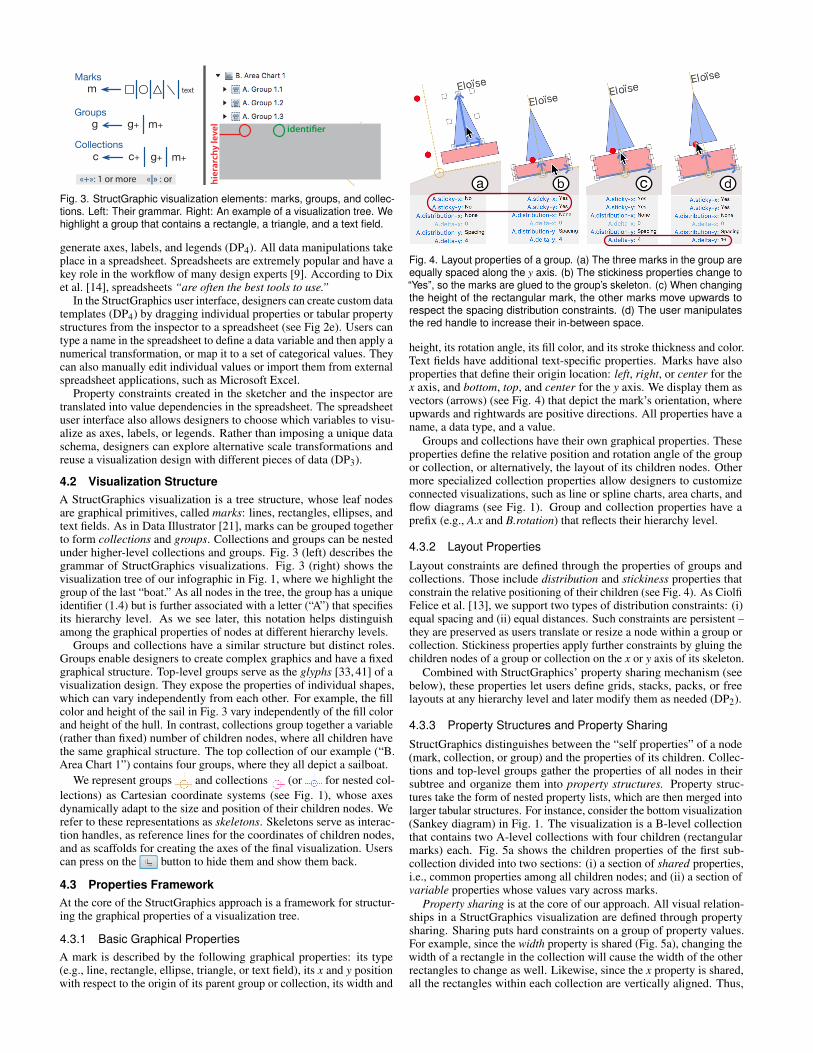
Fig. 4. Layout properties of a group. (a) The three marks in the group areequally spaced along the y axis. (b) The stickiness properties change to“Yes”, so the marks are glued to the group’s skeleton. (c) When changingthe height of the rectangular mark, the other marks move upwards torespect the spacing distribution constraints. (d) The user manipulatesthe red handle to increase their in-between space.
height, its rotation angle, its fill color, and its stroke thickness and color.Text fields have additional text-specific properties. Marks have alsoproperties that define their origin location: left, right, or center for thex axis, and bottom, top, and center for the y axis. We display them asvectors (arrows) (see Fig. 4) that depict the mark’s orientation, whereupwards and rightwards are positive directions. All properties have aname, a data type, and a value.
Groups and collections have their own graphical properties. Theseproperties define the relative position and rotation angle of the groupor collection, or alternatively, the layout of its children nodes. Othermore specialized collection properties allow designers to customizeconnected visualizations, such as line or spline charts, area charts, andflow diagrams (see Fig. 1). Group and collection properties have aprefix (e.g., A.x and B.rotation) that reflects their hierarchy level.
4.3.2 Layout Properties
Layout constraints are defined through the properties of groups andcollections. Those include distribution and stickiness properties thatconstrain the relative positioning of their children (see Fig. 4). As CiolfiFelice et al. [13], we support two types of distribution constraints: (i)equal spacing and (ii) equal distances. Such constraints are persistent –they are preserved as users translate or resize a node within a group orcollection. Stickiness properties apply further constraints by gluing thechildren nodes of a group or collection on the x or y axis of its skeleton.
Combined with StructGraphics’ property sharing mechanism (seebelow), these properties let users define grids, stacks, packs, or freelayouts at any hierarchy level and later modify them as needed (DP2).
4.3.3 Property Structures and Property Sharing
StructGraphics distinguishes between the “self properties” of a node(mark, collection, or group) and the properties of its children. Collec-tions and top-level groups gather the properties of all nodes in theirsubtree and organize them into property structures. Property struc-tures take the form of nested property lists, which are then merged intolarger tabular structures. For instance, consider the bottom visualization(Sankey diagram) in Fig. 1. The visualization is a B-level collectionthat contains two A-level collections with four children (rectangularmarks) each. Fig. 5a shows the children properties of the first sub-collection divided into two sections: (i) a section of shared properties,i.e., common properties among all children nodes; and (ii) a section ofvariable properties whose values vary across marks.
Property sharing is at the core of our approach. All visual relation-ships in a StructGraphics visualization are defined through propertysharing. Sharing puts hard constraints on a group of property values.For example, since the width property is shared (Fig. 5a), changing thewidth of a rectangle in the collection will cause the width of the otherrectangles to change as well. Likewise, since the x property is shared,all the rectangles within each collection are vertically aligned. Thus,

a b
c
d
e
f
g
drag to share
drag to makevariable
Fig. 5. Property structures of the visualizations in Fig. 1, as represented in the StructGraphics inspector. Left: (a) The children properties of the firstA-level collection divided into two groups: shared and variable. (b) Part of the children properties of the B-level collection. (c) A tabular structure thatsummarizes all variable properties. (d) Structure of connections between nodes. Right: (e) Structure of the children properties of an A-level group.The user can choose which properties to make public. (f) Those properties are highlighted and appear in the “Public (Visible to Collections)” section.(g) The structure of children properties in the B-level collection. Observe that only public group properties are shown.
property sharing can serve as an alignment mechanism that furtherconstrains a visualization layout (DP2).
Fig. 5b presents part of the children properties of the B-level collec-tion. Observe that the fill property is shared at this level, and the samefour colors are common in both A-level collections. In contrast, the yand height properties are variable at both levels, thus they can freelychange. Users can modify a property structure by dragging the labelof a property from the section of variable properties to the section ofshared properties, and vice-versa.
The tabular structure in Fig. 5c shows all properties that are variableat least at one level of the visualization hierarchy, where each variableproperty is represented by a separate column. Two additional columnsin the table represent the identifiers of the A-level collections (A.id)and the identifiers of the marks (id). Such tabular structures serve astemplates for generating data tables in the spreadsheet (see Sec. 4.5),where each column can be mapped to a data variable.
4.3.4 Property Grouping and Scoping
As we discussed earlier, groups can expose the properties of individualmarks. For example, the designer of our infographic in Fig. 1 wants tovary the sail height but keep the height of the hull and the flag constant.StructGraphics supports this design through a fine-grained interface forstructuring properties within groups. Fig. 5e shows how the inspectordisplays the property structure of a group. Notice that some properties(e.g., reference-y and thickness) are bound across all marks and havea common value (and name). Other properties (e.g., fill) are split intodistinct properties and are named by the mark to which they refer (e.g.,fill1, fill2, and fill3). Finally, some properties (e.g., reference-x) areonly partially split for a subset of the marks in the group.
Unfortunately, the number of individual properties in a group canbecome large and cause the tabular structures of parent collections toexplode in size. We address this problem with property scoping. Specif-ically, the inspector lets users pick which properties to make public, i.e.,visible to parent collections, by hovering over a property of interest andpressing a key (see Fig. 5e-f). As Fig. 5g shows, the property structureof a parent collection includes the public only properties of its children.Users can change the visibility of group properties at any moment, andthe property structure of parent collections are constantly updated.
4.3.5 Connections and Directional Links
Collections provide additional properties to describe connectionsamong their children. Connections that StructGraphics supports in-clude poly lines, areas, and Bezier curves. The ordering of connectionsfollows the natural ordering of the children in a collection. Connectionscan be created among the siblings of any type of node, including marks,groups, and sub-collections.
replicate vary its copy create B-level collection
draw links extend
Fig. 6. Creating nested collections: Sankey diagram of Fig. 1.
Furthermore, StructGraphics allows for directional links betweenany two nodes within a collection. For example, the flow connectionsin the Sankey diagram of Fig. 1 are weighted directional links betweenthe marks of the two nested collections. As shown in Fig. 5d, linksare represented as rows in a tabular structure. Each row includes theidentifier of the link’s source and destination, and a weight. For this typeof visualization, the weight expresses the height of a flow connection inpixels. As with other property structures, the designer can later use thetable of links as a template to generate the data that define the flows.
4.4 Constructing Visualization Designs
The StructGraphics user interface provides a set of tools that enabledesigners to draw shapes, create groups and collections, reuse them,structure their properties, map them to data variables, and decoratevisualizations with axes, labels, and legends.
4.4.1 Drawing, Replicating, Grouping, and Linking
As in traditional vector-graphics editors, users can draw shapes on thecanvas and then resize them with interactive handles. The effect of allobject manipulations is communicated to users with an “elastic band.”The band shows the trace of an ongoing manipulation to help userstrace their edits and easily cancel them, e.g., by pressing ESC. Ourimplementation resembles the Dwell-and-Spring technique [8] andserves as the base for all tools in the sketcher (see Fig. 6) by couplingdirect manipulation with crossing-based selection [7].
A replication (multiply) tool accelerates the creation of multiplesimilar objects. The tool substitutes the “repeat action” of Data Illustra-tor [21] but does not require the user to associate the action with a datadimension (see Fig. 2b). Users can replicate individual marks, groups,collections, and full visualization trees. As shown in Fig. 6, they canalso extend the internal nodes of a collection to achieve a target design.In such cases, the tool ensures that the collection’s layout and propertysharing constraints are respected. StructGraphics provides additionaltools for grouping canvas objects (marks, groups, or collections) intogroups or collections . Users can also draw direct linksbetween marks (see Fig. 6), where connected marks must belong to thesame visualization tree, i.e., appear under the same top-level collection.

As users create collections, groups, and connections, property struc-tures are automatically updated in a way that no conflicts arise. Forexample, StructGraphics ensures that the height property in the Sankeydiagram of Fig. 1 is not shared across rectangles. Likewise, the height ofconnected rectangles is constantly updated (e.g., the height of a sourcemark increases) to remain consistent with incoming and outgoing flows.
4.4.2 By-Example Design SpecificationCreating the right property structure can be tedious, since the designermust specify which properties are shared or variable at each level of thevisualization tree. StructGraphics’ grouping tools relax this problem bytrying to “guess” the designer’s target structure based on the propertyvalues of the grouped objects, which serve as examples. To this end,we calculate statistics for alternative layout configuration and pick themost probable configuration. Overall, StructGraphics’ by-examplespecification approach supports a design workflow with four main steps(see Fig. 2 and Fig. 6): (i) draw a shape, (ii) replicate it, (iii) vary theproperties of one or more replicas, and (iv) then group.
In order to decide whether a property is shared or variable, weanalyze its variance (in pixels) across all grouped objects. If it isbelow a threshold value, the property is considered as shared. Likewise,we infer reference points, alignment, and distribution constraints bylooking at all possible configurations of distance and spacing betweengrouped nodes. We then try to identify the most common patterns.When more than one possible configurations arise, e.g., equal distancesbetween centers but also equal spacing, we choose a configuration basedon a list of priority rules. We prioritize center-based alignments anddistance-based distributions on the x-axis and bottom-based alignmentsand spacing-based distributions on the y-axis.
4.4.3 Design ReuseSince visualization designs are independent of raw data and dataschemas, they can be easily reused (DP3). StructGraphics supportsreuse through a library of visualizations (see Fig. 1a), which can containindividual marks, groups, or collections. The library stores the fullvisualization tree of a node, including its property structures. Userssimply need to right-click on the node and then choose from a menu toadd it to the library. Later, they can drag its thumbnail from the libraryinto the canvas to create a copy and work on a different variation.
Visualization nodes, trees, and full libraries are exported and savedas JavaScript Object Notation (JSON) specification files. They canbe easily imported into the user’s workspace and shared. Our gallerypresents several examples of StructGraphics JSON specification files.In addition to the visualization structure, our JSON syntax can describea full StructGraphics workspace, including the tabular structures in thespreadsheet and their transformations (see next section). Thus, it couldbe further used to capture the full history of a design process.
4.5 Binding Visualization Designs with DataA “clear trend” observed by Bigelow et al. [9] was that “manualencoding is not only tolerated, but even embraced by designers [...].”However, the authors also report that “manual encoding consumessignificant time and effort [...].” StructGraphics supports a manualdata-encoding workflow but automates it by making use of the sharingrelationships in a visualization property structure.
4.5.1 From Graphical Properties to Data VariablesStructGraphics does not assume that a dataset pre-exists (DP1). Instead,it helps users to create it from scratch from their design (DP4). Propertystructures in the inspector (see Fig. 5), including individual propertyvalues, property lists, and property tables, are the basis for creating adata template. At any moment, the user can drag a property structurefrom the inspector into the spreadsheet. In the spreadsheet, propertiesare transformed into variables and appear in columns (see Fig. 7).
Initially, variables are named after properties, but users can designatenames that represent real data dimensions, such as Time or Country.Users can then type text and numbers. Variables are bidirectionallybound to the original properties and are also subject to their structuralconstraints. As a result, changing a variable value by editing a cell
Fig. 7. Transforming variables. Left: Applying a functional transformationto a variable that is bound to the height property. Right: Applying asymbolic transformation to the fill property and replacing its categoryvalues. Modifying the yellow value will cause all yellow cells to update.
in the spreadsheet will cause other cells to change, as long as they allcorrespond to the same property sharing. Such constraints automatethe manual entry of data and prevent data-entry errors.
Alternatively, users can import data from external spreadsheet appli-cations, such as Microsoft Excel, through copy and paste. StructGraph-ics thus takes advantage of the functionality of familiar applications fordata formatting. Notice that a table in the spreadsheet can take a wideor a long form, depending on whether it is created from properties inthe “Children Properties” section (Fig. 5b) or the “Tabular Structure”section (Fig. 5c) of the inspector. Therefore, a tuple in the spreadsheetdoes not necessarily represent a single glyph (see analysis by Satya-narayan et al. [41]). It can also represent a lower-level collection. Inthis case, the properties of its children will appear as separate columns.
A StructGraphics spreadsheet is fully synchronized with the sketcherand the inspector. Changes in a visualization can be initiated at anyof these three interfaces and are immediately propagated to the twoothers. When the user activates the “replicate” tool to add new childrento a collection, the data representations of the collection are updatedwith new rows or columns. However, users cannot currently add newchildren to a collection from the spreadsheet.
4.5.2 Data TransformationsTraditional visualization systems use scales [54] to map data dimen-sions to visual properties. StructGraphics follows the inverse approach,where users optionally transform properties to real units. To this end,the spreadsheet interface supports two transformation types (see Fig. 7):Functional. They are expressed as mathematical functions and apply tonumerical values. The spreadsheet provides a formula field for editingtheir syntax. To establish bidirectional mappings between originaland transformed values, the system calls a solver to derive the inversefunction. If, for example, the user types a function Seats= height/2−5,the solver will also derive the inverse function: height = Seats∗2+10.StructGraphics will then use this formula to map the values entered inthe spreadsheet to height property values.Symbolic. They define 1-by-1 mappings between individual propertyvalues and alphanumerics that represent discrete categories. Struct-Graphics initially assigns default names as categories. Then, users canedit their values. All instances of a category are linked together sincethey are bound to a shared property (see Fig. 7-Right). Changing aninstance will automatically cause all other instances to change as well.
Transformations apply to the variables in the spreadsheet, not tothe original properties. Therefore, users can create multiple variablesfrom a single property at different areas of the spreadsheet, where eachvariable can take a different function.
4.5.3 Axes, Labels, and LegendsVariables in a spreadsheet are also the basis for generating axes, labels,and legends. The user can right-click on a variable to activate a menuand choose to associate it with an axis or a legend, where only variableswith symbolic transformations can generate legends. Likewise, the usercan opt to decorate visualization nodes with a variable’s values, e.g., toshow the political parties (“Conservative”, “Labour,” etc.) on the flowsof the Sankey diagram in Fig. 1. Collection skeletons serve as scaffoldsfor constructing axes. If the user activates an axis of a collection, theaxis inherits the geometry and alignment constraints of its skeleton.

2.1.4
2.1.3
2.1.2
2.1.1
2.2.4
2.2.3
2.2.2
2.2.1
2.1.4
2.1.3
2.1.2
2.1.1
2.2.4
2.2.3
2.2.2
2.2.1
2.1.4
2.1.3
2.1.2
2.1.1
2.2.4
2.2.3
2.2.2
2.2.1
B-level sharing A-level sharing A- & B-level sharing2.1.4
2.1.3
2.1.2
2.1.1
2.2.4
2.2.3
2.2.2
2.2.1
No sharing
Fig. 8. Alternative binding patterns for the fill property of a B-levelcollection. We take as example the bottom visualization of Fig. 1.
4.6 Implementation DetailsThe StructGraphics system [4] is a JavaFX [3] application. The spread-sheet UI is an extension of the SpreadsheetView class of ControlsFX [1].The spreadsheet’s formula solver uses the Symja algebra library [5].
A major implementation challenge was how to create a reactiveand fully synchronized UI that continuously respects all constraintsof property structures. We use the property design pattern of JavaFXbut extend its bi-directional binding mechanism to a group (multi-directional) binding mechanism that ensures that each property in asharing relationship is only updated once. StructGraphics applies groupproperty bindings at different levels of a visualization hierarchy thatdetermine how properties are shared within each group or collection.Fig. 8 shows alternative bindings of the fill property for the bottomvisualization of Fig. 1. The approach generalizes to larger numbers ofhierarchy levels, where for each level, we add a new binding dimension.
StructGraphics ensures that all sharing bindings of the same level aresynchronized. For example, if the A-level sharing breaks at the first sub-collection of our example (“A. Collection 2.1”), then the sharing willalso break at the second sub-collection (“A. Collection 2.2”). As a result,users can change a property structure at any level of a visualization tree,knowing that the system will automatically apply the change to all othernodes of the same level. Finally, StructGraphics ensures that differentbindings (as well as layout constraints) do not conflict with each other.For example, suppose the marks in Fig. 8 are equally spaced along the yaxis through a spacing distribution constraint, while the height propertyis variable. Sharing their y property at the B-level would introducepositioning conflicts, and any change in the height of a rectangle wouldresult in unpredictable behavior. StructGraphics automatically breaksthe distribution constraint in this case to avoid the conflict.
5 EVALUATION
Ren et al. [34] discuss several approaches for evaluating visualizationauthoring systems, including informative, reproduction, comparative,free-form user studies, and image or video galleries. More recently,Satyanarayan et al. [41] introduce critical reflections as an informalmethod for comparing systems and assessing how each system meetsits authors’ assumptions. We use a mix of these methods.
5.1 GalleryWe demonstrate the expressive power of StructGraphics with a galleryof visualizations. It includes high-resolution images, videos that illus-trate their creation process, as well as StructGraphics JSON files thatspecify the structure of each visualization and their full workspace. Itis available at: https://www.lri.fr/˜fanis/StructGraphics.
5.2 User FeedbackWe held individual sessions with seven participants to collect user feed-back. The first two participants (P1, P2) participated in a laboratoryenvironment in proximity with the investigator. However, due to theCOVID-19 outbreak, we interrupted the study and adapted its protocolto remote sessions. We used the TeamViewer software [7], which al-lowed participants to view and take control of the investigator’s remoteworkspace. Participants used a home setup that varied across sessions.Our materials and data are available at: https://osf.io/dgbae/.Participants: The participants were volunteers (four women) withdiverse backgrounds. P1, P5, and P7 (denoted below as •) had 10-25years of professional experience in graphic design and had practiced
visualization design and infographics. P1 had also experience in infor-mation visualization research (Ph.D. level). P3 and P6 were facultymembers with more than 12 years of experience in information visual-ization research. P2 was a Ph.D. student with expertise in visualizationgrammars, while P4 was postdoctoral researcher in interaction design.Method: Sessions lasted 70 to 85 minutes. The participants filled outa pre-study background questionnaire. The investigator introduced theStructGraphics user interface and provided a step-by-step tutorial (45to 50 minutes) that explained its main features. During the tutorial, theparticipants carried out small tasks to test their understanding. Afterthe tutorial, they were asked to complete a chart reproduction task,which involved building a nested visualization structure, applying datatransformations, editing specific data values, and displaying axes andlegends. After the end of the session, each participant was asked tocomplete a post-study questionnaire. The questionnaire evaluated theusability of the system with respect to learning, creation difficulty, andoverall experience on a 5-point scale. The participants were also askedto report on their own approach to visualization creation (data-drivenvs. graphics-driven) and reflect on uses and limitations of the system.
Results: The mean rating for learning difficulty was 2.43 23 (1 =
very easy, 5 = very difficult): the tool “is pretty easy to use and learn”(P7), “is straightforward to use once you understand the underlyingmechanism” (P4). P3 found that it “is extremely flexible and rich,but requires some getting used to.” P6 liked that “there were only afew tools/concepts in total” but added that “one difficulty compared tofreeform drawing with Illustrator is that you have to think of constraintsright from the start.” A challenge that participants faced was under-standing how to change the sharing of properties at the correct hierarchylevel. P7 remarked that at higher collection levels, “shared/variablesettings are a bit complex to understand” and wondered whether theirpresentation in the inspector could become simpler.
The mean rating for creation difficulty was 1.71 (1 = veryeasy, 5 = very difficult). P5 and P7 (expert designers) were enthusiastic.P5 explained that “it’s very pleasing to be able to easily create graphicswith this tool, as it takes me much longer with my usual software.” P7found that it is “both intuitive and logic” and “allows to start visuallyand then to insert the real values – really easier than struggling withthe settings panels and tabs of a pre-existing graph in Excel.”
Concerning the participants’ overall experience, the mean ratingwas 2.0 2
31 (1 = very enjoyable, 5 = very frustrating). P6 liked“that you can drag graphical properties to the spreadsheet, and editthem.” According to this participant, this feature could be useful forother graphic design tasks “beyond linking visualizations to data.” P3reported that “this is a fun tool to experiment with. The logic behind thetool is intuitive and it can allow the creation of interesting visualizationswith simple drag and drop operations.” In contrast, P4 found that thegrouping “is not 100% intuitive.” She would prefer to manipulate
“individual objects first, and then allow building groups later on.”Reflecting on their own approach, few only participants could iden-
tify it as purely data-driven (P2) or purely graphics-driven (P5). P1, P3,P6, and P7 explained that their approach depends on the type or thephase of the task. According to P3, data-exploration tasks are alwaysdata-driven, and the tool is not well adapted. However, “when buildinga vis for communication I often start with the message I want to com-municate in mind and think of the visuals first [...] the tool makes thisprocess of adapting subtle properties very easy to do, helps customizeall aspects of the visual and gives absolute control on what the vis willlook at the end” (P3). P6 expressed the opinion that whether the taskis data-driven (“graphic meant to communicate a message or insightsabout a particular dataset”) or not (“designing a visualization meantto work with many datasets”), “visualization is always graphics-driven.”The participant continued that “you can definitely design a visualizationwithout a dataset” but “you eventually always have to test it and refineit by plugging data” (P6). In the same line, P7 argued that “data first”or “graphics first” are both true, since some graphic representationsmatch specific datasets, while others do not. But the designer empha-sized that “it is important to have an idea of what things could looklike, even if data is not yet complete (or arrived)” (P7).

Fig. 9. Recreating the Wall Street Journal’s A Field Guide to Red andBlue America visualization [58] with StructGraphics.
5.3 Critical ReflectionsSatyanarayan et al. [41] present their collective critical reflections. Here,although we report on the author’s own reflections, we use the analysisof Satyanarayan et al. [41] as reference. We reflect on StructGraphics’capabilities, assumptions, and limitations by referring to results of ouruser study. We also compare StructGraphics to existing visualizationauthoring systems and discuss future extensions.
5.3.1 Comparative ScenarioWe start with a scenario that reproduces A Field Guide to Red andBlue America, a nested visualization published in The Wall StreetJournal [58]. Satyanarayan et al. [41] use the same scenario to compareLyra [40], Data Illustrator [21], and Charticulator [33]. The originalvisualization contains a bar chart for each of the 51 states of USA thatdepicts the balance between votes for Democrats and Republicans from1980 to 2012. Fig. 9 shows the full visualization on StructGraphics’sketcher, while part of the dataset is shown on the spreadsheet. A videodemonstration of the creation process and the JSON specification ofthe visualization are included in our gallery.
As a first step, we bring a bar chart design from our library or build itfrom scratch. To do so, we draw a rectangle and replicate it alongthe x direction. Then, we vary the height of the rectangles and usethe tool to create a collection. In the inspector, we make their fillproperty variable, apply a red and blue color, and refine their alignementconstraints within the collection: A.sticky-x = Yes and A.sticky-y = Yes.As a second step, we create 50 copies of the bar chart and then createa B-level collection. We do so by replicating the bar chart: first alongthe y axis (×5) and then along the x axis (×10). In the inspector, weensure that height and fill are variable at all levels. We then explorealternative layouts by freely moving the bar charts on the cavas.
We now decide to bind our visualization with the original dataset,which contains the following columns: State, GridX and GridY coor-dinates, Year, Inclination (“Dem.” or “Rep.”), and PV I, a relative votemeasure that is negative for Democrats and positive for Republicans.We open it with Microsoft Excel and sort it first by Year and thenby State. In the inspector, we navigate to the tabular structure of thetop collection, drag the columns A.id, A.x, A.y, height, and f ill, anddrop them into the spreadsheet. We rename A.id to “State,” turn itstransformation to symbolic, and bring the State column from Excelvia copy and paste. Similarly, we make the f ill variable symbolic andcopy the Inclination column. For the other variables (A.x, A.y, height),we keep a functional transformation and choose a convenient function(e.g., GridY = A.y/100, GridX = A.x/120, PV I = 0.7∗height) to mappixels to data units. When we copy their values from Excel, all barcharts take the correct height values and positions. To display the namesof the states, we right-click on the “State” column and choose “Showon glyphs” from the menu. Later, we decide to drag the “Hawaii” chartfurther left to highlight the relative geographic location of this state.
Finally, we add a larger bar chart to explain the coloring schemeand dimensions of each bar chart (see Fig. 9). We copy the “WestVirginia” bar chart, make its bars wider and vary their heights. We dragits x, y, and f ill properties to the spreadsheet, where we add labels andtransformations (as above) and populate axis labels and a legend.
5.3.2 Critical Reflections on System ComponentsWe first reflect on the components of StructGraphics visualizations.Marks and Glyphs. Like Data Illustrator [21], StructGraphics requiresits users to activate a tool from the toolbar to draw a mark. This ap-proach facilitates the use of key shortcuts, which are extensively used bydesign experts [48]. Currently, StructGraphics only supports predefinedshapes (like Lyra and Charticulator), lacking Data Illustrator’s capabili-ties of drawing arbitrary paths. As in Data Illustrator, StructGraphicsgroups are drawn directly on the canvas. In contrast to groups or glyphsin Data Illustrator and Charticulator, groups in StructGraphics can beinfinitely nested. A strength of our design is that groups and collectionsshare the same representation, behavior, and creation process.
Unlike Data Illustrator and Lyra, StructGraphics does not treatcurves, areas, and connections as marks – it represents them as separateproperties within collections. This design is closer to Charticulator,which also expresses connections as separate objects, but StructGraph-ics further lets users create connections among sub-collections (notonly among glyphs).Data Editing and Data Binding. The spreadsheet is an integral com-ponent of the StructGraphics user interface. It enables users to shapetheir dataset based on the visual structure of the visualization design,apply data transformations to create mappings between pixels and dataunits, edit individual or multiple values (e.g., by copy-paste), and com-municate with external spreadsheet applications. This is a fundamentaldifference between StructGraphics and current visualization authoringtools [41], which do not deal with data entry and data formatting.
The data-binding philosophy of StructGraphics is also distinct. Inprevious systems [21, 33, 40], data-binding precedes and fully specifiesthe creation of all instances of a certain type of glyphs. In contrast,StructGraphics requires that all glyph instances are explicitly createdby the user. For example, in our scenario, we created all 51 bar charts(one for each state) directly on the canvas (see Fig. 10). Unfortunately,the creation process becomes cumbersome as the number of glyphsincreases. Thus, StructGraphics may not be suitable if the goal is tovisualize large datasets with hundreds or thousands of data points.
Furthermore, even after property structures have been bound to data,StructGraphics still allows users to freely manipulate the graphicalproperties of their visualizations on the sketcher or the inspector. Bind-ings between data and graphical properties are fully bi-directional,allowing users to explore visual layouts without being constrained byspecific data values. Users can further bind the same property structurewith different pieces of data and transformations to explore alternativesolutions. On the downside, this freedom raises ethical considera-tions, since users may be tempted to alter or fake their data in order toachieve a compelling visual result. Our study questionnaire asked ourparticipants’ opinion on this issue. Overall, participants did not viewit as a problem: “fake graphs based on fake data is a really differentproblem” (P7), “if people want to create fake data, they can alreadydo it without those tools” (P6). P3 expressed the same opinion but alsoadded: “I believe it is easy to make mistakes [...] if you have thousandsof data points, this is hard to double-check.” Adding common scales ofmeasurement and data summarization mechanisms could potentiallyimprove data entry and prevent errors in the spreadsheet interface.Scales, Axes, and Legends. In StructGraphics, scales, axes, and leg-ends are generated at will by interacting with the data variables at thespreadsheet interface. However, the sketcher does not currently allowusers to edit them and further customize them. Referring to this lack ofsupport, P4 complained that “it is a little bit frustrating that you cannotmanipulate everything on the interface.” This is a clear limitation incomparison with the capabilities of existing tools [41].Layout. Lyra and Charticulator use anchors to reference and relativelyposition visual objets. In StructGraphics, anchors are replaced byx and y reference positions at the level of marks, and skeletons atthe level of groups and collections. Skeletons are constantly visiblesuch that designers can directly manipulate the position of groupsand collections (P6: “I like that collections are reified. The fact thatgroups are invisible is definitely an issue with Illustrator”). LikeCharticulator, StructGraphics can express layout constraints at the level

1. Draw Rectangle
2. Replicate it
4. Replicate it (x51), and make a B-level collection
5. GridX -> A.x GridY -> A.y
3. Create a Collection
Fig. 10. Main steps for creating the layout of the visualization in Fig. 9.
of graphics. Both systems support alignment and spacing constraintsbut through different mechanisms. Charticulator’s constraints are basedon the alignment and margin properties of marks and a mechanismof persistent snapping. StructGraphics’ constraints are based on thestickiness and distribution properties of groups and collections andtheir sharing structures. Note that StructGraphics’ sharing mechanismallows for linking together other properties of a glyph. For example,we can create a group of three rectangles to represent an error bar,where the fill, width, and height of the top and bottom rectangles areshared and thus commonly change. This mechanism relieves usersfrom having to bind the properties of each individual object in a groupto a data variable and facilitates reuse.
Charticulator makes use of a constraint solver that could potentiallysupport more complex layout constraints. Nevertheless, further com-plexity comes with a cost, since users may not anticipate the solver’slogic. A major requirement for StructGraphics’ design was that objectmanipulations must be incremental across the full interface, where alllayout constraints are constantly evaluated and propagated as the userdirectly manipulates objects. Such behavior requires simple rules withpredictable outcomes.
StructGraphics uses the same layout mechanisms for groups andcollections, while users can define the full layout without a dataset (seeFig. 10: Steps 1-4). In contrast, Lyra, Data Illustrator, and Charticulatorrequire the visualization author to bind a layout structure to the variablesof a dataset. As we discuss below, this key difference derives from ourdifferent assumptions about the user task. Finally, StructGraphics lacksCharticulator’s support for polar and curve coordinates. In order tosupport alternative coordinate systems and nested 2D representations(e.g., as tree maps in Lyra), we need to extend StructGraphics withadditional by-example-specification tools and layout mechanisms.
5.3.3 Critical Reflections on our AssumptionsWe also reflect on how StructGraphics’ design meets our assumptions.The Task: Designing, not Authoring. A fundamental assumption ofthe developers of Lyra, Data Illustrator, and Charticulator “is that peo-ple want to author a chart, not to design one” [41]. For StructGraphics,we reverse this assumption. We assume that users want to design achart, not to author one. Our participants’ feedback confirms this as-sumption. Several participants expressed the opinion that the tool is notwell adapted to purely data-driven tasks, in particular data exploration(P3) or visualization generation from existing datasets (P1, P2, P4). Incontrast, they all found it valuable for design-oriented tasks (P1, P2,P6, P7), for education purposes (P4), for generating “simulation data”(P4), or for data communication purposes (P3, P5).
In summary, visualization authoring is a data-driven activity, whereasdesign tasks are often driven by graphics. StructGraphics lets designersfocus on their graphics, where any reference to data is only implicit.The distinction between “explicit” and “implicit” data is fundamentalfor design tasks. Data can be incomplete or ill defined in the designer’smind and progressively emerge as a visual structure takes shape.The Designer: Literacy & Skill Transfer. Since we target designpractitioners, we assumed that StructGraphics users have experiencewith vector-graphics editing applications and spreadsheets, are familiarwith visualization tools and grammars but may not know how to code.As we discussed earlier, the participants felt that the tool was overall notdifficult to learn but were sometimes perplexed about how to locate andmanage the property structures in the inspector. A possible direction forimproving the editing experience of property structures is to reify theirsharing relationships through constraint holders that users can directlyinteract with on the sketcher. P6 also remarked that the way transforma-
tions are expressed in the formula editor (e.g., deaths = height ∗10) isdifferent from how “visualization practitioners are used to think” (e.g.,height = deaths/10). Since the StructGraphics workflow may requireusers to think in either direction, a better approach might be to allowthem to switch between those two representations.
The Data: Formatted during Design. Unlike Satyanarayan et al. [41],we do not assume that data are appropriately formatted prior to the task.In StructGraphics, the data schema is defined as the user constructs avisualization structure, based on the property sharing of its components.Users may also decide to not deal with specific data values at all, oreven split their data into different areas of the spreadsheet. However,there are situations (like in our scenario) where users will need to bringreal data. StructGraphics provides data-transformation capabilitiesbut mostly relies on external spreadsheet applications for loading andtransforming existing datasets. For the dataset of our example, we usedthe formula editor of Microsoft Excel to derive the Inclination column:IF(PV I > 0, “Rep.”, “Dem.”). We then copied the column and pasted itto the StructGraphics spreadsheet to associate it with the fill property ofthe bars. However, the functional relationship between PVI (mapped toheight) and Inclination (mapped to fill) is not expressed at the level ofthe property structures. Thus, if the user turns the height of a bar frompositive to negative , its fill color will not automatically changeto blue. More generally, StructGraphics cannot express functionaldependencies between properties, which would require more expressivevisual languages, such as iVoLVER [26] or Linkify [23]. We defer thestudy of this problem to future work.
Export, Reuse, & Interoperability. Reuse is a fondamental activityof all design practices. A strength of StructGraphics is the fact thatgraphical structures of any nesting level are fully reusable and indepen-dent of datasets or data schemas. Designers can further build their ownlibraries of visualization structures and share them as lightweight JSONfiles. P1 commented that StructGraphics would be more valuable asan intermediate design tool, which requires better interoperability withother visualization software. A future direction is to develop wrappersto/from popular formats, such as Vega [43] (as in Lyra [40]), Power BIcustom visuals (as in Charticulator [33]), or ggplot2 [2] code snippets.
Finally, during their task, some participants expressed the need toapply structural changes to their collections, such as directly addingshapes to existing groups in the canvas. In order to construct a visu-alization with StructGraphics, the designer has to start from its basicshapes and progressively move to higher-level groups and collections.Unfortunately, the reverse workflow is not currently supported. Forexample, suppose a designer reuses the structure of the Sankey dia-gram in Fig. 1 but wants to replace the rectangular shapes by morecomplex glyphs, such as the sailboats of the top visualization in thesame figure. Extending StructGraphics to support such top-down vi-sualization constructions would allow designers to experiment withricher design-remixing workflows. Other interesting extensions in thisdirection include adding partitioning tools (as in Data Illustrator [21])and supporting embedded merge and split operations [39].
6 SUMMARY AND CONCLUSION
We presented StructGraphics, a new graphics-driven approach for datavisualization design. StructGraphics enable designers to produce data-agnostic visualizations that they can then reuse with different datasets.We introduced a framework for constructing property structures thatdetermine how graphical properties are grouped and shared among thenodes of a visualization hierarchy. We showed that property structuresact both as graphical constraints and as templates for data.
Creating a visualization design tool that is appropriate for all usersand design needs may be impossible or even not desirable [9]. TheStructGraphics approach provides a flexible design workflow but is stilllimited in the range of design solutions it supports. We second Liu etal. [21] who throughout their design iterations observe that constructinga “coherent set of concepts and tools that behave consistently” can be
“a great challenge.” How to extend the StructGraphics approach to dealwith more expressive visualizations and alternative design workflowsis an exiting challenge for future research.

REFERENCES
[1] ControlsFX. https://github.com/controlsfx/controlsfx.[2] ggplot2. https://github.com/tidyverse/ggplot2.[3] JavaFX. https://openjfx.io/.[4] StructGraphics code repository. https://gitlab.inria.fr/
structgraphics/code.[5] Symja - java computer algebra library. https://bitbucket.org/axelclk/symja_android_library/wiki/Home.
[6] Tableau. https://www.tableau.com.[7] J. Accot and S. Zhai. More than dotting the i’s — foundations for crossing-
based interfaces. In Proceedings of the SIGCHI Conference on HumanFactors in Computing Systems, CHI ’02, pp. 73–80. ACM, New York, NY,USA, 2002. doi: 10.1145/503376.503390
[8] C. Appert, O. Chapuis, and E. Pietriga. Dwell-and-spring: Undo fordirect manipulation. In Proceedings of the SIGCHI Conference on HumanFactors in Computing Systems, CHI ’12, pp. 1957–1966. ACM, New York,NY, USA, 2012. doi: 10.1145/2207676.2208339
[9] A. Bigelow, S. Drucker, D. Fisher, and M. Meyer. Reflections on howdesigners design with data. In Proceedings of the 2014 InternationalWorking Conference on Advanced Visual Interfaces, AVI ’14, pp. 17–24.ACM, New York, NY, USA, 2014. doi: 10.1145/2598153.2598175
[10] A. Bigelow, S. Drucker, D. Fisher, and M. Meyer. Iterating between toolsto create and edit visualizations. IEEE Transactions on Visualization andComputer Graphics, 23(1):481–490, Jan. 2017. doi: 10.1109/TVCG.2016.2598609
[11] M. Bostock and J. Heer. Protovis: A graphical toolkit for visualization.IEEE transactions on visualization and computer graphics, 15:1121–8, 112009. doi: 10.1109/TVCG.2009.174
[12] M. Bostock, V. Ogievetsky, and J. Heer. D3: Data-driven documents. IEEETransactions on Visualization and Computer Graphics, 17(12):2301–2309,Dec. 2011. doi: 10.1109/TVCG.2011.185
[13] M. Ciolfi Felice, N. Maudet, W. E. Mackay, and M. Beaudouin-Lafon.Beyond snapping: Persistent, tweakable alignment and distribution withStickyLines. In Proceedings of the 29th Annual Symposium on UserInterface Software and Technology, UIST ’16, pp. 133–144. ACM, NewYork, NY, USA, 2016. doi: 10.1145/2984511.2984577
[14] A. Dix, R. Cowgill, C. Bashford, S. McVeigh, and R. Ridgewell. Spread-sheets as user interfaces. In Proceedings of the International WorkingConference on Advanced Visual Interfaces, AVI ’16, pp. 192–195. ACM,New York, NY, USA, 2016. doi: 10.1145/2909132.2909271
[15] R. Hoarau and S. Conversy. Augmenting the scope of interactions withimplicit and explicit graphical structures. In Proceedings of the SIGCHIConference on Human Factors in Computing Systems, CHI ’12, pp. 1937–1946. ACM, New York, NY, USA, 2012. doi: 10.1145/2207676.2208337
[16] D. Jung, W. Kim, H. Song, J.-i. Hwang, B. Lee, B. Kim, and J. Seo.ChartSense: Interactive data extraction from chart images. In Proceedingsof the 2017 CHI Conference on Human Factors in Computing Systems,CHI ’17, p. 6706–6717. Association for Computing Machinery, New York,NY, USA, 2017. doi: 10.1145/3025453.3025957
[17] N. W. Kim, N. Henry Riche, B. Bach, G. A. Xu, M. Brehmer, K. Hinckley,M. Pahud, H. Xia, M. McGuffin, and H. Pfister. DataToon: Drawingdynamic network comics with pen + touch interaction. In CHI 2019, pp.1–12. ACM, May 2019.
[18] N. W. Kim, E. Schweickart, Z. Liu, M. Dontcheva, W. Li, J. Popovic,and H. Pfister. Data-Driven Guides: Supporting expressive design forinformation graphics. IEEE Transactions on Visualization and ComputerGraphics, PP(99):1–1, Jan 2017 2017.
[19] R. Kosara. Presentation-oriented visualization techniques. IEEE ComputerGraphics and Applications, 36(1):80–85, Jan 2016. doi: 10.1109/MCG.2016.2
[20] B. Lee, R. Habib Kazi, and G. Smith. SketchStory: Telling more en-gaging stories with data through freeform sketching. IEEE transactionson visualization and computer graphics, 19:2416–25, 12 2013. doi: 10.1109/TVCG.2013.191
[21] Z. Liu, J. Thompson, A. Wilson, M. Dontcheva, J. Delorey, S. Grigg,B. Kerr, and J. Stasko. Data Illustrator: Augmenting vector design toolswith lazy data binding for expressive visualization authoring. In Pro-ceedings of the 2018 CHI Conference on Human Factors in ComputingSystems, CHI ’18, pp. 123:1–123:13. ACM, New York, NY, USA, 2018.doi: 10.1145/3173574.3173697
[22] H. Mance, J. Pickard, and L. Hughes. Labour fails to make biggains in england local elections. https://www.ft.com/content/
5f2a3dcc-4f5b-11e8-a7a9-37318e776bab, 2018.[23] N. Maudet, G. Jalal, P. Tchernavskij, M. Beaudouin-Lafon, and W. E.
Mackay. Beyond grids: Interactive graphical substrates to structure digitallayout. In Proceedings of the 2017 CHI Conference on Human Factorsin Computing Systems, CHI ’17, pp. 5053–5064. ACM, New York, NY,USA, 2017. doi: 10.1145/3025453.3025718
[24] H. Mei, W. Chen, Y. Ma, H. Guan, and W. Hu. VisComposer: A visualprogrammable composition environment for information visualization.Visual Informatics, 2(1):71 – 81, 2018. Proceedings of PacificVAST 2018.doi: 10.1016/j.visinf.2018.04.008
[25] G. G. Mendez, U. Hinrichs, and M. A. Nacenta. Bottom-up vs. top-down:Trade-offs in efficiency, understanding, freedom and creativity with infovistools. In Proceedings of the 2017 CHI Conference on Human Factorsin Computing Systems, CHI ’17, p. 841–852. Association for ComputingMachinery, New York, NY, USA, 2017. doi: 10.1145/3025453.3025942
[26] G. G. Mendez, M. A. Nacenta, and S. Vandenheste. IVoLVER: Interactivevisual language for visualization extraction and reconstruction. In Pro-ceedings of the 2016 CHI Conference on Human Factors in ComputingSystems, CHI ’16, p. 4073–4085. Association for Computing Machinery,New York, NY, USA, 2016. doi: 10.1145/2858036.2858435
[27] B. A. Myers, J. Goldstein, and M. A. Goldberg. Creating charts bydemonstration. In Proceedings of the SIGCHI Conference on HumanFactors in Computing Systems, CHI ’94, p. 106–111. Association forComputing Machinery, New York, NY, USA, 1994. doi: 10.1145/191666.191715
[28] A. Oulasvirta, N. Ramesh Dayama, M. Shiripour, M. John, and A. Kar-renbauer. Combinatorial optimization of graphical user interface designs.Proceedings of the IEEE, 108(3):434–464, 2020.
[29] P. O’Donovan, A. Agarwala, and A. Hertzmann. DesignScape: Designwith interactive layout suggestions. In Proceedings of the 33rd AnnualACM Conference on Human Factors in Computing Systems, CHI ’15, p.1221–1224. Association for Computing Machinery, New York, NY, USA,2015. doi: 10.1145/2702123.2702149
[30] J. Poco and J. Heer. Reverse-engineering visualizations: Recovering visualencodings from chart images. Computer Graphics Forum, 36(3):353–363,2017. doi: 10.1111/cgf.13193
[31] B. Reinert, T. Ritschel, and H.-P. Seidel. Interactive by-example designof artistic packing layouts. ACM Trans. Graph., 32(6):218:1–218:7, Nov.2013. doi: 10.1145/2508363.2508409
[32] D. Ren, T. Hollerer, and X. Yuan. iVisDesigner: Expressive interactivedesign of information visualizations. IEEE Transactions on Visualizationand Computer Graphics, 20(12):2092–2101, 2014. doi: 10.1109/TVCG.2014.2346291
[33] D. Ren, B. Lee, and M. Brehmer. Charticulator: Interactive construction ofbespoke chart layouts. IEEE Transactions on Visualization and ComputerGraphics, 25(1):789–799, Jan. 2019. doi: 10.1109/TVCG.2018.2865158
[34] D. Ren, B. Lee, M. Brehmer, and N. Henry Riche. Reflecting on the evalu-ation of visualization authoring systems. In BELIV Workshop at IEEE VIS:Evaluation and Beyond - Methodological Approaches for Visualization.IEEE, October 2018.
[35] S. F. Roth, J. Kolojejchick, J. Mattis, and J. Goldstein. Interactive graphicdesign using automatic presentation knowledge. In Proceedings of theSIGCHI Conference on Human Factors in Computing Systems, CHI ’94,pp. 112–117. ACM, New York, NY, USA, 1994. doi: 10.1145/191666.191719
[36] K. Ryall, J. Marks, and S. Shieber. An interactive constraint-based systemfor drawing graphs. In Proceedings of the 10th Annual ACM Symposiumon User Interface Software and Technology, UIST ’97, pp. 97–104. ACM,New York, NY, USA, 1997. doi: 10.1145/263407.263521
[37] B. Saket and A. Endert. Demonstrational interaction for data visualization.IEEE Computer Graphics and Applications, 39(3):67–72, May 2019. doi:10.1109/MCG.2019.2903711
[38] B. Saket, H. Y. Kim, E. T. Brown, and A. Endert. Visualization bydemonstration: An interaction paradigm for visual data exploration. IEEETransactions on Visualization and Computer Graphics, 23:331–340, 2017.
[39] A. Sarvghad, B. Saket, A. Endert, and N. Weibel. Embedded merge split:Visual adjustment of data grouping. IEEE Transactions on Visualizationand Computer Graphics, 25(1):800–809, Jan 2019. doi: 10.1109/TVCG.2018.2865075
[40] A. Satyanarayan and J. Heer. Lyra: An interactive visualization designenvironment. Computer Graphics Forum, 33(3):351–360, 2014. doi: 10.1111/cgf.12391
[41] A. Satyanarayan, B. Lee, D. Ren, J. Heer, J. Stasko, J. L. Thompson,

M. Brehmer, and Z. Liu. Critical reflections on visualization authoringsystems. IEEE Transactions on Visualization and Computer Graphics,26:461–471, 2019.
[42] A. Satyanarayan, D. Moritz, K. Wongsuphasawat, and J. Heer. Vega-Lite:A grammar of interactive graphics. IEEE Transactions on Visualizationand Computer Graphics, 23(1):341–350, 2017.
[43] A. Satyanarayan, R. Russell, J. Hoffswell, and J. Heer. Reactive Vega: Astreaming dataflow architecture for declarative interactive visualization.IEEE Transactions on Visualization and Computer Graphics, 22(1):659–668, 2016.
[44] A. Satyanarayan, K. Wongsuphasawat, and J. Heer. Declarative interactiondesign for data visualization. In Proceedings of the 27th Annual ACMSymposium on User Interface Software and Technology, UIST ’14, p.669–678. Association for Computing Machinery, New York, NY, USA,2014. doi: 10.1145/2642918.2647360
[45] C. Stolte and P. Hanrahan. Polaris: A system for query, analysis andvisualization of multi-dimensional relational databases. In Proceedings ofthe IEEE Symposium on Information Visualization 2000, InfoVis ’00, pp.5–. IEEE Computer Society, Washington, DC, USA, 2000.
[46] K. Todi, D. Weir, and A. Oulasvirta. Sketchplore: Sketch and explorewith a layout optimiser. In Proceedings of the 2016 ACM Conferenceon Designing Interactive Systems, DIS ’16, p. 543–555. Association forComputing Machinery, New York, NY, USA, 2016. doi: 10.1145/2901790.2901817
[47] T. Tsandilas, A. Bezerianos, and T. Jacob. SketchSliders: Sketching Wid-gets for Visual Exploration on Wall Displays. In Proceedings of the ACMConference on Human Factors in Computing Systems, pp. 3255–3264.ACM, Seoul, South Korea, Apr. 2015. doi: 10.1145/2702123.2702129
[48] T. Tsandilas, M. Grammatikou, and S. Huot. BricoSketch: Mixing paperand computer drawing tools in professional illustration. In Proceedings ofthe 2015 International Conference on Interactive Tabletops & Surfaces,ITS 2015, Funchal, Portugal, November 15-18, 2015, pp. 127–136. ACM,2015. doi: 10.1145/2817721.2817729
[49] B. Victor. Drawing dynamic visualizations. http://worrydream.com/DrawingDynamicVisualizationsTalkAddendum, 2013.
[50] R. Vuillemot and J. Boy. Structuring Visualization Mock-ups at a Graph-ical Level by Dividing the Display Space. IEEE Transactions on Visu-alization and Computer Graphics, 24(1):424 – 434, Oct. 2017. doi: 10.1109/TVCG.2017.2743998
[51] J. Walny, S. Huron, and S. Carpendale. An exploratory study of datasketching for visual representation. Computer Graphics Forum, 34(3):231–240, 2015. doi: 10.1111/cgf.12635
[52] C. Wang, Y. Feng, R. Bodik, A. Cheung, and I. Dillig. Visualizationby example. Proc. ACM Program. Lang., 4(POPL), Dec. 2019. doi: 10.1145/3371117
[53] Y. Wang, H. Zhang, H. Huang, X. Chen, Q. Yin, Z. Hou, D. Zhang,Q. Luo, and H. Qu. InfoNice: Easy creation of information graphics. InProceedings of the 2018 CHI Conference on Human Factors in ComputingSystems, CHI ’18. Association for Computing Machinery, New York, NY,USA, 2018. doi: 10.1145/3173574.3173909
[54] H. Wickham. A layered grammar of graphics. Journal of Computationaland Graphical Statistics, 19(1):3–28, 2010. doi: 10.1198/jcgs.2009.07098
[55] L. Wilkinson. The Grammar of Graphics (Statistics and Computing).Springer-Verlag, Berlin, Heidelberg, 2005.
[56] H. Xia, N. Henry Riche, F. Chevalier, B. De Araujo, and D. Wigdor.DataInk: Direct and creative data-oriented drawing. In Proceedings ofthe 2018 CHI Conference on Human Factors in Computing Systems, CHI’18, pp. 223:1–223:13. ACM, New York, NY, USA, 2018. doi: 10.1145/3173574.3173797
[57] P. Xu, H. Fu, T. Igarashi, and C.-L. Tai. Global beautification of layoutswith interactive ambiguity resolution. In Proceedings of the 27th AnnualACM Symposium on User Interface Software and Technology, UIST ’14,pp. 243–252. ACM, New York, NY, USA, 2014. doi: 10.1145/2642918.2647398
[58] R. Yeip, S. A. Thompson, and W. Welch. A field guide to redand blue america. http://graphics.wsj.com/elections/2016/
field-guide-red-blue-america, 2016.[59] J. E. Zhang, N. Sultanum, A. Bezerianos, and F. Chevalier. DataQuilt:
Extracting visual elements from images to craft pictorial visualizations. InProceedings of the 2020 CHI Conference on Human Factors in ComputingSystems, CHI ’20. ACM, 2020. doi: 10.1145/3313831.3376172