“solving big problems is easier than solving little … · bootstrap organizes a page into a grid...
TRANSCRIPT

Bootstrap All-in-One A Quick Introduction to Managing Content in Cascade
Alex King, Jay Whaley 4/28/17 Bootstrap Docs
“Solving big problems is easier than solving little problems.”
Sergey Brin
Facilities Management | 1
Facilities Management | 1
Contents
Understanding the Grid ................................................................................................................................................ 2
Responsive Design .......................................................................................................................................................... 3
Common Fields ................................................................................................................................................................ 4
Features .............................................................................................................................................................................. 6
The Accordion Add-on ............................................................................................................................................. 6
The Button Add-on .................................................................................................................................................... 9
The Box List Add-on ............................................................................................................................................... 12
The Carousel Add-on ............................................................................................................................................. 15
The Embed Add-on ................................................................................................................................................ 17
The Image + Link Add-on .................................................................................................................................... 20
The Newsroom Add-On ........................................................................................................................................ 23
The Panel Add-on .................................................................................................................................................... 25
The PDF Viewer Add-on ........................................................................................................................................ 27
The Tab Add-On ...................................................................................................................................................... 29
The Text Add-on ...................................................................................................................................................... 31
Resources ........................................................................................................................................................................ 33
Box List Icons ............................................................................................................................................................. 33
Glyphicons .................................................................................................................................................................. 33
Appendices ..................................................................................................................................................................... 34
Appendix A: Accessibility Standards ................................................................................................................ 34
Appendix B: Fonts, Styles, and Design Standards ....................................................................................... 36
Bootstrap All-in-One | 2
Bootstrap All-in-One | 2
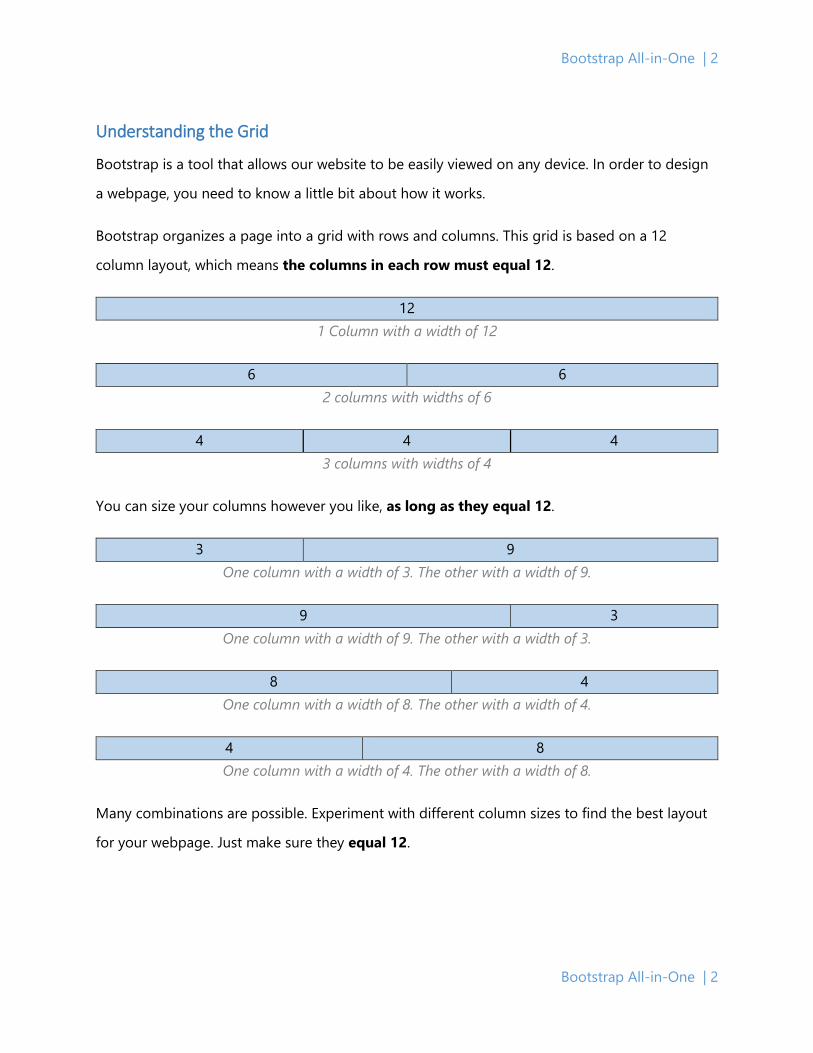
Understanding the Grid
Bootstrap is a tool that allows our website to be easily viewed on any device. In order to design
a webpage, you need to know a little bit about how it works.
Bootstrap organizes a page into a grid with rows and columns. This grid is based on a 12
column layout, which means the columns in each row must equal 12.
12 1 Column with a width of 12
6 6 2 columns with widths of 6
4 4 4 3 columns with widths of 4
You can size your columns however you like, as long as they equal 12.
3 9 One column with a width of 3. The other with a width of 9.
9 3 One column with a width of 9. The other with a width of 3.
8 4 One column with a width of 8. The other with a width of 4.
4 8 One column with a width of 4. The other with a width of 8.
Many combinations are possible. Experiment with different column sizes to find the best layout
for your webpage. Just make sure they equal 12.
Facilities Management | 3
Facilities Management | 3
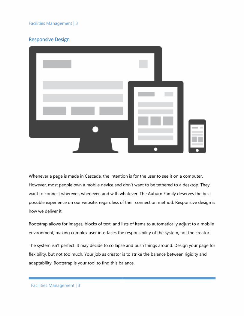
Responsive Design
Whenever a page is made in Cascade, the intention is for the user to see it on a computer.
However, most people own a mobile device and don’t want to be tethered to a desktop. They
want to connect wherever, whenever, and with whatever. The Auburn Family deserves the best
possible experience on our website, regardless of their connection method. Responsive design is
how we deliver it.
Bootstrap allows for images, blocks of text, and lists of items to automatically adjust to a mobile
environment, making complex user interfaces the responsibility of the system, not the creator.
The system isn’t perfect. It may decide to collapse and push things around. Design your page for
flexibility, but not too much. Your job as creator is to strike the balance between rigidity and
adaptability. Bootstrap is your tool to find this balance.

Bootstrap All-in-One | 4
Bootstrap All-in-One | 4
Common Fields
Some fields appear across multiple Bootstrap features, and some you do not need to concern
yourself with. It would be useful to familiarize yourself with them now.
Content – This is the standard editor for content on your page. You can type and format text
inside the box. Images and tables should be avoided inside the editor. However, they are
necessary in some cases. Contact IT if you need them on your page.
Page Link – This links to a page inside Cascade. This is the preferred method for linking to
another Facilities web page.
Web Link – This links to a page outside Cascade. Use it to link to non-Facilities pages.
Dividing Line – This adds a horizontal line between your rows.

Facilities Management | 5
Facilities Management | 5
Color – Bootstrap colors do more than make content stand out. They emphasize meaning. There
are five colors that represent the significance of different actions and information: Primary Blue,
Success Green, Info Blue, Warning Yellow, and Danger Red.
• Primary Blue indicates the primary action you want a user to take.
• Success Green indicates a positive action.
• Info Blue indicates useful information for the user.
• Warning Yellow indicates caution should be used with an action.
• Danger Red indicates a negative action.
DIV Style – This field is for IT use. It applies CSS to the column’s div.
IMG Style – This field is for IT use. It applies CSS to the image tag.
Bootstrap All-in-One | 6
Bootstrap All-in-One | 6
Features
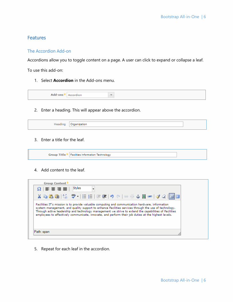
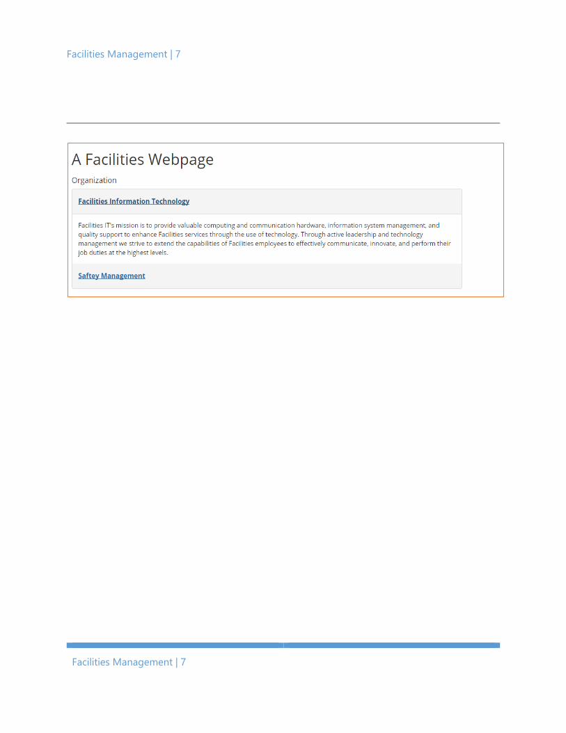
The Accordion Add-on
Accordions allow you to toggle content on a page. A user can click to expand or collapse a leaf.
To use this add-on:
1. Select Accordion in the Add-ons menu.
2. Enter a heading. This will appear above the accordion.
3. Enter a title for the leaf.
4. Add content to the leaf.
5. Repeat for each leaf in the accordion.
Facilities Management | 7
Facilities Management | 7
Bootstrap All-in-One | 8
Bootstrap All-in-One | 8
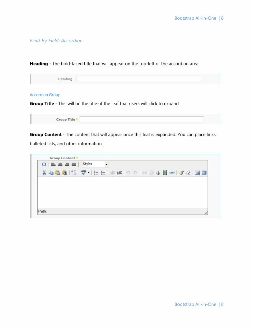
Field-By-Field: Accordion
Heading - The bold-faced title that will appear on the top-left of the accordion area.
Accordion Group
Group Title - This will be the title of the leaf that users will click to expand.
Group Content - The content that will appear once this leaf is expanded. You can place links,
bulleted lists, and other information.
Facilities Management | 9
Facilities Management | 9
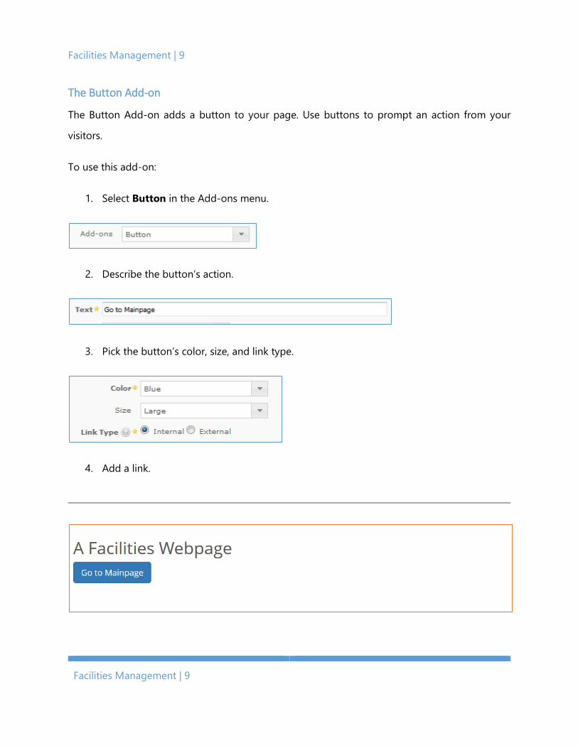
The Button Add-on
The Button Add-on adds a button to your page. Use buttons to prompt an action from your
visitors.
To use this add-on:
1. Select Button in the Add-ons menu.
2. Describe the button’s action.
3. Pick the button’s color, size, and link type.
4. Add a link.

Bootstrap All-in-One | 10
Bootstrap All-in-One | 10
Field-By-Field: Button
Text – This is the label on the button.
Color – This is the color of the button. Standard Bootstrap colors are available.
• Primary Blue indicates the primary action you want a user to take.
• Success Green indicates a positive action.
• Info Blue indicates useful information for the user.
• Warning Yellow indicates caution should be used with an action.
• Danger Red indicates a negative action.
Size – This is the size of the button.
Link Type – This is the internal page or external link that this button will take the user.

Facilities Management | 11
Facilities Management | 11
Page Link1 – This links your button to a page inside Cascade.
Web Link2 – This links your button to a page outside Cascade.
1. This field appears when Link Type is set to Internal.
2. This field appears when Link Type is set to External.
Bootstrap All-in-One | 12
Bootstrap All-in-One | 12
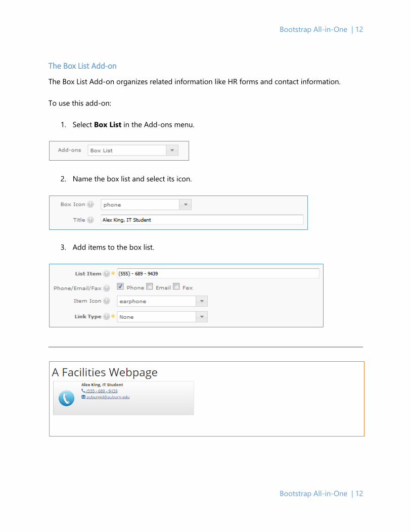
The Box List Add-on
The Box List Add-on organizes related information like HR forms and contact information.
To use this add-on:
1. Select Box List in the Add-ons menu.
2. Name the box list and select its icon.
3. Add items to the box list.

Facilities Management | 13
Facilities Management | 13
Field-by-Field: Box List
Box List Group
Box Icon – This is the large icon on the left of the Box List. There is a finite collection of images
that you may use, due to limitations under the hood. These images appear in the Resources
section of this booklet.
Title - This is the bold-faced title line that defines the rest of the content in the Box List.
Box Contents Group
List Item - This is content that will appear on one line.
Phone/Email/Fax – This allows special formatting for a phone number, email address, or fax
number.
Item Icon - This icon appears to the left of the content. This can be a phone icon, fax machine
icon, file icon, etc. Please see the Resources section for more information about these icons
called Glyphicons.
Bootstrap All-in-One | 14
Bootstrap All-in-One | 14
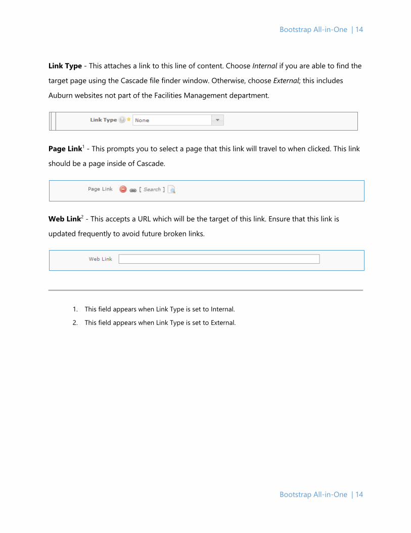
Link Type - This attaches a link to this line of content. Choose Internal if you are able to find the
target page using the Cascade file finder window. Otherwise, choose External; this includes
Auburn websites not part of the Facilities Management department.
Page Link1 - This prompts you to select a page that this link will travel to when clicked. This link
should be a page inside of Cascade.
Web Link2 - This accepts a URL which will be the target of this link. Ensure that this link is
updated frequently to avoid future broken links.
1. This field appears when Link Type is set to Internal.
2. This field appears when Link Type is set to External.
Facilities Management | 15
Facilities Management | 15
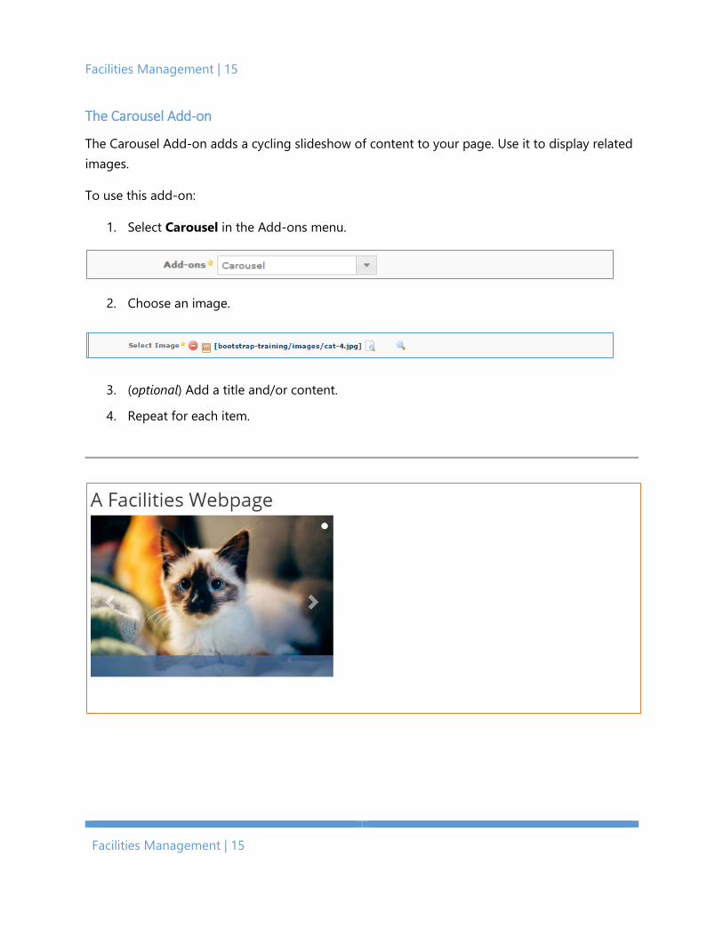
The Carousel Add-on
The Carousel Add-on adds a cycling slideshow of content to your page. Use it to display related images.
To use this add-on:
1. Select Carousel in the Add-ons menu.
2. Choose an image.
3. (optional) Add a title and/or content.
4. Repeat for each item.
Bootstrap All-in-One | 16
Bootstrap All-in-One | 16
Field-By-Field: Carousel
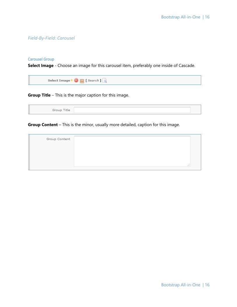
Carousel Group Select Image - Choose an image for this carousel item, preferably one inside of Cascade.
Group Title – This is the major caption for this image.
Group Content – This is the minor, usually more detailed, caption for this image.
Facilities Management | 17
Facilities Management | 17
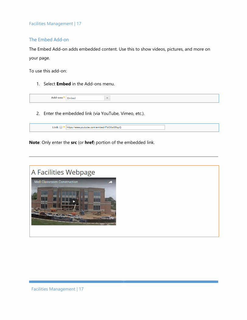
The Embed Add-on
The Embed Add-on adds embedded content. Use this to show videos, pictures, and more on
your page.
To use this add-on:
1. Select Embed in the Add-ons menu.
2. Enter the embedded link (via YouTube, Vimeo, etc.).
Note: Only enter the src (or href) portion of the embedded link.

Bootstrap All-in-One | 18
Bootstrap All-in-One | 18
Field-by-Field: Embed
Embed Type - This describes the type of media embedded into the page. The choices are
YouTube Video, Twitter Feed, Flickr Feed, or Facebook Feed.
Link – This field appears for every option. Enter the address in the href tag within the
embedded link.
Aspect Ratio1 - This formats the YouTube video to be widescreen or full screen.
Height2 - This describes the height of the Twitter feed in pixels. Please see the Resources section
for a link and small excerpt of pixels-to-inches conversion.
1. This field appears when Embed Type is set to YouTube Video.
2. This field appears when Embed Type is set to Twitter Feed
Facilities Management | 19
Facilities Management | 19
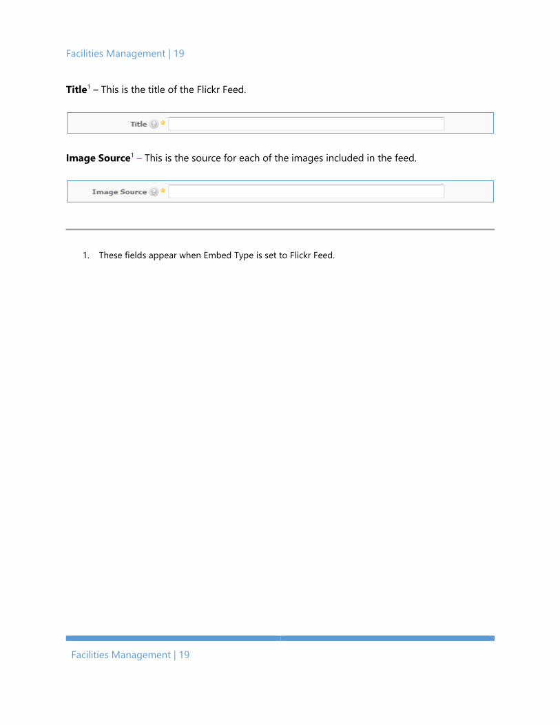
Title1 – This is the title of the Flickr Feed.
Image Source1 – This is the source for each of the images included in the feed.
1. These fields appear when Embed Type is set to Flickr Feed.

Bootstrap All-in-One | 20
Bootstrap All-in-One | 20
The Image + Link Add-on
The Image + Link Add-on adds an image to your page. It can also link to another page.
To select this add-on:
1. Select Image + Link in the Add-ons menu.
2. Add an image.
.
3. (Optional) Add a link.
• Click Link Type, then select Internal or External. Add a Facilities Webpage for an
internal link or URL for an external link.

Facilities Management | 21
Facilities Management | 21
Field-by-Field: Image + Link
Select Image - This allows you to choose an image file in Cascade. These will be automatically
updated whenever they are moved or renamed. Depending on the location of the image, there
may be size restrictions. Please see Appendix B: Fonts, Styles, and Design Standards to ensure
you’re using the correct sizes.
Image Alt Text - This describes the attached image. A one-line, first-glance description is all
that’s necessary. This complies with screen readers and other accessibility options common on
the web. Please see Appendix A: Accessibility Standards for more information.
Hover-Over Text - This displays whenever the user positions their mouse over the image.
Caption Text - This appears below the image as a bold-faced caption. This furthers the
information that a user may get when looking at the image.
Align - This aligns the image to the left-side, center, or right-side of the screen.

Bootstrap All-in-One | 22
Bootstrap All-in-One | 22
Link Type - This allows you to attach a link to the image. Choose Internal if you are able to find
the target page using the Cascade file finder window. Otherwise, choose External; this includes
Auburn websites not part of the Facilities Management department.
Page Link – This links your image to another page in Cascade.
Web Link1 – This selects a URL target to link to. Ensure it is updated frequently.
Content – Use this content editor to write an extra description underneath your image.
1. This field appears when Link Type is set to External.
Facilities Management | 23
Facilities Management | 23
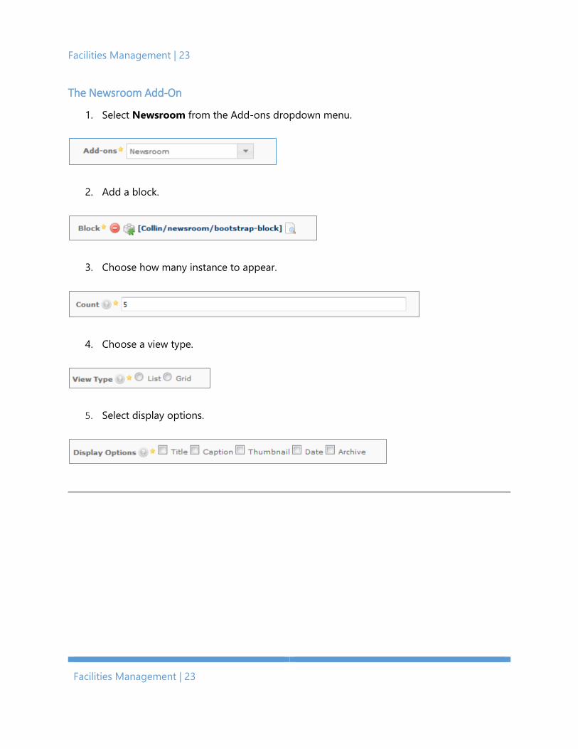
The Newsroom Add-On
1. Select Newsroom from the Add-ons dropdown menu.
2. Add a block.
3. Choose how many instance to appear.
4. Choose a view type.
5. Select display options.
Bootstrap All-in-One | 24
Bootstrap All-in-One | 24
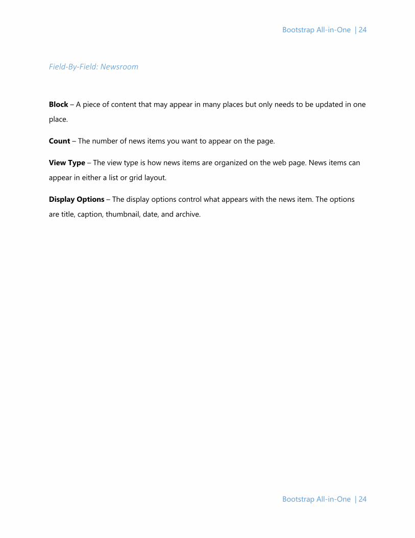
Field-By-Field: Newsroom
Block – A piece of content that may appear in many places but only needs to be updated in one
place.
Count – The number of news items you want to appear on the page.
View Type – The view type is how news items are organized on the web page. News items can
appear in either a list or grid layout.
Display Options – The display options control what appears with the news item. The options
are title, caption, thumbnail, date, and archive.

Facilities Management | 25
Facilities Management | 25
The Panel Add-on
The Panel Add-on adds a bordered box and heading around your content. Panels are a visually
pleasing way to present information.
To use this add-on:
1. Select Panel in the Add-ons menu.
2. Give your panel a heading and color.
3. Type and format your text in the editor.

Bootstrap All-in-One | 26
Bootstrap All-in-One | 26
Field-By-Field: Panel
Heading – This is the title of the panel.
Color – This is the color of the heading and border. Standard Bootstrap colors are available.
• Primary Blue indicates the primary action you want a user to take.
• Success Green indicates a positive action.
• Info Blue indicates useful information for the user.
• Warning Yellow indicates caution should be used with an action.
• Danger Red indicates a negative action.
Content – This content editor is for the information inside your panel.
Facilities Management | 27
Facilities Management | 27
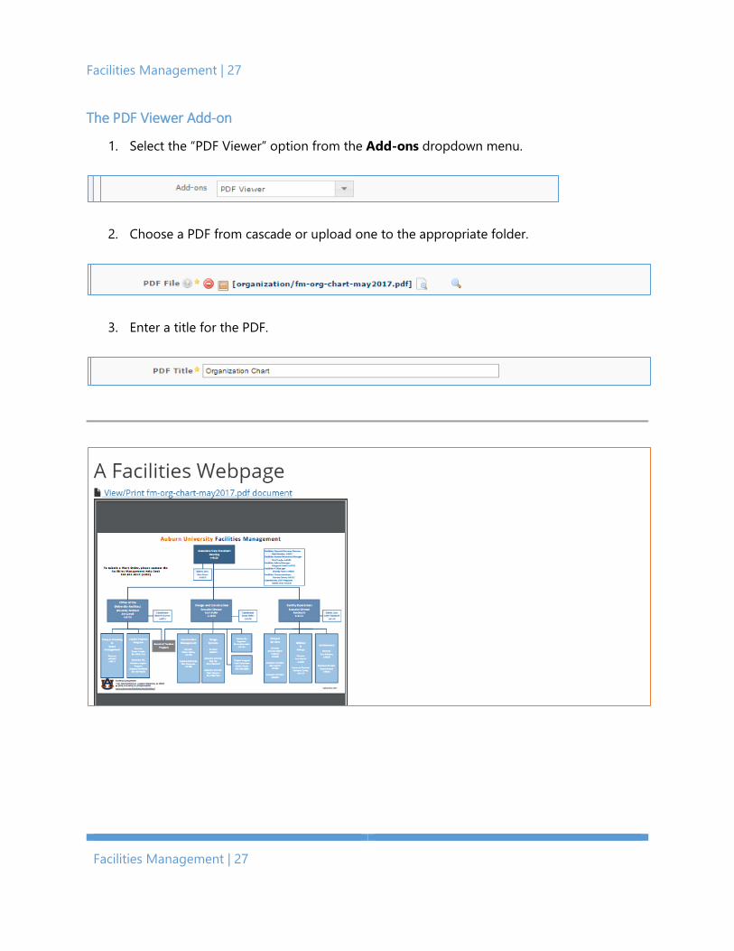
The PDF Viewer Add-on
1. Select the “PDF Viewer” option from the Add-ons dropdown menu.
2. Choose a PDF from cascade or upload one to the appropriate folder.
3. Enter a title for the PDF.
Bootstrap All-in-One | 28
Bootstrap All-in-One | 28
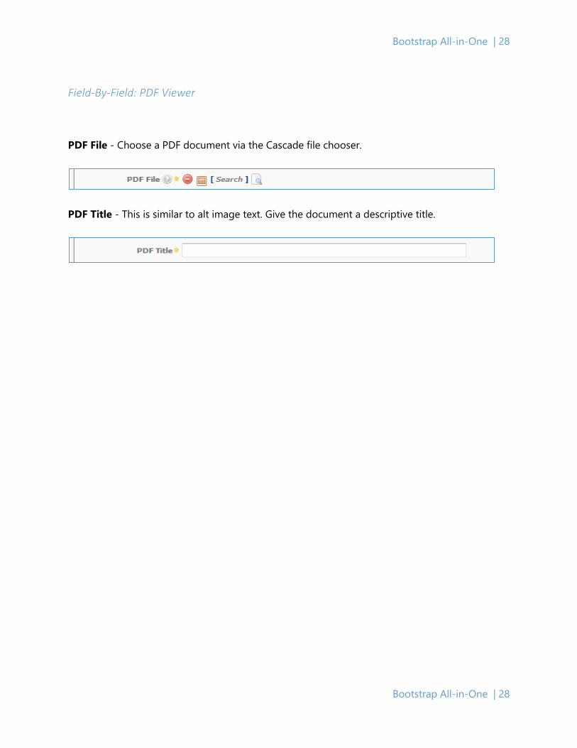
Field-By-Field: PDF Viewer
PDF File - Choose a PDF document via the Cascade file chooser.
PDF Title - This is similar to alt image text. Give the document a descriptive title.

Facilities Management | 29
Facilities Management | 29
The Tab Add-On
The Tab Add-on creates a tabbed navigation pane. Tabs provide a concise header for content.
To use this add-on:
1. Select Tab from the Add-ons menu.
2. (optional) Display social media and email links.
3. Give the tab a heading.
4. (optional) Add a tab image. If you do, change the Image Alt. Text.
5. Describe the content of the tab.

Bootstrap All-in-One | 30
Bootstrap All-in-One | 30
Field-By-Field: Tabs
Email Link - Check this box if you would like to have a “Share by E-mail” icon on the far right-
side of the tabs. The current page’s URL will be placed in the body section and the display title
of the page will be in the subject section of the e-mail generated.
Tab Heading - The text that will appear on the tab as its title/name.
Tab Image - The optional left-aligned icon that should be an image inside of Cascade.
Image Alt. Text - The image used as this tab’s icon should have a short description here. If no
image was used, then please leave this field as is (default being “Icon Present”).
Content Area - This is the editor for content inside the tab.
Facilities Management | 31
Facilities Management | 31
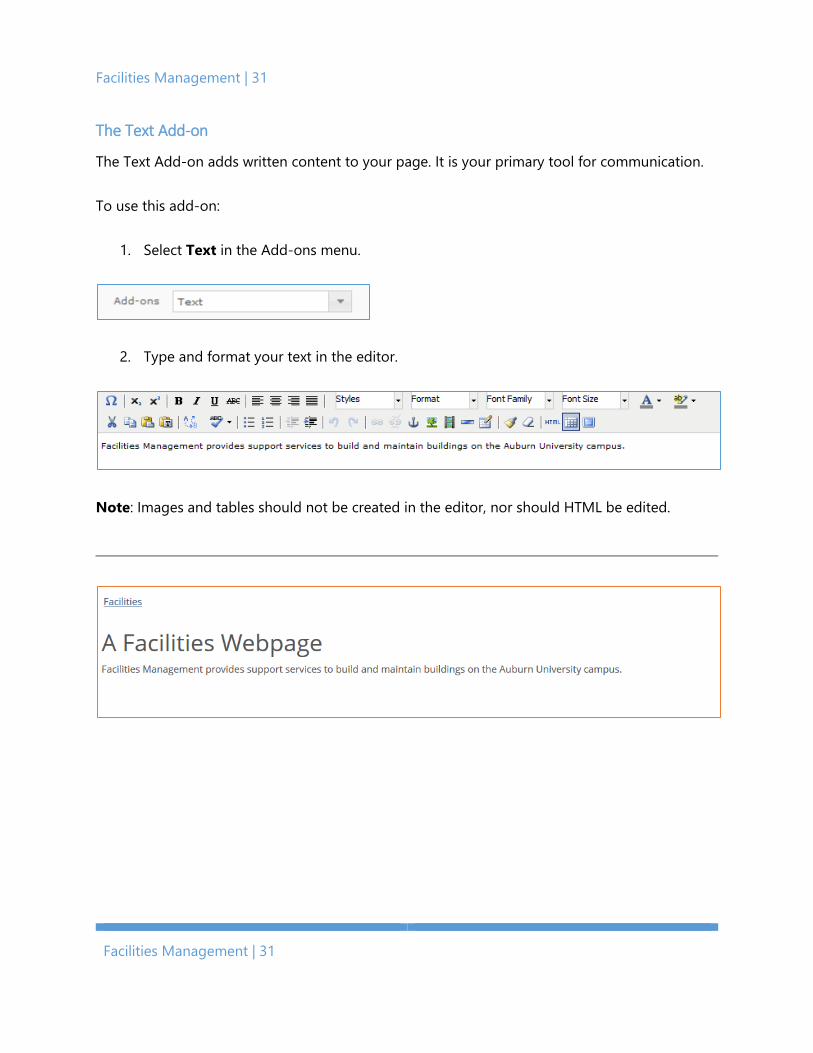
The Text Add-on
The Text Add-on adds written content to your page. It is your primary tool for communication.
To use this add-on:
1. Select Text in the Add-ons menu.
2. Type and format your text in the editor.
Note: Images and tables should not be created in the editor, nor should HTML be edited.
Bootstrap All-in-One | 32
Bootstrap All-in-One | 32
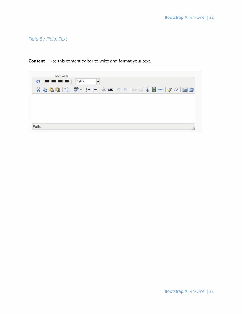
Field-By-Field: Text
Content – Use this content editor to write and format your text.
Facilities Management | 33
Facilities Management | 33
Resources
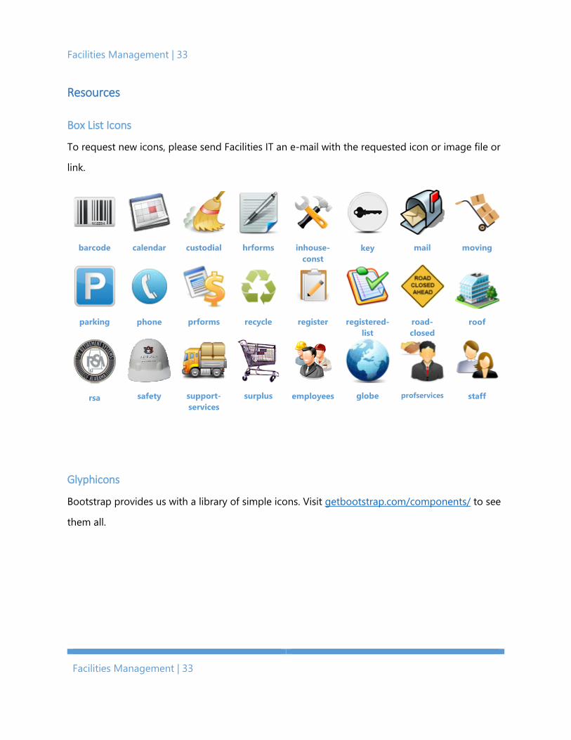
Box List Icons
To request new icons, please send Facilities IT an e-mail with the requested icon or image file or
link.
barcode
calendar
custodial
hrforms
inhouse-
const
key
moving
parking
phone
prforms
recycle
register
registered-
list
road-closed
roof
rsa
safety
support-services
surplus
employees
globe
profservices
staff
Glyphicons
Bootstrap provides us with a library of simple icons. Visit getbootstrap.com/components/ to see
them all.
Bootstrap All-in-One | 34
Bootstrap All-in-One | 34
Appendices
Appendix A: Accessibility Standards
Our online presence needs to serve all members of the Auburn Family. Therefore, we must make
our website accessible. We cannot assume our visitors share common characteristics. Some will
have visual impairments. Some will have auditory impairments. Some will be Alabama fans. We
want auburn.edu/facilities to work for all of them.
Four principles serve as the foundation for web accessibility. They are perceivable, operable,
understandable, and robust. It will take a collective effort to fulfill these principles of
accessibility. You may find a few tips here to help get started.
1. Add alt text to images.
Alt text describes the content of an image for people who cannot see it. Try to use short,
descriptive sentences to convey its purpose.
2. Make PDFs accessible.
If you include a PDF on your page, ensure it is understandable and will be read in a
logical order.
3. Use a color contrast checker.
A standard ratio will be applied, but keep color contrast between your content and background in mind when building your page.
4. Utilize white space.
White space creates a cleaner web page and helps users track text horizontally.
5. Think carefully about word choice.
We want our content to be simple and easy to understand. Do not use larger words and
longer sentences than necessary.
Facilities Management | 35
Facilities Management | 35
6. Caption videos.
Captions make videos easier to understand. If you embed a video on your page, ensure it
has captions available.
7. Test your page with a keyboard.
Try using your page with only the tab key on the keyboard. Can you navigate and
understand it?
8. Test your page with high contrast.
Enable a high contrast color scheme on your computer. When enabled, is the page
content still visible?
9. Test your page with assistive technologies.
Use a free screen reader and other assistive technologies for testing.
10. Test your page on a mobile device.
A large number of users will access your page on a mobile device, including those with
disabilities. Test your page using different sized mobile devices, making sure the page is
accessible on all.
Bootstrap All-in-One | 36
Bootstrap All-in-One | 36
Appendix B: Fonts, Styles, and Design Standards
This appendix is divided into three parts: fonts, styles, and overall design rules that the university
has standardized. Refer to the university’s style guide for more specific information.
Fonts: From Comic sans To Times New Roman
You would assume font choice is for you to decide. However, being an entity of Auburn
University, it is not the case. Auburn strives for a common identity across divisions of the
university. A contributor should place each piece of content with deliberation. We want the
content to catch our user’s attention, not the font choice.
Styles: Bullet Types, Boxes with Shadows, and Dividers, oh my!
A style trains users to pick out the important content on a page and helps creators decide what
is important. Different bullet styles, wavy underlines, or other stylistic brouhaha incites
confusion, which is the opposite effect we want to have. Keep this in mind as you build your
pages. Create your own consistent identify among the Facilities web pages.
Design Standards: The Big Picture
Design significantly affects how a user sees a page. Take for example our homepage. Every
detail is designed for the work Facilities Management does and the action or information a user
might request from it.
Responsiveness describes the ability for a single design to adequately function on any device. In
other words. We want our contributors to design their page once, and one time only for PCs, cell
phones, tablets, laptops, smartwatches, and anything else! Your design drives our website’s
development.