smm webinar - responsive design
TRANSCRIPT

Social Media Monthly November Webinar
Responsive Design:A Marketer’s POV

What

Responsive Design: The What
Optimization Across Devices
• Put simply: Responsive design provides an optimal viewing experience across all devices.
• Four breakpoints are considered when building a responsive site: mobile phone, tablet, small
screen/laptop and wide screen. Both portrait and landscape view are considered for tablets
and smartphones
• Websites and Microsites are a 1 for 1 meaning users are viewing the exact same site
regardless of device (different than a mobile optimized site)
• Technically put: through the use of CSS, pixel widths are converted to percentages. With
percentage values in place, resizing the browser window creates a fluid layout that scales to
the window.

Responsive Design: The What
Mobile Optimized vs Responsive
Mobile Optimized Responsive
Content Top 5-7 pages Full replica of desktop version
Design Different look/feel/UX Same look/feel/UX
Analytics Recommended separate view in GA
(distinguish desktop/table vs mobile)
No separate view required
(use mobile filter)
Maintenance Separate site to maintain Edits are made in 1 place
SEO Google non-preferred Google preferred
Build Level of Effort Minimal Medium - High

Responsive

Mobile Optimized

Responsive Design: The What
What Responsive is NOT:
• A 100% replica of a desktop site: elements can be hidden based on breakpoint
• A friend to outdated browsers, particularly IE7 and IE8
• A TREND

Why

Responsive Design: The Why
Mobile-Only Users
In a November 2013 eMarketer report titled “Redefining ‘Mobile-Only’ Users: Millions Selectively Avoid
the Desktop,” the authors cite that “mobile device usage has already surpassed desktop in terms of time
spent” going on to say that users will spend 2 hours and 19 minutes per day on desktops and laptops,
“while mobile will rise to 2 hours and 21 minutes” per day.
Consider those who don’t sit at a desk everyday:
• Police/Fire/EMT Professionals
• Teachers
• Healthcare Professionals
• Teens/Young Adults/College Students
• Airline Industry Professionals
• Military
Consider those who are always on the go:
• Everyone
Time Spent on Device Per Day
Desktop/Laptop Mobile

Responsive Design: The Why
Expectations
85% of adults think that a company’s mobile
website should be as good or better than their
desktop website
[Visual.ly Website, December 2013]

Responsive Design: The Why
• Pinching/pulling
• Hard to find/touch
navigation
• Menu is hard to locate
and read
• No click to call
• No easy path to book a
reservation
Cork Wine Bar DC vs. Old Ebbitt Grill, DC
• Accessible and easy-to-
use navigation
• Easy-to-read pages
• Click to call enabled
• Menus are easy-to-read
and scannable
• Events calendar well
scaled to mobile device,
easy to digest

Responsive Design: The Why
• Impossible to read HP
(pinching/pulling)
• Challenging to select
main navigation/tertiary
navigation elements
• Text way too small
• Imagery does not scale
• Simple forms very
challenging to complete,
ie Request Information
• Easy to read
• and consume
• Images scale well and
are removed strategically
on various pages vs
desktop
• Navigation easy to use
• Search feature prominent
and accessible
• Use of color and scale
makes long pages easy-
to-scan and consume,
eg. Studies page
• All phone numbers
leverage click-to-call
• Map feature optimized
and integrated with
Google Maps
Moravian College vs. University of South Carolina
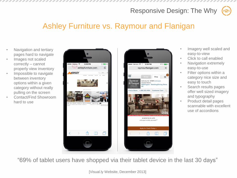
“69% of tablet users have shopped via their tablet device in the last 30 days”
[Visual.ly Website, December 2013]
Responsive Design: The Why
• Navigation and tertiary
pages hard to navigate
• Images not scaled
correctly – cannot
properly view inventory
• Impossible to navigate
between inventory
options within a given
category without really
pulling on the screen
• Contact/Find Showroom
hard to use
• Imagery well scaled and
easy-to-view
• Click to call enabled
• Navigation extremely
easy-to-use
• Filter options within a
category nice size and
easy to touch
• Search results pages
offer well sized imagery
and typography
• Product detail pages
scannable with excellent
use of accordions
Ashley Furniture vs. Raymour and Flanigan

Move the Needle
• Increase visitor time on site
• Increase page views and engagement
• Convert more leads
• Increase your sales
• Make search engines happy = move up in those search rankings
• Meet customer expectations
• Raise those repeat visitors
• Make sharing your site effortless
“ If you plan on sharing content or links to your website
socially or through blogs, you need a mobile-friendly
site, otherwise you will have high bounce rates, low
conversion rates, etc. ”
[HubSpot Responsive Design Article]
Responsive Design: The Why

Who

Responsive Design: The Who
Industries
Financial Services
Media/News Outlets
Healthcare/Pharma
Consumer Products
Education
Travel
Real Estate
Sports/Entertainment
Professional Services
Food Services

Responsive Design: The Who
Missing the Mark
• United Healthcare
• TCF Bank
• Bristol-Myers Squibb
• USAJobs.com

Responsive Design: The Who
Retail/e-Commerce
Mobile Optimized is sometimes a better bet
• Macy’s
• Lowe’s
• DSW Show Warehouse
• Barnes and Noble
• Nordstrom’s
• Target
• WalMart

Minimal Mobile Traffic?
Are you garnering less than 5% mobile visits to your website? If so, it might not be worth the investment
until you see an up-tick in mobile traffic.
Mobile Visits
< 5%
Other Visits
Responsive Design: The Who

Where

Responsive Design: The Where
Websites, Microsites & Email
Hershey’s Chocolate World Responsive Website Hershey’s Chocolate World Responsive Email

When

Responsive Design: The When
November 2014
S M T W T F S
1
2
9
16
23
30
3
10
17
24
4
11
18
25
5
12
19
26
6
13
20
27
7
14
21
28
8
15
22
29

How

Responsive Design: The How
IT vs Outsourcing
IF YOUR IT DEPARTMENT IS:
• Comprised of networking and telecommunications team members
• Are the people you call to order a new laptop or phone
• Focused on company telephony and Internet infrastructure needs
• Forcing you to use IE7 or IE8
• Sparingly helping you out with the company website but more for bug resolution THAN
improvements/enhancements/redesigns
THE WRITING IS ON THE WALL:
They are not website designers and developers

Digital Agencies
• Staffed with specialized team members who play an integral role in
responsive design:
• Website strategists
• Information Architects
• User Experience Designs
• Designers
• Front-End Developers
• Software Architects
• SEO Specialists
• QA Engineers
• Stay abreast of trends
• Gain efficiencies in responsive design due
to years of experience (yes, years)
Responsive Design: The How

Responsive Design: The How
Cost
•Take your full website redesign budget and add 30-40%
• Full = IA, UX, design, front-end dev, engineering, launch
•It’s cheaper to do it all together versus going responsive after you launch a new site

Responsive Design: The How
Time
Need your website launched before a certain date? Consider that responsive requires an additional level
of effort and time to cut up all your page templates against those breakpoints. Take your development
timeline and add about 15-20% more time.


Appendix

R2integrated (r2i) is a nationally recognized
and award-winning digital marketing agency
with one goal in mind. Our mission is to
develop innovative, memorable, meaningful
and results-oriented online customer
experiences for our clients.
11
100+
YEARS OLD
TEAMMEMBERS
STUFF WE
All Things Digital Integration/Platforms Analytics & Reporting
:
AT-A-GLANCE:
0 10101
01 101 1
110 100
010 10 1
Who are we?

Awards