slide 13 - 1 copyright © 2009 pearson education, inc. slide 13 - 1 copyright © 2009 pearson...
TRANSCRIPT

Slide 13 - 1Copyright © 2009 Pearson Education, Inc. Slide 13 - 1Copyright © 2009 Pearson Education, Inc.
Welcome to Survey of Mathematics!
Unit 8 – Statistics, Part I

Slide 13 - 2Copyright © 2009 Pearson Education, Inc.
Agenda
• Miscellaneous Notes • Sampling
Techniques• Misuses of Statistics• Frequency
Distribution• Statistical Graphs• Wrap up

Slide 13 - 3Copyright © 2009 Pearson Education, Inc. Slide 13 - 3Copyright © 2009 Pearson Education, Inc.
Sampling Techniques
The Census Bureau used statistical sampling
in the 1937 Survey of Unemployment.http://www.census.gov/history/www/innovations/data_collection/developing_sampling_techniques.html

Slide 13 - 4Copyright © 2009 Pearson Education, Inc.
Statistics
• Statistics is the art and science of gathering, analyzing, and making inferences (predictions) from numerical information, data, obtained in an experiment.
• Statistics is divided into two main braches.
– Descriptive statistics is concerned with the collection, organization, and analysis of data.
– Inferential statistics is concerned with making generalizations or predictions from the data collected.

Slide 13 - 5Copyright © 2009 Pearson Education, Inc.
Statisticians
• A statistician’s interest lies in drawing conclusions about possible outcomes through observations of only a few particular events.– The population consists of all items or
people of interest. – The sample includes some of the items in
the population. • When a statistician draws a conclusion
from a sample, there is always the possibility that the conclusion is incorrect.

Slide 13 - 6Copyright © 2009 Pearson Education, Inc.
Types of Sampling
• A random sampling occurs if a sample is drawn in such a way that each time an item is selected, each item has an equal chance of being drawn.
• When a sample is obtained by drawing every nth item on a list or production line, the sample is a systematic sample.
• A cluster sample is sometimes referred to as an area sample because it is frequently applied on a geographical basis.

Slide 13 - 7Copyright © 2009 Pearson Education, Inc.
Types of Sampling continued
• Stratified sampling involves dividing the population by characteristics called stratifying factors such as gender, race, religion, or income.
• Convenience sampling uses data that are easily or readily obtained, and can be extremely biased.

Slide 13 - 8Copyright © 2009 Pearson Education, Inc.
Example: Identifying Sampling Techniques
a. A raffle ticket is drawn by a blindfolded person at a festival to win a grand prize. RANDOM
b. Students at an elementary school are classified according to their present grade level. Then, a random sample of three students from each grade are chosen to represent their class. STRATIFIED

Slide 13 - 9Copyright © 2009 Pearson Education, Inc.
Example: Identifying Sampling Techniques
continued
c. Every sixth car on highway is stopped for a vehicle inspection. SYSTEMATIC
d. Voters are classified based on their polling location. A random sample of four polling locations are selected. All the voters from the precinct are included in the sample. CLUSTER
e. The first 20 people entering a water park are asked if they are wearing sunscreen. CONVENIENCE

Slide 13 - 10Copyright © 2009 Pearson Education, Inc. Slide 13 - 10Copyright © 2009 Pearson Education, Inc.
The Misuses of Statistics

Slide 13 - 11Copyright © 2009 Pearson Education, Inc.
Misuses of Statistics
• Many individuals, businesses, and advertising firms misuse statistics to their own advantage.
• When examining statistical information consider the following:
– Was the sample used to gather the statistical data unbiased and of sufficient size?
– Is the statistical statement ambiguous, could it be interpreted in more than one way?

Slide 13 - 12Copyright © 2009 Pearson Education, Inc.
Misuses of Statistics
If you count from "A" to Aa+", it does indeed look like "four steps higher than Nassau." And the graph dramatically shows the HUGE gap between Nassau and the Town of Hempstead.
Notice how the difference between Nassau and ToH aren't that far apart. Team Murray also neglected to put the "Aaa" rating in. According to that graph, "Aa+" is the best available.If anything, ToH is only 1 1/2 points better than Nassau - NOT 4.
Source:http://nassaugopwatch.blogspot.com/2007/09/team-murray-uses-misleading-graphs.html

Slide 13 - 13Copyright © 2009 Pearson Education, Inc.
Example: Misleading Statistics• An advertisement says, “Fly Speedway Airlines
and Save 20%”.– Here there is not enough information given. – The “Save 20%” could be off the original
ticket price, the ticket price when you buy two tickets or of another airline’s ticket price.
• A helped wanted ad read,” Salesperson wanted for Ryan’s Furniture Store. Average Salary: $32,000.”– The word “average” can be very misleading. – If most of the salespeople earn $20,000 to
$25,000 and the owner earns $76,000, this “average salary” is not a fair representation.

Slide 13 - 14Copyright © 2009 Pearson Education, Inc.
Charts and Graphs
• Charts and graphs can also be misleading. – Even though the data is displayed
correctly, adjusting the vertical scale of a graph can give a different impression.
– A circle graph can be misleading if the sum of the parts of the graphs do not add up to 100%.

Slide 13 - 15Copyright © 2009 Pearson Education, Inc.
Example: Misleading Graphs
While each graph presents identical information, the vertical scales have been altered.

Slide 13 - 16Copyright © 2009 Pearson Education, Inc. Slide 13 - 16Copyright © 2009 Pearson Education, Inc.
13.3Frequency Distributions
The average measured space cooling for all 169 FPC (Florida Power Customer) sites in the base sample from April through October of 1999 was 5,695 kWh. However, consumption varied by more than an order of magnitude, ranging from a low of 525 kWh to a high of 12,778 kWh. Figure 9 shows the frequency distribution of measured cooling energy use.<Source: http://www.fsec.ucf.edu/en/publications/html/FSEC-pf-369-02/index.htm>

Slide 13 - 17Copyright © 2009 Pearson Education, Inc.
Frequency Distribution
• A piece of data is a single response to an experiment.
• A frequency distribution is a listing of observed values and the corresponding frequency of occurrence of each value.

Slide 13 - 18Copyright © 2009 Pearson Education, Inc.
Example
• The number of pets per family is recorded for 30 families surveyed. Construct a frequency distribution of the following data:
443333
2210
22222211111111100000

Slide 13 - 19Copyright © 2009 Pearson Education, Inc.
Solution
24
43
82
101
60
FrequencyNumber of Pets
443333
2210
22222211111111100000

Slide 13 - 20Copyright © 2009 Pearson Education, Inc.
Rules for Data Grouped by Classes
• The classes should be of the same “width.”
• The classes should not overlap.• Each piece of data should belong to
only one class.

Slide 13 - 21Copyright © 2009 Pearson Education, Inc.
Definitions
• Midpoint of a class is found by adding the lower and upper class limits and dividing the sum by 2.
2
Limit Class U.Limit Class L.midpoint

Slide 13 - 22Copyright © 2009 Pearson Education, Inc.
Example
• The following set of data represents the distance, in miles, that 15 randomly selected second grade students live from school.
Construct a frequency distribution with the first class 0 2.
0.27.41.59.64.8
1.35.70.85.90.5
8.73.89.75.36.8
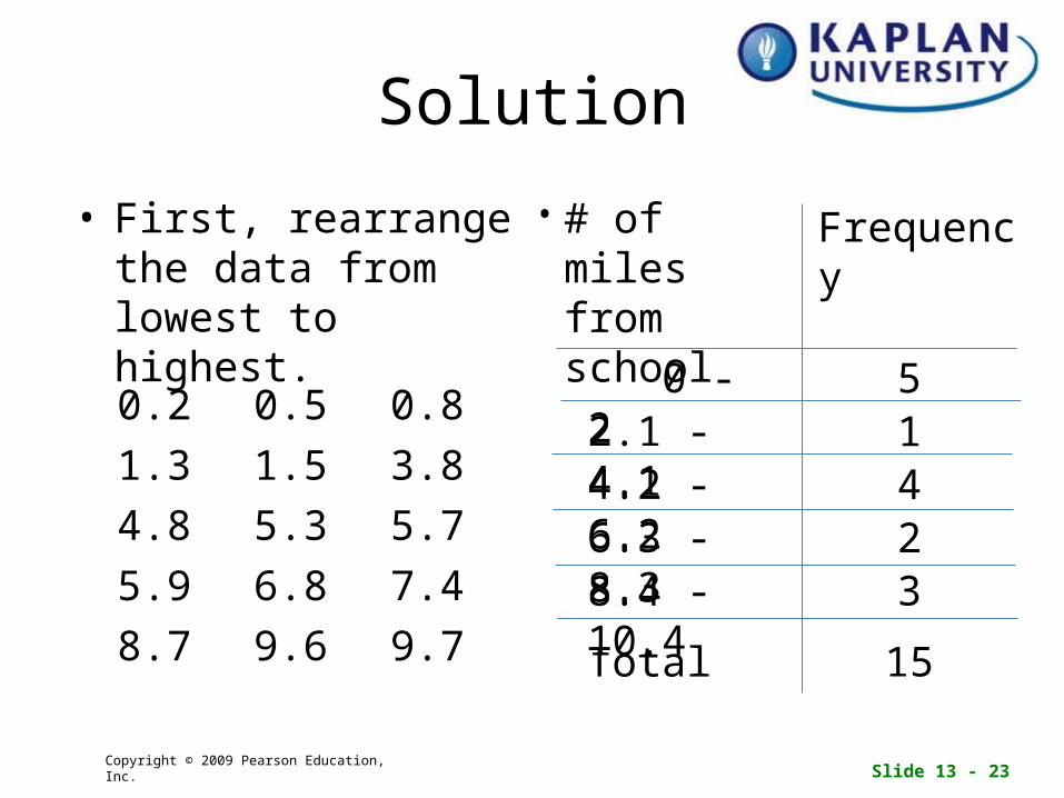
Slide 13 - 23Copyright © 2009 Pearson Education, Inc.
Solution
• First, rearrange the data from lowest to highest.
•
9.79.68.7
7.46.85.9
5.75.34.8
3.81.51.3
0.80.50.2
15
38.4 -10.426.3 - 8.344.2 - 6.212.1 - 4.15 0 - 2
Frequency# of miles from school
Total

Slide 13 - 24Copyright © 2009 Pearson Education, Inc.
Solution (continued)• Frequency Class
Width:Subtract 2.1 – 0 = 2.1Subtract 4.2 – 2.1 = 2.1and so on…
• Midpoints:Class 1: (0 + 2)/2 = 1Class 2: (2.1 + 4.1)/2 = 3.1Class 3: (4.2 + 6.2)/2 = 5.2Class 4: (6.3 + 8.3)/2 = 7.3Class 5: (8.4 + 10.4) = 9.4
• Modal Class:Class 1 (0 – 2) has the highest frequency and it is therefore the “modal class”
•
15
38.4 -10.426.3 - 8.344.2 - 6.212.1 - 4.15 0 - 2
Frequency# of miles from school
Total

Slide 13 - 25Copyright © 2009 Pearson Education, Inc. Slide 13 - 25Copyright © 2009 Pearson Education, Inc.
13.4
Statistical Graphs

Slide 13 - 26Copyright © 2009 Pearson Education, Inc.
Circle Graphs
• Circle graphs (also known as pie charts) are often used to compare parts of one or more components of the whole to the whole.
<Source: http://www.lucinda.net/surber/2002-2003.html>
Slide 13 - 27Copyright © 2009 Pearson Education, Inc.
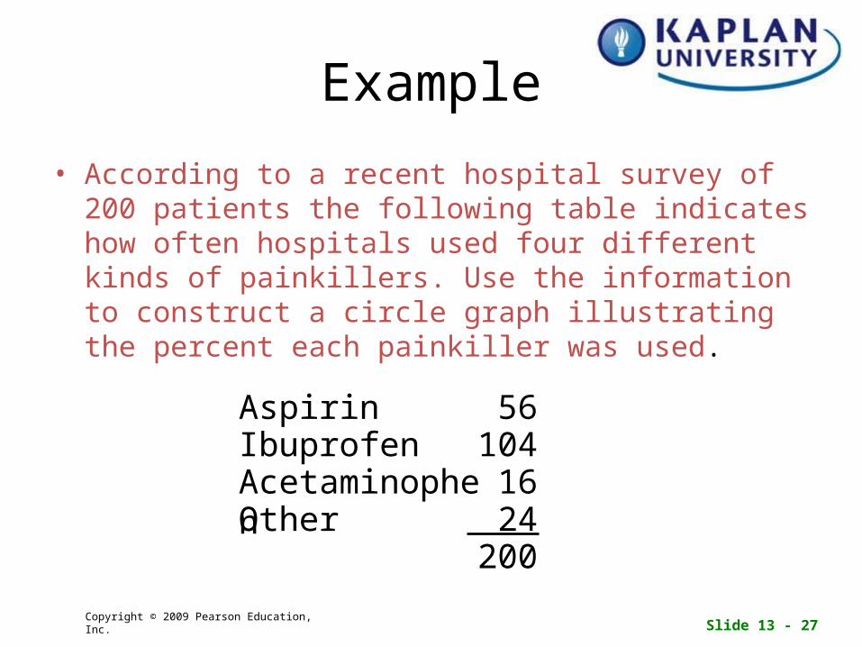
Example
• According to a recent hospital survey of 200 patients the following table indicates how often hospitals used four different kinds of painkillers. Use the information to construct a circle graph illustrating the percent each painkiller was used.
20024Other16Acetaminophen
104Ibuprofen56Aspirin

Slide 13 - 28Copyright © 2009 Pearson Education, Inc.
Solution
• Determine the measure of the corresponding central angle.
200
24
16
104
56
Number of Patients
100%
Percent of Total
360
0.12 360 = 43.2
0.08 360 = 28.8
0.52 360 = 187.2
0.28 360 = 100.8
Measure of Central Angle
Total
Other
Acetaminophen
Ibuprofen
Aspirin
Painkiller
28%
52%
8%
12%

Slide 13 - 29Copyright © 2009 Pearson Education, Inc.
Solution continued
• Use a protractor to construct a circle graph and label it properly.
187.2°Ibuprofen
52%
100.8°Aspirin
28%
43.2°Other
12%28.8°Acetaminophe
n
8%

Slide 13 - 30Copyright © 2009 Pearson Education, Inc.
Histogram
• A histogram is a graph with observed values on its horizontal scale and frequencies on it vertical scale.
• Example: Construct a histogram of the frequency distribution.
244382
10160
Frequency# of pets

Slide 13 - 31Copyright © 2009 Pearson Education, Inc.
Solution
244382
10160
Frequency# of pets

Slide 13 - 32Copyright © 2009 Pearson Education, Inc.
Frequency Polygon
• A frequency polygon is a line graph with observed values on its horizontal scale and frequencies on it vertical scale.

Slide 13 - 33Copyright © 2009 Pearson Education, Inc.
Stem-and-Leaf Display
• A stem-and-leaf display is a tool that organizes and groups the data while allowing us to see the actual values that make up the data.
• The left group of digits is called the stem.
• The right group of digits is called the leaf.

Slide 13 - 34Copyright © 2009 Pearson Education, Inc.
Example
• The table below indicates the number of miles 20 workers have to drive to work. Construct a stem-and-leaf display.
914352612
1621432717
41532125
12831812

Slide 13 - 35Copyright © 2009 Pearson Education, Inc.
Solution
• Data • Stem-and-Leaf
9143526121621432717
4153212512831812
34
53
1 1 5 6 72
2 2 2 4 5 6 7 81
3 3 4 8 90

Slide 13 - 36Copyright © 2009 Pearson Education, Inc.
Wrap Up
• Topics Covered:– Types of Sampling– Misuses of Statistics– Frequency
Distribution– Types of Statistical
Graphs
• My Notes will be found in Doc Sharing
• Have a good week!