showing our colours ruth rostron - british institute … · showing our colours ruth rostron ... no...
TRANSCRIPT

© Ruth Rostron 1
SHOWING OUR COLOURS
Ruth Rostron
A workshop with the same title was held on 20th November 2005 at St. Wilfred’s in Tite Street, London, the
last B.I.G. meeting at that venue. It was well attended and generated some lively discussion. This article
incorporates input from those who participated.
We show our personality through all the choices we make, but are colour preferences really of great
significance? Many people are sceptical about correlating colours with human traits and qualities and I was
no exception. The subject is hardly touched on in graphology books, and at best the colour of ink or paper is
generally considered a minor detail which has little or no bearing on the analysis. I was dubious when I read
statements such as - Red: active and adventurous, Blue: peaceful and passive, Black: serious etc. I wanted to
know why these characteristics were attributed to those particular colours. Hence this study, which came to
feel like reinventing the wheel!
What is colour?
Colour is a very strange phenomenon because it changes. Fluorescent lighting can alter the appearance of
cloth, bright colours turn grey as it grows dark, and by moonlight almost everything looks black. The colour
of an object depends both on the quantity and the quality of the light shining on to it. Sir Isaac Newton first
demonstrated that white light contains all colours (except black which is technically a mixture of the other
colours). In 1666 he shone a beam of light through a prism and split it into a rainbow of colours. Sending
the rainbow through another prism returned it to a single beam of white light.
Light not only enables us to see colours, but it colours objects as well. When beams of light strike an object
some of the light waves are absorbed while others are reflected. The quality of the object’s surface in
combination with the type of light shining on to it, give the object its individual colour. In other words
things appear to be different colours because they are reflecting light in different ways.
Colours of the Spectrum
Red, orange, yellow, green, blue, indigo and violet are the colours of the spectrum, and a range of objects
were displayed at the workshop to bring the colours into the room: tomato, orange, lemon, cucumber, lapis
lazuli, aubergine and amethyst. Some colours not on the spectrum were also added: black, brown, grey and
white. These were represented by coal, wood, grey stone, and a white leek. All who were present spent a
little time focusing on each of these objects from the natural world, mentally selecting the colours they liked
the most, and also those they liked the least.
The effects of colour
Colours affect us in a variety of ways. We like some and dislike others. A grey day can be depressing and
we may not be able to relax in a room painted bright orange. Colour affects us emotionally and can alter our
moods, and this has been understood since ancient times. War paint was used to frighten people and to
confer status, and colours were used for religious or therapeutic purposes. Colours also affect living
creatures physically. This was demonstrated in an experiment in which mice were reared and bred under
different coloured fluorescent lights. Under blue light the offspring produced were 70% female, 30% male;
under pink light they were 70% male, 30% female; and in natural light their offspring were half male and
half female.
Why does colour affect us physically and therefore emotionally as well? Because colours radiate
electromagnetic energy. Each colour has its own frequency and our bodies are sensitive to the different
energy levels of the individual wavelengths. For example: red waves are long and powerful so they
stimulate the heart and breathing, while blue waves are relatively short and soothe the nervous system.
© Ruth Rostron 2
Electromagnetic energy
The air is full of electromagnetic waves which we cannot see - X rays, radio and TV waves, microwaves,
ultraviolet and infrared light waves. The spectrum of light which we can see is actually very small.
Different colours can now be defined technically by the frequencies of the waves emitted by them. These are
measured in angstrom units, and they range from 4000-4500 units for violet through to 6200-6700 units for
red. We humans can only see colour waves, but some creatures such as snakes and bees can see the ultra
violet and infrared waves which are on the fringe of our visible spectrum, just as many animals can hear
sounds and notes beyond the range of human hearing. We may not be able to see the other waves, but we
still sensitive to them and need protection from the harmful ones
Colour awareness
The natural world is full of colour, and human life is sustained by it – yellow light and orange warmth from
the sun, blue water and green trees. Our sensitivity to colour has been inherited over millions of generations.
It is in our blood and gives us an instinctive understanding of each colour’s special qualities. Living in the
modern world we may hardly be aware of this because we take colour for granted. We are bombarded with
it from paint, cars, adverts and TV, but until modern times it was only in the natural world that most people
saw colour.
Colourful phrases
Individually we may have a ‘feel’ for the qualities of various colours, but I wondered if there might be any
evidence of a collective intuitive understanding of them. Common figures of speech can reflect ideas and
beliefs which are universally accepted, and these can help us to understand symbolic concepts which
underpin graphology. Phrases such as ‘on the decline’, ‘aiming high’, ‘feeling great’ or ‘belittling’
something, are easily related to interpretations of line direction and size, and can speak volumes in a few
words. I wondered therefore whether paying close attention to colour-related phrases in everyday language
might be a direct route to a better understanding of what different colours signify to us collectively, at an
unconscious level.
An Experimental Method
At the meeting we considered first some common phrases referring to colours in general, then individual
colours were discussed. For each colour, things commonly associated with it were listed, followed by
phrases and sayings relating to it. Paying careful attention to these phrases enabled us to shortlist various
characteristics which they appeared to have in common, and for these characteristics a list of handwriting
movements was tentatively compiled. By this method it was possible to link certain handwriting movements
with particular colours.
For example: the colour red might be associated with a volcano (among other things). A common phrase is
‘red rag to a bull’. The emotion associated with this is anger. Aggressive anger could be reflected through
angles and heavy pressure in the writing. This establishes a link between a colour, a personality trait and
handwriting movements.
The method was then tested experimentally. I had collected a large number of samples written in different
colour inks or on various colours of paper. Each sample had been photocopied in black and white and put in
a clear folder with the black and white version to the front. These were distributed to those attending, who
were invited to study the photocopy first. Turning the folder over to reveal the original sample allowed the
colour to make an impact which could be distinguished from the impact of the writing itself.
As the colours were dealt with one by one each person was invited to share his or her observations and
experiences. In some cases the colour appeared to accord with the impression of the writer’s qualities, and
was even anticipated on some occasions. In other cases the colour came as a surprise or even a shock.

© Ruth Rostron 3
The dominant handwriting movements of each sample could then be checked against the tentative checklist
previously compiled for each colour. By these means individual perception of harmony or discord between
colour and writing could to some extent be validated by a scientific method, albeit a highly experimental one.
Conclusions
Paying careful attention to common figures of speech and objects associated with various colours enabled us
to become more consciously aware of the intrinsic qualities of colours and how they come to be associated
with human qualities and characteristics. As we examined samples in all different colours we were able to
distinguish between those in which the colour reinforced the writer’s prominent characteristics, and those in
which the colour added a new dimension.
In these cases the colour sometimes gave the writing a more favourable aspect and sometimes a more
negative one. This led to further very interesting speculation. Was the colour in effect a mask or persona
disguising the writer’s true self? Or was something submerged coming to the surface? Did it give
expression to an undeveloped aspect of the personality or Jung’s fourth function? Might it indicate the
direction of development, or express a wish or aspiration? Or did it serve to release denied emotions from
the shadow side of the personality? Could the colour we most disliked make us more aware of
unacknowledged aspects of our own personality or behaviour?
Footnote
Colours radiate electromagnetic energy, and so do people. The electromagnetic energy we radiate, however,
is not just that of our skin colour. Energy emanates from within and Kirlian photographs show people
surrounded by clouds of different colours, which change as their inner states alter. It seems that our
colouring really is more than skin deep, and our colour choices may be significant in ways which are not as
yet clearly understood.
Colours Summary
Note: For colours such as indigo and violet few related phrases could be found. I therefore had to take
associated characteristics on trust from other sources.
In all cases the handwriting movements are offered as suggestions only. They relate to groups of
characteristics, so considerable variation is possible.
Article Revision
All handwriting samples were reproduced in black and white when this article appeared in the B.I.G. journal
‘The Graphologist’ Issue 92 Autumn 2006. Samples can now be seen in colour in this revised version,
which includes additional samples in the Orange and Brown sections of the Colours Summary and
substitutions in the Pink and Violet sections. The pressure of each sample has also been given.

© Ruth Rostron 4
COLOURS SUMMARY RED
A primary colour. Powerful rays which speed up the pulse, release adrenalin and raise blood pressure.
Phrases/words: to see red, red rag to a bull, red roses, the red flag, a red letter day, caught red-handed, red
sky at night - shepherd’s delight, red alert, scarlet woman, ruby lips, red-blooded, red faced.
Associated with energy and strong feelings: passion, anger, love, hate, guilt
People who like red are lively, energetic, courageous, passionate and enjoy attention. They have force of
personality and strength of will. Often assertive leaders with drive and initiative who are not afraid to use
confrontation, they may be impulsive or excitable.
Pos: Firm pressure, angles, large size/LZ, rhythmic, fairly connected, R slant/tends, broad, rising lines,
fluent, strong t bars/signature, narrow R margin, strong HT, hooks, vertical emphasis.
Neg: Pressure heavy/pasty, close spacing, arrhythmic, triangles, sharp points, slashed/blunted/braced
strokes, t bars down/detached, flooded ovals, letters falling forward, misplaced capitals, X-ing.
1a
1b
1c
1d
Figure 1 RED
1a male 60’s red ink medium/heavy pressure
1b male 20’s red felt tip medium pressure
1c female 30’s silvery red ink medium/heavy pressure
1d male 40’s red ink irregular pressure

© Ruth Rostron 5
PINK
Red + white. White softens the effect of strong red. Warm feelings run deep below the surface.
Phrases/words: in the pink, rose-tinted spectacles, flushed with success, the pink of perfection, pink for a girl,
rosy cheeks, baby pink, tickled pink, shocking pink.
Associated with the feminine: soft feelings, love, well-being, warmth, compassion, sensitivity.
People who like pink want to give and receive love. Romantics at heart, they are caring, gentle, supportive,
kind and compliant for the sake of peace, but are also vulnerable and may be passive.
Pos: Fairly regular, flexible baseline, garlands/arcades, medium size/pressure/speed, legible, R
slant/tends, good layout, dom. MZ, broad, curved strokes, extended ends.
Neg: Copybook, L slant/tends, arrhythmic, falling lines/tiles, unstable baseline, close spacing, LZ cradles,
roundness, drooping garlands, elliptical ovals, monotonous.
2a
2b
2c
2d
Figure 2 PINK
2a female 33 black biro, pink paper light/medium pressure
2b male 40’s pink ink medium pressure
2c female 60’s blue felt tip, pink paper medium/light pressure
2d female 55 black ink, dusky pink paper irregular pressure

© Ruth Rostron 6
ORANGE
Red + yellow. Both are strong and direct rays. Radiant warmth but with less intensity than red.
Sunrise and sunset reflect opposite moods so feelings may be turbulent.
Phrases/words: zest of an orange, a shining example, amber nectar, copper-bottomed, burning bright,
scorching hot, sunrise, sunset, amber-gambler, Orangemen, a fiery personality.
Associated with dynamic energy, intensity and radiance, stimulating and disturbing.
People who like orange are energetic, adventurous, enthusiastic and outgoing, with a zest for life. They may
also be restless and impulsive, or impatient, reactive or overpowering.
Pos: Large size, broad, R slant/tends, firm/medium pressure, lively rhythm, quick speed, angles/mixed
FOC, full, partly connected, simplified, rising lines, high t bars, irregular R margin.
Neg: Irregular, arrhythmic, angles/threads, mixed slant, triangles, sharp points, slashed/blunted strokes,
irregular pressure/width, t bars down/detached, disconnected, L tends, tics.
3a
3b
3c
3d
Figure 3 ORANGE
3a female age unknown orange ink medium pressure
3b female 40’s brown ink, apricot paper medium/heavy pressure
3c female 80’s black biro, orange paper heavy pressure
3d female 20’s black ink, orange paper irregular pressure

© Ruth Rostron 7
YELLOW
A primary colour. Brilliant rays which feed the nervous system and stimulate the mind and body.
Bright & cheerful, it promotes clear thinking but can be disturbing or unsettling.
Phrases/words: bright spark, flash of inspiration, little ray of sunshine, sunny temperament, look on the
bright side, golden opportunity, sparks flying, yellow streak, yellow peril, jaundiced.
Associated with clarity, brightness and excitement, also sharpness and fear.
People who like yellow tend to be optimistic, vivacious, alert and witty, but may be critical, restless,
superficial or disruptive. When tense they can become fearful or jealous.
Pos: Large UZ, quick, lively rhythm, rising lines, lean, simplified, no starting strokes, widening LM,
angles/mixed FOC, clever linking, medium/light pressure, upright/R slant/tends, clear spacing.
Neg: Arrhythmic, irregular pressure/size/zones/slant, angles/threads, L slant/tends, disconnected, close or
wide spacing, tics, sharp points, ovals narrow/enlarged.
4a
4b
4c
4d
Figure 4 YELLOW
4a female 50 black biro, bright yellow paper medium pressure
4b male 60’s black biro, bright yellow paper medium/light pressure
4c female 24 blue biro, lined yellow paper irregular pressure
4d female 24 yellow/gold ink, card medium pressure

© Ruth Rostron 8
GREEN
Blue + yellow. Green rays calm circulation and breathing, relieve stress and relax the body.
Harmonises and balances opposite elements: the calm of blue + the force of yellow.
Phrases/words: salad days, the Emerald Isle, green fingers, get the green light, green room, green, jaded, to
turn green, green with envy, the grass is greener on the other side, green-eyed monster.
Associated with relaxation, natural renewal and change, also envy and dissatisfaction.
People who like green are open-minded, nurturing and expansive individuals, but they can be restless and
may become exhausted. They may also be immature, envious or jealous.
Pos: Rhythmic, medium pressure/speed, medium/large size, broad, pasty, large LZ/balanced zones,
flexible baseline, upright or R slant/tends, half connected, garlands + angles, fairly regular.
Neg: Arrhythmic, irregular, heavy/irregular pressure, L tends, disconnected, small initial loops, large o/a,
hooks/tics, starting strokes, arcades/threads, falling lines/tiles, slow speed, circle i dots.
5a
5b
5c
5d
Figure 5 GREEN
5a female 49 green biro medium pressure
5b female 34 green ink light pressure
5c male 60’s green biro medium/light + stabs of pressure
5d female 87 green ink, card irregular pressure

© Ruth Rostron 9
TURQUOISE
Blue + green. Calming rays which encourage expression of feelings through creativity.
Calm leads to constancy, also firmness & resistance to change.
Phrases/words: proud as a peacock, ice blue, to break the ice. Associations: kingfisher, aquamarine.
Associated with calm, coolness, self-control and pride.
People who like turquoise need freedom to express themselves. Independent, clear thinking and self-assured,
they may be reflective or creative, but can be cool, proud, assertive, resistant or attention-seeking.
Pos: Rhythmic, upright/slight R slant, medium size, arcades/angles, wide/balanced margins, good layout,
clear spacing, partly disconnected, original, high i dots/t bars, lean + full.
Neg: L slant/tends, large size/MZ/UZ, wide or close spacing, persona, elaborated, arrhythmic, inflated
capitals/signature, sharp points, spirals, retracing.
6a
6b
6c
6d
Figure 6 TURQUOISE
6a male 50’s turquoise ink medium pressure
6b female 40’s (Swiss) turquoise ink and paper irregular pressure
6c female 40’s turquoise ink light pressure
6d female 80’s (German) silvery turquoise ink medium/light pressure

© Ruth Rostron 10
BLUE
A primary colour. Blue rays are very short and still. Lowers blood pressure, slows breathing and heart.
Soothing and cool but uplifting, it encourages peace of mind and physical relaxation.
Phrases/words: blue-eyed boy, true blue, blue chip, cordon blue, blueprint, blue blood, boys in blue, navy
blue, once in a blue moon, out of the blue, blue stocking, to feel blue.
Associated with calm, trust, self-discipline, loyalty and spirituality.
People who like blue are peace-loving, trustworthy, cooperative and supportive of others. Thoughtful and
sensitive people who try to control their feelings, they can be too responsible and become depressed.
Pos: Upright/R slant, stable baselines, rhythmic, fairly regular, medium size/pressure, balanced zones,
arcades/garlands, good layout, legible, fairly connected, straight L margin, sig. matching text.
Neg: Angles/copybook, rigid regularity, very connected, stilted rhythm, L tends, narrow L margin, falling
lines/tiles, drooping/pseudo garlands, narrow L margin, roundness, retracing.
7a
7b
7c
7d
Figure 7 BLUE
7a female 60’s dark blue ink medium pressure
7b male 30’s blue biro medium/light pressure
7c female 60’s? blue ink and paper medium/heavy pressure
7d male 70 (German) blue ink light/medium pressure

© Ruth Rostron 11
INDIGO
Calm of deep blue + strength of red. Deepens the breath and encourages meditation and insight.
Phrases/words: purple passage, purple patch, born into purple, blues and royals, a dark horse, to keep dark.
Associated with richness, insight, dignity, authority and integrity.
People who like indigo are deeply serious, responsible and dedicated. Powers of insight and concentration
can make them aware and authoritative, but they may become proud, sombre or dull with overwork.
Pos: Upright, arcades/angles, tall UZ, firm pressure, stable baselines, fairly regular, legible, simplified,
clear/even spacing, original, partly disconnected, high i dots/t bars, signature matching text.
Neg: Rigid regularity, arrhythmic, very connected, L tends, narrow, roofing strokes, close or wide
spacing, falling lines/tiles, triangles, persona, slow speed, monotonous, encircled signature.
8a
8b
8c
8d
Figure 8 INDIGO
8a male 60’s indigo ink irregular pressure
8b female 15 indigo ink, cream paper medium pressure
8c male age unknown indigo/purple ink, lined paper irregular pressure or ‘dip in’ pen?
8d male 60’s purple felt tip medium/heavy pressure
© Ruth Rostron 12
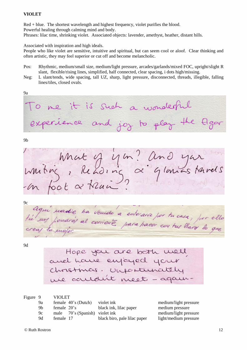
VIOLET
Red + blue. The shortest wavelength and highest frequency, violet purifies the blood.
Powerful healing through calming mind and body.
Phrases: lilac time, shrinking violet. Associated objects: lavender, amethyst, heather, distant hills.
Associated with inspiration and high ideals.
People who like violet are sensitive, intuitive and spiritual, but can seem cool or aloof. Clear thinking and
often artistic, they may feel superior or cut off and become melancholic.
Pos: Rhythmic, medium/small size, medium/light pressure, arcades/garlands/mixed FOC, upright/slight R
slant, flexible/rising lines, simplified, half connected, clear spacing, i dots high/missing.
Neg: L slant/tends, wide spacing, tall UZ, sharp, light pressure, disconnected, threads, illegible, falling
lines/tiles, closed ovals.
9a
9b
9c
9d
Figure 9 VIOLET
9a female 40’s (Dutch) violet ink medium/light pressure
9b female 20’s black ink, lilac paper medium pressure
9c male 70’s (Spanish) violet ink medium/light pressure
9d female 17 black biro, pale lilac paper light/medium pressure

© Ruth Rostron 13
BROWN
Red + yellow + black. Warmth of orange + darkness of black. Colour of the earth not the rainbow.
Phrases/words: brown as a berry, little brown jug, earthenware, nut brown, brownie points, heart of oak, feet
of clay, in a brown study, browned off, bogged down, stick in the mud, gone to earth, down to earth.
Associated with the earth, security and basic necessities, which may be dull or depressing.
People who like brown are practical and value stability. Down-to-earth, reliable, consistent and
hardworking, they make loyal friends and employees, but can seem unimaginative or unadventurous.
Pos: Regular, stable baseline, arcades/angles, firm pressure, medium size/speed, upright, straight L
margin, square, large MZ/LZ, connected, legible, careful diacritics.
Neg: Copybook, monotonous, arrhythmic, falling lines/tiles, slow speed, pasty, L slant/tends, all capitals,
very connected/disconnected, wide R margin.
10a
10b
10c
10d
Figure 10 BROWN
10a male 50’s brown ink, brown printing, thick cream paper medium pressure
10b female 20’s black ink, brown paper medium/heavy pressure
10c female 17 (Swiss) black ink, brown/orange paper light pressure
10d female 20’s black ink, thick brown paper medium pressure

© Ruth Rostron 14
BLACK
Black is a mixture of all the colours. It has a sedative effect.
Phrases/words: in black and white, it’s not all black, two blacks don’t make a white, blacken someone’s
name, black mood, black sheep, black art, black mark, black as sin, black humour, blackmail.
Associated with night, death, magic and sin it arouses feelings of fear and despair.
People who like black are serious, strong-willed, disciplined and decisive, but can lack humour and become
dogmatic or gloomy. They may counter fear with aggression or power-seeking.
Pos: Firm pressure, angles/arcades, strong HT, connected, fairly regular, rhythmic, straight L margin, firm
t bars, upright/R slant, stable/rising lines, lean, vertical emphasis.
Neg: Strong R/L slant, arrhythmic, angles, triangles, pressure heavy/irregular, very pasty, large
size/signature/PPI, t bars sharp/down, clubbed/slashed/braced strokes, narrow.
11a
11b
11c
11d
Figure 11 BLACK
11a male 50’s black biro medium/light pressure
11b female 60’s black ink medium pressure
11c female 70’s black biro very heavy pressure
11d male 60’s black felt tip, rough headed paper medium pressure