short sweet - goodmanbrand.com
TRANSCRIPT

short+sweet

We’re going above and beyond. We’re growing a bigger, better culture with a wider geographic reach.To do this, we have to embrace our brand. This means being progressive, energetic, positive and proud. At the same time, we’re straightforward, fresh and unpretentious.

core+identity
The Goodman logo is an icon for our brand. It has been crafted to create a unique mark to represent our company. It should not be recreated or redrawn under any circumstances.
The Goodman WordmarkLegible, uncomplicated, unique and contemporary.
The Goodman BadgeAn iconic and solid shape to build instant recognition across every touchpoint.
The Plus DeviceThe added value capability Goodman has – thinking outside the square.
Goodman GreenFresh, bold and in touch with today. Our green stands out making it easily recognisable.
1
2
3
4
1
2
3
4

Clear spaceTo stand out and maintain clarity, it’s essential that the Goodman logo has some breathing space. The optimum clear space is to be used wherever possible. That is twice the height of the Goodman ‘n’ from the logo.
The optimum clear space must also be applied when using the logo smaller than 250mm high and right aligned to an edge.
Minimum sizeTo maintain the integrity and legibility don’t reproduce the logo any smaller than 15mm in height.
clear space+ minimum size
15mm
Minimum
Optimum
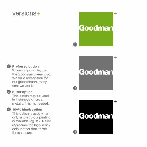
versions+
Preferred optionWherever possible, use the Goodman Green logo. We build recognition for our green square every time we use it.
Silver optionThis option may be used in instances where a metallic finish is needed.
100% black optionThis option is used when only single colour printing is available, eg. fax. Never reproduce the logo in any colour other than these three colours.
1
2
3
1
2
3

Goodman GreenThis is our primary colour and should be used to full effect.
Goodman SilverA silver version of our grey is to be used when a metallic finish is required.
Goodman GreyThis cool grey adds sophistication to our palette.
Tips+
+ Don’t set small type in silver, you won’t see it.
+ Don’t use large amounts of grey, it’s boring.
+ Do use lots of white and green.
+ Digital printing, set text to 70% black.
colour+
Goodman Green
PMS 369 CMYK 60.0.100.5 RGB 119.173.28 HEX #77ad1c
Goodman Silver
PMS 8401
Goodman Grey
PMS 431 CMYK 0.0.0.70 RGB 105.115.120 HEX #697378

secondary+ colours
Our secondary colour palette has been developed to complement our Goodman Green and Grey. Colours can be used in moderation across all marketing and corporate material to add visual interest or to indicate points of highlight.
Tips+
+ Use the colours in preference to the order in which they are displayed above, left to right, top to bottom.
+ Use your judgement. Don’t use all the colours at once, if they don’t complement the Goodman Green and Grey.
Yellow
PMS 130 CMYK 0.30.100.0 RGB 250.185.20 HEX #fab914
Orange
PMS 158 CMYK 0.60.100.0 RGB 245.130.35 HEX #f58223
Goodman Dark Grey
PMS 446 CMYK 20.0.25.75 RGB 91.91.91 HEX #535b51
Blue
PMS Cyan CMYK 100.0.0.0 RGB 0.175.235 HEX #00afeb
Purple
PMS purple CMYK 35.85.0.0 RGB 165.65.150 HEX #a54196
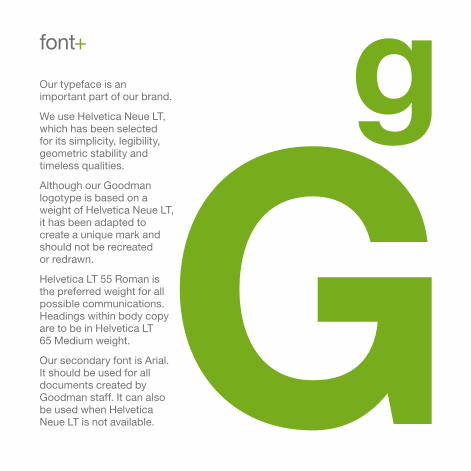
Our typeface is an important part of our brand.
We use Helvetica Neue LT, which has been selected for its simplicity, legibility, geometric stability and timeless qualities.
Although our Goodman logotype is based on a weight of Helvetica Neue LT, it has been adapted to create a unique mark and should not be recreated or redrawn.
Helvetica LT 55 Roman is the preferred weight for all possible communications. Headings within body copy are to be in Helvetica LT 65 Medium weight.
Our secondary font is Arial. It should be used for all documents created by Goodman staff. It can also be used when Helvetica Neue LT is not available.
font+

Our plus in language and as a graphic device.
The plus device can be teamed up with short words to create the unique Goodman language that we call ‘brand messaging’.
It’s always the same proportion and, like a logo, must not be altered. It is based on the plus character from Helvetica Neue LT font family. This is the only typeface that should be used when combining the plus with type. It should also only be used in the Goodman Green colour.
Tips+
+ Don’t overuse the plus, we don’t want to tire of it.
+ Don’t change, add to, or remove parts of the plus.
+ Don’t make the plus any colour other than our Goodman Green.
plus+
style+win+winintelligent+

The language we use is simple, smart and to the point. This is what we call brand messaging.
Words can be teamed up with the “Plus Device” and can be used as headings or for key points when we’re demonstrating our valued added capability.
The only time we use full lowercase text with no full stop is in our own brand messaging as shown here. We only use full uppercase in some headers such as reports and proposals, as per our guidelines. In all other standard communication we use sentence case with normal punctuation.
voice+
sim
ple+
sm
art
space+good+timeslease+

imagery+
Photographic style is a key component in the creation of successful brand communications, with design, typography, language and photography all working closely together to help define the Goodman brand.
The visual language used to depict Goodman is vitally important, and our photographic style and the use of imagery provides us with a unique opportunity to connect with our audience.
The following pages shows some examples of our photographic style.
Tips+
Our images should:
+ Appear unstaged and spontaneous (with the exception of portraits);
+ Reflect the dynamic working environments of Goodman properties;
+ Situations and people should appear relaxed and genuine, open and professional and reflect a diversity of cultures; and
+ As people are at the heart of our business, the human element in photograpy is important to us.

energetic, modern, architectural, graphic, sophisticated, distinctive.
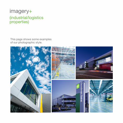
imagery+(industrial/logistics properties)
This page shows some examples of our photographic style.

imagery+(commercial properties)
This page shows some examples of our photographic style.

imagery+(people)
This page shows some examples of our photographic style.

goodman.com