section presentation ‘look and feel’ - adam oliver...
TRANSCRIPT

!" – !#
Section !." Presentation ‘Look and Feel’
Far from being superficial, slideshow aesthetics are an important aspect of your presentation and will either contribute or detract from the e!ectiveness of your communication. While some elements of a slideshow’s style will boil down to subjective perceptions and preferences, the following are some broad guidelines on how not to aesthetically alienate your audience.
When choosing a background colour for your slides, it is advisable to stay clear of dark colours, such as blue or black. Dark backgrounds are tiring on the eye, as well as the fact that many of the rooms in which the presentations are given are often dark that a dark-coloured presentation will inevitably put some people to sleep. Furthermore, blue backgrounds cause problems for colour-blind people when words or figures are presented in tones of red. Choose a calm but bright colour for your background and a strong and dark colour for your font.
Convey your information visually on the slides and textually with your spoken communication. Slides that contain large amounts of written information are merely a distraction from the overall presentation, as they cause the audience to read instead of to listen and look. Keep the text to a minimum of bullet points to remind you and the audience of the flow of the presentation and complement them with figures and pictures that visually help to illustrate some aspect of your current point. That way, the audience will be able to devote enough attention to what you are saying, which is where most of the factual and conceptual information should be being conveyed.
When presenting data in figures and graphs, keep it simple. Often times, it is tempting to post every bit of data we have in one figure, with everything labeled as it was for the manuscript publication. When you are giving presentations, you are often giving a portion of the larger research context and therefore not all of the data is necessary to illustrate your point. If your point can be shown with the simplest graph or table, feel free to make a scaled-down version in Powerpoint for the presentation, rather than including a scanned complicated behemoth from the published
article. Also, always remember to introduce each graph or table with an explanation of its axes and/or headings so that the audience will not lose track of your talk while looking to decipher your data.
The spatial layout of your slide is worthy of consideration, in that you want to optimize the use of your slides without making them cluttered or confusing. You may want to personalize the presentation with a banner containing your name and institution but keep it small, simple and uno-btrusive. Make sure each slide has a clear and dominant title and a mix of both text and imagery. Slides that only contain text should be used infrequently when necessary (presenting a list for example). Likewise, figures and images should not be presented alone, without explanatory text, arrows or other visual aids such as the use of the laser pointer.
A conscious but limited use of the laser pointer is the best way to visually guide your audience through your bullet points, figures, graphs or tables. It is best to avoid pointing with your finger for several reasons that will become apparent below. If you are close enough to touch the screen with a pointer stick, that can be used, but in many cases, the presenters are at a podium, which is too far removed from the screen to physically touch it. Conversely, going up and touching the screen can become dis-tracting to the audience as it struggles to take seriously a presenter who has fragmented words and images tattooed on their face.
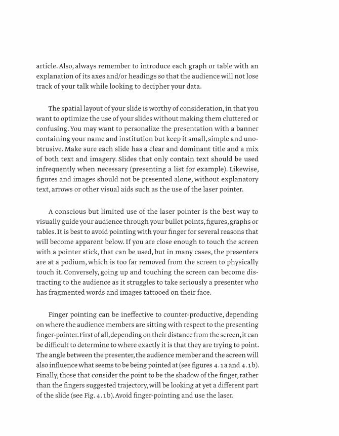
Finger pointing can be ine!ective to counter-productive, depending on where the audience members are sitting with respect to the presenting finger-pointer. First of all, depending on their distance from the screen, it can be di"cult to determine to where exactly it is that they are trying to point. The angle between the presenter, the audience member and the screen will also influence what seems to be being pointed at (see figures #.$a and #.$b). Finally, those that consider the point to be the shadow of the finger, rather than the fingers suggested trajectory, will be looking at yet a di!erent part of the slide (see Fig. #.$b). Avoid finger-pointing and use the laser.

!" – !#
Figure !.$ (a) and (b) Depending on the location of the viewer in the classroom, finger-pointing can appear to be directing us to di%erent places on the slide.
(a)
(b)

The number one laser-related blunder (from the perspectives of both the audience and a nervous presenter) is having the laser pointer errati-cally wander all over the screen during the presentation (Fig. !."). Those bright red or green dots are treacherous in their ability to highlight the shakiness of your hand under the stress of the presentation. While it is important to be able to use the laser pointer (even when stressed out), there are a few tricks that will make it work for you instead of against you. For example, never leave the laser at rest (lit) in one spot on the screen. Do not, however, have it doing constant loop-de-loops around or zig-zags across the screen either. Turn it on and o# only long enough to highlight the part of the slide towards which you are currently wishing to draw their attention (sentence, graph tendency, image detail). Circle or underline it a few times (including once more for those that had their heads down at the time) and move on (Fig. !.$). This minimizes the shaky e#ect and doesn’t have the laser around long enough to be a distraction anyway.
Body language and tone of voice are key elements to getting a hold of, and keeping, your audience’s attention. You want to be confident and relaxed, seeming as natural as possible (Fig. !.!). You will also want to engage your audience, both visually and aurally, with your presence. Visually speaking, you will want to get eye contact with your audience and move about natu-rally around your presentation area. %Your speech should be at a brisk but comfortable pace, taking time to breathe and to allow the information to sink in for your audience. %Your tone should be animated and enthusiastic but avoid overdoing it, as it may appear clownish and unprofessional. %You are allowed to enjoy giving your talk but do not distract from the message.
In order to maintain a good degree of eye contact with the audience, it is important to avoid looking at the screen. Many presenters make the fatal mistake of talking their way through a slide with their back to the audience (Fig. !.&). Nowadays, most seminar podiums (podia) have computer screens that face the presenter, allowing you to see what’s on the screen without turning away from the audience. Furthermore, the digital presenting software such as Powerpoint and Keynote have a feature that allows you to have written notes on your podium screen that don’t project to the main screen, giving you further reminders if you need them. In this way you can maintain a good amount of eye contact with your audience throughout the presentation.

!! – !"
Figure !.# A nervous presenter demonstrating their shakiness with an erratic laser trail.
Figure !.$ To properly illustrate something on a slide using a laser pointer, simply circle it or underline it a few times.

Figure !.! A relaxed poise and conversational tone go a long way when looking to captivate an interested audience.
Figure !." Do not read your slides from the screen, as you alienate your audience by turning your back on them.

!" – !#
On the subject of written notes, avoiding the use of them altogether is ideal in maintaining an optimal rhythm in your spoken presentation. Ideally, your tone and cadence should be akin to participating in an intel-ligent conversation at a work-related dinner party… relaxed and semi-for-mal. The reading of cue cards or written notes is a tone-killer and not only makes your speech monotonous and rigid, it suggests that the presenter is not fully prepared for their talk. In most circumstances, presenters are expected to be able to fully explain their stories without the use of reminders, requiring only prompts in order to follow the correct flow and order of the presentation. As mentioned previously, if you require more detailed notes, use the ones that are built into your presentation and use them sparingly, only as reminders and not read.
Lastly, but not least in importance is in the coherence of your sto-ryline and your logic. !A good presentation should tell a story and follow a logical flow that allows the audience to follow along and to develop and maintain a grasp on the presenter’s thesis. !A good way to get a view on your storyline is to plot out the story you are telling on a piece of paper aside from your presentation and ask yourself how well your slideshow tells that story. !Also, think about what are the important take-home mes-sages in your presentation and ask yourself if your audience is likely to retain them during the evening following your presentation, when they get home and relate their day to their family, for example.
Most presentations that a scientist will give over their career are time limited and it is therefore important to be able to tell your story e"ectively within the allotted timeframe. In order to be sure of getting your presenta-tion to fit within the amount of time prescribed, you should practice your complete presentation out loud several times before the o#cial time. In either case, it is a shame for both the presenter and the audience when the presentation is either rushed at a break-neck speed in order to get it all in or that the presentation is cut short, having run out of time due to a dawdling and unprepared presenter. Practice. Practice. Practice.