safari visual effects guide
DESCRIPTION
Use of the “keyboard” Apple logo (Option-Shift-K) for commercial purposes without the prior written consent of Apple may constitute trademark infringement and unfair competition in violation of federal and state laws. Java and all Java-based trademarks are trademarks or registered trademarks of Sun Microsystems, Inc. in the U.S. and other countries.TRANSCRIPT

Safari Visual Effects GuideAudio, Video, & Visual Effects
2009-02-17

Apple Inc.© 2009 Apple Inc.All rights reserved.
No part of this publication may be reproduced,stored in a retrieval system, or transmitted, inany form or by any means, mechanical,electronic, photocopying, recording, orotherwise, without prior written permission ofApple Inc., with the following exceptions: Anyperson is hereby authorized to storedocumentation on a single computer forpersonal use only and to print copies ofdocumentation for personal use provided thatthe documentation contains Apple’s copyrightnotice.
The Apple logo is a trademark of Apple Inc.
Use of the “keyboard” Apple logo(Option-Shift-K) for commercial purposeswithout the prior written consent of Apple mayconstitute trademark infringement and unfaircompetition in violation of federal and statelaws.
No licenses, express or implied, are grantedwith respect to any of the technology describedin this document. Apple retains all intellectualproperty rights associated with the technologydescribed in this document. This document isintended to assist application developers todevelop applications only for Apple-labeledcomputers.
Every effort has been made to ensure that theinformation in this document is accurate. Appleis not responsible for typographical errors.
Apple Inc.1 Infinite LoopCupertino, CA 95014408-996-1010
Apple, the Apple logo, QuickTime, and Safariare trademarks of Apple Inc., registered in theUnited States and other countries.
iPhone is a trademark of Apple Inc.
Java and all Java-based trademarks aretrademarks or registered trademarks of SunMicrosystems, Inc. in the U.S. and othercountries.
Simultaneously published in the United Statesand Canada.
Even though Apple has reviewed this document,APPLE MAKES NO WARRANTY OR REPRESENTATION,EITHER EXPRESS OR IMPLIED, WITH RESPECT TOTHIS DOCUMENT, ITS QUALITY, ACCURACY,MERCHANTABILITY, OR FITNESS FOR A PARTICULARPURPOSE. AS A RESULT, THIS DOCUMENT IS
PROVIDED “AS IS,” AND YOU, THE READER, AREASSUMING THE ENTIRE RISK AS TO ITS QUALITYAND ACCURACY.
IN NO EVENT WILL APPLE BE LIABLE FOR DIRECT,INDIRECT, SPECIAL, INCIDENTAL, ORCONSEQUENTIAL DAMAGES RESULTING FROM ANYDEFECT OR INACCURACY IN THIS DOCUMENT, evenif advised of the possibility of such damages.
THE WARRANTY AND REMEDIES SET FORTH ABOVEARE EXCLUSIVE AND IN LIEU OF ALL OTHERS, ORALOR WRITTEN, EXPRESS OR IMPLIED. No Appledealer, agent, or employee is authorized to makeany modification, extension, or addition to thiswarranty.
Some states do not allow the exclusion or limitationof implied warranties or liability for incidental orconsequential damages, so the above limitation orexclusion may not apply to you. This warranty givesyou specific legal rights, and you may also haveother rights which vary from state to state.

Contents
Introduction Introduction 7
Who Should Read This Document 7Organization of This Document 7See Also 8
Gradients 9
Background Gradients 11
Masks 13
Reflections 17
Transitions 19
How Transitions Work 19Setting Transition Properties 21Using Timing Functions 21Starting Transitions 23Handling Transition Events 24
Animations 25
How Animations Work 25Setting Animation Properties 26Creating Keyframes 27Using Timing Functions 28Repeating Animations 29Starting Animations 29Handling Animation Events 30
Transforms 33
Coordinate Systems and Rendering 34Setting Transform Functions 35
Rotating an Element 35Setting Multiple Transforms 36
Changing the Origin 37Setting the Perspective 38Setting the Transform Style 39Back Face Visibility 41
32009-02-17 | © 2009 Apple Inc. All Rights Reserved.

Creating Transforms in JavaScript 41
Interactive Visual Effects 43
Using Click or Tap to Trigger a Transition Effect 43Using Touch to Drag Elements 44
Create an Element to Manipulate 45Register and Implement Event Handlers 47
Using Gestures to Translate, Scale, and Rotate Elements 49Create the Element to Manipulate 49Register and Implement Event Handlers 49
Document Revision History 51
42009-02-17 | © 2009 Apple Inc. All Rights Reserved.
CONTENTS

Figures and Listings
Gradients 9
Figure 1 Linear gradient 9Figure 2 Radial gradient 9Figure 3 Orange gradient 10Figure 4 Orange gradient that starts later and ends earlier 11Figure 5 Color stops at the same location 11Figure 6 Tiled linear gradient 12Listing 1 Creating an orange gradient 10Listing 2 Using the from() and to() functions 10Listing 3 Not specifying start and end color stops 10Listing 4 Multiple color stops at the same location 11
Masks 13
Figure 1 Results of a fuzzy border mask 13Figure 2 Results of applying a gradient mask 14Figure 3 Results of applying a SVG mask 15Listing 1 Creating a fuzzy border 13Listing 2 Applying a gradient mask 14Listing 3 Applying a mask to an image with a border radius 14Listing 4 Applying a SVG mask 14
Reflections 17
Figure 1 Reflection 18Listing 1 Creating a reflection using a gradient mask 17
Transitions 19
Figure 1 Transition of two properties 20Figure 2 Card Flip example 20Figure 3 Cubic Bezier timing function 22Listing 1 Setting transition properties 21Listing 2 Creating multiple transitions at once 21Listing 3 Setting all transition properties at once 21Listing 4 Setting a transition’s timing function 22Listing 5 Simple fade away effect 23Listing 6 Handling transition end event 24
52009-02-17 | © 2009 Apple Inc. All Rights Reserved.

Animations 25
Figure 1 Poster Circle example 26Listing 1 Setting animation properties 26Listing 2 Declaring keyframes 27Listing 3 Using timing functions in keyframes 28Listing 4 Creating an animation that repeats 29Listing 5 Starting an animation 29Listing 6 Restarting an animation 30Listing 7 Handling animation events 31
Transforms 33
Figure 1 HTML page with rotation and perspective transforms 33Figure 2 3D coordinate space 34Figure 3 Rotating text 36Figure 4 Element rotated around the top-right corner 37Figure 5 Setting the perspective 38Figure 6 Preserving 3D 40Figure 7 Setting the perspective and preserving 3D 40Listing 1 Rotating an element 35Listing 2 Setting multiple transforms using a whitespace-separated list 36Listing 3 Nesting transforms 36Listing 4 Rotating an element around the top-right corner 37Listing 5 Adding perspective 38Listing 6 Setting the transform style 39Listing 7 Hiding the back side of a face card 41
Interactive Visual Effects 43
Figure 1 Click box to enlarge 43Figure 2 Drag box application 45
62009-02-17 | © 2009 Apple Inc. All Rights Reserved.
FIGURES AND LISTINGS

Important: This is a preliminary document for an API or technology in development. Although this documenthas been reviewed for technical accuracy, it is not final. Apple is supplying this information to help you planfor the adoption of the technologies and programming interfaces described herein. This information is subjectto change, and software implemented according to this document should be tested with final software andfinal documentation. Newer versions of this document may be provided with future releases of the API ortechnology. For information about updates to this and other developer documentation, view the New &Updated sidebars in subsequent seeds of the Reference Library.
Safari visual effects allow you to create sophisticated graphical user interfaces for web applications for thedesktop and iPhone OS. The visual effects available range from image effects using gradients, masks, andreflections, to more complex 2D and 3D effects.
These CSS and the DOM visual effects extensions allow you to add 2D and 3D graphics to your webapplications, create complex animations, and generate smooth transitions when element properties—suchas position or color—change. When you combine these visual effects with DOM mouse and touch events,you can create interactive applications, similar to native applications, that run in Safari.
Some of the properties and classes described in this book are proposed W3C standards or Apple extensions.Properties in CSS that begin with -webkit are usually proposed standards—the -webkit prefix will bedropped when they are approved. Similarly, JavaScript classes that begin with WebKit are also proposedstandards or Apple extensions.
Important: Not all CSS properties and JavaScript classes described in this book are supported on all Safariplatforms. Refer to the respective reference documents, Safari CSS Reference and Safari DOM ExtensionsReference for support level and availability details.
Who Should Read This Document
You should read this document if you want to use visual effects in your web content and web applications—ifyou are creating web applications for either Safari on the desktop or iPhone OS. Definitely read this documentif you are creating a custom web application for iPhone.
Organization of This Document
The articles in this book are as follows:
■ “Gradients” (page 9) explains how to use linear and radial gradients in place of images.
■ “Masks” (page 13) explains how to block out or obscure areas of an element.
Who Should Read This Document 72009-02-17 | © 2009 Apple Inc. All Rights Reserved.
INTRODUCTION
Introduction

■ “Reflections” (page 17) explains how to create a mirror image effect of an element.
■ “Transitions” (page 19) explains how to add transitions to your content that animate property valuechanges.
■ “Animations” (page 25) covers the basics on how to add animations to your content, including creatingkeyframes and setting timing functions.
■ “Transforms” (page 33) describes how to add 2D and 3D graphics effects to your content.
■ “Interactive Visual Effects” (page 43) provides step-by-step instructions on how to combine DOM eventswith visual effects to create interactive web applications.
See Also
There are a variety of other resources for Safari web content developers in the ADC Reference Library.
For details on properties and classes discussed in this book, refer to these visual effects reference documents:
■ Safari DOM Extensions Reference describes the touch event classes that you use to handle multi-touchgestures in JavaScript.
■ Safari CSS Reference describes the CSS properties supported by various Safari and WebKit applications.
If you are creating content for Safari on iPhone OS, also read these documents:
■ SafariWebContentGuide for iPhoneOS describes how to create content that is compatible with, optimizedfor, and customized for iPhone OS.
■ iPhone Human Interface Guidelines for Web Applications provides user interface guidelines for designingwebpages and web applications for Safari on iPhone.
If you want to use the JavaScript media APIs, then you should read these documents:
■ JavaScript ScriptingGuide forQuickTime describes how to use JavaScript to query and control the QuickTimeplug-in directly.
If you are combining visual effects with touch events on iPhone OS, see this sample code:
■ FingerTips demonstrates how to build an interactive 3D carousel using CSS, JavaScript and touch events.
If you want to read the WebKit W3C proposals, then go to http://www.webkit.org/specs.
8 See Also2009-02-17 | © 2009 Apple Inc. All Rights Reserved.
INTRODUCTION
Introduction

A gradient is a visual effect you can apply to a surface that gradually changes the fill color from one value tothe next creating a rainbow effect. Gradients can be used anywhere that an image can be used. For example,you can specify a gradient that changes the color of a background from yellow at the top to blue in themiddle and green at the bottom. You can specify multiple in-between color values, called color stops, andthe gradient function interpolates the color values between them.
Gradients are specified using the -webkit-gradient function and can be passed in place of an image URLparameter. For example, pass a gradient function as the image value for backgrounds, borders, and lists. Thefirst argument of the -webkit-gradient() function is the type. There are two types of gradients, linearand radial.
A gradient applied to a rectangle area is called a linear gradient. A linear gradient requires a start and endpoint to specify the direction of the gradient. Points are specified using two numbers separated by a spacewhere the first number is the x-coordinate and the second is the y-coordinate. You can use these constantsinstead of two numbers as shortcuts for the points left top, left bottom, right top, and rightbottom. For example, pass left top as the first point and left bottom as the second point to create alinear gradient that progresses from the top of a rectangle area to the bottom as shown in Figure 1.
Figure 1 Linear gradient
A gradient specified using circles is called a radial gradient. You specify a radial gradient using a start innercircle and a end outer circle. Each circle is specified by a center and a radius. The color values change graduallyfrom the circumference of the inner circle outward to the circumference of the outer circle. The two circlescan have offset centers creating spherical effect when rendered as shown in Figure 2.
Figure 2 Radial gradient
92009-02-17 | © 2009 Apple Inc. All Rights Reserved.
Gradients

You use the color-stop function to create a color stop. You pass this function as a parameter to the-webkit-gradient() function to specify the start, intermediate, and end colors in both a linear or radialgrradient. The colors between the specified color stops are interpolated.
The first parameter of the color-stop() function is the percentage of the distance from the start and endpoints of the gradient. The second parameter is the color at that location. For example, if the first color stopin a linear gradient is color-stop(0.0, yellow) as shown in Listing 1, then the gradient starts at yellow.If the next color stop is color-stop(0.5, orange), then the gradient transitions from yellow to orangeat 50% of the total distance. If the end color stop is color-stop(1.0, red), then the gradient transitionsfrom orange at 50% to red at the end, %100 of the distance.
Listing 1 Creating an orange gradient
body { background: -webkit-gradient(linear, left top, left bottom, color-stop(0.0, yellow), color-stop(0.5, orange), color-stop(1.0, red)));}
The result of Listing 1 is shown in Figure 3.
Figure 3 Orange gradient
The from() and to() functions are provided as a convenience for setting the start and end color stops.Passing from(yellow) as the color stop to -webkit-gradient() function is the same as passingcolor-stop(0.0, yellow). Passing to(red) is the same as passing color-stop(1.0, red). Listing2 simplifies Listing 1 (page 10) using these functions.
Listing 2 Using the from() and to() functions
body { background: -webkit-gradient(linear, left top, left bottom, from(#ff0), color-stop(0.5, orange), to(rgb(255, 0, 0)));}
For both types of gradients, you do not need to specify colors at 0% and 100% as shown in Listing 3. At andbefore the first specified color stop, the color of the first color stop is used. At and after the last color stop,the color of the last color stop is used. In other words, if the first color stop is at 40%, then that color is usedfrom 0% to 40%.
Listing 3 Not specifying start and end color stops
background-image: -webkit-gradient(linear, left top, left bottom, color-stop(0.40, #ff0),
102009-02-17 | © 2009 Apple Inc. All Rights Reserved.
Gradients

color-stop(0.5, orange), color-stop(0.60, rgb(255, 0, 0)));
In contrast, to Figure 3 (page 10), which shows the results when the gradient values are interpolated from0% to 100%, Figure 4 shows the results when the interpolation starts at 40% and ends at 60%. Yellow is usedfrom 0% to 40% and red from 60% to 100%.
Figure 4 Orange gradient that starts later and ends earlier
In addition, if no color stop is specified, then the gradient is transparent black. If multiple color stops arespecified at the same location, then they appear in order. Only the first and last color stop at location 0.5 isused in the sample shown in Listing 4.
Listing 4 Multiple color stops at the same location
-webkit-gradient(linear, left top, left bottom, from(#00abeb), to(#fff), color-stop(0.5, #fff), color-stop(0.5, #66cc00))
Figure 5 shows the results of Listing 4 where the gradient transitions from blue to white in the first half andgreen to white in the second half.
Figure 5 Color stops at the same location
Background Gradients
When specifying a gradient as a background, the gradient becomes a background tile. If no size is specified,then the gradient scales to the box specified by the -webkit-background-origin property. This propertydefaults to the upper-left corner of the padding area, so the gradient is scaled to the size of the padding-boxas shown in Figure 3 (page 10). This is equivalent to setting the -webkit-background-size property to100% in both the x and y directions.
Background Gradients 112009-02-17 | © 2009 Apple Inc. All Rights Reserved.
Gradients

If you want to tile a vertical gradient using a narrow strip, set -webkit-background-size to give thegradient tile an explicit size. Figure 6 shows the same linear gradient as in Figure 3 (page 10) but with the-webkit-background-size property set to 20.0.
Figure 6 Tiled linear gradient
12 Background Gradients2009-02-17 | © 2009 Apple Inc. All Rights Reserved.
Gradients
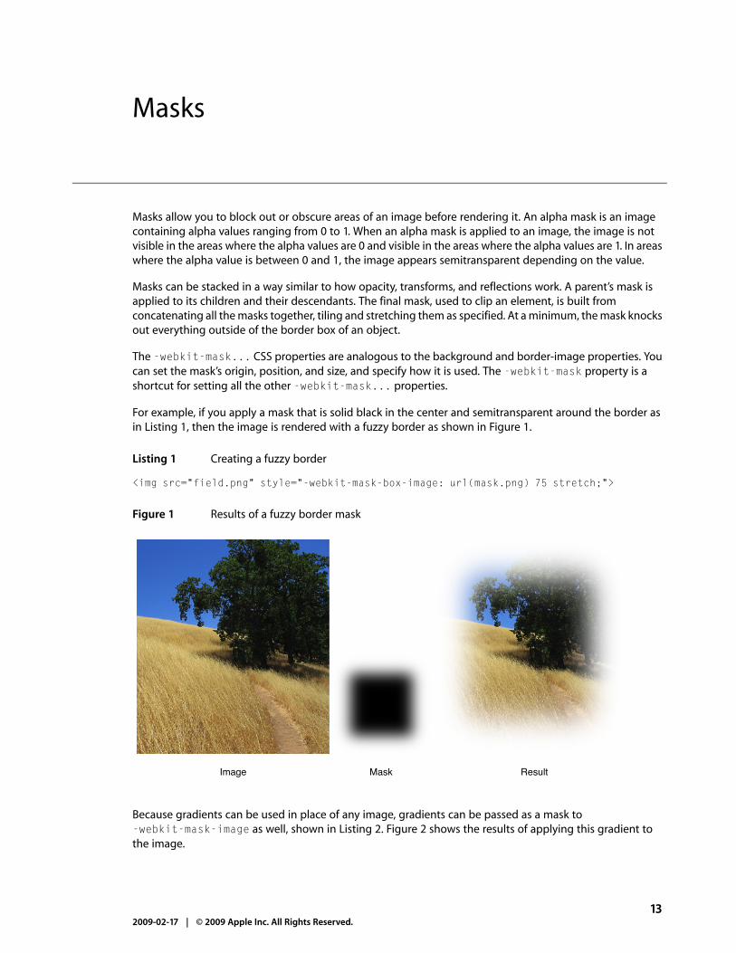
Masks allow you to block out or obscure areas of an image before rendering it. An alpha mask is an imagecontaining alpha values ranging from 0 to 1. When an alpha mask is applied to an image, the image is notvisible in the areas where the alpha values are 0 and visible in the areas where the alpha values are 1. In areaswhere the alpha value is between 0 and 1, the image appears semitransparent depending on the value.
Masks can be stacked in a way similar to how opacity, transforms, and reflections work. A parent’s mask isapplied to its children and their descendants. The final mask, used to clip an element, is built fromconcatenating all the masks together, tiling and stretching them as specified. At a minimum, the mask knocksout everything outside of the border box of an object.
The -webkit-mask... CSS properties are analogous to the background and border-image properties. Youcan set the mask’s origin, position, and size, and specify how it is used. The -webkit-mask property is ashortcut for setting all the other -webkit-mask... properties.
For example, if you apply a mask that is solid black in the center and semitransparent around the border asin Listing 1, then the image is rendered with a fuzzy border as shown in Figure 1.
Listing 1 Creating a fuzzy border
<img src="field.png" style="-webkit-mask-box-image: url(mask.png) 75 stretch;">
Figure 1 Results of a fuzzy border mask
Image Mask Result
Because gradients can be used in place of any image, gradients can be passed as a mask to-webkit-mask-image as well, shown in Listing 2. Figure 2 shows the results of applying this gradient tothe image.
132009-02-17 | © 2009 Apple Inc. All Rights Reserved.
Masks

Listing 2 Applying a gradient mask
<img src="field.png" style="-webkit-mask-image: -webkit-gradient(linear, left top, left bottom, from(rgba(0,0,0,1)), to(rgba(0,0,0,0)))">
Figure 2 Results of applying a gradient mask
Masks respect the -webkit-border-radius property setting of an element too. If you add a border radiusto the previous example as shown in Listing 3, then you get the gradient effect but with rounded corners.
Listing 3 Applying a mask to an image with a border radius
<img src="field.png" style="-webkit-border-radius: 10px; -webkit-mask-image: -webkit-gradient(linear, left top, left bottom, from(rgba(0,0,0,1)), to(rgba(0,0,0,0)))">
SVG images can be used as masks too. A semitransparent circle mask can be applied to an image as shownin Listing 4, producing the results shown in Figure 3 (page 15).
Listing 4 Applying a SVG mask
<img src="field.png" style="-webkit-mask-box-image: url(circle.svg)">
142009-02-17 | © 2009 Apple Inc. All Rights Reserved.
Masks

Figure 3 Results of applying a SVG mask
Mask Result
152009-02-17 | © 2009 Apple Inc. All Rights Reserved.
Masks

162009-02-17 | © 2009 Apple Inc. All Rights Reserved.
Masks

A reflection is a mirror image with its own specific transform and mask.
Use the -webkit-box-reflect property to set the direction, offset, and mask of an image’s reflection asshown in Listing 1.
Listing 1 Creating a reflection using a gradient mask
<img src="ship.jpg" style="-webkit-box-reflect:below 3px -webkit-gradient(linear, left top, left bottom, from(transparent), color-stop(0.5, transparent), to(white));">
The first argument of the -webkit-box-reflect property specifies the direction of the reflection, whichcan be either above, below, left, or right. The second argument is the offset or space between the originalimage and the reflection. The third argument is a mask applied to the reflection. In this example, the maskis specified as a gradient from transparent to white at 50% of the image height, producing a realistic mirroreffect as shown in Figure 1.
172009-02-17 | © 2009 Apple Inc. All Rights Reserved.
Reflections

Figure 1 Reflection
Reflections update automatically as the source image changes. If you hover over links, you’ll see the hovereffect happen in the reflection too. If you add a reflection to a video element, the video plays in the reflectionas well.
Reflections can be stacked in a way similar to how opacity, transforms, and masks work. A parent ’s reflectionis applied to its children and their descendants. The final reflection is built from concatenating all the reflectionstogether, tiling and stretching them as specified.
Also reflections are not interactive elements—mousing or touching a reflection does not generate any events.Reflections have no effect on layout other than being part of a container’s overflow. Reflections behave in away similar to box shadows in this respect.
182009-02-17 | © 2009 Apple Inc. All Rights Reserved.
Reflections

Transitions are implicit animations that occur when you change an animatable CSS property. Normally whenthe value of a CSS property changes, the affected elements are rendered immediately using the new propertyvalue. Using CSS transitions, the element automatically transitions from its current state to its new state whenyou set the property value.
To create a transition, you first create a style that sets up a transition—for example, you specify the element’sproperty that triggers the transition and the duration of the transition. Then you apply the style to an elementand set the element’s property value. Changing the property value starts the transition from the old to thenew value.
Not all element properties are animatable. In general, any CSS property that accepts values that are numbers,lengths, percentages, or colors is animatable. Some CSS properties that accept discrete values, such as thevisibility property, are animatable too, but they display a jump between values rather than a smoothtransition when changed. See Safari CSS Reference for which properties are animatable.
Note: There are actually two types of animations: declared animations and implicit animations. This articledescribes implicit animations, which are called transitions. Read “Animations” (page 25) for details ondeclared animations.
iPhone OS Note: In iPhone OS, transitions and animations of the -webkit-transform and opacityproperties are performance-enhanced.
How Transitions Work
Normally when the value of a CSS property changes, the result is rendered immediately. When applying atransition to an element’s property, the change animates smoothly from the old value to the new value overtime. The property values are computed over time. Therefore, if you query the value of a property during atransition, you may get an intermediate value that is the current animated value, not the old or new value.
For example, suppose you define a transition for the left and background-color properties and then setboth property values of an element at the same time. The element’s old position and color transition to thenew position and color over time as illustrated in Figure 1. If you query the properties in the middle of thetransition, you get an intermediate location and color for the element.
How Transitions Work 192009-02-17 | © 2009 Apple Inc. All Rights Reserved.
Transitions

Figure 1 Transition of two properties
Starting appearanceTime = 0.0 sec
Intermediate appearanceTime = 0.5 sec
Final appearanceTime = 1.0 sec
You can also control how these intermediate values are computed over time using a timing function. Read“Using Timing Functions” (page 21) to learn more about timing functions.
Transitions are powerful if you combine them with 2D and 3D transforms. For example, Figure 2 shows theresults of applying a transition to an element in 3D space. See the CardFlip sample code project for thecomplete source code for this example.
Figure 2 Card Flip example
20 How Transitions Work2009-02-17 | © 2009 Apple Inc. All Rights Reserved.
Transitions

Setting Transition Properties
You use the CSS transition properties to set parameters of a transition. Typically, you need to set the element’sproperty that the transition applies to and the duration of the transition. You don’t need to set the element’sproperty if you want the transition to apply to all properties. In addition, you can set a timing function (howintermediate values are distributed over the duration) and a delay before the transition begins.
Each parameter has a corresponding CSS property beginning with -webkit-transition. Use the-webkit-transition-property property to set the element’s property and the-webkit-transition-duration property to set the duration of the transition. In addition, you can usethe -webkit-transition property as a shorthand to set all the transition parameters using one style rule.
For example, Listing 1 defines a simple 2 second transition when the opacity property of an element is set.
Listing 1 Setting transition properties
div { -webkit-transition-property: opacity; -webkit-transition-duration: 2s;}
You can also pass multiple comma-separated parameters to the -webkit-transition-... properties toset up multiple transitions at once. The order of the parameters determines which transition the settingsapply to. For example, in Listing 2, the first parameter of each line applies to a -webkit-transform transitionand the second parameter applies to an opacity transition.
Listing 2 Creating multiple transitions at once
div.zoom-fade { -webkit-transition-property: -webkit-transform, opacity; -webkit-transition-duration: 4s, 2s; -webkit-transition-delay: 2s, 0;}
Listing 3 creates a 500 millisecond transition for the opacity property in one style rule using the-webkit-transition shorthand.
Listing 3 Setting all transition properties at once
div.sliding { -webkit-transition: opacity 500ms ease-out 100ms;}
Using Timing Functions
Timing functions allow a transition to change speed over its duration. The timing function is a mathematicalfunction that provides a smooth curve or path for the transition. These effects are commonly called easingfunctions.
Setting Transition Properties 212009-02-17 | © 2009 Apple Inc. All Rights Reserved.
Transitions

You set a timing function using the -webkit-transition-timing-function property. For example, youcan define a timing function that starts out slowly, speeds up, and slows down at the end. The timing functionis specified using a cubic Bezier curve, which is defined by four control points, as illustrated in Figure 3. Thefirst and last control points are always set to (0,0) and (1,1), so you just need to specify the two in-betweencontrol points. The points are specified as a percentage of the overall duration.
Figure 3 Cubic Bezier timing function
Out
put p
erce
ntag
e
Input percentage
1.0
1.0
0.5
0.5
P0
P2
P3
P1
You can set your control points by passing the cubic-bezier function as the parameter with your customcontrol points as arguments or by using constants for common timing effects. For example, in Listing 4,transitions are created for the -webkit-transform and opacity properties. The -webkit-transformtransition is 4 seconds and uses an ease-out timing function. The opacity transition is 2 seconds and usesa custom Bezier path.
Listing 4 Setting a transition’s timing function
div.zoom-fade { -webkit-transition-property: -webkit-transform, opacity; -webkit-transition-duration: 4s, 2s; -webkit-transition-timing-function: ease-out, cubic-bezier(0.5, 0.2, 0.3, 1.0);}
The default value for the timing function is ease, where the control points are (0.25, 0.1) and (0.25,1.0) respectively.
22 Using Timing Functions2009-02-17 | © 2009 Apple Inc. All Rights Reserved.
Transitions

Starting Transitions
Once you define a transition, you need to apply it to an element to start the transition. For example, normally,changing the value of an element’s left style property causes the element to jump to the new location.Although this is fine for static pages, it provides for a limited user-interface experience for rich web applications.A JavaScript function could be used to iterate over an array of intermediate values, constantly updating theleft property with new values, but this is computationally expensive and requires significantly more code.Instead you define a transition as described in “Setting Transition Properties” (page 21) and apply it to anelement as follows.
1. Define the transition in CSS.
This code fragment defines a 2 second opacity transition.
div { -webkit-transition-property: opacity; -webkit-transition-duration: 2s;}
2. Create a corresponding style in CSS that can be applied to an element.
This code fragment sets the opacity property to 0 causing a fade away effect.
div.fadeAway { opacity:0;}
3. Apply the style to an element in HTML.
This code fragment uses the onclick handler to trigger the fade away effect on the element.
<div style="width:100px; height:100px; background-color:blue;" onclick="className = 'fadeAway'">
Listing 5 shows the complete HTML for this simple web application that displays a 100 x 100 box that fadesaway when clicked.
Listing 5 Simple fade away effect
<html><head> <meta name="viewport" content="width=device-width, initial-scale=1, user-scalable=no"/> <style type="text/css" media="screen">
div { -webkit-transition-property: opacity; -webkit-transition-duration: 2s;}
div.fadeAway { opacity:0;}
Starting Transitions 232009-02-17 | © 2009 Apple Inc. All Rights Reserved.
Transitions

</style></head><body>
<div style="width:100px; height:100px; background-color:blue;" onclick="className = 'fadeAway'">Tap to fade</div>
</body></html>
Handling Transition Events
You can set a handler for a DOM event that is sent at the end of a transition. The event is an instance ofWebKitTransitionEvent and its type is webKitTransitionEnd in JavaScript.
For example, the JavaScript code in Listing 6 displays an alert panel whenever a transition ends.
Listing 6 Handling transition end event
box.addEventListener( 'webkitTransitionEnd', function( event ) { alert( "Finished transition!" ); }, false );
24 Handling Transition Events2009-02-17 | © 2009 Apple Inc. All Rights Reserved.
Transitions

You can use animation properties to animate elements as they move, resize, change color and opacity, andundergo other visual changes. You can also animate 2D and 3D visual effects such as rotating, scaling, andtranslating elements.
To create an animation, you first set animation properties, then you create keyframes, and then apply theanimation to some elements. For example, you set the animation’s name, duration, direction, and iterationcount. You can also set a timing function that specifies how an animation progresses between keyframes.The timing function defines a Bezier curve—a path that the animation follows between keyframes. You definekeyframes using a special keyframes at-rule.
Note: There are actually two types of animations: declared animations and implicit animations. Declaredanimations, described in this article, are explicitly executed when the animation properties are applied toelements. Implicit animations are called transitions and are triggered when you set a new value for ananimatable CSS property. Read “Transitions” (page 19) for details on implicit animations.
iPhone OS Note: In iPhone OS, transitions and animations of the -webkit-transform and opacityproperties are performance-enhanced.
How Animations Work
Animations are similar to transitions except you have more fine control by specifying keyframes. A keyframedefines the state of an animation at a particular point in time. A sequence of keyframes define the starting,middle, and ending points of an animation. The frames in between these points are computed based on theanimation and style properties you set.
Similar to transitions, when applying an animation to an element’s property, the change animates smoothlyfrom the old value to the new value over time. The property values are computed over time. Therefore, ifyou query the value of a property during an animation, you may get an intermediate value that is the currentanimated value, not the old or new value. However, unlike transitions, animations do not change propertyvalues at the end of the animation.
Similar to transitions, you can control how these intermediate values are computed over time using a timingfunction, except that the timing function applies to the part of the animation between keyframes. Read“Using Timing Functions” (page 28) to learn more about timing functions.
You can create unique effects combining animations with 2D and 3D transforms. For example, Figure 1 showsan animation of elements in 3D space. See the PosterCircle sample code project for the complete source codefor this example.
How Animations Work 252009-02-17 | © 2009 Apple Inc. All Rights Reserved.
Animations

Figure 1 Poster Circle example
Setting Animation Properties
Use the CSS animation properties to set basic parameters about an animation. At a minimum, you need toset an animation name and duration. In addition, you can specify how many times an animation iterates,whether it alternates between the begin and end states, and whether the animation should begin in a runningor paused state. You can also set a delay before the animation begins.
Each parameter has a corresponding CSS property beginning with -webkit-animation. For example, usethe -webkit-animation-name property to specify a name. Use the -webkit-animation-durationproperty to specify the duration in seconds. Use the -webkit-animation-iteration-count property tospecify the number of times the animation repeats. In addition, you can use the -webkit-animationproperty as a shorthand to set all these parameters in one style rule.
For example, an animation called diagonal-slide is declared in Listing 1. The animation name isdiagonal-slide, its duration is five seconds, and it repeats ten times.
Listing 1 Setting animation properties
.diagonalslide {
26 Setting Animation Properties2009-02-17 | © 2009 Apple Inc. All Rights Reserved.
Animations

-webkit-animation-name: diagonal-slide; -webkit-animation-duration: 5s; -webkit-animation-iteration-count: 10;}
The animation name is used to associate it with its keyframes. You use the animation name in the keyframesat-rule as described in “Creating Keyframes” (page 27).
Creating Keyframes
Keyframes are specified in CSS using a specialized @-webkit-keyframes at-rule. The keyframes rule consistsof the @-webkit-keyframes keyword, followed by the animation name, and then a set of style rules foreach keyframe as shown in Listing 2. The style rules are contained in blocks, surrounded by braces, and arepreceded by a percentage value marking the keyframe’s point in time. Any style rules can be placed in theblocks including 2D and 3D visual effects.
The value is a percentage of the animation’s duration (or the keywords from or to) . For example, 0% specifiesthe start of an animation, 50% halfway through an animation, and 100% the end of an animation. The fromkeyword is equivalent to 0% and the to keyword is equivalent to 100%. When the animation executes, ittransitions smoothly from one state to the next in increasing order, from 0% to 100%.
Listing 2 shows a keyframes at-rule where the animation is called wobble and the keyframes move an elementback and forth over time. (You set the animation name using the -webkit-animation-name property asdescribed in “Setting Animation Properties” (page 26).) In the first keyframe, the value of the element’s leftproperty is 100 pixels. By 40% of the animation duration, the value of the left property animates to 150pixels. At 60% of the animation duration, the value of the left property animates back to 75 pixels. At theend of the animation, the value of the left property returns to 100 pixels.
Listing 2 Declaring keyframes
@-webkit-keyframes wobble {
0% { left: 100px; }
40% { left: 150px; }
60% { left: 75px; }
100% { left: 100px; }
}
Creating Keyframes 272009-02-17 | © 2009 Apple Inc. All Rights Reserved.
Animations

Using Timing Functions
Timing functions allow an animation to change speed over its duration. The timing function is a mathematicalfunction that provides a smooth curve or path for the transition. These effects are commonly called easingfunctions.
You set a timing function in a keyframe block using the -webkit-animation-timing-function property.The timing function determines the speed of an animation from the current to the next keyframe. The timingfunction is specified using a cubic Bezier curve, which is defined by four control points as illustrated in Figure3 (page 22). The first control point is always (0,0) and the last control point is (1,1), so you only need to specifythe two in-between control points of the curve. The in-between points are specified as a percentage of theoverall duration. For example, this line of code sets the second point to (0.5, 0.2) and the third point to (0.3,1.0) using the cubic-bezier function:
-webkit-transition-timing-function: cubic-bezier(0.5, 0.2, 0.3, 1.0);
Similar to the -webkit-transition-timing-function property, you can set your control points bypassing the cubic-bezier() function as the parameter with your custom control points as arguments orby using constants for common timing effects. For example, Listing 3 shows a keyframes at-rule that usestwo timing function constants: ease-out and ease-in. Five keyframes are specified for an animation calledbounce. Between the first and second keyframe (the first quarter of the duration) an ease-out timingfunction is used. Between the second and third keyframe (second quarter of the duration) an ease-in timingfunction is used. And so on. The effect appears as an element that moves up the page 50 pixels, slowingdown as it reaches its highest point then speeding up as it falls back to 100 pixels. The second half of theanimation behaves in a similar manner, but only moves the element 25 pixels units up the page creating abouncing ball effect.
Note: The y-axis increases downwards. Therefore, in the first bounce, when the element’s y-coordinatechanges from 100 to 50 pixels, it moves up by 50 pixels. In the second bounce, when the y-coordinate changesfrom 100 to 75 pixels, it moves up by 25 pixels, half the height of the first bounce.
Listing 3 Using timing functions in keyframes
@-webkit-keyframes bounce {
from { -webkit-transform: translateY(100px); -webkit-animation-timing-function: ease-out; }
25% { -webkit-transform: translateY(50px); -webkit-animation-timing-function: ease-in; }
50% { -webkit-transform: translateY(100px); -webkit-animation-timing-function: ease-out; }
75% { -webkit-transform: translateY(75px); -webkit-animation-timing-function: ease-in;
28 Using Timing Functions2009-02-17 | © 2009 Apple Inc. All Rights Reserved.
Animations

}
to { -webkit-transform: translateY(100px); }
}
Repeating Animations
You use the -webkit-animation-iteration-count property to set the number of times to repeat ananimation. Listing 4 defines an animation that slides elements from the upper-left to lower-right corner. The-webkit-animation-iteration-count property is set to 10 causing the animation to repeat 10 timeswhen it is applied.
Listing 4 Creating an animation that repeats
.diagonalslide { -webkit-animation-name: diagonal-slide; -webkit-animation-duration: 5s; -webkit-animation-iteration-count: 10;}
@-webkit-keyframes diagonal-slide {
from { left: 0; top: 0; }
to { left: 100px; top: 100px; }
}
Starting Animations
Once you create an animation and specify its keyframes, you apply it to an element to begin the animation.You do this by applying the animation style to an element. This is typically triggered by some event such asthe user clicking an element.
Listing 5 shows how to apply an animation to an element when the user clicks it. (The diagonalslide isdefined in Listing 4 (page 29).) When the user taps in the blue box that says “Tap to slide” the onClickattribute changes the style class of the div element to diagonalslide and the animation begins.
Listing 5 Starting an animation
<div onClick="className='diagonalslide'"> Tap to slide
Repeating Animations 292009-02-17 | © 2009 Apple Inc. All Rights Reserved.
Animations

</div>
The effects of an animation cease once the animation completes or if the animation is removed. You removean animation by setting the -webkit-animation-name property to a value that does not include the nameof that animation.
When an animation finishes running because it has executed the number of times described in its iterationcount, the properties that were being animated return to their original values without animation.
To restart an animation, set the -webkit-animation-name property to a value that includes the name ofthat animation. Because style changes are coalesced, you may have to do this after a short delay. Listing 6shows how to restart the bounce animation.
Listing 6 Restarting an animation
<style>top:.bounce { -webkit-animation-name: bounce; -webkit-animation-duration: 4s; -webkit-animation-iteration-count: 3;}</style>
<script type="text/javascript" charset="utf-8">function restartBounce(element){ element.style.webkitAnimationName = ''; window.setTimeout(function() { element.style.webkitAnimationName = 'bounce'; }, 0);}</script>
<body><div class="bounce" onclick="restartBounce(this)"></div></body>
Handling Animation Events
Several animation-related events are available through the DOM event system. The start and end of ananimation, and the end of each iteration of an animation, all generate DOM events. The events are instancesof the WebKitAnimationEvent class and the possible types are webkitAnimationStart,webkitAnimationIteration, and webkitAnimationEnd in CSS.
Listing 7 adds an event listener for webkitAnimationEnd events at page load time on the div elementwith the box identifier. (See Listing 3 (page 28) for the definition of the bounce keyframes in this sample.)When the webkitAnimationEnd event occurs, an instance of WebKitAnimationEvent is created, thefunction checks to see if the animation was the bounce animation, and, if so, hides the box by setting theelement’s display style to hidden.
30 Handling Animation Events2009-02-17 | © 2009 Apple Inc. All Rights Reserved.
Animations

Listing 7 Handling animation events
<html> <head> <meta name="viewport" content="width=device-width, initial-scale=1, user-scalable=no"/> <title>Bounce Animation</title> <style> div#box { position: absolute; width: 100px; height: 100px; background-color: blue; -webkit-transform: translateY(100px); } .bounce { -webkit-animation-name: bounce; -webkit-animation-duration: 4s; -webkit-animation-iteration-count: 3; } @-webkit-keyframes bounce { ... } } </style> <script type="text/javascript" charset="utf-8"> function attachEventHandler() { box.addEventListener( 'webkitAnimationEnd', function( event ) { alert( "Finished animation!" ); }, false ); } </script> </head>
<body onload="attachEventHandler()"> <div id="box" class="bounce"> </div></body></html>
Note that an event is generated for each animation-name value and not necessarily for each property beinganimated since you can animate more than one property of an element at a time. You can animate multipleproperties either with a single animation-name value with keyframes containing multiple properties, orwith multiple animation-name values. For the purposes of events, each animation-name specifies a singleanimation.
The time the animation has been running is sent with each event generated. This allows awebkitAnimationIteration event handler to determine the current iteration of a looping animation orthe current position of an alternating animation. This time does not include any time the animation was inthe paused play state.
Read “Interactive Visual Effects” (page 43) for how to create interactive user interfaces using visual effectswith DOM touch events.
Handling Animation Events 312009-02-17 | © 2009 Apple Inc. All Rights Reserved.
Animations

32 Handling Animation Events2009-02-17 | © 2009 Apple Inc. All Rights Reserved.
Animations
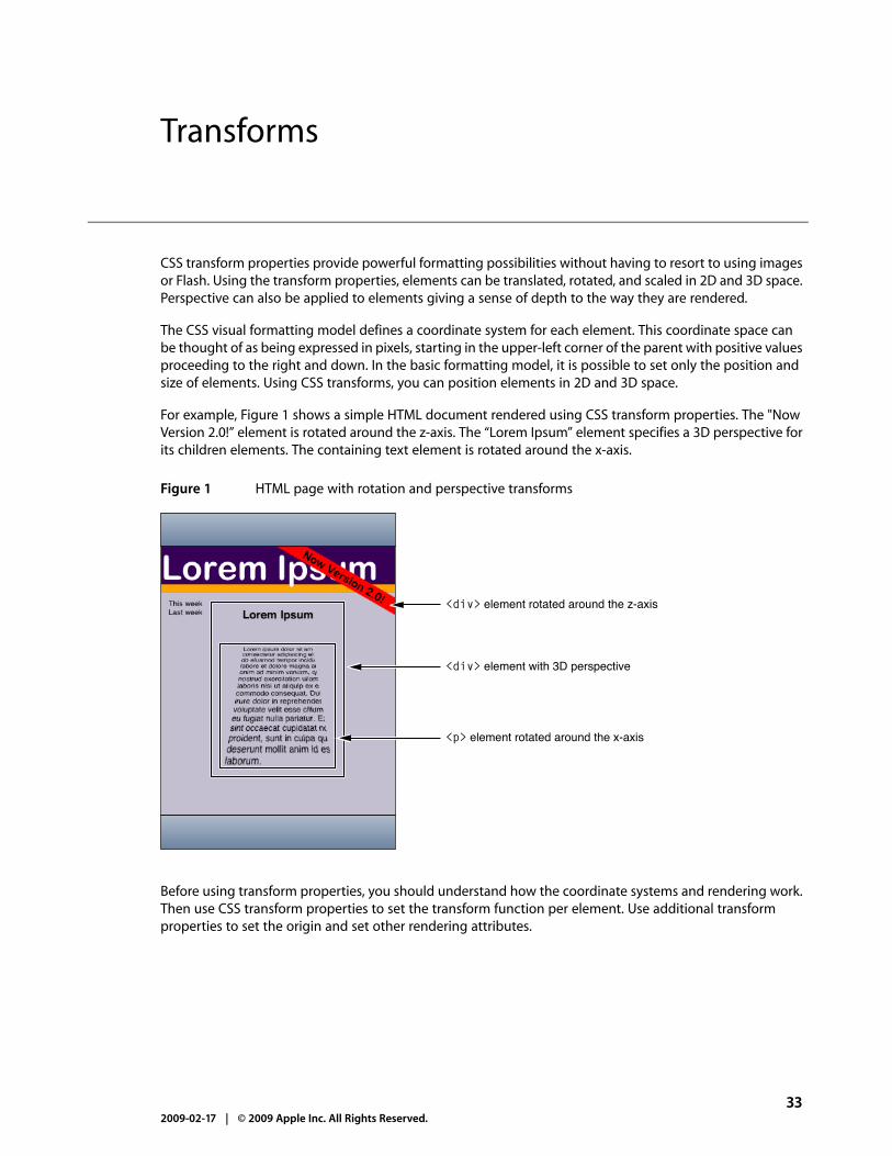
CSS transform properties provide powerful formatting possibilities without having to resort to using imagesor Flash. Using the transform properties, elements can be translated, rotated, and scaled in 2D and 3D space.Perspective can also be applied to elements giving a sense of depth to the way they are rendered.
The CSS visual formatting model defines a coordinate system for each element. This coordinate space canbe thought of as being expressed in pixels, starting in the upper-left corner of the parent with positive valuesproceeding to the right and down. In the basic formatting model, it is possible to set only the position andsize of elements. Using CSS transforms, you can position elements in 2D and 3D space.
For example, Figure 1 shows a simple HTML document rendered using CSS transform properties. The "NowVersion 2.0!” element is rotated around the z-axis. The “Lorem Ipsum” element specifies a 3D perspective forits children elements. The containing text element is rotated around the x-axis.
Figure 1 HTML page with rotation and perspective transforms
<div> element rotated around the z-axis
<div> element with 3D perspective
<p> element rotated around the x-axis
Before using transform properties, you should understand how the coordinate systems and rendering work.Then use CSS transform properties to set the transform function per element. Use additional transformproperties to set the origin and set other rendering attributes.
332009-02-17 | © 2009 Apple Inc. All Rights Reserved.
Transforms

iPhone OS Note: In iPhone OS, transitions and animations of the -webkit-transform and opacityproperties are performance-enhanced.
Coordinate Systems and Rendering
Transformed coordinate spaces behave differently in 2D and 3D. In 2D, the transformed coordinate spacebehaves as described in the coordinate system transformations section of the Scalable Vector Graphics (SVG)1.1 Specification. This is a coordinate system with two axes: The x-axis increases horizontally to the right; they-axis increases vertically downwards. In 3D, a z-axis is added, with positive z-values conceptually risingperpendicularly out of the window toward the user and negative z-values falling into the window away fromthe user as illustrated in Figure 2.
Figure 2 3D coordinate space
– Z
- Y
+ Y
+ X
– X
+ Z
Setting a transform property for an element establishes a new local coordinate system for that element. Youcan apply multiple transforms to parent and child elements. Transformations are cumulative. That is, elementsestablish their local coordinate system within the coordinate system of their parent. In this way, a transformproperty effectively accumulates all the transform properties of its ancestors. The accumulation of thesetransforms defines a current transformation matrix (CTM) for the element.
A transform property does not affect the flow of the content surrounding the transformed element. However,the value of the overflow area takes into account transformed elements. This behavior is similar to whathappens when elements are translated via relative positioning. Therefore, if the value of the overflowproperty is scroll or auto, scroll bars appear as needed to see content that is transformed outside thevisible area.
34 Coordinate Systems and Rendering2009-02-17 | © 2009 Apple Inc. All Rights Reserved.
Transforms

If a transform, other than the identity transform, is set for an element, a stacking context and a containingblock is created for that element. The object acts as though position: relative has been specified, butalso acts as a containing block for fixed-positioned descendants. The z-position of a transformed element(its location on the z-axis) does not affect the order within a stacking context. With elements at the samez-index, objects are drawn in order of increasing z-position.
Note that elements are flat, planar surfaces with no z-depth in their default orientation. The transform propertycan be used to change their size, position, and orientation to position them in 3D space. However, thoughelements can be positioned to intersect, they are always rendered fully above or below each other. Whichelements are rendered later (and therefore above elements rendered earlier) is determined by which is“closer” to the viewer.
Setting Transform Functions
A 2D or 3D transform is applied to an element using the -webkit-transform property. The parameter tothis property is a list of transform functions, described in “Visual Effects Timing Functions” in Safari CSSReference. The set of transform functions is similar to those allowed by SVG, although there are additionalfunctions to support 3D transforms.
Rotating an Element
Listing 1 rotates a div element by 45 degrees around the z-axis using an inline style.
Listing 1 Rotating an element
<div style = "width: 12em; margin-top: 5em; -webkit-transform: rotate(45deg)">I am rotated!</div>
The results on iPhone OS are shown in Figure 3.
Setting Transform Functions 352009-02-17 | © 2009 Apple Inc. All Rights Reserved.
Transforms

Figure 3 Rotating text
The rotate() function is just one of a number of functions you can apply using the -webkit-transformproperty. For a complete list of transform functions, see “Visual Effects Transform Functions” in Safari CSSReference.
Setting Multiple Transforms
You can apply multiple transforms to the same element and apply transforms to parent and child elements.The -webkit-transform property accepts a single transform function or a whitespace-separated list offunctions. When a list of functions is provided, the final transformation value for the element is obtained byperforming a matrix concatenation of each entry in the list.
Listing 2 sets an element’s transform to a list of transform functions and Listing 3 produces the same resultsby applying different transforms to nested elements.
Listing 2 Setting multiple transforms using a whitespace-separated list
<div style="-webkit-transform:translate(-10px,-20px) scale(2) rotate(45deg) translate(5px,10px)"/>
Listing 3 Nesting transforms
<div style="-webkit-transform:translate(-10px,-20px)"> <div style="-webkit-transform:scale(2)"> <div style="-webkit-transform:rotate(45deg)"> <div style="-webkit-transform:translate(5px,10px)"> </div> </div> </div></div>
36 Setting Transform Functions2009-02-17 | © 2009 Apple Inc. All Rights Reserved.
Transforms

Changing the Origin
Use the -webkit-transform-origin property to change the origin of transforms applied to an elementfrom the center default. The origin is expressed as a percentage of the size of the element. For example, thedefault value 50% 50% causes transformations to occur around the center of the element. Changing theorigin to 100% 0% causes transformation to occur around the top-right corner of on element.
The code in Listing 4 rotates the second box in Figure 4 around the top-right corner.
Listing 4 Rotating an element around the top-right corner
<div style="height: 200px; width: 300px; font-size:300%; text-align:center; background-color:red;">I am not rotated!</div>
<div style="height: 200px; width: 300px; font-size: 300%; text-align: center; background-color: blue; -webkit-transform: rotate(-45deg); -webkit-transform-origin: 100% 0%;">I am rotated about my top-right corner!</div>
Figure 4 Element rotated around the top-right corner
Changing the Origin 372009-02-17 | © 2009 Apple Inc. All Rights Reserved.
Transforms

Setting the Perspective
Use the -webkit-perspective property to change the perspective in 3D and give a sense of depth to ascene by causing elements further away from the viewer to appear smaller. The -webkit-perspectiveproperty applies the same transform as the perspective transform function, except that it applies only tothe children of the element, not to the transform applied to the element itself.
The code fragment in Listing 5 sets the parent element’s -webkit-perspective property to 500 causingthe child element to appear in 3D.
Listing 5 Adding perspective
<html> <head> <meta name="viewport" content="user-scalable=no, width=device-width"/> <title>Setting the Perspective</title> </head> <body> <div style="font-size: 200%; margin: 1em 1em; -webkit-perspective: 500;" > I have perspective. <div style="height: 6em; width: 6em; text-align:center; background-color: yellow; -webkit-transform: rotateY(40deg);"> I'm 3D. </div> </div> </body></html>
Figure 5 shows the before and after results of setting the perspective of a parent element.
Figure 5 Setting the perspective
Before perspective After perspective
38 Setting the Perspective2009-02-17 | © 2009 Apple Inc. All Rights Reserved.
Transforms

Setting the Transform Style
Use the -webkit-transform-style property to change how nested elements are rendered in 3D space.If -webkit-transform-style is flat, all children of this element are rendered flattened into the 2D planeof the element. Therefore, rotating the element about the x-axes or y-axes causes children positioned atpositive or negative z positions to appear on the element's plane, rather than in front of or behind it. If-webkit-transform-style is preserve-3d, this flattening is not performed, so children maintain theirposition in 3D space.
This flattening takes place at each element, so preserving a hierarchy of elements in 3D space requires thateach ancestor in the hierarchy have -webkit-transform-style set to preserve 3D. But-webkit-transform-style affects only an element's children; the leaf nodes in a hierarchy do not requirethe preserve-3d style.
The code in Listing 6 shows how to set the transform style of the parent element.
Listing 6 Setting the transform style
<div style="font-size: 200%; margin: 1em 1em; -webkit-perspective: 500;" > <div style="height: 8em; width: 6em; text-align:center; background-color: yellow; -webkit-transform-style: preserve-3d; -webkit-transform: rotateY(40deg);"> I am the parent, and have perspective. <div style="-webkit-transform: translateZ(3em); background-color: blue;"> I stand out from my parent element. </div> </div></div>
Figure 6 shows the before and after results of setting this property when the parent element has noperspective.
Setting the Transform Style 392009-02-17 | © 2009 Apple Inc. All Rights Reserved.
Transforms

Figure 6 Preserving 3D
Before preserve 3D After preserve 3D
Figure 7 shows the before and after results of setting this property when the parent element has perspectivetoo.
Figure 7 Setting the perspective and preserving 3D
Before preserve 3D After preserve 3D
Note that it’s possible for the elements in a 3D tree to be located behind an ancestor element and therefore,be invisible or hidden. To prevent this, ensure that ancestor elements in a 3D tree that uses preserve-3dset -webkit-transform-style to flat (the default).
Also, the effect of setting -webkit-transform-style to preserve-3dmay not be possible for all elements.Elements that have overflow set to hidden are unable to render their child elements in 3D. In this case,the element behaves as if the property is set to flat.
40 Setting the Transform Style2009-02-17 | © 2009 Apple Inc. All Rights Reserved.
Transforms

Back Face Visibility
Use the -webkit-backface-visibility property to set whether or not the “back side” of a transformedelement is visible when facing the viewer. If the identity transform is set, the front side of an element facesthe viewer. Applying a rotation about the y-axis of 180 degrees (for instance) causes the back side of theelement to face the viewer. For example, you might use this setting to create a box out of six elements, butwhere you want to see the inside faces of the box. You also need this property when creating a backdropfor a 3D stage.
Another example is when you want to place two elements back to back, as in the CardFlip sample codeproject. Without this property, the front and back elements of the face card could at times switch placesduring the flip transition causing a flicker. Listing 7 shows the style settings of the face card that sets the-webkit-backface-visibility property to hidden. Figure 2 (page 20) shows the results of setting thisproperty—a smooth flip transition with no flicker.
Listing 7 Hiding the back side of a face card
/* Styles the card and hides its "back side" when the card is flipped */.face{ position: absolute; height: 300px; width: 200px; /* Give a round layout to the card */ -webkit-border-radius: 10px; /* Drop shadow around the card */ -webkit-box-shadow: 0px 2px 6px rgba(0, 0, 0, 0.5); /* Make sure that users will not be able to select anything on the card */
/* We create the card by stacking two div elements at the exact same location. The back of the card is shown when we rotated the card 180 degrees along the y-axis. Setting this property to hidden ensures that the "back side" is hidden when the card is flipped. */ -webkit-backface-visibility: hidden;}
Creating Transforms in JavaScript
There are also a few JavaScript classes that you can use to access and manipulate transforms. Use theWebKitCSSMatrix class to create either a 4x4 matrix for 3D or a vector for 2D and theWebKitCSSTransformValue class to get and set the transform. There are also methods added to DOMWindowto convert points that use instances of the WebKitPoint class as parameters. This section presents someexamples of manipulating transforms in JavaScript. Refer to Safari DOM Extensions Reference for details onall these classes.
Use the window’s getComputedStyle() method to get an element’s style and the webkitTransformproperty to get an element’s transform as follows:
var theTransform = window.getComputedStyle(element).webkitTransform;
Back Face Visibility 412009-02-17 | © 2009 Apple Inc. All Rights Reserved.
Transforms

The webkitTransform property is a string representation of a list of transform operations. Usually this listcontains a single matrix transform operation. For 3D transforms, the value is "matrix3d(...)" with the 16 valuesof the 4x4 homogeneous matrix between the parentheses. For 2D transforms, the value is a "matrix(...)" stringcontaining the 6 vector values.
Similarly, use the webkitTransform property to set the transform of an element as follows:
var box2 = document.getElementById('box2');box2.style.webkitTransform = theTransform;
You can also use this string representation of a transform to create an instance of WebKitCSSMatrix asfollows:
var matrix = new WebKitCSSMatrix(theTransform);
Once you create a WebKitCSSMatrix object, you can apply transform functions to it in JavaScript using themultiply(), inverse(), translate(), scale(), rotate(), and rotateAxisAngle() methods. Thiscode fragment sets the transform of another element to a scaled version of the matrix above:
var box3 = document.getElementById('box3');box3.style.webkitTransform = matrix.scale(0.5, 0.5);
See the documentation for WebKitCSSMatrix in Safari DOM Extensions Reference for more details on thesemethods.
42 Creating Transforms in JavaScript2009-02-17 | © 2009 Apple Inc. All Rights Reserved.
Transforms

Note: DOM touch events used in this chapter are available on iPhone OS only.
You can use visual effects in combination with DOM mouse and touch events to create interactive webapplications—applications that allow the user to manipulate objects on the screen with the mouse or finger.The first step to building interactive web applications is to register for user events—specifically, register formouse, touch, and gesture events. Next, you implement the event handlers to apply the desired visual effects.This article contains three step-by-step examples that show you how to combine event handling with visualeffects. Each example uses different types of events and visual effects. For example, you can implement webapplications that allow the user to manipulate a 2D graphics object using multi-touch gestures.
Using Click or Tap to Trigger a Transition Effect
In this example, the user can click an element using the mouse or tap an element using a finger on an iPhoneOS-based device to change the size of an element. The element is a box that increases in width by a multipleof 1.5 when tapped using a transition effect as illustrated in Figure 1.
Figure 1 Click box to enlarge
Follow these steps to implement this example:
1. Create an element for the user to manipulate.
This CSS fragment creates a box element and uses the -webkit-transition-... properties to createa smooth transition when the width of the box changes:
Using Click or Tap to Trigger a Transition Effect 432009-02-17 | © 2009 Apple Inc. All Rights Reserved.
Interactive Visual Effects

div#box{ background-color: blue; display: block; position: absolute; width: 50; height: 50; -webkit-transition-property: width; -webkit-transition-duration: 0.5s; -webkit-transition-timing-function: default;}
2. Register for input events.
The following HTML registers an onclick event handler, grow(), for the box element:
<body> <div id="box" onclick="grow();"></div> <h1>Click box to grow</h1></body>
3. Implement the event handlers.
The following grow() JavaScript method sets the width of the box, which triggers the transition effectin step 1:
function grow() { box = document.getElementById( "box" ); var old_width = box.offsetWidth; box.style.width = old_width * 1.5;}
Using Touch to Drag Elements
In this example, the user can touch a box to drag it around the screen. The high-level steps are the same asbefore. You create an element to manipulate, register event handlers, and implement event handlers. However,in this example, touch events and transforms are used, and most of the application is written in JavaScript.
44 Using Touch to Drag Elements2009-02-17 | © 2009 Apple Inc. All Rights Reserved.
Interactive Visual Effects

Figure 2 Drag box application
Create an Element to Manipulate
Follow these steps to create a simple box that can be dragged across the screen.
1. Implement the element creation method in JavaScript.
This Box creation method sets the initial position of the box and registers a handler for the touchstartevent.
function Box(inElement){ var self = this;
this.element = inElement; this.position = '0,0'; this.element.addEventListener('touchstart', function(e) { return self.onTouchStart(e) }, false);}
2. Next create Box.prototype to contain additional methods for getting and setting the position of thebox.
Box.prototype = {...}
3. Add a position() get method as follows:
get position(){ return this._position;},
Using Touch to Drag Elements 452009-02-17 | © 2009 Apple Inc. All Rights Reserved.
Interactive Visual Effects

4. Add a position() set method to set the transform using the -webkit-transform CSS property.
// position strings are "x,y" with no unitsset position(pos){ this._position = pos;
var components = pos.split(',') var x = components[0]; var y = components[1];
const kUseTransform = true; if (kUseTransform) { this.element.style.webkitTransform = 'translate(' + x + 'px, ' + y + 'px)'; } else { this.element.style.left = x + 'px'; this.element.style.top = y + 'px'; }},
Note: Visual effects properties follow the same conventions as other CSS properties you set in JavaScript.Therefore, setting this.element.style.webkitTransform in JavaScript is the same as setting the-webkit-transform property in CSS.
5. Add x() and y() get and set methods to support the position() get and set methods above.
// position strings are "x,y" with no unitsget x(){ return parseInt(this._position.split(',')[0]);},
set x(inX){ var comps = this._position.split(','); comps[0] = inX; this.position = comps.join(',');},
get y(){ return parseInt(this._position.split(',')[1]);},
set y(inY){ var comps = this._position.split(','); comps[1] = inY; this.position = comps.join(',');},
6. Now, add a loaded() function that creates the box element:
function loaded(){
46 Using Touch to Drag Elements2009-02-17 | © 2009 Apple Inc. All Rights Reserved.
Interactive Visual Effects

new Box(document.getElementById('main-box'));}
7. Add this line of code to invoke the loaded() method when the application launches:
window.addEventListener('load', loaded, true);
8. Finally, set the appearance of the box using CSS as follows:
.box { position: absolute; height: 150px; width: 150px; background-color: green;}
.box:active { background-color: orange;}
Note: Elements have to be clickable to receive touch events. Read “Making Elements Clickable” in SafariWebContent Guide for iPhone OS for how to make a nonclickable element clickable.
Register and Implement Event Handlers
The bulk of the work in dragging the box is implemented in the touch event handlers. The touch events areinstances of the TouchEvent class. This example registers for all three types of touch events: touchstart,touchmove, and touchend events. It tracks single touches, not gestures, to implement dragging. Read “UsingGestures to Translate, Scale, and Rotate Elements” (page 49) for how to handle gesture events.
1. First implement the onTouchStart() event handler to start tracking touch events.
The onTouchStart() method was registered as an event handler in “Create the Element toManipulate” (page 49). This method first checks to see that there is only one touch, not multiple touches.It then stores the current position and registers for touchmove and touchend events.
onTouchStart: function(e){ // Start tracking when the first finger comes down in this element if (e.targetTouches.length != 1) return false;
this.startX = e.targetTouches[0].clientX; this.startY = e.targetTouches[0].clientY;
var self = this; this.element.addEventListener('touchmove', function(e) { return self.onTouchMove(e) }, false); this.element.addEventListener('touchend', function(e) { return self.onTouchEnd(e) }, false);
return false;},
Using Touch to Drag Elements 472009-02-17 | © 2009 Apple Inc. All Rights Reserved.
Interactive Visual Effects

2. Next implement the onTouchMove() event handler to move the element. The position() set method,implemented in “Create the Element to Manipulate” (page 49), uses the -webkit-transform CSSproperty to translate the element.
onTouchMove: function(e){ // Prevent the browser from doing its default thing (scroll, zoom) e.preventDefault();
// Don't track motion when multiple touches are down in this element (that's a gesture) if (e.targetTouches.length != 1) return false;
var leftDelta = e.targetTouches[0].clientX - this.startX; var topDelta = e.targetTouches[0].clientY - this.startY;
var newLeft = (this.x) + leftDelta; var newTop = (this.y) + topDelta;
this.position = newLeft + ',' + newTop;
this.startX = e.targetTouches[0].clientX; this.startY = e.targetTouches[0].clientY;
return false;},
Note: Use the preventDefault()method to disable the browser default behavior. For example, Safarion iPhone might attempt to scroll or zoom when the user touches and moves a finger on the screen.
3. Finally implement the onTouchEnd() event handler to remove the touchmove and touchend eventhandlers.
This method is invoked after the last touch leaves the screen, so you no longer need to observe touchmoveand touchend events until the next touchstart event.
onTouchEnd: function(e){ // Prevent the browser from doing its default thing (scroll, zoom) e.preventDefault();
// Stop tracking when the last finger is removed from this element if (e.targetTouches.length > 0) return false;
this.element.removeEventListener('touchmove', function(e) { return self.onTouchMove(e) }, false); this.element.removeEventListener('touchend', function(e) { return self.onTouchEnd(e) }, false);
return false;},
48 Using Touch to Drag Elements2009-02-17 | © 2009 Apple Inc. All Rights Reserved.
Interactive Visual Effects

Using Gestures to Translate, Scale, and Rotate Elements
Gesture events are high-level events that encapsulate the lower-level touch events—they are instances ofthe GestureEvent class. Gesture and touch events can occur at the same time. Your application has thechoice of handling touch events, gesture events, or both. The advantage of gesture events is that the locationand angle of the fingers are already calculated when the events arrive. Thus gesture events support pinchopen to zoom in, pinch close to zoom out, and pivoting to rotate elements. You simply apply the eventlocation, scale, and rotation values to your element.
The steps in this example are similar to implementing the draggable box in “Using Touch to DragElements” (page 44). Instead of just dragging the box, the user can also pinch open and close to scale it andpivot to rotate it. To do this, you simply extend the example to handle gesture events for scaling and rotating.In summary, you create the element to manipulate, register for touch and gesture events, and implementhandlers that translate, scale, and rotate the element.
Create the Element to Manipulate
Follow these steps to create a simple box that can be translated, scaled, and rotated.
1. Implement the element creation method in JavaScript.
This Box creation method sets the initial position, scale, and rotation of the box and registers handlersfor the touchstart and gesturestart events.
function Box(inElement){ var self = this;
this.element = inElement;
this.scale = 1.0; this.rotation = 0; this.position = '0,0';
this.element.addEventListener('touchstart', function(e) { return self.onTouchStart(e) }, false); this.element.addEventListener('gesturestart', function(e) { return self.onGestureStart(e) }, false);}
2. Follow steps 2 through 8 in “Create an Element to Manipulate” (page 45) to create a box prototype, addthe position() accessors and associated support methods, and create the box.
Register and Implement Event Handlers
The bulk of the work in this application is in the touch and gesture event handlers. This example builds onthe example in “Using Touch to Drag Elements” (page 44) by handling gesture events, too. The touch eventsare used to implement dragging as before and the gesture events are used to implement translating, scaling,and rotating.
Using Gestures to Translate, Scale, and Rotate Elements 492009-02-17 | © 2009 Apple Inc. All Rights Reserved.
Interactive Visual Effects

1. First implement theonTouchStart(),onTouchMove(), andonTouchEnd() event handlers by followingstep 1 through 3 in “Register and Implement Event Handlers” (page 47) to allow single-finger dragging.
2. Next, implement the onGestureStart() event handler to begin tracking gesture events for translating,scaling, and rotating.
This method registers the other gesture event handlers, onGestureChange() and onGestureEnd(),for the gesturechange and gestureend events.
onGestureStart: function(e){ // Prevent the browser from doing its default thing (scroll, zoom) e.preventDefault();
var self = this; this.element.addEventListener('gesturechange', function(e) { return self.onGestureChange(e) }, true); this.element.addEventListener('gestureend', function(e) { return self.onGestureEnd(e) }, true);
return false;},
3. Implement the onGestureChange() event handler to translate, scale, and rotate the element.
This method sets the element’s scale and rotation to the GestureEvent object’s precomputed scaleand rotation values. You do not need to compute the distance between multiple fingers or the changein angle to scale and rotate the element.
onGestureChange: function(e){ // Prevent the browser from doing its default thing (scroll, zoom) e.preventDefault();
// Only interpret gestures when tracking one object. Otherwise, interpret raw touch events // to move the tracked objects. this.scale = e.scale; this.rotation = e.rotation; this.position = this.position;
return false;},
4. Implement the onGestureEnd() event handler to remove the handlers for the gesturechange andgestureend events.
onGestureEnd: function(e){ // Prevent the browser from doing its default thing (scroll, zoom) e.preventDefault();
this.element.removeEventListener('gesturechange', this.gestureChangeHandler, true); this.element.removeEventListener('gestureend', this.gestureEndHandler, true);
return false;},
50 Using Gestures to Translate, Scale, and Rotate Elements2009-02-17 | © 2009 Apple Inc. All Rights Reserved.
Interactive Visual Effects

This table describes the changes to Safari Visual Effects Guide.
NotesDate
Added CSS gradients, masks, and reflections.2009-02-17
New document that describes how to add visual effects to web content that issupported by Safari on the desktop and iPhone OS.
2008-11-19
512009-02-17 | © 2009 Apple Inc. All Rights Reserved.
REVISION HISTORY
Document Revision History

522009-02-17 | © 2009 Apple Inc. All Rights Reserved.
REVISION HISTORY
Document Revision History