sa-application interface software expert version 5.0 designer guide
TRANSCRIPT

Copyright © 1997 by Software Artistry, Inc.
All rights reserved
Interface Designer Guide
SA-ApplicationSoftware ExpertVersion 5.0

All rights to this publication are reserved. No part of this manual may be reproduced or transmitted in any form or by any means, electronic or mechanical, including photocopying and recording, for any purpose other than the purchaser’s personal use without the written permission of Soft-ware Artistry, Inc.
SA-Application Software Expert and SA-Expert Advisor are trademarksof Software Artistry, Inc.
IBM, OS/2, DB2/2, and ECCO are registered trademarks of InternationalBusiness Machines Corp.
Microsoft , Windows, Windows NT, and Windows 95 are registeredtrademarks of Microsoft Corp.
Oracle, Oracle 7, SQL*DBA, SQL*Net, and SQL*Plus are trademarks ofOracle Corp.
SYBASE, Transact-SQL, and DB-Library are trademarks of Sybase, Inc.
Crystal Reports is a trademark of Crystal Technology, Inc.
Any other products mentioned in this document are trademarks of their re-spective companies.

Acknowledgements . . . . . . . . . . . . . . . . . . . . . . . . . . . . .5
About This Guide . . . . . . . . . . . . . . . . . . . . . . . . . . . . . .7Purpose of This Book . . . . . . . . . . . . . . . . . . . . . . . . . . . . . . . . . . 8Audience Considerations . . . . . . . . . . . . . . . . . . . . . . . . . . . . . . . . 8Overview of the Contents . . . . . . . . . . . . . . . . . . . . . . . . . . . . . . . 9Document Conventions . . . . . . . . . . . . . . . . . . . . . . . . . . . . . . . . 10The SA-ASE 5.0 Documentation Set . . . . . . . . . . . . . . . . . . . . . 12
Chapter 1 Introduction . . . . . . . . . . . . . . . . . . . . . . . . .13Overview . . . . . . . . . . . . . . . . . . . . . . . . . . . . . . . . . . . . . . . . . . . 14Forms . . . . . . . . . . . . . . . . . . . . . . . . . . . . . . . . . . . . . . . . . . . . . . 14Resource Files . . . . . . . . . . . . . . . . . . . . . . . . . . . . . . . . . . . . . . . 15Starting and Quitting the Interface Designer . . . . . . . . . . . . . . . . 16OK and Apply . . . . . . . . . . . . . . . . . . . . . . . . . . . . . . . . . . . . . . . 17Customizing the Interface Designer with Preferences . . . . . . . . . 18
Chapter 2 Designing Forms. . . . . . . . . . . . . . . . . . . . . . .21Overview . . . . . . . . . . . . . . . . . . . . . . . . . . . . . . . . . . . . . . . . . . . 22Opening Resource Files . . . . . . . . . . . . . . . . . . . . . . . . . . . . . . . . 22Working with Forms . . . . . . . . . . . . . . . . . . . . . . . . . . . . . . . . . . 24
Chapter 3 Designing Controls . . . . . . . . . . . . . . . . . . . . .31Overview . . . . . . . . . . . . . . . . . . . . . . . . . . . . . . . . . . . . . . . . . . . 32Overview to Control Properties . . . . . . . . . . . . . . . . . . . . . . . . . . 33Common Control Properties . . . . . . . . . . . . . . . . . . . . . . . . . . . . 33Specific Control Properties . . . . . . . . . . . . . . . . . . . . . . . . . . . . . 35Working with Controls . . . . . . . . . . . . . . . . . . . . . . . . . . . . . . . . 53
Chapter 4 Designing Notebooks . . . . . . . . . . . . . . . . . . .59Overview . . . . . . . . . . . . . . . . . . . . . . . . . . . . . . . . . . . . . . . . . . . 60Notebook Properties . . . . . . . . . . . . . . . . . . . . . . . . . . . . . . . . . . 61
Table of Contents

Using Notebook Properties . . . . . . . . . . . . . . . . . . . . . . . . . . . . . 62Creating Notebook Tabs . . . . . . . . . . . . . . . . . . . . . . . . . . . . . . . 63Working with Notebook Tabs . . . . . . . . . . . . . . . . . . . . . . . . . . . 64
Chapter 5 Building Additional Features. . . . . . . . . . . . . . .69Overview . . . . . . . . . . . . . . . . . . . . . . . . . . . . . . . . . . . . . . . . . . . 70Pattern Components . . . . . . . . . . . . . . . . . . . . . . . . . . . . . . . . . . . 70Formatting Text Boxes with Patterns . . . . . . . . . . . . . . . . . . . . . 72Creating Menus . . . . . . . . . . . . . . . . . . . . . . . . . . . . . . . . . . . . . . 75Creating and Working with Toolbars . . . . . . . . . . . . . . . . . . . . . 80Creating Hypertext Controls . . . . . . . . . . . . . . . . . . . . . . . . . . . . 85Creating Online Help . . . . . . . . . . . . . . . . . . . . . . . . . . . . . . . . . . 89
Chapter 6 Using Forms in SA-Script Programs . . . . . . . . . .91Overview . . . . . . . . . . . . . . . . . . . . . . . . . . . . . . . . . . . . . . . . . . . 92Form Types . . . . . . . . . . . . . . . . . . . . . . . . . . . . . . . . . . . . . . . . . 92Parsing Forms . . . . . . . . . . . . . . . . . . . . . . . . . . . . . . . . . . . . . . . 93
Appendix Geometry Management . . . . . . . . . . . . . . . . .95Overview . . . . . . . . . . . . . . . . . . . . . . . . . . . . . . . . . . . . . . . . . . . 96Dialog Coordinates . . . . . . . . . . . . . . . . . . . . . . . . . . . . . . . . . . . 97Examples . . . . . . . . . . . . . . . . . . . . . . . . . . . . . . . . . . . . . . . . . . . 98
Index . . . . . . . . . . . . . . . . . . . . . . . . . . . . . . . . . . . . .105

No one who writes documentation for software does so alone. It is impossible to produce good documentation without the knowledge and help of the people who create the software and understand its function for the end user.
The following people deserve much credit in the development of the SA-ASE 5.0 Interface Designer Guide.
The development team
The members of the development team for this project were:
• Dave Marquam
• Carl Sampson
• Sean Vyain
• Doug Wood
The editors The editors for this project were:
• Danna Cardwell
• Anne Block
Acknowledgements

6 SA-Application Software Expert 5.0

This chapter covers the following topics:
•Purpose of This Book
•Audience Considerations
•Overview of the Contents
•Document Conventions
•The SA-ASE 5.0 Documentation Set
About This Guide

8 SA-Application Software Expert 5.0
Purpose of This Book
What this book contains
The SA-ASE 5.0 Interface Designer Guide is a reference book that describes the Interface Designer. This new tool can be used to create forms, menus, toolbars, patterns, and string tables for SA-Script GUI applications.
What you will be able to do
This book serves as a reference guide when you:
•Create forms, menus, toolbars, and string tables for GUI applications
•Create notebooks
•Test forms and their controls
•Use forms in an SA-Script program
Audience Considerations
Who should read this book
This book is intended for users who configure and customize SA-Script applications at your site.
What you should know before beginning
Before you use this book, you should be familiar with:
• The SA-ASE development tools
• Customization practices at your site, and how your function relates to the customization process
• Operating systems used at your site

Overview of the Contents
Interface Designer Guide 9
Overview of the Contents
What is in this book
The SA-ASE 5.0 Interface Designer Guide contains the following chapters. Primary chapter topics are noted as well.
•Chapter 1, “Introduction,” discusses the basic features of the Interface Designer.
•Chapter 2, “Designing Forms,” discusses resource files, forms, and how to create basic forms.
•Chapter 3, “Designing Controls,” discusses the addition of controls to a form and how to set control properties.
•Chapter 4, “Creating Notebooks,” discusses how to build a notebook in the Interface Designer.
•Chapter 5, “Building Additional Features,” discusses how to format text boxes with patterns, how to design menus and toolbars, how to use string editors, and how to create hypertext controls.
•Chapter 6, “Using Forms in an SA-Script Program,” discusses how forms are called by a SA-Script program.
•Appendix, “Geometry Management,” discusses the sizing relationship of controls to forms and how to manage them.
How to use this book
This book is intended as a reference to assist you in using the Interface Designer. You can refer to any part of the book without reading preceding chapters.

10 SA-Application Software Expert 5.0
Document Conventions
Introduction There are several conventions used throughout this book to identify different text use or to point out particularly important information.
Instructions for Windows, OS/2, and UNIX users
This book contains only one set of instructions for the Windows, OS/2, and UNIX operating systems. Procedures should be the same for all operating systems. Graphics for this guide were created in the Windows 95 operating system.
Procedure methods
There is often more than one way to accomplish a task using the Interface Designer. Instructions appear in one of the following methods:
•Menu
•Pop-up menu
•Double-clicking an object
Text use • Italic text is used in procedures to indicate text that you must substitute in the course of a procedure.
Type the file name: SAIDEV
Note: UNIX file names do not necessarily have extensions.
• Italic text is also used for new terms.
client/server architecture
• Bold text is used for variable and data source names when they appear in text references.
SQLFetch

Document Conventions
Interface Designer Guide 11
• Bold text also denotes text that you must type, either at a command prompt or in a text box.
Type login
• Monospace fonts are used for code examples.
Function Add Data : INTEGER IS
Icons used in this book
Icons appear occasionally as a means of emphasizing a particularly important point.
Always read notes. Notes are important points that you should understand. They offer important information, and they explain special circumstances. The following is an example of a note.
Note: This is an example of a note.
Cautions occur when user actions might adversely affect data integrity.
Caution: This is an example of a caution.
Product names
Software Artistry products are referred to by the following names throughout the documentation set:
Product Name Referred to as
SA-EXPERTISETM for CRM EXPERTISE
SA-EXPERTISETM for ESM EXPERTISE
SA-Application Software Expert
ASE
SA-Expert Administrator Expert Administrator
SA-Expert Advisor Expert Advisor
SA-Expert Evolution Expert Evolution

12 SA-Application Software Expert 5.0
The SA-ASE 5.0 Documentation Set
Other books in the set
The following books, in addition to the SA-ASE 5.0 Interface Designer Guide, comprise the total SA-ASE documentation set:
• SA-ASE 5.0 Tools and Utilities Guide - A book that describes the SA-ASE Integrated Development Environment and the various tools contained in it. The book provides detailed information and procedures to help you learn to use the tools in your environment.
• SA-ASE 5.0 SA-Script Language Reference - A book that provides command references for SA-Script and for the APIs used with SA-Script. The command references include syntax, return codes, and system constants.
• SA-ASE 5.0 SA-Script Programming Guide - A book that provides information about SA-ASE and the SA-Script programming language.
• SA-ASE 5.0 Legacy APIs Guide - A book that contains information about the EHLLAPI and CPIC APIs in SA-ASE.
• SA-ASE 5.0 SA-Script Text Retrieval Guide - A reference book that explains the use of the Fulcrum SearchServer text retrieval engine.
• SA-ASE 5.0 Tutorials - A book that contains tutorial exercises for the primary functions found in SA-ASE.
SA-Expert Foundation Manager
Expert Foundation Manager
SA-Expert Mail Agent Expert Mail Agent
SA-Expert Quality Expert Quality
SA-Expert Support Expert Support
SA-ExpertView ExpertView
SA-Expert Web Expert Web
Product Name Referred to as

This chapter covers the following topics:
•Overview
•Forms
•Starting and Quitting the Interface Designer
•Customizing the Interface Designer with Preferences
1Introduction

Introduction
14 SA-Application Software Expert 5.0
1
Overview
What is the Interface Designer?
The Interface Designer is the tool used to create forms, menus, toolbars, and string tables for SA-Script GUI applications that you build.
Terminology conventions
The following terms are used frequently in this book:
•form - forms are created in the course of application development. Forms are used to create both dialog boxes and windows.
•resource file - a resource file is the file that you create within the Interface Designer when you create forms. Each resource file can contain multiple forms.
•dialog box - in this book, a dialog box refers to a part of the Interface Designer. Any dialog box that is part of the Interface Designer is referred to by its full name, followed by the words “dialog box,” such as, “the Preferences dialog box.”
•notebook - a notebook is a form that categorizes or organizes other forms. Forms contained in a notebook are considered subforms; the notebook is the top-level form. (A notebook is similar to a directory, subforms are similar to subdirectories.)
Forms
Introduction Forms provide an integral component to any GUI application. Forms present information to, and receive information from, end users.

Resource Files
Interface Designer Guide 15
Description of forms
Forms are special windows that can contain numerous types of controls. Controls are objects on a form that can be manipulated by the end user. Examples of controls include option buttons, text boxes, and check boxes.
Process used to build forms
The process of building a form involves the following steps.
1. Creating or opening a resource file.
2. Adding a new form to the resource file.
3. Customizing the form properties, size, and position.
4. Adding controls to the form.
5. Customizing the control properties, size, and position.
6. Saving the control properties, size, and position.
7. Saving the resource file (the file parses automatically when saved).
8. Testing the forms in the resource file.
Resource Files
Introduction Resource files (also known as .df files) are the physical text files created when you create definitions for forms. With the Interface Designer, you can open the resource file first, then access any form associated with the file.

Introduction
16 SA-Application Software Expert 5.0
1
Starting and Quitting the Interface Designer
Starting the Interface Designer
There are several ways to launch the Interface Designer depending on your operating system. The following are GUI procedures for Windows, OS/2, or X Motif for UNIX. You can also start the I-Designer from the command prompt of any supported operating system mentioned.
To start the Interface Designer:
If you are using... then...
Windows 95or NT 4.0
• From the Start menu, point to Program, point to SA-ASE, and then choose SA-Interface Designer.
Result: The Interface Designer window appears.
Windows NT 3.5.1 • In the SA-Application Software Expert folder, choose the Interface Designer icon.
Result: The Interface Designer window appears.
OS/2 • In the SA-Application Software Expert folder, choose the Interface Designer icon.
Result: The Interface Designer window appears.
X-Motif on UNIX 1. Make sure that the directory and path point to the location for Soft-ware Artistry products.
2. At the command prompt, type i-design.
3. Press ENTER.
Result: The Interface Designer appears.

OK and Apply
Interface Designer Guide 17
Quitting the Interface Designer
To quit the Interface Designer:
1. From the File menu, choose Exit.
Result: A prompt appears for you to confirm unsaved changes.
2. Choose OK to save your changes.
Result: The Interface Designer closes.
OK and Apply
Overview In nearly every dialog box in the Interface Designer you can implement your changes with the OK or Apply buttons.
Either button implements your changes immediately. The difference is that the OK button implements your changes while closing the dialog box where you made the changes. The Apply button implements your changes while keeping open the dialog box where you made the changes.
When should apply be used?
Use Apply when you want to preview your changes without closing the dialog box. For example, if you want to try several different preference colors for your controls, using the Apply button saves you from having to choose preferences from the options menu after each color selection.

Introduction
18 SA-Application Software Expert 5.0
1
Customizing the Interface Designer with Preferences
Introduction You can customize the Interface Designer’s environment using preferences. Preferences affect the function and appearance of the Interface Designer, as well as the appearance of controls on forms you create.
Setting general preferences
To set general preferences:
1. From the Options menu, choose Preferences.
Result: The Preferences dialog box appears and displays the General tab.
2. To align controls to the nearest grid coordinate, select the Snap To Grid check box. Otherwise, continue with step 3.
3. To automatically display the Properties dialog box when you create a new form or control, select the Auto Property Sheets check box. Otherwise, continue with step 4.
4. To draw or create multiple controls simultaneously, select the Draw Multiple Controls check box. Otherwise, continue with step 5.
5. To initially display the control palette in its own window, select the Detached Control Palette check box. Otherwise, continue with step 6.
6. To display the Menus tab in the SA-ASE Interface Designer window, select the Show Menu Page check box. Otherwise, continue with step 7.

Customizing the Interface Designer with Preferences
Interface Designer Guide 19
7. To display the Toolbars tab in the SA-ASE Interface Designer window, select the Show Toolbar Page check box. Otherwise, continue with step 8.
8. In the Editor box, type the name of the text editor you want to use to correct .df file parse errors.
9. In the Grid Spacing box, type your preferred point size for your form grid lines.
10. Choose Apply or OK.
Setting colors preferences
Colors preferences are used to set the background and foreground colors of forms as well as selected and active controls as you use the Interface Designer. (This does not affect the color of a form when your interface is integrated with an SA-Script application.)
To set colors preferences:
1. From the Options menu, choose Preferences.
Result: The Preferences dialog box appears.
2. Choose the Colors tab.
Result: The Colors tab appears.
3. From the Canvas Background list box, select the back-ground color of the form.
4. From the Canvas Foreground list box, select the grid point colors in the canvas foreground.
5. From the Selected Control list box, select the border color for a selected control.
Introduction
20 SA-Application Software Expert 5.0
1
6. From the Active Control list box, select the border color for the active control.
Note: The Selected Control and Active Control settings are used when you align and size controls. The selected controls align or are sized according to the position or size of the active control. This is explained in detail in the chapter “Designing Controls.”
7. Choose Apply or OK.
Saving preference selections
You must save your preference selections if you want them to remain in your next session of the Interface Designer.
To save your preference selections:
•From the Options menu, choose Save Preferences.
Result: The Preferences are saved.
This chapter covers the following topics:
•Overview
•Opening Resource Files
•Working with Forms
2Designing Forms

Designing Forms
22 SA-Application Software Expert 5.0
2
Overview
Introduction This chapter introduces the basic information you need to use the Interface Designer. The chapter also describes the procedures you follow to create basic forms.
The complexity of the forms you build depends on your environment and the applications you develop at your site. For more information about using controls, enhancing form designs, and creating notebooks, please consult the chapters that follow this one.
Opening Resource Files
Opening a new resource file
Starting the Interface Designer automatically creates a new resource file. You can create another resource file by using the following procedure. (Only one resource file can be open at a time.)
To open another resource file:
•From the File menu, choose New.
Result: A new resource file opens.
Note: Only one resource file can be open at a time.
Resource files can also be accessed from the command prompts of any operating system by typing:
i-design myfile (where myfile is the name of the resource file)
The .df extension is automatically added to the file name.
Opening Resource Files
Interface Designer Guide 23
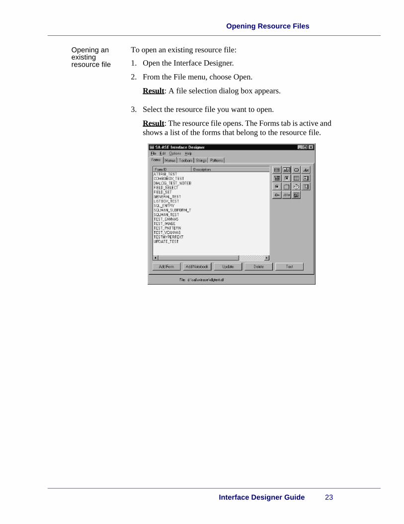
Opening an existing resource file
To open an existing resource file:
1. Open the Interface Designer.
2. From the File menu, choose Open.
Result: A file selection dialog box appears.
3. Select the resource file you want to open.
Result: The resource file opens. The Forms tab is active and shows a list of the forms that belong to the resource file.
Designing Forms
24 SA-Application Software Expert 5.0
2
Working with Forms
Creating a new form
To create a form:
1. Open the Interface Designer.
2. On the Forms tab, choose New Form.
Result: A new form appears.
Note: Every form you create appears in the Form ID column with a default name in the format, NEW_FORM1. Notebook form names follow the format, NEW_NOTEBOOK1.
Opening an existing form
To open an existing form:
1. Open the Interface Designer.
2. From the File menu, choose Open.
Result: A file selection dialog box appears.
3. Select the resource file and choose OK.
Result: The resource file opens. The Forms tab is active, and shows a list of the forms that belong to the resource file.
4. Double-click the name of the form you want to use.
Result: The form appears.
Note: To open multiple forms at once, use the SHIFT key while selecting the forms and choose Update.
Closing a form To close a form:
1. Right-click the form.
Result: The pop-up menu appears.
2. From the Form menu, choose Close.
Result: A prompt appears for you to save any changes to the form.
Working with Forms
Interface Designer Guide 25
3. Save your changes or close without saving.
Result: The form closes.
Deleting a form
You cannot delete a form that is used as a subform in a notebook.
To delete a form:
1. On the Forms tab, select the form you want to delete in the Form ID column.
2. From the Edit menu, choose Cut.
Result: The selected form is deleted from the Form ID col-umn. If you decide that you don’t want the form deleted, you can choose Paste to return it to the Forms tab.
Testing a form Testing forms is an easy way to preview the appearance of controls. Besides typing in text boxes or selecting items from a list you can also review the following:
• Tab order
• Control position and size
• Default selections in controls
• Selections in lists and combo boxes
• Display masks for text boxes with patterns
• Appearance of images and icons
• Property settings for controls and forms
• Hypertext links to controls
Though you can test a form any time, it is more valuable to test forms that have controls, otherwise you will see an empty form.
To test a form:
1. Open the Interface Designer.
2. From the File menu, choose Open.
Result: A file selection dialog box appears.

Designing Forms
26 SA-Application Software Expert 5.0
2
3. Select the resource file and choose OK.
Result: The resource file opens. The Forms tab is active, and shows a list of the forms that belong to the resource file in the Form ID column.
4. From the Form ID column, double-click the name of the form you want to test.
Result: The form appears.
5. Choose Test.
Result: A test form appears.
6. To close the test form, click the close menu.
Form properties
For each form, you can set properties that determine how the form looks and behaves. Properties are set for each form, and do not have to be identical with other forms in the same file.
The figure shows the Forms Properties dialog box, with the Base tab as the default.
From the Base tab you can set the following properties:
•Form Name - a meaningful form name which appears on the Form ID column and is used by SA-Script to load the form
•Position and Size - the coordinates that are used for geometry management in a form
Working with Forms
Interface Designer Guide 27
Note: Position and size coordinates only apply to forms, not subforms. They do not apply to subforms in notebooks.
•Description - a description of the form that you want to appear in the form list
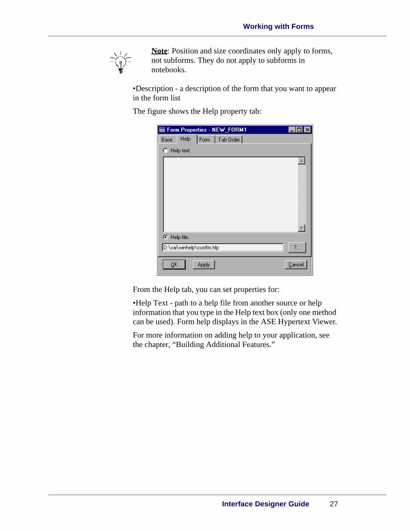
The figure shows the Help property tab:
From the Help tab, you can set properties for:
•Help Text - path to a help file from another source or help information that you type in the Help text box (only one method can be used). Form help displays in the ASE Hypertext Viewer.
For more information on adding help to your application, see the chapter, “Building Additional Features.”

Designing Forms
28 SA-Application Software Expert 5.0
2
This figure shows the Form properties tab:
From the Form tab, you can set properties for:
•Title - the text of the title that appears on the dialog box form title bar. If you choose to have a title, the Title check box should also be selected.
•Icon file - an icon file for use with the form
•Styles - the styles that affect the appearance and behavior of the form. The styles are:
• Title - determines whether a title bar appears on the form
• Resize - determines whether the form can be resized
• Minimize Button - determines whether the form has a minimize button
• MinMax Button - determines whether the form has both a minimize and maximize button
• System Menu - determines whether the form has a system menu icon. If you select this, select the Title and MinMax buttons as well.
• Toolbar - determines whether space is allocated for a tool bar on the window
• Menu - determines whether space is allocated for a menu bar on the window. If a menu has the same file name as the form, the menu is automatically loaded when the form is loaded.
Working with Forms
Interface Designer Guide 29
• Task List - indicates that space is allocated for a task list showing active files or documents
• Start on Blank Field - determines whether the insertion point appears in the first empty text box as defined in the tab order, when the form opens
•Position - determines the initial form location on the desktop
•Synchronize Form Coords - allows you to set the initial form size and location across multiple platforms
•Synchronize Control Coords - allows you to set the control locations in a form across multiple platforms
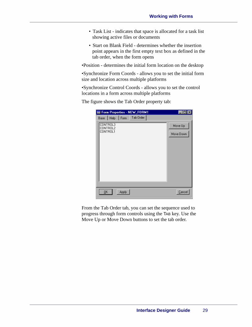
The figure shows the Tab Order property tab:
From the Tab Order tab, you can set the sequence used to progress through form controls using the TAB key. Use the Move Up or Move Down buttons to set the tab order.

Designing Forms
30 SA-Application Software Expert 5.0
2
Setting form properties
Note: If you set your preferences to show property sheets automatically when a new form or notebook is created you can skip steps 3 and 4.
To set form properties:
1. Open a resource file.
2. From the Form ID column on the Form tab, double-click the the form you want to use.
Result: The selected form appears.
3. Double-click or right-click anywhere in the form, except the title bar.
Result: A pop-up menu appears.
4. From the pop-up menu, choose Properties.
Result: The Form Properties property sheet appears.
5. Set the form properties.
6. When you are satisfied with the properties you selected for your form, choose Apply or OK.

This chapter covers the following topics:
•Overview
•Overview to Control Properties
•Common Control Properties
•Specific Control Properties
•Working with Controls
3Designing Controls
Designing Controls
32 SA-Application Software Expert 5.0
3
Overview
Introduction The number of controls you can add to a form is limited only by the size of the form. You can resize a form to allow additional space for controls.
Caution: If you resize a form during development, you need to save it with that same size. Otherwise, the form will not appear correctly to end users.
The process of adding controls to a form is the same for any control that you add to the form.
Overview to Control Properties
Interface Designer Guide 33
Overview to Control Properties
Overview Each control has a property sheet with the following tabs:
•Base
•Help
•Control (where control is replaced with the actual name of the selected control)
The Base tab and Help tab properties are covered in the following sections.
Common Control Properties
Base tab properties
This section describes the Base tab properties that are common to all controls.
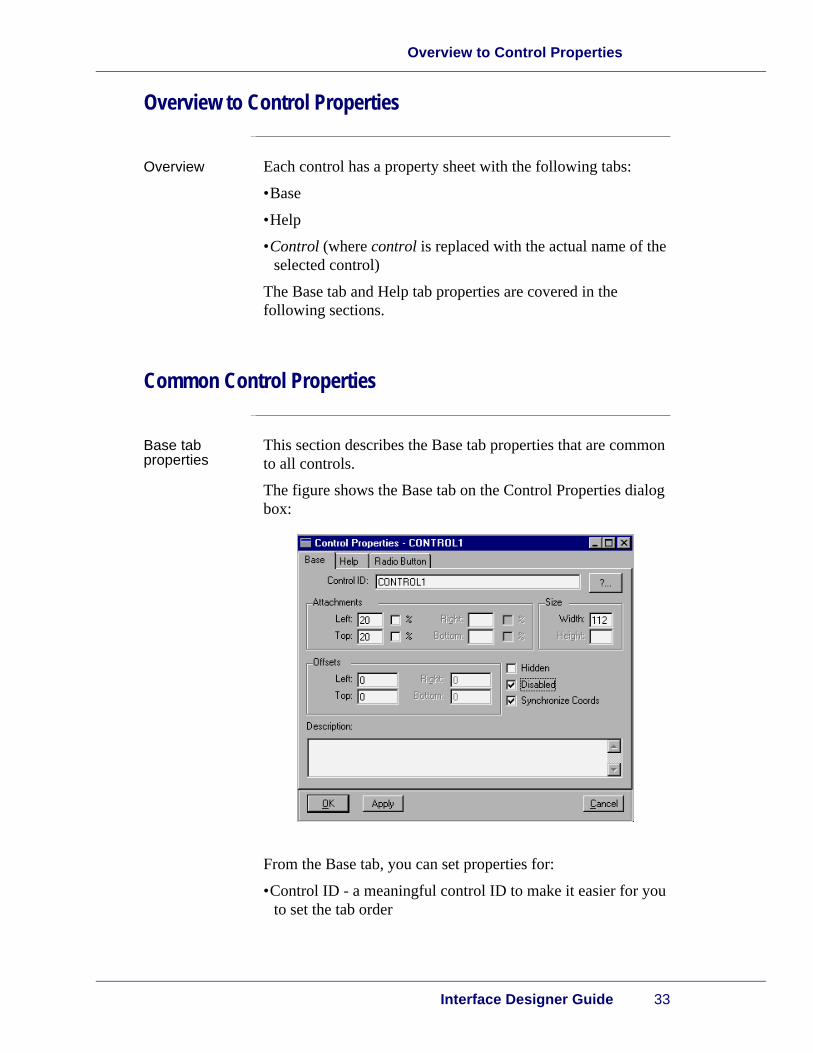
The figure shows the Base tab on the Control Properties dialog box:
From the Base tab, you can set properties for:
•Control ID - a meaningful control ID to make it easier for you to set the tab order
Designing Controls
34 SA-Application Software Expert 5.0
3
•Attachments - attachments maintain the position of controls in a form when the form is resized. Attachments can either be fixed, where a control remains in a specific location on a form no matter what the size of the form, or percentage, where a control location moves in proportion to the size of the form. For more information on setting control attachments, see the appendix, “Geometry Management.”
•Size - coordinates used to adjust the height and width of the control
•Offsets - coordinates used with percentage attachments that set the amount of “buffer space” between the control and the form borders. For more information on setting offsets, see the appendix, “Geometry Management.”
•Hidden - sets the control as hidden or visible. Select this check box if you want to define certain controls with permissions. For example, you might want to select this field if you want certain fields visible only to managers or supervisors.
•Disable - sets the control as active or inactive
•Synchronize Coords - sets a fixed location for the control across multiple platforms
•Description - a definition of the function of the control

Specific Control Properties
Interface Designer Guide 35
Help tab properties
This sections describes the Help tab properties that are common to all controls.
The figure shows the Help tab:
From the Help tab, you can set properties for:
•Help Text - path to a help file from another source or help information that you type in the Help text box (only one method can be used). Control help displays in the ASE Hypertext Viewer.
For more information on adding help to your application, see the chapter, “Building Additional Features.”
Specific Control Properties
Overview Each control has specific properties, in contrast to the properties common to all controls. This section describes the specific properties for each control.

Designing Controls
36 SA-Application Software Expert 5.0
3
Button properties
This section describes the specific properties for a button control.
The figure shows the Button tab:
From the Button tab, you can set the following function and appearance properties for a button:
•Button Text - the text that appears on the button
•Image File - the path and file name that contains the image that appears on the button.
Note: If you specify an image to appear on the button, the button text you specify becomes a tooltip.
•Action - the action that the button should perform. The following are valid actions:
• Accept - accepts any values typed in the form
• Cancel - closes the dialog box with no changes implemented
• Help - displays the help topic for the form
• None - a button whose function is determined by the application. For example, you can associate any kind of function to this button since its purpose is open to you.
•Display Image - select this box to specify an image file.

Specific Control Properties
Interface Designer Guide 37
•Default Button - determines whether the button is the selected one when the form is opened
Check box properties
This section describes the specific properties for a check box control.
The figure shows the Check Box tab:
From the Check Box tab, you can set the following label and appearance properties for a check box:
•Checkbox Label - the text that appears next to the check box
•Initial Value - determines whether the check box is initially selected or not. Choosing true selects the check box, while false leaves check box empty.
•Style - determines whether the selected check box is circular or square. Square is the default if box is unchecked.

Designing Controls
38 SA-Application Software Expert 5.0
3
Clock properties
This section describes the specific properties for a clock control.
The figure shows the Clock tab:
From the Clock tab, you can set the following clock type and display style properties for a clock:
•Clock Type - determines whether the clock has conventional twelve-hour or military twenty-four hour display
•Border - determines the appearance of the border around the clock. The following are valid borders:
• Raised - determines whether the lines appear raised above the form
• Lowered - determines whether the lines appear lowered below the form
• Field Border - determines whether the lines appear static, not raised or lowered, bordering the clock
• None - no lines bordering the clock
Specific Control Properties
Interface Designer Guide 39
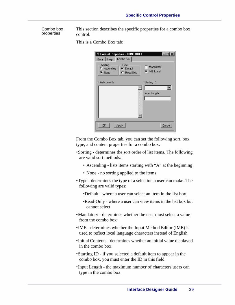
Combo box properties
This section describes the specific properties for a combo box control.
This is a Combo Box tab:
From the Combo Box tab, you can set the following sort, box type, and content properties for a combo box:
•Sorting - determines the sort order of list items. The following are valid sort methods:
• Ascending - lists items starting with “A” at the beginning
• None - no sorting applied to the items
•Type - determines the type of a selection a user can make. The following are valid types:
•Default - where a user can select an item in the list box
•Read-Only - where a user can view items in the list box but cannot select
•Mandatory - determines whether the user must select a value from the combo box
•IME - determines whether the Input Method Editor (IME) is used to reflect local language characters instead of English
•Initial Contents - determines whether an initial value displayed in the combo box
•Starting ID - if you selected a default item to appear in the combo box, you must enter the ID in this field
•Input Length - the maximum number of characters users can type in the combo box

Designing Controls
40 SA-Application Software Expert 5.0
3
Entry field properties
This section describes the specific properties for an entry field control.
This is the Entry Field tab:
From the Entry Field tab, you can set the following function and pattern type properties for an entry field:
Note: Users can only type one line of text in an entry field. Use the Multi-Line Edit control for more lines.
•Initial Value - the default value. If you do not type a value, the entry field appears empty when the dialog box appears.
•Pattern Type - the following are valid, predefined pattern types, except for the Custom option where you would design your own. For more information on patterns, see the chapter “Building Additional Features.”
• None - no pattern type
• Integer - whole numbers only
• Real - real numbers only
• Time - time format, such as mm/dd/yyyy
• Date - date format, such as hh:mm:ss
• Password - a password format pattern
• Custom - a pattern that you design

Specific Control Properties
Interface Designer Guide 41
Note: The Pattern and Maximum Length fields are active depending on the Pattern Type you select.
•Pattern - (only available for custom patterns) The pattern name.
•Maximum Length - The maximum amount of characters users can type.
•Read Only - determines whether the entry field is read only
•Mandatory - determines whether users must type a value in the entry field
•Caps Only - determines whether entries appear in all capital letters regardless of the case the user uses.
Group box properties
This section describes the specific properties for a group box control.
This is the Group Box tab:
From the Group Box tab, you can set the following title and style properties for a group box:
•Title - the name of the group box
•Style - determines how the title should be aligned

Designing Controls
42 SA-Application Software Expert 5.0
3
Hypertext properties
This section describes the specific properties for a hypertext control.
This is the Hypertext tab:
From the Hypertext tab, you can set the following style and starting text properties for a hypertext control:
•Style - the formatting style in the hypertext box. The following are valid styles:
• No WordWrap - user must use hard carriage returns to manually wrap text to the next line
• No Format - automatic wordwrap
• None - no line format
•Starting Text - determines whether any initial text should appear in the hypertext control

Specific Control Properties
Interface Designer Guide 43
Image properties
This section describes the specific properties for an image control.
This is the Image tab:
From the Image tab, you can set the following appearance properties for an image:
•Filename - the path of the file containing the image
•Border - determines the appearance of the border around the image. The following are valid borders:
• Raised - determines whether the lines appear raised above the form
• Lowered - determines whether the lines appear lowered below the form
• Field Border - determines whether the lines appear static, not raised or lowered, bordering the image
• None - no lines bordering the image
•Style - determines the appearance of the image in the form. The following are valid styles:
• Scroll Bars- so users can scroll to view the entire image
• Clip - crops the image to fit in the border
• Scale - scaled to a smaller size to fit in the border
Designing Controls
44 SA-Application Software Expert 5.0
3
List box properties
This section describes the specific properties for a list box control.
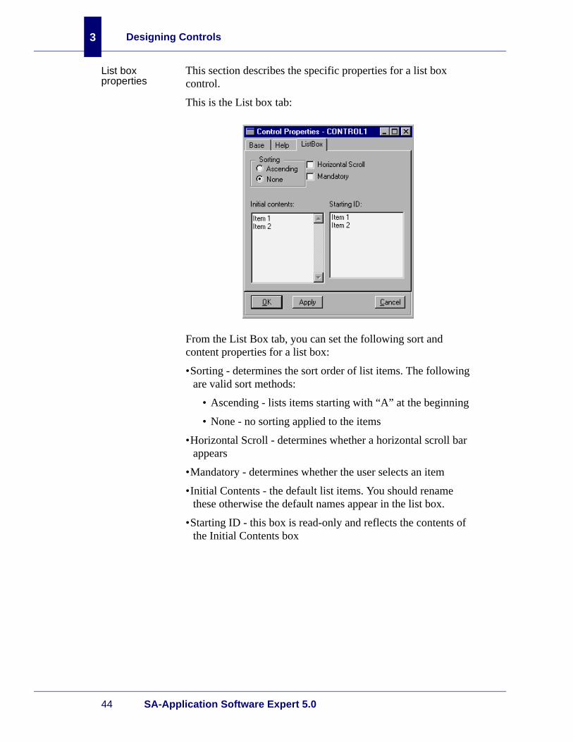
This is the List box tab:
From the List Box tab, you can set the following sort and content properties for a list box:
•Sorting - determines the sort order of list items. The following are valid sort methods:
• Ascending - lists items starting with “A” at the beginning
• None - no sorting applied to the items
•Horizontal Scroll - determines whether a horizontal scroll bar appears
•Mandatory - determines whether the user selects an item
•Initial Contents - the default list items. You should rename these otherwise the default names appear in the list box.
•Starting ID - this box is read-only and reflects the contents of the Initial Contents box

Specific Control Properties
Interface Designer Guide 45
Multi-line edit box properties
This section describes the specific properties for an MLE control.
This is the MLE tab:
From the MLE tab, you can set the following function and appearance properties for an MLE:
•Horizontal Scroll - determines whether a horizontal scroll bar appears on the MLE
•Vertical Scroll - determines whether a vertical scroll bar appears on the MLE
•Caps Only - determines whether entries appear in all capital letters regardless of the case the user uses
•IME Local - determines whether the Input Method Editor (IME) is used to reflect local language characters instead of English
•No WordWrap - determines whether the user must use hard carriage returns to manually wrap text to the next line
•Read Only - determines whether the MLE should be read only
•Mandatory - determines whether users must type in the MLE
•Input Length - determines how many characters users can type in the MLE
Designing Controls
46 SA-Application Software Expert 5.0
3
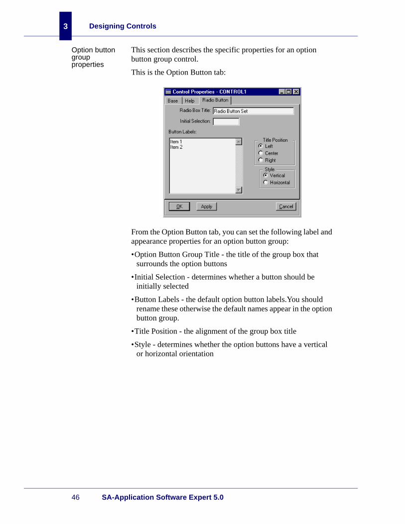
Option button group properties
This section describes the specific properties for an option button group control.
This is the Option Button tab:
From the Option Button tab, you can set the following label and appearance properties for an option button group:
•Option Button Group Title - the title of the group box that surrounds the option buttons
•Initial Selection - determines whether a button should be initially selected
•Button Labels - the default option button labels.You should rename these otherwise the default names appear in the option button group.
•Title Position - the alignment of the group box title
•Style - determines whether the option buttons have a vertical or horizontal orientation

Specific Control Properties
Interface Designer Guide 47
Slider properties
This section describes the specific properties for a slider control.
This is the Slider tab:
From the Slider tab, you can set the following scale and label properties for a slider:
•Scale - the following are valid scale options:
• Number of Ticks - the number of scale marks
• Distance - the distance between each scale mark
•Orientation - determines whether the slider has a vertical or horizontal orientation
•Snap - determines whether the slide rule moves to the nearest scale mark
•Labels - titles of scale marks. The order the labels appear here determines their order in your application.

Designing Controls
48 SA-Application Software Expert 5.0
3
Sub form properties
This section describes the specific properties for a subform control. You should use sub forms in the place of often used areas in forms. For example, if you have three buttons that appear as a group in several forms, instead of adding the three buttons to every form where they should appear, you can create one sub form control that contains the three buttons and refer to the subform control in each form. In other words, creating the buttons once for use in several forms.
Sub forms can also be used for grouping sections of a form to aid in geometry management. For more information, see the appendix “Geometry Management.”
This is the Sub Form tab:
From the Sub Form tab, you can set the following title, location, and style properties for a subform:
•Title - the title of the sub form that appears in the border
•Form - the location of the file containing the sub form
•Border - determines the appearance of the border around the sub form. The following are valid borders:
• Raised - determines whether the lines appear raised above the sub form
• Lowered - determines whether the lines appear lowered below the sub form
• Field Border - determines whether the lines appear static, not raised or lowered, bordering the sub form
• None - no lines bordering the sub form

Specific Control Properties
Interface Designer Guide 49
Table properties
This section describes the three specific tabs for a table control: Table, Columns, and SQL.
This is the Table tab:
From the Table tab, you can set the following sort, scrolling, and selection properties for a table:
•Sorting - determines the sort order of table items. The following are valid sort methods:
• Ascending - lists items starting with “A” at the beginning
• None - no sorting applied to the items
•Horizontal Scroll Bars - determines whether a horizontal scroll bar appears on the MLE
•Multiple Selection - determines whether users can select more than one item at a time in the table
Danna:Sean Vyainsays he’ll have thesame sort options for everything. Obviously my screen shot willhave to be updatedwhen he changes it.
Designing Controls
50 SA-Application Software Expert 5.0
3
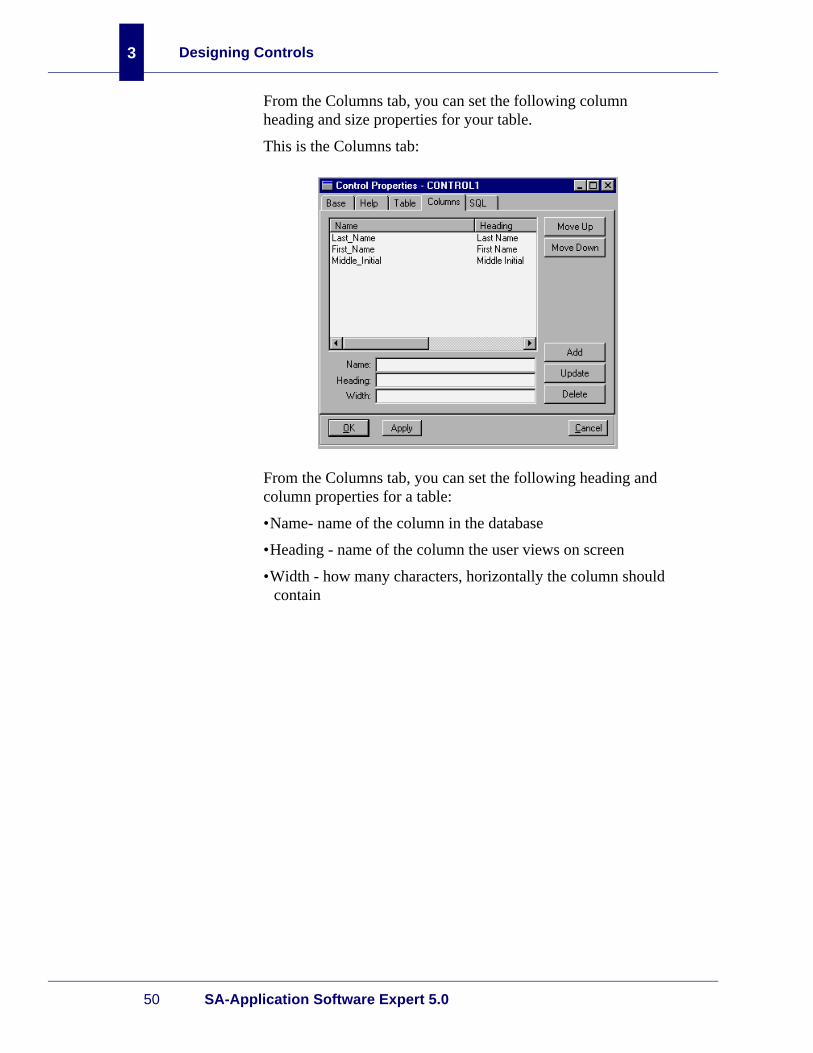
From the Columns tab, you can set the following column heading and size properties for your table.
This is the Columns tab:
From the Columns tab, you can set the following heading and column properties for a table:
•Name- name of the column in the database
•Heading - name of the column the user views on screen
•Width - how many characters, horizontally the column should contain

Specific Control Properties
Interface Designer Guide 51
From the SQL tab, you can set the following record limit and SQL statement properties for your table.
This is the SQL tab:
From the SQL tab, you can set the following record limit and SQL statement properties for a table:
•Record Limit - the maximum amount of records your table should contain
•SQL Statement - any SQL statement, SA-Script or otherwise, can be typed in this box

Designing Controls
52 SA-Application Software Expert 5.0
3
Text box properties
This section describes the specific properties for a text box control.
This is the Text tab:
From the Text Box tab, you can set the following label and alignment properties for a text box:
•Label Text - the title of the text box
•Horizontal Position - the horizontal alignment of the text inside the text box
Setting control properties
To set control properties:
1. Right-click the control you want to set properties for.
Result: The pop-up menu displays.
2. Choose Properties.
Result: The Control Properties sheet for the control appears.
Note: If you selected the Auto Property Sheets form preference, the Control properties sheet appears automatically when you create a new form or control.
3. Set the properties.
4. Choose Apply or OK.
Working with Controls
Interface Designer Guide 53
Working with Controls
Adding controls
To add a control:
1. Open a resource file.
2. Double-click the form you want to add a control to.
3. Click a control button on the control palette.
4. Click on the form where you want the control to appear and size the control with your mouse pointer.
Note: You can apply exact sizing to controls using the Base property tab.
Result: The control appears on the form with attachments. After you have added all the controls, then you need to con-figure the attachments.
Setting attachments
When you add a control it has two default attachments. Both attachments are fixed as the default, meaning that the control is in a set position on the form and will not move, regardless of how the form is resized. You can change attachments so a control moves proportionally when the form is resized by setting them as percentage attachments.
Attachments are set in the attachment editor, shown below the control palette. Fixed attachments are represented with solid lines, while percentage attachments are represented with dashed lines. For more information on attachments, see the appendix “Geometry Management.”
To set attachments:
1. Add a control to a form.
Result: The control appears on the form with two, fixed attachments. A likeness of the control also appears in the attachment editor.
2. To add a third attachment, click on a control side without any attachments.

Designing Controls
54 SA-Application Software Expert 5.0
3
Result: A third, fixed attachment line appears.
3. To set a fixed attachment as a percentage attachment, click on a fixed attachment.
Result: The solid, fixed attachment line changes to a dashed, percentage attachment line.
Note: You can add attachment lines to all four control sides by pressing SHIFT as you add the control to the form.
Moving controls
Note: Before moving a control make sure no controls are selected on the control palette.
To move a control:
1. Click the control to move.
2. Drag the control to its new location.
Note: You can move multiple controls by pressing the SHIFT key and clicking each control to move and dragging them to their new location.

Working with Controls
Interface Designer Guide 55
Copying controls
To copy a control:
1. Click the control to copy.
2. Right-click the control.
Result: The pop-up menu appears.
3. From the pop-up menu, choose Edit.
4. From the Edit menu, choose Copy.
5. From the Edit menu, choose Paste.
Result: The new control appears as the selected control on top of the original control.
6. Move the selected control to the desired location and dese-lect the control.
Resizing controls
To resize a control:
1. Select the control you want to resize.
2. Either resize the control with the mouse pointer or double-click the control to open the Control Properties property sheet. Sizing is complete if you use the mouse pointer.
3. Under Attachments, change the measurements.
4. Choose Apply or OK.
Result: The control is resized.
Resizing controls to the active control
Besides sizing controls manually, you can use the pop-up menu to size them to the active control. The active control is the “standard,” or the control that defines alignment for other selected controls. The active control is identified with a different color than the selected controls.
To size a control:
1. Press the SHIFT key and click each control you want to size. Select the active control last.Result: Each selected control is highlighted. The active control appears in a different color.
2. Right-click the active control.
Result: The pop-up menu appears.

Designing Controls
56 SA-Application Software Expert 5.0
3
3. Point to Same Size and choose the appropriate sizing com-mands.
Result: The controls change size according to your selec-tion.
Aligning controls to the active control
To align controls:
1. Press the SHIFT key and click each control you want to align. Select the active control last.Result: Each selected control is highlighted. The active control appears in a different color.
2. Right-click the active control.
Result: The pop-up menu appears.
3. Point to Align and choose the appropriate alignment com-mands.
Result: The controls change alignment according to your selection.
Finding missing or obscured controls
As you add controls to a form you may find that the placement of some controls may obscure or completely hide other controls, especially when the form is resized smaller. You can find controls using the pop-up menu.
To find controls:
1. Right-click anywhere in the form except the title bar.
Result: The pop-up menu appears.
2. From the Edit menu, choose Find Controls.
Result: The Select a Control box appears.
Working with Controls
Interface Designer Guide 57
3. Select any of the following check boxes to find the con-trol(s):
• All - displays all the controls in the list so you can select which ones to move
• Off form - displays only the controls in the list that do not appear in the current form size
• Zero Size - displays only the control(s) in the list that are so small they cannot be seen on the form
• Obscure - displays only the control(s) in the list that are obscured by another control
4. Choose Select to choose which controls to affect.
5. Choose one of the following:
• Raise - to bring to the front any controls obscured or hidden by another control
• Move - to move the hidden controls to the top-left corner of the form
Bringing a control to the front
As you add controls to a form you may find that the placement of some controls may obscure or completely hide other controls. You can bring smaller controls in the front of larger controls using the pop-up menu.
To bring controls to the front:

Designing Controls
58 SA-Application Software Expert 5.0
3
Sending a control back
Use the Send to Back menu command only with the group box control. The group box is a visual device that encloses a set of related options or controls. The group box must appear behind the controls, otherwise it would hide them.
To send a group box control to the back:
1. Right-click the group box control.
Result: The pop-up menu appears.
2. Choose Send To Back.
Result: The group box appears behind the controls.
Note: You can also bring a partially hidden control to the front again by choosing “Bring to Front” from the pop-up menu.
Deleting controls
To delete a control:
1. Right-click the control to delete.
Result: The pop-up menu appears.
2. From the Edit menu, choose Delete.
Result: The control is deleted from the form.

This chapter covers the following topics:
•Overview
•Notebook Properties
•Using Notebook Properties
•Creating Notebook Tabs
•Working with Notebook Tabs
4Designing Notebooks

Designing Notebooks
60 SA-Application Software Expert 5.0
4
Overview
Introduction Notebook forms are a useful means of organizing related forms in an application. In a notebook, each tab has a corresponding form in a resource file.
To create a notebook you must:
1. Create forms that will be the notebook tabs
2. Define the notebook and set its properties
3. Define the notebook tabs
4. Set the properties in the notebook tabs
The sections that follow give you the basic information for adding a notebook and setting its properties, defining the notebook tabs, and testing the notebook.
Note: Notebook properties override the properties of the forms they contain.
Adding a notebook
To add a notebook:
1. Open the Interface Designer.
2. Open a resource file that has forms associated with it.
Result: The resource file opens. The Forms tab appears.
3. On the Forms tab, choose Add Notebook.
Result: A new notebook appears.

Notebook Properties
Interface Designer Guide 61
Notebook Properties
Notebook properties summary
Notebooks are similar to forms in that they, too, have properties that you can set to determine how the notebooks look and behave. You use the Pages tab to define forms as tabs in the notebook.
This figure shows the Pages tab of the Form Properties dialog box.
From the Pages tab, you can set properties for:
•Tab Position - indicates the physical location of a tab on a notebook page
Note: In Windows, tabs can only be located on the top.
•Tab text - indicates the tab text of the tab
•Form - indicates the name of the form contained within the .df file
You can also arrange the tabs. See the section “Rearranging notebook tabs” on page 64 for instructions.

Designing Notebooks
62 SA-Application Software Expert 5.0
4
Using Notebook Properties
Setting notebook properties
Setting properties for a notebook is similar to setting properties for a form. You can set different properties for each notebook in a resource file.
Note: If you set your preferences to show property sheets automatically when a new form or notebook is created you can avoid steps 3 and 4.
To set properties for a notebook:
1. Open a resource file.
2. Do one of the following:
• If a notebook exists, double-click its file name in the Form ID column on the Forms tab.
• If you need to add a notebook, from the Forms tab, click Add Notebook.
3. Position the mouse pointer anywhere in the notebook, except the title bar, and right-click.
Result: A pop-up menu appears.
4. From the pop-up menu, choose Properties.
Result: The Form Properties properties sheet appears.

Creating Notebook Tabs
Interface Designer Guide 63
5. Set the properties for the notebook.
6. Choose OK.
Creating Notebook Tabs
Adding tabs to a notebook
You create notebook tabs from the forms in a resource file. Like forms, you can set different properties selected for each tab in a notebook.
To add a tab to a notebook:
1. Open the Interface Designer.
2. Open a resource file that contains at least one form.
3. Do one of the following:
• If a notebook exists, double-click its file name in the Form ID column on the Forms tab.
• If you need to add a notebook, from the Forms tab, click Add Notebook.
4. Position the mouse pointer anywhere in the notebook, except the title bar, and right-click.
Result: A pop-up menu appears.
5. From the pop-up menu, choose Properties.
Result: The Form Properties properties sheet appears.
6. Choose the Pages tab.
Result: The Pages tab appears.
7. Under Form Name, select the name of the form that you want to include as a tab in the notebook.
8. In the Tab Text box, type the text that you want to see on the tab.
9. Under Tab Position, select the position where you want the tab to appear.
10. Choose Add.
Result: The tab text appears in the Tab Text group box with the form description.
11. Choose Apply.
Result: The notebook tab appears on the notebook form.
Designing Notebooks
64 SA-Application Software Expert 5.0
4
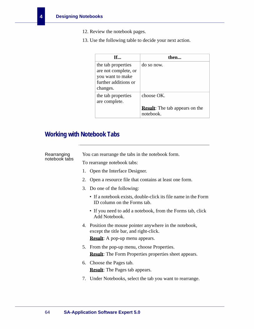
12. Review the notebook pages.
13. Use the following table to decide your next action.
Working with Notebook Tabs
Rearranging notebook tabs
You can rearrange the tabs in the notebook form.
To rearrange notebook tabs:
1. Open the Interface Designer.
2. Open a resource file that contains at least one form.
3. Do one of the following:
• If a notebook exists, double-click its file name in the Form ID column on the Forms tab.
• If you need to add a notebook, from the Forms tab, click Add Notebook.
4. Position the mouse pointer anywhere in the notebook, except the title bar, and right-click.
Result: A pop-up menu appears.
5. From the pop-up menu, choose Properties.
Result: The Form Properties properties sheet appears.
6. Choose the Pages tab.
Result: The Pages tab appears.
7. Under Notebooks, select the tab you want to rearrange.
If... then...
the tab properties are not complete, or you want to make further additions or changes.
do so now.
the tab properties are complete.
choose OK.
Result: The tab appears on the notebook.

Working with Notebook Tabs
Interface Designer Guide 65
8. Choose Move Up or Move Down.
Result: The notebook page moves to the position you chose.
9. Choose Apply.
10. Review the appearance of the notebook form and the page positions.
11. Use the following table to decide your next action.
Editing notebook tabs
Editing notebook tabs involves editing the page properties, not the form associated with the tab.
To edit a notebook tab:
1. Open the Interface Designer.
2. Open a resource file that contains at least one form.
3. Do one of the following:
• If a notebook exists, double-click its file name in the Form ID column on the Forms tab.
• If you need to add a notebook, from the Forms tab, click Add Notebook.
4. Position the mouse pointer anywhere in the notebook, except the title bar, and right-click.
Result: A pop-up menu appears.
5. From the pop-up menu, choose Properties.
Result: The Form Properties properties sheet appears.
6. Choose the Pages tab.
If... then...
the tab properties are not complete, or you want to make further additions or changes.
do so now.
the tab properties are complete.
choose OK.
Result: The tab appears on the notebook.
Designing Notebooks
66 SA-Application Software Expert 5.0
4
Result: The Pages tab appears.
7. Make changes to any of the properties on the Pages tab that need to be altered.
8. Choose Apply.
Result: The changes are applied to the notebook.
9. Choose Apply or OK.
Result: All applied properties take effect on the notebook tabs.
Removing notebook tabs
You can delete every notebook tab without deleting the notebook, but every notebook must have at least one tab; otherwise an error message appears.
To remove notebook pages:
1. Open the Interface Designer.
2. Open a resource file that contains at least one form.
3. Do one of the following:
• If a notebook exists, double-click its file name in the Form ID column on the Forms tab.
• If you need to add a notebook, from the Forms tab, click Add Notebook.
4. Position the mouse pointer anywhere in the notebook, except the title bar, and right-click.
Result: A pop-up menu appears.
5. From the pop-up menu, choose Properties.
Result: The Form Properties properties sheet appears.
6. Choose the Pages tab.
Result: The Pages tab appears.
7. Under Notebooks, select the page you want to delete from the list.
8. Choose Delete.
Result: The notebook page is deleted from the list.
9. Choose Apply or OK.
Result: The selected notebook tabs are deleted from the notebook.

Working with Notebook Tabs
Interface Designer Guide 67
Deleting notebooks
To delete a notebook:
1. Open the Interface Designer.
2. Open the resource file that contains the notebook that you want to delete.
Result: The resource file opens with a list of forms and notebooks in the Form ID column on the Forms tab.
3. Select the notebook you want to delete.
4. Choose Delete.
Result: The notebook is deleted and removed from the list of forms.

Designing Notebooks
68 SA-Application Software Expert 5.0
4

This chapter covers the following topics:
•Overview
•Pattern Components
•Formatting Text Boxes with Patterns
•Creating Menus
•Creating and Working with Toolbars
•Creating Hypertext Controls
•Creating Online Help
5Building Additional Features
Building Additional Features
70 SA-Application Software Expert 5.0
5
Overview
Introduction Adding enhancements, such as menus, toolbars, patterns, and online help can make your application more useful. You must first set menu and toolbar styles before you can add these enhancements. Then, rename the menu and toolbar with the same name as the form and they will automatically “attach” to the form.
Pattern Components
What are patterns?
Patterns are templates for text boxes and are used to provide visual cues to users regarding the format of typed information. Patterns are specified as part of the control description in a resource file.
Pattern types There are six possible pattern types:
• Date and Time - provides locale-aware entry masks for typing dates and times
• Integer - provides entry masks for typing integers
• Real - provides entry masks for real values
• Password - replaces all typed characters with *
• User-defined - allows custom descriptions for typing text in text boxes
Pattern Components
Interface Designer Guide 71
Entry and display masks
Every pattern consists of an entry and display mask. Entry masks consist of blank and non-blank characters and do not appear to users, but restrict what can be typed. For example, you may want to restrict users to only typing numbers in a social security field, and only alphabetic characters for a name field. Both entry masks are defined using character flags.
Display masks are visual cues to users for what should be typed in a text box. For example, a display mask for a social security number looks like this:
nnn-nn-nnn
and a display mask for a phone number looks like this:
nnn-nnn-nnnn
unlike entry masks, display masks appear to users.
Character flags
Entry masks are composed of character flags and define what a user can type in a pattern. Character flags can be one of the following:
• Alpha = restricts entries in a text box to alphabetic characters only
• Numeric = restricts entries in a text box to numeric characters only
• Any = entries can be alpha-numeric and include symbols as well
Valid characters
Character flags can be customized using valid characters. For example, if you create a control where a driver’s license number is entered, and the number begins with a capital letter, you could select the numeric character flag and customize it with the “A,” valid character. This allows the user to enter the one uppercase alpha letter in the first position, while the rest of the field remains numeric.
The following are valid character types:
• a = upper or lowercase alpha
• l = lowercase alpha
Building Additional Features
72 SA-Application Software Expert 5.0
5
• A = uppercase alpha
• # = numeric
• V = valid character list
• 0 = alpha-numeric
• SPACE = no characters allowed (read-only to users)
Fill flags Fill flags consist of the following:
• Reverse - makes a pattern fill from right to left
• Fill all - makes a pattern invalid until a valid character is typed for every non-blank position in the entry mask
Formatting Text Boxes with Patterns
Creating patterns
The predefined patterns in the Interface Designer cover most any type of control you will add to a form. However, use the following procedure if you prefer to create your own patterns.
To create a pattern:
1. Open the Interface Designer.
2. Open a resource file that contains a form for which you want to define patterns.
3. Choose the Patterns tab.
Formatting Text Boxes with Patterns
Interface Designer Guide 73
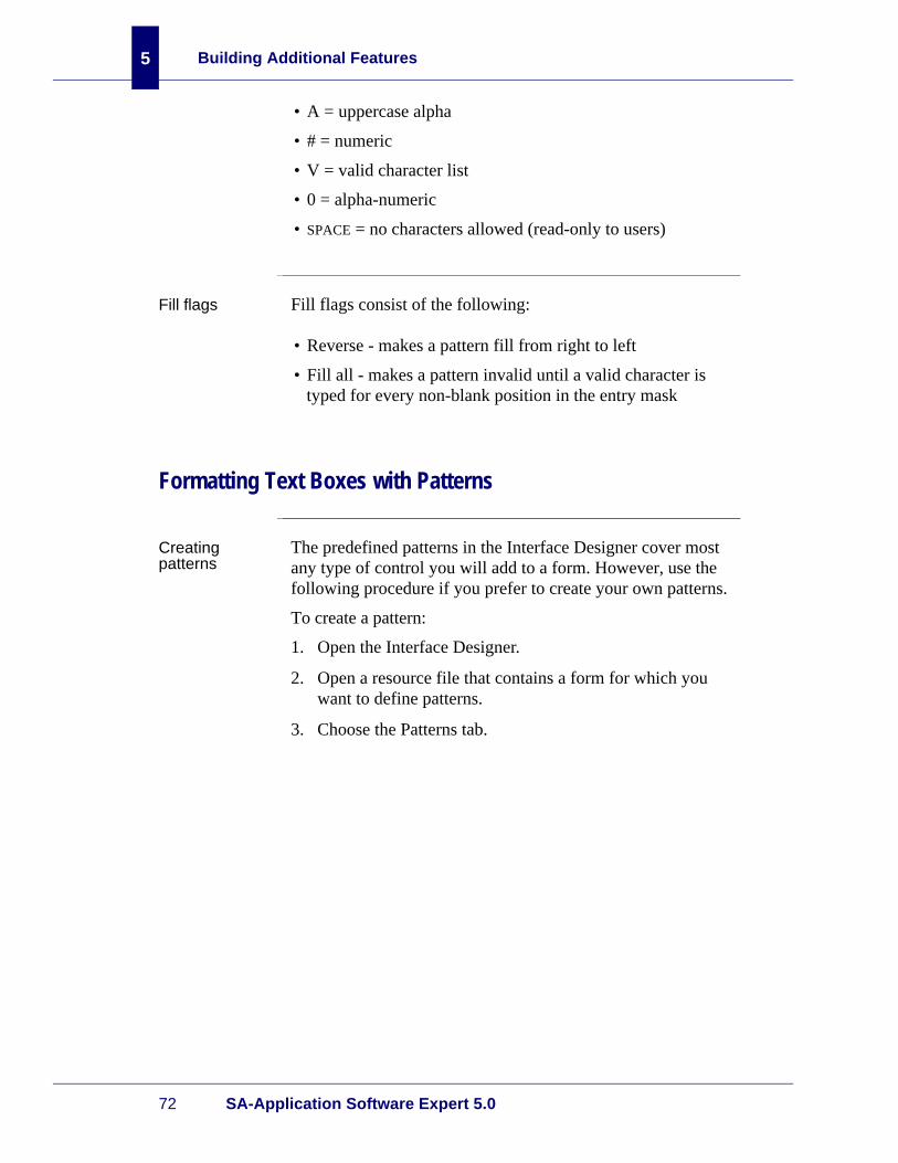
4. Choose Add.
Result: The Pattern Artist dialog box appears.
5. Type information as appropriate for your application.
• Pattern ID - the name of the new pattern
• Description - the description of the pattern
• Display Mask - the format that describes the pattern. Characters in this text box are seen by end users. For example, a date display mask might be mm/dd/yy.
• Entry Mask - the format interpreted by the Interface Designer. For example, an entry mask for a date pattern can be mm/dd/yy. If there is a space in the Entry Mask text box, the character used in the Display Mask replaces the space.
• Valid Characters - the type of characters that are typed, relative to the character flag selected. Valid characters are:
• a - upper or lowercase alpha
• l - lowercase alpha
• A - uppercase alpha
• # - numeric
• V - valid character list
• 0 - alpha-numeric
• SPACE - no characters allowed (read-only to users)

Building Additional Features
74 SA-Application Software Expert 5.0
5
• Fill Character - a character that is inserted in a text box when a control entry is incomplete.
• Test Pattern - the test pattern
• Characters - places a restriction on what type of data users can type in the pattern:
• Alphabetic
• Numeric
• Any characters
• Fill - specifies how fill characters can be inserted:
• Reverse - inserts characters from right-to-left
• Fill all - inserts characters in all non-blank spaces
6. Choose Apply or OK.
Result: The Patterns tab appears with the updated informa-tion.
7. Associate the pattern with a text box on the form. For more information about specifying patterns with text box control, see the chapter, “Designing Controls.”
Applying patterns to text boxes
You can apply predefined and user-defined patterns to text boxes.
To apply patterns to a text box:
1. Open the Interface Designer.
2. Open a resource file that contains at least one form.
3. Open the form that you want to use.
4. Double-click the text box to which you want to apply a pat-tern.
Result: The control properties appear.
5. Choose the Text Box tab.
Result: The Text Box tab appears.
6. From the Pattern Type list, select the pattern you want to use.

Creating Menus
Interface Designer Guide 75
7. Choose Apply or OK.
Result: The pattern is applied to the text box.
Disassociatingpatterns from text boxes
Patterns can be disassociated from any text box, including those in run time applications. If a pattern is disassociated from a text box, then any character can be typed in the text box.
To disassociate a pattern from a text box:
1. Open the Interface Designer.
2. Open a resource file that contains the form.
3. Open the form that you want to use.
4. Double-click the control from which you want to disassoci-ate the pattern.
Result: The properties sheet appears.
5. Choose the Text Box tab.
Result: The Text Box tab appears.
6. From the Pattern Type list, select None.
Result: The pattern is removed from the text box.
Creating Menus
Introduction Menus are often used in forms to access commands without using a command prompt. This section discusses how to create menus for forms that become windows.
The Interface Designer allows you to build menus with submenus.
Note: You must first set menu and toolbar styles before you can add these enhancements. Then, rename the menu and toolbar with the same name as the form and they will automatically “attach” to the form.

Building Additional Features
76 SA-Application Software Expert 5.0
5
Creating window menus
You can create a menu when you create a new form for a window, or when you work with an existing form. In this instance, instructions are for an existing form.
Note: It is not required to associate menus with forms.
To create a menu:
1. Open the Interface Designer.
2. Open a resource file that contains at least one form.
3. Choose the Menu tab.
Result: The Menu tab appears.
4. Choose Add.
Result: The Menu Designer dialog box appears.
5. Click the menu name.
Result: The name associated with the menu appears in the Menu Name box.
6. Choose the Menu Name browse button.
Result: The Unique ID dialog box appears.

Creating Menus
Interface Designer Guide 77
7. In the text box, type a unique menu name and choose OK.
Result: The Unique ID dialog box closes and the menu name you entered appears in the Menu Name text box on the Menu Designer dialog box. The menu name is for devel-opment purposes only and does not appear to your users
8. In the Menu Text box, type the text that you want to appear on the menu.
9. Under the Style group box, select a style:
• Separator - allows a separator between menu commands
• Disabled - determines whether a menu selection is available or not
• Checkable - allows a menu command to switch on or off when a user chooses it
• Checked - determines the default state of a checkable menu command
Note: If you select Separator, a blank separator line appears on the menu. This causes any text previously associated with the menu command to disappear.
10. Choose Update.
Result: The menu reflects the changes.

Building Additional Features
78 SA-Application Software Expert 5.0
5
11. Choose OK.
Result: The Menu Designer dialog box closes and the Menus tab appears.
Note: You can add another menu at the same menu level by clicking Add After.
Adding submenus
Submenus appear under menus. You can create submenus to a menu as well as nest another submenu of a submenu.
The following graphic shows submenus of the Format menu:
The following graphic shows a submenu of the Size submenu:
To add a submenu:
1. Open the Interface Designer.
2. Open a resource file that contains at least one form.
3. Choose the Menu tab.
Result: The Menu tab appears.
4. Choose the menu you want to add a submenu to and click Update.
Result: The Menu Designer dialog box appears.

Creating Menus
Interface Designer Guide 79
5. Click the menu in the menu list to which you want to add a submenu.
6. Choose Add Under.
Result: A new sub-menu with the default name NEW_ITEM1 appears under the selected menu.
7. Click the new submenu name.
Result: The Menu Name and Menu Text boxes populate with default information.
8. Specify a unique name, menu text, and help (if needed).
9. Choose Update.
Result: The default submenu is replaced by the new menu text, as well as the other information you specified.
10. Choose OK.
Result: The Menu Designer closes and the Menus tab appears.
You can add a submenu to a submenu by repeating this procedure. To do this, select the submenu instead of a menu before clicking Add Under.
Note: You can add another submenu at the same submenu level by clicking Add After.
Testing menus To test a menu:
1. Select a menu in the tree structure.
2. Choose Test.
Result: A pop-up menu appears with the menu structure and text you created.

Building Additional Features
80 SA-Application Software Expert 5.0
5
3. Click anywhere to close the pop-up menu.
Result: The pop-up menu closes.
4. Choose OK.
Result: The Menu Designer closes and the Menus tab appears.
Deleting menus
To delete a menu:
1. Click a menu or submenu in the tree structure.
2. Click Delete.
Result: If you selected a menu or submenu that is a “parent” to other submenus, a prompt appears that asks you whether to update the modifications to the menu. Otherwise, the selected menu is deleted and removed from the list of menus.
3. Choose OK.
Result: The Menu Designer closes and the Menus tab appears.
Creating and Working with Toolbars
Introduction Toolbars allow programs to behave in a manner that is more “user-friendly” than might be the case otherwise. The buttons on a toolbar act as visual mnemonics; that is, a button represents a menu command that the user does not have to remember. Buttons also makes frequently used commands more accessible.
This section describes how to add a toolbar to a form that becomes a window.
Creating Toolbars
A toolbar can be added to a form at any time.
To create a toolbar:
1. Open the Interface Designer.
Creating and Working with Toolbars
Interface Designer Guide 81
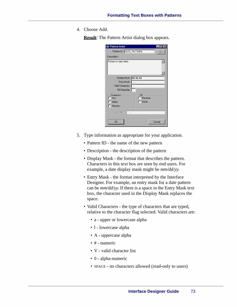
2. Choose the Toolbars tab.
Result: The Toolbars tab appears.
3. Click Add.
Result: The Toolbar Properties dialog box appears. A default toolbar name, NEW_TOOLBAR1, appears in the Toolbar Name text box.
Note: If you selected the Auto Property Sheets form preference, the Toolbar Properties properties sheet appears automatically when you create a new toolbar.

Building Additional Features
82 SA-Application Software Expert 5.0
5
4. Choose the Toolbar Name browse button.
Result: The Unique ID dialog box appears.
5. In the text box, type a unique name to replace the default toolbar name and choose OK.
Result: The Unique ID dialog box closes and the toolbar name you typed appears in the Toolbar Name text box in the Toolbar Properties dialog box.

Creating and Working with Toolbars
Interface Designer Guide 83
Creating toolbar buttons
To add a toolbar button:
1. Open the Interface Designer.
2. Choose the Toolbars tab.
Result: The Toolbars tab appears.
3. Click the toolbar to which you want to add a button.
4. Click Update.
Result: The Toolbar Properties dialog box appears.
5. In the Item ID text box, type a string ID to represent the but-ton for development purposes.
6. Click the Icon File browse button.
7. Select the icon file you want to appear on the button.
8. To create tooltip text for the button, type text in the Help Text box.
9. Choose Add.
Result: The button appears in the list represented by the item ID, icon file, and help text information you typed.
10. To add additional buttons to the toolbar, repeat steps 5-9 as needed.
11. If you want the buttons in a different order than that in which you added them, use the Move Up and Move Down buttons to rearrange the order.
Note: The button at the top of the list appears at the top of the toolbar if the toolbar appears vertically, and the first button on the left side if the toolbar appears horizontally.
12. Choose Update.
Result: The Item ID, Icon File, and Help Text fields clear and the toolbar is updated.
13. Choose OK.
Result: The Toolbar Properties dialog box closes.

Building Additional Features
84 SA-Application Software Expert 5.0
5
Creating separators between buttons
Separators enhance the appearance of a toolbar because they allow space between buttons, which makes the toolbar easier to use visually.
To add a separator to a toolbar:
1. Open the Interface Designer.
2. Open a resource file containing the form you want to work with.
3. Choose the Toolbars tab.
4. Double-click the toolbar name you want to use.
Result: The Toolbar Properties dialog box appears.
5. From the toolbar list, click the name of the toolbar form you want to use.
6. Choose Separator.
Result: The separator appears at the bottom of the list of toolbars.
7. Choose Move Up or Move Down to move the Separator between the toolbar buttons.
8. To add additional separators, repeat steps 6-7.
9. If you want the buttons in a different order than that in which you added them, use the Move Up and Move Down buttons to rearrange the order.
10. Choose Update.
Result: The Item ID, Icon File, and Help Text fields clear and the toolbar is updated.

Creating Hypertext Controls
Interface Designer Guide 85
11. Choose OK.
Result: The Toolbar Properties dialog box closes.
Note: You can rearrange the position of buttons and separators at any time using the Move Up and Move Down buttons.
Creating Hypertext Controls
Introduction Hypertext controls provide online information to end users and can include text, sound, and images. They can also be linked to external programs. Hypertext controls do not replace online help, but are an alternative method of displaying information.
Hypertext controls are visible as long as a form is open. Hypertext controls appear as a multi-line entry box with text. Text can be represented as colored text or as a button.
Types of hypertext buttons
Buttons appear in a different color from regular text at run time. When the button is clicked, the ASE Hypertext Viewer appears containing the linked item.
The following are the types of buttons you can create:
• Numerical
• Alphabetic
• Image
• External file
• Search string
• External program
• Marker tag

Building Additional Features
86 SA-Application Software Expert 5.0
5
Creating hypertext buttons
Buttons are created using hypertext string tags.
To create a hypertext button:
1. Open the Interface Designer.
2. Open a resource file that contains the form you want to use.
3. Open the form that you want to use.
4. From the Control Palette, click the Hypertext button.
5. On the form, click your mouse pointer where you want the button to appear and drag the mouse pointer until the button outline is the size you want.
Result: The button appears on the form.
Note: If you selected the Auto Property Sheets form preference, the Control Properties properties sheet appears automatically when you create a new control.
6. Right-click the hypertext control .
Result: The pop-up menu appears.
7. Choose Properties.
Result: The Control Properties sheet for the control appears.
8. Set Base or Help tab properties as needed.
9. Choose the Hypertext tab.
Result: The Hypertext tab appears.
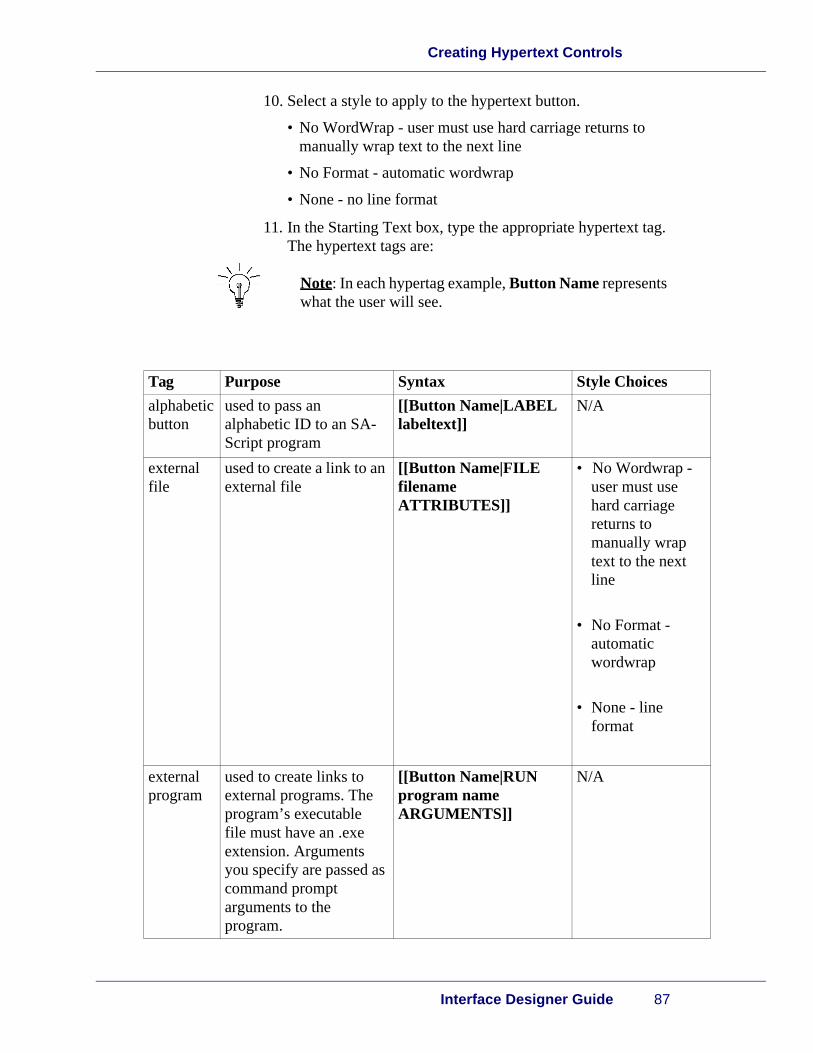
Creating Hypertext Controls
Interface Designer Guide 87
10. Select a style to apply to the hypertext button.
• No WordWrap - user must use hard carriage returns to manually wrap text to the next line
• No Format - automatic wordwrap
• None - no line format
11. In the Starting Text box, type the appropriate hypertext tag. The hypertext tags are:
Note: In each hypertag example, Button Name represents what the user will see.
Tag Purpose Syntax Style Choices
alphabeticbutton
used to pass an alphabetic ID to an SA-Script program
[[Button Name|LABEL labeltext]]
N/A
external file
used to create a link to an external file
[[Button Name|FILE filename ATTRIBUTES]]
• No Wordwrap - user must use hard carriage returns to manually wrap text to the next line
• No Format - automatic wordwrap
• None - line format
external program
used to create links to external programs. The program’s executable file must have an .exe extension. Arguments you specify are passed as command prompt arguments to the program.
[[Button Name|RUN program name ARGUMENTS]]
N/A

Building Additional Features
88 SA-Application Software Expert 5.0
5
image used to create an image button
[[Button Name|IMAGE filename ATTRIBUTES]]
• Scroll - the hypertext window contains scroll bars
• Clip - the image is clipped as the default unless you specify a different attribute
• Scale - the image is scaled to fit in the hypertext window
jump tag searches the tag list for a marker that matches the text following the jump. If a match is found, the line containing the marker is positioned at the top of the viewer. Also, the hypertext view processes the EventJump to keep a list of markers used in a file.
[[text | Jump marker name]]
N/A
marker tag
places an invisible marker in the text
[[text | Marker marker name]]
N/A
numeric button
used to pass a numeric button to an SA Script program
[[Button Name|ID id_number]]
where Button Name is the text displayed to the user
N/A
search string
used to find specified text in a hypertext viewer
[[Button Name|SEARCH search text]]
N/A
sound file used to create links to sound files
[[Button Name|PLAY filename]]
N/A
Tag Purpose Syntax Style Choices

Creating Online Help
Interface Designer Guide 89
12. When you finish setting properties, choose Apply or OK.
Result: The hypertext button appears on the form.
Creating Online Help
Introduction You can create context-sensitive online help for controls and forms in two ways:
• Adding help-text directly in the Interface Designer
• Linking a help file to the control or form
Help files linked to your form must reside in one of the following areas:
• Working directory
• Path
• Saipath
Adding online help
To add online help:
1. Double-click the control or form to display its properties.
Result: The Control Properties appear for the control or form.
2. Choose the Help tab.
Result: The Help tab appears.

Building Additional Features
90 SA-Application Software Expert 5.0
5
3. Do one of the following:
• If you want to add help text directly from the Interface Designer, select the Help Text option button and type the help text in the box under the Help Text option button.
• If you want to link a help file, select the Help File option button and type the path of the file in the text box. If you don not know where the file is located, use the Browse button to find the file and choose the file name.
Result: The path and file name appear in the text box.
4. Choose Apply or OK.
Result: The help is associated with the control or form.
Note: You can only use SA-Script help text tags in your form.

This chapter covers the following topics:
•Overview
•Form Types
•Parsing Forms
6Using Forms in SA-Script Programs

Using Forms in SA-Script Programs
92 SA-Application Software Expert 5.0
6
Overview
Introduction Forms created with the Interface Designer are called from a SA-Script program. The statements used to call forms are:
• DlgCreate
• DlgBox
For more information on these statements, see the SA-ASE 5.0 SA-Script Language Reference.
Resource file location
Resource files can reside in any location. You can open a resource file from the application using only its file name if you specify the filename in one of the following areas:
• path
• saipath
• working directory.
Form Types
Introduction A new form has its own user interface and program (its event handler). The form exists until the user accepts or cancels it or until another part of the application sends a close message, $MsgClose.
There are two types of forms:
•Modal
•Modeless

Parsing Forms
Interface Designer Guide 93
Modal forms A modal form is created with DlgBox. The statement following DlgBox is not executed until the user closes the form. The information specified by the user is returned in the fourth argument to DlgBox and is the output record variable.
A modal form should be reserved for important error messages or critical forms where the user cannot continue without answering a query. For example, a message asking the user to confirm the deletion of a file.
Modeless forms
A modeless form is created with DlgCreate. Modeless forms do not require a user response.
For more information on modal and modeless forms, see the SA-ASE 5.0 SA-Script Programming Guide.
Parsing Forms
Introduction When a resource file is saved, a binary (machine readable) version is created with a .dfc extension. It is the .dfc file that the SA-Script application actually uses.
To parse forms from a command line:
•For DOS/UNIX, enter: i-gen
•For GUI interfaces, enter: i-genw
For more detailed information on parsing forms, see the SA-ASE Script Programming Guide.
Common parsing errors
Parsing errors can occur when you open a resource file created with a prior version of the SA-ASE Dialog Box Painter or a file that has been edited with a text editor.
Opening a previous version of a .df file produces a number of warnings from the Interface Designer that can safely be ignored. However, if a parsing error occurs, an error message appears identifying the error type.
Note: Open the .df file in a text editor to correct parsing errors that prevent you from opening it.

Using Forms in SA-Script Programs
94 SA-Application Software Expert 5.0
6
The following examples create parsing errors in the Interface Designer. These examples only appear outside of the use of the Interface Designer. In other words, the following examples could not be created using the Interface Designer .
• Control, notebook, or form names having values other than numbers, letters, and underscores
• Control, notebook, or form names having a number in the first position
• Duplicate control, notebook, or form names in the same resource file
• Control, notebook, or form names that use a reserved keyword
This appendix covers the following topics:
•Overview
•Dialog Coordinates
•Examples
Geometry Management

96 SA-Application Software Expert 5.0
Overview
Introduction Geometry management is used in the Interface Designer and GUI library to automatically size and position controls in a form when the form is resized. You apply geometry management to a control by setting its attachments. For more information on attachments, see the chapter, “Designing Controls.”
An attachment appears as a line from a control side to a form side. Every control has two attachment lines by default. You can add an attachment to each side of a control by pressing the SHIFT key when adding a control to a form.
How attachments work
An attachment is used to set the distance between the side of a control and the side of a form. For example, the left attachment for a control determines the distance from the left side of the control to the left side of the form.
There are two types of attachments:
•Fixed
•Percentage
Attachment types are discussed in more detail in the following sections.
Fixed attachments
A fixed attachment specifies a set distance between a control side and a form side and does not change when the form is resized. When you add a control to a form, a likeness of the control appears on the attachment editor, located below the control palette. A fixed attachment is represented as a solid line from the control side to the form side. The following figure shows a control with two fixed attachments.

Dialog Coordinates
Interface Designer Guide 97
Percentage attachments
A percentage attachment specifies a proportionate distance between a control side and a form side that changes when the form is resized. When you add a control to a form, a likeness of the control appears on the attachment editor, located below the control palette. A percentage attachment is represented as a dashed line from the control side to the form side. The following figure shows a control with two percentage attachments.
Offsets Offsets apply only to percentage attachments and are used to alter the position of controls after their percentage attachments have been calculated. Offsets can be positive or negative in adjusting the position of controls.
Dialog Coordinates
Overview Dialog coordinates determine the size and position of controls regardless of screen resolution. Dialog coordinates cause buttons, labels, and entry fields to automatically scale when displaying their contents. Also, you can use any font and your forms adjust proportionately.

98 SA-Application Software Expert 5.0
Choosing fonts
When you choose fonts, remember that there are separate scale types for horizontal and vertical sizing. The horizontal scale is based on the width of a single character. The vertical scale is based on the height of the font. This means that a form appears much smaller with a 6-point font than a 12-point font. (Different fonts also have different width-to-height ratios.)
Examples
Introduction This section contains examples of different sets of attachments. Numbers next to attachment lines indicate the attachment size.
Note: If you want to see how attachments work, construct each example using the Interface Designer, and test the forms by resizing them.
You can use any type of control to test geometry management.

Examples
Interface Designer Guide 99
Fixed attachment example
The following figure shows five controls with different sets of fixed attachments.
As this form is resized, controls 1-4 remain in their respective corners, because each control has a fixed attachment to the two nearest form sides. The controls do not change size because only two of the control sides are attached to the form.
Control 5 functions differently because it has all four sides attached to the form. Each side of control 5 is set to a fixed distance from the form side, so the control changes size as the form is resized.

100 SA-Application Software Expert 5.0
Percentage attachment example
The following figure shows five controls with percentage attachments
.
Controls 1-4 do not change size, but their distance from the form sides changes proportionally to the size of the form. Control 5 changes size proportionally as the form is resized.

Examples
Interface Designer Guide 101
Two percentage-attached controls
The following figure shows two controls with fixed and percentage attachments.
Controls 1 and 2 have an equal share of the available width of the form. However, the space between the two controls expands and contracts as the form is resized. The size of the space between the controls is only 2% of the width of the form. The small space between controls makes the form appear awkward. Using offsets with percentage attachments creates more space between controls.

102 SA-Application Software Expert 5.0
Offsets example
The following figure shows two controls with fixed and percentage attachments using offsets.
The distance between the two controls remains constant when the form is resized. Offset values are added after percentage sizes for the attachments are computed.
Note: Offsets should not be used with fixed attachments.

Examples
Interface Designer Guide 103
Percentage attachments with offsets
The following figure is a complex example of percentage attachments with offsets, where three controls share approximately one-third of the form width.
This form functions similarly to the previous example with two controls. Percentage attachments for controls with adjacent sides should add up to 100%. For example, control 1's right attachment is 67%, so control 2's left attachment is 33%. Similarly, control 2's right attachment is 33%, so control 3's left attachment must be 67%. Opposing percentage attachments equalling 100% often produce the best layout though the 100% sum is not required.

104 SA-Application Software Expert 5.0
Fixed and percentage attachments with offsets
The following figure is an example of fixed and percentage attachments. Negative offsets are used for controls 2 and 3 to center them on the form. (It is assumed that the width of controls 2 and 3 is 40 dialog units.)
For more attachment examples, see the forms in the resource file of the Interface Designer.

Symbols
# valid character (character flags), 72$MsgClose message, 92.df files
see also df files, resource files, 15
Numerics
0 valid character (character flags), 7212-hour clock controls, 3824-hour clock controls, 38
A
A valid character (character flags), 72a valid character (character flags), 71accessing
forms, 15Action property
button controls, 36Active Control list box
Preferences dialog box, Colors tab, 20active controls
borderscolor settings, 20
addingcontrol attachments, 54, 96controls, 53forms
to notebooks, 63notebook tabs, 63, 64notebooks, 60online help
for forms/controls, 89separators
to toolbars, 84toolbar buttons, 83
aligningcontrols, 20
alignmentcontrols, 56
with grid coordinates, 18forms, 26group box control titles, 41
option button group control titles, 46text
in text box controls, 52All check box
Select a Control dialog box, 57alpha character flags (patterns), 71alphabetic hypertext button, 87Apply button, 17applying
menu styles, 77patterns to text boxes, 74, 75styles
to hypertext buttons, 87associating
help fileswith controls, 35
attachmentscontrols, 34, 96
adding, 54fixed attachments, 96, 99, 104percentage attachments, 97, 100, 101, 103,
104setting, 53, 54
Auto Property Sheets check boxPreferences dialog box, General tab, 18
B
backgroundforms
color settings, 19Base tab
Control Properties property sheet, 33Form Properties dialog box, 26
bold text, 10Border property
image controls, 43subform controls, 48
borders, 48active controls
color settings, 20clock controls, 38image controls, 43selected controls
color settings, 19Bring to Front command (pop-up menu), 58
Index

Index
SA-Application Software Expert 5.0106
button controlsproperties
Action, 36Button Text, 36Default Button, 37Display Image, 36Image Filet, 36
Button Labels propertyoption button group controls, 46
Button tabControl Properties property sheet, 36
Button Text propertybutton controls, 36
buttonsApply, 17hypertext buttons
creating, 86, 87, 89styles
applying, 87OK, 17toolbars
creating, 83icon files, 83rearranging, 83, 85separators
creating, 84, 85
C
callingforms
from SA-Script statements, 92Canvas Background list box
Preferences dialog box, Colors tab, 19Canvas Foreground list box
Preferences dialog box, Colors tab, 19Caps Only property
entry field controls, 41cautions, 11character flags
(text patterns), 71customizing, 71valid characters, 71
check box controlscircular, 37properties
Checkbox Label, 37Initial Value, 37Style, 37
square, 37Check Box tab
Control Properties property sheet, 37checkable menu commands, 77Checkbox Label property
check box controls, 37
checked menu commands, 77circular check box controls, 37clock controls
12-hour, 3824-hour, 38borders, 38properties, 38
Clock tabControl Properties property sheet, 38
Close command (Form menu), 24closing
forms, 24color
active control border settings, 20form background settings, 19form foreground settings, 19selected control border settings, 19
Colors tabPreferences dialog box, 19
Column tabControl Properties property sheet, 50
columns(tables)
naming, 50headings, 50width, 50
combo box controlsproperties
IME, 39Initial Contents, 39Input Length, 39Mandatory, 39Sorting, 39Starting ID, 39Type, 39
read-only, 39Combo Box tab
Control Properties property sheet, 39command prompts
UNIXi-design, 16
commandsEdit menu
Copy, 55Cut, 25Delete, 58Find Control, 56Paste, 55
File menuExit, 17New, 22Open, 23, 24
Form menuClose, 24
menus

107SA-Script Language Reference
checkable, 77checked, 77disabled, 77separators, 77
Options menuPreferences, 18, 19Save Preferences, 20
pop-up menuBring to Front, 58Properties, 62Send to Back, 58
conrolsdescriptions, entering, 34
control palettedisplaying, 18
Control Properties properties sheet, 86Control Properties property sheet
Base tab, 33Button tab, 36Check Box tab, 37Clock tab, 38Column tab, 50Combo Box tab, 39Entry Field tab, 40Group Box tab, 41Help tab, 35Hypertext tab, 42Image tab, 43List Box tab, 44MLE tab, 45Option Button tab, 46Slider tab, 47SQL tab, 51Sub Form tab, 48Table tab, 49Text tab, 52
controls(forms), 15active
border color settings, 20adding, 53aligning, 20
to grid coordinates, 18alignment, 56attachments, 34, 96
adding, 54fixed attachments, 96, 99, 104percentage attachments, 97, 100, 101, 103,
104setting, 53, 54
bringing to front, 57button controls
properties, 36check box controls
circular, 37
properties, 37square, 37
clock controlsproperties, 38
combo box controlsproperties, 39
copying, 55deleting, 58dialog coordinates, 97, 98, 99, 100, 101, 102,
103, 104disabling, 34displaying, 34entry field controls
properties, 40text limitations, 40
finding, 56fonts
selecting, 98group box controls
properties, 41titling, 41
grouping as a single control, 48help files
associating, 35creating, 89, 90
hiding, 34hypertext controls
creating, 85, 86, 87, 89properties, 42
image controlsborders, 43cropping, 43properties, 43scaling, 43scrolling, 43
list box controlsproperties, 44
MLE controlsproperties, 45
moving, 54offsets, 34, 97, 102, 103, 104option button group controls
properties, 46permissions, 34previewing, 25properties
displaying, 18ID, 33setting, 52
resizing, 55resizing to active control, 55, 56selected
border color settings, 19sending to back, 58sizing, 20, 34, 53, 55

Index
SA-Application Software Expert 5.0108
sizing to active control, 55, 56slider controls
labeling, 47orientation, 47properties, 47scaling, 47
space limitations, 32subform controls
borders, 48properties, 48titling, 48
synchronizing for cross-platform use, 34tab sequence, setting, 29table controls
properties, 49text box controls
alignment of text in, 52properties, 52titling, 52
coordinate systemsforms
setting, 26Copy command (Edit menu), 55copying
controls, 55creating
forms, 24help files
for controls, 89, 90for forms, 89, 90
hypertext buttons, 86, 87, 89hypertext controls, 85, 86, 87, 89menus, 76, 77notebook tabs, 63, 64notebooks, 60patterns, 72, 73, 74resource files, 22separators
for toolbar buttons, 84, 85submenus, 78submenus under other submenus, 79toolbar buttons, 83toolbars, 80, 81
croppingimage controls, 43
customizingpattern character flags, 71
Cut command (Edit menu), 25
D
data sourcesbold text denotation, 10
date patterns, 70Default Button property
button controls, 37defining
forms as notebook tabs, 61Delete command (Edit menu), 58deleting
controls, 58forms, 25menus, 80notebook tabs, 66notebooks, 67
Detached Control Palette check boxPreferences dialog box, General tab, 18
df filessee also resource files, 15
dialog boxes, 14Apply button, 17File Selection
Forms tab, 23Form Properties
Base tab, 26Form tab, 28Help tab, 27Tab Order tab, 29
Menu Designer, 76OK button, 17Pattern Artist, 73Preferences, 18
Colors tab, 19Select a Control, 57Unique ID, 76, 82
dialog coordinatescontrols, 97, 98, 99, 100, 101, 102, 103, 104
disabled menu commands, 77disabling
controls, 34disassociating
patterns from text boxes, 75Display Image property
button controls, 36display masks, 71displaying
control palettepalettes
control palette
displaying, 18control properties, 18controls, 34form properties, 18Menus tab in Interface Designer main window, 18Toolbars tab in Interface Designer main window,
19DlgBox statement, 92DlgCreate statement, 92double-clicking, 10

109SA-Script Language Reference
E
Edit menu commandsCopy, 55Cut, 25Delete, 58Find Control, 56Paste, 55
editingnotebook tabs, 65, 66
Editor boxPreferences dialog box, General tab, 19
entry field controlsproperties
Caps Only, 41Initial Value, 40Mandatory, 41Maximum Length, 41Pattern, 41Pattern Type, 40Read Only, 41
text limitations, 40Entry Field tab
Control Properties property sheet, 40entry masks, 71errors
parsing errorscommon occurances, 94troubleshooting, 93
Exit command (File menu), 17external file hypertext button, 87external program hypertext button, 87
F
field bordersclock controls, 38image controls, 43subform controls, 48
File menu commandsExit, 17New, 22Open, 23, 24
file namesUNIX, 10
File Selection dialog boxForms tab, 23
Filename propertyimage controls, 43
filesresource files, 14
creating, 22opening, 23path requirements, 92
fill all fill flags (patterns), 72fill flags
(patterns), 72Find Control command (Edit menu), 56finding
controls, 56forms
in notebooks, 61fixed attachments, 96, 99, 104
controls, 34setting, 54
fontscontrols
selecting, 98foreground
formscolor settings, 19
Form menu commandsClose, 24
Form Properties dialog boxBase tab, 26Form tab, 28Help tab, 27Tab Order tab, 29
Form Properties properties sheet, 62Form property
subform controls, 48Form tab
Form Properties dialog box, 28forms, 14, 15
addingto notebooks, 63
alignment, 26background
color settings, 19building process, 15calling
from SA-Script statements, 92closing, 24controls, 15
activeborder color settings, 20
adding, 53aligning, 20aligning to grid coordinates, 18alignment, 56attachments, 34, 96
adding, 54setting, 53, 54
bringing to front, 57button controls
properties, 36check box controls
properties, 37clock controls

Index
SA-Application Software Expert 5.0110
properties, 38combo box controls
properties, 39copying, 55deleting, 58descriptions, entering, 34dialog coordinates, 97, 98, 99, 100, 101, 102,
103, 104disabling, 34displaying, 34displaying properties, 18entry field controls
properties, 40finding, 56fonts, selecting, 98group box controls
properties, 41grouping as a single control, 48help files
creating, 89, 90help files, associating, 35hiding, 34hypertext controls
properties, 42image controls
properties, 43list box controls
properties, 44MLE controls
properties, 45moving, 54offsets, 34, 97, 102, 103, 104option button group controls
properties, 46permissions, 34previewing, 25properties
ID, 33setting, 52synchronizing for cross-platform use, 29
resizing, 55resizing to active control, 55, 56selected
border color settings, 19sending to back, 58sizing, 20, 34, 53, 55sizing to active control, 55, 56slider controls
properties, 47space limitations, 32subform controls
properties, 48synchronizing for cross-platform use, 34tab sequence, setting, 29table controls
properties, 49text box controls
properties, 52coordinate systems
setting, 26creating, 24default naming, 24defining as notebook tabs, 61deleting, 25descriptions
entering, 27desktop position
setting properties for, 29finding
in notebooks, 61foreground
color settings, 19grid lines
point size, setting, 19help files
creating, 89, 90setting properties for, 27
icon filessetting properties for, 28
modal, 93modeless, 93naming, 26opening, 15, 24opening multiple, 24parsing, 93, 94properties
displaying, 18overriding, 60setting, 26, 27, 28, 30synchronizing for cross-platform use, 29
resizingto accomodate controls, 32
see also resource files, 22sizing, 26styles, 28testing, 25, 26titling, 28
Forms tabFile Selection dialog box, 23Interface Designer
New Form command, 24
G
General tabPreferences dialog box, 18
grid linesforms
point size, setting, 19Grid Spacing box

111SA-Script Language Reference
Preferences dialog boxGeneral tab, 19
Preferences dialog box, General tab, 19group box controls
propertiesStyle, 41Title, 41
titling, 41Group Box tab
Control Properties property sheet, 41grouping
controls as a single control, 48
H
headingstable columns, 50
help filescontrols
associating, 35creating
for controls, 89, 90for forms, 89, 90
formssetting properties for, 27
path requirements, 89Help tab
Control Properties property sheet, 35, 90Form Properties dialog box, 27
hidingcontrols, 34
Horizontal Position propertytext box controls, 52
Horizontal Scroll Bars propertytable controls, 49
Horizontal Scroll propertylist box controls, 44MLE controls, 45
hypertext buttonsalphabetic, 87creating, 86, 87, 89external file, 87external program, 87image, 88jump tag, 88marker tag, 88numeric, 88search string, 88sound file, 88styles
applying, 87hypertext controls
creating, 85, 86, 87, 89properties
Starting Text, 42
Style, 42Hypertext tab
Control Properties property sheet, 42, 86
I
icon filesforms
setting properties for, 28toolbar buttons
assigning, 83icons, 11ID property
controls, 33I-Designer
see Interface Designer, 16image controls
borders, 43cropping, 43properties
Border, 43Filename, 43Style, 43
scaling, 43scrolling, 43
Image File propertybutton controls, 36
image hypertext button, 88Image tab
Control Properties property sheet, 43IME (Input Method Editor) property
combo box controls, 39IME Local property
MLE controls, 45Initial Contents property
combo box controls, 39list box controls, 44
Initial Selection propertyoption button group controls, 46
Initial Value propertycheck box controls, 37entry field controls, 40
Input Length propertycombo box controls, 39MLE controls, 45
integer patterns, 70Interface Designer
capabilities of, 8, 14Forms tab
New Form command, 24Menus tab
displaying in main window, 18preferences
saving, 20setting, 18, 19

Index
SA-Application Software Expert 5.0112
prerequisite knowledge for using, 8quitting, 17starting, 16Toolbars tab
displaying in main window, 19italic text, 10
J
jump tag hypertext button, 88
L
l valid character (character flags), 71Label Text property
text box controls, 52labeling
option button group controls, 46slider controls, 47
Labels propertyslider controls, 47
launchingInterface Designer, 16
list box controlsproperties
Horizontal Scroll, 44Initial Contents, 44Mandatory, 44Sorting, 44Starting ID, 44
List Box tabControl Properties property sheet, 44
listingforms
associated with resource files, 23lowered borders
clock controls, 38image controls, 43subform controls, 48
M
Mandatory propertycombo box controls, 39entry field controls, 41list box controls, 44MLE controls, 45
marker tag hypertext button, 88Maximum Length property
entry field controls, 41Menu Designer dialog box, 76Menu style
forms, 28
menus, 10commands
checkable, 77checked, 77disabled, 77separators, 77
creating, 76, 77deleting, 80naming, 77styles
applying, 77submenus
creating, 78creating under other submenus, 79naming, 79
testing, 79text
entering, 77Menus tab
displaying in Interface Designer main window, 18Minimize Button style
forms, 28MinMax Button style
forms, 28MLE controls
(multi-line edit box), 45properties
Horizontal Scroll, 45IME Local, 45Input Length, 45Mandatory, 45No WordWrap, 45Read Only, 45Vertical Scroll, 45
MLE tabControl Properties property sheet, 45
modal forms, 93modeless forms, 93monospace text, 11moving
controls, 54Multiple Selection property
table controls, 49
N
namingforms, 26menus, 77submenus, 79table columns, 50toolbars, 82
New command (File menu), 22New Form command (Interface Designer Forms
tab), 24

113SA-Script Language Reference
No WordWrap propertyMLE controls, 45
Notebook property sheet, 61notebooks
(forms), 14creating, 60deleting, 67properties, 61
setting, 62, 63requirements for creating, 60tabs
creating, 63, 64deleting, 66editing, 65, 66positioning, 61rearranging, 64, 65text, defining, 61
notes, 11numeric character flags (patterns), 71numeric hypertext button, 88
O
Obscure check boxSelect a Control dialog box, 57
Off form check boxSelect a Control dialog box, 57
offsetscontrols, 34, 97, 102, 103, 104
OK button, 17online help
creatingfor forms/controls, 89
Open command (File menu), 23, 24opening
forms, 15, 24multiple forms, 24resource files, 23
option button group controlslabeling, 46orientation
determining, 46properties
Button Labels, 46Initial Selection, 46Option Button Group Title, 46Style, 46Title Position, 46
titlesalignment, 46
titling, 46Option Button Group Title property
option button group controls, 46Option Button tab
Control Properties property sheet, 46
Options menu commandsPreferences, 18, 19Save Preferences, 20
orientationoption button group controls
determining, 46slider controls, 47
Orientation propertyslider controls, 47
overridingform properties, 60
P
Pages tabNotebook property sheet, 61
parsingforms, 93, 94
parsing errorscommon occurances, 94troubleshooting, 93
password patterns, 70Paste command (Edit menu), 55Pattern Artist dialog box, 73Pattern property
entry field controls, 41Pattern Type property
entry field controls, 40patterns
(text boxes), 70applying, 74, 75character flags, 71
customizing, 71creating, 72, 73, 74disassociating, 75fill flags, 72types, 70
percentage attachments, 97, 100, 101, 103, 104controls, 34
setting, 54permissions
controls, 34point size
settingfor form grid lines, 19
pop-up menu commandsBring to Front, 58Properties, 62Send to Back, 58
pop-up menus, 10positioning
notebook tabs, 61preferences
Interface Designersaving, 20

Index
SA-Application Software Expert 5.0114
setting, 18, 19Preferences command (Options menu), 18, 19Preferences dialog box, 18
Colors tab, 19previewing
controls, 25properties
button controlsAction, 36Button Text, 36Default Button, 37Display Image, 36Image File, 36
check box controlsCheckbox Label, 37Initial Value, 37Style, 37
clock controls, 38combo box controls
IME, 39Initial Contents, 39Input Length, 39Mandatory, 39Sorting, 39Starting ID, 39Type, 39
controlsdisplaying, 18ID, 33setting, 52synchronizing for cross-platform use, 29
entry field controlsCaps Only, 41Initial Value, 40Mandatory, 41Maximum Length, 41Pattern, 41Pattern Type, 40Read Only, 41
formsdisplaying, 18overriding, 60setting, 26, 27, 28, 30synchronizing for cross-platform use, 29
group box controlsStyle, 41Title, 41
hypertext controlsStarting Text, 42Style, 42
image controlsBorder, 43Filename, 43Style, 43
list box controls
Horizontal Scroll, 44Initial Contents, 44Mandatory, 44Sorting, 44Starting ID, 44
MLE controlsHorizontal Scroll, 45IME Local, 45Input Length, 45Mandatory, 45No WordWrap, 45Read Only, 45Vertical Scroll, 45
notebooks, 61setting, 62, 63
option button group controlsButton Labels, 46Initial Selection, 46Option Button Group Title, 46Style, 46Title Position, 46
slider controlsLabels, 47Orientation, 47Scale, 47Snap, 47
subform controlsBorder, 48Form, 48Title, 48
table controlsHorizontal Scroll Bars, 49Multiple Selection, 49Sorting, 49
text box controlsHorizontal Positiont, 52Label Text, 52
Properties command (pop-up menu), 62properties sheets
Control Properties, 86property sheets
Control PropertiesBase tab, 33Button tab, 36Check Box tab, 37Clock tab, 38Column tab, 50Combo Box tab, 39Entry Field tab, 40Group Box tab, 41Help tab, 35Hypertext tab, 42Image tab, 43List Box tab, 44MLE tab, 45

115SA-Script Language Reference
Option Button tab, 46Slider tab, 47SQL tab, 51Sub Form tab, 48Table tab, 49Text tab, 52
Form Properties, 62Notebook property sheet, 61Toolbar Properties, 81, 84
Q
quittingInterface Designer, 17
R
raised bordersclock controls, 38image controls, 43subform controls, 48
Read Only propertyentry field controls, 41MLE controls, 45
read-only combo box controls, 39real patterns, 70rearranging
notebook tabs, 64, 65toolbar buttons, 83, 85
records(tables)
limit properties, setting, 51SQL statements
properties, 51Resize style
forms, 28resizing
controls, 55controls to active control, 55, 56forms
to accomodate controls, 32resource files, 14, 15
associated formslisting, 23
creating, 22opening, 23path requirements, 92see also df files, 15see also forms, 22text editors
selecting, 19reverse fill flags (patterns), 72
S
SA-Application Software Expertsee ASE, 11
SA-ASEdocumentation set, 12
SA-Expert Administratorsee Expert Administrator, 11
SA-Expert Advisorsee Expert Advisor, 11
SA-Expert Evolutionsee Expert Evolution, 11
SA-Expert Foundation Managersee Expert Foundation Manager, 12
SA-Expert Mail Agentsee Expert Mail Agent, 12
SA-Expert Qualitysee Expert Quality, 12
SA-Expert Supportsee Expert Support, 12
SA-Expert Websee Expert Web, 12
SA-EXPERTISEsee EXPERTISE, 11
SA-ExpertViewsee ExpertView, 12
Save Preferences command (Options menu), 20saving
Interface Designer preferences, 20Scale property
slider controls, 47scaling
image controls, 43slider controls, 47
scroll barsimage controls, 43list box controls, 44MLE controls, 45
scrollbarstables, 49
scrollingimage controls, 43
search string hypertext button, 88Select a Control dialog box, 57Selected Control list box
Preferences dialog box, Colors tab, 19selected controls
borderscolor settings, 19
Send to Back command (pop-up menu), 58separators
menu commands, 77toolbar buttons
creating, 84, 85
Index
SA-Application Software Expert 5.0116
settingcontrol attachments, 53, 54control properties, 52coordinate systems
for forms, 26form properties, 26, 27, 28, 30Interface Designer preferences, 18, 19notebook properties, 62, 63
Show Menu Page check boxPreferences dialog box, General tab, 19
Show Toolbar Page check boxPreferences dialog box, General tab, 19
sizingcontrols, 20, 34, 53, 55controls to active control, 55, 56forms, 26
to accomodate controls, 32slider controls
labeling, 47orientation, 47properties
Labels, 47Orientation, 47Scale, 47Snap, 47
scaling, 47Slider tab
Control Properties property sheet, 47Snap property
slider controls, 47Snap To Grid check box
Preferences dialog box, General tab, 18Software Artistry
product names, 11sorting, 49Sorting property
combo box controls, 39list box controls, 44table controls, 49
sound file hypertext button, 88SPACE valid character (character flags), 72SQL statements
table recordsproperty settings, 51
SQL tabControl Properties property sheet, 51
square check box controls, 37Start on Blank Field style
forms, 29starting
Interface Designer, 16Starting ID property
combo box controls, 39list box controls, 44
Starting Text property
hypertext controls, 42statements
DlgBox, 92DlgCreate, 92
Style propertycheck box controls, 37group box controls, 41hypertext controls, 42image controls, 43option button group controls, 46
stylesforms, 28hypertext buttons
applying, 87menus
applying, 77Sub Form tab
Control Properties property sheet, 48subform controls, 48
borders, 48properties
Border, 48Form, 48Title, 48
titling, 48submenus
creating, 78creating under other submenus, 79naming, 79
synchronizingcontrol properties for cross-platform use, 29controls
for cross-platform use, 34form properties for cross-platform use, 29
System Menu styleforms, 28
T
Tab Order tabForm Properties dialog box, 29
tab sequence (controls)setting, 29
table controlsproperties
Horizontal Scroll Bars, 49Multiple Selection, 49Sorting, 49
Table tabControl Properties property sheet, 49
tables, 49columns
headings, 50naming, 50width, 50

117SA-Script Language Reference
recordslimit properties, setting, 51SQL statements
properties, 51scrollbars, 49sorting, 49
tabs(notebooks)
positioning, 61creating, 63, 64deleting, 66editing, 65, 66rearranging, 64, 65text
defining, 61Task List style
forms, 29testing
forms, 25, 26menus, 79
textbold, 10entry field control limitations, 40italic, 10menus
entering, 77monospace, 11notebook tabs
defining, 61text box controls
alignment of text in, 52properties
Horizontal Position, 52Label Text, 52
titling, 52text boxes
patterns, 70applying, 74, 75character flags, 71
customizing, 71creating, 72, 73, 74disassociating, 75fill flags, 72types, 70
text editorselecting for resource files, 19
Text tabControl Properties property sheet, 52
time patterns, 70Title Position property
option button group controls, 46Title property
group box controls, 41subform controls, 48
Title style
forms, 28titles
option button group controlsalignment, 46
titlingforms, 28group box controls, 41option button group controls, 46subform controls, 48text box controls, 52
Toolbar Properties properties sheet, 81Toolbar Properties property sheet, 84Toolbar style
forms, 28toolbars
buttonscreating, 83icon files, 83rearranging, 83, 85separators
creating, 84, 85creating, 80, 81naming, 82
Toolbars tabdisplaying in Interface Designer main window, 19Preferences dialog box, 19
troubleshootingparsing errors, 93
Type propertycombo box controls, 39
U
Unique ID dialog box, 76, 82UNIX
command promptsi-design, 16
file names, 10user input
bold text denotation, 11user-defined patterns, 70
V
V valid character (character flags), 72valid characters
character flags, 71variables
bold text denotation, 10Vertical Scroll property
MLE controls, 45

Index
SA-Application Software Expert 5.0118
W
widthtable columns, 50
windowssee also forms, 15
Z
Zero Size check boxSelect a Control dialog box, 57