revealing individual and collective pasts
TRANSCRIPT

Revealing individual and collective pasts: Visualizations of online social archives
Fernanda Bertini Viégas B.F.A. Graphic Design and Art History Summa Cum Laude University of Kansas, May 1997 Masters of Science in Media Arts and Sciences, Massachusetts Institute of Technology, February 2000 Submitted to the Program in Media Arts and Sciences, School of Architecture and Planning, in partial fulfillment of the requirements for the degree of Doctorate of Philosophy in Media Arts and Sciences at the Massachusetts Institute of Technology September 2005 © Massachusetts Institute of Technology, 2005 All Rights Reserved
Author Fernanda Bertini Viégas Media Arts and Sciences
August 3rd, 2005
______________________________
Certified by:
Judith S. Donath Assistant Professor of Media Arts and Sciences
Thesis Supervisor
______________________________
Accepted by: Andrew B Lippman
Chair, Departmental Committee on Graduate Students Program in Media Arts and Sciences
______________________________

1
2
Revealing individual and collective pasts: Visualizations of online social archives
Fernanda Bertini Viégas Submitted to the Program in Media Arts and Sciences, School of Architecture and Planning, in partial fulfillment of the requirements for the degree of Doctorate of Philosophy in Media Arts and Sciences at the Massachusetts Institute of Technology September 2005
Abstract
As mediated communication becomes an increasingly central part of everyday life, people have started going online to conduct business, to get emotional support, to find communities of interest, and to look for potential romantic partners. Most of these social activities take place primarily through the exchange of conversational texts that, over time, accrue into vast archives. As valuable as these collections of documents may be for our comprehension of the online social world, they are usually cumbersome, impenetrable records of the past.
This thesis posits that history visualization - the visualization of people's past presence and activities in mediated environments - helps users make better sense of the online social spaces they inhabit and the relationships they maintain. Here, a progressive series of experimental visualizations explores different ways in which history may enhance social legibility. The projects visualize the history of people's activities in four different environments: a graphical chat room, a wiki site, Usenet newsgroups, and email. History and the persistent nature of online communication are the common threads connecting these projects. Evaluation of these tools shows that history visualizations can be utilized in a variety of ways, ranging from aids for quicker impression formation and mirrors for self-reflection, to catalysts for storytelling and artifacts for posterity.
Thesis Supervisor: Judith S. Donath Assistant Professor, Program in Media Arts and Sciences

3

4
Revealing individual and collective pasts: Visualizations of online social archives
Fernanda Bertini Viégas Submitted to the Program in Media Arts and Sciences, School of Architecture and Planning, in partial fulfillment of the requirements for the degree of Doctorate of Philosophy in Media Arts and Sciences at the Massachusetts Institute of Technology September 2005 Doctoral Dissertation Committee
Advisor
Judith S. Donath Assistant Professor of Media Arts and Sciences
Massachusetts Institute of Technology
______________________________________
Thesis Reader Keith Hampton
Assistant Professor of Urban Studies and Planning Massachusetts Institute of Technology
______________________________________
Thesis Reader Martin Wattenberg Research Scientist
IBM Watson Research Center
______________________________________

5

6
ACKNOWLEDGEMENTS
This is probably one of the hardest pages I’ve had to write in this dissertation. I am so incredibly
indebted to all these people that it is difficult to convey my gratitude.
Pai, Robi e família, por toda a torcida ao longo dos anos, mesmo que à distancia. Sem o apoio
de vocês, nada disso teria se materializado. Vocês valem ouro!
Dani, por essa tua calma santa que me salvou muitas vezes quando eu estava prestes a
desmoronar. Por todas as noites de programação, pela tua ajuda e pelo teu carinho sem fim.
To my mentors, past and present. Judith Donath for guiding me since my Masters degree and
allowing me to run with my ideas. Liane Judd for helping me believe I should apply to MIT and for
holding my hand through the process.
My committee members for providing me with motivation and keeping me to a higher standard:
Martin Wattenberg and Keith Hampton. I was honored to have you both take part in this thesis.
My friend Karrie Karahalios for helping me maintain perspective and for being my role model as
the first PhD student in our group. You’ve paved the way! My friends Hyun-Yeul Lee, Scott
Golder, and Lisa Lieberson. Thanks for helping me keep sane in the past year.
Former and present SMG colleagues for inspiring me with their talent and generosity: Andrew
Fiore, danah boyd, Kelly Dobson, Ethan Perry, Roy Rodenstein, David Chiou, Rebecca Xiong,
Aaron Zinman, Francis Lam, and Christine Liu.
My gifted UROPs Shreyes Seshasai and Ethan Howe.
My friends in and out of the Lab: Silvia, Bakhtiar, Sunil, Andrea, Leo, Joanie, Win, Erik, Barbara,
Shani, Kimiko, David Nguyen. Thanks for making both the Lab and my home in Boston better
places to be.

7
8
TABLE OF CONTENTS
1 Introduction 10
2 Background 16
3 Collective Memories 32
4 Personal Memories 86
5 Conclusion 116
6 Bibliography 118

9

10
1 INTRODUCTION
On the net, community usually boils down to finding ways to let users talk to each other.
– Cherny, 1999
Online communication is becoming an increasingly important part of everyday life. People go
online to look for jobs, keep in touch with friends and family, conduct business, discuss politics,
talk about hobbies, and look for potential partners. Most of these social interactions leave behind
records of some sort: exchanged email messages, IM logs, newsgroup postings, blog entries, etc.
Hidden in these growing archives of interactions are useful social patterns that, if more easily
perceived, could greatly improve the social dynamics of the online world. This thesis presents
visualizations of interaction archives and explores the different ways in which these systems
might help users' understand the mediated environments they inhabit and the online relationships
they maintain.
The Internet has fostered environments that support social interaction at an unprecedented scale.
Hundreds, thousands of people come together in online public spaces to exchange ideas, ask
questions, and comment on daily life events. A single person can easily stay in touch with several
hundred people all over the globe over email. These public and private exchanges leave behind
massive amounts of persistent traces that are highly representative of the relationships that
people maintain. Yet, these traces are mainly invisible and unusable to users today. In a sense,
this thesis is about making the invisible visible.
The projects presented here focus on two different kinds of online archives: public collections of
social interactions – such as the ones found in online communities – and personal communication
archives – such as a person’s private email files. Collective archives of communication are
different from personal ones in important ways. In public online spaces, users usually interact with
lots of people they never see, people they have never met in real life. Participation in public
conversation can vary from a couple to hundreds of people. Most newcomers come and go
without leaving lasting marks in communal conversation whereas others stay and become key
participants in their communities. Flame wars and trolling might occur from time to time and
groups will devise strategies for ameliorating such anti-social behavior. For the most part,

11
participants are unfamiliar with the entire collection of messages that have been exchanged in the
communities in which they participate.
Personal archives of communication, on the other hand, tend to be much more familiar to their
owners. Whereas online communities are usually formed around a specific set of common
interests – politics, hobbies, health issues, education, etc. – a person’s email archive will, very
likely, bring together the various facets of this person’s life – from work-related messages to
family life, conversations with friends, daily errands. The structure of conversations in personal
email is also different from most public interactions because it tends to be much more dyadic than
the group-oriented conversations in online communities. Finally, the sheer fact that personal
email is, for the most part, private deeply impacts the kinds of exchanges present in personal
email archives.
In short, the social purpose of public and private archives of online conversations is significantly
different. The projects in this thesis have been designed with these differences in mind.
1.1 My Approach
In essence, this thesis is concerned with extracting information from large collections of data. This
is hardly a new problem. The idea of visualizing data for better comprehension also has an
extensive history (Ware 2000). So, what is different about this thesis?
The differences lie in the “what,” “how,” and “why” of my visualization enquiry.
What is being visualized?
All the projects in this thesis visualize persistent archives of social interactions. This means that
these projects deal with individuals and their interactions with the spaces and the people they
come into contact. I am not visualizing physical, chemical, or biological phenomena. Instead, I
visualize the social fabric of everyday life: friend and foe, family members and acquaintances. I
visualize people’s dealings with the ordinary and the dramatic events in their lives: day-to-day
errands, classes, meetings, travels, weddings, graduations, illnesses, funerals.
In so doing, I have chosen to limit myself neither to one type of persistent archive nor to one kind
of online environment. Instead, my projects explore a variety of online archives. This choice
means that every project is fundamentally different from the other; dealing with different social
spaces, people, and online architectures. This approach has allowed me to explore how visual
access to historical data might affect distinct online settings – public and private spaces,
synchronous and asynchronous environments, conversation-based and artifact-based
communities. In this way, this thesis informs how history visualizations can impact a series of
online social environments.
12
How am I choosing which dimensions of the data to visualize?
Most datasets have several more dimensions than can be legibly represented in a single
visualization. Therefore, one of the most challenging tasks of any visualization expert is to choose
which dimensions to include in a system. Creators of visualization tools often rely on two parameters
to decide which dimensions of a dataset to represent: the raw dimensions present in the data and the
questions they are interested in exploring with the visualization they are about to create.
To these two parameters, the work presented here adds a third one: empirical findings from a
variety of social sciences – ranging from social psychology to communication studies. Whenever
possible, the choice of which dimensions to visualize in this thesis has been guided by the
theories and empirical results from these fields.
Communication studies in particular, can be of great value to designers of information
visualization tools because they highlight the kinds of cues users of online spaces utilize as they
interact. These studies spell out some of the inner workings of social processes such as online
impression formation and the impact that different cues have on interpersonal communications
processes.
Why am I visualizing these data?
I decided to focus my PhD thesis on the visualization of online history because I was intrigued by
a seeming paradox: the amount of persistent social data floating online seemed to be inversely
proportional to the amount of use people got out of these data. It seemed to me that, even though
people were able to keep ever-more detailed logs of their actions online, they lacked the ability to
retrieve information from these archives in intelligible, useful ways. And yet, it was clear that
these archives could be important sources of information about the people that create them and
their experience as social beings.
So the research question I set out to explore was:
Does visualizing the cues & patterns present in social archives help users
understand the spaces they inhabit and the relationships they maintain online?
In order to answer this question, I set out to build visualizations of social data for social uses.
Instead of building visualizations for outsiders to “study” online users, I became interested in
creating visualizations for the owners of the data, the end users, to utilize. As simple as this
approach may sound, it is a clear departure from how visualizations are usually thought of today.
The great majority of visualization systems – even the ones that depict social data – are
developed so that scientists, analysts, and other outside experts can look at someone else’s data.
By developing systems that are aimed at the communities and individuals who created the
datasets being visualized, this thesis expands our knowledge of how visualizations can be used
and what impact they might have on users of online social spaces.

13
1.2 Familiarity with persistent archives
Even though the projects in this thesis are organized in chapters of collective and personal
memories, there is an additional dimension along which it is useful to think about these systems:
the axis of familiarity. A person’s familiarity with the archives being visualized determines how
she/he might use the visualizations presented here.
To a certain extent, all the projects in the Collective Memories chapter visualize archives with
which the user is assumed to be unfamiliar. The objective of these visualizations is to get the user
quickly acquainted with some of the basic features of the public social space she/he is exploring:
the number of participants in a newsgroups, how each participant usually behaves in the group, the
editing history of wiki pages, and so forth. The scenario is one where the user exploits the visualization
for discovery: how is one community different from the other? Who are the key players?
In contrast, the Personal Memories chapter presents visualizations that depict archives with
which the user is supposedly already familiar: one’s private email archive, IM conversation logs,
etc. Even though visualizations can be used for discovery in these cases – as when a
visualization shows that a user has a lot more email contacts than she/he remembered – the
process is essentially one of prodding a person’s memory, rather than one of true discovery.
The framing of these projects under the dimension of familiarity gives us the flexibility of asking
what happens when public archives become familiar to the user. For instance, if one has been an
active member of an online community for a couple of years, there is a good chance that this
person is already familiar with a bulk of this community’s persistent archive and is aware of who
the other members are. In a case like this, having history visualizations would not so much allow
the user to discover the unknown social dynamics of her/his community as much as it would allow
her/him to remember past communal interactions and to keep tabs on current behavioral trends.
Perhaps when one is an active member of an online community, visualizations should focus on
different aspects of that community’s archive. It might be that, as a person’s familiarity with a
community’s past grows, tools should depict more of the contents of interactions, instead of
focusing on quantitative measures – frequency, size, etc. – of interactions. If one is already
familiar with a community’s history, the desirable elements for a visualization to highlight might be
what has changed since one’s last visit, or what a user’s favorite participants have contributed
since the last log in. This way, visualization systems could adapt according to the evolving level of
familiarity and participation of users in online public spaces.
As important as these questions are, they fall outside the scope of this thesis. The work
presented here does not cover users’ evolving interactions with visualization tools as they
become more familiar with the archives of the communities to which they belong. Future work in
this direction would certainly add invaluable knowledge to the line of enquiry discussed here.
1.3 On Collaboration
During my tenure at the Media Lab, I had the good fortune of collaborating with several fellow
graduate students whose expertise in a variety of areas added invaluable insights to my enquiry
of persistent archives and helped shape several of the projects presented in this thesis.

14
Moreover, two of the projects in chapter II were done while I was interning in industrial research
laboratories, which means that they were done outside of my academic advisor’s supervision.
The ability to establish successful collaborations with sociologists, linguists, mathematicians,
engineers, historians, and computer scientists has been one of the great joys of my Ph.D. career.
Given that this dissertation is written from my perspective as an individual researcher, it is
important to clarify different people’s contributions to each project and my own role in them. It is
also essential to keep in mind, as I point out people’s different roles, that these projects benefited
from a true spirit of collaboration where each person’s contribution interacted with and was enriched
by those of others. These collaborations amounted to much more than the sum of their parts.
This section gives the reader an overview of each project and different people’s roles in them.
Every project in this thesis came about because of my interest in visualizing persistent archives
and history. Even though there were other researchers involved, the systems presented here did
not exist independently before. Each one of them was designed and implemented because of my
motivation to explore the visual representation of history. Luckily, I was successful in inspiring my
talented colleagues to collaborate with me in the various projects.
Newsgroup Crowds and Authorlines, visualizations of individuals in Usenet newsgroups, were
created and implemented entirely by me under the supervision of Marc Smith, at Microsoft
Research. I also conducted the user study of these two visualizations.
History Flow, a visualization of evolving wiki pages, is, in several respects, the hardest project for
which to discuss individual contributions. The visualization was created when I was interning at
IBM research, under the guidance of Martin Wattenberg. Because both Dr. Wattenberg and I are
active visualization researchers, we worked closely together in the various aspects of this system.
From brainstorming about the visualization technique to implementing and testing the system, this
was a truly hands-on project for both of us.
Chat Circles is an older system, one that I created during my Masters degree at the Media Lab. It
began as a project I did for Prof. Judith Donath’s “Virtual Communities” class. Later, Prof. Donath
and I decided to turn Chat Circles into a research project and I re-implemented the chatroom
prototype I had for her class. As scaling and optimization issues became crucial, I hired an MIT
computer science (CS) undergraduate student to help out with the implementation. Matt Lee, the
undergraduate working with me, became the mastermind behind the Chat Circles server-client
architecture. Finally, when I started my Ph.D., I decided to add persistent traces to Chat Circles.
Andrew Fiore, one of my graduate student colleagues at SMG, and I ran a user study of the
impact these traces had on Chat Circles users. This study is described in chapter II.
Artifacts of the Presence Era, a visualization of people’s presence in a museum, was a group
project lead by me. The museum’s desire to document how its current building was used by
patrons on a daily basis matched my interest in visualizing evolving history. Ethan Perry, a
graduate student in the Sociable Media Group, and Ethan Howe, an undergraduate at MIT, were
my partners in this project. The three of us worked very closely in the implementation of this art
installation. The idea that the piece would represent history as a series of accumulating,
interactive layers, and that things such as ambient sound and light would shape these layers, was
15
mine. Ethan Howe focused on implementing video and audio capture in the system. Ethan Perry
worked out the shaping and compressing algorithm for the layers in the visualization. I supervised
the overall implementation, created the interfaces for the two visualizations, and decided how the
art installation would be presented in the museum.
PostHistory, a visualization of email traffic, was done by me and David H. Ngueyn, a CS
colleague from Georgia Tech. I designed and implemented the interface for visualization and
David coded the backend, data storage and enquiry, of the system. I conducted the PostHistory
user study.
Mountain, a visualization of the accumulation of email contacts over time, was done entirely by me.
Themail, a visualization of email content, was done together with Scott Golder, a linguist and
colleague in the Sociable Media group. I was interested in finding out how someone’s
conversation over email with a given person differs from conversations with all other people in
this person’s email archive. Based on this line of enquiry, I designed and implemented the
visualization (front end portion) and Scott worked on the backend, content processing portion of
the system. Scott shared his workload with Shreyes Seshasai, an undergraduate CS student at
MIT. The Themail user study was conducted by me.
So far, the work in this thesis has been published in seven papers in academic conferences
ranging from Human Computer Interaction and Computer Graphics to Information Visualization
and Social Networks. I am the first author in all of these papers. Some of this work has also been
featured in four art exhibits in New York City and Boston.
Whenever the pronoun “I” is used in this thesis, it refers to aspects of projects that were carried
out solely by me.
All projects done in the Sociable Media Group were executed under the supervision of my
advisor, Prof. Judith Donath. These projects have benefited from our close collaboration both on
concept and design – in particular, Prof. Donath has provided significant input in the design of
Artifacts of the Presence Era and Themail.
Finally, it is important to reiterate that, as useful as it might be to point out people’s individual
contributions to these projects, these parts did not function as isolated pieces of a puzzle. The
work in this thesis has been genuinely enriched by my collaborators’ expertise and contributions. I
am truly indebted to my colleagues and supervisors for having added so much to these projects.
16
2 BACKGROUND
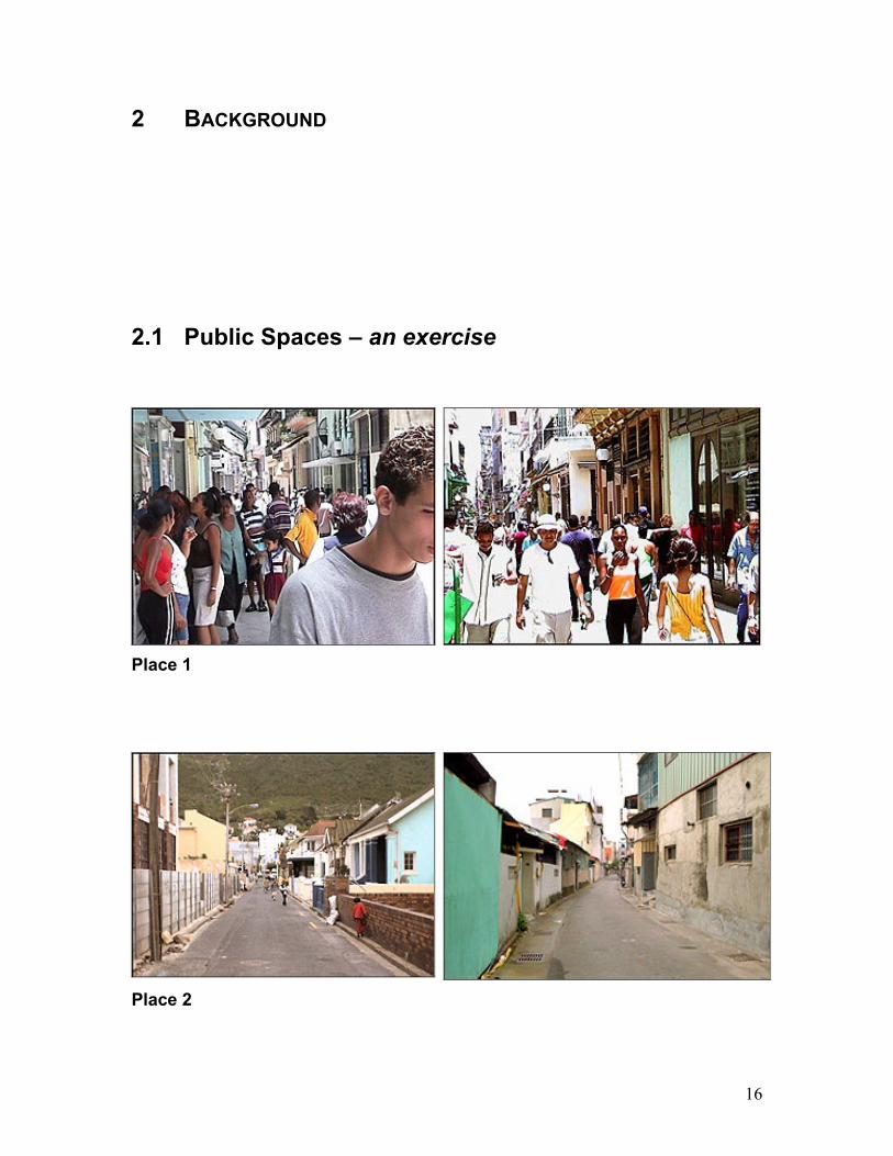
2.1 Public Spaces – an exercise
Place 1
Place 2

17
Take a minute to look at the pictures of the two public spaces on the previous page. What words
would you use to describe each place?
It probably took you only a few seconds to come up with words to describe each one of them.
Perhaps, like me, you might have thought about words such as “vibrant” and “crowded” for place
1 and “empty” and “desolate” for place 2.
But how is this possible? Have you ever been to either one of these places? Do you even know
where these places are located? Probably not. And yet, you were able to quickly form an impression
of these spaces and maybe, even, a notion of how they might be different from each other.
Now take a look at the public spaces below.
Place 1 Place 2 Place 3
What words would you use to describe these spaces? How are they different from one another?
Is one of them vibrant and crowded whereas the other ones are empty and desolate?
It is much more challenging to think about words to describe these spaces because it is harder to
perceive any differences among them. There is nothing that stands out about any of these three
environments to differentiate one from the other. So how does a newcomer start to get a sense of
what each place is like? How does a person form an initial impression of these spaces?
The problem of how to augment online impression formation is one of the main motivations in this
thesis. The work presented here posits that visualization of online social archives can get users
closer to the ease and speed with which people form impressions of real world public spaces –
such as the ones showed on the preceding page.
This thesis presents vast collections of digital communication records in new ways to help users:
o easily get a sense of the scale and social dynamics of the environments they inhabit online o form impressions of one another as they communicate online
o recall and reflect upon the ways in which their long-term online relationships evolve over time
18
To achieve these goals, this thesis is deeply informed by theories and experimental findings in
the fields of sociology, social psychology, and communications studies. By understanding how
people perform some of the above-mentioned activities in the real world, designers are better
equipped to create tools that assist users with these activities online.
This chapter is divided into three main sections:
1. Impression Formation Online: Theoretical Frameworks
Summarizes two of the most influential theories from Communications Studies that
attempt to explain how impression formation happens online and how “cues” play a role
in this phenomenon.
2. Impression Formation Online: Experimental Findings
Reviews experimental findings about how users rely on online cues for impression
formation. Explains how these findings are relevant to visualizations of online archives.
3. Visualizing Time and Change
Reviews some of the most important work in interactive visualizations of temporal data
and digital history and the affordances of these interfaces.
The concepts introduced in this chapter serve as the intellectual foundation for much of the work
produced in this thesis. One of the biggest challenges of building interactive visualizations is
choosing the dimensions of the data that should be visualized. Invariably there are several more
dimensions to the data than can be legibly visualized at once. The findings presented in the next
sections guided much of the data selection for each of the visualization systems in this dissertation.
2.2 Impression Formation Online: Theoretical Frameworks
Impression formation is a key element in interpersonal communication of any kind and it carries
serious consequences to all parties involved in a communicative process. As with any kind of
perception phenomenon, social impression is designed for action: we perceive others in order to
act upon our impressions. Studies have determined that people’s perception of one another
strongly influence various decision processes such as: the choice of political candidate to vote for
(Efran & Patterson, 1974), the choice of employees to promote (Klassen et al, 1993), and
teachers’ evaluations of pupils (Clifford and Walster, 1973) among others.
Therefore, it is important to understand the processes that govern impression formation. In face-
to-face interaction (FtF), physical appearance, vocabulary, grammar, other linguistic markers
(including tone and accent), and nonverbal cues ordinarily influence the ways in which people
initially form impressions of one another. A large body of literature describes how strongly people
rely on nonverbal cues in order to form impressions of others. Burgoon and Hoobler (2002) define
seven classes of nonverbal codes present in interpersonal communication:
1. Kinesis: bodily movements, gestures, facial expressions, posture, gaze, and gait
2. Vocalics or paralanguage: pitch, loudness, tempo, pauses, and inflection

19
3. Physical appearance: clothing, hairstyle, cosmetics, fragrances, adornments
4. Haptics: use of touch, including frequency, intensity, and type of contact
5. Proxemics: use of interpersonal distance and spacing relationships
6. Chronemics: use of time as message system, punctuality, lead time, etc.
7. Artifacts: manipulable objects and environmental features that may convey messages
In Computer-Mediated Communication (CMC), however, users are usually restricted to textual
interactions where most of the cues mentioned above are absent. Thus, since the early
beginnings of CMC, researchers have been interested in investigating whether people are
capable of forming impressions of others online and, if so, what mechanisms they employ to
achieve this task.
As a starting point from which to explore the unknown social world of CMC, communication
researchers in the 80s utilized media richness theory (Daft and Lengel 1986) as a framing
construct. One of the core concepts in media richness is equivocality; the more complex a
message is – for instance, an emotionally arousing, personally involving message is considered
highly complex – the more appropriate it is for richer media. Rich media boast multiplicity of cue
systems (bandwidth), availability of immediate feedback, message personalization, and language
variety (formal v. casual). In comparison, most CMC text-based media are considered relatively lean.
By sticking to the concept of media richness, early studies of CMC concluded that the paucity of
cues in text-based applications severely limited its suitability for social interaction. The so-called
“cues-filtered-out” approaches, assumed that all CMC should be less socially oriented and less
personal than FtF communication. Perhaps even more tellingly, there were significant research
results supporting the view that CMC is more task-oriented in nature (Rice and Love, 1987).
Nevertheless, as more experiments were conducted, evidence that CMC can be highly conducive
to social interaction started to accumulate. It became clear over the years that theorists had to
revise their predictions about CMC media and its fitness for socialization. In the early 90s, two
influential theories emerged in the field of communication studies about how social impression
formation happens in computer-mediated communication: Social Information Processing (SIP)
theory, and Social Identification/Deinvidualization theory (SIDE) theory. By looking beyond the
cues-filtered-out lenses, these theories help us understand how and when CMC users adapt to
the medium and create social presence in text-only environments. These theories also shed light
in our understanding of the ways in which CMC users sometimes experience exaggerated levels
of intimacy, affection, and interpersonal assessments of their partners that exceed what happens
in parallel FTF situations.
20
2.2.1 Social Information Processing (SIP)
SIP is based on principles of social cognition and interpersonal relationship development. “The
model assumes that communicators in CMC, like other communicators, are driven to develop
social relationships. To do so, previously unfamiliar users become acquainted with others by
forming simple impressions through textually conveyed information” (Walther, 1996). Walther
conjectures that the key difference between the process in CMC as opposed to FtF has to do less
with the amount of social information exchanged (as in media richness theory) than with the rate
of social information exchange:
This framework acknowledges that there is less social information per message in
CMC because of the absence of nonverbal cues. It also recognizes the potential for
users to adapt to the linguistic code as the sole channel for relational communication
and refers to a number of verbal strategies in the impression formation and
interpersonal interaction literature known to affect interpersonal attributions.
– Walther 1996
It consequently follows that one-time-only, time-bound CMC groups, like those characteristically
found in early CMC experiments are certain to appear more task-oriented than their FtF
counterparts – meaning that this is not an intrinsic effect of the medium. Furthermore, he points to
the importance, in longitudinal groups, of the anticipation of future interactions.
Finally, Walther addresses the occurrence of hyperbolic messages and excessively affectionate
responses in CMC communication, what he terms hyperpersonal CMC. On the receiver’s end,
there is idealized perception whereas on the sender’s end there is optimized self-presentation.
Walther claims that the most useful theoretical and empirical approach to understanding what
happens on the receiver’s end is the social indentity-deinviduation (SIDE) theory that refers to the
overattribution process that occurs when CMC users, in the absence of prior personal knowledge
about one another, build stereotypical impressions of their partners. On the sender’s side,
Walther refers back to Goffman’s work on presentation of self in social interaction (Goffman
1959). Seeing how senders have a lot of control over self-presentation, first impressions are
highly malleable in CMC.
Combined, these two phenomena create an intensification loop where the feedback between
sender and receiver actually reifies social impressions – a process known as behavioral
confirmation. Walther notes that behavioral confirmation seems to be magnified in minimal-cue
interactions. “Such a process as this may explain how such surprisingly intimate, sometimes
intense, and hyperpersonal interactions take place in CMC.”
In summary, SIP theory assumes the following:
1. Communicators’ social motives induce them to develop impressions and relations despite
hindrances that alternative media – such as CMC – may impose

21
2. Users adapt their efforts to present and acquire social information using whatever cue
systems a medium provides. CMC users, for instance, employ language, content, and
timing to achieve social goals
3. Relational processes take time, and CMC is relatively slower than face-to-face. Thus, if
time is restricted, social development is retarded.
Time is of utmost importance in SIP because it predicts that CMC has a negative impression
effect when users with zero-history interact online for a short period of time. When, on the other
hand, users have more time to interact online, SIP predicts that participants will actively seek and
present social and personal data about each other allowing knowledge to accrue and CMC
partners to construct impressions of each other. In addition, anticipated future interaction with
CMC partners has been shown to affect social information exchange rates; it promotes more
personal questions and self-disclosures online than in FTF first encounters (Tidwell and Walther
2000). Given reduced communication cues and asynchronous communication media in CMC,
Walther discusses the fact that senders have the opportunity of optimizing self-presentation and,
therefore, manipulating others’ impressions of them to a greater extent than what is possible in
FTF interactions.
Note: If rate of information exchange is the essence of SIP theory, it should follow that having
access to a lot of historical data (through visualizations, for instance) means that there is the
potential to significantly affect people’s impressions of one another online.
2.2.2 SIDE
SIDE theory posits that when people interact using visual anonymity, meaning they don’t have the
ability to see one another, they are deinviduated. Under these conditions, any piece of
information conveyed by the context or content of messages being exchanged is subject to
overattribution by receivers. In addition, if people experience a salient group identity rather than a
strong individual identity, these attributions accentuate assumed similarities and group norms.
Social Presence theory was one of the first theoretical frameworks to be applied to
CMC. Originally a theory of teleconferencing, it states that social presence relates to
the communicator’s subjective sense of the salience of an interaction partner and that
this measure derives from the number of cues that a medium transmits. The fewer the
available cues (verbal, aural, visual, etc.) the less the degree of social presence one
experiences when using that medium. Consequently, one might conclude from this
assertion that more cues should always yield a better, richer sense of social presence.
In fact, in CMC, such is not the case. A vast body of communication research literature
that spans from field studies to theory formulation shows that, in mediated interactions,
certain combinations of are more effective than others. Even though high-bandwidth
multimedia certainly offer more communication cues than text-based CMC, research
finds that a high degree of cue exchange is not necessarily more helpful to users than a
moderate level.
– Walther & O’Conaill, 1997

22
2.3 Impression Formation Online: Experimental Results
In addition to developing theories about how interpersonal impression formation happens in CMC,
communication scholars also tested these theories in experimental settings. For the most part,
experiments investigated the impacts that different cues and combinations of cues in
communication tasks had on interpersonal impression formation. This section briefly reviews
some of the most significant results from these experiments. Some of the relevant studies done in
the HCI community are also discussed.
2.3.1 Time
Time is one of the very few nonverbal cues present in text-based CMC and, as such, it is of
special interest to scholars. In communication research, studies of time and its impact in
interpersonal communication processes have a long tradition and are referred to as chronemics:
the study of the temporal dimension of communication, including the way people organize and
react to time.
Time is an important component of the performance of social roles as it is an intrinsic part of our
social interaction. Different cultures use and interpret social temporality in different ways –
people’s promptness, lead time, turn-taking rhythms, etc. Chronemics also affect people’s
perception of intimacy and affection. Because time is a valuable resource in our culture, the way
an individual chooses to allocate time – whom he/she spends time with, for how long – says a lot
about his/her priorities. Thus, depending on the social context, responsiveness and promptness
can be interpreted as urgency, caring or dominance.
In the mid 90s, Walther and Tidwell (1995) tested the impact of time variables in online
impression formation. Their experiment altered the time stamps in replicated email messages in
order to assess two time variables: the time of day a message was sent and the time lag until the
message was replied to. The results from this study revealed significant interactions among the
two time variables and the task-orientation or socioemotional orientation of the email messages.
Users’ perception about communicators’ intimacy/liking and dominance/submissiveness were
affected by the manipulation of the variables. Specifically, social messages sent out at night were
perceived to convey more intimacy and less dominance than the same messages sent out during
the day. In addition, task-oriented messages sent out at night were perceived to convey less
intimacy. Finally, fast replies conveyed less dominance as opposed to slow replies.
More recently, the HCI community has also looked at the importance of time variables and their
impact on impression formation. A study investigated email responsiveness and how the timing of
email responses conveys information (Tyler and Tang 2003). The results show that users
explicitly control email reply timing in order to project a responsive image. The researchers also
found that users utilize “time tools” such as calendars to establish a pacing between themselves
and their communication partners in order to know when to expect reply messages and when
breakdowns have occurred. Other work has looked at how cooperative work implicitly relies on
temporal structures to sustain information management tasks (Reddy and Dourish 2002).
23
2.3.2 Additional Nonverbal Cues
Archives of online communication – newsgroup discussions, chat room logs, etc. – contain, along
with all the exchanged words in a conversation, a wealth of nonverbal behavioral information.
Data such as the frequency with which participants contribute to discussions, which authors
participate in which conversations, etc., can tell a lot about online communities. Researchers from
different disciplines set out to investigate whether and how users make sense of all this
information. Whereas HCI researchers built interfaces to show these data to users,
communication researchers began to study the impact that different combinations of cues and
tasks have on online communicators.
Studies have shown that, in FtF communication, frequency and durations of speech are both
good predictors of a person’s participation and impression development in group communication.
People who participate more often (higher frequency) in group discussions are perceived as
being more competent than people who participate less (Willard and Strodtbeck 1972). Likewise,
people whose responses are longer are also perceived as being more competent and confident
than those with shorter duration responses (Koomen and Sagel 1977). When Liu and colleagues
investigated whether the effects of frequency and duration of messaging in CMC were the same
as those in FtF environments, they found a parallel (Liu et al 2001). Contrary to the FtF studies
cited above, Liu’s experiment was concerned with intensity instead of valence (positive v.
negative) of impressions. The results show that high frequency resulted in higher impression
scores as did longer duration of messages; in other words, people who either participated more
frequently in discussions or whose participation had longer duration left stronger impressions in
the rest of the group than those people who participated less. It would be interesting to test for the
valence of these strong impressions in order to find out whether the relationship found in FtF
situations – where more participation was correlated with more positive impressions – holds true
in CMC also.
In the HCI community, Fiore et al (2001) evaluated behavioral descriptors generated from an
analysis of a large collection of Usenet newsgroup messages. They found that many nonverbal
behavioral metrics, particularly the longevity and frequency of participation, the number of
newsgroups to which authors contribute messages, and the amount they contribute to each
conversation thread, correlate highly with readers’ subjective evaluations of the authors. The
study revealed that authors who were rated by their peers as people with whom they would like to
interact again in the future, could be described as “a poster who participates actively and
regularly in a variety of in-depth conversations, in which he or she responds to other participants
but does not overwhelm the discussion.” From this description, the following metrics appear to be
important for positive impression formation: high frequency of participation, consistency over time,
number of postings to any given conversation, and conversational concentration (quantity of
messages per conversation thread).
On top of supporting Walther’s Social Information Processing Model (Walther 1992), results like
the ones mentioned above help inform visualization work in online communities. By revealing
what kinds of nonverbal cues users pay attention to in online interactions, these experiments
highlight the kinds of data that visualization projects should focus on when trying to make the
social dynamics of online environments more legible to participants.
24
The projects in this thesis look back at the vast archives of social interactions available in online
communities – newsgroup conversation archives, wiki editorial history – for the cues mentioned
above. The frequency with which users have contributed to conversations, how consistent they
have been in the past, which conversation they have participated in; all of these data can be
extracted from community archives. The cues that have proven so crucial to users’ assessments
of one another are integrally preserved in the persistent traces left behind.
2.3.3 The Case for Faces
Whether or not people can see each other in CMC and how that ability impacts impression
formation has always been a big question in communication studies.
Jacobson (1999) looked at how expectations formed online about one’s communication partners
compared to the impression people had of one another once they met face to face. For the most
part, offline experiences did not match online expectations for study participants. Traits such as
talkativeness did not live up to people’s expectations. Several participants remarked that people
were chattier online that in real life. This is not surprising when we observe that online
communities are built on conversation. The fact that pauses and silence are lost in these
environments creates the illusion that people talk to each other non-stop.
Physical appearance was, by far the area in which most discrepancies occurred. People had
imagined their partners to be bigger, smaller, thinner, taller, shorter, with longer hair, with shorter
hair, and prettier than they were in real life.
Jacobson concludes that people form impressions of others online based not only on cues
provided, but also on the conceptual categories and cognitive models people use in interpreting
those cues. He notes that when participants in interaction employ different conceptual
frameworks, different meanings are attributed to the same message. For this reason, he
concludes, it is important that we better understand which cognitive models people in these
environments use.
Walther and colleagues (Walther et at, 2001) explored whether and when participants benefited
from seeing each other’s faces in computer-mediated communication in order to investigate how
the presentation of realistic images compared to idealized virtual perceptions. The study
evaluated the timing of physical image presentations for members of short-term and long-term
online groups. Basically, the authors showed pictures of participants to their partners in groups
where nobody knew one another and in groups with a long history of CMC (but not photos).
The study showed that for virtual partners in new groups, a picture would enhance relational
outcomes relative to unfamiliar partners with no picture. In contrast, CMC partners who had
gotten to know one another online over time experienced less affection and social attraction when
a picture was introduced, compared with long-term CMC partners who never saw each other’s
photos. The study concludes that the greatest affinity occurs in long-term text-based CMC with no
other cues. “The same photographs that help defeat impersonal conditions also dampen
hyperpesonal ones.”
25
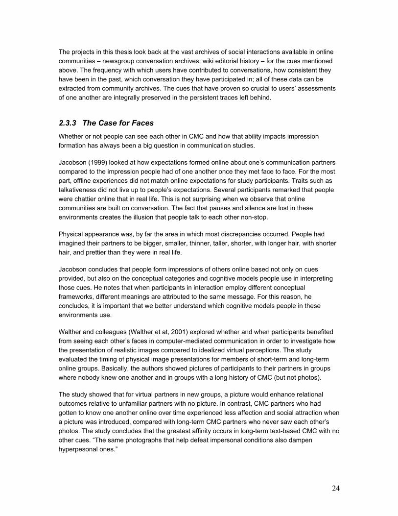
Figure 1: Explanation of Edit Wear and Read Wear’s
scroll-bar-based graphical interface.
Figure 2: Examples of attribute-
mapped scroll bars.
One of the problems with the concluding remarks in this study is the fact that the experiment
does not explore what happens with long-term online groups that have access to members’
photos throughout their entire interaction histories. By manipulating the timing of photograph
presentation but not the duration of exposure to photographs, questions about impression
formation development over time remain unanswered. This is ironic seeing how Walther’s theory
of online impression formation is strongly dependent on interaction over time. The other question
that this study brings up is how the results might compare to introducing visualizations of
members’ past activity. Visualizations are nonverbal, visual cues that function in very different
ways from photographs.
2.4 Visualizing time and change
From information management and retrieval tools to artistic renderings of the past
As seen in the previous sections of this chapter, time and temporal rhythms are arguably some of
the most important cues for impression formation online. As an organizing principle in
visualization systems, time has been extensively used in a wide variety of domains, ranging from
electrical engineering to software debugging and distributed systems (Karam 1994).
Because all projects in this thesis deal with long-term archives of social interaction, the most
obvious and, a lot of times, meaningful organizing principle for the data at hand is time. By
emphasizing the chronological order of events in the archives, the projects inevitably provide
users with a historical perspective on their communities and relationships. Whether dealing with
time or explicitly catering to notions of history, all of the projects discussed in this section turn to
the past in order to reveal new information and connections about the data they present.
The first set of projects to deal with the idea that digital objects could be “richer” (i.e. more
meaningful) if they were to convey their accrued interaction histories to users, was Edit Wear and
Read Wear (Hill et al, 1992; Hill and Hollan, 1993). Hill and Hollan devised an ingenious way of
graphically depicting computation wear in digital objects, they created attribute-mapped scroll

26
bars where wear marks appeared in positions relative to line positions in the document [Figure 1
& Figure 2]. The length of the marks depicted the magnitude of the wear. In Edit Wear, a
document’s authorship history is depicted by modifying the document’s screen representation.
Read Wear refers to the readership history of a document.
These two pioneering “wear and tear” applications have inspired an entire collection of history-
related projects (including Schütte 1998; Wexelblat 1999; Wexelblat and Maes 1999; Derthick,
and Roth 2000). Hill and Hollan’s history-enriched digital objects have also impacted areas of
scholarly inquiry that are not primarily concerned with history. For instance, social navigation
researchers have early on realized the importance of making interaction histories available to
other users (Dourish 1999); thus, the idea of being able to graphically depict usage history means
a significant gain in this field of study. Others have looked at how reconstructing digital history can
save others time and effort (Wexelblat and Maes 1999; Derthick, and Roth 2000). Perhaps the most
ubiquitous application of Hill and Hollan’s history-enriched objects is also the most powerful
testament to the intellectual force of this idea: Microsoft Word, a commercial text-editor, allows
users to graphically keep track of changes made to a text document [Figure 3 & Figure 4]. The
feature allows multiple users working on the same document to easily see what has been deleted,
where changes have been made in the document, what has been added, etc.
Figure 3: Microsoft Word dialog box with interface
choices for keeping track of changes.
Figure 4: Screen shot of document being edited
with change tracking in Miscrosoft Word.
Human action depends on time. The things we do, the events in our life all occur in a certain
order and this order deeply impacts the way we structure our memories. Humans’ temporal
framework for organizing memories has intrigued researchers in a wide variety of disciplines,
from psychology to information retrieval, to HCI. It is not uncommon for people to use past events
as “anchors” when trying to reconstruct memories. Episodic memory – the notion that memories
are organized by episodes – is a well-studied area in psychology scholarship.
27
Figure 5: Screen shot of Time-Machine in the
timeline view mode.
Figure 6: User’s desktop with current time position
highlighted on the left-hand side.
The projects discussed in this section rely on time and episodic memory as organizing principles
for the datasets they present.
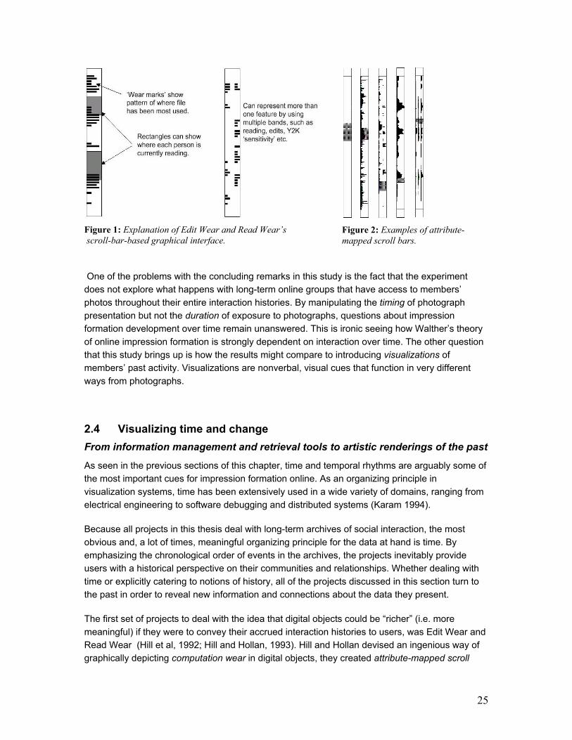
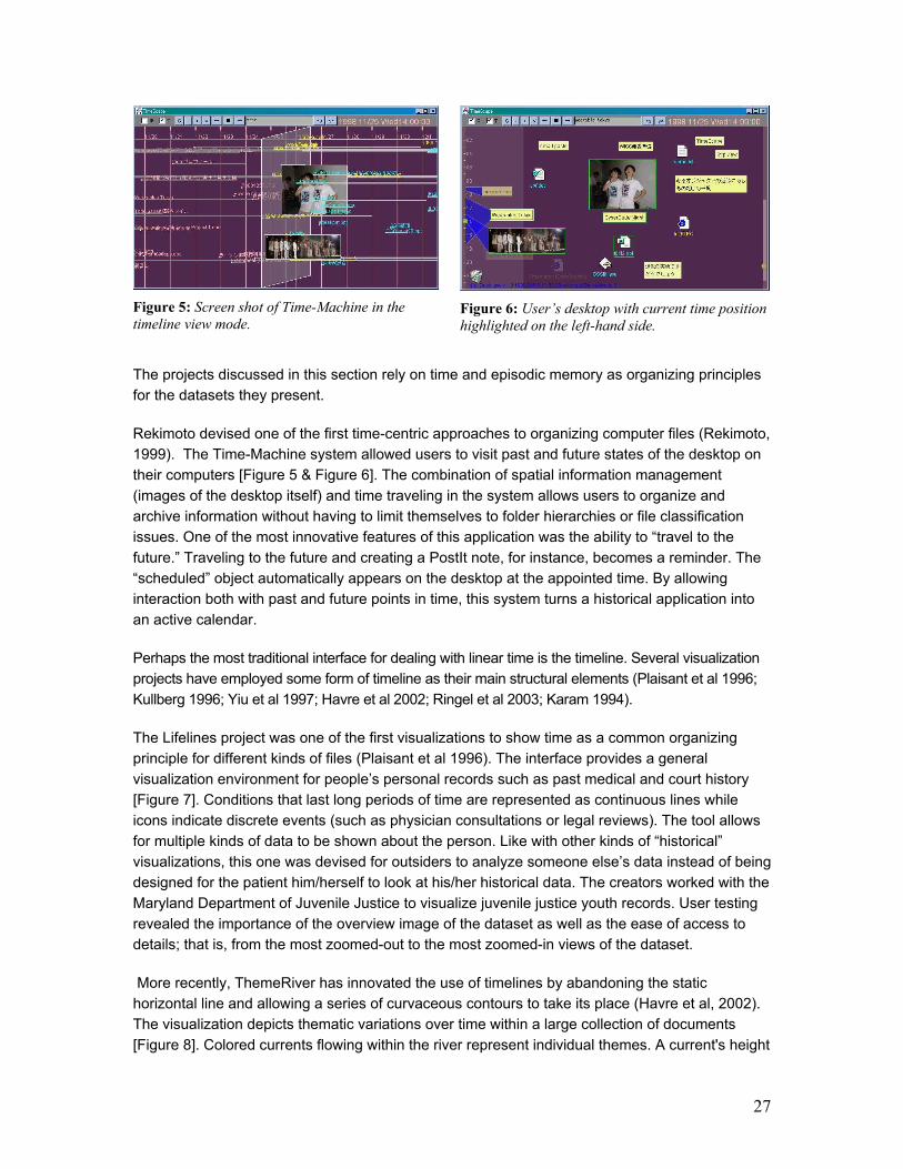
Rekimoto devised one of the first time-centric approaches to organizing computer files (Rekimoto,
1999). The Time-Machine system allowed users to visit past and future states of the desktop on
their computers [Figure 5 & Figure 6]. The combination of spatial information management
(images of the desktop itself) and time traveling in the system allows users to organize and
archive information without having to limit themselves to folder hierarchies or file classification
issues. One of the most innovative features of this application was the ability to “travel to the
future.” Traveling to the future and creating a PostIt note, for instance, becomes a reminder. The
“scheduled” object automatically appears on the desktop at the appointed time. By allowing
interaction both with past and future points in time, this system turns a historical application into
an active calendar.
Perhaps the most traditional interface for dealing with linear time is the timeline. Several visualization
projects have employed some form of timeline as their main structural elements (Plaisant et al 1996;
Kullberg 1996; Yiu et al 1997; Havre et al 2002; Ringel et al 2003; Karam 1994).
The Lifelines project was one of the first visualizations to show time as a common organizing
principle for different kinds of files (Plaisant et al 1996). The interface provides a general
visualization environment for people’s personal records such as past medical and court history
[Figure 7]. Conditions that last long periods of time are represented as continuous lines while
icons indicate discrete events (such as physician consultations or legal reviews). The tool allows
for multiple kinds of data to be shown about the person. Like with other kinds of “historical”
visualizations, this one was devised for outsiders to analyze someone else’s data instead of being
designed for the patient him/herself to look at his/her historical data. The creators worked with the
Maryland Department of Juvenile Justice to visualize juvenile justice youth records. User testing
revealed the importance of the overview image of the dataset as well as the ease of access to
details; that is, from the most zoomed-out to the most zoomed-in views of the dataset.
More recently, ThemeRiver has innovated the use of timelines by abandoning the static
horizontal line and allowing a series of curvaceous contours to take its place (Havre et al, 2002).
The visualization depicts thematic variations over time within a large collection of documents
[Figure 8]. Colored currents flowing within the river represent individual themes. A current's height
28
at any given moment indicates decreases or increases in the strength of the individual theme.
The focus on temporal thematic change within a context framework allows a user to discern
patterns that suggest relationships or trends. For example, the sudden change of thematic
strength following an external event may indicate a causal relationship. For instance, the
unfortunate tsunami disaster in December of 2004 caused the world media to start mentioning
tsunamis, earthquakes, Sri Lanka, and other related words to a much higher degree than usual;
such changes would be clearly reflected in ThemeRiver. On top of being informative, this visual
solution is also beautiful to look at. The metaphor of a flowing river imparts expressiveness to the
visualization in the way it suggests the ever-changing course of events in nature and history.
Figure 7: Screen shot of Lifelines interface
showing a patient’s medical history. Figure 8: ThemeRiver interface.
Media artists have also started to experiment with temporal arrangements of digital documents.
Because artists are not restricted by HCI researchers’ concerns with information retrieval and
management, their explorations often result in refreshingly novel interfaces that are highly
expressive of the power of time and history.
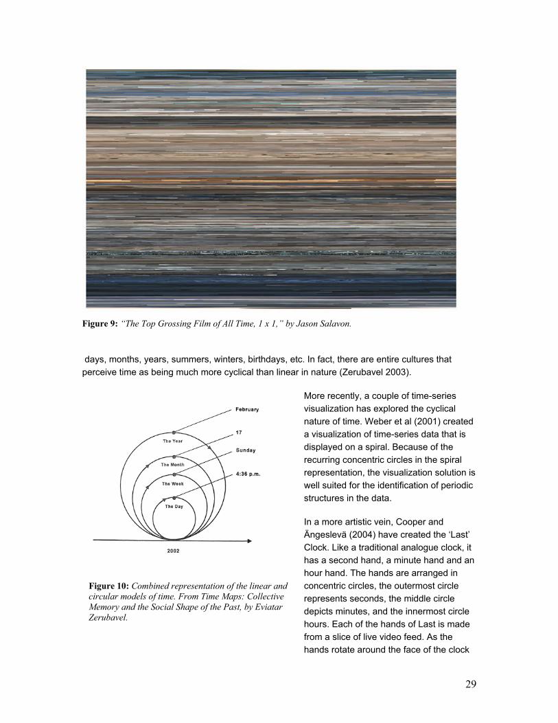
Jason Salavon created a time-based “portrait” of a movie (Salavon 2000). He digitized “Titanic”
(one of the top grossing movies of all time), broke it up into its constituent frames, and averaged
each one of them to a single colored pixel [Figure 9]. Thus, a dimly lit interior frame might
average to a single dark “average” color, such as charcoal gray or dark brown. Or a wide exterior
shot with a lot of sky might average to a single light blue-gray color. “Replacing each frame with
its single color representation, the material is reformatted as a photograph mirroring the narrative
sequence of the film. Reading from left-to-right and top-to-bottom the narrative's visual rhythm is
laid out in pure color” (Salavon, 2000).
Salavon’s wash of colored pixels is an unconventional take on more traditional time-based
interfaces. By restricting each frame of the movie to a single pixel, the sequential disposition of
colored dots becomes a timeline in itself. However, instead of operating as a simple time marker,
a structural frame in which to hang past events, here the timeline is the story.
All visualizations discussed so far show time always moving “forward” as if it were a straight line.
It makes sense that all of these are called timelines. But people do not always experience time in
a uniquely linear manner. The longer we live the more our lives seem to be filled with cycles:
29
Figure 9: “The Top Grossing Film of All Time, 1 x 1,” by Jason Salavon.
days, months, years, summers, winters, birthdays, etc. In fact, there are entire cultures that
perceive time as being much more cyclical than linear in nature (Zerubavel 2003).
More recently, a couple of time-series
visualization has explored the cyclical
nature of time. Weber et al (2001) created
a visualization of time-series data that is
displayed on a spiral. Because of the
recurring concentric circles in the spiral
representation, the visualization solution is
well suited for the identification of periodic
structures in the data.
In a more artistic vein, Cooper and
Ängeslevä (2004) have created the ‘Last’
Clock. Like a traditional analogue clock, it
has a second hand, a minute hand and an
hour hand. The hands are arranged in
concentric circles, the outermost circle
represents seconds, the middle circle
depicts minutes, and the innermost circle
hours. Each of the hands of Last is made
from a slice of live video feed. As the
hands rotate around the face of the clock
Figure 10: Combined representation of the linear and
circular models of time. From Time Maps: Collective
Memory and the Social Shape of the Past, by Eviatar
Zerubavel.

30
they leave a trace of what has been happening in front of the camera [Figure 11]. Once Last has
been running for 12 hours, you end up with a readable mandala of archived time.
Figure 11: The ‘Last’ Clock. The clock on the left had its camera pointed at the sky in London. The middle
clock had a video feed of BBC 2 showing golf. The clock on the right shows another view of London.
Finally, Arc Diagrams (Wattenberg 2002) is an attractive mix of linear and cyclical representations
of event series. Even though the visualization was originally designed to show complex patterns
of repetition in string data, it can very easily be applied to various kinds of temporal data as
illustrated in the image below of a song and its repeating sections [Figure 12]. It is interesting to
note how the designer has relied on circular shapes to represent cyclical events when he could
just as easily have connected the recurring portions of the song with other geometric shapes. The
choice, however, in addition to making the visualization aesthetically pleasing, seems like a
testament to primitive notions of a cyclical, circular time dimension.
Figure 12: Arc Diagram of “Clementine.” The image shows the simplicity and repetitiveness of the folk
song.

31

32
3 COLLECTIVE MEMORIES
The Usenet is a quintessential Internet social phenomenon: it is huge, global,
anarchic and rapidly growing. It is also mostly invisible. Although it is the
largest example of a conferencing or discussion group system, the tools
generally available to access it only display leaves and branches - chains of
messages and responses. None present the trees and forest. With hundreds of
thousands of new messages every day, it is impossible to try to read them all
to get a sense of the entire place. As a result, an overview of activity in the
Usenet has been difficult to assemble and many basic questions about its size,
shape, structure and dynamics have gone unanswered. How big is the
Usenet? How many people post? Where are they from? When and where do
they post? How do groups vary from one another and over time? How many
different kinds of groups are there? How many groups successfully thrive and
how many die? What do the survivors have that the others lack? How do
different social cyberspaces connect and fit together and form a larger ecology?
– Smith, 1999
Sociologist Marc Smith made this observation about Usenet newsgroups in 1999 but he could
just as easily be speaking about most online social environments today, from blog sites to
discussion forums. The social fabric of online environments continues to be, for the most part,
hard to see.
Presently, however, the importance of making social characteristics of online environments
legible to users has ceased to be a researcher’s “curiosity” and has become, instead, an
established fact. Evidence from experimental and ethnographic studies shows that users strongly
rely on social cues to make better sense of mediated communication spaces (Jacobson 1999; Liu
et al 2001; Reddy and Dourish 2002; Spears and Lea 1992; Tyler and Tang 2003; Walther 1992,
1996; Walther and Tidwell 1995; Walther et al 2001). For the most part, though, users have to
rely on their memories of past interactions to piece together a “mental map” of cues that guides
them in future interactions with other members of a group (Fiore et al 2001). This reliance on
memory and few tangible cues can cause distorted views of social dynamics to emerge in online
environments. An example of such misreadings are bloggers’ perceptions of their audiences –
based mostly on comments left by a few active readers and trackbacks, blog authors make
imprecise assessments of readership that have serious implications for privacy (Viégas 2005).

33
In the very few online spaces where metrics of social behavior are available, it has been shown that
users take advantage of these gauges to engage in a series of constructive social behaviors
(Burkhalter and Smith 2004; Kelly et al 2002). So far, these social metrics have always taken the form
of tables of numbers and statistics, which can be problematic when the volume of metrics is large.
In this chapter I present a series of projects that transform online social metrics into visual
representations of community activity. The chapter is divided into two sections: (1) persistent
archives and (2) add-on persistence.
Persistent Archives describes two projects that deal with different kinds of online spaces that
keep permanent archives of interactions: Usenet newsgroups and wiki sites.
The first project visualizes authors’ activities in Usenet newsgroups. Whereas regular Usenet
news browsers focus on messages and thread structures, disregarding valuable information
about the authors of messages, the visualizations presented here highlight the participants of the
various discussions and their activity history. Newsgroup Crowds graphically represents the entire
population of authors in a particular newsgroup. AuthorLines visualizes a particular author’s
posting activity across all newsgroups over a period of one year, revealing temporal patterns of
thread initiation and reply that can broadly characterize the roles authors play in Usenet.
Whereas original online communities – such as Usenet newsgroups – revolved around
conversation, newer Web-based communities have become more complex, spawning a range of
possible communal activities and the creation of collective artifacts. In these communities,
conversations represent but one aspect of social activity. Wiki sites for instance, where every
visitor has the power to become an editor, focus on the construction of communal web sites. The
second project presented in this chapter, History Flow, is a visualization of editing history of
pages in wiki sites. By visualizing the editing evolution of these pages, History Flow, reveals
several patterns of contribution and conflict management in these communities. Analysis of a
particular wiki site, Wikipedia, exposed the relevance of authorship, the value of community
surveillance in ameliorating antisocial behavior, and how authors with competing perspectives
negotiate their differences.
Not all online social spaces retain persistent archives of their users’ interactions; in fact, most
synchronous environments have no history. This variety of spaces allows users to engage in
different kinds of behavior in each one of these settings. For instance, a lot of conversations in
chat rooms are meant to be ephemeral. A lot of times, knowing that interactions will not be
permanently logged in a chat server allows users to engage in more carefree conversation or feel
more comfortable to exchange sensitive information. At the same time, however, this does not
mean that places where synchronous interactions take place cannot have any sort of persistence
whatsoever. One of the main problems with online spaces that are history free is the fact that,
whenever there are no users around, they look devoid of life.
The Add-on Persistence section introduces two projects where persistence was added to spaces
that were originally trace free: a graphical chatroom and a museum gallery. These projects add
visible traces of people’s presence in the spaces without logging the contents of their interactions.

34
Figure 13: Screen shot of Netscan showing a list
of Usenet newsgroups and their respective social
metrics.
Figure 14: Screen shot of Conversation Map. The top
left panel shows the social network structure of the
newsgroup, the top right panel shows the semantic
network of words and the bottom panel shows
thumbnails of conversational threads.
Observation and experimental results show that this level of persistence in these spaces affects
users’ behavior in positive ways. Users in the chatroom found ways to utilize the activity traces as
an extra channel for expressive communication whereas visitor to the museum viewed the history
visualization as a souvenir for posterity.
3.1 Related Work
A few HCI projects have started to investigate what happens when the behavioral information
contained in social archives is made more easily accessible to the online communities that created
them. Behavioral overviews can be very helpful to online communities because they allow members
to see a “reflection” of what their community is like as a whole and how they fit in it.
Projects that attempt to extract meaning from online social archives span a wide gamut of
objectives that range from serving as statistical benchmarks to immersive environments that are
supposed to be inhabited by community members. Moreover, some of these projects are geared
towards small groups while others address massively large communities. In this section I discuss
some of these projects and the range of interfaces they employ to convey their data.
Kelly et al (2002) describe two music-oriented educational web sites that collect user data from
site activity and feed it back to the user community. On top of recording temporal data about
when pages are visited, these sites also collect voluntarily submitted information such as user
demographics, rating of music lessons, etc. The sites attempt to increase social consciousness
and encourage user participation by feeding these data back to the community. With no financial
resources available to procure paid content, these two sites are dependent upon their users to
make valuable contributions to the community. Thus, community data are used to promote user
participation by informing contributors that their postings are appreciated by the rest of the
community. The study has found that the design and development of data collection and
feedback methods can solve critical challenges in online social conduct such as lack of
participation and bad behavior.

35
One of the earliest projects to extract social data from
Usenet newsgroups’ archives is called Netscan and it
has been continuously running since 1998 (Smith 1999).
Netscan does not employ visualization as its main
method of data presentation – even though a few
visualization components have been developed since its
inception (Smith and Fiore, 2001), the focus continues to
be on the tables of metrics [Figure 13]. In fact, its tabular
interface gives it a very different tone from the other
projects discussed in this section. Netscan’s visual
presentation makes users rely a lot more on their
analytical skills – reading tables of figures – as opposed
to giving users any sort of immediate gestalt about these
communities. By keeping a statistical interface, Netscan
makes it hard for users to see, at a glance, how different
newsgroups vary from one another. A recent report of
how users utilize the social metrics present on the
Netscan site reveals a series of applications of the data:
from “typification” of others (where users put others into
“context” for more effective future interactions) and spotting
of group “regulars,” to intra-group assessment and inter-
group comparisons (Burkhalter and Smith 2004).
Conversation Map is a project that extracts social
information from the conversational archives of large-
scale online communities such as the ones found on
Usenet newsgroups (Sack, 2000). The system computes
a set of social networks detailing who has been talking to
whom and who has been citing whom in the newsgroup.
The other main feature in Conversation Map is its
visualization of the centrality degree of users in the
newsgroup where the social network of each newsgroup
allows us to understand which users are more central
than others to that group’s discussions. Remarkable
patterns emerge that are related to people’s interactions
in the conversational space, giving participants new ways
of making sense of their community [Figure 14].
In the Sociable Media Group, some early work has also
visualized archived conversations of online communities
[Figure 15]. PeopleGarden visualizes message boards in
terms of their authors’ posting activity (Xiong and
Donath, 1999). Each flower in PeopleGarden represents
a user in the conversational space and its petals
represent his/her postings. PeopleGarden also shows
the amount of replies to a user’s post by displaying pistil-
Figure 15: Projects from the Sociable
Media Group. At the top, People
Garden; a visualization of participants
in a message board. In the center, the
original Loom project showing a
social newsgroup with a highlighted
conversation thread. At the bottom, a
screen shot of Loom 2, showing
communication clusters within a
Usenet newsgroup.

36
like circles on top of a petal to denote responses. Even though PeopleGarden’s focus was not
Usenet newsgroups, the fact that it strived to reify a conversational space in terms of its people
makes it conceptually close to some of the work presented in this chapter.
The original Loom project focused on visualizing social patterns within Usenet newsgroups by
mining conversational archives (Donath et al 1999). It highlighted saliencies such as rowdy,
vociferous users as well as the number of participants in different threads over time. It also
visualized the difference between initiated posts and replies. Although its focus was not on the
authors per se, Loom managed to uncover interesting author dynamics found in newsgroups – for
instance the marked difference between the average number of participants per thread in
technical versus social newsgroups.
Figure 16: The Babble system from
IBM. The top middle panel shows all
logged in users, with more active ones
being drawn to the center of the circle.
Figure 17: Screen shot of Babble’s timeline.
Combining both synchronous and asynchronous conversations, the Babble system developed at
IBM is another project that attempts to provide perceptually-based social cues to its users
(Erickson et al, 1999). The idea is to create and interface for interpersonal interaction that
provides awareness and accountability; a system that allows users to carry out coherent
discussions and to have meaningful social interactions [Figure 16 & Figure 17]. One of the
motivations behind Babble’s user interface design is to emphasize translucency instead of
transparency to reflect the vital tension between privacy and visibility. Thus, users are able to see
“who’s around” and who is currently active while still being able to engage in private conversations if
necessary. In Babble, the interface that shows the relative activity level of users is called a “social
proxy,” which indicates whether others are speaking or just listening to the conversation.
37
Persistent Archives
3.2. Newsgroup Crowds and AuthorLines: Visualizing authors in Usenet newsgroups1
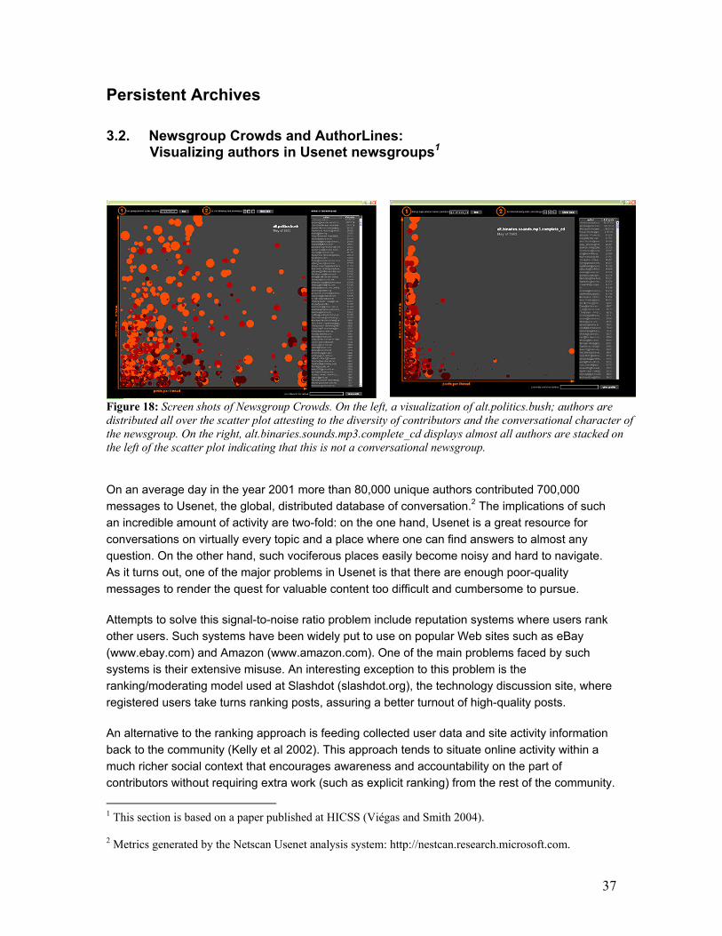
Figure 18: Screen shots of Newsgroup Crowds. On the left, a visualization of alt.politics.bush; authors are
distributed all over the scatter plot attesting to the diversity of contributors and the conversational character of
the newsgroup. On the right, alt.binaries.sounds.mp3.complete_cd displays almost all authors are stacked on
the left of the scatter plot indicating that this is not a conversational newsgroup.
On an average day in the year 2001 more than 80,000 unique authors contributed 700,000
messages to Usenet, the global, distributed database of conversation.2 The implications of such
an incredible amount of activity are two-fold: on the one hand, Usenet is a great resource for
conversations on virtually every topic and a place where one can find answers to almost any
question. On the other hand, such vociferous places easily become noisy and hard to navigate.
As it turns out, one of the major problems in Usenet is that there are enough poor-quality
messages to render the quest for valuable content too difficult and cumbersome to pursue.
Attempts to solve this signal-to-noise ratio problem include reputation systems where users rank
other users. Such systems have been widely put to use on popular Web sites such as eBay
(www.ebay.com) and Amazon (www.amazon.com). One of the main problems faced by such
systems is their extensive misuse. An interesting exception to this problem is the
ranking/moderating model used at Slashdot (slashdot.org), the technology discussion site, where
registered users take turns ranking posts, assuring a better turnout of high-quality posts.
An alternative to the ranking approach is feeding collected user data and site activity information
back to the community (Kelly et al 2002). This approach tends to situate online activity within a
much richer social context that encourages awareness and accountability on the part of
contributors without requiring extra work (such as explicit ranking) from the rest of the community.
1 This section is based on a paper published at HICSS (Viégas and Smith 2004). 2 Metrics generated by the Netscan Usenet analysis system: http://nestcan.research.microsoft.com.

38
It has also been suggested that metrics such as the longevity and frequency of participation, the
number of newsgroups to which authors contribute messages, and the average size of the
threads to which authors tend to contribute, strongly correlate to users’ subjective assessment of
the qualities and value of different authors in newsgroups (Fiore et al 2001). This indicates that
newsgroup users already rely on their personal knowledge of others’ behavior in online
environments to guide their choices of who to interact with and who to ignore. It seems desirable,
therefore, that we leverage the evaluation activities performed by users and design tools that
make these metrics more explicit and accessible.
Figure 19: Visualization of talk.politics.usa,
showing a lack of consistent contributors (all
circles are at the bottom of the scatter plot) or
recent contributions (there are no bright orange
circles).
Figure 20: Author with highlighted “information
box” next to her circle; circles staked to the right of
the interface reveal the highly conversationally
concentrated behavior of several authors in this
newsgroup: talk.politics.libertarian.
Most news browsing interfaces, however, display minimal, if any, information about the authors of
messages. When reading a post, users get no sense of the author’s history; how active they are
in the particular newsgroup, how long they have contributed to the community, in what other
conversations they have engaged in the past, etc. Instead, current systems for newsgroup
browsing focus on the message unit and the message structure of conversational threads;
thereby forcing users to pay attention to the organization of conversations instead of their social
significance.
3.2.1 Data Source
The Netscan (Smith 1999) project data mines an on-going collection of Usenet newsgroups and
creates aggregated meta-data for supporting sociological studies of these spaces. The system
generates and displays detailed metrics about the activity of each Usenet newsgroup, author, and
conversation thread. Profiles include the list of newsgroups to which each author has contributed,
a list of the threads in which they have participated in each newsgroup, how much he/she has
contributed to each thread, and whether he/she initiated any of the threads.
Newsgroup Crowds and AuthorLines build on the metrics created by the Netscan system.

39
One of the limitations in Netscan’s user interface is that all of the data are displayed as endless
tables of numbers. This format makes it hard for users to quickly grasp overall patterns and
outlying values in the data. The visualizations presented here make these metrics more
accessible to end users who, unlike researchers, might not be interested in painstakingly
evaluating the tabular presentation of social metrics but who can profit extensively from
expressive presentations of this information when browsing newsgroups.
3.2.2 Newsgroup Crowds
Newsgroup Crowds [Figure 18] is a graphical interface that shows the activity of participants in a
given newsgroup over a specific period of time. The visualization is a scatter plot of all authors
who were active (i.e. posted messages) in the chosen newsgroup during the month being
visualized. Each author is represented by a circle whose placement is determined by two axes:
number of days an author has been active during the chosen month – vertical axis – and the
author’s average number of posts per thread in the newsgroup – horizontal axis. The aim is to
convey, at a glance, how densely inhabited, active and conversational a given newsgroup is. The
visualization also makes other patterns explicit such as which authors are consistent contributors,
and the color of circles represents how recently authors have been active in the newsgroup and
their overall posting activity in Usenet as a whole. Newsgroup Crowds contains a table where the
email addresses of all authors are displayed. The table displays, next to each address, the
number of posts each author has contributed to Usenet newsgroups overall. Users can click on
an address and the corresponding author circle is highlighted in the visualization panel. Users
may also click directly on a circle in the visualization panel to see it highlighted. Whenever an
author circle is highlighted, a small, semi-transparent information window is displayed next to the
chosen circle containing more detailed information about the author [Figure 20 & Figure 22]:
(a) author’s email address
(b) author’s number of posts during the chosen month in the newsgroup being visualized,
(c) author’s total number of posts ever in all of Usenet
(d) first day this author was seen in this newsgroup
(e) last day this author was seen in this newsgroup
(f) author’s “top five” newsgroups (newsgroups to which the author posts the most)
This information window transforms the author’s generic circle into an individualized marker. The
“top five” newsgroups, for instance, help us understand what kinds of topics/subjects are of
interest to this person. They also indicate how focused on a specific topic the author might be; for
example, if author A’s top five newsgroups all start with “microsoft.public.vb…” we might infer that
author A is highly interested in Visual Basic. If, on the other hand, author B’s top five newsgroups
range from political to philosophical and religious topics, we get the sense that this person has a
more varied range of interests than author A. Moreover, clicking on various authors in the same
newsgroups allows users to get a sense of how tightly-knit the community is.
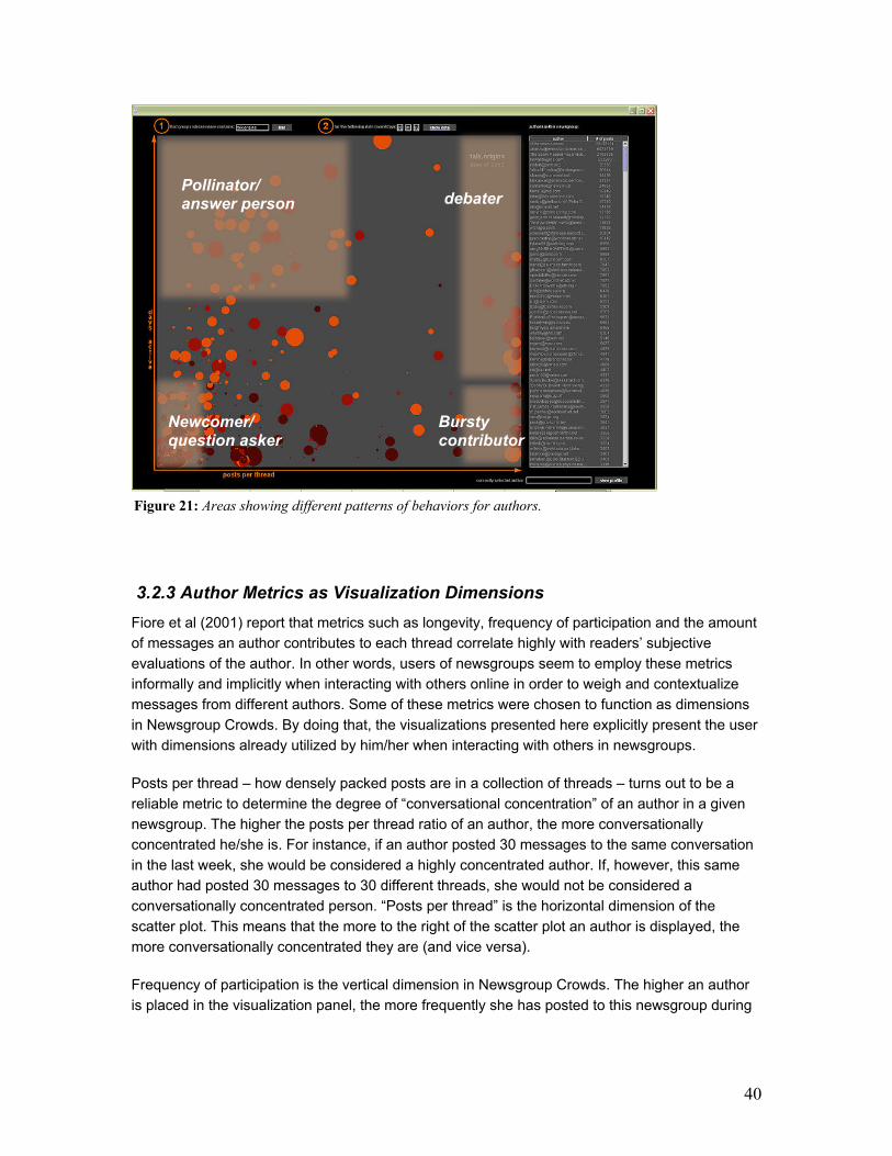
40
3.2.3 Author Metrics as Visualization Dimensions
Fiore et al (2001) report that metrics such as longevity, frequency of participation and the amount
of messages an author contributes to each thread correlate highly with readers’ subjective
evaluations of the author. In other words, users of newsgroups seem to employ these metrics
informally and implicitly when interacting with others online in order to weigh and contextualize
messages from different authors. Some of these metrics were chosen to function as dimensions
in Newsgroup Crowds. By doing that, the visualizations presented here explicitly present the user
with dimensions already utilized by him/her when interacting with others in newsgroups.
Posts per thread – how densely packed posts are in a collection of threads – turns out to be a
reliable metric to determine the degree of “conversational concentration” of an author in a given
newsgroup. The higher the posts per thread ratio of an author, the more conversationally
concentrated he/she is. For instance, if an author posted 30 messages to the same conversation
in the last week, she would be considered a highly concentrated author. If, however, this same
author had posted 30 messages to 30 different threads, she would not be considered a
conversationally concentrated person. “Posts per thread” is the horizontal dimension of the
scatter plot. This means that the more to the right of the scatter plot an author is displayed, the
more conversationally concentrated they are (and vice versa).
Frequency of participation is the vertical dimension in Newsgroup Crowds. The higher an author
is placed in the visualization panel, the more frequently she has posted to this newsgroup during
Pollinator/ answer person
Newcomer/ question asker
debater
Bursty contributor
Figure 21: Areas showing different patterns of behaviors for authors.

41
the month being visualized. Authors displayed at the very top of the scatter plot have posted to
the newsgroup every single day of the month.
These two dimensions cause certain areas of interest to emerge from the distribution of authors
within newsgroups. Generally speaking, there are four areas that turn out to be good descriptors
of different patterns of behaviors for authors [Figure 21]:
- Answer person or “Pollinator”: high number of days active, low posts per thread ratio
- Debater: moderate to high number of days active, very high posts per thread ratio
- “Bursty” contributors: low number of days active, moderate to high posts per thread ratio
- Newcomers and question askers: very low number of days active, low posts per thread
ratio – in every newsgroup we analyzed this has always been the most densely populated
area
The size of each author’s circle is determined
by the amount of posts this person has
contributed to Usenet as a whole –
irrespective of newsgroup. This means that
authors who have been consistently active for
several years in the Usenet space, are shown
as big circles whereas newcomers are shown
as small dots. This is an interesting piece of
information in situations where “experts” drop
in a newsgroup for the first time; it may be their
first time in this community, but their circle size
shows that they have obviously been around
Usenet for a long time. It is also interesting to
note when an author has a small dot that shows up fairly consistently (i.e. high in the vertical axis) in
a given newsgroup; this could mean that this newsgroup is a core community for the author.
The color of each author’s circles reflects how recently this person has posted to this newsgroup: the
brighter the circle, the more recent the posting activity. This metric makes highly active newsgroups
[Figure 18] look starkly different from more stale ones [Figure 19].
Finally, there is a “View Profile” button and text field on the lower right corner of the Newsgroup
Crowds visualization. This is where users choose to view a more highly detailed profile of a specific
author.
Figure 22: Detail of semi-transparent author
information box with data points about this author.

42
Figure 23: AuthorLines visualization of an author that starts about as many threads as the ones they respond to.
This author has been active for practically every single week of the year with the most amount of activity
happening towards the end of the year.
3.2.4 Authorlines
After displaying authors within the context of a specific newsgroup and providing users with some
information about each one of them, I decided to focus on a single author and get a much deeper
understanding of this person’s posting activity over time.
AuthorLines functions very much like a histogram showing intensity of posting activity over time
[Figure 23]. It is a visualization of an author’s posting behavior across newsgroups over an entire
year. It shows a horizontal timeline with vertical monthly dividers. Columns of circles represent
weekly activity: each circle stands for a conversation thread to which the author has contributed
during that week. In other words, a column of 20 circles means that the author has contributed to
20 different conversations during that week. The size of the circle represents the number of
messages contributed by the author to that thread; the more messages the author posted, the
bigger the circle is. Whenever a circle gets too big to fit in the space allocated for a week it
becomes semi-transparent so as not to obscure other circles around it.
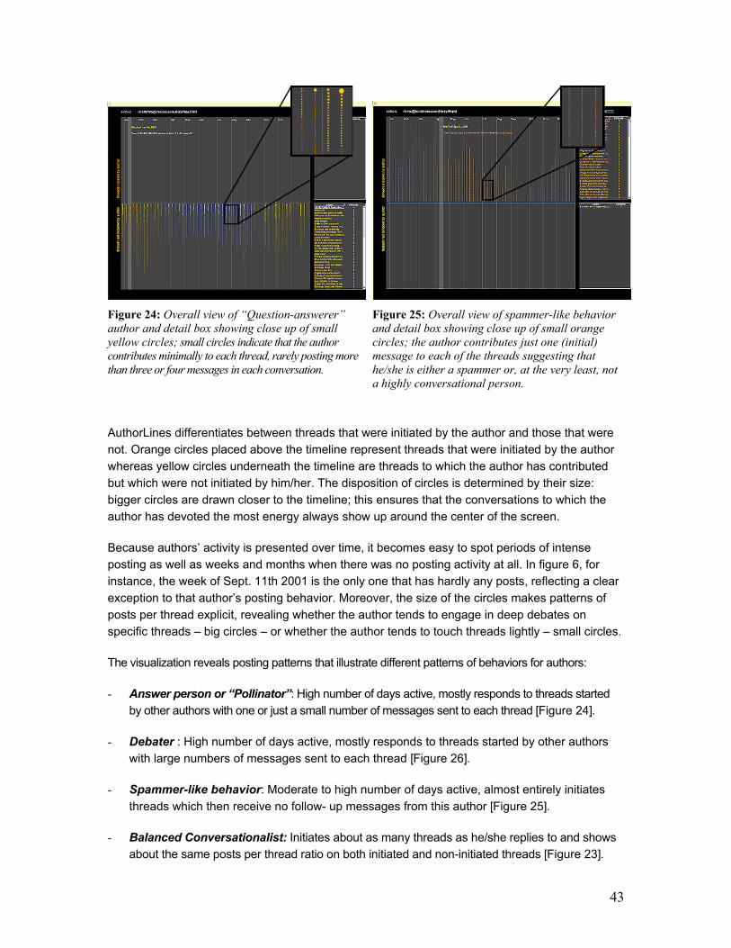
43
Figure 24: Overall view of “Question-answerer”
author and detail box showing close up of small
yellow circles; small circles indicate that the author
contributes minimally to each thread, rarely posting more
than three or four messages in each conversation.
Figure 25: Overall view of spammer-like behavior
and detail box showing close up of small orange
circles; the author contributes just one (initial)
message to each of the threads suggesting that
he/she is either a spammer or, at the very least, not
a highly conversational person.
AuthorLines differentiates between threads that were initiated by the author and those that were
not. Orange circles placed above the timeline represent threads that were initiated by the author
whereas yellow circles underneath the timeline are threads to which the author has contributed
but which were not initiated by him/her. The disposition of circles is determined by their size:
bigger circles are drawn closer to the timeline; this ensures that the conversations to which the
author has devoted the most energy always show up around the center of the screen.
Because authors’ activity is presented over time, it becomes easy to spot periods of intense
posting as well as weeks and months when there was no posting activity at all. In figure 6, for
instance, the week of Sept. 11th 2001 is the only one that has hardly any posts, reflecting a clear
exception to that author’s posting behavior. Moreover, the size of the circles makes patterns of
posts per thread explicit, revealing whether the author tends to engage in deep debates on
specific threads – big circles – or whether the author tends to touch threads lightly – small circles.
The visualization reveals posting patterns that illustrate different patterns of behaviors for authors:
- Answer person or “Pollinator”: High number of days active, mostly responds to threads started
by other authors with one or just a small number of messages sent to each thread [Figure 24].
- Debater : High number of days active, mostly responds to threads started by other authors
with large numbers of messages sent to each thread [Figure 26].
- Spammer-like behavior: Moderate to high number of days active, almost entirely initiates
threads which then receive no follow- up messages from this author [Figure 25].
- Balanced Conversationalist: Initiates about as many threads as he/she replies to and shows
about the same posts per thread ratio on both initiated and non-initiated threads [Figure 23].
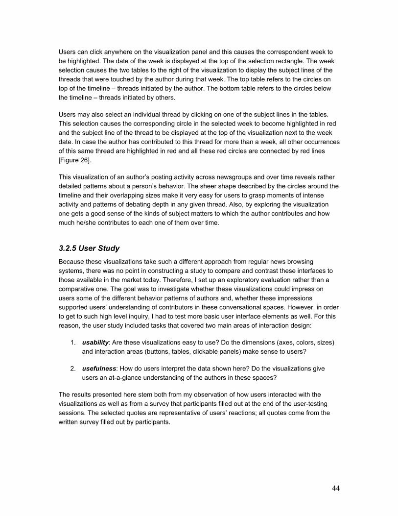
44
Users can click anywhere on the visualization panel and this causes the correspondent week to
be highlighted. The date of the week is displayed at the top of the selection rectangle. The week
selection causes the two tables to the right of the visualization to display the subject lines of the
threads that were touched by the author during that week. The top table refers to the circles on
top of the timeline – threads initiated by the author. The bottom table refers to the circles below
the timeline – threads initiated by others.
Users may also select an individual thread by clicking on one of the subject lines in the tables.
This selection causes the corresponding circle in the selected week to become highlighted in red
and the subject line of the thread to be displayed at the top of the visualization next to the week
date. In case the author has contributed to this thread for more than a week, all other occurrences
of this same thread are highlighted in red and all these red circles are connected by red lines
[Figure 26].
This visualization of an author’s posting activity across newsgroups and over time reveals rather
detailed patterns about a person’s behavior. The sheer shape described by the circles around the
timeline and their overlapping sizes make it very easy for users to grasp moments of intense
activity and patterns of debating depth in any given thread. Also, by exploring the visualization
one gets a good sense of the kinds of subject matters to which the author contributes and how
much he/she contributes to each one of them over time.
3.2.5 User Study
Because these visualizations take such a different approach from regular news browsing
systems, there was no point in constructing a study to compare and contrast these interfaces to
those available in the market today. Therefore, I set up an exploratory evaluation rather than a
comparative one. The goal was to investigate whether these visualizations could impress on
users some of the different behavior patterns of authors and, whether these impressions
supported users’ understanding of contributors in these conversational spaces. However, in order
to get to such high level inquiry, I had to test more basic user interface elements as well. For this
reason, the user study included tasks that covered two main areas of interaction design:
1. usability: Are these visualizations easy to use? Do the dimensions (axes, colors, sizes)
and interaction areas (buttons, tables, clickable panels) make sense to users?
2. usefulness: How do users interpret the data shown here? Do the visualizations give
users an at-a-glance understanding of the authors in these spaces?
The results presented here stem both from my observation of how users interacted with the
visualizations as well as from a survey that participants filled out at the end of the user-testing
sessions. The selected quotes are representative of users’ reactions; all quotes come from the
written survey filled out by participants.
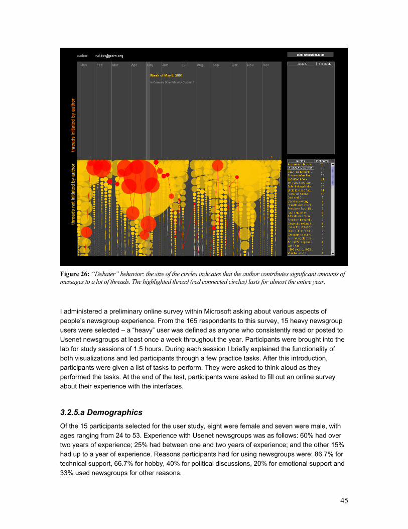
45
Figure 26: “Debater” behavior: the size of the circles indicates that the author contributes significant amounts of
messages to a lot of threads. The highlighted thread (red connected circles) lasts for almost the entire year.
I administered a preliminary online survey within Microsoft asking about various aspects of
people’s newsgroup experience. From the 165 respondents to this survey, 15 heavy newsgroup
users were selected – a “heavy” user was defined as anyone who consistently read or posted to
Usenet newsgroups at least once a week throughout the year. Participants were brought into the
lab for study sessions of 1.5 hours. During each session I briefly explained the functionality of
both visualizations and led participants through a few practice tasks. After this introduction,
participants were given a list of tasks to perform. They were asked to think aloud as they
performed the tasks. At the end of the test, participants were asked to fill out an online survey
about their experience with the interfaces.
3.2.5.a Demographics
Of the 15 participants selected for the user study, eight were female and seven were male, with
ages ranging from 24 to 53. Experience with Usenet newsgroups was as follows: 60% had over
two years of experience; 25% had between one and two years of experience; and the other 15%
had up to a year of experience. Reasons participants had for using newsgroups were: 86.7% for
technical support, 66.7% for hobby, 40% for political discussions, 20% for emotional support and
33% used newsgroups for other reasons.
46
3.2.5.b Procedure
Newsgroup Crowds: Participants were asked to examine five different newsgroups:
1. alt.politics.bush
2. talk.origins
3. microsoft.public.vb.general.discussion
4. talk.politics.usa
5. rec.sport.tennis.
These newsgroups were chosen because they spanned a range of subjects: from politics and
philosophy to technology and sports. Even though two of the newsgroups focus on American
politics - alt.politics.bush, talk.politics.usa – they were chosen because their social dynamics are
fairly different. All of the newsgroups were visualized for the month of May 2002, which was the
latest set of aggregate data available from the Netscan project.
For each one of these newsgroups, participants were asked to identify a couple of authors by
their email addresses (which could be done using the table with all authors’ email addresses).
They were also asked to find authors based on how consistently they had returned to the specific
newsgroup and how conversationally concentrated they were. For each one of these tasks,
participants were asked to explain their choices – I wanted to determine whether users could
understand the axes in the visualization or whether they had to make a big effort to comprehend
the placement of authors in the scatter plot. Finally, participants were asked to report on the
information displayed about each one of the authors they had highlighted during the study – the
information contained in the author’s “information box” that shows up next to the author’s
highlighted circle – they were asked to say what kind of contributors they thought these authors
were based on the information they had about them.
Finally, in a subset of newsgroups, they were asked to find out whether there was a lot of overlap
among the “five top newsgroups” lists of different authors within the same newsgroup. This task
was performed for the following newsgroups: microsoft.public.vb. general.discussion, and
alt.politics.bush. The former newsgroup has, in its core contributors, a high degree of overlap –
most of the core authors contribute to a lot of the same Visual Basic newsgroups outside of this
one. In the second newsgroup, however, overlap is not as evident; rather, authors seem to have
a wider range of interests spanning such topics as philosophy, religion, vegetarianism, cars, and
guns, etc.
AuthorLines: In this study, participants looked at the profiles of six different authors from the five
newsgroups listed above. These authors were chosen to represent a wide variety of posting
behaviors. AuthorLines displayed authors’ data for 2001.
Tasks included: identifying periods of intense posting activity, identifying specific weeks in the
year, identifying specific threads within given weeks; determining whether authors tended to
participate in the same threads for over a week, recognizing threads initiated by the author and
those that weren’t. Moreover, users were asked to elaborate on what the distinct activity patterns
displayed by the different authors might mean: some authors displayed spurts of activity followed by
47
months without posting anything, others posted every single week of the year, some posted a whole
lot of messages to the same threads while others would lightly touch a lot of threads every week.
3.2.5.c Results
Overall, users’ response to both visualizations was positive. Most users found the visualizations
highly useful and did not have any major difficulties interacting with them. In general, users were
also impressed at how fast they could learn about previously unknown authors in the newsgroups
presented to them. Most users were also quick in forming opinions about the kinds of authors
they were looking at; most of the time, after looking at data about five different authors, users had
become comfortable with the metaphors used in the visualizations (colors, placement, sizes, etc)
and were able to determine patterns that they thought reflected “regular” posting activity and
patterns that they deemed unusual – for instance, most participants were very surprised when
presented with data from an author whose posting pattern looked like the one on figure 9, which
showed intense reply activity over the entire year; sometimes hundreds of messages to the same
thread in a single week.
Newsgroup Crowds:
a) Usability: For the most part, users found both axes in the scatter plot to be clear (81% found
them clear, 10% moderately clear, 9% did not find them clear). Most users found it easy to find
specific authors in the visualization (84% found it easy, 16% did not find it easy). In general, users
also felt that they got a good sense of “interaction dynamics” by looking at the scatter plot (93%
got a good sense, 7% did not get a good sense of the interaction dynamics of newsgroups).
b) Usefulness: For the most part, users found the visualization successful in portraying
differences between newsgroups and most users said they would be interested in using this tool
again for news browsing (50% were extremely interested, 21% were interested, 29% were
moderately interested). Users’ responses about favorite features in the visualization include: (a)
being able to tell, at a glance, how dynamic a newsgroup is and who the top contributors are, (b)
ability to tell whether a particular newsgroup was inhabited by consistent contributors or whether
it was a place where people “come and go” (e.g. “It gave me a sense of the community,
responsiveness and participation types in the group immediately. I found myself starting to draw
boxes around groups of people and saying: these guys over here behave like this whereas these
other people behave like that”), (c) being able to, very quickly, get a sense of the community and
what kinds of things interest people in the same newsgroup. Users’ responses about least
favorite features include: (a) not being able to do side-by-side comparison of multiple
newsgroups, (b) not being able to get to the content of the messages exchanged by the people in
the newsgroups (e.g. “You can't tell the quality of the posts from the visualization, only the
quantity”), (c) not being able to zoom into the more dense areas of the scatter plot so that one
could more easily identify overlapping authors.
Finally, when asked whether having access to a visualization like Newsgroup Crowds might affect
their choice of newsgroups in which to participate, 54% of users answered Yes, 23% answered
Maybe and another 23% answered No.

48
AuthorLines
b) Usability: It became clear that users had no problems getting a sense of the times of the year
when authors had the most posting activity (78% found it extremely easy, 22% found it easy). For
the most part, users found it easy to find specific weeks during the year (43% found it extremely
easy, 29% easy, 28% found it moderately easy). Users also didn’t have major problems finding a
specific thread within a selected week (14% found it extremely easy, 43% easy, 36% moderately
easy, 7% not easy). About 40% of respondents were frustrated to find out that they could not click
on the circles of a highlighted week as a way of selecting a single thread in that week. These
repeated attempts made it clear that we should enable all selection actions to take place on the
visualization panel in addition to any selection actions that might be possible on the tables.
b) Usefulness: For the most part, users found AuthorLines successful in expressing basic
differences in author behavior (52% found it extremely successful, 32% successful, 16%
moderately successful). Most users said they would be interested in having this tool available to
them for news browsing (51% said they would be extremely interested, 21% interested, 21%
moderately interested, 7% were not interested).
Users’ responses about favorite features include:
(a) being able to get a sense of author’s behaviors without actually having to read all of their
postings
(b) ability to, at a glance, grasp behavior over a long period of time, (c) being able to highlight
threads and see how authors continue to contribute to the same threads over time
(c) seeing the different patterns in threads initiated by the author and threads initiated by others
Users’ responses to least favorite features include:
(a) inability to do side-by-side comparison of authors
(b) inability to play with the time dimension so that one could see posting patterns more clearly
over a month or even over a week as opposed to simply looking at activity over a year
(c) not being able to get to the content of posts and threads from the visualization
(d) inability to tell how big a thread is (e.g. “If I see that someone posted to a thread 20 times, I
want to know if the thread has 40 posts total, or 2000 posts, total -- this affects my
impression of the author’s behavior”).
When asked whether having access to a visualization like this one might affect their choices of
which messages and threads to read, 72% said Yes, 14% said Maybe and another 14% said No.
3.2.5.d Privacy
While some of the participants in this study marveled at the possibility of, as one of them put it
“seeing a particular author as the kind of person who is a vegetarian, drives a Volvo and

49
sympathizes with environmentalist causes”, others felt this much insight into someone else’s life
style could be a dangerous thing.
The goal of this project is not only to impress on users a vivid image of authors’ behaviors and
activity patterns but also to give users some inkling at how much data is available out there about
each one of us as we interact online.
Users’ concerns about privacy demonstrated that the work presented here was effective in rapidly
creating a “picture” of authors. I explained to participants that all data being visualized were
public; nothing they were shown was, at any level, private. Having said that, it is a known fact that
aggregating public data causes different privacy implications to emerge: people act a certain way
in public spaces when they know their behavior is not being recorded. People act a different way
in public spaces when they realize their actions are being recorded. The projects presented here
subscribe to the view that, because computer-mediated conversational spaces such as Usenet
are intrinsically recordable, user interfaces that bring up this persistent quality to the forefront of
the user experience actually do users a favor. They remind users at all times that this is a
mediated space, one where people can collect your data and profile your behavior. Because the
interfaces here do not hide this mediated reality from users, they act as constant reminders and
give users a better chance of adjusting their behavior and interactions accordingly.
3.2.6 Conclusions
These two visualizations feed collected author behavioral data back into communities of Usenet
newsgroups in ways that make overall activity patterns easy to understand. Previous work in this
area shows that quantitative behavioral metrics, in particular those that capture aspects of an
author’s tenure in a newsgroup and level of interactivity with other authors, serve as reliable
predictors of subjective evaluations of the author’s social and informational value to people in the
community. By extension, the work presented here shows that, because users can become
quickly acquainted with authors’ patterns of posting activity and behavioral histories, they will
become better equipped to decide which authors and messages might be of interest to them – a
huge gain from current news browsing interfaces. The study showed that, when viewing authors’
data in these systems, users were able to quickly differentiate between the varied behavior
patterns of authors. Moreover, the information users extracted from the visualizations was viewed
by them as an important guide to further exploration of the conversational spaces as well as an
effective means of navigating such voluminous spaces such as Usenet newsgroups.
Finally, some users in the study raised privacy concerns when looking at the data of fellows
Usenet members. This reaction points to the positive impact that history visualizations can have
on users’ perceptions of the virtual environments they inhabit. By serving as “mirrors” to users,
these systems make an important contribution to the online social world.
Visual feedback mechanisms such as the ones discussed here might prove to be an important
initial step towards designing social spaces that foster a higher level of social legibility and,
possibly, accountability.
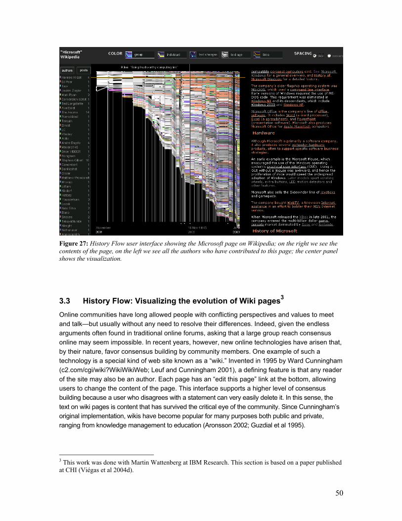
50
Figure 27: History Flow user interface showing the Microsoft page on Wikipedia; on the right we see the
contents of the page, on the left we see all the authors who have contributed to this page; the center panel
shows the visualization.
3.3 History Flow: Visualizing the evolution of Wiki pages3
Online communities have long allowed people with conflicting perspectives and values to meet
and talk—but usually without any need to resolve their differences. Indeed, given the endless
arguments often found in traditional online forums, asking that a large group reach consensus
online may seem impossible. In recent years, however, new online technologies have arisen that,
by their nature, favor consensus building by community members. One example of such a
technology is a special kind of web site known as a “wiki.” Invented in 1995 by Ward Cunningham
(c2.com/cgi/wiki?WikiWikiWeb; Leuf and Cunningham 2001), a defining feature is that any reader
of the site may also be an author. Each page has an “edit this page” link at the bottom, allowing
users to change the content of the page. This interface supports a higher level of consensus
building because a user who disagrees with a statement can very easily delete it. In this sense, the
text on wiki pages is content that has survived the critical eye of the community. Since Cunningham’s
original implementation, wikis have become popular for many purposes both public and private,
ranging from knowledge management to education (Aronsson 2002; Guzdial et al 1995).
3 This work was done with Martin Wattenberg at IBM Research. This section is based on a paper published at CHI (Viégas et al 2004d).
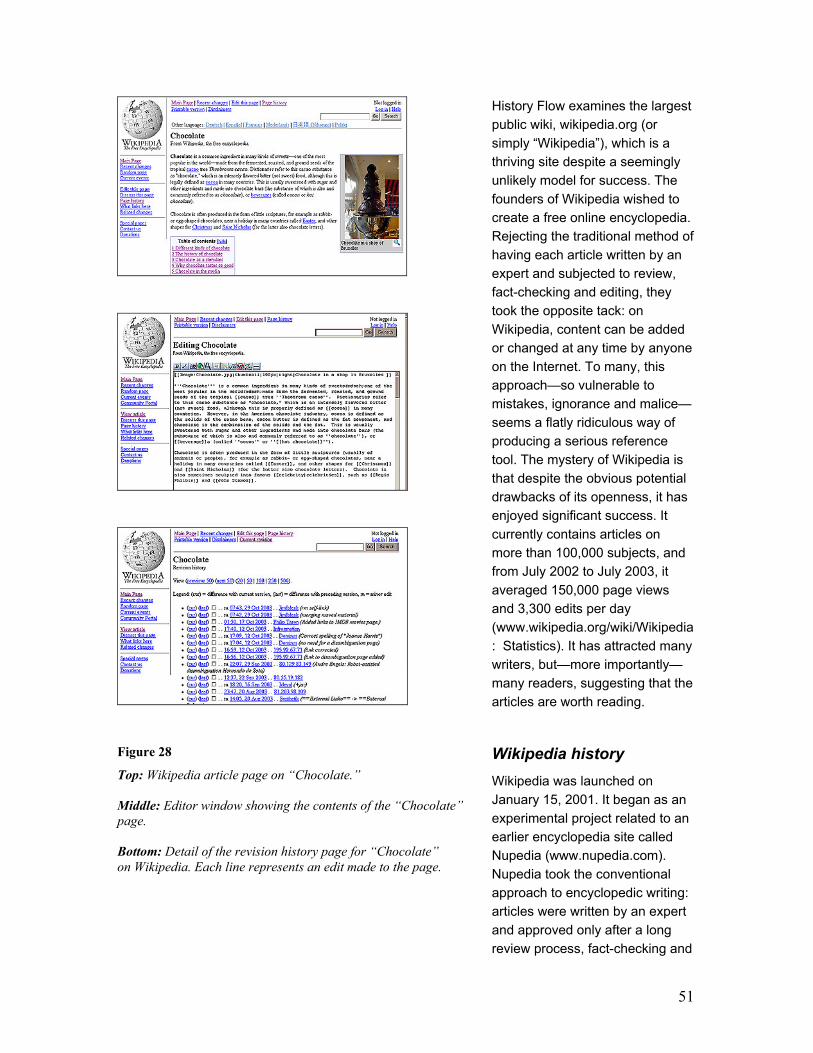
51
Figure 28
Top: Wikipedia article page on “Chocolate.”
Middle: Editor window showing the contents of the “Chocolate”
page.
Bottom: Detail of the revision history page for “Chocolate”
on Wikipedia. Each line represents an edit made to the page.
History Flow examines the largest
public wiki, wikipedia.org (or
simply “Wikipedia”), which is a
thriving site despite a seemingly
unlikely model for success. The
founders of Wikipedia wished to
create a free online encyclopedia.
Rejecting the traditional method of
having each article written by an
expert and subjected to review,
fact-checking and editing, they
took the opposite tack: on
Wikipedia, content can be added
or changed at any time by anyone
on the Internet. To many, this
approach—so vulnerable to
mistakes, ignorance and malice—
seems a flatly ridiculous way of
producing a serious reference
tool. The mystery of Wikipedia is
that despite the obvious potential
drawbacks of its openness, it has
enjoyed significant success. It
currently contains articles on
more than 100,000 subjects, and
from July 2002 to July 2003, it
averaged 150,000 page views
and 3,300 edits per day
(www.wikipedia.org/wiki/Wikipedia
: Statistics). It has attracted many
writers, but—more importantly—
many readers, suggesting that the
articles are worth reading.
Wikipedia history
Wikipedia was launched on
January 15, 2001. It began as an
experimental project related to an
earlier encyclopedia site called
Nupedia (www.nupedia.com).
Nupedia took the conventional
approach to encyclopedic writing:
articles were written by an expert
and approved only after a long
review process, fact-checking and

52
editing. Wikipedia instead leveraged the freeform style of interaction developed by Ward
Cunningham. While Wikipedia’s content grew rapidly, Nupedia’s progress has been slow—in the
period from October 2001 to April 2003, it released only two new articles
(www.wikipedia.org/wiki/Nupedia).
3.3.1 Wiki technology
Wikis rely on server-side technology that allows visitors to make instant updates to a web page
via a web interface. Every editable page on a wiki site has an “edit this page” link that visitors can
use to alter the contents of the page. Clicking on this link navigates to an editing view with a text
field containing the page’s contents. The user can edit this text and submit a new version, which
will immediately replace the previous one. Editing itself is quite lightweight, using simple markups
that are translated into HTML. It is similarly easy to create new pages and new links. In many
wikis, including Wikipedia, users have the option of either registering or remaining anonymous.
Registered users retain their profile whenever they come back to the site and their changes are
logged under their usernames. When anonymous users edit pages, their changes are logged with
their IP address.
Most wikis (including Wikipedia) have archiving systems that record all previous edits of a page
and make it simple to revert to an earlier version. If the ease of adding a contribution is a
distinguishing feature of a wiki, so too, paradoxically, is the ease of removing contributions of
others by reverting an edit. This archiving system ensures that no permanent harm can be
caused by bad editing.
The archived versions of a page are available to users via a “page history” link. Figure 1 shows a
sample page history from Wikipedia. Each row contains:
- a link to a saved version
- a link to the differences between the saved version and the one previous to it, showing what
was deleted from and what was inserted to the page
- date and time when the change happened
- who made the change (in case of an anonymous contributor, the user sees an IP address)
- any comments the contributor might have left about the change they made.
Finally, wikis have a “recent changes” page that lists the latest edits that have taken place across
the site. This is one important way in which users of a wiki track activity since their last visit.

53
3.3.2 Wikipedia enhancements
Some critical features in Wikipedia are
incidental or even absent in other wiki
implementations. Wikipedia allows users
to keep a “watch list” of pages they wish
to monitor closely. When a page in
someone’s watch list is modified, the
user is notified via email. This is an
effective means for topic experts and
serious Wikipedians to scrutinize
changes made to specific pages and fix
acts of vandalism such as mass
deletions. Watch lists function as
alerting mechanisms for wiki
communities.
The Wikipedia community also sets up
secondary pages that are devoted to the
discussion of issues surrounding the
topics on “real” pages; these are
sometimes called “talk pages.” They
represent an attempt to separate what is
“real” information from discussions
about what should and should not be on
the real page.
3.3.3 The History Flow visualization technique
Wikipedia makes its entire database of version histories available for download, a boon to
researchers. Making sense of the history for even a single entry, however, is not straightforward.
The sheer number of versions can be daunting: as of August 2003, the entry for Microsoft had
198 versions comprising 6.2 MB of text; to get an idea of how much information this is, imagine a
table like the one in figure 28 (bottom) but 22 times larger. Moreover, significant information is
often not contained in individual versions, but in the differences in the text of an entry from one
version to the next. Such differences highlight editing choices, emphasizing what does and does
not survive over time.
Wikipedia provides a method of viewing differences, similar to that found in source control
systems such Visual Source Safe (msdn.Microsoft.com/ssafe). This interface suffers from two
drawbacks: First, it only shows differences between two versions at once. Second, it records
differences only on a paragraph level (a change in a comma might cause a two-page paragraph
to be marked as deleted). Both problems made examination of version histories extremely
cumbersome. Since no commercial tools were available that solved both problems, we created a
new technique, a simple but effective visualization tool, dubbed History Flow.
Figure 29: Explanatory diagram of History Flow’s
visualization mechanism. In this scenario, three people
are working together on the same document and each
person is represented in a different color.
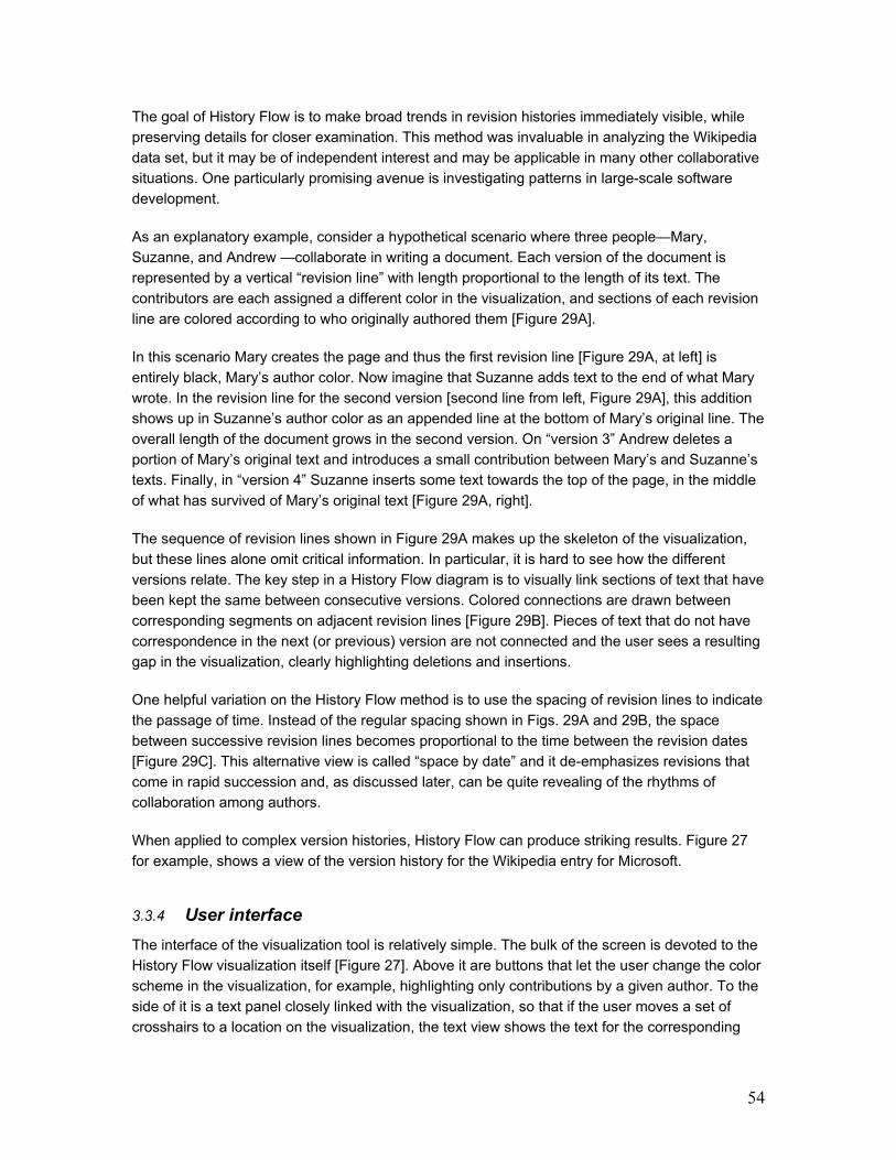
54
The goal of History Flow is to make broad trends in revision histories immediately visible, while
preserving details for closer examination. This method was invaluable in analyzing the Wikipedia
data set, but it may be of independent interest and may be applicable in many other collaborative
situations. One particularly promising avenue is investigating patterns in large-scale software
development.
As an explanatory example, consider a hypothetical scenario where three people—Mary,
Suzanne, and Andrew —collaborate in writing a document. Each version of the document is
represented by a vertical “revision line” with length proportional to the length of its text. The
contributors are each assigned a different color in the visualization, and sections of each revision
line are colored according to who originally authored them [Figure 29A].
In this scenario Mary creates the page and thus the first revision line [Figure 29A, at left] is
entirely black, Mary’s author color. Now imagine that Suzanne adds text to the end of what Mary
wrote. In the revision line for the second version [second line from left, Figure 29A], this addition
shows up in Suzanne’s author color as an appended line at the bottom of Mary’s original line. The
overall length of the document grows in the second version. On “version 3” Andrew deletes a
portion of Mary’s original text and introduces a small contribution between Mary’s and Suzanne’s
texts. Finally, in “version 4” Suzanne inserts some text towards the top of the page, in the middle
of what has survived of Mary’s original text [Figure 29A, right].
The sequence of revision lines shown in Figure 29A makes up the skeleton of the visualization,
but these lines alone omit critical information. In particular, it is hard to see how the different
versions relate. The key step in a History Flow diagram is to visually link sections of text that have
been kept the same between consecutive versions. Colored connections are drawn between
corresponding segments on adjacent revision lines [Figure 29B]. Pieces of text that do not have
correspondence in the next (or previous) version are not connected and the user sees a resulting
gap in the visualization, clearly highlighting deletions and insertions.
One helpful variation on the History Flow method is to use the spacing of revision lines to indicate
the passage of time. Instead of the regular spacing shown in Figs. 29A and 29B, the space
between successive revision lines becomes proportional to the time between the revision dates
[Figure 29C]. This alternative view is called “space by date” and it de-emphasizes revisions that
come in rapid succession and, as discussed later, can be quite revealing of the rhythms of
collaboration among authors.
When applied to complex version histories, History Flow can produce striking results. Figure 27
for example, shows a view of the version history for the Wikipedia entry for Microsoft.
3.3.4 User interface
The interface of the visualization tool is relatively simple. The bulk of the screen is devoted to the
History Flow visualization itself [Figure 27]. Above it are buttons that let the user change the color
scheme in the visualization, for example, highlighting only contributions by a given author. To the
side of it is a text panel closely linked with the visualization, so that if the user moves a set of
crosshairs to a location on the visualization, the text view shows the text for the corresponding
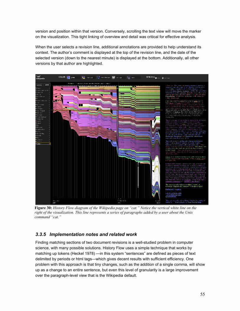
55
version and position within that version. Conversely, scrolling the text view will move the marker
on the visualization. This tight linking of overview and detail was critical for effective analysis.
When the user selects a revision line, additional annotations are provided to help understand its
context. The author’s comment is displayed at the top of the revision line, and the date of the
selected version (down to the nearest minute) is displayed at the bottom. Additionally, all other
versions by that author are highlighted.
3.3.5 Implementation notes and related work
Finding matching sections of two document revisions is a well-studied problem in computer
science, with many possible solutions. History Flow uses a simple technique that works by
matching up tokens (Heckel 1978) —in this system “sentences” are defined as pieces of text
delimited by periods or html tags—which gives decent results with sufficient efficiency. One
problem with this approach is that tiny changes, such as the addition of a single comma, will show
up as a change to an entire sentence, but even this level of granularity is a large improvement
over the paragraph-level view that is the Wikipedia default.
Figure 30: History Flow diagram of the Wikipedia page on “cat.” Notice the vertical white line on the
right of the visualization. This line represents a series of paragraphs added by a user about the Unix
command “cat.”
56
There are many existing methods for visualizing document revisions. Several popular source
control interfaces can color-code changed regions in files and show a side-by-side comparison of
two files, graphically connecting matching sections. Other methods use a thumbnail view of a
program, with line-by-line coloring to indicate authorship or age (Baker and Eick 1995). Visually,
History Flow diagrams have some similarity to Theme River (Havre et al 2002) and to parallel
coordinates systems (Inselberg 1985), but our method depicts a completely different type of data
and, our vertical axes function differently.
3.3.6 Patterns of cooperation and conflict
History Flow visualized in detail more than 70 different Wikipedia page histories. This examination
revealed several common patterns of collaboration and negotiation. These patterns represent
some of the techniques that this community has developed to deal with antisocial behavior,
disputes, and the determination of what is off topic on a page.
3.3.6.a Case Studies
To better illustrate a few of the patterns found in this study, this section describes three of the
pages visualized by History Flow. The patterns seen on these pages were typical of the various
pages visualized in this study.
1) Cat: The Wikipedia page on “cat” revealed one of the most commonly used mechanisms for
keeping the material on a page focused on the page’s subject: redirection of content. The “cat”
page was created to describe the human feline pet but, at one point, an author introduced several
paragraphs about the Unix command called “cat.” As seen on figure 30, this insertion of new
material looks like a lonely white line. The line stands out in the visualization because it is not
linked to any of the subsequent versions of the page. At first, it seems like this person’s
contribution might have been completely deleted in the following version. However, at closer look,
it becomes evident that, instead of being deleted, the paragraphs about the Unix command got
redirected into a new page entitled “Cat (Unix).”
2) Abortion: The visualization of the Wikipedia page on “Abortion” shows clear marks of
vandalism [Figure 31 top]. Figure 31 top is a view that equally spaces out revisions. When,
however, one looks at the same data spaced by date [Figure 31 bottom], one notices that there
are no interruptions. The instances of mass deletion were fixed so quickly that they cannot be
seen when revisions are spaced by date. Each mass deletion took only a minute or so to be fixed!
3) Chocolate: The Wikipedia page on Chocolate shows another interesting conflict pattern.
When the versions are spaced out by time [FIG XXXX], the visualization looks like any normal
History Flow diagram. However, when the versions are equally spaced out [FIG XXXXX], a
striking zigzag pattern is revealed. This pattern represents an edit war: two users are battling over
whether a piece of text should be part of the page or not. In this specific case, the users fought
over whether a kind of chocolate sculpture called “coulage” really existed and consequently,
whether or not the paragraph about it should appear on the page. This discussion resulted in 12
consecutive versions of reverting back and forth between two versions. Eventually the paragraph
was taken out for good.

57
Figure 31: Top view: editing history of “Abortion” equally spaced by version. Bottom view:
“Abortion” spaced out by date.

58
Figure 32: Edit history for “Chocolate” on Wikipedia. Top: versions spaced out by time. Bottom: edits
equally spaced out by number of versions. The zigzag pattern of an edit war becomes strikingly clear.
59
3.3.7 Statistical analysis: method and data
The History Flow visualization revealed some fascinating patterns, but examining pages by hand
has obvious limitations. A large-scale statistical analysis of the Wikipedia archives
(download.wikipedia.org) was conducted to find additional evidence of the patterns spotted in the
visualization. The statistics in the sections below were derived from data that represents the state
of the encyclopedia’s history as of May 2003. To derive statistics, the archives were loaded into a
MySQL database and queries were made using standard SQL syntax. The database contains
both “content pages” which represent entries in the encyclopedia as well as “talk pages”, which
represent discussion about the encyclopedia itself. Unless otherwise specified, the statistics cited
below are from the set of content pages only. There were 130,596 such pages, with an average
of 5.7 versions for each. 79,813 content pages had been revised at least once.
3.3.8 Vandalism and repair
Wikis are vulnerable to malicious edits or “vandalism,” which can take a surprising array of forms.
The true scope of vandalism became clear to us upon viewing the History Flow visualizations.
Mass deletions —edits that remove most of the contents of a page—constitute one common form
of vandalism in Wikipedia, and are easily spotted in History Flow visualizations because they
appear as breaks in the continuous horizontal flow of changes as mentioned in the “Abortion”
case study. This pattern appeared in almost every instance of a vandalized page that we
examined by hand. Many of the examined pages that had long revision histories (more than 50
versions) had suffered at least one act of vandalism.
In some cases the Wikipedia community itself cannot agree on whether an edit constitutes
vandalism or not. In fact there is a vandalism-tracking page where users discuss and coordinate
responses to specific instances of vandalism.
Because of their short-lived nature in the Wikipedia site, damaging acts often appear in History
Flow visualizations as single-version perturbations of the bigger, general flow of a page’s
evolutionary history: either one-version deletions or one-version insertions of content.
The variety of vandalism found in Wikipedia can be astounding; five common types are listed below:
1. Mass deletion: deletion of all contents on a page.
2. Offensive copy: insertion of vulgarities or slurs.
3. Phony copy: insertion of text unrelated to the page topic. E.g. on the Chemistry page, a user
inserted the full text from the “Windows 98 readme” file.
4. Phony redirection: Often pages contain only a redirect link to a more precise term (e.g. “IBM”
redirects to “International Business Machines.”), but redirects can also be malicious., linking to
an unrelated or offensive term. “Israel” was at one point redirected to “feces.” Note that a phony
redirect implies familiarity with Wikipedia’s editing mechanisms.
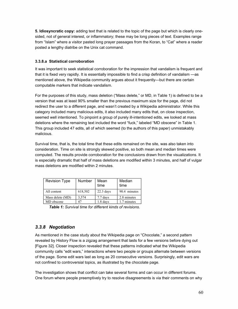
60
5. Idiosyncratic copy: adding text that is related to the topic of the page but which is clearly one-
sided, not of general interest, or inflammatory; these may be long pieces of text. Examples range
from “Islam” where a visitor pasted long prayer passages from the Koran, to “Cat” where a reader
posted a lengthy diatribe on the Unix cat command.
3.3.8.a Statistical corroboration
It was important to seek statistical corroboration for the impression that vandalism is frequent and
that it is fixed very rapidly. It is essentially impossible to find a crisp definition of vandalism —as
mentioned above, the Wikipedia community argues about it frequently—but there are certain
computable markers that indicate vandalism.
For the purposes of this study, mass deletion (“Mass delete,” or MD, in Table 1) is defined to be a
version that was at least 90% smaller than the previous maximum size for the page, did not
redirect the user to a different page, and wasn’t created by a Wikipedia administrator. While this
category included many malicious edits, it also included many edits that, on close inspection,
seemed well intentioned. To pinpoint a group of purely ill-intentioned edits, we looked at mass
deletions where the remaining text included the word “fuck,” labeled “MD obscene” in Table 1.
This group included 47 edits, all of which seemed (to the authors of this paper) unmistakably
malicious.
Survival time, that is, the total time that these edits remained on the site, was also taken into
consideration. Time on site is strongly skewed positive, so both mean and median times were
computed. The results provide corroboration for the conclusions drawn from the visualizations. It
is especially dramatic that half of mass deletions are modified within 3 minutes, and half of vulgar
mass deletions are modified within 2 minutes.
Revision Type Number Mean time
Median time
All content 618,502 22.3 days 90.4 minutes
Mass delete (MD) 3,574 7.7 days 2.8 minutes MD obscene 47 1.8 days 1.7 minutes
Table 1: Survival time for different kinds of revisions.
3.3.8 Negotiation
As mentioned in the case study about the Wikipedia page on “Chocolate,” a second pattern
revealed by History Flow is a zigzag arrangement that lasts for a few versions before dying out
[Figure 32]. Closer inspection revealed that these patterns indicated what the Wikipedia
community calls “edit wars,” interactions where two people or groups alternate between versions
of the page. Some edit wars last as long as 20 consecutive versions. Surprisingly, edit wars are
not confined to controversial topics, as illustrated by the chocolate page.
The investigation shows that conflict can take several forms and can occur in different forums.
One forum where people preemptively try to resolve disagreements is via their comments on why

61
they edited something on a page. History Flow revealed that comments on consecutive revisions
often read as a conversation between authors, rather than a mere summary of edits. Frequently
authors preemptively address possible objections or direct questions to each other.
The talk pages that accompany each Wikipedia entry are explicitly designed for resolving
disputes, and are frequently used for that purpose. The talk pages function as extensions of edit
comments, but afford more room for people to argue their positions. When people cannot
convince others of why their edits are valid via the comments they leave, the discussion escalates
into the talk pages. Talk pages comprise a significant amount of the content on Wikipedia; the
May 2003 database snapshot contains more than 11,000 “meta” pages, accounting for 17% of all
versions in the May 2003 database.
Figure 33: “Brazil” page showing abrupt growth and few
anonymous contributions.
Figure 34: Graph of version number versus average
version size (in kilobytes) shows steady growth for
pages with at least 100 edits.
3.3.9 Authorship
Explicit authorship of contributions on wiki pages is an issue of some contention among wiki
users; whereas some feel that authorship is an important part of social collaboration in the sense
that it adds context to interactions, others feel that authorship data is irrelevant and sometimes
even detrimental to the creation of truly communal repositories of knowledge
(c2.com/cgi/wiki?ThreadModeConsideredHarmful).
An explicit goal of Wikipedia is to create encyclopedic entries that are “neutral” instead of
expressing personal biases. This “neutral point of view” (“NPOV,”in Wikipedia shorthand) is a
touchstone of the Wikipedia community, frequently referred to in comments and talk pages. One
reflection of the NPOV policy is that contributions to article pages are not signed within the page
itself. However, on the discussion-oriented talk pages that accompany articles, most authors sign
their comments. This kind of conversation page makes for a different social space from the
regular Wikipedia article page. It is an important social environment where conflict can develop
and settle more naturally.

62
A small sample of frequent Wikipedia users said that they rely on authorship information when
browsing the RecentChanges page or the history page of a specific Wikipedia article. These page
“watchers” become familiar with the names of regular contributors to the pages they watch and
are constantly on the lookout for any unfamiliar names and unfamiliar IP addresses (the
“signature” left by anonymous contributors). First-time contributors represent a potential threat of
vandalism and therefore their edits are closely scrutinized. On the other hand, there is also the
possibility that a newcomer is someone who may be unfamiliar with Wikipedia standards. In either
case the article merits a second look.
Another pattern related to authorship and easily identifiable in History Flow is the variation in the
level of anonymous contributions across different pages. There is huge inconsistency between
individual pages in the proportion of anonymous contributions over time. Roughly 31% of the
versions in the May 2003 database were contributed by anonymous authors. Some pages have
been largely written by anonymous contributors (in our visualization, these show up as diagrams
mostly in shades of gray). Examples of such pages include: Microsoft, Sex, Music, Libertarianism,
Creation, and Computer. Other pages have few anonymous contributions ever in their history, for
example: Mythology, Evolution, Design, and Brazil [Figure 33]. There does not seem to exist a clear
preference either on the side of the anonymous users or otherwise for specific topics or clusters of
topics. More in-depth analysis is needed to help determine what can account for this distinction.
There is also no clear connection between anonymity and vandalism. Instances of vandalism
were observed by users with (sometimes tauntingly offensive) registered usernames. Conversely,
there are users that contribute quite a lot to the site but who choose to remain anonymous. One
particular case where an anonymous contributor to the page on Capitalism edited the page 55
times between Nov. 22, 2002 and Jun. 26, 2003. This person’s contributions were quite
substantial and were kept by subsequent contributors.
3.3.10 Temporal patterns and content stability
A History Flow visualization is, in effect, a fancy graph of how the length of a page varies over
time—and it turns out that even this simple measure holds some surprises. One might guess that
pages would tend to stabilize over time. The visualization tells another story. Most pages examined
in this study showed continual change in size and turnover in text. As examples, Figure 27
(Microsoft) shows an instance of near-constant growth; Figure 31 (Abortion) shows an example of
growth and shrinkage. Note that shrinkage can occur either when copy is deleted or when a large
section of the page is redirected to a new site (for instance, the most dramatic shrinkage in the
Abortion page in figure 31 is due to material being shifted to an entry on abortion in Ireland.)
History Flow visualizations suggested several other patterns which deserve mention. One pattern
we call first-mover advantage. The initial text of a page tends to survive longer and tends to suffer
fewer modifications than later contributions to the same page. This seems to suggest that the first
person to create a page generally sets the tone of the article on that page and, therefore, their
text usually has the highest survival rate.
A second pattern is that people tend to delete and insert text more frequently than moving text in
an article. In other words, there are many more “gaps” in the visualization than the type of

63
crossing lines in figure 31 (bottom). One explanation may be that the editing window of Wikipedia
pages is by default 25 lines long, making it hard for one to see long articles in their entirety.
Consequently, the task of moving things around becomes a lot more cumbersome than if one
could access the entire text at once. If correct, this explanation could help guide wiki developers
in building more user-friendly editors for wiki pages.
3.3.11 Statistical corroboration
It seemed important to directly measure the level of instability of Wikipedia pages, but obtaining
meaningful numbers for stability is difficult for two reasons. First, it would take a prohibitive
amount of time to run a fine-grained differencing algorithm on hundreds of thousands of versions,
especially one able to distinguish accurately between a change of an entire sentence and an
addition of a single comma. Second, and more seriously, Wikipedia has existed for a short time,
during which the number of readers (hence editors) has grown tremendously, thus making time-
based measures hard to interpret.
Therefore, this study focused on size change as a simple measure of change in content. Using
several measures, little evidence for stability was found. For instance, there are 273 pages on
Wikipedia that had more than 100 versions as of May 2003. A graph plotting average version size
in this subset versus version number [Figure 34] shows steady growth. Thus, as suggested by the
History Flow visualization, heavily edited pages seem not to converge in size. To take another
example, 21% of edits reduced the size of a page, with 6% decreasing it by more than 50
characters. Such cuts can be beneficial (tightening prose, eliminating irrelevant information) but at
the same time they make citing Wikipedia as a source problematic, since the information cited
may be removed from the page. Rapid turnover also means that news events may be assimilated
with a speed that is impossible in a print encyclopedia. Within a week of the U.S. invasion of Iraq
in 2003, for example, a page devoted entirely to that topic had been written, and the entry on Iraq
itself tripled in size in the weeks after the invasion began.
3.3.12 Discussion
The patterns described above show that Wikipedia has enjoyed significant success as a
community in which people with disparate perspectives can collaborate to create a single
document. A key question for designers of online communities is: How did they do it? In other
words, what design decisions allow Wikipedia to create the social structures that make it a
successful system? A full answer to this question is beyond the scope of this study but is an
important line of investigation. Here three hypotheses are proposed that may explain Wikipedia’s
success, and that may be useful as a starting point for future research. The common thread in
these hypotheses is that Wikipedia encourages community introspection: that is, it is strongly
designed so that members watch each other, talk about each other’s contributions, and directly
address the fact that they must reach consensus.
First, the watchlists provide a mechanism for community surveillance, and may be responsible for
the extremely rapid response to vandalism noted above. Second, the talk pages and other non-
content spaces help in removing “meta-level” discussions from the main encyclopedia. Indeed,
the May 2003 database snapshot contains more than 11,000 talk pages, a large amount of
64
discussion. Yet it is extremely rare to find discussion about an article embedded in the article
itself. Finally, the group consensus that a “neutral point of view” is to be desired provides both
common ground and rough guidelines for resolving disputes.
3.3.13 Conclusion
When visiting a wiki, one is greeted with what looks like a conventional static Web site. Yet this
serene façade conceals a more agitated reality of constant communal editing. Hundreds,
sometimes thousands of busy hands insert words, create new pages, delete paragraphs,
manicure the contents of the site.
History Flow was devised to better understand the ebb and flow of this editing frenzy. The
visualization technique reveals some of the patterns that have emerged within Wikipedia: its
surprisingly effective self-healing capabilities, the variety of negotiation processes used in
reaching consensus; the diversity of authorship, the bursty rhythms of page editing, and the
constant change in page contents. In turn, these facts point to some of the key social
mechanisms of the community: the importance of having forums for resolving conflicts and the
value of fast, efficient notification of changes to aid surveillance.
Without the aid of History Flow, it would have been a daunting task to piece together the
collaboration patterns described here. The efficacy of History Flow in highlighting patterns of
behavior suggests that visualization is a technique well-suited to records of social behavior. One
speculation is that social interaction is often characterized by mostly normal behavior punctuated
by outlying abnormal episodes, and information visualization can be an excellent way to
simultaneously show broad trends and outlying data points.
The results described here are of general interest for several reasons. First, Wikipedia is just one
of many wiki sites that make no distinction between readers and writers. The findings presented
here have relevance for the design of other wiki sites, especially as they scale up in size. Second,
the History Flow visualization method can be utilized in other situations that involve heavily
revised documents by multiple authors such as software version control systems for instance.
Finally, the ability to better understand the mechanisms for reaching consensus described here
may apply in other contexts and the “self-healing” qualities that Wikipedia promotes may turn out
to be a general principle of long-lived online communities.
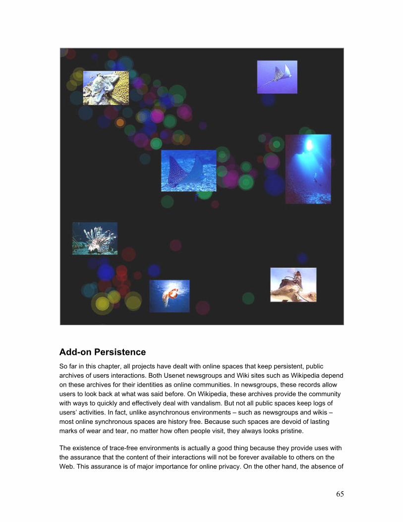
65
Add-on Persistence
So far in this chapter, all projects have dealt with online spaces that keep persistent, public
archives of users interactions. Both Usenet newsgroups and Wiki sites such as Wikipedia depend
on these archives for their identities as online communities. In newsgroups, these records allow
users to look back at what was said before. On Wikipedia, these archives provide the community
with ways to quickly and effectively deal with vandalism. But not all public spaces keep logs of
users’ activities. In fact, unlike asynchronous environments – such as newsgroups and wikis –
most online synchronous spaces are history free. Because such spaces are devoid of lasting
marks of wear and tear, no matter how often people visit, they always looks pristine.
The existence of trace-free environments is actually a good thing because they provide uses with
the assurance that the content of their interactions will not be forever available to others on the
Web. This assurance is of major importance for online privacy. On the other hand, the absence of
66
any traces whatsoever makes synchronous environments hard to read sometimes. How does one
know if an online place is a popular gathering spot or a dead-end destination? How is a
synchronous space used on a daily basis?
I became interested in the possibility of adding presence traces to synchronous spaces because
it seemed that usage history could be beneficial to these environments. The questions I was
interested in exploring were: What if synchronous places could tell the history of how they are
used? What if they could give users a sense of how many people inhabit them on any given day?
What if these places could flaunt their social usage?
This section introduces projects that visualize people’s past presence in two public, synchronous
spaces: an online chat room and an offline museum gallery. Even though these are very different
kinds of public spaces, both were originally trace-free. Chat rooms are the epitome of online
ephemerality and museums, like any other real-world space, are trace-free environments.4
In these two instances, traces were added to give visitors a better sense of how the spaces in
question were used. Adding persistence to originally trace-free spaces has the obvious effect of
raising a range of privacy questions. For this reason, the traces in these projects were kept
purposefully “anonymous.” In order to keep with the concept of social translucence – the existing
tension between visibility and privacy in public spaces (Erickson et al 1999) – the added traces
showed social wear and tear without revealing the content of people’s past interactions. In this
way, visitors were able to get a sense of how much these spaces had been used without knowing
what exactly people were talking about or doing there.
The addition of persistent traces in these different spaces and the ensuing visualizations
impacted visitors’ behavior. This section introduces each project separately and describes
visitors’ reactions. In the chat room, traces changed the way people moved through the space
and how they positioned themselves relative to other users. The traces also facilitated expressive
use of participants’ avatars, creating an additional communication channel.
Artifacts of the Presence Era, a museum visualization, captured video and audio from a gallery
and constructed an impressionistic visualization of the evolving history in the space. Instead of
creating a visualization tool for data analysis, the piece functioned as a souvenir of a particular
time and place.
4 It is true that surveillance cameras have become regular fixtures in several public spaces, including museums. Nevertheless, surveillance cameras’ footage is not normally displayed for visitors to see. Thus, for the purposes of this thesis, surveillance footage does not qualify as persistent archives that can be visualized.
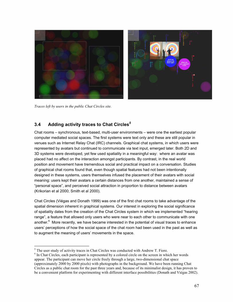
67
Traces left by users in the public Chat Circles site.
3.4 Adding activity traces to Chat Circles5
Chat rooms – synchronous, text-based, multi-user environments – were one the earliest popular
computer mediated social spaces. The first systems were text only and these are still popular in
venues such as Internet Relay Chat (IRC) channels. Graphical chat systems, in which users were
represented by avatars but continued to communicate via text input, emerged later. Both 2D and
3D systems were developed, yet few used spatiality in a meaningful way: where an avatar was
placed had no affect on the interaction amongst participants. By contrast, in the real world
position and movement have tremendous social and practical impact on a conversation. Studies
of graphical chat rooms found that, even though spatial features had not been intentionally
designed in these systems, users themselves infused the placement of their avatars with social
meaning: users kept their avatars a certain distances from one another, maintained a sense of
“personal space”, and perceived social attraction in proportion to distance between avatars
(Krikorian et al 2000; Smith et al 2000).
Chat Circles (Viégas and Donath 1999) was one of the first chat rooms to take advantage of the
spatial dimension inherent in graphical systems. Our interest in exploring the social significance
of spatiality dates from the creation of the Chat Circles system in which we implemented “hearing
range”, a feature that allowed only users who were near to each other to communicate with one
another.6 More recently, we have became interested in the potential of visual traces to enhance
users’ perceptions of how the social space of the chat room had been used in the past as well as
to augment the meaning of users’ movements in the space.
5 The user study of activity traces in Chat Circles was conducted with Andrew T. Fiore. 6 In Chat Circles, each participant is represented by a colored circle on the screen in which her words appear. The participant can move her circle freely through a large, two-dimensional chat space (approximately 2000 by 2000 pixels) with photographs in the background. We have been running Chat Circles as a public chat room for the past three years and, because of its minimalist design, it has proven to be a convenient platform for experimenting with different interface possibilities (Donath and Viégas 2002).
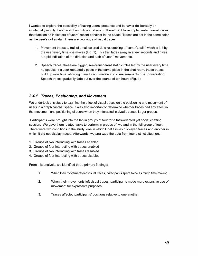
68
I wanted to explore the possibility of having users’ presence and behavior deliberately or
incidentally modify the space of an online chat room. Therefore, I have implemented visual traces
that function as indicators of users’ recent behavior in the space. Traces are set in the same color
as the user’s dot avatar. There are two kinds of visual traces:
1. Movement traces: a trail of small colored dots resembling a “comet’s tail,” which is left by
the user every time she moves (Fig. 1). This trail fades away in a few seconds and gives
a rapid indication of the direction and path of users’ movements.
2. Speech traces: these are bigger, semitransparent static circles left by the user every time
he speaks. If a user repeatedly posts in the same place in the chat room, these traces
build up over time, allowing them to accumulate into visual remnants of a conversation.
Speech traces gradually fade out over the course of ten hours (Fig. 1).
3.4.1 Traces, Positioning, and Movement
We undertook this study to examine the effect of visual traces on the positioning and movement of
users in a graphical chat space. It was also important to determine whether traces had any effect in
the movement and positioning of users when they interacted in dyadic versus larger groups.
Participants were brought into the lab in groups of four for a task-oriented yet social chatting
session. We gave them related tasks to perform in groups of two and in the full group of four.
There were two conditions in the study, one in which Chat Circles displayed traces and another in
which it did not display traces. Afterwards, we analyzed the data from four distinct situations:
1. Groups of two interacting with traces enabled
2. Groups of four interacting with traces enabled
3. Groups of two interacting with traces disabled
4. Groups of four interacting with traces disabled
From this analysis, we identified three primary findings:
1. When their movements left visual traces, participants spent twice as much time moving.
2. When their movements left visual traces, participants made more extensive use of
movement for expressive purposes.
3. Traces affected participants’ positions relative to one another.
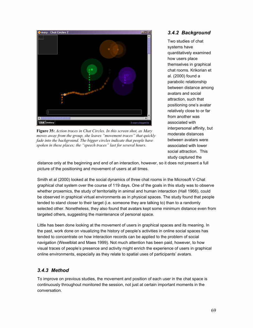
69
3.4.2 Background
Two studies of chat
systems have
quantitatively examined
how users place
themselves in graphical
chat rooms. Krikorian et
al. (2000) found a
parabolic relationship
between distance among
avatars and social
attraction, such that
positioning one’s avatar
relatively close to or far
from another was
associated with
interpersonal affinity, but
moderate distances
between avatars were
associated with lower
social attraction. This
study captured the
distance only at the beginning and end of an interaction, however, so it does not present a full
picture of the positioning and movement of users at all times.
Smith et al (2000) looked at the social dynamics of three chat rooms in the Microsoft V-Chat
graphical chat system over the course of 119 days. One of the goals in this study was to observe
whether proxemics, the study of territoriality in animal and human interaction (Hall 1966), could
be observed in graphical virtual environments as in physical spaces. The study found that people
tended to stand closer to their target (i.e. someone they are talking to) than to a randomly
selected other. Nonetheless, they also found that avatars kept some minimum distance even from
targeted others, suggesting the maintenance of personal space.
Little has been done looking at the movement of users in graphical spaces and its meaning. In
the past, work done on visualizing the history of people’s activities in online social spaces has
tended to concentrate on how interaction records can be applied to the problem of social
navigation (Wexelblat and Maes 1999). Not much attention has been paid, however, to how
visual traces of people’s presence and activity might enrich the experience of users in graphical
online environments, especially as they relate to spatial uses of participants’ avatars.
3.4.3 Method
To improve on previous studies, the movement and position of each user in the chat space is
continuously throughout monitored the session, not just at certain important moments in the
conversation.
Figure 35: Action traces in Chat Circles. In this screen shot, as Mary
moves away from the group, she leaves “movement traces” that quickly
fade into the background. The bigger circles indicate that people have
spoken in these places; the “speech traces” last for several hours.

70
3.4.3.a Participants
Twenty participants were
recruited in the Boston area
via announcements placed
online on a local classifieds
service (www.craigslist.org).
Half of the participants were
female, ages ranging from
23 to 43. Participants were
given a $10 gift certificate to
a local ice cream and coffee
shop.
3.4.3.b Sessions
For this study, we needed
exactly four participants per
session so that they could
chat both in pairs and in a
group of four. With 20
participants, we were able
to schedule five one-hour
sessions. Three sessions
(12 participants) were
randomly assigned to the
traces condition; two sessions (eight participants) were assigned to the no-traces condition.
Participants were not aware of these conditions.
3.4.3.c Procedure
Participants were told that the Chat Circles environment was being tested and that everything
they did and said in the chat room would be logged. Participants were not told, however, that the
study would specifically examine their movements and positioning in the room.
Because it was important that participants communicated solely via Chat Circles, each person
was placed in a separate office as he or she arrived. Participants did not see each other either
before or during the experiment and they did not know each other’s name or gender.
After being introduced to the Chat Circles environment, each person was given a small “script” of
the tasks they were supposed to perform during the experiment. In this script, they were told
which user name to use (always of the form “User1,” “User2,” etc.) and when to start interacting
with others in the room. Overall there were five users in the room: four participants and the
“media lab” user, which we used to assist participants with questions and problems. For the
purposes of the experiment, we divided the users into two teams of two: User1 with User2, and
User3 with User4. Participants were randomly assigned to be Users 1, 2, 3, and 4. The
experiment progressed as follows:
Figure 36: View of the entire Chat Circles space during a study
session. In this image, User3 and User4 are sharing their story with
User1 and User2, in the upper right hand corner of the room.

71
First five minutes:
1. users get to know the other users
2. each user pairs up with their pre-assigned partner in the chat space
3. with their partners, users move to their assigned region in the room. Each team saw two
pictures in their region.
4. Next 10 minutes: with their partners, users came up with a story about how their pictures
were related. We told them to be creative.
5. Next 15 minutes: the two teams were told to come together and share their stories and
pictures with one another [Figure 37].
6. The final 20 minutes of each session were devoted to a Web-based post-study survey in
which users were asked about their experience with Chat Circles.
3.4.3.d Log Methods
In order to analyze how users moved while interacting via Chat Circles, the Chat Circles server
was modified to automatically log users’ positions at one-second intervals during the sessions.
Users’ position was also logged whenever a participant posted a message to the chat room.
These data were stored in a database for later analysis.
3.4.3.e Results
The analysis focused on the interaction of participants’ positioning, and movement with the four
situations we mentioned above: groups of two and four in sessions with and without traces. We
were interested in finding out whether traces affected users’ behavior in the chat room.
Secondarily, we also investigated whether there are any typical movement or placement
dynamics in dyadic groups that differ from larger groups.
Participants maintained an average distance of 154.4 pixels (s.d.=77.8) between their circles and
the circles of others in the chat space. This value falls into the Close-Range Zone of Krikorian et
al.’s [3] Social Attraction Parabola.
To summarize their movements around the space, we divided the movement events into large
(greater than half the window, or 400 pixels) and small. We found that on average large
movements covered 716.0 pixels (s.d.=611.5) and small movements spanned 118.3 pixels
(s.d.=95.0).
The way participants moved and positioned themselves varied with both the presence of traces
and the number of participants in the immediate vicinity in the chat space (i.e., group size).
Additionally, group size interacted with the length of participants’ utterances.
72
3.4.3.e Traces
Movement: In sessions with traces, people moved their circles more often, though not farther or
faster, than in sessions without traces. In other words, the kinds of movements in both conditions
were the same but the frequency of movements was higher in the traces condition. Users made
an average of 1.05 moves per minute in sessions with traces (s.d.=0.42), but only 0.48 moves per
minute in sessions without traces (s.d.=0.38; p < 0.01). Similarly, those in the traces condition
spent an average of 10.3 percent of their total time on the system moving (s.d.=3.1), while those
in the no-traces condition spent only 4.4 percent of their time moving (s.d.=3.1; p < 0.001).
Additionally, we asked users if they used movement to show affection, emphasize a point, intimidate
another person, show disagreement, show agreement, tease, flirt, or annoy another person. Taken as
a whole, our users indicated on a five-point scale from “Not at all” to “A lot” that they did not use
movement very much for any of these purposes except emphasizing a point. However, the users in
sessions with traces made much more extensive use of movement for several purposes. Specifically,
they reported using movement significantly more often than users in the no-traces condition to show
agreement (mean 2.5 vs. 1.9 on the five-point scale; p < 0.01), to annoy another user (mean 2.3 vs.
1.8; p < 0.02), and to intimidate another user (mean 2.0 vs. 1.6; p < 0.05).
Positioning: Users positioned themselves closer to each other in sessions with traces (14.7
pixels closer on average, p < 0.0001) than in sessions without traces. This effect was the same
in groups of two and groups of four.
3.4.3.f Group Size
In considering differences in behavior between participants in groups of four and groups of two, it
is important to note that the two situations are not formal conditions in our study because
participants were not randomly assigned to them. In fact, every participant interacted in groups of
two and four in that order; thus, it is possible that these findings are due to the effect of learning
rather than group size. We think a learning effect is unlikely in the case of these particular
findings, which can be quite plausibly explained by group size effects, but until they are
independently confirmed, they must be considered with caution.
Positioning: In groups of both two and four, users positioned their circles an average of 154.4
pixels from those of others (sd=77.8). In groups of four, users stayed slightly but significantly
closer to their partners than to others (9.5 pixels closer on average, p < 0.0001).
3.4.3.g Users’ Reactions
In the post-study questionnaire, we asked participants to list three things they liked and three things
they disliked about Chat Circles. About a third of the participants mentioned the power of movement
as a good quality of the system. Only two users had trouble with the movement mechanism.
Additionally, in answers to free-response questions, many users noted that they used their circles
to gesture at others or to point at parts of the pictures in the chat space. In one case, a user
decided to “paint” the expression ‘OK’ with her movement traces (the trailing small dots that fade
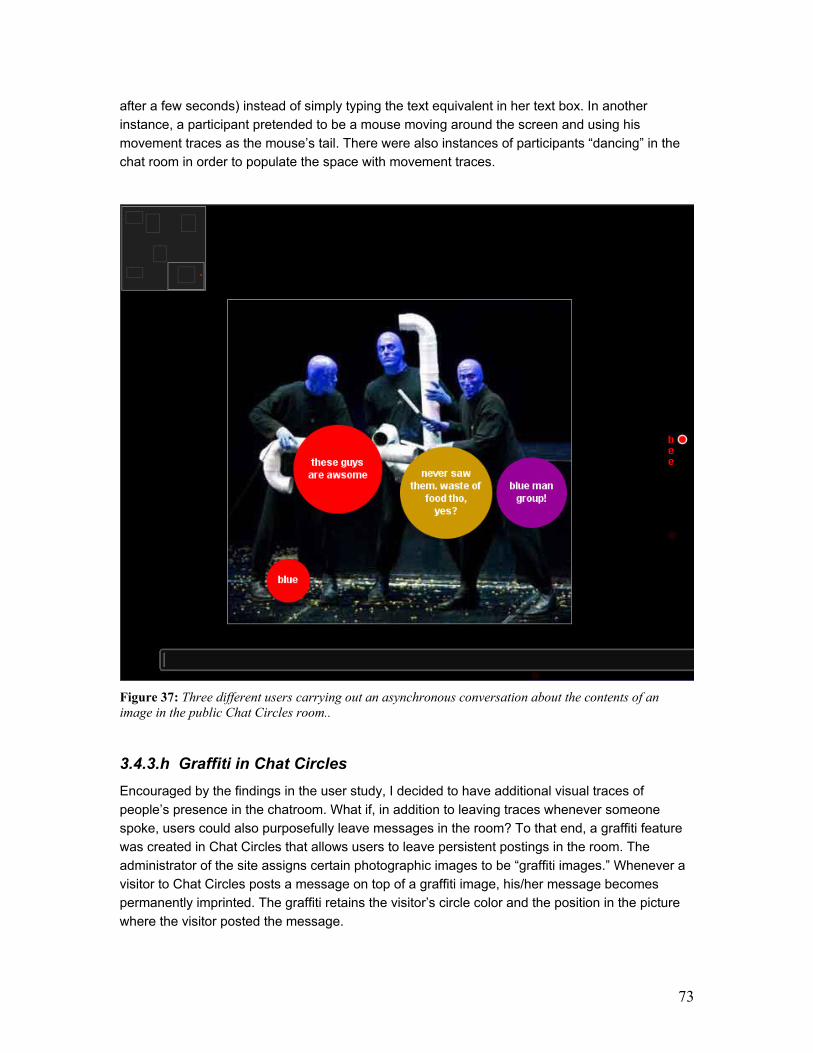
73
after a few seconds) instead of simply typing the text equivalent in her text box. In another
instance, a participant pretended to be a mouse moving around the screen and using his
movement traces as the mouse’s tail. There were also instances of participants “dancing” in the
chat room in order to populate the space with movement traces.
Figure 37: Three different users carrying out an asynchronous conversation about the contents of an
image in the public Chat Circles room..
3.4.3.h Graffiti in Chat Circles
Encouraged by the findings in the user study, I decided to have additional visual traces of
people’s presence in the chatroom. What if, in addition to leaving traces whenever someone
spoke, users could also purposefully leave messages in the room? To that end, a graffiti feature
was created in Chat Circles that allows users to leave persistent postings in the room. The
administrator of the site assigns certain photographic images to be “graffiti images.” Whenever a
visitor to Chat Circles posts a message on top of a graffiti image, his/her message becomes
permanently imprinted. The graffiti retains the visitor’s circle color and the position in the picture
where the visitor posted the message.

74
Figure 38: Graffiti left by visitors in Chat Circles. At the top of the page, visitors used their circles to write
messages over different pictures. At the bottom, a user utilized her/his own circles as colored paint to draw a
picture. This must have been either a group effort – where each user in a different color painted their portion of
the image – or the work of a single user who logged her/himself onto the chatroom multiple times using different
colors to achieve the desired effect.
75
The graffiti feature has been available in the Chat Circles public room for two years. Observation
of how visitors employ this capability has revealed a few usage patterns:
- asynchronous conversation about the subject of the photograph
- painting the picture with one’s colored circles
- attempts to cover entire pictures with a single circle
- helpful commentary about the images
- attempts to communicate with the administrator of the site
- trolling: use of foul language “spamming” all images in the room
3.4.3.j Conclusion
The results of this study show that adding visual traces to participants’ actions in the chat room
greatly affected their behavior. Not only did users move twice as frequently, they also moved their
circles in more expressive ways: to show agreement, to intimidate, and to annoy other users. By
allowing users to “paint” with their circles, traces gave them a new communicative channel. The
markings that users made with these traces served not only an immediate purpose but, by their
persistence, also reminded other participants that movement could be expressive in this space.
Traces proved to be a compelling addition to Chat Circles. Participants in the condition with
traces used these ephemeral trails and remnants as extensions of their abstract avatars to
express intention through movement. It seems, too, that traces encourage users to adopt a
friendlier stance by standing closer together. If this is in fact more sociable behavior, perhaps it
stems from an increased affinity that more expressive communication makes possible.
More generally, the ability to modify the chat space by moving or speaking gives users additional
incentive to be active. And traces left previously by others serve as a subtle reminder of the
potential for expression that the system provides, encouraging the present participant to wield her
own circle in evocative ways.
The findings from this study suggest that presence and movement traces can be exploited by
users in chat environments for communicative purposes. On top of giving users an expressive
venue, these activity traces also provide visitors with a more legible view of how these social
spaces have been utilized in the recent past.
These results might have relevance for the design of other graphical social spaces as well. The
traces implemented in Chat Circles are but one example of how history presented visually can
affect the behavior of users in graphical social spaces. Alternative expressions of the “wear and
tear” of social environments are bound to provide users with different communicative possibilities.
By understanding that, when given a chance, users make ample use of movement as social
gestures, we can better design the graphical interactive spaces of the future.
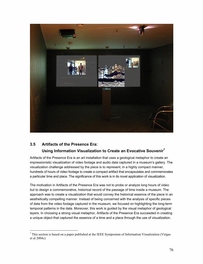
76
3.5 Artifacts of the Presence Era:
Using Information Visualization to Create an Evocative Souvenir7
Artifacts of the Presence Era is an art installation that uses a geological metaphor to create an
impressionistic visualization of video footage and audio data captured in a museum’s gallery. The
visualization challenge addressed by the piece is to represent, in a highly compact manner,
hundreds of hours of video footage to create a compact artifact that encapsulates and commemorates
a particular time and place. The significance of this work is in its novel application of visualization.
The motivation in Artifacts of the Presence Era was not to probe or analyze long hours of video
but to design a commemorative, historical record of the passage of time inside a museum. The
approach was to create a visualization that would convey the historical essence of the piece in an
aesthetically compelling manner. Instead of being concerned with the analysis of specific pieces
of data from the video footage captured in the museum, we focused on highlighting the long-term
temporal patterns in the data. Moreover, this work is guided by the visual metaphor of geological
layers. In choosing a strong visual metaphor, Artifacts of the Presence Era succeeded in creating
a unique object that captured the essence of a time and a place through the use of visualization.
7 This section is based on a paper published at the IEEE Symposium of Information Visualization (Viégas et al 2004c)

77
Figure 39: Present Display showing the video being
captured by the camera in real time. Below the
video image, an audio wave is being formed. After
five minutes, the wave is done and is sent, together
with the chosen video frame, to the “history
machine.”
Figure 40: History Display showing the growing
stack of layers on the left. Within the stack, the
currently selected layer is highlighted with yellow
lines outlining it. To the right we see the image
from the currently selected layer from the stack.
Below the image we see indication of the day and
time this image was captured.
3.5.1 The ICA Boston
In September of 2002 the Sociable Media Group was contacted by one of the curators at the
Institute of Contemporary Art (ICA). The Institute was going through a unique moment in its
history with the plans for a brand new building under way. In order to celebrate the beginnings of
this new site, the curator asked us to create an art piece that would sum up some interesting
aspect of the ICA’s current building and something that could be exhibited in the new site as a
memory piece about the Institute’s current space, a time capsule as it were.
We became immediately interested in the possibility of documenting how the current building was
used by its patrons on an everyday basis. We set out to capture the public’s presence in the
Institute’s building. Visitors and their movement through the galleries became the raw data
feeding and shaping our visualization. These data came from two sources: a camera that
captured the colors, shapes, and movements of people in the space and a microphone that
captured the ambient noise in the museum.
Artifacts of the Presence Era ran for three consecutive months – January to April of 2003 – and
was visited by over one thousand people. It was well received by the public and it was critically
acclaimed in the local media.
3.5.2 Metaphor
In trying to convey a sense of historical buildup over time, it made sense to look at natural
examples of accretion for inspiration. The geological layers in sedimentary rocks and their
function as record keepers provided us with such an example. The accumulation of geological
layers over time transforms temporal change into legible and appealing visual patterns that can,
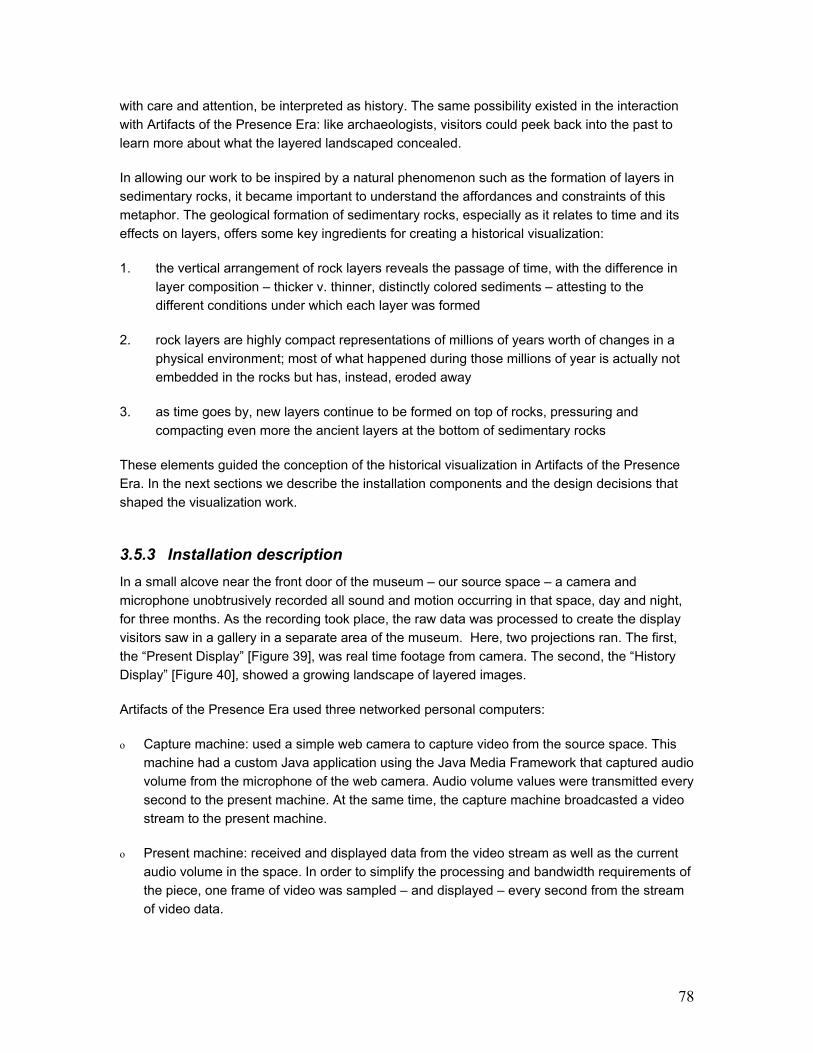
78
with care and attention, be interpreted as history. The same possibility existed in the interaction
with Artifacts of the Presence Era: like archaeologists, visitors could peek back into the past to
learn more about what the layered landscaped concealed.
In allowing our work to be inspired by a natural phenomenon such as the formation of layers in
sedimentary rocks, it became important to understand the affordances and constraints of this
metaphor. The geological formation of sedimentary rocks, especially as it relates to time and its
effects on layers, offers some key ingredients for creating a historical visualization:
1. the vertical arrangement of rock layers reveals the passage of time, with the difference in
layer composition – thicker v. thinner, distinctly colored sediments – attesting to the
different conditions under which each layer was formed
2. rock layers are highly compact representations of millions of years worth of changes in a
physical environment; most of what happened during those millions of year is actually not
embedded in the rocks but has, instead, eroded away
3. as time goes by, new layers continue to be formed on top of rocks, pressuring and
compacting even more the ancient layers at the bottom of sedimentary rocks
These elements guided the conception of the historical visualization in Artifacts of the Presence
Era. In the next sections we describe the installation components and the design decisions that
shaped the visualization work.
3.5.3 Installation description
In a small alcove near the front door of the museum – our source space – a camera and
microphone unobtrusively recorded all sound and motion occurring in that space, day and night,
for three months. As the recording took place, the raw data was processed to create the display
visitors saw in a gallery in a separate area of the museum. Here, two projections ran. The first,
the “Present Display” [Figure 39], was real time footage from camera. The second, the “History
Display” [Figure 40], showed a growing landscape of layered images.
Artifacts of the Presence Era used three networked personal computers:
o Capture machine: used a simple web camera to capture video from the source space. This
machine had a custom Java application using the Java Media Framework that captured audio
volume from the microphone of the web camera. Audio volume values were transmitted every
second to the present machine. At the same time, the capture machine broadcasted a video
stream to the present machine.
o Present machine: received and displayed data from the video stream as well as the current
audio volume in the space. In order to simplify the processing and bandwidth requirements of
the piece, one frame of video was sampled – and displayed – every second from the stream
of video data.

79
o History machine: received an
image and audio data from the
present machine every five
minutes. This machine then added
a “layer” to the sedimentary
structure, compressing and
combining older layers as time
progressed.
Connected to the History machine was
a rotating knob controller that users
utilize to move vertically through the
layers and highlight each one in turn.
3.5.4 Visualizing History Based on People’s Presence
Because the history we wanted to tell
was one of people as they visited the
museum, we decided to favor images
that showed people and ambient
sound that captured people’s
presence. In other words, footage that
showed people and audio that
represented what we understood to be
people in the space had a much
higher probability of surviving in our
visualization than footage and audio of
the empty space.
Each layer in Artifacts of the Presence
Era represented five minutes of time
gone by. During that time, we
captured the ambient sounds in the
galleries and generated an audio
wave. The shape of this wave – with
higher values at points where there
was more noise in the museum –
became the shape of the layer being
created. The texture of the layer (its
color and shade) came from the
images being captured with the
camera. Each layer encapsulated one
still image from those five minutes of
data. The choice of this image was, as
with the audio, based on simple
Figure 41: Explanatory diagram of how layers were shaped:
(1) original audio wave created over five minutes of activity
(2) sampled height of the audio wave
(3) shape of top layer in history stack; this is the landscape on
top of which the newly-formed layer will be placed
(4) placement of sampled wave on top of previous layers
(5) resulting wave form; the shape has changed from #1 (6) schematic masque showing how the final layer shape was
“cut” from the chosen video image.

80
heuristics of what we defined to represent “people’s presence in the space”:
a) Shape - ambient noise: we assumed that noise, as opposed to silence in a museum,
suggested the presence of people in the space. Therefore, we decided to keep more data during
the moments of more ambient noise in the museum, that is, “louder” layers showed up as thicker
layers in the history stack. The present machine processed the audio data. The highest audio
value from each 20-second segment of the five-minute layer-creation period was selected. These
values were used to draw a curve that shaped the layer for that period [Figure 41]. We wanted to
create curves that were reminiscent of archaeological sedimentary structures and, after
experimenting with different possibilities, we found that a 15-point curve seemed to be the optimal
resolution to achieve this aesthetic effect given the resolution of our projection screens. We chose
the highest value during each period rather than the average value because a short increase in
volume in the space was sufficient indication that some activity had occurred in the space.
b) Color - video images: we used difference of luminance between video frames as a simple
heuristic for defining the presence of people in the space. Our assumption was that whenever the
camera captured abrupt changes of luminance in the museum, this indicated that people were in
the scene. This was achieved in the present machine, which had a custom Java application that
compared each frame of video it obtained to the previous image received. It compared the
difference in luminance values to identify movement in the space. The image with the greatest
change in luminance from each five-minute period was selected. This process was a simple and
effective solution for our needs.
c) Compression over time: it was clear to us that, as time progressed and we captured more
data about the space, the accumulating layers would have to evolve in some way to become
more compact. The rationale here was that, as with real rocks, older layers – i.e. the bottom
layers – would suffer more pressure from all the data accumulating on top of them and would
become more compact. At extreme points of pressure, when layers became too compact, they
would start to merge with each other in a morphing process.
3.5.4.a History Display: how layers are formed and stacked
The history display was the heart of the Artifacts of the Presence Era installation because it
showed the continuously growing accumulation of layers captured in the gallery space [FIG
XXXX]. As mentioned, each layer consists of a piece of an image selected from the five-minute
video footage for that period. The chosen image is cut into a shape formed from the audio curve
representing the audio volume in the space during that period. Each new layer is added to the top
of the stack and the resulting shape of the layer depends on the shape of the “landscape” it rests
on; see Figure 4 for an explanatory diagram of the layer shaping process.
Because being able to navigate the layer stack while understanding the progress of time was key
for making sense of the piece, every layer had a timestamp attached to it. To the right of the history
stack was a grid of dots that represented the time when each layer was created. As an individual
layer was highlighted, its time stamp appeared next to the corresponding dot to the right. Whenever
a combined layer was highlighted, its corresponding combined image was shown.
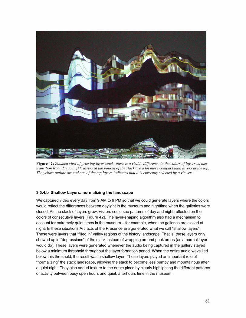
81
Figure 42: Zoomed view of growing layer stack; there is a visible difference in the colors of layers as they
transition from day to night; layers at the bottom of the stack are a lot more compact than layers at the top.
The yellow outline around one of the top layers indicates that it is currently selected by a viewer.
3.5.4.b Shallow Layers: normalizing the landscape
We captured video every day from 9 AM to 9 PM so that we could generate layers where the colors
would reflect the differences between daylight in the museum and nighttime when the galleries were
closed. As the stack of layers grew, visitors could see patterns of day and night reflected on the
colors of consecutive layers [Figure 42]. The layer-shaping algorithm also had a mechanism to
account for extremely quiet times in the museum – for example, when the galleries are closed at
night. In these situations Artifacts of the Presence Era generated what we call “shallow layers”.
These were layers that “filled in” valley regions of the history landscape. That is, these layers only
showed up in “depressions” of the stack instead of wrapping around peak areas (as a normal layer
would do). These layers were generated whenever the audio being captured in the gallery stayed
below a minimum threshold throughout the layer formation period. When the entire audio wave lied
below this threshold, the result was a shallow layer. These layers played an important role of
“normalizing” the stack landscape, allowing the stack to become less bumpy and mountainous after
a quiet night. They also added texture to the entire piece by clearly highlighting the different patterns
of activity between busy open hours and quiet, afterhours time in the museum.
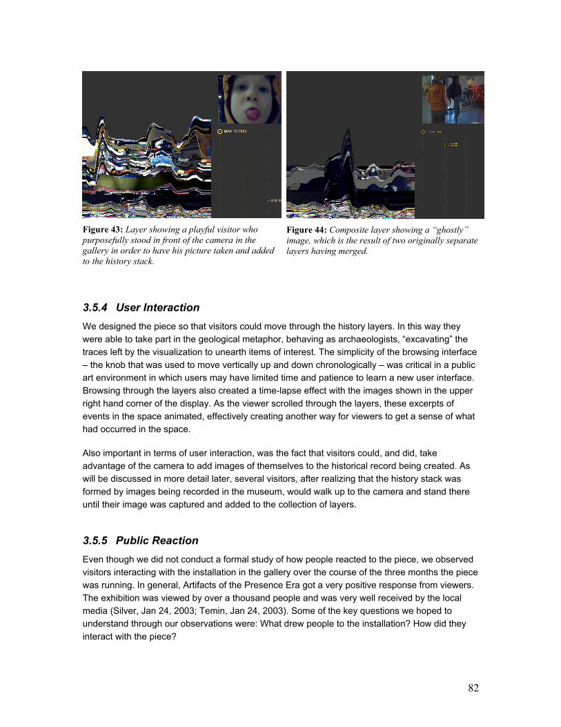
82
Figure 43: Layer showing a playful visitor who
purposefully stood in front of the camera in the
gallery in order to have his picture taken and added
to the history stack.
Figure 44: Composite layer showing a “ghostly”
image, which is the result of two originally separate
layers having merged.
3.5.4 User Interaction
We designed the piece so that visitors could move through the history layers. In this way they
were able to take part in the geological metaphor, behaving as archaeologists, “excavating” the
traces left by the visualization to unearth items of interest. The simplicity of the browsing interface
– the knob that was used to move vertically up and down chronologically – was critical in a public
art environment in which users may have limited time and patience to learn a new user interface.
Browsing through the layers also created a time-lapse effect with the images shown in the upper
right hand corner of the display. As the viewer scrolled through the layers, these excerpts of
events in the space animated, effectively creating another way for viewers to get a sense of what
had occurred in the space.
Also important in terms of user interaction, was the fact that visitors could, and did, take
advantage of the camera to add images of themselves to the historical record being created. As
will be discussed in more detail later, several visitors, after realizing that the history stack was
formed by images being recorded in the museum, would walk up to the camera and stand there
until their image was captured and added to the collection of layers.
3.5.5 Public Reaction
Even though we did not conduct a formal study of how people reacted to the piece, we observed
visitors interacting with the installation in the gallery over the course of the three months the piece
was running. In general, Artifacts of the Presence Era got a very positive response from viewers.
The exhibition was viewed by over a thousand people and was very well received by the local
media (Silver, Jan 24, 2003; Temin, Jan 24, 2003). Some of the key questions we hoped to
understand through our observations were: What drew people to the installation? How did they
interact with the piece?

83
People seemed to be drawn to the piece because of the imagery in the history stack. Most
visitors found the visualization very intriguing. When they knew that a gallery guide or one of the
creators of the piece was in the room, they often asked detailed questions about how the image
was generated, curious to know what data each visual element represented.
Maybe not surprisingly, seeing a recognizable face in the projections boosted people’s interest in
the visualization. Often if groups of people visited the gallery together, one person would walk in
front of the camera, and be seen by the other members of the group who were near the projection
screens. When learning that only one image would be saved in the history display every five
minutes and that images with more motion were more likely to be captured, some people went so
far as to stand in front of the camera for several minutes, sometimes waving their arms in the
process, in the hope of being captured.
Most people seemed to have understood that the piece was evolving in real time, as they looked
at the Present Display and realized that it was showing what was currently happening in the
gallery. Several visitors were struck by the fact that the visualization kept changing and that the
layered landscape was continuously growing. We observed visitors concluding that, if they were
to visit the piece again in the future, the then “current” stack of layers would look different and
most of the information that could be clearly seen on that specific day would be compressed and
“merged” as composite layers by their next visit.
This sense of fluid, evolving time seemed to be one of the most attractive aspects of the
installation to visitors. Being able to peek back at past moments in the gallery, seeing someone’s
glimpse, a person’s movement, a kid’s gesture provided visitors with moments of surprise and
amusement while giving them a sense of how the museum space had been inhabited in the
recent past. Visitors also enjoyed looking back at the night layers of the history stack because
these displayed a peculiar view of the galleries, one that showed what the museum looked like
after it was closed to the public. Visitors were excited to explore the unusually thick and dark layers
of evening parties held in the museum (regular night layers were thin because they represented
times when the galleries were silent). Sometimes viewers would also catch a glimpse of night layers
that showed the cleaning staff in the museum, vacuuming and tidying up the galleries.
From our observations it seemed that the audio part was the one least understood by some of the
visitors. We found out by listening to the comments of visitors that, a lot of times, it was not clear
to them what the audio wave being formed at the bottom of the Present Display meant in the
context of the piece. It seemed that several visitors never made the connection of the audio wave
with the resulting shape of layers being formed. Visitors seemed to think that the thickness of the
layers had to do with how many people where in the lobby area when the layer had been formed.
This conclusion, while incorrect, points to the fact that even those visitors who did not grasp the
technicalities of how the audio input was connected to the rest of the piece could still understand
the fact that the shape of the layers reflected the presence of people in the museum.
Finally, one of our main concerns when designing this piece were the privacy and surveillance
issues that arise when one sets up continuously running, unobtrusive cameras and a
microphones in a public space. Based on previous work dealing with cameras in public spaces
(Jancke et al 2001), we were worried that people might find the setup of the piece intrusive or
even offensive. To our surprise, however, visitors were amused by the camera and a lot of times
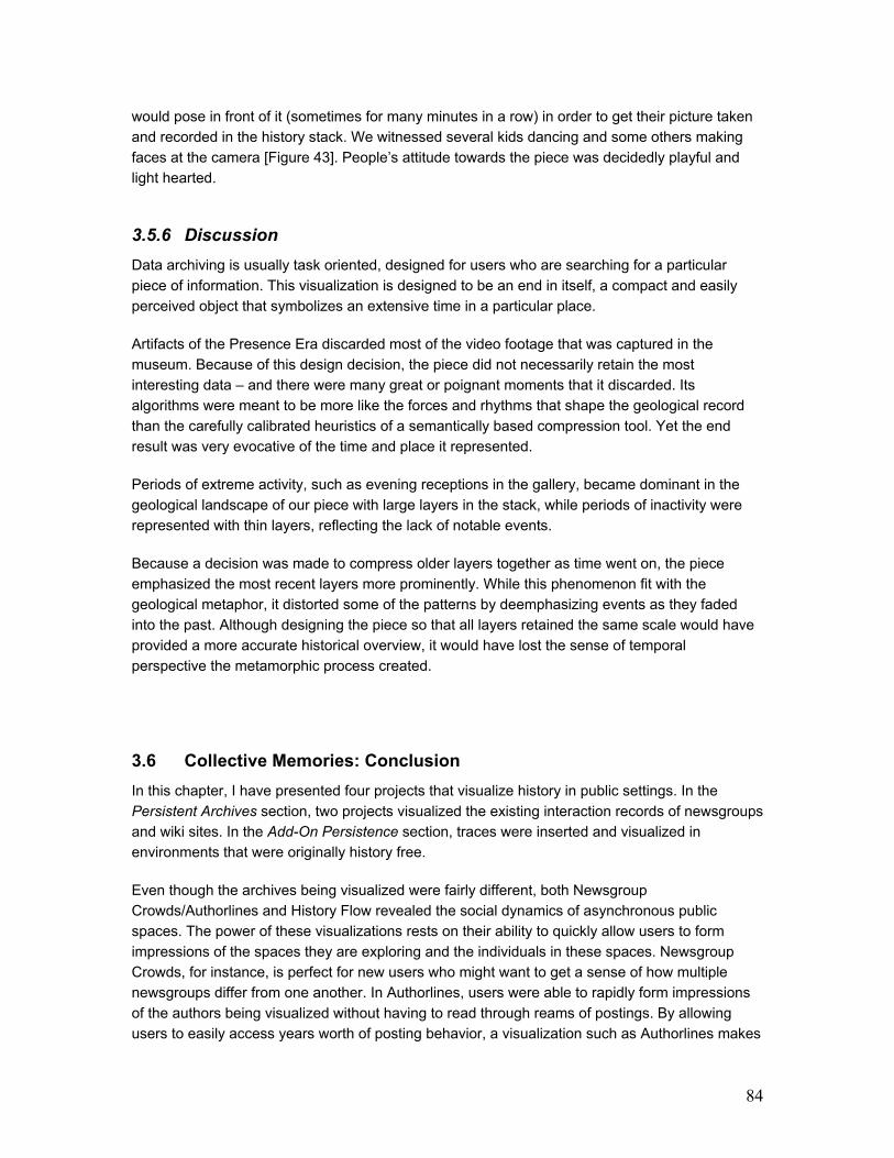
84
would pose in front of it (sometimes for many minutes in a row) in order to get their picture taken
and recorded in the history stack. We witnessed several kids dancing and some others making
faces at the camera [Figure 43]. People’s attitude towards the piece was decidedly playful and
light hearted.
3.5.6 Discussion
Data archiving is usually task oriented, designed for users who are searching for a particular
piece of information. This visualization is designed to be an end in itself, a compact and easily
perceived object that symbolizes an extensive time in a particular place.
Artifacts of the Presence Era discarded most of the video footage that was captured in the
museum. Because of this design decision, the piece did not necessarily retain the most
interesting data – and there were many great or poignant moments that it discarded. Its
algorithms were meant to be more like the forces and rhythms that shape the geological record
than the carefully calibrated heuristics of a semantically based compression tool. Yet the end
result was very evocative of the time and place it represented.
Periods of extreme activity, such as evening receptions in the gallery, became dominant in the
geological landscape of our piece with large layers in the stack, while periods of inactivity were
represented with thin layers, reflecting the lack of notable events.
Because a decision was made to compress older layers together as time went on, the piece
emphasized the most recent layers more prominently. While this phenomenon fit with the
geological metaphor, it distorted some of the patterns by deemphasizing events as they faded
into the past. Although designing the piece so that all layers retained the same scale would have
provided a more accurate historical overview, it would have lost the sense of temporal
perspective the metamorphic process created.
3.6 Collective Memories: Conclusion
In this chapter, I have presented four projects that visualize history in public settings. In the
Persistent Archives section, two projects visualized the existing interaction records of newsgroups
and wiki sites. In the Add-On Persistence section, traces were inserted and visualized in
environments that were originally history free.
Even though the archives being visualized were fairly different, both Newsgroup
Crowds/Authorlines and History Flow revealed the social dynamics of asynchronous public
spaces. The power of these visualizations rests on their ability to quickly allow users to form
impressions of the spaces they are exploring and the individuals in these spaces. Newsgroup
Crowds, for instance, is perfect for new users who might want to get a sense of how multiple
newsgroups differ from one another. In Authorlines, users were able to rapidly form impressions
of the authors being visualized without having to read through reams of postings. By allowing
users to easily access years worth of posting behavior, a visualization such as Authorlines makes

85
history available at a glance. This ability to feed behavioral data back into online communities has
been shown to increase social accountability (Kelly et al 2000). If used as part of newsgroups
regular interaction interfaces, these visualization could have significant impact on the social fabric
of a community by influencing trust among individuals.
In History Flow, the visualization of editing behavior over time revealed important mechanisms of
collaboration and conflict handling in the Wikipedia community. The visualization also highlighted
how quickly certain acts of vandalism are fixed by the community. Perhaps more importantly, by
showing years worth of editing action in a single image, History Flow very quickly impresses on
users what is “normal” behavior and what is “abnormal” or “weird” activity. I have personally
experienced this phenomenon with every single audience to which I have presented History Flow.
After a few seconds explaining how the visualization works, I ask the audience to tell me what
looks abnormal or “strange” in a given History Flow diagram and people readily point out patterns
such as the black dashes of mass deletions and zigzag signature of edit wars. It is true that
audience members may not initially understand what these strange patterns stand for, but they
are able to point them out all the same. This is where the tight coupling between visualization
patterns and content comes in handy. After the audience points out outlying patterns to me, I
show them how the content of the page being visualized changes over time and they promptly
grasp the notion of mass deletions and edit wars. The implications of such rapid exploration are
tremendous because they allow users to become familiar with the social workings of online
environments that even technologically savvy users have trouble grasping, such as wiki sites. It is
hard for most people to understand how such open spaces can be so successful.
In the Add-On Persistence section, I utilized history visualization in two spaces that are fairly
different from each other. In Chat Circles, the activity traces were part of the communication
interface and, because of that, allowed users to make expressive markings as they used the
chatroom space. Users whose representations left traces in the room made more dramatic use of
their avatars than did users whose actions left no marks in the room. The design of our user study
as a short-term experiment prevented us from investigating the long-term effects of having
presence markers in the chatroom.
The evocative metaphor of metamorphic rocks in Artifacts of the Presence Era points to an
additional direction for history visualizations: that of posterity piece. The design lessons for this
work carry implications to personally or collectively meaningful databases ranging from video
footage in personal web cams to newsgroups’ conversations. As the contents of digital archives
that permeate our daily lives become more emotionally charged – the accretion of all the
computer-mediated conversations people have with their loved ones over email, the growing
collection of digital pictures parents take of their kids – data analysis ceases to be the only
motivation for visualizing collections of documents. Such archives need to be regarded not only
as data repositories but also as the powerful catalysts for memory that they are.
This chapter has answered the question of what happens when we look at public spaces through
a variety of historical lenses: individual behavior, editing activity, and presence markers. As seen,
visualizations of collective past can yield some remarkable insights into the social dynamics of
online communities. The next chapter looks at what can be gained by visualizing the emotionally
charged, personal archives of people.
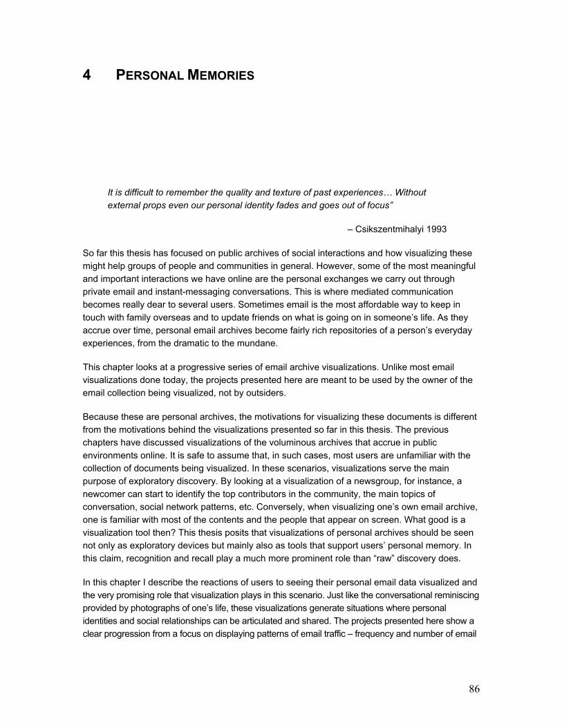
86
4 PERSONAL MEMORIES
It is difficult to remember the quality and texture of past experiences… Without
external props even our personal identity fades and goes out of focus”
– Csikszentmihalyi 1993
So far this thesis has focused on public archives of social interactions and how visualizing these
might help groups of people and communities in general. However, some of the most meaningful
and important interactions we have online are the personal exchanges we carry out through
private email and instant-messaging conversations. This is where mediated communication
becomes really dear to several users. Sometimes email is the most affordable way to keep in
touch with family overseas and to update friends on what is going on in someone’s life. As they
accrue over time, personal email archives become fairly rich repositories of a person’s everyday
experiences, from the dramatic to the mundane.
This chapter looks at a progressive series of email archive visualizations. Unlike most email
visualizations done today, the projects presented here are meant to be used by the owner of the
email collection being visualized, not by outsiders.
Because these are personal archives, the motivations for visualizing these documents is different
from the motivations behind the visualizations presented so far in this thesis. The previous
chapters have discussed visualizations of the voluminous archives that accrue in public
environments online. It is safe to assume that, in such cases, most users are unfamiliar with the
collection of documents being visualized. In these scenarios, visualizations serve the main
purpose of exploratory discovery. By looking at a visualization of a newsgroup, for instance, a
newcomer can start to identify the top contributors in the community, the main topics of
conversation, social network patterns, etc. Conversely, when visualizing one’s own email archive,
one is familiar with most of the contents and the people that appear on screen. What good is a
visualization tool then? This thesis posits that visualizations of personal archives should be seen
not only as exploratory devices but mainly also as tools that support users’ personal memory. In
this claim, recognition and recall play a much more prominent role than “raw” discovery does.
In this chapter I describe the reactions of users to seeing their personal email data visualized and
the very promising role that visualization plays in this scenario. Just like the conversational reminiscing
provided by photographs of one’s life, these visualizations generate situations where personal
identities and social relationships can be articulated and shared. The projects presented here show a
clear progression from a focus on displaying patterns of email traffic – frequency and number of email

87
exchanges between people – to a focus on content analysis. The different levels of insight afforded by
these visualizations are discussed in relation to design decisions and user feedback.
4.1 Related Work
Email is the ultimate killer application. It is so pervasive that it has been described as the habitat
of the information-age worker (Ducheneaut and Bellotti 2001). It is no surprise then, that research
on email spans a wide variety of fields: from information management, retrieval and security, to
spam detection, social network analysis, and user interface design. The growth of email archives,
in particular, presents challenges to librarians, scholars, historians, forensics experts, and
intelligence analysts. Recently, the information visualization community has also become
interested in the idea of exploring email archives and the opportunities they provide for the visual
discovery of patterns.
Here I present a brief overview of some of the work done on email archive visualizations. Roughly
speaking, the projects fall into four main categories:
- social network visualizations
- thread-based visualizations
- temporal visualizations
- contact-based visualizations
Social Network Fragments (Viégas et al 2004a) was done in the Sociable Media Group and was
one of the very first visualizations geared to the end user (the person whose email archive was
being visualized). Its use together with PostHistory8 revealed users’ interest in utilizing visualizations
as storytelling props [Figure 45 left]. Most other social network visualizations, however, focus on
allowing third party observers – scientists and researchers, for instance – to look at someone else’s
email archives. Recently Enron, the corporate giant, had its entire company email archives made
public in the wake of corruption allegations. This has been a boon for researchers who now have a
large corpus of email messages to explore. A team of researchers in Berkeley has built an entire
suite of social network visualizations for looking at the Enron archives [Figure 45 right].
In addition to looking at the structure of email networks, researchers have also started to look at
different aspects of email chronemics. MailView (Frau et al 2005), from the university of Kent,
displays emails on time-depentent plots [Figure 47 left]. Researchers at the University of
Maryland (Perer et al 2005), have also built a visualization toolkit that explores the temporal
rhythms of a person’s various email relationships [Figure 47 right].
Another kind of email visualization focuses on the thread structure of conversations. Researchers
from Microsoft [Figure 46 left] and IBM [Figure 46 right] have devised different ways of visualizing
email threads.
8 PostHistory is explained in greater detail later in this chapter
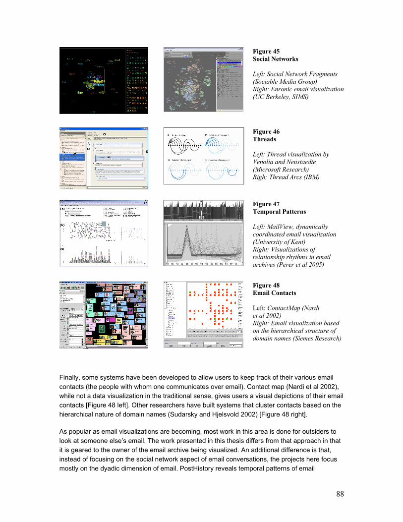
88
Figure 45
Social Networks
Left: Social Network Fragments
(Sociable Media Group)
Right: Enronic email visualization
(UC Berkeley, SIMS)
Figure 46
Threads
Left: Thread visualization by
Venolia and Neustaedte
(Microsoft Research)
Righ; Thread Arcs (IBM)
Figure 47
Temporal Patterns Left: MailView, dynamically
coordinated email visualization
(University of Kent)
Right: Visualizations of
relationship rhythms in email
archives (Perer et al 2005)
Figure 48
Email Contacts
Left: ContactMap (Nardi
et al 2002)
Right: Email visualization based
on the hierarchical structure of
domain names (Siemes Research)
Finally, some systems have been developed to allow users to keep track of their various email
contacts (the people with whom one communicates over email). Contact map (Nardi et al 2002),
while not a data visualization in the traditional sense, gives users a visual depictions of their email
contacts [Figure 48 left]. Other researchers have built systems that cluster contacts based on the
hierarchical nature of domain names (Sudarsky and Hjelsvold 2002) [Figure 48 right].
As popular as email visualizations are becoming, most work in this area is done for outsiders to
look at someone else’s email. The work presented in this thesis differs from that approach in that
it is geared to the owner of the email archive being visualized. An additional difference is that,
instead of focusing on the social network aspect of email conversations, the projects here focus
mostly on the dyadic dimension of email. PostHistory reveals temporal patterns of email

89
correspondence. Mountain displays the steady accumulation of email contacts over time, and
Themail explores the content of email conversations.
4.2 PostHistory9
Patterns in email usage are often inaccessible to users because the available archives provide
little descriptive detail. As such, PostHistory sets out to uncover two dimensions of email patterns:
1) dyadic exchange rhythms
2) the role of time in these patterns.
In presenting email data, the system follows a user-centric approach, focused on providing the user
with lasting impressions about their social interactions in email. The visualization attempts to uncover
the irregularities that users would recognize: vacation habits and project deadlines for instance.
In addressing these questions, PostHistory bases its analysis on header information: the FROM,
TO, CC, SUBJECT, and DATE fields present in both messages sent to and received by the user.
Email traffic is tracked as opposed to email content. As discussed later, this approach has both
merits and serious limitations.
4.2.1 The importance of dyads
In sociology, one of the most fundamental and yet elusive concepts is that of the “group.” A
special class of human grouping is the one termed “dyadic,” which refers to a group of two
people. The reason this group is in its own category is that only dyadic relationships have no
sense of collectivity. In all other groups, duties and responsibilities can be delegated whereas in
the dyad, each participant is immediately and directly responsible for any communal action
(Simmel 1908). This category of human relationship permeates personal spaces, including that of
email where the majority of conversations are only a few messages long and usually include only
two people (Hewett and Teplovs 1999). PostHistory focuses on this specific aspect of the user’s
social world: the users’ direct interactions with each of the contacts in their email world.
PostHistory focuses on two main data dimensions: (1) the dyadic relationships found in an email
archive, and (2) how these relationships evolve over time. By visualizing email activity along
these two axes, the system highlights interesting patterns that reflect the changes in interaction
between ego and his/her contacts over time such as:
1. How does the frequency of email exchange differ from one dyadic relationship to the next?
2. What are the rhythms of email exchange in the different relationships?
3. What does the landscape of egocentric, dyadic ties looks like? How does it evolve over time?
9 This section is based on portions of a paper published at HICSS (Viégas et al 2004a).
90
4. Is there a sense of periphery x centrality in the distribution of these dyadic ties? (i.e. What is
the core of people with whom ego corresponds? How big/small is this core? Does the
constitution of this core of people change over time?)
Figure 49: PostHistory interface with calendar panel on
the left and contacts panel on the right. A contact name
has been highlighted and the corresponding emails sent by
this person have been highlighted in yellow on the
calendar pane.
Figure 50: PostHistory interface with the circular mode
of the contacts panel on the right.
4.2.2 Time and Change
Time is a major structural factor in our lives. We pace ourselves by the hour, sometimes by the
minute. Not only does time structure our lives, it instills our daily activities with meaningful
rhythms. As anthropologists have long recognized, human practices are defined by the fact that
their temporal structure, direction, and rhythms are constitutive of their meaning (Bordieu 1977).
The same is true of our computer-mediated interactions: they are temporally structured and, as
such, defined by their tempo. Recent work on email rhythms (Begole et al 2002; Tyler and Tang
2003) has demonstrated that people are highly sensitive to the rhythms of email exchange, as they
are quite sophisticated and diligent in the coordination between receiving and sending messages.
PostHistory grounds its entire visualization scheme in the notion of time, expressing long-term
email exchange rhythms within an interface that is structured through a calendar. The system
visualizes the amount of email exchanged over time with each person the user knows, revealing
large concentrations of interaction during certain periods in contrast to times when almost no
email was exchanged. The application also visualizes how changing rhythms of email exchange
affect the social landscape of the user.

91
4.2.3 Implementation
In order to reveal the temporal and social dimensions mentioned above, PostHistory pre-
aggregates data on the following dimensions:
1. Daily email averages (i.e. how many messages a user sends and receives per day and
on average?)
2. Daily "quality" of emails (i.e. on a given day, are most of the messages sent directly to the
owner of the account, or are they sent to mailing lists to which the owner subscribes?)
3. Frequency of email exchanges with contacts (i.e. has “Mary” exchanged more/less email
with me today than usual?)
4. Comparative frequency of email exchanges with contacts (i.e. how does my email
exchange with “Mary” compare to the rest of my email activity with other contacts in my
social network?)
4.2.4 Interface
The PostHistory interface is divided into two main panels: the calendar panel on the left, which
shows the intensity of email exchanges over time, and the “contacts” panel on the right, which
shows the names of the people with whom ego has exchanged email [Figure 49].
The calendar panel displays email activity on a daily basis. Each square represents a single day
and each row of squares represents a week’s worth of email activity. Each week row starts on
Monday and ends on Sunday so that both week and weekend activities can be seen as
contrasting, adjacent visual units. Month names are shown on the right of week rows and each
day’s number is displayed above the day’s colored square. PostHistory shows an entire calendar
year at any given time, and the number of the year is shown at the bottom.
The size of each square represents the quantity of email received on that day. PostHistory
determines the average number of emails a person receives on a given day and uses this
average to determine the size of each daily square. Days with less than average numbers of
message are portrayed as small squares, while heavy email traffic days are shown through large
squares. Each square is centralized inside its grid cell and, as squares get bigger or smaller – in
a pattern reminiscent of halftone – the overall density pattern they create is readily perceived as
the gradation of intensity in email exchanges over time.
The second dimension used in the calendar visualization is color, which represents how
“personal” or “directed” to the user the messages have been on that particular day. Messages
where the only recipient is the user get tagged as “highly directed.” Messages where the user is
one of several recipients – i.e. their email address appears in conjunction with other email
addresses – get tagged as “somewhat directed.” Finally, messages where the user’s email
address does not appear – for instance, messages sent to mailing lists to which the user
subscribes – get tagged as “not directed at all.” PostHistory computes the “directedness” average

92
of a day based on the rating of all messages on that day. The brighter the color of a given day,
the more directed that day has been.
The “contacts” panel on the right displays the names of the people who have sent messages to
the user up to that point in time (i.e. the disposition of names is driven by the calendar panel).
There are three visualization modes in the contacts panel: vertical [Figure 49], circular [Figure
50], and alphabetical.
The vertical mode of the contacts panel displays ego’s name at the top of the panel; other
people’s names are placed below it, such that the most frequent contacts are visually closest to
ego. The circular mode works is similar to the typical circular egocentric diagrams first devised by
sociologists looking at social networks (Wellman 1997): ego’s name is displayed in the center of
the diagram and contacts’ names surround it. The closer someone’s name is to the center of the
diagram, the more email messages this person has exchanged with ego. The alphabetical mode
presents a table of contacts’ names that can be sorted either by alphabetical order or by the
number of emails people have sent to ego.
4.2.5 Interaction
Interaction with the PostHistory interface causes temporal patterns of email exchange to be
highlighted. When the user clicks on a specific day on the calendar, the names of people who
have sent email to ego on that day get highlighted on the contacts panel.
After the user clicks on the name of a person on the contacts panel, yellow squares are displayed
on top of each day in the calendar panel that the person has sent a message to ego. Each yellow
square represents a message sent to ego by that person. The accumulation of yellow squares on
the calendar panel creates a visual pattern that highlights times when email exchange was
intense and contrasts times when the exchange between the two people was at its lowest levels.
Finally, users can animate the passage of time in PostHistory to observe the changes in the
landscape of names displayed in the contacts panel. Underneath the vertical and circular modes
of the contacts panel, there are “play” and “pause” buttons that allows the user to animate the
passage of time. In the time animation, each day gets momentarily highlighted, from the start of
the chosen year to its end. Over the course of time, new names appear on the right panel
indicating the beginning of email exchange with a new person. In the vertical mode of the contact
panel, a contact’s name can move upwards – closer to ego – to reflect periods of more intensive
email exchanges. If ego starts to work on a project with “Maria,” her name might move up a
couple of levels very quickly during the time of the project and then subside again when the
project is over. This creates a series of rhythms on the contacts panel – names moving up,
staying stationary, moving down – that reflect the ebb and flow of ego’s evolving email
relationships.
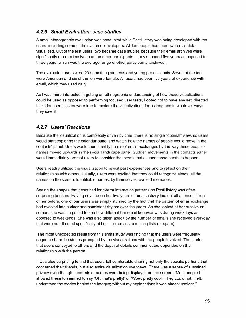
93
4.2.6 Small Evaluation: case studies
A small ethnographic evaluation was conducted while PostHistory was being developed with ten
users, including some of the systems’ developers. All ten people had their own email data
visualized. Out of the test users, two became case studies because their email archives were
significantly more extensive than the other participants – they spanned five years as opposed to
three years, which was the average range of other participants’ archives.
The evaluation users were 20-something students and young professionals. Seven of the ten
were American and six of the ten were female. All users had over five years of experience with
email, which they used daily.
As I was more interested in getting an ethnographic understanding of how these visualizations
could be used as opposed to performing focused user tests, I opted not to have any set, directed
tasks for users. Users were free to explore the visualizations for as long and in whatever ways
they saw fit.
4.2.7 Users’ Reactions
Because the visualization is completely driven by time, there is no single “optimal” view, so users
would start exploring the calendar panel and watch how the names of people would move in the
contacts’ panel. Users would then identify bursts of email exchanges by the way these people’s
names moved upwards in the social landscape panel. Sudden movements in the contacts panel
would immediately prompt users to consider the events that caused those bursts to happen.
Users readily utilized the visualization to revisit past experiences and to reflect on their
relationships with others. Usually, users were excited that they could recognize almost all the
names on the screen. Identifiable names, by themselves, evoked memories.
Seeing the shapes that described long-term interaction patterns on PostHistory was often
surprising to users. Having never seen her five years of email activity laid out all at once in front
of her before, one of our users was simply stunned by the fact that the pattern of email exchange
had evolved into a clear and consistent rhythm over the years. As she looked at her archive on
screen, she was surprised to see how different her email behavior was during weekdays as
opposed to weekends. She was also taken aback by the number of emails she received everyday
that were not directed specifically at her – i.e. emails to mailing lists (or spam).
The most unexpected result from this small study was finding that the users were frequently
eager to share the stories prompted by the visualizations with the people involved. The stories
that users conveyed to others and the depth of details communicated depended on their
relationship with the person.
It was also surprising to find that users felt comfortable sharing not only the specific portions that
concerned their friends, but also entire visualization overviews. There was a sense of sustained
privacy even though hundreds of names were being displayed on the screen. “Most people I
showed these to seemed to say ‘Oh, that's pretty!’ or ‘Wow, pretty cool.’ They could not, I felt,
understand the stories behind the images; without my explanations it was almost useless.”

94
Another user observed: “Sure, my closest friends could tell what those clusters [of names] were
and why they were so significant to me. But very few people had access to all of the different
social circles that I knew and maintained.” These testimonials seem to suggest that these
visualization kept just enough of the context needed for memory prompting and storytelling
without spelling out the details. In other words, the visualization seems to provide users with a
comfortable balance between private and public boundaries.
Users saw the “rise and fall” of many relationships: “I loved to see the pattern of my relationships
with various lovers: intense conversation, then stability, then slowed down conversation and then
!bam! no conversation (a.k.a. breakup). I saw my vacation habits, the intense (procrastination)
email during the stressful periods of the school year.” Some users would animate the time aspect
of PostHistory many times over to see the way the names on the contacts panel moved as time
progressed. After looking at his data on both systems, one of our case study users remarked on
the transient nature of his relationships: “In the broadest way, the visualizations made me very
aware of the ephemeral nature of relationships and community […]. Observing how my
relationships grew and died was fascinating.”
The visualization also highlighted the core group of relations and how this core evolved over time.
“Seeing my social network in PostHistory makes me aware of how many people overall I know,
and how few of them really count. It's fascinating to see how some of the stronger names (higher
up on the screen) stay around for a long time, bobbing up and down occasionally; how some of
them faded away slowly while others crashed instantly.”
4.2.8 Concerns
After using PostHistory, some users complained about the inability to go back into the calendar
panel and annotate important dates/events; they felt that after they had located meaningful
periods of activity, they wanted to highlight those in some way for future reference. The vertical
mode of the contacts panel was a lot more legible to users than the circular mode; users felt that
comparisons in the vertical mode were a lot easier to track than in the circular display. Some
users wanted to have PostHistory either linked to the actual email messages it represents or have
it show the subject lines of the messages being visualized so that people could get an idea of the
content of the exchanges shown on the screen. This reaction suggests that there might be
multiple levels at which users are interested in interacting with these visualizations: the high-level
patterns of social interaction that evolve over time could serve as a map for accessing “lower-
level” contents of conversations. This possibility implies multiple levels of privacy and
presentation for visualizations such as these.
4.2.9 Photographs?
In developing PostHistory I focused on creating a personally informative tool that provided high-
level views of social interaction over time. The evaluation with users, however, revealed that the
system had a much broader appeal. Not only did it allow users to reflect personally, but it also
operated as an artifact for sharing and storytelling. Whereas unanticipated uses for novel
applications are not that startling – people often find surprising social ways of using software

95
Figure 51: In the mountain above, the owner of the email archive has graduated from one school and
moved to a new university for his graduate studies. This is the reason why we see two distinct mountains;
the mountain on the right represents the surge of new contacts this person has made in the new school.
(Moningstar and Farmer 1990) – it is important to discuss both the design intentions and the uses
that emerged from users’ interactions with this application into the discussion.
Some of the ways in which users interacted with the visualization are reminiscent of how people
relate to photographs. People return to their photos to reflect on past experiences as well as to

96
share aspects of their lives with others. Photographs themselves convey limited slices of the
events they represent, but their presence allows the owner to convey as much or as little as they
want in sharing the event represented. Although our stories are as deeply embedded in our email
as they are in our photos, we rarely have access to any sort of “snapshot” of our email so as to
have these deep reflections and storytelling opportunities. The higher-level view of our digital
experiences is buried deep within the actual data. When users began storytelling around the
visualization, it became clear that it provided a missing link; it an accessible view for sharing and
reflecting upon past digital experiences, without revealing too much.
4.3 Mountain
Email archives are
ubiquitous, cumbersome
and vastly voluminous. This
visualization reflects the
massive nature of these
archives by depicting them
as a growing mountain over
time. In contrast to
PostHistory, Mountain does
not focus on the raw
frequency of exchanged
emails; instead, it displays
an impression of rising and
waning relationships based
on the recency of message
exchanges.
Mountain visualizes a
person's email archive in
terms of all the people with
whom this person has been
in touch over the years.
Each layer in the Mountain represents a different person. Layers are ordered by time, with the
first people in the email archive at the bottom and the most recent people in the archive at the top
right portion of the mountain. The thickness of each layer refers to how recently the person has been
in contact with ego (the owner of the email archive). If, for instance, a person has not been in touch
with ego in the last month, the thickness of the layer decreases. If, on the other hand, a person has
not been in touch with ego for the past year, the layer slowly flattens out and disappears.
Users can highlight specific layers in the Mountain causing the first words of every email
exchanged with this person to appear on the screen [Figure 51].
The piece is a commentary on the continuous accumulation of email contacts over time and the
large amounts of people we are constantly in touch with over email.
97
4.4 Themail: Visualizing content
Unlike PostHistory and Mountain, which visualize email traffic patterns, Themail focuses on the
contents of a person's email archive over time. The project looks beyond “who is talking to whom”
to explore what people are talking about. The application addresses two main research
questions:
1) What kinds of things do I (the owner of the archive) talk about with my various email contacts?
2) How do my email conversations with one person differ from those with other people?
In essence, Themail displays a series of words arranged along a timeline. These words represent
the most salient things that people talked about over time. And, just like painted portraits that
have a series of visual and conceptual “layers” – background, middle ground, and foreground –
Themail also counts on a set of typographic layers to build its historic portrait. The selection and
visual treatment of words is different in each layer.
There are two main “layers” of words:
- Year words (gray words)
The background layer displays the most common words used in email conversations over an
entire year. The selection of words is solely based on frequency of use – Themail uses a stop

98
list to disregard overly common words such as the, of, my, your, etc. These words show up in
dark, faded gray in the background.
- Month words (yellow words)
The foreground layer displays the most unique and frequently used words in email conversations
over a month. The selection and font size of words is based not only on frequency but also on
how uniquely the word is to a specific relationship. For instance, if one uses the word
“environment” a lot with a friend but not with anyone else, the word will appear fairly large when
one visualizes her/his communication with that friend. If, on the other hand, the word
“environment” is used a lot with other people, the word will not be as large in the visualization. The
more frequent and unique a work is, the bigger it appears in the monthly columns.
To the right of the visualization panel, a table displays all addresses of contacts in the user’s
email archive. When the user selects one of these contacts, Themail visualizes the conversation
history with that person.
Circles:
Each circle displayed among the columns of words represents an email that has been
exchanged with the selected person during that month. The size of the circle refers to the size of
the exchanged email (the number of original – i.e. not quoted – words the email contains). The
color of the circle represents the “direction” of the email:
- outgoing � muted red
- incoming � muted yellow
- incoming, impersonal (sent by the selected person to a list ego is a part of) � gray
4.4.1 Viewing email messages
Whenever a user mouses over words in a month column, they are highlighted in white and in a
big font size – which causes even words set in undersized fonts to be easily read. When a user
clicks on a month word, the email messages that have the selected word appear in an information
box [Figure 52], allowing users to recall the context in which the word was used in the past.
99
Figure 52: View of Themail with a selected month
word. When a word is selected, it causes the emails that
contain that word (in that month) to show up on the
screen. The user can read multiple messages related to
that word by using the navigation options within the
email message box (image on the right).
The box that shows emails packs a lot of functionality. It displays the headers of the displayed
message and it highlights all instances of the word that has been highlighted in the visualization
[Figure 52]. If an email is too long to be shown in the box, the white up and down arrows to the
right of the message allow the user to scroll through the message.
The email box also informs how many emails contain the selected word during the chosen month
(in Figure 52 on the right, it shows that there are 4 messages with the word "Orkut"). The user
can navigate the various messages either by clicking on the side arrows in the box or by using
the left and right arrows in the keyboard.
4.4.2 Time Scale
Themail displays content over time and, as such, temporal rhythms are an important aspect of the
visualization. A sporadic relationship, one where correspondents exchange a few messages
every other month, should look different from one where users correspond every single week.
Themail has two ways of displaying content over time: the expanded view and the collapsed view.
In the expanded view, monthly columns are placed in their real position in time and months
without exchange emails show up as blank spaces in the visualization [Figure 53].
The “collapsed” view displays only the months with email correspondence. In this view there are
no blank spaces [Figure 52]. In this way, the collapsed view populates the screen with the largest
amount of information, allowing users to quickly get a sense of the collection of words in their
correspondence with an email contact.
100
4.4.3 Themail Processor: handling email content
The Themail Processor application is the backend portion of Themail; it is the software that reads
in and processes the email archives users would like to visualize [Figure 54]. The Processor
treats people, messages and words as primary objects.
The Themail processor begins by reading MBOX mailbox files. This format is the internet-wide
standard specified in RFC 2822, “Internet Message Format” (www.faqs.org/rfcs/rfc2822.html). As
it reads the files, it collects references to each email address, message, and word. After
processing all the MBOX files, the Themail processor now has a complete structure of email
addresses, messages and words. However, three problems regarding the list of email addresses
remain. First, many people have multiple email addresses, and so are represented repeatedly
and fragmentedly in the dataset. Secondly, spam plagues email users, and so many addresses
in the list are likely those of spammers. Thirdly, users who subscribe to mailing lists will
undoubtedly have many messages from people they do not know. Themail solves these
problems with two steps, which are called “combine addresses” and “remove spammers.”
In combining addresses, the user is prompted to select groups of addresses that belong to the
same person. For example, “[email protected]”, “[email protected]” and “[email protected]” might all
be email addresses of Bob Foo. When a Themail user specifies such a group of addresses, the
first address in that group is treated as the “primary” address into which all the others are merged.
Finally, only the 200 most prolific email addresses are retained. The 200 addresses that are
associated with (i.e. have sent or received) the most messages are kept. All other addresses, as
well as their associated messages, are removed from the system.
After the data is culled to only the most important people, words and people are directly
associated with one another; that is, the message ceases to be an important unit of analysis.
For each person, a keyword scoring function is performed. This process is based on the well-
known TFIDF algorithm (Salton 1989) that scores words based on their frequency as well as their
uniqueness (http://instruct.uwo.ca/gplis/601/week3/tfidf.html):
Figure 53: Expanded view of communication with a friend. The arrangement of monthly columns over time quickly gives
users a sense of the rhythm of the relationship; in this case, the email traffic is fairly sporadic with several months when
no emails were exchanged.
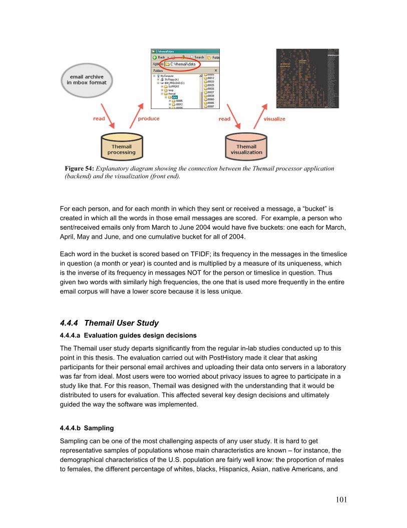
101
For each person, and for each month in which they sent or received a message, a “bucket” is
created in which all the words in those email messages are scored. For example, a person who
sent/received emails only from March to June 2004 would have five buckets: one each for March,
April, May and June, and one cumulative bucket for all of 2004.
Each word in the bucket is scored based on TFIDF; its frequency in the messages in the timeslice
in question (a month or year) is counted and is multiplied by a measure of its uniqueness, which
is the inverse of its frequency in messages NOT for the person or timeslice in question. Thus
given two words with similarly high frequencies, the one that is used more frequently in the entire
email corpus will have a lower score because it is less unique.
4.4.4 Themail User Study
4.4.4.a Evaluation guides design decisions
The Themail user study departs significantly from the regular in-lab studies conducted up to this
point in this thesis. The evaluation carried out with PostHistory made it clear that asking
participants for their personal email archives and uploading their data onto servers in a laboratory
was far from ideal. Most users were too worried about privacy issues to agree to participate in a
study like that. For this reason, Themail was designed with the understanding that it would be
distributed to users for evaluation. This affected several key design decisions and ultimately
guided the way the software was implemented.
4.4.4.b Sampling
Sampling can be one of the most challenging aspects of any user study. It is hard to get
representative samples of populations whose main characteristics are known – for instance, the
demographical characteristics of the U.S. population are fairly well know: the proportion of males
to females, the different percentage of whites, blacks, Hispanics, Asian, native Americans, and
Figure 54: Explanatory diagram showing the connection between the Themail processor application
(backend) and the visualization (front end).

102
other ethnicities in the population, etc. It is much harder, however, to determine what a
representative sample of an “unknown” population may be. For instance, the population with
which this study is concerned consists of email users who keep large archives of messages.10
Not much is known about the entire population of email users in the world, let alone about email
users with vast archives. There are no data about what percentage of email users keep such
archives and nothing is known about their demographics either; their ages, ethnicity makeup,
occupations, etc. Therefore, attempting to get a representative set of users for this study would
have been an impossible task.
Instead, the sampling strategy in this study relied on the author’s personal knowledge of where to
find email users who were likely to have extensive archives of email messages. It is a known fact
that not every person can keep large archives even if he/she would like to have such a collection
or if he/she uses email everyday. Most “regular” email users – i.e. those that rely on free
commercial email accounts like the ones available from services such as Hotmail.com,
Yahoo.com, etc. – did not, up to recently, have the capability of keeping large archives because
these accounts had very low storage limits. Both Hotmail and Yahoo used to offer less than 10
MB of free storage space until Gmail from Google was launched with a free mailbox of 1 GB.11
The implication of having such low storage space is that most users did not have any good way of
accumulating significant email archives. Therefore, people whose main email accounts are
popular, free commercial ones were not considered for this experiment. This leaves two main
sources of potential participants: people with academic email accounts and those with privately
owned commercial email accounts (such as a company’s email, for example). Participants for the
Themail user study were selected from these two venues: academia and industry.
4.4.4.c Backend design guided by user study
Most applications that process and visualize vast amounts of data rely on databases for data
storage and queries. Because it was important for Themail to be distributed to users and to run
locally on their machines the decision was made to rely on text files as opposed to databases. This
choice meant that users would not have to deal with downloading, installing and populating a database
prior to running the Themail visualization. In addition, Themail was designed to run on multiple platforms
(Windows, Macs, and Unix) in order to maximize the number of participants in the study.
10 For the purposes of this study, “large archives” are those that span at least three years or that are at least 100 MB. 11 In 2004 Google launched Gmail, its email service, built on the idea that users should never have to delete
email messages and should always be able to find the messages they want. As part of Google's self-
proclaimed mission to “organize the world's information and make it universally accessible and useful”,
Gmail offered an unprecedented amount of free email storage to its users: it started at 1 GB and is now over
2 GB whereas its main competitors – Hotmail and Yahoo – originally offered less than 10 MB of free storage
space. The impact of Gmail’s free storage space was so significant that Yahoo quickly upgraded the storage
capability of its free email accounts to 1 GB.
103
4.4.4.d Method
Unlike a laboratory user study where participant are brought into a controlled environment and
use machines that have been specially set up for the tasks at hand, Themail’s evaluation took
place out in the “real world,” running remotely on users’ regular computers. Participants carried
out every step of the process – from setting up and processing the email archives to visualizing
the data – without supervision. This is a challenging arrangement because it means that when
something goes wrong, the researcher is not there to help trouble shoot the problem and the
likelihood that the user will finish the study decreases.
As a way to address this difficulty, the Themail user study was broken down into steps and a
support system of Web pages was set up to guide users step by step. An email address was
given to users for reporting any problems they might have throughout the process.
1) Participant selection: Prior to being selected as a participant in the Themail user study, users had to fill out an online recruiting form about their email archives. Answers to this questionnaire determined whether the Themail Processor application was compatible with the potential participant’s email archives. Some of the questions asked included:
- What program(s) do you currently use to read your email?
- Where is your email archive currently located?
- What format is your email archived in?
- How large is/are your mailbox(es) in megabytes, total?
2) Themail Processor: email archive processing: After being selected for the user study, participants were sent the Themail Processor application for processing their data.
Themail Processor reads in an email archive and generates a series of files containing all of the
data that will be used by the visualization program. Every time a user runs the Themail
visualization, it reads the data in the directory and generates a visual representation of that data.
Once the Themail Processor application has successfully handled the participant’s entire email
archive, the user is sent the Themail visualization program.
3) Interview: A date and time was scheduled with each participant for a live interview.12
Participants were told to use the visualization before the interview took place. During the
interview, participants were asked questions about their experience with Themail.
4.4.5 User Study Results
4.4.5.a Demographics
- 16 participants - 4 female, 12 male - Age range: from 18 to 50 - Age distribution:
o Between 18 and 30 years old 10 participants o Between 31 and 40 years old 4 participants
12 In the case of users participating in the study remotely, the interview was conducted over email.
104
o Between 41 and 50 years old 2 participants - Occupation
o Student 7 participants o Professional 9 participants
- Native language distribution o English 11 participants o Portuguese 2 participants o German 1 participant o Japanese 1 participant o Spanish 1 participant
Participants for the Themail user study were selected both from industry and from academia,
more specifically, participants came from:
- two major American universities
- an American technology company
- a British telecommunications company
- a French telecommunications company
4.4.5.b Kinds of email archives
- total size of archives uploaded to Themail o less than 100 MB 2 participants o between 100 and 300 MB 2 participants o between 300 and 600 MB 3 participants o between 600 and 900 MB 3 participants o greater than 900 MB 5 participants
- kind of archive
o IMAP 5 participants o Mac Mail 5 participants o Mbox 4 participants o Webmail 1 participant o Outlook 1 participant
- number of years spanned by each participant’s archive
o less than 1 year 1 participant o 2 years 3 participants o 3 years 1 participant o 4 years 2 participant o 5 years 3 participants o 6 years 3 participants o 7 years 1 participant o 8 years -- o 9 years 2 participants
- Number of mailboxes uploaded by each participant to Themail o 1 – 10 mailboxes 11 participants o 11 – 20 mailboxes 2 participants o 21 – 30 mailboxes 2 participants o 50 or more mailboxes 5 participants
105
4.4.5.c Results
Overall, participants were excited to use Themail to look back at their email archives. When
prompted to explain what kind of information the tool displayed about their relationships with
people, most participants would quickly engage in storytelling. Participants would often gesture
and point to different parts of the visualization as they explained the information they saw
onscreen. The expressive use of body language and the fluidity with which users engaged in
these actions were impressive and suggest that, unlike current email interfaces, this visualization
supports users in actively engaging personal memories for animated recall and storytelling.
When asked, on a scale from 1 to 5 (1 being the least and 5 being the most), how much they
enjoyed looking at their email archives on Themail, participants responded, on average 3.9.
When asked whether they would like to use the tool again if it were integrated in their email
reader, 87% of participants responded yes.
In the following sections, I describe two case studies and discuss some of the main themes to have emerged from the user study.
4.4.5.d Two Case Studies
Of the 16 participants in this user study, two became case studies because of their availability for
longer interviews and the higher level of access they gave me to the visualization of their data. In
this section I discuss their reactions to Themail. All names have been changed for privacy reasons.
Ann
Ann is a graduate student at MIT. She is 26 years old and has recently gotten married. Her
extended family lives in the south of the United States and she lives with her husband in New
England. For Ann, one of the most exiting aspects of Themail was being able to see all the
correspondence that preceded her wedding:
It was funny going back both with [my husband] and my parents, there were these
few months before our wedding… it’s ALL about the wedding! There are all these
words like “invitations,” “tables,” “drinks,” guests’ names. It’s got all these words that
are totally related to the wedding plans. It was in October and November [user
gestures a peak] and then the words completely changed after that. And the same
happened with my friends that were bridesmaids. There are these few months where
you can see that the words were related to our wedding theme but then, the month
after the conversation it all switched back to normal. Yeah, it was like the before and
after. You could definitely see the event.
Ann thought it was important that Themail allowed her to look back at her relationships with loved
ones, friends, and family. Even though she exchanges more emails with her coworkers on a daily
basis, it was the personal facet of her email archive that she felt was the most exciting to explore.
Especially for my family, it was really fun to see all the words and the things that we
talk about for no reason other than to just reminisce; it was like looking through a
photo album or something. For instance, I would never go back and search for the
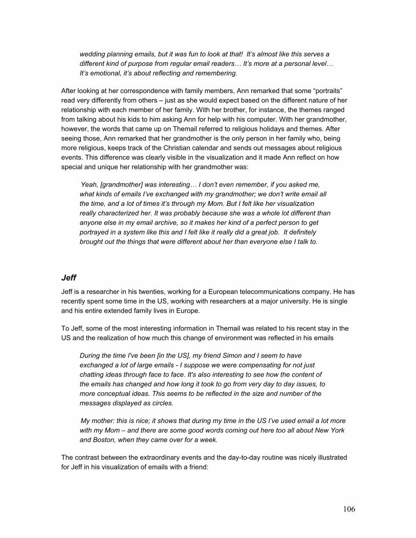
106
wedding planning emails, but it was fun to look at that! It’s almost like this serves a
different kind of purpose from regular email readers… It’s more at a personal level…
It’s emotional, it’s about reflecting and remembering.
After looking at her correspondence with family members, Ann remarked that some “portraits”
read very differently from others – just as she would expect based on the different nature of her
relationship with each member of her family. With her brother, for instance, the themes ranged
from talking about his kids to him asking Ann for help with his computer. With her grandmother,
however, the words that came up on Themail referred to religious holidays and themes. After
seeing those, Ann remarked that her grandmother is the only person in her family who, being
more religious, keeps track of the Christian calendar and sends out messages about religious
events. This difference was clearly visible in the visualization and it made Ann reflect on how
special and unique her relationship with her grandmother was:
Yeah, [grandmother] was interesting… I don’t even remember, if you asked me,
what kinds of emails I’ve exchanged with my grandmother; we don’t write email all
the time, and a lot of times it’s through my Mom. But I felt like her visualization
really characterized her. It was probably because she was a whole lot different than
anyone else in my email archive, so it makes her kind of a perfect person to get
portrayed in a system like this and I felt like it really did a great job. It definitely
brought out the things that were different about her than everyone else I talk to.
Jeff
Jeff is a researcher in his twenties, working for a European telecommunications company. He has
recently spent some time in the US, working with researchers at a major university. He is single
and his entire extended family lives in Europe.
To Jeff, some of the most interesting information in Themail was related to his recent stay in the
US and the realization of how much this change of environment was reflected in his emails
During the time I've been [in the US], my friend Simon and I seem to have
exchanged a lot of large emails - I suppose we were compensating for not just
chatting ideas through face to face. It's also interesting to see how the content of
the emails has changed and how long it took to go from very day to day issues, to
more conceptual ideas. This seems to be reflected in the size and number of the
messages displayed as circles.
My mother: this is nice; it shows that during my time in the US I’ve used email a lot more
with my Mom – and there are some good words coming out here too all about New York
and Boston, when they came over for a week.
The contrast between the extraordinary events and the day-to-day routine was nicely illustrated
for Jeff in his visualization of emails with a friend:
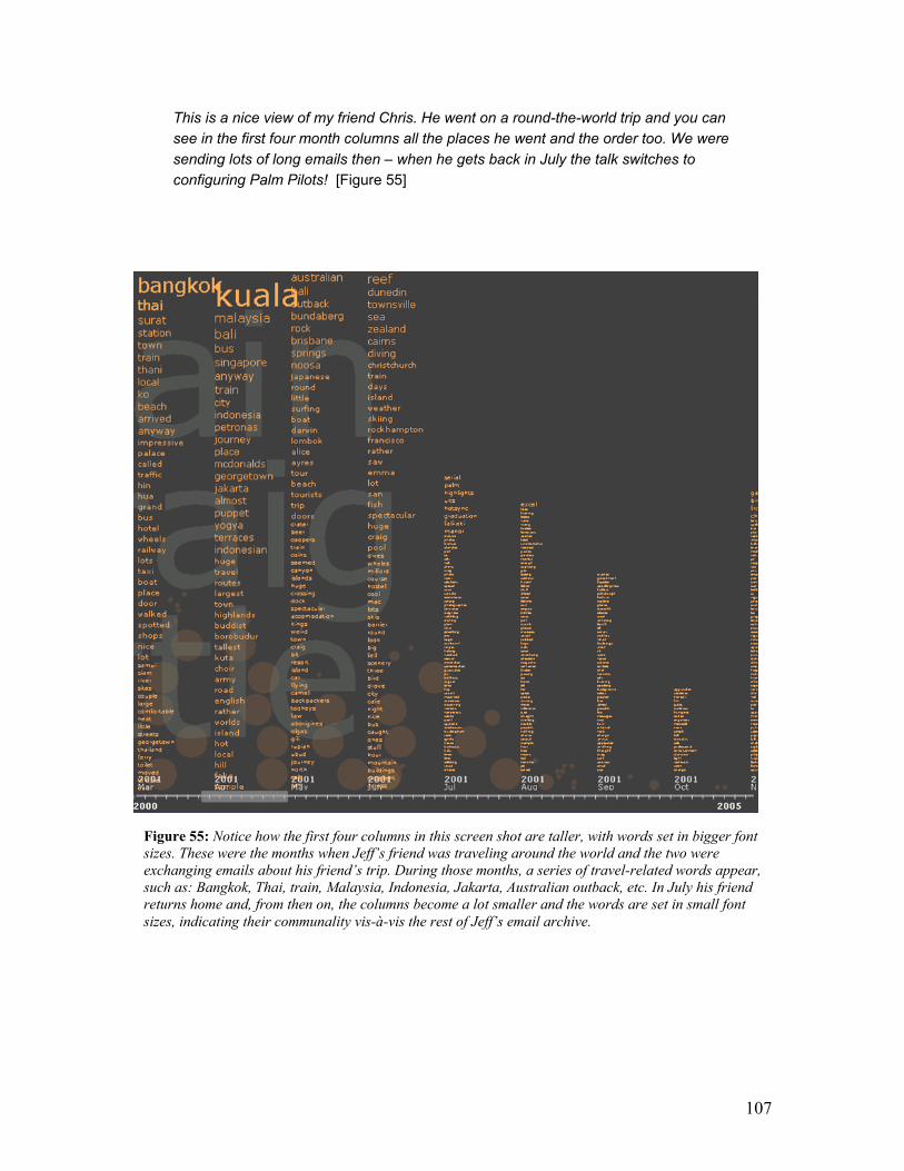
107
This is a nice view of my friend Chris. He went on a round-the-world trip and you can
see in the first four month columns all the places he went and the order too. We were
sending lots of long emails then – when he gets back in July the talk switches to
configuring Palm Pilots! [Figure 55]
Figure 55: Notice how the first four columns in this screen shot are taller, with words set in bigger font
sizes. These were the months when Jeff’s friend was traveling around the world and the two were
exchanging emails about his friend’s trip. During those months, a series of travel-related words appear,
such as: Bangkok, Thai, train, Malaysia, Indonesia, Jakarta, Australian outback, etc. In July his friend
returns home and, from then on, the columns become a lot smaller and the words are set in small font
sizes, indicating their communality vis-à-vis the rest of Jeff’s email archive.
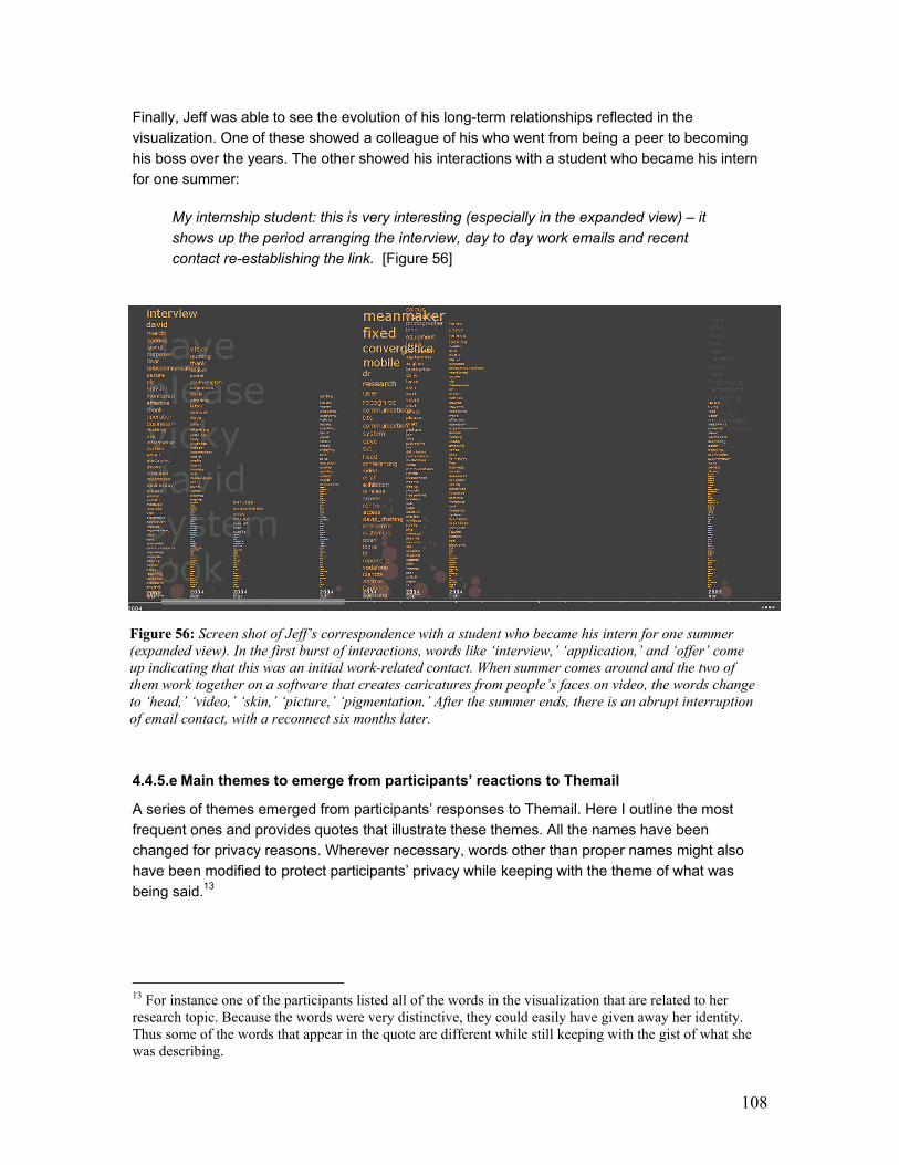
108
Finally, Jeff was able to see the evolution of his long-term relationships reflected in the
visualization. One of these showed a colleague of his who went from being a peer to becoming
his boss over the years. The other showed his interactions with a student who became his intern
for one summer:
My internship student: this is very interesting (especially in the expanded view) – it
shows up the period arranging the interview, day to day work emails and recent
contact re-establishing the link. [Figure 56]
4.4.5.e Main themes to emerge from participants’ reactions to Themail
A series of themes emerged from participants’ responses to Themail. Here I outline the most
frequent ones and provides quotes that illustrate these themes. All the names have been
changed for privacy reasons. Wherever necessary, words other than proper names might also
have been modified to protect participants’ privacy while keeping with the theme of what was
being said.13
13 For instance one of the participants listed all of the words in the visualization that are related to her research topic. Because the words were very distinctive, they could easily have given away her identity. Thus some of the words that appear in the quote are different while still keeping with the gist of what she was describing.
Figure 56: Screen shot of Jeff’s correspondence with a student who became his intern for one summer
(expanded view). In the first burst of interactions, words like ‘interview,’ ‘application,’ and ‘offer’ come
up indicating that this was an initial work-related contact. When summer comes around and the two of
them work together on a software that creates caricatures from people’s faces on video, the words change
to ‘head,’ ‘video,’ ‘skin,’ ‘picture,’ ‘pigmentation.’ After the summer ends, there is an abrupt interruption
of email contact, with a reconnect six months later.
109
1) Event-driven interface
Users remarked on how the visualization made events “emerge” in the interface. For instance, it
was easy to see the “before & after” effect that dramatic events had on their communication
patterns with others – as was the case with Ann’s wedding correspondence. The integration of
keywords to a time line lead users to quickly identify past events in their lives.
For the most part, I’d say that all the words made sense. Especially for the months, it
was usually around an event… Sometimes a word wouldn’t make sense but then I’d
click on it and realize “oh yeah, we did talk about that… at that time.
2) The portrait
Most participants enjoyed having a representation that was indicative of the various relationships
they had; they appreciated having their expectations confirmed by the visualization while still
being able to drill deeper and discover patterns they were not aware of. For several people, the
most enjoyable aspect of interacting with the system was looking at their families and friends in
the visualization and comparing what they saw on screen with their impressions of these
relationships; being reminded of important events in their lives; seeing the evolution of their
relationships.
The best "portrait" was for the mail with my mother...There have been all sorts of
emotional things happening in the past few months (her mother / my grandmother
passed away, she had surgery, etc.) and all of that comes through dramatically. I'd
send you a screenshot but I sort of feel like it would violate her privacy.
I think this would probably just look like a jumbled mess to other people but, to me, I
see lots of different things, it all jumps out at me, and it all makes a lot of sense.
If you look at the ten first words of each monthly column, for instance, it’s like you are
following someone’s storyline.
The most unexpected thing for me was simply the amazing feeling of launching this
visualization and seeing, for instance, the exchanges with [my wife]. There were
words like “love,” “hope,” “marriage,” “change…” It was great! It managed to sum up
in a few words a lot of what was being said at that time.
This is my advisor here- It’s SO FUNNY! The words are: human, robot, task,
memory, goal, action… It’s like, my thesis proposal!! It’s exactly, what you would
expect.
3) Evolution of relationships
A constant theme in participants’ accounts of their interaction with Themail was the fact that the
words reminded them of how particular relationships had evolved over the years. Jeff, one of the

110
case studies presented here, remarked on this experience himself. Below is a list of evolution
themes that emerged:
o from peer to boss o from acquaintance to good friend o from co-worker to social friend o from classmates to lovers o from lovers to spouses o from spouse to former-spouse o from child to adult (e.g. someone’s daughter or son that grows up) o from being co-located to moving away o from long distance to living in the same city o from being office-mates to living in separate cities/countries o being in the same research group to being colleagues in a bigger lab
I was really interested to see this one. During the past five years Ray has gone from
being an acquaintance to a very good friend. Looking at it actually takes a while for
the words to be dominated by things like bar names, beer and cinema! There are a
couple of things that come out of the visualization, like a holiday when we all went to
Sri Lanka and when Ray went to work in another town for a few months.
This person was on my master’s thesis committee so we emailed a lot during my
masters about research topics and then we lost touch. She had a baby and we had a
short interchange then. We exchanged some email this past March because I was
defending and here she was [user points at screen] having another baby. To see
phases of a relationship is the best thing about this visualization.
4) The importance of temporality
Several users were surprised at the results from the ranking of email addresses in Themail. When
the visualization is launched, it displays a list of email addresses ordered by the number of emails
exchanged between ego (the owner of the email archive) and each one of the contacts.
Participants were often surprise at the top people in the list because, a lot of times, these were
people with whom they had exchanged a lot of emails in the past but who were not currently their
top email correspondents.
I would say that, [my archive] is not homogenous. There are people with whom I’ve
exchanged much more emails in the past than in recent times. I think what I was
really reflecting on was probably the past 6 months, one year, year and a half, hm…
and not necessarily the whole archive dating back to 1997, in which case, [pointing to
the screen] it is very reasonable for those people to be listed where they are.
This raises an interesting question of what users might consider “current” versus “past” email
relationships. We certainly know whether or not we are currently “in touch” with different people in
our lives. But what time frame does this feeling of “being in touch” describes? Is it dependent on
our activities in the past couple of weeks? Past couple of months? Maybe six months? Maybe

111
the past year? As illustrated in the quote above, even users don’t really know what time interval
best reflects our understanding of current email activity.
5) New perspectives on relationships
The sheer collection of words exchanged with a person and presented in this visualization over
time makes the texture of different relationships quickly obvious to users. By looking at these
compilations of words, users were able to gain a new perspective on their relationships:
This is the one I got a little chuckle out of… this is the [ethnic dance] mailing list; this
is a group of us who help manage a dance club at [our university]. And the thing that
sort of stood out to me here was the fact that, in just about every one of these
columns has the word ‘please’ which is a reflection of everyone begging each other
to do something! It’s like, ‘you guys, please do this, please do that…” and so, I
thought it was really funny that this was sort of a predominant word that we’re all just
begging each other to do stuff! That’s really what this is about.
This one reminded me of the fact that I was a slacker for the first couple of years and
stuff like that… [Interviewer asks: how did the visualization remind you of that?] Well,
because the name of our baseball team appears here! I’m talking more about
baseball with [my advisor] than I am about work. I should probably have been
working a little harder back then.
Collapsing different contexts: realizing you know someone from fairly different contexts that you
did not associate with that person before:
I met Bob when I was interning at [companyX] in 2003 – he was my boss’s boss
and a very nice person. It was not until I saw the Themail visualization that I
realized we had exchanged a few emails back in 2001 about a possible internship
that never happened! Wow, I had no idea I had communicated with him before
2003… Since I had not met him in person before 2003, I never made that
connection!
6) The personal, cherished side of emails: family and friends
As was the case with Ann, various users remarked on the importance of looking back at their
most personal email exchanges, those with friends and family members. Some participants even
confessed to me that the only reason they had signed up for the study was so that they could look
at past conversations with their families.
The most enjoyable aspect of this experience was clicking on a word and reading a
message from a friend or family member. In some cases, I have not had much
recent communication with several of the people in this corpus, so it was fun to go
back and think about old friends.
112
I realized, as I played with this tool, that I was far more interested in looking at my
exchanges with family members and friends than at my exchanges with colleagues at
work. I think it makes sense because people usually put together photo albums of
family and loved ones; nobody ever makes a photo album of, say, work projects.
This software helps me appreciate past email exchanges more. Regular email clients
are too technical, too nitty-gritty, but this here gives me a better appreciation of the
contents of my messages, the ebb-and-flow of my exchanges over time. The regular
email reader I use is “cold,” it shows me that I have 1500 messages in my inbox and
that every day I receive more messages but it gives me no indication of how things
change over time. This helps me put my personal interactions into context.
7) (Re)Discovery in words
Themail lets users fetch the original email messages that caused the words that appear in the
visualization. This feature is essential for getting users to trust the system because it allows them
to access the ‘raw’ data – individual email messages – themselves and understand why certain
words are displayed on screen. This capability, much more than any other feature in Themail, led
to the discovery of events and interactions that users had previously forgotten about.
I’m not sure where the word ‘femur’ came from; why would I be talking with my dad
about ‘femur’? [The user clicks on the word and reads the messages that contain
‘femur’] Ah… my grandmother got hurt; that’s right. This is her name here [pointing
at the visualization].
I saw the word “horse” in the collection of correspondence with a family member and
assumed that the email would be about the horses my brother has on his small farm
in Minnesota. As it turns out, the email was one from my daughter (using my email
account) describing the horse riding lessons she had just begun. Nice turn of events,
as her email was written in the voice of a small child (~ 10 years old).
[I clicked] on the work “decision” in an email from a friend of mine who worked with
me on a local school technology planning committee. I was curious about what we
might have had to “decide” about, and sure enough, it was an email about the MAC
vs. Windows platform “decision” for the school. This brought back memories of many
long, and quite heated discussions on the topic among parents, teachers and
members of the committee.
8) Sharing
Given the results from PostHistory, where users were eager to share the visualization images
with others, I asked participants whether they thought about sharing Themail images:
To be honest, I shared stories that I discovered in the archive with family members
and with a few colleagues. I was moved to talk about the content of some of the
messages, much like someone would be moved to share a memory sparked by an
old letter or photograph.
113
I would like to use it again for friends and family, I often don’t “need” to look very
closely at past emails – but it’s really nice if we use it as a conversation piece.
4.4.6 Major Problems and frustrations:
Users main complaints about Themail can be divided in two main categories: content parsing
issues and usability problems
1) Content parsing
a. Signatures: Extracting signatures to make sure that the words in these passages don’t show
up as the biggest words in the visualization. Unfortunately, Themail did not always succeed in
spotting signatures at the end of people’s messages and ignoring them. In some cases, this
caused unique signature words to show up in large font sizes.
b. One-time-only messages (forwarded messages, jokes, code, etc) : A lot of times a single
message contained the most unique words in a month and, therefore, the words in a forwarded
message ended up being at the top of a month column, set in big font size. Most often than not, a
single forwarded message is not representative of people’s email exchanges. This indicates that
the algorithm should be changed, maybe counting only unique words that appear in more than
one message.
2) Usability
a. Small font: Words set in small font – several users complained that there were months where
all the words were illegible and they would have liked to be able to read a least a few of those (at
least a few legible words in every column).
b. Merging people’s multiple email addresses: At the same time that users appreciated the
option of merging people’s multiple email addresses, some found the implementation of the
merging process very frustrating. Because merging could only be done during the data
processing step (Themail Processor), several participants commented that they didn’t fully
understand the reason for going through the trouble of merging people’s multiple addresses until
they saw the visualization running and realized that it made a lot more sense to have the multiple
addresses of one person show up together. Users would like to be able to continue to merge
people’s addresses at the visualization stage.
c. Message format: Even though the visualization allows users to look the email messages that
caused each word on the screen to appear, Themail does not keep the original layout of the
message. Things such as paragraph breaks, html markers, and URLs are stripped from the
original messages. Some participants complained that this made some of the original email
messages hard to comprehend.
3) Feature requests
a. Quantity and structure markers: Some participants mentioned that they would have liked to
see explicit indicators of quantity – for instance: frequency of emails, total numbers of email

114
messages exchanged with each person, etc. Others mentioned that they would have liked to see
the actual threads of conversations instead of seeing disconnected email messages
b. User input: A few participants raised the possibility of having their input affect the way Themail
deals with content. Because it is a known fact that content analysis is a problematic area of
computer science – one with no perfect solution – it is expected that the output of the Themail
Processor should have flaws. Given this situation, some users suggested that, as they interact
with the visualization, they should be able to select keywords that the system should ignore (like
the eventual word originating from a friend’s email signature). This capability would render the
visualization more interactive and representative.
4.4.7 Discussion
What is the goal in visualizing archives with which the user is already familiar?
Is it to reflect people’s subjective impressions of their archives? In a sense, people already have
those clearly established in their minds, so we wouldn’t be adding much by creating a
visualization that reflects exactly people’s impressions. It seems desirable to create a
visualization that allows users to gain a new perspective into the past. At the same time, however,
it would be inadequate to create a visualization that presents someone’s personal archives in a
manner that is so dramatically different from that person’s perception of their past that he/she
cannot make any connection between the two. So there is an important balance that the designer
must strive to achieve where the visualization offers some resemblance to the user’s subjective
impression of his/her archive (for instance, obvious patterns such as the people with whom the
person exchanges lots of email messages should be readily recognizable in the visualization)
while, at the same time, providing a perspective that is new and allows users to learn something
about their collection of documents.
This becomes very important, for instance, with quantitative data. Humans are not very good at
remembering precise amounts of things. For instance, our entire visual system relies not on
absolute amounts of light but on the contrast of light and dark that we perceive around us – that’s
the key element for how we perceive colors in the world (Ware, 2000). Computers, on the other
hand, are very good at keeping track of numbers. So, the fact that participants in the Themail
user study were surprised to find out who they emailed the most with, is not that startling. What is
more interesting in that result is to find out why users had a different list of people in their minds.
What model were participants using to come up with a list of people with whom they felt they
were exchanging the highest number of messages?
Several participants gave more weight to people with whom they are currently in touch.
Participants would look at the top 4 people in the list of addresses and say something like “Oh, I
see… these are people with whom I’ve exchanged many emails in the past… not anymore
though.” This poses an interesting problem: computationally speaking, what does a “current”
relationship mean? How does that differ from a “past” relationship?
Sometimes a participant would be surprised by the placement of the top 4 people in the
visualization because those were people with whom he/she did not have highly personal email
interactions. In other words, these were people that were probably very active in mailings lists to

115
which the owner of the archive belonged. Systems such as Themail should allow more flexibility
in what dimensions should count for ordering email contacts and for weighting words from
different messages. It would have been interesting, for instance, to color words originating from
personal messages (those exchanged personally between ego and the highlighted person)
differently from words that originated from messages sent to mailing lists.
4.5 Personal Memories: Conclusion
Users’ reactions to the projects in this chapter indicate that visualizations have the potential of
transforming email archives into social objects of display and storytelling. The projects allowed
users to reflect on long-term patterns which were not obvious before.
While they may not be the kind of tools that people would use on a daily basis, PostHistory and
Themail provide the same type of memory building artifact as photographs do. They allow
individuals to recall their past and construct stories for sharing. Just as photographs allow
individuals to begin relationships by having a mechanism for sharing information about one’s
pasts, these visualizations provide a tangible link to one’s digital interactions.
While much meaning was derived from the patterns of email traffic visualized in PostHistory, the
content analysis in Themail provided a much richer source of social context. In Themail, users
were able to easily spot a variety of past events in their lives. The texture of everyday life became
obvious, revealing words that went all the way from people’s daily routine to the most dramatic
events in one’s life. The ability to fetch the original messages that caused each word to appear in
the visualization was a key part of the experience for participants in the study. Having learned
from my previous experience with PostHistory, several enhancements were made to Themail, all
the way from setting up the user study in a more natural setting to focusing more on content than
on email traffic.
The work in this chapter stemmed, in big part, from my notion that the current view of email
archives as solely utilitarian repositories of data is outdated and needs to be re-evaluated. I posit
that something like one’s email history is a very individual and organic entity; being highly infused
with personal meaning. Visualizations like the ones presented here provide users with accessible
ways of looking back at communication patterns over time and, therefore, have the potential to
enrich users’ sense of self as they get ever more engrossed in digital interactions. By
representing a person through the collection of their social interactions, PostHistory, Mountain,
and Themail present personal portraits of an individual through the context of their email
interactions.
116
5 CONCLUSION
I started this thesis by asking the following research question:
Does visualizing the cues & patterns present in social archives help users
understand the spaces they inhabit and the relationships they maintain online?
The answer is most certainly yes. But how exactly do these visualizations help users?
As I tested these systems, two main processes emerged as the leading practices utilized by
users to understand and reflect upon the massive archives they were presented with: discovery
and memory.
Discovery dominated interaction whenever users were not familiar with the archives they were
looking at. For the purposes of this thesis, unfamiliar archives translated into collective records in
public environments. On the one hand, Newsgroup Crowds and Authorlines allowed users to
quickly form impressions of different newsgroups and authors without having to read large
quantities of postings. On the other hand, History Flow, introduced users to the world of wiki page
editing, revealing impressive mechanisms of collaboration between hundreds of writers. In both
cases, users were exposed to the visualizations and the archives themselves for the first time so,
a lot of the impact I was able to measure rests on novelty. Future work should seek to understand
what happens when users are given continuous access to the kind of visualization tools
presented here. How does long-term usage differ from once-in-a-lifetime experiences? Moreover,
how do users interact with a visualization system as their knowledge of the archives being
displayed grows? How does increased familiarity change the types of insight that users draw from
these tools?
In order to address these questions, there are two independent aspects of “familiarity” that need
to be clarified. The first is familiarity with the archives being visualized and the second is
familiarity with a given visualization system. The former has been explored in this thesis in
chapter III, where I talk about visualizing personal email archives. The latter has yet to be
investigated. Except for the activity traces in Chat Circles, all other history visualizations in this
thesis exist apart from the communication spaces that generate the archives being visualized.
This is a significant limitation of the work presented here.
The ideal scenario would be to have history visualizations integrated in the communication
interfaces of newsgroups, wikis, email clients, etc. Only then will we be able to determine what
happens when users have constant access to visualizations of past communication behavior. My
belief is that, as users become familiar with a given visualization tool – that is, as users become
117
used to what others look like in a visualization system – they will become more effective in using
this tool to perform a lot of the social categorization that we carry out offline: from typifying people
and utilizing prototypes, to manipulating representations of self. After all, these visualizations
function very much in the same way that mirrors do: they allow one to see what others look like
as much as they allow one to examine oneself.
The other important lesson to draw from the visualizations of online public spaces is their function
as aids for understanding privacy implications online. In evaluating Newsgroup Crowds and
Authorlines, users were shocked at the amount of data they could access about an individual’s
past behavior. These were seasoned, heavy newsgroup users who knew that Usenet posts are
always public and persistent. Nonetheless, several of them gasped at the amount of information
they could interpret at a glance in the visualizations. By functioning as effective mirrors of online
behavioral data, these visualizations constantly remind users of the persistent nature of online
environments.
Visualizing archives with which users are already familiar was the main theme in the Personal
Memories chapter. There, a progressive series of visualizations explored different aspects of
personal email archives: patterns of email traffic, growing collections of email contacts, and email
content over time. Unlike the discovery process that was key in the Collective Memories chapter,
here users enjoyed interacting with the visualizations because these provided them with
opportunities for narrative of past events in their lives. In essence, the systems aided users’
personal and social memory. Themail, with its display of key words over time, afforded
opportunities for rather nuanced storytelling. The ability to fetch original messages in Themail was
essential for building trust – whenever users spotted words they did not recall having used, they
would look at the messages that were related to that word.
In fact, a common thread in the progression of projects both in the Collective and the Personal
Memories chapters has been the increased attention paid to content. My earlier projects integrate
content to a lesser extent than do my later ones. For instance, History Flow’s tight coupling of
visualization and content, assures that patterns can be readily understood and categorized. In
Themail, the fact that there were multiple layers of content analysis – background, most
frequently used words, columns of monthly, unique words, etc – gives the user different levels of
access to the contents of their archives.
Evaluation of these tools revealed the importance of these visualizations to the communities and
individuals that generated the documents being displayed. Unlike traditional information systems
that are built for expert analysis of someone else’s data, here the visualization were given to the
owners of the data. The unexpected uses that emerged from the user studies reveal that
visualizations systems can be utilized in much more flexible and personal ways than the
information visualization community realizes today.
This thesis stands as firm proof that information visualization ought to be seen not as an end in
itself but, instead, as a means for communication.

118
6 BIBLIOGRAPHY
Aronsson 2002 Aronsson, L. (2002) Operation of a Large Scale, General Purpose Wiki
Website: Experience from susning.nu's first nine months in service. In proceedings of the International ICCC/IFIP Conference on Electronic Publishing.
Baker and Eick 1995 Baker, M. J., Eick S. G. (1995) Space Filling Software Visualization. Journal of Visual Languages and Computing, Vol. 6, pp 119-133.
Begole et al 2002 Begole, J., Tang, J., Smith, R., & Yankelovich, N. (2002) Work rhythms:
analyzing visualizations of awareness histories of distributed groups. Proceedings of CSCW.
Bordieu 1977 Bordieu, P. (1977) Outline of a Theory of Practice. Cambridge University Press. Cambridge, UK.
boyd et al 2002 boyd, d., Lee, H., Ramage, D. & Donath, J. (2002) Developing Legible
Visualizations for Online Social Spaces. In Proceedings of HICSS.
Burgoon and Hoobler 2002
Burgoon, J., & Hoobler, G. (2002) “Nonverbal Signals.” In Handbook of
Interpersonal Communication. Mark Knapp and John Daly (Eds). Sage Publications.
Burkhalter and Smith 2004
Burkhalter, B. & Smith, M. (2004). “Inhabitants’ uses and reactions to Usenet social accounting data.” In Inhabited Information Spaces. David N.Snowdon, Elizabeth F. Churchill & Emmanuel Frécon (Eds). Springer-Verlang.
Cherny 1999 Cherny, L. (1999). Conversation and Community: Chat in a Virtual World. CSLI Publications, Stanford, CA.
Clifford and Walster 1973 Clifford, M., & Walster, E. (1973). The effect of physical attractiveness on teacher evaluation. Sociology of Education, 46, 248.
Comer and Peterson 1986 Comer, D. and Peterson, L. (1986) “Conversation-based Mail.” In TOCS
4(4), ACM Press, 299-319.
Cooper and Ängeslevä 2004
Cooper, R. & Ängeslevä, J. (2004) The ‘Last’ Clock. Emerging Technologies, SIGGRAPH. Los Angeles, CA.
Csikszentmihalyi 1993 Csikszentmihalyi, M. (1993) “Why We Need Things.” In History from
Things (edited by S. Lubar & W.D. Kingery), Smithsonian Institution Press.
Csikszentmihalyi and Rochberg-Halton 1981
Csikszentmihalyi, M., & Rochberg-Halton, E. (1981). The Meaning of
Things: Domestic Symbols and the Self. Cambridge University Press, New York.
Daft and Lengel 1986 Daft, R. & Lengel, R. (1986). Organizational information requirements,
119
media richness and structural design. Management Science, Vol. 32, No 5.
Derthick, and Roth 2000 Derthick, M., & Roth, S. (2000) Data exploration across temporal contexts. In Proceedings of Intelligent User Interfaces.
Dieberger and Guzdial 2002
Dieberger, A. and Guzdial, M. (2002) “CoWeb – Experiences with Collaborative Web Spaces.” In From Usenet to CoWebs: Interacting with Social
Information Spaces. Springer Verlag.
Donath et al 1999 Donath, J. Karahalios, K. & Viégas, F. (1999). Visualizing Conversations. In Proceedings of the 32nd Hawaii International Conference on Systems.
Donath and Viégas 2002 Donath, J., & Viégas, F. (2002). The chat circles series: explorations in designing abstract graphical communication interfaces. In Proceedings of Designing Interactive Systems (DIS) London, England.
Dourish 1999 Dourish, P. (1999). “Following Where the Footprints Lead: Tracking Down New Roles for Social Navigation.” In Munro, Hook, and Benyon (eds.), Social Navigation of Information Space, 15-34. London: Springer.
Dubrovsky et al 1991 Dubrovsky, V.J., Kiesler, S., & Sethna, B.N. (1991). The equalization phenomenon: Status effects in computer-mediated and face-to-face decision-
making groups. Human-Computer Interaction, 6, 119-146.
Ducheneaut and Bellotti 2001
Ducheneaut, N., & Bellotti, V. (2001). Email as habitat: an exploration of
embedded personal information management. Interactions, 8(5), pp. 30-38.
Efran and Patterson 1974 Efran, M. G., & Patterson, E. (1974). Voters vote beautiful: The effect of physical appearance on a national debate. Canadian Journal of Behavioral Science, 6, 352-356.
Erickson 2003 Erickson, T. (2003) Designing Visualizations of Social Activity: Six Claims. Proceedings of CHI.
Erickson et al 1999 Erickson, T., Smith, D. N. & Kellogg, W. A. (1999). Socially Translucent Systems: Social Proxies, Persistent Conversation, and the Design of
"Babble". Proceedings of CHI.
Fiore et al 2001 Fiore, A. T., LeeTiernan, S., & Smith, M. (2001). Observed Behavior and
Perceived Value of Authors in Usenet Newsgroups: Bridging the Gap. In Proceedings of CHI.
Frau et al 2005 Frau, S., Roberts, J., & Boukhelifa, N. (2005). Dynamic Coordinated Email
Visualization. In Proceedings of WSCG.
Freeman 1992 Freeman, L. (1992). Filing in the Blanks: A Theory of Cognitive Categories and the Structure of Social Affiliation. Social Psychology Quarterly, Vol. 55 No. 2.
Gergle et al 2004 Gergle, D., Millen, D., Kraut, R.E., & Fussell, S.R. (2004). Persistence Matters: Making the Most of Chat in Tightly-Coupled Work. In Proceedings of CHI, pp. 431-438. New York: ACM Press.
Goffman 1959 Goffman, E. (1959). The Presentation of Self in Everyday Life. Anchor.
Guzdial et al 2000 Guzdial, M., Rick, J., Kerimbaev, B. (2000) Recognizing and Supporting Roles in CSCW. Proceedings ACM CSCW 2000.
Hall 1966 Hall, E. T. (1966) The Hidden Dimension. Doubleday & Company.

120
Hancock and Dunham 2001
Hancock, J., & Dunham, P. Impression Formation in Computer-Mediated
Communication Revisited: An Analysis of the Breadth and Intensity of
Impressions. Communication Research, Vol. 28 No. 3.
Havre et al 2002 Havre, S., Hetzler, E., Whitney, P., & Nowell, L. (2002) ThemeRiver:
Visualizing Thematic Changes in Large Document Collections. IEEE Transactions on Visualization and Computer Graphics, v.8 n.1.
Heckel 1978 Heckel, P. (1978) A Technique for Isolating Differences Between Files. Communications of the ACM 21(4), pp. 264—268.
Herring 2001 Herring, S. C. (2001). Computer-mediated discourse. The Handbook of Discourse Analysis, D. Schiffrin, D. Tannen, and H. Hamilton (Eds). Oxford: Blackwell Publishers, 612-634.
Herring 2004 Herring, S. C. (2004). Computer-mediated discourse analysis: An approach
to researching online behavior. Designing for Virtual Communities in the
Service of Learning, S. A. Barab, R. Kling, and J. H. Gray (Eds.). New York: Cambridge University Press.
Hewett and Teplovs 1999 Hewett, J. & Teplovs, C. (1999) An Analysis of Growth Patterns in
Computer Conferencing Threads. In Proceedings of CSCL, Erlbaum.
Hill et al 1992
Hill, W., Hollan, J., Wroblewski, D., & McCandless, T. (1992). Edit wear and read wear. Proceedings of the CHI. Monterey, California.
Hill and Hollan 1993 Hill, W., & Hollan, J. (1993). History-Enriched Digital Objects. In Proceedings of Computers, Freedom and Privacy.
Inselberg 1985 Inselberg, A. (1985) The plane with parallel coordinates. The Visual Computer, 1(2):69--92.
Jacobson 1999 Jacobson, D. (1999). Impression Formation in Cyberspace: Online
Expectations and Offline Experiences in Text-based Virtual Communities. In Journal of Computer-Mediated Communication, (JCMC) 5 (1).
Jancke et al 2001 Jancke, G., Venolia, G., Grudin, J., Cadia, J. & Gupta, A. (2001) Linking Public Spaces: Technical and Social Issues. Proceedings of CHI.
Karam 1994 Karam, G. (1994) Visualization using timelines. Proceedings of ISSTA.
Kelly et al 2002 Kelly, S. U., Sung, C., & Farnham, S. (2002). Designing for Improved Social
Responsibility, User Participation and Content in On-Line Communities. Proceedings of CHI.
Klassen et al 1993 Klassen, M. L., Jasper, C. R., & Harris, R. J. (1993). The role of physical appearance in managerial decisions. Journal of Business and Psychology, Vol 8, 181-198.
Koku and Wellman 2004 Koku, E. & Wellman, B. (2004). Scholarly Networks as Learning Communities: The Case of Technet. In Designing for Virtual Communities in
the Service of Learning, S. A. Barab, R. Kling, and J. H. Gray (Eds.). New York: Cambridge University Press.
Koomen and Sagel 1977 Koomen, W., & Sagel, P. (1977). The Prediction of Participants in Two-Person Groups. Sociometry, Vol 40, No 4.
Krikorian et al 2000 Krikorian, D. H., Lee, J. S., Chock, M. T., & Harms, C. (2000) Isn’t That Spatial? Distance and Communication in a 2-D Virtual Environment.

121
Journal of Computer-Mediated Communication, Vol. 5, No 4.
Kullberg 1996 Kullberg, R. (1996) Dynamic Timelines: Visualizing the History of
Photography. In Extended Proceedings of CHI.
Kunda 1999 Kunda, Z. (1999). Social Cognition: Making Sense of People. MIT Press
Lakoff 1987 Lakoff, G. (1987). Women, Fire, and Dangerous Things. Chicago, IL: University of Chicago Press.
Leuf and Cunningham 2001
Leuf, B., Cunningham, W. (2001) The Wiki Way. Addison-Wesley.
Leyens et al 1994 Leyens, J., Yzerbyt. V., & Schadron, G. (1994). Stereotypes and Social Cognition. Sage Publications, London.
Lovejoy and Grudin 2003 Lovejoy, T., & Grudin, J. (2003). Messaging and Formality: Will IM Follow
in the Footsteps of Email? In Proceedings of Interact.
Liu et al 2001 Liu, Y., Ginther, D., & Zelhart, P. (2001). How Do Frequency and Duration
of Messaging Affect Impression Development in Computer-Mediated
Communication? Journal of Universal Computer Science, Vol 7, No 10.
MacKay 1988
MacKay, W. (1988). More than Just a Communication System: Diversity in
the Use of Electronic Mail. In Proceedings of ACM CSCW '88: Portland, Oregon: ACM.
Mackie et al 1996 Mackie, D. M., Hamilton, D. L., Susskind, J., & Rosselli, F. (1996). Social psychological foundations of stereotype formation. In C. N. Macrae, C. Stangor, and M. Hewstone (Eds.), Stereotypes and Stereotyping. (pp. 41-78) New York: The Guilford Press.
Macrae et al 1994 Macrae, C. N., Milne, A.B. & Bodenhausen, G.V. (1994). Stereotypes as energy-saving devices: A peek inside the cognitive toolbox. Journal of Personality and Social Psychology, 66, 37-47.
Middleton and Edwards 1990
Middleton, D., & Edwards, D. (1990) “Conversational Rememberings: A Social Psychological Approach.” In Collective Remembering. Sage Publications Ltd., London.
Millen 2000 Millen, D. (2000) Community Portals and Collective Goods: Conversation
Archives as an Information Resource. Proceedings of HICSS-33.
Morningstart and Farmer 1990
Morningstar, C. & Farmer, F. (1990) “The Lessons of Habitat.” In Cyberspace: First Steps (edited by Michael Benedikt), MIT Press. Cambridge, MA.
Nardi et al 2002 Nardi, B., Whittaker, S., Isaacs, E., Creech, M., Johnson, J., & Hainsworth, J. (2002). ContactMap: Integrating Communication and Information Through
Visualizing Personal Social Networks. Communications of the ACM.
Ong 1988 Ong, W. (1988). Orality and Literacy: The Technologizing of the Word. Routledge, July 1988.
Pastore 2001 Pastore, M. (2001) “E-Mail Continues Dominance of Net Apps.” CyberAtlas (based on Gallup Poll Results). http://cyberatlas.internet.com/big_picture/
Perer et al 2005 Perer, A., Shneiderman, B., & Oard, D. W. (2005). Using Rhythms of
Relationships to Understand Email Archives. In Review.
122
Pew 2002 PEW, Internet and American Life. (2002) “Internet Activities.” http://www.
pewinternet.org/reports/
Plaisant et al 1996 Plaisant, C., Milash, B., Rose, A., Widoff, S., & Shneiderman, B. (1996) LifeLines: visualizing personal histories. Proceedings of CHI.
Radley 1990 Radley, A. (1990) “Artefacts, Memory and a Sense of the Past.” In Collective Remembering. Sage Pub., London.
Reddy and Dourish 2002 Reddy, M., & Dourish, P. (2002) A Finger on the Pulse: Temporal Rhythms
and Information Seeking in Medical Work. Proceedings of CSCW.
Rekimoto 1999 Rekimoto, J. (1999). Time-Machine Computing: A Time-centric Approach
for the Information Environment. In Proceedings of UIST.
Rice and Love 1987 Rice, R., & Love, G. (1987), Electronic Emotion: Socioemotional Content in a Computer-Mediated Network. Communication Research, Vol. 14.
Ringel et al 2003 Ringel, M., Cutrell, E., Dumais, S., & Horvitz, E. (2003) Milestones in Time:
The Value of Landmarks in Retrieving Information from Personal Stores. Proceedings of Interact.
Rosch 1978 Rosch, E. (1978). Principles of Categorization. In Rosch, E. and Lloyd, B. B. (Eds.), Cognition and Categorization, Hillsdale, NJ, Erlbaum.
Sack 2000 Sack, W. (2000). Discourse Diagrams: Interface Design for Very Large
Scale Conversations. In the Proceedings of HICSS, Persistent Conversations Track. Maui, HI.
Saenger 1997 Saenger, P. (1997). Space Between Words: The Origins of Silent Reading. Stanford University Press.
Salavon 2000 Salavon, J. (2000). The Top Grossing Film of All Time, 1 x 1. Digital C-print mounted to Plexiglas. http://www.salavon.com/TGFAT/Titanic.shtml
Salton 1989 Salton, G. (1989) Automatic Text Processing - The Transformation,
Analysis, and Retrieval of Information by Computer. Addison-Wesley.
Schütte 1998 Schütte, A. (1998). Patina: Layering a History-of-Use on Digital Objects. Unpublished master's thesis, Massachusetts Institute of Technology, Cambridge, MA.
Silver, Jan 24, 2003 Silver, J. (Jan 24, 2003) Corridor at ICA a Walk Worth Taking. The Boston Herald. Boston, Massachusetts.
Simmel 1908 Simmel, G. (1908) “Quantitative Aspects of the Group,” in The Sociology of Georg Simmel. Reissue edition, Free Press (June 1985).
Simmel 1972 Simmel, G. (1972). On Individuality and Social Forms. University of Chicago Press. (Original work published 1908).
Smith 1999 Smith, M. (1999). Invisible Crowds in Cyberspace: Measuring and
Mapping the Social Structure of USENET. In Communities in Cyberspace. Marc Smith & Peter Kollock (Eds). London, Routledge Press.
Smith et al 2000 Smith, M., Farnham, S. D., & Drucker, S. M. (2000) The Social Life of Small
Graphical Chat Spaces. SIGCHI.
Smith and Fiore 2001 Smith, M., & Fiore, A. (2001) Visualization Components for Persistent

123
Conversations. In Proceedings of CHI.
Snyder et al 1977 Snyder, M., Tanke, E.D., & Berscheid, E. (1977). Social Perception and Interpersonal Behavior: On the self-fulfilling Nature of Social Stereotypes, JESP, 35, 656-666.
Spears and Lea 1992 Spears, R. & Lea, M. (1992). Social influence and the influence of the 'social' in computer-mediated communication. In M. Lea (Ed.), Contexts of computer-mediated communication (pp. 30-65). New York: Harvester Wheatsheaf.
Spears and Lea 1994 Panacea or Panopticon? The Hidden Power in Computer-Mediated
Communication. Communication Research, Vol. 21 No. 4.
Stangor and Schaller 1996
Stangor, C., & Schaller, M. (1996). Stereotypes as individual and collective representations. In C. N. Macrae, C. Stangor, and M. Hewstone (Eds.), Stereotypes and stereotyping. (pp. 3-37) New York: The Guilford Press.
Sudarsky and Hjelsvold 2002
Sudarsky, S., & Hjelsvold, R. (2002). Visualizing Electronic Email. In Proceedings of International Conference on Information Visualization.
Temin, Jan 24, 2003 Temin, C. (Jan 24, 2003) Slide Show. The Boston Globe, Staff Art Review Date: Page: D21 Section: Arts.
Tidwell and Walther 2000 Tidwell, L. C. & Walther, J. B. (2000). Getting to know one another a bit at
a time: Computer-mediated communication effects on disclosure,
impressions, and interpersonal evaluations. 7th International Conference on Language and Social Psychology.
Tufte 1992 Tufte, E. R. (1992). The Visual Display of Quantitative Information. Graphic Press, reprint edition.
Tyler and Tang 2003 Tyler, J., & Tang, J. (2003). When can I expect an email response? A study
of rhythms in email usage. In Proceedings of ECSCW. Helsinki, Finland.
Tyler et al nd Tyler, J. R., Wilkinson, D. M., & Huberman, B. A. (nd). Email as
Spectroscopy: Automated Discovery of Community Structure within
Organizations. HP Labs.
Venolia and Neustaedter 2003
Venolia, G., & Neustaedter, C. (2003). Understanding Sequence and Reply
Relationships within Email Conversations: A Mixed-Model Visualization. In Proceedings of CHI 2003.
Viégas 2000 Viégas, F. (2000) Collections: Adapting the Display of Personal Objects for
Different Audiences. MIT Master’s Thesis. Cambridge, MA.
Viégas 2005 Viégas, F. (2005) Bloggers' Expectations of Privacy and Accountability: An Initial Survey. Journal of Computer-Mediated Communication, Vol 10, no 3.
Viégas and Donath 1999 Viégas, F., & Donath, J. (1999). Chat Circles. In Proceedings of CHI.
Viégas and Donath 2002 Viégas, F., & Donath, J. (2002). PostHistory: Visualizing Email Networks
Over Time. In Proceedings of the International Sunbelt Social Network Conference XXII.
Viégas et al 2004a Viégas, F., boyd, d., Nguyen, D., Potter, J. & Donath, J. (2004a). Digital
Artifacts for Remembering and Storytelling: PostHistory and Social Network
Fragments. In Proceedings of HICSS-37.
124
Viégas et al 2004b Viégas, F., Perry, E., Donath, J., & Howe, E. (2004b). Artifacts of the Presence Era: Visualizing Presence for Posterity. In Proceedings of Siggraph.
Viégas et al 2004c Viégas, F., Perry, E., Howe, E., & Donath, J. (2004c). Artifacts of the Presence Era: Using Information Visualization to Create an Evocative
Souvenir. In Proceedings of InfoVis.
Viégas et al 2004d Viégas, F., Wattenberg, M., & Dave, K. (2004d). Studying Cooperation and Conflict between Authors with history flow Visualizations. In Proceedings of CHI.
Viégas and Smith 2004 Viégas, F. & Smith, M. (2004). Newsgroup Crowds and Authorlines:Visualizing the Activity of Individuals in Conversational
Cybersapces. In Proceedings of HICSS-37.
Walther 1992 Walther, J. (1992) Interpersonal Effects In Computer-Mediated Interaction:
A Relational Perspective. In Communication Research, 19, 1, 52-90.
Walther 1996 Walther, J. (1996). Computer-mediated communication: Impersonal,
interpersonal, and hyperpersonal interaction. In Communication Research, 23, 3-43.
Walther et al 1994 Walther, J., Anderson, J., & Park, D. Interpersonal Effects in Computer-
Mediated Communication: A Meta-Analysis of Social and Antisocial
Communication. Communication Research, Vol. 21 No 4.
Walther and Tidwell 1995 Walther, J. & Tidwell, C. (1995). Nonverbal Cues in Computer-Mediated
Communication, and the Effect of Chronemics on Relational
Communication. Journal of Organizational Computing. Vol 5(4).
Walther et al 2001 Walther, J., Slovacek, C., & Tidwell, L. C. (2001). Is a picture worth a thousand words? Photographic images in long term and short term virtual
teams. Communication Research, 28, 105-134.
Walther and Parks 2002 Walther, J., & Parks, M. (2002) Cues Filtered Out, Cues Filtered In:
Computer-Mediated Communication and Relationships. In Handbook of Interpersonal Communication. Mark Knapp and John Daly (Eds). Sage Publications.
Ware 2000 Ware, C. (2000). Information Visualization: Perception for Design. Morgan Kaufman Publishers.
Watt et al 2002 Watt, S., Lea, M., & Spears, R. “How Social is Internet Communication? A Reapraisal of Bandtwidth and Anonymity Effects.” Virtual Society? Technology, Cyberbole, Reality. Steve Woolgar, Ed. Oxford University Press.
Wattenberg 2002 Wattenberg, M. (2002) Arc Diagrams: Visualizing Structure in Strings. Proceedings of InfoVis.
Weber et al 2001 Weber, M., Alexa, M., & Muller, W. (2001) Visualizing Time-Series on
Spirals. Proceedings of InfoVis, vol. 00, p. 7, IEEE.
Wellman 1997 Wellman, B. (1997) “Structural Analysis: From Method and Metaphor to Theory and Substance.” In Social Structures: A Network Approach, CT: JAI Press.
Wexelblat 1999 Wexelblat, A. (1999). History-Based Tools for Navigation. In Proceedings of HICSS-32.

125
Wexelblat and Maes 1999 Wexelblat, A., & Maes, P. (1999). FootPrints: History-Rich Tools for
Information Foraging. In Proceedings of CHI.
Whittaker and Sidner 1996
Whittaker, S. & Sidner, C. (1996). Email overload: exploring personal
information management of email. In Proceedings of CHI. NY: ACM Press, 276-2.
Whittaker et al 2002a Whittaker, S., Jones, Q., & Terveen, L. (2002a). Managing Long Term
Conversations: Conversation and Contact Management. In HICSS-35.
Whittaker et al 2002b Whittaker, S., Jones, Q., & Terveen, L. (2002b) Contact Management:
Identifying Contacts to Support Long-term Communication. In Proceedings of CSCW. New Orleans, LA.
Willard and Strodtbeck 1972
Williard, D., & Strodtbeck, F. (1972) Latency of Verbal Response and Participation in Small Groups. Sociometry, Vol 32, No 1.
Wittgestein 1953 Wittgestein, L. (1953). Philosophical Investigations. New York: Macmillan.
Yiu et al 1997 Yiu, K., Baecker, R., Silver, N., & Long, B. (1997). A Time-Based Interface
for Electronic Mail and Task Management. Proceedings of HCI International.
Xiong and Donath 1999 Xiong, R. & Donath, J. (1999). PeopleGarden: Creating data portraits for
users. Proceedings of UIST.
Zerubavel 2003 Zerubavel, E. (2003). Time Maps: Collective memory and the social shape of
the past. The University of Chicago Press.