responsive design for web applications - ritswen-444/slides/instructor-specific/kuehl... · images,...
TRANSCRIPT

S. Ludi/R. Kuehl p. 1R I T
Software Engineering
R.I.T
Responsive Design for Web Applications

S. Ludi/R. Kuehl p. 2R I T
Software Engineering
R.I.T
Credit: Matt Griffin
What is the Problem?

S. Ludi/R. Kuehl p. 3R I T
Software Engineering
R.I.T
Mobile web access is ubiquitous
One interface design does not fit all screensfor optimal user interaction
Mobile users may have different needs from desktop users
So why not make designs flexible to dynamically match the screen environment?
What is the Problem?

S. Ludi/R. Kuehl p. 4R I T
Software Engineering
R.I.T
Web App Develop once, lower support costs
Cross device platform support
Dependent on a network connection
May be functional limitations
Native app More expensive to develop and support
Not portable
Better performance and security
Use local hardware
Better UX?
App store distribution
Hybrid app? Native app accesses website data
Web App vs. Native App?

S. Ludi/R. Kuehl p. 5R I T
Software Engineering
R.I.T
Create a single website that works effectively on the desktop as well as mobile devices
Responsive web sites reorganize themselves automatically according to the device displaying them
Desktops/laptops get the full experience – video, images, animation
Smartphones get a simplified experience that works quickly – app-like
Tablets – something in between
Responsive Web Design

S. Ludi/R. Kuehl p. 6R I T
Software Engineering
R.I.T
More than altering the layout based on viewport* size
Invert the process of web design
Design for the smallest viewport first
Progressively enhance the design and content for larger viewports
Can you find an example site with responsive design?
http://socialdriver.com/2015/05/28/25-best-responsive-web-design-2015/
* Viewport is display area versus physical screen size
Responsive Web Design

S. Ludi/R. Kuehl p. 7R I T
Software Engineering
R.I.T
Responsive Design Example
iPhoneiPad Desktop browser
http://www.andthewinnerisnt.com/
Check out the CSS File – look for @media

S. Ludi/R. Kuehl p. 8R I T
Software Engineering
R.I.T
Group similar devices by screen size to establish target size “breakpoints” for design
Don’ target specific devices and models
Optimize the UX – automatically adjust to screen viewport size and orientation
Responsive Web Design Guidelines

S. Ludi/R. Kuehl p. 9R I T
Software Engineering
R.I.T
Adaptive layouts – e.g., large menu bar on the desktop, dropdown menu on smartphone
Customize the amount and type of content –larger screens can support more text and other media types
Adapt websites for accessibility
Responsive Web Design Guidelines (cont)
S. Ludi/R. Kuehl p. 10R I T
Software Engineering
R.I.T
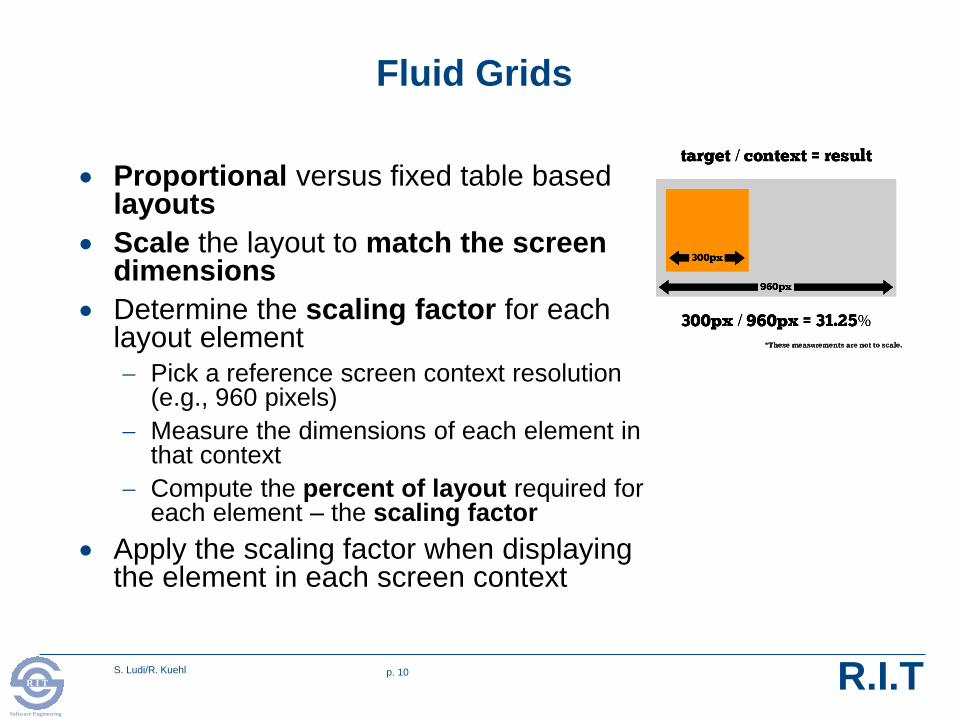
Proportional versus fixed table based layouts
Scale the layout to match the screen dimensions
Determine the scaling factor for each layout element
Pick a reference screen context resolution (e.g., 960 pixels)
Measure the dimensions of each element in that context
Compute the percent of layout required for each element – the scaling factor
Apply the scaling factor when displaying the element in each screen context
Fluid Grids

S. Ludi/R. Kuehl p. 11R I T
Software Engineering
R.I.T
The use of CSS3 and HTML5 encoding is recommended
Stick to standard markup
Gotcha – cross browser compatibility and/or obsolescence
Graceful degradation – design for modern browsers but assure a useful experience on older browsers
Progressive enhancement – start with standard markup for all browsers and enhance the experience for more capable browsers – recommended
Modernizr – open source JavaScript library that feature tests a browser’s capabilities
Polyfill – downloadable code that provides capabilities missing from the native browser (e.g., HTML5 features)
Design Techniques

S. Ludi/R. Kuehl p. 12R I T
Software Engineering
R.I.T
Specify how a document is to be presented on different media; e.g., screen vs. print
Unique properties to a media type
Shared properties with different values per media type; e.g., font size
The @media rule
Specifies target media type
All following style sheet rules apply to that media type
Cascading Style Sheet (CSS) Media Types
@media print {
body { font-size: 10pt }
}
@media screen {
body { font-size: 13px }
}
@media screen, print {
body { line-height: 1.2 } https://www.w3schools.com/css/css3_mediaqueries.asp

S. Ludi/R. Kuehl p. 13R I T
Software Engineering
R.I.T
CSS3 media query – query “screen” as media type with screen properties such as size and resolution
Substitute different layout commands or a tailored CSS file if those screen properties supported
Scale to match device screen resolution and size
Transform screen layout – e.g., number of columns of content
Adjust object size such as for links (Fitt’s Law)
Adjust typography – e.g., font size, line width and length
Cascading Style Sheet (CSS) Media Types

S. Ludi/R. Kuehl p. 14R I T
Software Engineering
R.I.T
@Media rule. What happens?
CSS Media Query Example

S. Ludi/R. Kuehl p. 15R I T
Software Engineering
R.I.T
Smartphones
Portrait and Landscape
@media only screen and (min-device-width : 320px) and
(max-device-width : 480px) { ... }
Landscape
@media only screen and (min-width : 321px) { ... }
Portrait
@media only screen and (max-width : 320px) { ... }
Tablets, Surfaces, iPads
Portrait and landscape
@media only screen and (min-device-width : 768px) and
(max-device-width : 1024px) { ... }
Landscape
@media only screen and (min-device-width : 768px) and
(max-device-width : 1024px) and (orientation : landscape) { ... }
Portrait
@media only screen and (min-device-width : 768px) and
(max-device-width : 1024px) and (orientation : portrait) { ... }}
Desktops, laptops, larger screens
@media only screen and (min-width : 1224px) { ... }
Large screen
@media only screen and (min-width : 1824px) { ... }
CSS Media Queries for Popular Form Factors

S. Ludi/R. Kuehl p. 16R I T
Software Engineering
R.I.T
Marcotte, Ethan (May 25, 2010). "Responsive web design". A List Apart
Foster, Aidan. http://responsivedesign.ca/blog/responsive-web-design-what-is-it-and-why-should-i-care
Frain, Ben, Responsive Web Design with HTML5 and CSS3 (eBook)
References