report 1: a demographic profile of maine highlighting … carsey report 1...report 1: a demographic...
TRANSCRIPT
Report 1: A Demographic Profile of Maine Highlighting the Distribution of Vulnerable Populations
Marybeth J. Mattingly Andrew P. Schaefer
June 21, 2012
Final Report to the John T. Gorman Foundation
Introduction This report is the first in a series of three reports commissioned by the John T. Gorman
Foundation to assist in informing its strategic planning process. As the first in the
collection, this paper aims to provide an overall sense of Maine’s demographic makeup,
with an eye toward identifying particular regions in the state that may be considered
“disadvantaged.” Along with a series of tables, figures, and maps, this report summarizes
findings in a variety of areas indicated as particularly relevant to the Foundation’s
purposes. Below, we discuss: general demographics, population change, housing
distribution, age structure, single mother households, racial/ethnic composition, migration,
education, income and home values, poverty, low-income seniors, disconnected youths,
veterans, and cancer rates. This paper concludes with an overview of our data and
methods.
Maine is one of the least populous states in the nation, with a population of 1,328,361—
only 0.4 percent of the total U.S. population. With 94.4 percent of the population reported
to be non-Hispanic white, Maine is also one of the most racially and ethnically homogenous
states (only 63.7 percent of the nation is non-Hispanic white). As in other parts of the
nation, however, Maine’s child population is more diverse, with 90.1 percent of children
being non-Hispanic white. According to the Bureau of Labor Statistics, Maine also differs
from the nation economically: as of April 2012, a smaller proportion of Mainers are
unemployed (7.2 percent) than Americans as a whole (8.1 percent). Lastly, Maine is slightly
less educated than the U.S. population as a whole: 26.5 percent of Mainers over age 25 have
completed a bachelor’s degree or higher, compared to 27.9 percent for the United States as
a whole.
Maine also differs from the U.S. in terms of its age structure. Maine is one of the oldest
states in the country with only 27.8 percent of households having children under 18
(compared to 33.4 percent across the U.S.) and 27.1 percent of households containing
seniors over sixty-five (24.9 percent for the U.S.). Like most Northeastern states, Maine also
has a lower proportion of people in poverty than in the U.S. as a whole, with 12.6 percent in
poverty, compared to 13.8 percent for the country. However, the percentage of people in
poverty in Maine is the highest of any New England state, with similar rates to Rhode Island
(at 12.2 percent). Maine also has a lower proportion of children in poverty, ranking
sixteenth of the fifty states in child poverty in 2010, with 18 percent of children living in
poor families (compared to 22 percent for the U.S.). Maine’s child poverty rate is
comparable to some New England states like Vermont (17 percent) and Rhode Island (19
percent), but higher than other New England states like Massachusetts (14 percent),
Connecticut (13 percent), and New Hampshire (10 percent).
Demographic Overview
The 2010 U.S. Census revealed that Maine’s population had grown to 1,328,361, up from
1,274,923 in 2000 (an increase of 4.2 percent), and following a general trend of growth for
the state. The population increased by 9.2 percent between 1980 and 1990 and by 3.8
percent between 1990 and 2000. Ranking forty-first out of the 50 states (right between
Hawaii and New Hampshire), Maine is among the ten least populous states. Map 1 shows
the 2010 population by Census tract and Map 2 shows a closer view of the southern
seacoast, Maine’s most populous region. Maine’s population is densest around the coast,
and fades toward the north and west. Oxford, Franklin, Somerset, and Piscataquis Counties
are home to the fewest residents, with the lowest populations in the north of these
counties. Much of Hancock and Washington Counties are also sparsely populated, while
Penobscot and Aroostook Counties have larger populations. The contrast between counties
like York and Cumberland on the southeastern coast of Maine and the rest of the state is
starker when we consider population density. Population density is defined as the number
of people living within a spatial unit, in this case a square mile. Maps 3 and 4 show how
Maine’s population is more concentrated along the southern coast, and specifically in the
greater Portland area.
[See Maps 1-4 and Table 1]
Map 5 illustrates population change between 2000 and 2010 for each Maine Census tract.
During this period, many of the least densely populated areas experienced the greatest
growth. Specifically, the northern areas of Oxford and Franklin Counties, and the middle
part of Somerset County all experienced a net population increase of ten percent or more
over ten years; northern Somerset County has experienced a gain of five percent over the
same period. Such growth is also apparent in tracts throughout Maine, excepting large
blocks in western Aroostook and Washington Counties, and most of Piscataquis County,
which have experienced population declines of five percent or more. While these are not
the only tracts to have experienced population decline, these western areas stand out, as
other tracts with declining populations are more proximal to areas of growth.
[See Map 5]
Housing
Another way to think about where people are located is to consider housing density.
Housing density describes the number of housing units in a given geographic area, in this
case, per square mile. Due to the large percentage of “seasonal homes” in Maine, housing
density takes on added importance here. Generally speaking, housing density does not

fluctuate throughout the year the way that population density does. Thus, areas in Maine
that have high housing density might only efficiently use it for part of the year. As Maps 6
and 7 show, housing density in Maine tells a similar story to overall population density,
though the differences are less severe. This indicates that more people are concentrated in
fewer housing units in the most densely populated counties like York, Cumberland, and
Androscoggin.
[See Maps 6-7]
Any driver in or near Maine is familiar with the state license plate reading “Vacationland.”
Correspondingly, our look at seasonal housing yields a different picture of Maine’s
population, as residents are not typically “counted” at these homes by the decennial
Census. Many seasonal residents will spend some weekends in Maine throughout the year,
but most are more heavily concentrated there during the summer to take advantage of the
various seasonal amenities (mountains, campgrounds, beaches) that Maine has to offer. For
example, a Maine travel website (“Tourist News Online” n.d.) notes that the town of
Ogunquit, with a winter population of around 1,500, swells to just over 20,000 during the
summer months. Map 8 shows places likely to be affected by this seasonal migration by
highlighting the percent of homes that are classified by the Census Bureau as “vacant for
seasonal, recreational, or occasional use.” This map illustrates that many of Maine’s least
populated counties may swell in population during peak vacation/tourist seasons; for
example, much of Oxford, Franklin, Somerset, Piscataquis, Penobscot, Washington, and
Hancock Counties are dominated by seasonal housing. In large portions of these counties,
seasonal housing accounts for half or more of the housing stock. In contrast, the heavily
populated southeastern coastal corridor has far fewer seasonal homes, indicating that
these residents are likely living year-round in Maine.
[See Map 8]
Age Structure
Maine has one of the oldest populations in the country. As of the 2010 Census, Maine is the
third oldest state, behind West Virginia and Florida, and the share of the population over
age 65 has grown over time. In 1980, only 12.5 percent of Mainers were over age 65. This
grew to 13.3 percent in 1990, then to 14.4 percent in 2000, and finally, 15.9 percent as of
2010. Likewise, Maine has one of the lowest shares of the population under 18 (20.7
percent), tied with Vermont (also, 20.7 percent) and only surpassed by Washington, D.C.
(16.8 percent). Figure 1 shows a population pyramid for Maine, which provides a visual
display of the age and sex structure of the state. For each age group, a bar represents the
size of the population. Females are represented by the red bars on the left, and males by the

blue bars on the right. Young populations are illustrated by a wider base, narrowing up the
age structure, while more cylindrical structures are characteristic of an aging population.
The population pyramid for Maine is relatively cylindrical, with a large middle-aged
population representing the baby boom cohort. The population pyramid for Maine is
similar to that of the U.S. as a whole, with one caveat: the dearth of people aged twenty to
forty in Maine is much less pronounced in the U.S. pyramid, meaning that there are fewer
people of childbearing age in Maine to produce the next cohort of Mainers.
[See Figure 1]
Another way we think about the age of Mainers is by mapping the percent of the population
that is age 65 or over. Maps 9 and 10 visually present these data for all of Maine.
Piscataquis County has the largest block of Census tracts characterized by 25 percent or
more of residents aged 65 or older. In general, older Mainers are concentrated along the
north and west portions of the state in Somerset, Piscataquis, and Aroostook and in pockets
along the seacoast. Map 10 shows where Maine’s children are concentrated. Evident from
this map is that high concentrations of children are located in York, Cumberland,
Androscoggin, Kennebec, and Waldo Counties.
[See Maps 9 and 10]
Single Mother Households
Map 11 presents the distribution of single mother households as a percentage of all family
households across Maine. There was relatively little variation (a low of 7.3 percent in
Sagadahoc and a high of 12.0 percent in Androscoggin) so we divided the data into two
meaningful categories around the median.1 It is clear from Map 11 that single mother
households are more heavily concentrated in the western and central counties of Oxford,
Franklin, and Somerset, as well as in Cumberland, Knox and Waldo Counties.
[See Map 11]
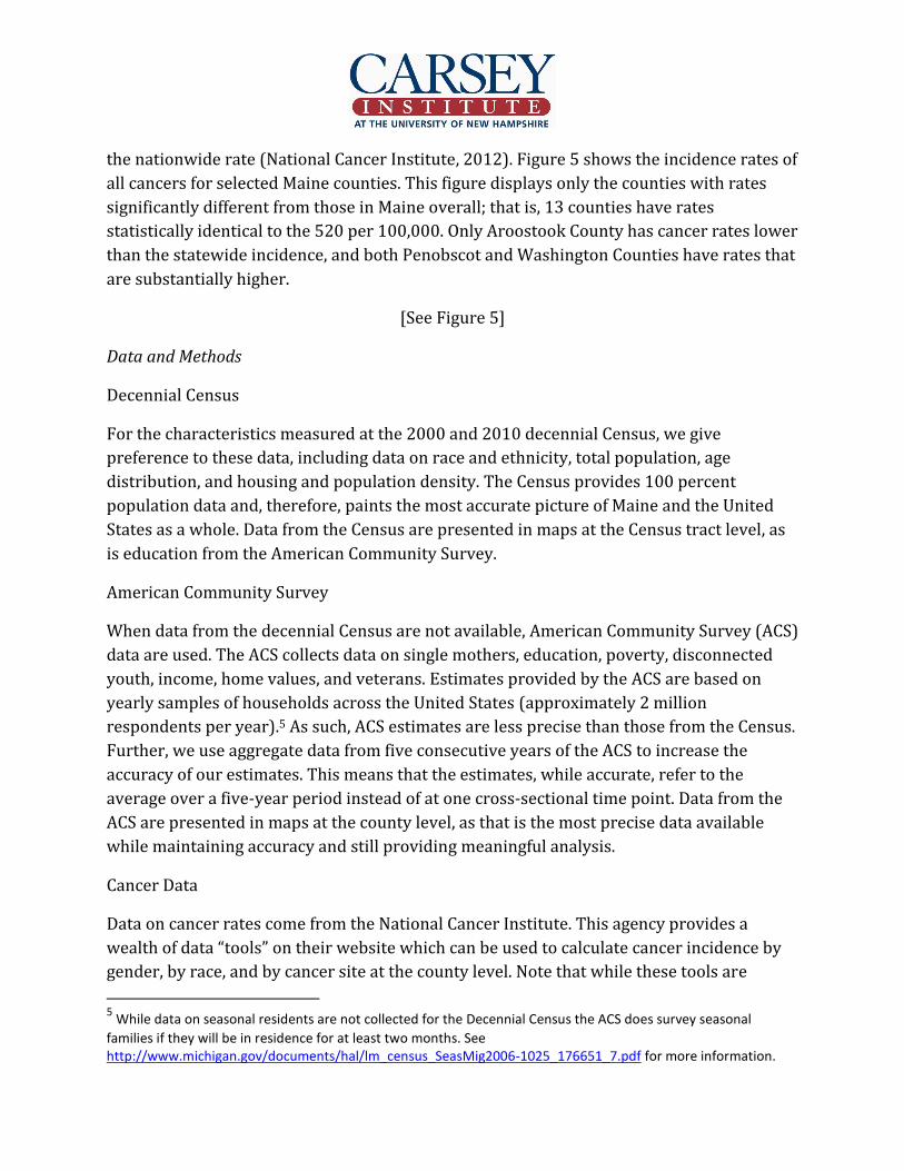
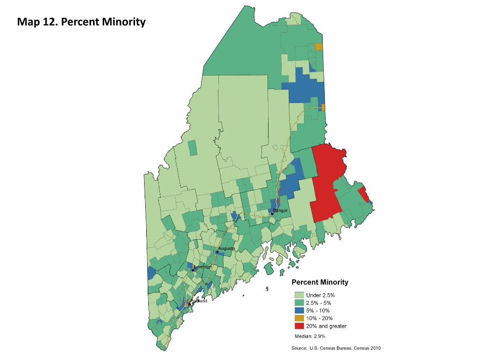
Racial/Ethnic Composition
As noted above, Maine is largely a homogenous state, with nearly 95 percent of the
population identifying as non-Hispanic white. However, the minority groups that reside in
Maine are largely concentrated in Washington County, where in several Census tracts
minorities represent twenty percent or more of the population (shown in Map 12). This
minority population is largely dominated by Native American citizens, due to spatial
1 This was done in order to make comparisons between places that had statistically significant differences from one another.

overlap with the Passamaquoddy Pleasant Point and Passamaquoddy Indian Township
Native American reservations. As shown in Table 2, the Native American population varies
across the state of Maine. As mentioned above, Washington County has the largest
population of Native Americans in Maine at 4.9 percent of the total population. In
Penobscot and Aroostook Counties Native Americans make up over 1 percent of the
population (1.2 and 1.7 percent, respectively). For all other counties in Maine, Native
Americans make up less than one half of one percent of the population.
[See Map 12 and Table 2]
Map 13 zooms in to the greater Portland area. It is evident from this map that there are also
minority concentrations in Portland and Lewiston/Auburn. The racial composition in these
places, however, is different than in Washington County. Refugee resettlement programs
have altered the racial landscape in these cities (Mamgain and Collins 2003). Indeed, many
Sudanese and Iraqi refugees now live within Maine cities like Portland and Lewiston
(Catholic Charities of Maine n.d.). Looking in the centers of Portland and Lewiston on Map
13, one can see the impact that incoming refugees have had on the minority population in
Maine. The percent of the population who is foreign born also varies across Maine, as
shown in Table 3, with some emerging patterns. At 5.5 percent, Cumberland County has the
largest proportion of foreign born residents: Portland and the surrounding areas are home
to many refugee populations. Aroostook County has the second largest proportion of
foreign born residents at 4.9 percent. As a border county, many continental immigrants
may enter Maine through Aroostook. At the other end of the spectrum, coastal counties like
Oxford and Lincoln along with the inland counties of Waldo and Somerset have populations
in which two percent or fewer of residents are foreign born.
[See Map 13 and Table 3]
Despite its history as largely white, the racial composition of Maine is changing. The U.S. as
a whole has undergone tremendous racial demographic change. Throughout much of the
United States, the racial composition is changing as a result of changing age and racial
patterns. As a result of demographic changes, including higher birth rates among Hispanics,
lower birth rates among whites, and immigration, American children are much more
diverse than the adult population (Johnson and Lichter 2010). Indeed, similar changes are
occurring in Maine. Map 14 shows a larger concentration, though still relatively small, of
minority populations among children. Figures 2 and 3 show population pyramids
illustrating the age structure of the non-Hispanic white and minority populations in Maine,
respectively. It is evident from Figure 2, a more cylindrically-shaped pyramid, that the
white population is aging and shrinking. Figure 3 stands in sharp contrast, with a wider

base and narrow peak, showing a young and growing minority population in Maine.
Though this population is small, it is growing at a faster rate than the white population.
[See Map 14, Figures 2 and 3]
In addition to being a largely white state, Maine, more than most states,2 is characterized by
a high proportion of residents who were born in Maine. Further, Maine leads New England
in the percent of the resident population born in-state. Sixty-four percent of those living in
Maine were born there. However, the patterns do vary somewhat across Maine. Map 15
shows that coastal areas and Aroostook County on the western edge of the state are
typified by fewer native Mainers, though even in these tracts, the concentration only
sometimes falls below 40 percent. In all other tracts, more than 50 and up to 85 percent of
current Mainers were born there.
[See Map 15]
Migration
Migration into Maine has slowed throughout the decade. Figure 4 shows the total migration
into and out of Maine for 2001-2004, 2004-2007, and 2007-2010. This figure paints a
picture of decreased migration into Maine over time, coupled with increased migration out
of Maine. Between 2001 and 2004, Maine’s population increased due to migration, with
around 90,000 people moving in and only about 70,000 moving out. A similar pattern
existed between 2004 and 2007, albeit on a smaller scale (about 80,000 in-migrants to
about 75,000 out-migrants). Between 2007 and 2010, however, Maine’s population
decreased due to migration. While fewer than 70,000 people moved to Maine during this
period, around 75,000 people moved out.
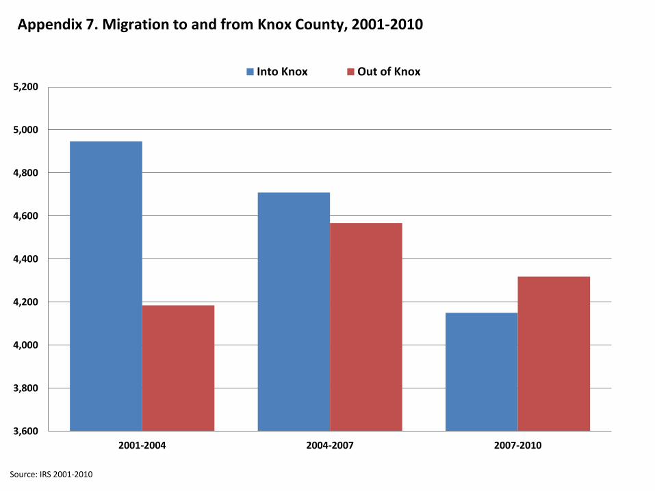
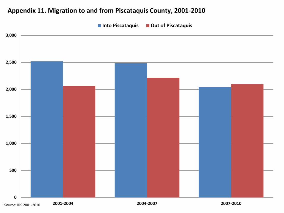
Similar patterns exist for places within Maine. Appendices 1-16 show migration flows to
and from all Maine counties. Between 2001 and 2004, all Maine counties had more people
migrate to the county than move elsewhere. By 2007-2010 all counties had a total net
migration of approximately zero or net out-migration, meaning more people moved away
from each county than entered them. For instance, consider Appendix 3 which shows the
total migration flows by year for Cumberland County, which contains the city of Portland.
Between 2001 and 2004, Cumberland County had over 38,000 in-migrants and over 36,000
out-migrants compared to roughly 35,000 in-migrants and 37,000 out-migrants between
2007 and 2010. At the turn of the twenty-first century, migration fueled much of Maine’s
population growth. By the end of the decade, migration trends in Maine had reversed.
2 Maine ranks eighteenth out of the fifty states in proportion of residents who were born in the state.

[See Figure 4]
Education
Education levels in Maine vary widely across the state. Map 16 shows the percent of the
population over age 25 with a bachelor’s degree or a higher level of education, which varies
widely across Census tracts. In many ways, this map is the inverse of the “Percent Born in
Maine” map (Map 15), as the same regions with low proportions born in Maine have a high
proportion of well-educated citizens. For instance, Maine’s southern coast has the highest
percentage of people with a four-year degree or more, and looking inland, these
percentages drop quickly. The only other places in Maine with a highly educated citizenry
are several Census tracts around the small cities of Lewiston, Augusta, and Bangor (Map
16). Throughout the rest of the state, education levels are low, with most tracts, especially
those in Somerset, Piscataquis, Aroostook, at somewhere under 20 percent with a college
degree or more.
[See Map 16]
Maine also has varying high school graduation rates across the state. The Maine
Department of Education collects data on school enrollment each year and their high
school graduation rates by county are presented in Table 4. As a whole, Maine had a high
school graduation rate of 82.0 percent in 2010, compared to a low of 72.8 percent in
Androscoggin County and a high of 89.0 in Franklin County.
[See Table 4]
Income and Home Values
To analyze family income, we broke the Census tracts into median income quartiles.
Twenty-five percent of the Census tracts in Maine are in each of the categories displayed in
Map 17. Looking at this map, one can see plainly that the Census tracts with the highest
median family incomes are clustered in York, Cumberland, Androscoggin, and Sagadahoc
and in the cities of Portland, Lewiston, Augusta, and Bangor. Census tracts in the northern
and far eastern tracts of Maine have lower median family incomes. Looking at this map in
conjunction with Map 13, one sees that the most racially diverse areas—areas in the center
of the cities—have lower median incomes than the surrounding, more racially
homogenous, areas.
[See Map 17]

Along with median family income, we also looked at median home value by Census tract.
Similar to Map 17, Map 18 shows that median home value is highest along the
southwestern coast in York, Cumberland, Sagadahoc, Lincoln and Knox, however we see
lower home values in the cities of Lewiston, Augusta, and Bangor. Home values, then, seem
to be highest in Portland and the surrounding seacoast communities.
[See Map 18]
Poverty
The official poverty threshold considers total family income and is based on family
composition. In 2011, the poverty threshold for a family comprised of two parents with
two children was $22,811. Those in similar families with incomes below this threshold are
counted as “poor.” In comparison to other New England states, Maine has the highest
percentage of people in poverty at 12.6 percent while states like Connecticut and New
Hampshire rank near the national bottom, at 9.2 and 7.8 percent, respectively. Map 19
shows the percent of people in Maine living in families below the poverty line by Census
tract. In contrast to Maps 16 and 17, the coastal Census tracts have generally low levels of
poverty compared to other parts of Maine. The southern portions of Somerset and
Piscataquis Counties, Washington County, and areas in Aroostook have the highest
percentages of people in poverty, with many tracts exceeding 20 percent. Map 20 zooms in
on the cities of Portland, Lewiston, and Augusta. In general, these three cities show similar
patterns: the most impoverished tracts are in the center of the city, with lower levels of
poverty in the surrounding tracts. In states that have similar racial composition, like New
Hampshire, other researchers have found the same patterns of poverty in the more
racially-diverse metropolitan cores (Johnson 2012).
[See Maps 19 and 20]
Since the 1960s, child poverty rates have risen while senior poverty has declined. By 1975,
the child poverty rate surpassed the senior poverty rate (DeNavas-Walt, Proctor, and Smith
2011) and today, children remain the most impoverished group in the United States.
Maine’s child poverty rate was slightly lower than the United States’ average in 2010 (18
compared to 22 percent) but higher than all other New England States, except Rhode Island
(19 percent). Map 21 shows the percent of children in poverty by county in Maine.3 Maine
counties range from 11.9 percent of children in poverty in Sagadahoc County to 29 percent
in Washington County. While this map is less nuanced than Maps 19 and 20, one still finds
3 The counties are divided into two groups to present statistically meaningful differences.

the same general pattern: coastal counties have lower proportions of children in poverty
than other parts of Maine, especially counties like Aroostook and Washington.
Washington County’s high rates of child poverty are not a recent phenomenon. Rather, high
child poverty in Washington has persisted for several decades. In 2004, the Economic
Research Service (ERS) released their County Typology Codes for all counties in the United
States and included an indicator for counties that had high child poverty (over 20 percent)
for each decade between 1970 and 2000. According to this typology, Washington County
was the only New England county that qualified for the persistent child poverty
demarcation during this time period. Furthermore, the rate of 29 percent of children in
poverty marks another decade of high child poverty for America’s most eastern county.
[See Map 21]
When considering poverty rates, it’s also important to take young children, a population of
particular interest to the John T. Gorman Foundation, into account. Young children are
more often in poverty than older children and are most likely to experience long-term
consequences, especially in terms of cognitive and emotional development (Korenman,
Miller, and Sjaastad 1995). Other authors have found effects of early childhood poverty on
future economic characteristics like income and work hours (Duncan, Ziol-Guest, and Kalil
2010), and on educational attainment (Duncan, Ziol-Guest, and Kalil 2008), all of which
could have impacts on other populations like disconnected youth. Finally, while economic
attainment is important, other research has also documented health effects of young child
poverty, including higher body mass index as an adult (Ziol-Guest, Duncan, and Kalil 2009).
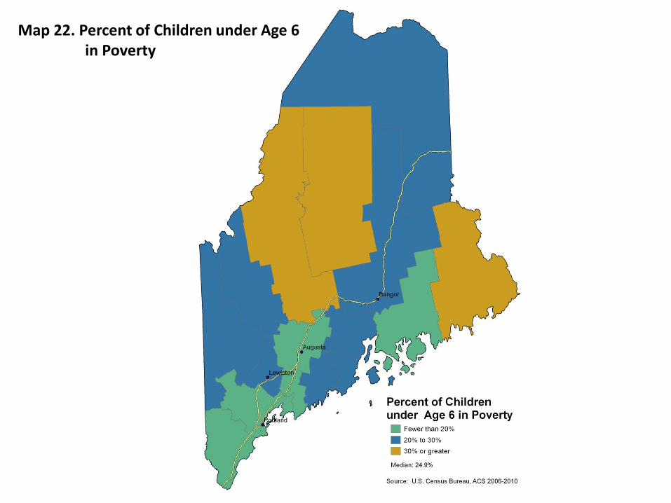
For these reason, Map 22 shows the distribution of young (under age six) child poverty in
Maine counties. The poverty rates for children under six are larger than those of the under
18 population as a whole, and range from 10 percent in York County to 39 percent in
Piscataquis County. This map is similar to Map 21 but is slightly more nuanced because of
more county-to-county variation; however, the results are generally the same. The counties
along the southwestern-most coast, like Cumberland and York, are least likely to have
young children in poverty while counties like Somerset and Piscataquis, and the far eastern
county of Washington have more than one in three (36 percent) young children in poverty.
[See Map 22]
Single Mothers and Poverty
The Foundation is also expressly interested in single mothers. Researchers have found that
single parent families, especially those headed by single mothers in rural areas, are more
likely than others to be in poverty (Mattingly, Johnson, and Schaefer 2011; Snyder and

McLaughlin 2009), with documented rates approximating fifty percent (Mattingly and Bean
2010). Map 23 shows the poverty rate among single mothers, ranging from a low of 29.2
percent in York County to a high of 56.1 percent in Piscataquis County. This map is
strikingly similar to Map 22, for obvious reasons. Because poverty is measured at the
family level, counties that have a high percentage of single mothers in poverty are typically
going to also have a high percentage of children (and young children) in poverty.
Map 23 is most useful in conjunction with Map 11, which showed the percentage of single
mothers by county. Taken together, it is possible to identify counties with high percentages
of single mothers and places of high poverty amongst those mothers. For example, in Map
11 counties in central Maine, like Penobscot and Somerset, both had high percentages of
single mother families. Map 23 shows that between 40 and 50 percent (48 and 45 percent,
respectively) of those single mothers are poor in these counties.
[See Map 23]
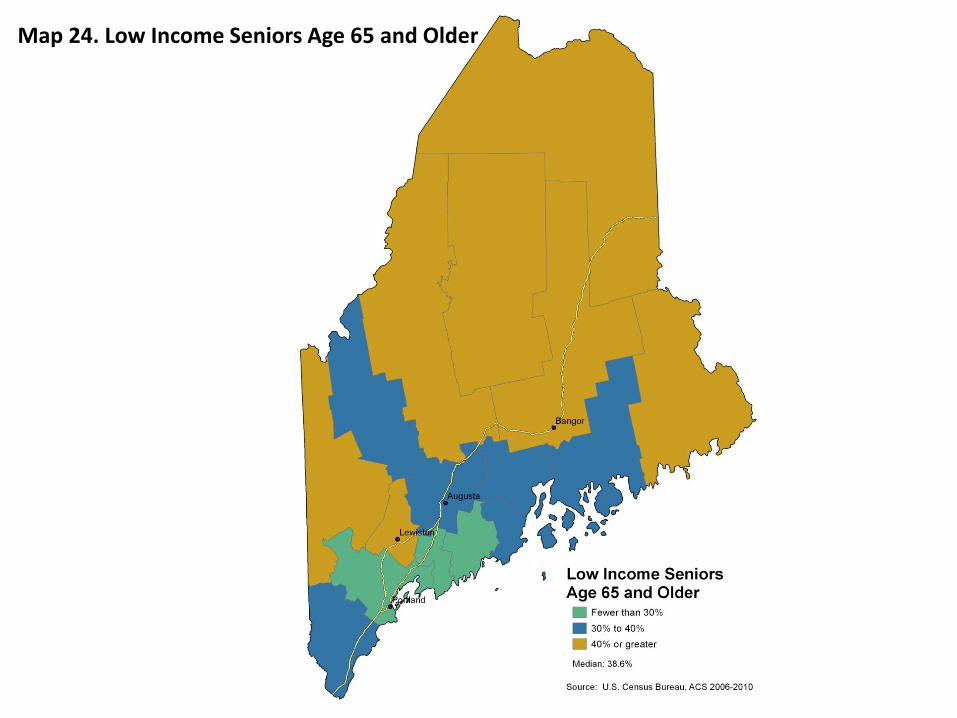
Low-Income Seniors
Map 24 shows the distribution of low-income senior citizens in Maine, a third focal
population for the Foundation. “Low-income” includes all those living in families with
incomes below 200 percent of the poverty threshold. This map aligns with general patterns
for Maine, in which the most impoverished regions are in the northern part of the state.
Counties with the highest proportions of low-income seniors are clustered in the north and
northeastern parts of Maine, including Piscataquis, Penobscot, and Washington Counties.
Also included is Oxford County, along the northwestern border with New Hampshire.
These regions are also less educated (see Map 16) and more likely to have a high
concentration of seasonal housing (see Map 8). Furthermore, these places have the lowest
population density in Maine, likely making it difficult for low-income seniors to gain access
to necessary services. Map 24 takes on extra significance when compared to Map 9, which
shows percent of seniors by Census tract. Recall that Map 9 showed large concentrations of
seniors in the northern-most counties of Maine, which are also the places with the highest
concentrations of low-income seniors.
[See Map 24]
Disconnected Youth
Disconnected youth are those currently not in the labor force and not enrolled in school,
another population of specific interest to the Foundation. The American Community Survey
provides workforce and school enrollment information for teenagers between 16 and 19
years of age. Table 5 shows the percent of youth that are disconnected in Maine and in each
of Maine’s counties.4 In all, about 2.2 percent of 16 to 19 year olds in Maine are
disconnected, compared to 3.0 percent for the United States as a whole.
[See Table 5]
Veterans
A final vulnerable sub-population of interest to the Foundation is veterans of the armed
services. In 2010, there were an estimated 128,123 veterans living in Maine, about 12.2
percent of the total civilian population aged 18 and over. About 28.4 percent of those
veterans had a disability of any kind compared to 16.2 percent of non-veterans. Thus,
Maine has a significantly larger proportion of veterans with a disability than in the United
States as a whole (25.5 percent). Map 25 shows the number of veterans in a county as a
percentage of residents aged 18 years and older. This map shows high proportions of
veterans in three stripes across the state: in the western border county of Oxford, in
Maine’s central counties of Somerset, Piscataquis, Kennebec, Waldo, Knox, and Lincoln, and
in Maine’s far eastern county of Washington.
[See Map 25]
One reason veterans are considered a vulnerable population is because of their increased
probability of having a disability. Table 6 compares the percentage of veterans with a
disability by age group for Maine and the United States as a whole. Generally speaking,
older veterans in both Maine and the United States are more likely than younger veterans
to have a disability. For instance, 11.1 percent of veterans 18 to 24 in Maine have a
disability compared to 42.3 percent of those 65 and older. For those aged 18 to 34, 35 to
54, and 55 to 64, there are no significant differences in disability status between Maine’s
and the United States’ veterans. However, at 42.3 and 38.2 percent respectively, Maine has
a larger proportion of veterans with a disability in the 65 and older age group than the
United States as a whole.
[See Table 6]
Cancer Rates
Given the Foundation’s historic focus on cancer, we examined rates for the state. These
data show that the incidence of cancer in Maine was significantly higher than that in the
United States between 2004 and 2008 (520 and 465 per 100,000 people in the population,
respectively). In fact, none of Maine’s 16 counties have cancer incidence rates lower than
4 A map was not created for disconnected youth because these youth populations are too small to make any meaningful comparisons between counties in Maine.
the nationwide rate (National Cancer Institute, 2012). Figure 5 shows the incidence rates of
all cancers for selected Maine counties. This figure displays only the counties with rates
significantly different from those in Maine overall; that is, 13 counties have rates
statistically identical to the 520 per 100,000. Only Aroostook County has cancer rates lower
than the statewide incidence, and both Penobscot and Washington Counties have rates that
are substantially higher.
[See Figure 5]
Data and Methods
Decennial Census
For the characteristics measured at the 2000 and 2010 decennial Census, we give
preference to these data, including data on race and ethnicity, total population, age
distribution, and housing and population density. The Census provides 100 percent
population data and, therefore, paints the most accurate picture of Maine and the United
States as a whole. Data from the Census are presented in maps at the Census tract level, as
is education from the American Community Survey.
American Community Survey
When data from the decennial Census are not available, American Community Survey (ACS)
data are used. The ACS collects data on single mothers, education, poverty, disconnected
youth, income, home values, and veterans. Estimates provided by the ACS are based on
yearly samples of households across the United States (approximately 2 million
respondents per year).5 As such, ACS estimates are less precise than those from the Census.
Further, we use aggregate data from five consecutive years of the ACS to increase the
accuracy of our estimates. This means that the estimates, while accurate, refer to the
average over a five-year period instead of at one cross-sectional time point. Data from the
ACS are presented in maps at the county level, as that is the most precise data available
while maintaining accuracy and still providing meaningful analysis.
Cancer Data
Data on cancer rates come from the National Cancer Institute. This agency provides a
wealth of data “tools” on their website which can be used to calculate cancer incidence by
gender, by race, and by cancer site at the county level. Note that while these tools are
5 While data on seasonal residents are not collected for the Decennial Census the ACS does survey seasonal
families if they will be in residence for at least two months. See http://www.michigan.gov/documents/hal/lm_census_SeasMig2006-1025_176651_7.pdf for more information.

available for all counties, Maine often has inadequate population to make full use of these
data, particularly in its low density of a non-white population and in the (fortunate)
scarcity of some types of cancer in the state. Further research would be required to
determine precisely which data are available by county.
Migration Data
Migration data are collected from the Internal Revenue Service (IRS). The IRS collects data
each year on the number of tax returns in a state along with information on where returns
were filed in the previous year. Migration to Maine is calculated by adding the total number
of tax returns (and dependents) that indicated a change from a different state. Likewise,
migration from Maine is calculated by adding the total number of tax returns (and
dependents) that indicated a move from Maine to another state.
High School Graduation Rates
High school graduation rate data are collected by the Maine Department of Education and
aggregated at the KidsCount.org Data Center. The high school graduation rate includes all
those who graduated from a public high school in 2010 that entered 9th grade in 2006
while taking into account transfers into and out of the school and other reasons for being
dropped from the data, like death.
Determination of Categories
We used different methods to determine map cut-points based on the data used. When
decennial Census data are used, cut points were determined so the state median value
would reside in the center category, with the distance between the categories following the
dispersion, or the spread, of the data. When ACS data are used, however, we must take into
account the margins of error of the estimates. For each estimate, we calculated 95 percent
confidence intervals based on the 90 percent margins of error provided by the ACS. To
construct the map cut-points with ACS data, as with the Census, we tried to keep the
median in the center category. However, we added the caveat that the categories had to be
large enough to accommodate the confidence intervals. In this way, we can be sure that the
maps present meaningful differences between geographic units.
References
Bureau of Labor Statistics. “Local Area Unemployment Statistics.” Retrieved from http://www.maine.gov/labor/cwri/laus.html, May 22, 2012.

Catholic Charities of Maine. N.d. “Refugee and Immigration Services.” Retrieved from http://www.ccmaine.org/info.php?info_id=73, May 22, 2012. DeNavas-Walt, Carmen, Bernadette D. Proctor, and Jessica C. Smith. 2011. “Income, Poverty,
and Health Insurance Coverage in the United States: 2010.” Current Population Reports P60-239. Washington, D.C.: U.S. Government Printing Office, U.S. Census Bureau.
Duncan, Greg J., Kathleen M. Ziol-Guest, and Ariel Kalil. 2008. “Economic Costs of Early Childhood Poverty.” Issue Paper No. 4. Washington, D.C.: Partnership for America’s Economic Success.
Duncan, Greg J., Kathleen M. Ziol-Guest, and Ariel Kalil. 2010. “Early-Childhood Poverty and Adult Attainment, Behavior, and Health.” Child Development 81(1):306-325
Johnson, K.M. and D.T. Lichter. 2010. “The Growing Diversity of America’s Children and Youth: Spatial and Temporal Dimensions.” Population and Development Review 36(1):151-176.
Johnson, Kenneth M. 2012. “New Hampshire Demographic Trends in the Twenty-First Century.” Reports on New England No. 4. Durham, NH: Carsey Institute.
Korenman, Sanders, Jane E. Miller, and John E. Sjaastad. 1995. “Long-term Poverty and Child Development in the United States: Results from the NLSY.” Children and Youth Services Review 17(1):127-155.
Mamgain, Vaishali and Karen Collins. 2003. “Off the Boat, Now Off to Work: Refugees in the Labour Market in Portland, Maine.” Journal of Refugee Studies 16(2):113-146.
Mattingly, Marybeth J. and Jessica A. Bean. 2010. “The Unequal Distribution of Child Poverty: Highest Rates among Young Blacks and Children of Single Mothers in Rural America.” Issue Brief No. 18. Durham, NH: Carsey Institute.
Mattingly, Marybeth J., Kenneth M. Johnson, and Andrew Schaefer. 2011. “More Poor Kids in More Poor Places: Children Increasingly Live Where Poverty Persists.” Issue Brief No. 38. Durham, NH: Carsey Institute.
Snyder, Anastasia R. and Diane K. McLaughlin. 2009. “Female-headed Families and Poverty in Rural America.” Rural Sociology 69(1):127-149.
Tourist News Online. N.d. “Southern Maine Towns.” Retrieved from http://www.touristnewsonline.com/mainetowns.html, May 22, 2012. U.S. Census Bureau. “Poverty: Poverty Thresholds by Size of Family and Number of
Children.” Retrieved from http://www.census.gov/hhes/www/poverty/data/threshld/index.html, May 22, 2012.
Ziol-Guest, Kathleen M., Greg J. Duncan, and Ariel Kalil. 2009. “Early Childhood Poverty and Adult Body Mass Index.” American Journal of Public Health 99(3):527-532.

Table 1. Maine Demographics
Maine U.S.
Total Population 1,328,361 308,745,538
% Population 0.4 100
% NH White kids 90.1 53.5
% NH White 94.4 63.7
% Households with kids 27.8 33.4
% Households with seniors 27.1 24.9
% Second Homes 16.4 3.5
% In Poverty 12.6* 13.8
% Bachelors or more 8.0* 9.2
% Unemployment rate 6.5* 7.9
*From the 2010 American Community Survey

Map 1. Total Population by Tract, 2010

Map 2. Total Population by Tract, 2010

Map 3. Population Density by Tract, 2010

Map 4. Population Density by Tract, 2010

Map 5. Population Change 2000 to 2010

Map 6. Housing Density by Tract, 2010

Map 7. Housing Density by Tract, 2010

Map 8. Seasonal Housing Percent by Tract, 2010

60,000 40,000 20,000 0 20,000 40,000 60,000
Under 5 years
5 to 9 years
10 to 14 years
15 to 19 years
20 to 24 years
25 to 29 years
30 to 34 years
35 to 39 years
40 to 44 years
45 to 49 years
50 to 54 years
55 to 59 years
60 to 64 years
65 to 69 years
70 to 74 years
75 to 79 years
80 to 84 years
85 years and over
Males Females
Source: US Census, 2010 Total Population=1,328,361
Figure 1. Age Structure of the Total Population in Maine in 2010

Map 9. Percent of Population Age 65 and Older

Map 10. Percent of Population Under Age 18

Map 11. Percent of Family Households Headed by Single Mothers
Map 12. Percent Minority
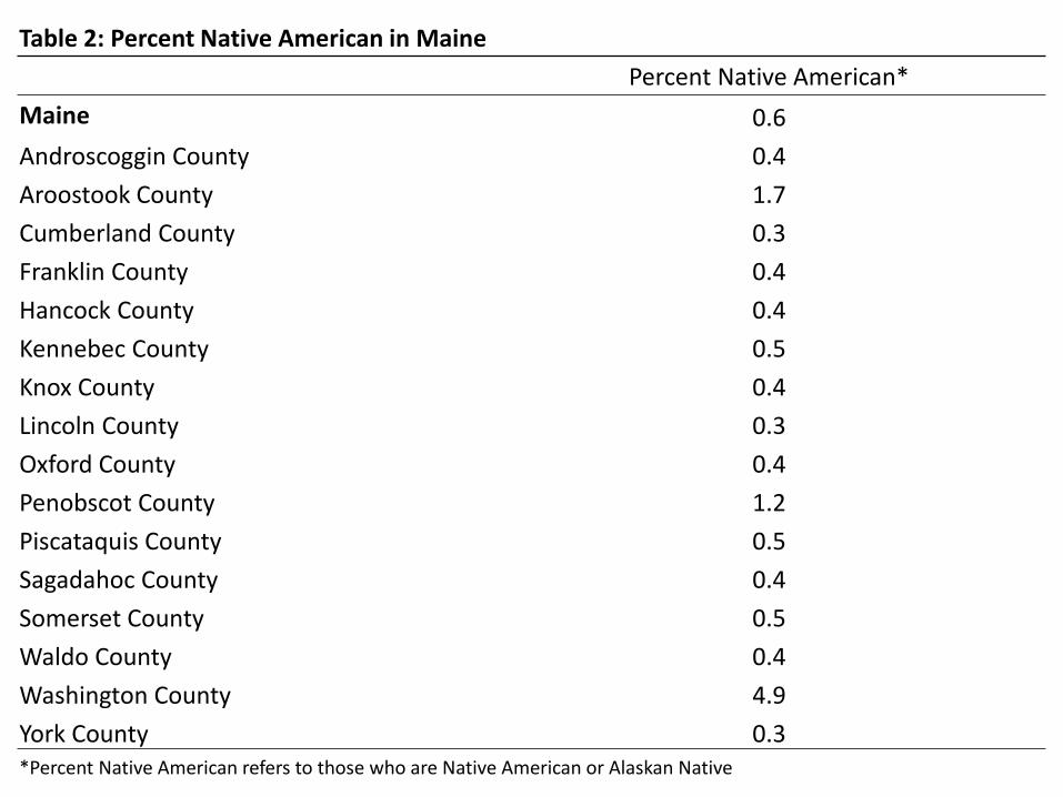
Table 2: Percent Native American in Maine
Percent Native American*
Maine 0.6
Androscoggin County 0.4
Aroostook County 1.7
Cumberland County 0.3
Franklin County 0.4
Hancock County 0.4
Kennebec County 0.5
Knox County 0.4
Lincoln County 0.3
Oxford County 0.4
Penobscot County 1.2
Piscataquis County 0.5
Sagadahoc County 0.4
Somerset County 0.5
Waldo County 0.4
Washington County 4.9
York County 0.3 *Percent Native American refers to those who are Native American or Alaskan Native

Map 13. Percent Minority

Table 3: Percent Foreign Born in Maine
Percent Foreign Born Margin of Error
Maine 3.3 0.1
Androscoggin County 3.4 0.4
Aroostook County 4.9 0.4
Cumberland County 5.5 0.3
Franklin County 2.0 0.4
Hancock County 2.3 0.4
Kennebec County 2.3 0.3
Knox County 2.0 0.4
Lincoln County 1.8 0.4
Oxford County 1.6 0.3
Penobscot County 2.7 0.3
Piscataquis County 1.7 0.5
Sagadahoc County 2.5 0.6
Somerset County 1.8 0.4
Waldo County 1.3 0.2
Washington County 4.0 0.5
York County 3.1 0.3

Map 14. Percent Minority Under 18

60,000 40,000 20,000 0 20,000 40,000 60,000
Under 5 years
5 to 9 years
10 to 14 years
15 to 19 years
20 to 24 years
25 to 29 years
30 to 34 years
35 to 39 years
40 to 44 years
45 to 49 years
50 to 54 years
55 to 59 years
60 to 64 years
65 to 69 years
70 to 74 years
75 to 79 years
80 to 84 years
85 years and over
Males Females
Source: US Census, 2010; Total Population=1,254,297
Figure 2. Age Structure of the Non-Hispanic White Population in Maine in 2010

5,000 4,000 3,000 2,000 1,000 0 1,000 2,000 3,000 4,000 5,000
Under 5 years
5 to 9 years
10 to 14 years
15 to 19 years
20 to 24 years
25 to 29 years
30 to 34 years
35 to 39 years
40 to 44 years
45 to 49 years
50 to 54 years
55 to 59 years
60 to 64 years
65 to 69 years
70 to 74 years
75 to 79 years
80 to 84 years
85 years and over
Males Females
Source: US Census, 2010; Total Population=74,064
Figure 3. Age Structure of Minority Population in Maine in 2010
Map 15. Percent Population Born in Maine

0
10,000
20,000
30,000
40,000
50,000
60,000
70,000
80,000
90,000
2001-2004 2004-2007 2007-2010
Figure 4. Migration to and from Maine, 2001-2010 Into Maine Out of Maine
Source: IRS 2001-2010

Map 16. Percent Population Having Education BA or Higher

Table 4. High School Graduation Rate for Maine and Counties
High School Graduation Rate*
Maine 82.0 Androscoggin County 72.8 Aroostook County 85.0 Cumberland County 84.7 Franklin County 89.0 Hancock County 82.5 Kennebec County 79.8 Knox County 84.0 Lincoln County 79.1 Oxford County 78.4 Penobscot County 80.6 Piscataquis County 80.1 Sagadahoc County 83.3 Somerset County 83.9 Waldo County 83.9 Washington County 81.0 York County 83.3 *Includes those who graduated high school in 2010 and entered high school as a freshman in 2006

Map 17. Median Family Income Quartiles

Map 18. Median Home Value

Map 19. Percent Poverty

Map 20. Percent Poverty

Map 21. Percent of Children under Age 18 in Poverty
Map 22. Percent of Children under Age 6 in Poverty

Map 23. Percent of Single Mothers in Poverty
Map 24. Low Income Seniors Age 65 and Older

Table 5: Disconnected Youth in Maine
Percent Disconnected Youth* Margin of Error
Maine 3.9 0.5
Androscoggin County 3.5 1.9
Aroostook County 5.0 2.4
Cumberland County 2.7 1.1
Franklin County 2.5 2.1
Hancock County 3.5 2.2
Kennebec County 5.1 2.1
Knox County 4.4 7.4
Lincoln County 9.0 4.7
Oxford County 6.0 3.0
Penobscot County 3.3 1.1
Piscataquis County 6.7 4.5
Sagadahoc County 4.6 7.6
Somerset County 5.9 3.4
Waldo County 4.9 2.9
Washington County 5.6 2.5
York County 3.0 1.4
*Disconnected youth refers to those aged 16-19 who are not in school or the labor force.
*There are no statistically significant differences between counties.

Map 25. Veterans as a Percent of Civilians Age 18 and Older
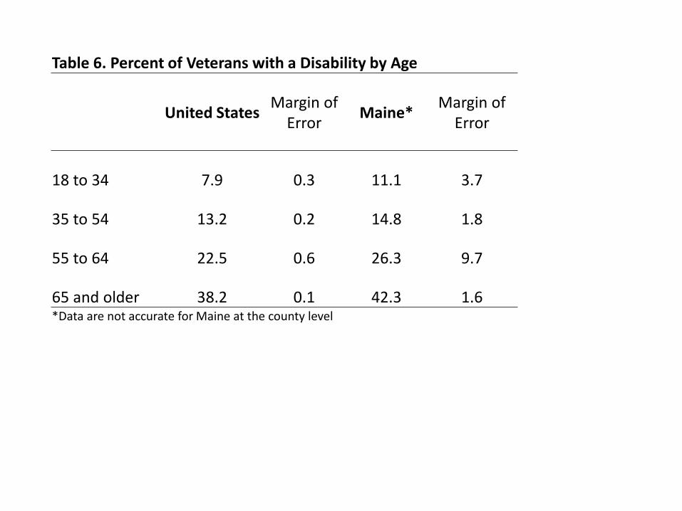
Table 6. Percent of Veterans with a Disability by Age
United States Margin of
Error Maine*
Margin of Error
18 to 34 7.9 0.3 11.1 3.7
35 to 54 13.2 0.2 14.8 1.8
55 to 64 22.5 0.6 26.3 9.7
65 and older 38.2 0.1 42.3 1.6 *Data are not accurate for Maine at the county level

440
460
480
500
520
540
560
580
Aroostook County Penobscot County Washington County
Note: Shown only for counties with rates significantly different from the statewide incidence (p<0.05). All Maine counties are significantly higher than the national incidence (p<0.05). Source: State Cancer Registry
STATEWIDE INCIDENCE
NATIONAL INCIDENCE
Figure 5. Incidence Rates of All Cancers in Maine (per 100,000 per year), 2004-2008

10,500
11,000
11,500
12,000
12,500
13,000
13,500
14,000
2001-2004 2004-2007 2007-2010
Into Androscoggin Out of Androscoggin
Source: IRS 2001-2010
Appendix 1. Migration to and from Androscoggin County, 2001-2010

0
1,000
2,000
3,000
4,000
5,000
6,000
7,000
2001-2004 2004-2007 2007-2010
Into Aroostook Out of Aroostook
Source: IRS 2001-2010
Appendix 2. Migration to and from Aroostook County, 2001-2010

33,000
34,000
35,000
36,000
37,000
38,000
39,000
40,000
2001-2004 2004-2007 2007-2010
Into Cumberland Out of Cumberland
Source: IRS 2001-2010
Appendix 3. Migration to and from Cumberland County, 2001-2010

2,800
2,900
3,000
3,100
3,200
3,300
3,400
3,500
3,600
3,700
2001-2004 2004-2007 2007-2010
Into Franklin Out of Franklin
Source: IRS 2001-2010
Appendix 4. Migration to and from Franklin County, 2001-2010

0
1,000
2,000
3,000
4,000
5,000
6,000
7,000
8,000
2001-2004 2004-2007 2007-2010
Into Hancock Out of Hancock
Source: IRS 2001-2010
Appendix 5. Migration to and from Hancock County, 2001-2010

0
2,000
4,000
6,000
8,000
10,000
12,000
14,000
16,000
2001-2004 2004-2007 2007-2010
Into Kennebec Out of Kennebec
Source: IRS 2001-2010
Appendix 6. Migration to and from Kennebec County, 2001-2010
3,600
3,800
4,000
4,200
4,400
4,600
4,800
5,000
5,200
2001-2004 2004-2007 2007-2010
Into Knox Out of Knox
Source: IRS 2001-2010
Appendix 7. Migration to and from Knox County, 2001-2010

0
1,000
2,000
3,000
4,000
5,000
6,000
2001-2004 2004-2007 2007-2010
Into Lincoln Out of Lincoln
Source: IRS 2001-2010
Appendix 8. Migration to and from Lincoln County, 2001-2010

0
1,000
2,000
3,000
4,000
5,000
6,000
7,000
8,000
2001-2004 2004-2007 2007-2010
Into Oxford Out of Oxford
Source: IRS 2001-2010
Appendix 9. Migration to and from Oxford County, 2001-2010

13,000
13,500
14,000
14,500
15,000
15,500
16,000
16,500
17,000
2001-2004 2004-2007 2007-2010
Into Penobscot Out of Penobscot
Source: IRS 2001-2010
Appendix 10. Migration to and from Penobscot County, 2001-2010
0
500
1,000
1,500
2,000
2,500
3,000
2001-2004 2004-2007 2007-2010
Into Piscataquis Out of Piscataquis
Source: IRS 2001-2010
Appendix 11. Migration to and from Piscataquis County, 2001-2010

0
1,000
2,000
3,000
4,000
5,000
6,000
7,000
8,000
9,000
2001-2004 2004-2007 2007-2010
Into Sagadahoc Out of Sagadahoc
Source: IRS 2001-2010
Appendix 12. Migration to and from Sagadahoc County, 2001-2010

0
1,000
2,000
3,000
4,000
5,000
6,000
7,000
8,000
2001-2004 2004-2007 2007-2010
Into Somerset Out of Somerset
Source: IRS 2001-2010
Appendix 13. Migration to and from Somerset County, 2001-2010

0
1,000
2,000
3,000
4,000
5,000
6,000
2001-2004 2004-2007 2007-2010
Into Waldo Out of Waldo
Source: IRS 2001-2010
Appendix 14. Migration to and from Waldo County, 2001-2010

0
500
1,000
1,500
2,000
2,500
3,000
3,500
4,000
2001-2004 2004-2007 2007-2010
Into Washington Out of Washington
Source: IRS 2001-2010
Appendix 15. Migration to and from Washington County, 2001-2010

0
5,000
10,000
15,000
20,000
25,000
30,000
2001-2004 2004-2007 2007-2010
Into York Out of York
Source: IRS 2001-2010
Appendix 16. Migration to and from York County, 2001-2010