readability and staging of cartoon characters in 2d …
TRANSCRIPT
READABILITY AND STAGING OF CARTOON
CHARACTERS IN 2D AND 3D
Jarmo Hirvikoski
Bachelor’s thesis
December 2018
Degree Programme in Media and Arts
Interactive Media
ABSTRACT
Tampereen ammattikorkeakoulu
Tampere University of Applied Sciences
Degree Programme in Media and Arts
Interactive Media
HIRVIKOSKI JARMO:
Readability and Staging of Cartoon Characters in 2D and 3D
Bachelor's thesis 72 pages, appendices 4 pages
December 2018
2D cartoons have always been a medium that has amazed its viewers with characterful
visual simplicity and exaggeration that exceeds the boundaries of realism. They are also
the medium’s greatest strengths against 3D animations that have not been able to compete
with the flexibility and liveliness of 2D animations until recently. Therefore the purpose
of this thesis was to find means for maintaining the original playfulness and readability
of Betty Boop, a classic cartoon character from the 1930s, when her 2D character design
is recreated in 3D environment.
The research was started by defining the areas of cartoon character design that can benefit
from readability improvements, because readability plays an important role almost in
every creative medium from graphic design to literature. Visual elements and narrative
become more accessible and understandable to their audience if they are presented with
appropriate clarity. Recurring practices were examined in the following series: Betty
Boop, Fingerpori, One Piece, Naruto, Dragon Ball Z, Boku no Hero Academia, and The
Adventures of Tintin.
The results indicated that cartoon characters’ seemingly scarce details can be harnessed
to provide as much information about their forms and purpose as realistic depictions of
characters can. Cartoons even boost readability and staging further by using symbolistic
cues and abstract elements. Cartoony simplification of specific elements also saved the
3D Betty Boop, because abstraction helped it to draw attention away from technical lim-
itations. The outcome proved that the two mediums work well when they complement each
other.
Key words: cartoon character, readability, staging, 2D art, 3D model
3
CONTENTS
1 INTRODUCTION ............................................................................................. 7
2 READABILITY ................................................................................................ 9
2.1 Target group ............................................................................................... 9
2.2 Character Design ...................................................................................... 10
2.2.1 Art style ......................................................................................... 10
2.2.2 Colors ............................................................................................ 12
2.2.3 Stereotypes .................................................................................... 12
2.2.4 Symbolic cues ............................................................................... 13
2.2.5 Silhouette ...................................................................................... 14
2.3 Contrasting details ................................................................................... 17
2.4 Staging ..................................................................................................... 18
2.4.1 Acting and timing .......................................................................... 19
2.4.2 Camera angle and position ............................................................ 19
2.4.3 Visual cues .................................................................................... 20
3 THE NATURE OF CARTOON ART ............................................................. 22
3.1 Simplicity as the base .............................................................................. 22
3.2 Abstract Art .............................................................................................. 24
3.2.1 Mind fills the holes ....................................................................... 25
3.2.2 Details bring the person ................................................................ 26
3.3 Seven elements of art ............................................................................... 26
3.3.1 Line ............................................................................................... 27
3.3.2 Shape ............................................................................................. 30
3.3.3 Value ............................................................................................. 31
3.3.4 Color .............................................................................................. 33
3.3.5 Pattern ........................................................................................... 34
3.3.6 Texture .......................................................................................... 34
3.3.7 Form .............................................................................................. 34
4 USE OF 3D MODELS IN CARTOONS ........................................................ 36
4.1 Rendering style ........................................................................................ 36
4.2 Lighting .................................................................................................... 37
4.3 Abstract elements ..................................................................................... 38
4.4 Dynamic variation .................................................................................... 40
5 RECREATING BETTY BOOP IN 3D ........................................................... 42
5.1 Who is Betty Boop? ................................................................................. 42
5.2 Concepting ............................................................................................... 43
5.3 Creating a base mesh ............................................................................... 44
4
5.4 Rigging ..................................................................................................... 47
5.4.1 Accurate gaze ................................................................................ 48
5.4.2 Facial expressions ......................................................................... 49
5.4.3 Hair silhouette ............................................................................... 50
5.4.4 Mesh weight tweaking .................................................................. 53
5.5 Staging the character ................................................................................ 55
5.5.1 Improving readability .................................................................... 56
5.5.2 Building the setting ....................................................................... 58
5.6 Rendering and final touches..................................................................... 59
5.7 Final result ............................................................................................... 60
6 CONCLUSION ............................................................................................... 63
REFERENCES ...................................................................................................... 65
APPENDICES ...................................................................................................... 69
Appendix 1. Effects of atmospheric perspective (Christensen 2017) ............. 69
Appendix 2. Effects of atmospheric perspective (Christensen 2017) ............. 70
Appendix 3. Original Betty Boop character sheet A (Fleischer Studios) ....... 71
Appendix 4. Original Betty Boop character sheet B (Fleischer Studios) ........ 72
5
ABBREVIATIONS AND TERMS
3D mesh Collection of faces/polygons, edges and vertices that define
the shape of 3D object. Often shortened to “mesh”.
3D space The space where 3D objects exist in a 3D software. The object
and space can be examined and viewed through the 3D soft-
ware’s viewports.
Anime Japanese animated cartoon. Refers to their visual style in some
cases.
Autodesk Maya 3D modelling and animation software by Autodesk. Often
shortened to “Maya”.
Black and white cartoon Any cartoon, manga or anime that only uses black and white
or shades of gray for drawings and shading
Blend shapes Function that stores alternative versions of 3D meshes in Au-
todesk Maya. User can switch between the original version
and the alternative versions by using a slider tool that can
gradually turn one version into another.
Caricature Portrait or illustration that has been given exaggerated fea-
tures, often in humoristic or mocking manner
Cartoonist Artist that creates or draws cartoons
Cel shading 3D rendering style that imitates the stylized look of 2D car-
toons
Child object Object that has been linked to a parent object and/or its prop-
erties
Manga Japanese comic. Refers to their visual style in some cases.
Mesh/skin weight Value that represents the strength of deformations when a
rig’s bone is moved. Zero value means a specific bone does
not create deformations. High value indicates a bone’s move-
ments have highly visible effects on the mesh
Parent object Object that has one or more child objects that are linked to it
or its properties
Render Action or process that turns a 3D scene into a 2D image in 3D
modelling or rendering software

6
Rig Set of digital “bones” that can be moved and altered to ani-
mate 3D objects or their parts in 3D space. Often represents a
skeleton in character art.
Rigging The process of creating a rig for a 3D model and attaching the
latter partially or wholly to individual bones of the rig
Texture 2D image file that can be projected onto 3D objects for deco-
rative purposes
Weight painting Action that increases or decreases mesh weight values in de-
sired areas
7
1 INTRODUCTION
Cartoons are a form of visual storytelling that have often been seen as a medium of cheap
gags and childish visual style. They appear as comics, illustrations and animations that
tell stories from various genres: it can be a stylized caricature portrait that makes fun of a
political figure by representing that person in an absurd manner, a comic strip in a news-
paper that illustrates the latest shenanigans of the certain lasagne-loving feline, or a Jap-
anese animated movie with a spiky-haired ninja protagonist that can turn into a demon
fox. Despite the different audiences that they cater to, all cartoons have a common key
feature and it is simplification of visual reality. But if they employ simplified versions of
something that already exists in the real world, do they also lose or twist some of the
visual information that they should be giving to the audience?
Look at Mickey Mouse for example and then imagine a real mouse in your head. The
former seems to be a highly stylized version of the latter, but its style still tells you that
the character is a sort of mouse, regardless of the change of details and representation that
makes him resemble a little boy. If you read a passage from a fairy tale book that contains
animal characters, on the other hand, you would probably create appearances for the crea-
tures in your imagination based on the author’s descriptions. According to cartoonist Will
Eisner (2008, 149), both mediums in this case work as a language of their own to tell
something about the characters that the artists had created. The fairy tale, as a work of
literature, relies on words and metaphors that invokes the reader’s imagination, while a
cartoon works similarly with images that are sometimes accompanied by sounds and lim-
ited amounts of text.
Readability of cartoon art, and especially the simplified, yet lively characters presented
by a single illustration or a series of them, are therefore worthy of closer inspection. As
cartoonist Scott McCloud states (2006, 29), delivering the creator's intent properly to the
audience is the biggest challenge that cartoons face, because people lose interest to images
that do not communicate well. Cartoonists’ practices in the following cartoons and comics
were examined: Adventures of Tintin, Naruto, Fingerpori, Dragon Ball Z, One Piece, My
Hero Academia, and Betty Boop.
8
Cartoons were a 2D medium for a long time, but the advent of 3D graphics created a new
playground for them. Possibilities provided by the modern image rendering technique
sounded like natural evolution for cartoons that had traditionally been drawn by hand, but
how well have the abstract qualities of cartoon characters transferred to the 3D environ-
ment? Because of the limitations of 3D modelling softwares, some elements cannot be
created as easily as they were with pen and paper, whose only limitation usually was the
artist’s own imagination and drawing skill. A good example of this would be the ears of
Mickey Mouse, that seem to retain their spherical silhouette in every angle. Wild hair
styles of Japanese anime characters also exemplify this kind of disregard for realistic de-
piction of perspective and anatomy. Transferring these abstract qualities from a 2D char-
acter concept to a 3D model therefore became the practical part of the thesis. The classic
cartoon character Betty Boop from the 1930s was chosen for the adaptation, because her
character design and low amount of modern 3D depictions presented interesting chal-
lenges for retaining the original feel and readability of visual elements.
9
2 READABILITY
Readability, despite its name, can be associated with legibility of text and visual elements
in printed media, web design and even in illustrations. Clarity of content and how easily
it can be understood and perceived are its main purposes, regardless of the chosen media.
(Cronin 2009). In cartoon art that aims to convey information in an easily absorbed man-
ner, emphasis is on the balance of visual elements and what kind of information they
contain, because overly detailed cartoons easily lose the feeling of intimacy that simpli-
fied illustrations create with their directness. (Eisner 2008, XV, 44; Salgood 2015,
0:50:00.) These elements include lines, dots, forms, colors, contrast and the combinations
that are created by them, such as silhouette, direction, symbolism and mood. With proper
and direct portraying of details, for example, the bulking muscles of a raging barbarian
hero or the glimmering eyes of a gentle oriental princess become more compelling!
As a proof of the universal use of readability guidelines, tips for web designers were
partially used as a reference. The next sections describe what kind of variables can affect
readability.
2.1 Target group
Readability of content does not rely solely on the visual presentation that artists put to-
gether, because the people that read or see the artists’ creations have variable personal
histories, cultural backgrounds and education. Readability therefore needs to be set to an
appropriate level based on the aforementioned qualities, since recognizable, familiar im-
ages make the viewers recall their own experiences about a specific subject, thus making
them feel more appealing, realistic and comprehended quicker (Eisner 2008, 9).
Interpretations often happen subconsciously. For example, Schodt (1983, 92–93) brought
up an event where a character’s hair turns white in a scene that has inverted values for
certain black elements in a black and white manga. This kind of change will not usually
confuse Japanese readers, because they automatically assume that every Japanese char-
10
acter has black hair if it is not stated otherwise. This interpretation is caused by the ho-
mogeneous genetics of Japanese people, as their hair color is most often very dark or
black.
Symbolism can be used to enhance desirable effects or messages that characters convey.
Some of them are familiar from other sources of entertainment and can be easily used,
because people have learned to associate specific subjects with in-depth meanings, usu-
ally based on their society, upbringing or education. A character that suddenly grows
horns from its brow can seem devious or evil, because some religions, such as Christianity,
tell about horned demons that represent evil deeds (McCloud 2006, 94; Gummerrus
Kustannus Oy 2009, 190–191). A character’s readability therefore increases if a cartoon-
ist includes visual hints that are familiar to the target group in one way or another. In the
previous example, the demonic horns acted as a catalyst for creating an impression of the
character’s personality.
2.2 Character Design
Character designs need to support alternative perception skills by having appropriate clar-
ity. It can be strengthened with both visual means and clever psychological hints.
2.2.1 Art style
Light-hearted series could have simple characters that put the biggest emphasis on clearly
drawn expressions that show strong emotions and simplified elements, because their di-
rectness makes a person excited or attracted to the content right away when it interacts
with that person’s senses. Erotic series could play more with realistically detailed visual-
ity for the sake of arousal, since it has an objectifying effect in cartoons (McCloud 1994,
44).
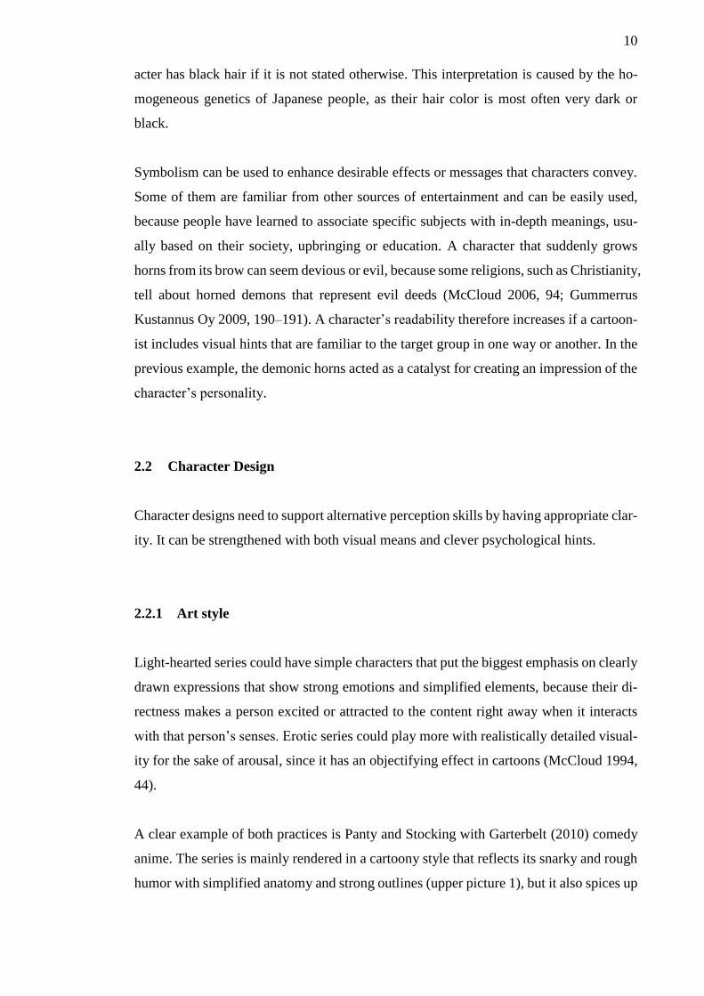
A clear example of both practices is Panty and Stocking with Garterbelt (2010) comedy
anime. The series is mainly rendered in a cartoony style that reflects its snarky and rough
humor with simplified anatomy and strong outlines (upper picture 1), but it also spices up

11
some scenes with realism that have more sensual feel and gentle outlines. The more real-
istic style is reserved for parts that show the two protagonists, Panty and Stocking, teasing
the viewer with suggestive moves and poses when they use their special powers (lower
picture 1). Based on this theory, the effect of objectification by giving a cartoon character
more details is basically present in every transformation scene that different series show
at key moments. By objectifying a character, the cartoonist can emphasize its otherness;
make the hero or heroine feel more special than the other characters or the environment
that are included in the scene (McCloud 1994, 44).
PICTURE 1. The heroines’ appearances have a significant difference between the pri-
mary cartoony scenes and semi-realistic power-up scenes (Panty and Stocking with Gar-
terbelt 2010).
12
2.2.2 Colors
Some colors in cartoons are more appealing to certain groups of people. For example,
bright colors are appealing and easy to distinguish for kids, because of their still-devel-
oping eye vision. (Pancare 2018.) Readability of characters in kids’ cartoons therefore
benefits from the use of basic colors, red, blue, green, yellow, orange, despite. Duller and
darker color themes are more suitable with adult viewers. In the absence of colors, black
and white cartoons rely on strong contrast and clearly illustrated elements.
2.2.3 Stereotypes
Classic stereotypes, like the damsel in distress, the muscular brute, the weak nerd, etc. are
often used in entertainment to create instantly recognizable characters. In cartoons, dif-
ferent personalities are implied by relying on physical characteristics. Stereotypes are
good for hastened readability, because they immediately give the reader hints about their
probable personality without the need for establishing scenes or background stories for
every side character. Visual variation is important though, because overly similar appear-
ances that are masked with different clothes or hairstyles make tracking of individual
characters hard due to lack of distinction and variety (McCloud 2006, 70–71, 73).
For example, Eiichiro Oda’s One Piece (1997 & 1999) series is famous for its varied
character designs, because it combines playfulness with absurdity. However, those qual-
ities seem to apply mainly to the series’ male characters that have unique silhouettes or
details that make them easily distinguishable. Notable female characters have less variety
in their character designs, because an hourglass-shaped body and a pretty face is the most
standard look for their gender in the series. There are some exceptions that share the com-
ical touch of male characters, but most often a female character’s hair style, eye color or
clothes are the only visual details that change if you compare her to another female char-
acter in the series (picture 2).
13
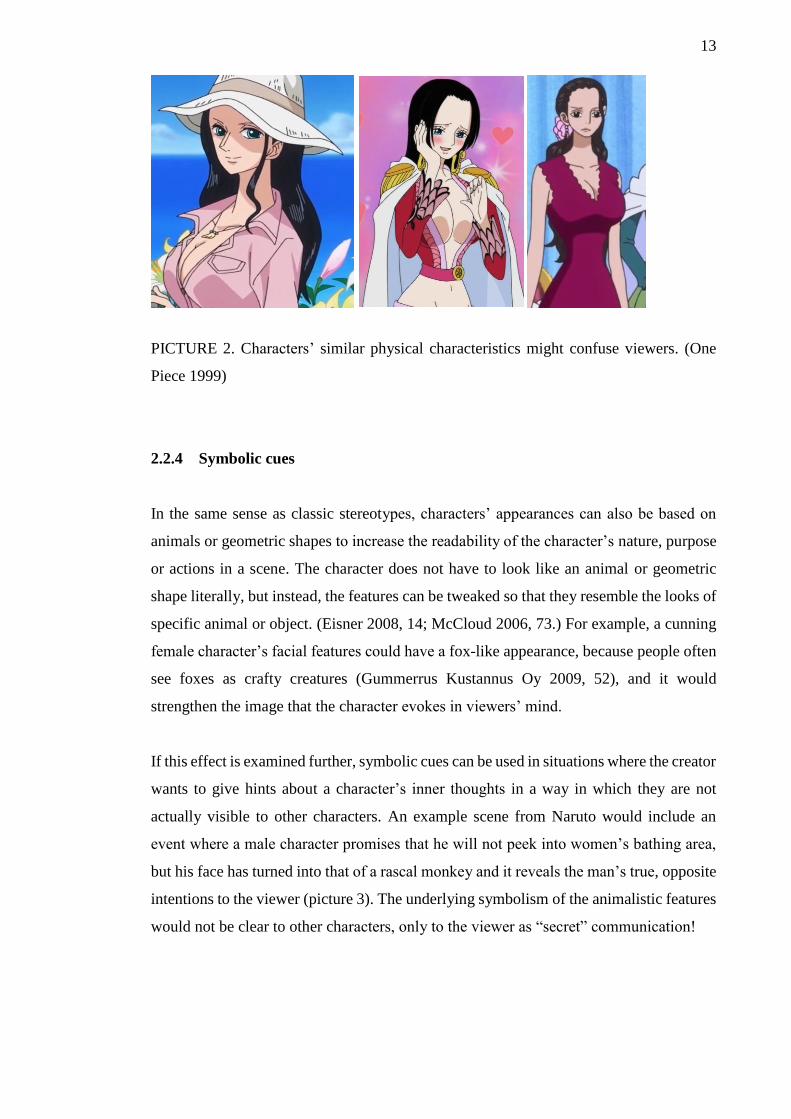
PICTURE 2. Characters’ similar physical characteristics might confuse viewers. (One
Piece 1999)
2.2.4 Symbolic cues
In the same sense as classic stereotypes, characters’ appearances can also be based on
animals or geometric shapes to increase the readability of the character’s nature, purpose
or actions in a scene. The character does not have to look like an animal or geometric
shape literally, but instead, the features can be tweaked so that they resemble the looks of
specific animal or object. (Eisner 2008, 14; McCloud 2006, 73.) For example, a cunning
female character’s facial features could have a fox-like appearance, because people often
see foxes as crafty creatures (Gummerrus Kustannus Oy 2009, 52), and it would
strengthen the image that the character evokes in viewers’ mind.
If this effect is examined further, symbolic cues can be used in situations where the creator
wants to give hints about a character’s inner thoughts in a way in which they are not
actually visible to other characters. An example scene from Naruto would include an
event where a male character promises that he will not peek into women’s bathing area,
but his face has turned into that of a rascal monkey and it reveals the man’s true, opposite
intentions to the viewer (picture 3). The underlying symbolism of the animalistic features
would not be clear to other characters, only to the viewer as “secret” communication!
14
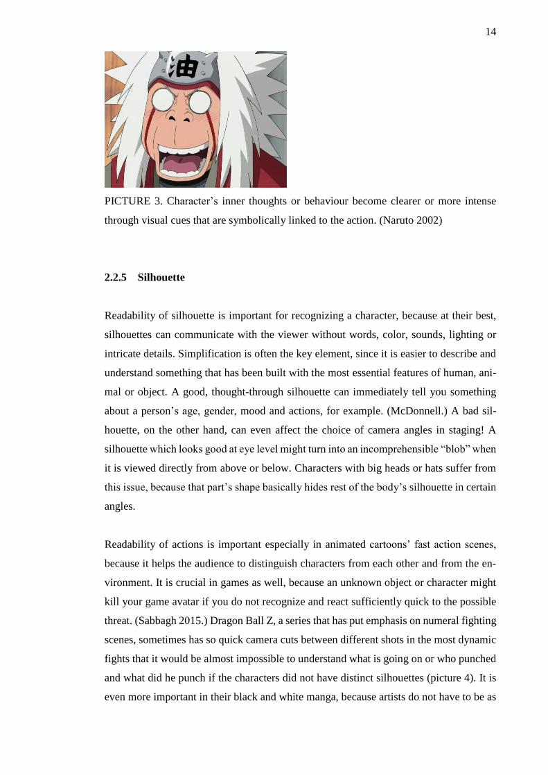
PICTURE 3. Character’s inner thoughts or behaviour become clearer or more intense
through visual cues that are symbolically linked to the action. (Naruto 2002)
2.2.5 Silhouette
Readability of silhouette is important for recognizing a character, because at their best,
silhouettes can communicate with the viewer without words, color, sounds, lighting or
intricate details. Simplification is often the key element, since it is easier to describe and
understand something that has been built with the most essential features of human, ani-
mal or object. A good, thought-through silhouette can immediately tell you something
about a person’s age, gender, mood and actions, for example. (McDonnell.) A bad sil-
houette, on the other hand, can even affect the choice of camera angles in staging! A
silhouette which looks good at eye level might turn into an incomprehensible “blob” when
it is viewed directly from above or below. Characters with big heads or hats suffer from
this issue, because that part’s shape basically hides rest of the body’s silhouette in certain
angles.
Readability of actions is important especially in animated cartoons’ fast action scenes,
because it helps the audience to distinguish characters from each other and from the en-
vironment. It is crucial in games as well, because an unknown object or character might
kill your game avatar if you do not recognize and react sufficiently quick to the possible
threat. (Sabbagh 2015.) Dragon Ball Z, a series that has put emphasis on numeral fighting
scenes, sometimes has so quick camera cuts between different shots in the most dynamic
fights that it would be almost impossible to understand what is going on or who punched
and what did he punch if the characters did not have distinct silhouettes (picture 4). It is
even more important in their black and white manga, because artists do not have to be as
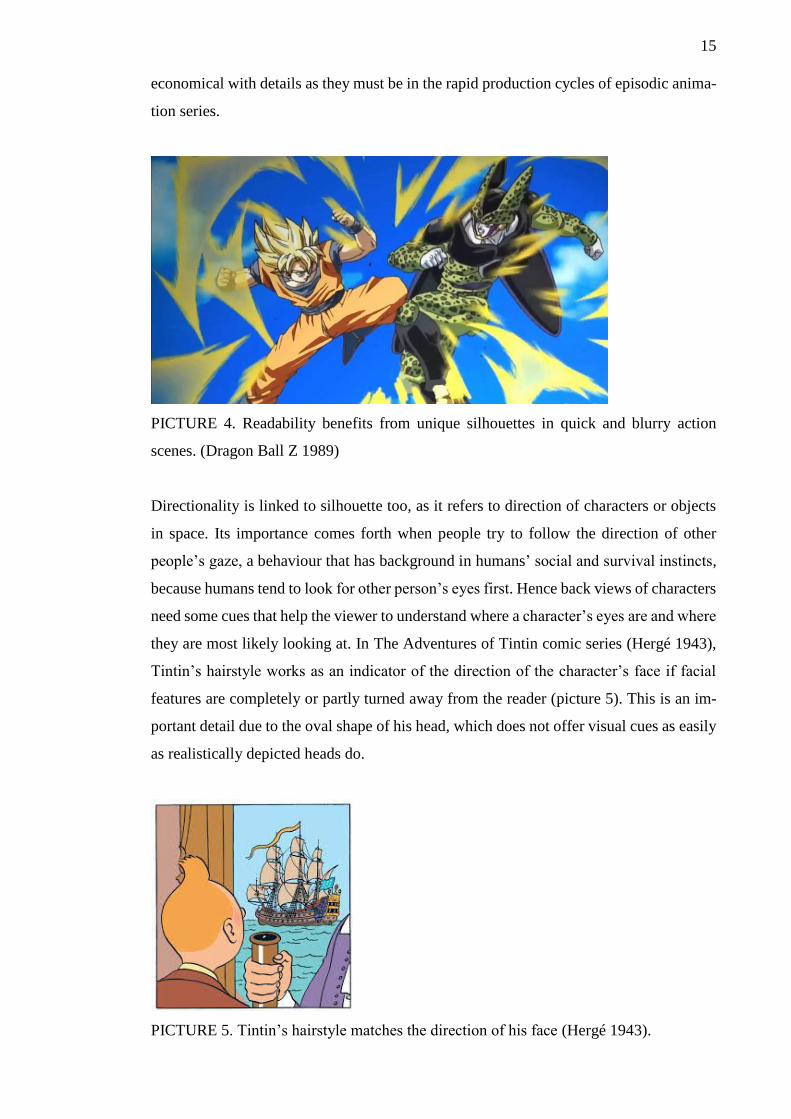
15
economical with details as they must be in the rapid production cycles of episodic anima-
tion series.
PICTURE 4. Readability benefits from unique silhouettes in quick and blurry action
scenes. (Dragon Ball Z 1989)
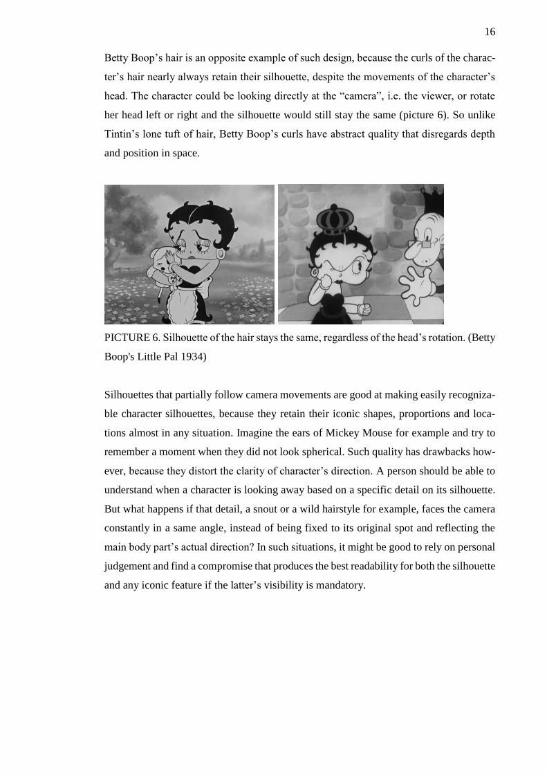
Directionality is linked to silhouette too, as it refers to direction of characters or objects
in space. Its importance comes forth when people try to follow the direction of other
people’s gaze, a behaviour that has background in humans’ social and survival instincts,
because humans tend to look for other person’s eyes first. Hence back views of characters
need some cues that help the viewer to understand where a character’s eyes are and where
they are most likely looking at. In The Adventures of Tintin comic series (Hergé 1943),
Tintin’s hairstyle works as an indicator of the direction of the character’s face if facial
features are completely or partly turned away from the reader (picture 5). This is an im-
portant detail due to the oval shape of his head, which does not offer visual cues as easily
as realistically depicted heads do.
PICTURE 5. Tintin’s hairstyle matches the direction of his face (Hergé 1943).
16
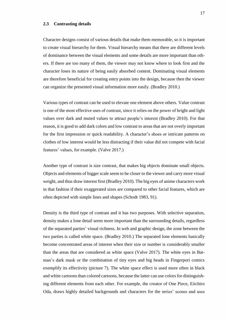
Betty Boop’s hair is an opposite example of such design, because the curls of the charac-
ter’s hair nearly always retain their silhouette, despite the movements of the character’s
head. The character could be looking directly at the “camera”, i.e. the viewer, or rotate
her head left or right and the silhouette would still stay the same (picture 6). So unlike
Tintin’s lone tuft of hair, Betty Boop’s curls have abstract quality that disregards depth
and position in space.
PICTURE 6. Silhouette of the hair stays the same, regardless of the head’s rotation. (Betty
Boop's Little Pal 1934)
Silhouettes that partially follow camera movements are good at making easily recogniza-
ble character silhouettes, because they retain their iconic shapes, proportions and loca-
tions almost in any situation. Imagine the ears of Mickey Mouse for example and try to
remember a moment when they did not look spherical. Such quality has drawbacks how-
ever, because they distort the clarity of character’s direction. A person should be able to
understand when a character is looking away based on a specific detail on its silhouette.
But what happens if that detail, a snout or a wild hairstyle for example, faces the camera
constantly in a same angle, instead of being fixed to its original spot and reflecting the
main body part’s actual direction? In such situations, it might be good to rely on personal
judgement and find a compromise that produces the best readability for both the silhouette
and any iconic feature if the latter’s visibility is mandatory.
17
2.3 Contrasting details
Character designs consist of various details that make them memorable, so it is important
to create visual hierarchy for them. Visual hierarchy means that there are different levels
of dominance between the visual elements and some details are more important than oth-
ers. If there are too many of them, the viewer may not know where to look first and the
character loses its nature of being easily absorbed content. Dominating visual elements
are therefore beneficial for creating entry points into the design, because then the viewer
can organize the presented visual information more easily. (Bradley 2010.)
Various types of contrast can be used to elevate one element above others. Value contrast
is one of the most effective uses of contrast, since it relies on the power of bright and light
values over dark and muted values to attract people’s interest (Bradley 2010). For that
reason, it is good to add dark colors and low contrast to areas that are not overly important
for the first impression or quick readability. A character’s shoes or intricate patterns on
clothes of low interest would be less distracting if their value did not compete with facial
features’ values, for example. (Valve 2017.)
Another type of contrast is size contrast, that makes big objects dominate small objects.
Objects and elements of bigger scale seem to be closer to the viewer and carry more visual
weight, and thus draw interest first (Bradley 2010). The big eyes of anime characters work
in that fashion if their exaggerated sizes are compared to other facial features, which are
often depicted with simple lines and shapes (Schodt 1983, 91).
Density is the third type of contrast and it has two purposes. With selective separation,
density makes a lone detail seem more important than the surrounding details, regardless
of the separated parties’ visual richness. In web and graphic design, the zone between the
two parties is called white space. (Bradley 2010.) The separated lone elements basically
become concentrated areas of interest when their size or number is considerably smaller
than the areas that are considered as white space (Valve 2017). The white eyes in Bat-
man’s dark mask or the combination of tiny eyes and big heads in Fingerpori comics
exemplify its effectivity (picture 7). The white space effect is used more often in black
and white cartoons than colored cartoons, because the latter can use colors for distinguish-
ing different elements from each other. For example, the creator of One Piece, Eiichiro
Oda, draws highly detailed backgrounds and characters for the series’ scenes and uses
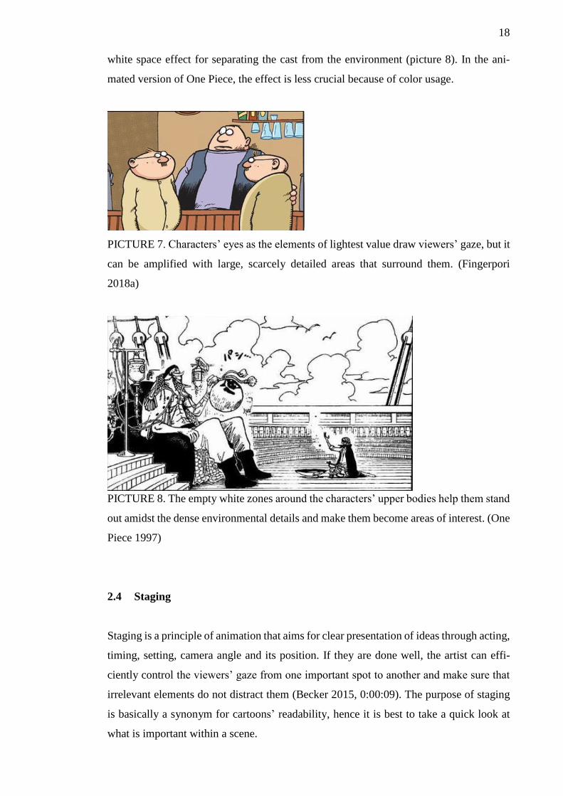
18
white space effect for separating the cast from the environment (picture 8). In the ani-
mated version of One Piece, the effect is less crucial because of color usage.
PICTURE 7. Characters’ eyes as the elements of lightest value draw viewers’ gaze, but it
can be amplified with large, scarcely detailed areas that surround them. (Fingerpori
2018a)
PICTURE 8. The empty white zones around the characters’ upper bodies help them stand
out amidst the dense environmental details and make them become areas of interest. (One
Piece 1997)
2.4 Staging
Staging is a principle of animation that aims for clear presentation of ideas through acting,
timing, setting, camera angle and its position. If they are done well, the artist can effi-
ciently control the viewers’ gaze from one important spot to another and make sure that
irrelevant elements do not distract them (Becker 2015, 0:00:09). The purpose of staging
is basically a synonym for cartoons’ readability, hence it is best to take a quick look at
what is important within a scene.
19
2.4.1 Acting and timing
Clarity of acting and timing often work hand in hand. They make the viewer’s attention
jump from one area of interest to the next in a path that highlights one or two of them at
a time (Becker 2015, 0:01:13). According to Scott McCloud (2006, 20, 34), “Readers
focus on areas of change and relevance to the story” – a behaviour that can be controlled
by making irrelevant elements seem stationary or repetitive. In a super hero comic for
example, there can be a scene where the hero talks and his cape flows with wind. The
reader would naturally pay attention to the character’s moving mouth, because he wants
to find out what the hero is saying, and ignore the flowing cape that has repetitive move-
ment. The character’s body would not get much attention either, because it is most likely
in a stationary pose in that kind of monologue scene. In animated cartoons, the clarity of
actions can be achieved by letting key movements and reactions have turns so they will
not overwhelm the viewer by overlapping or competing with each other (Becker 2015;
McCloud 2006, 34-35).
2.4.2 Camera angle and position
The camera represents the viewer’s point of view and the director or artist decides what
angle or position is the best for examining a setting. A continuous stationary view into a
scene makes the viewer focus on things that change within that framing, instead of getting
distracted by restless shots that do not benefit narrative. However, varying shots make
some scenes more interesting and highlight certain qualities. Special views make the
viewer follow the happenings from a character’s position or elevate them above the set-
ting or main events so that they can get an overview of everything. The latter works as an
establishing shot that can convey a mood or a sense of place. (McCloud 2006, 18-23).
The effect of different camera angles can be examined by comparing comics from the
early and latter half of 20th century. Early comic artists tended to depict events with cam-
era angles that showed characters’ full figures and environments that had diagrammatic
layouts. Both elements were practical at presenting information in a clear, yet uninterest-
ing manner. Nowadays, because of the dynamic staging and drawing practices of manga
artist Osamu Tezuka in the late 1940s and cartoon artist Jack Kirby in the 1960s, comics
20
evoke moods through livelier drawing styles and changing camera angles. (Schodt 1983,
62-63; McCloud 2006, 225).
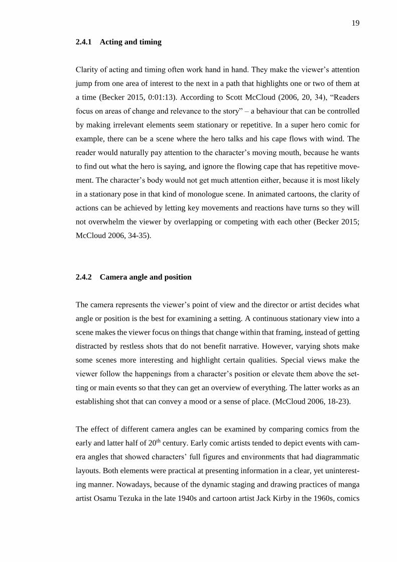
A picture’s “hot spots” can be also used for directing viewers’ eyes to desired details. Hot
spots refer to the center of the view or one of the thirds of the view (picture 9), which are
based on the rule of thirds that makes elements catch attention more easily if they are near
certain regions in a picture (Doucet). Movements in animations can surpass the effect of
the hot spots though. They additionally convey the absence of important elements, an
object’s motion, objects of interest that are not visible yet, the distance that has been
crossed or about to be crossed (McCloud 2006, 25).
'
PICTURE 9. Animation frame divided into the thirds of the view. The green dots repre-
sent hot spots of interest. (Doucet)
2.4.3 Visual cues
Presenting ideas to the viewers becomes easier through visual cues. Whether they are the
character’s mood or the items that decorate the walls of the character’s home, they all
become more effective at helping the viewers concentrate on the main concept if they are
presented selectively (Becker 2015, 0:01:39). In cartoons, this usually means exaggera-
tion, which removes the subtlety of realism and highlights the purest essence of its sub-
jects (McCloud 1994, 30). Character design’s effects to readability was already examined
earlier, but the effect extends to non-character objects as well! In the building phase of a
setting, it is best to include objects that are the most relevant for giving an impression
21
about a character or space. Irrelevant objects would just degrade the overall impression.
(Becker 2015, 0:01:49).
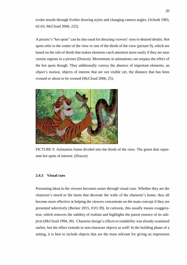
Cartoons also use the effect in a reverse manner to strengthen the viewer’s attention to a
specific subject. It means the important character, object or other detail is completely
isolated in a simple abstract space for a moment and returned to the initial “location”
when the effect has fulfilled its purpose (picture 10). The sudden disappearance or sim-
plification of possibly distracting surroundings forces the viewer to concentrate only on
the things that exist in the abstract space, thus improving staging and readability of im-
portant elements.
PICTURE 10. Characters seem to move into another space in shocking moments (upper
picture), but they are actually in the same spot the whole time (lower picture). (My Hero
Academia 2016)
22
3 THE NATURE OF CARTOON ART
3.1 Simplicity as the base
Cartoons have a distinct visual style that primarily uses various types of lines for depicting
characters and it can be seen as their biggest visual characteristic. Such a simplified way
of presentation has given cartoons a reputation as a medium of light-hearted and easily
readable content. That is not an unfounded accusation however, because cartoons have
catered to people of low literacy and limited intellectual accomplishment for decades.
(Eisner 2008.) That basically means the visual style of cartoons was partly affected by
their role as children’s entertainment - in the case of cartoons and comics from the early
20th century at least.
Another influential effect came from printing methods that limited the way how cartoons
were presented before the support for larger color palettes became common. Early print-
ers often provided only a handful of colors and cartoonists had to be content with them in
their character designs. For example, the iconic skin color of Marvel’s Hulk was gray in
one of the early iterations, but it had to be switched to green, because the former choice
could not be reliably reproduced every time. (Grais.)
Simplified visual elements of cartoon characters do not imply that they lack adequate
details though. On the contrary, every line and dot contains information that tells or gives
cues about the nature of the part that they partially or wholly depict (Salgood 2015). If
facial features of anime characters are examined for example, it can be seen a couple of
simple lines is enough for giving an impression that a character has nose and mouth (pic-
ture 11).

23
PICTURE 11. Despite the lack of visible lips and nostrils, just two lines can create cred-
ible forms for nose and mouth. (My Hero Academia 2016)
The extent of simplification often matches the intended mood of the story or illustration,
for highly detailed and realistic style is usually reserved for cartoons that cater to adults
and minimalistic style is saved for children’s cartoons. Nowadays realistic depictions of
characters do not belong exclusively to adults’ series, as childish cartoons also occasion-
ally use shots with increased realism as a mean to increase graveness of a situation (pic-
ture 12). Realistic shots of items and other inanimate objects are used in a similar manner
to make the viewer aware of them as objects of interest. This kind of practice is highly
common amongst Japanese series that are usually more creative with stylized special ef-
fects than their western counterparts. (McCloud 1994, 43-44)
PICTURE 12. Sudden realism makes characters’ reactions seem more intense if realistic
style is atypical for the series. (Daily Lives of High School Boys 2012)
Simplified style should not come at the expense of readability, as character’s lines can
turn into incomprehensible scribbles if they are not drawn with clarity. As cartoonist Scott
McCloud (2006, 26) stated it “No matter what style of image you choose, your pictures’
first and most important job is to communicate quickly, clearly and compellingly with the
24
reader”. This is true especially with characters, because the power of their expressions
lies in their ability to depict basic human emotions. (McCloud 2006, 81-82.)
People fortunately tend to see human-like features even in the simplest of forms that sug-
gest human anatomy with symmetrically placed features, so stylized and simplified char-
acter art is not a problem (McCloud 2006, 59-61). A good way to visualize this is the
difference between realistic portrait paintings and cartoon caricatures, because the former
would try to depict a person in realistic manner with proper perspective and lighting. The
latter, on the other hand, would probably look like a sketch that only uses few lines and
exaggeration for emphasizing the person’s most prominent features. In the end, the por-
trait and the caricature would look slightly different because of stylization, but both would
still represent the same person. In other words, both depictions contain the same infor-
mation that makes the character recognizable. As a conclusion, simplification is a way
for cartoons to ensure clarity for the most important details only, because they help the
audience understand what the cartoonist wants to tell and make them become interested
in the content (McCloud 2006, 9).
3.2 Abstract Art
To understand the stylized look of cartoons better, it is good to look at the theory of ab-
stract art, as they share many similarities. Artists have always utilized abstract shapes to
improve compositions, but abstract art as an artistic movement became popular in the
early 20th century, because it threw away some of the conventions that had been forced
on artworks. Instead of imitating visual reality accurately, abstract art started to represent
it with simplified shapes, colors, and forms that would give artworks dreamlike or night-
marish qualities in the most extreme cases. (Caterina 2017.) Despite the otherworldly
look, the simplified style was usually achieved by taking or separating elements from an
object, figure or landscape that existed in the real world.
Symbols in abstract art can also be used to depict and represent subjects that do not have
physical forms. It means that an artist can use strokes and paint marks, for example, in a
manner that would portray his emotions or state of mind when another person looks at
the artwork. (Tate a.) Cartoonists similarly utilize visible gusts of air and “speed lines” to
25
give detectable forms to movement. In the case of speed lines, they complement and ex-
aggerate the feel of movement in scenes that would otherwise look static. For example,
speed lines make fighting scenes look faster than one animation frame or a comic panel
could suggest on its own. Speed lines also depict the trails of movement if the cartoon
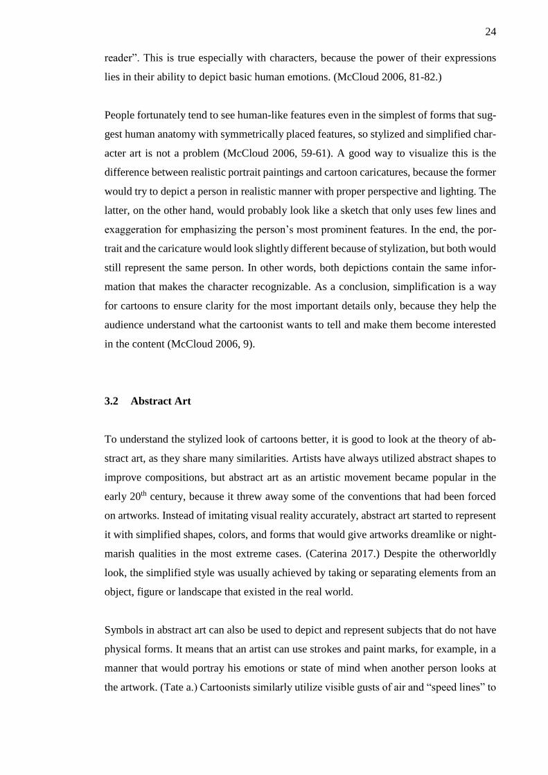
only shows the start and end poses of the most fastest actions (picture 13).
PICTURE 13. Some actions of the characters in Dragon Ball Z appear so quick that speed
lines are the only indicators of movement interpolation between the starting and ending
point of an action (Dragon Ball Z 1989).
The main appeal of abstract art is the theory that it lets artists aim for aesthetic experiences
that exhibit pure patterns of form, color and line. (Tate b). That theory impeccably
matches the general idea and feel of cartoon art, as various cartoon series have shown
with their stylized depictions of characters and their actions.
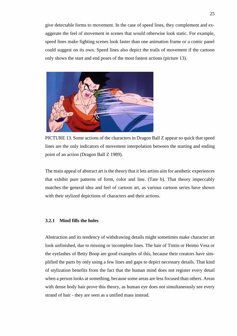
3.2.1 Mind fills the holes
Abstraction and its tendency of withdrawing details might sometimes make character art
look unfinished, due to missing or incomplete lines. The hair of Tintin or Heimo Vesa or
the eyelashes of Betty Boop are good examples of this, because their creators have sim-
plified the parts by only using a few lines and gaps to depict necessary details. That kind
of stylization benefits from the fact that the human mind does not register every detail
when a person looks at something, because some areas are less focused than others. Areas
with dense body hair prove this theory, as human eye does not simultaneously see every
strand of hair - they are seen as a unified mass instead.
26
3.2.2 Details bring the person
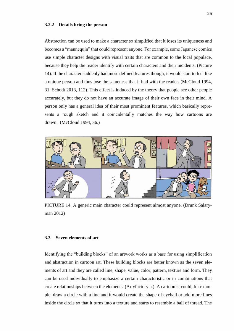
Abstraction can be used to make a character so simplified that it loses its uniqueness and
becomes a “mannequin” that could represent anyone. For example, some Japanese comics
use simple character designs with visual traits that are common to the local populace,
because they help the reader identify with certain characters and their incidents. (Picture
14). If the character suddenly had more defined features though, it would start to feel like
a unique person and thus lose the sameness that it had with the reader. (McCloud 1994,
31; Schodt 2013, 112). This effect is induced by the theory that people see other people
accurately, but they do not have an accurate image of their own face in their mind. A
person only has a general idea of their most prominent features, which basically repre-
sents a rough sketch and it coincidentally matches the way how cartoons are
drawn. (McCloud 1994, 36.)
PICTURE 14. A generic main character could represent almost anyone. (Drunk Salary-
man 2012)
3.3 Seven elements of art
Identifying the “building blocks” of an artwork works as a base for using simplification
and abstraction in cartoon art. These building blocks are better known as the seven ele-
ments of art and they are called line, shape, value, color, pattern, texture and form. They
can be used individually to emphasize a certain characteristic or in combinations that
create relationships between the elements. (Artyfactory a.) A cartoonist could, for exam-
ple, draw a circle with a line and it would create the shape of eyeball or add more lines
inside the circle so that it turns into a texture and starts to resemble a ball of thread. The
27
following paragraphs look further into the nature of these elements and try to identify
what kind of information they can contain or represent if their characteristics are changed
or emphasized in a particular manner.
3.3.1 Line
A line represents a moving dot and it is the most versatile visual element that can suggest
various things: shape, pattern, form, structure, growth, depth, distance, rhythm, move-
ment and a range of emotions (Artyfactory b). The most common objectives of a line are
defining edges of an object, contribute for something and be expressive (Fussell 2010;
Salgood 2015). That is important in a simplified style of cartoons, since every line con-
tains information. In character art for example, Salgood recommends using thick lines for
thick areas like muscles and thin lines for areas that have bones, elbows and wrists. These
line variations suggest that muscles have bigger mass than most bones.
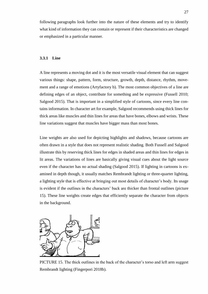
Line weights are also used for depicting highlights and shadows, because cartoons are
often drawn in a style that does not represent realistic shading. Both Fussell and Salgood
illustrate this by reserving thick lines for edges in shaded areas and thin lines for edges in
lit areas. The variations of lines are basically giving visual cues about the light source
even if the character has no actual shading (Salgood 2015). If lighting in cartoons is ex-
amined in depth though, it usually matches Rembrandt lighting or three-quarter lighting,
a lighting style that is effective at bringing out most details of character’s body. Its usage
is evident if the outlines in the characters’ back are thicker than frontal outlines (picture
15). These line weights create edges that efficiently separate the character from objects
in the background.
PICTURE 15. The thick outlines in the back of the character’s torso and left arm suggest
Rembrandt lighting (Fingerpori 2018b).
28
Line weight also gives the impression of distance and depth, because lines are a part of a
character and they both simultaneously become smaller if the character is further away.
Fingerpori and Betty Boop cartoons use line weights in this manner, but the only devia-
tion is the thickness of important characters’ or objects’ outlines that are occasionally
thicker than other subjects’ outlines. However, it should be noted that creators of Betty
Boop cartoons might have used transparent cels in the animation process in the 1930s and
overlapped slides could have decreased the contrast of lowest cels, which have usually
been reserved for details that do not move constantly – environmental details in this case.
Because the aforementioned cartoons are often depicted in black and white or grayscale
style that do not benefit from distinguishable color variation, thick outlines help important
subjects pop up if they are faraway in the scene or they are surrounded by dense environ-
mental details (picture 16 & 17). Using bold outlines seems to confirm effectivity of con-
trast, because bold, black outlines clearly tell the viewer where a character’s parts end
and the environment begins.
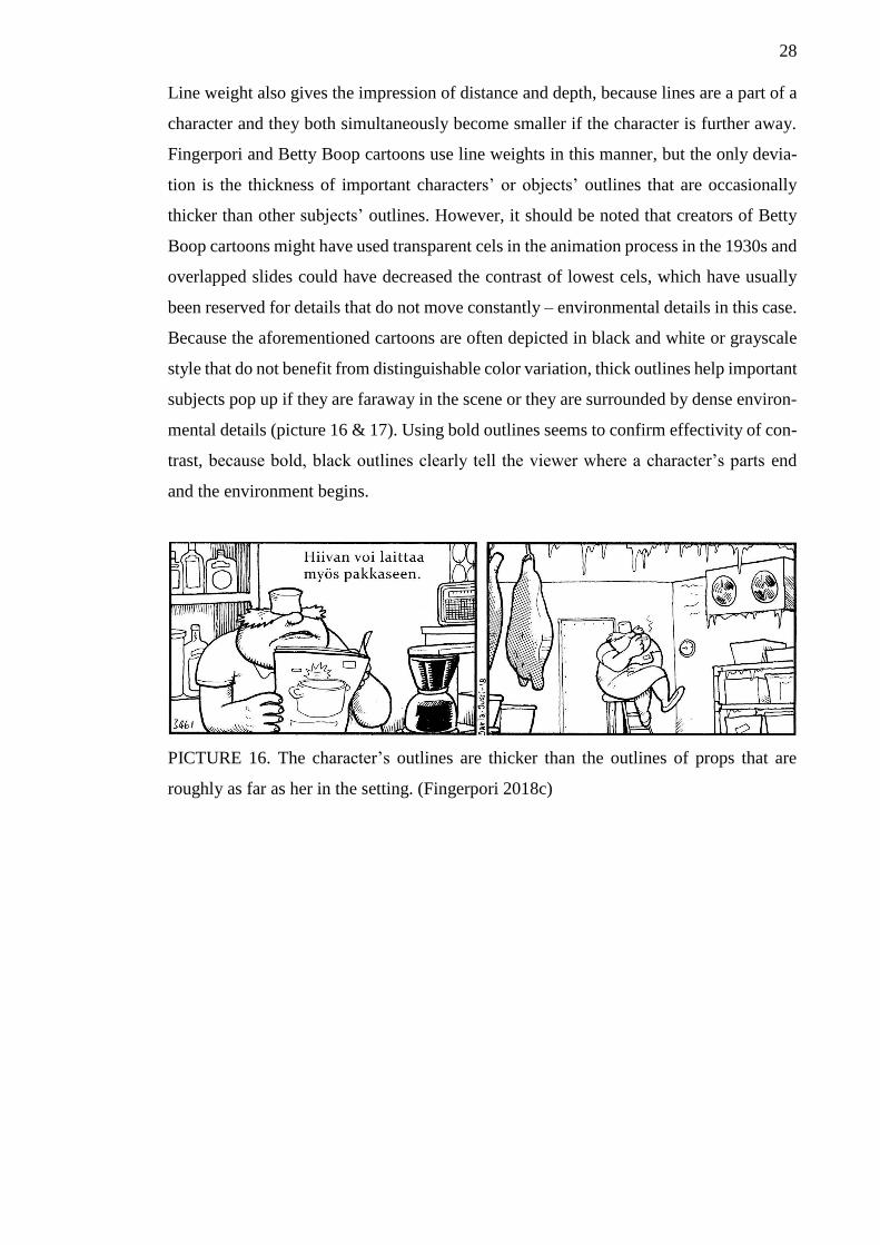
PICTURE 16. The character’s outlines are thicker than the outlines of props that are
roughly as far as her in the setting. (Fingerpori 2018c)
29
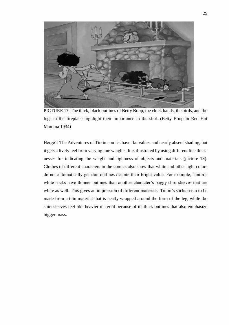
PICTURE 17. The thick, black outlines of Betty Boop, the clock hands, the birds, and the
logs in the fireplace highlight their importance in the shot. (Betty Boop in Red Hot
Mamma 1934)
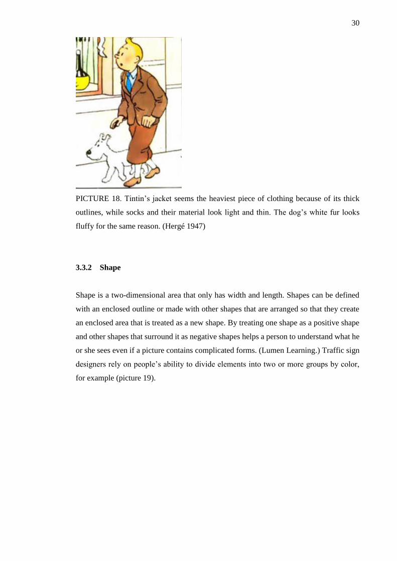
Hergé’s The Adventures of Tintin comics have flat values and nearly absent shading, but
it gets a lively feel from varying line weights. It is illustrated by using different line thick-
nesses for indicating the weight and lightness of objects and materials (picture 18).
Clothes of different characters in the comics also show that white and other light colors
do not automatically get thin outlines despite their bright value. For example, Tintin’s
white socks have thinner outlines than another character’s baggy shirt sleeves that are
white as well. This gives an impression of different materials: Tintin’s socks seem to be
made from a thin material that is neatly wrapped around the form of the leg, while the
shirt sleeves feel like heavier material because of its thick outlines that also emphasize
bigger mass.
30
PICTURE 18. Tintin’s jacket seems the heaviest piece of clothing because of its thick
outlines, while socks and their material look light and thin. The dog’s white fur looks
fluffy for the same reason. (Hergé 1947)
3.3.2 Shape
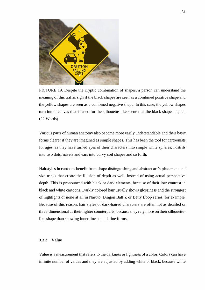
Shape is a two-dimensional area that only has width and length. Shapes can be defined
with an enclosed outline or made with other shapes that are arranged so that they create
an enclosed area that is treated as a new shape. By treating one shape as a positive shape
and other shapes that surround it as negative shapes helps a person to understand what he
or she sees even if a picture contains complicated forms. (Lumen Learning.) Traffic sign
designers rely on people’s ability to divide elements into two or more groups by color,
for example (picture 19).
31
PICTURE 19. Despite the cryptic combination of shapes, a person can understand the
meaning of this traffic sign if the black shapes are seen as a combined positive shape and
the yellow shapes are seen as a combined negative shape. In this case, the yellow shapes
turn into a canvas that is used for the silhouette-like scene that the black shapes depict.
(22 Words)
Various parts of human anatomy also become more easily understandable and their basic
forms clearer if they are imagined as simple shapes. This has been the tool for cartoonists
for ages, as they have turned eyes of their characters into simple white spheres, nostrils
into two dots, navels and ears into curvy coil shapes and so forth.
Hairstyles in cartoons benefit from shape distinguishing and abstract art’s placement and
size tricks that create the illusion of depth as well, instead of using actual perspective
depth. This is pronounced with black or dark elements, because of their low contrast in
black and white cartoons. Darkly colored hair usually shows glossiness and the strongest
of highlights or none at all in Naruto, Dragon Ball Z or Betty Boop series, for example.
Because of this reason, hair styles of dark-haired characters are often not as detailed or
three-dimensional as their lighter counterparts, because they rely more on their silhouette-
like shape than showing inner lines that define forms.
3.3.3 Value
Value is a measurement that refers to the darkness or lightness of a color. Colors can have
infinite number of values and they are adjusted by adding white or black, because white

32
is the lightest value and black is the darkest. An artist could, for example, add white to
blue to make it brighter for an illustration that depicts bright day sky or add black to match
darker sky of a nightly scene. Value also creates the illusion of form if a visual element
or a block of color has values that show contrast by shifting from darker to lighter values
or vice versa.
If black and white cartoons are excluded, cartoons’ simplified nature is apparent in the
way how they separate the values of highlighted areas and shaded areas into two or three
layers. The use of “layered shading” can be imagined as a pruned version of realistic
shading that uses smooth value transitions from shaded areas into bright areas (picture
20). In real life, objects that show clear borders between differently illuminated areas are
usually brightly lit, reflective or they have hard edges that suddenly create shadows. De-
spite the layered style of shading in cartoons, the strongest value contrasts are usually
saved for scenes that require specific mood. Characters have nearly similar values for
their highlights and shaded areas in scenes that have basic lighting conditions, because
lines can be coincidentally counted as an extra layer of shading. This coincidence is cre-
ated by the value of lines that is usually the darkest value on any character. This can be
based on the theory of occlusion shadows that appear in the least lit crevices or areas
where two surfaces meet (Prokopenko 2012).
PICTURE 20. Colored cartoons can depict differently lit areas broadly and sharply with
value layers, but they lose the ability to show the forms of shaded areas as accurately as
lines can in black and white cartoons (Naruto 1999, 2002).

33
Black and white cartoons have handled shading of medium lit areas with lines that illus-
trate fading illumination. Due to the lines’ ability of giving information about forms with
curves and other qualities, they do not depict shaded areas as flat as layered shading does.
On the other hand, layered shading excels at shading reflective materials, because of its
ability to use clear jumps and contrast between values.
3.3.4 Color
Colors refer to the experience that happens when wavelengths of light hit a light-sensitive
receptor cells called rods and cones in the retina of a person’s eye and he or she interprets
the light’s quality as a color. People with defective cells might have difficulties to inter-
pret colors in the same way as other people and are known as color-deficient. (Starr 2017;
Leong 2006)
Different wavelengths represent different colors, but humans create their own interpreta-
tions and it means that an apple might seem red to one person, while it is blue to someone
else in the most extreme cases. Neither of them is wrong, because the interpretation hap-
pens in the person’s mind and it is based on the viewed objects’ or scene’s lighting source
and environment. On the other hand, human mind might make wrong interpretations
based on the person’s existing knowledge about specific subjects. (Starr 2017). For ex-
ample, the aforementioned apple might seem red to the viewer in teal lighting, because
his brain tells him that apples are red. However, the color of the apple might actually be
gray in that situation, but the person’s brain, once again, made it seem red.
Despite the fact that people see colors a bit differently in some cases, it has been studied
that colors can affect humans mentally and emotionally (Nassau). Hence they are con-
venient for creating mood and atmosphere in cartoons that can exaggerate colors of the
real world to better match their goals.

34
3.3.5 Pattern
Patterns consist of “echoed” or repeated visual elements that give the impression of bal-
ance, harmony, contrast, rhythm, or movement, which can be natural or man-made. As
the name implies, natural patterns can be found in the nature as fur markings, spirals in
seashells, intricate branches etc. Man-made patterns are mainly used for decoration or
structural purposes by humans. Despite their different sources, both patterns can have
various appearances from regular and geometric to chaotic and organic. (Artyfactory c.)
Cartoonists utilize a wide range of patterns in their art, because they can be effectively
used for giving illusion of simplified reality. Cartoons use patterns for eyelashes and hair
to create the illusion of volume, for example.
3.3.6 Texture
Texture as an element of art refers to the surface quality of material and how it might feel
if it was touched. Textures can imply whether a specific material’s surface is rough or
smooth, for example. In cartoons, texture is usually created with lines, contrast or hue
changes. Black and white cartoons shading style might give wrong impressions about
textures, because some lines could be mistaken for textures. Hence it is important that
cartoonist remembers to simplify textures to a point where the most essential lines are
kept and unnecessary elements are gone (McCloud 1994, 30).
3.3.7 Form
Form represents objects that have width, height and depth. These characteristics make
forms 3D objects that have their own volume in space. Because of this same reason, forms
can also be used to create illusion of depth on 2D surface. If forms are compared to shapes,
the third dimension of depth turns squares into cubes, circles into spheres and triangles
into pyramids. Use of light and shadow help viewers to see forms as 3D objects, because
otherwise they would just look like flat shapes. (Pantelić 2016)
35
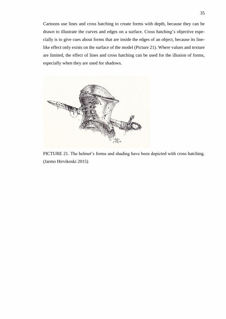
Cartoons use lines and cross hatching to create forms with depth, because they can be
drawn to illustrate the curves and edges on a surface. Cross hatching’s objective espe-
cially is to give cues about forms that are inside the edges of an object, because its line-
like effect only exists on the surface of the model (Picture 21). Where values and texture
are limited, the effect of lines and cross hatching can be used for the illusion of forms,
especially when they are used for shadows.
PICTURE 21. The helmet’s forms and shading have been depicted with cross hatching.
(Jarmo Hirvikoski 2015)
36
4 USE OF 3D MODELS IN CARTOONS
What are the benefits of using 3D models in 2D cartoon creating? Animation productions
often suffer from rapid production paces, which force producers to cut corners and make
compromises for the sake of saving time for more important parts. Hence animation stu-
dios sometimes decide to simultaneously use 3D and 2D graphics, because their combi-
nation makes the production of specific parts quicker and easier. The success of combing
the different qualities of 3D and 2D mediums has various challenges and the next sections
examine a few of them.
4.1 Rendering style
Various rendering styles have been designed for 3D animations. Emulating a cartoony
2D look with 3D models or going with the realistic shading style that 3D softwares pro-
vide as a standard feature are two common options.
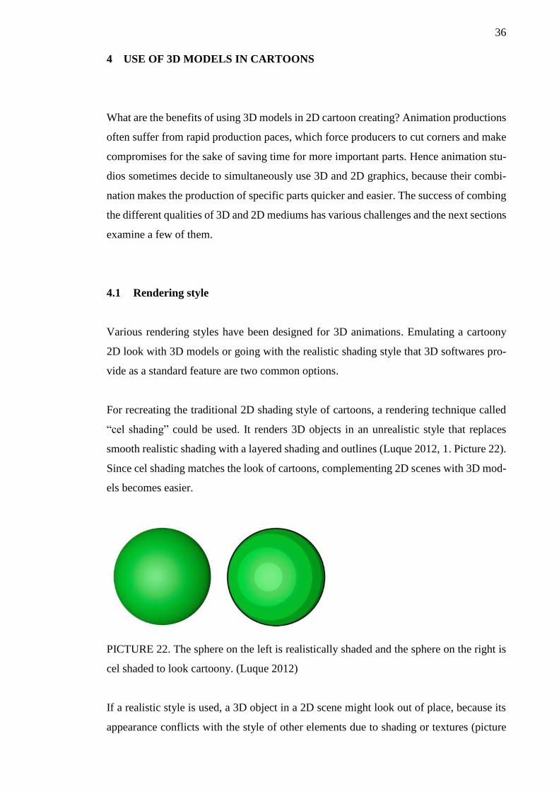
For recreating the traditional 2D shading style of cartoons, a rendering technique called
“cel shading” could be used. It renders 3D objects in an unrealistic style that replaces
smooth realistic shading with a layered shading and outlines (Luque 2012, 1. Picture 22).
Since cel shading matches the look of cartoons, complementing 2D scenes with 3D mod-
els becomes easier.
PICTURE 22. The sphere on the left is realistically shaded and the sphere on the right is
cel shaded to look cartoony. (Luque 2012)
If a realistic style is used, a 3D object in a 2D scene might look out of place, because its
appearance conflicts with the style of other elements due to shading or textures (picture
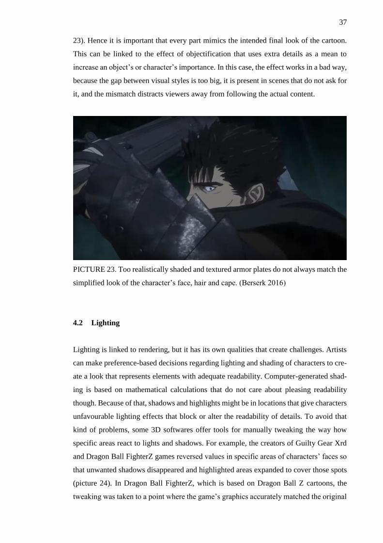
37
23). Hence it is important that every part mimics the intended final look of the cartoon.
This can be linked to the effect of objectification that uses extra details as a mean to
increase an object’s or character’s importance. In this case, the effect works in a bad way,
because the gap between visual styles is too big, it is present in scenes that do not ask for
it, and the mismatch distracts viewers away from following the actual content.
PICTURE 23. Too realistically shaded and textured armor plates do not always match the
simplified look of the character’s face, hair and cape. (Berserk 2016)
4.2 Lighting
Lighting is linked to rendering, but it has its own qualities that create challenges. Artists
can make preference-based decisions regarding lighting and shading of characters to cre-
ate a look that represents elements with adequate readability. Computer-generated shad-
ing is based on mathematical calculations that do not care about pleasing readability
though. Because of that, shadows and highlights might be in locations that give characters
unfavourable lighting effects that block or alter the readability of details. To avoid that
kind of problems, some 3D softwares offer tools for manually tweaking the way how
specific areas react to lights and shadows. For example, the creators of Guilty Gear Xrd
and Dragon Ball FighterZ games reversed values in specific areas of characters’ faces so
that unwanted shadows disappeared and highlighted areas expanded to cover those spots
(picture 24). In Dragon Ball FighterZ, which is based on Dragon Ball Z cartoons, the
tweaking was taken to a point where the game’s graphics accurately matched the original
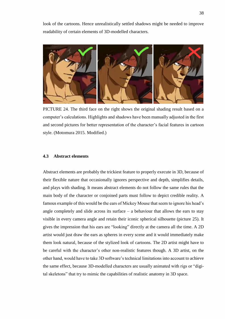
38
look of the cartoons. Hence unrealistically settled shadows might be needed to improve
readability of certain elements of 3D-modelled characters.
PICTURE 24. The third face on the right shows the original shading result based on a
computer’s calculations. Highlights and shadows have been manually adjusted in the first
and second pictures for better representation of the character’s facial features in cartoon
style. (Motomura 2015. Modified.)
4.3 Abstract elements
Abstract elements are probably the trickiest feature to properly execute in 3D, because of
their flexible nature that occasionally ignores perspective and depth, simplifies details,
and plays with shading. It means abstract elements do not follow the same rules that the
main body of the character or conjoined parts must follow to depict credible reality. A
famous example of this would be the ears of Mickey Mouse that seem to ignore his head’s
angle completely and slide across its surface – a behaviour that allows the ears to stay
visible in every camera angle and retain their iconic spherical silhouette (picture 25). It
gives the impression that his ears are “looking” directly at the camera all the time. A 2D
artist would just draw the ears as spheres in every scene and it would immediately make
them look natural, because of the stylized look of cartoons. The 2D artist might have to
be careful with the character’s other non-realistic features though. A 3D artist, on the
other hand, would have to take 3D software’s technical limitations into account to achieve
the same effect, because 3D-modelled characters are usually animated with rigs or “digi-
tal skeletons” that try to mimic the capabilities of realistic anatomy in 3D space.

39
PICTURE 25. The angle and location of Minnie’s ears are not strictly fixed to the head.
(Minnie’s Bow-Toons 2017)
Simplification represents another type of abstract elements and it can be constant or grad-
ual (McCloud 1994, 29). Constant simplification of details can be countered in the con-
cepting phase before the actual 3D modelling phase has begun. Those details are the char-
acter’s physical details that can be handled by creating appropriate 3D forms for them or
depicting them with textures. Simplification that happens gradually has to be countered
in a different manner, because their alternating visibility and forms require animation or
controlling. An example of this could be a scene where a character is faraway in the be-
ginning and then gets closer to the camera. For better readability in 2D cartoons, the char-
acter would have less details than normally in the initial faraway shot and then get more
detailed and defined as he comes closer to the camera (picture 26). If the same scene was
recreated in 3D, the 3D character model would seem less defined and detailed because of
atmospheric perspective. The effects of atmospheric perspective refer to the situations
when a subject’s contrast, hues or sharpness of details gets affected by distance (Chris-
tensen 2017. Appendix 1 & 2). Simplification of distant characters in cartoons therefore
represents such effects by dropping details to ensure that different elements stay easily
distinguishable even in faraway shots. Adding too many tiny details to a distant character
would just turn them into unnecessary “visual noise”, because they cannot distinctly cre-
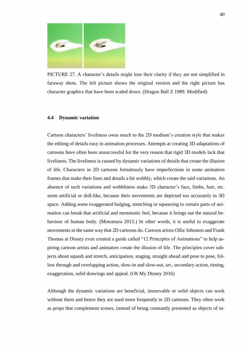
ate visual interest at long distances. (Teguh 2018. Picture 27).
PICTURE 26. Gradually increasing detail level of an approaching character keeps its
readability good at various distances. (Dragon Ball Z 1989)
40
PICTURE 27. A character’s details might lose their clarity if they are not simplified in
faraway shots. The left picture shows the original version and the right picture has
character graphics that have been scaled down. (Dragon Ball Z 1989. Modified)
4.4 Dynamic variation
Cartoon characters’ liveliness owes much to the 2D medium’s creation style that makes
the editing of details easy in animation processes. Attempts at creating 3D adaptations of
cartoons have often been unsuccessful for the very reason that rigid 3D models lack that
liveliness. The liveliness is caused by dynamic variations of details that create the illusion
of life. Characters in 2D cartoons fortuitously have imperfections in some animation
frames that make their lines and details a bit wobbly, which create the said variations. An
absence of such variations and wobbliness make 3D character’s face, limbs, hair, etc.
seem artificial or doll-like, because their movements are depicted too accurately in 3D
space. Adding some exaggerated bulging, stretching or squeezing to certain parts of ani-
mation can break that artificial and monotonic feel, because it brings out the natural be-
haviour of human body. (Motomura 2015.) In other words, it is useful to exaggerate
movements in the same way that 2D cartoons do. Cartoon artists Ollie Johnston and Frank
Thomas at Disney even created a guide called “12 Principles of Animations” to help as-
piring cartoon artists and animators create the illusion of life. The principles cover sub-
jects about squash and stretch, anticipation, staging, straight ahead and pose to pose, fol-
low through and overlapping action, slow-in and slow-out, arc, secondary action, timing,
exaggeration, solid drawings and appeal. (Oh My Disney 2016)
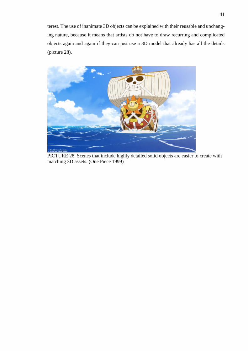
Although the dynamic variations are beneficial, immovable or solid objects can work
without them and hence they are used more frequently in 2D cartoons. They often work
as props that complement scenes, instead of being constantly presented as objects of in-
41
terest. The use of inanimate 3D objects can be explained with their reusable and unchang-
ing nature, because it means that artists do not have to draw recurring and complicated
objects again and again if they can just use a 3D model that already has all the details
(picture 28).
PICTURE 28. Scenes that include highly detailed solid objects are easier to create with
matching 3D assets. (One Piece 1999)
42
5 RECREATING BETTY BOOP IN 3D
Cartoons have created a wide cavalcade of diverse characters and choosing one of them
for 3D adaptation required a set of criterions. Betty Boop by Max Fleischer seemed like
a good candidate, since there are not many 3D adaptations of her. “Betty Boop Bop”
mobile rhythm game by Fowl Moon Studios in 2014 is one of the newest adaptations at
least. Nowadays the character mainly appears in various forms of merchandise, often in
illustrations or as collectible statues. Those statues and other figurines worked as the main
inspiration for modelling Betty Boop in 3D, because some of her features do not look
flattering if you look at them from certain angles. A character sheet from 1930s even
mentions the head’s side profile as one of the problematic parts (Appendix 3).
Betty Boop’s character design also exhibits abstract qualities that most modern 3D ani-
mation characters do not have, so the adaptation idea seemed an interesting challenge!
Recreating a handful of single animation frames from the original cartoons in 3D became
the main method for comparing capabilities of the 3D-modelled Betty with those of the
original 2D Betty. For that comparison, a 3D mesh and a character rig were needed. Ap-
plying the findings and practices about readability and staging to the final adaptations is
therefore the practical part of the thesis.
5.1 Who is Betty Boop?
Betty Boop is a cartoon character created by cartoon animator Max Fleischer in the 1930s
and a symbol of the decade’s debauchery. Jazz performer Helen Kane was said to be the
character’s inspiration and the artist even sued Fleischer studios in 1932 when the ficti-
tious Betty started to get more famous than her. According to Kane, Fleischer had stolen
her personality, looks and the famous “Boop-oop-a-doop” phrase. However, later it was
found out that Helen Kane had actually mimicked another performer, Baby Esther, who
was the original source of the characterful behaviour. Kane’s lawsuit withered soon af-
terwards. Creators of Betty Boop did not know about the connection between Esther and
Kane though, and acknowledged the latter as the true inspiration. (Pellot)
43
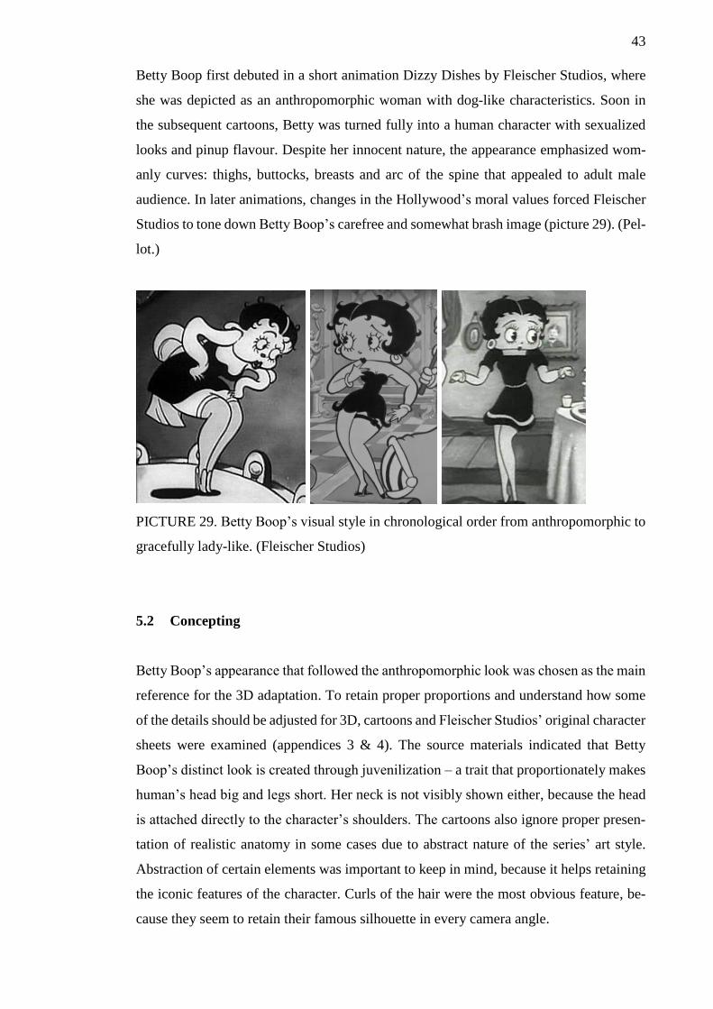
Betty Boop first debuted in a short animation Dizzy Dishes by Fleischer Studios, where
she was depicted as an anthropomorphic woman with dog-like characteristics. Soon in
the subsequent cartoons, Betty was turned fully into a human character with sexualized
looks and pinup flavour. Despite her innocent nature, the appearance emphasized wom-
anly curves: thighs, buttocks, breasts and arc of the spine that appealed to adult male
audience. In later animations, changes in the Hollywood’s moral values forced Fleischer
Studios to tone down Betty Boop’s carefree and somewhat brash image (picture 29). (Pel-
lot.)
PICTURE 29. Betty Boop’s visual style in chronological order from anthropomorphic to
gracefully lady-like. (Fleischer Studios)
5.2 Concepting
Betty Boop’s appearance that followed the anthropomorphic look was chosen as the main
reference for the 3D adaptation. To retain proper proportions and understand how some
of the details should be adjusted for 3D, cartoons and Fleischer Studios’ original character
sheets were examined (appendices 3 & 4). The source materials indicated that Betty
Boop’s distinct look is created through juvenilization – a trait that proportionately makes
human’s head big and legs short. Her neck is not visibly shown either, because the head
is attached directly to the character’s shoulders. The cartoons also ignore proper presen-
tation of realistic anatomy in some cases due to abstract nature of the series’ art style.
Abstraction of certain elements was important to keep in mind, because it helps retaining
the iconic features of the character. Curls of the hair were the most obvious feature, be-
cause they seem to retain their famous silhouette in every camera angle.
44
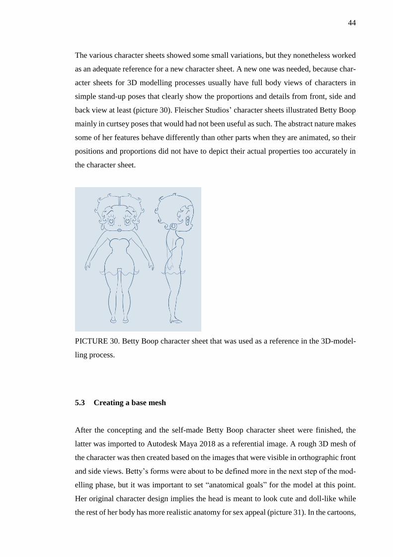
The various character sheets showed some small variations, but they nonetheless worked
as an adequate reference for a new character sheet. A new one was needed, because char-
acter sheets for 3D modelling processes usually have full body views of characters in
simple stand-up poses that clearly show the proportions and details from front, side and
back view at least (picture 30). Fleischer Studios’ character sheets illustrated Betty Boop
mainly in curtsey poses that would had not been useful as such. The abstract nature makes
some of her features behave differently than other parts when they are animated, so their
positions and proportions did not have to depict their actual properties too accurately in
the character sheet.
PICTURE 30. Betty Boop character sheet that was used as a reference in the 3D-model-
ling process.
5.3 Creating a base mesh
After the concepting and the self-made Betty Boop character sheet were finished, the
latter was imported to Autodesk Maya 2018 as a referential image. A rough 3D mesh of
the character was then created based on the images that were visible in orthographic front
and side views. Betty’s forms were about to be defined more in the next step of the mod-
elling phase, but it was important to set “anatomical goals” for the model at this point.
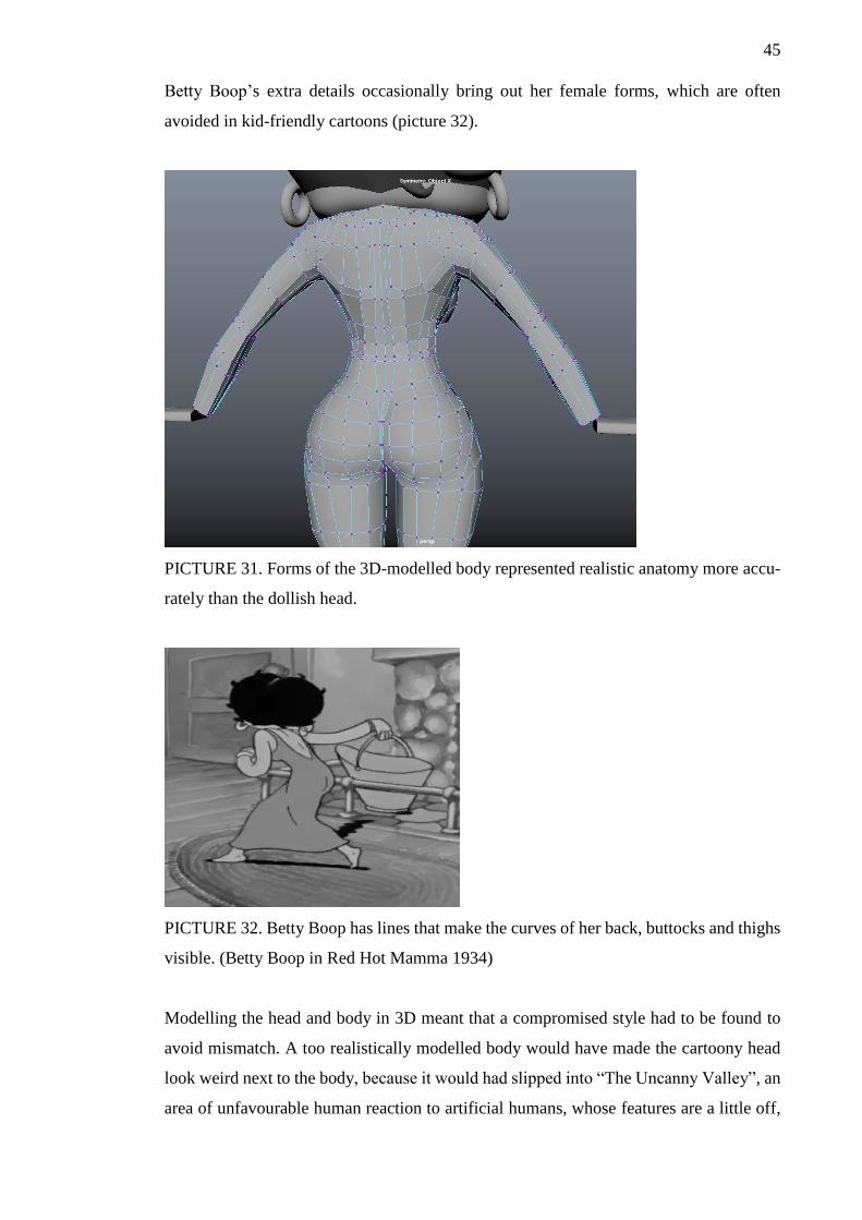
Her original character design implies the head is meant to look cute and doll-like while
the rest of her body has more realistic anatomy for sex appeal (picture 31). In the cartoons,
45
Betty Boop’s extra details occasionally bring out her female forms, which are often
avoided in kid-friendly cartoons (picture 32).
PICTURE 31. Forms of the 3D-modelled body represented realistic anatomy more accu-
rately than the dollish head.
PICTURE 32. Betty Boop has lines that make the curves of her back, buttocks and thighs
visible. (Betty Boop in Red Hot Mamma 1934)
Modelling the head and body in 3D meant that a compromised style had to be found to
avoid mismatch. A too realistically modelled body would have made the cartoony head
look weird next to the body, because it would had slipped into “The Uncanny Valley”, an
area of unfavourable human reaction to artificial humans, whose features are a little off,
46
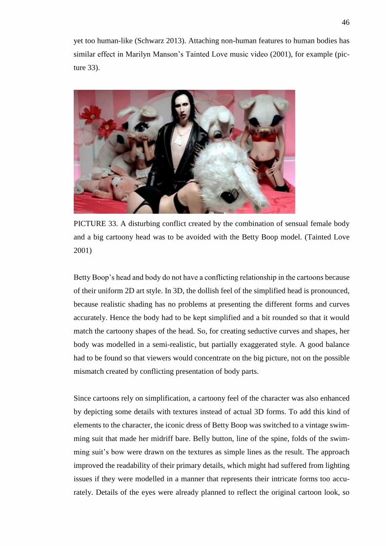
yet too human-like (Schwarz 2013). Attaching non-human features to human bodies has
similar effect in Marilyn Manson’s Tainted Love music video (2001), for example (pic-
ture 33).
PICTURE 33. A disturbing conflict created by the combination of sensual female body
and a big cartoony head was to be avoided with the Betty Boop model. (Tainted Love
2001)
Betty Boop’s head and body do not have a conflicting relationship in the cartoons because
of their uniform 2D art style. In 3D, the dollish feel of the simplified head is pronounced,
because realistic shading has no problems at presenting the different forms and curves
accurately. Hence the body had to be kept simplified and a bit rounded so that it would
match the cartoony shapes of the head. So, for creating seductive curves and shapes, her
body was modelled in a semi-realistic, but partially exaggerated style. A good balance
had to be found so that viewers would concentrate on the big picture, not on the possible
mismatch created by conflicting presentation of body parts.
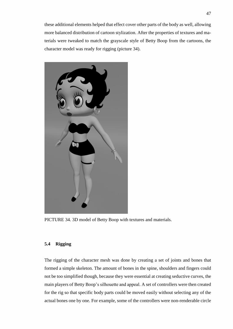
Since cartoons rely on simplification, a cartoony feel of the character was also enhanced
by depicting some details with textures instead of actual 3D forms. To add this kind of
elements to the character, the iconic dress of Betty Boop was switched to a vintage swim-
ming suit that made her midriff bare. Belly button, line of the spine, folds of the swim-
ming suit’s bow were drawn on the textures as simple lines as the result. The approach
improved the readability of their primary details, which might had suffered from lighting
issues if they were modelled in a manner that represents their intricate forms too accu-
rately. Details of the eyes were already planned to reflect the original cartoon look, so
47
these additional elements helped that effect cover other parts of the body as well, allowing
more balanced distribution of cartoon stylization. After the properties of textures and ma-
terials were tweaked to match the grayscale style of Betty Boop from the cartoons, the
character model was ready for rigging (picture 34).
PICTURE 34. 3D model of Betty Boop with textures and materials.
5.4 Rigging
The rigging of the character mesh was done by creating a set of joints and bones that
formed a simple skeleton. The amount of bones in the spine, shoulders and fingers could
not be too simplified though, because they were essential at creating seductive curves, the
main players of Betty Boop’s silhouette and appeal. A set of controllers were then created
for the rig so that specific body parts could be moved easily without selecting any of the
actual bones one by one. For example, some of the controllers were non-renderable circle
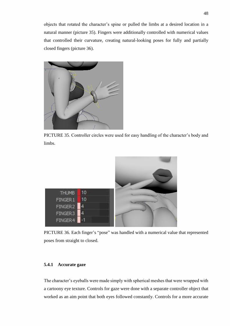
48
objects that rotated the character’s spine or pulled the limbs at a desired location in a
natural manner (picture 35). Fingers were additionally controlled with numerical values
that controlled their curvature, creating natural-looking poses for fully and partially
closed fingers (picture 36).
PICTURE 35. Controller circles were used for easy handling of the character’s body and
limbs.
PICTURE 36. Each finger’s “pose” was handled with a numerical value that represented
poses from straight to closed.
5.4.1 Accurate gaze
The character’s eyeballs were made simply with spherical meshes that were wrapped with
a cartoony eye texture. Controls for gaze were done with a separate controller object that
worked as an aim point that both eyes followed constantly. Controls for a more accurate
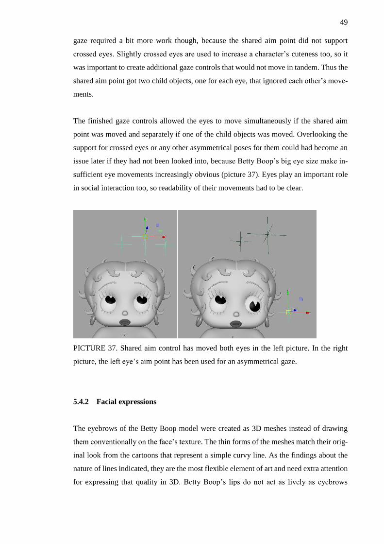
49
gaze required a bit more work though, because the shared aim point did not support
crossed eyes. Slightly crossed eyes are used to increase a character’s cuteness too, so it
was important to create additional gaze controls that would not move in tandem. Thus the
shared aim point got two child objects, one for each eye, that ignored each other’s move-
ments.
The finished gaze controls allowed the eyes to move simultaneously if the shared aim
point was moved and separately if one of the child objects was moved. Overlooking the
support for crossed eyes or any other asymmetrical poses for them could had become an
issue later if they had not been looked into, because Betty Boop’s big eye size make in-
sufficient eye movements increasingly obvious (picture 37). Eyes play an important role
in social interaction too, so readability of their movements had to be clear.
PICTURE 37. Shared aim control has moved both eyes in the left picture. In the right
picture, the left eye’s aim point has been used for an asymmetrical gaze.
5.4.2 Facial expressions
The eyebrows of the Betty Boop model were created as 3D meshes instead of drawing
them conventionally on the face’s texture. The thin forms of the meshes match their orig-
inal look from the cartoons that represent a simple curvy line. As the findings about the
nature of lines indicated, they are the most flexible element of art and need extra attention
for expressing that quality in 3D. Betty Boop’s lips do not act as lively as eyebrows
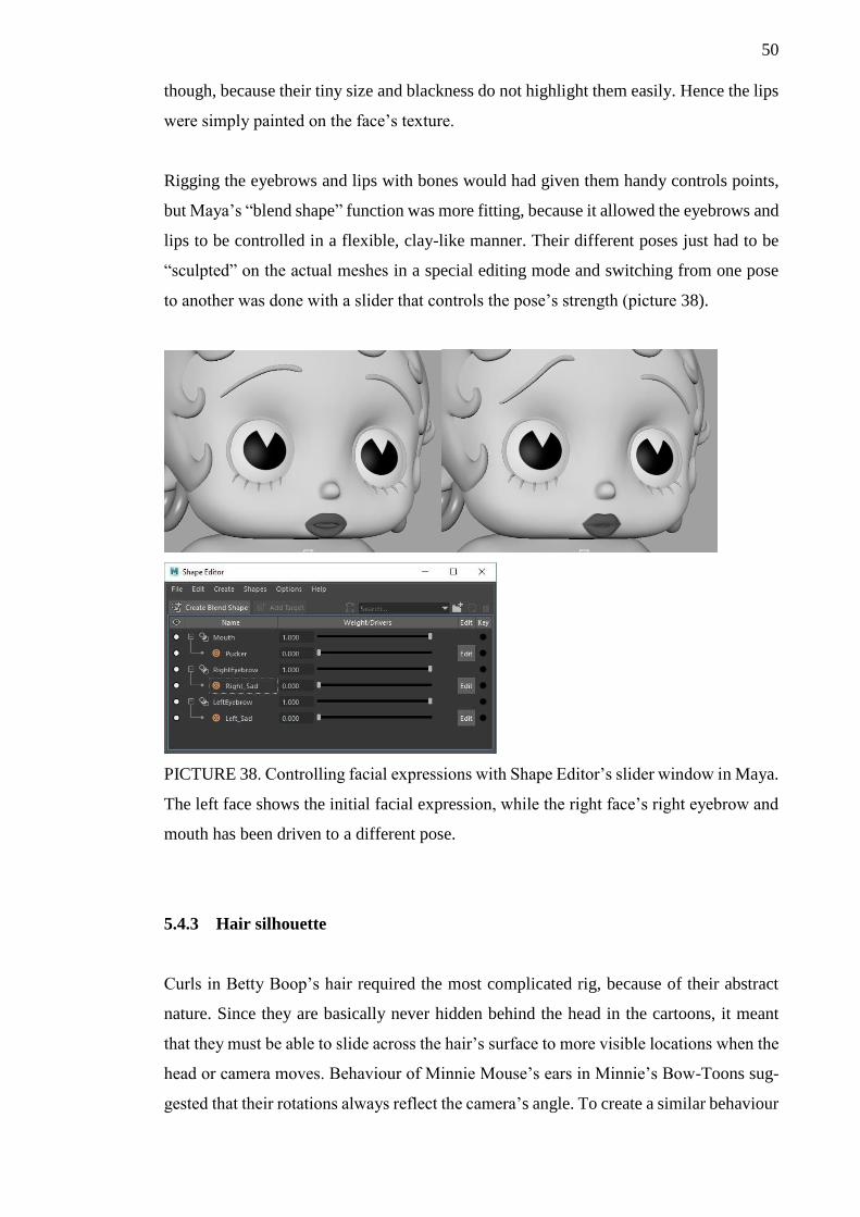
50
though, because their tiny size and blackness do not highlight them easily. Hence the lips
were simply painted on the face’s texture.
Rigging the eyebrows and lips with bones would had given them handy controls points,
but Maya’s “blend shape” function was more fitting, because it allowed the eyebrows and
lips to be controlled in a flexible, clay-like manner. Their different poses just had to be
“sculpted” on the actual meshes in a special editing mode and switching from one pose
to another was done with a slider that controls the pose’s strength (picture 38).
PICTURE 38. Controlling facial expressions with Shape Editor’s slider window in Maya.
The left face shows the initial facial expression, while the right face’s right eyebrow and
mouth has been driven to a different pose.
5.4.3 Hair silhouette
Curls in Betty Boop’s hair required the most complicated rig, because of their abstract
nature. Since they are basically never hidden behind the head in the cartoons, it meant
that they must be able to slide across the hair’s surface to more visible locations when the
head or camera moves. Behaviour of Minnie Mouse’s ears in Minnie’s Bow-Toons sug-
gested that their rotations always reflect the camera’s angle. To create a similar behaviour
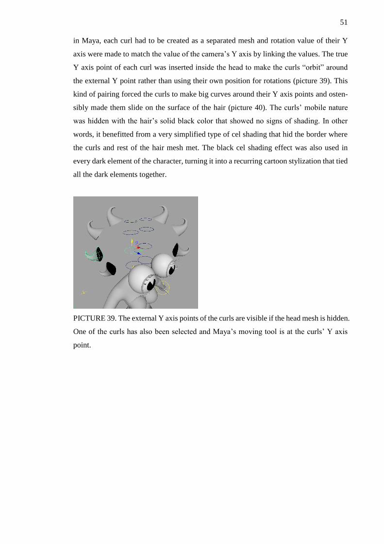
51
in Maya, each curl had to be created as a separated mesh and rotation value of their Y
axis were made to match the value of the camera’s Y axis by linking the values. The true
Y axis point of each curl was inserted inside the head to make the curls “orbit” around
the external Y point rather than using their own position for rotations (picture 39). This
kind of pairing forced the curls to make big curves around their Y axis points and osten-
sibly made them slide on the surface of the hair (picture 40). The curls’ mobile nature
was hidden with the hair’s solid black color that showed no signs of shading. In other
words, it benefitted from a very simplified type of cel shading that hid the border where
the curls and rest of the hair mesh met. The black cel shading effect was also used in
every dark element of the character, turning it into a recurring cartoon stylization that tied
all the dark elements together.
PICTURE 39. The external Y axis points of the curls are visible if the head mesh is hidden.
One of the curls has also been selected and Maya’s moving tool is at the curls’ Y axis
point.
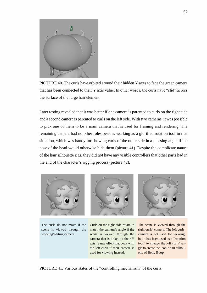
52
PICTURE 40. The curls have orbited around their hidden Y axes to face the green camera
that has been connected to their Y axis value. In other words, the curls have “slid” across
the surface of the large hair element.
Later testing revealed that it was better if one camera is parented to curls on the right side
and a second camera is parented to curls on the left side. With two cameras, it was possible
to pick one of them to be a main camera that is used for framing and rendering. The
remaining camera had no other roles besides working as a glorified rotation tool in that
situation, which was handy for showing curls of the other side in a pleasing angle if the
pose of the head would otherwise hide them (picture 41). Despite the complicate nature
of the hair silhouette rigs, they did not have any visible controllers that other parts had in
the end of the character’s rigging process (picture 42).
The curls do not move if the
scene is viewed through the
working/editing camera.
Curls on the right side rotate to
match the camera’s angle if the
scene is viewed through the
camera that is linked to their Y
axis. Same effect happens with
the left curls if their camera is
used for viewing instead.
The scene is viewed through the
right curls’ camera. The left curls’
camera is not used for viewing,
but it has been used as a “rotation
tool” to change the left curls’ an-
gle to create the iconic hair silhou-
ette of Betty Boop.
PICTURE 41. Various states of the “controlling mechanism” of the curls.
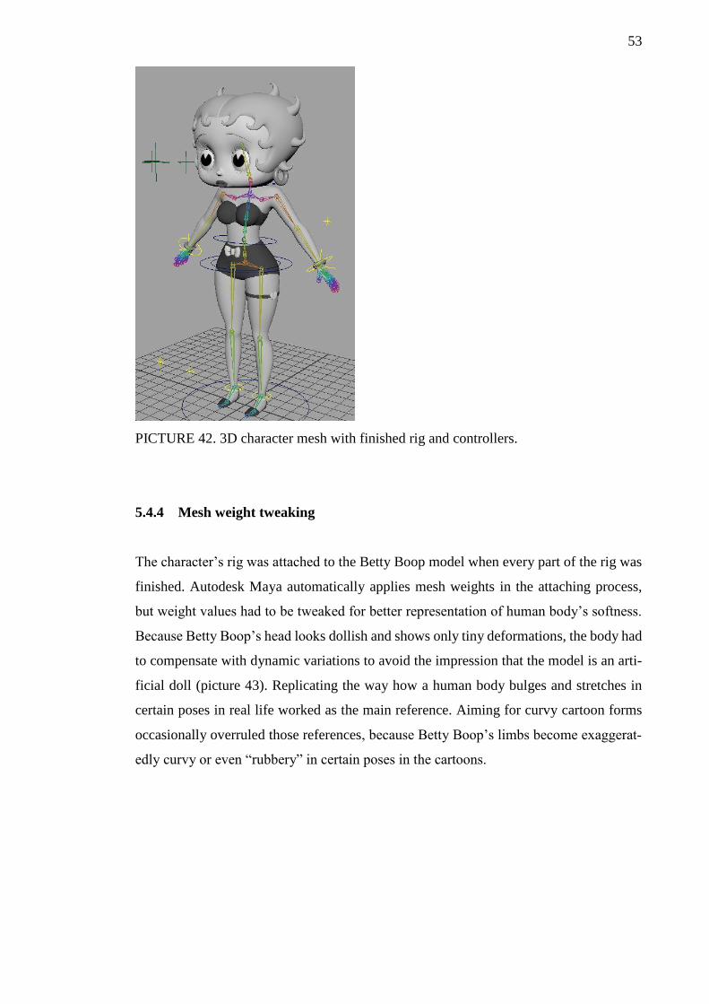
53
PICTURE 42. 3D character mesh with finished rig and controllers.
5.4.4 Mesh weight tweaking
The character’s rig was attached to the Betty Boop model when every part of the rig was
finished. Autodesk Maya automatically applies mesh weights in the attaching process,
but weight values had to be tweaked for better representation of human body’s softness.
Because Betty Boop’s head looks dollish and shows only tiny deformations, the body had
to compensate with dynamic variations to avoid the impression that the model is an arti-
ficial doll (picture 43). Replicating the way how a human body bulges and stretches in
certain poses in real life worked as the main reference. Aiming for curvy cartoon forms
occasionally overruled those references, because Betty Boop’s limbs become exaggerat-
edly curvy or even “rubbery” in certain poses in the cartoons.

54
PICTURE 43. Untweaked leg looks plastic in the right picture, but it gained more natural
skin and muscle behaviour after weight value tweaking.
The character’s apparel and clothes needed some tweaking too to retain their intended
shape. Betty Boop’s bracelets were a pair of items that had to retain their circular form
due to their solid, metallic nature, for example. To express that kind of nature, weight
values around the wrist had to be increased so that weights from other bones could not
distort the forms of the bracelets (picture 44).
PICTURE 44. Bracelets squeezed unrealistically whenever the hand was moved.
Tweaking mesh weights was the final part of the rigging phase. The complicatedly built
rig and weight tweaking made sure the model’s poses and silhouette could match their
2D counterparts from the cartoons as closely as possible in the staging phase.

55
5.5 Staging the character
3D Betty Boop’s posing capabilities were tested and confirmed in the rigging phase, but
it did not give a full image about the character’s readability in an actual scene. It meant
that a couple of scenes had to be created in the similar grayscale style that the character
model possessed. Instead of creating completely fictitious scenes, two scenes from the
original cartoons were chosen. A scene where Betty sings next to a voice recorder in an
exhibition tent was the first choice (picture 45). The second choice was combined from
two scenes: a throne room scene where Betty is feeling insecure, and another scene where
she is ropewalking in a circus tent (picture 46). These scenes made the swimming suit of
the 3D Betty Boop improve staging already at this point, because the clothes felt appro-
priate in the chosen settings.
PICTURE 45. A scene of singing Betty Boop.
PICTURE 46. Betty Boop’s pose from the left picture was combined with the ropewalk-
ing setting from the right picture.
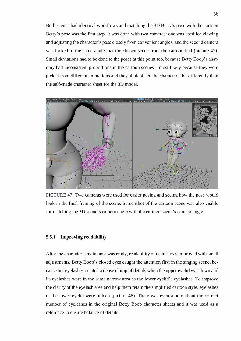
56
Both scenes had identical workflows and matching the 3D Betty’s pose with the cartoon
Betty’s pose was the first step. It was done with two cameras: one was used for viewing
and adjusting the character’s pose closely from convenient angles, and the second camera
was locked to the same angle that the chosen scene from the cartoon had (picture 47).
Small deviations had to be done to the poses at this point too, because Betty Boop’s anat-
omy had inconsistent proportions in the cartoon scenes – most likely because they were
picked from different animations and they all depicted the character a bit differently than
the self-made character sheet for the 3D model.
PICTURE 47. Two cameras were used for easier posing and seeing how the pose would
look in the final framing of the scene. Screenshot of the cartoon scene was also visible
for matching the 3D scene’s camera angle with the cartoon scene’s camera angle.
5.5.1 Improving readability
After the character’s main pose was ready, readability of details was improved with small
adjustments. Betty Boop’s closed eyes caught the attention first in the singing scene, be-
cause her eyelashes created a dense clump of details when the upper eyelid was down and
its eyelashes were in the same narrow area as the lower eyelid’s eyelashes. To improve
the clarity of the eyelash area and help them retain the simplified cartoon style, eyelashes
of the lower eyelid were hidden (picture 48). There was even a note about the correct
number of eyelashes in the original Betty Boop character sheets and it was used as a
reference to ensure balance of details.

57
PICTURE 48. Eyelashes of the upper and lower eyelids are visible in the left picture.
Lower eyelid’s eyelashes are hidden in the right picture to create clearer appearance for
the overlapped eyelash area.
Disabling some of the shadows became necessary too when the eyelashes were adjusted.
The selective absence of shadows in certain areas emphasized the contrast of dark and
light elements, because the disabled shadows could not soften the contrast with gray val-
ues. The shadows of eyebrows, eyelashes, earrings and curls of the hair were disabled for
that reason and, additionally, to simplify the shadows that big groups of elements casted
on underlying elements. For example, the character’s head created a rounder shadow on
the shoulder area, because it did not include small shadows that the earrings and curls
would had created outside the main shadow’s shape. Rounder shadow shapes basically
emphasized cartoony feel, since old cartoons often simplify shadows to the point where
they only crudely resemble the forms that cast them (picture 49).
PICTURE 49. Characters’ cast shadows sometimes resemble simple dark “blobs”.
(Dragon Ball Z 1989)
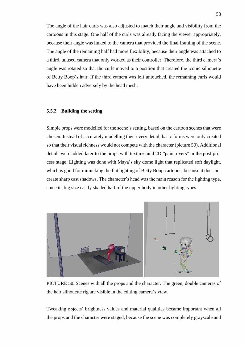
58
The angle of the hair curls was also adjusted to match their angle and visibility from the
cartoons in this stage. One half of the curls was already facing the viewer appropriately,
because their angle was linked to the camera that provided the final framing of the scene.
The angle of the remaining half had more flexibility, because their angle was attached to
a third, unused camera that only worked as their controller. Therefore, the third camera’s
angle was rotated so that the curls moved to a position that created the iconic silhouette
of Betty Boop’s hair. If the third camera was left untouched, the remaining curls would
have been hidden adversely by the head mesh.
5.5.2 Building the setting
Simple props were modelled for the scene’s setting, based on the cartoon scenes that were
chosen. Instead of accurately modelling their every detail, basic forms were only created
so that their visual richness would not compete with the character (picture 50). Additional
details were added later to the props with textures and 2D “paint overs” in the post-pro-
cess stage. Lighting was done with Maya’s sky dome light that replicated soft daylight,
which is good for mimicking the flat lighting of Betty Boop cartoons, because it does not
create sharp cast shadows. The character’s head was the main reason for the lighting type,
since its big size easily shaded half of the upper body in other lighting types.
PICTURE 50. Scenes with all the props and the character. The green, double cameras of
the hair silhouette rig are visible in the editing camera’s view.
Tweaking objects’ brightness values and material qualities became important when all
the props and the character were staged, because the scene was completely grayscale and
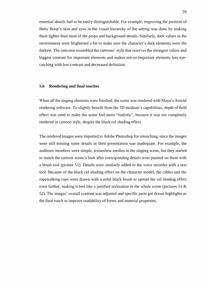
59
essential details had to be easily distinguishable. For example, improving the position of
Betty Boop’s skin and eyes in the visual hierarchy of the setting was done by making
them lighter than most of the props and background details. Similarly, dark values in the
environment were brightened a bit to make sure the character’s dark elements were the
darkest. The outcome resembled the cartoons’ style that reserves the strongest values and
biggest contrast for important elements and makes not-so-important elements less eye-
catching with low contrast and decreased definition.
5.6 Rendering and final touches
When all the staging elements were finished, the scene was rendered with Maya’s Arnold
rendering software. To slightly benefit from the 3D medium’s capabilities, depth of field
effect was used to make the scene feel more “realistic”, because it was not completely
rendered in cartoon style, despite the black cel shading effect.
The rendered images were imported to Adobe Photoshop for retouching, since the images
were still missing some details or their presentation was inadequate. For example, the
audience members were simple, textureless meshes in the singing scene, but they started
to match the cartoon scene’s look after corresponding details were painted on them with
a brush tool (picture 51). Details were similarly added to the voice recorder with a text
tool. Because of the black cel shading effect on the character model, the cables and the
ropewalking rope were drawn with a solid black brush to spread the cel shading effect
even further, making it feel like a justified stylization in the whole scene (pictures 51 &
52). The images’ overall contrast was adjusted and specific parts got drawn highlights as
the final touch to improve readability of forms and material properties.
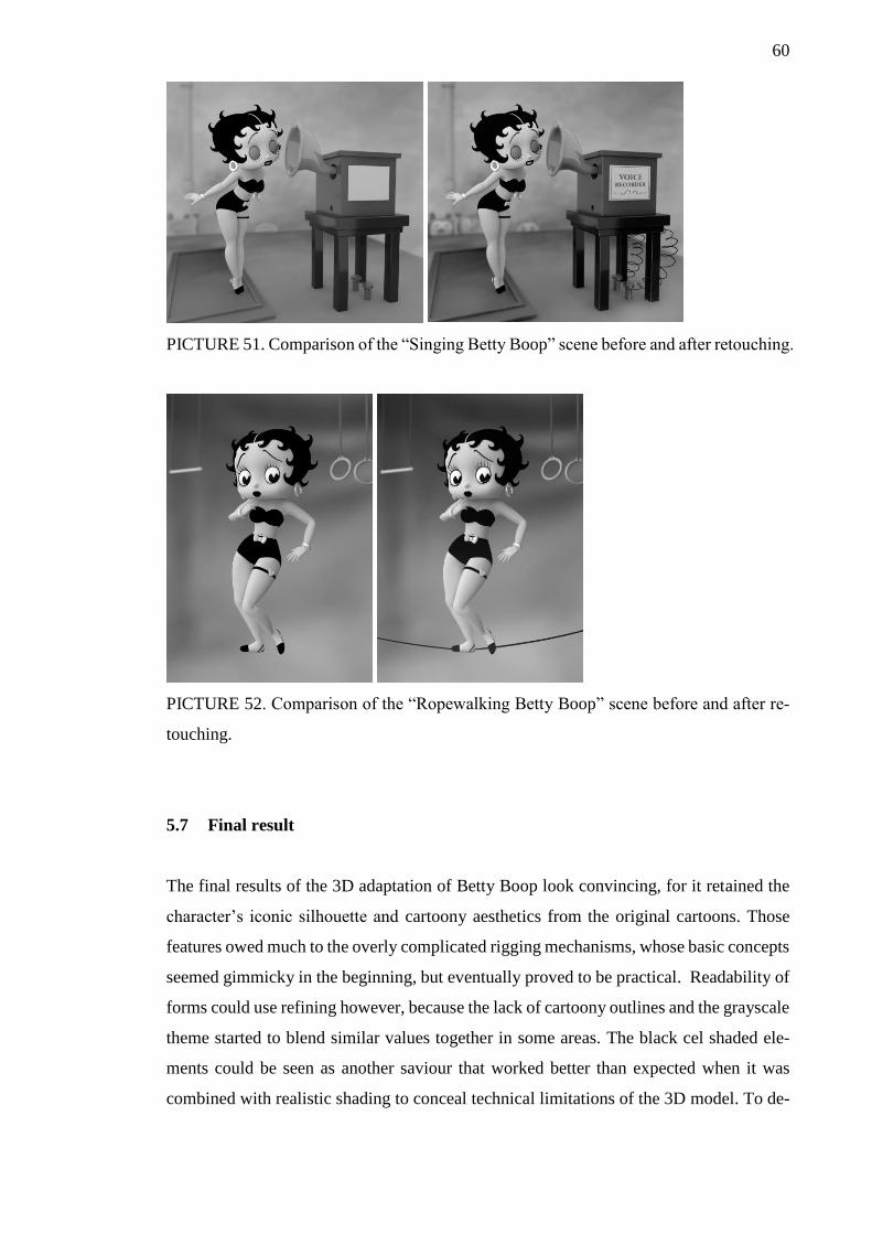
60
PICTURE 51. Comparison of the “Singing Betty Boop” scene before and after retouching.
PICTURE 52. Comparison of the “Ropewalking Betty Boop” scene before and after re-
touching.
5.7 Final result
The final results of the 3D adaptation of Betty Boop look convincing, for it retained the
character’s iconic silhouette and cartoony aesthetics from the original cartoons. Those
features owed much to the overly complicated rigging mechanisms, whose basic concepts
seemed gimmicky in the beginning, but eventually proved to be practical. Readability of
forms could use refining however, because the lack of cartoony outlines and the grayscale
theme started to blend similar values together in some areas. The black cel shaded ele-
ments could be seen as another saviour that worked better than expected when it was
combined with realistic shading to conceal technical limitations of the 3D model. To de-
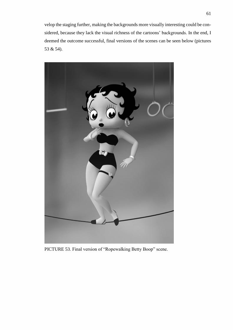
61
velop the staging further, making the backgrounds more visually interesting could be con-
sidered, because they lack the visual richness of the cartoons’ backgrounds. In the end, I
deemed the outcome successful, final versions of the scenes can be seen below (pictures
53 & 54).
PICTURE 53. Final version of “Ropewalking Betty Boop” scene.
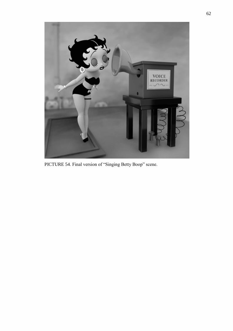
62
PICTURE 54. Final version of “Singing Betty Boop” scene.
63
6 CONCLUSION
Cartoons can be considered a playful medium that uses various visual tricks to get the
creator’s most important messages communicated to viewers. Sometimes the communi-
cation is handled in a subtle manner as the qualities of cartoon characters’ building blocks
indicated. In other occasions, the characters do their best to entertain the viewer with
imaginative visual cues that cannot be produced in the real world when they exaggerate
the purest essence out of a specific subject, whether it is a part of humanity or an abstract
feature. And yet, despite their simple appearance, cartoon characters make everything
seem credible, because their creators know how to pull the strings that are connected to
our own experiences. In contrast to my thoughts before the thesis was started, cartoon
characters’ distinguishable stylization does not twist or drop the essential information that
they should deliver to the audience. They strengthen it by dropping unnecessary parts
away so that people cannot miss the main idea of the concept.
The 3D adaptation of Betty Boop proved that abstract qualities of a cartoon character can
be transferred to 3D adequately. However, the success depended partly on the 3D model’s
ability to hide the medium’s technical limitations with stylization. The stylized parts were
therefore a forced feature in the sense that their absence would had most likely made
viewers concentrate on the shortcomings of the mechanisms that controlled abstract ele-
ments. The hair silhouette was basically the only risky part of the whole 3D adaptation,
but it can certainly work as a base for an updated version that would not have to hide any
weaknesses with material properties. Interestingly though, hiding the technical limitations
represented the way how cartoons drop irrelevant elements!
A possible update could add more flexibility to the character’s other body parts, because
the simplified rig of the 3D Betty Boop could not bend her limbs as freely as they did in
the cartoons. To be exact, this refers to the rubbery, arc-like shapes that some cartoons
characters can make with their arms and legs for example. More flexibly behaving limbs
would be better at mimicking the many natures of lines and creating a better illusion of
life. Nevertheless, I am content with the capabilities of the 3D Betty Boop, surprisingly
to be honest.

64
As a conclusion, cartoon characters can work and feel the same as they did in 2D when
they are moved to 3D. If you overcome the challenges of combining the different qualities
and technical limitations of the two mediums, they can work in a fascinating manner and
complement each other.
65
REFERENCES
22 Words. 12 Ridiculous Road Signs You’ll Have To See To Believe! Read 15.11.2018.
Online article. https://twentytwowords.com/12-ridiculous-road-signs-youll-have-to-see-
to-believe/
Artyfactory a. The Visual Elements: The Building Blocks of Composition in Art. Web-
site. Read 27.7.2018. http://www.artyfactory.com/art_appreciation/visual-elements/vis-
ual-elements.html
Artyfactory b. Line as a Visual Element of Art. Website. Read 27.7.2018
http://www.artyfactory.com/art_appreciation/visual-elements/line.html
Artyfactory c. Pattern as a Visual Element of Art. Website. Read 31.7.2018
http://www.artyfactory.com/art_appreciation/visual-elements/pattern.html
Betty Boop in Red Hot Mamma. 1934. Direction: Dave Fleischer. Production: Fleischer
Studios. Presented 2.2.1934.
Betty Boop's Little Pal. 1934. Direction: Dave Fleischer. Production: Fleischer Studios.
Presented 21.9.1934.
Becker, A. 2015. Staging - 12 Principles of Animation. Video. Released 30.1.2015.
Watched 26.11.2018. https://www.youtube.com/watch?v=u-SXLaQGg50
Berserk. 2016. Direction: Shin Itagaki. Production: GEMBA, Millepensee & Liden
Films. Presented 1.7.2016-23.6.2017.
Bradley, S. 2010. Dominance: Creating Focal Points In Your Design. Vanseo Design.
Online article. Released 1.2.2010. Read 25.7.2018 https://vanseodesign.com/web-de-
sign/dominance/.
Caterina. 2017. Abstract Art: Works And Artists. The ArtPost Blog. Blog Post. Released
6.10.2017. Read 20.10.2017. https://www.theartpostblog.com/en/abstract-art/
Christensen, E. 2017. 5 Exercises for Drawing with Atmospheric Perspective. Released
19.5.2017. Read 1.6.2018. https://medium.com/@ConceptsApp/5-exercises-for-draw-
ing-with-atmospheric-perspective-869e2dcbf855
Cronin, M. 2009. 10 Principles Of Readability And Web Typography. Article. Read
26.11.2018. https://www.smashingmagazine.com/2009/03/10-principles-for-readable-
web-typography/
Daily Lives of High School Boys. 2012. Direction: Shinji Takamatsu. Production: Sun-
rise. Presented in Japan 9.1.2012-26.3.2012.
Doucet, R. Drawing and Composition for Visual Storytelling. Blog post. Read
29.11.2018. http://www.floobynooby.com/comp1.html
Dragon Ball Z. 1989. Direction: Daisuke Nishio. Production: Toei Animation. Pre-
sented in Japan 26.4.1989-31.1.1996.

66
Drunk Salaryman. 2012. Production: The Japan Times. Comic strip. Released: 1.7.2012.
https://www.japantimes.co.jp/opinion/2012/07/01/cartoons/drunk-salaryman/#.XBL_l-
KYOUl
Eisner, W. 2008. Graphic Storytelling And Visual Narrative: Principles and Practices
from the Legendary Cartoonist. 1st edition. New York: W. W. Norton & Company.
Fingerpori. 2018a. Itä-Savo. Comic strip. Released 27.11.2018. Read 28.11.2018
https://ita-savo.fi/teemat/fingerpori/ef641b54-4a20-4681-8e83-ab9209c8f1d2
Fingerpori. 2018b. Helsingin Sanomat. Comic strip. Released 12.11.2018. Read
13.12.2018. https://www.hs.fi/fingerpori/car-2000005893882.html
Fingerpori. 2018c. Helsingin Sanomat. Comic strip. Released 3.8.2018. Read 15.9.2018
https://www.hs.fi/fingerpori/car-2000005777234.html
Fussell, M. 2010. Line Weight (Quality) and Cross Contour Lines. Website & video.
Read 28.8.2018. https://thevirtualinstructor.com/line-quality-cross-contour.html
Grais, S. Comics Color. DePaul University, College of Computing and Digital Media.
Website. Read 10.12.2018. http://facweb.cs.depaul.edu/sgrais/com-
ics_color.htm?fbclid=IwAR1iGuKTjDV6TvT7ac3owCOwys7w_nEpnQx0q9K-
K3xIjkaHCm3_spcmKgQ
Gummerrus Kustannus Oy. 2009. Symbolit Ja Merkit. Trans. Häkkinen, C. &
Ruuhinen, H. Helsinki: Gummerrus Kustannus Oy. Original work 2008.
Hergé. 1943. The Adventures of Tintin: The Secret of the Unicorn. Tournai: Casterman.
Hergé 1947. The Adventures of Tintin: King Ottokar's Sceptre, Tournai: Casterman.
Leong, J. 2006. Number of Colors Distinguishable by the Human Eye. Website. Read
14.12.2018. https://hypertextbook.com/facts/2006/JenniferLeong.shtml
Lumen Learning. Elements of Art. Website. Read 5.7.2018.
https://courses.lumenlearning.com/atd-sac-artappreciation/chapter/oer-1-9/
Luque, R. 2012. The Cel Shading Technique. Dissertation. Read 24.11.2018.
https://raulreyesfinalproject.files.wordpress.com/2012/12/dissertation_cell-shading-
raul_reyes_luque.pdf
McCloud, S. 1994. Sarjakuva: Näkymätön Taide. Trans. Heiskanen, J. Helsinki: The
Good Fellows ky. Original work 1993.
McCloud, S. 2006. Making Comics: Storytelling Secrets of Comics, Manga and
Graphic Novels. 1st edition. New York: HarperCollins Publishers.
McDonnell, M. The Importance of a Good Silhouette. Blog post. Read 27.11.2018.
http://theartcenter.blogspot.com/2010/02/importance-of-good-silhouette.html
67
Minnie’s Bow-Toons. 2017. Disney Junior. Video. Released 7.9.2017. Watched
2.12.2018.
https://www.youtube.com/watch?v=vfZbV2KXbDo&list=PL2m1vjiMH_hNYvAAHdL
suB0y7OIva3VSI
Motomura, J. Technical artist. 2015. GuiltyGearXrd's Art Style : The X Factor Between
2D and 3D. Keynote presentation. Game Developers Conference 2015. 2-6.3.2015. San
Francisco.
https://www.youtube.com/watch?v=yhGjCzxJV3Ehttps://www.youtube.com/watch?v=
yhGjCzxJV3E
My Hero Academia. 2016. Director: Kenji Nagasaki. Production: Bones. Presented in
Japan 3.4.2016-present.
Naruto. 1999. Written/direction: Masashi Kishimoto. Production: Shueisha. Presented
in Japan 21.9.1999-10.11.2014.
Naruto. 2002. Direction: Hayato Date. Production: Pierrot. Presented in Japan
3.10.2002-8.2.2007.
Nassau, K. The Perception of Colour. Website. Read 10.12.2018. https://www.britan-
nica.com/science/color/The-perception-of-colour
Oh My Disney. 2016. The 12 Principles of Animation as Illustrated Through Disney And
Disney Pixar Films. Website. Read 13.12.2018. https://ohmy.disney.com/mov-
ies/2016/07/20/twelve-principles-animation-disney/
One Piece. 1997. Written/direction: Eiichiro Oda. Production: Shueisha. Presented in
Japan 22.7.1997-present.
One Piece. 1999. Direction: Kōnosuke Uda, Junji Shimizu, Munehisa Sakai, Hiroaki
Miyamoto, Toshinori Fukazawa, Satoshi Itō, Tatsuya Nagamine. Production: Toei Ani-
mation Co. Ltd. Presented in Japan 20.10.1999-present.
Pancare, R. 2018. How Do Bright Colors Appeal to Kids? Article. Read 24.7.2018.
https://sciencing.com/do-bright-colors-appeal-kids-5476948.html
Pantelić, K. 2016. Exploring the Form in Art. Website. Released 10.12.2006. Read
25.11.2018 https://www.widewalls.ch/form-in-art/
Panty & Stocking with Garterbelt. 2010. Direction: Hiroyuki Imaishi. Production:
Gainax, Presented in Japan 1.10.2010-28.4.2011.
Pellot. The Scandalous Story Behind The Real Betty Boop Will Blow You Away. Little
Things. Online article. Read 9.8.2018. https://www.littlethings.com/real-betty-boop-
baby-esther?utm_medium=google&vpage=3
Prokopenko, S. 2012. Shading Light And Form – Basics. Website. Released 8.11.2012.
Read 25.11.2018 https://www.proko.com/shading-light-and-form-ba-
sics/#.W_sBxOKYOUk

68
Sabbagh, M. 2015. Out of Character: How to Design Good Game Characters. Article.
Read 15.6.2018. https://www.gamasutra.com/blogs/MichelSab-
bagh/20150825/252065/Out_of_Character_how_to_design_good_game_characters.php
Salgood, S. 2015. Line Weight: When to Vary It and Why? Video. Watched 9.8.2018.
https://www.youtube.com/watch?v=MldkhPOf10o
Schodt, F. 1983. Manga! Manga! The World of Japanese Comics. 1st edition. Tokyo:
Kodansha International Ltd.
Schwarz, R. 2013. 10 Creepy Examples of the Uncanny Valley. Article. Released
25.11.2013. Read 14.12.2018. https://www.strangerdimensions.com/2013/11/25/10-
creepy-examples-uncanny-valley/
Starr, M. 2017. Your Eyes Are Liars: These Strawberries Aren't Red. Website. Read
10.12.2018. https://www.cnet.com/news/your-eyes-are-liars-these-strawberries-arent-
red/?fbclid=IwAR3iwQ6FEglwhcHUdbNmHXeOU2RIHxXR8CAZiq5ROj_D0Izsef-
ndm3i3tSw
Tainted Love. 2001. Artist: Marilyn Manson. Direction: Philip G. Atwell. Production:
Interscope Records. Presented in USA 21.11.2001.
Tales from Weirdland. 2017. Blog post. Read 26.11.2018. http://talesfrom-
weirdland.blogspot.com/2017/04/betty-boop-model-sheets-mouth-chart-and.html
Tate a. Gestural. Website. London: Tate Gallery. Read 21.10.2018.
https://www.tate.org.uk/art/art-terms/g/gestural
Tate b. Abstract Art. Website. London: Tate Gallery. Read 8.10.2018.
https://www.tate.org.uk/art/art-terms/a/abstract-art
Teguh, T. 2018. Character Design: Shape Language and Readability. Released
26.4.2018. Read 10.6.2018. https://80.lv/articles/character-design-shape-language-and-
readability/
Valve. 2017. Dota 2 Workshop - Character Art Guide. Online Guide. Read 16.6.2018. https://support.steampowered.com/kb/9334-YDXV-8590/dota-2-workshop-character-
art-guide?l=spanish#gradient

69
APPENDICES
Appendix 1. Effects of atmospheric perspective (Christensen 2017)
Contrast variation based on distance:
Focus variation based on distance:
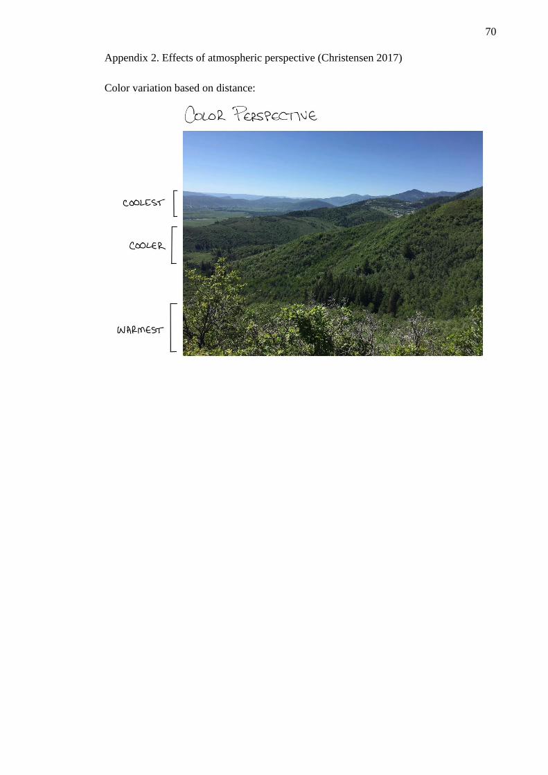
70
Appendix 2. Effects of atmospheric perspective (Christensen 2017)
Color variation based on distance:
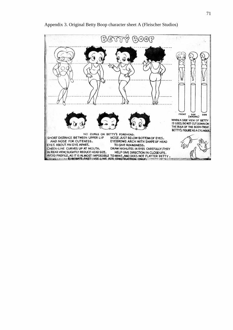
71
Appendix 3. Original Betty Boop character sheet A (Fleischer Studios)
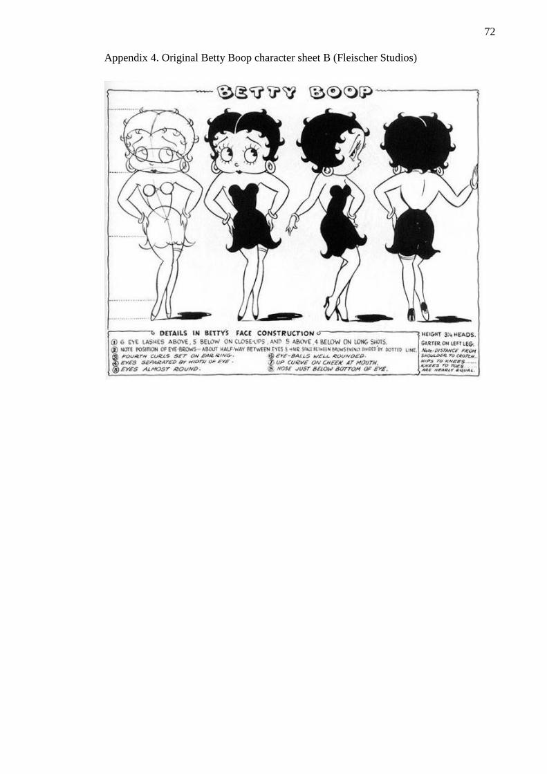
72
Appendix 4. Original Betty Boop character sheet B (Fleischer Studios)