question 4
TRANSCRIPT

E VA LU AT I O NC HA R L I E C R UM P

I N W HAT WAY D OES YOUR M ED I A P R OD UC T US E D EV ELOP OR C HA LLEN G E F OR M S A N D C ON V EN T I ON S
OF R EA L M ED I A P R OD UC T S ?
Question 4

‘ U S E ’ O F R E A L M AG A Z I N E P R O D U C T S - F R O N T C OV E R
• I like how ‘Maverick’ choose to have a MLS shot as you get to see exactly what the cover star dresses and looks like. I also like how ‘Country Music’ choose to put have their cover lines down the left hand side of the cover as it allows there to be more of a focus on the cover photo.
‘ D E V E LO P ’ R E A L M AG A Z I N E P R O D U C T S - F R O N T C OV E R
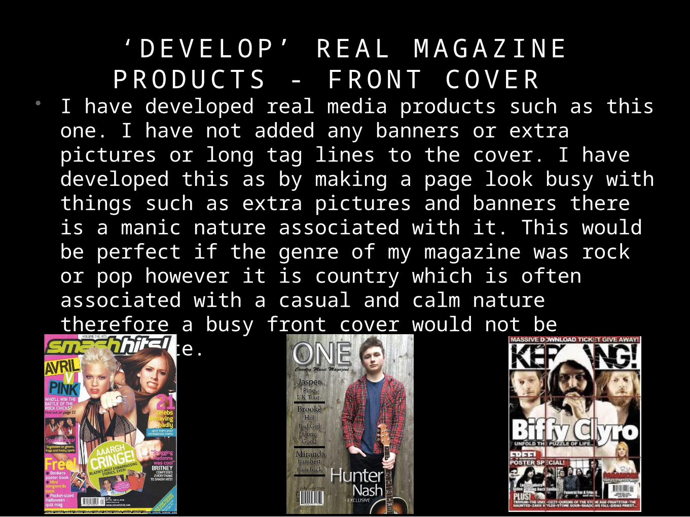
• I have developed real media products such as this one. I have not added any banners or extra pictures or long tag lines to the cover. I have developed this as by making a page look busy with things such as extra pictures and banners there is a manic nature associated with it. This would be perfect if the genre of my magazine was rock or pop however it is country which is often associated with a casual and calm nature therefore a busy front cover would not be appropriate.

‘ C H A L L E N G E ’ R E A L M E D I A P R O D U C T S - F R O N T C OV E R
• I believe I have challenged forms of real media products as I have created a magazine which is explicitly for the country genre. I think this because in my research I didn’t see any music magazines that were associated with just country genre, even if it looks like it will be due to the names of the magazine. For example, Taylor swift is originally of a country genre however, they have fitted her into magazines of a popular style. Here in these magazines they have made her look either quite edgy and rocky or quite seductive and almost a sex icon.

‘ U S E ’ O F R E A L M E D I A P R O D U C T S - C O N T E N T S PAG E
• Although Q is not a country magazine, I think their contents pages are very good and very effective, therefore I decided to do my contents page in a similar style. First of all I really like that both of these contents pages have a white background, therefore i decided to incorporate this into my contents page, i also like how they use a colour scheme of mainly 3 colours, therefore i did this in my contents page too. With the contents page on the left, I really like the layout, therefore I did my contents page in a similar layout style. On the contents page on the right, I find the bold lines to be current and effective, therefore I ave decided to do the same in my magazine too.
‘ D E V E LO P ’ R E A L M E D I A P R O D U C T S - C O N T E N T S PAG E
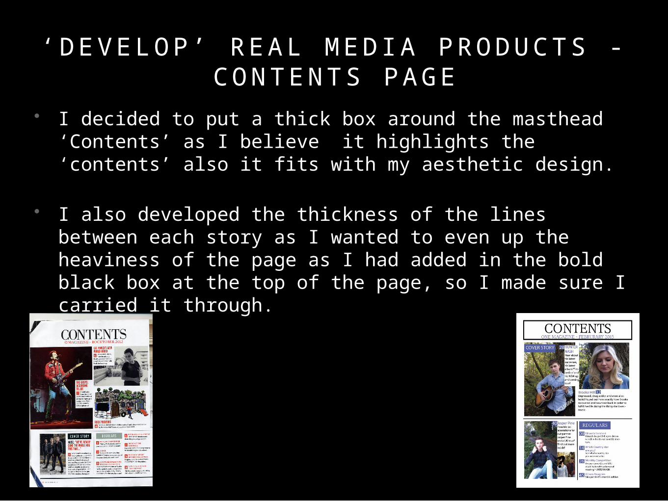
• I decided to put a thick box around the masthead ‘Contents’ as I believe it highlights the ‘contents’ also it fits with my aesthetic design.
• I also developed the thickness of the lines between each story as I wanted to even up the heaviness of the page as I had added in the bold black box at the top of the page, so I made sure I carried it through.
•

‘ C H A L L E N G E ’ R E A L M E D I A P R O D U C T S - C O N T E N T S PAG E
• I believe I challenged the typical conventions of using one image in the contents page by using multiple images. I think the cover photo attracts people to that article enough that by the time the reader gets to the contents page they don’t need another image of the same story. I think it would be more appropriate to have a few different images of different articles to attract other readers who weren’t originally attracted to the main cover story.

‘ U S E ’ O F R E A L M E D I A P R O D U C T S - D O U B L E PAG E S P R E A D
• Here in their double page spread, they have used one half as a just a photo of the artist, similarly in mine the left hand side is just the artist, I did this because it means the fans can cut it out and use it as a poster for their wall, as that is hat a lot of young fans do.

‘ D E V E LO P ’ R E A L M E D I A P R O D U C T S - D O U B L E PAG E S P R E A D
• I developed this media product by changing the advertisement of the other artists on the right hand side, to more photos of the cover star. I did this because I believe that the audience want to see more of their favourite star, not less of him and more of people they are not interested in.

‘ C H A L L E N G I N G ’ R E A L M E D I A P R O D U C T S - D O U B L E PAG E S P R E A D
• I have challenged the usual ways of doing a contents page. I have done this by not having photos all over the place and making the whole page look messy and manic. I have also made the contents age look less bay by not adding loads of tag lines. I did this because country music is usually associated with calmness not craziness.